 Georgia
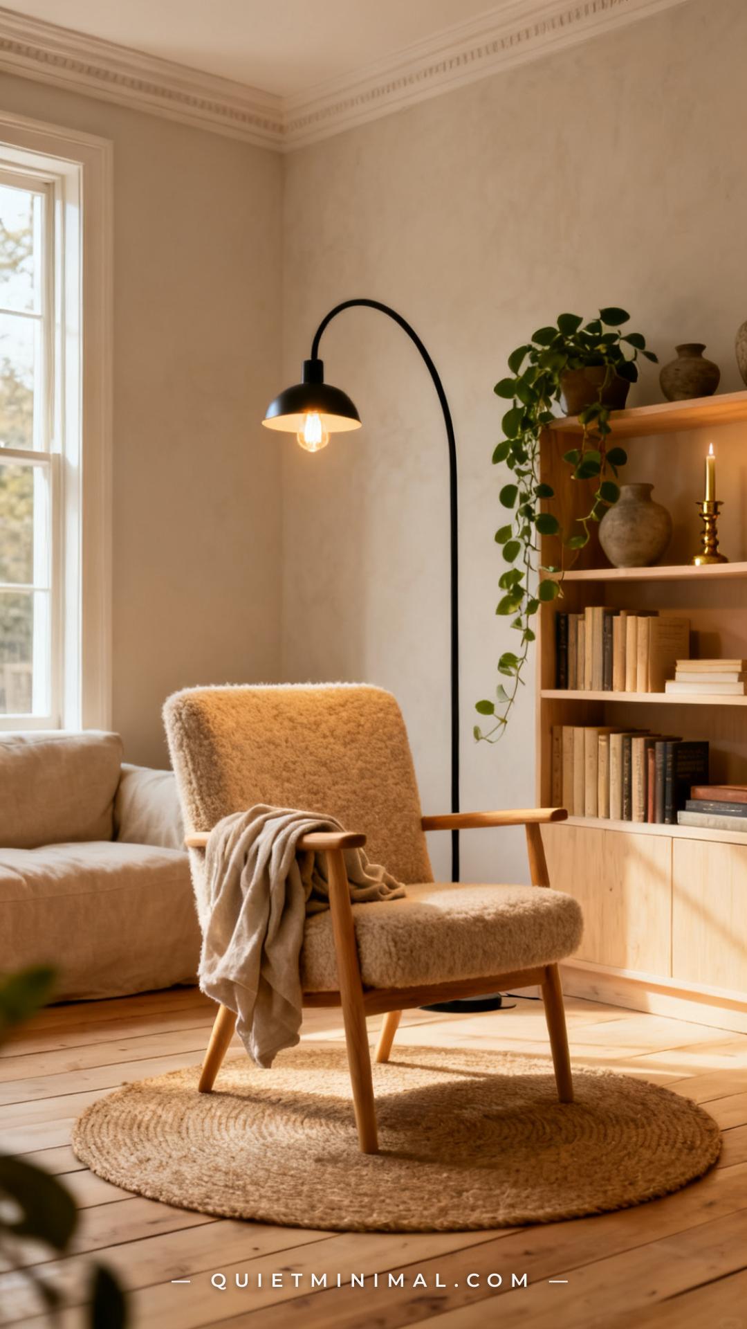
There is a difference between a corner that has books in it and a reading corner that actually feels like somewhere you want to stay. Most book lovers land somewhere in the middle — a chair that works, a lamp that kind of does the job, shelves that are full but somehow still look chaotic. The corner exists, but it doesn’t feel designed.
That gap is fixable, and it doesn’t require a renovation or a built-in bookcase that costs four figures. What it requires is understanding the layering system that interior designers use to make a small reading space feel like a real, intentional room within a room. This article walks through ten specific ideas — from the chair as your anchor point all the way through the finishing details that make a corner feel complete rather than assembled.
1. Choose a Chair That Does One Thing Well
 Save
The reading chair is the anchor of the entire corner, which means getting it wrong makes every other decision harder. The most common mistake is choosing a chair that looks right in a room but is uncomfortable to sit in for longer than twenty minutes. For a reading corner to function, the chair needs proper lumbar support, arms at the right height for resting a book, and a seat depth that lets you actually settle in.
From the guides
You've saved it, wanted it. Here's the how: codes, measurements, order. Your choices make it yours.
 The Japandi Honest PlaybookThe honest version of the style: what to keep, what to skip, and the order to do it in.See inside →
 The Room Refresh PlaybookA repeatable four-step method, room by room, in ten minutes, thirty minutes, or one weekend.See inside →
 Make Any Room Feel Cozy on PurposeWhy some rooms hold people and others empty out, and the moves that change it.See inside →
In practical terms, this points toward a few specific chair types: a low-profile slipper chair for tight spaces, a club chair for maximum comfort, or a curved accent chair (currently the most Pinterest-pinned silhouette for reading nooks) for a look that photographs beautifully and reads as intentional. The fabric matters for longevity — boucle and performance linen both hold up to daily use without looking worn, while velvet can pill faster in high-contact spots.
What to avoid: oversized recliners that dominate a small space, chairs without arm support (your wrists will notice), and barrel chairs with seats so deep they’re hard to get out of. The chair should invite you to stay, not challenge you to get comfortable.
Key Takeaway: Pick your chair for comfort first and silhouette second — a beautiful chair you never sit in is just an expensive sculpture.

2. Layer Three Types of Light (Not Just One)
 Save
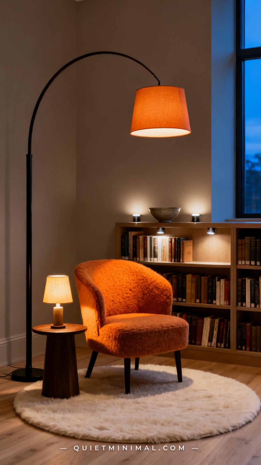
Single-source overhead lighting is the fastest way to make a reading corner feel like a waiting room. A corner that looks designed almost always has three types of light working together: task light for reading (directed, adjustable), ambient light for mood (warm, diffused), and accent light for the shelves or the wall behind.
The task light should be at eye level or slightly above when you’re seated — an arc floor lamp positioned behind and to one side of the chair is the most versatile option because it doesn’t require a table and can swing out of the way. For ambient, a small table lamp on the side table or a plug-in sconce on the wall adds warmth without competing with the reading light. For accent, puck lights or LED strip lights placed inside shelving units make book spines glow and add architectural depth to the corner even when you’re not reading.
All three sources should use bulbs in the 2700K–3000K range (warm white), never cool daylight. The difference between warm and cool light in a reading corner is the difference between a space that feels like a living room and one that feels like an office.
Key Takeaway: Three light sources at three heights transform a corner from functional to atmospheric — don’t skip the accent layer on the shelf.

3. Use a Side Table That Earns Its Place
 Save
A side table in a reading corner has a very specific job: hold a drink, hold a book, and stay out of the way. Where most people go wrong is choosing a table that’s either too large (taking up floor space the corner doesn’t have) or too small (a mug plus a bookmark fills it instantly). The right size is roughly 18 to 24 inches in diameter for a round table, or 16 to 20 inches square — large enough to be useful, small enough to pull aside when you stand up.
Material matters for the overall look. A travertine or stone-top pedestal table adds a current, designer-adjacent feel with minimal cost. A solid wood C-table that slides under the chair arm is the most practical option for small spaces because it frees up the floor entirely. Nesting tables give you flexibility — one tucked under the other until you need the extra surface.
The side table is also where the most personality shows up in a reading corner. A bold sculptural base, an unexpected material, or a vintage find from an estate sale can anchor the corner’s aesthetic without overwhelming it.
Key Takeaway: The side table should be the right height (level with your chair arm), the right size (useful but not crowding), and the first place your personality shows up in the corner.

4. Build a Shelf System That Looks Styled, Not Stuffed
 Save
A shelf full of books should look like a collection, not a storage problem. The difference is in the curation: how you mix vertical and horizontal arrangements, how you use objects to break up the mass of spines, and whether you’re grouping by color or by chaos.
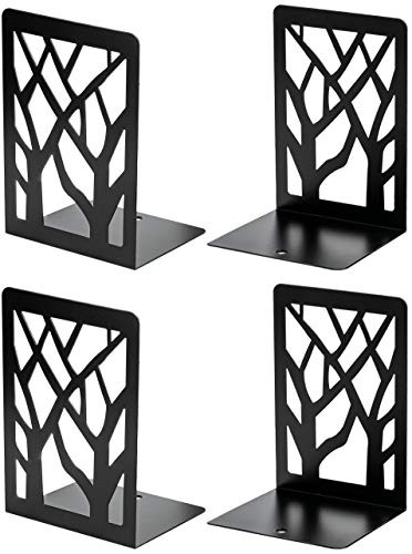
The most effective approach for a visually clean but warm shelf: group books loosely by spine color rather than strictly by subject or author. Cream, white, and neutral spines together read as calm and editorial. Pull out the brightest, most clashing covers and face them backward (yes, really — the pages out instead of the spine shows a clean cream-white edge that blends with neutrals). Then intersperse objects in roughly a one-to-four ratio: one object for every four book groupings. Ceramics, small plants, a candle, a small framed photo, or a sculptural bookend keep the eye moving without making the shelf feel cluttered.
For renters or anyone without built-ins, a tall ladder shelf or a freestanding five-tier unit against a wall gives the vertical presence of a built-in at a fraction of the cost.
Key Takeaway: Style your shelves with a one-to-four object-to-book ratio and group spines by color — it takes twenty minutes and makes the entire corner look intentional.

5. Add a Rug That Defines the Corner as Its Own Zone
 Save
In an open-plan room or a bedroom without a dedicated nook, a rug is the architectural tool that tells the eye “this corner is a room.” Without it, the chair reads as furniture floating in space. With it, the corner reads as a defined zone — almost like a separate room within the room.
For a reading corner, a round rug typically works better than a rectangular one because it matches the scale of a single chair without needing to accommodate a full sofa grouping. A 4-foot round rug under a single chair and side table is enough to establish the zone. A 5- or 6-foot round gives more generous grounding and works if you have a small ottoman included.
Material and texture are where the reading-corner rug earns its keep aesthetically. Natural fibers — jute, wool, cotton flatweave — add warmth and texture without competing with the chair fabric. A jute rug under a boucle chair is a high-texture pairing that photographs beautifully and looks intentional. Avoid high-pile rugs under chairs with legs, since the legs sink in and make the chair wobble.
Key Takeaway: A round rug in a natural fiber is the fastest way to make a reading chair feel like a reading corner — it zones the space without a single renovation.

6. Hang Something on the Wall Behind the Chair
 Save
A reading corner with a bare wall behind the chair looks like a staging photo, not a lived-in space. The wall behind the chair is prime real estate for making the corner feel like it has a backdrop — like it was designed to be there, not pushed into the corner because there was nowhere else to put the chair.
The most versatile options are a small gallery wall arrangement (three to five frames in complementary sizes, arranged at eye level and above the chair back), a single large-scale art print that anchors the space, or a round wall mirror that bounces light and adds visual depth. For book lovers specifically, a framed vintage map, a botanical illustration, or a literary-themed print adds thematic resonance to the corner without being heavy-handed.
Placement rule: the center of the arrangement should sit roughly 8 to 10 inches above the chair back, so the art and the chair read as a composed pair rather than two separate elements on the same wall. If hanging feels permanent (rentals, etc.), gallery-wall ledges let you prop frames without a single nail.
Key Takeaway: Art above the chair back completes the vertical composition of the corner — without it, the wall reads as empty space rather than intentional backdrop.
From the guides
You've saved it, wanted it. Here's the how: codes, measurements, order. Your choices make it yours.
The Japandi Honest PlaybookThe honest version of the style: what to keep, what to skip, and the order to do it in.See inside →The Room Refresh PlaybookA repeatable four-step method, room by room, in ten minutes, thirty minutes, or one weekend.See inside →Make Any Room Feel Cozy on PurposeWhy some rooms hold people and others empty out, and the moves that change it.See inside →
7. Bring In a Throw Blanket That Works as a Color Anchor
 Save
A throw blanket in a reading corner isn’t just about warmth — it’s the easiest single tool for introducing a color accent or a texture shift into the space without a single furniture purchase. It’s also the element that makes the chair look occupied in the best possible way: ready, inviting, already broken in.
The strategic move is to use the throw as your controlled color statement. If your corner is entirely neutral — cream chair, pale oak shelf, jute rug — a single throw in terracotta, sage green, dusty blue, or warm rust pulls the palette from “safe” to “considered.” Choose one color and carry it lightly into one other element (a ceramic on the shelf, a book spine color grouping) and the corner will feel cohesive rather than accidental.
For material, chunky knit throws photograph beautifully on Pinterest but pill faster with heavy use. A waffle-weave linen or cotton-linen blend is more durable for daily reaching-for. Wool is the most luxurious option and holds its shape best over time.
Key Takeaway: Use the throw as your color anchor — one warm accent against a neutral base is all the reading corner needs to feel complete.

8. Style Your Books Like a Prop, Not Just Storage
 Save
Books are design objects, not just reading material, and the way you arrange them on a shelf changes the entire visual tone of your reading corner. This is one of the highest-impact, zero-cost styling moves available — it just takes intentionality instead of impulse stacking.
The most effective book-as-prop techniques: arrange some volumes with pages facing out instead of spines (the cream edge of pages creates a clean, calm visual break in a row), stack three to five horizontally to create platforms for objects, and group remaining spines loosely by color family. Reserve one shelf for a “hero vignette” — a styled tableau of two to three objects and a small book stack that acts as the focal point of the whole shelf unit. Think of it like the window display at a bookshop: the rest of the store holds inventory, but the window sells the story.
For book lovers who have too many books to curate ruthlessly, this is the compromise: style the visible shelves with the most intentional arrangement, and use a closed cabinet, basket, or dedicated back room for the overflow. The reading corner only needs to show the edited version.
Key Takeaway: Style one shelf as a “hero vignette” and face some books pages-out — both moves cost nothing and raise the visual quality of the entire corner instantly.
9. Add a Plant That Fits the Light Conditions
 Save
A plant in a reading corner does something no other element does: it makes the corner feel alive in a literal sense. It adds organic movement, oxygen, and a softness that furniture can’t replicate. It’s also the styling decision that most often separates a Pinterest-saved reading nook from one that looks staged.
The critical rule is light-matching. Dim corners (away from windows, facing north) need low-light tolerant plants: pothos, snake plants, ZZ plants, or cast-iron plants. Brighter corners near south or west windows can support a fiddle leaf fig, monstera, or bird of paradise — all visually dramatic and currently dominating interior design references. Getting this wrong kills the plant within a month and turns the corner into a reminder of the failed attempt.
For placement: a tall floor plant beside the chair creates vertical balance against the shelf. A trailing pothos on the shelf adds movement and organic texture to the book arrangement. A small succulent or single stem in a bud vase on the side table adds scale variation at tabletop height. Using all three placements — tall, mid, low — creates the layered lush quality that reads as “designed” rather than “I bought a plant.”
Key Takeaway: Match the plant to the light conditions in your specific corner — a living plant signals that the space is genuinely cared for, and a dead one signals the opposite.

10. Use Scent as the Final Layer
 Save
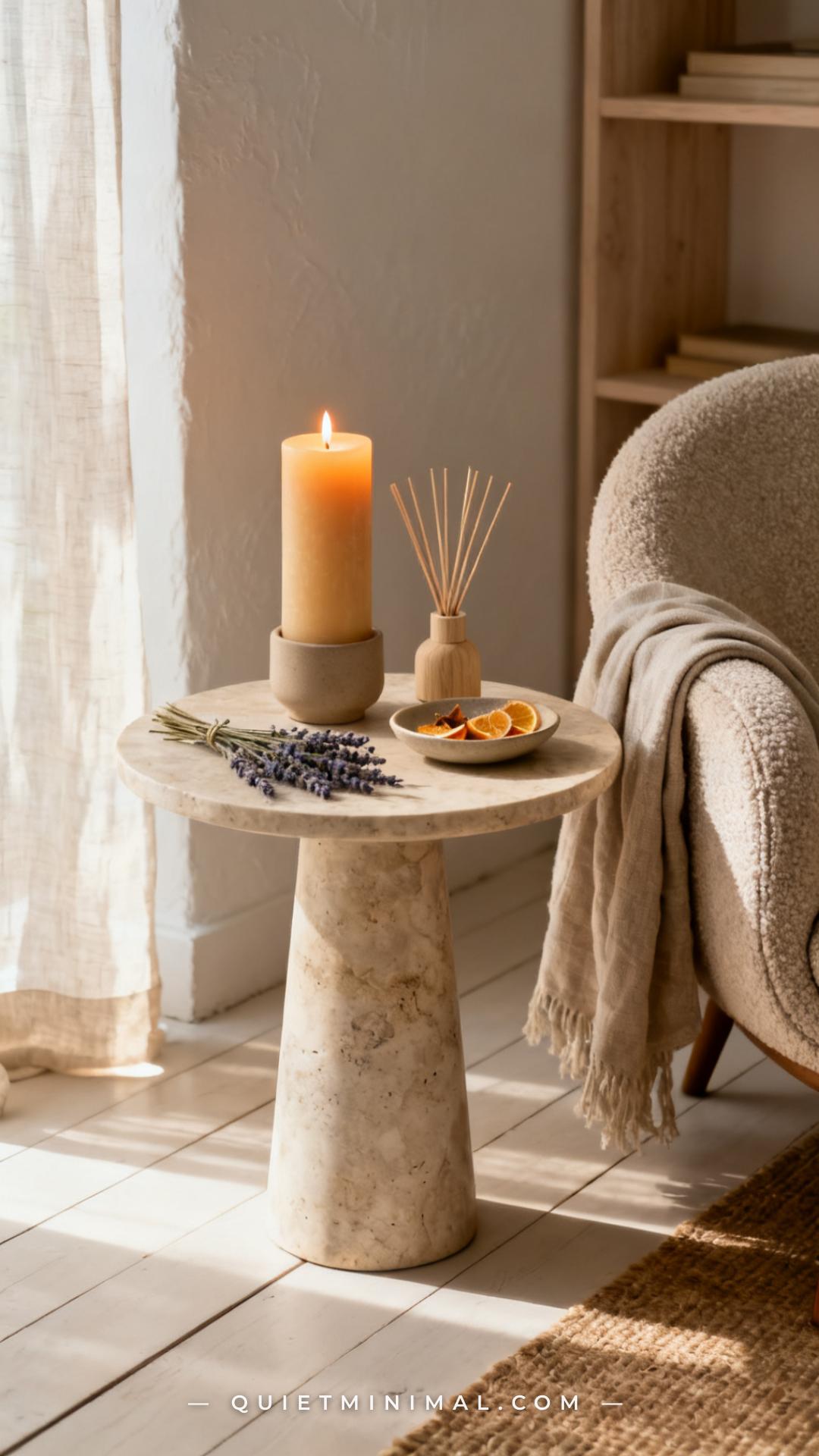
Scent is the layer of a reading corner that most design articles skip entirely, but it’s the one that makes the space memorable as an experience rather than just a visual. A corner that smells like cedar, warm vanilla, old paper, or fresh linen triggers a sensory cue that says “this is a reading place” before you’ve even opened a book.
The most low-maintenance options: a reed diffuser on the side table (set-and-forget, diffuses continuously without monitoring), a soy wax candle in a ceramic vessel that doubles as a styling object when unlit, or a small sachet of dried lavender or cedar tucked onto a shelf. Avoid synthetic air fresheners that overpower the space — scent in a reading corner should be subtle enough that you only notice it when you first enter.
For book lovers who love the smell of actual books, an intentional collection of older hardcovers or paperbacks on the shelf contributes to this naturally. It’s not a scent strategy exactly, but it’s the authentic version of it. The olfactory dimension of a reading corner is the final detail that moves it from “looks good in a photo” to “a place I actually want to be.”
Key Takeaway: A single reed diffuser or soy candle on the side table adds the sensory layer that no Pinterest photo can convey — and it’s the detail that makes the corner feel like yours.

Bringing It All Together
A reading corner that feels like a real room is built in layers, and the order matters. Start with the anchor (the right chair), build upward with light (three sources, all warm), define the zone with a rug, and then fill in the details — shelf styling, wall art, a throw in your accent color, a plant that can actually survive where you’ve put it, and finally, scent. Each layer builds on the previous one.
The mistake most people make is buying individual pieces they love without a system connecting them. This framework is that system. Apply it to whatever corner you have — small, awkward, north-facing, rental — and the result is a space that functions as a reading destination rather than just a spot where the chair ended up. Start with one layer this weekend and build from there.
From the guides
You've saved it, wanted it. Here's the how: codes, measurements, order. Your choices make it yours.
The Japandi Honest PlaybookThe honest version of the style: what to keep, what to skip, and the order to do it in.See inside →The Room Refresh PlaybookA repeatable four-step method, room by room, in ten minutes, thirty minutes, or one weekend.See inside →Make Any Room Feel Cozy on PurposeWhy some rooms hold people and others empty out, and the moves that change it.See inside → Save


