 Georgia
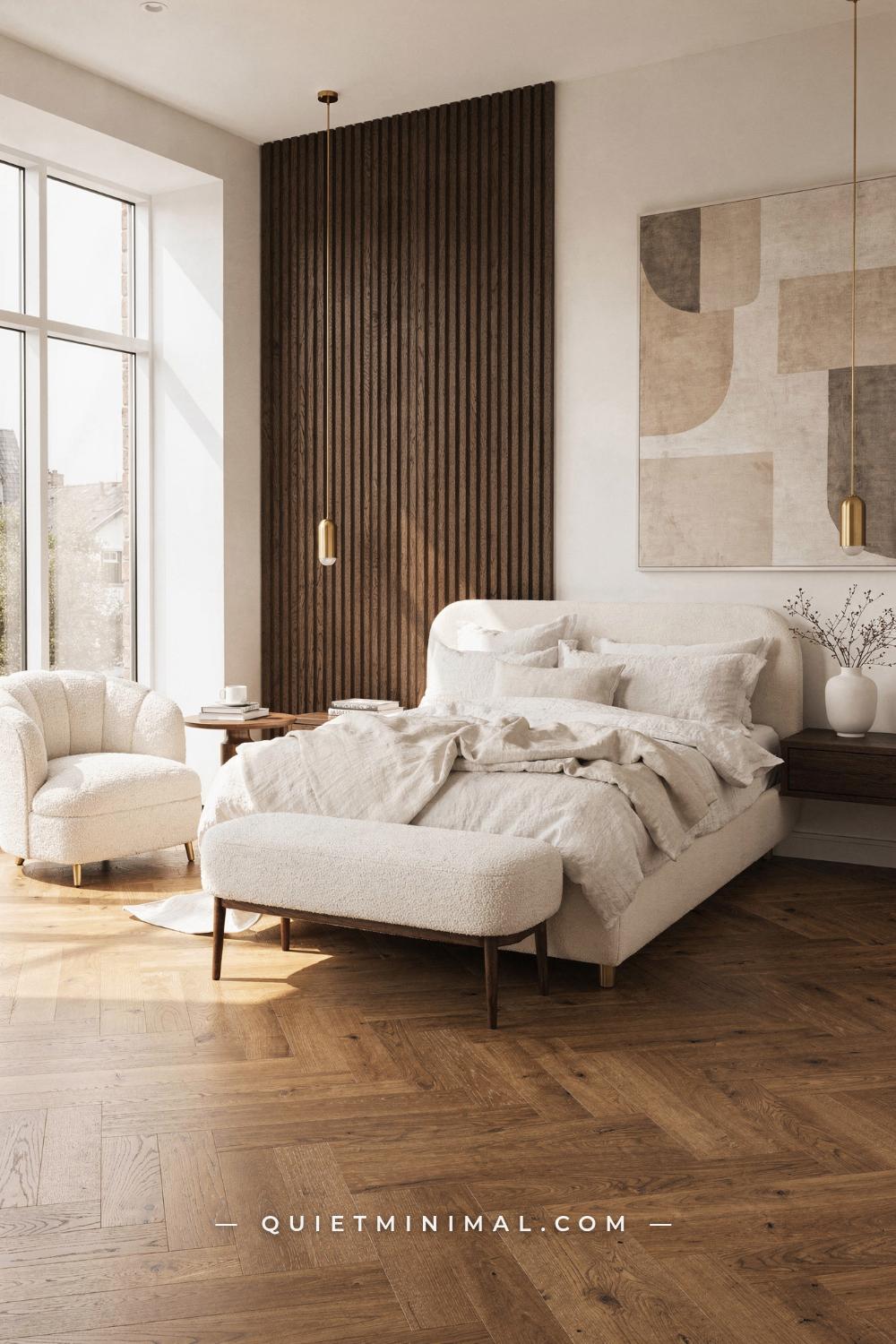
You already know what a chic primary bedroom looks like. You have the saves: the slatted walnut wall behind the headboard, the boucle bench at the foot, the pair of brass pendants hanging where table lamps used to sit. What a photograph will not tell you is why those rooms feel settled and why yours, assembled from the same parts, still feels slightly restless at the end of the day. It is rarely the budget. It is rarely the taste. It is proportion, it is light, and it is the handful of measurements a camera quietly hides.
The chic primary bedroom ideas below are organized around those mechanisms. Each one names a specific thing that goes sideways in real rooms, explains what your eye is reacting to before you can articulate it, and gives you the correction in numbers you can check with a tape measure. Paint colors appear by name only where the exact name and code were confirmed on the manufacturer’s own site. Everything else is described in plain language, because a color you cannot actually order is not advice.
Size the Slatted Panel to the Bed, Not to the Wall
 Save
The slatted accent panel is the single most saved element in this whole category, and it is also the one people most often build to the wrong width. The instinct is to treat it as a wall treatment, so it runs corner to corner, or it stops arbitrarily at a stud line. Either way the panel and the bed stop agreeing with each other, and the eye reads the bed as slightly off center even when it is dead centered.
Think of the panel as a piece of furniture rather than a finish. A king mattress is 76 by 80 inches (193 by 203 cm), and a headboard on that bed typically reads about 80 to 84 inches (203 to 213 cm) wide once you account for the frame. The panel should either match that width within a few inches or overshoot it generously, landing around 96 to 108 inches (244 to 274 cm), so the bed sits inside a clearly wider field. What does not work is the in-between, a panel 88 inches (224 cm) wide behind an 82 inch (208 cm) headboard, where the mismatch is visible but too small to read as intentional.
The dark walnut here is doing heavy lifting against warm cream walls, and it is worth confirming that Farrow and Ball All White No. 2005 is the actual name and number of that flat chalky white if you plan to match it. The brand lists it exactly that way. Against that pale field, the slats give you a vertical rhythm and the herringbone oak parquet gives you a diagonal one, which is why the room stays interesting without a single pattern in the bedding.
From the guides
You've saved it, wanted it. Here's the how: codes, measurements, order. Your choices make it yours.
 The Japandi Honest PlaybookThe honest version of the style: what to keep, what to skip, and the order to do it in.See inside →
 The Room Refresh PlaybookA repeatable four-step method, room by room, in ten minutes, thirty minutes, or one weekend.See inside →
 Make Any Room Feel Cozy on PurposeWhy some rooms hold people and others empty out, and the moves that change it.See inside →
The brass capsule pendants are the other measurement to get right. At roughly 4 by 10 inches (10 by 25 cm) they are small fixtures, so they need to hang low enough to matter. Aim for the bottom of the fixture 26 to 30 inches (66 to 76 cm) above the mattress top, which usually puts it around 58 to 62 inches (147 to 157 cm) off the floor. Hung near the ceiling they read as an afterthought and you lose the reading light entirely. Put them on a dimmer with 2700K bulbs and they become the last light you turn off rather than a decorative object you never switch on.
Key Takeaway: Build the slatted panel to either match the headboard width or clearly exceed it, and hang the pendants 26 to 30 inches (66 to 76 cm) above the mattress so they function as light, not decoration.

Make the Two Sides of the Bed Genuinely Match
 Save
Symmetry is the least expensive calm available in a bedroom, and it is also the easiest thing to half-do. The usual version: one real nightstand and one inherited side table, or two matching nightstands under two lamps of different heights, or a matched pair where one side carries a charging cable, a water glass, a stack of books and a phone stand while the other carries nothing at all. Your eye reads that imbalance in under a second and interprets it as unfinished, which is exactly the feeling the room was meant to remove.
The fix is more literal than people expect. Both nightstands should be the same piece, both lamps should be the same lamp, and both sides should carry roughly the same visual weight. Oak nightstands around 18 by 18 inches (46 by 46 cm) are on the small side for a king bed, which is fine here because the vertical oak slatted panels flanking the headboard are supplying the mass. What matters far more is height. A nightstand should land level with the top of the mattress or two to three inches (5 to 8 cm) above it, which for most beds means a case piece 24 to 27 inches (61 to 69 cm) tall. Below that you are reaching down for the lamp switch, and the headboard wall reads bottom-heavy from across the room.
Ceramic table lamps around 14 inches (36 cm) tall are correct on nightstands that size, and they should be the same 14 inches on both sides. Matching the shade diameter matters as much as matching the base. Two shades of different widths throw two different pools of light, and after dark that difference is far more obvious than it is at noon.
The palette is warm white walls, honey blonde oak and one sage green knit throw. Benjamin Moore White Dove OC-17 is a legitimate choice for that warm white, and the name and code are confirmed on Benjamin Moore’s own color page, where it is listed at an LRV of 83.16. Keep the sage to a single object. One throw folded across the foot of the bed does the entire job. Sage on the throw, the pillows, the vase and the shelf turns a restrained room into a themed one, and themed is the opposite of what you saved this look for.
Key Takeaway: Buy nightstands and lamps in genuine pairs, set the nightstand top level with the mattress or two to three inches (5 to 8 cm) above it, and let one sage object carry all of the color.

Give a Mural a Frame So It Reads as Art, Not as Wallpaper
 Save
Panoramic murals fail in a predictable way. The paper is beautiful, the installation is clean, and yet the room feels like a stage set, because the mural runs to the corners and dies there with no edge, no border and no relationship to anything else in the room. A mural without a frame is a backdrop. A mural inside a frame is a painting the size of a wall, and the eye treats those two things completely differently.
The correction here is architectural rather than decorative. Applied molding creates a picture-frame border around the mural field, painted out in the same color as the side walls so the surround reads as part of the room rather than as trim. Farrow and Ball Mole’s Breath No. 276 is the number that belongs with that name, confirmed on the brand’s own page, and it is a strong gray with real depth that will make a misty sage and taupe mural look deliberate instead of accidental. If your mural is lighter, step the surround lighter along with it. The rule is contrast, not darkness for its own sake.
Scale the mural panel to the bed the same way you would scale a canvas. An upholstered taupe wing headboard around 65 inches (165 cm) tall is already a large object, so the mural field should be noticeably wider than the bed, reaching at least 8 to 10 inches (20 to 25 cm) past each side of the headboard. Anything narrower and the bed looks like it is standing in front of the picture rather than sitting inside it.
Then resist adding more. The floating oak nightstand on its marble cylinder plinth, roughly 20 by 20 inches (51 by 51 cm), is a sculptural object in its own right, and a single stem of pink protea beside it is the correct amount of styling. A 20 inch (51 cm) drum pendant overhead gives you a soft general wash. Brass wall sconces flanking the bed give you the reading light, and they belong 20 to 28 inches (51 to 71 cm) above the mattress, set 6 to 12 inches (15 to 30 cm) out from the edge of the headboard so the light lands on the page and not in your eyes. Three sources, all dimmable, and nothing else on the mural wall except the mural.
Key Takeaway: Frame a mural with applied molding painted to match the side walls, run the field at least 8 to 10 inches (20 to 25 cm) past each side of the headboard, and leave that wall otherwise completely empty.

Put the Pattern on One Surface and Let Everything Else Go Quiet
 Save
Pattern is where a chic bedroom most often tips into a fussy one. The mechanism is simple. Every pattern you add asks the eye to resolve a rhythm, and the eye can comfortably resolve one, sometimes two if they differ enormously in scale. A ticking stripe headboard, a toile print, a patterned rug and a printed lampshade in one room means four rhythms competing for the same attention, and the result reads noisy no matter how good each individual choice was.
Here the pattern lives in exactly two places, and they are deliberately different in scale. The arched headboard carries a fine cream and charcoal ticking stripe, which at normal viewing distance reads almost as texture rather than as pattern. The framed equestrian toile above, roughly 36 by 48 inches (91 by 122 cm), carries a large pictorial pattern. A pinstripe and a picture do not compete, because they operate at completely different scales. A pinstripe and a small floral absolutely would.
Everything else is solid and doing textural work instead. A single dark chocolate velvet lumbar pillow supplies depth without introducing a third rhythm. Dark olive velvet barrel stools at the foot, about 18 inches (46 cm) in diameter, add a second solid color low to the ground where it reads as grounding rather than as an accent. Walnut three-drawer nightstands at roughly 26 by 18 inches (66 by 46 cm) are generous for a bedside, which is precisely what makes the pleated-shade brass-base lamps look correct on them rather than perched.
The wall color is the quiet half of this equation. Benjamin Moore Pale Oak OC-20 is a verified name and code, a warm gray neutral listed at an LRV of 68.64, and its job is to give the picture-frame molding something to cast a shadow against without pulling attention itself. Go whiter and brighter and the molding flattens out and stops reading as architecture, which is the entire reason it is on the wall.
Two more measurements worth having. A picture light above a framed print should sit 4 to 6 inches (10 to 15 cm) above the frame so it washes the top edge without glaring off the glass. And keep the frame itself 6 to 10 inches (15 to 25 cm) above the headboard, close enough that the art and the bed read as one composition rather than two separate events on the same wall.
Key Takeaway: Allow exactly two patterns in the room and make them wildly different in scale, one fine enough to read as texture and one large enough to read as an image.

Curves Need Straight Lines Nearby or the Room Goes Soft
 Save
The curved headboard has been running for several years now, and the failure mode has shifted. It used to be that people avoided curves entirely. The risk now is the opposite: a curved bed, a curved bench, a round rug, an arched mirror and a globe pendant all in one room, with nothing rectilinear left to push against. The result is a room with no structure. Curves read as generous when they interrupt a grid. Without the grid, they simply read as blurry.
This room solves it with the walls. Rich carved dark walnut paneling supplies strict verticals and hard geometry across the whole headboard wall, so the wide curved bed platform, roughly 90 inches (229 cm) across including its integrated rounded nightstand extensions, has something rigid to sit against. The cream and black grid-pattern rug with its geometric border does the same job underfoot. That is the reason the room can carry this much soft form without going shapeless.
Get the rug size right, because an integrated platform that wide changes the arithmetic. A standard 8 by 10 foot (244 by 305 cm) rug under a 90 inch (229 cm) platform leaves you roughly 15 inches (38 cm) of wool on each side, which is under the 18 to 24 inch (46 to 61 cm) margin designers generally work to. If the platform is genuinely 90 inches wide, look hard at a 9 by 12 foot (274 by 366 cm) rug instead. The extra foot on each side is the difference between your feet landing on wool in the morning and landing on cold parquet.
Farrow and Ball Pointing No. 2003 is a verified name and number for the soft warm off-white that suits the side walls here, and it is warm enough that dark walnut does not go cold against it. The single organic abstract canvas in flesh and terracotta tones, around 40 by 60 inches (102 by 152 cm), is the only color event in the room, and the ivory boucle bench at 54 by 18 inches (137 by 46 cm) is the only soft landing. In a room with this much carved surface, a second artwork would be one thing too many, and the plaster ceiling medallion overhead is already doing the ornament work at the top of the room.
Key Takeaway: For every curved piece you add, keep a hard geometric surface in view, and size the rug to leave 18 to 24 inches (46 to 61 cm) of wool past each side of the bed.

Keep the Bench Narrower Than the Bed
 Save
A bench at the foot of the bed is one of those details that separates a decorated bedroom from a furnished one, and it goes wrong in two specific ways. The first is width. People buy a bench that matches the bed exactly, so a 76 inch (193 cm) bench under a 76 inch (193 cm) king, and the foot of the bed turns into a solid block with no visual air. The second is that the bench immediately becomes a shelf for laundry, which is a storage problem disguised as a styling problem.
Width first. A tufted cream linen bench at 60 by 18 inches (152 by 46 cm) under a 76 inch (193 cm) king leaves about 8 inches (20 cm) of bed showing on each side. That gap is what makes the bench read as a deliberate object placed in front of the bed rather than as an extension of it. As a working range, aim for the bench to be 70 to 80 percent of the bed width. On a queen at 60 inches (152 cm), that is a bench around 44 to 48 inches (112 to 122 cm).
Depth matters too, and 18 inches (46 cm) is the number worth holding to. Deeper than that and you lose walking clearance at the foot of the bed, where you want 30 to 36 inches (76 to 91 cm) of clear floor to move comfortably. Shallower and the bench is not actually sittable, which means nobody will ever sit on it and it becomes furniture-shaped decoration.
For the laundry problem, give the bench a job. A glass vase of white roses and two or three stacked books is a real job, and objects with a purpose are much harder to bury under a pile of clothes than an empty surface is. This is a behavior fix more than a design fix, and it works.
The rest of this room is worth copying wholesale for its restraint. Sherwin-Williams Alabaster SW 7008 is confirmed on the brand’s own white paint page, and it is the warm soft white that lets natural honey oak read golden instead of orange. Oak three-drawer nightstands at roughly 22 by 18 inches (56 by 46 cm) are correctly sized for a king. A woven jute rug underneath adds the roughest texture in the room, which is what keeps all that smooth white linen from going flat.
Key Takeaway: Size the bench to 70 to 80 percent of the bed width at about 18 inches (46 cm) deep, and give its surface a permanent job so laundry cannot claim it.

Let the Window Be the Focal Point and Light the Room Around It
 Save
When a bedroom has real architecture, a bay window framing a garden, a plaster ceiling medallion, a built-in seat, the most common misstep is to keep decorating anyway. Heavy drapery goes up over the bay. A large piece of art goes on the wall opposite. A tall dresser blocks a portion of the glass. Every one of those choices competes with the thing that made the room special, and the room ends up feeling crowded in a way that has nothing to do with how much is actually in it.
The rule is that a room gets one focal point, and if you have a bay window with a garden view, the window has already won. Everything else drops to a supporting role. That means window treatments that stack entirely off the glass when open, or none at all if privacy allows. It means the framed pastoral painting stays small, because a large canvas would try to become a second focal point. And it means the built-in sage-painted window seat, roughly 96 inches (244 cm) wide with four drawers below, is treated as architecture rather than as furniture: cushioned, minimally pillowed, and left largely empty.
For color, Farrow and Ball Mizzle No. 266 is confirmed on the brand’s site as a soft gray green, described there as named for West Country skies when there is a mix of mist and drizzle. It is an excellent trim and joinery color precisely because it is indeterminate, meaning it shifts with the light coming off a garden instead of fighting it. Farrow and Ball Clunch No. 2009 is also verified, an off-white with a yellow base that keeps warm mahogany from looking heavy against it.
Hang the brass five-arm candelabra chandelier, roughly 24 inches (61 cm) in diameter, with at least 7 feet (213 cm) of clearance beneath it, and higher if the ceiling allows. In a bedroom people rarely walk under the center fixture, but a chandelier hung too low in a room with a bay window cuts the sightline to the glass from the doorway, which undoes the whole arrangement.
The carved mahogany turned-post bed with its cane headboard, around 60 inches (152 cm) tall, is the one heavy object in the room, and rumpled ivory linen is what keeps it from reading formal.
Key Takeaway: Give the room one focal point, and when that focal point is a window, keep drapery off the glass and every other object small enough to stay in a supporting role.
A Sitting Zone Only Works If the Walkway Survives It
 Save
The lounge chair in the primary bedroom is one of the most saved ideas in this category and one of the most abandoned in practice, because in most rooms it ends up squeezing a walkway down to something you have to turn sideways for. Within a month it is holding clothes, and within three it is back in the living room. The problem is almost never the chair. It is that nobody measured the path before buying it.
Here is the clearance to protect. You want 30 to 36 inches (76 to 91 cm) of clear floor along at least one side of the bed and across the foot, and an absolute minimum of 24 inches (61 cm) on the second side. Before a curved cream boucle lounge chair at roughly 30 inches (76 cm) wide goes anywhere, mark its footprint on the floor with painter’s tape along with the low walnut round coffee table at 28 inches (71 cm) in diameter, then walk the room for two days. If you clip the tape, the chair is in the wrong place or it is the wrong chair.
Where the sitting zone does work is exactly where it is here, in the corner nearest the floor-to-ceiling curtains and the garden view, outside the traffic pattern between the door, the bed and the closet. A chair placed against the flow of the room gets used. A chair placed in the flow gets resented.
Keep the coffee table low. At 28 inches (71 cm) across and low to the ground, that walnut round reads as a companion to the chair rather than as a second piece of furniture. If it climbs to standard coffee table height in a bedroom, it starts to look like a living room fragment that wandered in.
On finishes, this room pairs a cream boucle platform king at 76 by 80 inches (193 by 203 cm) with taupe linen bedding and floating oak nightstands at roughly 20 by 14 inches (51 by 36 cm), which are shallow enough to keep the floor plane reading open beneath them. Farrow and Ball Elephant’s Breath No. 229 is verified as a name and number and is a genuinely good ceiling color here, warm enough to keep the amber crystal pendant sconces from looking yellow against a cold white overhead.
Key Takeaway: Tape the chair and table footprint on the floor first, protect 30 to 36 inches (76 to 91 cm) of walkway, and place the sitting zone outside the path between door, bed and closet.

Cove Lighting Fails at the Wrong Color Temperature
 Save
Warm LED cove light beneath a floating headboard panel is the detail that makes a minimalist bedroom look like a hotel suite instead of an empty room, and it is also the detail most likely to be ruined by a twelve dollar strip. The failure is not brightness. It is color temperature and dimming. A cool white strip at 4000K behind a limewash plaster wall turns the warm cream plaster gray and the whole room reads clinical, which is the exact opposite of what a hushed bedroom is for.
Specify 2700K and nothing higher. Warm white at 2700K carries slightly less blue than 3000K, which is why it is the standard recommendation for bedrooms, and it lets limewash plaster hold the sand and cream tones it was mixed for. Ask for a CRI of 90 or above so the plaster texture and the linen bedding both keep their color under artificial light. And put it on a dimmer, because the point of a cove strip is that it can go down to a glow, not that it can go bright.
If you want the version that actually looks like the reference photographs, use a dim-to-warm strip. Those shift from roughly 2700K at full output down toward 1800 to 2200K as you dim, which mimics the way daylight falls off in the evening. They cost more and they need a compatible dimmer, but in a room where the cove light is the primary evening light source, that is where the money should go.
The three fluted glass pendants at roughly 8 by 18 inches (20 by 46 cm) each should be on their own switch, hung at varying heights so they read as a composition rather than a row. Stagger them by at least 6 inches (15 cm) of drop from one to the next, or the variation reads as a mistake rather than a decision.
For the wall itself, Farrow and Ball Lime White No. 1 is a verified name and number, described on the brand’s own page as a chalky off-white named after the chalky pigments used in original distempers. It is a sensible companion to a limewash finish because it shares that same powdery quality rather than fighting it with a modern sheen.
Key Takeaway: Run cove and pendant lighting at 2700K with CRI 90 or better on a dimmer, and stagger multiple pendants by at least 6 inches (15 cm) so the height variation reads as intentional.

Art Above the Bed Should Be Two-Thirds the Bed Width
 Save
Undersized art above the bed is the most common single error in bedroom decorating, and it is worth understanding why it looks so wrong. Your eye reads the bed and the art above it as one object. When the art is much narrower than the bed, that combined object has a wide base and a tiny top, so it reads as top-light and unresolved, and no amount of styling on the nightstands fixes it. It is the same reason a lamp with an undersized shade looks off.
The proportion designers work to is that art above a bed should span roughly two-thirds to three-quarters of the bed width. On a king at 76 inches (193 cm), that puts you between about 50 and 57 inches (127 and 145 cm). On a queen at 60 inches (152 cm), you want roughly 40 to 45 inches (102 to 114 cm). A large horizontal abstract landscape at 60 by 30 inches (152 by 76 cm) over a king lands slightly above that range, and it works because it is a single unbroken piece; the thing you cannot get away with is a 24 inch (61 cm) print floating in the middle of the same wall.
Height is the second half. Hang the piece so its bottom edge sits 6 to 10 inches (15 to 25 cm) above the headboard. Closer than that and it looks like it is resting on the bed. Farther and the art detaches and starts belonging to the ceiling. If your curved greige headboard is tall, measure from the top of the headboard rather than from the mattress, because the headboard is what the art is in conversation with.
If you cannot find one large piece, use a pair or a trio and treat the group as a single rectangle. Measure the total width including the gaps, keep those gaps to 2 to 4 inches (5 to 10 cm), and apply the same two-thirds rule to the group.
Benjamin Moore Edgecomb Gray HC-173 is verified on Benjamin Moore’s own page at an LRV of 63.09, and it is the warm greige that lets sand and taupe artwork sit on the wall without either the wall or the painting looking muddy. The arched leaner mirror at 30 by 72 inches (76 by 183 cm) on the opposite side balances the horizontal painting with a vertical, which is why the room reads composed rather than lopsided.
Key Takeaway: Span art across two-thirds to three-quarters of the bed width and hang the bottom edge 6 to 10 inches (15 to 25 cm) above the headboard.

A Floating Bed Only Reads as Floating If You Leave the Floor Visible
 Save
The floating platform bed is a beautiful piece of engineering and a genuinely fragile effect. The whole illusion depends on a continuous band of shadow under the frame and an uninterrupted plane of floor running past it. Push a rug halfway under the bed, add storage boxes below, or set a laundry hamper against the base, and the float collapses instantly. You have then paid for a bed that looks like a very low ordinary bed.
Protect three things. First, the shadow gap. A low floating white oak platform sitting about 12 inches (30 cm) off the floor needs that entire recess kept clear, including at the sides where you cannot see it from the doorway but can see it from the bed. Second, the floor plane. If you use a rug, either run it fully under the bed with 18 to 24 inches (46 to 61 cm) showing on each side, or skip the rug entirely and let the floor read as one surface. A rug tucked halfway under is what kills this look. Third, the integrated nightstand platforms. Those floor-level extensions are part of the same sculptural gesture, so they hold one object each, not four.
That is why a single tall white ceramic vase with pampas at roughly 24 inches (61 cm) works on one platform and a lamp, a book, a candle and a tray would not. The height of the vase is doing something specific too: at 24 inches it reaches up from a floor-level surface toward the pair of black cylindrical pendants, roughly 4 by 16 inches (10 by 41 cm) each, which is what keeps the low bed from making the whole room feel bottom-heavy.
The wall color in a room this stripped has to be genuinely white, not almost-white. Benjamin Moore Chantilly Lace OC-65 is verified on Benjamin Moore’s own page at an LRV of 90.04, which makes it one of the cleanest whites in their off-white collection. In a room where the only other colors are white ash oak and warm cream linen, a white with a visible undertone would read as a color decision, and that is not what this room wants.
Floor-to-ceiling white oak wardrobe doors on the right side finish the argument. Storage that reads as wall rather than as furniture is what allows the bed to be the only object with a shadow underneath it.
Key Takeaway: Keep the recess under a floating bed completely clear and either run the rug fully under it or use no rug at all, because a half-tucked rug destroys the float.

Point the Leaner Mirror at Something Worth Reflecting
 Save
A tall arched leaner mirror is one of the highest-return objects you can put in a bedroom, and it is regularly installed with no thought to what it is actually showing. A mirror is a second view of the room, so whatever it faces gets doubled. Aim it at a closet door and you have two closet doors. Aim it at the hallway and your bedroom now includes a corridor. Aim it at a window and the room gains a second source of daylight, which is the version everyone is actually chasing.
Before you lean the mirror anywhere, stand where you sit up in bed and where you stand at the doorway, and check the reflection from both. Those are the two positions you occupy most. An arched leaner at 28 by 72 inches (71 by 183 cm) is tall enough to reflect the ceiling line, which is what makes a standard 8 foot (244 cm) room read taller, but only if what it reflects above eye level is clean wall or window rather than the top of a dresser.
Then secure it. A mirror that size and weight leaning against a wall must be anchored with a strap or a bracket into a stud, without exception. Set the base 3 to 4 inches (8 to 10 cm) out from the baseboard so it leans at a shallow angle rather than standing nearly vertical, and check the reflected angle again once anchored, because a few degrees of lean changes what it picks up considerably.
The rest of this room is a study in one wood tone used with conviction. A dark walnut platform bed at 76 by 80 inches (193 by 203 cm), a pair of walnut nightstands at roughly 22 by 18 inches (56 by 46 cm), and a woven bench with a walnut frame at 54 by 18 inches (137 by 46 cm) all share the same species, set against white picture-molded paneling. Benjamin Moore White Dove OC-17 is verified for that molded paneling and is the right degree of warm; a cooler white would make walnut look purple in evening light.
A tall olive tree in a dark matte planter beside the mirror does one more job worth naming. It gives the reflection something living to hold, so the mirror is showing a scene rather than an empty corner.
Key Takeaway: Choose the leaner mirror’s position by what it reflects from the bed and the doorway, then anchor it to a stud with the base 3 to 4 inches (8 to 10 cm) off the baseboard.

Dark Walls Need Warm Light and a Matte Finish
 Save
Deep olive and sage walls are having a long run in bedrooms, and when they fail it is almost always for one of two reasons that have nothing to do with the color choice itself. Either the paint went on in a sheen, so every roller mark and every wall imperfection catches light and the room looks patchy. Or the light in the room is too cool, so a warm green wall turns flat and slightly gray after dark and the whole thing reads gloomy instead of enveloping.
Take the finish first. Dark colors show everything, so a flat or matte finish is not a preference here, it is the requirement. Matte scatters light instead of bouncing it, which hides the surface and lets the color itself come forward. Reserve eggshell for trim if you want the contrast, and accept that a matte dark wall will need touching up occasionally. That trade is worth it.
Then the light. Warm white at 2700K with a CRI of 90 or above is the specification, on a dimmer, and the layers matter more in a dark room than in a pale one. A dark room absorbs light rather than reflecting it, so a single ceiling fixture will not carry the space. A ceramic table lamp on the dark espresso nightstand, roughly 24 by 18 inches (61 by 46 cm), plus a second source across the room is the minimum. Aim for three sources at three different heights.
For the color itself, be careful with names circulating online. Benjamin Moore lists 2142-10 as Mediterranean Olive, not as any other name, and it is a rich green with golden undertones at an LRV of 11.05, which is genuinely dark. Sherwin-Williams Rosemary SW 6187 is also confirmed on the brand’s own green paint pages and reads slightly softer. Either will do what this room is doing. What matters is testing a large sample on the actual wall, because at an LRV that low the room’s daylight direction changes the color substantially.
The bedding is doing the balancing act. Layered white linen with sage velvet and textured pillows, plus a chunky sage cable-knit throw, keeps enough pale mass in the room that the olive reads as a frame rather than a weight. Pair the misty landscape prints at roughly 24 by 30 inches (61 by 76 cm) each and hang them as one rectangle with a 3 inch (8 cm) gap.
Key Takeaway: Paint deep olive in a flat or matte finish and light it with three separate 2700K sources at different heights, because a dark room absorbs the light a pale room would bounce back.

When There Is a Real View, the View Is the Artwork
 Save
A full-height glass wall onto a courtyard garden is the kind of asset most rooms never get, and the reflex to decorate around it is remarkably strong. Curtains go up. A tall plant goes in front. Furniture drifts toward the glass because that is where the light is. Every one of those moves trades a permanent, changing, three-dimensional picture for a static object, which is a bad trade every time.
Treat the glass wall as the room’s primary artwork and design everything else to stay below its sightline. That is exactly what a low platform bed with integrated floating nightstand wings, sitting around 12 inches (30 cm) off the floor, is for. The entire horizon of the furniture drops, so from anywhere in the room you are looking over the top of it and out. The low ash wood coffee table at roughly 36 by 18 inches (91 by 46 cm) and the stone bowl at about 10 inches (25 cm) across follow the same logic.
The reed screen panel on the right side is the piece of the arrangement most people would skip, and it is the one making it work. It gives the glass wall a soft vertical edge, so the room feels bounded rather than exposed. If you do not have a courtyard to look at, a reed or slatted screen against a plain wall gives you a similar containment.
Lighting a room with a glass wall requires one extra thought. Any bright fixture facing the glass turns the window into a mirror after dark and the view vanishes. Keep the sources low and warm: the LED cove beneath the bed at 2700K, and a large paper globe pendant around 20 inches (51 cm) in diameter on a dimmer. Nothing aimed at the glass.
Farrow and Ball String No. 8 is verified on the brand’s own page as an earthy yellow-based neutral, which is a considered choice against warm cream plaster because it keeps a courtyard-lit room from going green when the garden reflects into it. The single traditional ink landscape painting above the bed and the tall vase with one leafy branch are the only two decorative objects in the room, and that is not minimalism for its own sake. It is that a garden through glass changes every hour, and objects that compete with it lose.
From the guides
You've saved it, wanted it. Here's the how: codes, measurements, order. Your choices make it yours.
The Japandi Honest PlaybookThe honest version of the style: what to keep, what to skip, and the order to do it in.See inside →The Room Refresh PlaybookA repeatable four-step method, room by room, in ten minutes, thirty minutes, or one weekend.See inside →Make Any Room Feel Cozy on PurposeWhy some rooms hold people and others empty out, and the moves that change it.See inside →Key Takeaway: Keep furniture low and light sources warm, low and away from the glass, so a real view stays the room’s focal point instead of becoming a reflection after dark.

Built-In Shelving Needs Empty Space to Read as Design
 Save
Built-in shelving flanking the bed is a genuinely good architectural move. It gives the bed a niche, it adds storage without adding furniture, and it makes a standard rectangular room look considered. It also comes with a strong pull toward filling every inch, and a full shelf is a bookcase. A shelf with air in it is architecture.
The working number is that roughly a third of each shelf should be empty, and the emptiness should be distributed rather than clustered at the bottom. Group objects in odd numbers with clear gaps between groups, vary the heights so your eye moves up and down the column, and lay a few books flat as a base for a small object rather than standing every spine upright. The arched upper niche in each unit is the piece to protect most carefully. An arch is a frame, and a frame wants one thing inside it, not five.
Scale is the other half. Walnut built-ins running floor to ceiling on both sides of the bed put a lot of dark wood into the room, so the bed has to answer with equal presence. A channeled terracotta velvet headboard around 60 inches (152 cm) tall does that, and the channeling matters because vertical ribs echo the vertical shelving edges. An organic blob-shaped brass mirror at roughly 30 by 36 inches (76 by 91 cm) hung above the bed is then the one soft, irregular shape in a room of straight lines, which is why it holds attention.
On the wall behind the bed, be careful with color names you find attached to that pale warm parchment tone online. Benjamin Moore lists 2154-60 as Filtered Sunlight, so if someone hands you that number with a different name attached, the name is wrong. Rather than name a color that cannot be confirmed, describe what you want at the paint counter: a very pale warm neutral with a faint yellow cast, high LRV, matte finish, sampled on the actual wall against the walnut before you commit.
The olive green lounge chair at roughly 30 by 32 inches (76 by 81 cm) and the amber floor-length drapes complete a genuinely warm palette. Terracotta, walnut, olive and brass are all in the same temperature family, which is why the room reads rich instead of chaotic despite carrying four distinct colors.
Key Takeaway: Leave about a third of every built-in shelf empty, put exactly one object inside each arched niche, and let the headboard match the visual weight of floor-to-ceiling joinery.

Allow One Graphic Statement, Not Three
 Save
A graphic bedroom is a balancing act, because every high-contrast element you add competes for the same job. A bold black-and-white geometric rug wants to be the statement. A brass Sputnik chandelier wants to be the statement. A large black-and-white fashion portrait above the bed wants to be the statement. Put all three in one room without a hierarchy and none of them wins, and the room reads cluttered rather than graphic.
The way out is to rank them before you buy. Decide which single element is the loudest, then deliberately quiet the others by placing them at different distances from the eye and at different scales. In this room the rug is the loudest, so it sits on the floor where you look down at it rather than at it. The Sputnik at roughly 30 inches (76 cm) in diameter is second, and it is brass rather than black, so it reads as warmth rather than as contrast. The framed portrait at about 24 by 30 inches (61 by 76 cm) is deliberately modest for a king bed, which is the opposite of the two-thirds rule and correct here, because a 50 inch (127 cm) piece over an already loud room would be one shout too many.
Everything soft then goes almost silent. The arched headboard carries a fine black pinstripe ticking, which at a distance is texture. White linen bedding with sage green pillow accents supplies the only color. A pair of boucle barrel armchairs at roughly 28 inches (71 cm) wide face the bed with a small round wood side table between them, and their whole purpose is to add mass without adding contrast.
Benjamin Moore White Dove OC-17 is verified again here and is the right white for a graphic room, because its warmth keeps black-and-white from tipping into cold. A brilliant blue-white wall would sharpen the contrast further, which is the last thing this room needs.
One placement note on the chandelier. In a bedroom, a center fixture that hangs below about 7 feet (213 cm) from the floor will cut across the sightline to the headboard from the doorway. If the ceiling is a standard 8 feet (244 cm), a 30 inch (76 cm) Sputnik needs a short stem and a tight canopy, or move it toward the foot of the bed where the drop matters less.
Key Takeaway: Rank your graphic elements before buying, let exactly one be the loudest, and keep every soft surface in the room close to silent.

Repeat Every Wood and Metal Finish at Least Twice
 Save
Mixing woods and metals is the thing people are most anxious about, and the anxiety usually produces the wrong outcome: either everything matches, which reads like a furniture showroom, or one lonely finish appears exactly once and looks like a mistake. The rule that resolves both is repetition. Any finish that appears in a room should appear at least twice, ideally three times, at different scales and in different parts of the room.
Look at how it works here. Dark walnut appears in the carved sleigh bed and again in the three-dimensional geometric nightstand with its marble top, roughly 24 by 18 inches (61 by 46 cm). Forest and olive green appear in the velvet headboard interior and again in the velvet bench at 54 by 20 inches (137 by 51 cm) at the foot. Brass appears in the articulated arm sconce and again in the gold notes of the Persian-style rug. Nothing is orphaned, so nothing looks accidental.
The rug is the piece doing the most work and the one most often bought too small. A 9 by 12 foot (274 by 366 cm) Persian-style rug in gold and terracotta under a king bed gives you the 18 to 24 inch (46 to 61 cm) margin on each side that lets the nightstands sit partly on the wool, which is what visually ties the bed group together into one zone. An 8 by 10 (244 by 305 cm) under a king leaves the nightstands stranded on bare floor and the whole arrangement reads loose.
For the walls, Farrow and Ball Pointing No. 2003 and Clunch No. 2009 are both verified names and numbers, and either is a defensible warm off-white behind picture-molded paneling. Pointing is the slightly cleaner of the two; Clunch has a yellow base that pushes warmer. In a room carrying forest green velvet and gold-toned wool, the warmer choice usually wins, because a cool white makes green velvet look gray.
One small thing that makes a large difference: the yellow flowers on the nightstand. A single hit of a color that appears nowhere else, at a very small scale, reads as life rather than as a fourth finish. That exception only works because it is small and it is temporary. A yellow chair would be a different conversation entirely.
Key Takeaway: Repeat every wood, metal and fabric finish at least twice in different sizes and locations, and size a bedroom rug so the nightstands sit partly on it.

Take Built-In Cabinetry All the Way to the Ceiling
 Save
A full-wall wardrobe and vanity system is one of the largest visual commitments in a primary suite, and the detail that separates the bespoke version from the assembled version is the gap at the top. Cabinetry that stops 6 or 10 inches (15 or 25 cm) short of the ceiling creates a dust shelf, a shadow line and an unmistakable signal that the units were bought rather than built. Run it to the ceiling, or if the ceiling is out of level, run it close and close the gap with a scribed filler panel painted the same color.
At approximately 10 feet wide by 9 feet tall (305 by 274 cm), a system like this is essentially a wall, and it should be treated like one. That means the cabinet color and the wall color either match exactly or differ clearly. A cream matte lacquer that is almost but not quite the wall color is the version that looks wrong, because the eye reads the near-miss as a fault. If you are specifying a cream matte lacquer finish, take a physical sample to the room and check it against the wall in morning and evening light before ordering, and be skeptical of finish codes passed around online, which are frequently attached to the wrong name.
Hardware is the second decision that carries the whole look. Tall gold bar handles running most of the door height give you continuous vertical lines and make a nine foot (274 cm) wall read taller. Short knobs on tall doors do the reverse. As a proportion, a pull that runs at least half the height of the door face is what produces the bespoke effect.
The lit center section is where the system stops being storage and becomes a room. Open shelving with a warm amber LED strip, an oval backlit mirror at roughly 18 by 30 inches (46 by 76 cm), and a flush dressing table with three drawers give you a genuine dressing zone. Light the mirror at 3000K rather than 2700K, because slightly cooler light at a vanity renders skin tones more accurately, and keep the shelf strip at 2700K so the room stays warm. That is the one place in a bedroom where mixing color temperatures is the correct call.
A cream round leather pouf at about 16 inches (41 cm) in diameter tucks fully under the dressing table, which keeps the floor plane clear and the whole wall reading as joinery rather than furniture.
Key Takeaway: Run built-in cabinetry to the ceiling, choose handles that span at least half the door height, and light the vanity mirror slightly cooler than the rest of the room.
Put the Side Table at Arm Height, Not Coffee Table Height
 Save
A reading chair in the bedroom lives or dies on the table beside it. Almost every failed bedroom chair has a table that is too low, too far away, or too small to hold the two things you actually put down. You end up balancing a mug on the arm and the chair quietly stops being used, which is why so many bedroom armchairs turn into clothes racks.
The measurement to hold to is the table surface at or slightly below the arm height of the chair, and within easy reach without leaning. On a cream boucle armchair roughly 28 inches (71 cm) wide with typical arm height in the low twenties, a round travertine pedestal table at 18 inches (46 cm) in diameter and a similar height in the low twenties is right. Place it 4 to 8 inches (10 to 20 cm) from the chair arm. Farther than that and you have to shift your weight to set anything down, which sounds trivial and determines whether the chair gets used at all.
Diameter matters more than people expect. At 18 inches (46 cm) across, a pedestal table holds a mug, a book and a small ceramic vase of blossom branches at once, which is a realistic load. At 12 inches (30 cm) it holds a mug or a book but not both, and a table that forces you to choose is a table you will resent. Travertine is a good material choice here because it is heavy enough not to tip and porous enough to read as stone rather than as polish, which suits a room where the other surfaces are herringbone parquet and boucle.
Place the whole arrangement where the light is. Positioning the chair near the windows on the left, with brilliant morning light coming across, is what makes it a place you go rather than a place you look at. If your best window faces a wall, put a floor lamp behind the chair shoulder instead, at 2700K on a dimmer.
Sherwin-Williams Alabaster SW 7008 is confirmed on the brand’s own site and is the warm soft white that keeps herringbone parquet and travertine in the same family. Against that, an arched leaner mirror at 32 by 78 inches (81 by 198 cm) in the center background bounces the window light back into the room, which is why the whole space reads luminous rather than merely bright.
Key Takeaway: Set the side table at or just below the chair’s arm height, at least 18 inches (46 cm) across, and no more than 4 to 8 inches (10 to 20 cm) from the arm.

Put the Color on the Architecture, Not on Every Textile
 Save
The most common way a color-forward bedroom goes wrong is that the color wins too many times. Sage green goes on the accent wall, then on the velvet pillows, then on the ribbed throw, then on the vases, then on the branches in the vases. Every one of those decisions was reasonable in isolation. Together they produce a room that looks like it was ordered as a set, and the color stops being a choice and starts being a theme.
The correction is to decide where the color lives structurally and then let it appear only two or three more times, in small amounts, at a distance from each other. Here the sage lives on the paneled accent wall, which is architecture. It then reappears in the velvet pillows and the ribbed throw, and it stops. The nightstands are light oak, the bench and the bedding are cream, the vases are white, and the branches are olive rather than sage, which is a related but different green.
The large textured white abstract canvas at roughly 48 by 48 inches (122 by 122 cm) is the piece that makes this arrangement work, and it is worth understanding why. A colored wall needs a break in it or the eye slides off. A white impasto canvas gives the wall a bright interruption with real physical texture, so the sage reads as a field around something rather than as a flat expanse.
For the color itself, two options are verified on their manufacturers’ own sites. Sherwin-Williams Softened Green SW 6177 is listed on the brand’s green paint pages, and Benjamin Moore Pale Avocado 2146-40 is confirmed at an LRV of 58.88, described there as a sunlit green. Both are light enough to sit behind cream bedding without darkening the room. Sample both on the actual paneling, because applied molding creates shadow lines that read a full step darker than a flat wall.
A cream curved headboard around 54 inches (137 cm) tall, light oak nightstands at roughly 22 by 18 inches (56 by 46 cm), and gold globe pendants at either side of the headboard finish it. Hang those pendants with the bottom of the globe 26 to 30 inches (66 to 76 cm) above the mattress, the same rule that applies to any bedside pendant, so they are usable reading light rather than jewelry.
Key Takeaway: Anchor your color in something architectural and let it reappear only two or three more times in small amounts, keeping accessories in adjacent shades rather than matching ones.

Textured Plaster Only Exists Under Raking Light
 Save
Textured plaster walls are expensive, beautiful and completely invisible under the wrong light. That is the mechanism nobody mentions when they recommend limewash or a troweled finish. Texture is read by the eye as a pattern of tiny shadows, and shadows require light arriving at an angle. Light a plaster wall with a flat ceiling fixture directly overhead and the shadows disappear, taking the texture with it. You have then paid a specialist for a wall that looks like flat paint.
So light it from the side. A tall window with a sheer curtain on the left of the room is the ideal version, because a sheer diffuses direct sun into a soft raking wash that moves across the wall through the day and produces those long light stripes. If your window is on the wrong side, the artificial equivalent is a wall washer or a directional fixture mounted close to the wall, ideally within 8 to 12 inches (20 to 30 cm) of it, aimed down its face rather than out into the room.
Keep the ceiling fixture small and warm so it never becomes the dominant source. A cylindrical black pendant at roughly 4 by 8 inches (10 by 20 cm) is exactly the right restraint, and it should be on a separate dimmer from everything else. The dome-shade table lamp at about 12 inches (30 cm) tall on the black round pedestal side table, 18 inches (46 cm) in diameter, is the light you actually read by.
For color, Farrow and Ball Dead Salmon No. 28 is verified on the brand’s own page, described there as an aged salmon pink taken from the matte finish of an aged pink painted at Kedleston Hall in 1805. It reads as a warm mushroom in most light, which is what makes it a credible match for a terracotta-greige plaster. Test it large. A color that ambiguous shifts more than most between north and south light.
The furniture is deliberately low so nothing interrupts the wall. A low cream boucle platform bed at roughly 15 inches (38 cm) of floor height, a charcoal brown fringed throw, and a dark matte nightstand carrying a stone vase and one small plant. The contrast that carries the room is rough plaster against smooth boucle, which is a texture pairing rather than a color one, and it only works because the raking light makes the roughness legible in the first place.
Key Takeaway: Light textured plaster from the side with a sheer-filtered window or a wall washer set 8 to 12 inches (20 to 30 cm) off the surface, and keep the ceiling fixture small and dimmed.
Match the Mural’s Value to the Wall Color Before You Match the Pattern
 Save
Pairing a saturated paneled wall with a large-scale mural is the most ambitious move in this whole article, and it goes wrong on value long before it goes wrong on pattern. Value is simply how light or dark something is regardless of its color. If the deep burgundy panels and the grey and taupe forest mural sit at very different values, the mural reads as a hole punched in the wall. If they sit at similar values, the two surfaces read as one continuous, layered field, and the room becomes enveloping instead of chopped up.
The practical test costs nothing. Photograph your paint sample and your mural sample together and convert the photo to black and white. If one goes nearly black and the other stays pale gray, they are too far apart and you should either lighten the paint or choose a darker mural. Aim for the mural to sit one to two steps lighter than the panels, which gives you separation without a hole.
Farrow and Ball Preference Red No. 297 and Brinjal No. 222 are both verified names and numbers on the brand’s own pages, and either would give you the deep oxblood register this room is working in. Brinjal is described by the brand as a sophisticated aubergine and pulls more purple; Preference Red sits closer to true oxblood. In a room with mink taupe boucle upholstery, the warmer of the two usually reads better, because taupe against purple can look dusty.
Scale the bed to the drama. A wide curved platform bed at roughly 90 inches (229 cm) across is what allows a floor-to-ceiling mural and full-height paneling to feel proportionate. A standard 76 inch (193 cm) king in front of that much wall treatment looks undersized, and this is one of the rare cases where the furniture is the thing that needs to grow rather than the wall treatment that needs to shrink.
The pair of woven globe pendant lanterns at about 18 inches (46 cm) in diameter each are doing a specific job beyond light. Woven material in a room of lacquered panels, boucle and marble is the only rough texture present, and warm amber light passing through a weave throws a pattern that softens all that polish. Marble-top nightstands at roughly 20 by 18 inches (51 by 46 cm) keep the bedside from adding a fourth material.
Key Takeaway: Test a mural and a saturated wall color against each other in black and white first, aiming for the mural to sit one to two steps lighter so it reads as depth rather than as a hole.

Design the Room for After Dark, Not for Noon
 Save
Almost every bedroom is planned in daylight and lived in at night, which is why so many of them feel different in the evening than they looked in the plan. The specific failure is that all the light in the room is above eye level. A ceiling fixture and two tall lamps will light a room at noon perfectly well, and after dark they produce glare, hard shadows on faces, and a ceiling that reads as a bright lid over a dim room.
The correction is to add light below eye level, which is what makes a dark room feel enveloping rather than gloomy. Candles on a low organic concrete coffee table at roughly 36 by 20 inches (91 by 51 cm) sit at about 16 inches (41 cm) off the floor, which is well below where you look. Two Edison-style filament pendants hung low over the same zone give you a second source at chest height when seated. A cream linen platform bed low to the ground keeps the whole furniture horizon down. Together those produce a room that reads warm from the inside, with the dark charcoal textured walls receding rather than pressing in.
Dark walls make this more important, not less. Charcoal absorbs most of the light that hits it, so overhead lighting in a charcoal room produces a pool on the floor and almost nothing else. Farrow and Ball Railings No. 31 and Down Pipe No. 26 are both verified names and numbers, Railings being the near-black and Down Pipe the strong lead gray. Both are legitimate choices, and both need three or four low, warm sources rather than one bright one.
The oak slatted column at the center is the element preventing the room from going flat black. Raw warm oak against dark textured concrete is the highest contrast in the room, and vertical slatting catches the candlelight in a way a smooth panel would not. If you are working with dark walls in a real bedroom, one warm wood element at full height is the cheapest correction available.
For the seating, a boucle lounge chair at roughly 28 inches (71 cm) wide and a boucle oval pouf at 24 by 18 inches (61 by 46 cm) with a throw over it give the foreground two pale masses. In a dark room, pale upholstery is functional as well as decorative: it reflects the low light back up and keeps faces lit.
Key Takeaway: Put at least half your evening light below eye level, at 2700K on dimmers, so a dark room reads enveloping instead of gloomy.
In a Large Room, Undersized Furniture Is the Real Problem
 Save
A grand primary suite with double-height walls and a tall arched window is the one situation where ordinary furniture stops working. A standard 84 inch (213 cm) sofa, a 76 by 80 inch (193 by 203 cm) king bed and a normal 8 by 10 foot (244 by 305 cm) rug all look correct in an average room and all look like doll furniture in a room with 16 foot (488 cm) ceilings. The instinct is then to add more pieces to fill the space, which produces a crowded room that still feels empty, because quantity does not fix scale.
The answer is fewer, larger objects. Two curved cream upholstered sofas at roughly 96 inches (244 cm) wide each, facing one another around an oval marble side table at about 42 by 24 inches (107 by 61 cm), is one gesture at the correct size rather than five gestures at the wrong one. That conversation zone then becomes a genuine second room within the suite, with the greige platform king bed and its 60 by 18 inch (152 by 46 cm) cream bench occupying a separate zone entirely.
Height is the harder problem. Double-height plaster walls leave a large expanse above eye level that furniture cannot reach, so you need at least one vertical element that does. A large potted olive tree between the unlit stone fireplace and the arched window is the low-commitment version, and floor-to-ceiling sheers hung at the true ceiling line rather than at the window head are the other. As a general rule, mount a rod 4 to 8 inches (10 to 20 cm) above the window frame in a standard room, and in a double-height room take it as close to the ceiling as the structure allows, extending 4 to 6 inches (10 to 15 cm) past each side of the opening.
Leave the firebox unlit and let the stone surround do the work as architecture. In a room with this much daylight coming through a tall arched window, the fireplace is a mass and a texture, and it does not need to be doing anything else.
Farrow and Ball Elephant’s Breath No. 229 is verified on the brand’s own page and is a defensible choice for warm sand plaster at this scale, warm enough that cream upholstery does not go yellow against it. White hydrangeas on the marble table are the only high-contrast bright point in the room, which is all a space this size needs.
Key Takeaway: In an oversized room, buy fewer and much larger pieces, and add at least one full-height vertical element, because more furniture never fixes a scale problem.

Finish the Room with Storage, Not with More Decor
 Save
The last stretch of a bedroom project is where people reach for accessories, and it is almost always the wrong reach. The rooms that look resolved are not the ones with the most objects. They are the ones where everything that has to live in the room has somewhere specific to go, so the visible surfaces can stay quiet. A dark walnut open shelving column at roughly 18 by 96 inches (46 by 244 cm) with warm LED interior lighting is that piece here, and it does more for the finished look of the room than any amount of styling would.
Build or buy the column tall and narrow rather than short and wide. At 96 inches (244 cm) it reaches nearly to a standard ceiling, which gives the room a vertical anchor on one side and balances the horizontal mass of a wide low platform bed at 76 by 80 inches (193 by 203 cm). A wider unit at half that height would read as a bookcase and would not do the same structural job. Light the interior at 2700K with a concealed strip so the objects inside glow rather than being spotlit, and keep the same one-third-empty discipline that applies to any open shelving.
The dark sage accent wall behind the bed is the other structural decision. Farrow and Ball Studio Green No. 93 is verified on the brand’s own page and is described there as their darkest green, one that reads nearly black except in well-lit rooms. That is worth knowing before you commit. In a room with a modest window it will behave as a very dark neutral, which may be exactly what you want, but sample it on the actual wall and look at it after dark before ordering gallons.
The white sculptural relief canvas above the bed is what keeps that wall from closing in. A pale three-dimensional piece against a very dark matte field catches light on its raised edges and creates depth, which a flat print on the same wall would not. Flank it with dome pendants at roughly 10 inches (25 cm) in diameter, hung the usual 26 to 30 inches (66 to 76 cm) above the mattress.
A cream barrel armchair at about 26 inches (66 cm) wide and a potted olive tree in the far corner finish the room without adding a single object to a surface.
Key Takeaway: Solve the room’s storage with one tall, narrow, well-lit unit before adding a single accessory, because a resolved room is one where everything has a place rather than one with more things in it.

Three things carry most of the weight in a chic primary bedroom, and none of them are purchases. The first is proportion: art at two-thirds the bed width, a bench narrower than the bed, a rug with 18 to 24 inches (46 to 61 cm) of margin on each side. The second is light at the right color temperature and the right height, which means 2700K on dimmers, sources below eye level for the evening, and bedside light hung 26 to 30 inches (66 to 76 cm) above the mattress. The third is restraint, which usually means one focal point, one graphic statement, and one place where the color lives.
Pick the single measurement in your own room that you already suspect is off, and check it with a tape measure this week. It is usually the rug or the art. Fix that one thing before you buy anything else, because the room will look different enough afterward to change what you actually need.
From the guides
You've saved it, wanted it. Here's the how: codes, measurements, order. Your choices make it yours.
The Japandi Honest PlaybookThe honest version of the style: what to keep, what to skip, and the order to do it in.See inside →The Room Refresh PlaybookA repeatable four-step method, room by room, in ten minutes, thirty minutes, or one weekend.See inside →Make Any Room Feel Cozy on PurposeWhy some rooms hold people and others empty out, and the moves that change it.See inside → Save


