 Georgia
You want the rooms in your home to look as though one person chose them, in one sitting, with a plan. Right now they probably look like what they are: a sofa bought in one year, a rug found in another, a wall colour picked from a fan deck on a Saturday because something had to go on the wall. A colour combination for home that actually holds together is not a matter of finding the perfect pairing on a palette card. It is a sequence of decisions made in the right order, each one narrowing the next, until the last room is almost choosing itself. The order matters more than the colours. Start from the wall and you end up fighting the floor for years. Start from the floor, the countertop and the sofa you already own, and the wall colour becomes a short list instead of an ocean. What follows is that sequence, stage by stage, with the measurement or ratio that governs each one and a clear test for when a stage is finished and you are allowed to move on.
Stage 1: Read the Floor Before You Touch a Fan Deck
 Save
The first decision in a whole-home colour combination is the one most people skip, because it feels like it has already been made for them. The floor is the largest coloured surface in the house, it runs through every room, and it is the one thing you are not going to change this year. So it goes first. Get down at floor level in daylight and name what you see: not “wood”, but pale yellow oak, or pink-orange red oak, or grey-brown engineered plank. That undertone is the first colour in your combination whether you like it or not, and everything you choose from here either sits comfortably beside it or argues with it.
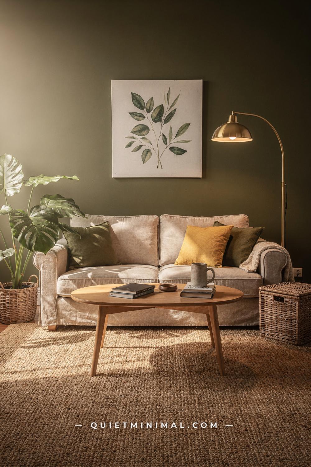
A warm light oak, the kind in the room here, is the easiest floor to build from because it reads as a soft yellow-tan. Yellow-tan has two natural partners: olive green, which shares the yellow, and a beige-oat neutral, which is simply a paler version of the floor itself. That is why a deep olive-khaki wall, an oatmeal linen sofa about 88 in (224 cm) long and a jute rug look as though they grew in the same room. The jute is the floor’s own colour one step lighter, the sofa is one step lighter again, and the olive wall is the floor’s yellow pushed toward green and darkened. Nothing here was matched; everything was pulled from the same starting point.
Do the same reading for every fixed finish in the house: countertop, tile, brick, the stone on a fireplace surround. Write each one down with its undertone next to it, on a single sheet, in one column. If they all lean warm (yellow, orange, red), the house is warm and the combination stays warm. If they all lean cool (blue, grey, violet), the house is cool. If they are split, you have found the real problem, and the combination’s job is to bridge it, which is Stage 8’s work.
The failure mode at this stage is choosing a wall colour you love from a card and discovering, once it is up, that a pink-undertone floor makes a sage wall look mint. The wall was not wrong. The order was. Done looks like a single column of fixed finishes, each with its undertone named, and a first accent colour chosen from that column rather than from a store display.
From the guides
You've saved it, wanted it. Here's the how: codes, measurements, order. Your choices make it yours.
 The Japandi Honest PlaybookThe honest version of the style: what to keep, what to skip, and the order to do it in.See inside →
 The Room Refresh PlaybookA repeatable four-step method, room by room, in ten minutes, thirty minutes, or one weekend.See inside →
 Make Any Room Feel Cozy on PurposeWhy some rooms hold people and others empty out, and the moves that change it.See inside →
Key Takeaway: Name the undertone of the floor and every fixed finish first, in one written column, and pull the first accent colour from that list rather than from a fan deck.

Stage 2: Choose the One Bold Colour and Decide Where It Repeats
 Save
Every combination that holds together across a house has exactly one colour that is allowed to be loud. Not two. One. This stage is choosing it, and, more importantly, deciding in advance where it will appear again, because a bold colour used once is an accident and a bold colour used three times is a decision the eye can read. The rule that governs this is the rule of three repeats: the strong colour shows up on one large surface, one mid-sized object and one small one, and then it stops.
Petrol teal is a good example of how this works, and it also happens to be one of the colours design press is calling out for living rooms this year, especially the greyed versions that stay livable. Here it takes the one large surface, a single wall, with the two side walls held at pale grey so the teal has an edge to stop at. Then it repeats at mid scale in the rug, a deep-pile piece around 8 by 10 ft (244 by 305 cm), and at small scale in two velvet cushions. Three appearances. The sofa, at roughly 87 in (221 cm), stays a pale silver grey so the teal has something quiet to sit against, and the black pendant with its warm gold lining adds the one metal and the one dark. Count the colours in the room and you get teal, grey, white, black and gold. Five. That is a full palette, and only one of them is shouting.
When choosing your own loud colour, hold it against the floor column from Stage 1. A yellow-oak floor takes teal well because teal carries green, and green and yellow are neighbours. It would take a red-orange less comfortably, because orange and yellow-tan blur into one warm mass. Cool grey floors invite the opposite: a rust or a burgundy that gives the grey something to warm up against.
The failure mode is falling for the wall colour and forgetting to buy the two repeats, so the wall reads as a leftover from the previous owner. Done looks like the colour named, its three placements listed by size, and a second, calmer surface chosen to hold it in check.
Key Takeaway: Pick one loud colour for the whole house and plan its three repeats, large, medium and small, before you open a single can.

Stage 3: Give the Hallways One Connective Colour
 Save
Rooms are where you make choices. Halls, stairs and landings are where those choices are seen next to each other, and this is the stage where most homes come apart. Walk from a green living room into a beige hall into a blue bedroom and the eye registers three unrelated decisions. The fix is to give every through-space in the house a single colour, and to choose that colour for its ability to sit beside all the room colours you are going to pick later. Think of it as the thread the beads are strung on.
A sage grey-green does this job unusually well, and it is not a coincidence that the design press is calling sage the living-room colour of the moment. It has enough grey to sit beside cool rooms and enough green-yellow to sit beside warm ones. In a foyer with dark walnut planks about 5 to 6 in (13 to 15 cm) wide, the sage reads as calm and the walnut reads as rich, and neither overpowers the other. If you want a named colour for this role, Sherwin-Williams Evergreen Fog SW 9130 is a greyed green that behaves this way; Farrow & Ball Green Smoke No. 47 is its darker, smokier cousin for a hall that gets strong light.
Then choose the white. The white for trim, crown, door surrounds and spindles is the second half of the connective colour, and it has to be the same white in every room of the house, no exceptions. Bright white works against a mid-tone hall colour because the contrast is what makes the millwork read as architecture rather than as a smudge. On a warmer house, a softer white such as Benjamin Moore White Dove OC-17, which the brand lists at an LRV of 83.16, keeps the trim from looking blue beside warm walls.
The failure mode is treating the hall as a leftover and painting it whatever was in the garage, so it becomes the seam where every room’s colour shows its edge. Done looks like one hall colour and one trim white, both chosen, both written on the sheet, and the trim white locked for the rest of the project.
Key Takeaway: Paint every hall, stair and landing one bridging colour and lock a single trim white for the entire house before choosing another room colour.

Stage 4: Let One Piece of Art Set the Accent Colours
 Save
With the fixed finishes read, the loud colour chosen and the halls threaded, the next stage is choosing the supporting accents, the two or three colours that appear in cushions, stools, rugs and small objects across the house. The mistake is to choose them one at a time from a shop floor. The better method is to let one large piece of abstract art choose them for you, because an artist has already done the work of making those colours agree.
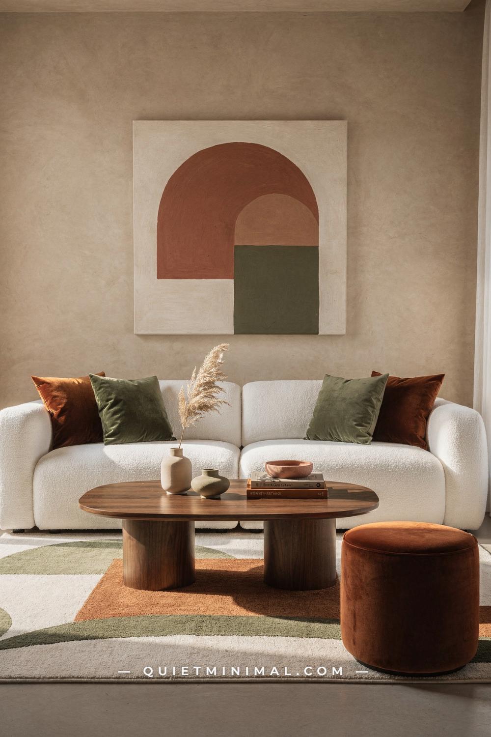
Here the canvas is a big square, roughly 48 by 48 in (122 by 122 cm), with a terracotta arc and olive shapes on a warm off-white ground. Look at what the room did with it. The rust cushions and the terracotta velvet stool are the arc. The sage cushions are the olive shapes. The rug repeats both, in cream, olive and burnt sienna. The white boucle sofa, about 110 in (279 cm) across its long side, and the plaster-toned walls are the canvas’s background. Every colour in the room is in the painting, and nothing in the room is not. That is the whole technique, and it works because the reader’s eye keeps returning to the canvas and finding the room explained.
Choose the art before the accents, and choose abstract over anything figurative, because abstract colour fields hand you a palette without handing you a subject to argue with. Then extract: pick the two most prominent colours in the piece for your medium accents and the ground colour for your walls. If the ground is a warm plaster off-white, that becomes the wall in this room, and a soft greige with a warm cast will do the job; Farrow & Ball Elephant’s Breath No. 229 is a warm mid grey that the brand itself warns can turn almost lilac in cool west light, which tells you how much the room’s orientation matters at this stage.
The failure mode is buying accents first and hunting for art that matches, which almost always ends in a print chosen for its colours and hated for itself. Done looks like one large abstract piece hung, and a list of its three main colours written beside the loud colour from Stage 2.
Key Takeaway: Hang one large abstract canvas first and extract your medium accents from it, so the whole room’s colour is explained by the one thing the eye returns to.

Stage 5: Distribute the Palette Across an Open Plan by Zone
 Save
An open plan is the hardest test of a colour combination, because there are no doors to hide a change of mind behind. One bold colour running unbroken from the kitchen to the far living-room wall drowns the space, which is the warning designers keep repeating about open plans. The method that works is to keep the walls and ceiling one continuous pale colour and to let the furniture carry the palette, zone by zone, so each area gets its own dose of the same few colours.
The ratio to use is the old 60-30-10, applied per zone rather than to the room as a whole. Sixty percent is the pale envelope: plaster-cream walls, a cream rug, a cream boucle sofa around 92 in (234 cm) long. Thirty percent is the dark anchor: dark walnut island cabinetry and a chocolate-brown tone that repeats in the dining table legs and the coffee-table base. Ten percent is the colour: forest green velvet on the dining chairs and the bar stools, and one rust boucle armchair about 30 in (76 cm) square beside the sofa. Notice how the green appears in two zones, dining and kitchen, and the rust appears in only one. That is deliberate. The colour that repeats across zones is the one that stitches them together; the colour that appears once is the one that says “this is the living area”.
A round travertine coffee table roughly 44 in (112 cm) across earns its place here as the warm sand tone that sits between cream and walnut, a stepping stone the eye uses to move between the pale and the dark. If you have a Stage 1 column with a marble or quartz counter in it, that stone tone is the one to repeat in a coffee table or a lamp base.
The failure mode is painting a “feature wall” at one end of an open plan, which turns the whole space into a hallway leading to it. Done looks like every zone containing all three ratio bands, with one accent colour shared by at least two zones and one accent kept to a single zone.
Key Takeaway: In an open plan keep the walls one pale colour and let furniture carry a 60-30-10 split in every zone, sharing one accent between zones and reserving one for a single area.

Stage 6: Put the Jewel Tone Where It Can Be Changed
 Save
Some colours are too strong to commit to on a wall and too good to leave out. Burgundy is one of them, along with plum, aubergine and the deep reds the current trend reports keep naming. The stage here is placing that jewel tone in the one element that costs a weekend to swap rather than a repaint: the curtains. A pair of deep burgundy velvet panels, floor-length and pooling by an inch or two, gives a pale room a single saturated vertical, and if in three years you tire of it, the panels come down and the room is unchanged.
The room around the curtains has to be built to hold them. Walls in a warm greige, the mushroom kind with a hint of brown rather than blue, are the right host, because burgundy carries warm red and needs a warm neutral behind it. Benjamin Moore Revere Pewter HC-172, which the brand describes as a bridge between warm and cool tones at an LRV of 55.05, is the classic pick for this middle-value greige. The trim stays the crisp white you locked in Stage 3. The sofa and armchair are cream linen, the sofa about 88 in (224 cm), so the only colour in the room with any weight is the curtain. The round drum coffee table, about 36 in (91 cm) across on brushed metal legs, adds the warm gold accent that burgundy always wants.
Then repeat the jewel tone exactly twice more, following the Stage 2 rule: a cushion or two on the cream sofa, and the dried stems in a white vase on the table. Small, medium, large. The velvet’s sheen matters as much as its colour; a matte burgundy cotton would read as dull, and velvet catches the cool window light and turns it warm.
The failure mode is loving the burgundy and painting the walls in it, which makes a room the family avoids after the first winter. Done looks like one jewel tone in a removable element, repeated twice in small objects, against a warm mid-value neutral wall.
Key Takeaway: Commit the strongest colour in the house to curtains and cushions, never to the walls, so it can be changed in a weekend when your taste moves on.

Stage 7: Test a Monochrome Room Before You Try Contrast
 Save
The easiest colour combination to get right is one colour, used at three depths, against wood. Before you attempt a room with real contrast, build one room this way, because it teaches you how much of a colour a room can absorb and it gives you a quiet space to retreat to when the rest of the house is louder. Soft blue is the natural candidate this year; it is the colour the trend guides keep calling the one everyone will be painting, and it pairs with almost every wood.
Here the wall is a muted powder blue, the sectional is the same blue a shade deeper in fabric, and the rattan accent chair is the blue again in a woven texture. That is one hue, three surfaces, three textures. What keeps it from feeling like a paint-store display is the warm counterweight: pale bleached oak in the sideboard, a light-oak coffee table around 48 in (122 cm) long, beige linen curtains, a cream rug and two woven-fibre pendants about 14 in (36 cm) across. Blue is cool. Everything that is not blue in this room is warm tan. The combination is really two colours, blue and tan, and the tan is doing half the work.
The measure to keep in mind is value, how light or dark a colour is. A pale wall, a mid-value sofa and a slightly darker chair give the eye a gradient to read. If all three were the same depth, the room would flatten into one blue block. Keep the wall the lightest of the three, always, because the wall is the biggest.
The failure mode is choosing a blue with too much green or too much violet in it for the wood. A blue leaning teal reads well beside yellow oak; a blue leaning violet reads badly beside it and wants a greyer, cooler floor. Done looks like one hue on wall, sofa and chair at three visibly different depths, with every other surface in the room a warm tan or cream.
Key Takeaway: Build one room from a single hue at three depths against warm oak, keeping the wall the lightest, before you attempt a room with real contrast.

Stage 8: Set the House White and the House Wood
 Save
Halfway through the sequence, two decisions have to be made that most people leave to chance: which white the house uses on its walls where it uses white, and which wood the house uses where it introduces new wood. Every later room leans on these two, and if either wanders from room to room, the combination breaks regardless of how good the colours are.
Whites are not neutral. A white with a yellow base beside a white with a blue base looks dirty, and you will see it every time a door stands open between two rooms. Pick one and use it everywhere white is needed. Two of the most used are Benjamin Moore White Dove OC-17, a soft warm white with an LRV of 83.16 per the brand, and Sherwin-Williams Alabaster SW 7008, which the brand describes as balanced, neither stark nor overly warm. In a bright north-lit room like this one, either reads as clean white; in a warm south room they read as cream. That is fine. The point is that they read the same way in every room of your house, because it is the same white.
Then the wood. This room’s light-oak plank floor is the Stage 1 fixed element, so the nesting coffee tables, the larger about 32 in (81 cm) across, are light oak too. New wood should match the floor’s tone or contrast it clearly, dark walnut against pale oak, and never split the difference with a medium brown that looks like a failed match. The travertine surround on the unlit corner fireplace, about 36 in (91 cm) square on its visible face, adds the warm sand that keeps the white from going cold, and the blue-grey sectional, about 110 in (279 cm) with its chaise, is the one cool colour, held in check by the cream loop-pile rug.
The failure mode is a different white in every room because each was chosen on its own, and two or three wood tones that sit within a shade of each other and look like mistakes. Done looks like one white and one new-wood tone, both written on the sheet, and every existing wood in the house sorted into “matches the floor” or “clearly contrasts it”.
Key Takeaway: Choose one white for the whole house and one new-wood tone that either matches the floor or contrasts it outright, then never deviate from either.

Stage 9: Add a Second Colour Only as an Architectural Moment
 Save
With one loud colour already committed in Stage 2, the house has room for exactly one more strong colour, and the only way to add it without breaking the combination is to tie it to a piece of architecture rather than to a whole wall. An arched niche, the inside of a bookcase, the panel behind a bed, a fluted section of wall: a defined shape with edges. The second colour lives inside that shape and nowhere else at wall scale.
This room shows how much a bounded colour can carry. The walls are a cool dove grey, calm and slightly flat. The arched niche is fluted plaster in a dusty blush rose, and the colour stops exactly at the arch’s edge. Because it is contained, it reads as a designed object, and the eye treats it the way it would treat a large painting. Farrow & Ball Sulking Room Pink No. 295, which the brand describes as a muted rose with enormous warmth rather than an overt pink, is the kind of colour that works here; a candy pink would not, because the niche needs to sit beside grey without fighting it.
The third element is the answer to the blush: terracotta. A rounded boucle armchair about 32 in (81 cm) wide and its ottoman pick up the niche’s warmth and push it one step deeper, and the herringbone oak floor carries the same warmth underfoot. Grey, blush and terracotta are three points along one warm-to-cool line, so they read as a family. The black bowl-form side table and the brass two-globe pendant are the one dark and the one metal, the same two supporting roles they play in every well-built room.
The failure mode is painting the second colour on a full wall opposite the first, which turns the house into two teams. Done looks like the second strong colour confined to one architectural shape, with one piece of furniture in a deeper version of it and the surrounding walls held in a cool neutral.
Key Takeaway: Introduce the house’s second strong colour only inside a bounded architectural shape, and echo it once in a single piece of furniture, never on a full wall.
Stage 10: Layer One Hue in Three Depths and One White
 Save
Stage 7 built a monochrome room with the wall as the lightest value. This stage inverts that, and it is the version to use in a room that gets strong daylight and can afford a mid-tone wall. The wall is a dusty slate blue, the sofa is deep navy, the poufs are a paler dusty blue and a light grey, and the shelves, table and cushions are white. That is a full range of one hue, dark to light, with white doing the job the tan did before.
The reason to build this room after the earlier ones is that mid-tone walls are unforgiving about undertone. Slate blue with a touch of grey sits happily beside navy; slate blue with a touch of green turns the navy purple by comparison. Test the wall against the sofa fabric in the room’s own light before committing, and expect to reject the first sample. A deep navy for the sofa is the safe anchor, and if you ever want that navy on a wall elsewhere in the house, Benjamin Moore Hale Navy HC-154, LRV 8.36 per the brand, is a navy that reads as navy under almost any light.
The white here has to be the house white from Stage 8, and here it is bright: a cluster of hexagonal shelves each about 15 by 13 in (38 by 33 cm), a round drum coffee table around 36 in (91 cm) across on thin brass legs, and cushions. White at three scales against blue at three depths. The brass legs and the woven rattan basket are the warm notes, small and deliberate, keeping a cool room from turning clinical.
The failure mode is a mid-tone wall that is too saturated, so the room becomes the colour instead of holding it. A dusty, greyed version of the hue is always the right choice for the wall; the saturated version belongs on the sofa. Done looks like one hue at three depths plus the house white, with the wall the greyest of the three and the darkest reserved for the largest piece of furniture.
Key Takeaway: When a room can carry a mid-tone wall, keep that wall the greyest version of the hue, put the saturated version on the sofa, and let the house white do the contrasting.

Stage 11: Pair the Dark Accent Wall With a Warm Partner Beside It
 Save
A single dark accent wall fails more often than it succeeds, and the reason is almost always the wall next to it. A forest green wall meeting a cold white side wall looks like a sample that never got finished. The stage here is choosing the partner colour for the adjacent walls, and the rule is that the partner is warm, mid-light, and shares an undertone with the dark colour. Deep green carries yellow; its partner is a putty cream that carries yellow too. The corner where they meet then reads as one colour changing depth rather than two colours colliding.
The furniture completes the argument. Two mustard-amber wool barrel chairs about 28 in (71 cm) wide face each other across a small dark walnut table around 24 in (61 cm) across, on a cream geometric wool rug of about 6 by 8 ft (183 by 244 cm). Mustard is the yellow inside the green, brought out into the open. Walnut is the brown inside the putty. Every colour in the room is either in the green wall or in the cream wall, and the two chairs are what tell the eye that the two walls were always meant to be together. Farrow & Ball India Yellow No. 66, a deep mustard the brand describes as strong and moody and best used in moderation, is the register the chairs are in; on a wall it would overwhelm, on two chairs it is exactly right.
Keep the dark wall to one plane and put it on the wall the seating faces, not the wall behind the seating, so the colour is what you look at rather than what you sit against. The light oak strip floor stays pale to hold the room open; a dark floor under a dark wall would close it.
The failure mode is a dark feature wall meeting bright white on three sides, which is the look of a decision half-made. Done looks like the dark wall on one plane, the adjacent walls in a warm cream sharing its undertone, and the seating in the accent colour that lives inside the dark wall.
Key Takeaway: A dark accent wall needs a warm, mid-light partner on the adjacent walls that shares its undertone, and two chairs in the colour hidden inside it.

Stage 12: Decide Which One Room Gets Drenched
 Save
Colour drenching, painting walls, ceiling, trim and doors in one deep colour, is the paint move of the year; mentions of it in home listings are up 149 percent according to the coverage of Zillow’s latest trends report. It is also the move that can wreck a whole-home combination if it is done in more than one room. So this stage is a single decision: which one room, if any, gets the full envelope. The right candidate is a room with a door, used mostly after dark or for one purpose, a den, a dining room, a study, a snug. Never the open plan, never the hall.
Navy is the safest drench because it reads as a neutral once it wraps the ceiling. Farrow & Ball Hague Blue No. 30, a deep dark blue with green undertones that the brand says sits happily in small dark rooms, is the reference point for this kind of colour; Benjamin Moore Hale Navy HC-154 is the American equivalent. With the walls and ceiling one colour, the room stops having corners, which is the whole effect. Then the furniture has to give the eye somewhere to land: a low cream modular sofa, about 106 in (269 cm), floats against the navy like a lit shape, and the large square abstract canvas above it, in burgundy, cream, pale blue and navy, is the palette of the room hung on the wall.
The burgundy is the accent, used three times exactly as Stage 2 taught: in the rug’s organic shapes, in cushions, and in a small velvet ottoman about 20 in (51 cm) across. Walnut in the twin-cylinder coffee table is the house wood, showing up on schedule. Cream curtains, not navy, so the window still reads as a window.
The failure mode is drenching a second room because the first went so well, at which point the house stops having a combination and starts having a theme. Done looks like one room chosen, one deep colour on every plane in it, a pale sofa and a large abstract piece to break it, and the accent from the rest of the house repeated three times.
Key Takeaway: Drench exactly one closed room, walls and ceiling together, in a navy or another deep neutral, and let a pale sofa and one large abstract canvas carry the rest of the house’s palette into it.

Stage 13: Save the Graphic Move for After the Rest Is Set
 Save
Once the whites, woods, hall colour, loud colour and second colour are all fixed, and only then, the house can afford one graphic gesture: a colour-block wall, a painted diagonal, a two-tone corner. Done early, a move like this dictates everything around it. Done last, it uses the colours you already have and simply arranges them more boldly. The order is the entire difference between a nook that looks designed and one that looks like a mural someone regretted.
The nook here is a diagonal split: a mustard-marigold triangle on the left meeting a warm grey-green field on the right, the line running from near the ceiling to the floor at roughly 60 degrees. Both colours already belong to the house. The mustard is the Stage 11 chair colour taken to the wall at last, in a small room where it can be strong without taking over. The grey-green is a cousin of the Stage 3 hall colour, so the nook connects to the corridor outside it. Two burnt-orange armchairs with exposed walnut frames, each about 28 in (71 cm) wide, are the warm accent of the whole house repeated once more, and the walnut is the house wood. A white pedestal tray table about 20 in (51 cm) across, a black dome pendant, and gold curtains complete the same supporting roles every other room has used.
The technique for the wall is painter’s tape and patience: paint the lighter colour over the whole wall first, let it cure for 24 hours, tape the diagonal, paint the tape’s edge with the base colour to seal it, then apply the darker colour and pull the tape while the second coat is still slightly wet. The line will be sharp. A soft line is what makes a colour-block wall look homemade.
The failure mode is doing this stage first, on a big wall, in colours that appear nowhere else, so the whole house has to answer to one corner. Done looks like a graphic wall in a small space, in two colours that both already exist elsewhere in the house, with a crisp taped line.
From the guides
You've saved it, wanted it. Here's the how: codes, measurements, order. Your choices make it yours.
The Japandi Honest PlaybookThe honest version of the style: what to keep, what to skip, and the order to do it in.See inside →The Room Refresh PlaybookA repeatable four-step method, room by room, in ten minutes, thirty minutes, or one weekend.See inside →Make Any Room Feel Cozy on PurposeWhy some rooms hold people and others empty out, and the moves that change it.See inside →Key Takeaway: Make the one graphic paint gesture last, in a small room, using two colours the house already owns, and cut the line with tape over a cured base coat.

Stage 14: Bring the Palette Down to a Whisper in the Calm Rooms
 Save
Not every room can be a statement, and a house where every room is trying is exhausting to live in. This stage is deciding which rooms are the rests between the notes, and how to keep the combination alive in them at a whisper. The technique is the same as Stage 4 in reverse: instead of extracting bold accents from the art, extract the palest versions of the house colours and use them at cushion scale only.
The walls here are a warm ivory, the Stage 8 house white. Benjamin Moore White Dove OC-17 and Sherwin-Williams Alabaster SW 7008 are both this kind of white, and either will read as ivory in a room like this with soft daylight from one side. The sofa, about 92 in (234 cm), and the armchair are a soft beige linen, one step warmer than the wall. The round fluted drum coffee table, about 44 in (112 cm) across in a light tan wood, is the house wood in its palest form. Onto that quiet base go the house colours at their smallest and softest: dusty blue and blush cushions, a muted teal velvet armchair about 30 in (76 cm) square, and one abstract painting in blue, ivory and blush that ties the cushions to the chair.
Look at what those accents are. The teal is the Stage 2 loud colour, greyed and calmed. The blush is the Stage 9 niche colour, reduced to a pillow. The dusty blue is the Stage 7 wall colour at one-tenth the area. Nothing new was introduced; everything already in the house was turned down. That is what makes the calm room feel like part of the same home rather than a hotel lobby dropped into it.
The failure mode is making the calm room beige and nothing else, which is not calm, it is absent. Done looks like the house white on the walls, beige on the big pieces, and the house’s three accent colours present at cushion and single-chair scale, in their softest versions.
Key Takeaway: In the calm rooms keep walls and big pieces in the house white and beige, then repeat the house’s accent colours at cushion scale in their softest, greyest versions.

Stage 15: Warm the Last Living Space With the Terracotta Partner
 Save
Most houses built on a green, blue or grey loud colour end up with one room that feels cold, usually the one with the least sun. This stage is fixing that room with the warmest colour the combination can hold, and in a house with a yellow-oak floor, that colour is terracotta. It is the complement of the blues and the warm cousin of the greens, which is why it has appeared as an accent in so many earlier stages. Here it finally gets a wall.
The wall is a terracotta-spice, an amber-leaning orange with enough brown to keep it from reading as a pumpkin. It takes one wall, the one the sofa faces, and meets cream side walls, following the Stage 11 rule that a strong wall’s neighbours share its undertone. Against it the oversized white cloud sofa, about 100 in (254 cm) wide and 42 in (107 cm) deep, does what the cream sofa did in the navy room: it floats. Burnt-orange velvet cushions repeat the wall at small scale, and the abstract canvas above in caramel and cream colour fields repeats it at mid scale. Three appearances, as always.
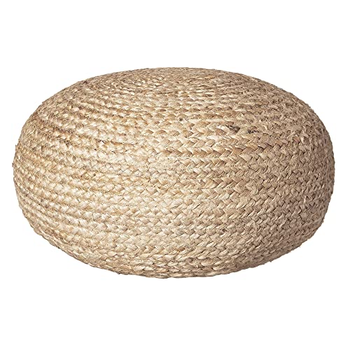
The supporting cast is the earthiest in the house, and it should be, because terracotta wants rough textures: a low rustic oak table about 48 in (122 cm) long, a woven jute pouf about 22 in (56 cm) across, a cream textured throw, a large leafy plant. If the trend reports are right that warm earth tones are the current direction for living rooms, this room is where the combination proves it without abandoning the cooler rooms elsewhere. Sherwin-Williams’ recent Color of the Year, Universal Khaki SW 6150, a mid-tone neutral with a slight yellow undertone in the brand’s own words, is the kind of colour that would sit between this terracotta and the cream on the side walls if the room ever wanted a third.
The failure mode is putting the terracotta wall in the sunniest room, where afternoon light turns it neon. Done looks like the coolest room in the house given one terracotta wall facing the seating, cream beside it, a white sofa in front of it, and rough natural textures everywhere else.
Key Takeaway: Give the coldest, least sunny living space the terracotta wall, facing the sofa and flanked by cream, and surround it with rough oak, jute and linen rather than anything glossy.
Stage 16: Sample on the Wall, Not on Paper, and Watch It for Two Days
 Save
Every stage so far has produced a name or a colour on a sheet. This stage is where the sheet meets the wall, and it is the stage that saves a repaint. The rule is simple and almost nobody follows it: never choose a colour from a chip smaller than your hand, and never choose it in the store. Paint a sample at least 24 by 24 in (61 by 61 cm) on two walls of the actual room, one wall that gets the window light and one that faces it, and look at both at three times of day for two days before deciding.
The reason for two walls is that a colour is not one colour in a room. It is two. Sage green beside a north window reads grey; the same sage on the wall the window faces reads warm, sometimes almost yellow. Farrow & Ball’s own description of Elephant’s Breath No. 229 says it can go almost lilac in cool west light, and every mid-tone neutral behaves this way to some degree. If you only sample the sunny wall, you will be surprised by the shady one for years.
The reason for two days is artificial light. The colour you approved at noon will be a different colour at 8 p.m. under a warm bulb, and the bedroom is a room you mostly see at 8 p.m. Turn on the lamps you actually use, not the overhead. Look at the sample beside the bedding and beside the floor, because the floor is the Stage 1 fixed element and the bedding is the biggest textile in the room, and both will shift the wall by a shade. A dusty blue blanket next to a sage wall will pull the green cooler; a caramel one will pull it warmer.
Sample with real paint, not peel-and-stick cards, and in the sheen you will use. Matte takes more of the colour and hides the wall’s flaws; eggshell reflects a little and lightens the colour by a visible step. The failure mode is approving a colour from a fan deck under store lighting and painting the room the same weekend. Done looks like two 24 in (61 cm) samples on two walls, viewed morning, midday and evening, with the floor and the main textile in view, and a decision written down only after the second day.
Key Takeaway: Paint a 24 by 24 in (61 by 61 cm) sample on the window wall and the wall facing it, watch both at three times of day for two days, and only then write the colour on the sheet.

Stage 17: Check the Kitchen’s Fixed Finishes Against the Whole Sheet
 Save
The kitchen has more fixed finishes than any other room, and they are the most expensive to change, so it is where the whole-home sheet gets its hardest test. Stand in it with the Stage 1 column in hand and check every fixed surface against it: countertop, backsplash, cabinet colour, floor, appliance finish. The kitchen does not get its own palette. It gets the house palette, expressed in materials.
Start with the counter. A warm greige quartz with a soft grey vein sits with a warm house; a stark white quartz with a cold blue-grey vein sits with a cool one, and a mixed house needs a counter that has both, which usually means a warm white ground with a grey vein. If the counter you inherited is on the wrong side of the line, the cabinets are where you correct it. Paint the cabinets in the house white from Stage 8, so that the cabinet colour is identical to the trim in the rest of the house, and the kitchen stops being a separate room. A soft warm white on flat panels with matte black pulls is the most forgiving version of this, because black hardware reads as the house’s one dark, the same role the black pendant or side table played in earlier rooms.
Then the backsplash. Plain matte cream ceramic laid straight, not in a herringbone or a glossy subway, is the tile equivalent of the putty-cream partner wall from Stage 11: quiet, warm, sharing an undertone with the cabinets. Save pattern for a rug. The floor, if it is the same pale oak as the rest of the house, is what carries the kitchen into the open plan.
Where does the colour go? In the objects that come and go: a stoneware bowl, a wooden board, a small oak stool, a dish towel in the house’s blue or terracotta. The kitchen is the room where the Stage 2 loud colour appears at its smallest scale, and where the sheet gets checked against reality.
The failure mode is a kitchen that looks like a showroom sample from a different house, because its finishes were chosen in a design centre without the sheet. Done looks like every fixed kitchen surface sorted into warm or cool to match the house, cabinets in the house white, hardware in the house dark, and colour only in things you can pick up.
Key Takeaway: Hold every kitchen finish against the whole-house sheet, paint the cabinets in the house white and use the house dark for hardware, so the kitchen reads as the same home rather than a separate room.

Stage 18: Lower the Chroma for the Bedrooms
 Save
Bedrooms take the house palette one step further down than the calm rooms of Stage 14. The rule for a bedroom is that every colour from the sheet is allowed, but each one arrives with its chroma lowered, greyed by a visible step, so that the room reads as the same home at a whisper. Chroma is the intensity of a colour, and it is the thing that keeps a person awake in a bedroom. A saturated teal wall is a living-room colour. A dusty blue-grey wall is a bedroom colour, and it is the same hue.
The wall here is that dusty blue-grey, the Stage 7 and Stage 10 blues taken almost to neutral. Against it the bed is a tall oatmeal linen headboard about 48 in (122 cm) high, warm and pale, with white linen bedding, and the house’s loud teal makes its single appearance as a folded wool blanket at the foot, itself muted. Walnut nightstands are the house wood in contrast mode against the pale oak floor, and brass lamps with linen shades are the house metal. The abstract canvas above the bed, in soft blue and sand, is the palette of the whole house with its volume turned down.
Ratio matters differently in a bedroom. Where the living room ran 60-30-10, the bedroom runs closer to 70-25-5: seventy percent pale (wall, bedding, rug, curtains), twenty-five percent mid (headboard, nightstands, floor), five percent colour (the blanket, the canvas). Push the colour past five percent and the room starts to feel like a place to be awake.
If you ever want a named colour in this register, look at the deep-neutral end of the trend reports rather than the bright one; Benjamin Moore’s recent Color of the Year, Silhouette AF-655, described by the brand as burnt umber with charcoal undertones, is the kind of muted deep colour that a bedroom could hold on one wall behind the bed without waking anyone.
The failure mode is carrying the living-room saturation into the bedroom because the colour “matches”, and then wondering why the room never settles. Done looks like every house colour present in the bedroom at one step greyer, with the strong colour confined to a blanket or a canvas, and the palette split roughly 70-25-5.
Key Takeaway: Bring every house colour into the bedroom one step greyer, hold the loud colour to a blanket or a single canvas, and shift the ratio to 70-25-5 so the room stays restful.

Stage 19: Send the Darkest Colour to the Smallest Room
 Save
Every whole-home combination has one colour that is too dark for any room you spend the day in and too good to leave out. Stage 12 gave it a den. This stage gives the rest of it to the smallest room in the house, the powder room, and the reasoning is the opposite of what most people expect. A small dark room reads as larger than a small pale one, because the walls stop registering as walls. Paint a 5 by 6 ft (152 by 183 cm) powder room in the deepest colour on the sheet, walls and ceiling both, and it becomes a jewel box rather than a cupboard.
The colour to use is the house’s loud colour taken to its darkest possible version. If the house is built on teal and green, that is a deep smoky green, and Farrow & Ball Green Smoke No. 47, a dark smoky green-blue the brand describes as calm and serene inside, is exactly this register. If the house is built on blue, it is Hale Navy HC-154 or Hague Blue No. 30 from Stage 12. Either way the powder room is the darkest point in the whole home, and it is deliberately placed off the palest space, a hall in the house white, so that the door frame becomes the strongest contrast in the house.
The fittings are the house’s supporting roles at their most concentrated: a plain white wall-hung basin, a matte black tap as the house dark, a round brass mirror about 24 in (61 cm) across and one brass sconce as the house metal, a small walnut shelf as the house wood, and the pale oak floor running in from the hall so the floor never changes. One lit sconce, warm, is the only light, and against a deep matte wall it does more than a ceiling fixture ever could.
Sheen matters here more than anywhere. A deep colour in gloss shows every roller mark and every reflection; in a dead-flat or matte finish it turns to velvet. Use the flattest finish the room’s humidity allows.
The failure mode is painting the small room pale “to open it up”, which only shows how small it is. Done looks like the house’s darkest colour on every plane of the smallest room, in a matte finish, with the house dark, metal and wood each present once and the floor unchanged.
Key Takeaway: Paint the smallest room in the house’s darkest colour, walls and ceiling, in a matte finish, and open it off the palest hall so the doorway becomes the strongest contrast in the home.

Stage 20: Decide Trim, Doors and Ceilings Room by Room
 Save
Trim, doors and ceilings are the connective tissue of a colour combination, and they are the decisions nobody plans because they seem like defaults. They are not. There are three legitimate treatments, and the house needs a written rule for which rooms get which.
The first treatment is trim in the house white, walls in colour, doors in the house white. This is the default for most rooms and it makes the millwork read as architecture. It suits the hall, the calm rooms and the bedrooms. The second is trim, doors and walls all in the wall colour. This is the drench from Stage 12, and it also suits any small room where you want the walls to disappear, and any room where the trim is ugly and you would rather not draw the eye to it. Painting frame and skirting the same greige as the wall makes a landing feel wider because the eye stops counting edges. The third treatment is the door in an accent colour with the trim in the house white, which is the one to use sparingly: one door, a deep olive on a greige wall, tells you which room is the special one.
Ceilings are simpler. In every room that is not drenched, the ceiling is the house white, flat finish, no exceptions, because a coloured ceiling in a room with white trim reads as a mistake. In the drenched rooms it is the wall colour. Never a “ceiling white” from the can that is a different white from the trim; use the same house white in flat.
Write the rule as a table with three columns: room, trim treatment, ceiling. Fill it in before buying a litre of trim paint, because trim is the most tedious painting in the house and you do not want to do it twice. Sheen for trim is satin or semi-gloss, both durable, and the same choice in every room.
The failure mode is trim painted whatever was on hand in each room, so that a door frame in one white meets a skirting in another at the corner of the landing. Done looks like a three-column table, every room assigned one of the three treatments, the house white in flat on every undrenched ceiling and in satin on every piece of trim.
Key Takeaway: Assign every room one of three trim treatments in writing, white trim, drenched trim or one accent door, and keep the ceiling the house white in flat everywhere the walls are not drenched.

Stage 21: Treat Metals and Wood Tones as the Fourth and Fifth Colours
 Save
By now the sheet lists the house white, the hall colour, the loud colour, the second colour, the accents and the drench. What it usually does not list, and should, are the metals and the wood tones, because the eye reads them as colours. Brass is a warm yellow. Matte black is the darkest neutral in the house. Walnut is a red-brown. Pale oak is a yellow-tan. A room with three metals and four woods has seven extra colours in it that nobody chose.
The rule is two metals and two woods for the whole house, written down beside the paint colours, and the pairing matters. One warm metal and one dark metal: brass and matte black is the pairing that suits a warm house, brushed nickel and black suits a cool one. One pale wood and one dark wood: pale oak and walnut in a warm house, ash and a dark stained oak in a cool one. In the dining room here that is exactly the count. A walnut oval table about 84 in (213 cm) long, six pale oak spindle chairs, a brass three-arm pendant with opal globes, a matte black steel sideboard about 60 in (152 cm) wide with two brass candlesticks. Two woods, two metals, and the room feels resolved because every hard surface belongs to one of four families.
Then repeat the rule from room to room. The brass that is a pendant here is a lamp in the bedroom, a mirror frame in the powder room and the coffee-table legs in the living room. The black that is a sideboard here is the kitchen hardware, the pedestal table and the pendant elsewhere. Consistency in metals is what makes a house look like it was furnished by one person over time rather than by whoever was on sale.
The abstract canvas above the sideboard, in muted olive and terracotta, is the house’s accent colours doing their usual work, and the undyed wool flatweave under the table is the Stage 5 warm-sand stepping stone between the pale oak floor and the dark table.
The failure mode is chrome in the kitchen, brass in the bathroom, oil-rubbed bronze on the door handles and black on the lamps, each chosen on its own day. Done looks like two metals and two woods on the sheet, and every hard finish in the house sorted into one of the four, with the odd ones out replaced when the budget allows.
Key Takeaway: Limit the whole house to two metals and two wood tones, one warm and one dark of each, write them on the sheet with the paint colours, and repeat them in every room.

Stage 22: Walk the Vista From the Front Door and Fix What Breaks the Line
 Save
A colour combination for a home is never experienced one room at a time. It is experienced as a sequence of views: from the front door down the hall, from the hall into the living room, from the landing into a bedroom, from the sofa through to the kitchen. So the final test is not standing in a room but standing in the doorways. Open every interior door, walk to the front door, and look. Then do the same from the foot of the stairs, the top of the stairs, and the sofa.
What you are checking is whether the line of colour holds. From the front door, the hall in the house white should lead the eye to one deep colour at the far end, the Stage 3 hall colour or the smoky green of a living-room wall seen through a cased opening, and nothing in between should interrupt. A pale oak floor running unbroken under a wool runner is the line. White-painted spindles and a walnut handrail are the house white and the house wood, exactly where the sheet says. A brass lamp on a walnut side table, seen at the end, is the house metal repeated on schedule. If every element in the view belongs to a column on the sheet, the vista holds.
What breaks it is always the same short list. A door painted a different white from its frame. A room whose accent colour appears nowhere else in the view. A piece of furniture in a third wood. A rug whose pattern introduces a colour the sheet does not own. A coat hook in chrome beside a brass lamp. Each of those is a one-hour fix, and this stage is about finding them all in one walk rather than noticing them for years.
Take the walk at two times of day, because the vista changes when the lamps come on. The living room’s deep green wall reads as near-black at dusk with only a window behind you; with one brass lamp lit beside it, it reads as green again. Plan the lamp for the view, not the room.
The failure mode is judging each room as finished on its own and never seeing that the doorways contradict each other. Done looks like every view from every doorway containing only colours, woods and metals that are written on the sheet, with the fixes made and the lamps positioned so the deep colours still read as colours after dark.
Key Takeaway: Judge the house from its doorways, not its rooms, and fix every element in each view that is not on the sheet, then place the lamps so the deepest walls still read as colour at dusk.

The sequence you have just walked through is long, and it is meant to be, because the thing that makes a house read as one deliberate choice is that the decisions were made in an order that let each one narrow the next. The floor named the undertone. The undertone chose the loud colour. The loud colour set the hall colour that could sit beside it. One white and two woods and two metals were locked, and after that, every room was really a question of ratio and depth rather than of taste. The rooms that should be loud got one wall or one drench; the rooms that should be quiet got the same colours a step greyer. Start this weekend with the first stage only: get down at floor level in daylight, write the undertone of every fixed finish in one column, and do not buy a single sample until that column is complete. Everything after that is easier than it looks, because the house has already begun to choose for you.
From the guides
You've saved it, wanted it. Here's the how: codes, measurements, order. Your choices make it yours.
The Japandi Honest PlaybookThe honest version of the style: what to keep, what to skip, and the order to do it in.See inside →The Room Refresh PlaybookA repeatable four-step method, room by room, in ten minutes, thirty minutes, or one weekend.See inside →Make Any Room Feel Cozy on PurposeWhy some rooms hold people and others empty out, and the moves that change it.See inside → Save


