Georgia
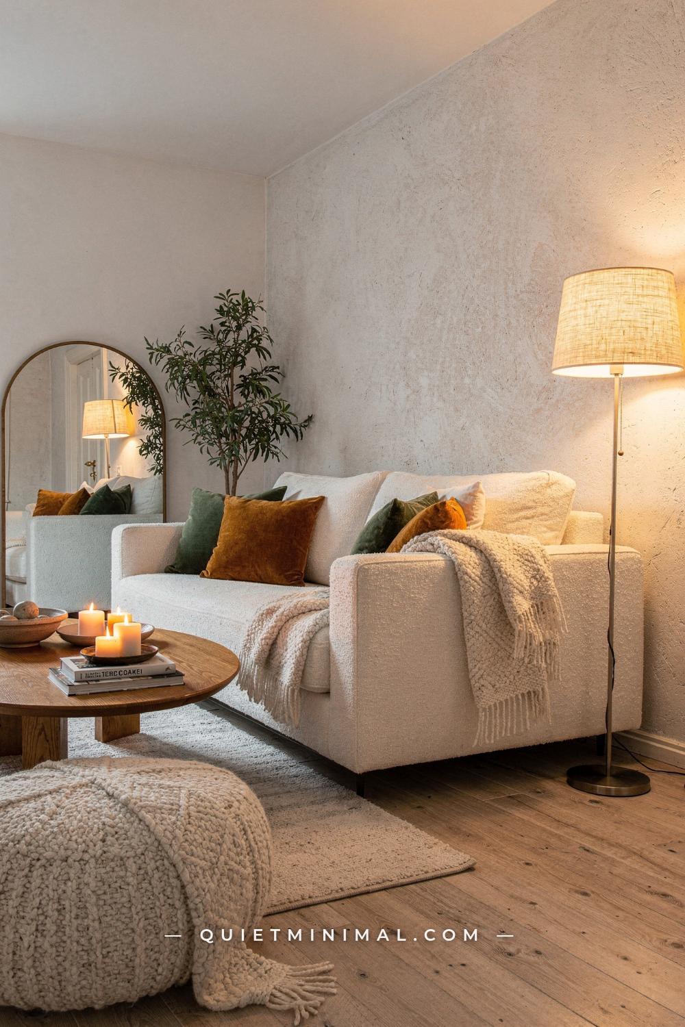
You pinned the warm, layered Nordic apartment. You bought the light wood furniture. You painted the walls white. And somehow the room still feels like a waiting room at a dental office rather than a Copenhagen flat where someone brews coffee in a chunky linen robe. The gap between the Scandinavian apartment you imagined and the one you’re living in is almost always caused by a small number of specific, correctable mistakes, not a lack of taste.
The good news: every one of these failures has a clear physical or perceptual cause. Fix the cause and the room shifts. This article walks through 12 of the most common cozy Scandinavian apartment problems, explains exactly why each one goes wrong in terms of scale, proportion, light temperature, and material contrast, and gives you a precise, actionable fix you can apply this week.
Your Ceiling Light Is Killing the Hygge
 Save
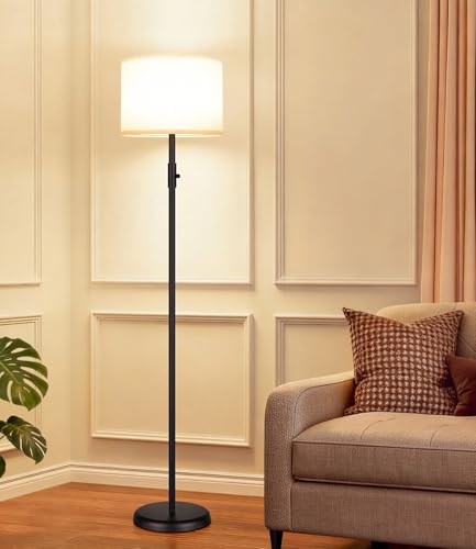
This is the most destructive mistake in any Scandinavian apartment, and it is also the most invisible to the person making it. A single overhead ceiling light floods the room from one direction at roughly 4,000K to 5,000K, which is the color temperature of a cloudy midday sky. Scientifically, your eye reads that light spectrum as “outside” or “functional,” not “restful.” The hygge feeling your Pinterest board promised you requires the brain to perceive warmth, and that perception is triggered by light sources at eye level or below, not from above.
The fix is not complicated, but it is specific. Remove the ceiling light from your evening routine entirely: put it on a dimmer or simply stop using it after 5 PM. Replace it with a minimum of four light sources positioned at different heights, none of them at ceiling level. A floor lamp with a linen shade in one corner. A small table lamp on a side table beside the sofa. A cluster of three candles on a wooden tray on the coffee table. A reading lamp behind the armchair. Each source contributes a separate warm pool of light, and together they create the layered, amber-toned atmosphere that makes a room feel like a Scandinavian home rather than an office.
From the guides
You've saved it, wanted it. Here's the how: codes, measurements, order. Your choices make it yours.
 The Japandi Honest PlaybookThe honest version of the style: what to keep, what to skip, and the order to do it in.See inside →
 The Room Refresh PlaybookA repeatable four-step method, room by room, in ten minutes, thirty minutes, or one weekend.See inside →
 Make Any Room Feel Cozy on PurposeWhy some rooms hold people and others empty out, and the moves that change it.See inside →
The color temperature you want for every bulb in the apartment is 2,700K. Not 3,000K, which reads slightly cool and clinical. Not the warm-white LED packs that are actually 3,500K despite the packaging. Buy the bulb, check the box: the number needs to say 2,700K. At that temperature, the light registers as candlelight-adjacent, and your walls read warm cream instead of institutional white. The difference is not subtle. At 2,700K in a room with oatmeal-toned walls, you will feel like you are sitting inside the apartment you pinned. At 4,000K, that same room feels like a photography studio.
If your ceiling fixture is not on a dimmer, a smart bulb that lets you drop to 10% brightness and shift to 2,700K is a reasonable workaround. But the layered floor-and-table approach will always outperform a single dimmed ceiling source, because it is the distribution of light across multiple planes, not just the warmth of one source, that creates depth.
Key Takeaway: Swap every bulb to 2,700K and build a floor lamp, table lamp, and candle trio before you change anything else in the room.
The Rug Is Too Small and It Is Chopping the Room in Half
 Save
The too-small rug is the single most common Scandinavian apartment mistake, and it is almost always chosen for the wrong reason: the buyer sees the price difference and thinks a smaller rug is a practical compromise. What actually happens is spatial fragmentation. When a rug is sized so that the furniture sits entirely off it, or so that only the front two inches of the sofa legs touch the edge, the rug reads as a separate object floating in the middle of the floor rather than as a zone-defining anchor. The eye perceives multiple disconnected pieces rather than one cohesive seating arrangement.
The rule for a Scandinavian living room rug is that the front legs of every major seating piece need to sit on it, and the rug should extend a minimum of 12 inches (30 cm) beyond the outermost furniture on each side. For a typical apartment sofa that runs 84 inches (213 cm) wide, you need a rug that is at least 8 by 10 feet (244 by 305 cm). Most people buy a 5 by 7 (152 by 213 cm) or a 6 by 9 (183 by 274 cm) and wonder why the room feels disjointed.
For material, the cozy Scandinavian apartment rug is low-pile and textural, not shaggy. A high-pile shag rug reads as 1970s rather than Nordic. What you want is a flat or low-pile wool rug with visible weave texture: a natural undyed wool, a dhurrie-style flatweave, or a bouclé-textured rug in oatmeal, warm ivory, or pale sage. The visual texture catches light differently across its surface and adds the tactile richness that makes a neutral room feel layered instead of flat.
If you are in a studio apartment where a single large rug would cover nearly the entire floor, consider using two rugs to zone the space instead of one. A larger rug under the sofa and coffee table, and a smaller runner-format rug near the entry or under a small dining table, define two distinct areas without requiring a partition or a change in wall color. This approach is quieter and more spatially efficient than any room divider you can buy.
Key Takeaway: Go up at least one rug size from what you think you need, and make sure every seating piece has its front legs firmly on the rug.

Every Wall Is White and the Room Reads Cold Instead of Calm
 Save
There is a persistent myth that Scandinavian design means white walls. That interpretation comes from a decade of IKEA catalog photography taken in bright studio conditions where cool white walls looked fresh and clean. In an actual apartment, with standard artificial lighting and limited window area, cool white walls read as blue-grey or slightly green under most common light sources. The result feels sterile rather than light-filled, and no amount of wood accents or linen throws fully corrects it.
The fix is to shift your wall color from a cool or neutral white to a warm white with a slight cream or oatmeal undertone. You are looking for paints with a Light Reflectance Value (LRV) above 80 that lean warm. Benjamin Moore’s White Dove (OC-17) and Chantilly Lace (OC-65) are two commonly cited references, but you want the warmer of the two: White Dove reads slightly creamy and softer; Chantilly Lace reads brighter and more neutral. For a Scandinavian apartment, White Dove or a comparable warm-white from Behr or Sherwin-Williams will do significantly more work than a true white.
If you want to go further, the current Scandinavian design shift is moving toward warm earth tones on accent walls: dusty terracotta, warm taupe, faded olive, and plummy blush. The approach that works best in a small apartment is painting one wall in a muted earth tone, typically the wall behind the sofa or the bed headboard wall, and keeping the other three walls in warm white. This creates visual depth without the commitment of a full room color change and without making the space feel smaller.
One thing to avoid: gray. A cool or medium gray reads beautifully in large, light-flooded spaces. In a typical apartment bedroom with one east-facing window, gray walls under 2,700K bulbs will look purple or lavender by evening. It is a combination that fights itself. If you love the idea of gray, go warmer than you think necessary, something like Sherwin-Williams Accessible Beige (SW 4664) or Agreeable Gray (SW 7029), both of which read as warm taupe rather than true gray in most apartment lighting.
Key Takeaway: Switch to a warm white with an LRV above 80 and add one muted earth-tone accent wall to create depth without shrinking the room.

The Sofa Scale Is Off and It Blocks the Room’s Sightlines
 Save
A Scandinavian apartment with a sofa that is too large for the room suffers from a specific failure: blocked sightlines. When a sofa fills more than roughly 60 percent of the wall it sits against, and when its back rises above 33 inches (84 cm) from the floor, the room feels divided rather than open. The eye hits the sofa back and stops. The space behind it disappears. In a room where you need every inch of perceived depth, that sofa height is doing real spatial damage.
The corrective direction is toward lower-profile furniture throughout. Scandinavian design has always favored sofas with seat heights between 16 and 18 inches (41 to 46 cm) and overall back heights at or below 32 inches (81 cm). At that height, sightlines travel over the furniture, across the room, and to the window or far wall. The eye reads the full length of the space. Perceived square footage goes up without moving a single wall.
Sofa leg height matters more than most people expect. A sofa with 6-inch (15 cm) legs instead of 4-inch (10 cm) legs allows you to see the floor under the piece. That visible floor gap is not a style preference; it is a spatial perception tool. It signals to the brain that the room is open and unobstructed. A sofa that sits flush to the floor or on a plinth base is visually heavier, and in a small apartment that extra visual weight compounds quickly with every other piece of furniture in the room.
If replacing your sofa is not an option right now, address the scale problem by removing one piece of furniture from the room entirely. The Scandinavian concept of “lagom,” meaning just the right amount, is a practical space management tool as much as a design philosophy. Most people have one chair too many, or a side table that serves no actual function but occupies 4 square feet of visual real estate. Pull it out. The room will read larger and the sofa will look more proportional without any new purchase required.
Key Takeaway: Choose a sofa with a back height at or below 32 inches and legs at least 6 inches tall, and remove any furniture piece that has no daily function.

The Textiles Are All One Texture and the Room Feels Flat
 Save
The flatness problem in Scandinavian apartments that try too hard for minimalism is almost always a texture problem rather than a color problem. When every textile in the room is the same weight and weave, smooth cotton cushions on a smooth cotton sofa under a smooth cotton throw, the room looks intentional in photographs and dead in real life. There is nothing for the eye to move across, nothing for the hand to want to touch.
The fix is contrast stacking. Rather than adding more objects, you add more feel across the same number of objects. The key principle is that every surface that can carry a textile should carry a different one. A smooth cotton or linen duvet gets a chunky knitted throw at the foot. A linen sofa gets one bouclé cushion and one smooth canvas cushion, not three matching ones. The coffee table, which is a hard surface, gets a rough ceramic bowl or a smooth stone object to contrast with the soft things around it.
Today, the specific textures that are driving the warmest Scandinavian interiors are bouclé upholstery, waffle-weave cotton, raw linen, chunky wool knit, and sheepskin or faux-sheepskin. Each of these has a distinct weight and surface that reads differently under the same light. A bouclé chair in the corner catches light differently from a linen sofa three feet away, and the visual contrast between them is what makes the room feel rich rather than spare.
The practical rule is to have at least three distinct textures in any seating area, spanning from rough to smooth. Rough: jute rug, chunky knit throw, woven wool cushion. Medium: bouclé upholstery, waffle cotton blanket. Smooth: linen cushion covers, ceramic or wooden objects. This three-tier stack works in any neutral color palette and requires no additional color to feel layered and intentional.
Key Takeaway: Pick three distinct textures, one rough, one medium, one smooth, and make sure at least one of each appears in every seating zone.

The Window Treatment Is Blocking Half Your Light
 Save
Most apartment window treatments solve the wrong problem. Heavy curtains and thick blinds are chosen for privacy, but in a Scandinavian apartment, the priority is always light first. The Nordic design tradition evolved in countries where daylight is scarce for half the year. Every design choice in the Scandinavian toolkit, white walls, light wood floors, mirrors opposite windows, is optimized to capture and distribute as much natural light as possible. A thick curtain panel that sits inside or just at the window frame edge is blocking exactly the resource that makes the whole style work.
The fix has two parts. First, hang your curtain rod at ceiling height, not just above the window frame. When the rod is mounted at or within 2 inches (5 cm) of the ceiling and the curtain panels hang all the way to the floor, the window appears dramatically taller than it is. The room reads taller. More importantly, when the curtains are pulled to each side during daylight hours, they frame the window from a wider position so the glass is fully exposed and no panel material overlaps the window itself.
Second, switch to sheer linen panels rather than blackout or semi-sheer synthetic fabric. Sheer linen in natural, ivory, or undyed tones diffuses incoming light without blocking it. The light passes through, softens slightly, and fills the room with the warm, diffused glow that is so characteristic of the best Nordic apartment photography. At night, the same panels create a softer privacy boundary than a bare window. You lose a small amount of blackout utility, but in a living room or main space, you gain the entire light character of the apartment.
If your apartment has a window that is undersized for the room or poorly positioned, a large flat mirror, 30 to 48 inches (76 to 122 cm) wide, placed on the wall opposite the window effectively doubles the light hitting the room. This is not a decorating trick; it is a physics intervention. The mirror reflects the full daylight spectrum back across the space, and at that size it carries enough surface area to make a measurable difference in how bright the room reads by mid-afternoon.
Key Takeaway: Mount curtain rods at ceiling height with sheer linen panels, and place a large mirror on the wall opposite your main window to reflect the full daylight back into the room.

The Wood Tones Are Mismatched and the Room Feels Unresolved
 Save
Mismatched wood tones are the invisible tension in many Scandinavian apartments that look busy or unresolved without any obvious single reason. The problem is that “wood” covers an enormous range: pale ash, cool birch, orange pine, orange-red cherry, red-brown walnut, golden oak. When a room contains two or more wood tones that are far apart in warmth or undertone, the eye registers low-level visual conflict. Nothing looks wrong, exactly, but nothing feels settled either.
In current Scandinavian design, the dominant wood tone has shifted toward honey-toned or golden oak, with a matte or oiled finish rather than high-gloss lacquer. If your floors are pale birch or ash, this works harmoniously because both tones share warm yellow undertones. If your floors are a cooler or greyer wood tone and you are bringing in honey oak furniture, the contrast is significant enough to register as mismatched.
The fix is not to replace everything, but to choose a “dominant” and “supporting” role for your two tones. Let the floor be one tone and pick all movable furniture in a single consistent tone. If you have existing pieces in two different wood colors, a medium honey oak shelf and a cooler pale birch side table, for example, add one piece that bridges the two: an oiled ash cutting board on the countertop, or a wooden tray in a middle tone. This bridge piece does not eliminate the contrast, but it prevents the eye from bouncing between two extremes by providing a visual middle step.
Metal finishes follow the same logic. Matte black and brushed brass are both Scandinavian-compatible, but not in the same room. Pick one and apply it consistently to lamp bases, drawer pulls, curtain rods, and small objects. Mixing metal finishes in a small apartment amplifies the sense of visual noise in exactly the way mismatched wood tones do, and the combination of both in the same space is the reason some rooms that look perfect in pieces feel chaotic as a whole.
Key Takeaway: Designate one dominant wood tone for all movable furniture and one consistent metal finish across the apartment, then stick to those two decisions across every purchase.

The Shelving Is Over-Styled and There Is No Breathing Room
 Save
This is where the “looks curated but feels cluttered” failure lives. Most people style Scandinavian shelves by filling them, then editing down slightly. The result is a shelf that is 70 percent full rather than 100 percent full, which still reads as busy in the context of a small apartment. The Nordic approach to shelving is not editing down to the point of sparseness; it is deciding upfront that empty space on the shelf is not wasted space. It is a deliberate component of the composition.
The professional rule is the “one third” guideline. No more than one third of the total shelf surface area should be occupied by objects. The remaining two thirds is negative space. This sounds extreme if you are used to filled shelves, but the visual effect in person is of intentionality and calm rather than of emptiness. Each object has room to register as an individual piece rather than as part of a visual pile-up.
What actually belongs on a Scandinavian shelf: a ceramic object, a small plant or branch in a simple vase, a stack of four or fewer books (horizontal, not vertical), and one sculptural object in a natural material such as stone, wood, or unglazed ceramic. That is a maximum of four elements per shelf, including the space between them. If a shelf holds more than that, it reads as a display case rather than a Nordic interior.
From the guides
You've saved it, wanted it. Here's the how: codes, measurements, order. Your choices make it yours.
The Japandi Honest PlaybookThe honest version of the style: what to keep, what to skip, and the order to do it in.See inside →The Room Refresh PlaybookA repeatable four-step method, room by room, in ten minutes, thirty minutes, or one weekend.See inside →Make Any Room Feel Cozy on PurposeWhy some rooms hold people and others empty out, and the moves that change it.See inside →The height and spacing of shelves also matters. Floating shelves mounted too close together, at 10 to 12 inches (25 to 30 cm) of clearance, force you to use small objects and create a dense, busy visual band on the wall. Shelves with 16 to 20 inches (41 to 51 cm) of clearance allow taller plants, larger books, and the breathing room that makes each item readable from across the room. If your shelves are already in place and too close, consider removing every other one and redistributing the objects across the remaining shelves.
Key Takeaway: Fill no more than one third of each shelf’s surface, space shelves at least 16 inches apart, and use a maximum of four object types per shelf including empty space as an intentional element.

Plants Are the Only Life in the Room and They Are Doing Too Much Work
 Save
Plants became a shortcut in the Scandinavian aesthetic conversation about a decade ago, and a lot of apartments are now over-planted in a way that actually works against the calm the style is supposed to deliver. The failure mode is placing multiple large plants at similar heights across a room. Three fiddle-leaf figs in different corners, or a collection of five similarly sized potted plants along a windowsill, creates a visual pattern of repetition that reads as a plant collection rather than as a composed interior.
The Nordic relationship with nature in interior design is about a connection to the natural world, not a volume of plant material. One large-scale plant, a monstera, a rubber tree, or a fiddle-leaf fig in a matte ceramic or terracotta planter, is enough to carry the organic note for an entire room. It provides a vertical element, a scale anchor, and a textural contrast to the smooth and woven surfaces around it. More than one large plant in the same room begins to compete with the furniture for attention rather than supporting it.
Where secondary greenery works well is in a smaller, quieter format: a single trailing pothos on a floating shelf, a branch with interesting silhouette in a tall ceramic vase on a console, or a small succulent on a windowsill. These secondary notes confirm the organic palette without adding visual weight. The key difference between the large anchor plant and the secondary notes is scale, not type.
Dried botanicals, specifically pampas grass stems and dried eucalyptus in a simple vase, are another valid option for Scandinavian apartments where maintaining living plants is difficult. They provide organic texture and the warm, muted tones that complement earth-tone Scandinavian palettes, and they require no light or watering. A single stem of dried pampas in a 24-inch (61 cm) floor vase can carry as much visual weight as a medium potted plant without competing for the window light that makes your other plants survive.
Key Takeaway: Use one large plant as a room anchor, two small secondary greenery notes maximum, and dried botanicals in a tall vase as a low-maintenance alternative to a second living plant.

The Bedroom Has No Layered Bedding and It Looks Like a Stock Photo
 Save
The stock-photo Scandinavian bedroom has a white duvet, two matching pillows, and a side table. It looks clean in a flat-lay photo and feels sterile in real life. The issue is that a single-layer duvet with no variation in weight, texture, or temperature reads as a hotel bed rather than a home. It communicates “this space has been prepared for a guest” rather than “this is where someone actually sleeps.”
The Nordic bedding formula that creates genuine hygge is a four-layer stack. A fitted sheet in breathable linen or cotton. A flat sheet in light linen that can be pulled up or pushed aside. A medium-weight duvet in a textured cover, bouclé or waffle-weave cotton in white or warm ivory. A heavier chunky knit or woven throw folded across the lower third of the bed. That fourth layer, the throw at the foot, is the key difference. It adds mass, color variation, and tactile contrast, and it reads as “someone lives here and pulls this up on cold mornings.”
Pillow arrangement matters too. The Scandinavian bedroom avoids the North American hotel stack of four or five pillows in matching cases. The Nordic version is two sleeping pillows in good-quality linen cases, and one or two accent cushions in a contrasting texture, a woven wool or a smooth cotton canvas in a muted accent color. Olive, warm blush, dusty sage, and slate blue all work within a neutral bedroom without fighting the warm-white wall or the pale wood floor.
The headboard or bed frame itself should sit low. A platform bed or a frame with a headboard that rises no more than 36 inches (91 cm) from the floor keeps the room’s sightlines open and prevents the bed from dominating the wall behind it. Low-profile beds also make the ceiling feel higher, which in a small apartment bedroom is one of the most effective perception shifts available without any construction work.
Key Takeaway: Layer the bed with four distinct textile elements in contrasting weights and textures, keep the headboard under 36 inches tall, and limit pillows to two sleeping and one or two textural accents.

The Kitchen Has No Warmth and It Reads as a Separate Space
 Save
In most apartments, the kitchen is where the Scandinavian aesthetic breaks down completely, and the reason is that kitchens are designed for function first with visual warmth as an afterthought. Builder-grade kitchens with cool white fluorescent or LED lighting, cool white cabinet fronts, and stainless steel appliances create a zone that reads as separate from the warm, layered living room even when there is no wall between them. The visual temperature difference between the two spaces breaks the apartment’s cohesion.
The fix does not require new cabinets. Under-cabinet LED strip lighting at 2,700K immediately shifts the kitchen’s ambient temperature to match the rest of the apartment. The cost is low and the installation is typically peel-and-stick. With under-cabinet lighting on in the evening and the overhead fixture off or dimmed, the kitchen reads as warm and intimate rather than functional and clinical.
Adding one or two honey oak floating shelves above the counter is the second most impactful change. Replacing upper cabinets or adding open shelving on one section of wall brings the warm wood tone that defines a Scandinavian kitchen into the space. The shelves do not need to hold much: four mugs, a small plant, a wooden cutting board standing vertically, one ceramic canister. The point is to introduce organic material and warm tone at eye level where the eye naturally lands when cooking or entering from the living area.
A pendant lamp above the kitchen island or peninsula, in brushed brass with a clear or amber glass globe, does two things simultaneously. It drops the light source to a human height, matching the layered-lighting approach of the rest of the apartment. And it introduces a material finish, brass, that signals warmth through color association even when the bulb is off. The pendant is often the single most visible Scandinavian design element in an open-plan kitchen because it hangs in the sightline from the living area and defines the kitchen zone as intentionally designed rather than just functional.
Key Takeaway: Install 2,700K under-cabinet lighting, add one honey oak floating shelf above the counter, and hang a warm-toned pendant above the cooking or prep area.

The Entry Has Nothing to Say and the Apartment Feels Anonymous
 Save
The apartment entry is a space that most people treat as a transition zone and not as a room, which means it is usually the point where the Scandinavian atmosphere fails to start. A bare white wall, overhead light, and a pile of shoes near the door communicates that the apartment is not yet intentionally designed. It sets the wrong expectation before the living room even comes into view.
The Scandinavian approach to an entry, even one that is only 4 by 6 feet (122 by 183 cm), is to treat it as a complete room at a smaller scale. Three elements are sufficient. A slim console table or wall-mounted shelf in honey oak or pale ash, 12 inches (30 cm) deep maximum, for keys and one decorative object. An arched or round mirror above it at eye height, 24 to 30 inches (61 to 76 cm) in diameter, which bounces the entry light back and makes the narrow space feel wider. And a dedicated coat and bag hook system, in matte black or brushed brass to match the apartment’s metal finish, on the opposite or adjacent wall.
The light in the entry also needs to be warm-toned. A single overhead fixture with a bare bulb or a cool-white LED is the fastest way to make an entry feel institutional. A small pendant lamp above the console table at 2,700K, or even a simple plug-in wall sconce on the side wall, shifts the entry into the same lighting register as the rest of the apartment. Continuity of light temperature across all rooms and transition spaces is what makes an apartment feel like a composed whole rather than a collection of separate spaces that each have their own aesthetic.
Shoe storage is the practical element that most entry guides skip over. Exposed shoes break the visual calm of even a beautifully styled entry. A low wooden bench with a slatted bottom shelf, or a slim drawer unit that fits under a console, keeps footwear accessible but out of sightline. In a truly small entry where no floor furniture fits, over-door hooks and a wall-mounted shoe cabinet keep the floor completely clear.
Key Takeaway: Furnish the entry with a slim console, a round mirror above it, warm-toned pendant lighting, and dedicated hidden shoe storage so the apartment makes an intentional first impression from the moment the door opens.

The Candles Are Decorative and Not Actually Lit
 Save
Here is the most counterintuitive point in this entire article: the candles sitting on your coffee table, styled perfectly on their tray, are probably never lit. They are doing the work of a decorative object, which is to say they are contributing visual interest during the day. But the hygge concept that makes a Scandinavian apartment feel genuinely different from any other neutral, minimal interior is almost entirely dependent on the actual physical experience of candlelight in the room.
Candlelight at 1,800K is warmer than any LED bulb you can buy. It flickers, which means it creates moving shadow patterns on the walls and ceiling that no static light source can replicate. In a room where every other element is still, a candle creates the low-level sensory movement that registers in the brain as “alive” and “inhabited.” This is not a poetic description. The Nordic design tradition built the hygge concept explicitly around candlelight as a tool for making dark winter evenings feel bearable and beautiful. It is a functional design element, not a decorative one.
The practical approach is to make lighting candles a default evening habit rather than something reserved for dinner parties. Four to six candles across a room, in varied heights, in unscented or lightly scented natural wax (beeswax or soy), with simple holders in white, black, or natural wood, generate a meaningful ambient contribution. Cluster three pillar candles of different heights on a wooden or stone tray on the coffee table. Add a taper candle in a matte black holder on the dining table. Place two votive candles on a shelf. The arrangement is casual and layered, not formal.
The scent note matters too. Unscented or very lightly scented candles in natural wax do not compete with the sensory experience of the room. Heavy synthetic fragrances in cheap paraffin candles create a conflict between what you are trying to smell and what the candle is emitting. If you want a scent, a single lightly scented beeswax or soy candle on the dining table is enough.
Key Takeaway: Light your candles every evening, not just for guests: four to six candles at varied heights across a room, in natural wax, produce a warmth and sensory depth that no lamp can replicate.

—
The cozy Scandinavian apartment you are trying to build is not a matter of buying more Nordic-looking things. Every point in this article comes back to the same underlying principle: the details that create the atmosphere are specific, physical, and often invisible to someone who has not had them named. Light at the wrong temperature, a rug two feet too small, wood tones in three conflicting undertones, textiles that all have the same weave weight. Each one is a small disruption. Together they are why the room never quite arrives at the calm you were reaching for.
Start with the light, because it costs the least to fix and delivers the largest immediate shift. Change every bulb to 2,700K this week and add one floor lamp to whatever room you use most in the evenings. Light your candles. Then address the rug size, because nothing reorganizes a room’s spatial logic more completely than a rug that is actually large enough to anchor the furniture on top of it. From there, every subsequent change, the texture layering, the warm-white walls, the properly scaled shelving, builds on a foundation that is already working. The apartment does not need to be redesigned. It needs the right specifics applied in the right order.
From the guides
You've saved it, wanted it. Here's the how: codes, measurements, order. Your choices make it yours.
The Japandi Honest PlaybookThe honest version of the style: what to keep, what to skip, and the order to do it in.See inside →The Room Refresh PlaybookA repeatable four-step method, room by room, in ten minutes, thirty minutes, or one weekend.See inside →Make Any Room Feel Cozy on PurposeWhy some rooms hold people and others empty out, and the moves that change it.See inside → Save