 Georgia
So you’ve saved a hundred Danish pastel rooms on Pinterest, and now you’re staring at your living room wondering why it doesn’t look like any of them. The palette seemed simple: blush pink, sage green, powder blue, butter yellow, creamy white. The furniture silhouettes are recognizable: rounded edges, light oak legs, wavy mirrors, boucle everything. But when you try to put it together yourself, something goes wrong. It either looks washed out and flat, or it tips into candy-store maximalism that reads closer to a toddler’s playroom than a curated apartment.
Danish pastel interior design works when three things are in place: a clear color hierarchy (one dominant pastel, two or three supporting tones, neutrals as the base), a Scandinavian discipline around negative space, and natural materials that ground the softness. Skip any one of those and the look collapses. This article walks through 25 real rooms across every room type, showing you exactly what makes each one succeed and precisely what failure mode it avoids. Every measurement is real. Every material matters. Start here.
—
1. Lead With a Layered Kitchen-Dining Open Plan
 Save
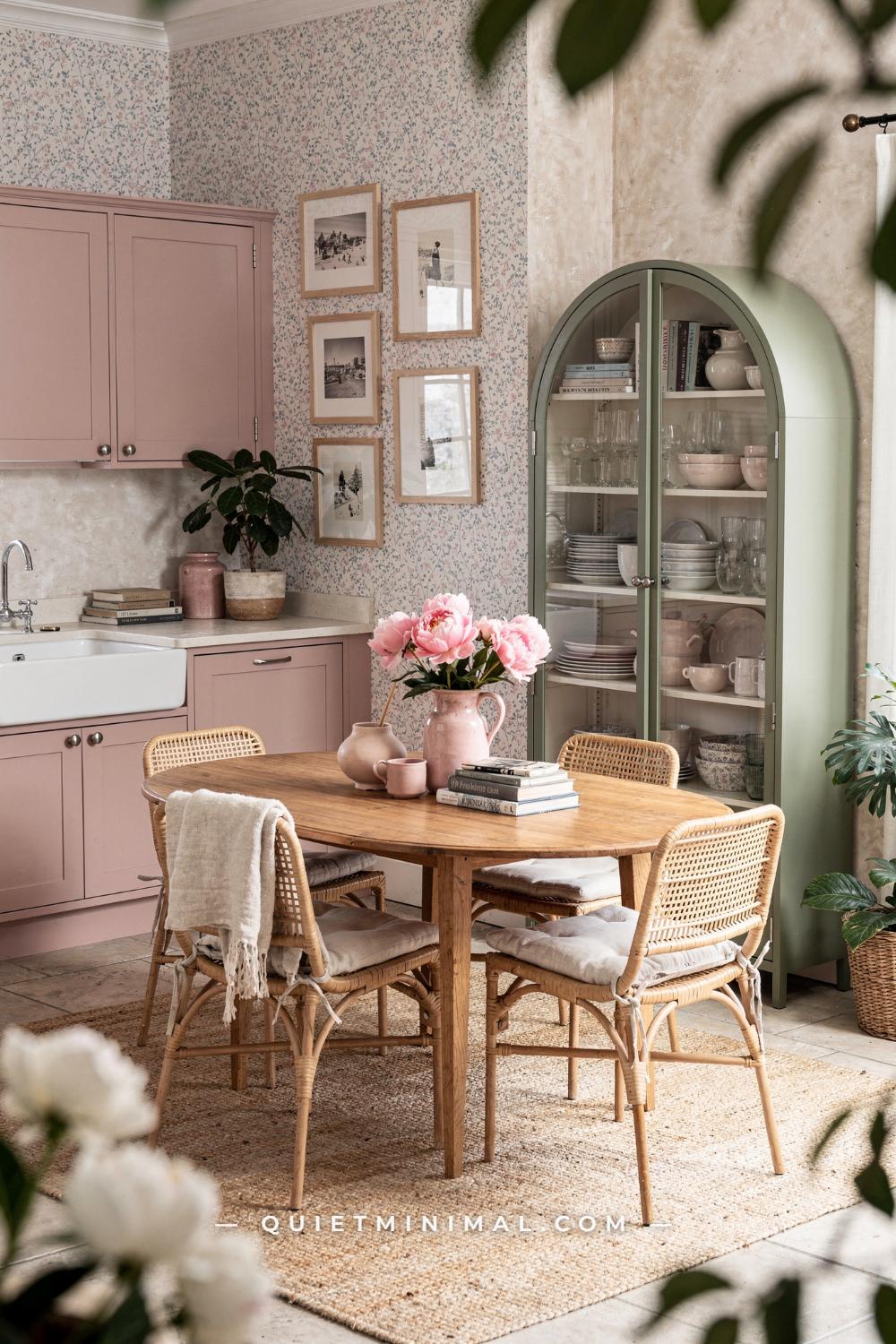
The open-plan kitchen-dining room is where Danish pastel makes its strongest argument, and also where most people make their first mistake. The instinct is to pick one pastel and repeat it everywhere. Blush cabinets, blush cushions, blush rug. The result looks like a paint swatch, not a room. The room that works here does the opposite: it assigns each surface a specific role in the palette.
Blush pink claims the shaker cabinets, which run floor to ceiling and set the dominant tone. Sage green gets the arched display cabinet, approximately 30 in (76 cm) wide by 72 in (183 cm) tall, placed against the adjacent wall as a visual counterpoint. The oval dining table at roughly 60 in x 36 in (152 x 91 cm) stays in natural wood, which is critical: if that table were painted, the room would have no organic relief and the pastels would read as synthetic. The jute rug under the dining zone does the same grounding work on the floor plane.
The floral wallpaper on the feature wall is the element people are most afraid of, but it is the element that makes the room read as curated rather than kindergarten. A single papered wall, never all four, keeps pattern in its place. Look for a design that carries both the blush and the blue within its motif, so the wall reads as an intentional gathering of the room’s colors rather than a separate thing hanging on it.
Chrome cup pulls on the shaker cabinets are a subtler choice than brushed brass, but both work. What doesn’t work is matte black hardware: it introduces a visual weight that fights the softness of the blush. If you have black hardware and can’t change it, shift your secondary pastel toward a deeper sage or dusty blue to absorb the contrast.
The white apron sink is not optional as a “nice to have.” It’s structural. The white breaks the continuous blush cabinetry surface and gives the eye a pause point. Without it, the cabinet run reads as a painted box.
Key Takeaway: In a Danish pastel kitchen-dining room, each surface gets one color role: cabinets in the dominant pastel, display piece in the secondary pastel, and the dining table in raw natural wood as the essential neutral anchor.

—
2. Build a Vanity Corner Around a Mirror, Not a Desk
 Save
The bedroom vanity is a high-leverage spot in a Danish pastel room because it concentrates detail into a small footprint, making it one of the easiest areas to style and also one of the easiest to over-style. The design principle here is hierarchy: one large anchor piece, two medium supporting pieces, and three or fewer small props.
The anchor is the round mirror. At roughly 24 in (61 cm) in diameter with a gold rim, it sits centered above the desk and pulls the eye immediately. The desk below, a lacquered white rectangle approximately 47 in x 20 in (120 x 50 cm), is essentially a pedestal for the mirror and the things on it. Resist the urge to buy a desk with a hutch or built-in shelving: those break the clean line between desk surface and mirror, and they eat the visual breathing room the style depends on.
The boucle accent chair with slender oak dowel legs is doing more work than it appears to. The nubby texture of boucle contrasts the glossy lacquer surface of the desk in a way that velvet or linen would not, because boucle has enough visual grain to register against hard shine. At roughly 30 in (76 cm) tall, the chair sits just below desk height, keeping the whole vignette low and intimate rather than imposing.
The layering on and around the desk follows the rule of odd numbers and varying heights. The white ceramic lamp with a pinched waist at approximately 18 in (46 cm) tall takes the left side. The white ribbed vase with pink tulips sits lower at mid-desk height on the right. The Matisse print and botanical illustration in thin oak frames flank the mirror: frame width matters here, no thicker than 1 in (2.5 cm), because heavier frames shift the feeling from Danish pastel toward something more traditional. The trailing pothos softens the right edge of the composition without adding another hard object.
The failure mode is buying a round mirror with a decorative frame that is too ornate. Chunky carved gold or layered plaster frames overwhelm the surrounding pieces. The correct frame is thin, round, and simply rimmed.
Key Takeaway: A Danish pastel vanity corner is organized around the mirror as anchor, with every other piece chosen to contrast one texture against the desk’s glossy surface.

—
3. Let the Sofa Set the Palette’s Temperature
 Save
Danish pastel separates into two temperature families: warm-leaning (blush, peach, coral, butter, terracotta) and cool-leaning (powder blue, mint, lavender, sage). Mixing across both families without an anchor is the most common reason a Danish pastel living room looks accidentally confused rather than intentionally eclectic. This room solves it by letting the sofa set the temperature family and then building outward from there.
The cream stripe modular sofa, approximately 98 in (249 cm) wide, is a warm neutral: not cold white, not beige, but a warm cream with a ribbed stripe that adds texture without pattern. That warm base makes coral and tangerine on the cushions feel cohesive rather than shocking. If the same sofa were an icy white or a cool dove gray, the coral cushions would feel harsh. Temperature alignment is the invisible logic behind why some rooms look effortless and others look assembled from random Pinterest saves.
The round walnut coffee table at approximately 36 in (91 cm) diameter is critical because walnut is a warm wood. Swap it for a pale birch and the table competes with the warm palette rather than belonging to it. Swap it for a glass table and you lose the grounding weight entirely. The table height should sit within 2 in (5 cm) of the sofa seat height for proportion: too low and the room looks unfinished, too tall and it blocks sightlines across the seating area.
The wavy-edge green glass pendant, approximately 18 in (46 cm) in diameter, is the signature Danish pastel lighting move. The organic handblown glass form reads as both sculptural and approachable. Hang it so the bottom of the shade sits at approximately 7 ft (213 cm) from the floor in rooms with standard 9 ft (274 cm) ceilings. Hanging it too low creates a physical obstruction; too high and it becomes a background lamp rather than a design moment.
The bird of paradise in a white pot at the right corner is not decorative filler. At 5 to 6 ft (152 to 183 cm) tall, it provides the vertical element the room needs without adding another hard surface or object. The plant and the cherry blossom branch foreground are the botanical counterpoint that prevents the room from reading as purely manufactured.
Key Takeaway: Choose a sofa in your temperature family first, warm or cool, and buy every other major piece within that same temperature range before adding accent color.

—
4. Use a Gallery Wall as a Color Inventory
 Save
A gallery wall in a Danish pastel room is not decoration added after the room is done. It is a color inventory: a concentrated area where every hue you plan to use elsewhere in the room appears first, in printed form, before you commit to buying furniture or ceramics in those colors. This is the planning technique that makes eclectic Danish pastel rooms look intentional rather than accumulated.
The light oak rattan-cane sideboard at approximately 55 in x 16 in x 28 in (140 x 40 x 71 cm) sits as the base for this corner. The splayed angled legs are functional: they lift the piece visually off the floor so the light wood floors below remain visible, which maintains the airiness the style needs. A sideboard with a solid plinth base or cabinet legs that go straight down would read as heavier and older. If you’re buying new, the angled-leg profile is the right choice for Danish pastel.
The gallery wall behind it carries lavender, peach, orange, and hot pink across multiple prints. The rule for making mismatched prints cohere: stay within a consistent illustration style. Flat graphic prints mix with flat graphic prints. Painterly figurative prints mix with painterly figurative prints. Combining a flat graphic print with a detailed photorealistic artwork creates visual friction the eye cannot resolve. Look for prints that share a similar line quality and color saturation level.
The orange dome ceramic vase at approximately 10 in (25 cm) diameter is doing two things simultaneously: it is a direct color echo of the orange in the gallery prints above it, and it is the first object you see on the sideboard surface, drawing the eye upward to the prints. This echo technique, placing on a flat surface a ceramic or object that matches a color in the art above it, is the single most useful trick for making a gallery wall feel like it was planned and not just hung.
The purple twisted ceramic pedestal stool holding the Calathea plant, approximately 18 in (46 cm) tall, introduces the room’s wildcard color. The twist surface texture catches light differently than the smooth orange vase glaze or the woven rattan door, creating the tactile variety that keeps a room from feeling flat at any single viewing angle.
Key Takeaway: Treat your gallery wall as a color inventory: every ceramic, textile, or accent piece in the room should echo at least one color already present in the prints.

—
5. Design a Studio Bedroom With Clear Zone Separation
 Save
A studio apartment presents a specific problem for Danish pastel: the style depends on breathing room, but a studio is one room trying to be several. The solution is zone separation through rug placement and furniture orientation, not through walls or dividers. The cream boucle modular sofa at approximately 90 in (228 cm) wide and low-profile is pointed toward the center of the space, defining the living zone. The white iron single bed at approximately 39 in (99 cm) wide is positioned on the opposite wall, and the cloud-edged aqua rug beneath the sofa zone marks the boundary between the two areas without a physical barrier.
The cream glossy organic-form coffee table at approximately 40 in (101 cm) long is deliberately low: at around 14 to 16 in (35 to 40 cm) high, it sits well below sofa height and keeps the sightlines open across the full room. A taller coffee table or a large cube ottoman would block the view of the bed zone from the sofa, making the studio feel segmented and smaller. The kidney or organic blob shape in glossy cream rather than glass means it reads as part of the soft pastel palette rather than as a transparent void.
The powder blue linen on the bed is the main color commitment in the bedroom zone. Pink sheer curtains across the full window wall at the rear are a deliberate choice: sheers filter without blocking light, and at a Danish pastel budget they are the fastest way to add color to a room without painting walls (relevant for renters). Cotton candy pink sheers in a full-length floor-to-ceiling drop at approximately 96 in (244 cm) make the ceiling feel taller.
The failure mode in a pastel studio is using too many furniture pieces at the boundary between zones: a console table, a freestanding shelf unit, and a decorative screen all at once. Pick one zone-defining strategy and commit to it. The rug does the work here; the furniture does not need to add to it.
Key Takeaway: In a pastel studio, the rug defines the zone boundary; furniture height must stay low enough to preserve sightlines across the entire room.

—
6. Choose Velvet for the Main Sofa in a Lush Urban Living Room
 Save
Sage green velvet is the material choice that separates a Danish pastel living room from a generic pastel one. Velvet catches directional light differently across its pile depending on the viewing angle: from straight on, sage velvet reads as a warm middle-green; at a side angle, it deepens toward forest. That variation means the sofa does not read as flat color, and it does not need pattern or texture thrown at it from cushions alone to feel interesting. The L-sectional at approximately 110 in (280 cm) wide is large enough to anchor the whole room without additional accent chairs.
The cushion strategy on a velvet sectional is to introduce a lighter pastel and a pattern. Lavender cushions against sage velvet work because they sit on opposite ends of the cool pastel spectrum without clashing: both are muted, low-saturation. The floral print cushion introduces an additional hue (likely blush or ivory) as a third player. Do not stack more than five cushions on a sectional of this size, and do not use more than three distinct pillow fabrics. The failure mode is cushion overcrowding, which reads as disorganized and eliminates the sofa’s own material as a readable feature.
The round rustic solid-wood coffee table at approximately 40 in (101 cm) diameter is deliberately rough-hewn, with visible grain and imperfections. This is a counterweight to the velvet luxury. An all-smooth room, velvet sofa plus lacquered table plus painted walls, reads as showroom rather than lived-in. One rough-hewn natural surface in every Danish pastel room anchors it in real life.
The gallery wall behind the sofa should hang so its lowest frame sits approximately 6 in (15 cm) above the sofa back. Hanging lower creates visual confusion between the sofa and the wall. Hanging higher than 12 in (30 cm) disconnects the gallery from the furniture below it and the composition floats.
Plants at the sliding glass door do the work of softening the frame of the room’s best architectural feature: the city view. The monstera and bird of paradise at 5 to 6 ft (152 to 183 cm) tall flank the door symmetrically, and their green reads as a living extension of the sage sofa.
Key Takeaway: Sage green velvet earns its place as the Danish pastel sofa material because its directional pile creates natural visual depth without requiring pattern at the furniture scale.

—
7. Make One Appliance the Anchor in a Retro Pastel Kitchen
 Save
The retro freestanding refrigerator in baby blue is the most polarizing element in this corner, and it is also the most effective. In a standard kitchen, appliances are hidden or matched to cabinetry. In a Danish pastel kitchen, one hero appliance becomes the anchor the room is built around. The baby blue refrigerator at approximately 24 in x 60 in (61 x 152 cm) earns that role because its enamel finish is smooth, its color is clear and unmuddy, and its retro silhouette has a sculptural quality that modern stainless appliances lack.
The critical pairing rule here is that every other smooth surface should carry a different pastel, never repeat the baby blue. The round lilac pedestal dining table at approximately 30 in (76 cm) diameter in matte lacquer introduces the second color. The pale blue and white checkered tile floor carries a blue-adjacent tone that bridges the refrigerator and the wall without simply repeating it. The bubblegum pink Windsor-style chair and the lime green metal folding chair create the intentional mismatch. Two chairs, two colors: not three and not four. Mismatched chairs work in Danish pastel when there are two of them; beyond that, the corner loses cohesion.
The shiplap-paneled wall painted in a warm cream plays against the cool blues and pinks without competing with any of them. Shiplap adds horizontal texture at low cost, and in a small kitchen corner it makes the wall feel wider. The crystal chandelier overhead is the unexpected formal note that keeps the room from reading as purely playful: one refined element in a whimsical room signals deliberate intent rather than accidental accumulation.
The failure mode with a retro statement appliance is surrounding it with too many other statement pieces at the same visual scale. The chandelier works because it hangs overhead and takes no floor space. A second large-scale statement piece at floor level would compete directly with the refrigerator and neither would win.
Key Takeaway: When a statement appliance anchors a Danish pastel kitchen corner, every other major surface must carry a different pastel, and no second large-scale object should compete with it at floor level.
—
8. Anchor a Reading Living Room With Textile Layering
 Save
The cottagecore variant of Danish pastel leans on textile layering more than any other sub-style, and the slipcovered sofa is the load-bearing piece of that approach. A slipcover in warm cream linen at approximately 84 in (213 cm) wide gives you a surface you can pile with pattern: gingham cushions, floral cushions, and a woven throw can all live on the same sofa because the slipcover itself is a neutral. If the sofa were blush velvet, only one of those three cushion patterns could coexist with it before the combination became too busy.
The honey oak freestanding bookshelf at approximately 30 in x 70 in (76 x 178 cm) provides the room’s primary vertical interest. Styling a bookshelf in a Danish pastel room follows a simple rule: books spines facing forward for the first three shelves, small plant pots or ceramic objects interspersed every three to four books. Do not pull the books out of order to create a “color-blocked” arrangement: it reads as performed rather than lived-in and it is the first thing that dates a bookshelf photograph. Keep the books upright and in their natural order, and let the plant and ceramic color do the color work.
The low rectangular coffee table with a rattan undertray at approximately 48 in x 24 in (122 x 61 cm) keeps the eye low in the room, reinforcing the sense of relaxed comfort. The rattan undertray introduces woven texture at floor level, which balances the woven gingham pattern on the sofa cushions without repeating the exact same material.
Ivy trailing along the curtain rod is the single greenery move that costs nothing and adds the most warmth per square inch of any element in this room. Run the trail from the curtain bracket outward toward the wall, not downward over the window: trailing down blocks light and obscures the window frame.
Warm amber floor lamp light from the back-left corner is doing the heavy lifting for evening ambience. Avoid overhead LED panels in a Danish pastel reading room: the flat even illumination erases the coziness that soft-source lighting creates.
Key Takeaway: In a Danish pastel reading room, the slipcovered sofa is the neutral foundation that allows maximum cushion pattern variety; the bookshelf provides vertical scale, not color.

—
9. Use a Kitchen Island to Introduce Mismatched Stool Colors
 Save
The kitchen island is where Danish pastel makes its strongest kitchen argument because it is the one surface that can carry color without committing every cabinet in the room to it. The sage green shaker island at approximately 60 in x 30 in (152 x 76 cm) with a butcher block countertop is the right format: the island gets the color, the surrounding wall cabinets match it, and the butcher block top stays in warm natural wood. This is a deliberate choice: a painted or quartz countertop on this island would push it from cottage-kitchen into something harder and more modern. Butcher block at this scale warms the whole room by roughly one stop on the visual temperature scale.
The mismatched bar stools in blush pink, butter yellow, and sage green are the detail everyone notices and almost everyone gets wrong. The rule is one stool per color, and all three stool silhouettes should match. The round seat at approximately 18 in (46 cm) diameter is what creates the family resemblance across three different colors. If the pink stool is round-seated and the yellow stool is square-padded and the sage stool is a bucket seat, the mismatch reads as accidental. Matching silhouette, varied color is the formula.
The pink dome pendant light above the island at approximately 14 in (35 cm) diameter echos the blush stool. Pendant scale is proportional to island length: for a 60 in (152 cm) island, one pendant at 14 in (35 cm) is appropriate. For an island at 80 in (203 cm) or longer, two pendants at 12 in (30 cm) each, spaced 20 in (50 cm) apart centered over the island length, are better than one large pendant.
The white shiplap backsplash rather than subway tile makes the room read as intentionally casual rather than restaurant-kitchen precise. Danish pastel kitchens should feel inhabited, not installed.
Key Takeaway: Mismatched bar stools work in a Danish pastel kitchen only when all stool silhouettes match: identical seat shape in three different pastels, never three different shapes in three different colors.

—
10. Style a Credenza Surface With the Echo Technique
 Save
A credenza surface is roughly 16 in (40 cm) deep and whatever width your piece happens to be, which in this case is approximately 55 in (140 cm). That is not a lot of horizontal space, and the temptation is to fill it with as many objects as possible. The credenza surface that actually reads as Danish pastel follows a strict hierarchy: one large centerpiece, one medium supporting piece, and one smallest detail. That is three objects total, not seven.
Here the large centerpiece is the orange donut-form ceramic bowl at approximately 12 in (30 cm) diameter, centered on the credenza. A donut bowl or ring form is specifically a Danish pastel product signature because its shape is recognizable, sculptural, and available in every pastel. The medium supporting piece is the terracotta ceramic vase at approximately 10 in (25 cm) tall with peach tulips: the tulips add organic height and the terracotta clay reads as a material echo of the orange glaze on the bowl. The stack of coral and pink art books is the third detail: books on a credenza serve a dual purpose as color object and implied lifestyle signal.
The gallery wall above follows the same warm temperature family as the surface below: warm-pink and orange figurative prints in thin oak frames. Oak frames here are the right choice over ornate gold because the credenza itself is light oak, and repeating the wood species in the frames creates a quiet material continuity that the eye reads as intentional without being able to name exactly why.
Plants flanking both sides of the credenza at 5 to 6 ft (152 to 183 cm) tall are the room’s depth mechanism. They push the credenza visually forward by providing a dark-green backdrop that separates it from the wall behind. Without the plants, the credenza reads as a piece sitting against a flat surface. With the plants, it reads as a composition in space.
Key Takeaway: Style a Danish pastel credenza with exactly three objects in descending scale, each carrying a color that echoes a print in the gallery wall directly above.

—
11. Use an Accent Wall to Frame the Bed Without Painting Everything
 Save
The painted accent wall behind the bed is one of the fastest ways to make a Danish pastel bedroom feel intentional in a rental. You paint one wall, you commit to one color, and the furniture does not need to do any of the color work because the wall is already doing it. The chartreuse-green or yellow-green used here is a bold choice: it is not a standard pastel, it is a pastel pushed toward yellow and lime, and that slight aggression is precisely what makes it interesting. Standard-issue blush or lavender on the accent wall reads as expected. A yellow-green reads as considered.
The wave-shaped painted form, rather than a full rectangular wall of color, adds a second design move without a second paint color. The wave or arch shape frames the bed headboard zone specifically, so the color effect is concentrated where the bed needs visual support. This is particularly useful if the bed itself is a simple white platform at approximately 54 in (137 cm) wide, full size, without an upholstered headboard: the painted wave performs the headboard function in color rather than furniture.
The white dresser at approximately 36 in x 40 in (91 x 101 cm) with round lavender hardware is a lesson in hardware impact. A white dresser with chrome or white knobs reads as utilitarian. The same dresser with 1.5 in (3.8 cm) round lavender ceramic knobs reads as Danish pastel. Hardware is the lowest-cost intervention in this room and the highest-leverage one. Change the knobs before you buy a new piece.
The daisy-shaped rug on the warm wood floor at a reasonable size for a full bedroom, approximately 60 in (152 cm) in diameter, provides the playful floor element without requiring a large rectangular rug that would require significant budget. Shaped rugs in Danish pastel rooms work because the shape itself contributes to the aesthetic language of curves and organic forms.
Key Takeaway: A wave-shaped painted accent wall behind the bed frames the sleeping zone and performs the visual function of a headboard in color rather than furniture.

—
12. Design a Kitchen-Dining Hybrid With Deliberate Chair Mismatching
 Save
The two-tone kitchen, powder blue upper cabinets and sage green lower units, is the Danish pastel kitchen move that most people see on Pinterest and most people are afraid to commit to. The hesitation is understandable: two different pastel cabinet colors sounds like a lot. In practice, it works because upper and lower cabinets are visually separated by the backsplash and countertop line, which means the eye processes them as two independent surfaces rather than one color decision.
The flat-front handle-free door profile matters here. Push-to-open cabinets or recessed-bar handles keep the surface uninterrupted, which is necessary when the cabinet color is already carrying significant visual weight. Add any ornate hardware and the cabinets become busy. The handle-free flat front is the only appropriate door profile for a two-tone Danish pastel kitchen.
The thin vertical rib tile backsplash between the upper and lower cabinets is the material transition. Vertical rib tile draws the eye upward, making the ceiling feel taller. It also introduces a third surface texture, flat cabinet above, ribbed tile in the middle, and smooth countertop below, that prevents the kitchen from reading as monotonously flat.
Four mismatched pastel dining chairs around the round tulip-base oak table at approximately 36 in (91 cm) diameter is where the kitchen gets its Danish pastel character. The four-chair mismatch strategy requires a unifying element: in this case, all chairs are at the same seat height and all are small-scale in silhouette. A white tulip chair, a green rattan armchair, and a blush pink side chair function as a collection when they are all slender and seat-forward. Substitute a large wing chair into that collection and it dominates the others.
Pale maple parquet flooring in a herringbone or straight-stack pattern keeps the floor light and warm, which both pastel palettes need as their grounding surface. A dark floor would make the pastels read as lighter and more floating; a cold gray floor would fight the warm oak dining table.
Key Takeaway: Two-tone pastel cabinetry works only with handle-free flat-front doors; any hardware ornament makes the color combination read as too busy.

—
13. Make a Reading Corner Work With One Round Chair
 Save
The reading corner is the highest-impact low-footprint investment in a Danish pastel home. You are working with one chair, one side table, one lamp, one rug, and one wall treatment: five decisions total. That limited scope means each decision carries significant weight.
The oversized round swivel chair at approximately 42 in (107 cm) diameter in baby blue velvet is the room’s singular statement piece. The size matters: a smaller chair at 32 in (81 cm) reads as a basic armchair. At 42 in (107 cm), the round form reads as a furniture object with architectural presence. The swivel function is not purely decorative: it allows the sitter to turn from reading to conversing without rearranging the furniture, which makes the corner genuinely livable rather than just photographable.
The chunky knit throw in lavender-to-cream gradient draped over the arm is a Danish pastel signature. The gradient, moving from a deeper lavender at one end to cream at the other, introduces tonal variation without adding a second solid color. Drape it over the chair arm rather than folding it into a square on the seat: folded reads as prepared for photography; draped reads as actually used.
The white tulip-base side table at approximately 16 in (40 cm) diameter should sit at chair arm height, approximately 26 to 28 in (66 to 71 cm) from the floor, so a book or a mug can rest there without reaching. Too low and it’s decorative only. Too high and it blocks the chair’s visual silhouette.
The rattan arc floor lamp at approximately 60 in (152 cm) tall with a woven shade belongs behind the chair, not beside it. “Behind” means the arc curves over the reader’s shoulder so the light source is above and slightly ahead, not at eye level. Eye-level lamp positioning creates glare when reading.
Trailing pothos strung with warm fairy lights across the wall above the chair is the accent that costs the least and photographs the most: a 6 ft (183 cm) pothos vine with a 20-light strand costs less than most throw pillows and delivers the full Danish pastel aesthetic in this corner immediately.
Key Takeaway: A 42 in (107 cm) round swivel chair in velvet earns its place in a Danish pastel reading corner through size and material alone; the five supporting decisions build inward from there.

—
14. Tile a Bathroom in Multicolor Pastels for a Full Candy-Sweet Effect
 Save
A full-tile pastel bathroom is the Danish pastel move that reads as the most committed and the most potentially divisive. In a bathroom, tile is semi-permanent: you cannot swap it as easily as a cushion or a throw. That permanence means the color decision must be made at the palette level, not the individual tile level.
The multicolor alternating tile grid in blush, mint, lavender, butter, and peach works because all five colors have the same saturation level: they are all equally soft, none of them bolder than the others. If one tile is a vivid lime green and the rest are soft pastels, that single tile dominates every other square in the grid and reads as an error rather than a choice. Source all tiles from the same manufacturer’s pastel collection or verify that all colors share a matching sheen level (matte or gloss) before ordering.
You've saved it, wanted it. Here's the how: codes, measurements, order. Your choices make it yours.

The floating open vanity shelf at approximately 36 in (91 cm) wide with a white surface provides the visual rest point in an otherwise fully tiled room. Open vanity shelving in a colorful bathroom means the pastel accessories on the shelf, small bottles, a hand towel, a plant, remain visible and contribute to the color story rather than being hidden behind cabinet doors. The tradeoff is that visible clutter on an open shelf in a colorful bathroom reads as chaotic immediately. Edit the shelf to seven objects maximum.
The oval vessel sink basin at approximately 16 in (40 cm) diameter in white ceramic is the correct sink choice for this bathroom: it sits above the vanity surface, reads as a sculptural object, and keeps the vanity surface visible below it. An undermount sink would be equally clean but would not carry the same design statement at the counter level.
The LED-glow rounded-rectangle mirror at approximately 20 in x 24 in (51 x 61 cm) is the bathroom’s only light source in this composition. In a tile-heavy room, the mirror light should be warm in color temperature, approximately 2700 to 3000K, not cool. Cool LED light (5000K and above) turns pastel tiles slightly gray and removes the candy warmth the room is built on.
Key Takeaway: Multicolor pastel tiles work only when all colors share an identical saturation level and sheen finish: one rogue bold tile in a soft grid destroys the cohesion.

—
15. Build a Cottage Dining Room Around a Centerpiece Floral Arrangement
 Save
The cottage dining room solves a specific Danish pastel problem: how do you make a dining table, an inherently functional piece, feel like a design moment without staging it for photography every meal? The answer is a permanent centerpiece arrangement large enough to read at room scale.
The white farmhouse rectangular table at approximately 60 in x 36 in (152 x 91 cm) is a deliberate neutral: white farmhouse table is the dining equivalent of a cream slipcovered sofa. It provides a clean base from which the chairs can do the color work. The Windsor-style chairs in blush pink, mint, and butter yellow follow the same mismatched-chair rule as Section 9: matching silhouette, different colors. Windsor chairs specifically work here because their spindle back has a visual lightness that does not compete with the vase arrangement at the table’s center.
The sky blue ceramic vase at approximately 14 in (35 cm) tall is the largest object on the table and the room’s visual anchor. Garden roses, hydrangea, and eucalyptus at a total height of approximately 20 to 24 in (50 to 60 cm) above the vase rim means the top of the arrangement reaches roughly 34 to 38 in (86 to 96 cm) from the table surface: tall enough to be seen from across the room but not so tall it blocks face-to-face conversation across the table. The rule is that the top of a dining centerpiece should not exceed seated eye level, approximately 46 to 48 in (117 to 122 cm) from the floor.
The walls in a pale blue-green tone are the backdrop that makes the sky blue vase read as intentional rather than arbitrary. When wall color and vase color share the same base hue at different saturations, the room reads as a tonal study rather than a random assembly. The sheer floral curtains filtering light through the window keep the room feeling airy: lined or blackout curtains in this room would visually compress the space.
The white beadboard hutch along the wall is styled with pastel ceramics in the same family as the chair colors: blush, mint, and butter. The hutch and its ceramics function as the room’s color inventory made physical, an extension of the dining table’s palette into the cabinetry zone.
Key Takeaway: The dining table centerpiece arrangement should sit at a maximum of 34 to 38 in (86 to 96 cm) total height from the table surface so it reads at room scale without blocking sightlines across the table.

—
16. Use an All-White Studio as the Canvas for Color Punctuation
 Save
The all-white studio approach is the opposite of the multicolor strategy, and it requires a different discipline. When walls, sofa, floor, and sideboard are all cream-white, color appears only through deliberate punctuation: the yellow coffee table, the pink mirror, the gallery wall art. Because every colored object is surrounded by white, each one carries enormous visual weight. This means you need fewer of them, not more, and you need each one to be specifically chosen rather than just pastel-colored.
The cloud-form white boucle modular sofa at approximately 90 in (228 cm) wide is the room’s largest surface and it is white. This is only possible in a home without young children or pets, and it requires removable boucle cushion covers that can be laundered. If your lifestyle rules out a white sofa, the all-white studio approach does not work: substitute cream-white walls and a pale blue or sage sofa instead, and the same color punctuation logic applies.
The yellow drum coffee table at approximately 18 in (46 cm) diameter and approximately 14 in (35 cm) tall is the room’s primary color decision. At this size, it is small enough to read as an accent object rather than a furniture anchor. It sits at the same low height as the organic-form tables in other sections, reinforcing the Scandinavian preference for low horizontal furniture that keeps sightlines open.
The pink wavy full-length floor mirror at approximately 20 in x 60 in (51 x 152 cm) standing in the corner is the room’s signature piece. The wavy frame in pink is the most widely recognized Danish pastel design element, and its presence in a corner takes zero floor space while adding significant visual height. A mirror in the corner also reflects the room back on itself, making the studio appear larger and allowing the pastel gallery art to be seen from multiple angles.
The pastel gallery wall behind the sofa, with heart and sun abstract prints, is the room’s only concentrated color surface. In an all-white studio, this wall performs the function of a painted accent wall: it gives the eye a destination without committing the room to a permanent color.
Key Takeaway: In an all-white Danish pastel studio, each colored object carries proportionally more visual weight, so three deliberate punctuation pieces, yellow coffee table, pink mirror, and gallery wall, are more than enough.

—
17. Build a Window Seat Into a Compact Living Room’s Color Strategy
 Save
A built-in window seat in a compact living room solves a specific spatial problem: the area below a wide garden window is typically unused space, and a bench there creates seating without pulling a piece of furniture away from the wall into the room’s center. For Danish pastel, the window seat cushion is a major color commitment because it sits at eye level from the room’s entrance and it runs the full window width at approximately 72 in (183 cm) long. Sage green is the right choice here because it reads as calm and natural against a backdrop of garden daylight: the green inside and the garden outside create a visual continuity that makes the room feel larger.
The pink velvet scallop-back accent chair alongside is the secondary seating piece and the room’s main color contrast. Scallop-back chairs are a Danish pastel signature because the scallop silhouette is a soft curved form that belongs to the same formal family as wavy mirrors and round coffee tables. At approximately 28 in x 30 in (71 x 76 cm), it is a small chair, which is correct: a compact room cannot absorb a large armchair without losing the proportional balance.
The round ribbed cream drum coffee table at approximately 24 in (61 cm) diameter is the session connector between the bench and the chair: it is accessible from both seating positions. The ribbed surface in cream plaster or paper-mache finish adds texture to the room’s center point without competing with the sage cushion or the pink velvet. A smooth glass table would disappear visually; a dark wood table would fight the sage green.
The multi-stripe abstract rug beneath the coffee table carries every pastel in the room, sage, blush, cream, and the warmer honey tones of the wood floor edge. A stripe-pattern rug is the single easiest way to introduce multiple pastels to a floor plane without buying a complex geometric or floral: the stripes read as simple and modern while doing significant color work.
Key Takeaway: A built-in window seat cushion in sage green creates both practical seating and a color anchor that the garden daylight intensifies, without pulling furniture into the center of a compact room.

—
18. Make Appliances Into Art Objects in a Pastel Kitchen Corner
 Save
Treating appliances as art objects is a Danish pastel kitchen approach that requires buying specific appliances for their visual design and color rather than for their brand or feature set. The powder blue kettle, toaster, and countertop microwave in matching enamel-smooth finish are the three-piece set that creates the “curated appliance shelf” effect: when all three appliances are the same color family and the same finish quality, they read as a designed collection rather than as random purchases.
The open metal lean-to shelving unit at approximately 24 in x 60 in (61 x 152 cm) in matte-finish pink metal is the shelf system that makes this approach work in a kitchen corner. Lean-to shelves require no wall attachment beyond a single top hook or lean support: they are the rental-friendly alternative to fixed shelving, and they can be relocated when you move. The matte pink finish of the shelf contrasts the enamel-smooth finish of the appliances, creating the matte-versus-gloss tactile dialogue that gives this corner its visual interest.
The pink lower cabinets and half-painted pink wall above a chair rail are two separate decisions that work together to create depth in the corner without painting the whole kitchen pink. A half-painted wall, color below the chair rail line and white or cream above, is a low-commitment way to test a bold cabinet color before committing to all four walls. In this kitchen the chair rail sits at approximately 36 in (91 cm) from the floor, which aligns with standard countertop height and makes the transition logical rather than arbitrary.
The mosaic patterned kitchen splashback in white and blue introduces the pattern element that keeps the pink-dominant corner from reading as one-dimensional. Mosaic tiles behind the shelving unit rather than behind the stove are unusual: it signals that this kitchen is designed rather than default.
The woven geometric runner on the warm wood floor adds the floor-level softness and color: approximately 20 in x 60 in (50 x 152 cm) runners are the kitchen-appropriate rug format, narrow enough to not obstruct traffic flow and long enough to anchor the appliance shelf zone visually.
Key Takeaway: Color-matched enamel appliances in the same finish family read as a designed collection on open shelving; without the matching finish quality, the same color across different appliances reads as coincidence.

—
19. Choose the Bed Frame as the Room’s First Color Decision
 Save
Most people choose their bed frame last, after bedding and furniture and rugs. In a Danish pastel bedroom, that order should be reversed: the bed frame is the room’s largest single color surface, and it should be chosen first, with everything else built around it.
The yellow scallop-edge upholstered bed frame at full size, approximately 54 in (137 cm) wide, is the dominant color decision in this room. Butter yellow is not a timid pastel: it reads clearly and warmly in any light, and the scallop edge at the headboard top adds a feminine detail that is distinctly Danish pastel. The failure mode with a colored upholstered bed frame is pairing it with bedding in the same color family. Yellow bed frame with yellow bedding washes the room in one temperature and eliminates contrast. The solution here is green gingham: the mint green gingham duvet is a direct complement to the butter yellow frame, and the gingham pattern adds a casual energy that prevents the room from feeling overly formal.
The floral white bedding overlay above the gingham creates a pattern mix: gingham below, floral on top. This works because both patterns are at the same scale and both are in the same cool-to-neutral temperature range. A large-scale floral on top of a gingham would create scale conflict; a stripe on top of gingham would compete for dominance. Floral-plus-gingham is a specifically cottage-correct combination.
The yellow mushroom table lamp at approximately 12 in (30 cm) tall on the white writing desk is the color echo that ties the desk zone back to the bed zone. The lamp is in the same butter yellow as the bed frame: the repetition of that color across opposite sides of the room, bed on one side and desk lamp on the other, creates a color rhythm that makes the room feel planned.
The lavender checkerboard floor rug introduces the third pastel at floor level. Checkerboard is the Danish pastel pattern that references retro aesthetics without committing to a fully maximalist approach: it reads as playful but structured.
Key Takeaway: Choose the colored upholstered bed frame before any other bedroom purchase, then build the bedding in a complementary color rather than a matching one to preserve contrast.

—
20. Build a Console Vignette Around Symmetry and Scale
 Save
A symmetrical console vignette is the Danish pastel move that feels the most polished and requires the least number of pieces to execute correctly. Two lamps, one large piece of art, and three objects between the lamps: that is the entire formula. The symmetry reads as intentional at first glance; the pastel colors and the art make it feel relaxed and personal rather than hotel-lobby formal.
The pale pink marble-top console table at approximately 48 in x 14 in (122 x 35 cm) introduces marble to a Danish pastel room for the first time in this article. Marble belongs in Danish pastel when it is a soft-toned marble, blush-veined or cream, and not a stark white Calacatta or a black-veined statement slab. The depth of the console at 14 in (35 cm) is appropriate for a living room: deep enough to hold a lamp base without it hanging over the edge, shallow enough to not impede traffic flow.
The pair of seafoam green ceramic table lamps at approximately 24 in (61 cm) tall with white drum shades are the symmetry anchors. Identical lamps flanking a central piece of art is a formula borrowed from traditional interior design, but in Danish pastel the ceramic glaze color and the art content make it feel contemporary. Shade dimensions matter: the drum shade diameter should be approximately 12 to 14 in (30 to 35 cm) at the bottom, narrow enough to look proportional with a slender lamp body.
The large abstract painting in pastel color blocks, carrying pink, teal, green, lavender, and orange, is the room’s color statement and should be sized to fill approximately 70 percent of the console width. For a 48 in (122 cm) console, that means the art should be approximately 34 to 36 in (86 to 91 cm) wide. Undersized art on a console looks like it belongs in a smaller room.
The amber glass sphere vase at approximately 8 in (20 cm) diameter, placed center-console between the lamps, introduces the one warm tone in a cool-pastel composition. Amber against seafoam green creates a natural complementary contrast: they sit opposite each other on the color wheel and make each other look more vivid without either becoming dominant.
Key Takeaway: The console vignette formula is two identical lamps flanking one piece of art at 70 percent of console width, plus one object in the complementary color to anchor the center.

—
21. Embrace Retro Maximalism With Bold Mixed-Pattern Cushions
 Save
The retro maximalist variant of Danish pastel is where most people abandon the style and say it doesn’t work for them: it looks incredible in photographs and chaotic in person. The difference between the rooms that work and the ones that overwhelm is the background discipline. Cream boucle rounded sofa, approximately 84 in (213 cm) wide, is the right base for mixed-pattern cushion play specifically because boucle is a nubby neutral. It absorbs and contextualizes the patterns on it rather than fighting them.
Three cushion patterns on a boucle sofa: pink checkered, black wavy-stripe, and orange heart-shaped. The formula that makes three patterns cohere is matching scale across at least two of the three. The pink checkered and the black wavy-stripe are both at a small graphic scale. The orange heart is a large repeat. Two at small scale, one at large: this hierarchy is what prevents the cushion arrangement from reading as cluttered. If all three cushions were at a different scale, the sofa surface would have no visual rest point.
The black wavy-stripe cushion is the one that surprises people. Black in a Danish pastel room is not a violation: it is the graphic anchor that prevents the room from looking too sweet. The key is limiting black to pattern rather than introducing black as a solid furniture color: a black cushion print versus a black coffee table is a very different intervention.
The lavender round pedestal coffee table at approximately 24 in (61 cm) diameter with a stacked art book arrangement is the room’s middle-ground connector: lavender sits between the blush and the orange on the warm-leaning pastel spectrum, and the round form belongs to the same formal family as the boucle sofa’s rounded arms. A rectangular coffee table would feel discordant against the sofa’s curves.
The green mushroom ceramic table lamp at approximately 10 in (25 cm) tall on the pink dresser behind the sofa introduces the room’s most unexpected color: green in a hot pink and orange composition. It works because it reads as the botanical note, a reminder of plant life, in an otherwise all-pastel-and-graphic room.
Key Takeaway: Retro maximalist Danish pastel cushion play requires two patterns at matching scale and one at a contrasting scale to give the sofa surface a readable hierarchy.

—
22. Create a Floor-Seat Cozy Zone With a Wavy Mirror Statement Piece
 Save
Floor-seat zones are a Danish pastel furniture move that comes directly from the hygge tradition: the closer seating is to the floor, the more intimate and informal the conversation it encourages. A cream round floor-seat pouffe at approximately 30 in (76 cm) diameter is not a substitute for a sofa; it is a supplementary gathering spot in a small sitting room that already has one armchair alongside it.
The tall wavy full-length mirror in a pink frame at approximately 26 in x 72 in (66 x 183 cm) is the statement piece that justifies the simplicity of everything else in this corner. A tall mirror standing against a blush wall in a small sitting room does two things simultaneously: it doubles the perceived depth of the room and it introduces a sculptural object that has significant visual presence without occupying floor space beyond its own footprint.
The wavy frame profile is the product signature of Danish pastel: regular rectangular frames belong to traditional interiors; circular frames belong to mid-century modern. The wavy or undulating profile is the specifically contemporary pastel form, and it signals aesthetic intent in the same way a gallery wall signals it in a living room.
The pink petal-shaped side table at approximately 14 in (35 cm) diameter sits beside the pouffe and holds a candle. This is the micro-moment of Danish pastel: a side table that is itself a sculptural petal form rather than a round disc or a rectangular end table. At this scale, approximately knee height when seated on the pouffe, it functions as a surface for a single object, a candle, a small plant, a cup, never more. Overloading a petal table reads as clutter immediately because the form itself is already visually busy.
The gallery wall in this corner follows the pink-toned single-color gallery rule: all prints carry pink as the primary or secondary color, moving from blush to dusty rose to cream across the frames. A monochromatic-toned gallery wall reads as cohesive in a small room even when the print subjects are completely different.
Key Takeaway: A tall wavy full-length mirror standing against a blush wall in a compact sitting room doubles perceived depth and functions as a statement piece without consuming any floor space beyond its own base.
—
23. Use a Color-Blocked Accent Wall to Anchor an Open-Plan Living Zone
 Save
In an open-plan apartment, the absence of walls makes zone definition difficult. Furniture placement and rug anchoring do part of the work. The accent wall does the rest: it creates a visual backdrop for the living zone that separates it from the kitchen zone without a physical partition.
The sage green accent wall behind the pink velvet sofa at approximately 84 in (213 cm) wide is the room’s primary color commitment, and the decision to use sage green rather than blush pink for the wall is counterintuitive but correct. If the wall and the sofa were the same color, the sofa would disappear into the wall. By using the sofa’s complement, sage green wall, blush pink sofa, the sofa reads clearly against its backdrop and the two tones intensify each other.
The floating shelves on the sage green wall at two heights, approximately 48 in (122 cm) from the floor and 64 in (163 cm) from the floor, carry the trailing pothos, ceramic vases, and a print. The lower shelf should hold the heavier ceramic objects; the upper shelf holds the print and the trailing plant. This staggered height creates the gallery-wall depth effect without committing to framed art on the sage wall itself.
The pink mushroom table lamp at approximately 10 in (25 cm) tall on the upper shelf is the warmth point: its pink glow echoes the sofa color and softens the sage green backdrop from cool to warm in evening light. In daylight the lamp is a color object; after dark it is a light source. This dual function is the efficiency logic behind Danish pastel accessory choices: objects that work in both light conditions earn their place.
The sage green kitchen island visible through the open plan creates a color echo across the full apartment: sage wall in the living zone, sage island in the kitchen zone. This repetition is the color story that ties both zones together without requiring matching paint colors on the kitchen walls.
Key Takeaway: In an open-plan apartment, paint the living zone accent wall in the complement of the sofa color so each surface intensifies the other, and echo that wall color in one kitchen piece to connect both zones.

—
24. Scale Up to Luxury Pastel With Tufted Upholstery and Marble Floors
 Save
The luxury pastel living room is the version of Danish pastel where the material quality carries the design rather than the color. Cream button-tufted L-sectional sofa at approximately 130 in (330 cm) wide, high-gloss marble-look floor, crystal chandelier: these are materials that communicate investment, and they work with pastel because the softness of the color counterbalances the formality of the materials.
The deep cream button-tufted L-sectional is a departure from the smooth modular sofas in other sections of this article. Button tufting reads as traditional and formal, which is why it works at the luxury level: it signals craftsmanship. At this scale, 130 in (330 cm) wide, the sofa becomes an architectural element in the room rather than furniture within it.
The pink recamier chaise longue at approximately 60 in (152 cm) long alongside the sectional introduces a second seating piece in a different silhouette. A recamier, a chaise with a scroll at one end, is specifically a high-glamour seating form that signals a different approach to relaxation than a standard sectional. Placing it adjacent to the L-sectional creates a paired seating zone that reads as a designed living arrangement rather than a single sofa in a room.
The clear lucite coffee table at this scale performs a different function than the wood and ceramic tables seen elsewhere in this article. Lucite is transparent: it takes up visual space without occupying it, which is essential in a room this large. A solid coffee table at the same scale would bisect the room visually. Lucite keeps the marble-look floor visible and the space feeling open.
The argyle-diamond area rug at approximately 120 in x 90 in (305 x 228 cm) in pink and white is the room’s pattern moment, and at this scale it reads as a second floor within the first, framing the seating zone. The pink and white diamond pattern of the argyle is graphic but low-contrast: both colors are in the warm neutral family, so the pattern reads as sophisticated rather than playful.
Key Takeaway: In a luxury pastel living room, material quality, tufted upholstery, marble floor, crystal chandelier, carries the design, and color softens the formality; a lucite coffee table keeps the floor plane visible at large scale.

—
25. Close With a Multi-Seat Eclectic Living Room That Uses Texture as the Story
 Save
The retro-maximalist multi-seat living room is the most complete expression of Danish pastel because it uses every design lever simultaneously: texture, color, pattern, plant life, gallery art, and multiple seating zones. The mint green boucle Togo-style bubble chair at approximately 38 in (97 cm) wide is the room’s most visually distinct piece: the Togo-style bubble form is deeply curved and low to the floor, which makes it read as a distinct seating zone rather than a companion piece to the cream modular sofa behind it.
Texture is the story in this room, and that is deliberately more than in any of the other 24 rooms in this article. Boucle on the bubble chair, ribbed plaster on the cream drum coffee table at approximately 36 in (91 cm) diameter, and woven checkerboard on the sage-and-cream rug beneath: three surfaces at floor and near-floor level, each in a completely different material finish. This density of texture at a single layer of the room, low and horizontal, creates richness without adding height or visual clutter above the seated eye level.
The pink and coral striped barrel pouf at approximately 20 in (51 cm) diameter is the room’s secondary seating option and tertiary color. Barrel pouf at this scale serves as extra seating, a footrest for the sofa, or a side table: it is the most flexible piece in the room. Coral is the warmest color in this composition and the pouf’s stripes keep it from reading as a single solid block.
The green arched bookcase with warm shelf glow is the room’s vertical bookend: approximately 36 in (91 cm) wide and whatever full-wall height is available, it grounds the gallery wall composition on the opposite wall and creates a green-to-sage color echo that brings the two long walls of the room into dialogue. The warm shelf glow from a small LED strip inside the bookcase is a finishing detail that adds depth after dark and makes the whole room feel more curated at evening.
The gallery wall of Matisse-style figurative prints and illustrated Stockholm prints in oak frames is the design element you should plan on a piece of paper before you hang it. Lay all frames face-down on the floor in the arrangement you want before putting a single nail in the wall. The arrangement should carry both large frames (approximately 18 in x 24 in / 46 x 61 cm) and small frames (approximately 8 in x 10 in / 20 x 25 cm) with medium frames connecting them. Never hang a gallery wall by hanging the first piece and adding from there: the result is always off-center and harder to fix than planning it flat on the floor first.
Danish pastel interior design works when you commit to a color hierarchy, ground the palette in natural materials, and discipline your instinct to fill every surface. The rooms that succeed across all 25 sections here share one non-negotiable: every color earns its place by echoing something already present in the room.
Key Takeaway: The multi-seat retro-maximalist room succeeds because texture variation, boucle against ribbed plaster against woven checkerboard, carries the visual interest at floor level, keeping color from having to do all the work.
You've saved it, wanted it. Here's the how: codes, measurements, order. Your choices make it yours.

 Save


