Georgia

There’s a reason dark amber keeps appearing on every “rooms to save” list in 2025 and 2026: it does something almost no other color does in a living room. It makes the space feel like it was lit from within. But the color alone is only half the story — the other half is what it’s painted on. Textured plaster walls, whether limewash, Venetian plaster, or rough trowel finish, scatter and amplify warm amber light in a way that flat paint simply cannot replicate. The result is a living room that reads as layered, intentional, and genuinely different from the beige-and-white rooms filling everyone else’s feeds.
If you’ve been pinning dark amber rooms and wondering why they look so good in photos but feel risky to commit to, this article is for you. Below are 12 specific ideas — covering color choices, plaster finishes, furniture pairings, and lighting strategies — that explain not just what to do, but why it works.
1. Start with Limewash Plaster in Amber Yellow
 Save
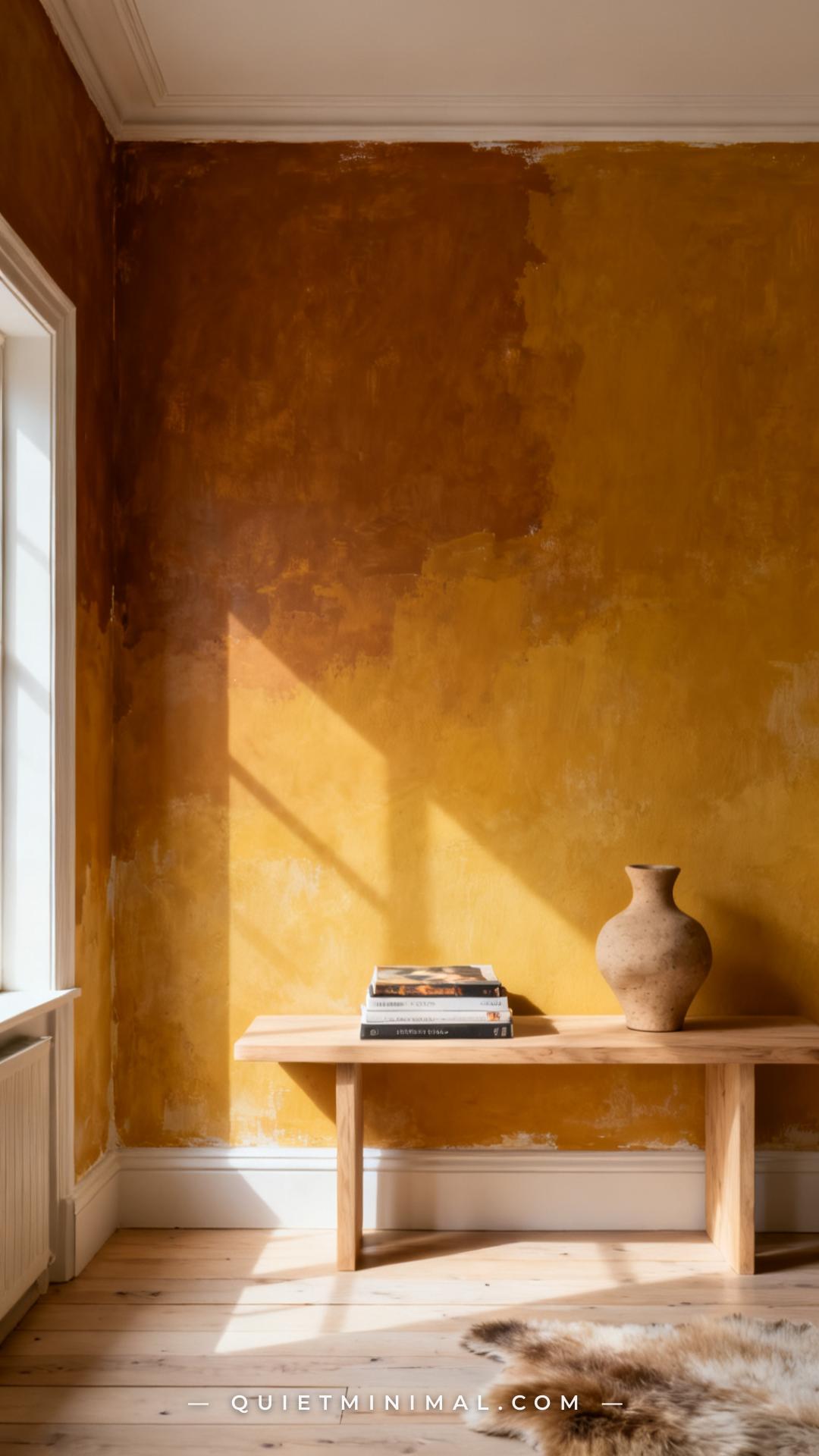
Limewash is the gateway plaster finish for dark amber rooms because it handles color variation naturally. Rather than laying down a flat coat of amber, limewash builds up through multiple thin passes, which means the final wall is never one uniform shade — it shifts between deep ochre, warm caramel, and sandy gold depending on light angle and time of day. For a dark amber brief, look at Sherwin-Williams Afterglow (SW 6346) or Behr Amber Wheat (N250-5) applied in a limewash formula or via a specialist like Portola Paints, who make a pre-mixed limewash product in amber-adjacent tones.
From the guides
You've saved it, wanted it. Here's the how: codes, measurements, order. Your choices make it yours.
 The Japandi Honest PlaybookThe honest version of the style: what to keep, what to skip, and the order to do it in.See inside →
 The Room Refresh PlaybookA repeatable four-step method, room by room, in ten minutes, thirty minutes, or one weekend.See inside →
 Make Any Room Feel Cozy on PurposeWhy some rooms hold people and others empty out, and the moves that change it.See inside →
The practical reason to start here: limewash is the most forgiving application for a first-time plaster project. It can be applied over existing painted drywall with a wide brush and doesn’t require a plasterer. The color variation it creates naturally does the visual work that would otherwise require expensive Venetian technique.
Key Takeaway: Limewash in an amber-yellow tone creates organic wall color that looks richer and more considered than flat paint — and it’s beginner-friendly enough to DIY.
2. Use Venetian Plaster for a High-Gloss Amber Effect
 Save
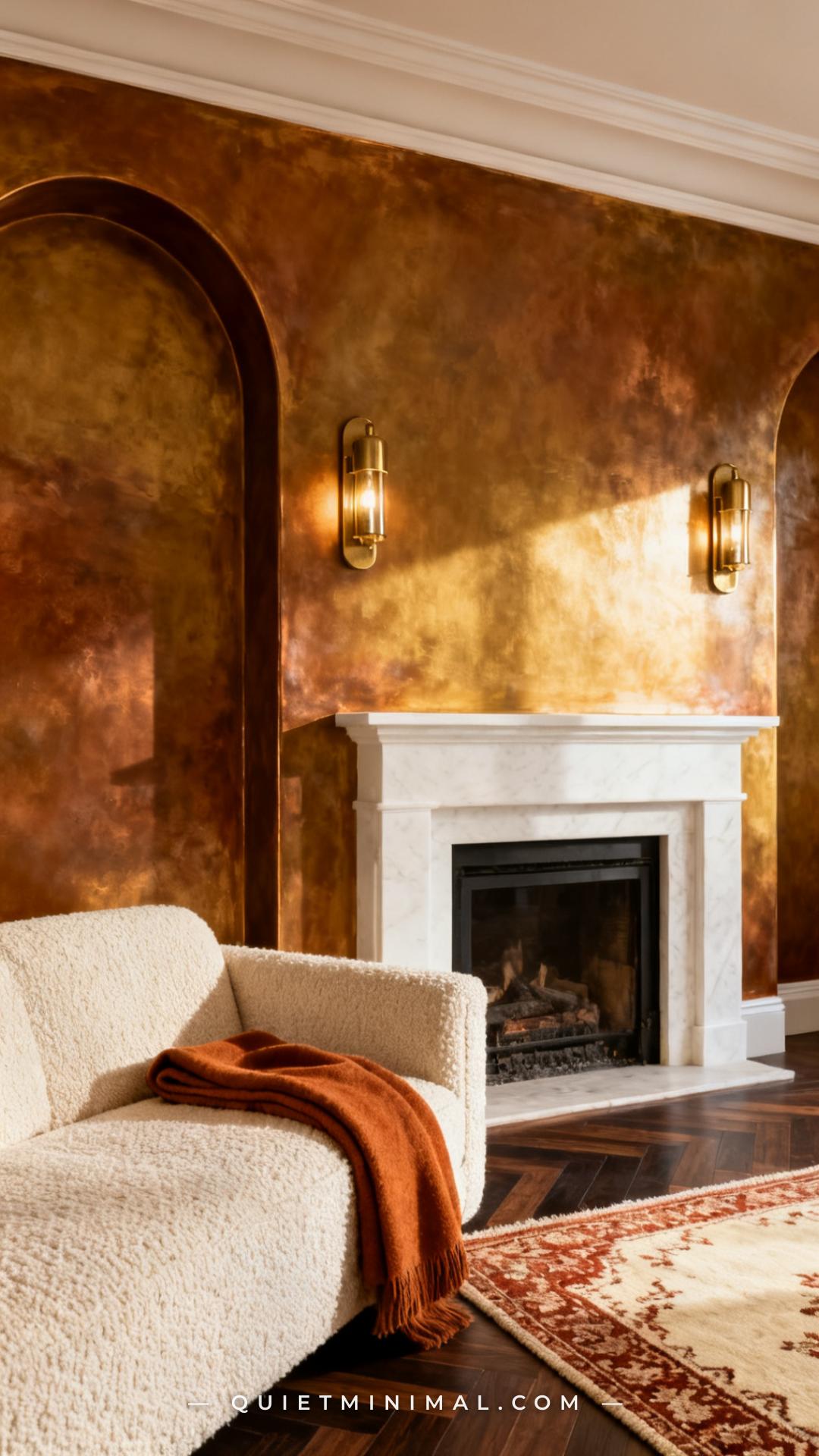
Venetian plaster is the high-commitment sibling of limewash — applied in multiple thin layers with a steel trowel and burnished while semi-wet to create a smooth, almost marbled surface with a soft reflective sheen. In dark amber tones, that sheen is what makes the room feel genuinely luxurious rather than just heavily painted. Light doesn’t bounce off Venetian plaster the way it does off flat paint — it glows through it, like the wall has depth.
The tradeoff is complexity. Venetian plaster requires a skilled applicator, and mistakes are difficult to correct after burnishing. If budget allows, this is a finish worth hiring out. The fireplace wall or a single accent wall is enough — you don’t need the full room to read as Venetian.
Key Takeaway: Venetian plaster in a dark amber tone delivers a visual depth no flat paint can match — reserve it for the most visible wall and treat it as a long-term investment.
3. Layer Warm Brass Hardware Against the Plaster
 Save
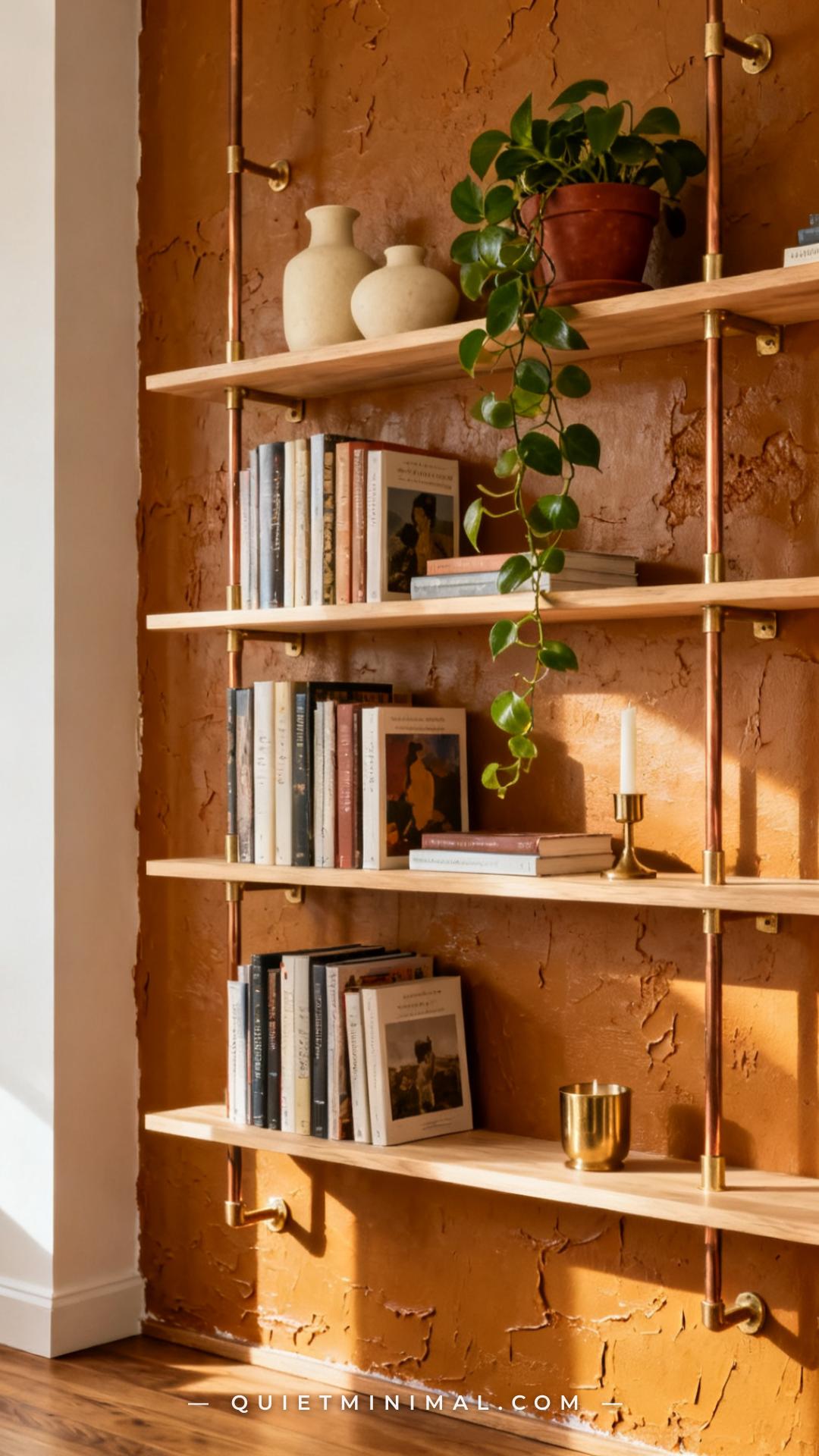
Brass is the hardware finish that does the most work in a dark amber room because it sits in the same warm, golden family as the wall color without blending into it. The key distinction is tone: unlacquered brass, which oxidizes slightly over time, reads richer and less “shiny new” than polished brass, and that lived-in quality is exactly what textured plaster walls are communicating. Together, they create a room that looks like it was assembled over time rather than purchased in a single weekend.
Apply brass at every scale: shelf brackets, curtain rods, picture rail hooks, light switch plates, door hardware. The plaster texture provides enough visual variation that the repeated use of brass reads as considered rather than repetitive.
Key Takeaway: Unlacquered brass is the metal finish that completes a dark amber plaster room — use it across all hardware scales, not just as a single accent.
4. Choose a Deep Rust Velvet Sofa as the Anchor Piece
 Save
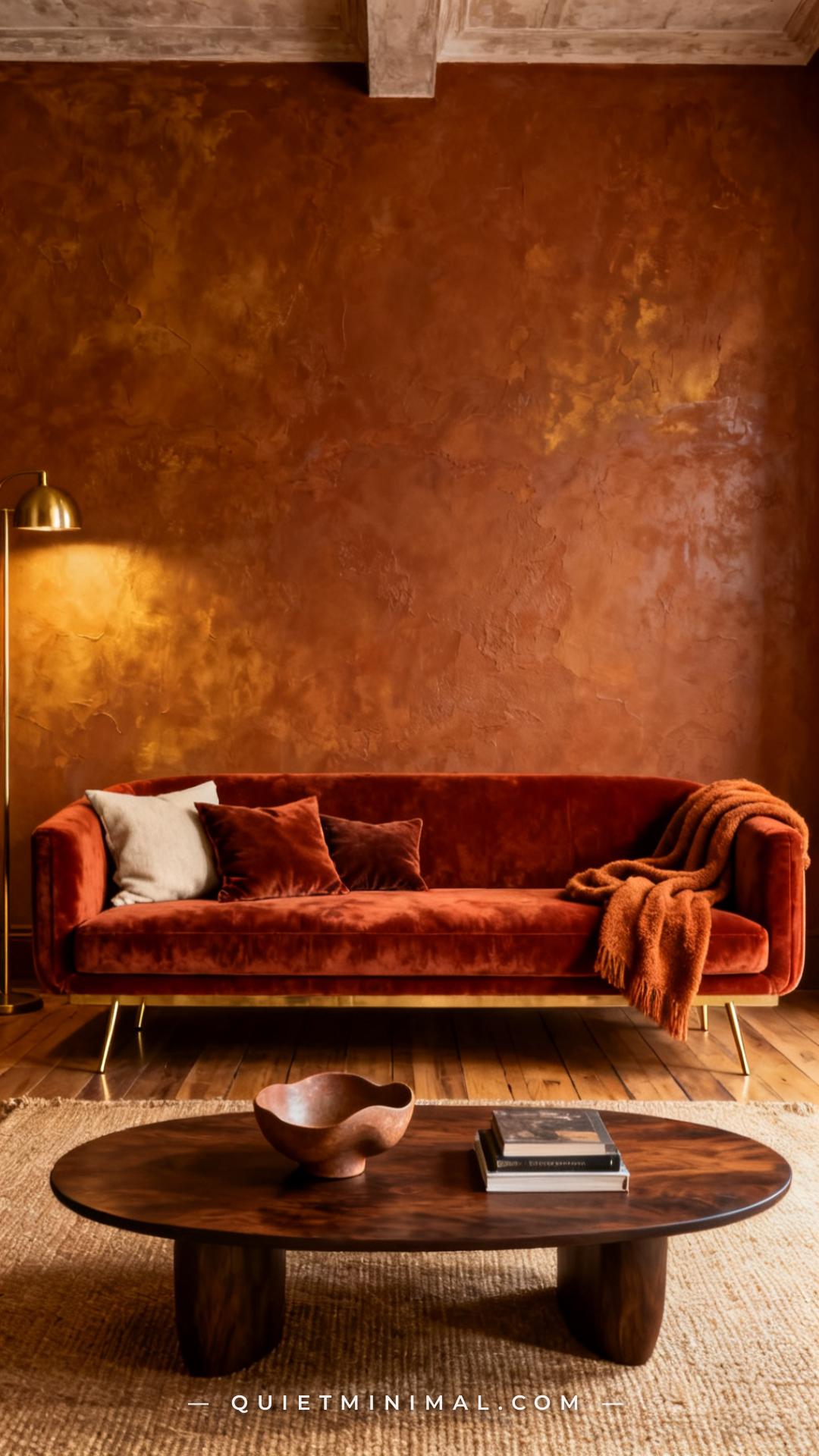
In a dark amber room, the sofa is where you either reinforce the warmth or balance it. A deep rust or burnt sienna velvet sofa reinforces it — the color sits close enough to amber to feel cohesive, while the texture of the velvet adds a third tactile layer after the plaster and any natural fiber rugs. This is the approach for rooms that want to lean fully into the moody, enveloping quality of the color story.
The practical note is scale: in a dark amber room, a sofa that is too small reads as furniture sitting inside a paint job. Opt for a generous, deep seat with good visual weight — the room can handle it, and the sofa needs presence to balance the drama of the walls.
Key Takeaway: A deep rust velvet sofa anchors a dark amber plaster room with cohesive warmth — choose a large-scale piece that can hold its own against the wall texture.
5. Use a Rough Trowel Finish for the Most Textural Impact
 Save
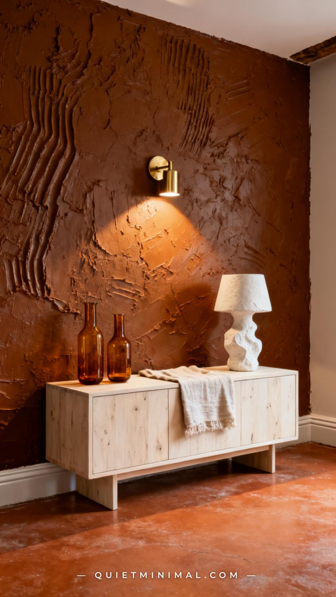
If limewash is the subtle end of the plaster spectrum, rough trowel is the dramatic end. Applied with a coarse skip-trowel technique that leaves ridges and furrows deliberately visible, a rough-trowel finish at dark amber creates the kind of wall that draws touch — it looks tactile from across the room. When a directional light source (sconce, floor lamp, picture light) rakes across it at a low angle, every ridge casts a shadow, and the wall becomes three-dimensional in a way no other finish achieves.
This finish is bold — it reads as a full design decision, not a background choice. It works best in larger living rooms where the wall has enough real estate to justify the visual complexity, or in smaller rooms where the intention is to make the space feel deliberately cocoon-like.
Key Takeaway: Rough trowel plaster at dark amber is the highest-impact plaster option — pair it with raking directional light to maximize the shadow play across the textured surface.
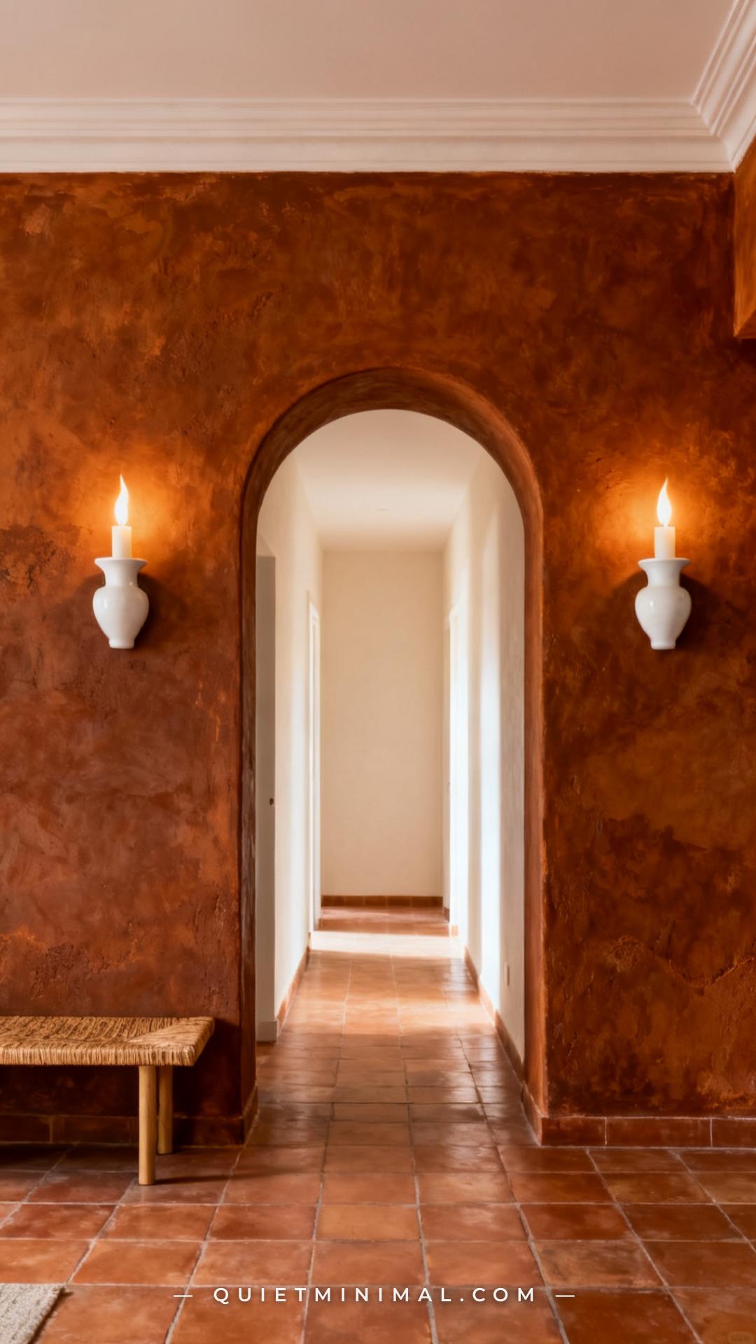
6. Install Arched Doorways to Complement the Organic Plaster Feel
 Save
Arched doorways and plaster walls share the same material logic — both reject the hard, sharp geometry of conventional construction in favor of forms that feel handmade and organic. An arched opening cut through a dark amber plaster wall amplifies both elements: the arch becomes part of the plaster composition, and the amber color gives the arch the visual weight it needs to read as an architectural feature rather than just a trimmed hole.
This is a renovation-level change, but the return is permanent. Once you have arched openings in a plaster room, the aesthetic coherence lifts the entire space from “decorated” to “designed.”
Key Takeaway: Arched doorways are the architectural detail that most naturally amplifies the handcrafted quality of textured plaster — they share the same design language, and the combination reads as intentionally Mediterranean or Southwestern.
7. Layer Multiple Warm Light Sources Instead of a Single Overhead
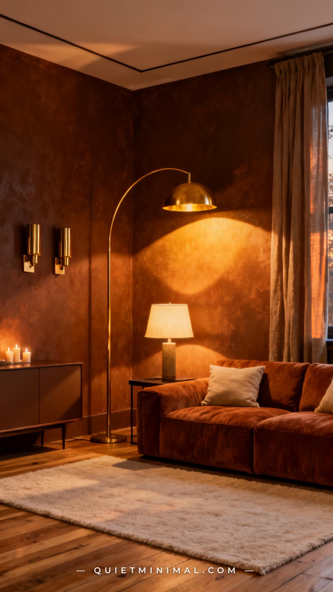 Save
The single most important decision in a dark amber plaster room is the lighting plan — specifically, eliminating reliance on a single overhead fixture. One centered ceiling light in an amber room flattens the texture and pushes the color toward “dark and dingy” rather than “warm and moody.” Multiple lower-level sources — floor lamps, wall sconces, table lamps — distribute light across the wall plane at varied angles, which is what activates the plaster texture and makes the amber color glow rather than absorb.
Aim for a minimum of four light sources per room, positioned so no single wall is in shadow. Warm-white bulbs (2700K or lower) are non-negotiable — anything cooler will read as gray or brown against amber plaster.
Key Takeaway: Dark amber plaster rooms live or die by the lighting plan — layer four or more warm-white sources at varied heights to activate the texture and keep the color from reading as dark and flat.
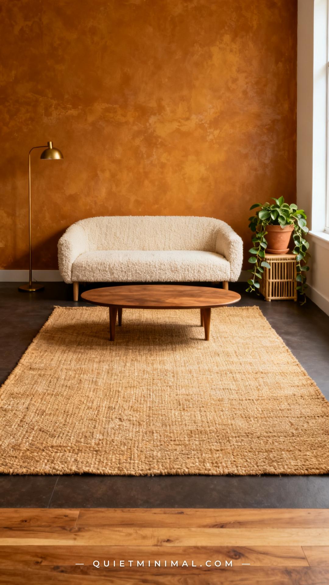
8. Introduce Natural Fiber Rugs to Ground the Warmth
 Save
From the guides
You've saved it, wanted it. Here's the how: codes, measurements, order. Your choices make it yours.
The Japandi Honest PlaybookThe honest version of the style: what to keep, what to skip, and the order to do it in.See inside →The Room Refresh PlaybookA repeatable four-step method, room by room, in ten minutes, thirty minutes, or one weekend.See inside →Make Any Room Feel Cozy on PurposeWhy some rooms hold people and others empty out, and the moves that change it.See inside →A dark amber room with textured plaster walls carries significant visual warmth — the risk is that without a grounding element at floor level, the whole room tips into feeling heavy. Natural fiber rugs — jute, sisal, seagrass — provide a textural counterpoint that sits in the same warm color family as the amber walls without competing. The coarse, matte weave of a jute rug absorbs rather than reflects light, which creates a natural visual resting point in a room where every other surface is doing something interesting.
Sizing matters: go larger than you think you need. In a dark amber room, a small rug reads as an afterthought. The rug should be large enough that at minimum the front legs of all seating rest on it.
Key Takeaway: A large jute or sisal rug is the grounding element that balances the warmth of dark amber plaster — size up and let the natural texture breathe at floor level.
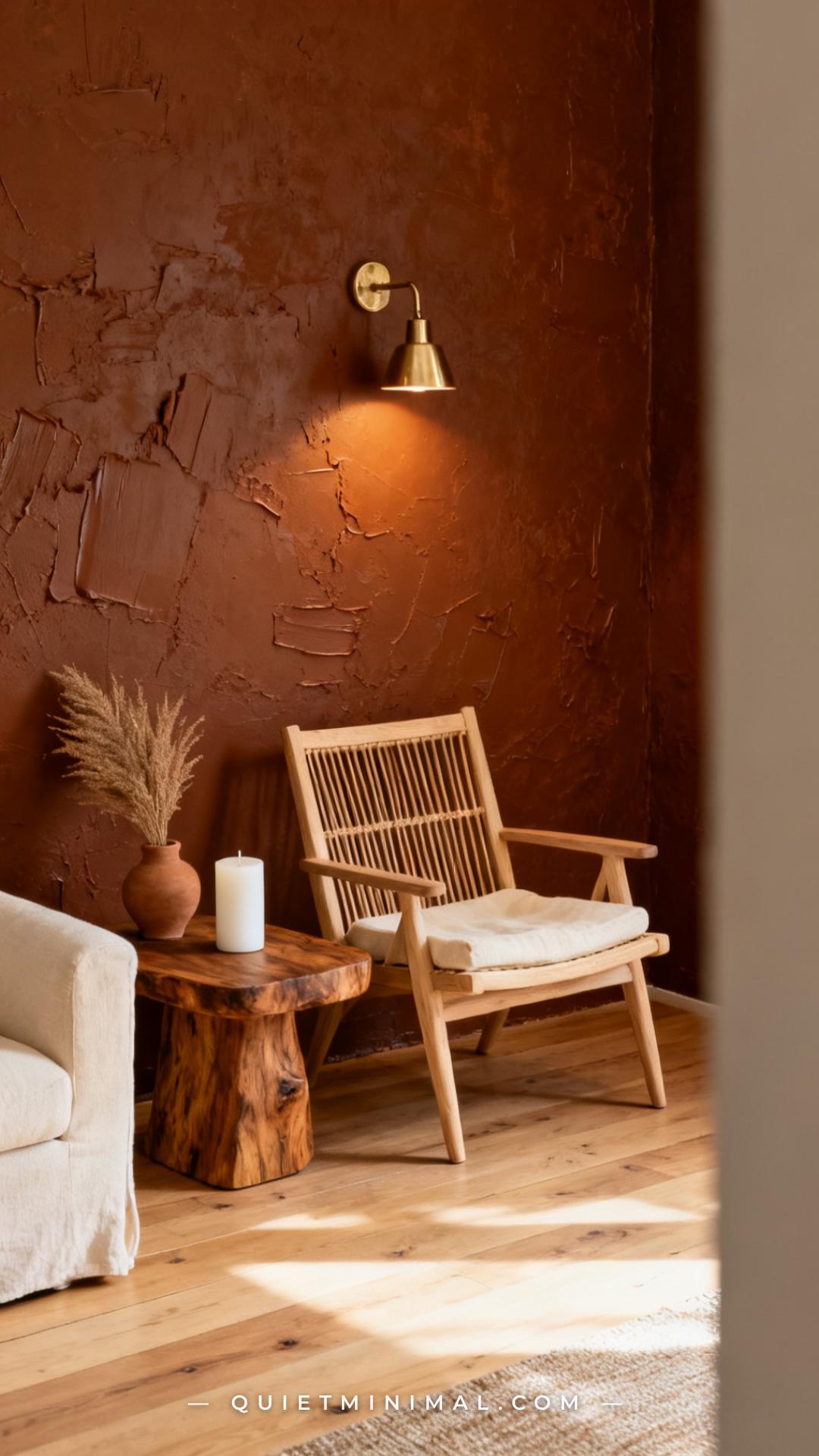
9. Mix in Raw Wood and Cane Furniture for Tactile Contrast
 Save
Dark amber plaster walls already carry a significant material presence — the furniture that works best alongside them is furniture that speaks the same tactile language. Raw wood, cane, rattan, and woven bamboo all introduce a different kind of natural texture that layers well against plaster without competing. The key is keeping the wood tones in the pale-to-medium range: whitewashed oak, natural cane, raw mango wood. Dark wood in a dark amber room can eliminate contrast entirely and make the space feel undifferentiated.
Cane-back chairs and rattan side tables are specifically useful because their open weave creates visual lightness — they occupy the room without adding visual weight, which is exactly the counterbalance a dark ambient space needs.
Key Takeaway: Natural cane and raw pale wood furniture provide the tactile contrast and visual lightness that dark amber plaster rooms need — avoid dark stains that blend into the warmth and eliminate depth.
10. Use Farrow & Ball India Yellow as the Anchor Paint Reference
 Save
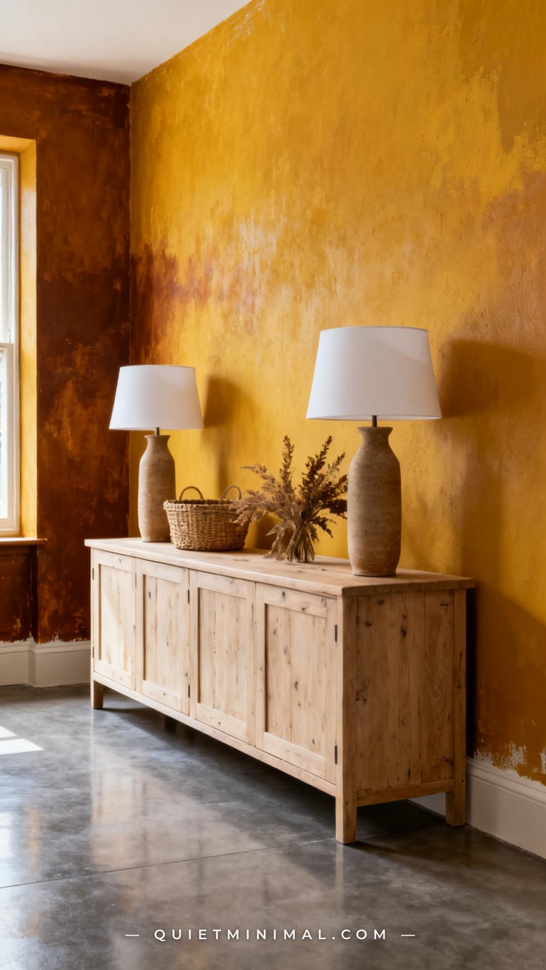
Farrow & Ball India Yellow (No. 66) deserves specific attention as a color reference because it demonstrates exactly how dark amber behaves at full saturation in a real room. It’s not a safe approximation of amber — it’s the full, committed version, and it reads differently in different light conditions in a way that cheaper paint formulas don’t replicate. In morning light it’s golden; in evening lamplight it deepens toward amber bronze.
For the textured plaster brief, India Yellow works best when the plaster finish provides enough variation to prevent the color from reading as flat. Applied over a rough limewash base, it picks up the tonal variation of the plaster and reads as at least two or three shades rather than one. This is the color for rooms that want to go all-in.
Key Takeaway: Farrow & Ball India Yellow over a textured limewash base is the highest-impact version of the dark amber brief — use it in rooms with strong natural light to balance the saturation.
11. Add Plaster Ceiling Details to Complete the Envelope
 Save
Most dark amber plaster rooms focus exclusively on the walls and miss the ceiling — which is the surface that most affects how enveloping the space feels. Taking the plaster treatment to the ceiling, even in a lighter tint of the amber tone, completes the “envelope” quality that makes a moody living room feel fully resolved rather than like a painted box. A ceiling plastered in a warm cream with amber undertones reads differently from a flat white ceiling — it reflects warm light back downward and deepens the color story rather than cutting it off at eye level.
Plaster coving or a simple ceiling rose in the same finish ties the wall plane to the ceiling and removes the hard line where the two surfaces meet.
Key Takeaway: Extending the plaster treatment to the ceiling — even in a lighter amber tint — completes the enveloping quality that makes dark amber rooms feel fully designed rather than half-finished.
12. Balance the Drama with a Single Bright White Focal Point
 Save
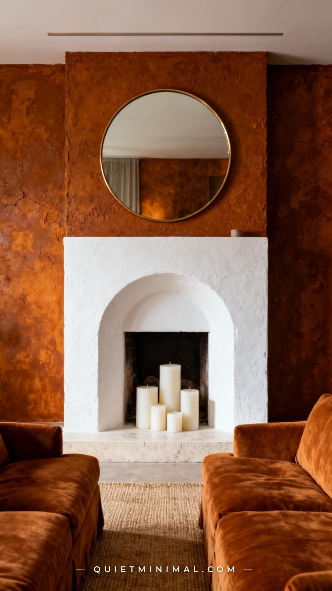
Every fully committed dark amber room needs one bright anchor point — a surface or object that stops the warmth from becoming overwhelming and gives the eye somewhere to rest. The most effective choice is a smooth white plaster fireplace surround. The contrast between the rough, dark amber wall texture and the clean, bright surround is deliberately sharp, and that contrast does two things simultaneously: it makes the white element feel architectural and important, and it makes the amber walls feel richer by comparison.
Other options include a large white linen curtain panel, a white-painted built-in bookcase, or a white plaster arch frame. The principle is the same: one high-contrast light anchor per room, positioned as the focal point the layout already points toward.
Key Takeaway: A single smooth white element — ideally a plaster fireplace surround or built-in — is the contrast anchor that keeps a dark amber room from feeling claustrophobic and gives the composition a clear focal point.
Dark amber living rooms with textured plaster walls work because they’re built on a material logic, not just a color choice. The texture of the plaster changes how the color behaves — it diffuses warm light across the wall plane, creates shadow play at every scale, and gives the room a quality of depth that flat surfaces can’t replicate. The ideas above show how to get there in layers: start with the right plaster finish and color, then build in the hardware, furniture, and lighting that complete the story. If you’re ready to commit, the single most impactful move is to choose one wall — the fireplace wall, the wall behind the sofa — apply a limewash in a dark amber tone, and add a raking floor lamp to see what it does to the texture overnight. That one wall will tell you everything you need to know about whether to take it further.
From the guides
You've saved it, wanted it. Here's the how: codes, measurements, order. Your choices make it yours.
The Japandi Honest PlaybookThe honest version of the style: what to keep, what to skip, and the order to do it in.See inside →The Room Refresh PlaybookA repeatable four-step method, room by room, in ten minutes, thirty minutes, or one weekend.See inside →Make Any Room Feel Cozy on PurposeWhy some rooms hold people and others empty out, and the moves that change it.See inside → Save
 Save