Georgia
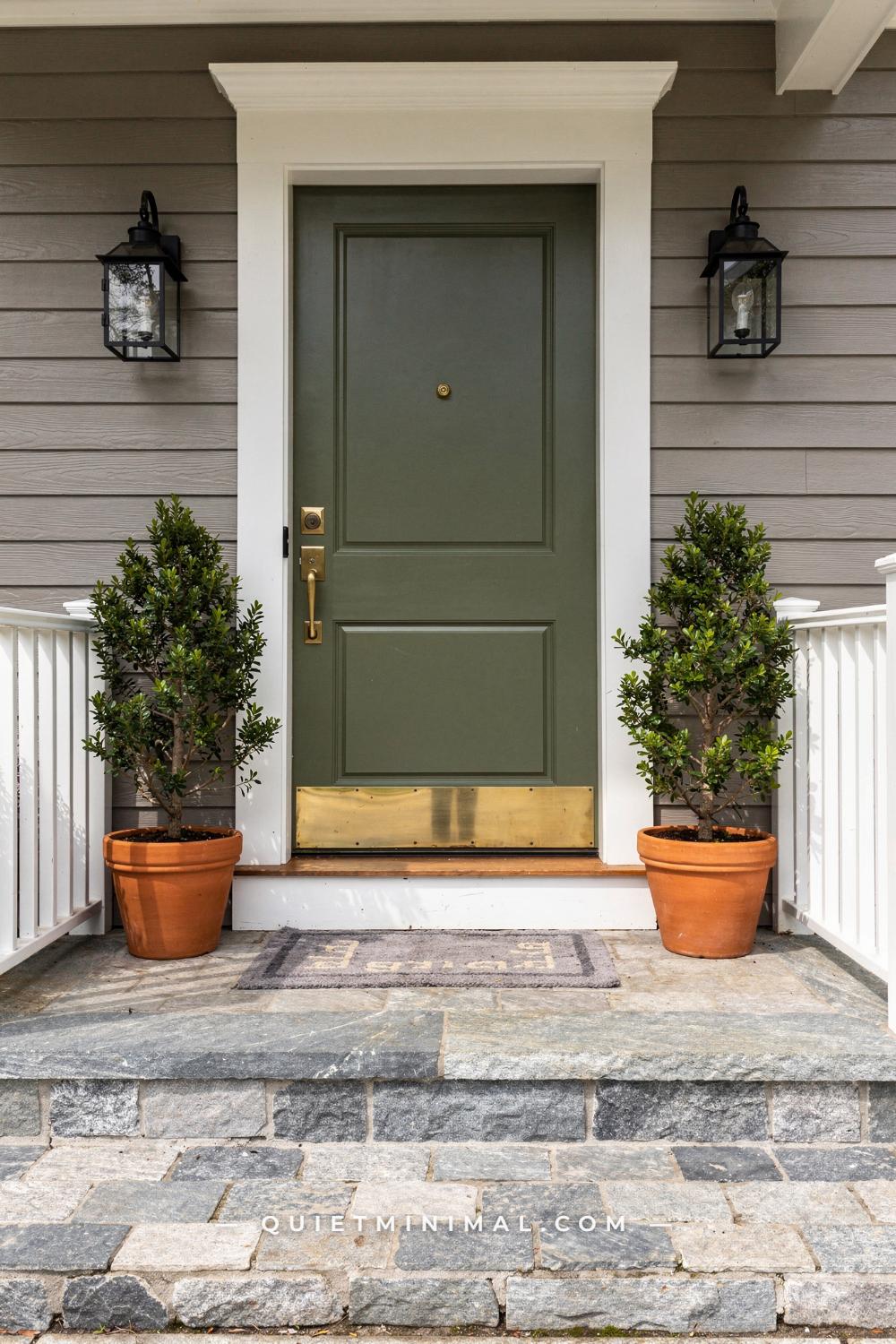
A gray house is the easiest house to paint a front door on, and it is also the one where the door goes wrong most often, and those two facts come from the same place. Gray takes almost any color, which is why every list of front door colors for a gray house runs to twenty entries, and it is exactly that permissiveness that lets a navy read purple, a black read like a hole, or a cheerful yellow look like a warning sign. The color lists are not wrong. They are incomplete, because they name the color and skip the four things that decide whether it works: the undertone of your particular gray, the sheen of the paint, what the trim and sidelights are doing, and what the door looks like at dusk when the porch light is the only light.
This guide takes the advice you have already heard, one line at a time, and tests it against what actually holds up from the sidewalk. Some of the received wisdom survives with a condition attached. Some of it is the reverse of the truth. By the end you will be able to look at your own siding, name its lean, and choose a door you will still like in three years.
Everyone Says Gray Is Neutral. Your Door Is the First Thing That Proves It Isn’t
 Save
The line you hear first is that gray is a neutral, so anything goes on the door. It is true in a paint store and false on a street. Every gray sold as an exterior color is mixed from a white base plus black plus a small amount of a chromatic pigment, and that pigment is the undertone. Blue and green pigments make a cool gray. Yellow, red and umber make a warm gray, the kind sold as greige. The undertone is invisible on a 2 by 3 inch (5 by 8 cm) chip and completely visible on 1,800 square feet (167 sq m) of siding at four in the afternoon. Your door color lands on top of that undertone, and the pairing either agrees or argues.
Sage is the cleanest example of agreement, and it is also the color climbing fastest on gray houses right now, which is not a coincidence. A muted green like Sherwin-Williams Evergreen Fog SW 9130 is itself a gray with a green undertone, so on a mid-gray body with a green or blue lean the door reads as the same family, one step more saturated. The eye registers calm rather than contrast. Put that same sage on a warm greige with a pink lean and the green suddenly looks minty and slightly sick, because pink and green are complements and the door is now fighting the wall. Nothing changed but the undertone.
The test is cheap. Hold a sheet of plain white printer paper flat against the siding at midday and look at the siding next to it. If the gray reads faintly blue, violet or green, you have a cool gray. If it reads tan, olive or slightly pink, you have a warm one. Do it on the north side and the south side, because the same paint reads cooler in north light. Then choose a door that either shares the lean (sage on cool gray, olive on warm gray) or contrasts it deliberately with warmth (a golden yellow or terracotta on cool gray). What fails is the accidental version, where a cool blue lands on a warm greige and the house looks like two people decorated it without speaking.
From the guides
You've saved it, wanted it. Here's the how: codes, measurements, order. Your choices make it yours.
 The Japandi Honest PlaybookThe honest version of the style: what to keep, what to skip, and the order to do it in.See inside →
 The Room Refresh PlaybookA repeatable four-step method, room by room, in ten minutes, thirty minutes, or one weekend.See inside →
 Make Any Room Feel Cozy on PurposeWhy some rooms hold people and others empty out, and the moves that change it.See inside →
Around a sage door, the supporting cast should stay warm so the green does not tip cold: brass rather than black hardware, a lantern in the same brass, and planters in a deep navy that pulls the door’s blue side out. Two 14 inch (36 cm) pots at the outer corners of the porch, a fern in each, and a coir mat about 36 by 24 inches (91 by 61 cm) with a solid charcoal mat beneath it to give the threshold some weight.
Key Takeaway: Find your gray’s undertone with white paper at midday before you buy a single door sample, then choose a color that shares the lean or contrasts it on purpose, never by accident.

The Door Does Not Have to “Pop”: Why a Gray Door on a Gray House Can Be the Better Choice
 Save
 Save
The advice that the door has to pop is the reason so many gray houses end up with a door that looks like it was ordered from a different catalog. Contrast is not the same thing as color. A door stands out from its wall when it is darker or lighter than the wall by a clear margin, and it does not need a hue change to get there. A medium charcoal door on a warm greige body, framed in white casing, has three distinct values in a row: light trim, dark door, mid wall. The eye reads the door instantly. It just does not read it as a decision that shouts.
The version of this that fails, and it is the one House Digest flags as a resale drag, is the door painted the same gray as the siding. One value, no edge, and the entry disappears into the facade. The rule of thumb that fixes it is two to three steps darker on the same paint strip. If the body is a light warm gray in the range of Repose Gray SW 7015, a door in Iron Ore SW 7069 is roughly five steps down and lands in near-charcoal territory. That gap is enough for the door to register from 50 feet (15 m), which is about where the sidewalk sits on a typical suburban lot.
Sheen does part of the work here. A flat-profile door in a matte or eggshell finish absorbs light and reads as a solid dark plane, while the surrounding trim in a semi-gloss white throws light back. That sheen difference alone gives the door an edge that a chip on the counter would never show. Keep the casing at least 3.5 inches (9 cm) wide so the white band is real; a skinny 2.25 inch (6 cm) brick mold nearly disappears and the gray-on-gray goes flat again.
The hardware finish is the one place to bring in a hue. Oil-rubbed bronze on a charcoal door is warm against cool, and a 4 inch (10 cm) lever is small enough to be a detail rather than a statement. If the stoop is a pale large-format stone, around 24 by 24 inches (61 by 61 cm), the door now has a light floor, a light frame and a mid wall around it, and it is the darkest thing in the picture without being the loudest.
Key Takeaway: A door needs a value gap from the wall, not a color change; two to three steps darker on the same strip, framed in wide white trim, reads as considered where a bright accent reads as a guess.
Black Doors Are Not “Over”, but Flat Jet Black on a Cold Gray Is
 Save
The latest trend pieces are calling black doors finished, and the numbers say the opposite: black is still the single most requested door color on gray houses, more than a quarter of them. Both are right, because they are talking about two different blacks. The one designers are tired of is a true jet black in a high gloss, which on a cool gray house reads as a rectangle cut out of the facade. The one that keeps getting chosen is a charcoal with a little blue or green in it, in a matte or satin finish, and that one has not aged at all.
The difference is measurable. A true black like Tricorn Black SW 6258 has almost no light reflectance and no visible undertone; it is a void, and on a white or pale house that is a crisp graphic move. On a mid or dark cool gray, though, the wall is already low in reflectance, so the gap between wall and door shrinks and you get a smudge rather than an edge. Iron Ore SW 7069 is the charcoal most people actually want: dark enough to read as black from the curb, but with enough gray in it that shadows on the panels still show, which is what makes a door look like a door instead of a hole.
The material around it decides which black to use. On white shiplap, as in a modern farmhouse entry, a charcoal door has a bright wall to push against and a 96 inch (244 cm) door with transom becomes the anchor of the whole facade. On a mid-gray body, the same charcoal needs the white casing to do that job, and the casing has to be wide. On a charcoal house, skip black altogether; that case has its own section later.
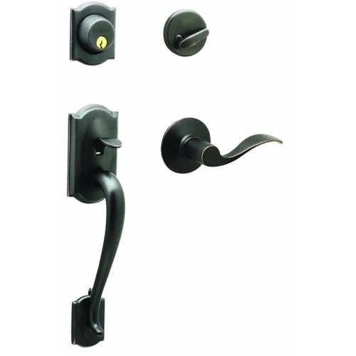
The trend pieces are correct on one point: a black door with no warmth anywhere near it feels cold, and the cure is texture and one warm object. A magnolia wreath, about 24 inches (61 cm) across, with the leaves’ bronze backs showing, puts a warm organic surface against the flat paint. A black gooseneck sconce, roughly 10 inches (25 cm), keeps the hardware story consistent. Keep the wreath year-round rather than seasonal; dried magnolia holds its color for a year or more and it does not read as any particular holiday.
Key Takeaway: Choose a charcoal with a visible gray undertone in a matte or satin finish, not a glossy jet black, and give it one warm textured object so it reads as depth rather than absence.

“Blue Looks Cold on Gray” Is Only True of the Wrong Blue
 Save
 Save
People who have tried a blue door on a gray house and hated it almost always tried a pure blue: a cobalt, a royal, a bright periwinkle. Those are blues with no green and no gray in them, and against a gray shake wall they sit on the surface like a sticker, because the wall has grayed-down pigment and the door has none. The cold feeling people describe is not the hue. It is the mismatch in saturation.
A teal or a slate blue solves it. Teal is blue with green in it, and green is the pigment that most cool grays are already carrying, so a muted teal on gray cedar shake shares a parent with the wall. The door reads as a color, clearly, but it belongs. Aim for a blue that looks slightly dirty on the chip; if it looks pretty on the chip it will look loud on the house. Mid-tone matters too: a teal with a light reflectance around 15 to 25 stays visible in shadow under a porch roof, where a very dark navy goes black and a pale blue washes to white.
Cedar shake has a texture that helps here. Each shingle throws a small shadow line, so the wall reads as a soft gray field rather than a flat plane, and a door with vertical tongue-and-groove detail picks up that rhythm at a different scale. On a door-plus-sidelights unit around 80 by 60 inches (203 by 152 cm), paint the sidelight frames the same teal as the door and leave the casing white; that widens the color to the full unit and keeps the white edge crisp.
Anchor the whole entry with black. Two floor lanterns, about 18 by 8 inches (46 by 20 cm), one in each outer corner of the porch, and a black pendant above the door give the composition its dark notes, which a teal door needs so it is not the darkest thing in view and therefore not carrying all the weight. A eucalyptus wreath keeps the gray-green thread going, and the coir mat underfoot adds the one warm tan the porch needs.
Key Takeaway: Pick a grayed-down blue with green in it, painted across the door and sidelight frames, and let black lanterns carry the dark notes so the blue reads as color rather than chill.

A Light Gray Door Does Not Disappear When the Trim and Hardware Are Doing Their Jobs
 Save
The received rule is that a front door should be darker than the house, so a light gray door is a wasted opportunity. That rule was written for gray houses. Flip the pairing, white board-and-batten siding with gray only on the door, and a light cool gray in the range of Repose Gray SW 7015 becomes the accent, because now the wall is the lightest surface and the door is the mid-tone. The whole facade is a two-value composition, and the door is the second value.
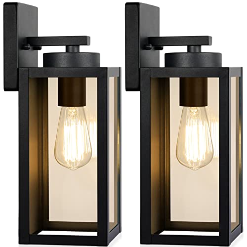
What this pairing depends on is a third element in black. A light gray door with white trim and silver hardware is three pale surfaces and it does go soft. Add two black cage sconces, roughly 12 by 6 inches (30 by 15 cm) each, mounted level with the top of the door at about 66 inches (168 cm) from the porch floor, and a slim black deadbolt and lever, and the entry snaps into focus. The black is doing what a dark door usually does, in small doses, and the gray door reads as calm rather than absent.
The texture of board-and-batten matters more than it looks like it should. Battens about 2.5 inches (6 cm) wide on 12 to 16 inch (30 to 41 cm) centers throw hard vertical shadows in midday sun, so the white wall is never truly flat. A smooth matte door against that striped wall reads as a rest for the eye, which is the opposite of disappearing. If the siding were smooth lap instead, this pairing would need a slightly darker gray on the door to hold its own, one step down the strip.
There is a practical bonus. A light gray door in a satin finish shows dust, pollen and fingerprints far less than a black one does, and it does not heat up in afternoon sun the way a dark door on a south-facing entry will. A dark steel or fiberglass door in direct sun can reach surface temperatures that soften weatherstripping and cause the slab to bow; a light color sidesteps the problem entirely. Keep the concrete threshold clean and uncovered, or use a plain charcoal mat, so the pale door meets a neutral floor.
Key Takeaway: On a white house, a light gray door is the accent, but only if black sconces and black hardware supply the dark notes the composition needs.

Navy Is Not the “Safe” Choice; It Is the Choice That Depends on Lighting
 Save
 Save
Navy is the second most chosen door color on gray houses and the one growing fastest among people repainting a door they already painted once, which tells you something: a lot of first navies get redone. The reason is not the color. It is that a true navy like Benjamin Moore Hale Navy HC-154 has a light reflectance value under 9, which means in shade it is functionally black, and most front doors on a colonial sit under a porch roof in shade for most of the day. Owners choose navy from a sunlit chip and then live with a black door.
The fix is to plan the light before the paint. A navy door needs to be seen, and on a covered entry that means fixtures, not daylight. Three lanterns is the classic arrangement: a pendant from the porch ceiling, about 20 by 10 inches (51 by 25 cm), and a matching pair of wall sconces at roughly 16 by 8 inches (41 by 20 cm) on either side of the surround. Warm bulbs in the 2700K range are the important part. Warm light on navy brings the blue forward; a cool 4000K bulb pushes it back to black. Seeded glass softens the glare so the door is lit rather than spotlit.
The white surround is not decoration either. A colonial pilaster-and-entablature frame, typically 5 to 7 inches (13 to 18 cm) wide at the pilasters, is the bright band that separates a dark door from a mid-gray wall. Without it, navy on gray lap siding has the same value-gap problem as black on charcoal. With it, the door sits in a white frame like a picture and reads as navy even in the shade, because the eye is comparing it to white, not to gray.
Hardware finish is where navy earns its reputation. Polished brass on navy is the combination that started the whole idea of navy as a classic, and a 5 inch (13 cm) polished lever with a matching deadbolt is all it takes. Keep the porch floor a natural bluestone; its blue-gray flecks tie floor and door together, and a single black matte pot with a fern in one outer corner keeps the arrangement from going stiffly symmetrical.
Key Takeaway: Navy only stays navy when it is lit; plan warm 2700K lanterns and a wide white surround first, and the door will read as blue rather than as black in the porch’s shade.

Sheen Changes a Dark Gray Door More Than a Shade Change Does
 Save
Most people agonize over which charcoal and then let the store default the finish. It should be the other way around. Two doors painted the identical dark gray, one in a high gloss and one in a satin, look further apart from the curb than two different charcoals painted in the same sheen. Gloss reflects the sky and the street, so a glossy dark door reads lighter and bluer than its chip in daylight and shows every brush mark and every dent. Satin holds the color as mixed and lets the panel shadows do the work.
Panel profile is the second half of the same decision. A dark gray door with real relief, vertical tongue-and-groove on the lower half and a raised panel above, casts its own shadows. In afternoon light from the side, the grooves go almost black and the flats stay charcoal, so a single paint color produces three values on its own. A flush slab door in the same color has none of that and needs a lighter surrounding to define it. If you have a paneled door, dark gray in satin is doing you a favor. If you have a slab, consider stepping one shade lighter, because the door has no edges of its own.
Frosted sidelights change what the door needs from its surroundings. Clear glass sidelights bring the interior’s warm light out at night and put a bright vertical stripe on either side of a dark door; frosted glass does the same in a soft glow and adds privacy. Either way, two 12 inch (30 cm) sidelights on an 80 inch (203 cm) door give the dark slab a pale frame the way white trim does on a smaller unit, and that is why this combination can skip the wide casing that other dark doors need.
Satin nickel hardware on a cool charcoal keeps the whole door in one temperature. Brass would warm it, bronze would muddy it; nickel agrees with the slight blue in the gray. A small wreath of white berry stems, about 16 inches (41 cm), in the upper corner of the door is the only bright object, and it needs to be small; on a close-up door like this a full 24 inch (61 cm) wreath would hide the panel work that makes the door worth looking at.
Key Takeaway: Decide the sheen before the shade: satin on a paneled door lets the profile create three values from one color, while gloss reflects the sky and lightens a dark gray you chose for its depth.

You Pick a Door Color From the Curb, Not From the Porch
 Save
 Save
The standard method for testing a door color is to tape a chip or paint a patch on the door and stand on the porch looking at it. That is where you will be standing least. A front door is seen from the driveway, the sidewalk and the street, at 30 to 60 feet (9 to 18 m), and at that distance the door is about the size of your thumbnail held at arm’s length. What you are really judging is a small dark or light rectangle inside a much larger composition of siding, trim, roof, stone and path, and the question is whether that rectangle is where the eye lands first.
A modern farmhouse entry shows why. Light warm gray board-and-batten in the range of Mindful Gray SW 7016, a deep white surround, stone veneer on the column bases, black lanterns and a straight paver walk. The door is charcoal, near black, and at 50 feet (15 m) it works not because of its exact shade but because the white surround is at least 6 inches (15 cm) wide and the walkway, about 4 feet (120 cm) across, leads the eye straight to it. Change the door to navy or deep green and from the curb the composition barely changes; those elements are what carry it. Which means the door color decision is more about temperature than identity: does the dark rectangle feel warm or cool against the wall?
So sample the way the house will be seen. Paint two coats on a sheet of primed hardboard at least 24 by 36 inches (61 by 91 cm), prop it in the door opening, walk to the street and look. Do it at nine in the morning, at two in the afternoon and at dusk with the porch light on. The color that survives all three is the one. A chip on the porch shows you a color; a board seen from the curb shows you the house.
Then use the approach to support the choice. Tall square black lanterns, about 18 by 6 inches (46 by 15 cm), either side of the surround, and low boxwoods along the path edges, keep the eye moving toward the door rather than stopping at the stone. Stone veneer on the column bases is the warm-gray texture that makes a charcoal door feel grounded rather than stark; if the bases were painted, the door would need a slightly warmer charcoal to compensate.
Key Takeaway: Judge a door color on a 24 by 36 inch sample board from the street at three times of day, because from the curb the trim width and walkway carry the door as much as the paint does.
Leave the Sidelights and Transom White? Not When the Door Is Navy
 Save
The default instruction from most painters is that the door gets the color and the sidelights and transom stay white with the trim. On a small door with narrow sidelights that is fine. On a full entry unit, a 36 inch (91 cm) door with two divided sidelights and an arched transom above, around 96 by 60 inches (244 by 152 cm) overall, leaving the frames white breaks the color into a thin vertical stripe surrounded by a lot of white muntins, and the navy reads as a sliver. The unit is the door. Paint it as one.
Painting the sidelight frames and the transom frame to match the door gives the color a footprint roughly 60 inches (152 cm) wide instead of 36 (91), and the white architectural surround outside it still provides the bright edge that navy needs against a medium gray. The muntins inside the glass go navy too. The divided lights then read as glass set into a dark frame, which is exactly how the entry looks from the street: one composed opening, not a door with accessories.
The arch matters because it is the only curve on most facades. A navy transom under a white arched surround draws the eye up, and it makes the entry taller from the curb, which on a two-story gray house with horizontal lap siding is a welcome vertical. Keep the surround crisp white rather than an off-white; the small amount of yellow in a cream trim turns navy slightly green next to it.
Landscaping finishes the argument for why navy and gray work together at all. Green boxwoods at the base of the steps, clipped to about 24 inches (61 cm), put a true green next to a blue and a gray, and the three together read as a considered palette rather than a house plus a door. Without the green, navy on gray is two cool colors alone and it can feel stern. With it, the entry feels planted.
Key Takeaway: On a door with sidelights and a transom, paint the whole unit including the muntins in the door color and leave only the outer surround white, so the color reads at full width from the street.

Your Door Color Is Not Finished Until You Have Seen It in Winter
 Save
 Save
Almost everyone picks a door color in spring or summer, with green lawn and leaves framing the house and warm light hitting the siding. Then December arrives, the trees are bare, the sky is white, and the door is suddenly the only color on a gray and white block. Colors that felt quiet in June can look either bleak or garish in January. A slate blue-gray is one of the few that holds in both, because it sits halfway between the gray of the house and the blue of a winter sky, and it is muted enough that it does not need leaves around it to look intended.
On white painted brick this door shows what “muted” buys you. The brick is rough, cool white and highly textured; a smooth slate door in a satin finish is the calm plane beside it, and the full-height divided glass panel, taking up the top two-thirds of an 80 inch (203 cm) door, keeps the color from becoming a wall of blue. In flat winter light the door reads as a soft blue-gray. In summer sun it warms slightly toward teal. Both are fine, and that stability is the test you want to run before committing: look at the sample board on the grayest day you can find.
Winter styling is where a muted door earns its keep, because the greenery goes on the door rather than around it. A fresh cedar wreath about 28 inches (71 cm) across hung on the glass, with a gray linen bow rather than a red one, keeps the whole entry in the same family of grays and blues with one deep green. A small potted spruce in a white planter to one side and a wicker basket of birch logs to the other add the warm tan and the white bark that a blue door needs in a season with no other warmth on offer. Note the color logic: nothing here is red or gold. The seasonal props are chosen to agree with the door, not to compete with it.
The mat matters more in winter than in summer. A black-and-white stripe cotton rug under a natural coir mat, about 36 by 24 inches (91 by 61 cm), gives the pale threshold a graphic edge and hides the salt and slush that would show on a plain coir alone. Black hardware ties the deadbolt to the stripe.
Key Takeaway: Test the sample board on a gray winter day as well as a bright one, and favor a muted slate blue-gray that stays calm without leaves around it, then choose winter greenery in the door’s own palette.

“Match the Door to the Shutters” Flattens a Ranch; Here Is the Better Rule
 Save
The rule you inherit with a ranch is that the shutters and the door are painted the same color. It comes from the paint-store three-color scheme, body plus trim plus accent, and on a one-story house 30 feet (9 m) wide it produces a facade where the door is one of five identical black rectangles in a row. The eye does not find the entry, because nothing distinguishes it from the windows. That is the flattening effect people notice and cannot name.
The better rule is that the door and shutters share a darkness, not a color. Shutters in a true soft black, louvered so the slats break up the surface, and the door one step away: a charcoal with a visible undertone, or a very deep green or navy that reads as near-black from the street but as a color from the walk. From 60 feet (18 m) the facade still has its rhythm of dark accents against medium gray. From 15 feet (4.6 m) the door is clearly its own thing. If the shutters are Tricorn Black SW 6258, then Iron Ore SW 7069 on the door is the smallest step that still registers, and it is the one most ranch owners end up happiest with.
Scale is the other lever. Shutters on a ranch are typically 48 by 15 inches (122 by 38 cm), and the door is 80 by 36 inches (203 by 91 cm), which means the door is already the largest dark shape on the house. Give it a little more: a 4 inch (10 cm) white casing around the door where the windows have a slimmer 2.5 inch (6 cm) trim, or a brick-trimmed step that puts a warm red-brown at the door’s feet and nowhere else on the facade. Either one tells the eye where to go without adding a color.
Painted brick on a ranch wants a gray with a warm lean, because brick’s texture reads cool in overcast light and a cool gray on it can look institutional. A mid warm gray with white trim and black accents is the pairing that made this style current again, and a dark green door instead of black is the move that will look freshest for the next few years as the trend pieces keep pointing at nature-led colors.
Key Takeaway: Let the door and shutters share a darkness but not a color, one step apart on the strip, and give the door a wider casing or a brick step so the entry reads as the entry from the street.

“A Gray House Needs a Warm Door” Ignores What the Stone Is Already Doing
 Save
 Save
The blanket advice that gray houses need a warm door assumes the house has no warmth anywhere else. Many do. Stacked stone veneer on a porch face and steps brings tan, rust and brown into the facade in a way no paint can, and once it is there, a warm door is competing with it. The door that works beside stone is often the coolest, palest thing on the house: a very light gray-greige, almost white with a cool tint, which lets the stone be the warm element and the door be the quiet one.
This is the reverse of the usual dark-door logic and it works for the same reason. On white lap siding with a stone base, the darkest and busiest surface is at the bottom of the composition. A pale door above it continues the white wall with just enough difference to read as a door, roughly one to two steps down from the siding, and the black slim deadbolt on the stile is the only hard contrast. The eye moves from stone to door to hardware. Add a charcoal or navy door and the eye stops at the stone and the door together, two heavy elements with nothing between them.
The pale door has a practical case as well. A six-pane upper window on an 80 by 36 inch (203 by 91 cm) Craftsman door brings light into the hall, and a very light door paint makes the muntins around the glass nearly disappear, which makes the glass feel larger. Choose a satin rather than a matte for a very light door; matte pale paint holds fingerprints and scuffs at the handle height, and satin wipes clean.
One deep accent keeps the scheme from washing out. A dark navy planter about 14 inches (36 cm) across, holding a spiky ornamental grass, sits to one side of the door in the outer corner, and that single dark object gives the pale door something to be pale against. A plain natural coir mat at the threshold picks up the tan in the stone. Nothing else is needed; the temptation to add a second planter for symmetry would take the scene from fresh to formal.
Key Takeaway: When the porch has stone, let the stone carry the warmth and paint the door a very pale cool gray, with one dark planter and black hardware supplying the only hard contrast.
Yellow Is Only “Too Much” When the Gray Underneath It Is Cold
 Save
Yellow gets filed under “brave” in every color list, and most people skip it because the yellow doors they remember looked like a caution sign. Those were lemon yellows, cool and green-leaning, on cool gray houses, and the combination is genuinely harsh: two cool colors, one of them screaming. A golden mustard on a warm taupe-gray stucco is a different animal. Mustard is yellow with red and brown in it, taupe is gray with red and brown in it, and the two share a base the way sage and cool gray do. The door is bold and the house agrees with it.
The specific range to look at is a golden amber with some depth, like Sherwin-Williams Nugget SW 6697, rather than a pale buttery yellow like Benjamin Moore Hawthorne Yellow HC-4, which is lovely on a cream farmhouse and washes out on gray. On a chip, the right mustard looks slightly dull. On a door in winter light against snow and gray stucco it is the warmest thing on the street, and it does not read as loud because it is low in saturation even though it is high in warmth.
Stucco is the friend here. A smooth taupe-gray stucco has a matte, slightly granular surface that eats light, and a satin-finish painted wood door with three recessed horizontal panels sits in front of it as a crisp, smooth plane. The 80 by 36 inch (203 by 91 cm) door plus its three-pane transom is a lot of yellow, and the white painted casing around it, at least 4 inches (10 cm), is what keeps the color from bleeding into the wall visually.
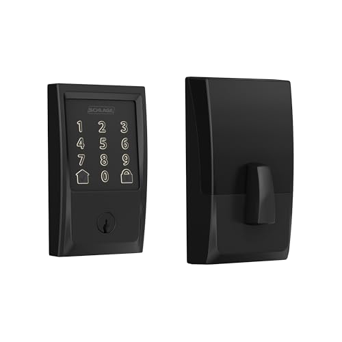
Black iron lanterns, about 16 by 8 inches (41 by 20 cm) each, either side of the casing are the contrast a yellow door needs so that it is not the only thing pulling focus, and they anchor the composition in winter when there is no foliage. Hardware is the one place to disagree with the usual advice: brass on a mustard door reads as yellow on yellow and vanishes. A satin nickel lever, about 4 inches (10 cm), cool and silver, gives the door its one cool note and looks crisp against the amber.
Key Takeaway: Pair a low-saturation golden mustard with a warm taupe-gray, never a lemon yellow with a cool gray, and use black lanterns plus a nickel lever so the door has both a dark anchor and one cool note.

“Bold Doors Hurt Resale” Misreads the One Study Everyone Cites
 Save
 Save
The resale argument against a bright door traces back to one piece of research: Zillow’s 2018 analysis of listing photos, which found homes with black or charcoal front doors sold for roughly 6,271 dollars more than expected. Two things get lost when that number is repeated. First, it measured photographs of homes that had already sold, so it describes an association between dark doors and higher prices, not a repaint that caused one; the kind of house that gets a charcoal door is often the kind of house that is well maintained everywhere else. Second, it says nothing at all about turquoise. It found a premium for dark doors. It did not find a penalty for bright ones.
What actually protects a bold color at resale is containment. A turquoise door under a white column portico on a medium gray clapboard colonial is a bright color inside a formal white frame, and the frame is what makes it read as a choice rather than a mood. The portico columns, the entablature and the simple transom above surround the color with the most traditional architecture on the house, and that architecture is what a buyer registers first. Take the same turquoise and put it in a plain brick-mold opening on a builder-grade front and it reads as a whim, because nothing around it says “considered.”
Saturation should scale with the frame. A wide portico can carry a clear, fully saturated turquoise. A narrow casing wants a grayed-down teal instead, the kind covered earlier under blue. Gray clapboard is the ideal ground for this because it is neither warm nor cool at a glance, and a strong blue-green pulls the gray toward cool, which reads clean and coastal rather than chilly, especially with warm late sun on the siding.
From the guides
You've saved it, wanted it. Here's the how: codes, measurements, order. Your choices make it yours.
The Japandi Honest PlaybookThe honest version of the style: what to keep, what to skip, and the order to do it in.See inside →The Room Refresh PlaybookA repeatable four-step method, room by room, in ten minutes, thirty minutes, or one weekend.See inside →Make Any Room Feel Cozy on PurposeWhy some rooms hold people and others empty out, and the moves that change it.See inside →Keep everything else strictly quiet. Slate gray steps, white columns, two low formal shrubs in small pots set in the outer corners at the base of the portico, and no wreath, no second color, no contrasting hardware. A bright door works when it is the only bold decision on the facade. The failure mode is a turquoise door plus a red mailbox plus coral cushions on the porch chairs, and at that point the door is blamed for a problem the accessories created.
Key Takeaway: The famous study rewards dark doors but never penalizes bright ones; a bold color survives resale when it sits inside a formal white frame and is the only strong color on the facade.

On a Charcoal House, the Door Is Not the Accent Anymore
 Save
Every rule in this guide assumes the door is the accent and the house is the ground. On a dark charcoal house that assumption breaks. When the body is a near-black Roman brick with black window frames, there is no darker color to give the door, and a bright color on a 36 inch (91 cm) door against 40 feet (12 m) of charcoal looks like a postage stamp. The accent job moves off the door and onto the landscape, and the door’s job becomes disappearing well.
Disappearing well means matching the window frames. On a contemporary charcoal facade with black aluminum glazing, a door in the same black, or in a charcoal one step lighter than the brick, reads as another opening in the grid. The entry is found by its position and its lighting, not by its color. If you want a whisper of warmth, a door in a very dark bronze does it without breaking the monochrome; a natural wood door in a dark walnut stain does it more obviously and is the one color move that reliably works on a house this dark.
The real accent is a single burgundy-red Japanese maple at the corner. Against charcoal brick and a green lawn, that one tree carries more color than any door could, and it changes through the year in a way paint cannot. Low clipped boxwood along the foundation, about 24 inches (61 cm) tall, gives the base of the dark wall a dark green line that keeps the brick from meeting the lawn abruptly. This is the palette: charcoal, black, green, one burgundy. A colored door would be a fifth element and the composition does not have room for it.
Brick tone is where the undertone question comes back. Narrow Roman brick in dark charcoal often has a warm, slightly brown cast when the mortar is a matching dark gray, and a cool blue-black when the mortar is lighter. Check the brick in cloudy light before choosing the door black; a warm brick wants a black with a hint of brown, and a cool brick wants a true neutral black. Getting that one degree wrong is the difference between a door that belongs to the grid and one that looks stuck on.
Key Takeaway: On a charcoal or near-black house, paint the door to match the window frames and let a single red-leaved tree and dark hedging carry the color instead.

Chips Held to the Door Lie; Sample Boards Seen From the Street Tell the Truth
 Save
 Save
The reason so many gray-house doors get repainted within a year is the way they were chosen: a paint chip pressed flat against the existing door, judged at arm’s length in porch shade. Three things are wrong with that. The chip is 2 by 3 inches (5 by 8 cm) and paint reads darker and more saturated as the area grows. The porch is in shade, and most of the day the door is being looked at from the sunlit lawn. And a chip against the old door color is being compared to the wrong thing; the comparison that matters is against the siding.
The method that works costs one sheet of primed hardboard and an afternoon. Cut the board to at least 24 by 36 inches (61 by 91 cm), bigger if you can manage it. Paint two full coats of the sample, in the sheen you intend to use, because sheen is part of the color. Lean the board in the door opening, or better, screw it to the door temporarily, and walk to the sidewalk. Look at it in the morning when the sun is on one side, in the flat light of early afternoon, and at dusk with the porch lantern on. Then move the board to the shaded side of the house and check whether the color goes muddy or goes dead. A deep forest green, for instance, stays green in sun and drops to near-black in shade, and you need to decide whether you like both versions before committing.
Compare boards, not a board against the door. Two or three candidates side by side in the opening tell you more in ten minutes than one candidate tells you in a week. What you are watching for is not which color is prettiest but which one holds its identity across all the light conditions and reads clearly against the siding from 50 feet (15 m).
Read the sample against the whole facade, not just the wall next to it. A two-story gray house has a roof color, a foundation, a walkway and often a large tree, and a dark green door under an oak on a cool gray house reads as part of the landscape, which is the effect that makes greens the growth color right now. On a bare lot with no trees, the same green can feel imported. Small sample, wrong light, wrong distance: that is the whole mechanism of a regretted door.
Key Takeaway: Paint two coats on a 24 by 36 inch board in the real sheen, mount it in the opening, and judge it from the sidewalk at morning, afternoon and dusk before you buy the gallon.
“Gray Houses Are Dated, Repaint the House” Is the Painter Talking; A Door Is the Fix
 Save
The latest color reports have been unusually consistent: warm neutrals are in, Sherwin-Williams named a khaki, Universal Khaki SW 6150, as its color of the year, and terracotta is being described as a new neutral. The conclusion people draw is that a gray house is now a dated house and the fix is a whole-exterior repaint. That is thousands of dollars of labor to solve a problem the door can solve on its own. What dates a gray house is not the gray; it is the cool gray plus white trim plus black door formula that was applied to every new build for a decade. Change the door and the formula is gone.
Terracotta on a light warm gray stucco is the clearest version of the update. A deep clay red-orange, matte, on a flat slab door with three small square windows, is exactly the color the trend pieces are talking about, and the house around it does not have to change at all. Warm gray stucco already has the red and brown in it that terracotta amplifies; the pairing reads as Southwest-meets-modern rather than as a gray house wearing an orange door. On a cool gray body the same terracotta fights, so this is a warm-gray move specifically. Check the undertone with the white-paper test first.
Match the hardware to the temperature. A dark bronze lever on a terracotta door keeps the whole entry warm; black hardware would be fine but slightly harder, and nickel would look cold against clay. A single black cylinder light above the casing keeps the modern line. A large unglazed terracotta pot, about 18 inches (46 cm), holding a gray-green agave in one outer corner of the entry, repeats the door color in a rougher material and puts a gray-green in the picture that ties back to the stucco.
If terracotta is more than you want, the same logic works with the rest of the current warm family: a deep tailored brown, an olive, a khaki-green. Any of them on a warm gray house reads as current without touching the siding. The rule underneath is simple. When the trend moves warm and your house is gray, move the door warm and let the gray become the neutral it was always supposed to be.
Key Takeaway: A gray house is dated by its black-door formula, not by its gray; a warm door in terracotta, olive or deep brown updates it for the cost of a gallon rather than a whole repaint.
“Wood Doors Only Suit a Craftsman” Is the Cheapest Warm-Up Most Gray Houses Skip
 Save
 Save
Wood front doors get filed under Craftsman bungalows and left there, which is how a lot of gray houses miss the single most reliable way to warm up a cool exterior. A stained wood door is not a color choice in the way paint is. It brings grain, which is texture, and a warm tan-to-brown range that no paint quite reproduces, and against a charcoal or cool gray wall the effect is immediate: the entry feels lived in rather than specified. Several of the latest trend pieces describe the tailored browns being pushed on doors as “echoing high-end wood stains,” which is a long way of saying that a real wood door is the original.
On a charcoal board-and-batten house, a white oak door in a clear matte finish is the version to look at. White oak is pale and slightly gray in its own right, so it does not turn orange the way a red oak or a pine will, and its open grain reads as texture even from the street. Skip the casing: let the oak meet the charcoal with a simple black steel reveal, so the door is a warm plank inside a dark wall rather than a picture in a white frame. This is the one pairing in this guide where white trim would hurt, because it would put a bright edge around a door whose whole point is its softness.
A wood door needs real maintenance and a real overhang. A clear exterior finish on a south or west entry will need recoating every one to two years; under a 4 foot (120 cm) porch roof, that stretches to three or four. If the entry has no overhang, choose a fiberglass door with a convincing oak grain and stain it, which gives the same warmth with a fraction of the upkeep. Either way, go matte. A gloss finish on a wood door reads as a bowling alley.
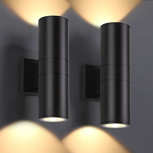
Keep the accessories in the dark family so the wood is the only warm thing. Matte black pull and deadbolt, a black rectangular lantern, and a tall charcoal planter with clipped boxwood in the outer corner. One narrow vertical glass lite on the slab brings light into the hall without breaking the plank rhythm.
Key Takeaway: On a cool or charcoal gray house, a white oak door in a matte clear finish is the surest warm-up there is; drop the white casing, keep the hardware black and give the wood an overhang.

“Green Needs a Green Landscape” Gets the Relationship Backwards
 Save
The objection to a green door is usually that the yard is not lush enough to support it, as if the door were a plant. In practice the relationship runs the other way: a deep green door supplies the green when the landscape cannot. In late winter on a mid-gray shingle house, with a mulch bed and dormant shrubs, a forest green door is the only living color on the facade, and it makes the house look planted even when nothing is. In June, the same door recedes slightly into the foliage and the white trim takes over as the accent. Both are good outcomes, which is why deep greens are the color the trend pieces keep returning to right now.
The depth matters. A forest green with a light reflectance under 10 behaves like navy in shade, so it needs either a wide white casing or a lantern to keep it from going black under a porch roof. A green in the 15 to 25 reflectance range, more of a hunter or a dark olive, holds its color in shade and is the safer choice for a covered entry. Either way, the green should look slightly gray on the chip; a clear emerald reads as a sports team on a gray house.
Cedar shingle is the ideal ground for green because weathered cedar has both gray and warm brown in it, and green sits between those two temperatures comfortably. On smooth vinyl or fiber cement in a cool gray, the same green needs a slightly bluer cast to agree with the wall; on a warm greige, a slightly yellower olive. This is the same undertone rule from the first section applied to one color family.
Brass is the hardware finish for green. A polished brass lever and a brass mail slot on a forest green door are warm metal against a cool-dark color, the same logic as brass on navy, and the combination is what makes a green door look established rather than trendy. Add one black iron lantern so the hardware is not the only metal, and keep the threshold plain: a natural coir mat, a granite step, gravel. Nothing else should be green, or the door stops being the point.
Key Takeaway: A deep green door supplies the landscape color your yard lacks in winter and rests behind the foliage in summer; keep it grayed rather than emerald and give it brass hardware.

The Red Door “Always Works” Right Up Until the Gray Underneath It Is Cool
 Save
 Save
The red front door is the one color everyone agrees “always works,” and on a gray house it works less often than any other classic. The reason is that most red door paints are tomato or fire-engine reds, clear and warm, and most gray siding sold in the last fifteen years is cool. Clear red on cool gray produces the visual equivalent of a siren: the two colors have nothing in common and the door vibrates against the wall. The people who say red always works are usually picturing it on a white house or a brick one.
The red that does work on gray is a dark, brown-leaning red: oxblood, cranberry, brick. These reds have black and brown in them, so they carry a gray component of their own, and on a light cool gray clapboard they read as deep and traditional rather than bright. From the street an oxblood door looks almost black with a red warmth in it, the same trick that charcoal-with-an-undertone plays, and up close it is clearly red. The chip should look slightly dull and slightly brown; if it looks like a candy apple, it will look like one on the door.
A Cape with a brick stoop is the natural home for this color, and the brick is doing more work than it seems. Worn red brick beneath the door repeats the door’s red in a rougher, lighter form, which makes the door read as part of the house’s material story rather than as paint. On a house with a concrete or bluestone stoop, an oxblood door still works but wants one other warm red-brown somewhere: a terracotta pot, a cedar bench, a natural wood mailbox post.
Brass is again the metal. A polished brass knocker and lever on oxblood is the pairing that gives this door its classic reading, and two small black lanterns keep the metals balanced. A single glazed black pot with a boxwood in the outer corner of the stoop, and nothing else, so the door, the brick and the brass are the only warmth on a cool gray house. That restraint is what separates a considered red door from a loud one.
Key Takeaway: Choose a brown-leaning red like oxblood or brick, never a clear tomato red, on cool gray siding, and let a brick stoop and brass hardware repeat its warmth so the door reads as tradition rather than as alarm.

The White Door Is Not the Boring Default; On Charcoal It Is the Boldest Move Available
 Save
White is what the builder left on the door, so it gets treated as the absence of a decision. On a light gray house that is fair; a white door on a light gray wall is the flattest pairing there is, one value against a slightly darker one. Reverse the house and everything changes. On a deep charcoal house with charcoal trim, a bright white door is the highest-contrast move on the entire facade, brighter than any color could be, and it does the job that a black door does on a white house: it is the graphic anchor the eye finds first.
The trick is to paint the casing white along with the door, and to leave every other piece of trim on the house charcoal. That gives the entry a white frame around a white panel, a bright block about 44 by 84 inches (112 by 213 cm) on a dark wall, and it makes the door read from two houses away. Paint only the door and leave the casing dark and the white shrinks to a slab and loses half its effect. Paint all the trim white as well and the door is no longer the point; it is just one white element among many.
Choose the white carefully. A pure, cool white in the same family as the trim whites reads crisp against charcoal; an off-white or cream picks up yellow against a cool gray and looks dingy. Satin rather than gloss, because a glossy white door on a dark house catches every reflection of the yard and turns gray in the process. A single large square glass lite in the upper half keeps the slab from feeling like a blank sheet.
The hardware and lighting stay black so they disappear against the wall and register only against the door. A matte black lever and deadbolt, two black cylinder sconces either side of the casing, a plain charcoal mat. One galvanized steel planter of tall ornamental grass in the outer corner adds a mid-gray metal and a green that keeps the scheme from being purely black and white. This is the pairing for the person who wants a bold entry and does not want a color, and it is not the boring version of anything.
Key Takeaway: On a charcoal house, paint the door and its casing a crisp cool white and leave all other trim dark; the white becomes the boldest element on the facade without adding a color.

Trim Is Not Always White, and Changing It Changes Which Door Colors Are Available
Every pairing so far has leaned on white trim to give the door a bright edge. That is the standard three-color scheme, and it is why so many door colors “need” a wide white casing to work. Change the trim and the rules change with it. A house with self-trim, meaning the trim, fascia and window frames painted the same gray as the walls, has no bright edges anywhere, and on a house like that the door is no longer competing with a white frame for attention. It can be quieter and still be found.
On a warm mid-gray stucco with matching trim, a deep bronze-brown door is the color that makes sense. It is darker than the wall by three or four steps, so it reads from the street, and it is warm in the same direction the gray is warm, so it belongs. With white trim the same bronze would look muddy next to the bright edge. Without it, the door is a warm dark plane in a warm mid field, and the effect is calm in a way that almost no white-trimmed entry achieves. This is the pairing for anyone whose reaction to most of this guide has been “I do not want the door to be a thing.”
Self-trim narrows the list of workable door colors, and that is a feature. Bright colors, turquoise, mustard, clear red, need a white frame to contain them, and on a monochrome house they float. Deep, grayed colors, bronze, olive, charcoal-blue, dark green, work because they read as the same house one step darker. If you are planning a full repaint and want a bold door, keep white trim. If you want the house to feel like one material, go self-trim and choose a door from the deep end of the strip.
The details on a monochrome entry have to be precise because nothing hides. Brushed bronze on the lever so the metal matches the door’s temperature, a long black linear light mounted horizontally above the door rather than lanterns either side, and a low concrete bowl of gray-green succulents in the outer corner of the stoop. Four small square lites across the upper third of the door give it a rhythm and let the hall light out at night, when this door is otherwise invisible.
Key Takeaway: Painting the trim to match the walls removes the bright edge that bold door colors rely on, and opens the door to deep warm neutrals like bronze that read as calm rather than as accent.

Hardware Is Not the Last Decision; It Is Part of the Color
 Save
Hardware gets picked in the last ten minutes at the store, after the paint, as if it were a screw. It is a color. A lever, a deadbolt and a lantern in one finish put a warm or cool metal in the picture at exactly the height where people look, and the metal changes how the door color reads. Brass warms a door. Black sharpens it. Nickel cools it. Bronze deepens it. The same dusty blue door on the same light gray house looks like four different doors under those four finishes.
The pairings follow the undertone logic. Cool door colors, navy, slate, forest green, dusty blue, gain from a warm metal, and unlacquered brass, which darkens and mottles over a few years, is the finish that makes a cool door look like it has been there a long time. Warm door colors, mustard, terracotta, oxblood, want either a cool metal, nickel, to give them one contrasting note, or black to anchor them. Black works on almost everything and is the safe pick, which is why every new build has it; it is also the finish most likely to make an entry look like every other entry on the street.
Scale the hardware to the door. A 5 inch (13 cm) lever and a 2.5 inch (6 cm) deadbolt rose on an 80 by 36 inch (203 by 91 cm) door are correctly proportioned; a full-length 24 inch (61 cm) pull on a traditional six-panel door is the wrong idiom. Add a house-number plaque on the casing in the same metal, plain raised numerals, no script, mounted at about 60 inches (152 cm) so it reads from the path. A small lantern in the same finish to one side completes a set of three, and three matched pieces in one metal is what reads as intentional.
On a dusty blue door the specific combination is a mid blue with enough gray that the chip looks dull, satin finish, unlacquered brass lever, deadbolt, plaque and lantern, white casing, natural coir mat. Nothing black, because black would pull the eye off the brass and the blue together. This is the one section of the guide where the door color is almost secondary: get the metal right and several blues will work.
Key Takeaway: Choose the hardware finish with the paint, not after it: brass for cool doors, nickel or black for warm ones, and three matched pieces in one metal so the entry reads as decided.

Plum Is Not a Novelty Color; on a Cool Gray House It Is the Sophisticated Near-Black
 Save
 Save
Purple doors get treated as a personality statement, and the current trend lists putting aubergine and plum next to sapphire and ruby do not help; they file it under “bold.” On a cool light gray house a deep aubergine is not bold at all. It is a near-black with a warm violet depth, the same relationship to black that oxblood has, and from the curb it reads as a very dark, very expensive-looking door that is not quite black and not quite navy. People stop and look because they cannot name it, and that is a different reaction from the one a bright door gets.
The reason it belongs on cool gray specifically is that cool grays often carry a faint violet undertone, the one Houzz posters panic about when their siding “looks purple” at dusk. A deep plum door leans into that instead of fighting it. Where a navy can make a violet-leaning gray look more purple by contrast, an aubergine absorbs the violet into itself and the siding reads as a cleaner gray beside it. It is the one case where matching the undertone you are worried about is the fix.
Depth is non-negotiable. A mid or light purple, a lilac, a mauve, reads as sweet and immediately dates the house. The chip should look nearly black with a purple warmth visible only in good light, a light reflectance under 10. Satin finish, not gloss; gloss on a color this dark reflects the sky and turns it blue. And a wide white casing with a pediment, at least 5 inches (13 cm), because like navy and black this is a low-reflectance door that needs a bright edge on a mid-value wall.
Keep the metals black rather than brass. Brass on aubergine reads as regal in a way that tips into costume; matte black lever, deadbolt and lanterns keep the door modern and let the plum be the only unexpected note. A single black glazed pot of silver-green lavender in the outer corner of the stoop is the one plant that agrees with the color, and it repeats the violet in a form that is clearly alive. The failure mode is over-committing: a plum door plus purple cushions plus a wreath with purple ribbon, and suddenly the house has a theme.
Key Takeaway: On a cool gray with a violet lean, a satin aubergine so dark it reads nearly black is the sophisticated alternative to navy; keep the metals black and let the door be the only purple on the house.

Two Coats and a Weekend Is the Myth; Prep Is Where the Color Actually Comes From
 Save
The last piece of received wisdom is the most practical one: a front door is a two-coat weekend job, brush and go. It is the reason so many carefully chosen door colors look wrong a month later, because the color you see on a badly prepped door is not the color you bought. Gloss left under the new paint makes a satin read glossy in patches. Old color bleeding through a single coat shifts a charcoal toward whatever was there before. Brush marks on a dark door catch light and turn a flat plane into a streaky one. The color decision is finished on the chip; the color result is decided on the sawhorses.
The sequence that gets the chip color onto the door starts with taking the door off. Pull the hinge pins, lay the slab flat across two sawhorses, remove the lever, deadbolt, knocker and weatherstripping. Sand the whole face with 220 grit to kill the old sheen, wipe with a tack cloth, and prime any bare or patched spots with an exterior bonding primer. On a dark color over a light one, or any color over a factory white fiberglass door, prime the whole slab in a gray-tinted primer; the tinted primer is what lets two topcoats reach full depth, and it is the difference between a charcoal that looks like the chip and one that looks dusty.
Use an exterior acrylic in satin, two full coats, with a 4 inch (10 cm) foam roller on the flats and a 2 inch (5 cm) angled sash brush in the panel grooves, working panels first and stiles last so the brush marks run with the grain. Allow the full recoat time on the can, typically four hours, and leave the door open on its hinges or flat on the horses for a further day before it closes against the weatherstrip, or the paint will print. Paint the outer edge the door color and the inner edge the interior color; the convention is that the edge belongs to the room it swings into.
Reinstall the hardware last, and only after the paint has cured, not merely dried. Then stand at the curb one more time. If the prep was right, the door on the house looks like the board you approved. If it looks different, it is almost always sheen, and sheen is a prep problem, not a paint-color problem.
Key Takeaway: Take the slab down, sand off the old sheen, use a gray-tinted primer under any dark or mid color, and roll two satin coats, because the color you chose only appears on a properly prepped door.

The received advice about front door colors for a gray house is not so much wrong as unconditional, and the conditions are the whole story. Gray is not neutral: it leans warm or cool, and the door has to know which. A door needs a value gap from the wall more than it needs a hue. Dark colors, navy, forest green, aubergine, charcoal, only stay themselves when a wide white surround or warm lantern light gives them an edge in the shade. Sheen and hardware finish shift a color as much as a shade change does. And the house decides what the door’s job is: on a light gray house the door is the accent, on a charcoal house the landscape is.
Start with the white-paper test on the siding this weekend. Then paint two or three candidates on 24 by 36 inch (61 by 91 cm) boards in the sheen you mean to use, prop them in the opening and walk to the street at morning, afternoon and dusk. The one that still reads clearly from the sidewalk in all three, against your gray and not against a chip, is the door you will not repaint.
From the guides
You've saved it, wanted it. Here's the how: codes, measurements, order. Your choices make it yours.
The Japandi Honest PlaybookThe honest version of the style: what to keep, what to skip, and the order to do it in.See inside →The Room Refresh PlaybookA repeatable four-step method, room by room, in ten minutes, thirty minutes, or one weekend.See inside →Make Any Room Feel Cozy on PurposeWhy some rooms hold people and others empty out, and the moves that change it.See inside → Save