Georgia
You want a living room that feels considered, European, and light-filled without tipping into fussy or generic “vintage white.” The Gustavian style promises exactly that. But the question most people are really asking when they search it is more pointed: how do you tell the difference between a Gustavian room that reads as the real thing and one that just looks like a collection of pale painted furniture with no logic holding it together?
That gap comes down to a handful of specific decisions, and most articles never name them. This one does. The 17 ideas below are organized around the actual choices you face: wall color and finish, furniture proportion and placement, how to handle a focal point, when pattern is appropriate and in what scale, and what the lighting has to do. Work through them in order and the room builds itself.
The Architectural Bones Come Before the Furniture
 Save
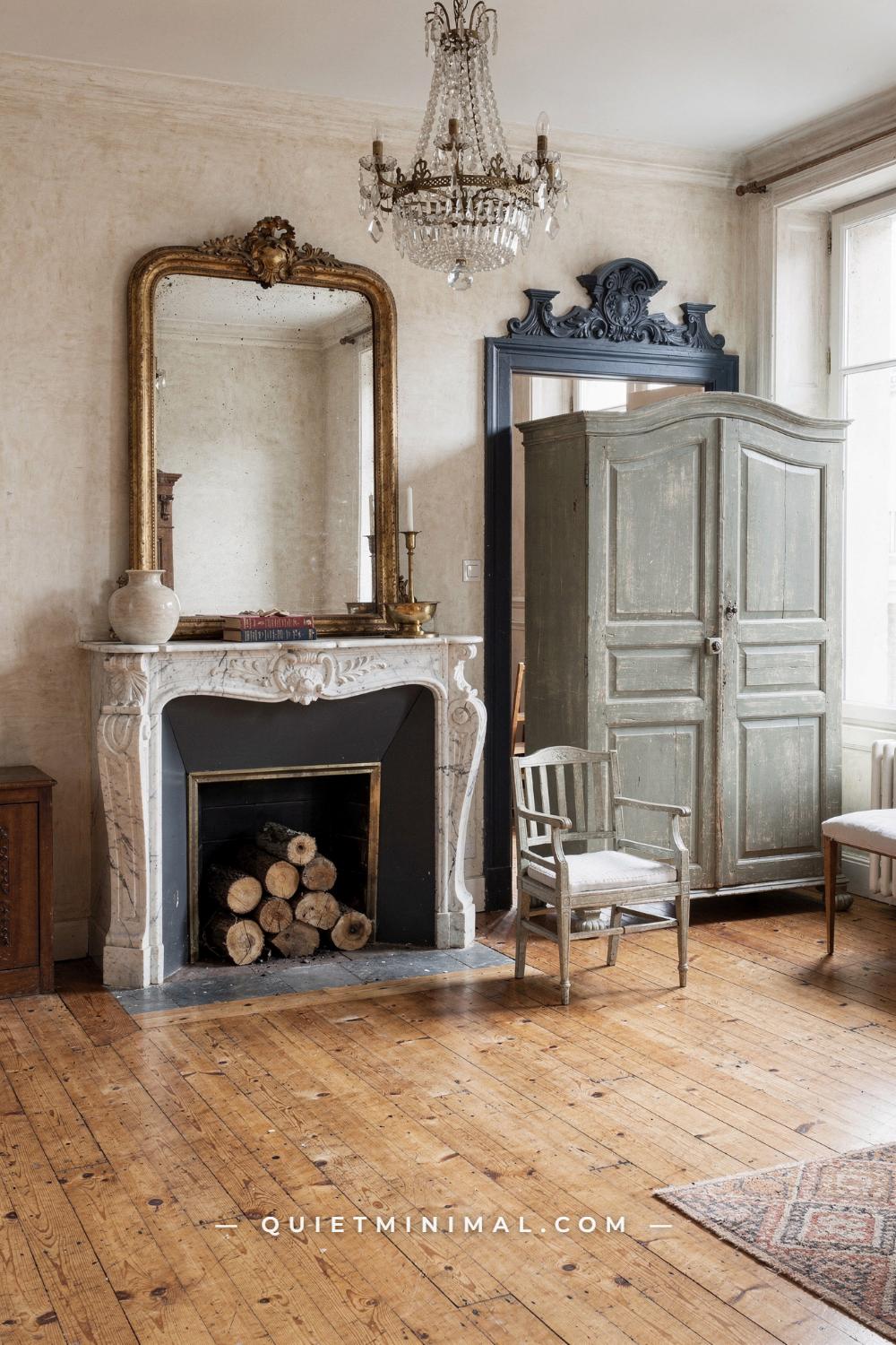
The failure mode that kills most Gustavian attempts starts before a single piece of furniture is chosen: people bring in pale painted chairs and call it done, with no attention to what the architecture is saying. Authentic Gustavian rooms lead with architectural elements, and the furniture steps back. The carved marble mantelpiece here sits at approximately 60 inches (152 cm) wide, the gilt mirror leans at around 48 inches (122 cm) tall, and together they create the room’s vertical axis. The furniture, two barrel chairs each about 26 inches (66 cm) wide and a brass side table at 18 inches (46 cm) in diameter, is comparatively modest in scale. That contrast, large architecture, restrained seating, is the Gustavian principle in spatial form.
If your room does not have a carved mantelpiece, your equivalent architectural move might be a pair of bookshelves flanking a centered console, or a paneled accent wall behind the sofa. The point is that the room needs a fixed focal wall that the furniture acknowledges and defers to. When both architecture and furniture compete for the same visual weight, the room looks cluttered regardless of palette.
The plaster wall reads in a warm greige, a putty tone with just enough warmth to keep the ivory marble from going cold. The painted doorframe in slate blue is a key detail: Gustavian interiors used painted architectural features, doors, cornices, and window surrounds, in tones that pulled from the room’s secondary accent palette. If your trim is painted a simple bright white, you are making a different and quieter choice, which is valid, but painting one set of casings or a single doorframe in a dusty blue or soft sage creates a layer of architectural intention that plain white cannot match. Do not paint all the trim in the room a colour accent; one feature at a time prevents the room from feeling like a paint store.
From the guides
You've saved it, wanted it. Here's the how: codes, measurements, order. Your choices make it yours.
 The Japandi Honest PlaybookThe honest version of the style: what to keep, what to skip, and the order to do it in.See inside →
 The Room Refresh PlaybookA repeatable four-step method, room by room, in ten minutes, thirty minutes, or one weekend.See inside →
 Make Any Room Feel Cozy on PurposeWhy some rooms hold people and others empty out, and the moves that change it.See inside →
The Persian rug at approximately 8×10 ft (244×305 cm) grounds the seating zone in deep crimson that both contrasts and completes the warm greige wall. Gustavian rooms historically included strong textile color at floor level even when walls stayed pale, and the rug is where that color lives most authentically.
Key Takeaway: Let your largest architectural element, fireplace, doorframe, or shelving wall, be the room’s first design decision; the furniture is sized and placed in response to it, not the other way around.

Natural Light Is Not a Bonus; It Is the Structural Element
 Save
The Gustavian style did not develop its pale palette because Swedes preferred neutrals aesthetically. It developed that palette because Scandinavian winters are dark for months at a stretch and every design decision was made to capture, hold, and return available light. Crystal chandeliers, large mirrors, and pale painted surfaces were not decorative choices in the original rooms; they were functional infrastructure for a climate that had very little daylight to spare. Understanding that context changes how you make decisions in your own room.
In this open-plan space, a large arched skylight is the primary light source, and every other element is arranged to receive and reflect it. The cream sofa, approximately 90 inches (229 cm) wide, is upholstered in a silk-sheen fabric that picks up the overhead light rather than absorbing it. The round glass coffee table at 40 inches (102 cm) in diameter does not interrupt the floor plane visually, which keeps the light reading continuous across the space. The dark walnut carved trim on the sofa and the dark walnut table legs provide the contrast needed to prevent the room from reading as flat and colourless without adding any surface that blocks light.
The practical translation for most rooms: identify where your strongest light source is and do not block it with tall furniture. Position your sofa to face the window rather than to back onto it, which allows the upholstery to be lit from the front. If you have no skylight, a chandelier hung at the center of the room with a glass or crystal shade returns light downward and sideways simultaneously, which is what the bronze and glass fixture here does.
The single large fiddle-leaf fig in the corner is the room’s only botanical accent, and it reads clearly because nothing competes with it. Gustavian rooms often included live plants and natural objects as decoration, but they were used singly, not in clusters, which kept the room from feeling like a conservatory.
Key Takeaway: Design the room around your light source first, orienting furniture and choosing surface finishes specifically to capture and return available daylight rather than blocking or absorbing it.

Sage Green Upholstery With French Doors Works Because of Scale, Not Color
 Save
Sage green is one of the Gustavian palette colours most often used incorrectly. The colour itself is right, but most people choose upholstery that is either too saturated, reading as herb green or moss green, or too grey, reading as sage-grey. The correct Gustavian sage sits in a narrow band: a mid-tone green with a quiet grey undertone that keeps it muted rather than fresh or botanical. The roll-arm sofas here, approximately 84 inches (213 cm) wide, get this right. Against the pale wood floors and the creamy wall, the sage reads as a true accent colour rather than the dominant surface.
The format of the seating arrangement is equally important. The two sofas are arranged facing each other around the round pine coffee table at 36 inches (91 cm) in diameter, with the French doors acting as the focal backdrop rather than a fireplace. This is a legitimate Gustavian move: the style centres a room on the social zone, and the focal point is whatever creates the strongest framing element in the space, whether that is a fireplace, a set of doors, or a window bay.
The floral chintz rug in cream, pink, and gold is a French Country crossover piece, which this room navigates because every other pattern, the curtain fabric and the botanical prints, stays in the same floral register. The failure mode here would be mixing the chintz with a geometric or stripe pattern at the same scale. When you use pattern in a Gustavian room, keep the pattern family consistent and use it at one dominant scale, with a second pattern appearing only at a much smaller or much larger scale to avoid visual collision.
The crystal and brass chandelier at approximately 20 inches (51 cm) in diameter is relatively compact for the room size, which is deliberate. A chandelier slightly undersized for the ceiling reads as collected and considered; a chandelier that fills the ceiling reads as a showpiece and shifts the room’s character toward something more formal than Gustavian intentions call for.
Key Takeaway: Sage green upholstery works in a Gustavian living room only when the tone is genuinely muted and grey-undertoned; a saturated or fresh green reads as a French Country colour, not a Gustavian one.

Flanked Bookshelves and a Central Fireplace Are the Formula That Survives Every Era
 Save
The flanked alcove formula, symmetrical bookshelves on either side of a centered fireplace, is not a trend. It is the oldest and most proven focal-wall strategy in European domestic architecture, and Gustavian rooms used it because it solves three problems at once: it creates a clear focal point, it provides storage that does not read as practical furniture, and it gives the room two additional vertical surfaces that can carry decorative objects without requiring wall art.
The carved marble fireplace surround here is approximately 60 inches (152 cm) wide, which is the minimum width needed for the flanking shelves to feel intentional rather than squeezed in. If your mantelpiece is narrower than 48 inches (122 cm), the shelves will fight with it rather than frame it. In that case, the better move is a single statement cabinet or armoire on one side of the fireplace and a generous reading chair on the other, which creates asymmetrical balance rather than formal symmetry.
The cream tufted wingback armchair at approximately 30 inches (76 cm) wide placed in front of the fireplace is the correct Gustavian reading: one primary seat faces the focal wall, oriented for both warmth and visual conversation with the mantelpiece. The failure mode is placing a full sofa in front of the fireplace when the room is not wide enough for it to sit at a proper distance. The minimum distance between the front edge of the sofa and the face of the firebox is 36 inches (91 cm) for both safety and proportion. Below that, the sofa crowds the mantel and both elements lose their presence.
The chandelier here is a Murano-style crystal piece at approximately 36 inches (91 cm) in diameter, hung at a ceiling height that keeps it well above the sightlines from the armchair. In a library-salon arrangement, the chandelier is the room’s crown, not its centrepiece, so hanging it too low breaks the vertical logic of the space.
Key Takeaway: The flanked-shelf and centered-fireplace formula works because it solves balance, storage, and focal point simultaneously; the only constraint is that the mantelpiece must be wide enough, at least 48 inches (122 cm), for the flanking elements to frame rather than crowd it.

Navy Walls With Toile Panel Inserts Are a Gustavian Move, Not a French Country One
 Save
Most people associate Gustavian living rooms exclusively with pale walls and cream furniture. The deep navy version here is equally authentic to the period: Gustavian Swedes of the 18th century used saturated navy, cobalt, and deep grey-blue in interiors where the architecture was strong enough to hold it. The rule was not “keep everything pale”; the rule was “keep the palette disciplined and the surfaces matte.”
The navy wall here works because it is held together by three constraints. First, the toile panel inserts, approximately symmetric on either side of the fireplace, provide a cream field that breaks the navy at regular intervals rather than letting it read as a single heavy mass. Second, the Louis XV canape settee at approximately 60 inches (152 cm) wide is upholstered in the same blue-on-cream toile as the wall panels, which ties the seating to the wall and prevents the furniture from floating. Third, the carved white marble fireplace surround at approximately 54 inches (137 cm) wide provides a hard, bright anchor that reads clearly against the saturated background.
The navy velvet tufted ottoman at 30 inches (76 cm) in diameter functions as the coffee table. Tufted velvet in the same family as the wall colour, rather than a contrasting piece, keeps the room from becoming choppy. The ginger jar planter at approximately 18 inches (46 cm) tall is the room’s only botanical accent and provides the one vertical element between the fireplace and the seated figure.
The failure mode in dark Gustavian rooms is choosing a warm navy, one with red or purple undertones, rather than a cool blue-grey navy. A warm navy reads as French Colonial or English club; a cool navy stays Swedish. Look at the blue in the toile pattern and match the wall to its darker ground, not to a navy that introduces warmth the toile does not have.
Key Takeaway: A deep navy Gustavian living room succeeds only when the navy is cool-toned and blue-grey rather than warm, and when it is broken at regular symmetrical intervals by a lighter fabric or panel insert that connects to the seating upholstery.

The Gallery Wall Behind the Sofa Needs One Rule to Work
 Save
Gallery walls in a Gustavian living room are an entirely different proposition from the curated mixed-media grid that became popular through the 2010s. The Gustavian version has a single defining rule: all frames are gilt, and all subjects are in the same pictorial register, typically oil paintings, whether pastoral landscapes, portraits, or still lifes. Mixing gilt frames with natural wood frames or black frames is the fastest way to destroy the cohesion that makes a Gustavian gallery wall read as intentional.
The paintings here all share a dark, aged-canvas quality, which is the correct texture. A Gustavian gallery wall does not include bright prints, fashion illustrations, or graphic posters, even in gilt frames. The subjects do not need to match thematically, but they need to share a similar tonal weight, which in practice means they should all look as though they came from the same era and colour palette. Aged landscape paintings do this naturally; their grounds of sienna, umber, and cadmium naturally unify disparate subjects.
The sage green roll-arm sofa at approximately 84 inches (213 cm) wide sits directly below the gallery, which means the lowest frame should clear the back of the sofa by at least 8 inches (20 cm). Place it lower and the frames read as if they are resting on the sofa rather than inhabiting the wall above it. Place them more than 18 inches (46 cm) above the sofa back and the gallery disconnects from the seating zone entirely.
The boucle accent chair at approximately 28 inches (71 cm) wide sits alongside the sofa rather than facing it, which creates an L-shaped conversation configuration. This is appropriate for an evening room where the arrangement prioritises intimacy over formality. The rustic plank coffee table at approximately 48 inches (122 cm) long provides the worn, collected quality that is essential in a Gustavian-adjacent room: the table should look as though it has history, not as though it arrived last week.
Key Takeaway: A Gustavian gallery wall requires all gilt frames and all subjects in the same pictorial register; the first exception, whether a black frame or a graphic print, collapses the visual logic of the entire wall.

Blue Display Cabinets Are the Credenza Upgrade That Defines the Room
 Save
Painted glass-front display cabinets are a foundational Gustavian storage piece, and they offer something a simple console or credenza cannot: vertical presence. Each cabinet here is approximately 40 inches (102 cm) wide and arched at the top, which gives the wall a height it would otherwise not have. When display cabinets flank a central credenza and an oil painting above, the result is a self-contained wall composition that does not require additional art or objects to feel complete.
The blue in these cabinets sits in a steel-blue range, a cool mid-tone that keeps its distance from navy and from the brighter powder blues that read as nursery colours. This is the correct Gustavian register: the blue is decisive without being saturated, and it works because the cream sofa and cream walls give it clear negative space. The failure mode is placing painted blue cabinets on a coloured wall, which compresses the visual contrast and makes the cabinets disappear into the background.
The contents of the cabinets are equally important. Blue-and-white porcelain, whether genuine Chinese export pieces, Swedish Delft-influenced pottery, or well-made reproductions, is the most period-appropriate content for a Gustavian cabinet. It provides colour continuity with the cabinet’s exterior paint while adding the layered depth that makes a glass-front piece worth having. Do not fill the cabinets with a mix of colours or objects from different periods; the cohesion of what is inside is what separates a display cabinet from a storage cabinet.
The pale blue Chesterfield-tufted rectangular ottoman at approximately 50 inches (127 cm) long serves as the coffee table. The tufting detail connects it visually to the upholstered sofa, and its length is proportional to the sofa’s 90-inch (229 cm) width. A common mistake is choosing an ottoman that is too short for the sofa it serves; the correct proportion is for the ottoman to span roughly 55 to 65 percent of the sofa’s width.
Key Takeaway: Painted glass-front display cabinets in a steel-blue tone function as both storage and architecture; their height and symmetrical placement create wall structure that a flat credenza alone cannot achieve.

Authentic Boiserie Uses Celadon, Not Plain White
 Save
If you have wall paneling in your living room, whether built-in or applied, the most common mistake is painting it a crisp bright white. White paneling reads as contemporary Farmhouse or American Colonial, not Gustavian. Authentic boiserie in a Gustavian room is painted in a chalky, slightly desaturated colour: celadon, a duck-egg blue-grey, a muted sage, or a pale ocher. The tone has to be present enough to read clearly against the gilt carved ornament it frames.
The celadon boiserie here, in a blue-grey with quiet warmth underneath, creates the exact relationship that makes the gilt carving visible: the carved gilded laurel garland over the doorway reads because the background is a distinct, committed colour, not a colour pretending to be neutral. If you painted these same panels white, the carving would almost disappear.
For a modern room where you are adding applied paneling, the recommended approach is to use medium-density fibreboard panels with a moulded edge profile, install them with a 1 inch (2.5 cm) reveal between each panel, and paint the entire wall including the panels in the same chalky tone. Two-tone paneling, different colours for the panel infill and the stile rails, is a different look that belongs to a different tradition. Gustavian boiserie is monochrome, with the depth created by the shadows in the mouldings rather than by colour contrast.
The Louis XV bergere armchair at approximately 26 inches (66 cm) wide is upholstered in aged gold damask, which grounds the celadon wall in warmth without introducing a competing hue. The large blue-and-white ginger jar at approximately 22 inches (56 cm) tall sits on the parquet floor as a floor-level accent, which is a distinctly Gustavian and Swedish decorative habit: large ceramic pieces placed directly on the floor rather than on a pedestal or shelf.
Key Takeaway: Paneling in a Gustavian living room must be painted in a committed chalky colour, not white; the colour creates the field that makes gilt and carved ornament visible against it.

All-White Gustavian Rooms Succeed Only When Texture Does the Work Colour Would Normally Do
 Save
All-white Gustavian rooms are the version people are most likely to get wrong, because the approach requires more precision than coloured rooms, not less. When you remove colour as a differentiating variable, every surface must justify its presence through texture, sheen, or carved detail, or the room becomes flat and reads like an empty staged space.
This room succeeds because it runs four distinct surface types simultaneously: the tufted satin on the carved settee, approximately 64 inches (163 cm) wide, carries a mid-level sheen; the sheepskin throw draped over the coffee table is matte and tactile; the ivory textured damask rug at approximately 9×12 ft (274×366 cm) absorbs light rather than reflecting it; and the sheer voile curtains filter and soften the daylight coming through the bay windows. Remove any one of those four textures and the room loses a layer. Add a fifth in the same register as an existing one and you lose contrast.
The carved limewood settee and matching armchair are the room’s point of distinction. Carved detailing in a pale painted finish is the original Gustavian furniture signature: ornate silhouettes with all the surface gilding replaced by chalky paint. In an all-white version, the carving has to be generous enough to cast its own shadows, because the shadows are what provide visual interest in the absence of colour. A simple, lightly carved frame in a white room reads as nothing. A heavily carved cabriole leg or fluted column reads clearly even across the room.
The carved coffee table at approximately 48 inches (122 cm) long with cream painted cabriole legs is the room’s center, and the sheepskin throw draped across it is the room’s single textural surprise. Sheepskin is a natural material used historically in Nordic interiors for warmth, and it introduces the softness and irregularity that keeps an all-white room from reading as sterile.
Key Takeaway: An all-white Gustavian living room requires at least four distinct surface textures running simultaneously; without that variation, the room reads as staged rather than lived-in.

The Fireplace Mantel Vignette Has Three Objects, Not Five
 Save
The mantelpiece vignette is the most edited surface in a Gustavian living room, which means it is also the most commonly overcrowded one. The mantel here, on a white marble fireplace surround approximately 54 inches (137 cm) wide, carries exactly three objects: a round arched mirror above, a brass table lamp, and a single white orchid. That is the correct Gustavian number. Three objects at different heights create a triangle of visual weight that the eye can read and rest on. Four or more objects turn the mantel into a shelf display, which is a different design intention entirely.
The arched overmantel mirror at approximately 48 inches (122 cm) tall is the primary object and the one that does the most design work: it reflects the room back, doubles the apparent light, and frames the fireplace opening below it. The brass lamp at one side provides warmth at eye level when the overhead light is off. The orchid at the other side provides height variation and a natural element without the messiness of cut flowers. If you add a fourth object, whether a clock, a stack of books, or a decorative object, you disrupt the triangle. The only exception is a pair of identical objects placed symmetrically at equal height on both ends, which restores balance rather than breaking it.
The bleached wide-plank oak floors running through to the dining area visible beyond the arched opening demonstrate the Gustavian enfilade principle: rooms should connect visually through doorways and openings, and the flooring material should be consistent across zones so the eye can travel uninterrupted. If your floors change material at a doorway, the visual flow stops at that threshold. Consistent wide-plank bleached oak or painted floorboards throughout the connected zone are the correct choice.
From the guides
You've saved it, wanted it. Here's the how: codes, measurements, order. Your choices make it yours.
The Japandi Honest PlaybookThe honest version of the style: what to keep, what to skip, and the order to do it in.See inside →The Room Refresh PlaybookA repeatable four-step method, room by room, in ten minutes, thirty minutes, or one weekend.See inside →Make Any Room Feel Cozy on PurposeWhy some rooms hold people and others empty out, and the moves that change it.See inside →The wicker log basket beside the fireplace at approximately 16 inches (41 cm) tall is the room’s practical detail: natural materials used directly and without ceremony. Wicker, rattan, and sisal are all appropriate Gustavian materials because they were used in Nordic interiors as functional everyday objects, not as decorative choices borrowed from another tradition.
Key Takeaway: A Gustavian mantelpiece vignette holds three objects at different heights forming a visual triangle; adding a fourth breaks the edited quality that is the mantel’s entire purpose.

The Painted Swedish Armoire Is the Room’s Statement Piece, Not a Storage Afterthought
 Save
The painted Swedish press cupboard or armoire is the single most identifiable piece of Gustavian furniture in a living room context. At approximately 48 inches (122 cm) wide and 84 inches (213 cm) tall, it commands any wall it inhabits. The key point that most buyers miss: the chippy, distressed surface on authentic Gustavian painted pieces is not damage. It is evidence of multiple repainting campaigns over the decades or centuries of the piece’s life, and that accumulated patina is exactly what makes it valuable and visually interesting.
If you are buying a reproduction or painting a piece yourself, the goal is to achieve a surface that looks as though it has been repainted two or three times over its life, with the most recent coat sitting on top of older colour showing through at the edges and corners. A single fresh coat of chalk paint in the correct colour will look like a newly painted piece, not a Gustavian one. You need to apply two or three thin coats in slightly different shades of the same colour family, sanding back at the high-wear areas between coats to let the underlayers show through.
The pale blue in the armoire here reads as a blue with significant grey and white mixed in, which keeps it from reading as bright or juvenile. Place this same piece against the warm greige plaster wall in strong afternoon sun, which is what this room does, and the blue will shift warmer and slightly more golden, which is the correct Gustavian optical behaviour: the colour is never static and never primary.
The white hydrangea stems in the blue-and-white porcelain pitcher, approximately 10 inches (25 cm) tall, on the rustic walnut coffee table are the room’s editorial moment. Hydrangea is a correct Gustavian botanical choice because the blooms are large, rounded, and neutral in form; they do not read as fussy or tropical. White or pale blue flowers are the consistent Gustavian choice. Avoid roses with tight buds, tropical foliage, or highly graphic botanical forms.
Key Takeaway: The painted Swedish armoire must have a distressed, multi-layered surface rather than a single fresh coat, because it is the accumulated patina rather than the colour alone that gives the piece its Gustavian character.

Pale Grey-Green Walls With Directoire Furniture and Parquet Are the Elevated Version
 Save
Pale grey-green is the wall colour that most directly references the Swedish interior tradition, and it is also the colour most often confused with sage green. The difference is in the proportion of grey to green: a true Gustavian pale grey-green has more grey than green, so that it reads as almost neutral in lower light and reveals its green quality only in direct afternoon sun. A sage green has more green than grey and reads consistently as a colour rather than as a near-neutral.
The Directoire sofa here at approximately 78 inches (198 cm) wide and the two matching wing chairs at approximately 28 inches (71 cm) wide each are upholstered in an aged linen that reads in the same grey-green family as the wall but is noticeably lighter. This tonal stacking, a mid-tone wall with a slightly lighter upholstery in the same family, is a specific Gustavian move. It creates depth without introducing contrast, which keeps the room serene rather than active. The failure mode is choosing upholstery in a complementary or contrasting colour, which turns the sofa into a focal piece it should not be; in a Gustavian room, the focal piece is always the architecture, not the seating.
The glass-topped gilt Louis XV coffee table at approximately 48 inches (122 cm) long is the right piece for this arrangement: the glass top keeps the floor visible beneath it, which preserves the visual continuity of the parquet de Versailles, and the gilt carved base provides the ornamentation at table height. A solid wood coffee table in this room would block the floor pattern and reduce the apparent spaciousness.
The neoclassical painted frieze at the cornice level, in sage and ivory, is the room’s most architectural detail and the one that requires a committed long-term investment: it must be painted directly onto the plaster or a high-quality substrate, and it cannot be moved when you rearrange the furniture. If you are not ready for that permanence, a plaster cornice moulding in the correct period profile, installed and painted in the wall colour rather than in white, achieves a similar architectural presence without the painted frieze’s commitment.
Key Takeaway: The Gustavian grey-green wall succeeds because it has more grey than green, reading as near-neutral in low light and revealing colour in direct sun; upholstery in the same family but slightly lighter creates tonal depth without introducing contrast.

Travertine and Boiserie Together Create the 2020s Gustavian Living Room
 Save
The 2020s reading of a Gustavian living room introduces materials that did not exist in the 18th century but that share the same formal values: organic, matte, chalky, and warm without being saturated. The travertine coffee table with scalloped edges at approximately 40 inches (102 cm) in diameter is the clearest example. Travertine is a sedimentary stone with a porous, chalky surface texture that reads in the same register as authentic Gustavian plaster and painted wood. The scalloped edge is a direct reference to the baroque moulding profiles used in period Gustavian furniture. Put those two things together and you get a contemporary piece that is completely at home in a historically informed room.
The cream deep-cushion sectional at approximately 120 inches (305 cm) in the main run is notably larger than a traditional Gustavian settee, and that is the transitional aspect of this room. The bones are Gustavian, the boiserie wall, the gilt gallery, the brass sconces, but the seating format is contemporary. The room works because the large-scale contemporary sofa is in a neutral, cream tone that yields to the architecture rather than competing with it.
The teal velvet cushions at approximately 20 x 20 inches (51 x 51 cm) each are the room’s most saturated colour and they manage it well because they are small relative to the sofa they sit on. The rule for accent cushions in a Gustavian room is that the accent colour should appear in no more than 20 to 25 percent of the seating surface. Below that threshold it reads as an accent; above it, the cushion colour starts to dominate and the sofa stops being neutral.
Six taper candles in mixed brass candleholders on the travertine table are the room’s ambient light source at dusk. Candle light is functionally important in Gustavian rooms, not just decorative: the warm amber glow completes the colour story of the aged gold frames and the brass sconces in a way that overhead electric light cannot.
Key Takeaway: Travertine with scalloped edges is the contemporary material that most honestly translates Gustavian surface values into a 2020s room, because it shares the chalky, matte, organic quality of authentic period plaster and painted pine.

The Alcove Shelf and Cast-Iron Stove Room Is the Gustavian Farmhouse Version
 Save
Cast-iron stoves with tiled surrounds were a defining element of authentic Gustavian interiors, documented as both functional and focal objects in 18th-century Swedish rooms. A cast-iron wood-burning stove on a stone base, approximately 24 inches (61 cm) wide, positioned in a corner is the historically correct placement: corners were preferred over wall centers because the stove radiates heat in multiple directions, and placing it in a corner sends heat into the room rather than back toward the wall.
The built-in cream alcove shelving with shiplap backing is the correct Gustavian built-in format: simple, painted in the same tone as the surrounding wall so it reads as part of the architecture rather than as furniture, and filled with practical objects, books, ceramic vessels, a cream jug, rather than with decorative collections. The shelves are not styled; they are used. That distinction is what separates the Gustavian farmhouse version from the French Country version, where shelving is more deliberately arranged as a display surface.
The cream roll-arm sofa at approximately 78 inches (198 cm) wide with a cream fringe throw is the room’s primary soft furnishing, and the cushions in gingham check and floral print are the room’s only pattern. Both patterns, the gingham at a small check scale and the floral at a slightly larger scale, are in the same colour family, dusty pink, sage, and cream, which keeps them from competing. If you add a third pattern, stripe or toile, at a third scale, the room tips from layered into busy.
The rustic pine plank coffee table at approximately 42 inches (107 cm) long is undersized relative to the sofa, which is correct for a farmhouse Gustavian room: the table should feel functional rather than decorative, which means it should not dominate the seated zone or require navigation around it. A glass jar of pink roses on the table, at a very small scale, is the room’s only floral accent and keeps the botanical presence restrained.
Key Takeaway: A cast-iron stove in a corner, alcove shelving painted to match the walls, and cushions in two patterns from the same colour family are the three decisions that correctly distinguish the Gustavian farmhouse version from a generic cottage room.

Distressed Farmhouse Furniture With Aqua Accents Is the Coastal Gustavian Crossover
 Save
The coastal Gustavian crossover uses aqua teal as its accent in the same way the traditional version uses blue-grey: as the secondary colour applied to ceramics, textiles, and painted furniture rather than to walls. The distinction between an aqua that reads as Gustavian and one that reads as coastal cottage lies in the finish: aqua on a glazed ceramic is a coastal choice; the same colour on a chalky, matte-painted vintage sideboard is a Gustavian choice. The finish determines the style register, not the hue.
The chippy white-painted vintage French sideboard at approximately 72 inches (183 cm) wide is the anchor of this room’s back wall, and it is doing the same job the armoire does in a more formal Gustavian room: providing vertical presence, storage, and the primary decorative surface for a collected arrangement. The aqua ceramic vases in mixed heights from 6 to 14 inches (15 to 36 cm) tall sit on the sideboard’s surface alongside botanical prints in worn frames and glass vessels, creating a vignette that ranges across three heights and three textures within a single colour family.
The whitewashed brick fireplace is the room’s most rustic element, and its success depends on commitment: the whitewash must cover the brick fully enough that the room reads as pale and airy rather than as a raw masonry surface. If the brick color shows through significantly, the fireplace stops reading as a Gustavian element and starts reading as a rustic or industrial one, which disrupts the otherwise cohesive pale palette.
The jute area rug at approximately 8×10 ft (244×305 cm) is the correct ground-level material for this version of the room: it is natural, textured, and neutral, and it does not introduce any pattern that would compete with the collection of objects on the sideboard. In a room where the back wall carries the decorative weight, a plain or minimally textured rug is the correct counterpoint.
Key Takeaway: Aqua reads as Gustavian when it appears in matte chalky finishes on painted wood; the same colour in a high-gloss or glazed ceramic reads as coastal, and the finish rather than the colour determines which tradition the room belongs to.

The Formal Gustavian Sitting Room Succeeds With Restraint, Not Abundance
 Save
The most stripped-back version of a Gustavian living room, what this sitting room represents, is also the most demanding to execute because every piece must be exactly right. There is nowhere for a mis-scaled piece or a wrong-toned fabric to hide when the room holds so little.
The cream roll-arm sofa at approximately 90 inches (229 cm) wide is the largest piece in the room and the correct starting point for scale decisions. In a room this restrained, the sofa establishes the proportional baseline: the ottoman at 52 inches (132 cm) long must be proportional to the sofa, the two armchairs at approximately 28 inches (71 cm) wide each must feel balanced to the sofa without crowding the ottoman, and the chandelier at approximately 24 inches (61 cm) in diameter must be scaled to the ceiling height rather than to the room footprint.
The pale blue silk cushions on the sofa and the pale blue Chesterfield-tufted ottoman are the room’s only colour accent, and they are disciplined: the same blue appears in both pieces, which prevents the eye from bouncing between competing colour notes. The two pale blue-grey armchairs flanking the ottoman are in a slightly more grey version of the same blue, which creates tonal depth without introducing a new colour. This kind of tonal stacking within a single colour family, going slightly more grey as you move from the cushions to the chairs, is a Gustavian colour principle: the room stays within one hue but moves across its value range to create depth.
The silver-grey pinch-pleat floor-length curtains are the room’s most technically demanding element. They must be hung at ceiling height, not at window height, to maintain the room’s proportional logic. The standard mistake is mounting curtain hardware at window frame height, which truncates the wall and makes the room appear shorter. Mount the hardware 4 to 6 inches (10 to 15 cm) below the ceiling or at the top of the plaster moulding if one exists, and the curtains will add approximately 18 to 24 inches (46 to 61 cm) of apparent height to the room.
Key Takeaway: In a stripped-back formal Gustavian sitting room, curtains must be hung at ceiling height rather than window height; this single decision determines whether the room reads as composed or as compressed.

White Bergere Chairs With Gilt Frames Are the Gustavian Chair, Full Stop
 Save
The bergere chair, a French neoclassical armchair with an upholstered back panel, seat, and arms within a carved exposed frame, is the single most versatile and correct seating piece for a Gustavian living room. In white linen with a gilt carved frame, approximately 26 inches (66 cm) wide, it is equally at home in a formal sitting room, a reading corner, or as an accent chair beside a larger sofa. No other chair type combines the carved ornament of French neoclassicism with the pale restraint of Swedish taste as precisely.
The two chairs here are placed on either side of the round glass coffee table at approximately 36 inches (91 cm) in diameter, creating a symmetrical conversation arrangement that does not require a sofa. This is a valid and distinctly Gustavian seating format: two matching chairs at a shared table, with the fireplace as the background focal element. It is appropriate for a smaller living room or a secondary sitting room where a full sofa would be too large for the space.
The white marble fireplace surround at approximately 54 inches (137 cm) wide and the landscape oil painting in a large gilt frame at approximately 30 x 40 inches (76 x 102 cm) above the mantel repeat the principle established in the first section of this article: the architecture leads, the furniture responds. The chairs are positioned to face the fireplace, not to be seen by someone entering the room, which is the Gustavian social logic: the room is arranged for the people in it, not for an imaginary viewer.
The white plush rug at approximately 8×10 ft (244×305 cm) defines the seating zone and keeps the dark hardwood floor visible at the perimeter, creating a clear distinction between the living area and the surrounding space. The ornamental plants in white planters at the window corners are the room’s only natural elements and they are contained, white-potted, and upright, which keeps the botanical presence tidy rather than sprawling.
Key Takeaway: Two bergere chairs in white linen with gilt frames at a shared round table is a complete and self-sufficient Gustavian seating arrangement for a smaller room, and the fireplace orientation rather than the room’s entry point determines where the chairs face.

The question that started this article was how to tell a Gustavian living room that reads as the real thing from one that reads as generic vintage white. The answer is consistent across every section here: the real version commits. It commits to a specific palette within the Gustavian range, not just any pale neutral. It commits to chalky, matte finishes rather than fresh paint or high gloss. It commits to letting the architecture lead and the furniture respond. And it commits to restraint in the number of objects on any given surface, knowing that an edited room has more presence than a full one.
Start with the one decision that has the longest reach: the focal wall. Whether that is a fireplace, a set of flanking bookshelves, or a pair of painted display cabinets, that wall determines everything else. Get the focal wall right, and the rest of the room has a clear architectural logic to respond to.
From the guides
You've saved it, wanted it. Here's the how: codes, measurements, order. Your choices make it yours.
The Japandi Honest PlaybookThe honest version of the style: what to keep, what to skip, and the order to do it in.See inside →The Room Refresh PlaybookA repeatable four-step method, room by room, in ten minutes, thirty minutes, or one weekend.See inside →Make Any Room Feel Cozy on PurposeWhy some rooms hold people and others empty out, and the moves that change it.See inside → Save