Georgia
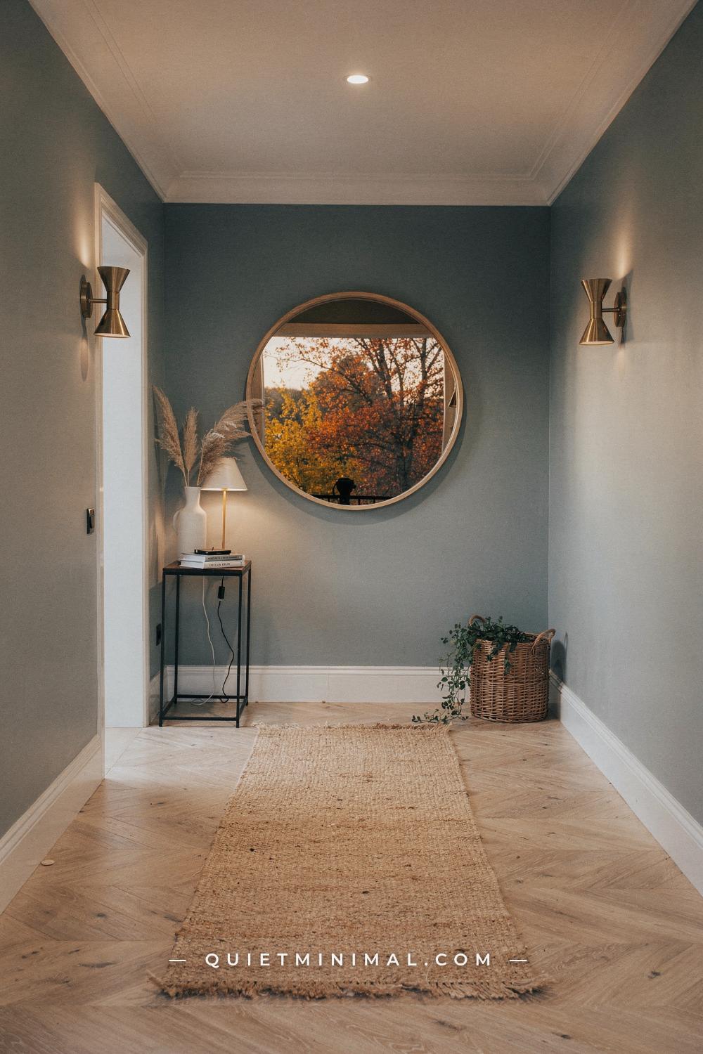
Ask anyone how to paint a hallway and you will hear the same three sentences. Keep it light so it feels bigger. Keep it neutral so it goes with everything. Do not overthink it, because it is just a corridor. Most hallway paint color ideas are built on those three sentences, and all three of them quietly work against you. A hallway is the worst-lit space in the house, the most-touched wall surface you own, and the one stretch of paint that appears in the background of nearly every room you sit in. That combination rewrites the rules. The white that glows in your living room can turn gray and tired ten feet away. The accent wall that works behind a sofa does almost nothing in a corridor you walk through sideways. The safe flat finish shows every jacket zipper by the end of the month. This guide takes the received wisdom one claim at a time, shows what actually holds up in a real hall with real light and real traffic, and names the exact colors that earn their place there.
The Advice Everyone Repeats, and Why a Hallway Refuses to Follow It
 Save
The standard advice treats a hallway like a smaller living room, and that is the root mistake. A living room has windows, lamps, and furniture that give a color something to do. A hallway usually has none of those. Its light arrives secondhand, borrowed through doorways from rooms that keep the best of it for themselves. Its walls carry hands, elbows, backpacks, and grocery bags instead of art and bookshelves. And unlike a living room, which you experience from a seated distance, a hallway puts your eyes 24 to 36 inches (61 to 91 cm) from the wall as you pass. Every choice gets inspected at close range, dozens of times a day.
So the three safe rules collapse one by one. “Light colors make it feel bigger” assumes the color will actually read as light, and in a windowless corridor most whites do not. “Neutral goes with everything” ignores that a neutral has undertones, and the wrong undertone clashes with every room the hall touches. “It is just a corridor” is the most expensive assumption of all, because the corridor is the connective tissue of the house. It sets the first impression at the front door, frames the view from the sofa, and appears at the edge of nearly every sightline you live with.
None of this means hallway color is hard. It means the deciding factors are different from the ones the chip display at the paint store is organized around. Light reflectance, undertone, sheen, and the colors of the adjoining rooms matter more than the shade family you start from. Get those four right and a surprising range of colors works, from the palest warm white to a navy so deep it reads almost black. The rest of this article walks through each reversal with the numbers attached, so you can stop repainting on faith.
Key Takeaway: A hallway breaks the standard color rules because it has borrowed light, close-range viewing, and heavy traffic, so choose by reflectance, undertone, and sheen instead of habit.
From the guides
You've saved it, wanted it. Here's the how: codes, measurements, order. Your choices make it yours.
 The Japandi Honest PlaybookThe honest version of the style: what to keep, what to skip, and the order to do it in.See inside →
 The Room Refresh PlaybookA repeatable four-step method, room by room, in ten minutes, thirty minutes, or one weekend.See inside →
 Make Any Room Feel Cozy on PurposeWhy some rooms hold people and others empty out, and the moves that change it.See inside →

A Hallway Is a Room You Feel Before You See
 Save
Nobody stands in a hallway and studies it, which is exactly why its color works on you so strongly. You experience a hall in motion, in two-second passes, and what registers is not the specific shade but the sensation: bright or dim, warm or cold, cared-for or forgotten. That sensation attaches itself to the whole house. Walk through a dim gray tunnel to reach a beautiful bedroom and the bedroom inherits a little of the tunnel. Walk through a hall that glows and the room at the end of it feels better than it is.
Designers use a pair of ideas for this that is worth borrowing: compression and release. A hallway is the compressed passage, the rooms are the release, and the contrast between them is a tool. A hall painted a shade deeper or warmer than the rooms it serves makes each doorway feel like an arrival. A hall painted identically to every room makes the whole floor read as one continuous, slightly monotonous surface. Neither choice is wrong, but only one of them is a choice; the other is usually an accident of leftover paint.
There is also a practical reason to take the feeling seriously. The hallway is the one space every guest crosses and no guest lingers in, which means it does its entire job in the first three seconds. It cannot recover from a weak first impression with comfortable seating or a good view, because nobody stays long enough. Its paint color, its light, and the state of its walls are the whole performance. That is a strong argument for giving the corridor the same deliberation you gave the living room, and it costs exactly one gallon more of thought, not money.
Before you look at a single chip, walk your own hall twice: once at 8 a.m. and once after dark with only the fixtures on. Note where the light dies, which doorways lend brightness, and where your eye snags. That two-minute survey will do more for your final color than an hour at the paint display.
Key Takeaway: You experience a hallway in motion and in seconds, so choose its color for the sensation it hands to every room it touches, not for how it looks as a standalone shade.
The Truth About White: It Borrows Light It Cannot Always Repay
 Save
White paint does not make light. It returns the light it receives, and that distinction is the entire story of why so many white hallways disappoint. In a bright room, a crisp white bounces daylight around and earns its reputation. In a corridor with no window, the same white has almost nothing to return. What it reflects instead is shadow, and white reflecting shadow reads as gray, flat, and faintly dirty even on the day it dries. The chip did not lie; the hallway just could not pay the light the color required.
The measurement that predicts this is the light reflectance value, or LRV, printed on the back of most chips and listed on every brand website. It runs from 0, absolute black, to 100, theoretical pure white. A color with an LRV of 82 returns 82 percent of the light that hits it. Here is the trap: in a hall receiving a fraction of a room’s light, a high-LRV cool white returns a fraction of a fraction, and the small amount it does return skews toward the blue-gray of shadow. The result is the dingy corridor everyone recognizes and nobody can explain.
The fix is not abandoning white; it is choosing whites with warmth built in, so the shadow they reflect leans golden instead of gray. That is the difference between a bright white and a warm white, and in a hallway it is the difference between a hall that glows at 6 p.m. and one that looks like it needs washing. It also changes what you should test for. Do not ask a white “how bright is this?” in the store. Ask “what color is this in shade?” by holding the chip inside a cupped hand and looking at the shadowed half. The color you see there is the color your hallway will wear most of the day.
Key Takeaway: White only returns the light it receives, so in a low-light hall pick a warm white and judge every chip by how it looks in shadow, not in the store’s bright display.

The Warm Whites That Hold Up Without a Window
 Save
If the hallway gets little direct daylight, the working shortlist is short, and every color on it is a warm white with an LRV high enough to make the most of borrowed light. Sherwin-Williams Alabaster SW 7008, with an LRV of 82, is the steadiest performer: a soft white with a whisper of warmth that never tips into yellow, which is why it shows up on so many designer spec sheets for connective spaces. Benjamin Moore White Dove OC-17 sits slightly brighter at an LRV around 85, with a faintly softer, almost putty warmth that flatters both cool and warm floors. Benjamin Moore Swiss Coffee OC-45 is the creamier option, and the right call when the hall’s borrowed light is cool, because its stronger warmth cancels the blue cast. Sherwin-Williams Shoji White SW 7042 leans a touch more greige and is the pick when the hall opens onto beige or oak-heavy rooms.
Choosing among them comes down to the light source, not personal taste. Stand in the hall and identify where its light actually comes from. If it arrives through a south-facing room, the light is already warm, and Alabaster or White Dove will read clean and gentle. If it arrives from a north-facing room or a glazed front door facing the street’s shaded side, the light is cool, and the creamier Swiss Coffee earns its keep by pushing back. If the hall borrows from several rooms at once, split the difference with Shoji White, which is warm enough to survive shadow and gray enough to avoid reading cream next to true white trim.
One warning applies to all four: warm whites amplify whatever they sit next to. Against bright cool trim they look slightly dirty; against wood tones they look intentional and soft. Paint the trim in the same color at a higher sheen, or in a white from the same warm family, and the pairing settles. Put them against a stark blue-white trim and you will spend a year wondering why the walls look old.
Key Takeaway: In a windowless hall, choose Alabaster, White Dove, Swiss Coffee, or Shoji White based on whether the borrowed light is warm or cool, and keep the trim in the same warm family.
Greige Was Never a Compromise: Why Mid-Tones Read Richer Than White
 Save
The standard framing treats greige as the color you pick when you cannot commit, white’s less confident cousin. In a hallway the hierarchy flips. A mid-tone neutral in the LRV 55 to 65 band is often the strongest color in the house’s connective space, for two reasons the chip display never mentions. First, a mid-tone has enough pigment to keep its character in low light. Where a starved white collapses into gray, a greige simply becomes a slightly deeper version of itself, which reads as intentional rather than dingy. Second, a mid-tone hides the life a hallway lives. Scuffs, hand marks, and the faint polish of a thousand shoulder brushes vanish into a 60-LRV wall and glare accusingly from an 85-LRV one.
The proven names cluster tightly. Sherwin-Williams Agreeable Gray SW 7029, LRV 60, is the most-specified greige in America for a reason: its warmth is real but restrained, and it survives both warm and cool borrowed light. Sherwin-Williams Accessible Beige SW 7036 sits a step warmer and suits halls that open onto wood-heavy, earthy rooms. Benjamin Moore Edgecomb Gray HC-173 is the quiet one, a barely-there greige for halls that get decent light and need only a soft veil of color. Benjamin Moore Pale Oak OC-20 splits the difference between a warm white and a true greige, and is the safest single answer when the hall must serve rooms in several different palettes.
The mid-tone move does ask one thing of you: contrast at the trim. A greige hall with trim in a clean soft white, School House White No. 291 from Farrow and Ball or the trim version of White Dove, gains architecture it did not have. Painted wall-to-wall with no trim contrast, the same greige can flatten. Give the doors and casings their moment and the corridor starts to read like a designed space instead of a leftover one.
Key Takeaway: A mid-tone neutral around LRV 55 to 65 keeps its character in low light and hides daily wear, which makes greige the confident hallway choice, not the cautious one.

The Dark Hallway Reversal: When Deep Color Makes a Narrow Hall Feel Bigger
 Save
Here is the reversal that surprises people most: painting a narrow, dim hallway dark can make it feel larger, not smaller. The received wisdom says dark colors shrink a space, and in a big daylit room that can be true, because dark walls pull inward against bright windows. But a dim corridor has no bright windows to argue with. What makes a narrow hall feel tight is not darkness; it is the visible geometry of the tunnel, every corner and edge crisply outlined by contrast. Paint the whole thing deep, walls, trim, even the doors, and those edges dissolve. The eye can no longer find the exact boundaries of the space, and a hall with no visible boundaries reads as depth instead of confinement.
Darkness also solves the problem light colors cannot: shadow. A pale hallway is in a losing fight with its own shadows, which read as grime. A deep hallway has enlisted them. Shadow on Farrow and Ball Hague Blue No. 30 just looks like more Hague Blue. The wall never looks dirty because it never pretends to be bright. The other proven deep shades work the same way: Farrow and Ball Railings No. 31, a soft black with blue in its bones, Benjamin Moore Hale Navy HC-154, the most forgiving true navy in the deck, and Sherwin-Williams Iron Ore SW 7069, an LRV 6 near-black that flatters brass and wood like nothing else.
There is a structural reason a hall is the right room to be brave in: exposure time. You occupy a bedroom for eight hours and a hallway for eight seconds. Drama that would exhaust you in a room you live in is pure pleasure in a room you pass through. Two practical notes make it work. Warm metal and warm light are mandatory, so plan for brass, wood, and 2700K bulbs. And a dark hall needs a bright destination; make sure at least one doorway in the sightline opens to real light, because deep color frames a glow beautifully and a dead end poorly.
Key Takeaway: In a dim narrow hall, a full drench in a deep shade like Hague Blue, Hale Navy, or Iron Ore dissolves the tunnel’s edges and turns unavoidable shadow into intended atmosphere.

The Light Test That Outranks Every Trend List
 Save
Every color article you have saved, including this one, is trumped by a fact it cannot know: which way your windows face. Light direction changes paint more than brand, more than price, more than trend year, and a hallway complicates it further by receiving light secondhand. So before committing to any shade, run the orientation logic once. It takes ten minutes and settles arguments the chip display cannot.
North-facing light is cool, steady, and slightly blue. If your hallway borrows from north-facing rooms or a north-facing front door, every color on your shortlist will read grayer and colder on the wall than on the chip. Compensate with warmth: creamier whites, warmer greiges, earth tones with red or yellow in the base. This is the light in which Swiss Coffee beats a brighter white and Accessible Beige beats Agreeable Gray.
South-facing light is warm and generous through the middle of the day, and it is the most forgiving. Nearly everything works, though very warm colors can tip toward yellow at noon. If your hall drinks from a south-facing room, you can afford the cooler, more interesting mid-tones, the smoky greens and blues, without them going cold.
East light is warm at breakfast and gone by afternoon; west light is neutral all day and then flooded with orange at dusk. Halls fed by these directions live two lives, which is the strongest argument for the mid-tones and muted shades that shift gracefully instead of clashing with one of their two selves. A muted grey-green that reads sage at noon and olive at sunset is behaving, not failing.
The final layer is the borrow itself. A hallway takes on the temperature of the rooms that feed it light, because that light arrives already tinted by their walls and floors. A hall borrowing from a terracotta dining room receives warm light no compass can predict. This is why the only verdict that counts is a sample on the hallway wall itself, watched through a full day, which the sampling section below turns into a routine.
Key Takeaway: Identify where your hallway’s borrowed light originates and its compass direction before choosing, then warm up your shortlist for north light and mute it for mixed light.
Undertones: Why the Neutral That Worked Next Door Turns Purple in Your Hall
 Save
Every neutral is secretly another color. Grays carry blue, green, or purple in the base; beiges carry pink, yellow, or orange; whites carry all of the above in trace amounts. In a bright room the secret stays mostly hidden. In a hallway, where the wall is lit by weak, tinted, borrowed light, the undertone steps forward and runs the show. This is the mechanism behind the most common hallway complaint there is: the exact color that looked composed in someone else’s house goes vaguely purple, pink, or green in yours. The paint did not change. The light tinting it did.
Reading undertones is a skill you can fake with two tricks. First, never judge a chip alone; judge it against its neighbors. Hold your candidate gray against three other grays and its hidden color declares itself instantly, the purple one suddenly obvious in the lineup. Second, compare every candidate against a plain sheet of white printer paper in the hallway itself. The paper is your fixed reference; whatever color the chip appears to lean next to it is the lean your wall will amplify.
Then match the undertone to what the hallway cannot escape: its floor and its sightlines. An oak floor with orange in it will fight a purple-gray wall forever and settle happily against a green-gray or a warm beige. A cool tile floor does the opposite. The adjoining rooms vote too, which the next section takes up properly, but the floor is the loudest voice because it reflects light directly up the walls all day.
If the undertone hunt feels like guesswork, use the shortcut the pros use: stay inside one brand’s curated families. Colors like Agreeable Gray, Accessible Beige, and Alabaster are specified constantly precisely because their undertones are moderate and well-documented. The exotic chip with the poetic name is a fine risk in a powder room. The hallway, which touches everything, is where you want the boring, proven undertone.
Key Takeaway: Weak borrowed light pushes a neutral’s undertone to the surface, so identify it against white paper in the hall itself and match it to your floor before you commit.
The Adjoining-Room Rule: Five Doorways Choose Your Color Before You Do
 Save
A hallway is never seen alone. Stand at either end of yours and count what is actually in the frame: the hall walls, yes, but also two, three, sometimes five open doorways, each serving up a rectangle of another room’s color. Your hallway paint will spend its entire life being compared, side by side, against every one of those rectangles at once. This is why a shade that sampled beautifully on a lone wall can feel wrong the day the tape comes off. It was auditioned solo and hired into an ensemble.
The working rule is simpler than it sounds: the hallway color must share an undertone family with the rooms it frames, and it should sit a half-step away in depth. Shared undertone means a warm hall for warm rooms, a cool hall for cool rooms, and a truly neutral bridge, Pale Oak or Shoji White territory, for a house that mixes both. The half-step in depth is what keeps the ensemble interesting. A hall slightly deeper than its rooms makes each doorway read as a brightening, an arrival. A hall slightly lighter works when the rooms themselves are moody and you want the corridor to serve as the breather between them.
There is one element that should not vary at all: the trim. Run one trim color through the hallway and every room it touches, and the whole floor plan knits together even when the wall colors range widely. This single move is most of what people are admiring when they say a house flows.
Test the ensemble the way it will be lived in. Tape your hallway sample where you can see it and an adjoining room’s wall in the same glance, then squint. Squinting strips detail and leaves relationships, and if the pairing clashes it will clash hardest through squinted eyes. Repeat at each doorway. Ten minutes of this replaces a year of low-grade visual irritation.
Key Takeaway: Choose a hallway color that shares an undertone family with every room visible from it, sits a half-step deeper or lighter, and shares one trim color across the whole floor.

Sample Like a Pro: The Test That Replaces the Repaint
 Save
The single highest-return hour in this whole project is the one you spend sampling properly, and almost nobody does it, because the chip rack feels like enough. It is not. A 2 by 3 inch (5 by 8 cm) chip under the store’s bright cool fluorescents has nothing in common with a wall of that color in your corridor’s borrowed dusk. The professionals never skip this step in exactly the rooms where light is strange, and no room’s light is stranger than a hallway’s.
The method takes three moves. First, get real samples of your final three candidates, either sample pots brushed in two coats onto white poster boards about 12 by 12 inches (30 by 30 cm), or the peel-and-stick sheets painted with two coats of the true formula. Two coats matters; one coat over white reads a full step lighter than the finished wall will. Second, place them where the hall actually lives: one board in the darkest stretch, one near the brightest doorway, and move them over a couple of days. A color that only works in the hall’s best three feet is not your color. Third, check each board at three times, morning, midday, and after dark under the actual bulbs, because a hallway spends more waking hours under artificial light than nearly any room in the house. The after-dark reading is the one most people never take and the one that decides whether the hall feels welcoming at 7 p.m. in January.
Judge the boards on one question only: which color still looks like itself in the worst light? Not which is prettiest at its best moment. The winner of the worst-light round is the color that will make the hallway feel consistent and cared-for around the clock, and consistency is the entire job of a corridor color. If two finalists tie, take the warmer one; hallway shadow always votes cool, and the warmer candidate is the one carrying insurance.
Key Takeaway: Sample your final three colors on movable boards, in two coats, judged in the hall’s darkest stretch after dark, and hire the color that holds up in the worst light.
Sheen Is Half the Color: The Finish Decision Nobody Puts on the Chip
 Save
Two hallways painted the identical color can look a full shade apart, and the variable is sheen. Finish changes how much light a wall returns, how saturated the color appears, and, in a hallway above all rooms, how long the paint survives contact with actual life. The chip cannot show you any of this, which is why sheen is the most underweighted decision in the whole project.
The received wisdom says flat or matte for walls, because it is elegant and hides surface flaws. In a bedroom, agreed. In a hallway, traditional flat paint is a liability, because the corridor is the most-touched surface in the house. Shoulders graze it, hands trail along it, bags and sleeves and dog tails polish it daily, and traditional flat finishes respond to scrubbing by burnishing, leaving shiny ghost patches that look worse than the marks did. The classic hallway answer is eggshell: a soft, low glow that wipes clean without burnishing and adds just enough light-return to help a dim corridor. For households running at full contact, kids, dogs, gear, satin steps up another notch in washability, at the cost of highlighting any drywall imperfections, so patch and sand honestly before committing to it.
Sheen also bends color. The same greige reads slightly deeper and richer in matte, slightly lighter and cooler in satin, because gloss returns more of the ambient light. If your sampled boards were flat sample-pot paint and your final choice is eggshell, expect the wall to land a touch brighter than the board promised, a shift that almost always flatters a hallway. Trim and doors, meanwhile, want semi-gloss regardless: the extra light it throws off outlines the architecture, and doors take more direct handling than any wall.
Key Takeaway: Specify eggshell for hallway walls, satin for full-contact households, and semi-gloss for trim and doors, because finish decides both how the color reads and how long it lasts.

The Scuff-Resistant Formulas Worth the Upgrade
 Save
The paint aisle has quietly solved a problem hallway owners still think they have to live with. Every major brand now makes a washable, scuff-resistant line, matte finishes engineered to take scrubbing without burnishing and to resist marking in the first place, and the hallway is the one room in the house where that upgrade pays for itself in the first year. These formulas cure harder than standard wall paint, so a sponge and dish soap removes the black heel mark that would have gouged a memory into a builder-grade flat.
Whether you need the premium tier depends on an honest audit of your corridor’s traffic. A quiet upstairs hall between two adult bedrooms will do fine in any quality eggshell. A main-artery hallway that doubles as mudroom runway, bike path, and dog racetrack earns the top-shelf can, and the math works because of what repainting actually costs: not the gallon, but the weekend, the cutting-in, and the color-matching risk if the original batch is gone. A finish that pushes the repaint from year three to year eight is the cheapest insurance in the house.
Two application notes protect the investment. First, primer is not optional when changing color meaningfully, and it is doubly not optional under the deep shades from the dark-hallway section. A deep navy or near-black over a tinted gray primer covers in two coats; the same color straight over white can demand four, and the difference in cost and patience is the difference between finishing the project and abandoning it at the streaky stage. Second, keep a labeled touch-up jar, a small sealed container of the final paint with the color code written on the lid. Hallways collect nicks at doorknob height and corner edges no matter what you buy, and a thirty-second dab from the jar every few months keeps the corridor reading freshly painted for years.
Key Takeaway: Put the scuff-resistant premium line on high-traffic halls, prime tinted under deep colors, and keep a labeled touch-up jar, because the expensive part of hallway paint is the repaint.
The Fifth Wall: Why the Ceiling Should Usually Match
 Save
Standard practice paints every ceiling bright ceiling-white and moves on, and in a hallway that habit quietly works against the space. A corridor is narrow, so its ceiling occupies a huge share of your visual field as you walk it, and a stark white plane over colored walls draws a hard horizontal line at the top of every wall. That line is a lid. In a hall with standard 8 foot (244 cm) ceilings, the lid is the most claustrophobic element in the room, more than the width, more than the light.
Take the lid off by closing the contrast. The gentlest version: paint the ceiling in the wall color cut to half strength, which most paint desks will mix on request, or simply choose a soft warm white ceiling instead of a bright one when the walls are pale. The full version, and the one designers now reach for in corridors, is running the wall color across the ceiling at full strength in a flat finish. With no color break, the eye slides up the wall and across without stopping, and the perceived height rises even though nothing measurable changed. This works in both directions of the color range. A warm white hall with a matching warm white ceiling reads as one continuous airy volume. A deep drenched hall with a matching deep ceiling reads as one continuous jewel box, and abandoning the white ceiling is precisely what makes the dark hallway feel intentional instead of unfinished.
Keep two rules constant whatever you choose. The ceiling always gets flat sheen, because any gloss overhead flags every seam, roller mark, and drywall dimple the moment the hall light comes on. And if the hall has crown molding, let the molding be the transition, painted with the trim, so the color change happens on the architecture instead of at a taped line in space.
Key Takeaway: Match or near-match the hallway ceiling to the walls in a flat finish, because erasing the hard white lid is the cheapest height a low corridor can buy.
From the guides
You've saved it, wanted it. Here's the how: codes, measurements, order. Your choices make it yours.
The Japandi Honest PlaybookThe honest version of the style: what to keep, what to skip, and the order to do it in.See inside →The Room Refresh PlaybookA repeatable four-step method, room by room, in ten minutes, thirty minutes, or one weekend.See inside →Make Any Room Feel Cozy on PurposeWhy some rooms hold people and others empty out, and the moves that change it.See inside →Color Drenching Beats the Accent Wall in a Corridor
 Save
The accent wall had a long run as the low-commitment way to add color, and in a hallway it almost never earns its tape. The geometry explains why. An accent wall works when you face it: behind a bed, behind a sofa, at the end of a long view. In a corridor you face the walls only in passing, at an extreme sideways angle, which turns a painted accent into a colored blur in your peripheral vision. Worse, a single colored wall in a narrow space announces its own edges, four crisp lines reminding you exactly how tight the corridor is. The one accent that does work is the end wall, and only when the hall genuinely terminates in a flat wall you walk toward; a deep shade there pulls the far wall closer and makes a long tunnel feel composed. If your hall ends in a doorway or a window, even that option is off the table.
What replaced the accent wall is color drenching, one color across walls, trim, doors, and often the ceiling, and the hallway is the single best room in the house for it. Every argument for drenching is a hallway argument. It erases the visual noise of a corridor’s many door casings, which otherwise stripe the walls with white interruptions. It dissolves the edges that make narrow spaces feel narrow. It delivers maximum character in minimum square footage, so a mid-priced gallon goes further here than anywhere. And because you pass through rather than sit inside, a drench that might feel intense in a living room feels like a pleasure lasting eight seconds.
Muted mid-tones drench best: the olives, clays, smoky blues, and deep greiges of the sections that follow. Vary the sheen to keep depth, eggshell walls, semi-gloss trim and doors in the same color, and the monochrome corridor reads layered instead of flat.
Key Takeaway: Skip the side-wall accent, reserve end-wall color for halls that truly end in a wall, and let a full drench in one muted shade do what corridors do best.

Trim and Doors: The Stripes You Stop Noticing Until They Are Gone
 Save
Count the vertical white lines in your hallway: door casings, jamb edges, the baseboard run, maybe a linen closet and an attic hatch. A typical corridor carries six to ten doors and their frames, which means bright white trim turns the walls into a barcode of interruptions. No other room in the house has this problem at this density, and it is why trim strategy matters more in the hallway than anywhere else, and why the default, brightest-white-on-everything, is worth questioning.
You have three honest options, in ascending confidence. The classic: walls in your chosen color, all trim and doors in one soft white, semi-gloss, consistent across the entire floor. This keeps the architecture legible and suits traditional homes; just choose a warm-leaning white like School House White No. 291 or a trim-sheen White Dove rather than a stark blue-white, which makes warm walls look dirty by comparison. The quiet upgrade: trim matched to the walls, doors included, the drenching logic applied even if the ceiling stays light. The barcode disappears, the corridor calms down instantly, and pale walls gain a subtlety people feel but cannot name. The confident move: soft walls with deep doors. Doors in Sherwin-Williams Iron Ore SW 7069 or Urbane Bronze SW 7048 against warm white or greige walls give a hallway rhythm and a custom, considered look, hiding hand marks at exactly the height hands land. Keep the casings in the wall or trim color and let only the door slabs go dark, so the effect reads as punctuation rather than clutter.
Whichever you choose, choose once for the whole floor. Trim treatment is the one element that must not vary hall to room to landing, because consistent trim is the thread that lets varied wall colors read as a collection instead of a disagreement.
Key Takeaway: With six to ten doorframes striping a typical corridor, decide deliberately between soft white trim, wall-matched trim, or dark doors, and apply one answer to the entire floor.
The Earth-Tone Shift: Clay, Cinnamon, and Terracotta Come Inside
 Save
The strongest current in hallway color right now runs toward earth: soft clays, cinnamons, terracottas, and plaster tones, the shades design editors keep photographing because of what they do to light. An earth tone with real red or brown in the base takes whatever weak, warm light a hallway receives and returns it as glow. Under a 2700K bulb at 7 p.m., a clay-colored corridor produces the lit-from-within warmth that white halls chase and never catch. This is the trend’s practical core, and it is why the look lands hardest in exactly the light-starved transitional spaces this article is about.
The entry points span the range of nerve. Sherwin-Williams Redend Point SW 9081, a blush-clay the brand crowned a color of the year, is the gentlest: barely more assertive than a warm greige, but with enough earth in it to glow at night. The middle path is a true soft terracotta or cinnamon in the LRV 30 to 45 band, deep enough to hide corridor wear, light enough to keep the hall from going cave-like at noon. The full-conviction version is a drenched clay hall, walls and trim together, which pairs almost automatically with oak, rattan, iron, and every houseplant ever grown.
Earth tones do carry two cautions. They are warmth amplifiers, so in a hall that already receives strong warm light from a south-facing room, a mid-depth terracotta can tip toward orange at midday; sample through a full day before committing, exactly as the sampling section prescribes. And they are choosier about neighbors than neutrals are. Clay sings beside greens, creams, wood tones, and warm whites, and argues with cool grays and blue-whites, so run the doorway squint test against every adjoining room before the deposit of a whole weekend goes in.
Key Takeaway: Earth tones return weak warm light as glow, so a clay or terracotta in the LRV 30 to 45 range turns an evening hallway from dim to lit-from-within, provided the adjoining rooms lean warm.

The Greens That Behave Like Neutrals
 Save
If one color family was purpose-built for corridors, it is muted green. Gray-greens and sage tones occupy a rare middle ground: enough color to give a hallway a personality, enough gray to coordinate with nearly anything visible through its doorways. Designers describe these shades as behaving like neutrals, and the hallway is where that behavior pays. A sage corridor flatters wood floors, white trim, brass or black hardware, terracotta rooms and blue rooms alike, which makes it the rare confident choice that still passes the adjoining-room test in almost every house.
Green also solves the hallway’s specific light problem gracefully. The current crop of smoky, gray-veiled greens is prized precisely for shifting through the day, silvery sage in morning light, deeper olive by lamplight, and in a corridor fed by changing borrowed light, a color that shifts gracefully beats a color that fights. The proven names ladder neatly by depth. Sherwin-Williams Sea Salt SW 6204, LRV around 63, is the lightest touch, a green-gray whisper for halls that need brightness most. Benjamin Moore October Mist 1495, a gentle sage the brand once named color of the year, sits in the versatile middle. Sherwin-Williams Evergreen Fog SW 9130, LRV around 30, brings genuine depth while staying soft, and it drenches beautifully across trim and doors. At the moody end, Farrow and Ball Pigeon No. 25 and Card Room Green No. 79 carry the smoky, old-house sophistication that makes a corridor feel like it has always been that color.
Match the green’s undertone to your floor with extra care: yellow-green sages love oak and warm woods, blue-greens prefer cooler floors and black accents. And keep the trim warm white rather than stark, because a blue-white edge next to sage reads clinical while a soft white reads like a garden wall.
Key Takeaway: Muted gray-greens from Sea Salt to Evergreen Fog carry personality while coordinating like neutrals, and their graceful shifting through the day suits a hallway’s changing borrowed light.

Smoky Blues for Halls That Live by Evening Light
 Save
Some hallways barely exist in daylight. An interior corridor in the center of the floor plan, an upstairs hall that only wakes up when the bedroom doors open, a city apartment passage lit by fixtures from breakfast onward: these halls live their real lives in the evening, and the honest move is choosing a color for the light they actually get. This is where the smoky blues earn their place. A muted, gray-veiled blue under warm 2700K light settles into something dusky and calm, the visual equivalent of lowered voices, and it does this precisely because it never depended on daylight to look finished.
The trend agrees with the physics for once. The shades getting specified right now are exactly these shifting, atmospheric blues, and Behr naming Hidden Gem, a smoky jade blue-green, its recent Color of the Year put the category’s official stamp on what corridor owners had already noticed: a color with gray in its base cannot be washed out by weak light, because it already accounted for the gray. Alongside Hidden Gem, the reliable names ladder by depth. Farrow and Ball De Nimes No. 299 is the standard-bearer, a worn-denim blue that reads relaxed rather than nautical. Benjamin Moore Hale Navy HC-154 takes the same evening logic all the way down into drench territory, covered in the dark-hallway section, and between them sit a dozen chalky mid-blues worth sampling.
Blue’s one demand is warmth in everything around it. Brass and aged bronze hardware, oak or walnut furniture, warm-white bulbs, a runner with rust or cream in it: these are not styling suggestions but the counterweights that keep a blue corridor from tipping cold. Under a cool 4000K builder bulb, the loveliest smoky blue goes institutional, so the bulb swap, covered near the end of this article, is mandatory rather than optional here.
Key Takeaway: For halls that live under artificial evening light, a gray-veiled smoky blue like De Nimes or Hidden Gem stays composed where daylight-dependent colors wash out, as long as everything around it runs warm.

The Plaster Pinks That Read as Neutral, Not as Pink
 Save
Say “pink hallway” and most people picture a nursery, which is exactly the misunderstanding that keeps one of the best corridor families underused. The pinks that work in hallways are not sweet; they are plaster tones, pinks so muted and earthen they read as warm neutrals with a pulse. Farrow and Ball built the category’s two reference points: Setting Plaster No. 231, a dusty, chalky pink named for the color of bare plaster walls, and Sulking Room Pink No. 295, a deeper powdery rose with enough brown in it to feel like velvet rather than candy. On the wall, both land closer to “warm stone” than to anything a paint store files under pink.
The corridor case for them is the same case the earth-tone section made, tuned one degree softer. A plaster pink flatters everything that passes through it. It is the wall color equivalent of warm lamplight, and design editors recommending pale pink specifically for small, dim halls are pointing at this mechanism: the color returns weak light as warmth while staying high enough in reflectance to keep the space feeling open. Where a terracotta makes a statement, a plaster pink makes an atmosphere, and guests will compliment the hallway without being able to say what color it is. That vagueness is the point, and the proof it is functioning as a neutral.
Pairings decide whether the effect holds. Plaster pinks want warm white trim, never stark white, and they are at their best against oak, walnut, rattan, aged brass, and muted greens through the doorways; a sage room seen from a Setting Plaster hall is one of the easiest beautiful pairings in this whole article. They struggle beside strong cool grays and bright primaries. And depth matters more than usual: sampled too light, a plaster pink drifts toward sweet, so when torn between two chips, take the dustier, browner one. The mud is what makes it grown-up.
Key Takeaway: Chalky plaster pinks like Setting Plaster read as warm neutrals in a corridor, returning weak light as warmth, provided the trim stays warm white and the chip you pick errs dusty rather than sweet.
The Two-Tone Wall: Old-House Logic for the Scuff Zone
 Save
Before scrubbable paint existed, old houses solved the hallway problem with geometry: a darker, tougher color on the lower wall where the wear happens, a lighter color above where it does not, and a rail between them. The two-tone hallway is that logic revived, and it solves three modern corridor problems in one weekend. It puts the deepest, most scuff-hiding color exactly in the strike zone where bags, shoes, and pets make contact. It adds architectural interest to the featureless drywall tube that most modern hallways are. And it lets you have the confident dark color and the airy light color at once, which is the treaty most households actually need.
The proportions carry the whole effect. Set the dividing line at classic chair-rail height, 32 to 36 inches (81 to 91 cm) off the floor, or take it higher, around 60 inches (152 cm), for the modern two-thirds look that makes ceilings feel taller. What matters is committing to one line and leveling it with a laser or a measured chalk line, because an off-level break will bother you from across the house. You do not need molding; a sharp taped line in two sheens, or one color in two finishes, reads clean and contemporary. If you do add a rail or panel molding, paint it with the lower color to keep the composition calm.
Combinations that consistently work: a deep olive or brown below with warm cream above, Iron Ore below with Alabaster above for the graphic version, Hale Navy below White Dove for the classic one, or the subtle route, one greige in eggshell below and its half-strength mix above. The lower band should always be the darker and the tougher sheen of the pair, satin or semi-gloss, so the design and the durability point the same direction.
Key Takeaway: A two-tone wall with the darker, tougher color below a level line at 32 to 36 inches (81 to 91 cm) puts durability exactly where hallways take their damage while adding architecture drywall corridors lack.

Stairways and Landings: One Color, Three Kinds of Light
 Save
The hallway rarely ends at the hallway. Most corridors flow into a stairway, and the stairway climbs into a landing, and suddenly your one-gallon decision spans three spaces with three completely different lighting situations. The received approach, changing color at each floor, creates a layer cake of seams that makes the house feel subdivided. The stronger move is one color carried through the entire circulation route, hall to stairs to landing, and it works because circulation space is experienced as a single continuous journey. Paint it as one and the house feels larger and more coherent than its floor plan.
The catch is that one color will not look like one color, and you should plan for that rather than fight it. A ground-floor hall borrowing warm light from living spaces, a stairwell lit by a high window, and an upstairs landing under a single fixture will each render the same greige differently, lighter and cooler up high, deeper and warmer below. Sample accordingly: tape boards of your finalist in all three zones, not just the downstairs hall, and pick the color that stays likable in all of them. Mid-tones with moderate undertones survive this test best, which is one more argument for the Agreeable Gray and Evergreen Fog families over anything extreme.
Stair parts give you the punctuation. Carrying the wall color over everything is one option, but the classic hierarchy still earns its keep: treads and handrail in wood or a deep paint like Urbane Bronze SW 7048, risers and balusters in the trim white, walls in your through-color. Dark handrails hide the polish of daily hands, and dark treads hide the traffic that pale painted stairs broadcast within a season. If the stairwell wall is tall enough to feel bare, resist the urge to solve it with a different paint color; a run of frames climbing the diagonal does the job while keeping the envelope unbroken.
Key Takeaway: Run one mid-tone color through hall, stairs, and landing, sample it separately in all three light zones before committing, and let dark treads and handrails absorb the wear.
Small, Narrow, or Low: Match the Move to Your Actual Hallway
 Save
“Small hallway” describes three different problems, and each one has a different paint answer, which is why generic small-space advice keeps disappointing people. Diagnose which corridor you actually have before choosing the move.
The narrow hall, decent length and height but tight side to side, benefits most from the edge-dissolving strategies covered earlier: a full drench in one color, matched trim, and a runner with strong lengthwise lines. What narrows a corridor visually is contrast at its corners, so the enemy is a light wall meeting dark trim meeting a different ceiling. One continuous color, light or dark, is the fix; the width has not changed, but the eye stops measuring it.
The low hall, under 8 feet (244 cm), wants vertical continuity. Walls and ceiling in the same color, flat sheen up top, and any two-tone treatment set at the taller 60 inch (152 cm) line rather than chair-rail height, because a low horizontal band drags the eye down exactly when you need it drifting up. Skip crown molding entirely here; every horizontal line overhead is a reminder of the ceiling you are trying to forget.
The long tunnel, a corridor that feels endless, is the one case where the end wall earns special treatment. Painting the far end wall one to two steps deeper than the side walls pulls it visually closer and turns the tunnel into a room with a destination. Deepen it further with what lives there: a mirror or a lamp at the end wall gives the corridor a reason to be long.
And the genuinely tiny hall, a few feet of transition, should stop trying to look bigger at all. A small space painted a rich, deliberate color reads as a designed moment; the same space in apologetic white reads as a gap between rooms. Jewel-box logic beats expansion logic below a certain size, and most entry vestibules are below it.
Key Takeaway: Diagnose narrow, low, long, or tiny before choosing: drench the narrow, unify wall and ceiling in the low, deepen the end wall of the long, and let the tiny go rich instead of bigger.
Change the Bulbs Before You Blame the Paint
 Save
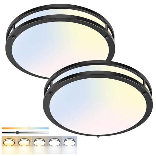
Some fraction of the hallways repainted every year did not have a paint problem. They had a 4000K bulb problem, and the new color inherited it on day one. Light temperature, measured in kelvins, decides what any paint becomes after dark: 2700K is the warm amber of a traditional lamp, 3000K a soft neutral white, 4000K the cool bluish light of offices and garages. A warm greige under a 4000K builder-grade bulb goes morgue-gray. The same wall at 2700K glows. If your current hall color looks worse at night than in daylight, run this test before opening a single sample pot: swap the fixture to a 2700K bulb, wait for dark, and look again. The repaint you were planning may already be finished.
For hallways specifically, the target is 2700K to 3000K, high CRI, and enough of it. CRI, the color rendering index, measures how faithfully a light source shows color; bulbs rated 90 and above render your carefully sampled paint as sampled, while the bargain 80-CRI bulb quietly mutes reds and warms nothing. Brightness matters too, because a single dim ceiling fixture is what gives corridors their gloom: for a hall, aim for roughly 10 to 20 lumens per square foot (110 to 215 per sq m), which for a typical 3 by 12 foot (91 by 366 cm) corridor means 400 to 700 lumens total, one good fixture or a pair of modest ones.
This is also the final variable in the sampling ritual from earlier. The after-dark reading of your sample boards only means something under the bulbs the hall will actually wear, so make the bulb decision first and the color decision second. Warm bulbs widen your safe color range dramatically: the smoky blues, deep greens, and plaster pinks in this article all assume warm light, and all of them will punish a cool bulb. Ten dollars of light is leverage on eighty dollars of paint.
Key Takeaway: Set the hallway to 2700K to 3000K bulbs with CRI 90 or higher before sampling any color, because light temperature decides what every paint becomes after dark.
The Hallway That Greets You Tomorrow
 Save
Strip away the received wisdom and hallway color comes down to a handful of truths this article has been circling. The corridor is the worst-lit, most-touched, most-glimpsed surface in the house, so the winning color is the one that holds its character in borrowed light, hides an honest week of contact, and agrees with every doorway it frames. Sometimes that is a warm white with real pigment behind it. Just as often it is a greige, a smoky green, a clay, or a navy deep enough to make the shadows part of the design. The chip rack cannot tell you which; your own hall at 8 p.m. can.
The order of operations matters more than the shade, so run it as a sequence. Bulbs first, warm and bright enough to give any color a fair trial. Then the shortlist, three candidates chosen for undertone against your floors and your adjoining rooms. Then the boards, two coats, moved through the hall’s best and worst light for two days, judged at night. Then sheen, eggshell on walls and semi-gloss on trim, with the scuff-resistant upgrade anywhere life runs at full speed. The color that survives that gauntlet will not need replacing when the trend cycle turns, because it was chosen against your light, not a photograph of someone else’s.
Start tonight, before the resolve fades: order sample pots or peel-and-stick sheets of your three finalists, and swap the hall bulb while you wait for them to arrive. By the weekend you will know something most people never learn about their own homes, which color the hallway has been asking for all along. The room you pass through forty times a day is the cheapest one to get right, and from now on it will greet you properly every single time.
Key Takeaway: Sequence the decision, bulbs, undertone shortlist, sampled boards judged at night, then sheen, and the hallway color you land on will hold up in the light you actually live in.
From the guides
You've saved it, wanted it. Here's the how: codes, measurements, order. Your choices make it yours.
The Japandi Honest PlaybookThe honest version of the style: what to keep, what to skip, and the order to do it in.See inside →The Room Refresh PlaybookA repeatable four-step method, room by room, in ten minutes, thirty minutes, or one weekend.See inside →Make Any Room Feel Cozy on PurposeWhy some rooms hold people and others empty out, and the moves that change it.See inside →
 Save