Georgia

There is a version of this house that stayed small and apologetic — a cramped 1920s Toronto semi with a sagging rear extension and a backyard full of weeds. That version no longer exists. What stands in its place, in the Wallace Emerson neighbourhood, is a fully rebuilt, colour-zoned, art-forward home that takes its cues from the owner’s extensive collection of modern and other artworks. The brief was specific: make the collection feel at home, and make the house feel like it was always this way.
The Project
House For An Art Lover is a residential gut renovation by Toronto-based Picnic Design Inc. The 1920s house required structural rebuilding of a rear extension, a basement dig-down, and the addition of a full extra floor above the rebuilt rear portion. The design brief asked for a space that could hold a bold, colourful art collection without feeling like a gallery — it needed to remain a warm, functioning family home. Picnic Design answered that by using the collection itself as the north star: every material choice, every zone transition, and every framed vista was calibrated to the kind of energy the art already brought into the space.
The organizing concept was connection through contrast. Rather than unifying the ground floor with a single neutral palette, the team created a series of deliberate transition zones — dark to light, rough to smooth, colour-saturated to calm — that pull you through the house the way a well-hung exhibition pulls you through a room. Intersecting lines drawn from modern art vocabulary show up in the architecture itself: in the arched kitchen entrance, in the shadow lines of the rear addition’s fluted cladding, and in the perforated metal shelving that floats above the peninsula.
 Save
The Spaces
The Vestibule and Entry Zone
The front entry was previously too small to register as a room at all. It is now a five-foot-deep vestibule that spans the full width of the house, marked by a dark slate-grey tile floor that creates an immediate and deliberate contrast with the wide-plank white oak flooring that begins just beyond it. The shift in material underfoot is the first of many dark-to-light transitions the house uses to signal movement between zones. A staircase rises from this entry floor, white-painted with traditional turned balusters and a skylight overhead flooding the upper hallway with diffused natural light — a direct intervention into what was once a dark, compressed vertical core.
 Save
The Vestibule Window Bench
Sitting at the threshold between the dark-tiled vestibule and the living area is what Picnic Design describes as their signature nook: a wide, low oak window bench with flush storage drawers beneath it. In practice it functions as the living room’s focal anchor — a place to land, to read, to pile books. The window above it is large and simply detailed, fitted with a sheer roller shade that diffuses street light into something soft and even. To the right, a dark-stained open bookcase is packed with books, doing exactly what built-in shelving should do in a house like this: making the space feel inhabited without feeling staged.
From the guides
You've saved it, wanted it. Here's the how: codes, measurements, order. Your choices make it yours.
 The Japandi Honest PlaybookThe honest version of the style: what to keep, what to skip, and the order to do it in.See inside →
 The Room Refresh PlaybookA repeatable four-step method, room by room, in ten minutes, thirty minutes, or one weekend.See inside →
 Make Any Room Feel Cozy on PurposeWhy some rooms hold people and others empty out, and the moves that change it.See inside →
 Save
The Black Strip and Living-to-Kitchen Connection
Running the full length of the ground floor’s main wall is what the project calls the Black Strip: a long feature wall in thermo-fused, detailed woodgrain laminate with a dark, near-black finish. It begins near the front of the house — concealing a powder room behind flush panelling and hidden hardware — and continues without interruption through the kitchen as tall cabinets, a built-in refrigerator, and a wall oven before terminating in a white oak bench at the glazed back door. Seen from the dining table, the strip reads as a graphic line that ties the original house to the rebuilt rear addition. The Black Strip is visible flanking the right edge of the arched kitchen entrance, its dark woodgrain texture grounding an otherwise light composition.
The Kitchen Arch and Peninsula
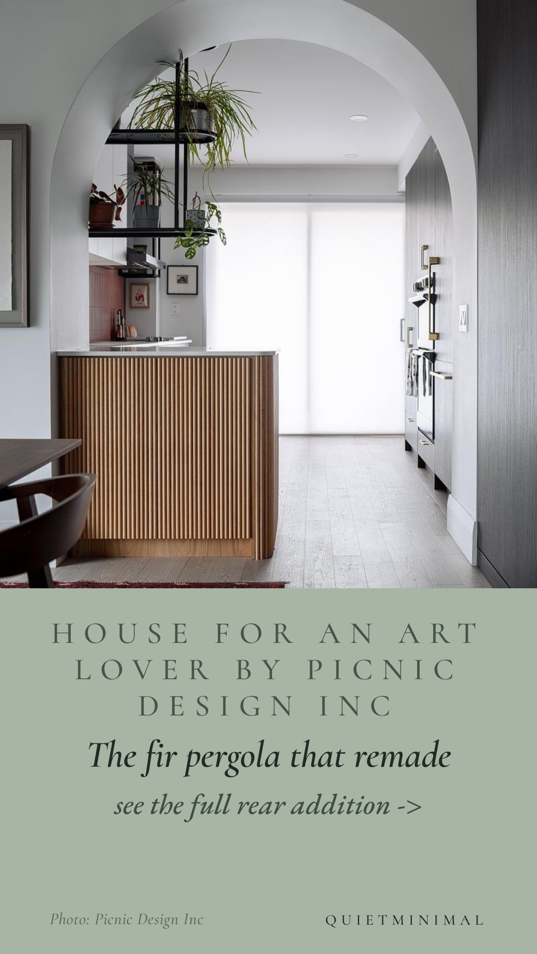
From the dining area, the kitchen announces itself through a large white plaster arch — a framed vista that creates visual continuity without removing the sense that you are moving between distinct spaces. Centered in that arch, and partially blocking it in the most intentional way possible, is the peninsula. Its living-room-facing side is wrapped in solid white oak half-round tambour — a fluted, rippled texture that catches light and gives the eye somewhere to rest before stepping into the kitchen proper. Above the peninsula, a black perforated metal open shelving unit hangs from the ceiling, dressed with trailing plants and small objects. It is a playful move that softens what could have been a stark architectural moment.
The Kitchen Interior
Inside the kitchen, the terracotta moment arrives. The backsplash — running from counter level up past the range hood and wrapping to fill the wall — is covered in vertically stacked earthy terracotta-toned rectangular tiles. They are warm and deliberate against the dark woodgrain laminate base cabinets with their brass bar pulls, and the crisp white porcelain slab countertop that runs across both the perimeter and the peninsula top. A slim horizontal window sits between the matte grey overhead cabinets and the sink, acting as a linear strip of daylight rather than a conventional window. The black perforated metal shelving frames the corner near the range. It is a kitchen that holds three distinct material registers — terracotta tile, dark laminate, matte grey — without any of them fighting for dominance.
 Save
 Save
The Kitchen-to-Living Vista
Seen from inside the kitchen looking back toward the living area, the arched entrance frames a clear sightline through to the front of the house — a mid-century chair visible in the distance, the dark tile floor of the vestibule beyond. This is the framed vista strategy made literal: standing at the sink, you can read the full depth of the house. The tambour-wrapped peninsula base occupies the lower half of the arch, and the hanging perforated shelving unit occupies the upper half, creating a layered composition that keeps the arch from feeling like a simple hole in a wall.
 Save
The Back Bench and Patio Transition
The Black Strip ends at the rear of the kitchen in a white oak bench that sits directly adjacent to the glazed sliding doors leading to the back deck. This is a small but considered detail: the strip shifts material from dark laminate to warm oak at precisely the moment the house opens to the outside, softening the threshold. The bench itself sits in a recessed nook with vertical white-painted panelling behind it and a floating oak shelf above, a plaid cushion indicating that this is a place people actually use. The tall dark laminate cabinetry of the Black Strip flanks it on the right, its brass hardware consistent with the kitchen pulls throughout.
 Save
The Ensuite Bathroom — Shower
The bathrooms in this house are where the colour commitment becomes most concentrated. The ensuite shower is tiled floor to ceiling in a deep teal-green glazed rectangular tile with a handmade variation in tone — no two tiles read the same shade, so the surface shifts between forest green and deep teal depending on the light. Against that wall, all the fixtures are matte black: a large round rain head, a slide-bar handset, and a round thermostatic valve. A built-in white niche holds product on the left. A window on the right brings in natural light, bouncing off the glazed tile surface and filling the enclosure with a cool, saturated glow.
 Save
The Ensuite Bathroom — Vanity
The vanity side of the ensuite continues the deep teal tile from the shower across the full back wall and into the shower enclosure, separated by a glass panel. A floating oak vanity unit holds an undermount basin and is topped with a white stone slab. The wall-mount faucet is brushed brass, a warm counterpoint to the cool depth of the teal tile behind it. A subtle horizontal LED strip runs below the tile field just above the backsplash, providing a warm wash of light across the vanity surface. The overall effect is deliberate immersion: you are inside the colour, not looking at it.
 Save
The Cedar Deck and Trellis
The backyard was, by the press release’s own description, a field of weeds. It is now a cedar deck with a slatted trellis overhead that casts striped shadows across the deck boards in afternoon sun. A white metal chair sits on the deck beside a collection of potted plants — the kind of outdoor space that asks to be used in the morning with coffee. The cedar slats of the trellis and the horizontal cedar privacy screen create a rhythm of parallel lines that echo the fluted cladding on the addition’s exterior facade. Even outside, the intersecting lines drawn from modern art vocabulary are present.
 Save
What you might carry home
The most transferable idea from House For An Art Lover is also the simplest one to get wrong: let one existing thing drive every material decision that follows. Here, it was the art collection. The terracotta tile, the teal bathroom, the dark laminate strip — none of these feel arbitrary because they were all calibrated to the energy of something the owner already owned and loved. If you have a rug, a painting, or even a chair that feels like the truest version of your taste, that object can function the same way. Build your palette from it rather than around it.
The second thing worth taking is the zone transition as a deliberate tool. The shift from dark tile to pale oak at the vestibule boundary costs nothing in square footage and completely changes how the floor plan reads. If you have an open-plan space that feels undifferentiated, a change in floor material — even a slim inset strip in a contrasting tile — gives each area its own address without adding a wall. This house uses that move twice on the ground floor alone.
Third: one long unifying element can do more cohesive work than any amount of matching finishes. The Black Strip runs from the powder room through to the back bench, tying a house that is structurally two different buildings — original 1920s construction and rebuilt rear addition — into a single read. In a home where rooms feel disconnected, a continuous element in the same material, whether a cabinet run, a ceiling detail, or even a painted wall colour, can create that spine without a renovation.
Finally, the framed vista is worth treating as a design tool rather than an accident. The arch here was designed so that the tambour peninsula base and the hanging plant shelf would partially fill it — creating a layered picture rather than just a hole. If you have a doorway or opening between rooms, consider what is framed in it from your most-used vantage point. A single piece of furniture or a hanging object placed deliberately in that opening can turn a transition into a moment.
SaveHouse For An Art Lover, an Architecture Master Prize winner in the Houses Interior category, is the kind of project that makes a case for restraint and boldness coexisting in the same space — not as opposites, but as collaborators. Picnic Design did not tone down the art collection to make the house work. They turned the volume up on the architecture until it was worthy of sharing a room with it.
From the guides
You've saved it, wanted it. Here's the how: codes, measurements, order. Your choices make it yours.
The Japandi Honest PlaybookThe honest version of the style: what to keep, what to skip, and the order to do it in.See inside →The Room Refresh PlaybookA repeatable four-step method, room by room, in ten minutes, thirty minutes, or one weekend.See inside →Make Any Room Feel Cozy on PurposeWhy some rooms hold people and others empty out, and the moves that change it.See inside →
From the guides
You've saved it, wanted it. Here's the how: codes, measurements, order. Your choices make it yours.
The Japandi Honest PlaybookThe honest version of the style: what to keep, what to skip, and the order to do it in.See inside →The Room Refresh PlaybookA repeatable four-step method, room by room, in ten minutes, thirty minutes, or one weekend.See inside →Make Any Room Feel Cozy on PurposeWhy some rooms hold people and others empty out, and the moves that change it.See inside →