 Georgia
You have the board. Sage bedrooms, warm white kitchens, a navy powder room you keep coming back to. What you do not have is the confidence that any of those colours will do the same thing on your walls, under your bulbs, next to your floor, at nine at night when you are actually in the room. That is the whole problem with how to choose paint colors: the chip is honest and the room is not. A colour that reads calm in the store reads pink beside your oak floor, or turns to putty once the sun goes down and the lamps take over. The fix is not a better chip. It is a better order of decisions. Colourists start with the things in the room they cannot change, then the light, then the depth of the colour, and only at the end the colour itself. Then they test it the way it will actually be seen. This is that sequence, one stage at a time, each with what “done” looks like before you move on, so the colour you choose is the one you still like a year in.
Stage 1: Name What the Room Is For Before You Look at a Chip
 Save
Every colour decision that goes wrong goes wrong here, before a single chip is in the house. People start with a hue they like and work backward to justify it. Colourists start with a sentence: what this room is for, when it is used, and what it should feel like at that hour. A bedroom used from ten at night to seven in the morning needs a colour that behaves under lamplight and in weak dawn light. A home office used from nine to five needs one that holds up in full daylight without glare. Those are different colours, even if the board says “sage” for both.
Write the sentence down. Three parts, no more: the activity, the hours, the feeling you want walking in. “Reading and sleeping, evenings and early mornings, settled.” “Cooking and homework, afternoons and evenings, bright but not clinical.” The sentence becomes the test every candidate colour has to pass later, and it stops the board from steering you toward a colour that only works in someone else’s photograph.
The feeling word matters more than it sounds. “Settled” points you toward mid-tone, low-contrast colour with a warm base, the kind of greige that sits at an LRV around 40 to 55 and stops bouncing light around at night. “Bright” points you toward higher LRV, above 70, and a cooler or cleaner base so the room wakes up in daylight. “Enveloping” means you are shopping below LRV 25, in the territory of deep greens and navies, and you will need to plan lighting to match. You do not need the numbers yet. You need to know which direction you are heading before the chips start talking.
The failure mode is choosing for the room you photograph rather than the room you live in. A living room that looks perfect at two in the afternoon and dull at eight at night is a living room whose colour was chosen for the wrong hour. Most of your waking time in that room happens after work, under bulbs, so if the sentence says “evenings”, every later stage answers to evenings.
From the guides
You've saved it, wanted it. Here's the how: codes, measurements, order. Your choices make it yours.
 The Japandi Honest PlaybookThe honest version of the style: what to keep, what to skip, and the order to do it in.See inside →
 The Room Refresh PlaybookA repeatable four-step method, room by room, in ten minutes, thirty minutes, or one weekend.See inside →
 Make Any Room Feel Cozy on PurposeWhy some rooms hold people and others empty out, and the moves that change it.See inside →
Done looks like this: one line on paper, activity, hours, feeling, taped inside a cupboard door where the samples are going to live.
Key Takeaway: Decide what the room is for and when it is used before you pick a colour, because that sentence is the test every candidate has to pass.

Stage 2: Inventory the Fixed Finishes You Will Not Be Changing
 Save
A room is never a blank canvas, even when it is empty. The floor is a colour. The trim is a colour. The tile, the countertop, the brick around the fireplace, the stair treads, the vinyl window frames, all of them are colours you did not choose and are not about to replace. Your wall colour has to get along with every one of them, and the ones that cost the most to change get the biggest vote. That terracotta floor outranks the sofa. The sofa outranks the cushions.
Walk the room with your phone and photograph every fixed finish in daylight, close enough to fill the frame. Then list them in order of permanence: floor, tile and stone, trim and doors, built-ins and cabinets, large upholstery you are keeping. Beside each, write the plain colour you actually see, not the name the seller gave it. “Orange-brown tile.” “Yellow-beige oak.” “Grey marble with a green vein.” “Trim, slightly creamy white.” This list is the brief for the wall colour, and a good one takes ten minutes.
The reason this comes before undertones and before light is that the fixed finishes set the ceiling on how much freedom you have. A room with a warm terracotta floor, cream cabinets and honed grey marble has already been given its palette: warm, soft, low-contrast. A cool blue-grey wall would fight the floor from the first coat. A warm off-white, a soft clay, or a muted green would sit inside what is already there. Most people skip this stage, fall for a chip, and spend the sample money finding out the floor disagrees.
The common failure is treating “neutral” finishes as colourless. Oak flooring is yellow-orange. Most builder-grade trim is a warm white with a yellow lean. Grey tile is almost always blue, green or violet underneath. If the inventory says “white, wood, grey” you have not looked hard enough. Go back and name the colour inside the neutral.
Done looks like this: a list of five to eight fixed finishes with a plain-English colour beside each, ranked by what it would cost to change.
Key Takeaway: List every finish you are not replacing and name its real colour, because the wall has to answer to the floor and the tile, not the other way round.

Stage 3: Find the Undertone in Each Fixed Finish
 Save
An undertone is the colour hiding inside the colour. A beige tile that looks “just beige” on its own turns out to be pink-beige the moment a truly neutral beige sits beside it. This is the single most cited paint mistake in designer roundups, and it is the one that explains why a chip that looked perfect at the store looks wrong on the wall: the chip was judged alone, and the wall is never alone.
The tool is a sheet of plain white printer paper. Hold it flat against each fixed finish in daylight and look for what the paper does to the finish. Against pure white, the hidden colour steps forward. Beige tile goes pink, or yellow, or green. Grey stone goes blue or violet. Oak goes orange. Write the undertone next to each item on your Stage 2 list. If you cannot see it, photograph the paper and the finish together and look at the photo; the camera flattens the scene and makes the lean easier to read.
Then compare within the room. Put the trim next to the tile next to the floor and see whether they agree. Most rooms have one finish that leans a different way from the rest, and that odd one out is the finish your wall colour has to make peace with. In a bathroom with pink-beige tile, the wall needs a warm white that carries a whisper of the same pink, so the tile reads intentional instead of dated. Choose a cool white and the tile looks like a mistake. Choose a yellow white and the tile looks dirty.
The failure mode is matching the undertone to the wrong thing, usually the sofa or a rug, because they are what you look at. Fabric is the easiest thing in the room to replace. Tile grout is not. Match the wall to the most permanent finish, then choose fabrics that bridge the two.
Done looks like this: each fixed finish on your list has an undertone written beside it, and you know which one is the odd one out.
Key Takeaway: Hold white paper against every fixed finish to expose its undertone, then match the wall to the most permanent one, never to the cushions.

Stage 4: Map How the Light Enters the Room, by Compass and by Hour
 Save
Light is the second thing the colour has to answer to, and it is worth an hour of your attention. Stand in the room with a compass app and note where the windows face. North light is cool, blue-leaning and steady all day; it pushes every colour cooler and greyer, so warm greiges go flat and cool greys go icy. South light is warm and strong through the middle of the day; it warms colours up and can make a pale yellow look like a highlighter by two in the afternoon. East light is warm and bright in the morning, then cool and dim from noon. West is the reverse, cool in the morning and a hot orange-gold from four until sunset.
Now add the hour. Visit the room three times in one day, morning, midday, and after dark with the normal lights on, and photograph the same wall from the same spot each time. You are not judging colour yet. You are learning the room’s schedule: when it is brightest, when it goes dim, and which hours you actually spend in it. A north-facing living room in a house where everyone is at work until six is a room that is used almost entirely under artificial light. The window orientation matters less than the lamps.
Then check what is outside the window. A brick wall, a green hedge, a neighbour’s pale render, snow in winter, all of it bounces coloured light into the room. A north window facing a red brick wall delivers warm-tinted light, which is the opposite of what the compass says. Trees outside a south window turn the light green for half the year. This is the layer most guides skip and the reason two rooms with the same orientation want different colours.
The failure mode is choosing a colour for the orientation on paper rather than for the room as it is lived in. A warm greige chosen “because north light is cool” can go muddy at night under warm bulbs, when the room is actually used, because the daylight it was chosen to correct is not there.
Done looks like this: window direction, what is outside each window, and the three photographs, with the hours you are really in the room circled.
Key Takeaway: Map the light by compass, by hour and by what is outside the window, then weight the hours you actually spend in the room.

Stage 5: Choose the Room’s Worst Hour and Build Around It
 Save
Here is the reframe that makes the rest of the process work: choose the colour for the room’s worst light, not its best. Every room has an hour when the colour has the least help, and for most rooms that hour is after dark under artificial light, because that is when there is the least of it and the warmest of it. A colour that holds up then will hold up at noon. A colour chosen at noon has no such guarantee.
Go back to your Stage 4 photographs and find the dim one. If the room is a bedroom, the worst hour is probably ten at night with two lamps on. If it is a north-facing kitchen, it might be four on a winter afternoon. If it is a hallway with no window, every hour is the worst hour and the bulbs are the whole story. That hour becomes the reference condition for the samples in Stage 12, and it changes which colours are even worth ordering.
Under warm bulbs, everything shifts toward yellow-orange. A pale blue-grey goes greenish. A warm greige goes tan. A crisp white goes cream. Reds and clays deepen and become richer, which is why deep warm colours feel so good at night. Greens with a grey base hold their character better than greens with a yellow base, which is one reason muted grey-greens keep coming up in bedroom boards year after year. If your worst hour is lamplight, lean toward colours that already have a little grey in them; they have less distance to fall.
The failure mode is the daytime showroom decision. The colour looks perfect in a bright sample room with big south windows, you buy it, and the room you paint has one north window and a ceiling fixture. At night the wall goes to putty and you blame the colour. The colour was fine. It was tested for a room you do not have.
Done looks like this: one hour written on the cupboard door as “the test hour”, and a note of which lamps are on at that hour.
Key Takeaway: Pick the colour for the room’s dimmest, warmest hour, because a colour that holds up then holds up all day.
Stage 6: Set the Bulbs Before You Judge Any Colour
 Save
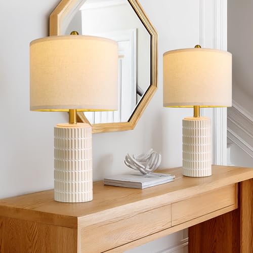
You cannot judge a paint colour under bulbs you are about to replace, and most people are about to replace them without knowing it. Before any sample goes up, decide what the room’s artificial light is going to be, because the bulb has as much say in the final colour as the paint. Two numbers on the bulb box do the work: colour temperature, in kelvin, and CRI, the colour rendering index.
Colour temperature is the warmth. 2700K is the warm glow of an old incandescent bulb; 3000K is a touch whiter and still warm; 3500K to 4000K starts to look like an office; 5000K is daylight and reads clinical in a home. For living rooms and bedrooms, 2700K keeps skin and wood looking good and pairs with warm and mid-tone wall colours. For kitchens and bathrooms where you need to see what you are doing, 3000K is the compromise most designers land on. Mixing temperatures in one room, a 2700K lamp beside a 4000K ceiling fixture, is the fastest way to make any wall colour look wrong, because half the room is reading it warm and half is reading it cool.
CRI is how faithfully the bulb shows colour, on a scale to 100. Cheap LEDs at CRI 80 flatten reds and make greiges look muddy. CRI 90 or above shows the colour you actually paid for. It costs a little more per bulb and it is the cheapest improvement you can make to any painted room.
The failure mode is judging samples under the wrong bulbs, choosing a colour to compensate for them, then upgrading the bulbs later and finding the colour has gone somewhere else. Buy the bulbs first. It is a small purchase compared with a gallon of the wrong paint.
Done looks like this: every fixture in the room on the same colour temperature, CRI 90 or higher, and a dimmer on at least one of them so you can see the wall at low levels.
Key Takeaway: Fix the bulbs to one colour temperature and CRI 90 or better before the samples go up, because the bulb is half the colour you see.

Stage 7: Pick One Anchor Object That Sets the Palette
 Save
A palette needs a source, and the source should already be in the room or already chosen for it. A rug, a large piece of art, a patterned fabric, even a favourite ceramic: one object with three or more colours in it that you love without reservation. Colourists call it the anchor, and the wall colour is pulled from it rather than chosen alongside it. This is the single move that makes a room look like it was planned rather than assembled, and it is why the rooms on your board hang together in a way you cannot quite name.
The anchor has to be large enough to matter and permanent enough to trust. A 8 x 10 ft (244 x 305 cm) rug qualifies. A 36 x 48 in (91 x 122 cm) canvas qualifies. A cushion does not, because cushions get replaced and then the wall is orphaned. If you have no anchor yet, buy the anchor before the paint. A rug is harder to find in the right colour than a paint chip; paint can be mixed to anything, rugs cannot. Choosing the paint first and then hunting for a rug that agrees with it is the sequence that ends in a beige rug bought out of exhaustion.
Once the anchor is chosen, pull the palette out of it literally. Photograph it in daylight, then pick the three colours your eye lands on: the one that covers the most area, the one that supports it, and the one that flashes. In a rug of faded terracotta, dusty rose and cream, the wall colour comes from the quietest of those, the cream or the rose knocked back to a putty, and the terracotta stays as the accent it already is on the floor. The wall never copies the loudest colour in the anchor. It carries the softest one.
The failure mode is anchoring to a photograph of someone else’s room. That room’s floor, light and trim did the real work in the picture, and none of them are in your house. The board is a mood. The anchor is a thing you can hold.
Done looks like this: one object, photographed, with three colours named from it in order of how much space they take.
Key Takeaway: Pull the wall colour out of one large permanent object you already love, and let the wall carry its quietest colour rather than its loudest.

Stage 8: Build the Palette in Three Parts Before Any Brand Is Named
 Save
With the anchor’s three colours in hand, assign them jobs before you assign them brands. The rule designers use is a proportion: roughly 60 percent of the room’s visible surface in the dominant colour, 30 percent in the secondary, 10 percent in the accent. The walls are usually the 60, because they are the largest surface. Large furniture, curtains and the rug share the 30. The accent lives in art, ceramics, a single chair, lampshades.
Write the three colours in plain words with their jobs. “Dominant: muted olive, walls. Secondary: pale oak and cream, furniture and textiles. Accent: warm rust, ceramics and one cushion.” The wall colour is now fully specified in every way except the brand and code, and that is deliberate. You are describing a colour, not shopping for one, and the description is what protects you from falling for a chip that is beautiful and wrong.
Depth matters in this stage as much as hue. If the dominant colour is mid-tone, the secondary should be lighter and the accent either much lighter or much darker so the three read as three. Three mid-tones in one room go muddy under lamplight, and no amount of good bulbs will separate them. A muted olive wall with pale oak furniture and cream linen works because the oak and the linen are clearly lighter than the wall; the room has a light-to-dark order the eye can read from the doorway.
The failure mode is letting the walls be the accent. A saturated accent colour is exciting on a chip and exhausting on 400 sq ft (37 sq m) of wall. If the colour you love is the flashing one in the anchor, give it the 10 percent and let the wall carry something calmer that agrees with it. The room will look like the photograph you saved; the photograph almost never had the loud colour on the walls either.
Done looks like this: three colours in plain words, each with a percentage and a surface, and the wall is the calmest of the three.
Key Takeaway: Assign the three palette colours to 60, 30 and 10 percent of the room by surface, and give the walls the calmest one rather than the loudest.

Stage 9: Decide the Depth With LRV Before You Decide the Hue
 Save
Before you fall for a name, settle on a number. LRV, light reflectance value, is printed on the back of most chips and on every brand’s website, and it runs from 0, which reflects nothing, to 100, which reflects everything. It tells you how light or dark a colour will actually look on the wall, and it is a better predictor of how a room will feel than the hue. Two greiges with the same LRV behave the same way in the same light even if one leans pink and one leans green. Two greiges thirty points apart are different rooms.
The working bands are simple. Above 70 is a light colour: it bounces daylight, keeps small rooms feeling open and reads as “white-ish” from a distance. Benjamin Moore White Dove OC-17 sits around 83 and Simply White OC-117 around 90; both are whites that behave like whites. Between 50 and 70 is light-to-mid: colour you can see as colour, still airy, and the range most of the popular greiges live in, Agreeable Gray SW 7029 sits near 60. Between 25 and 50 is a true mid-tone, where the wall becomes a presence and the room feels held; Evergreen Fog SW 9130 sits around 30. Below 25 is deep: Dried Thyme SW 6186 at about 21, Silhouette AF-655 at about 10, Hale Navy HC-154 at about 8. Deep colours absorb most of the light that hits them and need the lighting from Stage 6 to have been done properly.
Match the band to the sentence from Stage 1 and the light from Stage 4. “Settled” in a north-facing room used at night wants 35 to 55. “Bright” in an east-facing kitchen wants 70 plus. “Enveloping” in a small windowless room wants under 20, and it will be better than a pale colour there, because pale colours in dim rooms go grey and sad while deep colours simply look deep.
The failure mode is choosing LRV to fix a problem paint cannot fix. A dark room does not become bright by painting it LRV 85; it becomes a dim room with pale walls. Light comes from windows and bulbs. LRV decides what the colour does with the light it gets.
Done looks like this: a ten-point LRV band written next to the dominant colour, and every candidate outside that band crossed off before you order a sample.
Key Takeaway: Choose a ten-point LRV band from the room’s light and purpose first, then only consider colours inside it.

Stage 10: Narrow to Three Candidates From One Brand’s Deck
 Save
Now, finally, the deck. Pick one brand and stay inside it for this room. Brands mix their neutrals around their own base tints, and a Sherwin-Williams greige next to a Benjamin Moore greige will disagree in ways that have nothing to do with the names; the trim, the wall and the ceiling should come from one system so they share the same underlying bias. Choose the brand your nearest good store carries, because you will be back for samples and touch-ups, and colour-matching across brands is close but never exact.
Take the plain-word description from Stage 8 and the LRV band from Stage 9 to the brand’s website, which lets you filter by colour family and shows the LRV on each colour page. This turns four thousand chips into perhaps twenty. Then apply the undertone from Stage 3: if the fixed finishes lean warm, cross off everything with a blue or violet lean; if they lean cool, cross off the yellow-based ones. You should be down to six or eight.
Pick three. Not one, and not ten. Three that sit in the same band but differ in one dimension each: one slightly warmer, one slightly greyer, one a touch lighter or darker. For a muted green bedroom you might have a grey-green, a slightly bluer grey-green and a lighter version of the first, all within ten LRV points. Three candidates that are genuinely different in hue will tell you nothing about each other; three that differ by one step tell you exactly which step the room wants.
The failure mode is falling back in love with a chip at the store and adding it as a fourth. The fourth is always the one that broke the process. If it belongs, it fits the description and the band. If it does not, it is a colour for another room.
Done looks like this: three names and codes on a card, each with its LRV written beside it, all from one brand, all inside the band.
Key Takeaway: Filter one brand’s deck by your plain description, LRV band and undertone, then carry exactly three candidates that differ by one step each.

Stage 11: Put the Colour Where You Can Change It First
 Save
If the three candidates from Stage 10 are all bold, saturated colours, stop and check where the boldness belongs. The rooms that make bright colour look easy nearly always put it in the furniture and keep the walls near-white. A mustard velvet two-seater about 56 in (142 cm) wide, two teal velvet cushions at 18 in (46 cm) square and a powder-blue side table 18 in (46 cm) across carry a whole colour story on their own, and the walls behind them are a warm near-white doing nothing but holding the light. That is not a compromise. It is the version of the room that still looks good when your taste moves on.
The reasoning is simple. Paint is cheap to buy and expensive in time: a room takes a weekend, two coats and a week of fumes. A sofa is expensive to buy and takes an afternoon to replace. So the colour with the shortest expected life, the one you love this year, belongs on the thing that is easiest to swap. Walls get the colour you are confident about in five years. Cushions get the colour you are confident about this season. A sofa sits in between, which is why a strong-coloured sofa is a bigger commitment than it looks and should be one you have lived with as a sample fabric before ordering.
Complementary pairs, mustard against teal, rust against blue-green, work in furniture precisely because they are small and separated by a lot of white. Put the same pair on walls and trim and the room vibrates. If your anchor object from Stage 7 is bold, the wall in the 60 percent slot should be a warm white with an LRV above 80 that picks up the anchor’s warmth without competing. White Dove OC-17 is the standard example of that kind of white: warm enough to flatter velvet and oak, clean enough to stay out of the way.
The failure mode is painting the walls the colour of the sofa you wish you had. The wall then has to carry the whole personality of the room, and the day the personality changes, so does the weekend.
Done looks like this: every saturated colour in your palette assigned to a movable object, and the three wall candidates all inside the calm band.
Key Takeaway: Put the boldest colour on the easiest thing to replace and keep the wall in the calm band, so the room can change without a repaint.

Stage 12: Order Large Samples, Never Judge From the Store Chip
 Save
A store chip is 2 x 3 in (5 x 8 cm) of colour on coated card under fluorescent light, and it is the least reliable object in this whole process. The colour on the wall will be two hundred times larger, lit by your windows, surrounded by your floor. The rule every colourist gives is a sample at least 12 in (30 cm) across, and larger is better; 24 in (61 cm) starts to behave like a wall.
There are two honest ways to get one. A peel-and-stick sample, made with two coats of the actual paint on a 12 x 12 in (30 x 30 cm) sheet, costs about $6 to $7 each and arrives in a couple of days; it is repositionable, so one sheet can visit every wall in the room. Or buy a quart-size sample pot, about $10 from Sherwin-Williams for their Color to Go size, and paint two coats onto a 20 x 30 in (51 x 76 cm) sheet of white poster board with a small foam roller. Three candidates, three boards, under $35 either way. Against the cost of a gallon of the wrong colour and a lost weekend, that is the cheapest insurance in decorating.
Paint the boards, not the wall. A sample painted straight onto the existing colour is surrounded by that colour and your eye reads the contrast, not the candidate. On a white board with a 2 in (5 cm) white border left around the edge, the colour is isolated the way it will be once the whole wall is done. Label the back, never the front; a written code beside the colour pulls your eye and skews the read.
The failure mode is the little smear on the wall, usually three smears in a row, judged at arm’s length in the afternoon. Every one of those smears is smaller than a hand and surrounded by the wrong colour, and every one of them lies.
Done looks like this: three boards, two coats each, borders clean, codes on the back, dry for a full day before you look at them seriously.
Key Takeaway: Sample at 12 in (30 cm) or larger on white board, never as a smear on the old wall, because the chip is too small and the old colour skews the read.

Stage 13: Test on Two Walls at Three Times of Day
 Save
One board, one wall, one glance is not a test. The colour changes with the wall it sits on and the hour it is seen, so the sample has to travel and the judging has to be scheduled. Put each candidate on the window wall, where light hits it hardest and flattest, and on the wall opposite the window, which is the brightest-lit surface in the room and the one you look at most. Then move it to the wall beside the window, which is always the darkest because it gets no direct light. The same colour will look like three colours in those three places. That is not a defect. It is information about how much the colour moves, and a colour that moves a lot in daylight will move even more at night.
Look at each position at three times: morning, midday and your test hour from Stage 5 with the Stage 6 bulbs on. Take a photograph of each board in each position at each time, with the same phone, without editing. Nine photographs per candidate, twenty-seven for three. It sounds like a lot; it is about ten minutes spread over one day, and the photographs let you compare side by side in a way your memory cannot.
Look for two things. First, does the colour stay itself? A grey-green that reads green at noon and grey at night is fine if you like both; if you only like the noon version, it is the wrong colour. Second, does it agree with the fixed finishes in every position? Set each board on the floor beside the trim and the flooring and look at all three together. The candidate that looks right next to the floor at the test hour is ahead of any candidate that only looks right on its own.
The failure mode is judging at the best hour and moving on. That is how a colour gets chosen at eleven in the morning and regretted at nine at night, which is when the room is used.
Done looks like this: twenty-seven photographs sorted by candidate, and a note of which one held together at the test hour.
Key Takeaway: Move each sample to three walls and judge it at three hours including the test hour, because a colour that only works at noon is the wrong colour.

Stage 14: Judge the Sample Against the Finishes, Not Against the Old Wall
 Save
The most common reason a good sample gets rejected is that it was judged against the wrong thing. On a wall of old builder beige, a warm white looks pink. On a wall of cool grey, the same warm white looks yellow. The old wall is leaving; it has no vote. The floor, the counters, the tile and the trim are staying, and they are the only things the candidate has to get along with.
So bring the boards to the finishes. Set each candidate directly against the countertop, then the cabinet door, then the trim, then the floor, and photograph each pairing at your test hour. A white that looks lovely on its own but goes grey next to a honed white marble is telling you the marble is cleaner than the white; you need a white with less warmth. A greige that looks perfect against the oak but dirty against the trim is telling you the trim is a cooler white than you thought, and the trim colour has just joined the decision.
From the guides
You've saved it, wanted it. Here's the how: codes, measurements, order. Your choices make it yours.
The Japandi Honest PlaybookThe honest version of the style: what to keep, what to skip, and the order to do it in.See inside →The Room Refresh PlaybookA repeatable four-step method, room by room, in ten minutes, thirty minutes, or one weekend.See inside →Make Any Room Feel Cozy on PurposeWhy some rooms hold people and others empty out, and the moves that change it.See inside →The white-board frame trick helps here too. Cut a 4 in (10 cm) wide border of plain white poster board and lay it around the sample so the old wall is masked from view. The candidate is now surrounded by neutral white, the way it will be surrounded by itself once the whole wall is painted, and the comparison to the finishes becomes honest. It costs nothing and it removes the single biggest source of a false read.
Do this in the order of permanence from Stage 2. If the candidate agrees with the floor and the tile but fights the sofa, the sofa is negotiable. If it agrees with the sofa and fights the floor, the candidate is out. The most permanent finish wins every tie.
The failure mode is falling for a candidate because it improved the old wall. Everything improves the old wall. The question is whether it agrees with the things that are staying.
Done looks like this: one candidate that agreed with every fixed finish at the test hour, and a note of any finish it merely tolerated.
Key Takeaway: Judge every sample against the finishes that are staying, with the old wall masked by white board, and let the most permanent finish break ties.

Stage 15: Choose the Trim White Before You Commit to the Wall
 Save
The trim is the frame around the picture, and the picture changes depending on the frame. A warm greige wall with a bright cool white trim reads crisper and cooler; the same wall with a warm creamy trim reads softer and more traditional. Most people inherit their trim colour, paint the walls, and then wonder why the wall looks slightly off against the woodwork. The answer is that the wall was chosen without looking at what it would be framed by.
Decide the trim in one of three ways. Keep the existing trim if it is a clean white with no yellowing and its undertone agrees with the wall candidate; hold the sample board against it under the test-hour light and the answer is usually obvious. Repaint the trim in the same brand’s standard white if the existing trim has aged; White Dove OC-17 for Benjamin Moore rooms and Alabaster SW 7008 for Sherwin-Williams rooms are the warm-white workhorses that suit most greiges, greens and clays, while Simply White OC-117 is the cleaner, brighter option when the wall colour is cool or the room needs lifting. Or paint the trim the wall colour, which is the colour-drenching move that makes small rooms feel calm and larger rooms feel deliberate.
The contrast between wall and trim should be a decision, not an accident. A wall at LRV 55 against a trim at LRV 85 has a visible, crisp edge. A wall at LRV 75 against the same trim barely registers a change and looks like a mistake unless the sheen makes the difference clear. If the wall and trim are within about ten LRV points, either drench them both in one colour or move the wall darker so the edge is intentional.
The failure mode is choosing the wall for the room and the trim for the trim, as if they were separate jobs. They are one decision viewed from two sides.
Done looks like this: a trim colour and sheen written next to the wall colour, and the sample board held against a painted trim sample at the test hour.
Key Takeaway: Choose the trim white with the wall, not after it, and make the wall-to-trim contrast a decision of at least ten LRV points or none at all.

Stage 16: Decide the Ceiling on Purpose
 Save
The ceiling is a fifth wall and it is usually the largest unbroken surface in the room, so leaving it “just white” is a colour choice, and often the wrong one. Flat bright white on a ceiling above a mid-tone wall creates the hardest edge in the room, at the line you see every time you look up, and it makes the ceiling feel lower because the eye reads it as a lid.
Three options, in order of how often they are right. First, the wall colour lightened. Ask the store to mix the wall colour at 50 percent strength, or choose the next lighter colour on the same strip, and put that on the ceiling. The edge softens, the ceiling reads as part of the room, and the colour above the eye-line is calmer than the colour at it. This is the safe move for most living rooms and bedrooms. Second, the wall colour at full strength on every surface, walls, ceiling, trim and doors. Colour-drenching in a muted mid-tone at LRV 25 to 45 makes a small bedroom feel enclosed and settled, particularly at night under lamplight, because there are no edges for the eye to catch on. It works in rooms used mainly after dark. Third, a true white ceiling, but a warm one that shares the wall’s undertone, in flat sheen so it disappears. This is right when the walls are already very pale or when the room has good height and you want it to feel taller.
The sheen matters as much as the colour. Ceilings show every roller mark and every patch, so flat or ceiling-flat is the finish unless the ceiling is being drenched in a kitchen or bathroom, where a matte washable finish holds up better.
The failure mode is the automatic bright white ceiling in a room with warm mid-tone walls. It looks clean in the can and cold in the room, and the wall colour below it goes slightly muddier by comparison.
Done looks like this: a ceiling colour and sheen written under the wall and trim, and the sample board held up to the ceiling at the test hour to check the edge.
Key Takeaway: Decide the ceiling as a colour, lighter wall, same wall or a warm flat white that shares the undertone, and never leave it to the default.

Stage 17: Match the Sheen to the Room’s Traffic
 Save
The same colour in two sheens is two colours. Sheen changes how much light bounces off the surface, and a satin wall reads a shade lighter and a touch cooler than the same colour in flat, especially where light rakes across it. Sheen also decides how well the wall survives, so the choice comes from the room’s traffic, not from the chip.
Flat or matte hides everything: roller marks, patched drywall, the slight waviness of an older wall. It gives colour its deepest, most velvety read and is the right finish for bedrooms, living rooms, dining rooms and ceilings, anywhere hands rarely touch the wall. Modern matte formulas are far more washable than they were ten years ago, so “flat means unwashable” is no longer true of the mid-range lines. Eggshell is the small step up: a whisper of sheen, still forgiving, wipeable, and the default for hallways and family rooms where the wall meets the occasional bag or shoulder. Satin has a visible soft glow and shrugs off scrubbing, so it belongs in mudrooms, kitchens, bathrooms, laundry rooms and kids’ rooms, on any wall that gets wet or wiped weekly. Semi-gloss is for trim, doors and cabinets, where the hard, reflective finish makes the edge crisp and takes the abuse of hands and vacuum cleaners. Gloss is a deliberate effect, not a default.
The trap is that higher sheen shows every flaw. A satin wall in a mudroom with lumpy plaster will highlight every lump under the raking light from the door. If the wall is imperfect and the room is high-traffic, choose the best washable matte the brand makes rather than jumping to satin.
The failure mode is choosing one sheen for the whole house for simplicity. A bedroom in satin looks like a hospital corridor at night; a mudroom in flat looks scuffed within a month.
Done looks like this: a sheen written next to every surface on the spec, walls, trim and ceiling, chosen from the traffic of that room.
Key Takeaway: Choose the sheen from how the wall gets used, flat for rooms hands rarely touch and satin where walls get wiped, because the sheen shifts the colour and decides how it wears.

Stage 18: Carry One Connecting Colour Through the Whole Home
 Save
A single room can be chosen on its own; a home cannot. From any doorway you can usually see two or three painted surfaces at once, and if they were chosen separately they will read as three separate decisions. The fix is one connecting element that runs through every room, so that the colours can differ and still belong together.
The strongest connector is the trim. One white, in one sheen, on every casing, baseboard and door in the house, gives the eye a constant to measure everything else against. The second connector is the floor, which you usually already have; if the oak runs through the whole ground floor, every wall colour has already been given a shared warm base and the palette has a built-in agreement. The third is the undertone. If the hall is warm off-white, the living room is grey-green and the dining room is olive, they hold together because all three carry the same warm grey base. Add a cool blue-grey room to that sequence and the doorway becomes a border.
Plan the sequence from the entry inward. The hall and any space you pass through takes the lightest and quietest colour, so it reads as a pause between rooms rather than a room of its own. Rooms you sit in take the mid-tones. The smallest and most enclosed rooms, a powder room, a study, a dining room used at night, take the deepest colour, because depth is a pleasure in a small space and a weight in a large one. Line the sample boards up on the hall floor in the order you would walk past the rooms and look at them together at the test hour.
The failure mode is choosing each room from its own board. Every room looks right from inside and wrong from the doorway, and the house feels like a series of apartments.
Done looks like this: one trim white for the whole house, and the wall colours of every visible room lined up on the floor in walking order and agreeing on their undertone.
Key Takeaway: Hold every room together with one trim white and one shared undertone, lightest in the spaces you pass through and deepest in the smallest rooms.

Stage 19: Give a Dark or Small Room a Deep Colour Instead of a Pale One
 Save
The instinct with a small or dim room is to paint it as pale as possible and hope. It rarely works. A pale colour needs light to reflect; in a room with one small window or none, there is nothing to reflect, and the pale wall turns a flat, tired grey by mid-afternoon. A deep colour in the same room does not depend on daylight. It simply looks deep, the corners disappear, the room stops trying to be bigger than it is and becomes a place instead.
The band is LRV under 15. Hale Navy HC-154 sits around 8 and is the standard example of a navy that works in a powder room, a study or a windowless hallway: blue enough to read as a colour, grey enough not to go electric under warm bulbs. Silhouette AF-655, Benjamin Moore’s recent Color of the Year, sits around 10 and is a soft brown-grey that behaves like a deep neutral rather than a colour, which makes it easier in a small dining room or a study than a navy. At this depth, the trim decision from Stage 15 changes: drench the trim in the wall colour, or take it to a soft white and accept a strong graphic edge. A creamy white trim against a deep navy goes yellow.
Lighting does the rest. A deep room needs its light at eye level, not the ceiling: a sconce beside the mirror, a lamp on the vanity, so the light hits faces and objects and the wall stays a backdrop. A single ceiling fixture over a navy powder room lights the top of your head and leaves the mirror in shadow. Use the CRI 90 warm bulbs from Stage 6 and keep them under 3000K; deep colours go cold and hard under anything whiter.
The failure mode is sampling a deep colour by the smear method. A 6 in (15 cm) patch of navy on a white wall looks like a hole. The colour only makes sense at full scale, so sample it on the largest board you can manage and stand it in the room’s darkest corner at the test hour.
Done looks like this: a deep colour under LRV 15 sampled at full board size in the darkest corner, with eye-level lighting planned and the trim decision made.
Key Takeaway: In a small or dim room, choose a deep colour under LRV 15 and light it at eye level, because pale walls with no light to reflect only look tired.

Stage 20: Plan the Primer and the Coats for the Colour You Chose
 Save
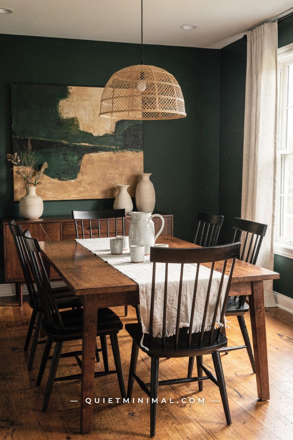
The colour on the board and the colour on the wall are only the same if the wall is prepared for it, and the deeper or cleaner the colour, the more that matters. Most colour disappointments after painting are not the colour; they are the coverage. A deep green rolled over builder white in two thin coats comes out streaky and a shade lighter than the sample, and it looks like the wrong colour. It is the right colour, under-built.
The rule is about the distance between the old wall and the new colour. Going from a pale wall to a pale or mid-tone colour in the same family, two coats of a good paint-and-primer product will usually cover. Going from pale to deep, or from a strong colour to a pale one, or over fresh drywall or patched areas, use a separate primer first. For deep colours, ask the store to tint the primer toward the finish colour; a grey-tinted primer under a navy or a deep green saves a coat and gives a truer, more even depth than white primer ever will. Then plan three coats of the finish and be pleased if two turn out to be enough.
Coverage per gallon is the arithmetic. Most brands quote 350 to 400 sq ft (33 to 37 sq m) per gallon per coat on a smooth wall. Measure the room’s perimeter, multiply by the wall height, subtract roughly 20 sq ft (2 sq m) per door and 15 sq ft (1.4 sq m) per window, and divide by 375 for the gallons per coat. A 12 x 14 ft (366 x 427 cm) room with 8 ft (244 cm) ceilings has about 416 sq ft (39 sq m) of wall before openings; call it 375 after two windows and a door, so one gallon per coat, three gallons for a deep colour with a primer on top. Buy it all at once from the same batch so the tint matches can for can.
The failure mode is buying one gallon, running out on the second coat and getting a second gallon mixed a week later. Tint drift between batches is small but real, and on a deep colour it shows as a faint change at the wall where the second can started.
Done looks like this: a primer decision, a coat count and a gallon count written on the spec, all bought together.
Key Takeaway: Plan the primer, the coat count and the gallons from the distance between the old wall and the new colour, and buy every can at once.

Stage 21: Write the Spec Sheet for the Room
 Save
Every decision so far lives in your head, in photographs and on the back of three boards. Before you buy a can, write it all in one place, because you will need it again: for the touch-up in eighteen months, for the trim repaint, for the next room that has to agree with this one, and for whoever paints after you. A spec sheet is a page, and it takes ten minutes.
The page has one line per surface. Walls: brand, colour name, code, sheen, number of coats. Trim and doors: the same. Ceiling: the same, including whether it is the wall colour lightened and by how much. Then the primer, if any, and its tint. Then the bulbs: colour temperature and CRI for every fixture in the room. Then the fixed finishes from Stage 2 with their undertones, so the next colour decision in this house starts from the finished inventory rather than from scratch. Finally, the room’s sentence from Stage 1, because it is the reason for all of it.
Keep the sheet somewhere it will survive: a photograph in a phone album named for the room, and a paper copy taped inside the cupboard door with the sample boards. Brands rename and retire colours, so the code matters more than the name, and a small painted swatch on the sheet itself matters more than either. Dab a 2 in (5 cm) square of the real wall paint on the page from the can.
If several rooms are being done, the sheets stack into a whole-house palette, and that stack is what Stage 18 was building toward. Looking at five sheets side by side, one trim white repeated, one floor, one undertone, is how you check the house is one house.
The failure mode is not writing it down and, a year later, colour-matching a chip cut from behind the radiator. The match is never exact, and the patch shows.
Done looks like this: one page per room with every surface, sheen, coat count, bulb and fixed finish, plus a real painted swatch, in the phone and in the cupboard.
Key Takeaway: Write one page per room with every surface, code, sheen, coat and bulb, plus a painted swatch, so the next decision in this house starts from a record and not a guess.

Stage 22: Buy the Right Line, Not Just the Right Colour
 Save
The same colour code is mixed into several product lines at every brand, and the line changes the result. Budget lines have less pigment and less resin, so they take an extra coat to reach the sample’s depth and they scuff sooner. Premium lines cover in fewer coats, hold their colour longer, and in the matte finishes wipe clean in a way the budget matte will not. On a deep colour the difference is a full coat; on a pale colour it is a year or two of looking fresh.
Choose the line from the room, the way you chose the sheen. A bedroom or living room in a mid-tone with normal traffic does well in the brand’s mid-range interior line. A kitchen, bathroom, hallway, mudroom or a child’s room wants the brand’s top washable line in the sheen you chose in Stage 17. A nursery, or any room where fumes matter, wants a low- or zero-VOC line; most premium interior paints now are, but check the can rather than assuming. A ceiling can take the cheapest flat the brand makes; nobody touches it.
Buy the sample in the same line you will buy the gallon. This is the small trap in the sampling stage: sample pots and peel-and-sticks are usually made from a standard interior line, and if you then buy the gallon in a different line, the finish and the depth will shift slightly. If you are planning a premium washable matte, ask the store to mix your sample quart in that line so the board tells the truth.
Then buy the tools the colour deserves. A 3/8 in (10 mm) nap microfibre roller for smooth walls, 1/2 in (13 mm) for lightly textured ones, a 2 in (5 cm) angled sash brush for cutting in, and a good tape. A deep colour rolled with a cheap sleeve leaves lint in the finish and a visible texture; a soft white rolled with a heavy nap looks like orange peel.
The failure mode is spending on the colour process and saving on the can. The best-chosen colour in the house looks tired in a year if the paint under it is thin.
Done looks like this: the product line named on the spec next to each surface, the sample quart mixed in that line, and the roller nap chosen for the wall texture.
Key Takeaway: Match the paint line to the room’s traffic and fumes, sample in that same line, and choose the roller nap for the wall, because the can decides how long the colour looks chosen.

Stage 23: Live With the Finished Wall for Two Weeks Before You Judge It
 Save
The first evening after the last coat is the worst possible moment to decide whether the colour was right. Fresh paint is not finished paint. Most interior finishes take a week or two to cure fully, and the sheen settles and the colour deepens slightly as they do; a matte that looks chalky and a touch pale on day one looks like the sample by day ten. The room is also empty or half-dismantled, with the furniture pushed to the middle and the art off the walls, so the colour has nothing to relate to.
Put the room back before you judge. Art on the walls, rug down, lamps on, curtains hung. The colour was chosen to sit behind those things, and on its own it has to carry the whole room, which it was never asked to do. Then leave it for two weeks and use the room normally, at the hours you actually use it. Somewhere in the second week you will stop noticing the walls, and that is the sign of a colour that works: it has become the background it was chosen to be.
If after two weeks something is still wrong, diagnose it before you reach for a brush. Nine times out of ten the fault is not the wall. It is the bulbs, still the old cool ones because Stage 6 was skipped; or the trim, now visibly yellow against a clean new wall and needing its own coat; or the ceiling, a bright white lid over a mid-tone that needs to be knocked back. Fix those first. Each is an afternoon. A repaint is a weekend, and it may not fix what the bulbs were doing.
The failure mode is the day-one verdict. The paint is wet, the room is a mess, the light is wrong and the cushions are in the hall. Every colour looks like a mistake under those conditions.
Done looks like this: fourteen days, furniture back, lamps on, and a note of whether you have stopped noticing the walls.
Key Takeaway: Put the room back together and live in it for two weeks before judging the colour, and if something still looks wrong, check the bulbs, the trim and the ceiling before the wall.

Stage 24: What Done Looks Like at Nine at Night
 Save
This is the test the whole sequence was built to pass. It is nine at night, the curtains are drawn, two lamps are on, and the room looks like the room you meant. The grey-green on the walls is still grey-green, not tan, because it was chosen with a little grey in it and judged at this hour on a board on this wall. The ceiling has no hard edge, because it carries the same colour lightened. The trim is a soft white that stays white under the warm bulbs, because the bulbs were fixed before the sample went up. The oak floor and the linen and the wool sit inside the palette instead of arguing with it, because the floor was the first thing on the list and the wall answered to it.
None of that came from a better chip. It came from the order: purpose, fixed finishes, undertone, light, the worst hour, the bulbs, the anchor, the three-part palette, the depth by LRV, three candidates from one deck, large samples on three walls at three hours, judged against the finishes, then trim, ceiling, sheen, the whole-house thread, primer and coats, the spec, the line, and two weeks of patience. Twenty-three decisions, most of them ten minutes, and the colour becomes the least dramatic thing in the room, which is exactly what a wall colour is for.
Use this stage as the check. Walk into the finished room at the test hour and ask the sentence from Stage 1: does the room do what it is for, at the hours it is used, with the feeling you wrote down? If the answer is yes, you are done, and the spec sheet is the record. If the answer is nearly, go back to Stage 23 and run the three quick fixes before you doubt the colour.
The failure mode at this stage is not a failure of colour. It is forgetting to look. Most people never stand in the finished room on purpose, at the hour it matters, and notice that it worked. Do that once. It is the only moment in the whole process that is just for you.
Done looks like this: the room at its test hour, furniture home, lamps on, and the wall doing nothing at all, which is everything you asked of it.
Key Takeaway: The finished wall is the one you stop noticing at the room’s worst hour, and every stage before this one existed to make that ordinary.

Choosing paint colours well is a sequence, not a search. The chip you love will always look different on the wall, and the difference is not bad luck; it is the floor, the trim, the light and the bulbs, all of which were in the room before the chip arrived and all of which can be read in an afternoon. Start with what the room is for and the finishes you cannot change. Find the hour when the colour will have the least help and choose for that hour. Decide the depth by LRV before the hue, pull the hue from something you already own, and put the boldest colour on the thing that is easiest to replace.
Then sample properly: three candidates, one brand, boards at least 12 in (30 cm) across, three walls, three times of day, judged against the finishes that are staying. Decide the trim, the ceiling and the sheen as part of the same decision, write it all on one page, and give the finished wall two weeks before you make up your mind. This weekend, do Stage 2 and Stage 3 for one room. The list of fixed finishes and their undertones takes half an hour, costs nothing, and it is the half hour that makes every colour after it easier.
From the guides
You've saved it, wanted it. Here's the how: codes, measurements, order. Your choices make it yours.
The Japandi Honest PlaybookThe honest version of the style: what to keep, what to skip, and the order to do it in.See inside →The Room Refresh PlaybookA repeatable four-step method, room by room, in ten minutes, thirty minutes, or one weekend.See inside →Make Any Room Feel Cozy on PurposeWhy some rooms hold people and others empty out, and the moves that change it.See inside → Save


