 Georgia
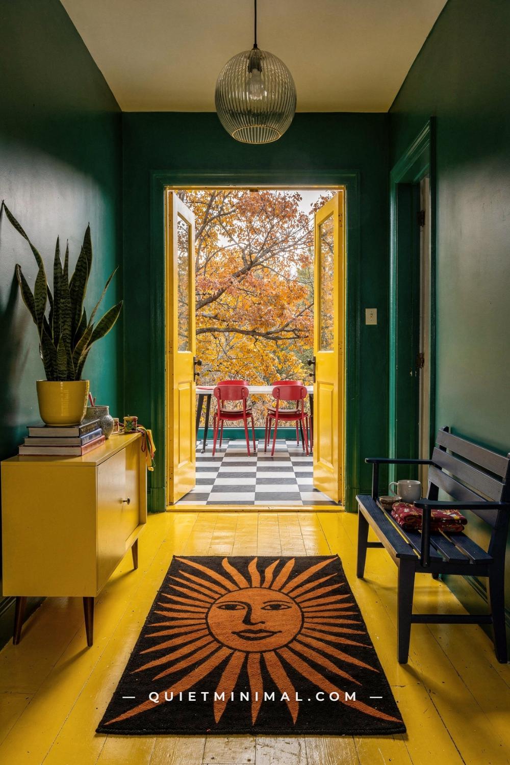
Wes Anderson interior design at home is a measuring job before it is a shopping job. The ten ideas below this block still tell you what the look is made of: a one-point view, a saturated color story, tidy clutter, a grid of frames, lamps that behave like sculpture. What they never gave you is the tape measure. The rooms Pinterest keeps saving under this keyword all share one thing a mood board cannot show: somebody found the centerline first, and every pair, every lamp and every frame was measured off it. So this block adds the arithmetic. It shows how to find the axis in your own room and draw it on a plan, how far apart a pair of sconces or nightstands sits, where the art centers, how the 70-20-10 palette ratio splits across an axis with paint codes checked on the brand sites, and how a bedroom, a bathroom, a kitchen run and a living room each lay out with 36 in (91 cm) walkways intact. Every chain of inches closes inside the room it is drawn for, so you can check it against your walls before anything heavy moves.
Find the Centerline First: the Window Wall Sets the Axis, Not the Door
 Save
The centerline is the whole method, and most rooms hide it. Start with the wall that holds the biggest fixed thing, which in a living room is nearly always the window: measure it corner to corner, halve it, and mark the halfway point on the floor with painter’s tape. Then measure the window. If its center lands within 2 in (5 cm) of your mark, the window is your axis. If the door on the opposite wall is also centered, you have the classic door-to-window line and the one-point view the look is built on; if the door sits off to one side, the window still wins and the door is simply where you stand to check.
The room in the photograph is that case. A triple window fills the back wall center, so the 72 in (183 cm) coral sofa sits on the window’s centerline, 36 in (91 cm) of it each side of the tape, and the two tripod lamps stand the same distance out even though the chairs they flank are different colors. That is the allowance you get: a pair must match in height and distance, not in fabric. Leave the tape down for a week and every piece that should be centered will show whether it is.
Key Takeaway: Halve the window wall, tape the line from the window center to the opposite wall, and measure every pair from that tape, not from the door or the corners.
The Centerline Plan for a 12 x 16 ft (366 x 488 cm) Living Room, in Inches
 Save
Here is the same rule drawn for a room you can check against yours. The room is 12 x 16 ft (366 x 488 cm), so the short walls are 144 in (366 cm) and the centerline runs 72 in (183 cm) from each long wall down the full 192 in (488 cm) length. The window on the far short wall is 60 in (152 cm) wide and centered, leaving 42 in (107 cm) of wall each side, the number every flanking piece on that wall is sized against. The door is a 32 in (81 cm) swing on the near long wall, 36 in (91 cm) from the corner, so it sits off the axis and is simply where you enter.
From the guides
You've saved it, wanted it. Here's the how: codes, measurements, order. Your choices make it yours.
 The Japandi Honest PlaybookThe honest version of the style: what to keep, what to skip, and the order to do it in.See inside →
 The Room Refresh PlaybookA repeatable four-step method, room by room, in ten minutes, thirty minutes, or one weekend.See inside →
 Make Any Room Feel Cozy on PurposeWhy some rooms hold people and others empty out, and the moves that change it.See inside →
The eye point is the middle of the near short wall at 60 to 64 in (152 to 163 cm) high, standing eye height and the height a camera sits at for the one-point view. From that spot the window center, the sofa center, the coffee table and the pendant should stack into one vertical line. Every centered piece is dimensioned from that tape, never from a wall, because real walls are rarely square and the eye reads the axis, not the corners.
Key Takeaway: In a 12 x 16 ft (366 x 488 cm) room the axis is the 72 in (183 cm) line from the window center, with 42 in (107 cm) of wall each side of a 60 in (152 cm) window.
Mirror the Flanks: Matched Lamps and Shelves Either Side of the Alcove
 Save
A pair reads as a pair when three things match: height, distance from the axis, and visual weight. Color can drift, as the terracotta room showed; height and distance cannot, and the distance is measured from the tape outward, never from the side walls inward. In the parlor here the arched alcove is the axis. It is 40 in (102 cm) wide, so its edges sit 20 in (51 cm) either side of the centerline; the two ladder shelves are 24 in (61 cm) wide and stand 6 in (15 cm) off the alcove edges, which puts each shelf’s center 38 in (97 cm) from the axis.
The lamps follow the same logic one ring further out. In a room 144 in (366 cm) wide the two tripod lamps stand with their centers 60 in (152 cm) off the axis, 12 in (30 cm) in from each side wall, and their globes sit at one height because they are the same lamp. The 72 in (183 cm) sofa is the one thing on the axis; the chairs and lamps are the twos. If you can afford only one matched pair, make it the lamps.
Key Takeaway: Match a pair on height, distance from the axis and weight, dimension it from the tape (38 in / 97 cm shelves, 60 in / 152 cm lamps), and buy the lamps first.
The Pair Spacing Table: Sconces, Nightstands, Lamps, Mirrors and the Art Center
 Save
These are the spacing numbers every pair in this block is checked against. Sconces mount at 60 to 66 in (152 to 168 cm) from the floor to the fixture center as the standard; beside a bed the range drops to 60 to 65 in (152 to 165 cm); flanking a mantel or a large canvas they rise to 66 to 72 in (168 to 183 cm) and sit 8 to 12 in (20 to 30 cm) off the frame edge. Both sconces in a pair share one height and one distance from the axis.
Art centers at 57 in (145 cm) on a bare wall; above a sofa or sideboard the bottom edge takes over and sits 6 to 10 in (15 to 25 cm) above the piece. Nightstands come in equal widths, tops within 2 in (5 cm) of the mattress top, each the same 2 to 4 in (5 to 10 cm) off the mattress side. Pendants hang 30 to 34 in (76 to 86 cm) above a dining table and 30 to 36 in (76 to 91 cm) above an island, multiples 24 to 30 in (61 to 76 cm) center to center with the outer ones at least 6 in (15 cm) in from the island ends. Two mirrors over a double vanity center on their sinks, not on the wall.
Key Takeaway: Sconces 60 to 66 in (152 to 168 cm), bedside 60 to 65 in (152 to 165 cm), art centered at 57 in (145 cm), nightstand tops within 2 in (5 cm) of the mattress, pendants 30 to 34 in (76 to 86 cm) over a table.
One Envelope Color and Two Matched Dressers: the Bed on the Axis
 Save
The bedroom is the easiest room to get symmetrical because the bed is a rectangle and everything wants to attach to it. The rule is one envelope color, two matched flanks, one bed on the axis, and a datum line that ties the flanks together. Here the envelope is teal on every wall, the datum is the cadmium-yellow stripe at the ceiling line, and the flanks are two orange metal dressers of the same width standing the same distance out from a 54 in (137 cm) bed frame. The three globe pendants cluster on the centerline so the ceiling carries the axis too.
Two measurements do the work. The gap between mattress and nightstand is the same on both sides, 2 to 4 in (5 to 10 cm), and the nightstand tops land within 2 in (5 cm) of the mattress top. Then the stripe: a horizontal band at one height around all four walls is the cheapest datum in decorating, and it makes the two dressers read as a pair even when their tops differ by an inch. The trunks stacked at the foot are the one object allowed on the axis besides the bed, and there are three of them, not two, because an odd count belongs on the centerline.
Key Takeaway: Center the bed, set two equal nightstands 2 to 4 in (5 to 10 cm) off the mattress, paint one datum stripe around the room, and keep the axis for the bed and one odd-count stack.
The 70-20-10 Split Across the Axis: Three Cards With Verified Codes
 Save
The 70-20-10 ratio is usually explained by area, but in a symmetrical room it is easier to assign it by role. The 70 is the envelope: walls, ceiling, trim and the floor plane in one color or two close ones, because the look depends on the box reading as a single flat field. The 20 goes on everything that comes in twos: armchairs, nightstands, lamp bases, the door pair. The 10 goes on the one thing that sits on the centerline: a sofa, a bed frame, a painted mantel, a console. Assign the colors that way and the symmetry does half the color work, because the eye finds the axis by finding the 10.
Three cards, every code checked on the brand’s own page. Green room: Farrow & Ball Mizzle No. 266, a soft gray-green, on the envelope; Blue Ground No. 210, a clean mid blue, on the pair; Citron No. 74, a warm lemon yellow, on the axis piece. Blue room: Benjamin Moore Palladian Blue HC-144, a soft airy blue-green, on the envelope; Buxton Blue HC-149, a buoyant blue, on the pair; Farrow & Ball Charlotte’s Locks No. 268, a deep playful orange, on the axis piece. Blush room: Farrow & Ball Pink Ground No. 202, a dusty blush pink, on the envelope including ceiling and molding; Lulworth Blue No. 89, a fresh mid blue, on the pair; Charlotte’s Locks No. 268 again on the one centered piece.
Key Takeaway: Envelope 70, pairs 20, the centered piece 10: Mizzle / Blue Ground / Citron, Palladian Blue / Buxton Blue / Charlotte’s Locks, or Pink Ground / Lulworth Blue / Charlotte’s Locks.
Flanking Alcoves and One Draped Window: the Dining Room Read From the Doorway
 Save
A dining room has a built-in axis, the long line of the table, and the job is making the architecture agree with it. The room here does it three ways. The window is centered on the far wall and its velvet drapes hang at equal widths off the axis, so the window reads as one framed rectangle rather than a hole with fabric beside it. The two arched alcoves are the pair, identical in width and shelf count and filled the same way, vases at the same shelf heights. The chandelier hangs on the centerline above the table’s center, not the room’s.
The numbers are short. A 72 in (183 cm) table takes three chairs a side at 24 in (61 cm) centers, and the chandelier’s diameter should be about half the table width, so 36 in (91 cm) here, hung 30 to 34 in (76 to 86 cm) above the marble. The one object on the table sits at its center and is a single piece, a pitcher of cut flowers, not a scattered row. If the window is off-center, drape it with unequal panel widths so the fabric edges land symmetrically off the axis and the glass becomes the thing that is off.
Key Takeaway: Center the chandelier on the table, hang the drapes at equal widths off the axis, fill both alcoves identically, and put one object at the table’s midpoint.
Bedroom and Bathroom Plans: the Bed Wall and the Double Vanity by the Numbers
 Save
The bedroom plan is 12 x 12 ft (366 x 366 cm). A 60 in (152 cm) queen centers on the 144 in (366 cm) bed wall, leaving 42 in (107 cm) each side. Two 18 in (46 cm) nightstands sit 3 in (8 cm) off the mattress, so each takes 21 in (53 cm) and leaves 21 in (53 cm) to its side wall; their centers fall 12 in (30 cm) beyond the mattress edges, so the two sconces above them sit 84 in (213 cm) apart at 60 to 65 in (152 to 165 cm) high. Along the length, an 80 in (203 cm) mattress plus a 4 in (10 cm) headboard leaves a 60 in (152 cm) lane at the foot. The chain closes: 21 + 18 + 3 + 60 + 3 + 18 + 21 = 144.
The bathroom plan is 8 x 10 ft (244 x 305 cm) with the vanity on a short wall. A 60 in (152 cm) double vanity centers on the 96 in (244 cm) wall with 18 in (46 cm) each side. Its sink centers sit 15 in (38 cm) in from each end, 30 in (76 cm) apart, and two 24 in (61 cm) round mirrors center on the sinks with 6 in (15 cm) of wall between them. That gap is the axis, and it holds one slim sconce at 66 in (168 cm) rather than a pair squeezed outside the mirrors, which would land 3 in (8 cm) from the vanity ends. A 21 in (53 cm) deep vanity leaves 99 in (251 cm) of the 120 in (305 cm) length, so the 36 in (91 cm) lane in front is never in question.
Key Takeaway: Queen at 42 in (107 cm) each side with sconces 84 in (213 cm) apart; a 60 in (152 cm) vanity with sinks 30 in (76 cm) apart, two mirrors and one sconce on the axis.
Center the Arch on the Counter Run: the Kitchen Seen From the Breakfast Table
 Save
Kitchens resist symmetry because the appliances are fixed, so pick the one axis you can control and make everything seen through it agree. That axis is the range. The hood centers over it, the upper cabinets mirror in door count on both sides, and if the kitchen is seen through an opening from another room, the opening should land on the same line. In the home here an ogee arch frames the counter zone from the breakfast nook, and the vase of yellow flowers on the counter sits exactly where the arch’s centerline crosses it.
The floor carries the axis too. A checkerboard reads symmetrical only when a grout line or a full tile sits on the centerline, so the tile is set out from the axis toward the walls, not from a corner. With 12 in (30 cm) tiles on a 96 in (244 cm) wide nook, a grout line on the axis gives four full tiles each side and no cuts; on a 100 in (254 cm) nook, a 2 in (5 cm) sliver at each wall, equal on both sides. The nook follows the dining rule: the table centers on the banquette, the two metal chairs are the pair, and the banquette is the one long thing that holds the axis.
Key Takeaway: Make the range the kitchen’s axis, mirror the doors and hood on it, set the checkerboard out from the centerline, and center the breakfast table on the banquette.
Kitchen Run and Living Room Plans With 36 in (91 cm) Walkways
 Save
The kitchen run is 12 ft (366 cm). A 30 in (76 cm) range centers at 72 in (183 cm) from each end, a 36 in (91 cm) hood centers above it, and the 54 in (137 cm) of upper cabinet left on each side splits into a 24 in (61 cm) door beside the hood and a 30 in (76 cm) door at the end, mirrored: 30 + 24 + 36 + 24 + 30 = 144. A 72 in (183 cm) island sits in front with a 42 in (107 cm) aisle, and its two pendants hang 30 in (76 cm) apart with 21 in (53 cm) to each island end, 30 to 36 in (76 to 91 cm) above the counter: 21 + 30 + 21 = 72.
The living room is the 12 x 16 ft (366 x 488 cm) room from the centerline plan, with the sofa on the short wall opposite the window. An 84 in (213 cm) sofa on a 144 in (366 cm) wall leaves 30 in (76 cm) each side, enough for a tripod lamp or a 24 in (61 cm) side table. Down the length: 36 in (91 cm) of sofa depth, 18 in (46 cm) to a 48 x 24 in (122 x 61 cm) coffee table, 18 in (46 cm) to two 28 in (71 cm) wide, 32 in (81 cm) deep armchairs facing the sofa with 12 in (30 cm) between them, a 36 in (91 cm) lane, then 28 in (71 cm) for a console under the window: 36 + 18 + 24 + 18 + 32 + 36 + 28 = 192. The 68 in (173 cm) chair pair leaves 38 in (97 cm) to each long wall.
Key Takeaway: Doors mirrored 30-24-hood-24-30 on a 12 ft (366 cm) run, pendants 21 + 30 + 21 on a 72 in (183 cm) island, and a living room chain of 36 + 18 + 24 + 18 + 32 + 36 + 28 = 192 in (488 cm).
Center the Stripe on the Mantel: Wallpaper Hung From the Axis Outward
 Save
Wallpaper is where symmetry is won or lost before any furniture arrives, because the paper decides where the eye finds the middle. Hang from the axis outward, never from a corner inward. In the pinstriped drawing room here the axis is the mantel, and one cream stripe lands dead on its center, so the stripes count out identically left and right and the mantel reads as the middle of the wall. With a motif paper you center a full drop on the axis instead, so the pattern column sits over the fireplace and the seams fall at matching distances either side.
The furniture in this room is not symmetrical at all, and that is the home version of the look: the wall is dead centered, the mantel holds one vase at its midpoint, and the tub chair, the wire chair and the stool are free to drift because the architecture is doing the holding. Before the paper goes up, drop a plumb line from the ceiling at the mantel’s center and mark it on the wall; the first stripe or the first drop goes on that line, and the paperhanger works out toward both corners.
Key Takeaway: Hang wallpaper from a plumb line at the mantel’s center outward, a stripe on the axis for stripes and a full drop for a motif, and let the seating drift.
Wallpaper Repeat Against Wall Width, and Frame Count Times Spacing Equals Wall Width
 Save
Two pieces of arithmetic keep a wall honest. First, the wallpaper. A standard roll is 20.5 in (52 cm) wide, so a 144 in (366 cm) wall takes seven drops with almost nothing over. Center one drop on the axis, from 61.75 in to 82.25 in (157 to 209 cm); three full drops each side then cover 61.5 in (156 cm) left and right, and a 0.25 in (0.6 cm) sliver remains at each corner, equal on both sides. Vertically, a 21 in (53 cm) repeat on a 96 in (244 cm) wall means each drop is cut at five repeats, 105 in (267 cm), with 9 in (23 cm) of waste and the full motif starting at the ceiling line.
Second, the grid. Total width equals frame count times frame width plus one fewer gaps times the gap: three 16 in (41 cm) portrait frames with 3 in (8 cm) gaps make 48 + 6 = 54 in (137 cm), and two rows of 20 in (51 cm) with one gap make 43 in (109 cm). Above a 32 in (81 cm) sideboard the bottom edge sits 8 in (20 cm) up at 40 in (102 cm), the top at 83 in (211 cm), and the wall shows 45 in (114 cm) each side. On a bare wall, four columns by three rows of 8 x 10 in (20 x 25 cm) frames at 2 in (5 cm) gaps make 38 x 34 in (97 x 86 cm), centered at 57 in (145 cm) so it runs from 40 to 74 in (102 to 188 cm). An odd column count puts a frame on the axis; an even count puts a gap there, and the gap reads better because the object below keeps the centerline.
Key Takeaway: Seven 20.5 in (52 cm) drops centered on a 144 in (366 cm) wall leave equal slivers; a 3 x 2 grid of 16 x 20 in (41 x 51 cm) frames at 3 in (8 cm) gaps is 54 x 43 in (137 x 109 cm).
Two Sconces and One Pendant: the Lighting Pair Rule
 Save
Light is the pair the eye notices first after dark, so it is the pair to get most exactly right. The rule has two halves: the twos go on the walls at equal distances from the axis, and the one goes on the ceiling on the axis. In the blue room here the two brass sconces flank the gallery above the sideboard at one height, and the kite pendant hangs on the centerline over the coffee table.
The numbers: for a 72 in (183 cm) sofa the sconces sit 12 in (30 cm) beyond each arm, which puts their centers 96 in (244 cm) apart, 48 in (122 cm) off the axis each, at 60 to 66 in (152 to 168 cm) high, or 66 to 72 in (168 to 183 cm) if they frame the art rather than the sofa. The pendant’s bottom clears the coffee table by at least 30 in (76 cm). If you own one lamp you love, it goes on the axis as the one, at the sideboard’s center, and a pair of plainer sconces takes the flanks; a single lamp at one end of a sofa is the fastest way to lose the line.
Key Takeaway: Sconces at equal distance off the axis and one height, the pendant on the centerline at least 30 in (76 cm) above the table, and any single lamp on the axis, never at one end.
Odd on the Axis, Even at the Flanks: the Object Count per Surface
 Save
Symmetry is not only where the furniture stands; it is how many things sit on each surface and where. The rule is the one the whole block has used: odd totals, the one on the axis, the twos at matching distances out from it. A 60 in (152 cm) mantel holds three, one abstract canvas or mirror centered and one pair of candlesticks or vases 6 in (15 cm) in from each end. A nightstand holds two, a lamp and one object, and the other nightstand holds the same two in mirror image.
A 60 in (152 cm) console holds three: a pair of lamps at the ends and one bowl on the axis. A 48 x 24 in (122 x 61 cm) coffee table holds three: one tray on the centerline, one closed stack of books with spines turned in, one vessel. A 72 in (183 cm) dining table holds one, a pitcher or a low bowl at the midpoint. A 60 in (152 cm) sideboard carries five, two lamps and two boxes as the twos and one object as the one. Island: one. Vanity: two, one at each sink. Whenever a surface ends up with an even total, something is missing from the axis or one of a pair has wandered.
Key Takeaway: Mantel three, nightstand two mirrored, console three, coffee table three, dining table one, sideboard five: odd totals, the single piece on the axis, every pair at equal distance.
The Off-Center Screen and the Single Lamp: the Room With Both Put Right
 Save
Six things break the line in real houses, and each has a measured fix. The screen off the seating axis is the biggest: center the screen on the sofa’s centerline, not the wall’s, even when that leaves unequal wall either side, because the eye judges symmetry from the seat. The single lamp is next, one lamp at one sofa end: the fix is a pair, or one lamp moved onto the axis. Art hung at door-frame height comes down to a 57 in (145 cm) center. Nightstands of different heights get matched to within 2 in (5 cm) of the mattress. A rug 4 in (10 cm) off the axis gets pulled back. Pendants hung over the room’s center instead of the table’s get rehung.
The room here has all six put right. The arched window is the axis, the amber leather sofa sits below it on the same line, the two rust armchairs are the pair at equal distance out, the globe pendant hangs on the centerline, the grid of frames on the wainscoting is set out symmetrically from the window, and the sideboard carries a pair of lamps rather than one. The two-tone wall adds a datum line at the wainscot cap that ties both sides together, and the teal rug sits square to the tape.
Key Takeaway: Center the screen on the sofa’s line, pair the lamps, drop art to a 57 in (145 cm) center, match nightstand heights, square the rug to the tape, and hang pendants over the table’s center.
The Symmetry Budget Ladder at Current Prices: Tape, the Pair, the Envelope, the Axis Piece
 Save
 Save
Symmetry is unusually cheap, because most of it is moving things you own to the right place, and the ladder runs in the order the block has used. Rung one costs almost nothing at current prices: a roll of painter’s tape, a chalk line for the floor, a plumb line for the wall, and one gallon of Benjamin Moore Regal Select at about $55 to $70 to paint the single centered piece, a door, a mantel or a console, in the card’s 10 percent color.
Rung two is the first pair, and the honest pair to buy is the nightstands. Two IKEA HEMNES nightstands at $129.99 each, $259.98 the pair, are 18 1/8 in (46 cm) wide and 27 1/2 in (70 cm) tall, which lands within 2 in (5 cm) of most mattress tops and closes the bedroom plan above exactly. Rung three is the envelope, the 70 percent: a Farrow & Ball code runs $120 to $149 a gallon in Modern Emulsion, so budget two gallons for two coats on a 12 x 12 ft (366 x 366 cm) room. Rung four is the one piece on the axis, the bed frame or the sofa, and it carries no price on this ladder because it is the thing you buy once and never move off the tape.
From the guides
You've saved it, wanted it. Here's the how: codes, measurements, order. Your choices make it yours.
The Japandi Honest PlaybookThe honest version of the style: what to keep, what to skip, and the order to do it in.See inside →The Room Refresh PlaybookA repeatable four-step method, room by room, in ten minutes, thirty minutes, or one weekend.See inside →Make Any Room Feel Cozy on PurposeWhy some rooms hold people and others empty out, and the moves that change it.See inside →Key Takeaway: Tape and one gallon of Regal Select at about $55 to $70 first, two HEMNES nightstands at $129.99 each for the pair, the envelope at $120 to $149 a gallon, and the axis piece last.
The original ideas from this article continue below.
There is something undeniably soothing about the world of a Wes Anderson film. Beyond the quirky dialogue and star-studded casts, it creates a visual language that feels safe, curated, and intentionally beautiful. For the creative soul who views their home as a personal sanctuary, this aesthetic offers more than just movie trivia—it offers a blueprint for living.
You don’t need to live on a film set to capture that distinct sense of whimsy and order. It’s about blending your maker mindset with a keen eye for composition. Whether you are looking to refresh a tired living room or seeking a new DIY project to showcase your thrifted finds, adopting the “Andersonian” look is about finding the balance between playful color and rigid structure. It is sophisticated, yet deeply personal.
Here is how to master Wes Anderson interior design symmetry at home, transforming your space into a curated masterpiece.
Establish the “One-Point Perspective”
 Save
The hallmark of Anderson’s visual style is radical symmetry. In film, this is called one-point perspective, where the camera is placed exactly in the center of the room, and everything radiates from that middle point. In your home, this translates to finding the architectural center of a room and anchoring your furniture around it.
Start by identifying the natural focal point of your space, such as a fireplace, a large bay window, or a central wall. Arrange your primary seating—like that refurbished mid-century sofa—directly facing this focal point. Flank the center with identical side tables or lamps to create a mirror image on either side. This instantly calms the visual noise and creates a sense of intentionality.
Key Takeaway: Identify the center point of your room and arrange furniture to mirror itself on either side, creating a calming, theatrical sense of balance.
Commit to a Specific Color Story
 Save
Anderson’s interiors are never accidental; they are drenched in specific, saturated color palettes. Think of the dusty pinks and deep purples of The Grand Budapest Hotel or the mustard yellows and teals of Moonrise Kingdom. To get the look, you must be bold with your paint brush.
Move away from safe “greige” and embrace distinct color blocking. A monochromatic approach works wonders here. Try painting your walls, trim, and even the ceiling in varying shades of the same hue—like a soft sage green or a terra-cotta pink. If painting the whole room feels too daunting, start with a large accent piece or a DIY cabinet project in a high-gloss pastel.
Key Takeaway: Choose a saturated, limited color palette (often pastels mixed with jewel tones) and apply it liberally to walls and trim to create an immersive atmosphere.
The Art of “Organized Clutter”
 Save
For someone who loves collecting and crafting, the line between “curated” and “messy” can be thin. The Anderson aesthetic embraces stuff—vintage cameras, maps, binoculars, books—but it treats them as museum exhibits rather than clutter. This is the ultimate storage hack for the creative curator.
Use open shelving or glass-front cabinets to display your collections. The trick is repetition and alignment. If you have a collection of vintage embroidery scissors or ceramic animals, group them together. Line them up by size or color. By grouping similar objects, you turn everyday items into an art installation.
Key Takeaway: Display your collections in strict groups or lines; repetition turns miscellaneous small objects into a cohesive design element.
Statement Wallpaper with Retro Motifs
 Save
If you look closely at the backgrounds of these films, you will rarely see a plain white wall. Pattern plays a massive role in building the world. Whether it’s a Scalamandre zebra print or an Art Deco geometric design, wallpaper adds texture and narrative to the room.
For a DIY-friendly approach, look for high-quality peel-and-stick wallpapers in vintage botanical prints or bold stripes. While the pattern can be loud, the symmetry of the room will keep it from feeling chaotic. A wallpapered feature wall behind your bed or sofa acts as the perfect backdrop for your life.
Key Takeaway: Use bold, vintage-inspired wallpaper patterns to add depth and whimsy, ensuring the busy print is balanced by symmetrical furniture placement.
Mid-Century Modern Silhouettes
 Save
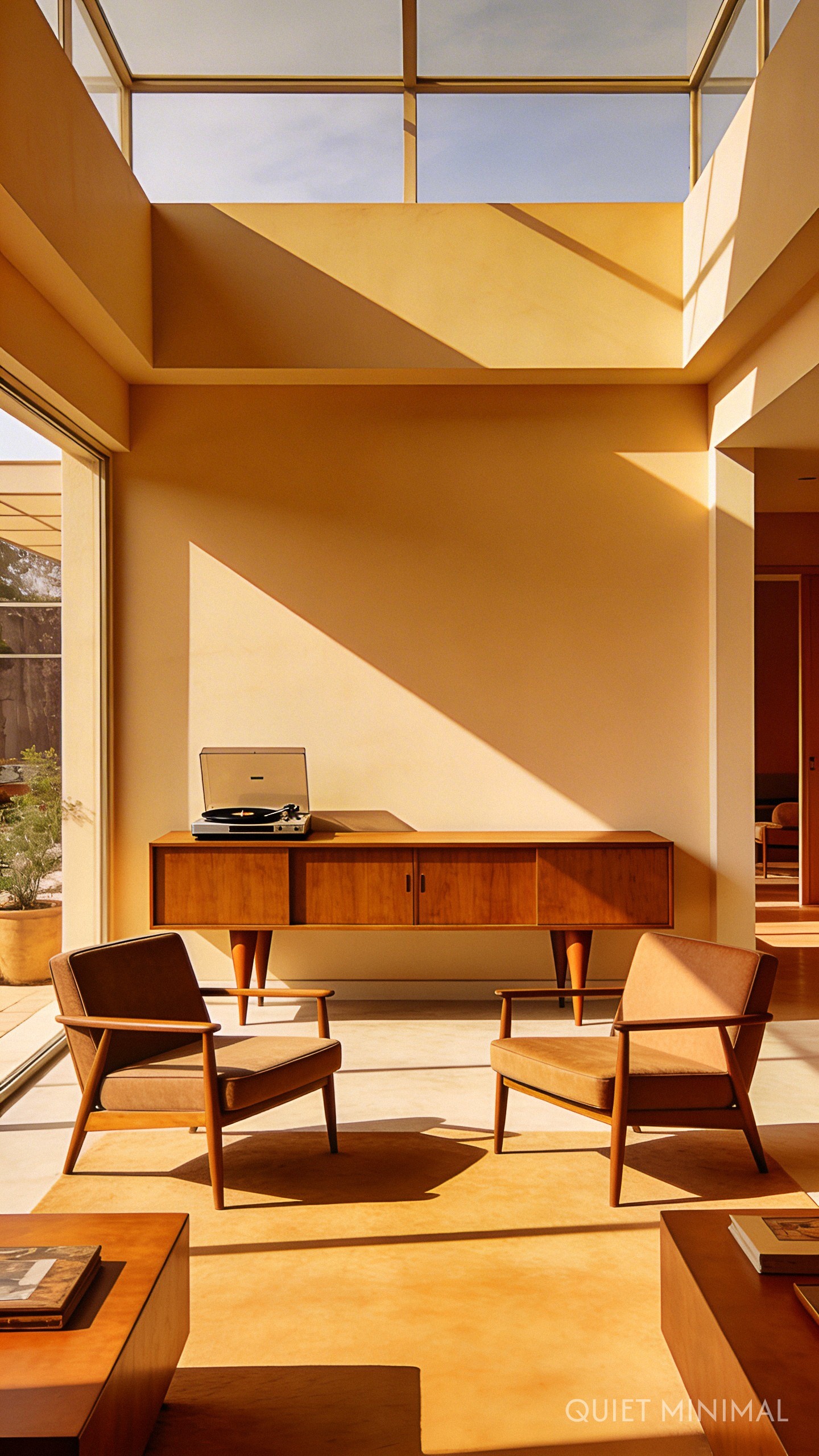
The furniture in a Wes Anderson-inspired home almost always leans heavily into the Mid-Century Modern aesthetic. The clean lines, tapered legs, and low profiles of the 1950s and 60s contribute to the graphic quality of the room without overcomplicating the visual field.
You don’t need to buy expensive designer originals. Scour estate sales or marketplaces for pieces with good bones—a low credenza or a structured armchair. Refurbishing these pieces with new varnish or fun hardware allows you to inject your “maker” personality into the space while maintaining that retro vibe.
Key Takeaway: Anchor your room with low-profile Mid-Century Modern furniture pieces that feature clean lines and tapered legs to maintain a retro, graphic look.
Velvet and Corduroy Textures
 Save
While the visual layout is rigid, the tactile experience of the room should be soft and inviting. Texture is what keeps a stylized room from feeling like a cold museum. Anderson often utilizes rich, tactile fabrics like velvet, corduroy, and wool to add warmth and nostalgia.
Consider reupholstering an ottoman in a mustard corduroy or adding velvet throw pillows in a contrasting color to your sofa. These fabrics catch the light beautifully and add a layer of sensory luxury that supports your self-care rituals. It invites you to sit down, touch, and relax.
Key Takeaway: Incorporate rich, tactile fabrics like velvet or corduroy in your upholstery and soft goods to add warmth and nostalgic comfort to the structured space.
The Grid Gallery Wall
 Save
Gallery walls are a staple for any art lover, but the “eclectic/random” layout doesn’t fit this specific vibe. To master Wes Anderson interior design, your wall art needs to be disciplined. This means utilizing a grid layout.
Choose frames that are identical in size and style—perhaps simple thin wood or black frames. Arrange your art prints, botanical illustrations, or personal photography in perfect rows and columns. This grid structure turns your artwork into a singular, impactful graphic statement rather than a scattered collection of images.
Key Takeaway: Swap the random gallery wall for a strict grid layout using identical frames to display your art with graphic impact and order.
Lighting as Sculpture
 Save
Lighting fixtures in these films are rarely hidden recessed cans; they are objects of beauty in themselves. Symmetrical lighting is crucial for nailing the one-point perspective. This usually involves matching sconces flanking a mirror, art piece, or doorway.
Look for fixtures with a strong geometric presence—globe lights, brass sputnik chandeliers, or classic bankers’ lamps. Placing a bold pendant light exactly in the center of the ceiling draws the eye upward and reinforces the room’s symmetry. It acts as the jewelry of the room.
Key Takeaway: Use matching wall sconces or a central geometric pendant light to reinforce the room’s symmetry and act as sculptural focal points.
Framing Views and Portals
 Save
Anderson uses doorways, windows, and curtains to frame his characters, creating a “picture within a picture.” You can use your home’s architecture to do the same. Treat your doorways as portals that guide the eye into the next room.
You might paint the trim of a doorway in a contrasting color to highlight the frame. Alternatively, use heavy velvet curtains on windows (tied back symmetrically, of course) to frame the view outside. This technique adds depth to your home and makes moving between rooms feel like a scene transition.
Key Takeaway: Accentuate doorways and windows with contrasting paint or heavy drapes to create “frames” that guide the eye and add theatrical depth.
Typography and Labeling
 Save
Finally, no Wes Anderson aesthetic is complete without a nod to typography. The films are famous for their use of Futura and other clean, geometric fonts on signs, books, and labels. This detail appeals directly to the organizational lover in you.
Incorporate this through small details: vintage-style signage in the kitchen, monogrammed towels in the bathroom, or beautifully labeled storage jars for your craft supplies. It is a small, graphic touch that shows you have curated every inch of your sanctuary, right down to the font choice.
Key Takeaway: Introduce vintage or geometric typography through art prints, signage, or organizational labels to add the final layer of graphic detail.
Follow Quiet Minimal on Pinterest for more curated aesthetic inspiration.
 Save
The images featured in this article have been generated or modified using AI to help visualize these design concepts.
From the guides
You've saved it, wanted it. Here's the how: codes, measurements, order. Your choices make it yours.
The Japandi Honest PlaybookThe honest version of the style: what to keep, what to skip, and the order to do it in.See inside →The Room Refresh PlaybookA repeatable four-step method, room by room, in ten minutes, thirty minutes, or one weekend.See inside →Make Any Room Feel Cozy on PurposeWhy some rooms hold people and others empty out, and the moves that change it.See inside →


