 Georgia
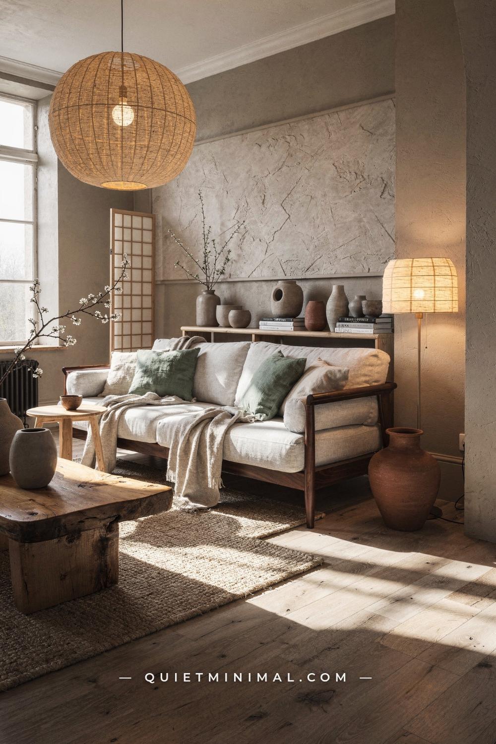
If you have been saving Japandi Scandinavian interior images for months and your room still does not look right, the problem is almost never what you bought. It is what you understood about why those rooms work. Japandi and Scandinavian design share a family resemblance, which is exactly why blending them is so easy to get wrong. The result lands either too cold, too sterile, or so neutral it reads as empty rather than intentional. This article answers one question precisely: what decisions, made at the room level, separate a Japandi Scandinavian interior that feels genuinely calm and curated from one that just looks like budget minimalism with a rattan tray? The answer covers palette, wood tone logic, furniture proportion, lighting temperature, textile layering, object restraint, and the specific places where Scandinavian warmth actually improves a Japandi base. By the end, you will know exactly what to keep, what to swap, and what to stop doing.
Scandinavian and Japandi Are Not the Same Style
 Save
The confusion starts here. Both styles value natural materials, neutral palettes, and clean lines. Both use wood, linen, and a mostly white-to-warm-beige color range. So when people search for “Japandi Scandinavian interior,” they often assume the two styles are interchangeable expressions of the same thing. They are not, and that distinction is the whole ballgame.
Scandinavian design prioritizes light, comfort, and what Danes call hygge: a sense of warm, inhabited contentment. It leans bright. White walls, light birch or ash furniture, soft pastels, candles on every surface, and an easy permissiveness with decorative objects. A lived-in Scandinavian room has books on the coffee table, a cluster of pillar candles by the fireplace, a stack of throws on the armchair. It feels warm because it looks used.
Japandi, by contrast, is Scandinavian hygge filtered through Japanese wabi-sabi and Zen restraint. The warmth is there, but it is quieter. Lower furniture. Darker wood contrasts. More negative space. Fewer objects, but each one placed with visible intentionality. Where Scandinavian design says “bring more warmth in,” Japandi says “remove everything that is not earning its place, then add warmth through material rather than quantity.” The edit is tighter. The emotional register is closer to a deep breath than a warm hug.
From the guides
You've saved it, wanted it. Here's the how: codes, measurements, order. Your choices make it yours.
 The Japandi Honest PlaybookThe honest version of the style: what to keep, what to skip, and the order to do it in.See inside →
 The Room Refresh PlaybookA repeatable four-step method, room by room, in ten minutes, thirty minutes, or one weekend.See inside →
 Make Any Room Feel Cozy on PurposeWhy some rooms hold people and others empty out, and the moves that change it.See inside →
When you blend the two, the Scandinavian contribution is warmth and livability. The Japanese contribution is restraint and weight. Get the ratio right and the room feels both calm and genuinely inhabited. Tip the ratio toward Scandinavian without the Japanese edit and it goes soft and unfocused. Tip it toward pure Japandi minimalism without the Scandinavian warmth and it goes cold and empty. Most rooms that fail Japandi actually fail at this balance point, not at the product level.
The structural difference to internalize: Scandinavian design is additive, hygge-building. Japandi is subtractive first, then additive. You subtract until the room breathes, then you add back warmth through specific materials. If you are adding before you have subtracted, you are building Scandinavian, not Japandi.
Key Takeaway: Japandi is not Scandinavian design with darker accents. It is a different editorial philosophy that borrows Scandinavian warmth and adds it on top of a Japanese foundation of restraint and material intentionality.

Why the Wall Color Decision Matters More Than Any Furniture Purchase
 Save
Before you buy a single piece of furniture, settle the wall color. The wall is the largest surface in the room, and it sets the emotional temperature that every other decision either reinforces or fights against. This is where most Japandi Scandinavian interiors fail before they even start.
The failure mode is reaching for bright white or cool gray because both feel “safe” and minimal. Bright white walls with cool-undertone furniture create a clinical quality that washes out natural materials. Linen looks dingy against a bright white. Pale oak looks flat. The warmth disappears. The room ends up looking like a showroom rather than a home, which is the opposite of hygge and the opposite of wabi-sabi.
The Japandi Scandinavian palette requires warm undertones across every surface. For walls, the working range today sits in greige territory: Sherwin-Williams Accessible Beige (SW 7036) for open-plan living areas with natural light, Benjamin Moore White Dove (OC-17) as the gold standard warm white for rooms that already have good warmth from wood floors, and Farrow and Ball Elephant’s Breath (No.229) for bedrooms where you want more complex depth and a slightly more Japanese register. For a home office, Sherwin-Williams Shoji White (SW 7042) delivers a gray-green undertone that supports sustained focus without reading cold.
The rule behind all of these choices: every color in the Japandi palette must have a warm undertone. Avoid anything with a blue or purple undertone, including most “greige” shades sold under generic paint store labels. Test your shortlist by holding the sample card against a piece of actual wood in natural light. If the card and the wood breathe together, sharing the same direction of warmth, the color works. If they fight each other, the card has a cool undertone even if it looks beige in the store.
For accent color, the current Japandi update introduces earthy terracotta, muted sage, and soft indigo as limited accent reads: one wall, one cushion, or one ceramic object. Sherwin-Williams Cavern Clay (SW 7701) as a single upholstered chair or a jug on the windowsill. Benjamin Moore Saybrook Sage as a single linen cushion cover or a set of cabinet doors. These are not dominant colors. They are grounding notes that prevent an all-neutral room from reading flat.
One thing the latest evolution makes clear: the days of pure cool gray Japandi are over. Greige and warm sage have replaced gray as the dominant wall choices. If your room still has cool gray walls paired with light wood furniture, that specific combination is the most common reason a Japandi Scandinavian interior reads as sterile rather than serene.
Key Takeaway: Settle on warm-undertone wall paint before buying any furniture: Sherwin-Williams Accessible Beige, Benjamin Moore White Dove, or Farrow and Ball Elephant’s Breath are the three most reliably correct choices for a Japandi Scandinavian interior today.

The Wood Tone Decision That Either Unifies or Breaks the Room
 Save
Wood tone is the decision that most people make by accident, and the results show. Walking into a Japandi Scandinavian interior where the dining table is light birch, the shelves are mid-tone oak, the floor is honey pine, and the coffee table is walnut produces a visual noise that undermines every other careful decision in the room. The eye reads it as chaos rather than layering.
The logic behind a coherent wood palette in a Japandi Scandinavian interior is not about matching every piece to the same exact tone. It is about choosing a direction and staying in it. Today, that direction has shifted definitively warmer and darker than the original Japandi wave. Light ash and birch still appear in Scandinavian-leaning rooms, but the Japandi Scandinavian fusion now centers on walnut, smoked oak, and espresso-tone wood as the primary furniture material, with pale oak or white oak reserved for floors and lighter accent pieces.
The reason this shift matters: darker wood provides visual weight and grounding that lighter wood cannot. A walnut dining table in a room with warm greige walls and a stone tile floor creates a sense of permanence and history. The same table in light birch reads as temporary. Japandi, at its core, is about a room feeling considered and settled, not styled for a weekend. Darker primary furniture, lighter floors, and warm neutral walls create a tonal arc from light at the bottom to dark in the middle to light again at the top, a layering principle borrowed directly from traditional Japanese interior composition.
Practical rule: limit yourself to two wood tones maximum per room. One dominant (floor or main furniture), one supporting (smaller accent pieces, shelving, picture frames). If your floor is pale oak, let the main furniture anchor be walnut or smoked oak. If your floor is dark, lighten the furniture. Never use three distinct wood tones in a single visual field. The eye cannot rest when competing wood tones pull in different directions.
The Scandinavian contribution here is important: do not swing so dark that the room loses lightness. The Japanese Zen aesthetic can handle near-black wood. The Japandi Scandinavian blend needs light held somewhere in the room, which is why pale oak floors under walnut furniture works better than walnut floors with walnut furniture. Keep the floor light and let it breathe. Darker wood belongs on the furniture, not the floor, in a Japandi Scandinavian space.
The failure mode to watch for: buying furniture from multiple shopping trips without holding a consistent wood tone standard. One IKEA piece in light birch, one Wayfair piece in “natural oak” (which is usually lighter and more yellow-toned), and one thrifted piece in honey pine will produce three visually incompatible tones even if each individual piece looks fine on its own. Decide on your tone direction before you buy, then audit everything in the room against it.
Key Takeaway: Choose one dominant wood tone (walnut or smoked oak for the Japandi Scandinavian blend), one supporting tone for floors or lighter accents (white oak or pale oak), and remove every piece that falls outside that two-tone logic.

Furniture Height: The Proportion Rule That Changes How the Whole Room Feels
 Save
If you have ever looked at a Japandi room in a photo and thought it looked more spacious than your room even though the square footage is the same, furniture height is the reason. This is one of the most under-discussed specifics in Japandi Scandinavian interior design, and it is one of the most immediately impactful decisions you can make.
Traditional Japandi furniture sits low. Deliberately, significantly low. The current standard for seating height in a Japandi Scandinavian interior is 14 to 16 inches (35 to 40 cm) from floor to seat cushion. The coffee table sits at 12 to 14 inches (30 to 35 cm). The bed platform, if using a floor-profile platform style, can sit as low as 10 inches (25 cm) off the floor. This is rooted in Japanese interior tradition, where proximity to the floor creates a grounded, contemplative atmosphere and visually opens the room by expanding the amount of visible wall space above the furniture line.
Compare this to standard Western furniture: a conventional sofa sits at 18 to 20 inches (45 to 50 cm). A standard coffee table lands at 18 inches (45 cm). These are not wildly different numbers in isolation, but in a room, the difference between 16-inch and 20-inch sofa height is the difference between a room that looks designed and a room that looks default. Lower furniture creates more breathing room above the furniture line. The wall reads taller. The room reads calmer.
The failure mode that creates an outsized-furniture problem: choosing a sofa with boxy proportions and thick arms because it reads as “cozy” in the Scandinavian hygge sense, then pairing it with a full-height media console and standard-height dining chairs. Every piece individually looks fine. Together they create a room that reads crowded because every item occupies the same mid-height visual band.
The Japandi correction is to create a clear horizon line in the room: most furniture sits below 30 inches (75 cm), with vertical elements (floor lamp, tall plant, wall art hung high) used as deliberate accents above that line rather than continuous furniture height. This compositional logic comes from Japanese garden design, where low ground elements are interrupted by intentional vertical punctuation.
For renters who cannot replace a standard-height sofa: lower the visual height by choosing a sofa without arms or with very minimal arm rolls, swap a standard coffee table for a floor cushion or a flat wood tray on low legs, and make sure the sofa legs are slim and visible rather than hidden by a skirt. Visible, tapered legs read lighter and lower than block furniture even at the same actual seat height.
Key Takeaway: Aim for seating at 14 to 16 inches (35 to 40 cm) and coffee tables at 12 to 14 inches (30 to 35 cm): that specific height range is what produces the calm, expansive feeling of a genuine Japandi Scandinavian interior.

Lighting Temperature: The Detail Most People Get Exactly Wrong
 Save
Lighting is where many carefully planned Japandi Scandinavian interiors quietly collapse. A room can have the right palette, the right furniture height, and the right wood tones, and still feel wrong if the light is too cool or too harsh. The specific temperature of light determines whether a warm-undertone room reads calm and inhabited or washed out and clinical.
The standard in current Japandi Scandinavian interior design is layered lighting at 2700K color temperature. The Kelvin scale measures how warm or cool a light source appears: 2700K is the warm amber-white of old incandescent bulbs, the quality of light that makes skin, wood, and linen look like they belong together. 3000K starts to lose warmth. Anything above 3500K reads as cool-white and fights directly against the warm material palette that Japandi depends on.
The “layered” part is equally important. Overhead-only lighting is the single biggest Japandi lighting mistake. A single recessed LED overhead fixture, even at 2700K, creates a flat even wash that removes shadow and texture from the room. Natural materials get their visual interest from shadow: the grain in walnut is revealed by raking light across it, not flooding it from directly above. Woven linen texture disappears under flat overhead light.
The Japandi Scandinavian lighting scheme uses three layers. First, ambient: a pendant or ceiling fixture as a starting point, not the sole source. Second, task: a table lamp beside a reading chair or on a nightstand, at 2700K, providing warm local light. Third, accent: a floor lamp in a corner, or a strip of warm low-voltage lighting behind shelving, that illuminates the wall rather than the room and creates depth. In the Scandinavian tradition, candles serve this third layer naturally, which is one of the few places where the hygge tendency to add more is appropriate in a Japandi Scandinavian interior.
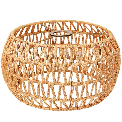
The materials of the light fixture matter in Japandi Scandinavian design almost as much as the light itself. Paper shades (referencing Japanese washi paper lanterns), woven rattan pendants, matte black metal as a structural accent, and unglazed ceramic bases all fit. Chrome, bright brass, and glossy white plastic do not. The Scandinavian contribution here is the soft floor lamp, which Scandinavian homes have always used well to create hygge-radius pools of warmth in corners and beside seating.
Practical implementation: if you are working with an existing overhead fixture you cannot change, replace the bulb with a 2700K warm white LED, then add a table lamp and a floor lamp. The moment you have three light sources in a room at 2700K, the quality of light changes even if the fixture is ordinary. The room stops reading as overhead-lit and starts reading as layered.
Key Takeaway: Set every bulb in a Japandi Scandinavian interior to 2700K warm white, eliminate overhead-only lighting by adding a table lamp and a floor lamp, and let the fixture material do aesthetic work by choosing paper, rattan, matte black, or ceramic over chrome or gloss.
Textiles: Where Scandinavian Warmth Does Its Best Work in a Japandi Base
 Save
This is the one area where the Scandinavian side of a Japandi Scandinavian interior gets to be genuinely generous, because textiles are how warmth enters a room without adding visual clutter. A Japandi base room with no textiles reads as a showroom. A Scandinavian approach to layering textiles on top of that base is exactly what gives the room life.
The key is to stay within natural, undyed or low-saturation materials. Linen is the foundational Japandi Scandinavian textile, and it earns that position because it does two things at once: it adds warmth through its imperfect weave and slight texture, and it reads as neutral enough that it does not disrupt the careful palette work of the walls and wood. Look for undyed or oatmeal-tone linen for sofas and bedding, soft charcoal linen for cushions where you need a darker note, and muted sage linen for the one accent cushion per seating group.
The rug is the largest textile decision after the sofa, and it does structural work that no other element in the room can replicate. In a Japandi Scandinavian interior, the rug defines the zone, grounds the furniture group visually, and adds texture underfoot. Natural fiber rugs, jute, sisal, and hemp, are the most Japandi-aligned choice: they bring organic imperfection through their irregular weave and they age in a wabi-sabi direction rather than looking worn. The size rule is specific: in a living room, the rug should be large enough that the front two legs of the sofa rest on it. A rug that sits entirely in front of the sofa floats awkwardly and makes the seating group look unanchored.
Throws are the Scandinavian contribution to this layer. Japandi on its own rarely uses throws because excess fabric reads as clutter rather than warmth. But a single chunky cotton or undyed wool throw draped over one arm of the sofa or folded at the foot of the bed is an unambiguously Scandinavian hygge signal that adds warmth without adding visual noise, because a single throw reads as used, not decorated.
The failure mode in textiles is introducing too many patterns. Japandi Scandinavian textiles should be almost entirely textural rather than patterned. A subtle stripe in a weave, the irregular slub texture of linen, the varying pile height of a natural fiber rug: these are appropriate patterns. A geometric print cushion, a Moroccan-style rug, or a plaid throw each carry pattern information that competes with the calm, tone-on-tone visual field the rest of the room is building. One small pattern note is acceptable, a single small cushion with a very muted print, but it should never be the dominant textile.
Key Takeaway: Layer linen (undyed or oatmeal for main pieces, muted sage or soft charcoal as accents), one large natural fiber rug with the front sofa legs on it, and a single throw over one arm, and you have the complete Japandi Scandinavian textile palette without introducing visual noise.

Object Restraint: The Rule That Separates Japandi from Minimalism
 Save
This is the facet of Japandi Scandinavian interior design that most people intellectually understand and practically resist, because the discomfort of restraint is real. When you have cleared surfaces and the room looks emptier than you expected, the instinct is to fill it. Resisting that instinct is the whole practice.
The distinction between Japandi and minimalism here is precise and important. Minimalism tolerates emptiness. It can have a plain white shelf with nothing on it and the absence is intentional. Japandi does not operate from absence. It operates from intentional selection: the right objects, the right number, the right placement. A Japandi Scandinavian shelf is not empty. It has three things on it, and each of those three things is worth looking at individually and as a group.
The practical rule for open shelving in a Japandi Scandinavian interior: a maximum of five objects per shelf, with visible negative space between each object. Not five objects crammed together on one side, five objects spaced so the shelf surface itself is visible as part of the composition. Apply the same rule to every surface: the coffee table holds three items maximum (a ceramic object, a small stack of books, and one living element like a small plant or a single stone). The dining table when not in use holds one thing. The windowsill holds one.
This is where the Scandinavian tendency to add more objects runs into the hardest friction with the Japandi philosophy. Scandinavian hygge decorating naturally accumulates: a candle here, a small vase there, a framed photo, a decorative bowl. Each addition feels right in isolation. Collectively they cross from hygge into visual noise. The Japandi Scandinavian blend requires the Scandinavian warmth to come through material texture, not quantity of objects.
What counts as an object in this context: anything that sits on a surface without a primary functional role. A lamp is not an object in this sense. A book that is actively being read is not an object. A ceramic bowl you use for keys is not an object. A ceramic bowl that is purely decorative is an object. Count your decorative objects per surface and hold the five-maximum per shelf, three-per-table rule strictly.
The wabi-sabi correction for empty-feeling rooms: instead of adding more objects, improve the quality and intentionality of the ones you have. One handmade ceramic vessel with visible finger marks in the clay reads as more alive and warm than five identical machine-made spheres. One dried botanical branch in a tall floor vase fills a corner without adding surface clutter. The sensation of the room being inhabited comes from the weight and quality of the objects present, not their number.
Key Takeaway: Hold a strict maximum of five objects per open shelf and three objects per table surface, and make each object genuinely worth looking at individually: quality and intentionality replace quantity in a Japandi Scandinavian interior.

The Role of Negative Space: What Japanese Design Calls “Ma”
 Save
In Japanese aesthetic philosophy, “ma” refers to the purposeful emptiness between things: the pause, the space, the interval. It is not the absence of something. It is a present thing in itself. A Japandi Scandinavian interior uses negative space in this exact spirit, which is why it looks different from a room that is simply underfurnished.
From the guides
You've saved it, wanted it. Here's the how: codes, measurements, order. Your choices make it yours.
The Japandi Honest PlaybookThe honest version of the style: what to keep, what to skip, and the order to do it in.See inside →The Room Refresh PlaybookA repeatable four-step method, room by room, in ten minutes, thirty minutes, or one weekend.See inside →Make Any Room Feel Cozy on PurposeWhy some rooms hold people and others empty out, and the moves that change it.See inside →An underfurnished room looks like it is waiting for more furniture. A room designed with ma looks like it is complete. The difference is compositional deliberateness: the empty wall next to the bed is there because the composition requires it. The bare floor between the entrance and the first piece of furniture is a landing zone for the eye, a moment of visual rest before it reaches the focal point. When you understand this, bare space stops feeling like something went wrong and starts feeling like a design decision.
The practical implication: in every room, designate at least one wall that remains completely clear. No art, no shelving, no furniture leaning against it. In a bedroom, this is usually the wall opposite the bed. In a living room, it is the wall adjacent to the largest window. This bare wall is doing active work: it gives the eye somewhere to rest and makes the entire room feel larger and more intentional.
The Scandinavian design tradition is less comfortable with bare walls. Hygge rooms often have art, floating shelves, and framed prints distributed across multiple walls. In a Japandi Scandinavian blend, the compromise is to concentrate your art and wall interest on two walls maximum and leave at least one wall completely clear. The Japanese contribution (emptiness as a positive element) and the Scandinavian contribution (warmth through curated objects on walls) can coexist if they are allocated to different walls rather than spread equally around the room.
For renters with builder-grade walls in colors you cannot change: use furniture placement to create the impression of negative space. Pull the sofa away from the wall by 4 to 6 inches (10 to 15 cm) so there is visible space behind it. This gap between furniture and wall reads as breathing room and softens even a color you did not choose.
The floor is also part of the negative space equation. Resist the urge to cover every inch of floor with a rug. In a Japandi Scandinavian interior, the rug defines a zone (the seating area, the bedside area) and the bare floor around it is intentional. Visible floor between the rug edge and the wall is negative space. It makes the room feel deliberately organized rather than carpet-covered.
Key Takeaway: Designate one completely bare wall in every room, keep visible floor space between the rug edge and the walls, and understand that empty space is a design decision rather than a gap waiting to be filled.

Plants and Nature: Moving Beyond the Single Fiddle Leaf Fig
 Save
The latest evolution of Japandi Scandinavian interior design is moving beyond the solitary potted plant on a shelf toward what designers are calling integrated biophilia: nature used architecturally rather than decoratively. This is a meaningful shift, and it distinguishes a current Japandi Scandinavian interior from one that looks like 2021.
The 2021-era Japandi interior had one fiddle leaf fig in a white pot, positioned in the corner as a single living accent. This still works as a starting point, but the current approach frames plants as structural elements of the room rather than decorative additions. A tall indoor tree (ficus microcarpa, olive tree, or a well-grown Japanese maple in a large terracotta vessel) occupies a corner with the same compositional authority as a floor lamp. It is not a decoration. It is a vertical element in the room’s composition.
The Scandinavian tradition here supports the Japandi direction: Nordic interiors have always brought the outdoors in, and Scandinavian design is comfortable with plants as architectural contributions to a room rather than as accessories. The Japandi Scandinavian blend uses this tendency but restrains the variety. Instead of many small plants on many surfaces, use two or three significant plants: one large corner tree at 5 to 7 feet (150 to 210 cm), one medium-scale plant on the floor beside a reading chair (a Peace Lily or Snake Plant at 2 to 3 feet, or 60 to 90 cm), and one small plant on the coffee table or a windowsill as the only living surface object in that spot.
Material of the planter matters: terracotta, unglazed ceramic, and rough stone-look concrete all fit within the Japandi material palette. Bright white ceramic pots with glossy finishes, plastic nursery pots, and woven basket liners without an interior pot all create different problems. Glossy white reads clinical. Plastic reads temporary. Woven baskets read craft-market rather than wabi-sabi. Terracotta is the most reliable choice because it ages in the direction of wabi-sabi: it develops mineral deposits and patina that become part of the object’s character over time.
Dried botanicals are also a significant element in current Japandi Scandinavian interiors, specifically pampas grass, dried lotus pods, bleached branches, and bunches of dried lunaria. These work because they carry the wabi-sabi quality of organic imperfection (no two are identical) without requiring water or care. A tall dried pampas arrangement in a floor vase in a corner uses vertical space, adds texture, and requires nothing from you once placed.
Key Takeaway: Use two to three significant plants placed as structural vertical elements rather than many small plants distributed across surfaces, and choose terracotta or unglazed ceramic planters that will age in a wabi-sabi direction rather than staying pristine.

Storage: The Invisible Foundation of the Whole Aesthetic
 Save
Here is the version of Japandi Scandinavian interior design nobody talks about in Pinterest posts: the aesthetic is only as good as the storage behind it. The serene, clutter-free surfaces that make a Japandi room look calm in a photo are clutter-free because everything that would otherwise live on those surfaces is hidden. The real design work in a Japandi Scandinavian interior is storage design, not surface styling.
The fail condition: adopting Japandi surface principles without addressing storage. Within two weeks, the beautiful cleared surfaces are re-covered because there is nowhere else for things to go. Mail stacks up on the cleared dining table. Shoes pile by the door. Skincare products crowd the bathroom counter. The room reverts to looking like every other room. This is not a willpower failure. It is a storage design failure.
The Japandi Scandinavian approach to storage is built on one principle: every item has a home, and that home is closed. Open shelving is used only for objects that are genuinely worth looking at. Everything else goes behind doors. In a Japandi Scandinavian living room, this means a media console with full-door storage rather than open shelving, a coffee table with a drawer, and built-in cabinetry rather than open bookcases. In a bedroom, it means a wardrobe with flush-panel doors rather than open closet rods, and nightstands with a single small drawer.
The Scandinavian tradition is particularly helpful here. Scandinavian design has always been serious about functional storage because Nordic apartments are often compact, and compact living requires organization to remain comfortable. IKEA’s foundational design logic, flat-pack pragmatic storage, is essentially Scandinavian hygge applied to practicality. The Japandi refinement is to require that the storage itself look designed: flush-panel doors, warm white or greige cabinet fronts, no visible hinges, and push-to-open mechanisms rather than hardware. The storage disappears visually because it presents as a flat, calm surface.
Entryways deserve particular attention because they set the emotional tone of the home from the first step inside. A Japandi Scandinavian entryway has exactly one low bench or floor cushion for sitting while changing shoes, one hook per person for bags and outerwear (not a cluster of three hooks piled with multiple layers), and a closed cabinet or built-in below-bench storage where shoes live out of sight. Nothing else. This level of restraint at the entry is what allows the rest of the home to feel calm rather than cluttered.
For renters who cannot build in storage: use free-standing cabinetry with solid doors (not open-back units), and put everything inside. The outside of the cabinet becomes a calm, flat surface. The interior holds the clutter. This is the same principle as a built-in at a fraction of the cost, and it is entirely consistent with the Japandi Scandinavian aesthetic as long as the cabinet’s exterior is in the right material palette: warm white paint, pale oak, or warm linen-look finish.
Key Takeaway: Plan for closed storage before styling any surfaces: every item needs a home behind a door, and the aesthetic only holds when the hidden-storage capacity matches the volume of objects that actually live in the room.

How to Handle Art in a Japandi Scandinavian Interior
 Save
Art is one of the most visible places where Japandi Scandinavian interiors go wrong because the default approach, grouping many prints in gallery-wall format, is exactly what the Japanese half of the equation disallows.
A gallery wall is a Scandinavian and general Western decorating instinct that works within certain styles. In a Japandi Scandinavian interior, a gallery wall with 12 frames of mixed sizes produces the same visual effect as too many objects on a shelf: the eye is pulled in multiple directions at once and cannot find rest. The quiet that makes a Japandi room feel restorative disappears.
The Japandi art rule is: one significant piece per wall, maximum. In a living room with four walls, that means one or two walls carry art, the other two are bare. The single piece should be large enough to hold the wall without needing company: a minimum of 24 by 30 inches (60 by 75 cm) in a room of average proportions. A small print surrounded by empty wall space reads as insufficient, not minimal.
Content of the art matters. Japandi Scandinavian interiors are best served by abstract or near-abstract works in the room’s existing palette range (earthy neutrals, charcoal, soft sage), nature photography in a muted palette (black-and-white Japanese forest photography, close-up botanical photography in desaturated tones), or simple linework drawings of natural subjects. Bright primary colors, complex figurative imagery, and typography-heavy prints all introduce visual noise that competes with the palette and the material warmth of the rest of the room.
Frame choice: thin pale oak, thin walnut, or thin matte black metal all work within the Japandi Scandinavian material range. Wide ornate frames in gold or silver do not. The frame should recede and let the art speak rather than adding its own visual weight.
Hanging height: the center of the artwork should sit at approximately 57 to 60 inches (145 to 152 cm) from the floor, which is average eye level when standing. The consistent mistake in Japandi interiors is hanging art too high because the wall space feels large and the instinct is to fill it higher. Art hung too high disconnects from the furniture below and makes the room feel unbalanced. Keep it at eye level, let the wall space above breathe.
Key Takeaway: Use one large-format artwork (minimum 24 by 30 inches) per wall, leave at least two walls completely bare, choose muted-palette abstract or nature-based imagery, and hang the center at 57 to 60 inches (145 to 152 cm) from the floor.

Wabi-Sabi: The Element That Keeps Japandi from Looking Like a Catalog
 Save
Wabi-sabi is the piece that most Western interpretations of Japandi either misunderstand or skip, and when it is skipped, the result is exactly what one designer described as “minimalism that gave up.” The room is clean but it has no soul. The surfaces are clear but they have no texture. The furniture is the right scale but nothing in the room rewards looking at it closely.
Wabi-sabi is the Japanese philosophy of finding beauty in imperfection and impermanence. In practical interior terms, it means choosing handmade over machine-made, aged over pristine, and natural irregularity over uniform perfection. A handmade ceramic bowl with finger marks pressed into the clay carries wabi-sabi. An identical set of machine-pressed ceramic bowls from a chain retailer, even in the right color, does not. The look may be similar from across the room, but the quality of attention in the room changes when the objects have visible marks of making.
This is not an argument for expensive objects. It is an argument for noticing the difference between mass-produced precision and handmade variation. A terracotta jug from a local market can carry wabi-sabi. A linen cushion with a slight irregularity in the weave carries wabi-sabi. A piece of driftwood on the coffee table carries wabi-sabi. These are not expensive choices. They are attentive ones.
The Scandinavian design tradition has its own version of this through its respect for craft and functional objects made well. Nordic ceramics, wooden objects, and woven textiles from Scandinavian design brands often have the same handmade quality. The practical guidance for a Japandi Scandinavian interior: when choosing between two objects at the same price point, always choose the one with more visible evidence of the material it is made from, the grain in the wood, the speckle in the clay, the slub in the linen, over the one that looks more uniform and perfect.
Where wabi-sabi shows up most clearly in current Japandi Scandinavian interiors: handmade stoneware in off-white, speckled clay, and warm sand tones on open kitchen shelving; visible wood grain in furniture rather than lacquered or painted wood; linen with slight texture variation rather than smooth satin; plaster or limewash wall finishes that carry natural variation rather than smooth painted drywall. Each of these choices costs little to no extra money but adds the quality of intentionality that separates a genuine Japandi interior from a mood board approximation.
Key Takeaway: Choose one handmade, natural-material object per room (a ceramic piece, a wooden tray with visible grain, a woven textile) and let it carry the wabi-sabi quality that makes the whole room feel considered rather than catalog-assembled.

The Kitchen and Bathroom: Applying the Same Logic in Harder Rooms
 Save
Kitchens and bathrooms are where the Japandi Scandinavian logic gets stress-tested, because both rooms accumulate objects at a rate that challenges any minimalist approach. The principles are the same as the rest of the house, but the application needs room-specific calibration.
In the kitchen, the current Japandi Scandinavian direction is toward two-tone cabinetry: upper cabinets in warm white (Sherwin-Williams Alabaster SW 7008 or Benjamin Moore White Dove OC-17), lower cabinets in a grounded tone (muted sage, warm greige, or a deep walnut-tone stain). The lighter-above, darker-below principle echoes the furniture height logic of the rest of the home and creates a sense of rootedness without heaviness. Hardware follows the matte black or aged brass rule from the main living spaces. Countertops in warm white quartz with subtle veining or pale stone look tile floors anchor the material palette in the natural-material direction.
Open shelving in a Japandi Scandinavian kitchen works only if the objects on it are worth looking at and are maintained with the five-object-per-shelf discipline. A shelf of matching handmade stoneware in warm clay and off-white reads as wabi-sabi intentionality. A shelf of mismatched everyday dishware, various-branded mugs, and assorted spice jars reads as clutter regardless of the shelf material. If you cannot commit to the object discipline on open kitchen shelving, use closed cabinetry throughout and accept that the kitchen will look calmer for it.
In the bathroom, the Japandi Scandinavian approach uses warm stone-tone tiles rather than bright white subway tile (which reads clinical and fights the warm palette), a single round or simple rectangular mirror in matte black or pale wood frame rather than an LED mirror cabinet with chrome trim, matte black tapware, and undyed linen hand towels rather than bright white cotton terry. Farrow and Ball Elephant’s Breath translates exceptionally well to bathrooms with good light, where it reads as stone and mineral rather than gray.
The countertop rule in the bathroom is stricter than any other surface in the home: one item on the counter at a time. A pump dispenser in a ceramic or stone-look container, or a single object that earns its place visually. Everything else goes into the vanity drawer or the cabinet beneath the sink. The bathroom counter is small and any accumulation of objects reads as immediately cluttered against a Japandi-disciplined backdrop.
Key Takeaway: Apply two-tone cabinetry in the kitchen (warm white above, grounded greige or sage below), maintain the strict five-object maximum on any open shelving, and keep bathroom counters to one intentional object at most.

A Japandi Scandinavian interior comes down to one consistent answer at every decision point: subtract before you add, choose natural materials over uniform perfection, and let the warmth come from texture and craft rather than quantity. Get the wall color right first (warm undertone, greige or warm white), then the wood tone direction (two tones maximum, walnut or smoked oak as the primary anchor), then furniture height (seat at 14 to 16 inches), then lighting (2700K, layered, never overhead-only). Everything else, textiles, objects, plants, art, follows from those foundations. The specific thing to do today: pull everything off one surface in your main room, choose the one or two objects that genuinely earn their place back on it, and live with the result for a week before you add anything else.
From the guides
You've saved it, wanted it. Here's the how: codes, measurements, order. Your choices make it yours.
The Japandi Honest PlaybookThe honest version of the style: what to keep, what to skip, and the order to do it in.See inside →The Room Refresh PlaybookA repeatable four-step method, room by room, in ten minutes, thirty minutes, or one weekend.See inside →Make Any Room Feel Cozy on PurposeWhy some rooms hold people and others empty out, and the moves that change it.See inside → Save


