The minimalist color palette you choose for your home makes a huge difference. That’s because colors provoke powerful psychological responses. They can make you feel calm, relaxed, stressed, or even angry. And it all depends on the colors you choose.
But if you have too many different colors, it can feel very overwhelming. Whereas you want your home to feel welcoming and tranquil. (I share more about this in my guide to zen home decor).
So, the solution is to go for a minimalist color palette. It combines carefully chosen colors that complement each other.
That’s essential because not all colors work well together. There’s a whole science to choosing complementary colors. And it can get quite complicated if you don’t know the theory behind it. (You can find out more about color theory here).
But this article will take all the guesswork out of it for you. I’ve picked out some minimalist aesthetic color palettes for you to choose between.
These color schemes will provide some inspiration for your own home. You can use these exact minimalist color palettes or tweak them to fit your needs.
There’s something for every home, no matter what kind of colors you prefer. You’ll find something that will work with your home and your unique interior design style.
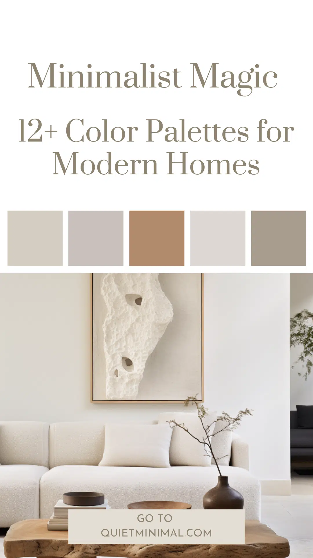
12+ Minimal Home Decor Color Palettes
Here are several minimal interior design palettes for you to browse. So, have a look and see which one would suit your home.
Coastal Color Palette
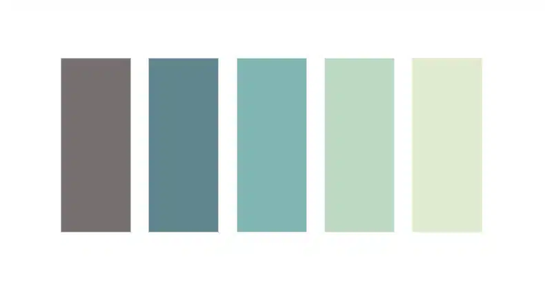
#74706f – #61858d – #80b5b2 – #bcdac3 – #dfeacf
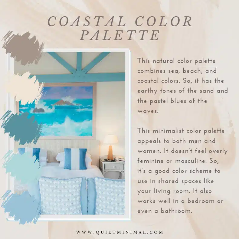
This natural color palette combines sea, beach, and coastal colors. So, it has the earthy tones of the sand and the pastel blues and greens of the waves.
These shades are muted and work well in your home. You can use pale yellow as your main color and the other shades as your accent colors.
This minimalist color palette appeals to both men and women. It doesn’t feel overly feminine or masculine. So, it’s a good color scheme to use in shared spaces like your living room. It also works well in a bedroom or even a bathroom.
Rose Garden Color Palette
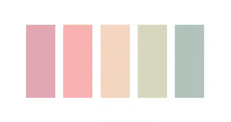
#e2a8b3 – #f8b3b1 – #f4d5be – #d7d7be – #b0c2ba
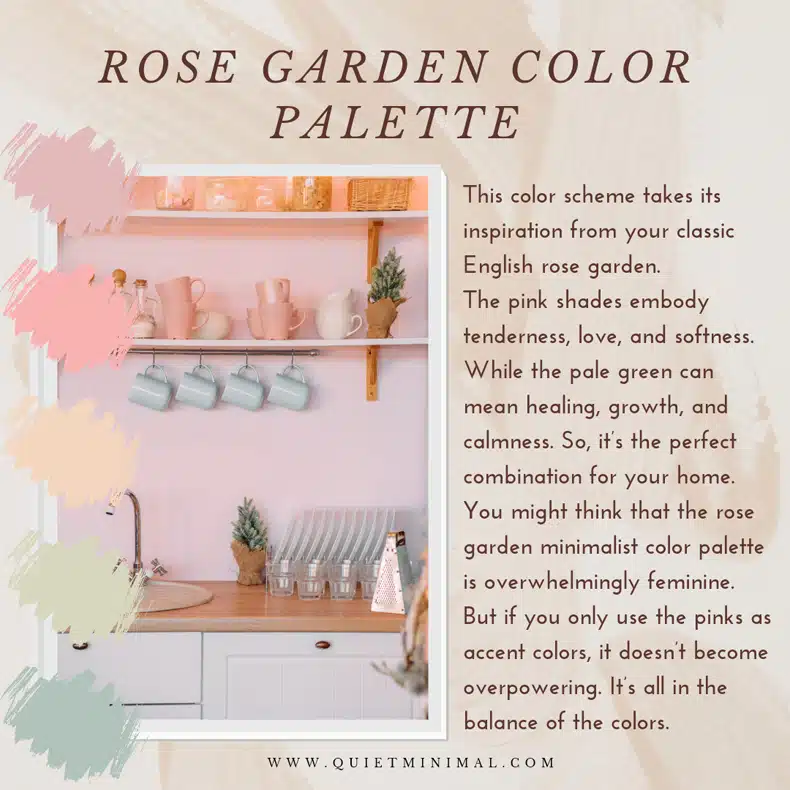
This color scheme takes its inspiration from your classic English rose garden.
The pink shades embody tenderness, love, and softness. While the pale green can mean healing, growth, and calmness. So, it’s the perfect combination for your home.
You might think that the rose garden minimalist color palette is overwhelmingly feminine. But if you only use the pinks as accent colors, it doesn’t become overpowering. It’s all in the balance of the colors.
The beige makes an excellent color for your walls and flooring. I would recommend mainly using the pale green and pink shades to add some color. Then, you can throw in a splash of the darker shades here and there.
Monochrome Color Palette

#000000 – #5b5b5b – #909090 – #dedcdc – #f5f5f6
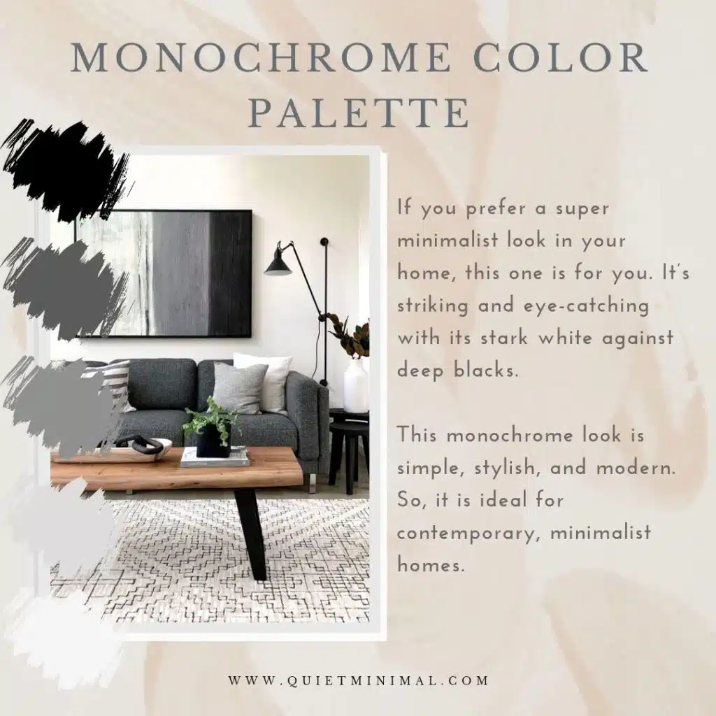
If you prefer a super minimalist look in your home, this one is for you. It’s striking and eye-catching with its stark white against deep blacks.
You can use pale gray as an accent color to provide some texture and contrast. Because it’s nice to have some middle ground between the black and white.
This monochrome look is simple, stylish, and modern. So, it is ideal for contemporary, minimalist homes.
Coffee Color Palette
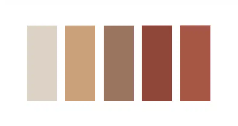
#ded2c6 – #cba17b – #9d7462 – #8e4738 – #a65645
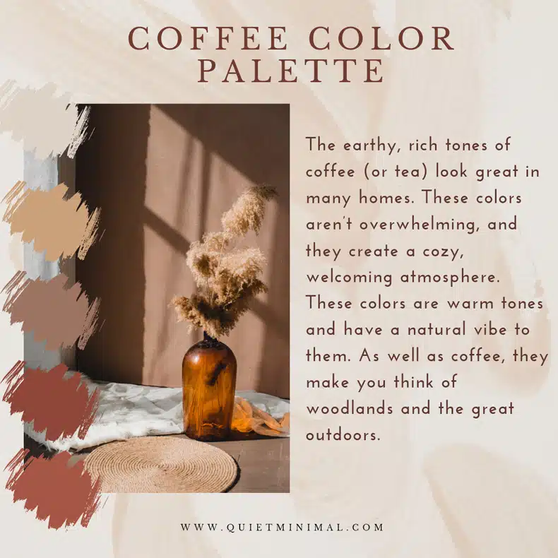
The earthy, rich tones of coffee (or tea) look great in many homes. These colors aren’t overwhelming, and they create a cozy, welcoming atmosphere.
These colors are warm tones and have a natural vibe to them. As well as coffee, they make you think of woodlands and the great outdoors.
But they are also simple and relaxing, allowing you to feel safe and let down your guard. Because your home should be your safe haven from the world.
Colors like beige, light brown, and warm orange are often used in Japanese interior design. You can find out more Japandi home design tips here.
Sea Waves Color Palette
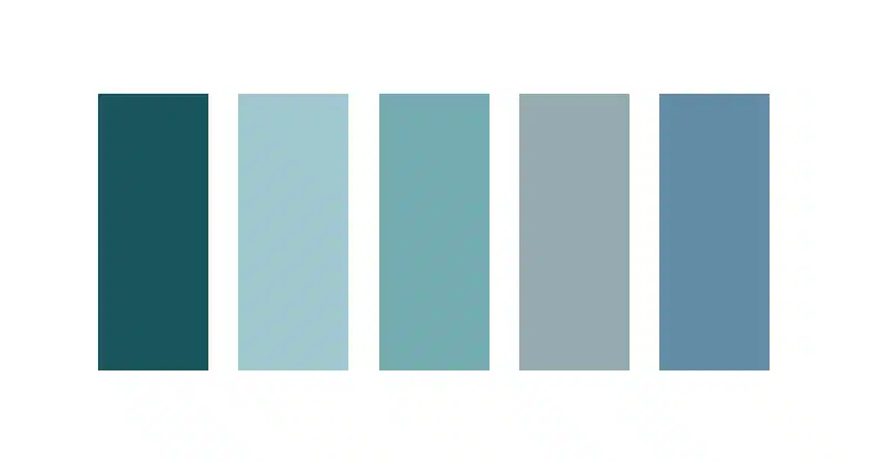
#19555b – #9fc8ce – #75abb3 – #95acb2 – #628ca5
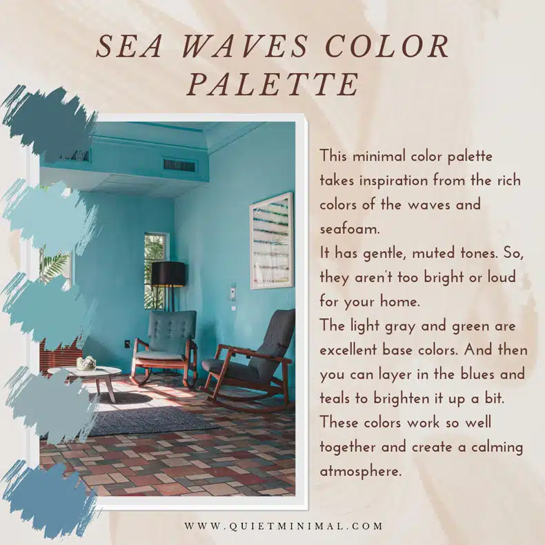
Many people find nothing more relaxing than sitting on the beach and looking at the waves. It makes you feel calm, peaceful, and fully present in the moment.
If you want to channel that feeling in your home, then go for this minimal color palette. It takes inspiration from the rich colors of the waves and seafoam.
But this minimalist color scheme has gentle, muted tones. So, they aren’t too bright or loud for your home.
The light gray and green are excellent base colors. And then you can layer in the blues and teals to brighten it up a bit. These colors work so well together and create a calming atmosphere.
Tea & Honey Color Palette
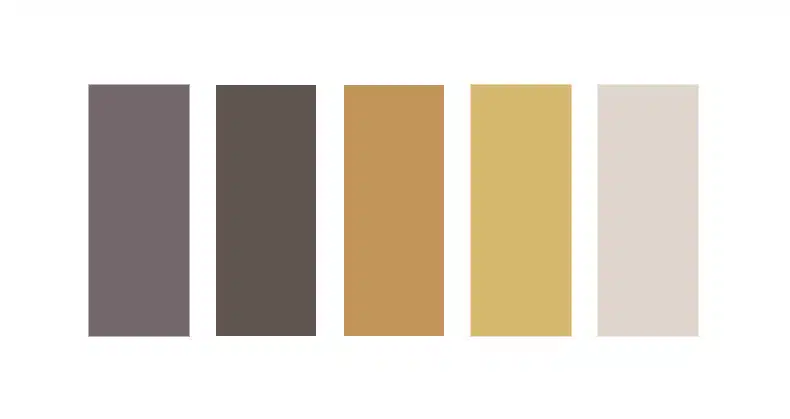
#73666a – #5f5450 – #c19658 – #d7b76e – #dfd4cc
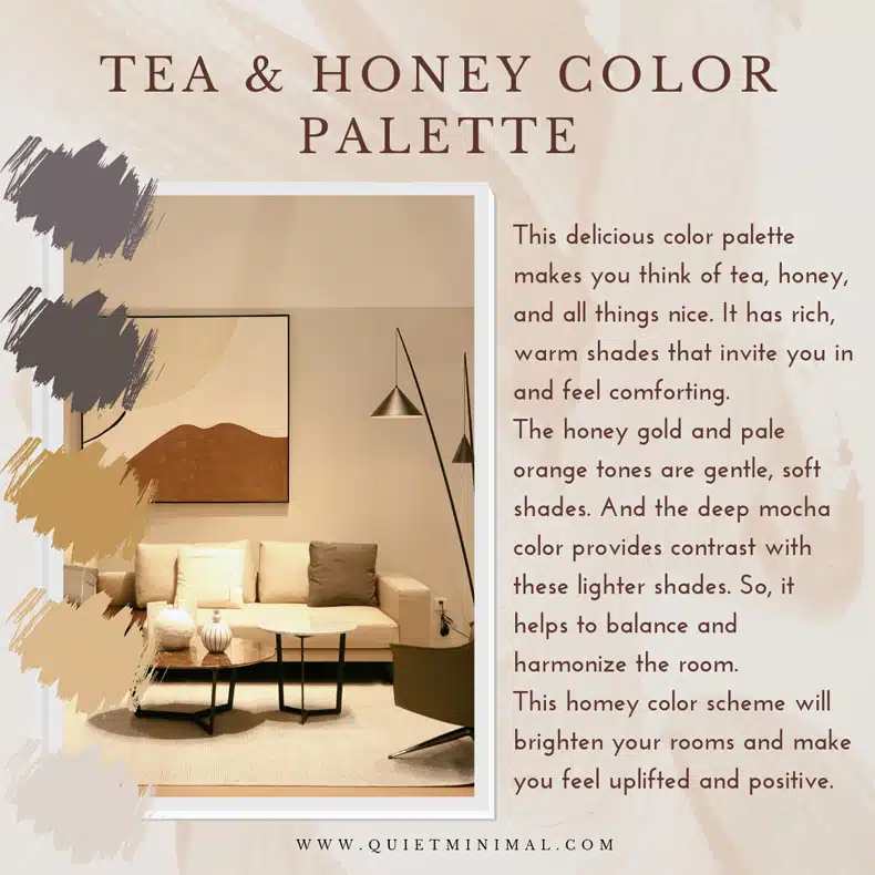
This delicious color palette makes you think of tea, honey, and all things nice. It has rich, warm shades that invite you in and feel comforting.
The honey gold and pale orange tones are gentle, soft shades. And the deep mocha color provides contrast with these lighter shades. So, it helps to balance and harmonize the room.
This homey color scheme will brighten your rooms and make you feel uplifted and positive.
Pastel Color Palette
#debba5 – #c1abad – #c7c7bb – #cec2b4 – #f0ede8
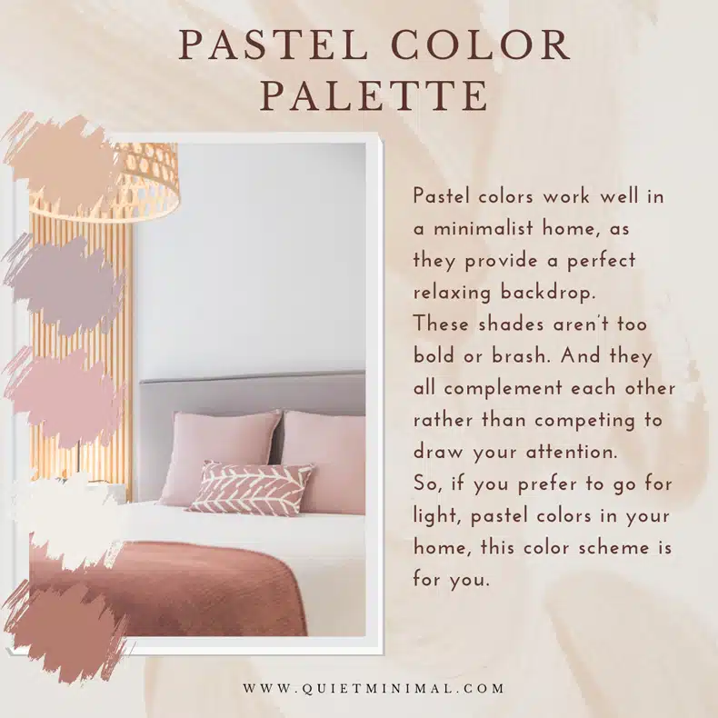
Pastel colors work well in a minimalist home, as they provide a perfect relaxing backdrop.
These shades aren’t too bold or brash. And they all complement each other rather than competing to draw your attention.
So, if you prefer to go for light, pastel colors in your home, this color scheme is for you.
Linen Color Palette

#b9b9b9 – #93a5b3 – #a3b8c9 – #dddbde – #c7d5e0
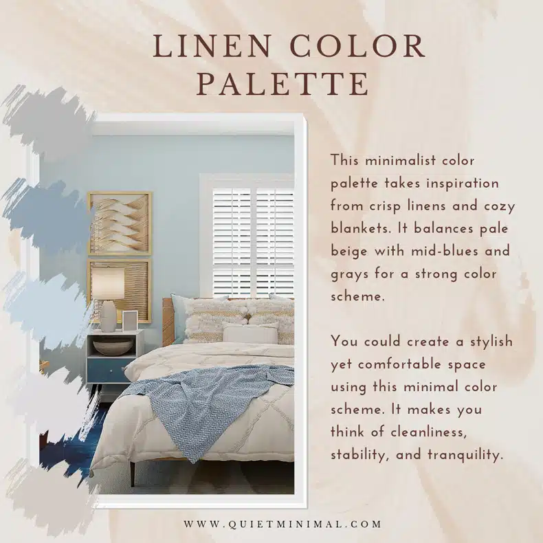
This minimalist color palette takes inspiration from crisp linens and cozy blankets. It balances pale beige with mid-blues and grays for a strong color scheme.
You could create a stylish yet comfortable space using this minimal color scheme. It makes you think of cleanliness, stability, and tranquility.
If you need a place to escape the outside world, go for this palette. You can use this color scheme to create a sacred space where you can destress from your daily routine. It exudes calmness and security.
Industrial Color Palette
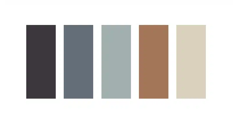
#3c373d – #646e78 – #a1afb0 – #a37657 – #d9d1bd
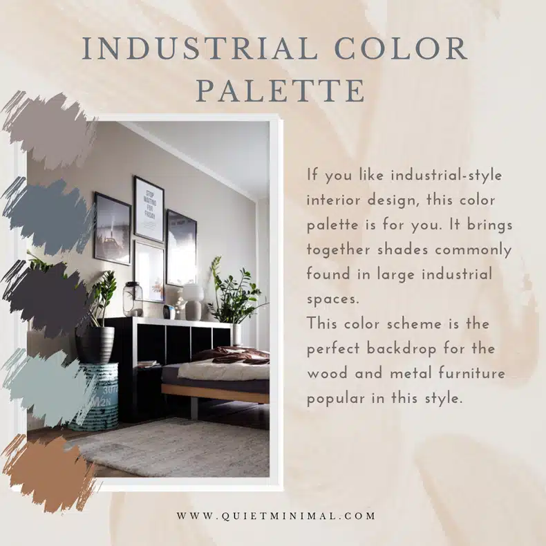
If you like industrial-style interior design, this color palette is for you. It brings together shades commonly found in large industrial spaces.
This color scheme is the perfect backdrop for the wood and metal furniture popular in this style.
Sweet & Feminine Color Palette
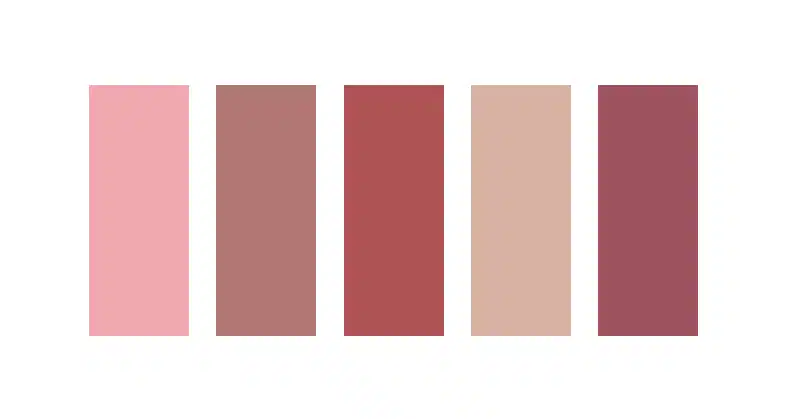
#f1a8af – #b17773 – #af5354 – #d8b1a2 – #9e525f
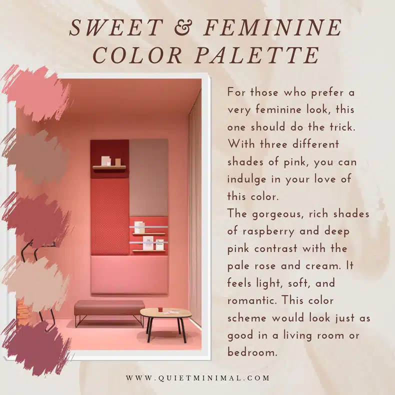
But for those who prefer a very feminine look, this one should do the trick. With three different shades of pink, you can indulge in your love of this color.
The gorgeous, rich shades of raspberry and deep pink contrast with the pale rose and cream. It feels light, soft, and romantic. This color scheme would look just as good in a living room or bedroom.
Lavender Fields Color Palette
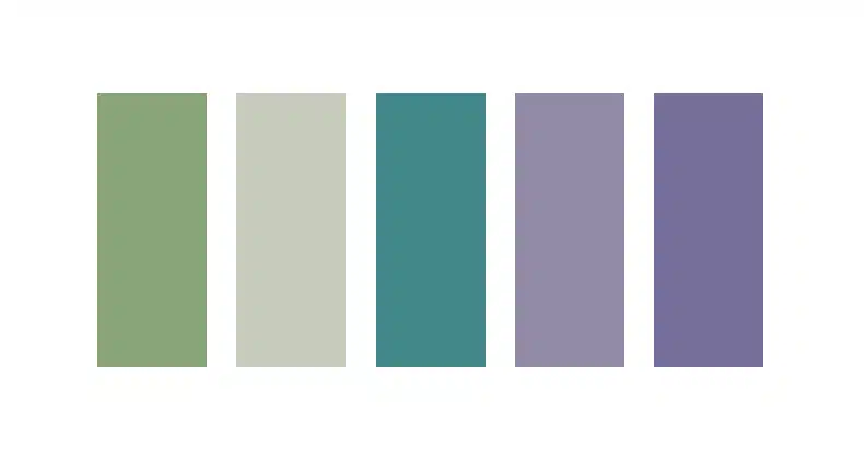
#89a479 – #c7cbbc – #408889 – #918ba7 – #776e99
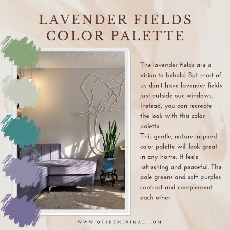
The lavender fields are a vision to behold. But most of us don’t have lavender fields just outside our windows.
Instead, you can recreate the look with this color palette. It uses dusty lavender, mid-green, and gentle neutrals that work well as a backdrop.
This gentle, nature-inspired color palette will look great in any home. It feels refreshing and peaceful. The pale greens and soft purples contrast and complement each other.
Sunrise Color Palette
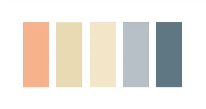
#f7b18a – #e8d9b2 – #f3e6c8 – #b4c0c5 – #607682
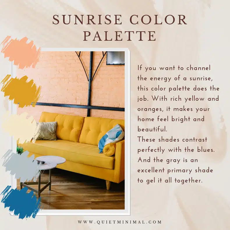
If you want to channel the energy of a sunrise, this color palette does the job. With rich yellow and oranges, it makes your home feel bright and beautiful.
These shades contrast perfectly with the blues. And the gray is an excellent primary shade to gel it all together.
Woodlands Color Palette
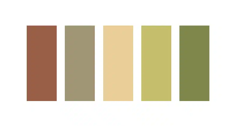
#996047 – #a09574 – #eace98 – #c5be6d – #80874c
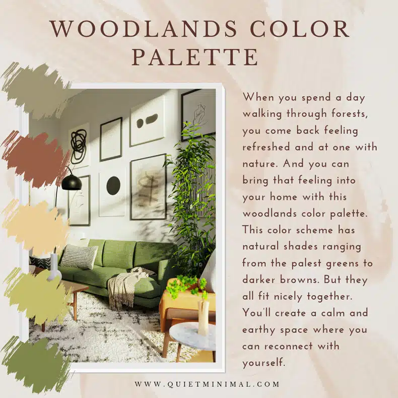
When you spend a day walking through forests, you come back feeling refreshed and at one with nature. And you can bring that feeling into your home with this woodlands color palette.
This color scheme has natural shades ranging from the palest greens to darker browns. But they all fit nicely together.
You’ll create a calm and earthy space where you can reconnect with yourself.
One Last Tip: Decide on Your Main, Secondary, & Accent Colors
Now you’ve decided which color palette to go with, and you’re probably excited to start decorating! But first of all, you need to assign roles to your colors.
In interior design, it’s recommended to follow the 60 – 30 – 10 rule.
First of all, you choose a base color to use on your walls, flooring, etc. That should add up to around 60% of your room. Normally, this will be a neutral shade that becomes a backdrop for your other colors.
Then, you can build on this base color with your secondary colors. You should use these colors for around 30% of your room. You want color tones that will add interest without being too bright or bold.
Finally, you add your accent color(s) for the final 10%. These colors will be the richest tones in your room and add a splash of color. You could add a rug, cushions, or other little touches in these colors.
But I would stick with no more than two accent colors. Otherwise, it could look too mismatched and disjointed. Remember that you want all these colors to work together – which is why we start with a color palette in the first place!
Final Thoughts
Finding the right color palette is a crucial decision for your home. You want colors that match your furniture and look good in your home.
But most importantly, you want to create the right kind of atmosphere at home. It should be a place where you can relax, destress, and feel at ease. But you also want your house to be a welcoming space for your guests.
So, you should think carefully about the colors you choose. Don’t just pick colors at random without considering how they will work together.
This guide should have given you some ideas to help you pick the perfect minimal color palette. I’d love to know what colors you go for – go ahead and share with me in the comments!
Make sure to follow Quiet Minimal on Pinterest for more minimalist and interior design resources.