Georgia
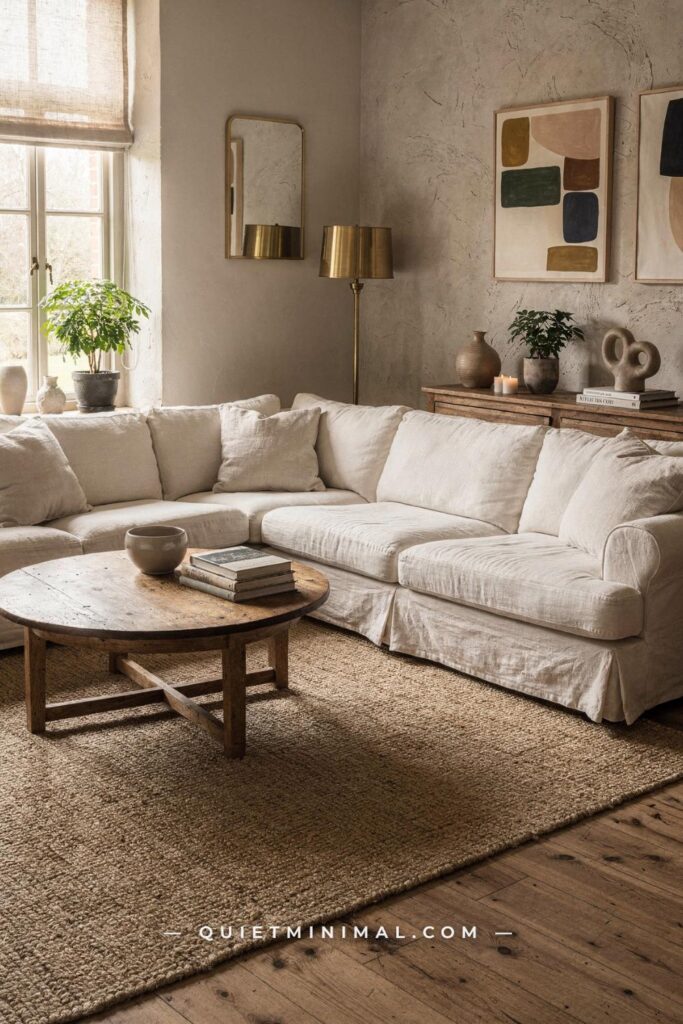
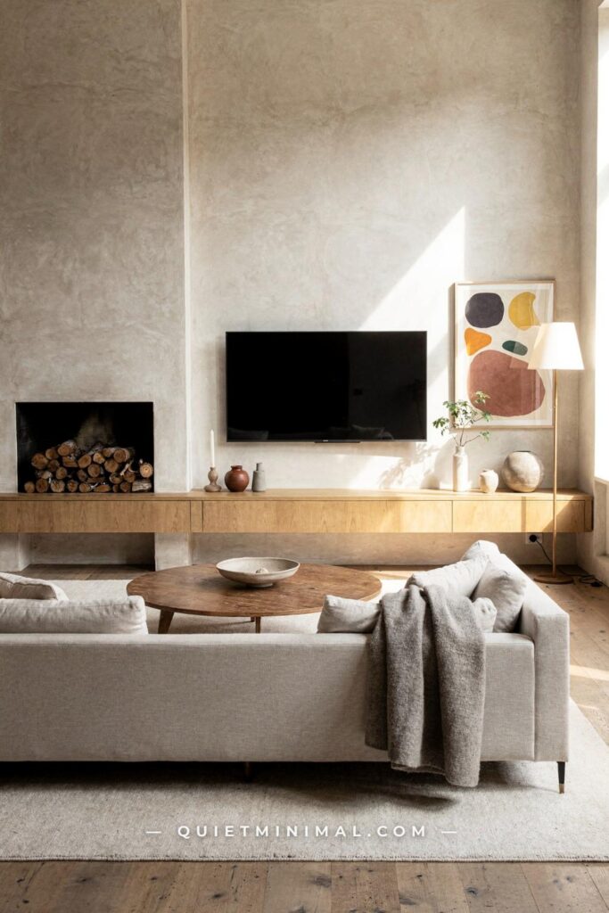
Search modern rustic living room ideas and the same room comes back a hundred times: a reclaimed wood coffee table, a stone wall, a chunky knit throw, and a caption telling you to add warmth. None of that is wrong. It is just the surface of a style that actually runs on proportion, material contrast, and the color temperature of the light, which is why two rooms built from the same shopping list can land completely differently once the furniture is in.
What follows is the version that holds up. Each section takes one piece of advice you have already read a hundred times, keeps the part that is true, and shows you where the received version quietly misleads. You get the measurement that decides whether a piece works, the wood and stone pairings that read as designed rather than assembled, and the way each idea fails so you can catch it before you commit. Start with the claim that has been repeated longest: that rustic warmth is something you add at the end.
Rustic Warmth Is Structural, Not Something You Add Last
 Save
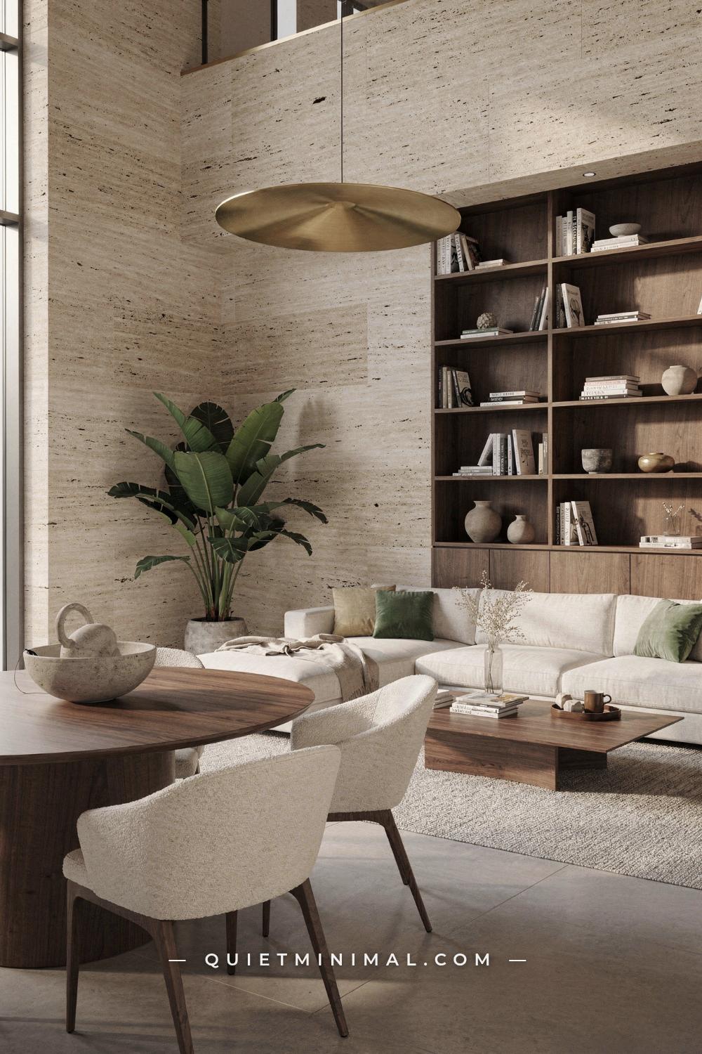
The received advice says warmth arrives with textiles. Buy the throw, buy the pillow, drape the basket. In a room with real ceiling height, that advice collapses immediately, because a 12-inch (30 cm) square of nubby fabric cannot do anything against 20 feet (6.1 m) of vertical wall. Warmth in a room like this comes from the surfaces themselves, and it has to be decided before anything soft is purchased.
Look at what carries the load here. Travertine plaster on the walls, which reads warm because it holds a slight tooth and scatters light instead of bouncing it. Oiled walnut in the built-in bookcase, running floor to ceiling, so the eye reads a single continuous material rather than a shelf hung on a blank wall. Then the same walnut repeats in the pedestal dining table, roughly 60 inches (152 cm) across, and again in the low coffee table beyond. One wood species, stated three times, at three scales. That repetition is what makes a big volume feel held rather than hollow.
The rest is restraint. Cream bouclé dining chairs at about 20 by 22 by 32 inches (51 by 56 by 81 cm) keep the table visually light, since a pedestal base only reads as a pedestal if you can see under it. A sculptural brass disc pendant around 24 inches (61 cm) in diameter hangs low enough to compress the space over the table, which is the trick that makes a double-height room usable. Hang it so the bottom edge sits 30 to 36 inches (76 to 91 cm) above the tabletop. Higher and it stops doing its job.
From the guides
You've saved it, wanted it. Here's the how: codes, measurements, order. Your choices make it yours.
 The Japandi Honest PlaybookThe honest version of the style: what to keep, what to skip, and the order to do it in.See inside →
 The Room Refresh PlaybookA repeatable four-step method, room by room, in ten minutes, thirty minutes, or one weekend.See inside →
 Make Any Room Feel Cozy on PurposeWhy some rooms hold people and others empty out, and the moves that change it.See inside →
The palette is doing quiet work too: rust brown, olive green, linen, and taupe, four values that sit close together in tone. Sherwin-Williams named Universal Khaki SW 6150 its recent Color of the Year, a mid-tone neutral with a slight yellow undertone, and that is exactly the register this room lives in. Where this fails is when people pick a warm neutral and then introduce a cool grey sectional, which drains the wood of its color and makes the whole room read muddy.
Key Takeaway: Decide the wall finish and the wood species first, repeat that wood at three different scales, and the textiles become optional rather than corrective.

The TV Wall Is Not the Enemy of a Rustic Room
 Save
The standard instruction is to hide the television. Put it behind cabinet doors, mount it over the mantel, disguise it as art. That advice made sense when screens were thick and grey. What actually happens in a rustic room is that the wall behind the screen becomes the most-looked-at surface in the house, and hiding it wastes the single best opportunity you have to introduce depth.
The move here is to build that wall out of a material with real relief. Dark reclaimed wood planks give you shadow lines between boards, so even switched off the wall has texture. A floating console of roughly 84 by 18 by 12 inches (213 by 46 by 30 cm) keeps the floor visible beneath it, which is what stops a dark wall from feeling like a solid block. Floating is not a style choice here, it is a weight-management choice. Every inch of visible floor under a console reads as air.
The lighting is the part most people get wrong. Warm amber LED strips tucked under each shelf tier work because they wash across the wood grain at a shallow angle and reveal the texture. Aim for a strip rated around 2700K, and mount it at the front lip of the shelf facing back toward the wall, not at the back facing out. Facing out gives you a visible bright line and a hot spot on the screen. Facing back gives you the glow with no visible source, which is the entire point.
Keep the shelf objects few and matte. Terracotta and black-glazed ceramic vessels, a couple of small potted plants, and nothing reflective, because a glossy object next to a screen picks up the screen. The palette running through this wall is dark walnut brown, charcoal stone, amber glow, and a terracotta accent, which is a narrow enough range that the television reads as one more dark rectangle among many rather than the only one.
The failure mode is over-lighting. When every tier is lit at full brightness the wall stops being architecture and starts being retail display. Put the strips on a dimmer and run them at roughly half output during viewing.
Key Takeaway: Build depth into the wall behind the screen and light it from the front lip backward, and the television stops competing with the room.
Texture Belongs on the Walls Before It Reaches the Throw Pillows
 Save
Every list tells you to layer texture, then shows you a pile of cushions. Cushions are the last five percent. The texture that changes how a room photographs and how it feels at seven in the evening is on the plane you never touch, which is the wall.
Limestone plaster is the reason this room reads Mediterranean rather than beige. It is troweled, so it holds directional marks, and those marks catch raking daylight from the tall windows on the right. Lime plaster and limewash have been flagged repeatedly as the defining wall finish right now, with painters and decorators pointing out that flat paint has started to read as predictable. If you are renting and cannot replaster, a limewash paint over a primed wall gets you most of the mottling with none of the demolition, and it comes off with a coat of regular paint later.
Against that rough wall you want the opposite. A cream linen low-back sofa around 90 by 36 by 30 inches (229 by 91 by 76 cm) is smooth and matte. Low-back matters here: it keeps the sofa under the sightline so you read the wall behind it. A solid oak plank coffee table at roughly 55 by 30 by 15 inches (140 by 76 by 38 cm) is the third texture, dense and close-grained. Three surfaces, three different tactile registers, all of them matte and warm.
The pendants are the piece people copy badly. Three open-weave rattan domes at about 24 inches (61 cm) each, hung at staggered heights, work because rattan is transparent. You see the wall through them. Hang three solid pendants in the same positions and you have built a visual wall at head height. Stagger the drops by 8 to 10 inches (20 to 25 cm) so the cluster reads as one composition rather than three separate fixtures that failed to line up.
An olive tree in a white plaster pot and a fiddle leaf fig flank the far wall. Both are chosen for leaf shape, not for filling a corner. Olive gives you small silvery leaves and open structure. The fig gives you broad glossy paddles. That contrast is doing the same job the plaster is doing, one register up.
Key Takeaway: Put your money and effort into a textured wall finish first, because no quantity of woven cushions can compensate for a flat one.

A Faded Rug Does More Rustic Work Than Another Wood Surface
 Save
When a room already has oak floors, an oak console, and an oak table, the instinct is to add a jute rug because jute is the approved rustic floor covering. It is a reasonable instinct and it is usually the wrong one. Jute against pale oak gives you two neutrals of nearly the same value, and the floor plane goes flat. What the room needs at that point is color and age, and a faded Persian-style rug supplies both.
Look at what the rug contributes here: dusty reds and tans that have gone soft, against pale oak boards and a charcoal steel window frame. Those muted reds are the only warm chroma in the room, and they are what stop a glass-walled space from reading like an office. Age is the second contribution. A pattern that has worn unevenly gives the eye a history, which is precisely the quality people are chasing when they buy distressed furniture and rarely get, because factory distressing is uniform and real wear is not.
The console is the structural decision. A low floating oak unit running the full wall width, roughly 96 by 14 by 18 inches (244 by 36 by 46 cm), keeps everything below the horizon line so the garden stays the view. Store vinyl records vertically underneath and the spines become a stripe of color at ankle height, which is a genuinely useful trick in a room with very little pattern. A vintage turntable on top gives you a working object rather than a decorative one, and working objects age far better than styled ones.
The round oak drum coffee table at about 36 inches (91 cm) across is sized to leave 16 to 18 inches (41 to 46 cm) of walkway between it and the seating. Round is deliberate in a room this rectilinear. Steel frames, a straight console, and a straight glass wall give you a grid, and a circle is the only shape that breaks it without arguing with it.
The failure here is buying a new rug in a faded colorway. New low-pile rugs printed to look worn read as printed, because the wear pattern does not follow where feet actually go. Buy an older piece, or buy a plain flatweave and skip the imitation.
Key Takeaway: In a wood-heavy room the rug should supply the color and the age, not another neutral texture.

The Coffee Table You Inherit Beats the One You Match
 Save
Furniture retailers sell coffee tables in sets with the side tables, and the sets sell because matching feels safe. In a room with rough-cut stone walls and aged timber beams, matching is the one thing that will make the whole arrangement read as staged. The architecture is irregular. Anything perfectly coordinated placed inside it looks like it was delivered.
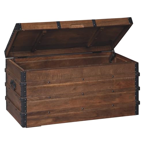
An antique painted wood trunk with iron hardware, used as the coffee table at roughly 42 by 26 by 18 inches (107 by 66 by 46 cm), solves three problems at once. It has patina the stone can talk to. It has storage, which a solid slab does not. And at 18 inches (46 cm) tall it sits right at the height that works with a sectional seat, which is generally within 2 inches (5 cm) of the seat cushion height either way. Go much lower and reaching for a mug becomes awkward. Go higher and it starts blocking the seat.
The sectional itself is doing the balancing. Cream linen, modular, around 110 by 90 by 30 inches (279 by 229 by 76 cm) in its L configuration. Linen is the correct choice against uncut stone because it is a plain weave with visible slubs, so it holds its own texturally without adding another pattern. Load it with knit and woven pillows in the same off-white to oatmeal range, and vary the weave rather than the color. Four to six pillows across an L that size is plenty. Nine is where it starts looking like a display bed.
A woven rattan globe pendant of about 18 inches (46 cm) hangs from the beams, and its job is to be small. In a room with heavy timber overhead, a large light fixture competes with the structure. An 18-inch (46 cm) globe reads as an object hung among beams rather than a rival to them. The diamond-pattern woven wool rug underfoot is the only geometry in the room, which is why it can afford to be geometric.
The failure mode: buying a reproduction trunk. Reproduction hardware is uniform, and uniform iron against uncut stone is the tell. If a real one is not available, a plain solid slab is a better answer than a faked antique.
Key Takeaway: One genuinely old piece at the center of the seating group does more for a stone-walled room than any matched set, and a trunk earns its place twice by storing things.
Dark Rooms Can Be the Most Rustic Rooms in the House
 Save
The standing advice is that rustic means light and airy: white plaster, pale oak, natural linen, more windows. That version exists and it works. It is also only half the tradition. Farmhouses and lodges were dark rooms with small openings, and the modern reading of that is one of the strongest looks available right now, particularly for a north-facing room that will never be bright no matter what you paint it.
Here the sofa is deep olive-green velvet, low-profile, roughly 90 by 38 by 28 inches (229 by 97 by 71 cm). Velvet is the correct pile for a dark room because it has directional nap, so a single light source rakes across it and produces two values from one color. Flat cotton in the same green would go dead. Behind it, a textured linen wallpaper wall gives the room its second surface, and espresso vertical timber slats on the right give it the third. Rough weave, smooth velvet, and hard slat, all sitting within a narrow tonal band.
Benjamin Moore named Silhouette AF-655 its recent Color of the Year, described as burnt umber with notes of charcoal. That is the family this room belongs to, and it is worth knowing that a major brand has put its weight behind deep warm browns, because it means the coordinating finishes and fabrics will be easy to find for the next several years.
The round marble coffee table, deep green and matte at about 42 inches (107 cm) across, is the piece that keeps the room from going soft. Everything else absorbs light. Stone is cold, dense, and slightly reflective even in a matte finish, and that single contradiction is what stops a dark room from feeling like a padded box. Matte matters: polished green marble in a room lit by one lamp becomes a mirror of the ceiling.
A brown bouclé ottoman around 24 inches (61 cm) in the foreground and mixed-weave pillows in sand and ivory lift the value range just enough to read. One tall fabric-shaded floor lamp in the corner is the whole lighting plan, and it should be on a dimmer with a warm bulb near 2700K.
Where this fails is contrast starvation. If every surface sits within two values of each other and nothing light interrupts, the room stops reading as depth and starts reading as gloom. The sand and ivory pillows are not decoration, they are the calibration.
Key Takeaway: A dark rustic room needs one cold, hard, slightly reflective surface and two genuinely light accents, or the whole palette closes in on itself.

Stone Does Not Need a Fireplace to Earn Its Place
 Save
Stone in a living room is treated as fireplace-only equipment. If there is no hearth, the assumption goes, there is no reason for stone. That assumption is why so many rooms end up with a painted accent wall that adds color and no depth. Stacked ledger stone behind a television does everything a hearth surround would do and gives the room a permanent focal point that is not dependent on a chimney.
Warm amber ledger stone is the specific choice worth copying. Ledger stone comes in panelized strips, so it installs over a prepared substrate without a mason building a full wall, and the horizontal coursing runs the same direction as a wide screen, which is why the screen sits into it rather than on it. Amber rather than grey is what keeps the wall from reading commercial. Grey stacked stone has been used on so many lobby walls that it carries that association.
Below it, a wide floating console at roughly 84 by 18 by 20 inches (213 by 46 by 51 cm) with a stone countertop surface and drawer fronts ties the two materials together. The countertop repeating the wall material is a small move that reads as intentional carpentry rather than a console pushed against a wall.
The sconces are the detail most people skip. A pair of black metal fixtures with amber glass, roughly 6 by 14 inches (15 by 36 cm) each, flanking the screen at shoulder height. Mount them so the center sits around 60 to 66 inches (152 to 168 cm) from the floor. Their real job is not illumination, it is reducing the contrast ratio between a bright screen and a dark wall, which is why the room stays comfortable to sit in for a long stretch. Put them on their own dimmer.
Styling stays sparse because the wall is loud. A tall stoneware vase of dried pampas grass at the far left of the console, a dark tray with an 8-inch (20 cm) metal sphere at the far right, nothing in the middle. The palette is amber stone, dark walnut, iron black, and pampas cream.
The failure is a full-height stone wall with a small console floating in the middle of it. Stone wants a horizontal element at the bottom to land on, or it looks like cladding.
Key Takeaway: Ledger stone behind the screen gives you the depth a hearth would, provided you ground it with a full-width console and flank it with dimmable sconces.

Leather Is the Upholstery That Gets Better, Not the One That Dates
 Save
Leather has a reputation problem. It gets filed with the oversized recliner and the man cave, and design advice steers toward fabric because fabric is easier to make look current. In a room with a vaulted cathedral ceiling and a floor-to-ceiling stacked river stone chimney breast, fabric is the piece that will look tired first, because it is the only thing in the room that does not improve with time.
Two cognac leather sofas facing each other, each roughly 88 by 38 by 30 inches (224 by 97 by 76 cm), do something specific in a tall room. Leather has sheen. Under warm incandescent table lamps on both sides, the seat and back panels catch light unevenly and pick up the amber, which is how a sofa competes with 20 feet (6.1 m) of stone. Full-grain or top-grain leather also develops a patina, so the arms and seat fronts darken where hands and bodies land. Five years in, that is character. The same five years on a pale fabric sofa is a cleaning problem.
Facing sofas rather than an L is the right layout under a ridge beam because the ceiling is symmetrical and the seating should acknowledge it. Leave 30 to 36 inches (76 to 91 cm) between the sofa fronts and the coffee table edges combined, and keep the sofas 8 to 10 feet (2.4 to 3 m) apart at most, since conversation across a wider gap stops happening.
The rug carries the pattern. A geometric earth-tone wool rug at 9 by 12 feet (274 by 366 cm) is the standard size that lets both sofas sit with front legs on, which is the arrangement that makes a seating group read as one object. Wool is worth the difference here because it holds furniture indentations less and takes traffic in a room where people come in from outside.
Everything else stays heavy and warm: dark espresso timber beams crossing the ceiling, a tongue-and-groove plank ceiling above them, forest green in the windows. The firebox stays unlit and clean, which is the more useful state anyway since an open masonry opening reads as architecture on its own.
The failure mode is bonded leather. It peels at the seat front within a few years and there is no repair. If real hide is out of reach, choose a heavy woven fabric in a mid tone instead of imitating leather.
Key Takeaway: In a tall stone-and-timber room, cognac leather is the upholstery that gains from use, so buy the hide grade you can afford and let the rug carry the pattern.

One Raw Edge Per Room Is the Actual Rule
 Save
Live-edge and raw-edge wood is the shorthand everyone reaches for. A raw-edge coffee table, raw-edge shelves, a raw-edge console, and a raw-edge bench, all in one room. Each piece is fine. Together they cancel out, because the whole appeal of an uncut edge is that it is the one place the material has not been squared off. Repeat it four times and it becomes a finish, not an event.
The room here gets it right by concentrating everything into one object. A chunky two-tier reclaimed wood slab table with raw edges, roughly 60 by 36 by 16 inches (152 by 91 by 41 cm), sitting on a woven jute rug. Two tiers is a real functional gain in a room without much storage, and the lower shelf is where the books and trays live so the top can stay nearly clear. That size is substantial, and it should be: a raw-edge table under about 48 inches (122 cm) long tends to read as a slice rather than a slab.
Everything around it is deliberately squared. Cream linen sofas on either side at about 90 by 36 by 30 inches (229 by 91 by 76 cm) each, low-backed so the black steel window frames stay visible above them. Floating solid oak shelves in a set of three, roughly 36 by 10 inches (91 by 25 cm) each, are cut clean and straight beside the white fireplace surround. Straight shelves next to a raw table is the contrast that makes the table read as chosen.
Space the three shelves 12 to 14 inches (30 to 36 cm) apart vertically. Closer and plants have no headroom. Wider and the group stops reading as a set. Potted plants in woven baskets on those shelves keep the material story going without adding another wood tone.
Light does the rest. Afternoon sun through a full-height glass wall rakes across the splintered grain of the table and picks out every irregularity, which is exactly the reason to place a raw-edge piece where the light crosses it rather than where the light hits it straight on.
The failure is buying a slab with a heavily epoxied edge. Filled voids and a thick clear pour turn an uncut edge into a resin object, and it will look of its moment in a way the wood alone does not.
Key Takeaway: Spend on one substantial raw-edge piece, keep every other wood element square-cut, and place the slab where side light can cross the grain.

A Feature Wall Made of Paint Is the Weakest Version
 Save
The default feature wall is a color. Paint one wall darker, hang the television, done. It photographs acceptably and it does almost nothing in the room, because paint has no thickness. A rustic feature wall works when it has relief you can read from across the room and shadow that moves as the light changes through the day.
This one is built from three materials in a deliberate order. A central column of stacked natural fieldstone, flanked left and right by dark espresso vertical wood slat panels. The stone is irregular, the slats are rhythmic, and the contrast between random and regular is the whole idea. Slat panels typically come in sections around 94 inches (239 cm) tall with battens spaced at regular intervals, and the important decision is to run them full height rather than stopping partway, because a slat panel that ends at picture height looks like wainscoting that gave up.
Below, a wide walnut media console with cabinet doors at roughly 84 by 18 by 20 inches (213 by 46 by 51 cm) spans both flanking panels rather than sitting under the stone alone. That single choice is what makes the wall read as one composition. Four oak floating shelves at about 30 by 10 inches (76 by 25 cm) each mount directly onto the slat panels and hold small framed art and plants in dark pots.
Keep the shelf contents in the same two families: something green and something framed. Mixing in ceramics, candles, and books as well turns a structured wall into a junk drawer. Dark pots rather than terracotta, because the pots need to disappear into the slats and let the leaves do the talking.
On the adjacent white wall, a large forest landscape painting at roughly 36 by 48 inches (91 by 122 cm) does the job of resolving the palette. Warm fieldstone grey-tan, dark espresso slat, forest green, charcoal. The painting is where the greens outside and the greens on the shelves meet.
The failure mode is slats on every wall. The panel only works as a feature because the walls around it are quiet. Two slat walls in one room and the room starts to read as a treatment rather than a place.
Key Takeaway: Build the feature wall from at least two materials with real depth, span it with one full-width console, and leave the surrounding walls plain.

Facing the Screen Is Not the Only Layout That Works
 Save
Nearly every living room gets laid out the same way: sofa opposite the screen, chairs at the edges, coffee table in the middle. That plan is efficient and it produces rooms where nobody talks to anybody. In a large open great room with a timber beam ceiling and a stacked fieldstone chimney breast at the far end, an open U formation is the better answer, and it is worth understanding why before you rearrange anything.
A U puts every seat within conversational range of every other seat. Two cream linen sofas at roughly 88 by 36 by 30 inches (224 by 91 by 76 cm) each, set at right angles to a third side, with the fourth side left open toward the sliding garden door. The open end matters as much as the closed ends. It is the way in, it is where the light comes from, and it prevents the arrangement from becoming a pen.
Size the group by the distances, not by the wall lengths. Keep 8 to 10 feet (2.4 to 3 m) between facing seat fronts, 16 to 18 inches (41 to 46 cm) from seat edge to coffee table, and at least 30 inches (76 cm) for the main circulation path around the outside. A solid rectangular oak coffee table at about 56 by 28 by 18 inches (142 by 71 by 46 cm) sits centrally, and a round wicker side table around 20 inches (51 cm) across floats at the open corner where a fixed piece would block the route.
The finishes are all sun-bleached and matte: rough-hewn timber overhead, smooth plaster walls, honey oak, bleached linen, fieldstone grey. Benjamin Moore included Sherwood Tan 1054 in its recent Color Trends palette, and a soft tan in that register is the right register for plaster in a room where the garden light is doing most of the work.
The unlit firebox at the end of the room becomes a sculptural anchor rather than a viewing target, which is honest about how these rooms actually get used. Put a large basket or a pair of tall ceramics on the hearth and let it read as mass.
The failure is a U that is too tight. Push the sofas in to fill a smaller footprint and knees start colliding with the table, which is why the walkway numbers above are the ones to hold.
Key Takeaway: Arrange the seating around the conversation and leave one side open to the light, then let the fireplace be mass rather than the thing everyone stares at.

The Chair That Disagrees With the Sofa Is the One That Sells the Room
 Save
Showrooms sell seating in families. A sofa, a matching loveseat, a matching chair, all in the same fabric and the same arm profile. It is the least risky purchase available and it is also the reason so many rustic rooms look like they were bought in one transaction. The room reads as a catalogue page because every seat agrees with every other seat.
Under an exposed timber truss ceiling, the arrangement here does the opposite. A warm tan leather modular sofa at roughly 100 by 40 by 28 inches (254 by 102 by 71 cm) faces a Chandigarh-style rattan lounge chair at about 28 by 28 by 30 inches (71 by 71 by 76 cm). Leather against cane. Heavy against open. Low-arm modular against a fixed vintage-derived frame. Nothing about those two pieces matches, and that is why the group looks collected.
The rule underneath it is simpler than it sounds. Keep the seat heights within about 2 inches (5 cm) of each other so people are not looking up or down at each other, and let everything else differ. Material, arm shape, era, color: all fair game. A single dissenting chair is usually enough. Two dissenting chairs from two different directions starts to look unresolved.
Overhead, three oversized white bouclé dome pendants at roughly 24 inches (61 cm) each hang from the trusses. Fabric pendants under a timber truss are the softening agent, because a truss is all hard angles and shadow. If the pendants were metal the ceiling would be relentless. Hang them along the line of the truss, not scattered, and keep the lowest point at least 7 feet (2.1 m) off the floor in a circulation zone.
A natural tree-stump side table holding a single ceramic cup is the third texture, and the fact that it holds exactly one object is the point. A woven jute rug pulls the tan leather down to the floor. Dark walnut kitchen cabinetry in the background gives the palette its deep end: tan leather, dark walnut, white bouclé, warm concrete grey.
The failure mode is a dissenting chair that is too small. A delicate accent chair against a 100-inch (254 cm) sofa reads as an afterthought. The chair has to have enough presence to be a genuine second opinion.
Key Takeaway: Buy one chair that shares nothing with the sofa except seat height, and give it enough scale to hold the other side of the room.

Beams Should Contrast the Floor, Not Match It
 Save
A common piece of advice is to match your ceiling beams to your flooring so the wood tones tie together. It sounds tidy. In practice it produces a room where the eye slides from floor to ceiling without stopping, and the beams stop registering as structure. Beams are the most expensive-looking thing in a modern farmhouse room. They should be read, and being read requires contrast.
The version that works here is a white-painted ceiling crossed by thick exposed dark walnut beams. Maximum value contrast between the beam and the plane behind it, so each beam casts a visible shadow and the ceiling reads as depth rather than as a lid. Benjamin Moore’s Swiss Coffee OC-45, which appears in the brand’s recent Color Trends palette, is a soft white with enough warmth to sit against oiled walnut without going blue. A crisp cool white ceiling under warm beams is where this combination usually goes wrong.
On the wall, a stacked stone fireplace roughly 60 inches (152 cm) wide with a rough-hewn wood mantel anchors the room. The mantel should be the same tone family as the beams and a different tone from the floor, so the vertical elements group together. Wall-mounted sconces flank the fireplace, and they should be mounted high enough that their glow lands on the stone rather than on the mantel objects. Somewhere around 60 to 68 inches (152 to 173 cm) to center works for most rooms.
Seating stays simple because the ceiling is doing the work. A cream linen sofa at about 90 by 36 by 30 inches (229 by 91 by 76 cm) on a geometric-patterned wool rug, and two small live-edge walnut side tables at roughly 16 by 16 by 22 inches (41 by 41 by 56 cm) each, placed informally rather than symmetrically. Note the height: 22 inches (56 cm) is above sofa arm height, which is deliberate. A side table you can see from a seated position gets used.
The palette is four values: white, warm walnut, stone grey, linen cream. That is enough. Adding a fifth accent color to a room with this much textural contrast usually dilutes it.
The failure mode is faux beams in a stain that reads plastic. If you are installing box beams, have them stained on site to match a walnut sample rather than accepting a factory finish, and specify a matte sheen.
Key Takeaway: Set the beams several values darker than the ceiling and match the mantel to the beams instead of the floor, so the overhead structure stays legible.

Mantel Symmetry Is Not the Goal
 Save
Mantel styling advice has calcified into one arrangement: a mirror in the center, a candlestick on each side, greenery draped across. It is symmetrical, it is safe, and in a room with a genuinely dramatic fireplace it fights the architecture. A floor-to-ceiling stacked fieldstone chimney breast under an A-frame truss ceiling is already the strongest thing in the room. The mantel does not need to compete, it needs to sit quietly inside it.
The arrangement worth copying: one framed abstract print at roughly 24 by 30 inches (61 by 76 cm) in neutral tones, offset to one side, with two small white vases grouped on the other. Uneven weight, resolved by placement. The larger object sits closer to the center, the smaller pair sits further out, and the eye balances them because they are at different distances from the fulcrum. That is the same logic a picture hanger uses, and it is more interesting than a mirror flanked by twins.
Height matters more than most guides mention. Lean the print rather than hanging it, and keep its top edge below roughly two thirds of the visible stone height above the mantel. Fill more than that and the stone stops reading as full height, which was the whole reason to build it.
The seating supports the vertical drama by staying low and horizontal. Two cognac leather sofas at about 88 by 38 by 30 inches (224 by 97 by 76 cm) each, on a layered jute rug, with a solid oak rectangular coffee table at roughly 48 by 28 by 18 inches (122 by 71 by 46 cm). Pale oak trusses overhead, fieldstone grey on the chimney, linen white walls, cognac on the sofas.
A tall potted olive tree in the right corner is the one vertical that is allowed to answer the fireplace, and it works because it is soft. Black-steel-framed windows onto open countryside supply the frame. Layering a jute rug means a larger flat-weave underneath and a smaller textured one on top, offset by 8 to 12 inches (20 to 30 cm) on two sides so both are visible.
From the guides
You've saved it, wanted it. Here's the how: codes, measurements, order. Your choices make it yours.
The Japandi Honest PlaybookThe honest version of the style: what to keep, what to skip, and the order to do it in.See inside →The Room Refresh PlaybookA repeatable four-step method, room by room, in ten minutes, thirty minutes, or one weekend.See inside →Make Any Room Feel Cozy on PurposeWhy some rooms hold people and others empty out, and the moves that change it.See inside →The failure mode is overfilling. Six objects on a mantel under a two-story stone wall reads as clutter at that scale, because each item is too small to be seen from the seating.
Key Takeaway: Use one large piece and one small group, offset rather than mirrored, and keep the mantel under two thirds of the stone height so the chimney keeps its scale.

Brown and Cream Is a Starting Point, Not the Palette
 Save
The unspoken rule in rustic decorating is that color is risky. Stay in brown, cream, and grey and nothing can go wrong. Nothing can go wrong, and nothing much happens either. The rooms that stay interesting for years almost always have one saturated color holding a large surface, and green is the color that behaves best against wood and brick.
A deep sage green velvet sofa at roughly 88 by 36 by 30 inches (224 by 91 by 76 cm) is the whole move here. Sage sits between the terracotta of an exposed brick arch and the dark walnut of the beams, which means it does not have to fight either one. It is also a desaturated green, so it functions almost as a neutral at a distance and only reads as color up close. Benjamin Moore included Narragansett Green HC-157 in its recent Color Trends palette if you want to carry that green onto a wall or into millwork instead of upholstery.
Velvet is the right pile against brick for the same reason it worked in the dark room earlier: brick is matte and irregular, velvet is smooth and light-responsive, and the contrast is what keeps both surfaces legible. In a room with a large window on the right, the nap will read two different greens depending on which way you approach the sofa.
The coffee table is reclaimed wood on hairpin iron legs at about 48 by 28 by 16 inches (122 by 71 by 41 cm). Hairpin legs are doing something specific: they take a heavy top and make it hover, which is necessary on a herringbone floor because you want to see the floor pattern continue underneath. A round woven knit pouf around 20 inches (51 cm) in the foreground is the flexible seat, and knit is the fourth texture after brick, velvet, and raw wood.
A wicker basket planter with a trailing vine in the near corner is the last piece. Trailing rather than upright, because the corner needs something that spills.
The failure mode is matching the green to the plants. A sofa green that lands in the same family as the foliage flattens both. Pick a sage that is greyer and duller than any leaf in the room.
Key Takeaway: Give one large upholstered surface a desaturated green and keep every other color earth-based, and the brown-and-cream base becomes a background instead of the whole story.

You Do Not Need a Cabin to Get This Look
 Save
The most discouraging thing about modern rustic content is that it is nearly always photographed in a house with beams, stone, and a mountain outside. If you live in a rental or a new-build with flat drywall and a builder off-white, the honest question is whether any of it applies. It does, because rustic is a material strategy, not an architectural one, and the material strategy is portable.
Here is the version that works in an ordinary room. A slim walnut television console with a timber slat panel behind it, and that panel is the one element carrying all the architecture. Slat panels come in peel-and-stick and screw-fixed formats, and a panel sized to the console width rather than the wall width reads as furniture, which matters when you have a lease. A white deep-seat modular sofa at roughly 100 by 40 by 28 inches (254 by 102 by 71 cm) does the comfort work.
Then one piece that is nothing like the rest. A round green bouclé bubble-form lounge chair at about 36 by 36 by 30 inches (91 by 91 by 76 cm), which brings curve, color, and a completely different era into a room that would otherwise be all rectangles. A round glass-top coffee table on a wood base, around 36 inches (91 cm) across, keeps the floor visible in a smaller room, which is the single most effective trick for making a modest space read larger.
Plants are the other structural element. Four of them at varying heights, so the eye moves up and down rather than scanning a flat line. A framed Bauhaus geometric print on the far wall is the reference to a different tradition, and mixing eras is what separates a collected room from a themed one.
The lighting plan is one floor lamp in the back corner, warm amber, no overhead. That is genuinely all it takes in the evening, and it is the change that makes the biggest difference in a builder-grade room, because ceiling cans at a cool color temperature will undo every warm material you bought. Swap bulbs to 2700K and put the lamp on a dimmer.
The failure mode is trying to fake beams in an eight-foot (2.4 m) ceiling. It reads as a costume. Put the texture on a vertical surface instead.
Key Takeaway: In a plain room, put the texture on one vertical panel, add one curved piece from another era, and light the evening with a single warm lamp instead of the ceiling.

Modern Rustic Is Not a Cold Climate Style
 Save
Rustic gets treated as a winter idea. Wool, cabins, snow through the window, heavy layers. That association is so strong that people in warm climates skip the style entirely, which is a shame, because the underlying principle is honest natural materials, and warm regions have their own versions that are older than any lodge.
A tropical reading uses stone and wood exactly as a mountain room does, just different stone and different wood. Rough-cut ashlar sandstone block, laid in regular courses, gives you the same textural relief as fieldstone with far more order. Backlighting it from above with warm cove lighting is what turns a flat wall into a raking-light surface. Cove light works because the fixture is hidden and the light travels down the face, so every stone joint throws a shadow. Mount the cove 4 to 6 inches (10 to 15 cm) off the wall face for the cleanest wash.
Teak is the wood that belongs in this context. Solid teak lounge chairs at roughly 28 by 28 by 33 inches (71 by 71 by 84 cm) each, and a round solid teak coffee table around 36 inches (91 cm) across, both of them oily and dense enough to handle humidity and an open glass slider. Cream linen on the sofa at about 90 by 36 by 30 inches (229 by 91 by 76 cm) keeps the seating light against dark teak.
Large-format travertine tile underfoot is the third material and the one doing the climate work. Stone floors stay cool, they take sand and water, and travertine has visible fossil texture, so it reads as natural rather than as a hard surface chosen for maintenance. A bamboo and timber ceiling closes the material story overhead.
A large fiddle leaf fig in a dark ceramic urn anchors the corner where the stone wall meets the glass. One big plant beats five small ones in a room open to a garden, because the garden already supplies the small-scale green.
The failure mode is importing cold-climate textiles. Chunky wool throws and shearling in a humid room look wrong and feel worse. The equivalent gesture is a woven cotton or a raw linen, and the tactile interest comes from the stone.
Key Takeaway: Warm-climate rustic swaps fieldstone for ashlar sandstone and oak for teak, and gets its texture from raking cove light rather than from heavy textiles.

Plants Are Structure, Not Garnish
 Save
Plants get added at the end. The room is finished, it feels a little bare, so a few pots go in the empty spots. That sequence is why so many plant arrangements look like they are apologizing for a gap. Treated as structure instead, a plant grouping can hold a whole corner and give a room the vertical interest that furniture cannot.
A corner shelf gallery is the clearest example. Four floating oak shelves in an L-shaped configuration wrapping the corner, each roughly 24 by 8 inches (61 by 20 cm). The L is the key decision. Shelves that turn a corner make the corner read as designed volume rather than as leftover space, and they give you two viewing angles instead of one.
Space them so the plants have room to grow into the gaps. Twelve to fourteen inches (30 to 36 cm) between shelves suits trailing species, which need clearance to hang without touching the shelf below. Alternate the habit: one upright, one trailing, one upright, one trailing, going up. A column of four trailing plants turns into a curtain and you lose the shelves entirely.
Warm amber LED strip underlighting on each shelf is the element that makes this read as architecture. It uplights the leaves from beneath, which is the opposite of how plants are normally lit, and the underside of a leaf is where the veining shows. Use a warm strip around 2700K, run it along the front underside of each shelf, and add a dimmer. At low output in the evening, the corner becomes the only lit thing in the room.
Ribbed white ceramic pots in two or three sizes keep the container language consistent. Ribbing catches the LED light and gives each pot a vertical stripe of highlight. Same glaze, same white, varied heights: this is the one place matching helps, because the pots need to disappear so the plants can differ.
The failure mode is grow-light color temperature. Cool white or blue-tinted strips will make green leaves look grey and the oak look pink. Check the Kelvin rating before you buy, and check the CRI too if the listing gives one, since low-CRI strips render green particularly badly.
Key Takeaway: Wrap a corner in shelves, alternate upright and trailing plants, and underlight every tier with a warm dimmable strip so the grouping becomes the room’s evening focal point.

Not Everything Should Be Hung on the Wall
 Save
Hanging art is treated as the responsible choice and leaning it as the temporary one, something you do before you get around to the drill. In a room with a heavy vaulted timber ceiling and a stone chimney breast, leaning is frequently the better permanent answer, and there are two reasons that have nothing to do with avoiding holes.
The first is scale. An arched mirror and a framed landscape print resting against the stone surround read as objects with weight, sitting on the hearth the way a piece of furniture sits on the floor. Hung, the same two pieces would float, and floating objects on a rough stone wall always look slightly wrong because stone has no flat plane to reference.
The second is light. The arched mirror leaning on the hearth catches the warm recessed ceiling ambient and throws it back into a room that is otherwise dark timber and grey stone. Angle matters: a leaning mirror tilts back a few degrees, so it reflects the ceiling and the upper wall rather than the seating, which is more useful and far less awkward than a mirror pointed at the sofa.
The seating group is a cream linen L-shaped sofa at roughly 110 by 90 by 30 inches (279 by 229 by 76 cm) facing a chunky live-edge round walnut coffee table around 42 inches (107 cm) across on a woven jute rug. Round against an L is the correct pairing, because an L already gives you two straight runs meeting at a right angle, and a rectangular table inside that corner produces four parallel lines and nowhere to walk.
Behind, a dark kitchen island with a pair of black industrial dome pendants at about 12 by 18 inches (30 by 46 cm) each keeps the open plan legible. In an open plan, matching the metal finish between the pendants and any hardware in the living zone is what makes the two areas read as one room. A tall terracotta-potted olive tree beside the fireplace supplies the only bright organic note against dark espresso timber, cream linen, stone grey, and warm walnut.
The failure mode is leaning something too small. A 16-inch (41 cm) frame on a wide hearth reads as forgotten. Leaned pieces need to be at least half the width of the surface they rest on.
Key Takeaway: Lean large mirrors and art against stone rather than hanging them, size each leaned piece to at least half the hearth width, and tilt the mirror to catch ceiling light.

More Lamps Is Not the Same as More Warmth
 Save
The standard lighting advice is to add lamps. Three sources minimum, layer your light, never rely on the ceiling. All true, and all of it stops short of the thing that actually makes a small room feel enclosed and warm at night, which is lowering the height of the light rather than multiplying the number of fixtures.
A snug cabin room lit entirely by candle lanterns placed around the space demonstrates the principle at its extreme. Every light source is below waist height. The ceiling goes dark, the walls fall off into shadow, and the room contracts to the size of the seating group. That is a spatial effect, not a brightness effect, and no number of table lamps at 26 inches (66 cm) will reproduce it because table lamps light the walls.
You can build a dimmable version of this with electric light. Put your sources low: a floor-standing lamp with the shade at about 40 inches (102 cm), a small lamp on a low shelf, a strip under a console. Then dim everything below roughly 30 percent. Warm-dim bulbs, which shift toward amber as they dim rather than staying at a fixed 2700K, are the ones to look for, because that shift is what candlelight actually does.
The furniture is built for the same effect. A chunky brown chenille sectional at roughly 100 by 90 by 30 inches (254 by 229 by 76 cm) wraps three sides, and chenille is the right pile because it has a short dense nap that reads soft in low light without the sheen velvet gives. A tree-stump log slice coffee table around 24 inches (61 cm) across and 18 inches (46 cm) tall sits at the center on a Berber-pattern wool rug, with a tray on top holding small lanterns and a ceramic mug. Tea and a stack of books is the correct evening program for a room like this.
Wicker baskets on dark wood shelves beside the console handle the practical side. In a room this dark, closed storage in a light natural material is the only thing that keeps the shelves from disappearing.
The failure mode is running candles unattended or near the sectional. Keep every flame inside a glass lantern, on a hard tray, at least 12 inches (30 cm) from any fabric, and put them out before you leave the room.
Key Takeaway: Drop your light sources below waist height and dim them deeply, because room warmth at night comes from where the light sits, not how many fixtures you own.

Concrete Belongs in a Rustic Room
 Save
Concrete is filed under industrial, industrial is filed under cold, and rustic advice tells you to keep it out. That taxonomy is a marketing invention. Concrete is a poured mineral surface with visible aggregate, form marks, and color variation, which puts it in exactly the same family as plaster and stone. What makes a room cold is the color temperature of the light and the absence of any soft material, not the presence of concrete.
The wall here is split down the middle: a raw concrete-texture panel on the left, vertical oak wood slat panel on the right. Half hard and irregular, half warm and rhythmic, meeting on a clean vertical joint. That fifty-fifty split is bolder than most rooms attempt, and it works because the two materials share a value range. If the oak were much lighter, the concrete would read as a stain rather than a decision.
A floating dark-finish television console with a natural wood top at roughly 90 by 15 by 18 inches (229 by 38 by 46 cm) runs across the joint, which is what stitches the two halves together. Backlight it with a warm amber LED strip mounted on the underside at the rear, so the wash lands on the wall behind and the console appears to hover. Fifteen inches (38 cm) deep is shallow on purpose: a deep console under a feature wall casts its own heavy shadow and swallows the effect.
Three matte black floating shelves at about 24 by 10 inches (61 by 25 cm) each mount on the slat side only. Black metal against oak slats is a hardware color decision that repeats in the window frame at the far left, and repeating a metal finish twice in a room is generally the minimum for it to read as chosen.
Styling is one object: a tall white ceramic vase around 18 inches (46 cm) with dried branches at the left end of the console. Against raw concrete, a single clean white form is more effective than a group, because the wall supplies all the visual noise the room can carry.
The failure mode is sealing concrete to a high gloss. A wet-look sealer turns a mineral surface into a plastic one. Use a matte penetrating sealer and accept the variation.
Key Takeaway: Split the media wall between raw concrete and oak slats at the same value, run one shallow floating console across the joint, and keep styling to a single tall object.

Overhead Light Alone Will Undo Everything Else You Did
 Save
You can spend a year choosing stone, linen, velvet, and walnut, then wire the room to a single ceiling fixture and lose all of it after sunset. Overhead light comes straight down. It flattens texture, puts shadows under everyone’s eyes, and reduces a carefully layered material palette to a set of flat colored planes. This is the most common and most fixable problem in rustic rooms.
The correction is a triangle of table lamps at seat height. In a lake-view cabin room, that means one at each end of a cream L-shaped sofa around 110 by 90 by 30 inches (279 by 229 by 76 cm) and a third across the room near the pair of green velvet accent chairs at roughly 28 by 30 by 32 inches (71 by 76 by 81 cm) each. Three points, none of them in a line, all of them with shades that sit near eye level when you are seated, which is roughly 40 to 42 inches (102 to 107 cm) to the top of the shade.
Shade material decides the quality of the light. An opaque linen or paper shade sends light up and down in two cones and leaves the middle of the room soft. A translucent shade glows all over and lights the walls. In a room with a rough stacked stone chimney breast, you want at least one lamp near the stone with a shade that throws light sideways across it, because stone only reads as stone when the light crosses it.
The two-tier reclaimed wood coffee table at about 60 by 36 by 18 inches (152 by 91 by 46 cm) benefits from the same logic. Side light picks out the grain and the saw marks on the raw edges. Overhead light makes it look like a brown rectangle.
Deep olive velvet on the accent chairs is the color anchor against cream linen, warm amber lamp glow, and dark walnut. Two chairs rather than one, because they face the lake view and a pair reads as a place to sit and watch rather than as an odd seat.
The failure mode is bulbs of different color temperatures in the same room. One 3000K bulb among 2700K lamps is instantly visible and reads as a mistake. Buy all your bulbs at once from the same product line.
Key Takeaway: Set three table lamps in a triangle with shade tops near 40 inches (102 cm), match every bulb to the same warm color temperature, and let the ceiling fixture stay off.
One Oversized Piece Beats a Coordinated Set
 Save
In a big bright room the instinct is to buy more furniture. More seats, more tables, more surfaces, until the floor is covered and the room still feels unresolved. The reason it stays unresolved is that a dozen medium objects give the eye nowhere to rest. One genuinely oversized anchor does the opposite: it sets the scale for everything else and lets the rest of the room stay sparse.
A massive square reclaimed wood coffee table with raw edges at roughly 48 by 48 inches (122 by 122 cm) and 16 inches (41 cm) tall is that anchor. Square is the right shape between two facing sofas, because a square fills the void the two parallel runs create, and 48 inches (122 cm) is large enough to read as architecture rather than as a table. Check the walkways before you commit: with two white low-back linen sofas at about 90 by 36 by 30 inches (229 by 91 by 76 cm) each, you want 16 to 18 inches (41 to 46 cm) clear between sofa front and table edge on both sides.
Because the table is enormous, the styling on it has to be nearly nothing. A woven basket tray and one small potted ornamental grass. That is it. The slab is the decoration, and covering it with vignettes wastes the piece.
The ceiling gives the room its contrast: white plaster crossed by dark reclaimed wood beams. High value contrast overhead, low contrast at eye level, which is why the room reads bright and grounded at the same time. Underfoot, a sisal rug adds a tight grid texture without pattern.
The one other large gesture is on the far wall: a bold horizontal abstract canvas in gold and charcoal at roughly 72 by 48 inches (183 by 122 cm). In a room with a white ceiling, white walls, and white sofas, that canvas is where all the color lives. Hang it with its center around 57 to 60 inches (145 to 152 cm) from the floor, or slightly higher if the sofa backs sit beneath it.
The failure mode is buying the big table and then adding two more side tables, an ottoman, and a bench. Every addition steals scale from the anchor.
Key Takeaway: Choose one oversized anchor, keep its surface almost empty, and resist adding secondary furniture that competes for the same visual weight.
Built-Ins Are Storage First and a Display Second
 Save
Shelf styling advice treats built-ins as a display case. Stack books horizontally, add a bookend, insert a small object, repeat. Follow it and you get a beautiful shelf and a room with nowhere to put anything, which is why the coffee table and the sectional end up carrying the household’s remote controls, chargers, and paperwork.
A built-in shelving unit around 48 inches (122 cm) wide running floor to ceiling should be planned the other way around. Decide what has to be hidden first, allocate the lower third to closed or basket storage, and style whatever is left. Woven wicker baskets sized to the shelf opening are the workhorse here, and the reason they suit a rustic room is that the material is already part of the palette. Framed photographs and small plants fill the upper shelves, which are the ones people actually look at from a seated position.
A useful ratio is roughly sixty percent things you use and forty percent things you look at. Below that and the shelf becomes a cupboard. Above it and you are back to a display case.
The seating is a large cream linen sectional wrapping three sides at roughly 130 by 100 by 30 inches (330 by 254 by 76 cm), with a solid wood square coffee table at about 48 by 48 by 16 inches (122 by 122 by 41 cm) at the center. A stacked tray on the table holding a white ceramic plant pot and two lit candles keeps the surface useful rather than decorated. Keep any open flame on the tray and away from the shag rug underfoot.
The lighting is the part that makes it work at golden hour: a warm amber ceiling cove strip plus a white floor lamp in the back corner, with the open glass doors to the patio adding a third layer. When guests come through those doors, a glass pitcher of iced tea with lemon and a jug of sparkling water on the table are the only drinks you need, and they suit the palette better than anything else would.
The failure mode is a built-in painted a different white than the walls. Two whites next to each other read as a mistake unless the difference is obvious enough to look deliberate.
Key Takeaway: Assign the lower third of any built-in to basket storage before you style a single shelf, and hold the ratio near sixty percent useful to forty percent decorative.

Rustic Does Not Have to Mean Hard Edges
 Save
The last piece of received wisdom is the most structural one. Rustic is imagined as angular: square beams, straight-planked tables, boxy sofas, rectangular fireboxes. Look at the older Mediterranean tradition the whole style borrows from and it is full of curves, because hand-applied plaster does not hold a sharp arris and nobody tried to make it.
A smooth white plaster fireplace surround with a softly radiused opening and an unlit firebox is the clearest statement of that. Plaster over a formed shape gives you a rounded edge that catches afternoon sidelight with a gradient instead of a hard line, and gradients are what make a wall look hand-made rather than fabricated. If you are working with an existing square surround, a skim coat of lime plaster with a radiused corner bead gets most of the way there.
The seating continues it. A cream curved cloud sofa at roughly 90 by 40 by 28 inches (229 by 102 by 71 cm) facing a dark olive velvet bench sofa at about 72 by 32 by 28 inches (183 by 81 by 71 cm). One curved, one straight, which is the balance point. Two curved sofas facing each other start to look like a lobby. A round travertine pedestal coffee table around 36 inches (91 cm) across sits between them, and travertine is the right stone because its fossil pitting gives a curved form some grain to read.
Farrow & Ball’s Carte Blanche collection includes Au Lait CB9, a soft off-white, and Roasted Macadamia CB2, a warm brown, both confirmed on the brand’s own colour pages. That pairing is close to the register a room like this wants: plaster cream on the walls, something deeper on joinery or a single wall.
A tall terracotta amphora-style vase beside the fireplace and an olive tree in a large terracotta pot at the right corner supply the clay. A built-in warm-lit wood bookcase along the left wall provides the only rectilinear rhythm, which the curves need in order to register as curves.
The failure mode is rounding everything. Curved sofa, curved table, arched doorway, round rug, curved mirror. At that point the room reads as a single effect rather than a place.
Key Takeaway: Introduce curves through the plaster surround and one seating piece, keep the joinery straight, and let travertine or terracotta give the soft forms enough grain to read.

Three things carry more weight than everything else here. Decide the wall finish and the wood species before you shop, because the surfaces set the temperature and the textiles only adjust it. Keep one genuinely old or genuinely irregular object per room rather than four, so the irregularity still counts as an event. And light the room from below eye level with warm bulbs on dimmers, since a ceiling fixture at the wrong color temperature will erase a year of material decisions in one evening.
If you only act on one of them this month, make it the lighting. Swap every bulb in the room to the same warm rating, add a dimmer to the lamp you use most, and turn the overhead off for a week to see what the room actually looks like. Then pick the wall that gets the plaster, the slats, or the stone, and build outward from there.
From the guides
You've saved it, wanted it. Here's the how: codes, measurements, order. Your choices make it yours.
The Japandi Honest PlaybookThe honest version of the style: what to keep, what to skip, and the order to do it in.See inside →The Room Refresh PlaybookA repeatable four-step method, room by room, in ten minutes, thirty minutes, or one weekend.See inside →Make Any Room Feel Cozy on PurposeWhy some rooms hold people and others empty out, and the moves that change it.See inside → Save