Georgia

Navy rustic wedding decor comes with a whole set of rules attached, and most of them are repeated so often that nobody checks whether they are true. Keep the palette to two colours. Never drape navy overhead or the barn goes dark. Burlap is dated, the mason jar is over, satin is too formal for a barn, the navy has to live in the tablecloth. If you are planning a barn, tent or garden wedding right now and your board is full of navy tables that look nothing like the version you can picture in your own venue, that gap is usually the rules, not you. Navy is one of the few colours that gets warmer as the light drops, which is exactly why it suits a timber room lit by string lights and candles, and almost every piece of received advice about it was written for a white ballroom instead. What follows takes each rule in turn, tests it against what actually happens once the cloths are on and the lights are low, and keeps only the moves that hold up. Start with the one thing nearly everyone gets backwards: where the gold goes.
Gold Belongs at the Edges, Not Across the Table
 Save
The received version of navy and gold is that gold is the second colour, so it should show up in the same quantity as the navy. That is how a table ends up with a sequin runner the full width of the wood slab, a glitter-wrapped vase, a glitter jar, gold-beaded chargers and a gold-trimmed napkin, all fighting for the same square foot. In overcast daylight, the kind you get under a tent or in an open field before the ceremony, sequins reflect flat white sky rather than warm light, so a wide gold runner reads as silver-grey glitter and the navy satin beneath it goes almost black. The glamour you were promised only arrives at dusk, and by then most of the photographs are already taken.
What actually holds up is gold as an edge, not a field. On a 60 in (152 cm) round with a white cloth, keep the navy satin runner as the wide band, about 14 in (36 cm), and let the gold appear only where metal naturally belongs: the beaded rim of the charger, the flatware, a thin ribbon on the napkin. The 18 in (46 cm) wood slab under the centrepiece is doing more for the rustic half of the brief than any prop on top of it, because bark edge against satin is a real material contrast and glitter against satin is two shiny things arguing. If you love the sequin runner, shrink it to a 6 in (15 cm) strip laid on top of the navy so the navy frames it on both sides, and the sparkle becomes a detail rather than a surface.
The failure mode to watch is scale. Every one of those props should fit in one hand, and the moment a glitter object grows to the size of the wood slab, the slab stops reading as the base and starts reading as a tray of party favours. Bare twigs are the right instinct for height, because they add reach without adding shine, and the small ivory rose on each napkin does the same job at each place: one soft note per setting. White resin folding chairs are honest at an outdoor daytime reception; you do not need to dress them, and a navy sash on every chair is exactly the kind of matching that turns a garden into a hall.
Key Takeaway: Let navy be the wide band and gold the thin edge, because a full-width sequin runner reflects grey sky by day and flattens the very navy it was meant to warm.
From the guides
You've saved it, wanted it. Here's the how: codes, measurements, order. Your choices make it yours.
 The Japandi Honest PlaybookThe honest version of the style: what to keep, what to skip, and the order to do it in.See inside →
 The Room Refresh PlaybookA repeatable four-step method, room by room, in ten minutes, thirty minutes, or one weekend.See inside →
 Make Any Room Feel Cozy on PurposeWhy some rooms hold people and others empty out, and the moves that change it.See inside →

Navy Overhead Lowers the Ceiling in the Way You Want
 Save
The rule everyone repeats is that dark fabric overhead makes a room feel smaller and darker, so ceiling drape should always be white or ivory. In a low hall with a flat ceiling that is fair advice. In a barn it is backwards. A barn’s problem is rarely darkness; it is height. A ridge 25 or 30 ft (7.6 or 9 m) up means the light from a table candle dies long before it reaches the roof, and the guests sit under a black void while the tables glow. Navy chiffon swagged at 12 to 14 ft (3.7 to 4.3 m) gives that void a surface. The fabric catches the string lights woven through it, and because navy sits so close to the colour of the night sky, the eye reads the ceiling as an evening rather than as a lid.
The mechanism is contrast at the wall, not at the ceiling. White-washed brick is what makes this installation work, and it is worth checking your venue for a pale wall before you commit. A 30 ft (9 m) run of navy chiffon in swags against white mortar brick looks intentional and dramatic; the same run against dark stained plank walls disappears, and then the received wisdom becomes true because the whole room turns into one shadow. If your barn is dark timber all the way up, use the navy on a single central run and leave the outer bays in ivory, so the navy reads as a spine rather than a canopy.
Two practical numbers decide whether this looks like a wedding or a school dance. Swag depth should be no more than a fifth of the span between rafters, so a 10 ft (3 m) gap gets a swag that drops roughly 2 ft (60 cm) at its lowest point, and globe bulbs of about 2 in (5 cm) should be spaced on a run of their own, not clipped to the chiffon, because the fabric needs to move slightly when the doors open and a fixed bulb will pull it. Fairy lights can sit inside the fabric; globes cannot. Arched windows around 48 in (120 cm) wide keep daylight coming in at the sides during the meal, which is the second reason navy overhead does not darken the room: the light is arriving horizontally, and the ceiling was never where it came from.
Key Takeaway: Navy overhead works when the walls are pale and the swags are shallow, because it gives a tall barn an evening sky instead of a black void.

Burlap Is Not the Problem, the Quantity Is
 Save
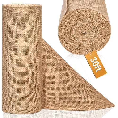
Burlap has been declared dead every year since about 2015, and every year it turns up on half the tables at every barn wedding, which tells you the material is not the issue. What dated the burlap weddings of a decade ago was that burlap was the answer to every question: runner, chair sash, jar wrap, favour bag, sign backing, bunting. When one textile covers a whole room, the room reads as a craft aisle. Used once, as a single rough band down a navy cloth with a strip of linen gauze softening its centre, burlap is doing a job nothing else does. It is the only cheap fabric that reads as agricultural, and a barn wedding needs one honest reference to the building it is in.
The pairing that makes it work is navy underneath. Burlap on a white cloth looks like a craft project because tan and white are both pale and both soft; burlap on deep navy looks like a field seen from a dark road, and the tan suddenly has something to be lighter than. The runner should be about 12 to 14 in (30 to 36 cm) wide on an 8 ft (240 cm) farm table, and the gauze strip roughly a third of that, so the eye reads two textures in a clear hierarchy. Skip the burlap napkins entirely. Rolled navy linen at each place keeps the burlap as the one rough note, and gold flatware gives the setting the single bright edge it needs.
Spacing is where most long tables fail, and the number matters more than the flowers. Unglazed clay vessels about 10 in (25 cm) across, filled with navy delphinium, white garden roses, baby’s breath and dried grasses, should sit roughly 30 to 36 in (76 to 91 cm) apart, with a pillar candle on a 10 in (25 cm) wood-slice riser between each pair. That leaves a full plate-and-elbow zone at every seat and lets the runner show between arrangements, which is the whole point of having one. Fill every inch and the table becomes a hedge; guests cannot see across it and the burlap you chose disappears under the flowers. Twine-wrapped bottles as bud vases, kept to one or two per stretch, add the handmade note without adding bulk.
Key Takeaway: Use burlap once, as a single runner on navy cloth with arrangements spaced 30 to 36 in (76 to 91 cm) apart, and it reads as rustic rather than as a craft aisle.
Navy Does Not Vanish at Dusk, It Makes the Lights Count
 Save
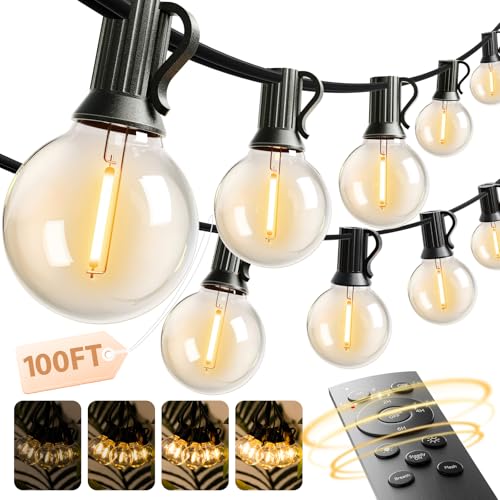
The warning you will hear from at least one planner is that navy linen outdoors disappears the moment the sun goes down, so an evening reception should use ivory cloths that stay visible. Watch what actually happens at twilight under a tree canopy. As the sky drops toward the same blue as the linen, the tables stop being objects and become part of the ground plane, and everything set on them, the cream floral clusters, the ivory cushions on the crossback chairs, the tumblers, lifts off that ground and glows. Ivory cloths at dusk do the opposite. They stay the brightest thing in the frame, brighter than the flowers and the faces, and the string lights overhead have to compete with forty white discs on the floor.
The reason is simple contrast arithmetic. String lights through a live oak canopy produce a ceiling of small amber points, and small points read best against a dark field. Navy linen extends that dark field down to table height, so the whole scene becomes lights against night, which is the picture people are trying to book when they book a garden. Keep the arrangements to white and cream, about 12 in (30 cm) across so they sit below eye level for a seated guest, and let the ivory seat cushions carry the second pale note. Gold chargers add a warm ring at each place that catches the overhead light; anything cooler, silver or glass chargers, reads as grey at this hour.
Where the received wisdom does hold is under a solid-roofed tent with no lights above the tables. There navy does go flat, because nothing is arriving from overhead to pick up the edges of the cloth. The fix is not ivory linen; it is a second layer of light at table height, one candle cluster per table at minimum, so the cloth has a source close enough to model its folds. The failure to avoid is a single string of lights on the tent perimeter and navy everywhere else, which produces a dark centre and bright edges, the reverse of a garden under a canopy. Layer the lights over the seating, not around it, and navy is the colour that makes them count.
Key Takeaway: Under string lights navy linen becomes the dark field that makes every amber point and cream bloom read, so keep the cloths navy and put the light over the tables, not around them.
One Oversized Centerpiece Beats Five Small Ones
 Save
Most centrepiece advice for long tables says to spread the budget across many small arrangements so every guest has flowers in front of them. On a bare wood farm table that advice produces a row of identical jars, and a row of identical jars is the single most common reason a rustic reception looks like a catalogue page. The version that holds up is one generous organic arrangement per 6 to 8 ft (180 to 240 cm) of table, built in a vessel with real presence, and then a lot of nothing around it. A turned wood bowl about 10 in (25 cm) across, unglazed so the grain shows, filled loosely with white garden roses, blue statice, baby’s breath and dried grasses, will spill to roughly 20 in (50 cm) wide and give the table a focal point rather than a texture.
The loose, romantic style matters as much as the size. A tight dome of the same flowers reads formal and belongs on a white cloth with a gold urn, which is a different table and a later section. Here the roses should sit at different heights, the grasses should reach past the rim, and about a third of the arrangement should be air. That looseness is what lets one large piece feel generous instead of heavy, and it is also what makes it cheaper than it looks, because grasses and statice are filler-priced and the roses are the only flower you are really paying for.
Then leave the table alone. A navy gauze runner cascading off the ends is enough colour, and its crinkle is enough texture against the flat oak. One small glass hurricane with a pillar candle, about 4 in (10 cm), placed off to one side rather than symmetrically, gives the arrangement a light source at its own scale. A round wood charger under the white plate repeats the vessel’s material at each setting so the big bowl does not feel like a stranger. Add a second candle, a second jar, a sprig at every plate, and you are back to the catalogue. The discipline is the decoration.
Key Takeaway: One loose 20 in (50 cm) arrangement in a 10 in (25 cm) wood vessel per 6 to 8 ft (180 to 240 cm) of bare table reads more generous than five matching jars, because it gives the table a focal point and leaves the wood visible.

Long Tables Do Not Feel Like a Cafeteria When You Give Them Height
 Save
The objection to long tables is always the same: two parallel rows of 8 to 10 ft (240 to 300 cm) tables look like a dining hall, and rounds are friendlier. Rounds are friendlier in a square room. In a long timber-framed barn, rounds fight the building. The rafters run one way, the floorboards run the same way, and a scatter of circles across that grain reads as clutter no matter how well each table is dressed. Two long rows in navy linen with a central aisle follow the barn’s own lines, and the navy cloth turns each row into a single dark band that the eye reads as architecture rather than furniture.
What separates a dining hall from a reception is the vertical. A long table that stops at plate height is a cafeteria whatever colour it wears. Arrangements on slim stands rising to about 48 in (120 cm), placed every 8 ft (240 cm) or so, lift the eye up into the string-light canopy and break the rows into bays. Copper-leaved heuchera with white blooms is a clever choice against navy: the foliage is warm and dark enough to bridge the linen and the honey timber, and the white keeps the arrangements legible from the far end of the room. Between the stands the tables should stay low, votives and small candles only, so guests can talk across them and the height reads as rhythm, not a wall.
Chairs decide the temperature of this room. Black crossbacks, not natural wood, are what make the navy read as deliberate: the black frames outline each dark table and stop the linen from sinking into the floor. Natural oak crossbacks would be fine with the navy on a lighter floor, but against dark boards the whole lower half of the room turns to mud. The last failure is symmetry taken too far. Perfect mirror-image rows with identical stands at identical intervals feel like a state banquet, so shift the stands so they alternate rather than face each other across the aisle, and let one row carry the taller arrangements near the entrance where the first view is taken.
Key Takeaway: Long navy tables suit a long barn when 48 in (120 cm) stands every 8 ft (240 cm) give them height and black crossback chairs outline the rows, so the room reads as architecture rather than a dining hall.
The Mason Jar Was Never the Mistake
 Save
“No mason jars” is now such standard advice that couples apologise for wanting them. Look at what the classic jar centrepiece actually is: a clear quart jar about 6 in (15 cm) tall, a cloud of baby’s breath, a wrap of burlap, a ribbon. Every element is honest and cheap and reads at a glance, which is why it spread. The reason it started to look tired had nothing to do with the jar and everything to do with what surrounded it: three jars per table in three sizes, a chalkboard, a lace doily, a wooden heart, a strand of twine bunting and a personalised tag, until the table was a gift shop. Strip that back and the jar is a good object again.
The version that holds up puts one jar on a 14 in (36 cm) log round, on a navy cloth, and stops. The slab does three things: it lifts the jar about 2 in (5 cm) so the baby’s breath sits above the plates, it gives the burlap wrap a bark edge to echo, and it draws a clean circle on the navy that frames the whole composition. The ribbon should be navy satin, tied once, not the full craft-store bow, because the satin sheen against the burlap weave is the one contrast in this centrepiece that reads as considered rather than homemade. A mercury glass square votive of about 3 in (8 cm) and a plain glass tealight holder on the same slab give it two small points of light, and a scatter of dried moss around the base ties the jar to the wood instead of leaving it standing on a plinth.
Where the mason jar genuinely fails is in a formal room. Under a crystal chandelier with a white cloth and gold chargers, the jar looks like it wandered in from a different wedding, and that mismatch is what people mean when they call it dated. On a navy cloth under string lights in a real barn it is exactly the right register. The one adjustment worth making at scale is variety across the room, not on each table: alternate jar tables with the lantern tables described later and the eye never gets the chance to count them.
Key Takeaway: A single burlap-wrapped quart jar of baby’s breath on a 14 in (36 cm) log round, on navy, holds up because it is honest and spare; it only dates the room when it is multiplied or dropped into a formal setting.

The Welcome Sign Works Before a Word Is Painted On It
 Save
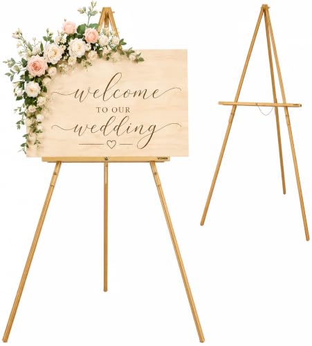
Received wisdom treats the welcome sign as a lettering job: choose the script, pick the gold, and the sign is done. Then the sign gets photographed from 15 ft (4.6 m) away at dusk and nobody can read it anyway, and what the picture actually shows is a dark rectangle on an easel with some flowers. That rectangle is the design. A board of roughly 24 by 30 in (60 by 75 cm) in a dark walnut frame, painted a flat navy and set on a 60 in (150 cm) A-frame easel, is a piece of furniture in the garden before it says anything, and the moment to judge it is with the face blank. If it looks right empty, it will look right with names on it. If it needs the lettering to look finished, the proportions are wrong.
The proportion that usually goes wrong is the frame. A thin gold frame on a navy board reads as a mirror from a distance; a 2 in (5 cm) dark walnut frame reads as an object with weight, and it repeats the crossback chairs and the barn timber the guest is about to walk into. Matte navy paint, not gloss, because gloss throws back the string lights as a white streak across the message. If you want to name the colour for a painter, Sherwin-Williams Naval SW 6244 is the one navy this article will put a number to, a deep true navy with no purple in it, confirmed on the brand’s own site; anything sold as “midnight” or “ink” is usually warmer or greener and will not match the linens.
Then the garland, which is what the guest actually notices. Two corners, not four, and diagonally opposite, so the eucalyptus, cream roses and baby’s breath describe a soft curve across the board rather than a wreath around it. The upper-left cluster should be the larger, roughly 14 in (36 cm), with the lower-right about two-thirds of that, and both should trail past the frame onto the easel leg so the sign and its stand read as one thing. Wire the stems to the frame, not the easel, because easels get moved. Lettering, when it comes, is a thin gold script kept to the upper two-thirds of the face so it does not collide with the flowers, and it should be the last decision, not the first.
Key Takeaway: Judge the welcome sign with a blank face: a 24 by 30 in (60 by 75 cm) matte navy board in a 2 in (5 cm) walnut frame with two diagonal garlands is the design, and the lettering is the finishing detail.
Navy Needs a Third Colour, Not a Stricter Palette
 Save
The tidy rule is that navy is strong enough to carry a wedding with white alone, so add nothing else and the room will look restrained. In practice navy and white with no third colour looks like a uniform. Across a barn full of 60 in (152 cm) rounds in navy linen, all-white centrepieces read as identical pale blobs from the door, and the navy cloths become a flat plane the eye slides over. What holds up is a third colour that sits between the two: purple and blue-violet blooms mixed with the white, so each centrepiece contains a colour that belongs to the navy and a colour that belongs to the white. The arrangements then bridge the cloth and the candlelight rather than sitting on top of the cloth like a hat.
Purple works where dusty rose or peach would not because it shares a parent with the navy. Delphinium, statice, lisianthus and thistle in the blue-violet range read as darker white in the amber light rather than as a competing colour, and they stop the white roses from looking clinical. Keep the ratio around two parts white to one part purple-blue with greenery filling the rest, in clear glass vessels of mixed heights so the glass disappears and the flowers seem to float. On a polished concrete floor, which is what many converted barns actually have, the navy cloth is the only thing separating the tables from the ground, and the purple in the flowers is what keeps that navy from reading as grey.
Then give the room two soft edges. A sheer white drape framing one wall throws diffused light back into the space and gives the navy something to be dark against; without it, dark tables, dark floor and dark timber walls close in. Potted trees along the back wall do the same at a lower level. The failure this section prevents is the over-corrected version: five colours in the florals because someone was told navy is “so versatile.” Three is the number. Navy, white, one bridging colour, and warm candlelight doing the rest.
Key Takeaway: Navy and white alone read as a uniform across a room of rounds; a two-to-one mix of white and blue-violet blooms bridges the cloth and the candlelight and is the only third colour you need.

A Formal Table Sits Comfortably in a Barn
 Save
The line you will read on every planning forum is that formal and rustic cancel each other out, so pick one: either the barn with the jars or the ballroom with the urns. That rule protects people from a real mistake, which is mixing registers on the same table, but it overshoots. A fully formal table in a barn is not a contradiction; it is a contrast, and contrast is what makes a timber room feel like a chosen setting rather than a fallback. What matters is that the table is formal all the way through and the barn is left rustic all the way through, so the two meet only at the edge of the cloth.
The formal table done properly on a 60 in (152 cm) round: white linen to the floor, a narrow navy satin runner about 10 in (25 cm) wide, 13 in (33 cm) gold chargers, navy napkins, gold flatware and clear crystal for water. The centrepiece is a dense dome of white hydrangea, white roses and baby’s breath about 18 in (45 cm) across in a brushed gold compote urn roughly 10 in (25 cm) tall, with small glass votives clustered at the base. The dome is deliberate: a loose arrangement would drift toward the rustic register and blur the contrast. Here navy is at its most restrained, a runner and a napkin, and the reason is that the white cloth and gold are already carrying the formality; navy is the note that ties the table back to the room.
What you leave rustic is the envelope. Wooden crossback chairs, not gold chiavari, so the formal table sits in honest seating. The timber framing stays bare. A crystal chandelier hung among string lights in the rafters is the one place the two registers are allowed to touch overhead, and it works because both are light sources rather than surfaces. The failure mode is dressing the barn to match the table: white drape on every beam, a white dance floor, uplights washing the timber. At that point you have rented a barn to hide it, and the formal table loses the contrast that made it interesting. Keep the table formal, the room rustic, and the window behind a white floral arch as the one moment where they are introduced.
Key Takeaway: A fully formal white, navy and gold table works in a barn as long as the table is formal all the way through and the room is left rustic all the way through, meeting only at the edge of the cloth.

Navy in the Glass Beats Navy on the Cloth
 Save
The assumption behind almost every navy wedding is that the navy lives in the tablecloth, because the cloth is the biggest surface and the colour is the theme. It is the most expensive way to use the colour and often the least flattering. Full navy linen on every round darkens the whole floor of a garden reception at exactly the hour the light is going, and it puts the strongest colour where nobody is looking, under the plates. Move the navy up to eye level and into the objects people touch, and a cream cloth can carry the room while the navy does more work in a tenth of the area.
The most effective single object is the goblet. A deep navy diamond-cut glass about 8 in (20 cm) tall at each setting puts the colour at the height a seated guest actually sees, and cut glass does something plain linen cannot: it fractures candlelight into small navy and gold points every time it is lifted. Eight goblets on a 60 in (152 cm) round hold more visible navy at dusk than the cloth would, because the cloth is below the sightline and mostly covered. Add navy napkins on gold 13 in (33 cm) chargers and the colour appears twice at each place, once matte and once faceted, and that repetition is what reads as a scheme rather than a tablecloth order.
The cream cloth then becomes the ground for a garland runner rather than a competitor to it. Eucalyptus with white roses and blue delphinium laid across the centre, with five slim gold candlesticks holding ivory tapers rising out of it and votives scattered along its length, gives the table its height and light without any single arrangement. Keep the tapers to about 10 in (25 cm) so they clear the garland and stay below eye level once lit. The failure this avoids is the navy-everywhere table where cloth, napkin, runner and glass are all the same colour and none of them registers. Navy has to be scarce somewhere to be noticed anywhere.
Key Takeaway: Put the navy in the diamond-cut goblet and the napkin and leave the cloth cream, because faceted glass at eye level carries more visible colour at dusk than a full cloth ever will.

The Lantern Earns Its Place When the Flowers Stay Low
 Save
The lantern centrepiece gets dismissed as a cliché in the same breath as the mason jar, and for a similar reason: it has been done badly so often that the object took the blame. The bad version is a 12 in (30 cm) lantern with a tall arrangement beside it, so the table has two competing verticals and a guest cannot see past either of them. The version that holds up is the lantern as the only tall thing on the table, with a ring of flowers kept low and flat around its base. A ring of about 14 in (36 cm) across and no more than 4 in (10 cm) high, built from eucalyptus, dusty rose and white roses and baby’s breath, gives the lantern a soft foot without adding a second silhouette.
The lantern has to be black, not gold or white, on this table. Black metal against a white cloth and a crinkled navy gauze runner is the strongest graphic element in the room, and it is what lets the softer colours work. Dusty rose is the third colour here, and it is a riskier one than the purple used earlier, because pink and navy can drift toward a nursery. The black lantern and black flatware are what stop that drift; they hold the scheme in an adult register and give the dusty pink something serious to sit beside. A 4 in (10 cm) white pillar inside the lantern, lit, is the table’s light source, and because the glass sides diffuse it, the flame is at eye level without being in anyone’s eyes.
The rest of the setting should repeat the two textures already on the table. A 13 in (33 cm) wicker charger under a plain white plate carries the rustic half at each place, and a navy napkin carries the colour, so nothing new is introduced. A small plain wood block tucked into the ring is a natural spot for a table number if you want one, and left bare it still reads as part of the rustic vocabulary. The failure to avoid is the lantern table that keeps growing: a second lantern, a jar, a frame, a runner of petals. One lantern, one low ring, one runner, and the table is finished.
Key Takeaway: A 12 in (30 cm) black lantern works when it is the only vertical on the table and the flowers are kept to a ring no higher than 4 in (10 cm), with black flatware holding dusty rose and navy in an adult register.

Rustic Does Not Mean Distressed
 Save
There is a version of rustic that insists every surface be weathered, chipped, whitewashed or wrapped in twine, and it produces tables that look like they were assembled from a salvage yard. The building supplies the age. Once you are inside a timber barn or under an oak, the rustic half of the brief is already met by the walls and the rafters, and the table is free to be clean. A smooth navy cloth, a plain white 10 in (25 cm) plate, gold flatware and a single white cylinder vase about 5 in (13 cm) across is the most modern table in this article, and in a barn it reads as more rustic than a distressed one, because the contrast between the clean setting and the rough room is doing the work.
The vase is the whole centrepiece, and the plumes are why it works. White garden roses and baby’s breath sit low at the rim, and three or four cream pampas plumes arch up and outward to roughly 30 in (76 cm). Pampas gives height without weight and catches the light like the string bulbs overhead, and its cream reads as a warm white against the navy where a pure white would look cold. The cylinder vase must be matte white ceramic, not clear glass, so the stems stay hidden and the shape reads as a solid column; that solidity is what makes one vase enough. Space them every 4 ft (120 cm) along the table and stagger them slightly off the centreline.
The cloth is the honest part. This table uses a smooth polyester or satin-finish navy, the kind you can rent by the hundred, and the reason it looks right is that nothing on the table pretends to be linen or burlap. A navy satin napkin folded flat on the plate matches the cloth exactly and keeps the setting to two materials, cloth and ceramic, with gold as the edge. The failure mode is the half measure: a smooth navy cloth with a burlap runner and a jar, which puts the salvage yard back on a table that was trying to be clean. Choose the clean register and hold it to the last fork.
Key Takeaway: In a timber room the building supplies the age, so a smooth navy cloth, plain white plates and one matte ceramic cylinder with pampas reads as more rustic than a distressed table, not less.

Handmade Shows, and That Is the Point
 Save
The fear behind most DIY decor is that it will look DIY, and the standard fix is to buy your way out of it with rentals that look professional. That misreads what guests respond to in a barn. A jar wrapped by hand with burlap and a strip of lace, set on a 12 in (30 cm) wood slice on a navy gauze runner, looks handmade, and in this setting handmade is the compliment. What makes DIY look cheap is not the materials or the hand that assembled them; it is inconsistency. Ten jars wrapped ten different ways, at ten different heights, with ribbon ends of ten different lengths, read as a rush job. Ten jars wrapped identically read as a decision.
So the discipline is repetition, not spending. Cut the burlap strips to one width, about 4 in (10 cm), and the lace trim to one width, about 1 in (2.5 cm), and fix both with a glue dot at the back seam rather than a knotted bow so each jar has the same clean profile from the front. Use one flower type per jar: a single white rose with a stem or two of baby’s breath is enough, because the jar is a quart, about 6 in (15 cm), and anything fuller hides the wrap you just made. A small glass tealight beside the jar, not in front of it, gives it a light at its own scale. The wood-slice round under each one should be roughly the same diameter across the room, which usually means buying a bag of slices rather than cutting your own from a log that tapers.
From the guides
You've saved it, wanted it. Here's the how: codes, measurements, order. Your choices make it yours.
The Japandi Honest PlaybookThe honest version of the style: what to keep, what to skip, and the order to do it in.See inside →The Room Refresh PlaybookA repeatable four-step method, room by room, in ten minutes, thirty minutes, or one weekend.See inside →Make Any Room Feel Cozy on PurposeWhy some rooms hold people and others empty out, and the moves that change it.See inside →The navy runner is what separates this table from a craft fair. A crinkled gauze in deep navy on bare wood gives the honey tones a dark ground, and the crinkle means it never needs pressing, which is exactly the kind of practical detail a DIY table depends on. A second bare wood slice leaning against the jar is the natural place for a hand-lettered number and stays part of the composition even when it is blank. The failure mode is adding a printed element to “finish” the handmade table: a glossy card, a foil-stamped label. Those signal that you did not trust your own work. Let the wrap and the wood carry it.
Key Takeaway: DIY reads as intentional when every jar is wrapped identically, with 4 in (10 cm) burlap and 1 in (2.5 cm) lace fixed at the back seam, on matching wood slices along one navy gauze runner.

Satin Belongs on the Tall Tables
 Save
Satin gets ruled out of rustic weddings on sight, because a shiny cloth on a farm table does look wrong. But the tall standing tables around the edge of a reception, the 42 in (107 cm) highboys guests lean on before dinner, are a different piece of furniture with a different problem. A highboy has a small top and a lot of leg, and the standard fix, a stretch cover in polyester, makes it look like a stool in a sock. A full-length navy satin drape, gathered at the waist into an hourglass, turns that awkward proportion into a column, and satin is the one fabric heavy enough to drop straight from a 30 in (76 cm) top to the floor without clinging to the legs. This is where the sheen belongs: at standing height, catching the light, on a table nobody eats at.
The cinch is the design decision. A cluster of navy, dusty blue and ivory garden roses with eucalyptus and a few gold filler stems, wired around the waist of the drape, gives the column its narrowest point at about 24 in (60 cm) from the floor and makes the fabric above and below it bell out. Keep the cluster to about 10 in (25 cm) across; larger and it becomes a bouquet that happens to be attached to a table. Dusty blue is doing quiet work here, sitting between the navy satin and the ivory rose so the cluster does not read as two hard colours on a shiny ground.
On top, one object only. A gold Moroccan filigree lantern about 18 in (46 cm) tall holding an unlit ivory pillar is the right scale for a 30 in (76 cm) top and the right amount of ornament against a plain drape, and its cut metal echoes the diamond-cut goblets and gold chargers from the dining tables so the highboys feel like part of the same wedding. Leave the candle unlit at standing tables; elbows and sleeves cross that surface all evening. The failure mode is treating the highboys as extra dining tables with small versions of the centrepiece. They are lamps you can stand next to, and dressing them as columns of navy satin is the one place in a barn where the fabric everyone told you to avoid is exactly right.
Key Takeaway: Navy satin belongs on the 42 in (107 cm) highboys, draped to the floor and cinched at the waist with a 10 in (25 cm) rose cluster, because it turns an awkward table into a column and puts the sheen at standing height where it reads.
Navy as the Accent Is the Version That Photographs Best
 Save
If the keyword is navy, the received logic goes, navy should dominate, and a table that is mostly cream is a different wedding. The tables that photograph best in this palette say otherwise. On an 8 ft (244 cm) harvest table in cream linen, navy appears in exactly two places: the taper candles and the satin napkins. That is a small fraction of the visible surface, and yet every photograph of the table reads as a navy wedding, because the eye finds the darkest object first and the navy tapers are the darkest objects on the table. A colour used as the accent gets credited with the whole scheme; a colour used as the ground gets ignored.
The rest of the table is built to make those two navy notes count. A full-length garland of powder-blue hydrangea, ivory garden roses and eucalyptus runs the whole table, and powder blue is the bridge that keeps navy from reading as an outsider on a cream cloth. Gold candlesticks of 8 to 12 in (20 to 30 cm) hold the navy tapers at intervals of about 3 ft (90 cm); tapers of mixed heights look intentional, tapers of one height look rented. At the centre a tall clear vase of about 24 in (61 cm) holds a single olive branch, which gives the table a silver-green canopy without blocking the view across it, because an olive branch is mostly air.
Each place repeats the accent logic. A 13 in (33 cm) white porcelain charger with a gold rim, a navy satin napkin folded flat beside it rather than on it, so the navy sits as a rectangle of colour on the cream, gold flatware, and a tall clear glass of sparkling water. A sprig of eucalyptus on the charger is the only decoration at the setting. The failure mode is the reflex to add navy back in: a navy runner under the garland, navy ribbon on the chairs, until the accent becomes the ground and the tapers stop registering. Under overcast light especially, which flattens everything, a cream table with two navy notes keeps its contrast, and a navy table with cream notes goes grey.
Key Takeaway: On a cream harvest table, navy tapers and navy napkins are enough to make the whole scheme read as navy in photographs, because the eye credits the darkest object with the palette.

Matching Every Table Makes a Big Room Feel Smaller
 Save
The instinct with a big tent is to make every table identical so the room looks organised, and the result is the opposite: twenty identical navy rounds under a white tent become a pattern the eye reads in one glance and then stops looking at, and the tent feels like a cafeteria however good each table is. Alternating the cloths, navy on one table and cream on the next in a checker across the floor, breaks that pattern. The eye moves from dark to light and back, the tent reads as bigger because it is being read one table at a time, and each navy table gets a cream neighbour to be dark against.
The cross-runner is what makes the two cloth colours belong to the same wedding. On the cream tables a navy strip about 14 in (36 cm) wide crosses the centre, and on the navy tables a 12 by 12 in (30 by 30 cm) burlap square sits under the centrepiece, so every table carries the same three materials in a different order. The centrepieces stay small and identical on purpose: a low cluster of small white flowers and a metal lantern of 10 to 14 in (25 to 36 cm), because the variation is already in the cloths and adding variation in the flowers would turn the checker into noise. White folding chairs, the plain metal kind, are right here; anything fancier fights the deliberately simple tables.
The tent itself does the rest. Gathered white fabric at about 14 ft (427 cm) clearance softens the frame and bounces daylight, and that diffused light from the side walls is what keeps the navy polyester from going flat; it is the one venue in this article where you should not draw the walls closed. The failure mode is the half-alternated room, where the cloths alternate in one row and not the next because the linen order came up short. Count the tables, order exactly half in each colour plus one spare of each, and lay the checker from the entrance so the first table a guest sees is navy and the second is cream.
Key Takeaway: Alternate navy and cream cloths in a checker across a tent and tie them with a navy strip on cream tables and a burlap square on navy ones, because varying the ground is what makes twenty identical centrepieces read as a room rather than a pattern.

Put the Navy in the Aisle, Not on the Arch
 Save
Ceremony advice for a navy wedding almost always starts with the arch: drape it in navy chiffon, hang navy ribbon, add navy flowers. Think about what the arch is for. It frames two people in the one set of photographs that will be looked at most, and a navy panel behind them turns both faces grey in overcast light and fights with a navy suit. The arch should be timber and flowers, and the navy belongs on the ground. A long matte navy linen runner laid down the aisle over cut grass is a stripe of colour in every wide ceremony shot, it hides the trampled turf, and it is the first thing guests see when they arrive, before the arch even registers.
The arbor itself does more when it is dressed less. Two rough-sawn cedar posts with a cross beam, around 7 ft (2.1 m) tall and 6 ft (1.8 m) wide, need only one swag of eucalyptus, white roses and baby’s breath along one post and the corner above it. Dressing both sides symmetrically makes a doorway; dressing one side makes a frame, and the bare cedar on the other side keeps the structure honest. Anchor the posts with sandbags hidden in the grass rather than stakes if the site is a rented meadow. Two black iron lanterns at the outer corners of the base, candles unlit in daylight, mark the end of the aisle without adding height.
The runner has a practical dimension most people skip. Grass is uneven, so a lightweight polyester aisle runner ripples and shows every footprint; a heavier linen or linen-look cloth about 36 in (90 cm) wide lies flat and reads as fabric rather than plastic. Pin it at 3 ft (90 cm) intervals with landscape staples pushed through the hem, and roll it out no more than an hour before the ceremony so it does not take up dew. Seating in natural pine benches rather than folding chairs keeps the lines simple, and a single sprig of eucalyptus on each bench end is the only decoration the seating needs. The failure mode is the navy-draped arch with a white aisle, which puts the colour where the faces are and leaves the ground the same as any other field.
Key Takeaway: Keep the arbor to bare cedar with one asymmetric swag and lay a 36 in (90 cm) navy linen runner down the aisle, because navy behind faces greys them out and navy underfoot is in every wide shot.

String Lights Alone Leave the Tables Dark
 Save
String lights are treated as the complete lighting plan for a barn, and a rafter full of warm globes does give a room its glow in wide photographs. Sit at a table under them and the maths changes. A bulb 20 ft (6 m) overhead throws very little usable light onto a plate, and a navy cloth absorbs most of what arrives. The room looks lit from the doorway and feels dim from a chair, and guests spend the evening leaning into the one candle in the middle of the table. What holds up is three layers at three heights: the string lights overhead for the room, candles at table height for the faces, and lanterns at floor level for the edges and the walls.
The table layer is the one that matters for a navy scheme. Ivory pillars in clear glass hurricanes, one every 24 to 30 in (60 to 76 cm) along an 8 ft (240 cm) table, put a flame about 8 in (20 cm) above the cloth, which is exactly the height that models the linen’s folds and lights a face across the table without glare. Clear hurricanes rather than coloured or mercury glass, because the navy cloth needs the light to arrive uncoloured; amber glass on navy produces a muddy green. Eucalyptus trailing between the hurricanes softens the row and hides the bases. Battery pillars are acceptable if the venue bans open flame, but choose ones with a real wax shell and a warm colour temperature, and set them all to the same flicker mode.
The floor layer is what most rooms skip and what makes the difference between a lit table and a lit barn. Tall black iron lanterns of about 24 to 30 in (60 to 76 cm), placed in pairs at the base of timber posts and at the corners of the dance floor, throw light up the posts and give the walls a surface, so the dark timber stops swallowing the room. The failure mode is doubling the string lights instead: a second and third run in the rafters brightens the ceiling, which was never the problem, and leaves the tables exactly as dark as before. Light the room from the bottom two layers and let the string lights be the sky.
Key Takeaway: A barn needs light at three heights, string lights overhead, ivory pillars in clear hurricanes every 24 to 30 in (60 to 76 cm) on the table, and 24 to 30 in (60 to 76 cm) floor lanterns at the posts, because overhead bulbs alone leave navy tables dark.

The Drink Station Deserves the Same Table as the Guests
 Save
Drinks stations are the afterthought of most reception plans: a folding table against a wall with a plastic cloth and whatever dispensers the caterer brought. Every guest visits it several times, it sits in the background of dozens of candid photographs, and it is usually the one surface in the room that ignores the scheme. Treat it as a table like any other. An 8 ft (240 cm) bare oak farm table with a navy linen runner down its length, the same runner as the guest tables, brings the station into the room; a white plastic cloth takes it out.
The set-up that holds up is two glass dispensers and one pitcher. Lemonade with sliced lemons in one, iced tea with lemon wheels in the other, and a pitcher of sparkling water for anyone who wants neither. Three choices is enough; more than three means more dispensers than the table can carry and a queue while people decide. Set each dispenser on a wood-slice riser of 4 to 6 in (10 to 15 cm) so the spigot clears the rim of a tumbler without tilting, which is the single most common practical failure at a self-serve table. Plain clear tumblers on a wicker tray, not stemmed glasses, because stems tip on a bare wood table and the tray keeps the glasses from spreading across the runner.
Then decorate it as lightly as you would a guest table. One low arrangement of eucalyptus and white roses in an unglazed clay pot at one end, a stack of navy linen napkins, and nothing else on the surface. The lemon yellow in the dispensers is a colour the rest of the wedding does not have, and against the navy runner it is exactly the small bright accent a drinks table wants, so do not compete with it. Position matters: the station should be visible from the entrance and reachable without crossing the dance floor, usually along a side wall about 10 ft (3 m) from the nearest guest table, and it needs a second bare table behind it for refills and ice out of sight. The failure mode is the station that looks like a different event from the tables it serves.
Key Takeaway: Give the drinks station a bare oak table with the same navy runner as the guests, two dispensers of lemonade and iced tea on 4 to 6 in (10 to 15 cm) risers plus a pitcher of sparkling water, and it becomes part of the room instead of a caterer’s corner.

The Cake Table Is Where Navy Can Go Darkest
 Save
Cake tables in a navy wedding default to white: white cloth, white cake, white flowers, on the logic that the cake should be the brightest thing in the room. It is the brightest thing in the room already. What a white cake needs is the darkest ground you can give it, and the cake table is the one surface in a barn where navy can go as deep and heavy as the fabric allows, because nobody sits at it and nothing else has to read against it. A 48 in (120 cm) round draped to the floor in navy velvet, not satin and not polyester, gives a three-tier white buttercream cake a matte, light-absorbing base that makes every ridge of the frosting stand out under a single string-light run.
Velvet is the choice for a specific reason. Satin on the cake table throws highlights that compete with the cake in photographs, and polyester reads flat and slightly blue under warm light. Velvet reads as near-black navy with soft depth, and in the one set of photographs that will be taken straight on at close range, that depth is the whole background. It also justifies the expense: one 120 in (305 cm) round of velvet is a single rental, where velvet on every guest table would be the most expensive line on the linen order.
Then keep the top of the table nearly empty. The cake sits on a raw-edge oak slab about 2 in (5 cm) thick, which puts the barn’s material directly under the buttercream and is the only rustic note the table needs. One trail of eucalyptus and two white roses laid against the base of the bottom tier, a pair of brass candlesticks at the outer edge with tapers unlit until the cutting, a short stack of small white plates and a row of gold forks on a napkin to one side. No cake topper, no scattered petals, no second arrangement. The failure mode is the cake table dressed as a display: bunting behind it, a frame beside it, a runner of flowers in front, until the cake is one object among a dozen. It is the object. Everything else on the table is there to be dark, low, and quiet.
Key Takeaway: Drape the cake table in navy velvet to the floor and stand the white cake on a 2 in (5 cm) raw oak slab, because the cake is already the brightest thing in the room and what it needs is the darkest, quietest ground you can give it.

Chair Covers Cannot Fix a Chair, and You Do Not Need Them
 Save
The rule passed down from hotel ballrooms is that rental chairs are ugly and should be covered, with a sash in the wedding colour on every one. In a barn that rule produces two hundred navy-sashed white socks, and it is the single fastest way to make a timber room look like a conference. The truth is that a chair cover cannot fix a chair; it can only hide one, and the chairs available to a rustic wedding no longer need hiding. A natural oak crossback with an ivory linen seat cushion is a finished object, and at roughly $7 to $9.50 per chair per event from most regional rental companies, it is usually cheaper than a folding chair plus a cover plus a sash once labour is counted.
Which chair is the real decision, and navy makes it clearer. Natural oak or fruitwood crossbacks suit navy on a pale floor or against whitewashed walls, where the honey frame reads as warm against the cloth. Black crossbacks suit navy on a dark floor, as the long-table section explained. Gold chiavari chairs suit the formal white-cloth table and almost nothing else in a barn. Plain white metal folding chairs are right for the alternating-cloth tent and the daytime garden. Whatever you choose, choose one and use it everywhere except the highboys, because a room that mixes two chair types looks like it ran out of the first.
Decoration on chairs should be nearly nothing. A sprig of eucalyptus tied with a short length of navy satin ribbon to the aisle-end chair of each ceremony row, and only those chairs, gives the aisle a rhythm and costs about a minute per row. Every chair decorated is noise; every fourth chair decorated is a line. Skip cushion ties in the wedding colour, skip chair signs, skip the draped fabric across the backs of the head table. The failure mode is spending on covers to correct a bad chair choice. Put that money into the chair itself and leave it bare.
Key Takeaway: Choose one finished chair, oak crossbacks for pale floors and black for dark ones, and decorate only the aisle-end chairs with a eucalyptus sprig and navy ribbon, because a cover hides a chair and never fixes one.

A Lounge Corner Is Not a Luxury in a Barn
 Save
Lounge furniture at a wedding gets filed under luxury, something you add if there is money left after the flowers. In a barn it is closer to a necessity, for a structural reason: a barn is one large room with no natural edges, and guests who are not dancing have nowhere to be except their dinner chair. A lounge corner gives the room a second place, and it is also where the navy of the tables can become the navy of a piece of furniture, which anchors the colour more firmly than any cloth. A deep navy velvet three-seat sofa with plain ivory linen cushions is the one piece worth renting; everything around it can be cheaper.
The composition that holds up is a sofa, two rattan armchairs and a low oak slab table on a jute rug, arranged in a U facing the dance floor so the group is part of the room rather than a retreat from it. The rug is the boundary: a flat-woven jute of about 8 by 10 ft (240 by 300 cm) draws the corner on the floorboards, and the furniture should sit fully on it so the edge is clean. Rattan armchairs rather than a matching second sofa keep the group from looking like a furniture showroom, and their honey tone repeats the crossback chairs. The oak slab table on black iron legs carries the drinks station’s materials, raw wood and black metal, into the seating.
Dress it as a room, not a table. A low clay pot of eucalyptus, a pitcher of iced tea and a few clear tumblers on the slab, two black floor lanterns at the outer corners of the rug, and a single wrap of eucalyptus around the nearest timber post to tie the corner to the building. No throw pillows in five patterns, no blanket ladder, no faux-fur throws; those turn a wedding lounge into a furniture pin. Place the lounge within sight of the drinks station and at least 12 ft (3.7 m) from any speaker so it is usable during the dancing. The failure mode is the lounge set that arrives as a rental package of white leather and acrylic, which belongs in a hotel and will fight every other material in the barn.
Key Takeaway: One navy velvet sofa with two rattan armchairs and an oak slab table on an 8 by 10 ft (240 by 300 cm) jute rug gives a barn its second place and anchors the navy in a piece of furniture rather than a cloth.

Three Navies Are Not the Same Navy Once the Sun Goes Down
 Save
The last piece of received wisdom is the quietest and the most expensive: navy is navy, so order it from wherever is cheapest and it will all match. Lay three navy textiles on a bare oak table in daylight and they already disagree. Linen reads as a soft, slightly greyed navy with visible weave. Crinkled cheesecloth gauze reads lighter, almost a dusty blue, because the crinkle scatters light. Satin reads darkest and coolest, with a sheen that shifts toward purple as the fabric folds. Under an overcast sky those differences are mild. Under warm string light and candles at night they widen: the linen warms toward a deep teal-navy, the gauze goes soft and smoky, and the satin stays cold and picks up every bulb as a white streak.
None of this means you should use one fabric. It means the three have jobs, and the jobs match what this article has already laid out. Linen for the ground, on guest tables and runners, because it warms with the light and takes candlelight without glare. Gauze for the softening layer, the runner over a white or bare wood table, because its lightness is the point. Satin for the vertical, on the highboys and in the napkins and ribbon, because the sheen reads at eye level and disappears at plate level. What fails is mixing them without a plan, a satin runner on a linen cloth beside a gauze-draped chair, so three navies sit within a foot of each other and read as three separate orders that did not match.
The check is simple and worth the afternoon. Get one sample of each fabric you intend to rent or buy, lay them on a piece of the actual table or a wood board, and photograph them together twice: once outdoors in flat daylight and once in the evening under a warm string light or a table lamp with a warm bulb. Look at the two photographs side by side and decide which fabric goes where based on the night picture, since that is the one guests will remember. If two navies from two suppliers are meant to touch on the same table, they must pass this test together. If they do not, change the plan rather than the supplier: put the odd one out on the highboys or the cake table, where it never has to sit beside another navy.
Key Takeaway: Linen, gauze and satin are three different navies once the light goes warm, so give linen the ground, gauze the softening runner and satin the verticals, and photograph samples together at night before any two of them share a table.

Every rule this article tested was written for a room with white walls and a flat ceiling, and a barn is neither. Navy behaves differently in timber and under string light: it warms as the light drops, it makes small points of light count, and it needs a third colour and a change of texture more than it needs a stricter palette. The moves that held up are the ones that put the colour where the eye actually goes, in the goblet, the taper, the napkin and the aisle, and left the largest surfaces to do their quiet work as ground. The moves that failed were the ones that multiplied a good object until it became a pattern, or dressed the barn to match a table instead of letting the two contrast. Before you order a single cloth, take three navy samples out to the venue at dusk with a candle and a string of lights, photograph them on the real table, and let that picture, not the rule you were told, decide where each navy goes.
From the guides
You've saved it, wanted it. Here's the how: codes, measurements, order. Your choices make it yours.
The Japandi Honest PlaybookThe honest version of the style: what to keep, what to skip, and the order to do it in.See inside →The Room Refresh PlaybookA repeatable four-step method, room by room, in ten minutes, thirty minutes, or one weekend.See inside →Make Any Room Feel Cozy on PurposeWhy some rooms hold people and others empty out, and the moves that change it.See inside → Save