Georgia
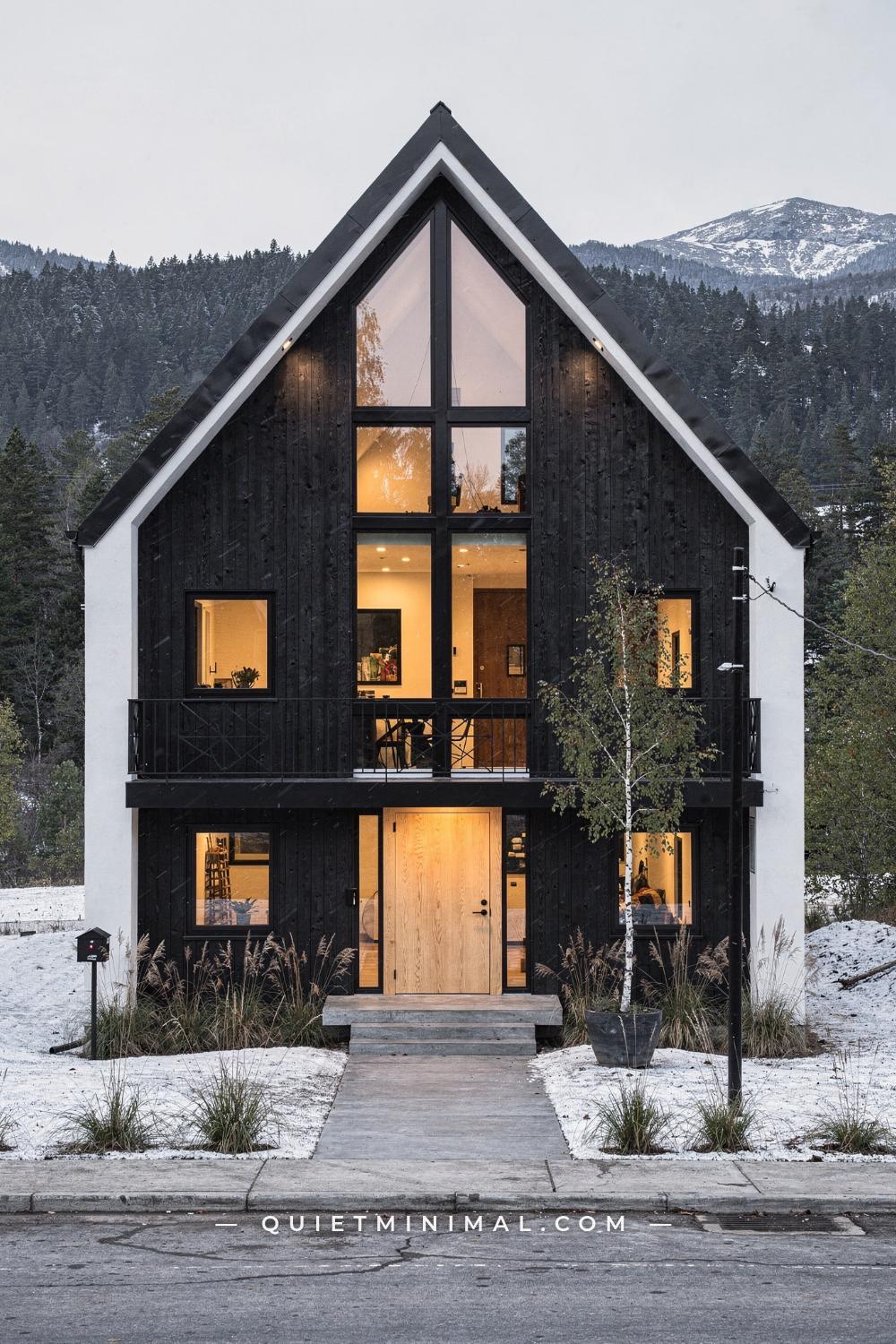
If you’ve saved dozens of Nordic house exterior photos and your own facade still looks nothing like them, the problem almost certainly isn’t your taste or your budget. It’s one of a dozen very specific mistakes that sever the visual logic the style depends on. Nordic exteriors read as effortless because every element reinforces the same three ideas: simplicity of form, honesty of material, and restraint of palette. When one element breaks that agreement, the whole facade looks off in a way that’s hard to name but impossible to miss. This article goes through each of those breaks one by one: what the failure looks like from the street, why it happens at the level of proportion or material, and exactly what to replace or adjust to bring the design back into focus.
Your Siding Direction Is Horizontal When the Style Demands Vertical
 Save
The orientation of your siding boards is one of the most consequential decisions on a Nordic facade, and it’s the one most often defaulted to horizontal because horizontal lap siding is what contractors stock and install by habit. The problem is directional. Horizontal siding runs the eye along the widest dimension of the house, making a two-story home read as a low, squat box from the street. Nordic architecture does the opposite: it uses vertical boards to pull the eye upward, reinforcing the steep pitch of the gable roof and making the whole structure feel taller and more slender than it actually is.
The specific format to reach for is board-and-batten, where a wide vertical board (typically 8 to 12 inches, or 20 to 30 centimeters, wide) alternates with a narrow batten strip (typically 2 to 3 inches, or 5 to 7.5 centimeters, wide) covering the seam. The shadow line the batten creates is the operative detail: it deepens the texture of the facade and gives the surface a hand-crafted weight that flat horizontal planks simply cannot produce. When you look at Scandinavian homes in Stockholm or Oslo, that shadow-line rhythm is what your eye is reading as “Nordic,” even if you can’t articulate it consciously.
The fix is not always a full re-clad. If your house currently has horizontal vinyl or fiber cement siding, one option is to apply vertical board-and-batten over the existing surface on the front gable face only. Even cladding a single elevation or one prominent section in vertical boards changes the visual logic of the whole facade from the street, because the gable is where the eye lands first. Pair it with a coat of matte black or deep charcoal stain, and the transformation in silhouette is immediate.
The failure mode to avoid here: board-and-batten applied horizontally. It exists as a product, and some contractors will offer it as a “similar option.” It delivers none of the vertical lift the style relies on, and it tends to look like modern farmhouse rather than Nordic. Direction matters more than the product itself.
From the guides
You've saved it, wanted it. Here's the how: codes, measurements, order. Your choices make it yours.
 The Japandi Honest PlaybookThe honest version of the style: what to keep, what to skip, and the order to do it in.See inside →
 The Room Refresh PlaybookA repeatable four-step method, room by room, in ten minutes, thirty minutes, or one weekend.See inside →
 Make Any Room Feel Cozy on PurposeWhy some rooms hold people and others empty out, and the moves that change it.See inside →
Key Takeaway: Switching siding orientation from horizontal to vertical board-and-batten is the single highest-impact change you can make to a Nordic facade because it fixes the proportional problem at the source.

Your Trim Color Is Matching the Siding When It Should Contrast It
 Save
When siding and trim are the same color, the facade reads as one undifferentiated mass from the street. This is the opposite of what Nordic architecture does. The style is built on high-contrast pairing: body versus trim, wall versus frame, cladding versus soffit. That contrast is not decorative. It serves a functional purpose. It makes the outline of the structure legible at a distance, it separates architectural planes from each other, and it gives windows and doors the visual weight they need to anchor the composition.
The classic Nordic palette operates on two moves. Move one is the dark body with light trim: charcoal or matte black vertical cladding with white or warm off-white fascia, window surrounds, and soffit. Move two is the light body with dark trim: white or pale pine siding with matte black window frames and door. Both work because the contrast is sharp enough to be read clearly, even from across the street. Many Scandinavian exterior house designs showcase pale wood or white vertical siding with black as the accent color for window frames, entry door, garage door, and roof. That formula is not arbitrary. The light field of the cladding requires the dark punctuation of the frames to stop the eye and create hierarchy.
The failure mode to avoid is the “greige sandwich”: a medium-toned greige siding with slightly lighter greige trim. It reads as one muddy tone and destroys the clean plane separation Nordic architecture depends on. If you’re unsure whether your contrast is strong enough, photograph the facade in black-and-white on your phone. If body and trim look nearly the same value, they are too close.
For the fix, you do not need to repaint the whole house. Start with the window frames and the fascia board. Painting just those elements in a contrast color will do 80% of the visual work. Choose a trim white with a warm undertone, specifically Sherwin-Williams Extra White SW 7006 or Benjamin Moore Chantilly Lace OC-65 for light trim against dark siding. For dark trim against light siding, Benjamin Moore Wrought Iron 2124-10 or Sherwin-Williams Iron Ore SW 7069 are the standards Nordic-influenced designers reach for repeatedly.
Key Takeaway: High contrast between body and trim is structural to the Nordic look, not optional, and the fastest fix is repainting just the window frames and fascia before touching anything else.
Your Roof Pitch Is Too Shallow for the Gable to Do Its Job
 Save
The gable roof is the defining silhouette of Nordic residential architecture. It is what separates a Scandinavian house exterior from a generic contemporary build in a photo, even before color or material register. But the gable only works at the right pitch. Specifically, four elements signal a contemporary Scandinavian exterior: vertical wood cladding, simple steeply pitched gable roofs (often 35 to 45 degrees), large window openings with minimal frames, and a disciplined two-tone palette. A simple symmetrical gable pitched between 35 and 45 degrees is the correct range.
Below 30 degrees, the roof reads as a low modern shed. The triangular peak loses its visual authority, and the facade starts to look like a ranch house with Nordic accessories bolted on. Above 50 degrees, the roof becomes the whole building, and the walls lose proportion beneath it. The 35-to-45-degree zone is where the gable becomes a structural graphic: it frames the house from the sky downward and gives the vertical cladding beneath it a destination to rise toward.
If you own an existing home with a shallow hip roof or a low-slope gable, a full roof re-pitch is a major structural project and often not the right starting point. The better move is to work within the roofline you have and compensate visually. First, extend the gable end trim to create a deeper fascia overhang that reads as more decisive from the street (even 4 to 6 extra inches, or 10 to 15 centimeters, of fascia depth makes the roofline look heavier and more intentional). Second, choose a very dark roofing material. Standing-seam metal in dark grey or black, corrugated steel, or dark slate all read as more architectural than light shingle. Dark roofing optically increases the weight of the roofline and makes a moderate pitch read as more dramatic than it is.
The material that actively works against you is light-colored asphalt shingle in tan or beige. It blends with the sky, erases the roofline, and leaves the facade looking headless. If a full roof replacement is not on the table, at minimum ensure all exposed fascia and soffit are painted in high-contrast dark or white to give the roofline a defined visual edge.
Key Takeaway: A Nordic gable needs to pitch between 35 and 45 degrees to anchor the facade, and if you cannot re-pitch, a dark standing-seam material and a deep fascia edge are the two compensations that recover the most ground.

Your Windows Are Too Small and Too Many for the Wall They’re In
 Save
Nordic residential design treats windows as apertures in a wall, not as decorative elements applied to a surface. The difference sounds philosophical but it has very specific physical consequences. An aperture is large, singular, and flush with its surround. A decorative element is small, multiplied, and surrounded by thick trim or shutters that compete with it for attention. Most suburban American homes default to the second type: four 36-inch (91-centimeter) double-hung windows with six-inch (15-centimeter) brick-mold trim and snap-in grilles. On a Nordic facade, every one of those choices is wrong.
Expansive window walls are a defining feature of the modern Scandinavian house exterior, dissolving the boundary between inside and out. This design choice floods the home with natural light and turns the surrounding landscape into a living piece of art. The physics behind this is simple. In Nordic countries, the sun sits low in the sky for most of the year, and natural light is scarce in winter. Windows are made large to capture as much of it as possible. That functional imperative became the aesthetic principle: large openings with minimal frames.
The fix for an existing home has two parts. First, if you can replace windows, go as large as the structural opening allows and choose slim-profile black or charcoal aluminum frames with no grilles and no snap-in dividers. A 4-foot by 6-foot (1.2-meter by 1.8-meter) fixed picture window reads as Nordic. A 3-foot by 4-foot (0.9-meter by 1.2-meter) double-hung with grilles reads as traditional colonial. Second, if window replacement is not in the budget, remove all exterior shutters and paint the existing frames in matte black. This single color change strips away the decorative character and replaces it with something that reads closer to a true aperture. It will not replicate the proportions of a genuine Nordic window, but it will stop the trim from fighting the cladding.
Hipped roofs, mansards, dormers, and roof breaks fight the Scandinavian style. The same principle applies to windows: dormers with arched tops, bay windows with projecting frames, and round porthole windows all introduce curves and projections that break the flat plane discipline the style depends on.
Key Takeaway: Replace small divided-light windows with the largest rectangular fixed or casement openings the structural frame allows, and remove exterior shutters and decorative grilles before anything else.

Your Front Door Is a Style Accent When It Should Be a Material Statement
 Save
Most front door choices are chosen from a palette of “front door colors” rather than from material logic. That is the root of the failure. Nordic exteriors do not use the front door as a color accent. They use it as a material moment: solid timber in pale oak, ash, or pine, sometimes painted black, sometimes left in its natural tone, always flat-panel and always hardware-minimal. The door communicates that the house is made of real things, not decorated surfaces.
The decorating convention that causes the most damage to a Nordic facade is the bold-colored door with decorative glass sidelights. Sidelights add width to the entry surround and introduce a visual complexity that works in traditional or transitional architecture but directly contradicts the closed, planar quality of a Nordic wall. The eye is drawn to blond wood contrasting with black windows and front door, as well as the gable and beams over the entry door, which echo the triangular window and the slope of the roof. The material continuity between door, window frames, and roof trim is the point, not the door color itself.
For a solid-wood door, look for a flat flush panel or a flat two-panel design with no raised molding or routed profiles. The finish should be either a clear oil that lets the wood grain read naturally, or a flat (not satin, not semi-gloss) matte black paint. Hardware should be a single long vertical pull bar in matte black, or integrated flush hardware. Lever handles with ornate backplates, brass knockers, and decorative kick plates all reintroduce the traditional character the palette is trying to remove.
If budget limits you to a steel or fiberglass door, choose one with a completely flat face and no decorative grille inserts. A flat-panel fiberglass door with a wood-grain finish and matte black paint lands closer to the correct read than an ornate solid-wood door with raised profiles and sidelights.
The surrounding reveal matters as much as the door itself. Remove any decorative pilasters, applied trim columns, or arched pediment above the door opening. Nordic entries are recessed slightly from the wall plane or sit flush within it, framed by the thinnest possible reveal in a contrasting color.
Key Takeaway: Choose a flat-panel pale wood or matte black door with no glass sidelights, a long vertical pull bar in matte black, and no surrounding decorative trim, because the door’s job is material honesty, not color accent.

Your Color Palette Has Three Tones When Nordic Discipline Demands Two
 Save
The three-tone problem is ubiquitous on facades that are trying to be Nordic but not quite committing. It looks like this: cream siding, brown wood trim, black window frames, and a green front door. Each element might look reasonable in isolation, but together they create a palette fight that reads as indecision from the street. Nordic exteriors enforce two tones, maximum. Less is often more in Scandinavian design: limit your palette to two or three complementary colors for maximum impact, and in practice the most resolved examples use exactly two.
The operative two-tone combinations are black and white, charcoal and pale timber, or matte black and warm off-white. The rationale is not minimalism for its own sake. It is that a two-tone palette eliminates every surface decision except one: does this element belong to the light field or the dark field? Once that question is answered for every element on the facade (siding, trim, roof, door, gutters, downpipes, window frames, garage door), the composition resolves itself. There is no leftover element that needs a third color to “fit in.”
The current Scandinavian color story draws directly from the northern landscape: faded sage, dusty terracotta, warm taupe, and blush stone are hues that feel grounded and easy to live with long-term. On the exterior specifically, these warmer neutrals are entering as body colors in place of stark white, but they still operate within the two-tone rule: the body shifts to warm taupe, and the trim remains matte black. The palette warms but the discipline holds.
The element that most often adds an unauthorized third tone is the garage door. On a house with white siding and black frames, a beige or tan garage door introduces a tone that belongs to neither field. Paint it to match either the siding or the window frames. The choice will depend on proportion: if the garage occupies more than one-third of the facade width (which it often does on American homes), painting it to match the body is the safer move. Painting it black when the siding is white will make it read as a large, visually heavy void.
Key Takeaway: Audit every exterior surface and assign it to either the light field or the dark field, with no element occupying a third in-between tone, then paint accordingly.

Your Landscaping Is Working Against the Clean Facade You Built
 Save
Landscaping that crowds a Nordic facade is one of the most common and least-discussed failures. It takes a clean, minimal exterior and buries the sightlines that make the architecture legible. The specific failure mode is the foundation planting ring: arborvitae, boxwood globes, juniper mounds, and ornamental grasses planted in a continuous arc along the base of the house. This convention comes from traditional American residential landscaping, where the goal is to soften the foundation and transition between house and ground. Nordic architecture does not want that transition softened. It wants the wall to meet the ground on its own terms.
The Nordic approach to front-yard landscaping operates on three principles. First, the planting should be sparse enough that the full base of the house is visible from the street. Second, the plant palette should be limited to two or three species, and those species should be architectural in form: ornamental grasses, single-trunk birch trees, low groundcover sedge, or clipped box hedges in a strict geometric shape. Third, hardscape should dominate over softscape. A wide concrete path, a gravel forecourt, or a poured slab approach reduces the amount of plant material competing with the facade and gives the entry a clean, purposeful geometry.
The specific plants that actively fight a Nordic look: red-tipped photinia (too much competing color), variegated euonymus (too busy), flowering azaleas (too cottage), and any shrub that grows to an irregular mounded shape without pruning. These introduce the organic complexity that Nordic architecture is specifically designed to exclude.
For a practical fix, consider removing the foundation planting ring entirely and replacing it with a 12-inch-deep (30-centimeter) gravel border at the base of the house, from foundation to edge of path. Add two or three concrete or steel planting containers at the entry, each containing a single architectural plant. The total plant count for a standard 40-foot (12-meter) wide front elevation should not exceed five to seven plants. Less than that is better.
Key Takeaway: Remove the foundation planting ring and replace it with a gravel border plus two or three architectural plant containers at the entry so the base of the house reads cleanly from the street.
From the guides
You've saved it, wanted it. Here's the how: codes, measurements, order. Your choices make it yours.
The Japandi Honest PlaybookThe honest version of the style: what to keep, what to skip, and the order to do it in.See inside →The Room Refresh PlaybookA repeatable four-step method, room by room, in ten minutes, thirty minutes, or one weekend.See inside →Make Any Room Feel Cozy on PurposeWhy some rooms hold people and others empty out, and the moves that change it.See inside →
Your Exterior Lighting Is Decorative When It Should Be Architectural
 Save
Exterior lighting is where Nordic facades most often break character. The failure pattern is consistent: a homeowner builds a clean, minimal exterior and then installs a traditional coach lantern at the front door because the landscaping company included it in the package. Coach lanterns, with their arched glass panels and bronze or oil-rubbed bronze finish, carry a traditional American colonial character that directly contradicts Nordic discipline. The same is true of carriage-style fixtures with chain hangers, nautical pendants, and Edison-bulb cages. Each carries a style reference that is not Nordic.
The correct exterior lighting for a Nordic house has three characteristics. It is wall-mounted rather than hanging. It is rectangular or cylindrical in profile with no decorative housing detail. And it is in matte black with no exposed warm-metal hardware. Two fixtures flanking the front door at 60 inches (152 centimeters) from the threshold is the standard placement. The spacing between the two fixtures should be slightly narrower than the door width, so the lights frame the door without visually pushing it in from the sides.
Bulb temperature matters precisely. In Nordic-inspired homes, warm or warm-neutral lighting usually works best. This type of lighting softens the appearance of materials, complements natural textiles better, and creates a more pleasant atmosphere. Aim for 2,700K on exterior fixtures. At 3,000K and above, the light starts reading as cold and institutional against dark timber cladding. The warmth of the light source compensates for the dark palette of the facade and keeps the entry feeling welcoming rather than stark.
Pathway lighting, when used, should be in-ground or low-profile stake lights in matte black or weathered steel. No solar mushroom fixtures, no ornate post lanterns, no color-changing LEDs. The path light’s only job is to define the edge of the walk. Keep it below ankle height and space fixtures 6 to 8 feet (1.8 to 2.4 meters) apart so the light reads as a linear rhythm, not a decorative cluster.
Key Takeaway: Replace decorative coach lanterns with rectangular matte black wall-mounted sconces at 60 inches flanking the door, using 2,700K bulbs so the light reads warm against the dark cladding.

Your Cladding Material Is Vinyl When the Style Requires Texture
 Save
Vinyl board-and-batten is the category of product most likely to produce a Nordic-looking facade in a catalog photo and a completely generic-looking facade in real life. The reason is texture. Nordic timber cladding carries visible grain, color variation between boards, and a surface depth that reads differently in morning light versus evening light, in summer sun versus overcast winter. Vinyl replicates the profile of board-and-batten but produces a uniform, grain-free surface that reads as flat from any distance beyond 10 feet (3 meters).
Texture is not a decorative extra in Nordic exterior design. It is the primary material signal. Pale birch and washed oak, plus smooth stone and slubby textiles, are hallmarks of the Scandi look, and there is a shift toward texture-led spaces as opposed to purely material ones. On the exterior, that translates directly to cladding: the material must carry tactile depth that the camera, and the eye, can read at a distance.
The hierarchy of cladding materials for a Nordic facade, from most to least appropriate, is as follows. First choice: natural pine or spruce board-and-batten, stained with a penetrating oil-based stain in black, charcoal, or dark iron grey. This gives you grain depth and the slow weathering character that is central to Nordic material philosophy. Black-stained or pine-tar-treated wood has practical roots in Nordic preservation traditions; the dark coating extends timber lifespan in harsh climates. Aesthetically, black facades absorb winter sun, contrast beautifully with snow, and emphasize the wood texture. Second choice: fiber cement board-and-batten (products like James Hardie HardiePlank with a fine wood-grain texture), which can be painted and holds a matte finish better than vinyl. Third choice: engineered wood siding. Last resort only: vinyl.
If vinyl is already installed and replacement is not currently in budget, the single best intervention is paint. Use a 100% acrylic exterior paint formulated for vinyl adhesion in a deep matte finish. Matte sheens hide the plastic surface quality of vinyl far better than satin or semi-gloss. Paint in the darkest possible tone you are comfortable with, because dark colors compress the apparent uniformity of a flat surface and make it read as closer to real timber from the street.
Key Takeaway: Natural pine or spruce board-and-batten with a penetrating dark stain is the first-choice cladding material, because the grain and weathering are doing structural design work, not decoration.

Your Roof Material Has the Wrong Finish for a Nordic Profile
 Save
Most suburban homes are roofed in standard asphalt shingle, and most asphalt shingle comes in a color range from medium grey to tan. Neither reads correctly on a Nordic facade. The problem is reflectivity and tone. Standard dimensional shingles have a slightly granular surface that scatters light in a way that reads as busy and textured at the roofline. Nordic roofing material is supposed to be quiet: it should recede visually and let the gable silhouette do the work, not compete with the cladding for attention.
The roofing material that fits the Nordic exterior most precisely is standing-seam metal in a matte dark finish. Simple steeply pitched gable roofs are one of the four elements that signal a contemporary Scandinavian exterior, and the preferred roofing materials are standing-seam metal in black or grey, corrugated steel, or dark slate, always in simple gable form. Standing-seam metal has two advantages over shingle. First, the vertical seams echo the vertical orientation of the board-and-batten below, creating a continuous design language from ground to peak. Second, the smooth panels and matte powder-coat finish read as a single dark plane rather than a textured field, which is exactly what the style wants at the roofline.
If a full roof replacement is not feasible, the next best move is to select the darkest available asphalt shingle from the GAF or Owens Corning range and pair it with metal or aluminum gutters and downpipes in a matching charcoal. GAF’s Timberline HDZ in Charcoal and Owens Corning’s Duration in Onyx Black are the closest standard shingle options to the Nordic dark roof read. Neither is equivalent to standing-seam metal in visual quality, but both are substantially better than medium grey or brown shingle.
Gutter profile matters more than most people realize. K-style gutters, the standard American residential profile with the ogee front curve, introduce a traditional decorative line at the eave. Nordic architecture uses half-round gutters or concealed box gutters where possible, because the clean circular or hidden profile is continuous with the simplicity of the roof material. If replacing gutters, choose 6-inch (15-centimeter) half-round in dark charcoal or matte black aluminum.
Key Takeaway: Standing-seam matte charcoal metal is the correct Nordic roofing material, and if shingle is the only option, pair the darkest available color with half-round charcoal gutters to maintain the roofline’s visual clarity.

Your Entry Zone Has Too Many Decorative Objects Where There Should Be None
 Save
The entry zone is where Nordic discipline most often collapses in execution. The decision to add “just a few things” accumulates into a decorative cluster that reads as traditional or farmhouse rather than Nordic. A woven wreath, a potted plant in a terracotta pot, a painted welcome mat, a traditional script address plaque, and a carriage-style light fixture are each a small choice. Together, they reverse every design signal the rest of the facade sends.
Nordic entry zones work on subtraction, not addition. The entry should contain: the door, the hardware, the address number, and at most two planting containers. That is the complete list. Every additional object needs to justify its presence against the standard of material honesty. A woven reed wreath is a crafted textile object that looks appropriate in many contexts, but it competes with the flat-plane discipline of a matte black door in a minimal reveal. Remove it.
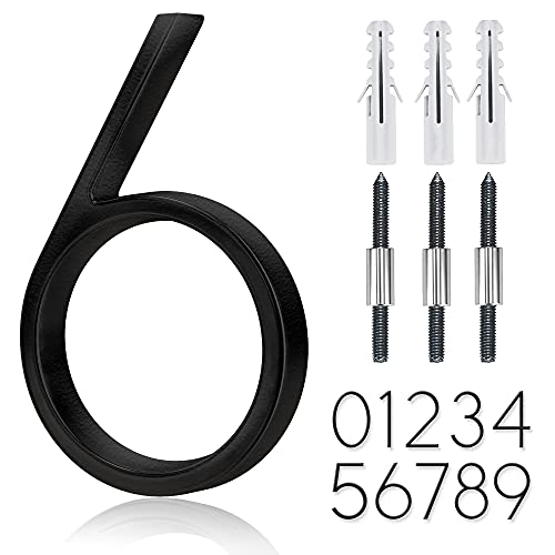
Address numbers are a specific failure point. The standard approach is a rectangular plaque in antique bronze or brushed nickel with a serif font, mounted to the door surround. This introduces a traditional material (warm metal) and a typographic character (serif) that both conflict with the Nordic palette. The correct approach is individual numeral plates in a sans-serif face, in matte black powder coat, mounted directly to the cladding beside the door at eye level. Products like modern house numbers in matte black aluminum are available from most architectural hardware retailers and make a disproportionate improvement to the entry’s visual clarity.
The doormat question has a clear answer: none, or a very simple one. A plain rubber or coir mat with no text and no pattern, in black or natural coir tan, can work if the entry demands it practically. A branded mat with a word, a monogram, or a traditional border pattern is a style conflict with every part of the Nordic facade behind it.
Key Takeaway: Reduce the entry zone to door, hardware, address numbers (matte black sans-serif), and a maximum of two architectural planters, because every additional object introduces a competing decorative character.
Your Garage Door Is a Traditional Panel Design on a Nordic House
 Save
The garage door failure is one of the most structurally damaging mistakes on a Nordic exterior, and it is almost universal in American suburbs. Traditional raised-panel garage doors, whether in white, cream, or faux-wood, carry a strong traditional residential character. The raised panels, the arched top sections, the decorative strap hinges, and the frosted glass inserts all reference carriage house architecture from the early twentieth century. None of that references Nordic architecture from any century.
A Scandinavian modern exterior shows how black garage doors are a great match with vertical siding. The operative product is a flush-panel garage door with a completely flat face, no texture, no grilles, no window inserts. Ideally, the garage door surface matches the body cladding in color. On a matte black board-and-batten house, the garage door is matte black flush panel. On a white house with black frames, the garage door is either white to match the body or black to match the frames. There is no third option.
The garage door is often the widest single surface on the front elevation of an American home. On a standard three-bedroom house, a two-car garage door occupies 16 feet (4.9 meters) of a 40-foot (12-meter) facade. That is 40% of the total width. At that proportion, a wrong garage door does not just look bad in a small section. It dominates the facade and defeats every other correct choice on the building. This is why getting the garage door right is disproportionately important relative to its visual footprint.
If a full garage door replacement is not in the budget, the minimum intervention is paint. Sand or prime the existing door to accept exterior paint, then apply a flat or matte exterior finish in the correct palette color. This does not fix the raised panel profile, but it removes the color conflict and is an enormous improvement in the visual logic of the facade. Remove any decorative strap hinges or faux hardware at the same time. These accessories are the most direct marker of carriage-house character and can be removed in under an hour.
Key Takeaway: Replace or repaint the garage door in a flush-panel matte black design that matches either the cladding or the trim color, because at 40% of facade width it is too dominant a surface to get wrong.

The Nordic house exterior gets its authority from coherence, not from any single expensive element. A charcoal standing-seam roof over a mismatched decorative garage door, or vertical board-and-batten siding next to a coach lantern and a raised-panel door, does not add up. What makes a Nordic facade read as resolved is that every surface answers the same two-tone palette question, every fixture is in matte black with no decorative profiling, and every piece of landscaping is sparse enough to let the building’s geometry read clearly. Start with the element that is furthest from those standards. Fix that one thing completely before moving to the next. The style rewards commitment to the logic, and the logic becomes easier to apply as more of the facade falls into alignment.
From the guides
You've saved it, wanted it. Here's the how: codes, measurements, order. Your choices make it yours.
The Japandi Honest PlaybookThe honest version of the style: what to keep, what to skip, and the order to do it in.See inside →The Room Refresh PlaybookA repeatable four-step method, room by room, in ten minutes, thirty minutes, or one weekend.See inside →Make Any Room Feel Cozy on PurposeWhy some rooms hold people and others empty out, and the moves that change it.See inside → Save