Georgia
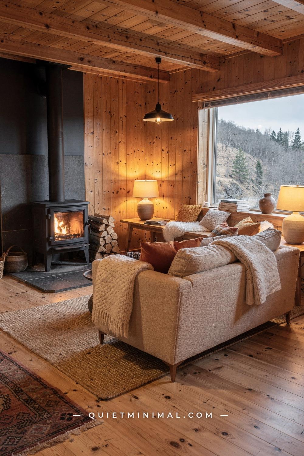
You’ve saved the photos. The pale pine walls, the sheepskin on the bench, the candles lined up on a window ledge with mountains in the background. The Norwegian cabin interior looks effortless in every image you find, and yet every attempt to recreate it ends up feeling either too stark or too rustic, either a ski-lodge cliché or an empty room with one throw on a couch.
The reason that gap exists is that almost every guide to hytte design stops at the surface level: use natural wood, keep it neutral, add some wool. Those things are not wrong, exactly, but they are incomplete in ways that matter. The genuine Norwegian cabin interior is not a vibe board. It is a specific set of decisions rooted in a culture that has been refining these spaces for centuries, and those decisions have reasoning behind them that most Pinterest captions never explain.
This article walks through the most common pieces of received wisdom about Norwegian cabin interiors, what they actually mean in practice, and the specific places the popular version falls short. If you are designing, renovating, or simply furnishing a cabin-inspired space, this is the thinking you need before you start buying.
The “All Pine Everything” Rule Makes Rooms Look Smaller, Not Warmer
 Save
The most repeated advice in Norwegian cabin design is this: cover the walls, ceiling, and floor in matching pine panels, and the result will feel warm and authentic. In practice, that instruction produces rooms that feel like the inside of a wooden crate. When every surface shares the same material and tone, the eye has nothing to contrast against, no visual resting point, and the space reads as compressed even when it is generously sized.
The original principle behind all-wood interiors was functional, not aesthetic. Traditional Norwegian hytter used timber cladding for insulation and vapor management in mountain climates where stone walls were impractical for small-scale construction. The wood served the building. The warmth was a byproduct of necessity, not a decorative target in itself. When contemporary designers translate that material choice into a decor strategy without the functional context, they strip out the subtlety that made the original spaces work.
From the guides
You've saved it, wanted it. Here's the how: codes, measurements, order. Your choices make it yours.
 The Japandi Honest PlaybookThe honest version of the style: what to keep, what to skip, and the order to do it in.See inside →
 The Room Refresh PlaybookA repeatable four-step method, room by room, in ten minutes, thirty minutes, or one weekend.See inside →
 Make Any Room Feel Cozy on PurposeWhy some rooms hold people and others empty out, and the moves that change it.See inside →
What the real hytte tradition does is vary the tones within the same material family. Floor boards run slightly deeper in color than wall panels. A ceiling gets a white soap-washed finish that bounces light downward while the walls stay in their natural state. A stone or slate element around the hearth breaks the wood at the room’s focal point. The contrast is quiet, but it is doing essential work: it gives the room depth, and it makes the warmth of the wood register against something lighter.
In a room where you want to apply this principle, the practical move is to treat the ceiling separately. A whitewash or soap finish on pine ceiling boards costs almost nothing in materials, takes a single afternoon, and immediately opens the room by 15 to 20 percent perceptually. If you are working with a smaller cabin space under 400 square feet (37 square meters), this ceiling treatment alone shifts the room from oppressive to inviting. The walls can stay in their natural finish. The floor absorbs everything below.
The failure mode to avoid: staining all surfaces the same medium-brown “cabin” color in an attempt to unify the space. It does the opposite. A single-tone dark room in a small footprint feels like a bunker, not a refuge.
Key Takeaway: Vary the finish tone across pine surfaces so ceiling, wall, and floor each read as a distinct plane, giving the room visual depth instead of visual compression.

Hygge Is Not a Decorating Style, and Treating It Like One Produces Clutter
 Save
Hygge is the Norwegian and Danish word for the feeling of warm contentment, the specific ease of being comfortable and present in a moment. Design writers love it because it sounds actionable, and it has become a shorthand for a specific set of decorating moves: pile in the throws, add candles everywhere, stack books on the floor, hang fairy lights. The result is usually a room that looks layered in photographs and feels cluttered in person.
The confusion comes from treating hygge as a noun you can buy rather than a quality a space either generates or does not. A room that creates hygge is a room where nothing is competing for your attention, where the seating is genuinely comfortable, where the light is warm enough and dim enough to make you want to stay. None of those outcomes require buying anything specific. They require restraint applied in the right places.
In traditional Norwegian cabins, the concept closest to hygge in design terms is koselig, a word that means snug and sheltered. Koselig spaces work because they are physically and visually complete. Everything has a place, and nothing extra is visible. A single sheepskin on a bench conveys more warmth than four sheepskins piled on a floor. A pair of candles on a windowsill read as intentional. Twelve candles scattered across every surface read as a fire hazard and a staging set.
The practical rule is the one-surface-one-object principle. Every horizontal surface in a hytte-inspired space should have one considered object on it, not a collection. A pine bench gets a sheepskin. A side table gets a ceramic mug or a single candle, not both. A windowsill gets the view, unobstructed. When you remove the surplus, the objects that remain carry weight, and the room settles into the quiet that hygge actually describes.
Where the all-in version fails: rooms loaded with “cozy” accessories register as staging, not living. The eye reads them as effort, and effort is the opposite of the ease hygge is supposed to produce.
Key Takeaway: Hygge is a feeling produced by restraint and warmth, not a category of products, so edit surfaces down to one deliberate object each before adding anything more.

Neutral Means Warm, Not White
 Save
When design guides describe Norwegian cabin interiors as “neutral,” they almost always illustrate that claim with very white or very gray rooms. Both are wrong for the context. A cold white wall in a pine-clad space fights the warm amber of the wood and makes the room feel clinically bright in summer and visually cold in winter, which is precisely the wrong outcome in a climate that runs dark for months.
The Norwegian interior tradition uses warm whites, specifically warm whites with cream or yellow-gray undertones that read against natural wood without creating tension. The difference between a warm white and a cool white on a paint chip is subtle. The difference in a wood-paneled room is immediate. A cool white with a blue or green undertone next to pine paneling makes the pine look orange. The room reads as mismatched rather than layered.
Specific colors that work consistently in this context are those in the warm beige and creamy stone family. Benjamin Moore’s Pale Oak (OC-20) has become a documented go-to in Nordic-inspired interiors for exactly this reason: it sits warm enough to complement pine without adding perceptible color. On the muted green and sage side of the palette, colors like Farrow and Ball’s Mizzle (266) or Pigeon (25) read as naturalistic against wood in a way that forest-adjacent spaces can carry without feeling themed.
The failure mode to avoid is using stark white or cool gray in a heavily wood-paneled room in an attempt to “balance” the warmth. The intention is right, the execution produces a room that looks like a renovation project in progress rather than a finished interior. The warmth of the space should come from the materials, and the walls exist to provide a receding background, not a contrasting feature.
For accent walls or areas with no paneling, clay plaster and limewash finishes are increasingly used in contemporary hytte projects because they provide texture and tonal variation within a single color family, giving the room handcrafted depth without introducing additional materials.
Key Takeaway: Neutral in a Norwegian cabin context means warm-toned cream and stone, never cool white or gray, because the undertone of the wall color either harmonizes or fights the amber of the wood.

The Fireplace Is the Room, Not the Focal Point
 Save
Most articles about Norwegian cabin interiors treat the fireplace or wood-burning stove as a decorating asset, something to style around with a basket of logs and a row of candles on the mantel. The actual role of the stove or fireplace in a traditional hytte is more fundamental: it organizes the room. Every other furniture decision flows from the fire’s position, and getting that sequence wrong is the reason many cabin-inspired living rooms feel like furniture was placed and then a stove was added, rather than the other way around.
In a functional Norwegian cabin, the stove determines the seating plan. Chairs and sofas are arranged to face the heat source at a distance that allows everyone seated to feel it. In Norwegian mountain cabins, this is a practical calculation: the stove needs to heat the people using the space efficiently, which means no seating behind or perpendicular to it without a clear sight line to the fire. The furniture grouping is tight and inward-facing, creating the enclosed sense of a room within a room.
The compact cast-iron wood-burning stove is the authentic choice over a traditional open fireplace in Norwegian cabin contexts, both for efficiency and for the visual quality it produces. A stove generates more heat per log, requires less clearance, and can occupy a corner or wall rather than commanding a full chimney breast. For non-cabin spaces where a wood stove is not an option, the principle still applies: identify the warmest or most grounding element in the room (a built-in bench, a heavily textured wall, a window with a long view) and let that element organize the furniture position.
The styling error that most commonly appears in copied versions of this look is the decorative fireplace surrounded by perfect symmetry: matching floor lamps on either side, matching throws on matching chairs. That arrangement signals display, not use. Norwegian cabin furniture shows the logic of being placed for warmth and function: one chair angled slightly inward, a bench at the side for extra seating, a side table within reach of both. Asymmetry that reflects use is more honest to the style than symmetry that reflects staging.
Key Takeaway: Let the wood stove or heat source determine the seating plan before you place any furniture, because the room should organize itself around warmth, not around how the room photographs.

The Wood Has to Be Finished Correctly, or It Looks Like a Hardware Store
 Save
The most common material mistake in Norwegian cabin interiors is applying a high-gloss or semi-gloss polyurethane finish to pine walls, floors, or furniture. The result looks like a prefabricated holiday rental unit rather than a genuine hytte. Gloss finishes on softwood reflect light harshly, emphasize grain irregularities in an unflattering way, and prevent the material from developing the patina that makes aged pine beautiful over time.
Traditional Norwegian woodwork is finished with white soap, oil, or wax. Soap finishing is the most historically accurate and the least expensive. The process involves dissolving white soap flakes in warm water and applying the mixture to raw or lightly sanded pine with a cloth in thin coats, building up a matte, slightly clouded finish that protects the wood while preserving its natural color and texture. The finish is renewable: when it dulls, you apply another coat. It does not require sanding between applications.
For floors, the trade-off is durability. Soap-finished pine floors mark and dent more readily than lacquered ones, and that is partly the point: the marks tell the story of use, which is culturally consistent with the hytte philosophy that values evidence of real life over pristine appearance. If you want the look without the maintenance intensity, hardwax oil finishes like those from Rubio Monocoat or Osmo produce a similar matte quality with more durability. The key specification in both cases is choosing a colorless or warm-tinted product, not a white-pigmented one if you want to retain the natural wood color.
For walls and furniture specifically, the contemporary alternative is a lightly pigmented wood oil in white or near-white tones. This slightly bleaches the wood’s surface to a cooler blonde tone without producing the harsh pallor of a painted surface. It is the finish visible in many of the architectural hytte projects published by Dwell and Monocle in recent years, where interior pine has that silvery-warm quality that reads as refined rather than raw. The product category to look for is white-pigmented hardwax oil or white-tinted wood soap, applied in one thin coat over sanded pine.
The failure mode is clear lacquer over unsanded pine with visible mill marks. It looks like the cabin was finished by a contractor on a deadline, which is exactly what it communicates.
Key Takeaway: Soap, hardwax oil, or white-tinted wood oil are the right finish categories for Norwegian cabin pine. High-gloss lacquer belongs on furniture being sold at a hardware store, not on the walls of a hytte.

Overhead Lighting Is the Single Fastest Way to Ruin the Atmosphere
 Save
Nothing destroys a Norwegian cabin interior faster than a single overhead light fixture switched on at full brightness. The space drops from sanctuary to utility room in one switch movement. This is the lighting mistake most guides either ignore or mention too gently: overhead lighting, especially recessed downlights, produces the quality of light you want in an office or a retail space, not in a room designed around the concept of refuge.
The authentic hytte lighting model uses multiple low-level sources. This is not a decorating choice. It reflects the practical reality of how Norwegian cabins were originally lit: by fire and by candle. The light came from below and from the side, at eye level or beneath it. It pooled and overlapped. It left the ceiling and upper walls in shadow. That quality of light is what makes a space feel enclosed and protected in a way that overhead fixtures, no matter how beautiful, cannot replicate.
The contemporary translation of this principle is layered electric lighting at 2700K, which is the warm white color temperature closest to incandescent and firelight. Specifically, you need a minimum of three sources in any living space to avoid both the bleaching effect of a single bright overhead and the insufficient-light problem of a single floor lamp. A functional layering for a 250 square foot (23 square meter) cabin living room: one table lamp at each end of the primary seating piece, one wall sconce at the far wall providing ambient bounce, and candlelight on the table surface.
The pendant light above a dining table is the one acceptable overhead element in a Norwegian cabin interior, and it works because it is a directional source aimed at the table, not at the room. It should hang low, between 28 and 34 inches (71 to 86 centimeters) above the table surface, and it should be on a dimmer. At full brightness over a dinner table, it is a task light. Dimmed to 50 percent, it becomes part of the ambient layering.
Recessed downlights and track lighting have no place in this style regardless of the bulb specification. The issue is not just color temperature: it is the quality of light from above that conflicts with the low-shelter quality the space is trying to produce.
Key Takeaway: Replace any single overhead light with at least three low-level warm sources at 2700K, because the atmosphere a Norwegian cabin interior depends on is built from light that comes from below, not above.

Textile Layering Has a Logic, and Ignoring It Produces a Messy Room
 Save
The image that circulates most widely as “Norwegian cabin bedroom” shows a bed loaded with layers: a linen duvet, a knit throw, a sheepskin, multiple cushions in different textures, and usually a folded blanket at the foot. It looks extraordinarily inviting in a photograph. In a real room, it reads as a laundry situation that never gets resolved.
The Norwegian cabin textile tradition has structure. There are specific objects in specific positions, and each position has a reason. The duvet cover is linen, stonewashed for texture, in a natural undyed tone because undyed linen registers as warmer than white. The throw is wool, folded and placed deliberately at the foot of the bed or over a single arm of a chair, never spread across the whole surface. The sheepskin occupies one position: draped over a chair back, laid on a bench, or hung over a bed frame rail. It does not go on the floor next to the bed, which in a real cabin would collect dust and moisture from boots.
Cushions follow a quantity rule: two to three maximum on a bed, in the same tonal family. A bed with seven cushions signals that no one actually sleeps there. One natural linen sham, one wool cushion in a muted tone, one sheepskin-covered lumbar if the headboard is hard. That is a complete bed in the Norwegian cabin sense: generous in material, restrained in quantity.
The same logic extends to the living space. One rug, chosen for the right dimensions (front legs of all seating on the rug, which for a standard grouping means a minimum of 8 by 10 feet, or 240 by 300 centimeters). One throw per seating piece, folded and draped over an arm rather than thrown casually, because the casual throw only looks casual in a photo session and reads as untidy in daily life. One sheepskin at the most prominent sitting position.
The material palette for textiles in this style is the same across every category: linen, wool, cotton, and natural sheepskin or hide. No velvet, no faux fur, no patterned fabric unless the pattern is a traditional Norwegian geometric in muted tones.
Key Takeaway: Layer textiles by position and purpose, with one deliberate piece per surface, using only linen, wool, cotton, or natural hide, because quantity without structure reads as disorder rather than warmth.

The Kitchen Needs Honest Materials, Not a Farmhouse Conversion
 Save
The farmhouse kitchen trend has a significant overlap with the Norwegian cabin aesthetic on Pinterest, and that overlap produces a genuine design confusion. Shaker cabinets, open shelving stacked with mismatched ceramics, a farmhouse sink, copper pots hanging from a ceiling rail: these are not wrong elements in isolation, but they belong to a different tradition, one that is more British and American rural than Norwegian, and they produce a kitchen that reads as styled rather than used.
The Norwegian cabin kitchen is organized around a different set of priorities: function first, visual quiet second, nothing that requires regular maintenance to look good. Cabinets are simple flat fronts, not Shaker profiles with their raised molding details. Hardware is plain and durable: solid bar pulls in matte black or brushed steel, not decorative bin pulls. Open shelving exists because Norwegian cabins historically had no room for upper cabinet doors, not as a display opportunity.
The countertop material matters more than the cabinet style. Norwegian kitchens favor soapstone, which is a material quarried in Scandinavia and used continuously in the region for centuries. It is dark gray to blue-gray when dry, darker when oiled, completely heat-resistant, and non-porous. It ages to develop a patina that lacquered granite never achieves. Light gray quartzite and honed marble are appropriate substitutes. Polished granite and quartz composites in neutral tones are both technically functional and visually wrong for the style: too processed, too reflective.
From the guides
You've saved it, wanted it. Here's the how: codes, measurements, order. Your choices make it yours.
The Japandi Honest PlaybookThe honest version of the style: what to keep, what to skip, and the order to do it in.See inside →The Room Refresh PlaybookA repeatable four-step method, room by room, in ten minutes, thirty minutes, or one weekend.See inside →Make Any Room Feel Cozy on PurposeWhy some rooms hold people and others empty out, and the moves that change it.See inside →The backsplash in a Norwegian cabin kitchen reads best in handmade ceramic tile with a slightly uneven glaze in off-white or pale stone. The glaze variation creates visual texture without pattern, which is the consistent principle across every surface in this style. Subway tile in its classic pressed, uniform version is too commercial in this context: it belongs in a New York apartment renovation, not a mountain cabin.
The failing version of this kitchen is one that has borrowed the farmhouse checklist: open shelving crowded with mismatched items, a sink designed to look antique, exposed wood beams that do not align with the structure. The result is a set piece, not a working kitchen.
Key Takeaway: Norwegian cabin kitchens are honest, not styled: flat-front cabinets, soapstone or honed stone countertops, handmade ceramic tile, and hardware that works without decoration.

Windows Are Not Just for Light, They Are the Main View
 Save
A persistent mistake in Norwegian cabin interiors done by people outside the tradition is treating windows as a design element to frame and dress: heavy linen curtains pooling on the floor, wooden shutters painted in an accent color, Roman blinds in a textured neutral. These treatments come from an interior design context where windows face other buildings or a street and require some visual management. In a Norwegian cabin, the window faces a mountain, a fjord, or a forest, and dressing it means obscuring the most valuable thing the space has.
The authentic Norwegian cabin approach to windows is to leave them bare whenever the view warrants it. This is a functional and philosophical decision. The friluftsliv principle, which describes the Norwegian value of connection to the outdoors and free air life, extends inside the cabin through visual access to the landscape. A window that frames a pine forest is doing more spatial work than any piece of art you could hang beside it. Blocking it with fabric reduces the room’s most powerful feature.
Where curtains or blinds are genuinely needed for privacy or light management, the Norwegian cabin uses a single layer of unlined natural linen in the palest undyed tone. The curtain is hung close to the ceiling, extends 2 to 3 inches (5 to 7 centimeters) below the sill at most, and is held back fully open during daylight hours. It is there to manage light when needed, not to decorate the window.
The window itself should be the largest the structure allows. Contemporary Norwegian cabin architecture consistently uses oversized glazing precisely because the relationship between the interior and the landscape is the primary experiential offering of the space. When the window is small and the wall around it is heavily paneled, the cabin reads inward and closed. When the window is large and unobstructed, the room reads as part of the landscape, which is the intended experience.
The failure mode is a small window hung with layered treatments that block both light and view, producing an interior that looks nothing like the images you saved because those images were made with bare, oversized windows in landscape-facing positions.
Key Takeaway: Leave cabin windows bare or use a single unlined linen panel when privacy requires it, because the view is the room’s most powerful design element and covering it defeats the entire purpose of the space.

Furniture Should Be Low, Not Heavy
 Save
Furniture scale is where many Norwegian cabin-inspired rooms go wrong in a way that is visually obvious once you identify it. The instinct when designing a cabin space is to go large: a substantial sofa, a heavy dining table, tall cabinetry that fills the wall. The result is a room where the furniture dominates the space rather than occupying it. In a small cabin where ceiling height may be 8 to 9 feet (2.4 to 2.7 meters) and floor plans often run under 500 square feet (46 square meters), tall heavy furniture compresses the room and makes it feel crowded.
The Norwegian cabin furniture tradition is consistently low-slung and proportionally modest. Sofas sit close to the floor, typically with legs of 4 to 6 inches (10 to 15 centimeters) and seat heights of 15 to 16 inches (38 to 41 centimeters). Coffee tables are low, at 14 to 16 inches (35 to 40 centimeters). Dining chairs are often benchlike, without elaborate back structures. The visual effect is a room where the furniture feels settled and grounded rather than planted.
The practical reason for low furniture in original hytter was ceiling clearance and transport. Mountain cabins had low doorways and roof pitches designed for snow load management. Furniture had to fit through small openings and navigate tight stairways, which meant simple, compact forms without elaborate frames. Contemporary hytte-inspired furniture design maintains this scale as an aesthetic principle even when the practical constraint no longer applies.
For the bedroom specifically, a platform bed with a low pine frame at no more than 12 inches (30 centimeters) from floor to mattress top creates the same grounded quality. Paired with a low side table at 20 inches (51 centimeters), the room feels proportioned rather than furnished, which is a subtle but meaningful distinction. The bedroom in a Norwegian cabin is not a showroom; it is a place to sleep in a space that does not feel industrial.
The furniture failure to avoid is a massive sectional sofa that fills 70 percent of the floor plan. It photographs well but kills the sense of a sheltered interior room by overwhelming the scale relationships.
Key Takeaway: Choose furniture with a low seat height, under 16 inches (40 centimeters), and a compact footprint, because low-slung proportions ground the room and preserve the sense of sheltered refuge that defines the Norwegian cabin feel.

The Bathroom Is Not an Afterthought, and Wood Belongs There Too
 Save
The Norwegian cabin bathroom is consistently the most mishandled room in cabin-inspired interiors. The most common mistake is treating it as a completely separate design problem from the rest of the cabin and finishing it with tile, chrome, and a generic vanity that could belong in any suburban bathroom renovation. The result is a room that breaks the material story of the whole space the moment you walk in.
Wood belongs in Norwegian cabin bathrooms. Not raw pine on surfaces that will be regularly wet, but properly finished pine or larch on walls above the wet zone, on vanities, and on shelving. The Norwegian practice of using softwood in bathrooms goes back to the era before tile was widely available in rural construction, and the principle that emerged from that necessity is still visually correct: the wood connects the bathroom to the rest of the cabin rather than making it feel like a hotel room that was attached by accident.
The floor material that reads most authentically in a Norwegian cabin bathroom is natural stone, specifically dark slate or quartzite in a honed, non-slip finish. The contrast between the dark floor and the warm pine walls is one of the most distinctive visual signatures of the genuine hytte bathroom. It is the material version of what the whitewashed ceiling does in the living space: a tonal anchor that gives the room depth.
Hardware throughout the bathroom should be matte black or brushed steel, never chrome. Chrome belongs to a mid-century urban bathroom aesthetic that has no connection to the materials and context of a mountain cabin. Matte black fixtures against pine and slate produce the consistent, grounded quality the rest of the space should already have.
For the specific surfaces in the wet zone (the shower walls and any backsplash behind the basin), large-format slate or quartzite in the same dark tone as the floor is the most coherent choice. It extends the floor material vertically and keeps the material count low, which is the consistent principle: fewer materials used consistently produce more visual harmony than many materials used sparingly.
Key Takeaway: Treat the bathroom as a continuation of the cabin’s material language, using properly finished pine above the wet zone, dark honed slate on the floor, and matte black hardware throughout.

Decorative Objects Should Earn Their Place Against a High Standard
 Save
The decorative element that Norwegian cabin interiors do differently from almost every other style is this: every object earns its presence through material quality or function, not through emotional resonance or trend alignment. A basket that holds blankets belongs. A candle that provides light belongs. A ceramic bowl handmade from local clay belongs. A piece of wall art purchased because it “feels Scandinavian” and a driftwood collection that looked good in a shop do not belong unless they are genuinely specific to the person and the place.
This is the principle that the style guides summarize as “meaningful objects” and then immediately illustrate with generic shopping recommendations. The actual standard is harder to meet: the object should either be locally made, personally significant, or practically useful. Preferably all three. A hand-thrown ceramic mug made in Norway is a better decorative object than any art print from a Nordic design store, because the mug tells a specific story and has a function.
For people replicating this style without access to Norwegian craft objects, the working principle is to choose handmade over factory-made, natural material over synthetic, and fewer over more. A single ceramic vessel with visible throwing marks communicates the quality and honesty the style requires. Three ceramic vessels of different sizes communicate it more convincingly. Twelve ceramic vessels communicate a shopping spree.
Wall art follows the same logic. The Norwegian cabin tradition uses either objects with direct natural reference (a simple framed botanical drawing, a small watercolor of the local landscape, a piece of traditional folk art) or no wall art at all. Gallery walls with eclectic mixed-frame arrangements belong to a different style entirely. In a Norwegian cabin interior, every horizontal and vertical surface is a considered decision, not an opportunity to fill space.
The one decorative category that is both authentic and practical is handwoven textiles: flat-weave wool rugs with geometric patterns in natural tones, wall-hung woven pieces in undyed wool or linen. These objects carry craft history and serve a functional purpose in softening acoustics in a wood-paneled room, which is a genuine need that decoration can solve.
Key Takeaway: Apply a high standard to every decorative object: handmade over mass-produced, locally specific over generically Nordic, one considered piece over a collection of similar ones.

Scent and Acoustics Are Part of the Interior, Not Separate Categories
 Save
Almost every article about Norwegian cabin interiors focuses entirely on what you see. Almost none of them address what you smell or hear, both of which are as much a part of the koselig atmosphere as the visual arrangement.
The acoustic quality of an all-wood room is hard and bright unless it is addressed. Pine panels on walls and ceilings, combined with hard floors, create a room where sound bounces rather than absorbs. Voices carry, footsteps are loud, and the silence you expect from a mountain cabin does not arrive. The fix is the same material layer that provides visual warmth: textiles absorb sound. A large flat-weave wool rug under the seating area drops the acoustic brightness significantly. Upholstered furniture does additional work. A wall-hung woven textile, even a small one, absorbs high-frequency reflection. The absence of these elements is the reason all-tile, all-stone, or all-hard-surface interiors feel so cold regardless of color temperature.
The scent element in a Norwegian cabin interior is not an afterthought. The smell of natural pine is part of the atmosphere, and it diminishes as the wood ages and offgasses. Beeswax candles restore a warm, honey-adjacent scent that complements pine without competing with it. They also produce a slightly amber-tinted light that reads warmer than most electric sources. A single beeswax pillar candle on the coffee table does more atmospheric work than any scented product purchased specifically as home fragrance.
Cedar, juniper, and birch tar are the scent references most authentically connected to Norwegian cabin environments. Products using these notes exist across multiple categories, but the most honest version is sourced from the materials themselves: a small cedar block in a closet, a bundle of dried juniper on a shelf, a birch-bark tray holding the room’s candles. The scent is present without being a design choice announced to guests.
The point is simply this: what makes a Norwegian cabin interior feel complete on a sensory level is the sum of what you see, what you hear, and what you smell. Getting two out of three right still produces a room that feels slightly off.
Key Takeaway: Address acoustics with a large wool rug and upholstered seating before any visual layer, and use beeswax candles for scent rather than synthetic fragrance products, because the Norwegian cabin atmosphere is fully sensory.

—
The Norwegian cabin interior is not a difficult style to get right. It is a specific style, with real reasoning behind every decision, and that specificity is precisely what makes it hard to shortcut. When you understand that the pine needs to be soap-finished, not lacquered; that the light needs to come from below, not above; that the textiles need to be positioned, not piled; and that the view through the window is the room’s most important feature, the style stops being a mood board and starts being a set of decisions you can execute.
The approach that works is the same one the Norwegians have been using for centuries: start with the materials that belong in the landscape, finish them honestly, arrange them for warmth and function, and leave space for the room to breathe. Nothing more is needed. Anything more gets in the way.
From the guides
You've saved it, wanted it. Here's the how: codes, measurements, order. Your choices make it yours.
The Japandi Honest PlaybookThe honest version of the style: what to keep, what to skip, and the order to do it in.See inside →The Room Refresh PlaybookA repeatable four-step method, room by room, in ten minutes, thirty minutes, or one weekend.See inside →Make Any Room Feel Cozy on PurposeWhy some rooms hold people and others empty out, and the moves that change it.See inside → Save