 Georgia
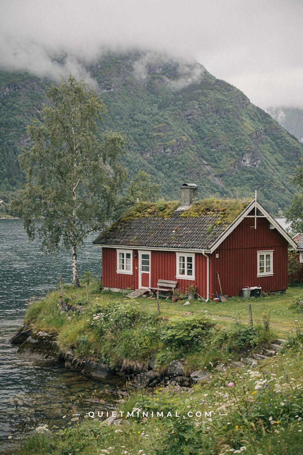
You already know the picture: a red timber house with white windows, a steep roof, water in front and a mountain behind, and a feeling that everything in the frame has agreed to stop moving. If you have been saving Norwegian house exteriors for months and wondering what exactly you are responding to, the answer is not the fjord. The fjord helps, but the same feeling turns up on a pink townhouse in a Bergen alley and on a cedar-and-glass cabin with no water in sight. What carries it is a short list of decisions about colour, roof, base, entrance and scale that Norwegians arrived at over two centuries of building cheaply in a hard climate. Most of the advice that circulates about a Norwegian house gets those decisions backwards: it tells you to blend in, keep everything neutral, strip off ornament, hide the foundation and add more lighting. The houses themselves say the opposite. This walk through twenty-five of them takes one piece of received wisdom at a time, shows what the buildings actually do, and ends each stop with the version you can build on an ordinary lot.
The Received Idea That a Norwegian House Is a Red Cabin
 Save
Ask almost anyone to describe a Norwegian house and they will describe a red one. The pale white villa here, with its oval porthole set into the gable pediment, its arched glazed double doors and a plaster roundel over the entrance, is every bit as Norwegian, and for most of the nineteenth century it was the one people actually wanted. Colour on a timber facade was a price list before it was a style. Red iron-oxide pigment was the cheapest finish available, ochre yellow cost more, and white made with zinc cost the most, which is why the white house became the signal that a family had money and the red one covered barns, boathouses and workers’ cottages. Coastal owners who could not stretch to four white walls sometimes painted only the wall that faced the water.
So the first thing to unlearn is that the colour is the style. The style is a set of proportions: horizontal boards, a steep gable, a symmetrical face with the door on the centre line, and one strong approach. Here that approach is roughly ten granite risers, run the full width of the facade and left to grow moss, with rhododendrons allowed to close over the sides until the house is reached through a green tunnel. Nothing about that composition depends on red.
What you can take from it on a suburban lot is the axis. Most American houses are approached from a driveway at an angle, so the front door is something you find rather than something you arrive at. If a straight path can be cut from the sidewalk to the door, even a 36 in (91 cm) wide one in plain concrete pavers, the house immediately reads as more composed, because the eye is being led to the one thing the facade is organised around. Flank that path with something evergreen and let it grow tall; the villa’s rhododendrons are at least 8 ft (2.4 m) and they do more for the house than the plaster ornament does. The failure mode is timidity: a path that curves for no reason, or shrubs kept clipped to knee height so the house stands exposed. The calm comes from being enclosed on the way in and released at the door.
Key Takeaway: Colour was a price tier, not the style; the Norwegian house is a symmetrical face reached along a straight, enclosed axis, and that you can build in any colour.
From the guides
You've saved it, wanted it. Here's the how: codes, measurements, order. Your choices make it yours.
 The Japandi Honest PlaybookThe honest version of the style: what to keep, what to skip, and the order to do it in.See inside →
 The Room Refresh PlaybookA repeatable four-step method, room by room, in ten minutes, thirty minutes, or one weekend.See inside →
 Make Any Room Feel Cozy on PurposeWhy some rooms hold people and others empty out, and the moves that change it.See inside →

Why Falun Red Is Not Really a Colour at All
 Save
The received idea treats Falun red as a paint chip you can match at any hardware store. It is closer to a material. The traditional product is a slurry: iron-oxide pigment from the tailings of the copper mine at Falun in Sweden, cooked with water, rye flour and linseed oil into something with the consistency of thin porridge. It does not form a film on the wood. It soaks in and leaves a dead-flat, slightly chalky surface that lets the boards breathe, which is why a red house that is two hundred years old still has sound timber under the colour. The original product is sold in 10-litre pails and covers only about 3 m² per litre, so a modest cottage swallows several pails, with two coats on bare wood and one on a repaint. The modern film-forming version of the same colour covers 6 to 7 m² per litre and looks noticeably shinier.
That flatness is the whole effect. The lakeside house here, red boards with cream brackets under the balcony and an orange clay-tile roof, looks soft in low light because nothing on the walls reflects. A glossy red house in the same spot would look plastic. The white balusters and brackets carry a slight sheen by contrast, and that difference in finish, matte walls against satin trim, is what makes the trim look crisp without any change in colour temperature.
If you want the effect without importing pails from Sweden, buy the flattest exterior finish available in a deep red-brown with more brown than blue in it, and test it on a 24 by 24 in (61 by 61 cm) board propped in the shade, because iron-oxide reds go orange in direct sun on a sample and settle in place. Keep the roof in an earth tone rather than black; the orange clay here is warmer than the walls and the house looks lit from within even on an overcast day. And if there is any outbuilding, a shed, a garage, a pool house, paint it the same red, with the same cream trim. The 10 by 8 ft (3 by 2.4 m) boathouse at the dock is what makes this scene read as a place rather than a house.
Key Takeaway: Falun red works because it is dead flat and soaks into the wood; choose the flattest red-brown you can find and put a satin white trim against it.

The Neutral Palette Rule Was Never Norwegian
 Save
Scandinavian has come to mean grey, white and pale oak, and people carry that assumption to the exterior. Walk any old-town lane in Bergen and it collapses. The house on the left here is a dusty blush pink, the one ahead is white with a sawn-timber dormer, the one on the right is cream, and the lane between them is rounded cobblestone the colour of warm ash. Bunting in red and white is strung across at about door-head height. None of it is neutral, and the lane still feels calm, which tells you the calm was never coming from the colour.
It comes from a rule that every house on the lane follows: one body colour per building, white window casings on all of them, and no second colour anywhere on the wall. The pink house has pink boards and white windows and nothing else. Because the grammar is identical from house to house, the colours can differ wildly without arguing. The eye reads a row of related objects, the way a row of books in different jackets still reads as a shelf.
Apply that to a house that is not in a row and it becomes: pick one wall colour, paint every window frame and casing the same white, and resist the urge to introduce a third colour on a gable or a band. Then put all the accent in things that sit in front of the wall rather than on it. Here it is a matte black cast-iron lantern about 14 in (36 cm) tall mounted at roughly 7 ft (2.1 m), and terracotta pots of red geraniums on the doorstep, both ordinary objects at ordinary size. A dusty pink is a fine choice for a small house, by the way, if it is a pink with grey and brown in it rather than a pastel; on a north-facing wall in flat light it reads as a warm off-white, and only in full sun does it declare itself.
The failure mode is spreading the accent thin. A red door, red shutters, red planters and a red mailbox on a beige house is four accents arguing; a red pot of geraniums beside a white door on a pink wall is one, and it is enough.
Key Takeaway: Old-town lanes prove that colour can be bold as long as every house follows the same grammar: one wall colour, white casings, accents in objects rather than on the wall.

The Truth About Big Glass on a Traditional Form
 Save
The purist version of the advice says a Norwegian house has small windows, because the climate demanded it and because the old ones did. Small windows, therefore, are the authentic choice. The contemporary farmhouse here disagrees: a steep white-rendered gable with symmetrical dormers, the traditional silhouette exactly, and then the whole gable end below the ridge filled with a single black-framed triangle of glass, with sliding doors under it, the interior glowing amber into the snow.
What that glazing does is not a break with tradition. It is the old logic pushed as far as modern glass allows. In a country where the sun sits low for months and sets in the middle of the afternoon, the lit window seen from outside has always been the point of a house, the reason a fisherman’s cottage with one lamp on a rocky shore reads as a welcome instead of a warning. The gable window makes the entire end of the house into that lamp. The proportions are what keep it Norwegian: the roof pitch is still around 45 degrees, the dormers are still paired and small, the wall is still one material, smooth white mineral render, and the frames are matte black so that in daylight the glass reads as a dark shape, the same weight as the roof.
The transferable version for a house that already exists is not a triangular window; it is aiming glass where the light is seen. If you are replacing a window on the gable end or beside the door, go one size larger than the standard and choose black or charcoal frames, then put the room’s warmest lamp inside it at 2,700 K. From the street at dusk, that single warm rectangle does more for a house than any number of exterior fixtures. The failure mode is the reverse: expensive glass on a wall nobody sees, and floodlights on the front that turn the house into a flat white shape with black holes in it. Notice too that the terrace here is timber and sits at floor level, half under the snow; there is no railing between the sliding doors and the forest, which is what makes the glass feel like a threshold and not a display case.
Key Takeaway: Large glass is the old Norwegian instinct for the lit window pushed to its limit; keep the roof steep, the frames dark and the warmest lamp inside the glass that faces the street.

Ornament Was Not Stripped Off, It Was Put Somewhere
 Save
Received wisdom says Scandinavian exteriors are plain, so if you want the look you remove the shutters, the brackets and anything sawn into a curve. Then you meet a sveitserstil villa and have to revise. The Swiss chalet style arrived in Norway in the middle of the nineteenth century, introduced by the architect Linstow, who thought neoclassical proportions sat badly on a timber house, and it produced buildings like this one: a chalk-white two-storey villa with a carved upper veranda running the full width of the facade, scroll brackets and turned balusters, a covered entrance porch on turned columns, and a hip roof in red clay tile pitched steeply enough to shed snow.
The point is where the ornament is. Look at the wall and it is plain horizontal boards, painted one colour, with window casings in the same white. Every piece of fretwork is concentrated in one zone, the veranda and porch, and it is all white, so it reads as lace laid over the house rather than a house covered in pattern. The lilacs in the foreground at 8 to 10 ft (2.4 to 3 m) are the only saturated colour besides the roof, and they are seasonal. This is restraint expressed as placement, not as absence.
That is the transferable idea for a house with a porch. Rather than stripping every detail, decide which single element is allowed to be decorative and make it generous: a deeper porch roof on proper turned posts at 6 in (15 cm) diameter instead of 4 by 4 in (10 by 10 cm) lumber, a balustrade with real spacing rather than off-the-shelf pickets, all of it painted the same white as the window trim. Keep the rest of the wall bare. The stone steps matter too; six wide granite risers from lawn to porch, with no handrail cluttering the middle, present the house the way a plinth presents a sculpture.
The failure mode is decoration sprinkled everywhere at small scale: a little gable bracket, a little shutter, a little medallion, each too small to read and together too busy to settle. One place, one colour, and larger than you think.
Key Takeaway: Norwegian villas concentrate all their ornament in one zone, the veranda, and leave the wall plain; choose one element to be decorative and make it generous.

Why the Door Is Where the Second Colour Belongs
 Save
The usual advice for a coloured house is to keep the door quiet so the wall can do the talking. Norwegian towns do it the other way round. This compact two-storey house is an olive-lime green that would frighten most paint counters, with a white-edged gable and white casings on six windows arranged three over three, and set into the centre of that is a crimson red panel door with a fanlight. Green and red, side by side, and it works, because the door is the only place on the facade where a second colour appears and it is framed by white on every side.
The logic is that the door is the object, and the wall is the field. A field can be any colour as long as it is uniform; an object can be any colour as long as it is small and isolated. The door here is roughly 36 by 80 in (91 by 203 cm), which is about three percent of the facade, and the white casing around it acts as a mat around a picture. Move that same red onto the window casings and the house would fall apart.
For a house on an ordinary street, this is the most forgiving rule of all: keep the body colour, keep the trim white, and put the entire personality of the house into one door. Choose the door colour as a complement to the wall rather than a match: red on green, deep blue on yellow, black or oxblood on white. Paint the frame and the fanlight bars white, and if the door has a storm door in front of it, take the storm door off or paint it to match the door exactly, because a white storm door over a red door is the fastest way to lose the effect. The street lamp and the porch light here are both warm amber, and in the snow at twilight they pick up the red and leave the green in shadow, which is the other half of why the door reads: colour temperature is doing the work the daylight did.
The failure mode is a second colour that is too close to the first. An olive door on an olive house looks like a mistake; a red one looks like a decision.
Key Takeaway: Put the second colour on the door only, frame it in white and choose a complement to the wall, not a near-match.

The Blending-In Rule Is Backwards
 Save
Every guide to a house in a landscape says the same thing: choose colours from the surroundings so the building disappears into them. The naust, the traditional fjord boathouse, has never once followed that advice. This one is burnt orange, sitting on a shelf of black wet rock between mossy cliffs, under a dark grey metal roof with a chimney at the ridge and four white divided-light windows in two rows of two. It could not be more visible, and it is the reason the scene feels composed rather than empty.
A building that matches the landscape makes the landscape feel unfinished; a small building that contrasts with it gives the eye a place to rest and a scale to measure everything else against. The cliffs here look enormous because the boathouse is small, perhaps 16 ft (4.9 m) wide, and its orange is the one warm note in a frame of teal water, grey stone and fog. Norwegians understood this instinctively, partly because pigment was cheap and grey stain was not yet fashionable, and partly because in a winter of fog and dusk you want to be able to find your own boathouse from the water.
For a house on a wooded or rural lot, the honest version is: stop trying to disappear. Grey-brown siding under a grey roof in a grey-green wood is the current default and it produces a house that looks apologetic. Choose one warm saturated colour, orange, ochre, iron red, and keep everything else disciplined: white windows, a dark roof, no additional accent. The smaller the building, the bolder the colour can be, so the garden shed and the studio at the bottom of the lot are the safest places to try it. On the main house, the same principle appears as contrast at the edges: dark roof against light sky, light trim against dark wall.
The failure mode is a colour that half-contrasts. A muddy terracotta on a grey house reads as a stain. Go all the way to burnt orange or not at all, and let the reflection in whatever water or wet paving you have double it.
Key Takeaway: A small building that contrasts with its landscape settles the scene; pick one warm saturated colour and keep every other element quiet.

What a Mossy Roof Understands About Weight
 Save
Conventional maintenance advice treats a roof as something to keep clean, light and new-looking. The farmhouse on this promontory has a dark shingle roof gone green with moss along the ridge and eaves, a brick chimney in the centre of the ridge, and it looks more finished than any pressure-washed roof could. That is not neglect being romanticised. It is a principle about weight.
A Norwegian house is almost always darker on top than on the walls: slate, dark tile, tarred shingle, or in the old days a sod roof planted with grass. The roof is meant to read as heavy, as the thing that holds the house down against the wind and the snow, and the walls are meant to read as the lighter box beneath it. Red under dark green-black is the classic pairing precisely because the red is warm and mid-toned and the roof sits over it like a lid. Moss simply pushes the roof further in the direction it was already going, darker and more matte, and ties it to the mountain behind.
On a house that is not on a fjord, the roof colour is the most neglected decision in the whole exterior and the one that most often goes wrong. Pale grey or tan asphalt shingles on a coloured house make the house look top-light, as though it might lift off. Choosing the darkest roof the supplier offers, charcoal, deep green or near-black, costs nothing extra and immediately settles the building. If the roof is already pale and not due for replacement, darkening the fascia and gutters to charcoal gives a surprising amount of the same effect from the street. A chimney in the centre of the ridge, or a stovepipe at least, is the other marker; it is the vertical that tells the eye the roof has a middle.
Around the base, notice that nothing is manicured. The grass runs to wildflowers and the shoreline is rough rock; a red house does not need a lawn edge. The failure mode is the opposite of this whole picture: a light roof, a scrubbed one, and a clipped lawn that makes the house look like it was set down yesterday.
Key Takeaway: The roof should be the darkest, heaviest thing on the house; choose near-black or deep green and let the walls be the lighter element beneath it.

Size Is Measured Against the Landscape, Not the Lot
 Save
The received idea is that presence comes from size: a bigger house with a bigger roofline makes a bigger impression. This two-storey red house on an islet in the middle of a fjord is perhaps 30 ft (9 m) wide, six white windows in two rows, a charcoal pitched roof, conifers behind it and snow-capped ridges behind those, and it has more presence than any house three times its size, because everything around it is enormous and it is the only thing in the frame at human scale.
This is the piece of Norwegian building culture that transfers least literally and matters most. Norway has more than 452,000 registered cabins, and the ones finished in 2025 averaged 98.9 m², which is about 1,065 sq ft. The instinct is to build small and let the landscape be the big thing. A small house with a simple gable, seen from a distance, becomes a figure; a large house with a complicated roof becomes a collection of parts. The six windows here are identical, evenly spaced and white, which is what lets the house read as a single object from across the water. One bay window or one odd-sized opening and the figure would break.
On a suburban lot there is no fjord, but there is still a relationship between the house and what surrounds it, and the same rule applies: the house should be the smallest-seeming thing in the composition, not the largest. Practically that means letting trees get tall instead of topping them, keeping the front yard open enough that the house is seen against sky or canopy rather than against a fence, and above all keeping the facade simple. If you are adding on, add a separate small building rather than a bump-out that complicates the roof.
Colour helps too. The red here is not decoration; it is what makes a tiny building legible at half a mile. On a big lot, a mid-toned saturated wall colour reads as a figure where beige reads as a smear. The failure mode is the house that tries to compete with its setting, with a three-storey entrance, a roof of eight gables and a lawn scaled to a golf course. It wins the competition and loses the calm.
Key Takeaway: Presence comes from a small, simple, single-coloured figure against a large setting, so keep the facade uniform and let the trees and sky be the big thing.

The Modern Nordic House Is Not a Black Box
 Save
The current facade guides describe the contemporary Scandinavian formula as vertical cladding in black or charred timber, a steep gable and minimal frames, and the internet has compressed that to “paint it black”. This cabin does something warmer and, in Norwegian practice, more common. Honey-toned rough-sawn cedar runs horizontally across the gable end, a full-height triangle of black-framed glass fills the gable from ridge to floor, and a single board-formed concrete column stands at the centre of the glass carrying the ridge. Three materials, no paint, and a wide cedar deck with three steps in front.
What the black-box version misses is that the new Norwegian cabin is a material study, not a colour choice. Each material is doing one job and is left to look like itself: the cedar is the enclosure and will silver over about three years, the glass is the opening, the concrete is the structure. Nothing is clad in something pretending to be something else. The frames are black not for drama but because a dark frame disappears against the interior in daylight and the glass reads as one uninterrupted plane. The snow here shows the roof is nearly flat, a single metal plane; the steep gable of the older houses has been kept as a shape in the glazing and let go in the roof.
The lesson for a renovation is to reduce the material count and stop hiding structure. Most suburban houses carry five or six exterior materials: brick on the front, vinyl on the sides, stone veneer at the base, painted trim, a metal door, a composite deck. Getting that to three, one wall material, one frame colour, one deck and step material, does more than any colour change. If a post or beam has to exist, let it show and make it honest, 8 by 8 in (20 by 20 cm) timber or true concrete, rather than wrapping it in trim. And build the deck flush with the interior floor and at least 12 ft (3.7 m) deep, so the glass wall opens onto a room rather than a ledge.
The failure mode is contemporary details applied as decoration: black window frames on a house still wearing four materials, or cedar accent panels stuck on a vinyl wall. The calm comes from subtraction, and cedar, glass and concrete is about as far as the subtraction goes.
Key Takeaway: The new Norwegian cabin is a three-material study, honest cedar, black-framed glass and visible structure, and reducing your own material count is the move that matters.

Yellow Was Never the Risky Choice
 Save
People treat yellow as the colour you regret. In Norway it sat one rung above red in the historical price list, made with ochre and oil, and it was the colour of merchants’ houses and the better sort of farmhouse. This one is a golden mustard, not lemon and not cream, under a dark grey clay-tile roof, with white window trim and white fascia, an attached single-storey outbuilding painted the same yellow with a glazed garden-room door, and a flight of granite steps climbing through a terraced garden of roses and lupins.
Two things make it work, and both are transferable. First, the yellow has a lot of red and brown in it. A clean yellow on a wall in full sun looks like a highlighter; an ochre with the warmth of a good mustard looks like sunlight on timber even when the sky is grey, which in western Norway is most of the time. Test yellow samples on an overcast day, because that is when the pale ones go greenish and the ochres hold. Second, the roof is dark. Charcoal tile over mustard is the same weight relationship as dark shingle over red: the lid holds the colour down. A yellow house under a light roof floats, and that floating is most of what people mean when they say yellow looks cheap.
Then there is the approach. The steps are granite, full facade width, and they climb through planting that is allowed to be soft: roses, lupins in pink and purple, green in every layer. The garden is doing what shutters and bands would do on a fussier house, providing the secondary colour, and it changes with the season while the house does not. If you have a sloped lot, terracing it with two or three low retaining walls and running wide steps up the middle does more for the house than any facade change, because the house is then presented rather than parked.
The outbuilding matters for the same reason the boathouse did earlier: painted to match, with its glazed door in white, it makes the composition a small settlement rather than a house and a shed. The failure mode is yellow chosen from the pale end of the chip and paired with a tan roof and no planting; that is the yellow people regret, and it was never the Norwegian one.
Key Takeaway: Choose a mustard ochre with red and brown in it, put it under a dark roof and let a soft perennial garden supply the secondary colour.

The Lane and the Outbuilding Are Part of the House
 Save
Most people photograph a house and crop everything else out, and then wonder why their own house never looks like the pictures. The Bergen cottage here is a low two-storey in red boards with white six-over-six windows, and on its own it is modest. What makes the scene is everything around it: a small red outbuilding with a black door standing at the left, a cast-iron lamp post about 8 ft (2.4 m) tall on the edge of a curved cobblestone lane, trees overhead gone orange-gold, and a low green shrub at the base of the wall. The house is perhaps a third of the picture, and it feels complete because the rest of the picture belongs to it.
The Norwegian habit is to treat the immediate surroundings as rooms of the house. The outbuilding is painted identically and is close enough to read as a wing. The lane curves, so the house is discovered rather than presented head-on, and the lamp post stands at the exact point where the curve reveals it. None of this is landscaping in the American sense. There is no lawn, no foundation planting, no mulch bed; there is a hard surface, one vertical light and one green thing.
On an ordinary lot, the two parts of this that transfer are the outbuilding and the vertical. If there is a detached garage or a shed, painting it the same body colour and trim as the house, with the door in a dark neutral, is the single cheapest way to make a property look considered. It is astonishing how many houses have a red house and a beige shed. Then add one vertical element at the point where the house first comes into view from the street: a lamp post on a 6 in (15 cm) diameter black post at 7 to 8 ft (2.1 to 2.4 m), or a single tree with a clear trunk. That vertical gives the composition a foreground, which is what a photograph has and a real house usually does not.
The failure mode is the reverse instinct, clearing everything back so the house can be seen whole. A house seen whole from a wide empty lawn is a real-estate listing. A house glimpsed past a lamp post around a curve is a place.
Key Takeaway: Paint the outbuilding to match, curve or angle the approach, and put one vertical element where the house first appears; the surroundings are part of the house.

A Foundation Should Be Seen, Not Hidden
 Save
American building practice hides the foundation. Siding runs down to within a few inches of grade, foundation planting covers the rest, and the house appears to have been placed on the lawn like a box. The mountain cabin here does the opposite: a rough stone plinth about 18 in (46 cm) high runs the full perimeter, the red boards start above it, a dark slate roof with two stone chimneys sits on top, and the whole thing stands on rock and heather with orange birch and snow-dusted peaks behind.
The plinth is why the cabin looks as if it has been there a hundred years, which it probably has. A visible base tells the eye that the house is held up by something, and that the wood is kept away from the wet ground. It also gives the face of the house three distinct layers, stone, wall and roof, with the darkest at the top and the heaviest at the bottom, which is the most stable composition a building can have. The twin windows, two small white squares side by side rather than one wider opening, keep the wall reading as a solid with holes in it rather than a frame with panels, and the two chimneys mark that there are two rooms with two stoves, unlit at this time of day.
Very few suburban houses have a stone base, but almost all have a concrete one that has been hidden. Exposing 12 to 18 in (30 to 46 cm) of it and painting it a dark warm grey, or facing it in a real split-face stone rather than a thin veneer with fake corners, changes the proportions of the whole house. Pull the foundation shrubs out at the same time; they were only ever there to hide the base, and once the base is meant to be seen they are clutter. Replace them with low, tough ground plants that read like heather, thyme, low sedum, or simply gravel to a width of 24 in (61 cm).
The failure mode is the half-measure: a strip of stone veneer three feet tall on the front only, wrapping the corner for 12 in (30 cm) and stopping, so that from the side the house is visibly wearing a bib.
Key Takeaway: Show the foundation as a dark, heavy base of 12 to 18 in (30 to 46 cm), and take away the shrubs that were only hiding it.

Symmetry Is a Habit, Not a Law
 Save
Every traditional house in this article is symmetrical, so it would be easy to conclude that symmetry is the rule. This cabin on a snow plateau breaks it deliberately and is still unmistakably Norwegian. The form is a pure triangle, a gable with no eaves and no wall below it, in deep blood-red vertical pine planks. The openings are three, and none of them line up: a tall portrait window high in the centre, a small square window low on the left with amber light inside it, and a flush black door to the right of centre. On the ground, scattered dark boulders in white snow.
What holds it together is not symmetry but singularity. There is one material, one colour, one shape. When the whole facade is a single unbroken surface, the openings can go where the rooms inside want them, and the eye reads the asymmetry as intention rather than accident. The old houses needed symmetry because their walls were made of many boards and many windows and needed a rule to stay calm; this one has so little on it that a rule is unnecessary. The vertical boards matter too. Horizontal cladding widens a building and settles it; vertical cladding makes it taller and more like a single object, which suits a small footprint.
On an existing house, this is permission rather than a project. If a room needs a window where the facade has none, it can have one, provided the wall around it is uniform and there are not already a dozen other openings competing. A single square window, 24 by 24 in (61 by 61 cm), placed low where a reading chair sits, with a warm lamp beside it, does more at dusk than a symmetrical pair that lights nothing. The door can sit off-centre if it is flush and dark and does not ask for a porch. The discipline is that everything else stays quiet: no shutters, no trim colour, no second cladding.
The failure mode is asymmetry on a busy wall. Three different window sizes on a house that also has stone veneer, a bay and a gable vent is chaos. Three openings on a single-material wall is a composition.
Key Takeaway: Asymmetry works when the wall is one material and one colour with almost nothing on it; earn the freedom by subtracting first.
From the guides
You've saved it, wanted it. Here's the how: codes, measurements, order. Your choices make it yours.
The Japandi Honest PlaybookThe honest version of the style: what to keep, what to skip, and the order to do it in.See inside →The Room Refresh PlaybookA repeatable four-step method, room by room, in ten minutes, thirty minutes, or one weekend.See inside →Make Any Room Feel Cozy on PurposeWhy some rooms hold people and others empty out, and the moves that change it.See inside →
A Minimal Entrance Was Never the Point
 Save
The minimalist version of this style says the door should be bare: no planters, no wreath, no lantern, just a slab in a wall. Gamle Stavanger, the best-preserved wooden old town in Norway, has never heard of it. The white timber house here has a steep gable, a red clay-tile roof, white divided-light windows lit warm from inside, a deep green panel door, one black iron lantern centred above it, two hanging baskets of hot pink geraniums spaced well apart on either side, and climbing roses and ivy over a white picket fence at the left. The street is rounded cobblestone.
It is a lot, and it is calm, because it obeys a structure. The wall is one colour. The door is the one second colour. Everything else is either white (trim, fence, window bars) or living (geraniums, roses, ivy). Living colour is allowed to be loud in a way painted colour is not, because it is seasonal and because it sits in front of the wall. The lantern is centred on the door, not off to one side, so it reads as part of the door composition rather than as a fixture. The baskets are spaced roughly 5 ft (1.5 m) apart, at the same height, so they frame the door instead of crowding it.
To do this on a house with a plain front, the order matters. Door colour first, a saturated green, blue or oxblood against white. Then one lantern, black, about 12 to 14 in (30 to 36 cm) tall, mounted dead centre above the door at 7 ft (2.1 m); if the house has two matching sconces flanking the door, keep them symmetrical and make them small. Then flowers in one colour only, one that argues pleasantly with the door: pink against green, orange against blue, white against oxblood. Nothing else at the entrance, no bench, no sign, no second planter type.
The failure mode is the porch as storage: a mat, a boot tray, a chair, a lantern on a hook, three planters in three materials and a seasonal flag. Stavanger’s entrance is generous and full and it has exactly four elements. Count yours.
Key Takeaway: A full entrance stays calm when it has one door colour, one centred lantern and one flower colour in matched pairs, and nothing else.

The Driveway Is a Facade Too
 Save
The driveway is treated as infrastructure: get the car to the garage by the shortest route, pave it, forget it. Seen from above, the farmhouse here shows why Norwegian farms never thought that way. The drive curves in from the lower right, edged in stone with grass strips, and arrives at the side of the house rather than charging at the front. The house itself is red boards with white six-over-six windows on a rough fieldstone plinth about 18 in (46 cm) high, under a dark grey weathered tile roof. A tree in white blossom stands in the foreground, and the lawn on the left is kept but not fussy.
From this angle it is obvious that the drive is a line in the composition as strong as the roofline, and that its curve is doing the same work as the lane in Bergen: it delays the house. A straight drive from the road to the front door is a runway, and the house at the end of it looks like a terminal. A drive that curves, even slightly, and lands beside the house leaves the front facade for people on foot, which is the only way a facade is ever really seen. The stone edging keeps the gravel from bleeding into the grass and makes the line crisp enough to read.
The other lesson from above is the roof plane. From the street you see the walls; from any height you see the roof, and on this house it is the largest single surface and the darkest, unbroken by skylights or vents on the visible side. That is what “orderly” means here: three surfaces, roof, wall, ground, each uniform.
For a house with a straight concrete drive, the realistic moves are to edge it in a 4 in (10 cm) band of dark stone or steel so it stops reading as a slab, to plant one blossoming tree at the point where the drive meets the yard so that arrival has a marker, and to keep the lawn plain rather than cut into beds. If the drive is ever replaced, land it at the side and make the path to the front door a separate, narrower, walking-scale line. The failure mode is the double-width drive that swallows the front yard and makes the house a garage with rooms attached.
Key Takeaway: Treat the drive as a line in the composition: edge it, curve it if you can, land it beside the house and mark the arrival with one tree.

Every House Being Different Is the Actual Problem
 Save
The advice for a new neighbourhood is that each house should express its owner, so a street of the same house is a failure of imagination. Look down on a fjord village and the opposite is true. Six red houses with dark grey pitched roofs sit along a curving road at the water’s edge, separated by green gardens and dry-stack stone walls, with a small grey jetty at the water and the mountains and a glacier beyond. Every house is the same colour, the same roof, the same white windows, and the village is beautiful precisely because of it.
Repetition is what lets the landscape be the subject. If the six houses were red, yellow, grey, white, blue and green, the eye would stop at the houses and never reach the fjord; as it is, the houses read as one gesture and the mountains get the rest of the attention. The variation that does exist, in size, in the angle each house sits to the road, in the gardens between, is enough to keep it from feeling like a development, and the stone walls give every plot a boundary that is heavy, low and permanent.
On a real street you do not control your neighbours’ houses, but you control how yours relates to them, and the Norwegian instinct is to relate rather than to stand out. Before choosing a body colour, look at the two houses on either side and the three across the street and pick something in the same value range, the same lightness, even if the hue differs. Match the roof colour to the darkest roof on the street rather than the lightest. Keep the trim white if the neighbours’ trim is white. Then, if you want the house to be distinct, do it with the door, the plinth and the planting, not the wall.
The boundaries matter as much as the buildings. A dry-stack stone wall 24 to 30 in (61 to 76 cm) high along the front of the lot, or a clipped hedge at the same height, does what those walls do in the village: it gives the property a base and ties it to the neighbours’ base in a single line. The failure mode is the lot with no edge at all, lawn running into lawn, and a house painted to be noticed. It is noticed, and the street loses its calm.
Key Takeaway: Relate your house to the street in value, roof and trim, and be distinct through the door and the plinth; a low stone or hedge boundary ties the lots into one line.

Bold Colour Is a Northern Tradition, Not a Southern One
 Save
The assumption is that saturated house colours belong to the Mediterranean and the Caribbean, and that the north does grey. Bergen’s wharf, Bryggen, has been contradicting that since the Hanseatic merchants set up their office there in 1360 and painted their warehouses in ochre red, mustard and white so ships could find them from the harbour. Sixty-two of those buildings survive, the last big fire was in 1955, and the row has been on the UNESCO list since 1979. The harbour row here takes the idea to its limit: orange, hot pink, mustard gold, blush, teal, each narrow gabled face in vertical boards with white windows, snow on the roofs, the whole row mirrored in still water.
It works for the same reason the pink lane did, only more so. Every building shares the form (a narrow steep gable to the street), the trim (white, on every window), the cladding direction (vertical) and the roof (dark, snow-covered here). The only variable is the body colour, and because it is the only variable, it can be anything. Bold colour on a northern building also behaves differently from bold colour in the south: under a flat grey sky, orange and teal read as warmth rather than glare, and in snow they are what stops the town from disappearing.
There is a practical lesson in how the colours are distributed. No two neighbouring buildings are in the same family; orange sits next to pink, pink next to gold, gold next to blush, blush next to teal. Each colour is fully saturated or fully soft, never a muddy middle. If you live in a row house or a townhouse and want a colour, look at the immediate neighbours and choose something that is clearly different from both but shares their value, then keep every bit of trim white and the roof dark.
The failure mode is the timid version: a “colourful” house that is actually sage or greige, or a bold body colour with matching bold trim so there is no white to separate it from the sky. Bryggen’s discipline is that the colour is loud and everything around it is quiet. If you are only going to do this once, do it on the smallest facade you own.
Key Takeaway: Northern towns have used saturated colour for six centuries; it works when form, trim and roof are shared and the body colour is the only variable.

Choosing a House Colour Alone Is the Mistake
 Save
Paint advice is written for one house at a time: pick a colour that suits your architecture and your taste. The three neighbouring houses here, burgundy red in front, silver grey in the middle, mustard yellow at the far left, show what happens when colour is chosen in relation to the neighbours instead. Each house is a different hue, and they share white trim, similar dark roofs in clay tile and shingle, horizontal boards, and clipped hedges of about 4 ft (1.2 m) between the plots, with old apple trees and perennial borders filling the gaps. A wooden utility pole and a plain metal street lamp stand along the path, and nobody has tried to hide them.
The trio works as a chord. Burgundy is dark and warm, grey is mid and cool, yellow is light and warm: three different values as well as three hues, so from any angle the eye can tell them apart and see them as a group. Two houses in the same value, even in different colours, would merge; three in a graded set read as deliberate. The white trim on all three is the common note that makes the chord resolve. This is the ordinary suburban Norwegian street from the 1930s to the 1960s, not a heritage district, and it feels composed because the houses were built by people who looked at each other’s walls.
Before you pick a colour, photograph your house with both neighbours in frame and convert the photo to black and white. If your house is the same grey as one of theirs, that is the problem to solve first; change the value, darker or lighter, before you change the hue. Then choose the hue against theirs: if the left house is cool, go warm, and the reverse. Keep your trim the same white the street uses.
The hedges are the other half of this. A clipped hedge at 4 ft (1.2 m) between plots lets each house be a distinct block of colour with green between, which is exactly what makes three strong colours possible. Open lawn running from house to house forces the colours to touch. The failure mode is the house that ignores the street and is chosen from a chip in a kitchen: right on its own, wrong in the row.
Key Takeaway: Choose your colour against the neighbours’ in value first and hue second, keep the shared white trim, and let a hedge separate the blocks of colour.

Additions Do Not Have to Match
 Save
When you add to a house, the standard instruction is to make the addition invisible: same siding, same windows, same roof, so nobody can tell. The red cottage here has a glass conservatory attached to its left side, white-framed and fully glazed, and a bare metal exterior stair bolted to the right gable, and neither pretends to be original. The main house is red boards under dark red clay tile with a brick chimney and white woodwork. The meadow in front is uncut, tall grass and daisies, with a timber raised bed for vegetables near the front.
The conservatory is the honest addition. It is a different material, glass, and a lighter structure, and it is clearly later, but it borrows the house’s white trim and sits under a roof that runs off the main one, so it reads as a room that grew rather than a box that was attached. In the Norwegian and Swedish tradition a glass veranda was often the first addition a family made once they could afford it, because it added a bright room in a country where light is scarce. The metal stair is even blunter: it is a fire escape, or a way to a separate upstairs flat, and it is painted nothing and hidden by nothing.
That is the lesson for any addition or porch: match the trim and the roof line, and let the body of the addition be different. A glazed sunroom in white frames on a red or green house looks right; a sunroom clad in the same siding with the same small windows looks like the house was stretched. Keep the addition lower than the main roof, and keep its roof pitch the same as the main house’s even if the material changes.
The meadow is doing something too. A cottage with a mown lawn to the walls looks tidy and nothing more; a cottage rising out of tall grass and daisies looks like it belongs to the land. On a suburban lot the realistic version is a strip of meadow planting 6 to 8 ft (1.8 to 2.4 m) deep along the front or the side, mown once a year, with a raised bed at 24 in (61 cm) high somewhere the kitchen can see it. The failure mode is the invisible addition on a manicured lawn, tidy and forgettable.
Key Takeaway: Let an addition be honest about being glass or metal, borrow only the trim colour and roof pitch from the house, and let the ground around it grow long.

More Light Fixtures Make a House Less Welcoming
 Save
Exterior lighting advice tends to arrive as a list: path lights, uplights on the trees, sconces either side of the garage, a fixture over the door, a wash on the facade. The small red townhouse here, seen from above at dusk, has one black lantern beside a navy blue door, and the windows are lit warm from inside. That is the entire lighting scheme. The wreath on the door is plain evergreen, the pots flanking the step are small, the courtyard is dark cobblestone, and the city lights of Bergen are far away below the mountain.
One lantern is more welcoming than ten fixtures because it tells you where to go. A facade washed in light has no destination; every part of it is equally bright and the door is just another rectangle. A single warm lantern at 2,700 K, mounted at 6 ft 6 in to 7 ft (2 to 2.1 m), with the rest of the wall in shadow, makes the door the only bright thing, and the lit windows above and beside it do the rest. Warm interior light seen through white-framed glass is the Norwegian answer to landscape lighting; it costs a lamp and a decision to leave the curtains open.
The navy door on the red wall is the other thing to notice. It is a dark colour on a mid-dark colour, and it works because the door is glossy and the wall is flat, and because the white frame separates them. In the amber lantern light the navy reads almost black and the red goes warm, and the door becomes a deep shadow with a wreath on it, which at dusk reads as depth rather than as colour.
If your house is currently lit by a fixture over the garage and a floodlight on a motion sensor, the upgrade is subtraction. Replace the floodlight with a shielded fixture that lights the ground only, keep one lantern at the door and put it on a dusk timer, and change every exterior bulb to 2,700 K, because a 4,000 K bulb turns a red house grey and a navy door purple. Then leave a lamp on inside the window nearest the door. The failure mode is the lit house that looks like a car park.
Key Takeaway: One warm lantern at the door and lit windows behind it are the whole scheme; every fixture beyond that makes the entrance harder to find.
Do Not Clear the Trees to Show the House
 Save
A common instruction when a house is bought is to take down the trees in front so the house can be seen from the road. This red two-storey with its full-width veranda and red-painted railing is seen through two silver birch trunks standing close to the camera, with meadow grass in front and the fjord and mountains behind, and it is a better picture of the house than any clear view would be. The trunks give the scene a foreground, the canopy gives it a ceiling, and the house sits in the middle distance where a house looks best.
The reason is depth. A house seen across open lawn is a flat facade, a drawing. A house seen past something closer is an object in space, and the eye involuntarily measures it, which is what makes it feel real and settled. Birch is the perfect framing tree because the trunks are pale and thin enough to read as lines rather than mass, and because the bark against red boards is one of the classic Norwegian colour pairs, silver-white on Falun red with green above. The veranda railing being red rather than white is worth noting: it keeps the veranda reading as part of the house rather than a white cage bolted to it, and it lets the white of the birch be the only white in the frame.
For a suburban front yard the move is to plant, not to clear. Two or three multi-stem birches, or a river birch if the climate is warm, set 8 to 12 ft (2.4 to 3.7 m) from the sidewalk and off to one side of the path, so that the house is seen past them rather than through a hedge. Limb them up as they grow so the trunks are clear to 6 or 7 ft (1.8 to 2.1 m) and the canopy is overhead. Let the grass under them grow longer than the lawn. In five years the house will be framed the way this one is.
The failure mode is either extreme: the house exposed on a bare lawn, or the house hidden behind a foundation-hugging screen of evergreens. Framing trees stand away from the house, not against it.
Key Takeaway: Plant trees between the street and the house rather than removing them; a house seen past pale trunks has depth that no open lawn can give it.

You Do Not Need a Garden, You Need One Plant
 Save
The assumption that a house needs a garden, beds along the front, a border along the path, colour through the seasons, is an English one, and it has been exported everywhere. The hytte here, the archetypal red cabin with white trim and a white door, a steep gable and white-framed windows, has a single white hydrangea at the doorstep and otherwise stands on rough grass above granite boulders, with pines and birch on the left and a bare grey peak filling the sky behind it. That one plant is the garden, and it is enough.
What the single plant does is mark the door. From across the water, the white hydrangea is a white dot beside a white door on a red wall, and the eye goes straight to it. A bed of mixed perennials along the front would blur the base of the house and compete with the white trim; one large plant in one colour, placed at the threshold, reinforces the composition instead. It also repeats the trim colour in a living material, which is why white hydrangea, white roses or white lilac are the traditional choices against red. Everything else around the house is what was already there: grass, rock, trees.
For a suburban house the discipline is harder than adding a garden, because it means resisting. Choose one plant of real size, a hydrangea that will reach 4 to 5 ft (1.2 to 1.5 m), a lilac, a tree peony, in a colour that matches the trim or the door, and plant it within 3 ft (0.9 m) of the door on the side away from the path. Then leave the rest of the foundation clear. If the lot came with a bed of mixed shrubs along the front, thinning it to grass and one specimen will make the house look larger and better made. The white trim needs to be crisp for this to work; on a red house, trim is repainted every five to seven years and the walls every ten to fifteen, and it is the trim that people see.
The failure mode is the foundation bed: eleven kinds of shrub in a mulch strip, none large enough to matter, all of them hiding the base of the house that the last section argued should be seen.
Key Takeaway: One large plant in the trim colour at the door does more than a bed of many; let the rest of the ground be grass and rock.

Fading Paint Is a Finish, Not a Failure
 Save
The maintenance rule most people carry is that faded paint means it is time to repaint. The farmhouse on this snow plain, small, alone, with a white plank door gone soft grey, two tiny attic windows in the gable, a single rusted metal flue and boards faded from Falun red toward a dusty rose, is the most beautiful house in this article, and repainting it would ruin it for a decade.
Iron-oxide slurry paint does not peel. It weathers by wearing away slowly and evenly, going paler and chalkier, and because the pigment soaks into the wood, the boards underneath stay sound. That even fade is why Norwegians treat it as a patina rather than a defect and repaint on a cycle of ten to fifteen years, or when the surface starts to chalk off on a hand, rather than when the colour changes. A repaint on slurry needs one coat and no scraping, which is the other reason the tradition survived. Against snow and a pale silver-blue fjord under a blue-white mountain, the softened red is the only warm thing for miles, and it is warm precisely because it has lost its saturation and gained a bloom.
For a house with modern film-forming paint the physics are different, since film paint fails by cracking and peeling rather than by fading evenly, so it does need attention when it goes. But the aesthetic lesson still holds: choose colours that will look right as they age. A deep red-brown or an ochre fades toward something softer and still handsome; a bright blue or a pure grey fades toward something tired. Choose the flattest sheen available, because gloss shows every year of wear and matte shows none. And when you do repaint, do not go to a fresh, saturated version of the old colour; match the weathered one, or the house will look new for a year and wrong for five.
The two attic windows are a small thing worth copying on any gable: two square windows, side by side, high and small, make a gable look like a face and give a plain house a roof storey. The failure mode is the house repainted the moment it softens, so that it never acquires the surface that would have made it belong.
Key Takeaway: Choose colours and a flat sheen that age well, repaint on a long cycle and match the weathered shade, not the original chip.

Blue Is Not a Cold Colour on a Timber House
 Save
Blue gets a bad reputation on exteriors: cold, hard to match, prone to looking either navy or baby. The last alley here, in Stavanger, has a slate-blue clapboard house in the foreground, a white gabled house with an ornate dormer in the centre and a red house on the right, all three under terracotta clay tile, with curved stone steps and a black metal railing between them, a bicycle against the blue wall and one small pot on a ledge. The blue is the calmest of the three houses.
It is calm because it is a slate blue, a blue with grey and a little green in it, and because it sits between white and red under a warm roof. Terracotta tile against slate blue is the same complementary pair as the red door on the green house earlier, only reversed in scale: the warm colour is on top and the cool one on the wall. The white trim does its usual job of separating the blue from everything else. And the cobblestone is a warm grey, so the ground and the roof are both warm and the wall is the one cool note, which reads as depth rather than as chill.
If you want a blue house, that is the recipe: a greyed slate or a deep muted teal rather than a clean blue, a warm roof (terracotta, brown or dark red rather than grey), white trim and a warm ground plane of gravel, brick or warm-toned pavers. Test the blue on the north side of the house on a grey day, since that is where it will look coldest; if it holds there, it will hold anywhere. The three-house rhythm is also worth noticing one more time, because it is the rhythm of the whole article: warm, white, cool, all under the same roof colour, all with the same trim, each house one colour.
The steps and railing are the incidental lesson. Curved stone steps with a plain black railing, no ornament, at a height of 34 in (86 cm), are all that separate the three houses, and they are as much a part of the alley as the walls. The failure mode is blue chosen from the bright end of the chip on a house with a grey roof and grey concrete in front of it. That house is cold, and the blue gets the blame.
Key Takeaway: A greyed slate blue under a warm roof, with white trim and a warm ground plane, is as settled as any red; the coldness comes from the pairing, not the colour.

The calm you keep saving from Norway comes down to a handful of decisions, and most of them contradict the advice you have been given. The wall is one colour, and it can be almost any colour, as long as the trim is white and the roof is dark and heavy. The base is shown, not hidden. The door carries the second colour, the lantern is singular and warm, and the light that matters most is the light inside the windows. The house is kept small and simple against whatever surrounds it, and the surroundings are treated as part of it: the outbuilding painted to match, the approach allowed to curve, the trees left standing in front, one large plant at the threshold and long grass where a lawn would be. Start this month with the two that cost least: change every exterior bulb to 2,700 K and leave a lamp on in the window by the door, then paint the shed the same colour as the house. Choose the roof colour the next time it comes up and the door colour before then. None of it needs a fjord. It needs a house that has stopped trying to be noticed, which is what these houses have understood all along.
From the guides
You've saved it, wanted it. Here's the how: codes, measurements, order. Your choices make it yours.
The Japandi Honest PlaybookThe honest version of the style: what to keep, what to skip, and the order to do it in.See inside →The Room Refresh PlaybookA repeatable four-step method, room by room, in ten minutes, thirty minutes, or one weekend.See inside →Make Any Room Feel Cozy on PurposeWhy some rooms hold people and others empty out, and the moves that change it.See inside → Save


