 Georgia
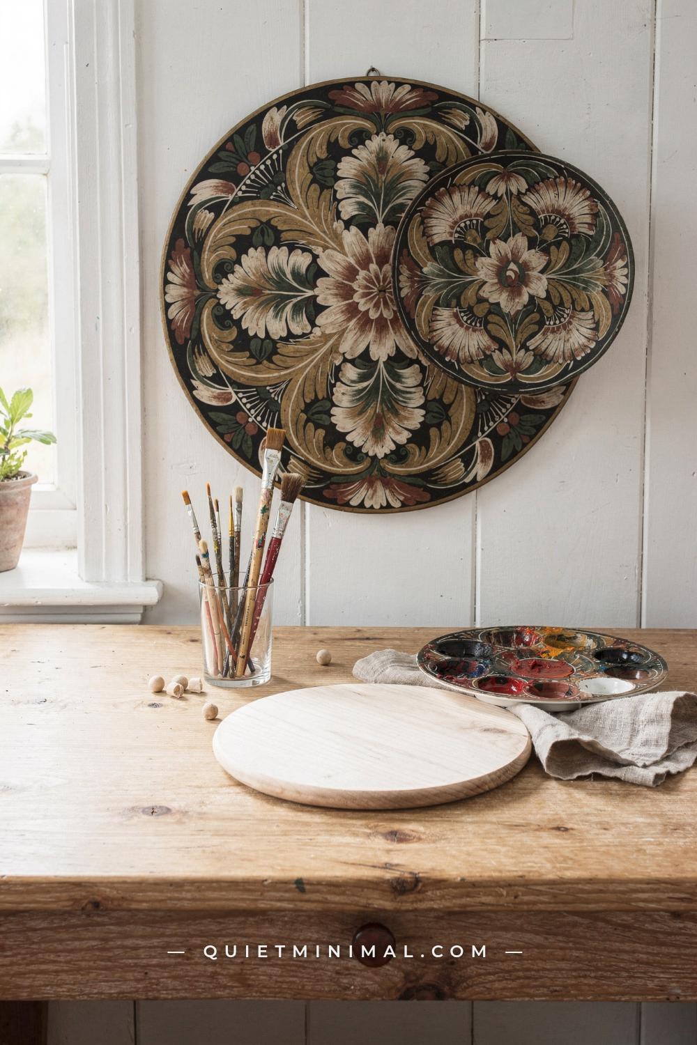
Norwegian rosemaling is one of those art forms that looks effortless when a skilled painter does it and immediately exposing when a beginner gets one thing wrong. The swirling florals, confident C and S strokes, and layered color feel alive on a well-executed piece. On a struggled piece, they feel stiff, muddy, or thin, and the painter often can not tell why. That gap between “this looks like rosemaling” and “this looks like I tried rosemaling” is almost always caused by a small number of fixable mistakes. Not a lack of talent. Not a lack of practice time. Specific, nameable errors that show up again and again, across every skill level, from first-timers painting a basswood plate to intermediate painters wondering why their Telemark scrolls never look quite fluid enough.
This article names twelve of those mistakes, explains exactly why each one produces the wrong result, and gives you a clear correction. Work through these before you start your next piece, or use them to diagnose something you already finished and were not happy with.
Painting Directly on Raw Wood Without Sealing It First
 Save
This is the first mistake, and it quietly ruins more rosemaling projects than any other. Raw wood is porous and the grain runs in directions that have nothing to do with your design. When you lay down a stroke directly on unsealed wood, the bristles drag on the raised grain, the paint absorbs unevenly, and the fine linework that gives rosemaling its character bleeds into soft edges instead of holding crisp lines.
The mechanism is simple: wood grain acts like a series of tiny ridges and valleys, and paint settles into the valleys faster than it sits on the ridges. Your stroke lands, then the paint migrates downward into the grain before it dries. The result looks like your lines are fuzzy, your colors are duller than they should be, and the whole design has a slightly washed-out quality.
The correction is a base coat, applied before any rosemaling begins. Traditional painters used a ground of linseed oil or a thinned gesso layer. Contemporary painters typically apply a painted background color directly, let it dry fully, then sand lightly with 220-grit paper to knock down the raised grain. That second surface accepts brushstrokes cleanly. Many rosemaling competitors and instructors go further: they apply a thin sealing layer of the background color, sand, then apply a second, full-coverage coat of the background before touching a liner brush to the surface. The difference between a sealed background and a raw one is immediately visible under a raking light. The sealed surface looks intentional. The raw surface looks like the paint is sitting on top of something that rejected it.
If your current piece already has this problem, apply a thin wash of your background color over the whole surface once the rosemaling is dry, let it cure, and repaint the design on top. It is extra work, but the result justifies it.
Key Takeaway: Always seal and base-coat your wood surface before the first stroke of rosemaling, because raw grain fights your brushwork and softens every line.

Using Craft Acrylics Instead of Artist-Grade Paint
 Save
The paint aisle at a craft store is full of small bottles of acrylic color that cost a fraction of artist-grade tubes, and they are fine for many projects. Rosemaling is not one of those projects. The reason is pigment load.
Craft acrylics are formulated for general craft use: they cover paper, wood, and fabric adequately, and they dry fast. But the pigment-to-binder ratio is lower than artist-grade paint. In practice, this means the colors are weaker and more translucent than the label suggests. When you try to lay down the deep, saturated cobalt blue or the warm terracotta red that rosemaling requires, craft acrylics require multiple thick coats to reach the right depth. Multiple thick coats mean your paint layer builds up into visible ridges, the stroke edges look chunky rather than tapered, and the fine S-scroll transitions from dark to light disappear under opacity.
There is also a consistency difference. Artist-grade acrylics, particularly formulas widely used in the rosemaling community, are designed to stay open slightly longer and move predictably off the brush. Craft acrylics tend to grab and drag, which fights the confident single-pass stroke that rosemaling demands. The C-stroke and S-stroke only look fluid when the paint releases off the bristle at a controlled rate. A paint that grabs cuts that release short.
The correction is to invest in a small set of artist-grade or specialty folk art acrylics rather than a large set of craft bottles. You do not need a full color range. Rosemaling palettes are traditionally narrow: one or two deep background colors, three to five accent colors, and a few tints of each for highlighting. A small, quality palette outperforms a large, cheap one on every stroke.
If you have already started a piece with craft acrylics, you can continue and add artist-grade paint for the detail work and linework on top. The fine lines will hold better and read more crisply, which partially compensates for the flatter base layers below.
Key Takeaway: Artist-grade or specialty folk art acrylics carry enough pigment to deliver rosemaling’s characteristic depth and release off the brush predictably; craft bottle paints do not.

Choosing the Wrong Brush Shape and Size
 Save
Most beginner rosemalers walk into a craft store, look at the brush wall, and pick something medium-sized and affordable. The result is a brush that has too many bristles splayed too wide, cannot hold a point through a full stroke, and delivers a blunt line where rosemaling requires a tapered one.
Rosemaling strokes are pressure-and-release movements. You press the brush down at the widest point of the stroke, then gradually release pressure as you move through the arc, lifting onto the tip by the end. This technique only works if the brush has a belly that holds enough paint to get through the stroke and a tip that comes to a genuine point when pressure is released. A round brush with a poor tip breaks the point within the first quarter-inch of a stroke, producing a flat blunt tail instead of a tapered one. That is the difference between a scroll that reads as fluid and one that looks like it was painted with a cotton swab.
Flat brushes have their place in rosemaling, primarily for petal strokes in the Hallingdal style and for laying down background color. But beginners who default to flat brushes for scrollwork end up with angular, geometric strokes that look more like a simplified folk pattern than a proper rosemaling composition.
The correct brush category for most rosemaling work is a round, in size 4 or size 6 (about 5mm to 7mm at the belly). A sable or sable-blend bristle holds the point through a full stroke and gives you the control to taper cleanly at the end. Synthetic brushes vary enormously in quality; cheaper synthetics spring back too fast and prevent you from feeling the pressure release. A liner brush in size 0 or 1 handles the fine linework: the hairlines, tendrils, and decorative detail work that give rosemaling its distinctive handmade quality. Start with two brushes: one round size 4 or 6 for the main scrollwork, one liner for finishing work. That is enough for most beginner to intermediate pieces.
Key Takeaway: A quality sable-blend round brush in size 4 or 6 is the correct tool for rosemaling scrollwork; it is the only brush shape that delivers the pressure-and-release taper that makes a C-stroke read as fluid.

Mixing Paint Too Thick or Too Thin Before Starting
 Save
Paint consistency is the variable that beginning rosemalers control least, and it affects every single stroke on the piece. Too thick and the paint drags under the brush, builds up ridges at the beginning of every stroke, and refuses to taper at the tip. Too thin and the color floats on the surface, runs outside the intended line, and dries to a washy, faded version of what was intended.
The target consistency for rosemaling is described in different ways by different teachers, but the most useful benchmark is the behavior of the paint as it leaves the bristle: it should flow off at steady, even pressure without pooling at the start, and it should stop at the tip without running past it. When working in acrylics, this usually means thinning with a small amount of water and a touch of a retarder medium to extend the open time slightly. The retarder matters because standard acrylic dries so fast that the paint can begin to skin over on the brush between the time you load it and the time you complete the stroke. When that happens, the beginning of the stroke looks smooth and the tail end looks dragged and broken.
When working in oils, which is the traditional medium for rosemaling, the consistency control comes from the amount of medium mixed in. Boiled linseed oil or a painting medium thins the paint and extends open time. The oil-paint version of rosemaling has a slightly luminous quality that acrylic struggles to match, because the paint stays workable long enough to blend wet-into-wet at the petal edges. If you are working in oils and your strokes look choppy at the transition zones between the shading color and the highlight color, it usually means you are working with undiluted paint that is too stiff to blend.
Test your paint consistency on a practice surface or a piece of palette paper before going to the actual piece. Do a few C-strokes. If the start of the stroke has a blob of extra paint and the end trails off to nothing, thin the paint by about 10 to 15 percent more. If the stroke runs outside the line you intended, thicken slightly. Adjust before you commit to the real surface.
Key Takeaway: Test your paint consistency on palette paper before every session; rosemaling demands a flowing but controlled consistency that neither pools at the start nor runs at the tip.

Skipping the Stroke Practice Before Going Straight to the Piece
 Save
The two foundational strokes of rosemaling, the C-stroke and the S-stroke, are not complicated in concept. Press down, curve, lift. But the physical coordination between hand pressure, brush angle, and arm movement takes repetition before it becomes reliable. The single most common reason beginner rosemaling looks stiff is that the painter went straight from watching a demonstration to painting the actual piece, without any isolated stroke practice.
When you skip the practice phase, you are solving two problems at once: the stroke technique and the design composition. That is too much to manage simultaneously. The design problem (where does this scroll go, how large should this flower be) uses a different kind of attention than the technique problem (how much pressure, how fast, what angle). Trying to solve both at once usually results in both being solved poorly.
The practice stroke is also diagnostic. A well-formed C-stroke begins broad at the head, curves smoothly through the arc, and tapers to a clean point at the tail. If your practice strokes have blunt tails, the problem is that you are not releasing pressure soon enough. If they have wide, uneven bodies, the problem is that your arm is moving faster than your pressure is increasing at the start. Both of these are correctable, but you need to see them isolated on a practice sheet before you can fix them. On the actual piece, they are buried in the composition and harder to diagnose.
Spend 15 to 20 minutes on palette paper before every painting session doing isolated C-strokes and S-strokes. This is not wasted time. It is the same warm-up that every trained painter uses, for exactly the same reason a musician runs scales before performing: it coordinates the hand before demanding that it produce something finished. Experienced rosemalers still do this. If you are skipping it because you feel like you should be past it, that is a sign you are not past it yet.
Key Takeaway: Practice isolated C-strokes and S-strokes on palette paper for 15 to 20 minutes before every session, because stroke technique and design composition require separate attention.

Choosing a Background Color That Fights the Design Instead of Supporting It
 Save
In traditional Norwegian rosemaling, the background color is not neutral. It is a deliberate design choice that either makes the scrollwork readable or destroys it. The most common beginner mistake with backgrounds is choosing a color that feels safe: a medium tan, a soft gray, or a light natural wood stain. These colors sit in the mid-value range, and rosemaling designs typically contain both light highlights and dark shadow colors. When both the lights and the darks of the design are fighting a mid-value background, neither reads clearly.
Authentic regional rosemaling backgrounds tend toward the deeper end: deep cobalt blue in the Rogaland style, dark forest green or deep brick red in Telemark pieces, deep ivory or near-black in some Hallingdal work. These dark grounds do something specific: they push the lighter highlights of the design forward and make the shadow tones of the scrollwork recede. The result is a sense of depth and three-dimensionality that flat or mid-value backgrounds cannot produce. The flowers look like they are sitting above the surface rather than painted onto it.
The second background mistake is choosing a color that shares the hue family of the design colors. If your scroll palette is primarily warm: oranges, reds, golden yellows, and you paint them on a warm medium-brown background, all the warmth competes in the same visual space. The contrast that makes rosemaling legible disappears. Traditional painters understood color temperature contrast intuitively. Cool backgrounds support warm design colors. Dark backgrounds support light highlight colors. The design needs something to push against.
Before committing to a background, test a swatch of your intended design colors over it on a piece of palette paper. Look at it from 18 inches (46cm) away, which approximates how someone views a displayed piece. If you cannot immediately read the scroll line against the background at that distance, change the background, not the design. The background is easier to repaint than the design.
Key Takeaway: Choose a background color that is at least two value steps darker or lighter than your design’s mid-tone, and consider opposite color temperature, because rosemaling legibility depends on that contrast.

Overfilling the Design Space and Ignoring Negative Space
 Save
Negative space is not empty space in rosemaling. It is structural. The areas of bare background visible between and around the scroll motifs are part of the composition’s rhythm. When beginners fill every inch of a surface with scrolls, flowers, and leaf details, they eliminate the rhythm and the eye has nowhere to rest. The result looks busy, almost frantic, and the individual elements of the design become unreadable because they are all competing with each other at the same time.
This mistake comes from a reasonable instinct: more detail seems like more skill. The opposite is true in rosemaling. The confidence to leave a section of deep blue background untouched requires more discipline than filling it. The master rosemalers from whom this tradition descends understood that the scroll becomes beautiful when it floats in space, when the eye can travel the arc of the line and then rest in the open field before encountering the next element. That rest is what gives the next element its impact.
The Telemark style is particularly instructive here. Its characteristic asymmetrical composition is built on an open background field that accounts for roughly 40 to 50 percent of the surface area on many well-executed pieces. The scrollwork emerges from a root center and branches outward, with open background between the branches. The Hallingdal style uses a stronger central framing border and fills more of the interior, but even there, the convention is structured breathing room at the corners and along the edges.
To correct over-filling on a piece you are planning: sketch your design on tracing paper first and hold it over the prepared background. If the sketch covers more than 60 to 65 percent of the surface, pull one or two elements out. Usually the right edit is removing the outer ring of smaller fill-in flourishes and letting the main scroll and central flower carry the composition. What remains will feel sparse at the sketch stage. On the finished piece, with the contrast of paint against background, it will feel balanced.
Key Takeaway: Leave 35 to 50 percent of your surface as open, painted background, because negative space is the visual rest that makes the scroll elements readable and the composition feel intentional.

Painting a Symmetric Composition When the Style Calls for Asymmetry
 Save
Most people learn to draw by copying symmetrical forms. Flowers with petals on both sides. Vases with equal handles. This habit follows painters into rosemaling and produces a specific kind of work that looks more like a manufactured pattern than a hand-painted folk art piece.
Symmetry is not wrong in all rosemaling styles. The Hallingdal and Rogaland traditions use centered, symmetrical compositions quite deliberately, with a dominant central flower or motif surrounded by balanced scrollwork. But the Telemark style, which is one of the most practiced and admired in North America, is fundamentally asymmetrical. Its defining characteristic is a scroll that begins at a root point and flows outward in a non-repeating, one-directional movement. Copying the composition exactly on both sides of the surface kills this quality entirely. The result looks like a geometric textile repeat rather than a painted folk tradition.
The mistake compounds when painters mirror not just the layout but the direction of individual scrolls. In authentic Telemark work, each scroll has a head-to-tail direction that contributes to the overall movement of the composition. When scrolls are mirrored, the directional flow reverses on one side and the composition loses its sense of organic movement.
You've saved it, wanted it. Here's the how: codes, measurements, order. Your choices make it yours.

The practical correction is to reference good examples of the specific regional style you are working in before you begin, and to ask yourself explicitly: does this style use symmetry or asymmetry? If you are working in Telemark, your compositional sketch should have a single root center, and the branches should develop from it without repeating the same shape on both sides. If you find yourself drawing the same scroll twice to balance the left and right, stop. Add a different element: a smaller leaf cluster, a different-size flower, an additional tendril. Let the composition be uneven. That unevenness is what makes it read as hand-made rather than printed.
Key Takeaway: Identify whether your regional style is symmetrical or asymmetrical before designing your composition, because applying left-right mirroring to a Telemark-style piece destroys its defining characteristic.

Skipping the Linework That Gives Rosemaling Its Handmade Quality
 Save
Linework is the final layer of rosemaling: the thin, flowing hairlines that trace the edges of petals, the tendrils that connect one scroll to the next, and the small decorative accents that define the space between major elements. Many beginners stop the painting process before they reach this stage, either because the piece already looks done to them or because they are not sure how to approach lines with a round brush. This is where most beginner rosemaling diverges most visibly from the traditional look.
A rosemaling piece without linework has a blocked-in, unfinished quality. The flowers and scrolls look like shapes rather than like painted form. The linework is what gives the art its handmade signature: the variation in line weight as the brush tip moves, the way the hairline curves match the direction of the scroll beside them. Without it, the piece could have been produced with a stencil. With it, it looks like an heirloom.
Linework is done with a liner brush, a size 0 or size 1 round with a long belly that holds plenty of paint and a tip that comes to a near-microscopic point. The paint needs to be thinned more than for scrollwork: the consistency should be close to ink, flowing easily with almost no pressure required. The technique is to move the whole arm, not just the wrist. When wrist-only linework is used, the lines curve in tight arcs that follow the radius of the wrist joint. When the arm moves, the lines flow in long, graceful curves that follow the composition’s movement.
Practice your linework on palette paper first: draw a series of flowing S-curves and spirals using only arm movement, keeping the brush nearly upright. Then do the same on your piece. A 12-inch (30cm) plate or panel typically requires 20 to 30 minutes of linework to reach the level of detail that reads as complete. That time is worth spending.
Key Takeaway: Linework applied with a thinned liner brush and arm-movement technique is the layer that distinguishes finished rosemaling from a stenciled approximation, and skipping it is immediately visible.

Using Too Many Colors and Losing the Palette’s Coherence
 Save
Historical Norwegian rosemaling palettes were narrow by necessity: traditional painters worked with pigments they made from local plants, minerals, and earth, which limited the available colors to what the land provided. That constraint produced something aesthetically valuable: compositions where every color relates to every other color because they all come from the same limited source. When beginners approach rosemaling with a full set of 36 craft acrylic bottles and try to use most of them, the result is a composition that feels visually restless, because no color relationship was intentionally designed.
The mechanism is color competition. In a tight, intentional palette, the eye moves through the composition following the color relationships: the cobalt background sets a cool temperature, the terracotta flowers provide the warm contrast, and the ivory highlights read against both. Every color decision supports the next one. In a loose, multi-color palette, the eye bounces unpredictably from one unrelated color to the next without a clear path through the composition. The painting looks effortful rather than skilled.
Traditional rosemaling palettes typically use one or two dominant colors, two to three accent colors, and a highlight color derived from tinting the accent colors with white or a pale ivory. The Telemark style often works in cobalt and rusty red on a dark background, with warm white highlights and a deep green leaf accent. The Hallingdal style might use a wider range, but the colors are closely related in temperature and saturation level. The key is that the palette was selected as a system, not assembled by picking individual colors that each looked nice on their own.
Before your next project, select your full palette before painting begins: background color, two main design colors, one leaf or vine accent, and your tinting white. Test all five or six together on a palette paper swatch and look at them as a group. If they feel coherent as a group, proceed. If one color jumps out as unrelated, replace it.
Key Takeaway: Build your rosemaling palette as a system of five or six related colors before you start, because color decisions made piece by piece during painting produce compositions that look unplanned.
Protecting the Finished Piece With the Wrong Varnish
 Save
Many painters reach the end of a rosemaling project, feel relieved to be almost done, and grab whatever varnish is within reach. A high-gloss polyurethane spray, a decoupage medium, or a general-purpose craft sealer. Any of these can ruin the visual quality of a piece that looks right at every other stage.
The problem with high-gloss varnish on rosemaling is reflectance. A high-gloss finish creates specular reflections: when the piece is displayed on a wall or shelf, the sheen of the varnish catches overhead light and creates bright hot spots that obscure sections of the design. The piece looks like it is under glass. The brushstroke texture, which is part of what gives rosemaling its handmade character, disappears under gloss because the flat varnish film evens out the surface variation. The result reads as a print, not a painting.
High-gloss varnish also does something more subtle: it shifts the value relationships in the composition. Darks appear darker and lights appear lighter under gloss, which increases contrast beyond what the painter intended. A carefully balanced palette of related colors that looked unified under matte suddenly looks garish and high-contrast under a full-gloss coat.
The correct finish for most rosemaling pieces is a satin or semi-gloss varnish with low UV content, applied in two thin coats rather than one thick one. Satin varnish protects the surface, repels dust, and adds a slight sheen that reads as polished without creating reflective glare. For pieces that will be handled or displayed in a kitchen, a polyurethane topcoat in satin or eggshell provides more durability than a water-based acrylic varnish. For display-only wall plaques, a water-based satin medium is sufficient and does not yellow over time the way oil-based varnishes can.
Apply the varnish in smooth, even strokes with a clean flat brush or a foam applicator. Let the first coat dry fully, sand lightly with 400-grit paper if the surface feels rough, then apply the second coat. Two thin coats outperform one thick coat in clarity, adhesion, and final appearance every time.
Key Takeaway: Finish rosemaling with two thin coats of satin or semi-gloss varnish rather than a high-gloss finish, because gloss creates reflective hot spots that obscure the design and make the piece look like a reproduction.

Painting on a Surface That Is Too Large or Too Complex for Your Current Skill Level
 Save
Scale is a skill in itself. A rosemaling design that reads beautifully on a 6-inch (15cm) plate does not automatically transfer to a 14-inch (36cm) oval by simply making every element bigger. The proportional relationships between scroll size, flower diameter, linework weight, and open negative space all shift when the surface scales up, and the painter needs to have developed enough design intuition to manage those shifts deliberately. Beginners who start on large surfaces often produce work where the scrolls look oversized and lonely, the flowers look like they were placed at random to fill space, and the linework is either too heavy (because it was scaled proportionally from a smaller piece) or too light (because the painter held back, sensing something was wrong).
The surface shape adds another layer of complexity. Flat, round plates are the most forgiving surface for learning rosemaling because the composition boundaries are clear and the paint applies evenly. Curved surfaces like ale bowls, covered boxes with raised lids, or furniture panels introduce new challenges: the stroke direction has to account for the curve of the surface, paint consistency has to be slightly adjusted because the brush contacts a convex or concave surface differently than a flat one, and the design has to be mapped around a three-dimensional form rather than a two-dimensional plane.
The conventional teaching sequence used by rosemaling instructors begins with flat practice sheets (palette paper or inexpensive hardboard), moves to small flat plates in the 5-inch (13cm) to 8-inch (20cm) range, then to medium flat plates in the 10-inch (25cm) to 14-inch (36cm) range, and only then to curved or three-dimensional surfaces. Each stage is a separate skill. Skipping stages in the interest of working on a more impressive final piece is the most reliable way to produce work you are unhappy with.
If you have been struggling with a large or complex surface, give yourself permission to step back: finish a small plate first, complete the linework, varnish it, and set it somewhere you can see it. The confidence from completing a small piece successfully is the foundation that makes the larger piece achievable.
Key Takeaway: Begin every new level of rosemaling on the smallest appropriate surface, because scale and surface complexity are independent skills that compound the technical demands of the brushwork.

Ignoring the Regional Style Rules and Mixing Dialects Unconsciously
 Save
Norwegian rosemaling is not one style. It is a family of distinct regional traditions, each with its own compositional rules, palette conventions, stroke vocabulary, and characteristic motifs. Telemark is asymmetrical, free-flowing, with strong dynamic scrolls. Hallingdal uses structured layouts with strong central motifs and more formal framing. Rogaland favors dark backgrounds with delicate, intricate flower detail. Valdres has its own characteristics. Os has its own. Each developed in a specific valley in Norway, among specific painters, over generations.
When a beginning painter absorbs some Telemark imagery, some Hallingdal color choices, and some Rogaland detail work and combines them on one piece, the result is not a synthesis. It is a composition that has no grounding identity. The elements conflict with each other because they were designed to function within different compositional systems. A Rogaland-style dense, small-scale flower cluster placed at the center of an asymmetrical Telemark scroll disrupts the open movement that the Telemark style depends on. A Hallingdal-style formal border placed around a free-flowing Telemark composition contradicts both.
This is not a rule that exists to be rigid. Advanced rosemalers do develop personal styles that draw from multiple regional traditions. But that synthesis is only coherent when the painter understands each tradition deeply enough to know which elements they are borrowing, why those elements work in their original context, and how to adapt them to a different compositional system without breaking either. That understanding takes years to build.
For any painter in the first two to three years of rosemaling, the practical guidance is: choose one regional style and learn it fully before borrowing from another. Reference books and museum sources, particularly the collection at the Vesterheim Norwegian-American Museum in Decorah, Iowa, provide well-documented examples of each style painted by masters. Study one style until you can identify what makes a given piece clearly Telemark or clearly Hallingdal, then paint in that tradition exclusively for long enough to internalize its rules. Deliberate mixing comes later, and it is far more successful when built on that foundation.
Key Takeaway: Choose one regional rosemaling style, study its specific compositional rules and palette conventions, and work within that tradition until you can identify its defining characteristics from memory before attempting to blend styles.
Norwegian rosemaling rewards patience in a specific way: the mistakes described here are not mysterious. They are solvable. Seal your surface before you paint. Use artist-grade paint and a quality round brush. Build your palette as a coherent system, choose a background value that the design can push against, and leave the negative space open. Practice your strokes before they go on the real piece, complete the linework before you varnish, and finish with a satin coat that lets the painting speak without glare. Above all, pick one regional style and commit to understanding it fully. Your next piece does not have to look like you merely tried rosemaling. With these corrections in place, it can look like you actually know it.
You've saved it, wanted it. Here's the how: codes, measurements, order. Your choices make it yours.
 Save


