Georgia
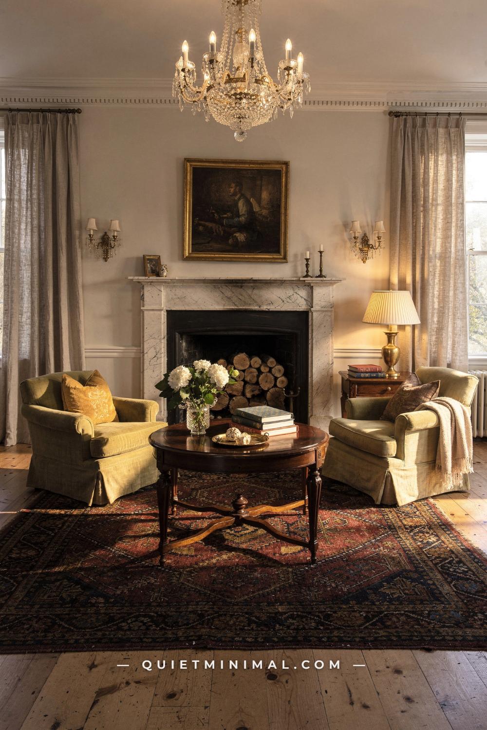
There is a particular kind of living room that reads as expensive without anything in it looking new. Deep moulding, curtains that fall properly to the floor, a worn rug, upholstery in colours you could not name quickly, lamps rather than ceiling lights, and a few pieces of furniture that are clearly older than everyone in the room. It photographs as unreachable, and most articles about it respond by listing furniture that costs more than a car.
That is not where the effect comes from. If you take an old money living room apart and ask what is actually producing the impression, the answer is consistently the same two categories, and neither is furniture. The first is architecture: moulding, panelling, a mantel, built-in cabinetry, and the proportions those create. The second is textiles: curtains hung to the right height in enough fabric, one properly upholstered piece, and a rug of the right size and age.
Everything else in these rooms, the side tables, the lamps, the boxes, the pictures, the books, tends to be old, inherited or bought for very little, and that is the point rather than a compromise. The look is built on accumulation, restraint and one or two well-chosen large expenses, which is a far more achievable specification than it appears. What follows is what the room is made of, in the order the money should go in.
It Starts at the Trim, Not the Sofa
 Save
Every serious description of this look names the same thing first, and it is not a piece of furniture. Crown moulding, panelling, a mantel and built-in cabinetry are described as the backbone of the interior, and the reason is that they do their work before anything is furnished.
Architecture sets the proportions of a room, and proportions are what your eye reads as quality. A room with a 3 inch (8 cm) builder baseboard, no crown, and flat drywall walls announces its own construction cost regardless of what is placed in it. The same room with an 8 inch (20 cm) baseboard, a proper crown, and simple applied panelling reads as a much older and much more expensive house, and the materials involved cost very little.
From the guides
You've saved it, wanted it. Here's the how: codes, measurements, order. Your choices make it yours.
 The Japandi Honest PlaybookThe honest version of the style: what to keep, what to skip, and the order to do it in.See inside →
 The Room Refresh PlaybookA repeatable four-step method, room by room, in ten minutes, thirty minutes, or one weekend.See inside →
 Make Any Room Feel Cozy on PurposeWhy some rooms hold people and others empty out, and the moves that change it.See inside →
Baseboard is the highest-value change and the least disruptive. Going from a 3 inch (8 cm) to a 7 or 8 inch (18 to 20 cm) baseboard changes the perceived height and age of a room more than any paint colour. It is straightforward carpentry, it can be done room by room, and the material is inexpensive.
Crown moulding is second. Keep it in proportion: in an 8 foot (244 cm) room, a crown of 3 to 5 inches (8 to 13 cm) is right, and anything larger starts to close the room down. In a 9 or 10 foot (274 or 305 cm) room you can go to 6 or 7 inches (15 to 18 cm). A simple profile in the right size always beats an ornate one in the wrong size.
Panelling is third and it is more achievable than people think. Simple applied box panelling below a chair rail, made from lengths of trim glued and pinned to the wall and then painted over with the wall, costs very little and reads as joinery. Keep the boxes in consistent proportion, and align them with the room’s openings rather than dividing the wall arbitrarily.
The mantel is fourth. If you have a fireplace with a plain surround, a simple painted timber mantel with a proper shelf changes the whole focus of the room. If you have no fireplace, a substantial built-in bookcase or a pair of them flanking a window does the same job of giving the room a built element to organise around.
Paint all of it the same colour as the walls, in a soft eggshell rather than a gloss. Contrasting bright white trim is a contemporary signal; trim in the wall colour is what makes moulding read as architecture rather than as decoration.
Key Takeaway: Spend on trim before furniture, take the baseboard to 7 or 8 inches (18 to 20 cm), size the crown to the ceiling, and paint every moulding the same colour as the wall.

The Palette: Warm Neutrals With One Deep Note
 Save
The palette in these rooms is warm, narrow and almost entirely neutral, with one deeper colour used sparingly, and the discipline of it is what produces the calm.
The base is a warm off-white or a soft greige on the walls, and it matters that it is warm. Cool greys and blue-based whites read as contemporary and slightly clinical, and they make wood and old textiles look grey. A white with a touch of yellow or a hint of pink, or a soft stone colour, is the family to shop in.
Upholstery sits in the neutral band: beige, oatmeal, soft grey, cream, and warm taupe. This is the anchor layer and it should be the largest area of colour in the room. Neutral upholstery is also the practical choice for a room built over years, because everything you add later will work with it.
Then one deep note, used sparingly. A muted green, a deep blue, a faded oxblood, a dark brown. It appears on a pair of small chairs, or in the curtains, or in the rug, or on a single wall, and nowhere else. Layering darker tones in small quantity is exactly what the current guidance describes, and the sparingly is doing as much work as the colour choice.
Wood tone is the third element and it should be warm throughout. Walnut, mahogany, old oak. Mixed species are fine and correct; what does not belong is a cool grey-washed or limed finish, which reads as contemporary and fights the whole palette.
Metals follow the same rule of restraint. Aged brass is the default and it belongs on lamps, on picture lights, on hardware. Keep it consistent and let it be dull rather than bright.
The last part of the palette rule is the one people skip: nothing is at full saturation. Every colour in these rooms has been knocked back. A clear bright green cushion in a room of soft ones is instantly the loudest thing present, and loud is the one quality this look cannot carry.
Key Takeaway: Build on a warm off-white with neutral upholstery, add exactly one deep muted colour in one or two places, keep all wood tones warm, and let nothing sit at full saturation.

The Fireplace and What Sits on the Mantel
 Save
The fireplace is the one element in this kind of room that organises everything else, and it is worth treating as architecture rather than as a feature.
Proportion first. A mantel shelf sits at roughly 48 to 54 inches (122 to 137 cm) from the floor in most rooms, and the surround should read as substantial rather than slim. A narrow modern surround in a room with an 8 inch (20 cm) baseboard and a proper crown looks undersized, and the fix is usually a simple painted timber surround built around whatever opening exists. This is inexpensive carpentry and it changes the room more than any object placed on it.
Material should be quiet: painted timber, a plain stone, or brick left alone. What reads wrong is high-polish marble with heavy veining, and anything with applied ornament that does not match the rest of the room’s trim. Painted in the wall colour, a plain surround becomes part of the architecture, which is exactly the intention.
Keep the firebox clean and the hearth swept, and leave it unlit in daylight. A basket of split logs beside it, a pair of simple fire tools, and nothing else. An empty firebox that is clearly maintained reads far better than one filled with candles or a decorative screen.
The mantel itself follows a rule of asymmetry. A large picture or a mirror above, hung so its bottom edge sits 6 to 10 inches (15 to 25 cm) above the shelf. Then a small number of objects grouped toward one end rather than spaced evenly along it: a pair of ivory candlesticks, a small box, a bowl. Perfect symmetry, with a matched pair at each end and something centred between them, is the arrangement that reads as decorated.
Height variation does the composition. One tall element, one mid, one low, exactly as on any other surface, and a good deal of bare shelf left visible. Two thirds full is about right.
If there is no fireplace at all, the same organising job can be done by a substantial built-in bookcase, a pair of them flanking a window, or a large piece of art with a console beneath it. What the room needs is one place the seating faces, and it does not have to contain a fire.
Key Takeaway: Build a substantial painted surround with the shelf at 48 to 54 inches (122 to 137 cm), keep the hearth swept and the firebox clean and unlit, and group a few objects of varying height toward one end of the mantel rather than symmetrically.

Curtains Are the Biggest Single Spend
 Save
If there is one place where spending real money produces an unmistakable result, it is the curtains, and it is the line most people cut first.
Three specifications separate curtains that read as expensive from curtains that read as rental. Fullness, height and length, in that order of importance.
Fullness is the amount of fabric across the width, and it is the one that costs. Curtains should be two to two and a half times the width of the window in flat fabric, so that they hang in deep even folds rather than in shallow ripples. A panel that is barely wider than the window looks thin and flat no matter how good the cloth is, and this single variable accounts for most of the difference in how curtains photograph.
Height is the cheapest of the three and produces the most dramatic change. Mount the rod close to the ceiling, or at minimum 6 to 10 inches (15 to 25 cm) above the window frame, and extend it 8 to 12 inches (20 to 30 cm) past the frame on each side. The high rod makes the window read as taller and the room as loftier, and the wide extension means the panels stack against the wall rather than covering the glass, so you keep the daylight.
Length is a binary. Curtains either just brush the floor, break slightly on it, or pool a little. Anything that stops short of the floor reads as a mistake, and the classic 4 inches (10 cm) above the floor is the single most common curtain error in domestic interiors.
Fabric should be substantial and quiet. Heavy linen, wool, cotton velvet, or a good cotton, in a solid neutral. Lining is what makes a curtain hang properly and it also protects the face fabric from sun, so it is worth the cost. Interlining, a soft layer between the face and the lining, is what gives the very heavy, sculptural fall in the rooms you are looking at, and it is the detail worth asking about if you are having curtains made.
Hardware should disappear. A slim rod in aged brass or a painted wood pole, simple rings, and a finial that does not draw attention. Fussy decorative hardware pulls the eye to the top of the window, which is exactly where you do not want it.
Key Takeaway: Buy two to two and a half times the window width in fabric, hang the rod close to the ceiling and 8 to 12 inches (20 to 30 cm) wider on each side, and let the panels just brush the floor.

One Serious Upholstered Piece
 Save
After the architecture and the curtains, the third real expense is one properly made upholstered piece, and one is genuinely enough.
What separates a good sofa from a cheap one is mostly invisible and entirely worth understanding. A hardwood frame, kiln dried, jointed and corner blocked rather than stapled. Eight-way hand-tied springs or, at minimum, a serpentine spring system on a solid deck. Seat cushions with a high resilience foam core wrapped in down or a down blend, which holds shape and can be re-filled. Upholstery fabric that can be replaced.
Those specifications are the reason a good sofa lasts thirty years and a cheap one sags in three. They are also why a secondhand sofa from a serious maker, reupholstered, is very often better value than a new mid-market one. Reupholstering costs real money, but you are putting it into a frame that will outlive you rather than into a frame that will not.
Shape is where the current direction helps. Rolled arms, skirted bases and traditional silhouettes have come back into contemporary upholstery, which means you can buy new pieces whose shape belongs in this kind of room. A rolled arm sofa with a tailored skirt, in a neutral linen, reads as inherited from the moment it arrives.
The skirt deserves a specific note. A tailored skirt to the floor hides the legs and gives the piece a solid, grounded, slightly old-fashioned presence that exposed tapered legs cannot. It is one of the strongest single signals of this style and it costs nothing extra to specify.
Everything else can be secondhand. Two small armchairs from an auction, reupholstered or simply left as they are if the fabric is decent. A slipper chair. A stool. Once one properly made piece is anchoring the room, the rest can be honest old furniture and the room reads as accumulated rather than as furnished.
And keep the scale generous but not enormous. These rooms tend toward pieces that are comfortable and substantial rather than oversized. A sofa of 84 to 90 inches (213 to 229 cm) suits most living rooms; the 108 inch (274 cm) sectional belongs to a different aesthetic entirely.
Key Takeaway: Put the furniture budget into one well-built upholstered piece with a hardwood frame and a tailored skirt, and let everything else in the room be secondhand.

The Rug: Old, Worn, and Correctly Sized
 Save
The rug is the object that does the most to signal age in these rooms, and it is also the one most often bought at the wrong size.
Size first, because it is the fixable error. Leave 12 to 18 inches (30 to 46 cm) of bare floor between the rug edge and the walls, which frames the rug and keeps the room from looking wall to wall carpeted. The rug should extend at least 6 to 8 inches (15 to 20 cm) beyond each side of the sofa. And at minimum the front legs of every seating piece should sit on it, with all legs on being better if the room allows.
An 8 by 10 foot (244 by 305 cm) rug is the default that works in most living rooms, and a very large number of rooms are furnished with a 5 by 7 foot (152 by 213 cm) rug floating in the middle with nothing on it. A small rug makes a room look smaller and cheaper simultaneously, and it is the single most common and most correctable mistake in living room decorating.
Then age. A genuinely old rug, with a low worn pile and faded colours, does something a new one cannot, which is to establish that the room has a history. The good news is that worn is exactly what makes old rugs affordable. A hand-knotted rug with a thin patch and softened colours sells for a fraction of a pristine one, and in this room the thin patch is an asset.
Where to find them: local auction houses, estate sales, and specialist dealers who sell worn pieces at a discount. Sizes will be irregular, which is fine and correct; an 8 foot 4 inch by 11 foot 2 inch (254 by 340 cm) rug is a sign it was made rather than manufactured.
If a genuine antique is out of reach, look for a machine-made rug with a low pile and a properly muted, faded colour palette. What to avoid is the high-contrast, bright, chemically-even reproduction, because the flatness of the colour is what gives it away at a glance.
Layering is the useful trick for an awkward room. A large flat natural fibre rug underneath, with a smaller worn rug on top, gives you the coverage you need at the size you need and puts the good piece where it is seen.
Key Takeaway: Size the rug so all seating touches it with 12 to 18 inches (30 to 46 cm) of floor showing at the walls, and buy an old worn hand-knotted piece rather than a pristine new one.

Lamps, Shades, and the Ceiling Light
 Save
The lighting in these rooms follows one rule with no exceptions, and it is the easiest thing on this whole list to copy tonight: nothing comes from the ceiling.
An overhead fixture produces flat, even, downward light that flattens texture, deadens colour and reveals the exact dimensions of a room. Every room in this style is lit from lamps at seated height, which is why the corners stay soft and the fabrics look rich and the room appears to extend beyond what you can see.
The working number is four to six lamps in a living room. That sounds like a lot and it is the correct amount. Two table lamps at roughly 26 to 30 inches (66 to 76 cm) tall, on side tables and consoles, which is the height that lights faces. One or two floor lamps at 58 to 64 inches (147 to 163 cm) beside seating for reading. And at least one small accent, a picture light over art, a lamp on a bookshelf, a pair of candles on the mantel.
Shades decide the quality. Cream or off-white fabric shades, and pleated shades in particular, are the correct choice here and they are widely available again. A pleated shade transmits light through its sides as well as up and down, which fills a room with a soft even glow instead of two hard cones. Dark or opaque shades throw light only vertically and leave the middle of the room dim.
Lamp bases should be substantial and old-looking. Brass, ceramic, tole, wood, a converted vase. Secondhand shops are full of good lamp bases for very little, and rewiring one is a small job. A pair of matched lamps on either side of a sofa is the traditional arrangement and it works, though allowing one lamp somewhere in the room to be an odd one out keeps the room from looking staged.
Bulbs at 2700K, dimmable, and low. Four lamps at 40 to 60 watt equivalent produce a far better room than one bright ceiling fixture, and the whole scheme should be able to come down in the evening.
Candles are the last layer and they belong. Plain ivory tapers or pillars in simple brass or silver holders, on the mantel and on a side table, unscented. They are the cheapest thing of everything here and among the most effective.
Key Takeaway: Turn off the ceiling light permanently and run four to six lamps at three heights with cream pleated shades and warm dimmable bulbs.

Art Hung Like It Was Inherited
 Save
Art in these rooms is doing something specific: it is providing evidence that the contents predate the decoration. That means the choices are about frame, hanging and mix rather than about buying anything valuable.
Subject matters less than people think, and the safe categories are quiet: landscapes, still lifes, portraits of people nobody knows, botanical prints, architectural drawings, small abstracts in muted colour. What reads wrong is anything obviously current, high contrast, or mass produced at large scale, because scale plus newness is the combination that says the piece was bought to fill a wall.
From the guides
You've saved it, wanted it. Here's the how: codes, measurements, order. Your choices make it yours.
The Japandi Honest PlaybookThe honest version of the style: what to keep, what to skip, and the order to do it in.See inside →The Room Refresh PlaybookA repeatable four-step method, room by room, in ten minutes, thirty minutes, or one weekend.See inside →Make Any Room Feel Cozy on PurposeWhy some rooms hold people and others empty out, and the moves that change it.See inside →Frames do most of the work. Plain worn gilt, dark stained wood, and simple black wood are the three families, and mixing them across a room is correct and desirable. A wide cream mount around a small work makes it read as considered and gives the eye a rest. What is best avoided is a set of matching frames bought together, because a matched set of frames says the art arrived as a decorating decision.
Hanging height is the single most common error. The centre of a picture should sit at roughly 57 to 60 inches (145 to 152 cm) from the floor, which is average eye level, and most people hang 6 to 10 inches (15 to 25 cm) too high. Above furniture, the rule shifts: leave 6 to 10 inches (15 to 25 cm) between the top of the furniture and the bottom of the frame, so the picture reads as belonging to the piece below it.
Groups should be uneven. A grid of nine identical frames is a contemporary arrangement; a cluster of different sizes and frames, hung close together with about 2 to 3 inches (5 to 8 cm) between them and aligned on an invisible centre line rather than on their edges, is the traditional one. Lay the whole group out on the floor first and photograph it before putting a single nail in.
Picture lights are the finishing detail and they are more affordable than they look. A small aged brass picture light over the main painting, on at night, does two things: it makes the art the focus after dark, and it adds a warm accent layer at a height nothing else occupies.
And lean some. A framed piece propped on a mantel or on a bookshelf rather than hung is a small informality that keeps a formal room from feeling staged.
Key Takeaway: Mix frame styles rather than matching them, hang centres at 57 to 60 inches (145 to 152 cm) and 6 to 10 inches (15 to 25 cm) above furniture, and add a picture light over the main piece.

Antiques as Punctuation
 Save
Old wooden furniture is essential to this room and the quantity is smaller than people assume. Two or three pieces in a living room is plenty, and they function as punctuation rather than as the sentence.
What they contribute is the presence of forms and finishes that clearly predate the decoration. A side table with turned legs, a small bureau, a low chest, a pair of dining chairs used as occasional seating. Each is a dark, defined shape among neutral upholstery, and each one reads as a choice.
Prefer pieces on legs. A table or chest raised on legs shows floor underneath and reads far lighter than a piece sitting flat on the ground, which matters when everything else in the room is substantial. Eighteenth and early nineteenth century furniture tends to work better in modern rooms than heavy late Victorian pieces for exactly this reason.
Prefer pieces that do a job. A drop-leaf table that opens for a meal, a chest that holds blankets, a bureau with a fall front that becomes a small desk. An antique that is used looks like part of the household; one that only exists is more exposed to the question of why it is there.
Scale carefully in a modern room. Old case furniture is often deeper than its contemporary equivalent, so a Victorian sideboard at 24 inches (61 cm) deep in a room where the console would normally be 15 inches (38 cm) will take real floor space. And a tall piece needs 8 to 12 inches (20 to 30 cm) of clear wall above it with nothing hung there.
Where to buy: local auction houses, estate sales and house clearances, which is where the trade buys and where good unfashionable pieces still go cheaply. Brown furniture prices have been soft for years and are only now turning, so this is the moment.
Finish should be a soft satin rather than a hard shine. Much of the glassiness on inherited pieces is decades of spray polish, and cleaning it off and applying a clear paste wax brings a piece back to a patina that sits properly beside matte linen and wool.
Key Takeaway: Keep antiques to two or three per room, choose pieces raised on legs that do a real job, buy at auction, and wax them back to a soft satin rather than a hard shine.

Books, Boxes, and the Surfaces They Sit On
 Save
The small objects in these rooms are consistent and inexpensive, and they follow one principle: everything is either useful, personal, or genuinely old, and nothing was bought to decorate a surface.
Books are the largest category. Real ones, read, in ordinary modern editions with cloth or paper spines, stacked flat in threes and fours on tables and standing on shelves. A stack of oversized coffee table books bought for their spine colours is the most recognisable shortcut in this whole style and it reads as staging within a second.
Boxes are the second, and they are the object that does the most for the least money. A worn leather box, a small wooden box with a brass clasp, a lacquer box. They hold the remote controls, the coasters, the keys and the batteries, which means the surfaces stay clear, and they read as objects with a history.
Bowls and trays organise the rest. A shallow pale stoneware bowl for keys, a small tray on the coffee table that gathers whatever accumulates. The tray is the mechanism that makes a formal room survivable, because it turns clutter into a defined group.
Candles belong, and they should be plain ivory tapers or pillars in simple brass or silver holders, unscented. Two or three around the room, of varying heights, lit in the evening. Printed scented candles in branded jars belong to a different decade of decorating.
Flowers are the last element and they are the one thing in the room that should be alive. A simple arrangement of one kind of stem in a plain vessel: hydrangeas, tulips, branches in spring, evergreens through the holiday season. Not a mixed florist arrangement, which reads as bought, but a quantity of one thing, which reads as cut.
If a drink appears on a tray in one of these rooms it is tea or water, in plain glass or plain china, and it is there because someone was sitting there.
And keep the surfaces mostly empty. Three objects on a coffee table, two on a side table, and a good deal of visible wood. The restraint is not an absence of decoration; it is what makes the few things present look deliberate.
Key Takeaway: Use real books stacked flat, a worn box for the remotes, a tray for whatever accumulates, ivory candles and one kind of cut stem, and leave most of every surface clear.

What Restraint Actually Means Here
 Save
Restraint is the word every description of this look reaches for, and it is worth being precise about what it means practically, because it is not the same as minimalism.
These rooms are not sparse. They contain a great deal: layered textiles, pattern in the rug, books, pictures, several lamps, old furniture. What they do not contain is anything shouting. Restraint here means low contrast, muted colour, quiet materials and no single object competing for attention.
The most useful operational version of this is a subtraction habit. When a room feels not quite right, the instinct is to add something, and in this style the answer is almost always to remove something instead. Take three things off the surfaces and look again. Nine times out of ten the room improves.
Empty space is a material in its own right. A bare stretch of wall, a clear half of a coffee table, an area of rug with nothing on it. These are what allow the objects present to be read individually, and a room where every surface and wall is occupied reads as busy no matter how good the individual pieces are.
Scale restraint matters too. One large piece of art rather than a wall of small ones. One deep colour rather than three. One patterned element, usually the rug, with everything else plain. The pattern in these rooms almost always comes from a single source, and it is worth identifying which one it will be before you buy anything.
Then there is the restraint that is about not signalling. Nothing in these rooms carries a visible logo, a brand name, or an obvious price. Objects are unbranded, plain, and often slightly worn, and that plainness is precisely the signal being sent. It is the reason a plain white lampshade reads more expensive than an elaborate one, and the reason very old and very plain sit so comfortably together.
Finally, restraint about newness. A room in which everything arrived within a year cannot read as accumulated. Leaving a wall bare for six months until the right picture appears is not an unfinished room, it is the method.
Key Takeaway: Subtract rather than add, keep pattern to a single source, leave real empty space on walls and surfaces, and let plainness and slight wear do the signalling.

Where the Money Should Not Go
 Save
It is as useful to know where this look does not need money as where it does, because most of the expensive shortcuts do not produce the effect.
A very expensive sofa is the first. Beyond a well-built frame and good cushions, additional spend on a sofa buys refinement that does not read across a room. One properly made piece in a neutral fabric produces the result; a second and third at the same price do not add to it proportionally.
Matched sets are the second, and they actively work against the look. A three-piece suite, a set of matching side tables, a coordinated collection of accessories from one shop. Every one of these signals that the room was purchased rather than assembled, which is the opposite of the impression being sought.
Anything designed to look old is the third. Reproduction antiques, artificially distressed furniture, printed reproduction art, faux architectural salvage. All of them cost money to produce an appearance that a genuinely old object provides for less, because unfashionable old things are cheap and manufactured age is not.
Statement lighting is the fourth. A large sculptural ceiling fixture is a contemporary move and it is also money spent on a light source this style does not use. The equivalent budget spread across four good secondhand lamp bases, new shades and dimmers will do far more.
Ornate architectural detail is the fifth. Elaborate ceiling roses, heavy dentil crowns and complex panelling in a modest room read as applied grandeur, which is exactly the register this look avoids. Simple profiles in generous proportions cost less and read better.
And branded anything is the sixth. The visible logo is the single element most incompatible with this style, which is built on things being quietly good rather than identifiably expensive.
Where the money goes instead, in order: trim and paint, curtains with proper fullness, one well-made upholstered piece, an old rug of the right size, and then nothing much at all, because the rest of the room is secondhand furniture, real books, plain candles, cut flowers and lamps you rewired yourself.
Key Takeaway: Skip the expensive second sofa, matched sets, reproduction antiques, statement ceiling lights and anything branded, and put the money into trim, curtains, one good upholstered piece and an old rug.
Building It Over Three Years Instead of One Weekend
 Save
The honest description of how these rooms come together is that they are not decorated in one go, and building yours the same way is both cheaper and more convincing.
A workable order. Year one is architecture and light: baseboard, crown, paint everything including the trim in one warm colour, remove the ceiling fixture from use and buy four lamps and shades. This is the least expensive year and it produces the biggest single change, because it alters the room rather than its contents.
Year two is textiles: curtains with real fullness hung close to the ceiling, and the rug at the correct size. These two together are the second biggest visual step and they are where a real budget goes. If you can only do one, do the curtains, because a room with proper curtains and a small rug still reads better than the reverse.
Year three is furniture: one well-made upholstered piece, and then the slow accumulation of old wooden pieces from auctions as they turn up. This is the year that never really ends, and it should not.
Alongside all of it runs the collecting, which is the part that cannot be rushed and costs the least. Pictures found one at a time and framed as they arrive. Books read and kept. A leather box from a market. A brass lamp base rewired. Candles, a pair of good linen cushions, a wool throw.
Two habits make this work. First, buy nothing to fill a gap. An empty wall waiting for the right picture is not a problem; a wrong picture bought to end the waiting is. Second, keep a running list of what the room actually needs, with dimensions, so that when something turns up at an auction you already know whether it fits.
And accept that the finished state is not the goal. The rooms being copied here look the way they do because they have been added to and edited by more than one generation, and the visible evidence of that process is the whole effect. A room assembled over three years already reads very differently from one assembled over three weeks.
Key Takeaway: Do architecture and lamps first, curtains and the rug second, furniture third, buy nothing simply to fill a gap, and keep a list with dimensions so you can act when the right piece appears.

Strip this look back and it is four things. Moulding in generous proportions, painted the same colour as the walls. Curtains with two to two and a half times the window width in fabric, hung close to the ceiling and brushing the floor. Four to six lamps with cream shades and warm dimmable bulbs, and a ceiling fixture that never goes on. And an old worn rug big enough that every seat touches it. Add one well-made sofa in a neutral fabric and two or three pieces of genuinely old wooden furniture, and the room is there. Start with the cheapest item on that list, which is the lamps. Buy four secondhand bases, put cream pleated shades and warm bulbs on them, switch the overhead light off tonight and leave it off, and you will see most of the difference before you have touched the walls.
From the guides
You've saved it, wanted it. Here's the how: codes, measurements, order. Your choices make it yours.
The Japandi Honest PlaybookThe honest version of the style: what to keep, what to skip, and the order to do it in.See inside →The Room Refresh PlaybookA repeatable four-step method, room by room, in ten minutes, thirty minutes, or one weekend.See inside →Make Any Room Feel Cozy on PurposeWhy some rooms hold people and others empty out, and the moves that change it.See inside → Save