 Georgia
You are standing in a room with a good floor and a wall colour that is almost right, and you want to know which paint finally makes the two agree. That is the whole question behind paint colors for warm wood floors, and it deserves a definite answer rather than another grid of thirty neutrals with no reasoning attached.
The answer exists, and it is shorter than the swatch boards suggest. A warm wood floor is already a saturated colour in the room. Honey oak, golden oak, orange-toned builder oak, red-brown cherry, amber sapele: every one of them is a large, permanent field of warm pigment covering the biggest surface you own. The wall colour does not get to be neutral in the abstract. It either shares that warmth quietly, balances it with a cool complement, or fights it and loses. Every colour that has ever looked yellow, pink or icy next to your floor failed for one of those three reasons, and once you can name the reason you can predict the result before the sample dries.
What follows walks that logic floor by floor: pale blond oak, honey and golden oak, orange builder oak, red-brown sapele and cherry, dark walnut. Each section names the colours that hold up, the numbers that matter, and the way each choice goes wrong. The last section states the answer in one sentence.
Start With the Undertone Your Floor Already Has
 Save
 Save
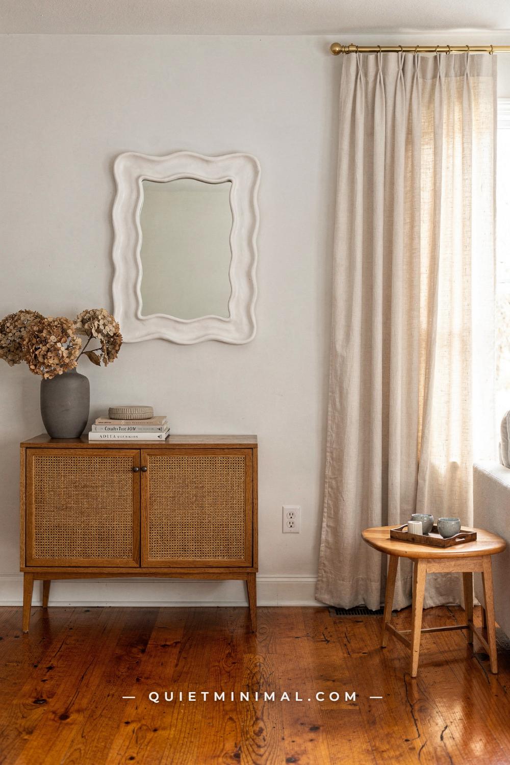
Before any colour name, you need one piece of information: which way your floor leans. Warm wood floors are not one colour. A polished honey-red oak like the one in an open-plan entry reads red at the knots and gold across the plank, and it is the red that decides everything. Golden oak with no red in it behaves differently. Orange builder oak from a 2000s subdivision behaves differently again. Cherry and sapele are a third family. If you skip this step, you will keep pulling colours that look fine on the chip and wrong on the wall, and you will not know why.
The test is simple and costs nothing. Lay a sheet of plain white printer paper on the floor at about 2 pm in whatever daylight the room gets, then look at the floor next to the paper rather than at the paper. Against true white, the floor’s bias shows immediately: it will look pink-red, yellow-gold, or orange. Write that word down. It is the undertone, and it is the thing the wall colour has to answer. A honey-red floor wants a wall that does not add more red; a yellow-gold floor wants a wall that does not add more yellow; an orange floor wants either a cool counterweight or a neutral warm enough not to look chalky beside it.
From the guides
You've saved it, wanted it. Here's the how: codes, measurements, order. Your choices make it yours.
 The Japandi Honest PlaybookThe honest version of the style: what to keep, what to skip, and the order to do it in.See inside →
 The Room Refresh PlaybookA repeatable four-step method, room by room, in ten minutes, thirty minutes, or one weekend.See inside →
 Make Any Room Feel Cozy on PurposeWhy some rooms hold people and others empty out, and the moves that change it.See inside →
Warm white is the answer that works for the largest number of red-leaning floors, and it is worth understanding why before you reach for a cooler colour. Sherwin-Williams Alabaster SW 7008 is the reference point here: a white with a small amount of warmth and a light reflectance in the low eighties, which is bright enough to bounce daylight but not so stark that the floor looks orange by comparison. Beside a honey-red oak it reads as a soft ivory, and the floor reads as rich rather than loud. A pure gallery white in the same room does the opposite. It makes the floor look like it is wearing too much colour, because the eye reads saturation relative to what is next to it.
The mistake in this first decision is choosing the white from a fan deck under store lighting. Warm whites shift more than any other colour family with the light temperature in the room, so buy a sample, paint two coats on a 24 inch (61 cm) square of poster board, and stand it on the floor against the wall, not on the floor. Look at it at 9 am, 2 pm and 8 pm with the lamps on. If it stays ivory in all three, you have your white. If it goes yellow at 8 pm, the room’s bulbs are too warm for it, and a whiter white or a bulb change comes next.
Notice what else is doing work in a room like this. Natural oak furniture, cane, gold hardware and ivory linen are all in the same warm family as the floor, and a gray matte vase and white plaster mirror give the eye somewhere cool to rest. That is the pattern that repeats through every good pairing in this article: one saturated warm (the floor), one quiet warm (the wall), and a few small cool notes so the room does not feel like a single temperature.
Key Takeaway: Name the floor’s undertone against white paper before you look at a single paint chip, because the wall colour’s only job is to answer that undertone.

If the Floor Is Pale Blond, Which Four Colors Cover Every Room?
 Save
 Save
Pale blond oak is the easiest warm floor to paint around and the one people overthink most. Because it is light and low in saturation, almost any mid-value colour sits comfortably beside it, and the temptation is to treat that freedom as permission to use a different colour in every room. The result is a house with no through-line. The better move is a four-colour system: one white, one greige, one soft green-blue, one deep blue, and then every room in the house is one of those four.
The white is Alabaster SW 7008 again, because on a blond floor its warmth reads as cream rather than ivory and the floor does not go gray beside it. The greige is Benjamin Moore Revere Pewter HC-172, a warm gray with enough green in its base that it never turns pink, and with a light reflectance in the mid fifties it is dark enough to give a room walls that feel like walls. The soft green-blue is Sea Salt SW 6204, which shifts between pale sage and pale blue depending on the light, and on a blond floor that shift is the whole point: it keeps the room from feeling flat. The deep colour is Farrow & Ball De Nimes No. 299, a slate blue with gray in it, dark enough for a study, a powder room or a dining room and still calm.
Here is how the four work as a system. Alabaster goes on every ceiling and every piece of trim, and on the walls of the rooms that need to feel biggest: the entry, the stair hall, a small living room. Revere Pewter goes on the walls of the rooms you spend evenings in, because it holds lamplight without going yellow. Sea Salt goes in the bedrooms and the bathroom, where you want the colour to move with the day. De Nimes goes in one room, at most two, as the colour that makes the other three read as deliberate rather than safe. Four cans of colour, one house, and the blond floor runs under all of it as the constant.
The failure mode on pale floors is the opposite of the failure mode on honey oak. A blond floor does not have enough colour to hide a wall that is slightly wrong, so a greige with a pink base or a white with a blue base will show its bias immediately. Test every chip against the floor in the room it will live in, not in the room with the best light. The chip that is perfect in the south-facing kitchen may go lavender in the north-facing bedroom.
One measurement matters more than the rest: the width of the planks. Wide planks, 7 inches (18 cm) and up, show more grain variation and read warmer than the same species in a 3 inch (8 cm) strip. If your blond floor is wide-plank, lean the greige and the white a fraction warmer than you think you need. If it is narrow strip, you can afford the cooler end of each colour.
Key Takeaway: On pale blond oak, choose one white, one greige, one soft green-blue and one deep blue, and use only those four through the whole house so the floor becomes the constant instead of the problem.

Is Greige Still the Safe Answer for Honey Oak?
 Save
 Save
Yes, and it is worth saying why rather than just repeating it, because greige has been recommended for so long that people have started to doubt it. The reason it works with honey oak is not fashion. Honey oak is a warm colour with medium saturation, and a warm gray sits at exactly the point where it shares enough warmth to look related and enough gray to look like a different material. That relationship is what makes a hallway feel settled rather than staged, and it is why a warm taupe-gray with white millwork and a knotty honey floor still reads as a house someone lives in.
Two greiges are the working answer. Benjamin Moore Revere Pewter HC-172 leans slightly green under its gray, which is what stops it from going pink beside the red in honey oak. Sherwin-Williams Accessible Beige SW 7036 leans slightly warmer and reads more taupe than gray, and it is the better choice when the floor is more amber than red, because it does not create a visible temperature step at the baseboard. Both sit in the mid-fifties to low sixties for light reflectance, which is the range where a hallway with no window still feels lit rather than dim.
The white millwork is not decoration; it is the mechanism. A wide-plank honey floor against a mid-value greige wall with no white between them can read as one continuous brown surface, especially at night. Deep baseboards, 5 to 7 inches (13 to 18 cm) tall, painted a crisp white in a semi-gloss, draw a line between floor and wall and make both look more like themselves. If your baseboards are the 3 inch (8 cm) builder profile, the cheapest upgrade in the whole house is a taller baseboard before the paint goes on. Crown molding in the same white finishes the frame.
Where greige fails is in the sconce light. Amber bulbs and amber glass shades push everything warmer by two or three steps, and a greige that was perfect at noon can read as a flat mushroom brown at 9 pm. This is not the paint’s fault. Check the bulb temperature: 2700K is the warmest that still lets a greige read as gray, and anything labelled “warm white” below that will yellow the wall. If you love the amber shade, choose the cooler of the two greiges and let the shade do the warming.
A last practical note about hallways specifically. Most of the wall you see in a corridor is the far end, lit from the doorways on either side, and that is the patch to test on. Paint a sample on poster board and stand it at the far end, not next to you. What you see from the front door is what the house says every time you come home.
Key Takeaway: Greige is still right for honey oak because it shares the floor’s warmth without copying its colour; choose the green-based one for red-leaning floors, the taupe one for amber floors, and put white millwork between the two.

What Does a Whole-House Palette for Golden Oak Look Like?
 Save
 Save
Golden oak is the classic 1990s floor and the most common one readers are living with, and it needs a slightly different structure from blond oak because it brings more yellow. The four-colour system still works, but two of the four shift: the white stays, the greige goes warmer, the soft colour goes to a sandy tan, and the deep colour goes to a dusty blue-gray rather than a true blue. Each of those shifts is there to absorb yellow rather than emphasise it.
The four colours, with each one’s job. Sherwin-Williams Alabaster SW 7008 is the white for trim, ceilings and the rooms that need to feel large; beside golden oak it reads as a warm cream, and the floor reads as gold rather than yellow. Ethereal Mood SW 7639 is the greige, warmer and slightly more taupe than the ones recommended for honey oak, and it works here because a cooler greige next to a yellow floor makes the floor look like it needs refinishing. Jogging Path SW 7638 is a warm sandy tan that belongs on wainscoting, a mudroom, or a board-and-batten wall: it is close enough to the floor to feel like an extension of it, and different enough not to look like an accident. Slate Tile SW 7624, a dusty blue-gray, is the one room of depth, and the gray in it is what keeps it from fighting the gold.
The structure is where the value is. Think in terms of the vertical band. Floor: golden oak. Baseboard and wainscoting to 36 or 42 inches (91 or 107 cm): Jogging Path or Alabaster, depending on how much warmth the room can take. Wall above: Ethereal Mood in the living spaces, Alabaster in the small ones. Ceiling: Alabaster, always. One room, a study or dining room, in Slate Tile floor to ceiling, with the same Alabaster trim as everywhere else so it still belongs to the house. Read as a list it is four colours; walked through as a house it is one decision made once.
The failure mode with golden oak is the beige spiral. Because the floor is warm, every neutral you pick against it looks safe, so you keep adding beige until the whole house is the colour of a paper bag. The dusty blue-gray room is the antidote, and so are the small cool objects in every room: a gray ceramic, a slate-coloured rug, black window hardware. If you find yourself with four warm neutrals and nothing cool, stop and swap one.
Test size matters here more than usual. Golden oak reflects a lot of yellow light upward, and a 2 inch (5 cm) chip cannot show you what that does to a wall. Paint a 24 by 24 inch (61 by 61 cm) board and stand it on the floor against the wall for a full day. The colour you see at 4 pm, when the sun comes in low and bounces off the floor, is the colour you are actually buying.
Key Takeaway: For golden oak, keep the white, warm the greige, use a sandy tan on the lower wall and give one room a dusty blue-gray, and then hold that four-colour palette through the whole house.
Can You Go Cool Against an Orange Floor?
 Save
 Save
You can, and for the orange-toned builder oak that came with so many 2000s houses it is often the best answer, because orange is the one warm floor that a warm wall cannot fix. Put a cream or a greige beside a genuinely orange floor and the wall just joins the orange. Put a mid-tone blue-gray beside it and something different happens: blue is the complement of orange, so the wall makes the floor look richer and the floor makes the wall look calmer. Neither one is fighting; they are doing each other a favour.
The two colours to sample are Sherwin-Williams Rainwashed SW 6211 and Watery SW 6478. Rainwashed leans a little green and reads as a soft spa colour, Watery leans a little more blue and reads as a true pale blue-gray. Both sit in the light-reflectance range where a vaulted, open-plan room stays bright under flat overhead light. Watery is the one to choose when the floor is strongly orange, because more blue does more balancing. Rainwashed is the one to choose when the floor is honey-orange with some gold in it, because the green in it bridges the gap.
There is a complication in rooms like this one, and it is the millwork. Warm-stained door trim and a stained front door are the same colour family as the floor, so the cool wall is being asked to balance two warm elements, not one. That is fine if the wall is a real mid-tone. It fails if you go too pale. A blue-gray that is almost white beside orange trim and orange floors reads as icy, and the room looks like it has not been finished. Aim one step darker than your instinct: if the chip looks right, buy the next one down on the strip.
The ceiling is the other place this goes wrong. In a vaulted room, the ceiling is a huge surface, and if you carry the blue-gray up onto it the whole room can tip cold. Keep the ceiling a soft white with a touch of warmth, so there is a warm plane above the cool walls to match the warm plane below. A dark bronze ceiling fan with wood-grain blades then reads as a deliberate warm object against the cool wall rather than a leftover.
Test the cool wall for a full evening before committing, because cool colours are the most sensitive to bulb temperature. Recessed downlights at 3000K will keep a blue-gray honest. At 2700K it will drift toward a muddy green-gray, and the effect you wanted, the clean complement, disappears. Change the bulbs or move the colour one step bluer.
Key Takeaway: Against a true orange floor, a mid-tone blue-gray wall is the complement that makes both look intentional; go one step darker than you think, keep the ceiling warm white, and check the bulbs.

What Works With Red-Brown Floors Like Sapele?
 Save
 Save
Sapele, Brazilian cherry and the deeper red-brown oaks are a different problem from honey and golden floors, and the same answers do not carry over. These floors are darker, more saturated and unmistakably red. Warm walls next to them make the room feel heavy; cool walls that are too pale make the floor look like a stage. What works is a wall in the gray-to-blue family with enough value to hold its own, and there is a wide range of value that succeeds, from near-white down to charcoal.
Start at the light end. Sherwin-Williams Natural White SW 9542 is a pale off-white with just enough warmth to keep the red floor from looking orange by contrast, and it is the trim and ceiling colour for everything below. Silver Strand SW 7057 is a pale gray with green and blue in it, and beside sapele it reads as a soft mist that lets the floor be the colour in the room. Evergreen Fog SW 9130, a sage green-gray, is the mid-value option that most people end up choosing, because the green in it is the complement of the red in the floor and the gray keeps that relationship from being loud. At the deep end, Outerspace SW 6251 is a charcoal with blue under it, and in a dining room or study with a sapele floor it makes the wood glow.
Between those, the grid runs through a warm medium gray, a cool medium gray, a pale cool white, a light cornflower blue and a mid-tone blue-gray, all of which work by the same logic: gray to carry the value, blue or green to balance the red. The choice among them is about how much wall you want to notice. In a north-facing room with a red floor, stay light. In a room with a big window, the mid-tones will read as intended.
The failure mode with red-brown floors is pink. A gray with a red or violet base, and there are many, picks up the floor’s red and reads as a faint mauve, especially in the evening. The way to catch it is to paint the sample board and set a white towel beside it: if the board looks pinker than the chip did, the gray has the wrong base. Choose one with green or blue in it instead.
One measurement is worth pulling out. Red-brown floors are usually 3 to 5 inch (8 to 13 cm) strips rather than wide planks, and the tight grain makes the floor read as a single saturated field. That is why the wall can carry more value than it could beside a wide, variable honey floor: there is less visual noise in the floor for a deep wall to compete with.
Key Takeaway: Beside sapele or cherry-red floors, choose a wall in the gray-to-blue or gray-to-green family with a green or blue base, at whatever depth the window allows, and reject any gray that shows the slightest pink.

How Do You Build the Rest of the Room Around the Wall Color?
 Save
 Save
Choosing the wall colour is half the job. The other half is deciding what goes in front of it, and a wall that was right in the empty room can look wrong the moment a sofa arrives if the furniture pulls the temperature the wrong way. The method that works is to build the room from three colour roles: the floor is the saturated warm, the wall is the quiet colour, and the furniture divides between one more warm and one more cool.
Take a honey oak floor with sage-green walls in Sherwin-Williams Clary Sage SW 6178, trim in Alabaster SW 7008, and a single accent room in Distance SW 6243, a denim blue. The sage is a gray-green that has enough gray to read as a neutral and enough green to balance the floor’s red-gold. That is the wall. Now the furniture. A cream low-profile sofa, around 90 inches (229 cm) wide, is a second quiet colour and gives the room a large soft plane. A pair of caramel leather armchairs, roughly 28 by 30 inches (71 by 76 cm) each, is the second warm: caramel is the floor’s colour family with more depth, so the chairs and the floor read as related. A distressed blue-gray rug, 8 by 10 feet (244 by 305 cm), is the second cool, and it sits between the floor and the sofa so the eye moves from warm to cool to quiet in a way that feels layered rather than busy.
The rule to take from that: two warms, two cools, and the wall in between. Floor and leather are the warms. Rug and one deep accent, here the denim room or a dark landscape painting in a gilt frame, are the cools. The wall and the sofa are the quiet colours that let both pairs breathe. Change any one element and the balance shifts, which is why a room that looks good on a board can go wrong when the real rug turns out to be more brown than blue.
The failure mode is stacking warms. Honey floor, caramel leather, a jute rug, oak side tables and brass lamps is five warm elements with no counterweight, and the sage wall alone cannot hold it. The room reads as a single colour with a green backdrop. Swap the jute for a blue-gray rug, or the brass lamps for black, and it resolves.
A practical note on the rug: on a warm floor, the rug is the single most effective cool element you can add, because it covers so much of the warm surface. A vintage or distressed piece with a faded blue-gray field does more balancing than any wall colour, and it is the thing to buy before the armchairs if you are choosing an order.
Key Takeaway: Build the room as two warms and two cools around a quiet wall, with the floor and the leather as the warms and the rug and one deep accent as the cools, and buy the rug first.

Which Green Actually Works With Warm Oak?
 Save
 Save
Green is the colour readers ask about most beside warm oak, and for good reason: green is the complement of red, so almost any green does some balancing. The problem is that “sage” now covers a range from pale mint to deep forest, and half of those go wrong beside golden oak. The greens that work share one property: gray in the base. Clear, saturated greens fight the floor. Grayed greens settle it.
Five greens across the value range, with what each does. Benjamin Moore Sage Tint 458 is a pale minty sage, light enough to use in a small bedroom, and beside golden oak it reads as a soft cool white with a hint of green rather than a colour. Gloucester Sage HC-100 is a warm gray-sage, deeper and browner, and it is the one to choose when the room is also full of warm furniture, because it bridges rather than contrasts. Between them sit a medium cool sage and a medium sage-green, both mid-value, both suited to a living room with a large window. At the deep end, Cushing Green HC-125 is a dusty forest green with enough gray that it does not read as a Holiday colour, and against golden oak in a dining room or a study it makes the floor look like honey.
How to choose among the five. Light-reflectance is the deciding number, and the rule is that the wall should be lighter than the floor in a room without much daylight and can be darker than the floor in a room with plenty. Golden oak sits somewhere in the middle of the scale. A pale sage above it in a north-facing room keeps the space bright. A forest green above it in a south-facing room gives the space weight. The mid-value sages are the ones that work almost everywhere, which is why they are the ones everyone paints.
From the guides
You've saved it, wanted it. Here's the how: codes, measurements, order. Your choices make it yours.
The Japandi Honest PlaybookThe honest version of the style: what to keep, what to skip, and the order to do it in.See inside →The Room Refresh PlaybookA repeatable four-step method, room by room, in ten minutes, thirty minutes, or one weekend.See inside →Make Any Room Feel Cozy on PurposeWhy some rooms hold people and others empty out, and the moves that change it.See inside →The failure mode is yellow. Golden oak reflects yellow light onto the lower part of the wall, and a green with too much yellow in it will go chartreuse in the bottom 24 inches (61 cm) by late afternoon. Grayed greens resist this; clear greens do not. If your sample board looks like a different colour at the bottom than at the top, the green has too much yellow. Go one step grayer.
One more thing about green walls and warm floors: the trim colour matters more than with any other wall colour. A stark white trim beside sage can look clinical. A warm white, Alabaster SW 7008 or similar, keeps the green soft and connects it to the floor.
Key Takeaway: Choose a green with gray in its base, pick the value by how much daylight the room gets, and test the bottom of the sample board at 4 pm to catch any yellow the floor throws up.

How Light Should the Wall Be Next to a Honey Floor?
 Save
 Save
Once the colour family is settled, the next question is value: how light or dark the wall should be relative to the floor. This is the number most swatch boards skip and it is the one that decides whether a room feels airy or heavy. Every paint colour has a light reflectance value, from 0 for black to 100 for pure white, and the relationship between the wall’s number and the floor’s is what the eye reads as depth.
Honey-gold oak sits somewhere around the middle of that scale, depending on finish and age. A wall in the sixties, like Benjamin Moore Gray Owl OC-52 at a little over 64, or Sherwin-Williams Agreeable Gray SW 7029 in the low sixties, is lighter than the floor by a comfortable margin, and the room reads as a bright box with a warm base. That is the fresh, empty-room effect that makes a listing photograph look good and makes a bedroom feel calm. Both colours are pale gray with a faint green or warm cast, which is exactly the cast that stops a light gray from going blue beside honey wood.
The rule of thumb: in rooms with one window or less, keep the wall at least 15 points lighter than the floor. In rooms with two or more windows, or a large one, you can bring the wall down to within 5 points of the floor and even below it. A pale sage-gray with a single double-hung window, roughly 36 by 48 inches (91 by 122 cm), on one wall sits right at the edge of what that light can carry, and it works because the colour is pale.
The failure mode at the light end is chalk. A wall that is too far above the floor in value, a near-white in the nineties beside a mid-value honey floor, makes the floor look like it is sitting in a white room rather than in a room with walls, and the floor’s colour reads as too strong. Come down ten points and the floor calms. The failure mode at the dark end is the cave: a mid-value wall in a one-window room with a mid-value floor leaves the eye nowhere bright to rest, and the room feels smaller than it is.
Trim is where you set the top of the range. White baseboards and casing in a semi-gloss, five to ten points lighter than the wall, are the brightest element and give the eye a ceiling for the value scale. If the wall is very pale, the trim can be the same colour in a higher sheen; if the wall is a real mid-tone, the trim needs to be white.
Key Takeaway: Read the wall’s light reflectance against the floor’s, keep it at least 15 points lighter in a one-window room, and let the trim set the bright edge.

What About Dark Walnut or Espresso Floors?
 Save
 Save
Dark walnut and espresso floors are warm, but they are dark first, and that changes the question. The floor is no longer competing on colour; it is competing on value. A dark floor absorbs light, so the wall has to give some back, and the answer for most dark-floored rooms is a wall that is considerably lighter than the floor, with the colour choice made second.
Six colours across the useful range. Sherwin-Williams Greek Villa SW 7551 is a bright warm white, and on a dark walnut floor it is the wall that makes the room feel like it has windows even when it does not. Natural Linen SW 9109 is a warm cream, one step down, and it softens the contrast for a bedroom. A blush-gray, a gray with a touch of pink, works here in a way it never does beside red oak, because the walnut has no red to amplify. Tavern Taupe SW 7508 is a warm medium taupe for a room with strong daylight, where you want the walls to have weight. Evergreen Fog SW 9130 brings sage to the dark floor, and the pairing reads as forest floor and canopy. Silvermist SW 7621, a muted blue-gray, is the cool option, and beside walnut it reads as sophisticated rather than cold.
The organising principle is contrast. Dark floor, light wall, and the room reads as grounded. Dark floor, mid-value wall, and the room reads as moody, which is a legitimate choice for a dining room or study with a big window and a disaster in a north-facing bedroom. Dark floor, dark wall, and you have committed to lamplight as the main light source; it can be beautiful, and it needs at least three lamps and a light ceiling.
The failure mode is gray. Dark walnut beside a cool, blue-based gray wall produces a room that feels like an office. Every colour above works because it has warmth somewhere in it, including the blue-gray, which has enough gray to stay friendly. If you want gray walls with a dark floor, choose the taupe or the blush-gray, both of which are grays that have not forgotten the floor is wood.
A note on finish. Dark floors show every scuff, and a satin or matte floor finish reads warmer and more forgiving than a gloss. If the floor is high-gloss, it will reflect the wall colour back up, and a very pale wall will produce a visible pale sheen on the floor. A matte finish keeps the floor’s colour true and lets the wall do its job.
Key Takeaway: Beside dark walnut or espresso, choose the wall by value first, lighter than the floor by a wide margin in most rooms, and make sure whatever colour you pick has warmth somewhere in its base.

How Do You Calm Down Cherry or Mahogany Floors?
 Save
 Save
Cherry and mahogany floors are the ones most people want to tone down, and the instinct is usually wrong. The instinct is to go cool, to fight the red with blue or gray. That can work, as the sapele section covered, but it has a cost: it makes the red look redder, because contrast increases saturation. If what you want is for the floor to look quieter rather than more dramatic, the answer is the opposite: warm pale neutrals that lower the contrast and let the red-brown read as brown.
The family that does this is the warm pale tans, creams and taupes. Sherwin-Williams Dumpling SW 9616 is a warm pale tan that reads as almost white beside cherry and takes the edge off the red. White Sesame SW 9586 is a warm linen cream, a fraction warmer, the one to use on trim and ceiling in a cherry-floored house so the millwork does not glare. Alongside them sit a light warm gray, a warm tan, a pale warm gray and a soft warm taupe, all in the same low-saturation, high-value band. Any of them on the wall lowers the temperature difference between floor and wall, and the room settles.
The rug is the second tool, and in a cherry-floored room it is doing something different from what it does beside honey oak. Beside honey oak the rug is a cool counterweight. Beside cherry the rug can carry the floor’s own colour in a pattern, a deep burgundy field with teal and ivory in a traditional medallion, so that the floor’s red reads as one instance of a colour the room uses on purpose. The teal in the pattern is the small cool note that keeps the whole thing from going flat. A rug of about 8 by 10 feet (244 by 305 cm) under the seating area covers enough of the floor to make that argument.
The rust-red accent is the counterintuitive third tool. A single object in a saturated rust, a painted stool, a lamp base, a cushion, tells the eye that red is a choice in this room. Without it, the red floor can look like a fact you inherited. With it, the floor looks like the start of a palette.
The failure mode is the warm-on-warm spiral again, and it is worse with cherry because the floor is so saturated. Warm tan walls, a burgundy rug, oak furniture and brass, and the room has no cool anywhere. The teal in the rug helps; so does one cool ceramic, one black metal lamp, or a painting with blue in it. Two cool objects in a room of warms is usually enough.
Key Takeaway: To quiet cherry or mahogany, lower the contrast with warm pale tans and creams rather than fighting the red with gray, then use a patterned rug and one rust object to make the red read as intentional.

Where Do Wallpaper, Navy and a Runner Fit In?
 Save
 Save
A house is rarely just floor and walls, and the question of what colour goes with the floor eventually becomes the question of what wallpaper, what deep accent and what runner go with the wall colour you chose. The answer follows the same logic: everything is either a warm that agrees with the floor, a cool that balances it, or a quiet colour that lets the other two work.
Take a honey oak floor with a sage wall in Sherwin-Williams Willow Tree SW 7741, a soft gray-green, and trim in Natural Linen SW 9109, a warm cream. That is the base. Now add a deep navy for one room or one wall: a navy with a touch of green in it, so it reads as related to the sage rather than as a stranger. Navy beside honey oak is one of the oldest pairings in American houses because it is the blue complement to the floor’s orange, and at a deep value it makes the floor look like polished amber. A powder room, a study, or the inside of a bookcase is the right amount.
Wallpaper is where the three roles come together in one object. A botanical print with a green ground and rust and cream fruit and foliage carries the sage of the wall, the cream of the trim and a rust that is the floor’s colour family turned into a pattern. That is why it works: it is the room’s palette, already resolved, on one surface. Use it on the smallest wall you can find, the wall behind a bed, an entry, a hallway end, because a print that resolves the palette on one wall will overwhelm it on four.
The runner is the quiet piece. Striped natural jute on a honey floor is warm on warm, and it works precisely because it is almost the floor’s own colour: it adds texture and softens sound without adding a new colour to manage. A 24 by 72 inch (61 by 183 cm) runner in a hallway or beside a bed is enough. If the room already has a cool rug, the jute runner is the wrong choice; the two will argue.
The failure mode here is the fourth colour. Floor, wall, navy and the wallpaper’s rust make four, and the rug, the art and the cushions all need to stay inside those four. The moment a fifth colour arrives, a yellow cushion, a pink vase, the room stops looking planned. Keep a swatch of every element together on one board and add nothing that does not already appear on it.
Key Takeaway: Wallpaper, navy and a runner belong to the same three roles as everything else, warm, cool and quiet, and a botanical print that carries the wall, trim and floor colours in one pattern is the piece that makes the whole palette look decided.

When Should the Walls Go Dark and Rich Instead?
 Save
 Save
Everything so far has been about settling the floor. There is a different answer available, which is to stop trying to calm the room and let it be rich, and it is worth knowing when that works, because it is the version most people are secretly saving. The condition is simple: the room needs to have enough daylight to afford a dark wall, and the dark wall needs to be a colour that agrees with the floor rather than a colour chosen to contrast with it.
A dark cherry floor with tall grid-panel wainscoting in a sage-olive green is the model. The green is deep, grayed and slightly yellow, which puts it in the same warm family as the cherry, so floor and wall read as two shades of one material rather than two opponents. A lighter cousin of that colour is Sherwin-Williams Clary Sage SW 6178, and if the room has one window rather than three, that is the version to use; the deep olive belongs to rooms with real light. The panelling matters too: a grid of flat panels to about 84 inches (213 cm) breaks the dark wall into rectangles, so it reads as architecture rather than as a painted box.
Furniture in a room like this follows the same warm-family logic. A forest-green leather sofa, around 84 inches (213 cm) wide, is the wall’s colour with more depth; rust and terracotta cushions are the floor’s colour with more saturation; a live-edge dark walnut slab table, roughly 48 by 24 inches (122 by 61 cm), is a third warm brown. Two amber sconces bracketing an abstract print in a simple frame give the warm light that a dark room needs at night. The cool notes are the plants, two tall tropical specimens in woven vessels, and their green is the only cool thing in the room, which is enough.
The failure mode is darkness with nothing to hold it. Dark floor, dark wall, one overhead light, and the room becomes a corridor. Every dark-walled room needs a light ceiling, at least three light sources at different heights, and one large pale object, a cream rug, a light sofa, a big mirror, so the eye has somewhere to go. The rich version is not the low-effort version; it is the one that needs the most planning.
Rich also does not mean cluttered. The reason the model room reads as lush rather than heavy is that it is symmetrical and there are few objects in it: one sofa, one table, two plants, two sconces, one print. The wall colour is doing the work. Add a gallery wall and a second rug and the whole thing collapses into brown.
Key Takeaway: Dark walls beside a warm floor work when the wall is a deep grayed colour in the floor’s own family, the room has real daylight, and the furniture stays few and symmetrical.

So here is the answer, in one sentence: the right paint colour for a warm wood floor is a grayed, low-saturation colour that either shares the floor’s warmth quietly (a warm white, a greige, a warm tan) or balances it with its complement (a grayed green or a blue-gray), chosen at a light reflectance comfortably above the floor’s in a one-window room and free to drop below it where the light allows.
Everything else in this article is that sentence applied to a specific floor. Pale blond and golden oak take a four-colour house palette with a warm white, a greige and one deep room. Orange builder oak takes a mid-tone blue-gray. Red-brown sapele takes a gray with green or blue under it, and cherry that you want quieter takes a warm pale tan instead. Dark walnut takes a wall lighter than the floor by a wide margin, in any colour with warmth in its base. Green works with almost all of them when it has gray in it, and dark walls work when the room has the daylight to pay for them.
Do the white-paper test on your floor this afternoon, buy two samples from the section that matches what you saw, paint them on 24 inch (61 cm) boards, and stand the boards against the wall for one full day. The floor will tell you which one is right by evening, and the guessing stops there.
From the guides
You've saved it, wanted it. Here's the how: codes, measurements, order. Your choices make it yours.
The Japandi Honest PlaybookThe honest version of the style: what to keep, what to skip, and the order to do it in.See inside →The Room Refresh PlaybookA repeatable four-step method, room by room, in ten minutes, thirty minutes, or one weekend.See inside →Make Any Room Feel Cozy on PurposeWhy some rooms hold people and others empty out, and the moves that change it.See inside → Save


