 Georgia
We’ve all had that moment. You’re sitting on the sofa, perhaps with a half-finished embroidery project in your lap or a smoothie on the coffee table, and you look around. You love your home; it’s your sanctuary. But lately, the walls feel like they’re closing in just a little bit. You’re craving that airy, expansive gallery feel, but knocking down walls isn’t exactly on the weekend to-do list.
As a creative curator of your own space, you know that perception is everything. The debate often comes down to two powerful tools: paint and light. Can the right shade of white truly push back the walls? Or is a strategically placed floor lamp the real hero? The truth is, both have the power to transform a cramped corner into a breathing room. Whether you are ready to pick up a roller or simply swap out a bulb, here is how to master the illusion of space.
1. The “Receding” Paint Palette
 Save
When searching for paint to make a room look bigger, the instinct is often to grab the brightest white on the shelf. However, the real secret lies in “receding” colors. These are hues—typically cool whites, soft greys, and icy blues—that visually push away from the eye. Unlike warm tones (reds, oranges) that advance and make a room feel cozy but smaller, cool undertones create a sense of distance.
If your living area gets a lot of natural light, a stark white can actually look flat. Instead, opt for an off-white with a blue or green undertone. This mimics the atmospheric perspective seen in nature (think of distant mountains), effectively tricking the brain into perceiving more depth than actually exists.
Key Takeaway: Don’t just choose white; choose a cool-toned off-white or light grey to visually push the walls outward.
From the guides
You've saved it, wanted it. Here's the how: codes, measurements, order. Your choices make it yours.
 The Japandi Honest PlaybookThe honest version of the style: what to keep, what to skip, and the order to do it in.See inside →
 The Room Refresh PlaybookA repeatable four-step method, room by room, in ten minutes, thirty minutes, or one weekend.See inside →
 Make Any Room Feel Cozy on PurposeWhy some rooms hold people and others empty out, and the moves that change it.See inside →
2. Layered Lighting to Eliminate Shadows
 Save
Relying on a single overhead fixture—often affectionately dubbed the “boob light”—is the quickest way to shrink a room. A single light source creates harsh shadows in the corners of the room, which visually cuts off the square footage. To counter this, you need to think like a set designer and layer your lighting.
Combine ambient lighting (general glow) with task lighting (reading lamps) and accent lighting. By placing light sources at different heights—a mid-century floor lamp in one corner and a table lamp on a sideboard in another—you draw the eye around the room rather than focusing it on the center. Illuminated corners make the entire footprint of the room visible and functional.
Key Takeaway: Banish dark corners by using multiple light sources at varying heights to define the room’s full perimeter.
3. Blurring the Boundaries: Monochromatic Trim
 Save
A common DIY mistake is painting the walls a beautiful airy color and then outlining them with a stark, bright white trim. While traditional, this creates a “frame” around the wall, effectively stopping the eye and defining the limits of the space. To maximize the feeling of openness, paint your baseboards, door frames, and window trim the exact same color as your walls.
This monochromatic technique makes the woodwork blend seamlessly into the drywall. Without that hard visual border, the walls appear taller and wider. It’s a subtle, sophisticated trick often used in high-end galleries to ensure the focus remains on the art and the furniture, rather than the architecture’s limitations.
Key Takeaway: Paint your trim and baseboards the same color as the walls to remove visual stops and create a seamless, expansive look.
4. The Mirror Multiplier Effect
 Save
While technically a decor item, mirrors are a lighting strategy. They are the oldest trick in the book for a reason: they double your visual space and bounce light deeper into the room. However, placement is critical. A mirror placed on a dark wall reflecting another dark wall does nothing.
Position a large mirror—perhaps a leaning floor mirror or a statement oversized round piece—directly opposite or adjacent to a window. This catches the natural sunlight and redistributes it, essentially acting as a second window. This influx of light confuses the eye’s depth perception, making the room feel significantly larger and brighter.
Key Takeaway: Place mirrors opposite natural light sources to bounce sunlight and artificially extend the room’s depth.
5. The “Infinite Box” Dark Paint Theory
 Save
It sounds counterintuitive. We are always told that light colors expand and dark colors contract. However, for a small room with very little natural light (like a powder room or a den), white paint can look dingy and sad. In these specific scenarios, embracing a dark, moody hue like charcoal, navy, or forest green can actually make the room feel larger.
Dark paint blurs the edges and corners of a room. When the shadows blend into the paint color, you can’t quite tell where the wall ends. It creates an “infinite” feeling, much like looking into the night sky. This adds drama and creates a cozy, jewel-box effect that feels intentional rather than cramped.
Key Takeaway: In low-light rooms, use deep, saturated colors to blur corners and create an illusion of infinite depth.
6. Vertical Washing with Sconces
 Save
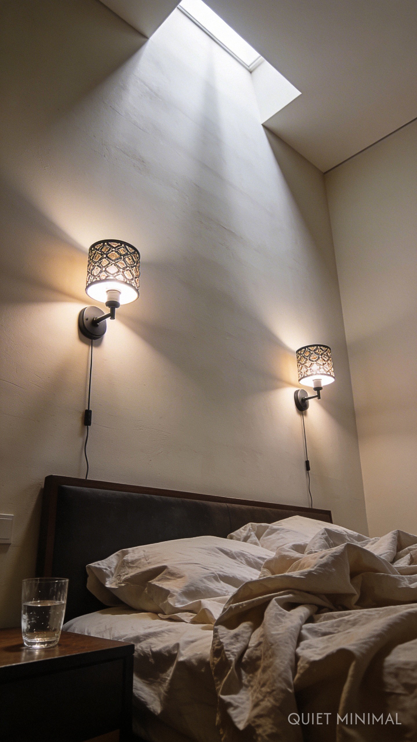
If your floor space is at a premium (we see you, apartment dwellers), utilizing wall space is essential. Sconces are not just for saving bedside table space; they are tools for vertical expansion. “Wall washing” is a lighting technique where light is directed upwards or downwards along a surface.
By installing sconces that direct light upward toward the ceiling, you draw the eye up, emphasizing the height of the room rather than the width. This vertical emphasis lifts the visual weight of the space. Ideally, use plug-in sconces if you are renting or not ready for electrical work—there are plenty of stylish options that match a maker-aesthetic.
Key Takeaway: Use uplighting or sconces to wash walls with light, drawing the eye upward to emphasize ceiling height.
7. The Fifth Wall: Lighter Ceilings
 Save
When painting to make a room look bigger, the ceiling is often ignored. The standard “ceiling white” is fine, but you can do better. If your walls are a color, painting the ceiling a significantly lighter shade of that same color (or a crisp, bright white) forces the eye upward and creates a feeling of loftiness.
Alternatively, if you have very low ceilings, consider painting the wall color up past the top of the wall and onto the first few inches of the ceiling perimeter. This tricks the eye into thinking the walls are taller than they actually are. It requires a steady hand or some good painter’s tape, but the payoff is a room that feels instantly airier.
Key Takeaway: Keep the ceiling lighter than the walls to maintain a sense of openness and vertical space.
From the guides
You've saved it, wanted it. Here's the how: codes, measurements, order. Your choices make it yours.
The Japandi Honest PlaybookThe honest version of the style: what to keep, what to skip, and the order to do it in.See inside →The Room Refresh PlaybookA repeatable four-step method, room by room, in ten minutes, thirty minutes, or one weekend.See inside →Make Any Room Feel Cozy on PurposeWhy some rooms hold people and others empty out, and the moves that change it.See inside →8. Controlling Color Temperature (Kelvin)
 Save
You can pick the perfect paint color, but the wrong light bulb can ruin it instantly. Light bulbs have a color temperature measured in Kelvins. A bulb that is too yellow (2700K or lower) can make a room feel closed in and antique, while a bulb that is too blue (5000K+) feels like a hospital. Both extremes shrink the vibe of a sanctuary.
To keep a room feeling spacious and clean, aim for a “neutral white” or “soft daylight” range, typically between 3000K and 3500K. This temperature keeps your white walls looking crisp and your colored walls true to hue, ensuring the “visual expansion” effect of your paint choice actually works.
Key Takeaway: Swap bulbs for 3000K-3500K LEDs to ensure your paint colors read true and the space feels clean and open.
9. The Sheen Factor: Reflective Finishes
 Save
Most people default to matte or flat paint for living areas because it hides imperfections. However, matte finishes absorb light. If your goal is expansion, you want to reflect light. Stepping up the sheen just one level to an Eggshell or Satin finish can make a surprising difference.
These finishes have a slight luster that bounces light around the room, similar to the mirror effect but on a micro-scale. It adds a subtle glow to the walls that flat paint lacks. For the bold “Creative Curator,” a high-gloss ceiling is a dramatic design choice that reflects the room below, effectively doubling the visual height.
Key Takeaway: Use Eggshell or Satin finishes rather than flat paint to subtly reflect light and add dimension to the walls.
10. The Synthesis: Focal Points and Track Lighting
 Save
Ultimately, the best approach is a marriage of paint and light. A great way to execute this is by creating a focal point. Paint one wall (or an alcove) a distinct color, and then aim directional lighting, such as track lights or a picture light, at that specific area.
This creates a destination for the eye. When you enter the room, your vision is pulled across the space to that illuminated, colored focal point. This journey for the eye registers as “distance.” It allows you to display that gallery wall you’ve curated while simultaneously stretching the perceived length of the room.
 Save
Key Takeaway: Combine a painted focal wall with directional lighting to pull the eye across the room, creating a sense of distance.
Follow Quiet Minimal on Pinterest for more curated aesthetic inspiration.
The images featured in this article have been generated or modified using AI to help visualize these design concepts.
From the guides
You've saved it, wanted it. Here's the how: codes, measurements, order. Your choices make it yours.
The Japandi Honest PlaybookThe honest version of the style: what to keep, what to skip, and the order to do it in.See inside →The Room Refresh PlaybookA repeatable four-step method, room by room, in ten minutes, thirty minutes, or one weekend.See inside →Make Any Room Feel Cozy on PurposeWhy some rooms hold people and others empty out, and the moves that change it.See inside →


