 Georgia

Your kitchen island is the one surface that can completely reframe how the whole room feels — and paint is the fastest, most affordable way to make it happen. Not a full renovation, not new countertops, not a contractor. Just the right color, the right prep, and the right finish.
The problem is that most inspiration galleries show you a beautiful sage island without telling you which sage, what sheen, or how to avoid the streaky brush-mark finish that ends up looking worse than the builder beige you started with. This article fixes that. Below are 14 painted kitchen island ideas — in sage green, terracotta, deep blue, and two-tone combinations — each one paired with specific verified colors, execution notes, and the tools that make the difference between a Pinterest-worthy result and a redo.
1. Classic Sage Green With White Perimeter Cabinets
 Save
Sage green and white is the most enduring island color pairing in modern kitchen design, and it earns that status because the contrast is high enough to read from across the room without feeling aggressive. The key is choosing a sage with enough gray in it to stay neutral under warm and cool light. Sherwin-Williams “Privilege Green” SW 6193 and Behr “Dusty Miller” S430-4 are both verified current options that hit this balance — warm enough to feel organic, gray enough to stay sophisticated.
From the guides
You've saved it, wanted it. Here's the how: codes, measurements, order. Your choices make it yours.
 The Japandi Honest PlaybookThe honest version of the style: what to keep, what to skip, and the order to do it in.See inside →
 The Room Refresh PlaybookA repeatable four-step method, room by room, in ten minutes, thirty minutes, or one weekend.See inside →
 Make Any Room Feel Cozy on PurposeWhy some rooms hold people and others empty out, and the moves that change it.See inside →
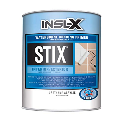
For the finish, a satin or semi-gloss sheen on the island (while perimeter cabinets stay eggshell) creates a subtle visual hierarchy that designers use intentionally. The island reads as the focal piece. Apply two coats of a bonding primer before your topcoat, and lightly sand between coats with 220-grit for a factory-smooth result.
Key Takeaway: Sage green islands work best when the white perimeter cabinets stay true-white, not cream — the contrast is what makes the sage pop rather than read as a dingy green.

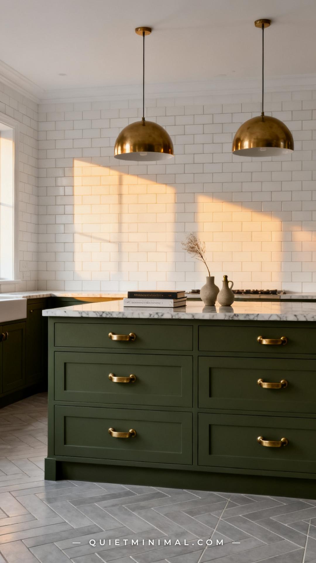
2. Deep Sage With Unlacquered Brass Hardware
 Save
When sage goes deeper — think Farrow & Ball “Mizzle” No. 266 or Sherwin-Williams “Privilege Green” at full depth — it starts to behave like a proper accent color rather than a neutral. This version works especially well in kitchens that already have a lot of white or very light gray, because the island becomes an intentional grounding element. Unlacquered brass hardware accelerates the effect: it adds warmth against the cool sage and develops a natural patina over time that reinforces the organic, lived-in aesthetic.
The painting execution for deeper saturated sages requires an extra primer step. Use a gray-tinted bonding primer rather than white — it reduces the number of topcoats needed to achieve full color depth and prevents the underlying wood tone from bleeding through into the finish.
Key Takeaway: Deep sage paired with unlacquered brass is one of the few color-hardware combinations that gets better as the hardware ages — the patina echoes the organic undertones in the paint.

3. Terracotta Island in a White Kitchen
 Save
Terracotta is having a genuine design moment, and the kitchen island is the best place to try it because it reads as a deliberate choice rather than an accident. In an all-white or near-white kitchen, a terracotta island becomes the room’s entire personality. Behr “Terra Cotta Tile” M200-6 and Sherwin-Williams “Cavern Clay” SW 7701 are both verified current options — “Cavern Clay” leans slightly more pink-orange, while “Terra Cotta Tile” is warmer and earthier.
The pairing that makes terracotta islands work is restraint everywhere else. Keep countertops light (white quartz, butcher block, or light marble), keep hardware matte black or simple brushed nickel, and keep the backsplash neutral. Terracotta carries the room — everything else supports it.
Key Takeaway: Terracotta island paint reads very differently under warm versus cool lighting — always test a large swatch on the actual island surface under your kitchen’s overhead light before committing.

4. Terracotta With Sage Green Accents — The Earthy Two-Tone
 Save
Pairing terracotta and sage in the same kitchen sounds risky — two saturated earthy tones competing for attention — but it works because both colors share the same warm-neutral undertone family. The rule is proportional dominance: one color leads, the other supports. In this approach, the island takes terracotta (the bolder, more statement-forward choice) while lower perimeter cabinets take a softer sage, and upper cabinets or open shelving stays cream or warm white.
This combination photographs beautifully, which makes it especially well-suited to a Pinterest audience. The warm palette reads cohesive rather than chaotic, and the tonal relationship between terracotta and sage creates a sense of intention. Use the same paint formula — bonding primer, two topcoats, satin finish — on both colors for a consistent sheen level throughout.
Key Takeaway: The two-tone earthy palette works because terracotta and sage share warm undertones — never combine a warm terracotta with a cool blue-based sage, or the pairing will feel jarring rather than cohesive.
5. Navy Blue Island for a Bold, Grounded Look
 Save
Navy blue is one of the most proven kitchen island colors precisely because it behaves like a neutral in a white kitchen: it provides deep contrast without clashing with any countertop material or backsplash tile. Benjamin Moore “Van Deusen Blue” HC-156 is a blue-black navy that pulls slightly toward blue in natural light and almost black in evening light — giving the island two moods across the day.
Navy also happens to be the most forgiving island color for resale. It reads as a classic design choice rather than a trend, which matters if Maya is painting an island she’s planning to sell around. Pair with polished nickel or chrome hardware for a crisp, high-contrast look, or brass for a warmer editorial feel.
Key Takeaway: Navy islands need a high-quality primer formulated for adhesion on MDF or wood — skipping primer on a dark color like navy almost always results in uneven coverage and visible brush drag in the topcoat.
6. Dusty Blue — The Softer, More Versatile Blue Island
 Save
Dusty blue sits between sage green and navy on the color spectrum — cool enough to feel fresh, muted enough to stay livable. It is especially well-suited to kitchens with warm wood floors or honey-toned countertops, where the cool island color provides visual relief without feeling cold. Sherwin-Williams “Interesting Aqua” SW 6220 and Benjamin Moore “Graystone” HC-166 are current verified options in this range.
The advantage of dusty blue over navy is versatility with different hardware finishes. It pairs equally well with matte black, brushed brass, polished nickel, and even antique bronze. For kitchens that aren’t fully committed to a single metal finish — which is most real kitchens — that flexibility matters.
Key Takeaway: Dusty blue island paint benefits from a warmer white on the perimeter cabinets — a crisp cool white will make the island feel washed out, while an off-white or warm white creates tonal depth.

7. Two-Tone Island: Painted Base, Natural Wood Top
 Save
Two-tone doesn’t always mean two paint colors. Pairing a painted island base with a natural wood countertop is one of the most practical versions of the two-tone look because the wood surface is left unpainted — which eliminates the most fragile part of the island (the working surface) from the painting equation. Only the cabinet face, sides, and toe kick get painted.
This approach works with almost every color: sage, terracotta, navy, or deep blue all read beautifully against pale maple or light oak butcher block. The natural grain of the wood softens even bold paint colors, making the combination feel organic rather than graphic.
Key Takeaway: When painting only the island base and leaving a wood top, always tape the underside of the countertop overhang before applying primer — paint spray and brush drag on unfinished wood creates rough spots that are difficult to sand out later.

8. Two-Tone Kitchen: Painted Island Versus Painted Lowers
 Save
The two-tone kitchen layout — where the island is one color and the perimeter lowers are a second coordinating color — is the most popular version of the two-tone trend right now because it distributes color throughout the room instead of concentrating all of it in one spot. The key to making it feel intentional rather than accidental is tonal coordination: both colors should share either the same undertone family or the same value (lightness level).
Sage lowers with a warm charcoal or dark navy island is one of the strongest pairings because the sage is warm and the dark island grounds the room without competing. Avoid pairing two equally saturated colors — one should always be the more neutral supporting player.
Key Takeaway: In a two-tone kitchen, the island and lower cabinets should never be painted the same sheen — use semi-gloss on the high-touch island and satin on the perimeter lowers to create a subtle visual rhythm that registers even if most people can’t name why.

9. Sage Green Island in a Dark Kitchen
 Save
From the guides
You've saved it, wanted it. Here's the how: codes, measurements, order. Your choices make it yours.
The Japandi Honest PlaybookThe honest version of the style: what to keep, what to skip, and the order to do it in.See inside →The Room Refresh PlaybookA repeatable four-step method, room by room, in ten minutes, thirty minutes, or one weekend.See inside →Make Any Room Feel Cozy on PurposeWhy some rooms hold people and others empty out, and the moves that change it.See inside →Sage green behaves completely differently in a dark kitchen than it does in a white one. Surrounded by charcoal or near-black cabinetry, sage reads as a light, almost luminous accent — it catches the eye immediately and provides the visual breathing room the room needs. This is counterintuitive but effective: sage green often shows its best version in a dark setting, where it contrasts sharply with its surroundings rather than blending into a pale neutral backdrop.
The execution note for dark kitchen two-tone: the sage island must be painted to a higher quality standard than everything else because it will be the most noticed surface in the room. Use three thin topcoats instead of two, and finish with a water-based polycrylic clear coat in satin to protect the lighter color from the fingerprint traffic it will receive as the room’s visual focal point.
Key Takeaway: In a dark kitchen, a sage island should be painted two to three shades lighter than your instinct suggests — the dark perimeter cabinets will make any color read richer and deeper than it appears on the chip.

10. Terracotta in a Boho Kitchen
 Save
In a boho kitchen, terracotta is not the accent — it is the foundation. The goal is to anchor an eclectic mix of textures, patterns, and natural materials with a warm, grounding base color. Sherwin-Williams “Cavern Clay” SW 7701 is the verified go-to for this application because its slightly dusty, sun-baked quality bridges the gap between paint and natural material rather than reading as flat color.
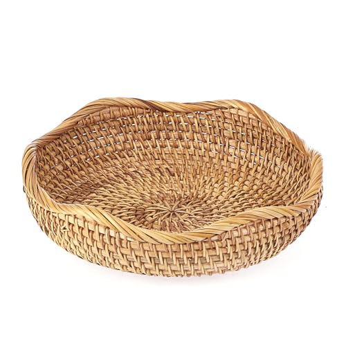
The boho terracotta island pairs naturally with rattan cabinet inserts, woven pendants, encaustic floor tile, and live-edge wood countertops. The more texture in the room, the better the terracotta reads — because its earthy undertone unifies materials that would otherwise feel random.
Key Takeaway: In a boho kitchen, paint sheen matters more than in a modern kitchen — use eggshell or flat sheen on the terracotta island so the color has a matte, organic quality that reinforces the natural-material aesthetic rather than reflecting light like furniture lacquer.
11. Deep Teal-Blue for Maximum Drama
 Save
Teal-blue sits where blue and green intersect, and on a kitchen island it creates a jewel-box quality that photographs unlike any other color. Benjamin Moore “Salamander” HC-136 is a verified deep teal with strong green undertones that reads almost emerald in warm light and true teal under cool daylight. It is a high-commitment choice — but in a white kitchen with brass hardware, it is visually arresting in exactly the right way.
The painting approach for deep jewel tones requires a gray-tinted bonding primer (not white) to achieve full color depth in two topcoats. On a teal this deep, three topcoats are often necessary for complete opacity. Patience in application — thin coats, full dry time, 220-grit between passes — is the difference between a paint-job finish and a furniture finish.
Key Takeaway: Deep teal is most impactful in kitchens with a white or very pale perimeter — the contrast is the effect, and adding any other color to the room risks diluting the drama the teal creates.
12. Sage Green With Black Hardware for a Modern Edge
 Save
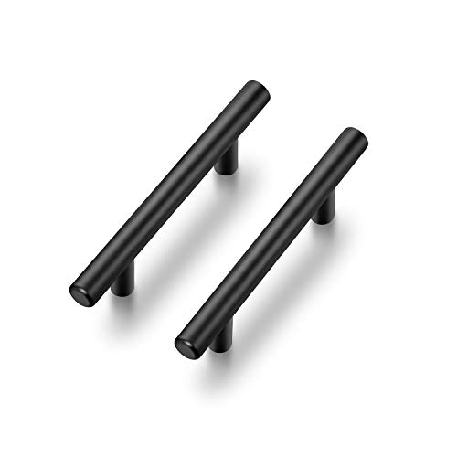
Matte black hardware is the styling detail that moves sage green from cottagecore toward contemporary. The same sage color — whether Sherwin-Williams “Privilege Green” or Behr “Dusty Miller” — takes on a more architectural, graphic quality when paired with slim black bar pulls instead of brass cup pulls. This pairing appeals to Maya if her kitchen already has stainless appliances, black light fixtures, or any other black metal element in the space.
The rule with black hardware on sage: keep the hardware profile simple. Thick, ornate black hardware competes with the sage rather than complementing it. Thin bar pulls or minimal round knobs let the color lead.
Key Takeaway: The black hardware–sage green combination reads most cohesive when the countertop is white or very light — a dark countertop with dark hardware and medium sage can flatten the whole composition into a murky mid-tone.
13. Warm White Island in a Colorful Kitchen — The Reverse Two-Tone
 Save
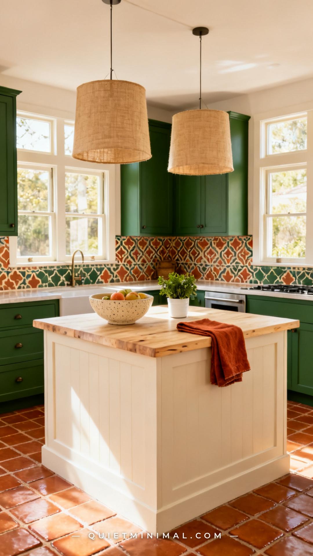
Most painted kitchen island content assumes the island is the saturated color and the perimeter is neutral. Reversing that formula — painting the perimeter cabinets in deep sage or rich teal and letting the island be the clean, warm white anchor — creates a completely different room dynamic. The island becomes the breathing room in an otherwise bold kitchen.
This approach is particularly useful in smaller kitchens where a dark-painted island would feel visually heavy. The white island keeps the center of the room light and open while the perimeter color delivers the bold personality the room needs. Use a warm white with yellow or pink undertones (Benjamin Moore “White Dove” OC-17 or “Chantilly Lace” OC-65) rather than a stark cool white that will clash with warm terracotta or sage perimeter cabinets.
Key Takeaway: In the reverse two-tone formula, the island’s warm white needs to be at least a semi-gloss finish to stand out from the more saturated perimeter cabinets — a flat or eggshell white in a sea of deeply painted cabinetry will simply disappear.

14. How to Actually Paint Your Kitchen Island Without Ruining It
 Save
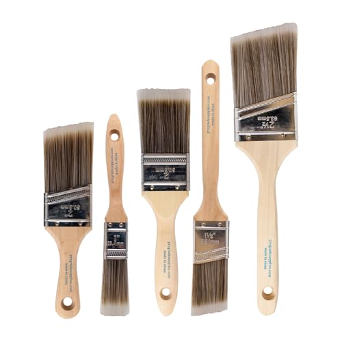
The most common reason a painted kitchen island looks amateur is skipped prep, not the wrong color. The sequence matters as much as the paint brand. Start by removing all doors, drawers, and hardware. Clean every surface with TSP substitute (a degreaser) to remove cooking oil and grime — this step alone determines whether your topcoat adheres or peels within a year.
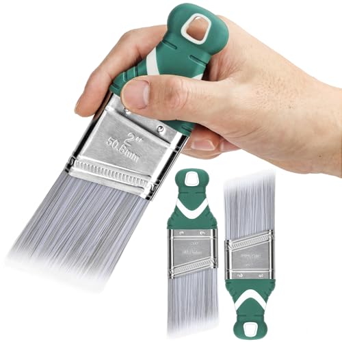
Apply a bonding primer formulated for cabinets — gray-tinted for dark colors, white for light colors. Let it dry fully (not just dry to touch — full cure per the label). Sand lightly with 220-grit between the primer coat and each topcoat. Apply two to three thin topcoats of a cabinet-specific alkyd or waterborne alkyd formula like Benjamin Moore Advance. Avoid cheap interior wall paint — it will not harden properly on a high-touch cabinet surface. Reinstall hardware only after the final coat has cured for at least 72 hours.
Key Takeaway: The single most important material upgrade for a DIY painted island is using a cabinet-specific waterborne alkyd paint instead of standard interior latex — alkyd formulas self-level as they dry, which eliminates brush marks without any extra technique.
Painting your kitchen island is one of the highest-return weekend projects in home decor — but only if you approach it as a material decision, not just a color decision. Pick your color from the verified options in this list, match your sheen level to your kitchen’s overall palette, and follow the prep sequence in Section 14 before you open a single can. Sage, terracotta, navy, deep teal, or a two-tone combination — any of these works as long as the execution is right. Your island is already the room’s focal point. Paint gives it the authority to match.
From the guides
You've saved it, wanted it. Here's the how: codes, measurements, order. Your choices make it yours.
The Japandi Honest PlaybookThe honest version of the style: what to keep, what to skip, and the order to do it in.See inside →The Room Refresh PlaybookA repeatable four-step method, room by room, in ten minutes, thirty minutes, or one weekend.See inside →Make Any Room Feel Cozy on PurposeWhy some rooms hold people and others empty out, and the moves that change it.See inside → Save


