 Georgia
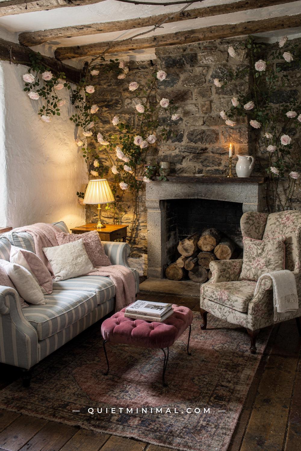
There is a particular kind of room that people keep coming back to. Low beams, a stone fireplace, a striped sofa sitting next to a floral armchair that should not work with it, a velvet ottoman where a coffee table ought to be, and a general sense that nothing in the room was bought at the same time as anything else. The Rosehill cottage aesthetic has stayed in circulation for two decades because it looks like a house rather than a scheme.
Most attempts at it go wrong in the same way. People buy cottage objects, add florals, and end up with a room that reads as busy rather than as collected. The difference is not the objects. It is that the original is built on two invisible rules, and once you know them you can apply them to furniture you already own.
The first is a locked palette of three desaturated colors. The second is a deliberate ladder of pattern scales, so that patterns never compete at the same size. Everything else in this look, the beams, the stone, the chintz, the ivory candles, sits on top of those two decisions. What follows works through both, then through the room element by element, and it is honest at the end about the parts that only exist because a camera was in the room.
The Palette Lock: Faded Red, Soft Blue, Cream
 Save
Look at any still from this cottage and count the colors. There are three, and they repeat everywhere.
A faded, brick-leaning red that never gets close to true scarlet. A soft blue somewhere between chambray and slate, with gray in it. And a warm cream that is not white. That is the entire palette, and it appears in the striped sofa, the floral chair, the rug, the blanket, the lampshades and the picture mounts. Nothing in the room sits outside it.
From the guides
You've saved it, wanted it. Here's the how: codes, measurements, order. Your choices make it yours.
 The Japandi Honest PlaybookThe honest version of the style: what to keep, what to skip, and the order to do it in.See inside →
 The Room Refresh PlaybookA repeatable four-step method, room by room, in ten minutes, thirty minutes, or one weekend.See inside →
 Make Any Room Feel Cozy on PurposeWhy some rooms hold people and others empty out, and the moves that change it.See inside →
This is why the mismatched furniture holds together. When five pieces from five decades all draw from the same three hues, your eye reads them as belonging to each other regardless of their shape or period. It is the single most transferable rule here, and it is also the cheapest, because applying it usually means removing things rather than buying them.
The word doing the heavy lifting is desaturated. Every one of these colors has been knocked back with gray or brown. A bright primary red beside a bright navy is a nautical scheme; the same two colors with about twenty percent of their intensity removed become this. If you are matching by eye in a shop, hold the fabric next to something genuinely bright and check that yours looks a little dusty by comparison. If it looks clean and vivid, it is the wrong one.
Apply the lock like this. Walk the room and pick out every item with a color you can name. Sort them into the three families, and put everything that does not fit into a fourth pile. Almost always that fourth pile contains a black object, something in a cool gray, and one item in a color from a previous scheme. Move those out of the room, or move them to a shelf where they read as small punctuation, and the room will settle before you have bought anything at all.
Two colors are allowed to sit outside the three, and only two. The wood tones, which are their own family and read as neutral. And green, in small living quantities, because plants and cut stems are exempt from every palette rule ever written.
Key Takeaway: Lock the room to a faded red, a soft grayed blue and a warm cream, keep every color desaturated, and remove anything that falls outside the three before buying anything new.

Nothing Matches, Everything Agrees
 Save
The furniture in this room is genuinely mismatched. Different periods, different woods, different shapes, and not one piece that was bought as part of a set. That is not a happy accident and it is not laziness; it is the whole point, and it is the hardest part for most people to allow themselves.
The instinct that fights it is the matching suite. Sofa, loveseat and chair in one fabric, plus two identical side tables. A suite tells you the room was bought in an afternoon, and every signal of this aesthetic is about time having passed. The moment you break the suite, the room starts reading as inherited.
But mismatch has a threshold and going over it produces chaos, not charm. The rule that keeps it on the right side is that every two pieces must agree on at least one thing. Two chairs that agree on color but not on shape. A table and a bookcase that agree on wood tone but not on period. A sofa and an ottoman that agree on nothing except their faded red. When you can draw a line of agreement between each pair, the room reads as a collection. When a piece agrees with nothing, it reads as a mistake, and the fix is usually to move it to another room rather than to add more things around it.
Practically, this means shopping one piece at a time and against the room you already have. Take a photograph of the room on your phone before you go anywhere. In front of a candidate piece, ask which existing item it agrees with and on what. If you cannot answer in a sentence, walk away.
The pieces worth hunting are the ones with a bit of oddity: an armchair with a shape that no current manufacturer makes, a small table with turned legs, a footstool with worn upholstery. Secondhand shops, estate sales and marketplace listings are where these live, and they are frequently cheaper than new flat pack. A dark polished mahogany table that would have been unfashionable a decade ago is exactly the piece this look wants, and it is currently one of the best value categories in secondhand furniture.
Do not sand and repaint everything you find. Original finish, even scuffed, is what carries the age. A tin of dark wax and twenty minutes will do more for a battered table than a full refinish, and it leaves the history in place.
Key Takeaway: Break up any matching suite and buy one piece at a time, making sure every new item agrees with something already in the room on at least one point.

The Pattern Scale Ladder
 Save
Pattern is where most attempts at this look come apart, and the fix is a rule you can apply in ten minutes.
Use three scales and only three. One large, one medium, one small. The large is the blousy floral, and it should appear once in a room, on the biggest surface you are willing to give it: an armchair, a pair of curtains, or a sofa. The medium is a stripe or a wide check, and it goes on a second substantial piece. The small is a tight check, a ticking stripe, a fine sprig print, and it goes on cushions and lampshades.
The reason this works is that patterns at the same scale compete for the same attention. Two large florals in one room fight and both lose. A large floral beside a small check reads as depth, because your eye can separate them instantly and understands one as background to the other. This is exactly what the current chintz revival is doing: generous florals sitting confidently against stripes and small checks rather than matching them.
The palette lock is what makes the ladder safe. If all three patterns are drawn from the same faded red, soft blue and cream, you can mix them freely and the room stays coherent. If one of them introduces a fourth color, you get the busy result everyone fears. So choose the large floral first, because it has the most colors in it, and pull the stripe and the check out of the colors already inside it.
Quantity matters too. A useful proportion is roughly 60 percent plain, 40 percent patterned across the room’s fabric surfaces. Plain includes the walls, the plain linen curtains, the solid cushions and the plain-woven upholstery. That plain majority is what gives the patterns somewhere to land.
If chintz feels like too much, the entry point is a single armchair. One floral chair in a room of plains does about seventy percent of the work of the whole look and is easily reversible. If it turns out not to be for you, one chair is one chair. If it works, add the small check on cushions next, and leave the stripe for last.
Key Takeaway: Use exactly three pattern scales, large floral, medium stripe, small check, all drawn from the same three colors, and keep roughly 60 percent of the fabric surfaces plain.

Chintz Without the Time Warp
 Save
Chintz is the fabric this whole aesthetic rests on and the one people are most nervous about, usually because they remember the 1980s version. It is worth separating what makes a floral look current from what makes it look like a period piece.
Ground colour is the first variable and the most decisive. A floral on a cream, oyster or soft stone ground reads as English country. The same floral on a bright white ground reads as a bedsheet, and on a deep saturated ground it becomes a much more formal, drawing-room fabric. Cream is the safe answer and it is what the original room uses.
Scale is the second. The blousy, generous, loosely drawn floral, where a single bloom is 4 to 6 inches (10 to 15 cm) across, is the one that reads as confident. A small dense repeating floral with tiny flowers is the version that reads as dated, because tight small-scale florals were what covered every surface in the last wave of this look. If you are choosing between two, take the larger and looser one.
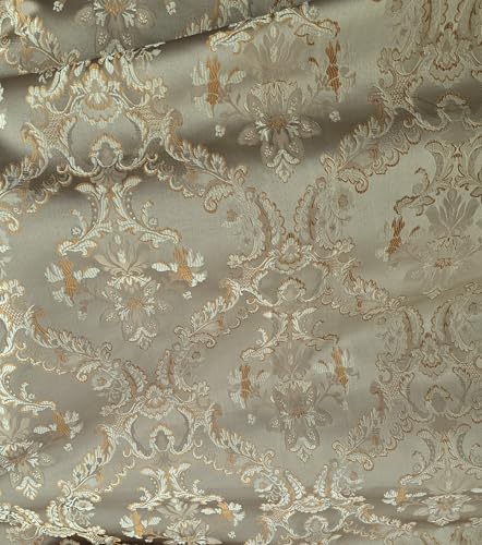
Colour saturation is the third and it follows the palette lock. Faded, dusty, slightly washed. A chintz that looks like it has been laundered a hundred times is exactly right; one with clean bright pinks and vivid greens is not. Many current fabric ranges sell both a bright and a faded colourway of the same design, so check before ordering.
Then quantity, which is where restraint matters. One large floral surface in a room. An armchair, a pair of curtains, or a sofa, and then nothing else in that print. The temptation to buy the matching cushions, the matching lampshade and the matching footstool is exactly how a floral becomes a theme, and a theme is the thing that dates.
If you want the softest possible entry point, a pair of floral curtains does the least visual damage and is the easiest to change. If you want the strongest, put the floral on the armchair, which is a defined object rather than a wall of pattern and reads as a piece of furniture with personality rather than as a decorating scheme.
Key Takeaway: Choose a large loose floral on a cream ground in a faded colourway, use it once on a single substantial piece, and never buy the matching accessories.
Low Sheen Is the Whole Trick
 Save
Here is the detail almost nobody mentions and everybody feels. There is nothing shiny in this room.
The walls are chalky. The beams are dry timber. The rug is a matte wool. The upholstery is slubby cotton and worn velvet. The stone is unpolished. The only thing in the room with any real reflectivity is the glass in a picture frame and the brass on a lamp base, and even that is dulled. This is a huge part of why the room reads as old, because sheen is the most reliable signal of newness in a domestic interior.
That gives you a simple test for any object you are considering. Tilt it under a light. If it throws a sharp highlight, it will fight this room.
Applied to specific decisions: paint the walls in a flat or matte emulsion rather than eggshell. Modern matte paints are washable now, so the old argument for eggshell in a living room has largely gone. Choose a warm off-white with a hint of yellow or pink rather than a cool brilliant white, because brilliant white against faded colors makes them look dirty rather than aged.
For woodwork, use eggshell rather than gloss, and consider painting it the same color as the walls rather than in a contrasting white. A cottage with white gloss trim against cream walls reads as recently decorated; the same room with everything in one soft chalky color reads as having always been that way.
For furniture, avoid the high-gloss lacquer finishes and the very smooth synthetic velvets. A cotton velvet with a slightly irregular pile is the right texture; a polyester velvet with a mirror sheen is not. Linen, slubby cotton, worn wool, rush and rattan are all in the right family because none of them reflects.
The exception, and it is a real one, is candlelight and lamplight on brass. A small amount of warm metallic glow at night is what stops a fully matte room from going flat, which is why there are always ivory candles on that mantel.
Key Takeaway: Take the sheen out of everything, matte walls, eggshell woodwork in the wall color, and matte textiles, and let brass and candlelight supply the only glow.

The Fireplace Wall and Its Stone
 Save
The stone chimney breast is the architectural anchor of the room and the element most people assume they cannot have. It is worth separating what the stone is doing from how it was built.
What it is doing is providing one wall of rough, irregular, non-repeating texture in a room where everything else is smooth. That contrast is what makes the plaster look soft and the fabrics look inviting. It is also providing a strong vertical mass that stops a room full of low mismatched furniture from feeling formless.
If you have a genuine stone or brick chimney breast, the only advice is to leave it alone. Painted brick has its uses but not here, and the current direction has moved firmly back toward exposed masonry. If yours has been painted, a limewash rather than a strip is the kinder route: a thinned limewash lets the texture and some color variation come through and looks a hundred years old within a week.
If you have a plain plasterboard fireplace surround, the two honest options are a rough timber mantel beam or nothing. A reclaimed oak beam, 6 to 8 inches (15 to 20 cm) deep and set at about 48 to 54 inches (122 to 137 cm) from the floor, does most of the work of the stone by itself, because the roughness is the operative quality rather than the material. Stone-effect cladding panels are the tempting third option and they are usually a mistake, because they repeat, and repeating stone is instantly readable as fake.
If you have no fireplace at all, build the same function somewhere else. What the wall provides is a focal mass, a mantel-height shelf for candles and objects, and a place the seating turns toward. A tall dark dresser, a wide low bookcase with a heavy top, or even a large framed picture with a shelf beneath it can all take that role.
Whatever the surround, keep the hearth swept and the firebox clean and unlit in daylight, with a basket of split logs beside it and a pair of ivory candles on the mantel. That is exactly the arrangement in the original, and it works because it implies use without performing it.
Key Takeaway: Give the room one wall of rough irregular texture and a heavy mantel at about 48 to 54 inches (122 to 137 cm), and use a reclaimed timber beam rather than repeating stone-effect cladding.

Beams, and How to Handle a Flat Ceiling
 Save
Beams are the second architectural signature and the one most often faked badly. There is a right way and a wrong way, and the difference is mostly about color and cross-section.
Real structural beams in an old cottage are irregular. They have saw marks, they are not perfectly straight, they vary in depth along their length, and their color is a dry medium brown rather than a dark stain. The very dark, perfectly rectangular, evenly spaced beams sold as a period feature are the version that reads as fake, because uniformity is the giveaway every time.
If you are adding beams, hollow box beams made from reclaimed timber or from new timber that has been distressed and dry-brushed are entirely legitimate. The specifications that matter: depth of 5 to 8 inches (13 to 20 cm), spacing of 3 to 4 feet (91 to 122 cm) rather than evenly dividing the ceiling into neat squares, and a finish somewhere in the mid brown range with visible grain. Never gloss, never near-black.
Ceiling height is the constraint. Beams read as charming at 7 feet 6 inches to 8 feet (229 to 244 cm) because the low ceiling is part of the cottage character, but if your ceiling is already 8 feet (244 cm) flat and the room is large, adding a 7 inch (18 cm) beam across it can feel oppressive rather than snug. In that case run beams in one direction only, along the short dimension, and keep them shallow.
If beams are out of reach entirely, the same enclosure can come from color. Painting the ceiling the same warm off-white as the walls, with no white ceiling paint and no contrast line, removes the visual lid and makes a low room feel held rather than pressed down. Adding a picture rail at about 12 to 18 inches (30 to 46 cm) below the ceiling and painting above it in the ceiling color does something similar.
One caution on lighting. Beams and recessed ceiling spotlights are a poor pairing, because downlights between beams create a striped shadow pattern that no amount of dimming fixes. If you have beams, light the room from lamps.
Key Takeaway: Keep any added beams irregular, mid brown, 5 to 8 inches (13 to 20 cm) deep and unevenly spaced, and if beams are not possible, paint the ceiling the same warm off-white as the walls.

Lamps at Three Heights, and the Ceiling Light Off
 Save
The single fastest way to make any room read as a cottage rather than as a rental is to stop using the ceiling light.
From the guides
You've saved it, wanted it. Here's the how: codes, measurements, order. Your choices make it yours.
The Japandi Honest PlaybookThe honest version of the style: what to keep, what to skip, and the order to do it in.See inside →The Room Refresh PlaybookA repeatable four-step method, room by room, in ten minutes, thirty minutes, or one weekend.See inside →Make Any Room Feel Cozy on PurposeWhy some rooms hold people and others empty out, and the moves that change it.See inside →Overhead light flattens. It puts a uniform wash on everything, kills the shadows that give texture its depth, and makes a room with faded colors look tired rather than aged. Every frame of this cottage interior is lit from lamps at seating height, which is why the corners go soft and the fabrics look rich.
Build three heights. A floor lamp at roughly 58 to 64 inches (147 to 163 cm) beside a chair, so light falls over a shoulder onto a book. A table lamp at 24 to 28 inches (61 to 71 cm) on a side table or a dresser, which is the height that lights faces. And something low, a candle on the mantel, a small lamp on a bookcase shelf, a picture light. Three sources at three heights in one room is the minimum, and five is better in a room this layered.
Shades decide the quality of the light. Cream or off-white pleated fabric shades are the correct choice here and they are also having a genuine revival, so they are easy to find. A pleated shade diffuses light through the sides as well as the top and bottom, which is why a room lit with them glows rather than spotlights. Avoid drum shades in dark or opaque fabric, which throw light only up and down and leave the middle of the room dim.
Bulbs at 2700K, dimmable, and low wattage. A 40 to 60 watt equivalent in each of four lamps produces a far better room than one 100 watt equivalent in a ceiling fixture. If your lamps are not on dimmers, plug-in dimmer modules cost very little and let you take the whole room down in the evening.
And let one lamp be slightly wrong. A shade that sits a fraction crooked, a base that is clearly older than everything else, a lamp that does not match its pair. The set dressers on this cottage did exactly that on purpose, because perfect symmetry in lamps is one of the strongest signals of a scheme.
Key Takeaway: Turn the ceiling light off permanently and build at least three lamps at three heights with cream pleated shades and warm dimmable bulbs.

Layering the Sofa Without Making a Pile
 Save
Sofa layering is where this look tips into parody fastest, because the instinct is to keep adding and the correct answer is a specific small number.
Four cushions on a three-seat sofa. Two on a two-seat. That is the working limit, and it is a functional limit rather than a stylistic one, because a sofa with eight cushions is a sofa you have to unload before you sit on it, and a sofa nobody sits on stops looking lived in almost immediately.
Arrange them by the pattern ladder. The two outer cushions are the largest and the plainest, usually a 20 to 22 inch (51 to 56 cm) linen in cream, which frames the group. Inside those, the floral, at 18 to 20 inches (46 to 51 cm). In front, the small check or ticking stripe at 16 inches (41 cm) or a lumbar shape. Big and plain outside, patterned and smaller inside, and the eye reads it as arranged rather than piled.
Inserts matter more than covers. A feather or feather-and-down insert one size larger than the cover is what gives a cushion the soft collapsed shape that belongs to this look. A polyester insert cut to exact size stays rigid and square, which is the shape that reads as showroom. Buying a 22 inch (56 cm) insert for a 20 inch (51 cm) cover costs a few dollars more and changes the whole character.
The blanket is the other half. One blanket, folded loosely over an arm or thrown across a corner, in wool rather than fleece, and in the palette. It should look like it was put down rather than placed, which in practice means folding it in half twice and then giving it one shake.
The ottoman deserves its own note because the original uses it so well. A tufted velvet ottoman in place of a coffee table gives you a soft surface, a footrest and a seat, and its round or square soft form breaks up a room otherwise full of rectangles. Top it with a flat tray for anything that needs a hard surface, and choose a version with storage inside if the room is small, because that is where the blankets live.
Key Takeaway: Cap the sofa at four cushions arranged large and plain outside, patterned and smaller inside, use inserts one size larger than the covers, and add exactly one wool blanket.

The Windows, the Curtains, and the Light
 Save
Cottage windows are small, deep-set and divided, and they produce a very specific quality of light: directional, falling into the room in a defined patch rather than washing it evenly. Most modern rooms have the opposite, large windows producing flat overall brightness, and reconciling the two is a real design problem.
The first move is to let the light stay directional. Resist the urge to maximize brightness. Heavy full-length curtains that stack back off the window entirely are a formal-room solution; here you want simple panels that sit partly across the glass, or a single panel on one side, so the light comes in with an edge to it.
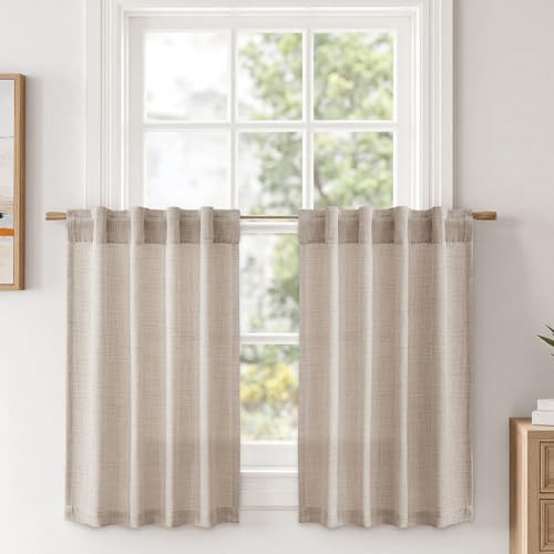
Fabric should be plain and unlined. Cream or oatmeal linen, or a plain cotton in the palette. Unlined matters because the glow of light through the cloth is half the effect. Hang from a slim dark iron or wooden rod with simple rings and no finial worth noticing, mounted just above the window frame rather than at the ceiling, because a cottage window wants its own proportions rather than a heightened one.
Length is a small decision that changes the register. Curtains that break slightly on the floor, or that hang to a deep sill, both read as cottage. Curtains that stop 4 inches (10 cm) above the floor read as a mistake in any style.
The deep sill is the feature to exploit if you have one. It is the natural place for a white jug of garden flowers, a small stack of books, a candle. If your windows have shallow sills, a narrow shelf mounted just below the window at sill depth of about 6 inches (15 cm) gives you the same surface, and it is one of the least expensive changes of everything here.
For privacy in a room overlooked at the front, a simple cafe curtain on a slim rod across the lower half of the window is the correct historical answer and it keeps the top light coming in. It reads as considered rather than as blocked, which is more than can be said for a blind.
Key Takeaway: Hang plain unlined linen panels on a slim rod just above the window frame, let them sit partly across the glass so the light stays directional, and use the sill as a shelf.
White Objects Doing the Editing
 Save
Here is the detail that separates a coherent version of this look from an overwhelming one, and it is easy to miss because the objects doing it are so plain.
Scattered through the whole cottage are plain white things. White ceramic jugs and bowls. Ivory candles. Framed pictures with wide white or cream mounts. Plain white lampshades. They are not decorative in themselves and they are not what anyone photographs, and that is exactly their function: they are visual rest.
A room with three pattern scales and a stone wall and beams has a great deal going on. Without something quiet, the eye has nowhere to stop and the whole room reads as noise. Every plain white object is a small pause, and distributing eight or ten of them around a room is what lets the patterns be as generous as they are.
The wide mount on framed pictures is the clearest example. A picture with a 3 to 4 inch (8 to 10 cm) cream mount around it creates a defined area of blank on a busy wall, and the picture itself becomes readable rather than being one more pattern. Frame in plain dark wood or a simple gilt rather than anything ornate, and keep the mounts consistent across a group even when the frames differ.
Ceramics are the second category and the cheapest. White jugs, ironstone bowls, plain vases, all mismatched and all in the same rough white family: some bright, some cream, some with a crackled glaze. Secondhand shops are full of them for very little. Put them where a pattern needs interrupting, on a mantel between two patterned things, on a shelf, on the deep windowsill with stems in them.
The candles matter too and they should be plain ivory, unscented, of varying heights, in simple brass or glass holders. Scented candles in printed jars are a different aesthetic entirely, and the printed label is a strong signal of the current decade.
Keep the whites warm. A bright optical white next to faded reds and creams reads as harsh and makes everything around it look grubby. Ivory, bone, oyster and unbleached are the right family.
Key Takeaway: Distribute eight to ten plain warm-white objects around the room, ceramics, ivory candles and wide cream picture mounts, and treat each one as a place for the eye to rest.

The Small Kitchen and the Bedroom Under the Eaves
 Save
The two rooms people always ask about after the sitting room are the kitchen and the bedroom, and both follow the same rules with a different weighting.
The cottage kitchen is small, freestanding and unfitted. That is the important word. Rather than a continuous run of matching units, it reads as a collection of separate pieces of furniture that happen to be in a kitchen: a painted cupboard, a table used as a work surface, an open shelf, a dresser holding the plates. If you have a fitted kitchen, the achievable moves are removing the doors from one or two upper cabinets, adding a freestanding piece such as a small dresser or a butcher block table, and putting a gathered linen skirt under the sink.
Keep the surfaces worn and the objects visible. A wooden counter that shows knife marks, mismatched white plates on an open shelf, a crock of used wooden spoons, a jug of flowers on the windowsill. The palette lock still applies, so a faded red checked tea towel and a soft blue enamel jug are exactly right, and a set of bright modern canisters is not.
The bedroom under the eaves works on enclosure. A low sloping ceiling, a bed pushed under it, a small window at bed height. If your bedroom is a plain rectangle, you can build the same feeling with color: paint the walls and the ceiling in the same warm off-white or the same soft faded color so the corner between them disappears, which makes the room feel wrapped rather than boxed.
Bedding follows the ladder. A plain cream or white base, a faded floral quilt or eiderdown folded across the bottom third, one small check cushion, and a wool blanket. An eiderdown or a quilt rather than a thick duvet is the specific cottage note, because the shape is flatter and the surface is stitched rather than smooth.
In both rooms, keep the lighting to lamps and keep everything matte, and both will read correctly even if the architecture is entirely ordinary.
Key Takeaway: Make the kitchen read as unfitted furniture rather than a matching run, and wrap the bedroom in one soft color from wall to ceiling with a quilt folded across the bed.

The Lived-In Signals You Have to Add Deliberately
 Save
The set dressers on this cottage did something most decorators would never allow: they added imperfection on purpose. Marks on the walls. A lamp sitting slightly crooked. Objects that are clearly not where they were placed. It is the reason the room reads as a home rather than as a scheme, and it is the part of the look you have to add deliberately because tidying removes it.
The useful principle is that a room should contain evidence of the last hour. A book lying face down rather than stacked. A blanket half off the arm. A mug on a table. Reading glasses somewhere they were put down. When you tidy a room into perfect order and then photograph it, you get a state the room never actually occupies, which is exactly why real rooms often photograph worse than sets.
Second, allow wear to stay. A rug that has gone thin in the walking line, a table with rings on it, a painted door with the paint worn through at the handle. These are the things people are tempted to fix and they are precisely the things this aesthetic is built on. If you are buying secondhand, buy the piece with honest wear over the refinished one, and pay less for it.
Third, resist symmetry. Two identical lamps flanking a sofa, two matching side tables, a perfectly centered picture above a fireplace: all of these say scheme. Move one thing off center. Use a floor lamp on one side and a table lamp on the other. Hang pictures in an uneven group rather than a grid.
Fourth, add the layer of things that are used rather than displayed. A basket of newspapers. A pair of slippers by the hearth. A tin of matches on the mantel. Fresh garden flowers in a white jug, which is the one item in this whole aesthetic that appears in almost every frame.
And leave the accumulation visible. This look is supposed to represent decades, so a room where every object arrived within a year has a ceiling on how convincing it can get. Buy slowly, keep the palette locked, and let the room fill up over time. That is not a limitation of the method; it is the method.
Key Takeaway: Add evidence of the last hour on purpose, keep honest wear rather than refinishing it, break every symmetry by one item, and let the room accumulate over years rather than months.
Two rules carry almost all of this. Lock the palette to a faded red, a soft grayed blue and a warm cream, with every shade knocked back rather than clean. Then build a ladder of three pattern scales, a large floral, a medium stripe and a small check, all drawn from those same colors, and keep about sixty percent of the room plain so they have somewhere to sit. On top of that, take the sheen out of everything, switch the ceiling light off for good, and light the room from three lamps at three heights. Start this week with the palette walk: go through the room, sort every colored object into the three families, and take the fourth pile out. It costs nothing, it takes twenty minutes, and it is the single change that makes everything else you do afterward land.
From the guides
You've saved it, wanted it. Here's the how: codes, measurements, order. Your choices make it yours.
The Japandi Honest PlaybookThe honest version of the style: what to keep, what to skip, and the order to do it in.See inside →The Room Refresh PlaybookA repeatable four-step method, room by room, in ten minutes, thirty minutes, or one weekend.See inside →Make Any Room Feel Cozy on PurposeWhy some rooms hold people and others empty out, and the moves that change it.See inside → Save


