 Georgia
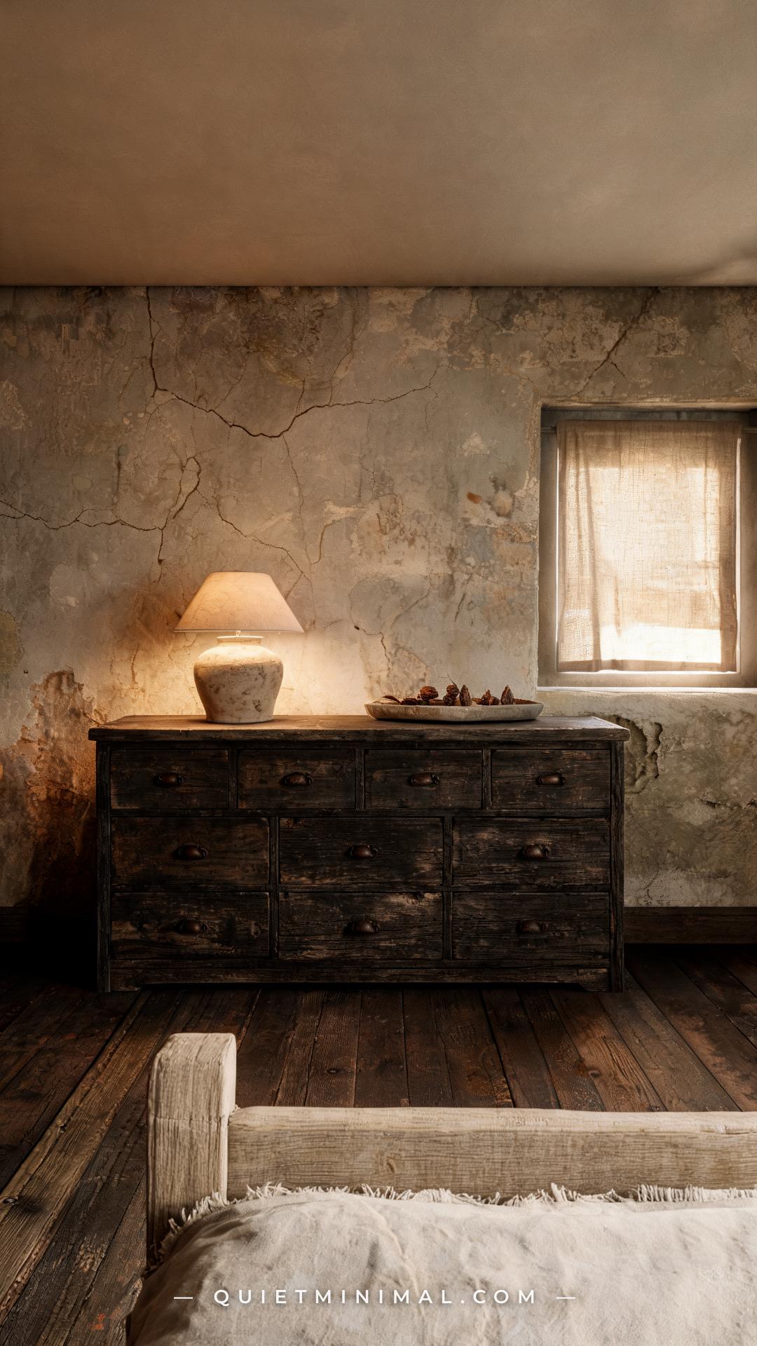
There is a specific kind of dresser that makes a bedroom feel like it has always been there — like it was carried up the stairs decades before you moved in and simply never left. That is the dark distressed dresser: rough-sawn grain exposed at the edges, a worn painted surface that has been sanded back to near wood in the right places, and iron pulls that look like they were salvaged from a barn door rather than ordered from a catalog. The problem is that most people either fall for the wrong version of this piece — factory-faked distressing that reads as cheap — or they find the right one and have no idea how to use it without making their bedroom feel like a storage unit. This article fixes both problems. Below are fourteen specific, actionable ideas that show you how to choose, style, and live with a dark distressed dresser in a way that looks intentional, not accidental.
1. Choose Rough-Sawn Oak Over Smooth Pine for Maximum Grain Contrast
 Save
The single biggest visual mistake in the distressed dresser category is choosing a wood species with too little grain character. Smooth pine takes stain evenly and looks flat once distressed — the “aging” effect just reads as a bad paint job. Rough-sawn oak, by contrast, has deeply defined grain channels that catch and hold dark finishes in all the right places: the valleys go near-black while the ridges hold a slightly lighter tone, creating natural contrast without any additional technique.
When you are shopping, look specifically for the term “rough sawn” or “hand-hewn” in the product description. Feel the surface if you are buying in person — it should not be glassy smooth. If you are shopping online, zoom into the photo and look for that ridge-and-valley texture along the drawer faces. A piece finished over MDF or smooth-sanded maple will not hold distressing the same way, and the difference is visible from across the room.
Key Takeaway: Rough-sawn oak gives you real grain contrast that makes a dark finish look earned, not applied.

2. Let the Distressing Follow the Wood’s Natural Stress Points
SaveAuthentic distressing follows the logic of real use: edges wear first, then corners, then the high-contact zones around hardware. Factory-distressed pieces that scatter white sanding marks randomly across flat drawer faces look like a paint accident rather than aging. When you are evaluating a piece, check whether the wear pattern makes physical sense — if the middle of a drawer face is heavily “worn” but the corners are pristine, the distressing is decoration rather than simulation.
From the guides
You've saved it, wanted it. Here's the how: codes, measurements, order. Your choices make it yours.
 The Japandi Honest PlaybookThe honest version of the style: what to keep, what to skip, and the order to do it in.See inside →
 The Room Refresh PlaybookA repeatable four-step method, room by room, in ten minutes, thirty minutes, or one weekend.See inside →
 Make Any Room Feel Cozy on PurposeWhy some rooms hold people and others empty out, and the moves that change it.See inside →
If you are distressing a piece yourself or having one custom-finished, give the finisher a reference photo of an actual antique. The instruction is simple: sand back to bare wood at every point where a real user’s hand, hip, or corner bump would have made contact over thirty years. The top surface, front corners of every drawer, and the area directly above the pulls should all show the most wood. The center of each drawer face should show the least.
Key Takeaway: Distressing that follows real wear logic reads as aged; distressing that ignores it reads as damaged.

3. Match the Iron Pull Finish to the Undertone of Your Wood
 Save
Not all dark iron reads the same way against wood. Aged iron with a warm black patina — sometimes described as “oil-rubbed” or “antique bronze” — works better against wood with amber or red undertones (walnut, cherry, warm oak). Cool-toned iron with a flat gunmetal or charcoal finish looks better against gray-washed or ebonized wood. When these undertones clash, the hardware looks like an afterthought even if it is technically “rustic.”
Pull a wood swatch or a clear photo of the dresser into daylight before ordering hardware. Look at the warmth in the grain — if it leans golden or reddish, go warm-patina iron. If it leans gray or cool brown, go flat black or dark pewter. This single decision determines whether the hardware looks like it belongs on the piece or was simply bolted on.
Key Takeaway: Matching the iron’s undertone to the wood’s undertone is what makes hardware look native to the piece.

4. Use a Dark Distressed Dresser as the Bedroom’s Anchor Wall Piece
 Save
A dark piece earns its place in a room when it is given a clear visual role. The most reliable role for a large distressed dresser is anchor: the dominant object on one wall that every other piece in the room relates to. This means centering it on the wall, giving it symmetrical flanking elements (matching lamps, matching bedside tables, or at minimum a centered mirror above), and resisting the urge to crowd it with smaller furniture.
When a dark dresser is pushed into a corner without ceremony, it reads as furniture that was run out of space rather than placed with intention. Front it with the full wall. If the wall has a window, place the dresser centered below it — the light will catch the distressed grain beautifully and the window symmetry reinforces the anchor positioning.
Key Takeaway: A dark dresser only reads as intentional when it is given a clear, centered, purposeful position in the room.

5. Balance the Dark Finish with a Warm Plaster or Limewash Wall
 Save
The most common fear with dark furniture is that it will make a room feel smaller or cave-like. The fix is not to avoid dark furniture — it is to choose the right wall finish behind it. Flat white paint makes a dark distressed dresser look like it is sitting in a showroom. Limewash, venetian plaster, or a warm clay-based paint creates enough visual texture and warmth that the dark piece settles into the wall rather than confronting it.
Sherwin-Williams Urbane Bronze (SW 7048) on the dresser and a limewash like Portola Paints Roman Clay on the wall behind it is a combination that design professionals use repeatedly. The wall reads as slightly lighter in some areas and deeper in others — that variation is what gives the dark furniture room to breathe. If you are not ready to commit to limewash, even a warm off-white like Benjamin Moore White Dove will serve better than a cool stark white.
Key Takeaway: Textured warm walls prevent a dark dresser from feeling heavy by giving the eye something complex to read behind it.

6. Style the Dresser Top Like a Collected Shelf, Not a Display Case
 Save
The dresser top is the part of the room Maya sees every morning and every night — and it is the place most likely to devolve into a dumping zone of receipts, loose change, and old lotion bottles. The styling rule for a dark distressed dresser top is: treat it like a collected shelf, not a curated display. That means objects in natural materials (ceramic, linen, dried botanicals, raw wood), different heights, and a deliberate empty zone so the wood itself is visible.
The worst thing you can do to a dark distressed dresser is cover the entire top surface with matching decorative objects in matching tones. The wood grain is the feature — the styling exists to frame it, not bury it. A linen tray to corral smaller items, one tall element (a lamp or a vase), and one low element (a stack of books or a small ceramic bowl) is enough. Leave at least forty percent of the surface empty.
Key Takeaway: Keep forty percent of the dresser top bare so the grain finish — the whole reason you bought the piece — actually reads.

7. Pair Worn Painted Finishes with Raw Linen Textiles for Tactile Balance
 Save
A worn painted surface carries significant visual texture — the roughness of exposed wood grain, the slight irregularity of hand-applied or sanded paint. When you pair that with smooth or synthetic textiles (polyester duvet, glossy throw pillows, synthetic rug), the dresser starts to look like it belongs in a different room. The counterpart to rough painted wood is raw, undyed linen — a material that is equally tactile, equally natural, and equally imperfect.
Look for linen described as “stonewashed” or “pre-washed raw linen” in undyed or oatmeal tones. This goes on the bed closest to the dresser, on any throw draped nearby, and on window treatments in the same room. The goal is a room where every material has been handled, not manufactured. Boucle is also an excellent counterpart — its looped texture reads as artisanal next to rough-grained wood.
Key Takeaway: Raw linen and boucle are the only textile categories that match the tactile register of a worn painted dresser finish.

8. Use an Aged Iron Pull with a Hand-Forged Profile, Not a Stamped Shape
 Save
Factory-stamped iron pulls are made by pressing molten metal into a standardized mold. Every bail ring is identical. Hand-forged pulls are shaped by a hammer and anvil, which means each one carries slight variations in width, surface texture, and curvature. On a dark distressed dresser, that variation is critical — it is the difference between hardware that looks mass-produced and hardware that looks like it was collected from an old workshop.
When shopping, look for the terms “hand-forged,” “hand-hammered,” or “artisan iron” in the listing. The product photos should show slight surface irregularity — small hammer marks or flat spots in the metal where a uniform stamped pull would be perfectly smooth. Brands like Richelieu Hardware and regional blacksmith suppliers on Etsy carry genuine hand-forged options. The price difference from stamped hardware is modest; the visual difference is significant.
Key Takeaway: Hand-forged iron pulls with visible hammer marks read as authentically aged; stamped pulls read as a costume.

9. Place the Dresser on a Natural Fiber Rug to Soften the Weight
 Save
Dark furniture on a light floor without a rug creates a visual drop — the eye reads the dark mass as sitting in empty space rather than in a room. A natural fiber rug under or in front of the dresser solves this by creating a visual base that grounds the piece and connects it to the rest of the room. The best choices for this aesthetic are jute, sisal, or a flat-woven wool in natural, undyed tones.
The rug does not need to be large — a 2×3 or 3×5 runner in front of the dresser is enough to create the grounding effect. If the dresser sits against a wall with walkway space in front, place the rug so the dresser’s front feet sit on the rug’s back edge. This pulls the piece forward into the room slightly and makes it look intentionally placed rather than pushed against the wall.
Key Takeaway: A natural jute or sisal rug grounds a dark dresser by giving it a visual base and connecting it to the room’s texture language.
From the guides
You've saved it, wanted it. Here's the how: codes, measurements, order. Your choices make it yours.
The Japandi Honest PlaybookThe honest version of the style: what to keep, what to skip, and the order to do it in.See inside →The Room Refresh PlaybookA repeatable four-step method, room by room, in ten minutes, thirty minutes, or one weekend.See inside →Make Any Room Feel Cozy on PurposeWhy some rooms hold people and others empty out, and the moves that change it.See inside →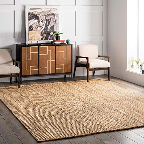
10. Add a Leaning Mirror Rather Than a Mounted One for an Unfussy Look
 Save
A mounted mirror above a dresser implies formality — the kind of matched dresser-and-mirror set that felt right in the early 2000s but now reads as bedroom furniture that came in a box. For the dark distressed aesthetic, which is fundamentally about things that look like they were collected over time rather than purchased together, a leaning mirror is a better choice. It reads as found, not matched.
Choose a mirror with a frame that complements the iron hardware — a thin dark iron frame or a raw wood frame in a lighter tone for contrast. The mirror should be tall enough to lean from floor level and still show above the dresser top when standing in front of it: a minimum of 60 inches for most dresser heights. Lean it at a slight angle — not perfectly upright — for the most natural look.
Key Takeaway: A leaning mirror signals that the room was assembled thoughtfully over time, rather than ordered as a set.

11. Use the Dresser in a Non-Bedroom Space for an Unexpected Application
 Save
Most people limit distressed dressers to the bedroom, which means the rest of the home stays in its default state — IKEA-flat or mid-century minimal — and the bedroom feels like a stylistic island. Moving a dark distressed dresser into an entryway as a console, into a dining room as a sideboard, or into a living room as a media cabinet is one of the most effective ways to give an entire home a consistent design language at a single purchase point.
The dresser works particularly well as a dining room sideboard because the drawer storage is genuinely useful (linens, candles, serving utensils) and the top surface can hold a lamp, a tray of candles, or a large ceramic planter. In an entryway, the drawers hold seasonal accessories and the top holds keys, a linen tray, and a lamp. The dark finish anchors whichever room it lands in.
Key Takeaway: Moving a dark distressed dresser outside the bedroom is the fastest way to give your whole home a unified, collected aesthetic.

12. Layer Warm Candlelight on the Dresser Top for Evening Depth
 Save
A dark distressed dresser in daylight reads as textural and grounded. The same dresser under warm evening light reads as atmospheric and deeply beautiful — but only if the lighting on or near the dresser is intentional. An overhead recessed light directly above the piece flattens the texture. A warm incandescent or amber LED lamp on the dresser top, supplemented by one or two pillar candles in iron holders, creates the kind of side-lighting that makes rough grain and aged iron look dramatic.
Choose bulbs with a color temperature of 2200K–2700K for the dresser lamp — the warmer the light, the more the grain textures are revealed in the shadows of their own channels. If you use battery-operated pillar candles (a practical choice for a surface you use regularly), choose ones with a flickering flame mode rather than a steady glow. The flicker interacts with the distressed surface in the same way real flame does.
Key Takeaway: Warm side-lighting at 2200K–2700K is what transforms a dark distressed dresser from furniture into atmosphere after sundown.

13. Mix a Dark Distressed Dresser with Modern Minimal Pieces Deliberately
 Save
The fear most people have with a dark distressed dresser is that it forces a commitment to a fully rustic or farmhouse room. It does not. Some of the most visually interesting rooms using this piece mix it deliberately with one or two modern minimal elements — a clean-lined upholstered bed frame, a simple geometric bedside lamp, a flat-weave geometric rug. The rough and the refined in the same room create a collected tension that a fully matched rustic set never achieves.
The rule for mixing is: let the distressed dresser be the most dramatic object in the room. Everything else should be quieter in visual intensity — lighter in color, cleaner in line, less textured. The dresser will read as the anchor of the room’s personality, and the modern pieces will read as sophisticated restraint that keeps the space from tipping into theme-room territory.
Key Takeaway: Mixing a dark distressed dresser with modern minimal pieces makes both look more intentional — as long as the dresser remains the room’s dominant personality piece.

14. Know When a Reproduction Versus a True Antique Is the Better Buy
 Save
There is a practical decision point that this article has been circling: do you buy a true antique or a well-made reproduction? The honest answer is that for most buyers in 2026, a quality reproduction is the better functional choice — new drawer slides that actually close smoothly, consistent sizing that fits modern rooms, and a warranty. But not all reproductions are equal.
The line between a reproduction worth owning and a cheap knockoff is the finish process. Look for pieces with a description that includes hand-applied finish, wire-brushed grain, multi-step glaze process, or hand-distressed edges. Avoid pieces described only as “rustic look” or “country style” with no finish detail — these are usually printed paper-on-MDF with a debossed grain pattern that will not hold up. If you are buying an actual antique, expect to replace the hardware, refinish the top surface, and potentially repair a drawer or two — that is part of the relationship with a genuine piece, and worth understanding before you commit.
Key Takeaway: A quality reproduction with a hand-applied, wire-brushed finish will outperform a cheap “rustic look” piece every time — and often rivals a true antique for daily use.

A dark distressed dresser is not a safe piece of furniture. It makes a statement, takes up visual weight, and demands that everything around it respond to it with intention. That is exactly what makes it worth having. The pieces that commit to a point of view — rough grain against warm plaster, aged iron against pale linen, worn paint against clean modern lines — are the ones that make a room feel like it was designed by someone who knew what they were doing. Choose the wood species carefully, match the iron undertone to the wood, style the top with restraint, and give the piece a clear visual role in the room. Do those four things and the dresser stops being furniture and starts being the reason people walk into your bedroom and immediately ask who did your room.
From the guides
You've saved it, wanted it. Here's the how: codes, measurements, order. Your choices make it yours.
The Japandi Honest PlaybookThe honest version of the style: what to keep, what to skip, and the order to do it in.See inside →The Room Refresh PlaybookA repeatable four-step method, room by room, in ten minutes, thirty minutes, or one weekend.See inside →Make Any Room Feel Cozy on PurposeWhy some rooms hold people and others empty out, and the moves that change it.See inside → Save


