Georgia
—
If you have been saving Scandi cottage pins for months and your room still does not quite land, you are not alone. The style looks deceptively simple from the outside: a bit of wood, some linen, a candle or two. But Scandi cottage sits at the intersection of two very specific design philosophies, and each one is pulling in a different direction. Scandinavian design is about editing, restraint, and letting function lead. Cottage style is about warmth, layers, and the feeling that a room has been lived in with care. Getting the balance wrong is easy, and the results range from a room that feels sterile and cold to one that tips into country clutter with no breathing room.
The fixes are not expensive or complicated. They are mostly decisions, made at the right moment, with the right understanding of why the style works when it works. This article breaks down the 13 most common Scandi cottage mistakes, names exactly why each one looks off, and gives you a specific, actionable correction for every single one.
—
You Painted the Walls Pure Brilliant White
 Save
Pure brilliant white, the kind that comes out of a budget roller sleeve without any thought, is the single fastest way to make a Scandi cottage room look like a showroom bathroom. The problem is not the color itself. It is the undertone. Optical bright white has a blue bias that reads as cool under almost every natural light condition. In a Scandinavian city apartment with floor-to-ceiling glass, that cool quality creates the clean, spacious feeling the style is known for. In a cottage context, where ceilings are often lower, windows are smaller, and the whole point is warmth and ease, that same white turns clinical.
From the guides
You've saved it, wanted it. Here's the how: codes, measurements, order. Your choices make it yours.
 The Japandi Honest PlaybookThe honest version of the style: what to keep, what to skip, and the order to do it in.See inside →
 The Room Refresh PlaybookA repeatable four-step method, room by room, in ten minutes, thirty minutes, or one weekend.See inside →
 Make Any Room Feel Cozy on PurposeWhy some rooms hold people and others empty out, and the moves that change it.See inside →
The mechanism is simple: your eye reads color temperature in relation to the light source. In a north-facing or low-ceilinged room, brilliant white absorbs the cooler rays and amplifies them back at you. The room feels like it is being lit by strip lights even when it is not. It kills the hygge effect instantly, and no amount of linen or candles can fully recover the warmth you have painted out.
The fix is a warm off-white with a yellow or pink undertone. Specific options that work well in this context include Farrow and Ball’s Pointing (a creamy warm white), Benjamin Moore’s White Dove (a soft, barely-there yellow-white), and Sherwin-Williams Alabaster, which carries just enough warmth to read as white while pulling every natural light source toward gold rather than grey. The difference is subtle on the paint chip and significant on the wall. Apply it to all four walls and the ceiling in a matte or flat finish, which diffuses light softly rather than bouncing it back hard like a satin sheen would.
Room size does not change this rule. A small Scandi cottage bedroom painted in a warm off-white feels larger and lighter than the same room in brilliant white, because your eye relaxes instead of straining to find warmth that is not there.
Key Takeaway: Switch from optical bright white to a warm off-white with a cream or pink undertone, and choose a flat or matte finish to diffuse light gently rather than reflect it cold.

—
You Chose Pale Pine Furniture Instead of Warm Oak or Beech
 Save
Pale pine became the default Scandi furniture wood for a decade because IKEA made it affordable and accessible. The problem is that pale pine has a slight yellow-green undertone that ages quickly under changing light conditions. In a Scandinavian context with very specific soft grey-white walls, it can work. In a Scandi cottage context, where the walls are warmer, the textiles are layered, and the whole mood is about organic naturalness, pale pine reads as flat and slightly synthetic rather than genuinely natural.
The mechanism: wood warmth comes from the undertone of the grain, not just the shade. Pale pine sits in a cool-to-neutral range. Honey oak, beech, and mid-tone walnut all carry richer red, amber, or caramel undertones that respond to warm light sources and make a room feel like the furniture grew there rather than arrived in flat-pack boxes. When you place pale pine against a warm off-white wall and layer in linen and bouclé textiles, the pine fights the palette instead of supporting it. Everything else pulls warm; the pine pulls cool. The mismatch is subtle but your eye picks it up as “something is off” even when you cannot name it.
The correction is not necessarily replacing every piece of furniture. Start by identifying which wood is the room’s anchor, usually the largest piece such as a bed frame, dining table, or sofa console. Replace or refinish that one piece in honey oak or beech first, and assess. In many rooms, getting the anchor wood right immediately pulls the whole space into coherence, and the secondary pieces either work with it or become easy candidates for thrifting or painting.
Mixing two wood tones is also a legitimate Scandi cottage move, provided they share an undertone family. A honey oak dining table with a slightly darker walnut sideboard reads as intentional and layered. A honey oak dining table with a pale grey-washed pine chair reads as two rooms fighting each other. The rule is: warm with warm, cool with cool, or one deliberately dark accent wood against a lighter primary.
Key Takeaway: Replace pale pine as your room’s anchor wood with honey oak, beech, or mid-tone walnut, all of which carry warm amber undertones that support the Scandi cottage palette instead of pulling against it.

—
You Layered Textures but Forgot to Vary the Weight
 Save
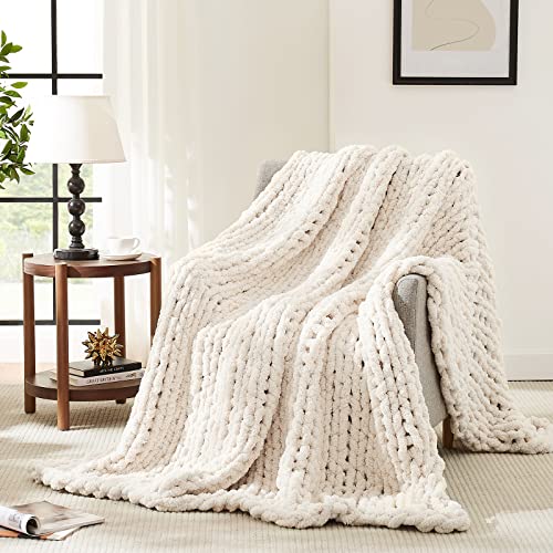
Texture layering is the most-repeated piece of Scandi cottage advice online, and it is also the most commonly misapplied. The mistake is not using too few textures. It is using textures that are all the same weight and pile height. When every textile in a room is flat or semi-flat, including a flat-weave rug, flat linen cushions, a thin linen throw, and a smooth cotton curtain, the room reads as visually monotone regardless of how many different materials are technically present. Your eye needs contrast in pile height, not just contrast in material name.
The mechanism: visual warmth in a room comes from how light behaves on surfaces. A chunky bouclé cushion catches light differently from a flat linen throw, which catches it differently from a wool rug with a longer pile. That variation in light response creates visual depth, the sense that a room has dimension. When every surface is flat, light hits everything at the same angle and the room collapses into a single plane. It looks like a magazine cut-out rather than a lived-in space.
The correct layering approach uses three weight categories. The heavy layer grounds the room: a wool or cotton rug with a pile height of at least half an inch (1.2 cm), a chunky knit throw, or a bouclé upholstered piece. The mid-weight layer builds on it: linen cushion covers, a waffle-weave cotton blanket, or a woven rattan element such as a side table base or pendant shade. The light layer is the finish: a single sheepskin draped over a chair arm, a gauze-weight linen curtain, or a ceramic vase with a visible raw clay body. Getting at least one piece from each weight category into the room is what makes the texture story read as rich rather than flat.
The ratio matters too. One heavy piece per seating area, two to three mid-weight pieces, and two to four light finishing pieces is a workable starting point. Going heavy on the mid-weight layer without the heavy anchor gives the room a slightly restless, unresolved quality.
Key Takeaway: Layer textures across three weight categories, heavy, mid-weight, and light, so that light behaves differently on each surface and the room reads with genuine depth rather than surface decoration.
—
You Over-Decluttered and Lost the Cottage Character
 Save
Every Scandi cottage article tells you to declutter, and the advice is correct. But a significant number of people take it further than it needs to go and arrive at a room that feels like a budget hotel: technically tidy, but with no sense that anyone lives there or cares about it. The Scandi part of Scandi cottage does prioritize editing. The cottage part requires warmth, character, and the sense that a room has accumulated meaning over time. Strip out every personal object and you have achieved the first half of the brief while destroying the second.
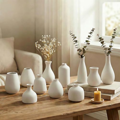
The mechanism: what makes a room feel lived-in is not clutter. It is the evidence of selectivity. A shelf with three well-chosen ceramic objects, a stack of two or three books, and a small dried flower arrangement communicates that someone actively curated this space. A bare shelf communicates that nobody has finished decorating. The brain reads intentional curation as warmth. It reads bareness as absence.
The practical rule for Scandi cottage is the rule of three surfaces. Every room should have at least three surfaces that carry a small, curated grouping of objects. A nightstand might hold a table lamp, a ceramic bud vase, and one book. A floating shelf might carry a small woven basket, a textured ceramic bowl, and a trailing plant. A windowsill might hold two small planters and a single candle. The objects should be in the same material family, natural ceramics, raw wood, dried botanicals, unbleached linen, and grouped at varied heights so the eye moves across the arrangement rather than landing on a flat row.
The editing question is not “can I remove this?” It is “does keeping this add character or add noise?” A chipped enamel mug you use every morning and display on a shelf adds character. A collection of seventeen decorative plates with no personal meaning adds noise. The distinction is intent, not quantity.
Key Takeaway: Keep at least three curated surface groupings in every room, each built from natural materials at varied heights, so the space reads as intentionally inhabited rather than half-finished.
—
You Chose the Wrong Rug Size
 Save
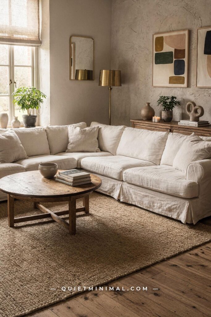
A rug that is too small is one of the most common and most visually damaging mistakes in any room, and it is particularly disruptive in Scandi cottage interiors where the rug is often the heaviest textural element doing important grounding work. The tell is always the same: the rug sits under the coffee table only, with no furniture legs touching it, and the seating group floats above it like mismatched islands.
The mechanism: furniture placed entirely off the rug creates visual fragmentation. The room reads as two separate zones, the furniture zone and the floor zone, with no connective tissue between them. In a Scandi cottage living room that relies on layered warmth rather than bold statement pieces, that fragmentation is fatal. The room immediately looks unfinished even when everything else is well-chosen.
For a standard living room sofa configuration, the minimum workable rug size is 8 by 10 feet (244 cm by 305 cm). In most suburban living rooms with a sofa, coffee table, and one or two accent chairs, a 9 by 12 foot (274 cm by 366 cm) rug is the better default. The correct configuration has the front two legs of the sofa sitting on the rug, with at least 6 inches (15 cm) of rug visible beyond those legs on each side. Accent chair legs can sit fully on the rug or just touch it with front legs only.
In a bedroom, the rug should extend at least 18 inches (45 cm) beyond the side and foot of the bed on every exposed side. A queen bed needs at minimum a 5 by 8 foot rug positioned two-thirds of the way under the bed, with 18 inches of rug landing on the floor beyond the mattress edge on both sides and at the foot. A rug centered entirely under the bed with nothing extending outward is another version of the same mistake.
Scandi cottage rugs should also carry texture: a flatweave jute or sisal rug looks honest and clean but reads as thin. A wool pile or cotton loop rug with a pile height of at least 0.4 inches (1 cm) adds the visual and physical warmth the style needs.
Key Takeaway: Use a rug large enough for the front legs of every major seating piece to rest on it, and choose a pile height of at least 0.4 inches to carry the textural weight the style demands.

—
You Used Overhead Lighting as Your Only Source
 Save
Scandinavian countries spend months in very low natural light, which is precisely why Nordic interior culture developed such a sophisticated approach to artificial lighting. Hygge, the Danish concept of warmth and contentment, is almost inseparable from the quality of light in a room. The single biggest lighting mistake in Scandi cottage interiors is relying on one overhead source as the primary, or only, light for the room. The result is a room that looks fine in a listing photo and feels like a cafeteria to live in.
The mechanism: overhead lighting, whether recessed, pendant, or flush mount, creates a downward wash that hits the horizontal surfaces hard and leaves the walls and corners in relative shadow. That lighting direction reads as task-oriented to the brain, the same direction as office and kitchen lighting. It signals function, not rest. Scandi cottage interiors require a lighting plan that comes from multiple heights and directions, creating overlapping pools of warmth that feel ambient rather than directed.
The correct Scandi cottage lighting plan uses four sources: one ambient overhead source (a rattan pendant or simple linen shade pendant rather than recessed spots), one floor lamp with a soft fabric shade positioned beside the sofa or reading chair, one table lamp on a sideboard or shelf, and one low-level source such as a candle cluster or a small battery-powered puck lamp tucked into a bookshelf nook. All bulbs should be 2700K to 2800K color temperature, which produces the warm amber-gold light that reads as hygge. Anything above 3000K reads as cool and clinical.
Dimmers are not optional in a Scandi cottage room. A single ceiling pendant on a dimmer, dropped to 30 to 40 percent brightness for evening use and combined with the floor lamp and one table lamp, creates the multi-source, low-level warmth that makes the style feel genuinely Nordic. Without dimmers, you are choosing between too bright and complete darkness.
Key Takeaway: Replace the single overhead source with a four-point lighting plan at varied heights, use 2700K to 2800K bulbs throughout, and install dimmers on at least the main pendant so you can drop the ceiling light to ambient level in the evening.

—
You Picked Cottage Floral Prints Instead of Nordic Folk Patterns
 Save
The word “cottage” in Scandi cottage pulls many people toward English cottage florals: the kind of printed fabric with roses, lavender, and overblown peonies that reads as more Downton Abbey than Scandinavia. The visual result is a room that fights itself, with the Scandinavian structural elements (low-profile furniture, pale wood, neutral walls) in direct conflict with the decorative maximalism of a busy floral print.
The mechanism: English cottage florals carry high contrast and high saturation, which draws the eye strongly and demands attention. A Scandi cottage room is built around a quiet, low-contrast palette in which no single element shouts louder than the others. One large floral print, particularly on the largest surface in a bedroom such as the duvet cover or curtains, immediately becomes the room’s visual anchor by default, overriding everything else you have carefully chosen. The furniture recedes; the floral takes over. The room no longer reads as Scandi cottage. It reads as floral bedroom with some wooden furniture.
The correct print approach for Scandi cottage uses patterns from the Nordic decorative tradition: small-scale geometric folk patterns, simple stripe repeat in two to three neutral tones, abstract botanicals with a hand-drawn quality, or the clean graphic geometry associated with brands in the Scandinavian design tradition. These patterns carry low contrast, meaning the difference between the lightest and darkest tones in the print is subtle. They add visual interest without creating a focal point that competes with the room.
In practice, prints in Scandi cottage are used sparingly and at small scale. A duvet cover in plain linen with two cushions in a muted folk-geometric print is exactly the right ratio. A curtain panel with a subtle stripe and a plain everything else allows the pattern to read as detail rather than statement. If you do want a botanical print, choose a sparse, line-art style rather than a full English chintz.
Key Takeaway: Replace high-saturation English cottage florals with low-contrast Nordic folk geometrics or sparse hand-drawn botanicals, and treat any pattern as a detail rather than the room’s focal anchor.

—
You Bought Rustic Cottage Furniture with Heavy Ornamentation
 Save
One of the more nuanced mistakes in Scandi cottage is the choice of furniture silhouette. Scandi cottage does invite cottage-style warmth, but it does not invite the ornamental vocabulary of traditional English or American country furniture: turned spindle legs, distressed crackle finishes, carved apron details, or the heavy bracket feet that read as Victorian farmhouse. These details carry historical associations that conflict with the clean, modern restraint at the core of Scandinavian design.
The mechanism: heavy ornamentation on furniture reads as period-specific. It anchors a piece in a historical style context, which means the furniture then competes with the contemporary, simplified forms around it. In a room where most elements are quiet and clean-lined, one highly ornate piece becomes the visual center of the room by default, and not for a good reason. The eye is drawn to the contrast but finds no resolution, just two design vocabularies sitting side by side without agreement.
The correct furniture silhouette for Scandi cottage is the one Scandinavian design has always favored: simple, slightly tapered legs (not turned), clean flat panels or gently curved forms, joinery details that are visible but not decorative for decoration’s sake, and finishes that show the material honestly. A solid oak side table with straight tapered legs and an oiled surface is a Scandi cottage piece. A matching side table with ball-and-claw feet and a wax distressed finish is not, even if both are the same wood species.
The exception to this rule is vintage pieces with genuine age and patina. A genuinely old piece of farmhouse furniture that has developed an honest patina over decades reads differently from a new piece artificially distressed at a factory. Scandi cottage rooms often include one or two found or inherited pieces with real history. The distressed-new look does not carry the same authenticity and tends to read as themed or costume-y instead.
Key Takeaway: Choose furniture with straight or gently tapered legs, clean panels, and honest material finishes; avoid turned spindles, scrollwork, and factory-distressed surfaces, which read as period-specific rather than quietly Nordic.
From the guides
You've saved it, wanted it. Here's the how: codes, measurements, order. Your choices make it yours.
The Japandi Honest PlaybookThe honest version of the style: what to keep, what to skip, and the order to do it in.See inside →The Room Refresh PlaybookA repeatable four-step method, room by room, in ten minutes, thirty minutes, or one weekend.See inside →Make Any Room Feel Cozy on PurposeWhy some rooms hold people and others empty out, and the moves that change it.See inside →
—
You Ignored the Ceiling and Left It Flat Builder White
 Save
The ceiling is the fifth wall, and in Scandi cottage interiors it carries more weight than it does in most styles. Because Scandi cottage rooms typically run a quiet, tightly controlled palette on the lower four walls, the ceiling is highly visible by contrast. Leaving it in the default builder white, which is almost always a cooler, harder white than the rest of the room, creates a visual break that reads as unfinished. The room feels like a box with a different-colored lid.
The mechanism: the ceiling color affects how warm the ambient light in the room feels. A cool white ceiling reflects whatever natural or artificial light hits it back into the room with a cooler cast, counteracting the warmth you are building in the walls, textiles, and lighting. A warm off-white ceiling does the opposite: it picks up the warm light and bounces it back softly, making the whole room feel as though it is lit from within rather than lit from above.
The Scandi cottage ceiling treatment depends on the room height. In a room with a standard ceiling at 8 feet (244 cm), painting the ceiling in the same warm off-white as the walls creates a continuous enveloping warmth without making the room feel smaller. If anything, a warm ceiling color makes a room feel more intentional, because the eye reads the space as a designed whole rather than four walls with an afterthought on top.
In rooms with lower ceilings at 7 feet (213 cm) or less, a slightly lighter value of the wall color works better than an exact match. Paint the ceiling two shades lighter on the same paint strip, staying in the same warm family but lightening the depth. Avoid going to brilliant white, which will immediately create the same jarring contrast you are trying to eliminate.
Textured ceilings are also legitimate Scandi cottage moves. White-painted tongue-and-groove planking on the ceiling is a direct reference to Nordic summer cottage architecture and adds significant character to a room that might otherwise feel like a standard suburban box.
Key Takeaway: Paint the ceiling in the same warm off-white family as the walls, or use a slightly lighter value of the same tone, to create an enveloping warmth rather than a cold lid that visually cuts the room off at the top.

—
You Skipped Shiplap or Paneling and Lost the Cottage Structure
 Save
Plain, flat painted walls are often the missing ingredient in Scandi cottage rooms that feel almost right but not quite there. The style draws heavily from Nordic coastal and woodland cabin architecture, where wall paneling, specifically shiplap and tongue-and-groove boarding, is a structural and aesthetic staple. Without any wall architecture, even a beautifully furnished Scandi cottage room reads as a suburban apartment wearing cottage accessories rather than a room that has genuine cottage bones.
The mechanism: wall paneling adds shadow lines at regular intervals. Those shadow lines create micro-texture, a subtle visual pattern that makes the wall a contributing element of the room rather than a neutral backdrop. In a Scandi cottage room where the palette is intentionally quiet, that micro-texture is what gives the room its sense of depth and character. Without it, the walls recede entirely and the room relies entirely on furniture and accessories to carry the visual weight, which is more than they can handle on their own.
The most practical paneling approach for renters and owners alike is peel-and-stick shiplap panels or traditional MDF beadboard installed as a wainscot reaching from floor to approximately 36 to 42 inches (91 to 107 cm) in height. Painted in the same warm off-white as the walls, the wainscot adds architectural interest without requiring a full room renovation. The shadow line at the top of the wainscot also acts as a visual horizon that makes rooms with low furniture feel more proportionate.
Full-height shiplap, running from skirting board to ceiling on a single feature wall behind the bed or sofa, is the higher-impact version. It works particularly well in bedrooms, where the paneled wall behind the headboard creates the sense of a built-in alcove without any structural change to the room. Paint the shiplap the same color as the surrounding walls for a tonal, quiet result, or go one shade deeper on the feature wall for a more deliberate focal point.
Key Takeaway: Add shiplap paneling or a wainscot to at least one wall per room, painted in the same warm off-white family as the walls, to give the room the cottage architectural structure that furniture and accessories alone cannot provide.

—
You Mixed Too Many Accent Colors Without a Dominant Neutral Ground
 Save
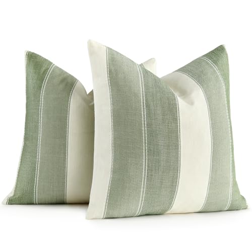
The current Scandi cottage palette is not all-white or all-grey. Muted sage, dusty clay-pink, soft ochre, and dusty navy are all legitimate accent colors within the style. The mistake is treating each color as an equal player. When sage cushions, clay-pink throws, ochre ceramics, and dusty blue vases all appear at the same visual weight in the same room, the effect is not colorful and curated. It is visually restless, the opposite of the calm the style is meant to create.
The mechanism: accent colors in Scandi cottage work because they stand out from a dominant neutral ground. The contrast between the warm off-white walls and the single muted sage cushion is what makes the sage legible and intentional. When you introduce four accent colors at equal intensity, there is no neutral ground for any of them to stand out from. They compete with each other, and the room reads as busy rather than composed.
The correct approach is the 80-15-5 ratio. Eighty percent of the room should be in the dominant neutral family: walls, large furniture upholstery, curtains, rug. Fifteen percent is the primary accent color, appearing in cushions, a throw, and one or two ceramic pieces. Five percent is the secondary accent, appearing in one small object such as a single vase or a single candle holder. In a room with warm cream as the dominant neutral, sage green as the 15 percent accent, and a single dusty clay-pink ceramic as the five percent note, every element is legible and the room reads as resolved.
The practical test is the “what is the color?” question. If someone walks into your room and cannot immediately name one primary accent color, you have too many. If they can name it in three seconds, the ratio is working.
Key Takeaway: Use one primary accent color at 15 percent of the room’s visual weight and one secondary accent at five percent, keeping 80 percent in the warm neutral family so each color has a ground to stand out from.
—
You Placed Plants as Accessories Instead of as Structure
 Save
Plants are a non-negotiable element of Scandi cottage interiors, but there is a specific way they go wrong. The mistake is treating every plant as a small decorative accessory, a succulent on a shelf, a tiny herb pot on the windowsill, a single trailing vine in a small pot on the coffee table. When every plant is small, no single plant carries enough visual weight to do structural work in the room, and the collective effect reads as “someone put a few plants around” rather than “this room is connected to the natural world.”
The mechanism: plants in Scandi cottage serve a dual purpose. They add living organic texture, which no manufactured material can replicate. But they also provide vertical scale, something the style’s deliberately low furniture profile needs to balance the room. A sofa, coffee table, and side table all sit in the lower half of the room. Without a tall vertical element, the eye has nowhere to travel above mid-height, and the room reads as low and flat. A plant that reaches 60 inches (150 cm) or higher changes the room’s proportions immediately.
The rule for Scandi cottage planting is one large anchor plant per main room, plus smaller plants as secondary elements. The anchor plant should reach at least 48 inches (120 cm) in height and should be placed in a corner or beside a sofa arm where its canopy can be seen against the wall. Olive trees, fiddle-leaf figs, rubber plants, and large monstera all work well and are consistent with the natural, organic material palette of the style. The pot should be a large terracotta, a matte ceramic in white or clay, or a textured concrete, never a plastic nursery pot left uncovered.
Secondary plants on shelves and sills should be in the same pot material family as the anchor, creating a cohesive botanical language across the room rather than a random collection of mismatched vessels.
Key Takeaway: Anchor each main room with one large plant reaching at least 48 inches tall before adding smaller plants as secondary elements, so the room has genuine vertical structure and not just botanical decoration.

—
You Hung Art Too High and Broke the Room’s Sightlines
 Save
Art hung at standing eye level, roughly 66 to 70 inches (168 to 178 cm) from floor to center of the piece, is the default setting of most people’s decorating instinct, because that is where museum curators and art galleries position work for optimal standing viewing. In a home, where most time is spent sitting, that height creates a consistent and irritating visual gap between the furniture below and the art above. The furniture and the art appear to belong to different rooms.
The mechanism: when you sit on a sofa or in an armchair, your natural eye level drops to approximately 38 to 42 inches (97 to 107 cm) from the floor. Art hung at 68 inches is 26 to 30 inches above your eye line when seated, which puts it out of comfortable viewing range and into the peripheral zone. More importantly, the gap of blank wall between the top of the sofa back, usually at 30 to 36 inches, and the bottom frame of the art becomes a negative space large enough to read as a design decision itself, and not a good one.
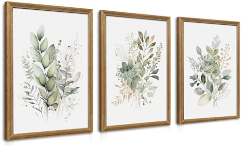
In Scandi cottage rooms where the art is typically simple, a single print in a thin natural wood or matte black frame, or two to three unframed pieces, the correct hanging height is 55 to 60 inches (140 to 152 cm) from floor to the center of the piece when hung above a sofa. This puts the visual center of the art at approximately 6 to 10 inches above seated eye level, which reads as comfortable and connected to the furniture below.
The gap between the top of the sofa back and the bottom of the frame should be between 6 and 10 inches (15 to 25 cm). Any more than 10 inches creates the floating disconnect described above. Less than 6 inches risks the art appearing to rest on the sofa.
For a Scandi cottage gallery wall, which typically runs three to five pieces in simple frames without the salon-style density of a maximalist arrangement, treat the overall cluster as a single piece and center the group at 57 to 60 inches to center-of-cluster.
Key Takeaway: Hang art so the center of the piece sits at 55 to 60 inches from the floor when it is above seating, which places it in comfortable visual relationship with the furniture below rather than floating on the wall above.
—
You Bought Curtains That Are Too Short
 Save
Curtains that hover above the floor, stopping somewhere between ankle and calf height on the window, are one of the clearest signals that a room has been decorated without a plan. In Scandi cottage interiors, where the curtain is often the largest single textile in the room and does significant work as both light filter and texture element, getting the length wrong undermines every other decision in the space.
The mechanism: short curtains visually lower the ceiling. When a curtain panel ends in mid-air, the eye reads the stopping point as a horizontal boundary, which then registers as an implied ceiling height in that area of the room. The more abruptly the curtain ends, the stronger the ceiling-lowering effect. In rooms with already standard 8-foot (244 cm) ceilings, this creates a compressed, slightly awkward feeling that no amount of furniture arrangement can correct.
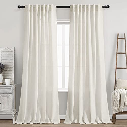
The correct Scandi cottage curtain approach uses floor-length panels, with the rod mounted as close to the ceiling as possible. Mounting the rod 4 to 6 inches (10 to 15 cm) below the ceiling line rather than just above the window frame adds perceived height to every room, regardless of actual ceiling height. The panel should graze the floor with a 0.5-inch to 1-inch (1.2 to 2.5 cm) break, meaning it just touches the floor and barely pools. Panels that stop 2 inches above the floor read as accidental. Panels that pool 8 or more inches read as formal, which conflicts with the relaxed Scandi cottage aesthetic. The gentle graze is the sweet spot.
The fabric should be a natural linen or linen-cotton blend in a warm white, cream, or oatmeal tone. Sheer panels that filter light without blocking it are the default Scandi cottage choice: they soften the window without creating the cave effect that heavy blackout panels produce during the day. Layering a sheer panel closest to the glass with a slightly heavier linen panel on the outside gives flexibility and adds the layered textile depth the style requires.
Key Takeaway: Mount curtain rods 4 to 6 inches below the ceiling and use floor-length linen panels that graze the floor with a half-inch break, so the window reads taller, the ceiling reads higher, and the room feels intentionally resolved.
—
Scandi cottage is a style built on balance, not simplicity alone. The rooms that get it right are not the ones with the most restraint or the most warmth. They are the rooms where those two qualities are held in deliberate tension with each other. A warm off-white on every surface including the ceiling, warm-toned wood in the anchor furniture pieces, textiles layered across three weight categories, a lighting plan built from four sources at varied heights, and enough curated objects to signal that someone lives there and cares about the space. That is the recipe.
Start with whichever mistake in this list you recognized first. Usually, it is the rug or the curtains, because those are the decisions most people make quickly and then stop questioning. Fix that one thing and reassess the room. In most cases, correcting one foundational element shifts the balance enough that the next issue becomes obvious, and the room starts guiding its own correction from there.
From the guides
You've saved it, wanted it. Here's the how: codes, measurements, order. Your choices make it yours.
The Japandi Honest PlaybookThe honest version of the style: what to keep, what to skip, and the order to do it in.See inside →The Room Refresh PlaybookA repeatable four-step method, room by room, in ten minutes, thirty minutes, or one weekend.See inside →Make Any Room Feel Cozy on PurposeWhy some rooms hold people and others empty out, and the moves that change it.See inside → Save