Georgia
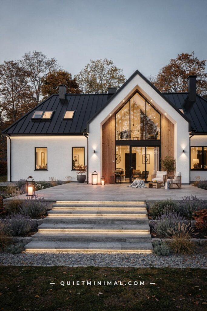
You have seen the Pinterest boards. Bare white walls, a single stem in a thin vase, one linen throw draped over a bone-colored sofa with the geometric precision of a styling shoot. That version of a Scandi home is everywhere, and it is also the version that makes real rooms feel cold, flat, and slightly depressing to live in. The people who actually live in Denmark, Sweden, and Norway do not live in those rooms. Their homes are warm, layered, personal, and full of objects they have used for years. The gap between what gets sold as Scandinavian design and what Nordic living actually looks like is wide, and that gap is exactly where most decorating mistakes happen.
This article works through the most common pieces of received wisdom about Scandi homes, explains why each one misleads, and gives you the version that holds up in a real room with real people in it.
Conventional Advice Says: All-White Walls Are the Foundation. Here Is Why That Stops Working.
 Save
The white wall instruction is not wrong, exactly. It is just incomplete in a way that causes trouble. White does reflect light, and Scandinavian interiors were developed in part because the Nordic climate makes natural light scarce for months at a time. The logic behind choosing a pale base makes total sense. The mistake is assuming that any white will do, and that more of it is better.
Stark, bright white with a cool or blue undertone reads as clinical in most home environments. It amplifies shadows rather than softening them, and it makes every piece of wood furniture look yellowed by comparison. The rooms that actually read as Scandi use whites that sit closer to warm white, cream, or soft greige. Specific shades that work: Benjamin Moore’s White Dove (OC-17), Sherwin-Williams’ Shoji White (SW 7042), and Farrow and Ball’s Pointing (No. 2003). All of them have enough yellow or pink warmth in their base to make timber, linen, and wool look natural rather than dingy beside them.
The second failure mode is surface saturation. Painting every wall, the ceiling, the trim, and the built-ins the same white removes all depth and makes a room look like a display unit rather than a home. Nordic interiors use the white as a backdrop, not as a finish in its own right. One wall in a slightly deeper tone, a visible wood-grain ceiling, or painted trim that is a half-shade warmer than the main wall creates the layered quality that makes photographs of actual Danish and Swedish apartments look so good.
From the guides
You've saved it, wanted it. Here's the how: codes, measurements, order. Your choices make it yours.
 The Japandi Honest PlaybookThe honest version of the style: what to keep, what to skip, and the order to do it in.See inside →
 The Room Refresh PlaybookA repeatable four-step method, room by room, in ten minutes, thirty minutes, or one weekend.See inside →
 Make Any Room Feel Cozy on PurposeWhy some rooms hold people and others empty out, and the moves that change it.See inside →
If the room already has white walls and they feel flat, the fix is almost never repainting. It is adding enough warm-toned materials around the white that the eye reads warmth overall. Honey oak, raw linen, a cream wool rug, and a brushed brass pendant light do more to fix a cold white room than any paint color change.
Key Takeaway: Replace cool, bright white with a warm-undertone off-white like Benjamin Moore White Dove or Farrow and Ball Pointing, and keep at least one surface in a wood or textured material so the white reads as a backdrop rather than the room itself.

Conventional Advice Says: Less Is Always More. Here Is Where Minimalism Becomes the Problem.
 Save
Lagom is a Swedish concept that translates roughly as “just the right amount.” It is not a synonym for minimalism, and it is certainly not an instruction to empty every surface. When the Western design world absorbed Scandi style, it borrowed the visual language of restraint without the underlying logic, which is that every object in a Nordic home earns its place through use, beauty, or meaning. Objects are edited, not eliminated.
The practical failure of over-minimalism is well-documented by anyone who has actually tried to live in it. Removing all visible storage means that the items you use daily, chargers, books, keys, blankets, pile up with nowhere to go. The room looks correct for forty-eight hours after a clean and then reads as chaotic. Functional Scandinavian design solves this by treating storage as a design element rather than a problem to hide. A low sideboard with closed cabinets and an open shelf for display does the same visual work as a floating shelf while actually holding things. A storage ottoman in the seating area is a surface, a seat, and a hiding place for extra throws.
The objects that remain in a properly edited Nordic room are not invisible. They are specific and intentional: a ceramic pitcher that gets used daily, a handful of books stacked with visible spines, a wooden tray that corrals small items on the coffee table. These are not decorative props. They are items the people in the home actually use, and they happen to look good because they were made well. The distinction matters because it determines what you buy. A cactus picked because it reads as Scandi-correct will feel wrong in six months. A piece of pottery you found on a weekend trip that you use to hold kitchen utensils will still be there in ten years.
The number to aim for on an open shelf is roughly 70 percent full. Enough objects to read as curated, enough empty space to let the eye rest. Running below 50 percent and the shelf looks unfinished. Running above 85 percent and the shelf starts reading as storage rather than display.
Key Takeaway: Edit your objects to what you actually use and genuinely like, then stop, because a Scandi home at 70 percent full on open surfaces reads as intentional rather than empty or cluttered.

Conventional Advice Says: Stick to Neutrals Only. Here Is the Color Argument You Are Missing.
 Save
The neutral-only rule is the one that Scandinavian interiors themselves have already broken. Design sources from Copenhagen and Stockholm today show dusty terracotta, faded sage green, muted olive, and deep forest tones appearing as primary room colors, not just accent cushions. The palette has expanded specifically because years of all-neutral rooms began reading as interchangeable rather than personal.
The error in the conventional advice is not that neutrals are wrong. It is that neutrals without variation in depth and saturation are flat. A room where the walls are warm white, the sofa is cream, the rug is oat, and the cushions are ivory is technically all-neutral but visually monotone. There is no contrast for the eye to rest on, which paradoxically makes the room feel smaller and less calm rather than more so.
The Nordic approach to color today uses a single deeper tone as an anchor in an otherwise neutral room. One wall, one large upholstered chair, or one rug in a muted sage, dusty rose, or warm charcoal shifts the whole reading of the space from flat to considered. The depth of that one color makes the surrounding whites and creams look intentional rather than accidental. Interior designers working in this tradition refer to it as a “color anchor”: a single mid-to-deep tone that gives the neutral palette something to respond to.
For renters who cannot paint, the color anchor can come entirely from textiles. A deep sage wool throw, an olive-toned linen curtain panel at the window, or a dusty terracotta boucle chair achieves the same visual effect without touching the walls. The rule is one anchor color, repeated in two to three places so it reads as deliberate rather than random. Sage in a curtain that also shows up in a small ceramic vase and the binding of a design book on the shelf reads as a color story. Sage in a single cushion with nothing else nearby reads as a leftover.
Key Takeaway: Add one muted anchor color in two to three places across the room rather than stacking neutrals on neutrals, because depth of tone is what makes a neutral Scandi palette look curated rather than beige.

Conventional Advice Says: Bare Wood Floors Are Enough. Here Is What the Floor Is Actually Missing.
 Save
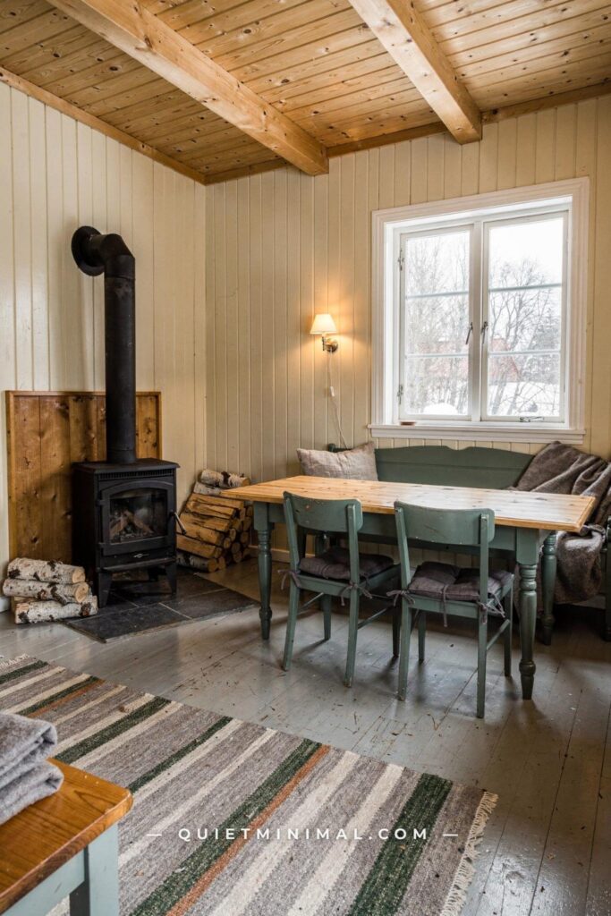
Pale wood flooring is one of the most recognizable elements of a Scandi home, and rightly so. Light oak, ash, and birch floors reflect natural light and give a room a clean, open quality. The conventional advice stops there, which is where the decorating problem starts. An uncovered wood floor in a seating area reads as a staging choice, not a decorating choice. Without a rug, the furniture arrangement floats and the room loses the quality of rootedness that makes a seating area feel like a place to stay rather than a place to pass through.
The rug in a Scandi room is not optional, and its size is where most people go wrong. The most common mistake is buying a rug that fits under the coffee table only, leaving the sofa legs floating on bare floor. The correct sizing places at least the front two sofa legs on the rug, and ideally all four. In a standard living room with a three-seat sofa, that means a rug of at least 8 by 10 feet (244 by 305 cm). Most people buy a 5 by 7 (152 by 213 cm) because it looks large enough on the floor of a showroom. In a furnished room, it reads as a bath mat.
The material of the rug matters as much as the size. Synthetic fibers, even when they look like wool in a photograph, flatten under foot traffic within a year and begin to pill. A flatweave cotton rug in a solid natural tone is a better long-term choice than a shaggy pile rug in a synthetic that photographs well but wears badly. For the main seating area, a chunky wool rug in natural cream, oat, or warm sand is the material that holds up both visually and physically. For a bedroom, a softer Moroccan-style high-pile wool rug brings the tactile quality that makes bare floors feel worth keeping.
Layering rugs, a flatweave cotton base with a smaller sheepskin thrown over one corner, is a Nordic habit that reads as high-investment styling but costs almost nothing if the sheepskin is sourced from a discount home goods retailer. The layered effect adds depth and shifts the floor from a background into part of the design.
Key Takeaway: Size up your rug to at least 8 by 10 feet (244 by 305 cm) in a standard living room, choose natural wool or cotton over synthetic pile, and place at least the front two sofa legs on it to anchor the seating zone properly.

Conventional Advice Says: Natural Light Is Enough. Here Is the Lighting Layer Nobody Adds.
 Save
Nordic countries deal with extreme light scarcity in winter. A Finnish city can receive as little as six hours of usable daylight in December. The design response was never to rely on natural light alone but to build a layered artificial lighting system that compensates for what the sky does not provide. What arrives in Western Scandi decorating guides as “maximize natural light” is a partial reading of a much more complex approach.
The failure of relying on natural light only is most obvious in the evening. A room lit by a single overhead fixture, even a well-chosen one, reads as institutional. The overhead light casts uniform brightness from above, which is the least flattering and least comfortable angle for both people and objects in a room. Nordic interiors almost never use overhead lighting as the primary evening source. Instead, they build from multiple lower light points: floor lamps, table lamps, candles, and pendant lights positioned to create pools of warmth rather than overall illumination.
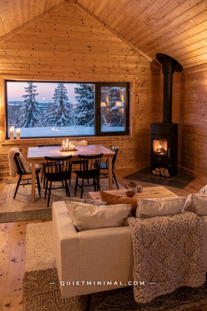
The practical approach is a three-layer system. The first layer is ambient: a pendant or ceiling fixture on a dimmer set to about 40 percent in the evenings. The second layer is task-and-accent: two to four lamp points at sofa or table height, typically floor lamps and table lamps with fabric or paper shades that diffuse rather than direct light. The third layer is atmospheric: candles, a string of small warm-toned globe lights, or low battery candles placed at coffee table level. Hygge, the Danish quality of sheltered warmth and candlelit ease, lives almost entirely in this third layer.
Bulb temperature matters more than fixture style. Bulbs in the 2,700 Kelvin range produce a warm amber tone that reads as firelight in photographs and feels welcoming in person. Bulbs above 3,500 Kelvin produce a cool, white-blue tone that makes a room feel like a hospital corridor regardless of how well the furniture is styled. Check the Kelvin rating before buying, not just the wattage.
Key Takeaway: Build a three-layer lighting plan with a dimmable ceiling source, two to four lamp points at sofa and table height, and at least one low atmospheric layer such as candles or 2,700 Kelvin globe lights to achieve the warm evening quality Nordic interiors are known for.

Conventional Advice Says: Functional Furniture Only. Here Is the Texture Argument That Changes Everything.
 Save
The functionality principle in Scandinavian design is real and important. Every object should serve a purpose. The mistake is reading “functional” as a synonym for “smooth, hard-surfaced, and uncomplicated.” The most livable Nordic interiors are filled with texture: wool, linen, bouclé, rattan, rough-grain ceramic, oiled oak with visible grain. These materials perform the same function as smooth ones, holding a blanket, framing a window, storing things, but they add a tactile warmth that smooth materials cannot.
Texture is particularly important because a Scandi home’s palette is deliberately restrained. When you limit yourself to warm whites, oats, and soft creams, the only tool left to create visual interest is variation in surface quality. A linen sofa beside a smooth oak coffee table beside a chunky wool rug beside a raw ceramic lamp reads as rich and considered despite using no color contrast at all. The same room with a synthetic sofa, a laminate table, and a nylon rug reads as flat regardless of how well the shapes match.
The specific textures that read as authentically Nordic today: bouclé upholstery on chairs and sofas, raw or stonewashed linen on curtain panels and cushion covers, chunky wool or flatweave cotton rugs, oiled or lightly waxed oak on furniture (not lacquered, which reads as too polished), ribbed ceramic vessels in matte finishes, and woven rattan for lighting pendants and storage baskets. These materials also age well. A linen cushion cover that gets washed regularly develops a softness that looks more natural, not less. A lacquered veneer coffee table that chips at the corners looks worse.
The tactile quality extends to the touch experience in a room, not only the visual one. A Scandi home should be a room you want to put your hands on, not just photograph. That is the test. If the room looks right in a photo but you do not want to sit down in it, the textures are wrong.
Key Takeaway: Use texture variation across at least four different materials in the room, because when your palette is deliberately restrained, surface quality is the only tool you have left to create depth.

Conventional Advice Says: Keep Plants Minimal. Here Is What Nordic Interiors Actually Do with Greenery.
 Save
The plant advice in most Scandi decorating guides lands somewhere between “one plant in a simple pot” and “a small succulent on the shelf.” Both are understatements of what Nordic interiors actually contain. The Scandinavian relationship with nature, called friluftsliv in Norwegian and broadly translated as “open-air life,” runs deep enough that bringing the outside in is not an aesthetic choice but something closer to a cultural necessity during the months when going outside is dark and cold.
Real Nordic homes tend to have multiple plants in varied sizes distributed across rooms rather than one statement plant positioned for a photo. The logic is the same as layered lighting: many smaller presences create a sense of life and rhythm rather than a single object creating a focal point. A large plant in a corner (fiddle leaf fig, rubber tree, or tall monstera), a medium plant on a shelf or sideboard, and a cluster of small plants on a windowsill creates a gradient from ground to eye level that makes a room feel inhabited.
The pot matters as much as the plant. Terracotta pots in their natural, unsealed form are the clearest expression of the Nordic preference for raw, honest materials. They age to a mineral white crust that looks right beside natural wood. Matte ceramic in cream, stone, or warm white reads similarly well. Glossy white nursery pots, plastic cache pots, and pots with decorative patterns break the material harmony the rest of the room is trying to establish. If the plant came in a plastic nursery pot, repotting into a matte ceramic or terracotta takes three minutes and changes the entire reading of the plant in the room.
Dried botanicals deserve mention here. A bunch of dried pampas grass, a stem of dried protea, or a bundle of eucalyptus in a slim ceramic vase is a low-maintenance alternative to live plants that reads as deliberately Scandi without the watering schedule. The palette of dried botanicals, cream, tan, pale rust, and warm brown, fits perfectly within the Nordic color range.
Key Takeaway: Use a minimum of three plants in graduated sizes across a room rather than a single statement plant, choose terracotta or matte ceramic pots, and treat dried botanicals as a legitimate full-season alternative to live plants.

Conventional Advice Says: Uncluttered Shelving Reads as Scandi. Here Is How to Style a Shelf That Actually Works.
 Save
Floating shelves in a Scandi home look effortless in photographs and bewildering in practice, because nobody explains the specific internal logic that makes Nordic shelf styling look curated rather than random. The issue is not the objects themselves. It is the absence of a visual system.
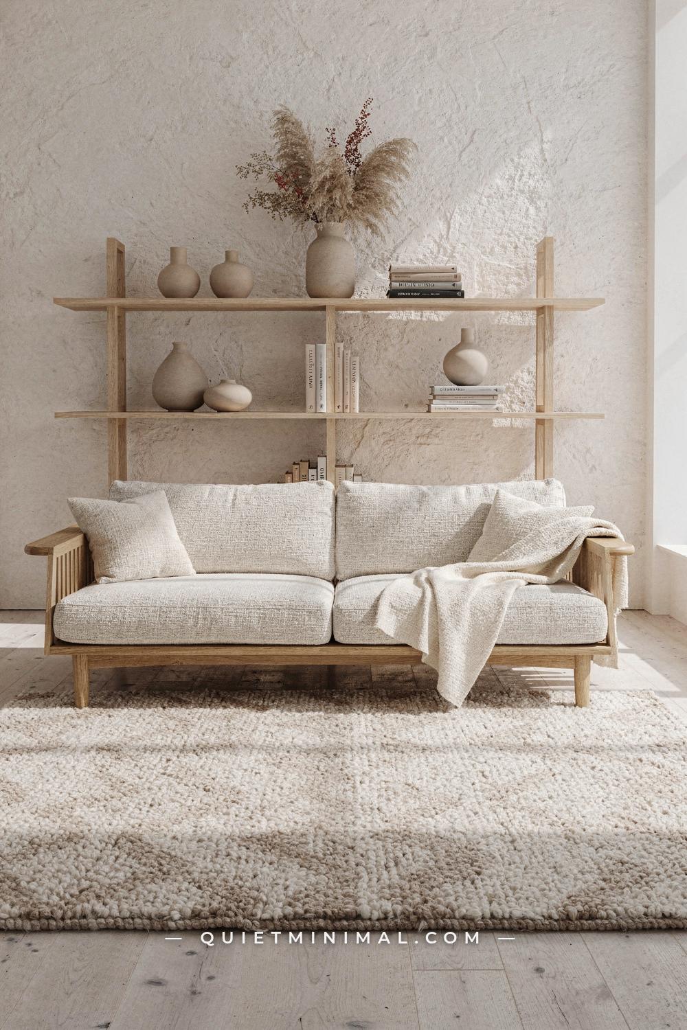
The system that Nordic stylists actually use: group objects in odd numbers (three or five items per zone), vary the height of objects within each group (one tall, one medium, one low), and introduce at least one item of negative space (a gap, a blank wall section, or a low object that lets the eye breathe) for every two groups of objects. This is not a rigid formula but a rhythm. The eye reads rhythm as intentional and breaks from rhythm as mistakes.
Books are the most misused element on a Scandi shelf. Displaying books spine-out in a color-sorted gradient is a Pinterest styling trick that reads as performed rather than lived-in. Nordic homes display books the way people actually use them, some spine-out, some stacked flat with a small object on top, some open-faced where a cover is worth seeing. The informality is part of the point. A shelf that looks like someone organized it by color for a photo shoot does not read as Scandinavian. A shelf that looks like a thoughtful person has been adding to it for five years does.
From the guides
You've saved it, wanted it. Here's the how: codes, measurements, order. Your choices make it yours.
The Japandi Honest PlaybookThe honest version of the style: what to keep, what to skip, and the order to do it in.See inside →The Room Refresh PlaybookA repeatable four-step method, room by room, in ten minutes, thirty minutes, or one weekend.See inside →Make Any Room Feel Cozy on PurposeWhy some rooms hold people and others empty out, and the moves that change it.See inside →The three object categories to rotate through on an open shelf: vessels (ceramics, glass, small clay pots), natural objects (dried stems, a pine cone, a river stone, a piece of raw wood), and books. These three categories in varied heights and groupings produce a shelf that reads as curated without looking styled. Adding a fourth category, framed art, small candles, or figurines, tips toward cluttered. The rule is restraint within the categories, not restraint about having any objects at all.
Key Takeaway: Style shelves in odd-numbered groupings that vary in height, rotate between vessels, natural objects, and books, and leave visible negative space between every two groupings so the overall rhythm reads as intentional.

Conventional Advice Says: Modern Furniture Is the Right Fit. Here Is Why Mixing Eras Works Better.
 Save
The Instagram version of a Scandi home looks like it was purchased in a single afternoon from one store. Every piece matches in era, material, and tone. This is the version that goes flat after six months, because uniformity reads as showroom staging rather than a home that has been built over time.
Actual Nordic interiors mix design eras deliberately. A Danish mid-century dining chair, designed in the 1950s and still produced under the same specifications today, sits beside a newly made linen-upholstered bench. A vintage oak sideboard holds a ceramic lamp produced last year. The mix works because Scandinavian design across decades shares a common visual language: natural materials, honest construction, clean-but-not-rigid lines. A piece made in 1962 and a piece made today that both follow those principles look like they belong together even though they are sixty years apart.
The practical advice is to anchor a room with one piece that has clear design provenance, a Hans Wegner-style shell chair, a classic Shaker-derived side table, or a vintage Scandinavian sideboard, and build around it with newer, simpler pieces. The provenance piece does not need to be expensive. Secondhand markets, estate sales, and furniture resale apps carry genuine 1960s and 1970s Nordic pieces regularly. One real piece surrounded by good-quality new furniture reads as collected. Five matching new pieces read as a store display.
The one rule for mixing eras: keep the wood tones in the same temperature family. Oak, ash, and beech are all warm and pale and sit together naturally. Mixing warm-toned oak with cool-toned walnut or dark mahogany creates visual noise that undermines the calm the style depends on. Within warm-pale wood tones, you can mix freely. Across warm-cool or light-dark, you need a connecting element, a rug that contains both tones, a textile that references both, or a deliberate contrast that is clearly intentional rather than accidental.
Key Takeaway: Anchor your room with one piece that has genuine design provenance, then mix in newer simple pieces in the same warm wood family, because mixed-era rooms read as personal and collected rather than purchased all at once.

Conventional Advice Says: Window Treatments Are Optional. Here Is What Bare Windows Actually Signal.
 Save
Bare windows are presented in most Scandi decorating content as a commitment to maximizing light. There is truth in this, but it is partial truth that creates a specific problem in practice. An uncovered window at night reads as a black mirror. It reflects the room back at you, amplifies the sense of being observed, and removes the softness that window treatments add to a room’s perimeter. Nordic homes manage this with sheer linen panels that filter light during the day and a heavier panel that can be drawn at night. The light is not sacrificed. It is managed.
Curtain installation height is where the most visual damage happens in apartments. Hanging curtains at the top of the window frame, which is the natural instinct, makes the ceiling look lower and the window look smaller. The Nordic approach is to mount the rod at ceiling height or as close to it as possible, typically 1 to 2 inches (2.5 to 5 cm) below the ceiling, and let the curtain fall to the floor. This single change makes a standard 8-foot (244 cm) ceiling read as significantly taller and makes the window appear full-height even when it is not.
Fabric choice matters as much as installation height. Heavy, lined curtains in a small room make the windows feel like they are being managed rather than celebrated. Natural linen in its unlined form lets light through while still providing privacy at most times of day, and it moves beautifully with air circulation. Stonewashed linen in warm white, oat, or soft grey is the material that reads most authentically Nordic. The slight irregularity in stonewashed linen’s surface catches light differently from one panel to the next, which adds life to what is otherwise a large flat expanse of fabric.
For renters who cannot drill, tension rods mounted inside the window recess with a single linen panel provide most of the visual effect at a fraction of the cost. The interior mount is not as dramatic as a ceiling-height installation, but it is far better than a bare window that reflects the room back at you after dark.
Key Takeaway: Mount curtain rods at ceiling height rather than window frame height, use stonewashed linen in a warm neutral, and include both a sheer and a heavier panel so the window can be open, filtered, or closed depending on the light and the hour.

Conventional Advice Says: Keep It Personal With One Sentimental Piece. Here Is What Personality Actually Means in a Nordic Home.
 Save
The received version of Scandi personality advice usually amounts to: “Add one personal piece, a family photograph or a souvenir, to make the room feel like yours.” This is well-meaning but misses what Nordic homes actually do with personal expression, which is considerably more layered and specific.
Nordic homes are full of personal objects, they are simply selected and displayed with the same intentionality applied to everything else. A handmade ceramic bought from a local market, a vintage poster from a museum visit, a piece of driftwood from a family beach, a linen textile woven by a great-aunt, all of these objects carry meaning and also look right because they share the material language of the style: natural, tactile, unpretentious. The objects are personal. They are not decorative.
The distinction is worth sitting with. A generic ceramic from a mass-market home goods store does not become personal just because you bought it. A mug you use every morning that you bought because you loved the glaze does. A framed family photograph is personal, but if the frame is cheap and the print is faded, it reads as an afterthought rather than a considered display. A properly framed black-and-white print from a family trip, mounted behind glass in a slim oak frame, reads as intentional and personal at the same time.
The wall is the most underused surface in most Scandi-inspired rooms. One large-format print or photograph, printed at 24 by 32 inches (61 by 81 cm) or larger, framed in a simple pale oak or thin matte black frame and hung at eye level on a clean wall, does more for a room’s personality than a gallery wall of twelve smaller pieces ever will. The gallery wall has become a shortcut that reads as effort rather than taste. One large, specific, personal image reads as decision-making.
Key Takeaway: Choose personal objects that share the natural material language of the room and display them with the same intentionality you apply to everything else, because a room that looks like it belongs to someone specific is the goal, not a room that looks Scandi with one personal object added.

Conventional Advice Says: Scandi Works for Every Room Equally. Here Is Where It Breaks Down.
 Save
Scandinavian design principles work in living rooms and bedrooms with relatively little adaptation. Two spaces where the style requires deliberate modification, bathrooms and kitchens, are the rooms where it most often falls apart.
In a bathroom, the challenge is that the materials which carry Scandi warmth in other rooms, raw linen, untreated wood, natural wool, are impractical in a wet environment. A raw wood vanity without a sealed finish will warp within a year in most bathrooms. Linen towels, while beautiful, mildew faster than cotton terry if they do not dry quickly. The response is to use materials that hold the visual quality of natural Scandi materials without the practical vulnerabilities: properly sealed oak or teak vanities, large-format warm stone tile instead of small cold white tile, matte ceramic in greige or warm white rather than glossy white, and brushed brass fixtures that age gracefully rather than chrome, which scratches and dulls.
In a kitchen, the failure mode is typically cabinetry. Flat-front cabinetry in matte white or pale grey is presented as the natural Scandi kitchen, and it is, but flat-front cabinetry without visible hardware reads as unfinished rather than minimal in most kitchens that are not photographed in controlled conditions. Simple brushed brass or matte black hardware on otherwise plain cabinetry gives the doors a physical endpoint and makes the flat fronts read as a design choice rather than a cost-saving one.
The kitchen countertop is the other decision that determines whether the style holds. White quartz reads as clean and easy to maintain but also as slightly corporate. A honed, unsealed white or warm grey marble reads as expensive and high-maintenance. The practical Nordic choice is a matte-finish quartz in warm white or greige, which photographs well, cleans easily, and ages without the visible damage that polished surfaces accumulate.
Key Takeaway: Adapt material choices room by room, replacing raw natural materials with their moisture-resistant equivalents in kitchens and bathrooms, because the style breaks down when materials chosen for living rooms are applied unchanged to wet environments.

Conventional Advice Says: Seasonal Decorating Is a Different Style Entirely. Here Is the Nordic Rhythm Nobody Mentions.
 Save
The seasonal rhythm of a Nordic home is one of the most underreported aspects of the style, and it is the practice that separates a room that reads as genuinely Scandinavian from one that merely has the furniture. In Denmark and Sweden especially, the home changes meaningfully between seasons, not through redecorating but through a deliberate rotation of textiles, lighting, and natural objects that responds to what is happening outside.
In winter months, Nordic homes add weight and warmth. Heavier wool throws replace linen ones. Candles become the primary evening light source rather than a supplement. Natural objects from the season, pine cones, bare branches, dried seed pods, bowls of smooth river stones, come inside. The palette deepens slightly, a darker cushion cover replaces a lighter one, an extra sheepskin appears on the floor. None of this requires a purchase. It requires having two sets of textiles and knowing which season each belongs to.
In summer, the opposite movement happens. Heavy textiles go into storage. Lighter linen pieces come out. Plants move to windowsills to catch the long daylight. Bare branches are replaced by a vase of fresh stems, whatever is currently in season. The candles stay but appear less often. The overall feeling of the room lightens without any change to the furniture.
This practice, the seasonal textile rotation, costs nothing beyond the initial investment in two sets of throws and cushion covers. A summer set in light linen, pale cotton, and thin knits; a winter set in wool, bouclé, and heavy knit. The room the same structure, the same furniture, the same color palette, but a fundamentally different emotional register depending on which textiles are out. That capacity for the room to breathe with the seasons is what makes Nordic homes feel genuinely inhabited rather than staged.
Key Takeaway: Invest in two sets of textiles, a lighter summer set in linen and cotton and a heavier winter set in wool and bouclé, and rotate them with the season so the room responds to the calendar the way Nordic homes have always done.

The common thread across every section above is this: the versions of Scandi home design that circulate on Pinterest and in mass-market decorating guides are abbreviations of a style whose actual logic is much warmer, more layered, and more personal than the abbreviation suggests. Getting a Scandi home right is not about buying the right objects from the right stores. It is about understanding why each principle exists and applying it to your specific room, your specific light conditions, and your specific way of living. Start with the one principle that you know you have been getting wrong, correct it with intention, and the rest of the room tends to follow.
From the guides
You've saved it, wanted it. Here's the how: codes, measurements, order. Your choices make it yours.
The Japandi Honest PlaybookThe honest version of the style: what to keep, what to skip, and the order to do it in.See inside →The Room Refresh PlaybookA repeatable four-step method, room by room, in ten minutes, thirty minutes, or one weekend.See inside →Make Any Room Feel Cozy on PurposeWhy some rooms hold people and others empty out, and the moves that change it.See inside → Save