Georgia
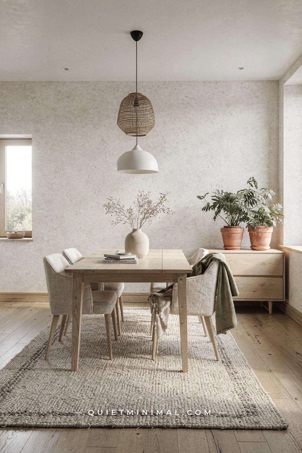
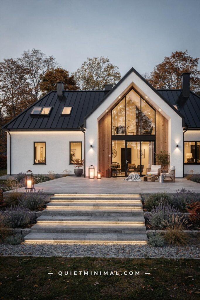
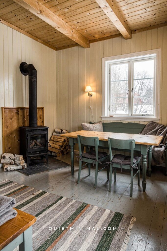
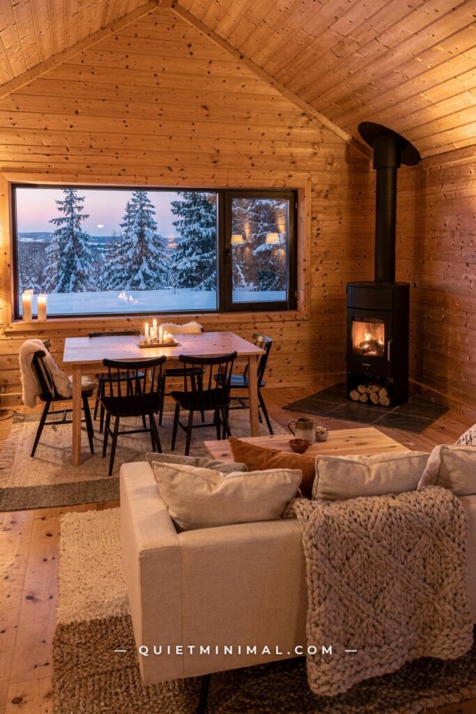
You want a home that feels genuinely calm, not performatively empty. That is the exact gap between Scandi interior design done well and Scandi done wrong. The style has a reputation for cold white boxes with a single potted plant and a folded throw, and if that is the version you have been scrolling past on Pinterest, it is understandable to feel like something is missing. The good news is that the version people actually love living in looks quite different. It is warmer, more textured, and more personal. It still has clean lines and a quiet palette, but it never mistakes sparse for serene.
This guide walks you through every decision in the order it actually matters: foundation colors first, then furniture, then light, then textiles, then the details that make it look like you knew what you were doing all along. Each stage builds on the last so that when you are done, the room holds together as a whole rather than reading as a collection of separate purchases.
Step 1: Understand What Scandi Design Actually Asks of a Room Before You Buy Anything
 Save
The single most important thing to know before you spend a dollar on Scandi-style pieces is this: the style is a set of principles, not a product category. Picking up a light wood coffee table and a grey throw from a big-box store does not produce a Scandi room. What produces a Scandi room is applying a specific decision hierarchy to whatever space you have.
Those principles, in order of importance, are: function over decoration, natural light over artificial atmosphere, material quality over quantity of pieces, and warmth over emptiness. The Nordic countries developed this aesthetic partly out of necessity. With winters that cut natural daylight to as few as six hours a day, interiors had to work hard to hold onto every lumen of available light. White and cream walls were not a trendy choice; they were a practical tool for bouncing light into corners. That same logic still holds, and it is the reason a Scandi room in Los Angeles can feel just as grounded as one in Stockholm.
Before you move a single piece of furniture or open a paint sample, walk through the room you want to address and answer three questions. Where does natural light enter, at what time of day, and at what angle? What is currently blocking or absorbing that light? And what is in the room purely out of habit rather than genuine use? The answers to those three questions tell you what stays, what goes, and where your walls and floor need to be in terms of reflectivity before anything else is introduced.
From the guides
You've saved it, wanted it. Here's the how: codes, measurements, order. Your choices make it yours.
 The Japandi Honest PlaybookThe honest version of the style: what to keep, what to skip, and the order to do it in.See inside →
 The Room Refresh PlaybookA repeatable four-step method, room by room, in ten minutes, thirty minutes, or one weekend.See inside →
 Make Any Room Feel Cozy on PurposeWhy some rooms hold people and others empty out, and the moves that change it.See inside →
The failure mode here is skipping this audit and going straight to shopping. You end up with Scandi-adjacent pieces dropped into a room that is still fundamentally cluttered, where the light is fighting a dark accent wall and the furniture sits at the wrong scale. The pieces look fine individually and strange together. The audit prevents that.
Key Takeaway: Map the room’s light and identify what is absorbing it before any purchase decision is made.
Step 2: Set the Wall Color as a Light Reflector, Not a Backdrop
 Save
Wall color is the structural decision in a Scandi interior, not the finishing touch. Get it right early and every material you add afterward reflects light correctly, reads warmer, and costs less because you need fewer of them. Get it wrong and you are compensating for a light-absorbing wall with layer after layer of soft furnishings that never fully fix the problem.
The classic Scandi base is a white or very soft grey with warm undertones. Two reliable real-world options are Sherwin-Williams Alabaster (SW 7008), a soft off-white with just enough warmth to read as cream in strong light, and Benjamin Moore White Dove (OC-17), a slightly warmer white that sits comfortably in both north- and south-facing rooms. Both reflect light without the harshness of a stark pure white, which under artificial evening light can tip blue and cold. If you want to step into greige territory, Sherwin-Williams Accessible Beige (SW 7036) and Benjamin Moore Edgecomb Gray (HC-173) both work: they read as light neutrals in daylight but carry enough warmth to keep the room grounded after dark.
The latest evolution of Scandi has introduced what designers are calling Dark Scandi: the same functional principles but expressed through a much deeper base palette. Charcoal, deep forest green, and dark navy walls paired with brass or amber glass accents. If that direction appeals to you, Sherwin-Williams Tricorn Black (SW 6258) and Benjamin Moore Wrought Iron (2124-10) are both usable anchors. The key is that in a dark Scandi room, the warmth comes entirely from materials and lighting, not from the wall color itself, which means your fabric and wood choices have to work even harder.
Do not split the color decision between rooms without testing all samples under your actual light at the actual time of day you are most likely to be in that room. A paint chip viewed on a white store card in fluorescent light tells you almost nothing. Paint a 12-inch by 12-inch (30 cm by 30 cm) patch directly on the wall, let it dry fully, and look at it at 7 a.m., at noon, and at 8 p.m. with your usual lights on.
Key Takeaway: Choose a wall color that maximizes light reflection under your room’s specific light conditions, and commit the entire square footage before introducing any other material.

Step 3: Choose the Floor Finish That Anchors the Whole Palette
 Save
The floor is the largest single surface in any room, and in a Scandi interior it does most of the tonal work. The palette decision you made on the walls is half the story; the floor is the other half, and they have to be in dialogue rather than competition.
Pale oak is the canonical Scandi floor choice, and it remains the most useful one because it reads as warm without being yellow. A natural oiled or matte-lacquered pale oak board in a width of at least 5 inches (127 mm) has enough visual weight to ground a room while staying light enough not to absorb the daylight you worked to preserve with your wall color. Birch works similarly. Pine is softer and shows wear faster, but its natural variation adds character that some rooms benefit from. If you are working with an existing dark floor that cannot be replaced, a large, light-toned natural fiber rug covering at least 80 percent (80%) of the main seating or sleeping area is the practical workaround. It does not replicate pale flooring, but it brings the visual floor level back into the light palette.
The mistake most people make at this stage is choosing a floor based on the sample alone without holding it next to the wall color. A pale birch-tone floor next to a very warm cream wall can read as mismatched and slightly yellow because the undertones amplify each other. A pale grey-toned oak against the same cream wall creates instant harmony because the grey cools the warmth into balance. Before finalizing any flooring material, hold a large sample against the painted wall in the actual room. Look at them together in natural light and again under your warmest artificial light in the evening. The pairing should feel cohesive in both.
If your floor is existing tile or concrete, do not try to fight it. Pale concrete is an excellent Scandi surface: it reads as neutral and cool in a way that lets wood tones in furniture and textiles carry the warmth. Dark tile is a harder problem and the rug solution is your best tool.
Key Takeaway: The floor and wall must be chosen as a matched pair, not separately; hold large samples together in the actual room under both daylight and artificial evening light before committing.

Step 4: Edit the Furniture Down to the Functional Core
 Save
Furniture editing is where most Scandi attempts fail because it requires actually removing things rather than just buying better things. The logic of Nordic design is that every piece in the room should serve a clear purpose. Not a sentimental purpose, not a “I might use it one day” purpose: a daily or weekly functional one. If you cannot name what it does, it does not belong in a Scandi room.
The practical way to edit is to clear the room entirely, then reintroduce pieces one at a time and stop when the room can breathe. “Breathe” means there is clear floor space around each major piece, no piece is competing visually with another, and you can see the floor in front of at least two of the four walls. For a standard living room, the functional core is: one main sofa or seating group, one coffee or side table, one storage unit or shelving, one light source beside natural daylight, and one rug that defines the seating zone.
Silhouette matters as much as material. Scandi furniture has clean horizontal lines and low profiles. A sofa that sits 15 inches (38 cm) from the floor on slim tapered legs reads very differently from a heavy sectional that sits 10 inches (25 cm) off the floor on a continuous base. The tapered-leg version lifts the visual weight off the floor and makes the room feel taller and lighter. The scale of the legs is not incidental; it is doing structural visual work.
Materials at this stage should lean toward pale oak, birch, or ash for wood components, and undyed or lightly dyed natural upholstery: oatmeal bouclé, raw linen, warm grey wool, or sheepskin. Avoid anything with a high-gloss finish on wood surfaces; it reads as cheap in person in a way that matte finishes do not.
The failure mode is stopping the edit too early because removing a loved piece feels difficult. The room will look better with one fewer item you love than with a full room of pieces you are attached to that have no clear conversation with each other.
Key Takeaway: Clear the room entirely, reintroduce one functional piece at a time, and stop when you can see clear floor around every major item.

Step 5: Get the Wood Tones Working Together, Not Against Each Other
 Save
Mixed wood tones are one of the subtler ways a Scandi room falls apart. The style tolerates and even celebrates natural variation in wood, but only within a controlled tonal range. The mistake is bringing in a pale birch bed frame, a medium-brown walnut side table, and a dark mahogany-stained bookshelf and expecting them to live peacefully together. They will not. Each pulls the eye in a different temperature direction, and the room ends up looking unsettled and assembled by accident.
The practical rule is to work within a single wood tone family and allow variation only in grain and texture, not in color. If your floor is pale honey oak, your furniture wood should stay within a range of blonde to warm tan: pale ash, natural birch, lightly oiled oak. If you have one statement piece in a darker tone, such as a walnut side table you love, keep it as the only wood in that color family and make sure everything else stays lighter.
The current Scandi direction is favoring warm oak and visible wood grain over the cooler, more uniform blonde tones that defined the early 2010s version of the style. That means choosing boards and pieces where the grain is a feature rather than something sanded into uniformity. A table with distinct grain running through it has more presence and character than one that looks like a sheet of MDF with a wood-look veneer, even if the footprint and price are similar.
If you are starting from scratch with furniture, building the entire room around one signature wood piece and matching everything else to it is the most reliable method. Choose the piece you are most certain about, hold every subsequent wood sample next to it, and do not buy anything that pulls the palette out of range.
Key Takeaway: Keep all furniture wood tones within a narrow warm blonde-to-tan range, and allow variation only in grain pattern, not in color temperature.

Step 6: Layer Textiles in the Right Sequence and Quantity
 Save
Textiles are the warmth mechanism in a Scandi interior. The palette and furniture give the room its structure; the textiles determine whether it feels like a place you want to sit down in or a showroom you are afraid to touch. Getting the layering sequence right is what separates a room that looks photographed from one that looks lived in.
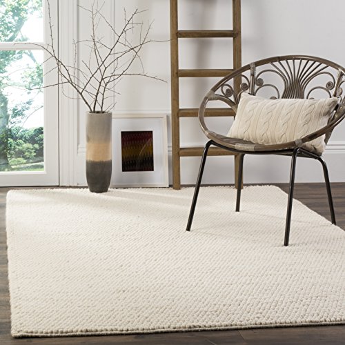
The sequence has three layers and they should be introduced in this order. First, the floor layer: a rug that defines the primary use zone of the room. In a living room, the rug should extend at least 18 inches (46 cm) beyond each side of the sofa and sit fully under the front legs of the seating group. In a bedroom, a runner on both sides of the bed or a single large rug centered under the bed frame with at least 24 inches (61 cm) of rug visible on each side are both correct. Natural fiber is the right material here: wool, jute, or a wool-jute blend. A chunky flat-weave in oatmeal or warm grey is the most versatile starting point.
Second, the seating layer: a throw and two cushions on the sofa, or two cushion covers on the bed. The throw should be in a different texture from the rug: if the rug is flat-weave, choose a bouclé or chunky knit throw. The cushion covers should be in a fabric that introduces one additional texture without introducing a new color. Brushed cotton, ribbed linen, or washed velvet in a tone one step darker or lighter than the sofa fabric are all correct moves.
Third, the window layer: linen curtains in white or natural undyed linen, floor-to-ceiling, hung 4 to 6 inches (10 to 15 cm) above the window frame on a minimal rail. This is one of the single most effective changes in the room because ceiling-height curtains make the window appear taller and the room appear larger. They also soften the wall-to-floor transition in a way that bare windows never do. Avoid blackout liners in rooms where natural light is an asset; if light control is needed, a separate roller blind in white or warm white behind the linen panel is cleaner than a lined curtain.
The failure mode is introducing too many colors across the textile layers. Three tones maximum: primary (white or cream), secondary (oatmeal or warm grey), and one accent (dusty sage, muted terracotta, or soft blue-grey). Any more and the textiles start competing with the furniture and floor.
Key Takeaway: Layer textiles in sequence: floor first, seating second, window third, and hold the palette to three tones across all layers.

Step 7: Design the Lighting in Three Tiers, Not One
 Save
Lighting is the element that makes or breaks a Scandi interior after dark, and most rooms get it wrong in the same way: one overhead light source, usually a recessed ceiling light or a harsh flush-mount fixture, that flattens the room and strips every textile and wood surface of the warmth and depth that makes the style work.
Scandi lighting philosophy is built around multiple small light sources placed at different heights rather than a single dominant overhead. The goal is to create an atmosphere that mimics the quality of Nordic candlelight: warm, layered, slightly directional, and low to mid-height rather than overhead. This is not merely an aesthetic preference. It is the reason hygge, the Danish concept of enveloping comfort, is achievable in a room. You cannot create hygge under a 4000K recessed can light. You can create it with three sources at three heights set to 2700K or lower.
The three tiers work as follows. Top tier: a statement pendant over the dining table or main seating area, hung low enough to be in the occupant’s sightline when seated (between 28 and 32 inches (71 to 81 cm) above the table surface for a dining pendant). Mid tier: a floor lamp or a wall sconce that places light at shoulder height when you are seated, approximately 55 to 65 inches (140 to 165 cm) from the floor at the shade. Lower tier: table lamps on side tables or bedside surfaces, ideally with opaque or semi-translucent ceramic or paper shades that diffuse the bulb rather than projecting bare light.
All sources should be set to a warm color temperature. 2700K is the practical maximum for a Scandi interior; 2200K is ideal for bedroom and evening living spaces. If the fixture uses a replaceable bulb, specify a filament-style LED at the correct temperature. The bulb choice is not decorative; it determines whether the room reads as warm wood and linen or as a hospital waiting room.
Dimmer switches on every circuit that allows them are not a luxury at this stage; they are functional necessities. The ability to move from a full-brightness cooking or working level to a 30 percent dusk-level setting for the evening is the difference between a room that serves one mood and a room that serves all of them.
Key Takeaway: Install at least three light sources at three different heights set to 2700K or lower, and put every circuit on a dimmer.

Step 8: Apply the Scandi Approach to the Living Room Specifically
 Save
The living room is where all the principles converge into a single space that has to function for multiple activities: conversation, reading, screen time, and quiet evenings. The Scandi approach to this room is to design for the activity that requires the least stuff and let the other activities borrow from that baseline. That primary activity is almost always relaxed seated conversation, which means the sofa and its immediate orbit are the room’s center of gravity.
Start with the sofa and position it before you place anything else. In a Scandi living room, the sofa faces the room’s best light source, either the primary window or the fireplace, not the television. The television is a secondary object that gets accommodated; it does not dictate the layout. A sofa with a back height of no more than 34 inches (86 cm) maintains the visual flow of the room. If the back is any higher, it begins to act as a wall inside the room.
The coffee table sits 14 to 18 inches (36 to 46 cm) from the sofa front edge. This is not arbitrary: it is the reach distance for someone seated comfortably. A table outside this range means people are either straining forward or stepping around it to use it, which breaks the ease the style is supposed to create.
The shelving unit, if included, is the one place in a Scandi living room where curated objects are allowed to exist. The operative word is curated. One object per shelf, maximum. Not one category of object: one object. A ceramic bowl. A single candle in a stone holder. Three books stacked spine-out in the same color family. The shelving unit should look as though you have already edited it twice.
Television integration is the detail most Pinterest images skip. A wall-mounted television with all cables concealed in a wall-cable raceway is the Scandi approach. A television on a stand with visible cables contradicts everything the style is trying to do visually. If cable management is not an option in a rental, a slim media cabinet with closed doors that conceal the equipment when not in use is the acceptable workaround.
From the guides
You've saved it, wanted it. Here's the how: codes, measurements, order. Your choices make it yours.
The Japandi Honest PlaybookThe honest version of the style: what to keep, what to skip, and the order to do it in.See inside →The Room Refresh PlaybookA repeatable four-step method, room by room, in ten minutes, thirty minutes, or one weekend.See inside →Make Any Room Feel Cozy on PurposeWhy some rooms hold people and others empty out, and the moves that change it.See inside →Key Takeaway: Position the sofa to face the room’s best light source, set the coffee table at 14 to 18 inches (36 to 46 cm), and limit every shelf to one object before considering additions.

Step 9: Build the Scandi Bedroom as a Sensory Retreat, Not a Display Space
 Save
The bedroom is the room where the Scandi principle of functional calm pays the highest personal dividend, and it is also the room where people most consistently over-decorate. Gallery walls, multiple throw pillows, nightstand collections, and clothing draped over chairs all read as evidence of a room that has not yet been edited. The Scandi bedroom starts from the opposite position: nothing goes in unless it directly supports sleep, rest, or the morning routine.
The bed frame sets the room’s tone. A low-profile platform frame in pale oak or solid birch, sitting no higher than 14 inches (36 cm) from floor to mattress surface, is the correct scale. A higher frame lifts the sleeping surface but also adds visual mass that works against the room’s lightness. If storage is needed beneath the bed, choose a frame with integrated drawer pulls in a recessed or minimal hardware style rather than an external bed-skirt solution, which breaks the clean line.
Bedding is the most important textile decision in this room. The Scandi approach is a duvet in natural linen or washed cotton, in white or warm oatmeal, with a waffle-knit or chunky knit throw across the foot in a tone one step deeper. Two pillowcases per side, same fabric as the duvet cover. No decorative shams, no bolster, no five-cushion arrangement. The bed should look like it was made in two minutes and still look right.
Wardrobes and storage should have flush or recessed handles and matte finishes in white, cream, or pale wood. Open wardrobes are a Scandi option that works only if the clothing inside is edited to a capsule level and hung facing the same direction in tonal groups. If your wardrobe situation is currently realistic rather than aspirational, a closed front is the more honest choice.
One piece of meaningful art, properly sized, at the correct height, is allowed. The center of the artwork should sit at 57 inches (145 cm) from the floor, which is standard eye-level height. A single framed print in natural black or pale oak frame, sized at least 20 by 24 inches (51 by 61 cm) for a standard bedroom wall, reads as intentional. A small 8 by 10 inch (20 by 25 cm) print on a large wall reads as forgotten.
Key Takeaway: Strip the bedroom to functional essentials first: frame, bedding, one lamp per side, one rug, one piece of art, then stop before adding anything more.

Step 10: Handle the Scandi Kitchen Without Gutting It
 Save
Most people cannot gut and rebuild a kitchen, and the Scandi approach does not require it. The principles of the style translate directly into what designers call a “surface and hardware edit,” which changes the visual language of the room without structural work.
The surface edit starts with cabinet fronts. Flat-front cabinetry is the Scandi standard. If your existing cabinets have raised-panel or decorative-profile doors, the most effective improvement that does not require a full replacement is to swap the hardware and repaint or reface the fronts in a matte warm white or cream. Hardware in matte black, brushed brass, or brushed nickel on a simple bar or minimal knob profile does the most work per dollar of any single change in a kitchen. The hardware should be consistent across every door and drawer in the space: switching hardware is one of the rare moments where uniformity is a rule rather than a guideline.
Countertops in a Scandi kitchen are either white quartz, pale grey concrete-look, or light wood butcher block. If your current countertop is a heavily veined or heavily patterned material, that pattern is likely working against the calm palette. A white quartz or white laminate overlay countertop is a rental-viable workaround in some situations; verify with your landlord before proceeding.
The backsplash, if present, should be as quiet as possible: white or off-white subway tile, white square tile, or plain painted wall. Patterned or colored tile is a choice that can work in a Scandi-adjacent kitchen but requires everything else in the room to be exceptionally restrained to avoid reading as busy.
Open shelving in a Scandi kitchen is earned, not given. If you introduce open shelving, the items on it must be edited to the same standard as the living room shelving: matching or near-matching vessels (white or natural ceramic), one hanging plant or trailing herb pot, and folded linen towels in cream or white. A shelf with a random assembly of different-height mugs, various protein powder containers, and a half-used spice collection is not a Scandi feature. It is clutter with better lighting.
Key Takeaway: Start the kitchen edit with hardware replacement and paint, keep the shelf edit to matching ceramics and folded linen, and do not open shelves until the objects going on them meet the standard.

Step 11: Bring Nature In Without Turning the Room Into a Greenhouse
 Save
Plants belong in a Scandi interior in the same way they belong in any well-considered room: purposefully and in proportion. The style’s connection to nature is expressed through materials (wood, linen, stone, wool) as a primary move, and through living plants as a secondary, supporting one. Reversing that order, relying heavily on plants to add the nature element while the room’s base materials are synthetic or poorly chosen, produces a room that feels like a garden center rather than a Nordic home.
The Scandi approach to plants is one anchor plant and one or two supporting vessels. The anchor plant is a large-scale specimen, typically floor-level, that holds its own visually in the room: a fiddle-leaf fig in a white or terracotta ceramic planter, a rubber tree, a large bird-of-paradise, or a monstera at full maturity. The plant’s container should be in the room’s neutral palette: white ceramic, matte terracotta, or pale concrete. No patterned, metallic, or brightly colored pots in this role.
The supporting vessels hold smaller or trailing plants: a pothos, an ivy, a hoya in a smaller ceramic at mid-height (on a shelf or side table), or a succulent grouping on a windowsill. The number across the whole room should not exceed four plant positions. More than four starts to visually compete with the furniture, which is doing the primary work of defining the room.
Dried botanicals, specifically dried pampas grass, dried cotton stems, dried bunny tail grass, are Scandi-adjacent choices that have been heavily over-used. They still work when used sparingly: one stem in a tall slim ceramic vase as a single accent. A full arrangement of mixed dried botanicals in a large vase is a maximalist choice that contradicts the style’s edited nature.
The failure mode at this stage is buying plants before the room’s base materials are in place. Plants are a finishing layer, not a foundational one. A room with perfect textiles and no plants reads as Scandi. A room with twelve plants and unresolved furniture does not.
Key Takeaway: Choose one large anchor plant and no more than three small supporting vessels, all in neutral ceramic or terracotta, placed after the room’s furniture and textile decisions are finalized.

Step 12: Curate Decorative Objects with a One-In, One-Out Standard
 Save
Decorative objects are the most subjective category in a Scandi interior and the one where the style most often collapses into either sterile emptiness or scattered clutter. The principle that keeps it on track is simple: every object in the room should be able to answer the question “why are you here?” with something other than “someone gave it to me” or “I bought it on impulse.”
The objects that earn their place in a Scandi room fall into one of three categories. Functional-decorative: things that have a purpose but are beautiful enough to be visible, such as a hand-thrown ceramic bowl used for keys or fruit, a linen throw that gets used, a stone tray that holds candles currently in use. Material-beautiful: things that earn attention purely through the quality of their material, such as a single piece of driftwood on a shelf, a smooth river stone, a handmade ceramic with visible throwing marks. Meaningful: things with a specific personal history that would be missed if they disappeared.
The one-in, one-out standard prevents accumulation without requiring you to clear the room repeatedly. Every time something new comes in, something already present must be evaluated and removed if it is not in one of those three categories. This is how the style stays edited over time rather than gradually drifting back toward clutter.
In the current Scandi direction, there is more room than in earlier versions for handmade objects with visible imperfection: asymmetric ceramics, slightly irregular linen weaves, objects with patina or age marks. This is the Scandi-Sabi influence, drawn from the Japanese wabi-sabi philosophy, and it is a meaningful evolution because it allows the room to feel personally inhabited rather than showroom-finished. The key is that these objects are still curated, still few, and still within the neutral material palette. An asymmetric ceramic bowl in pale grey is Scandi-Sabi. A painted folk-art figure in five colors is not.
Candles are one of the most specifically Scandi decorative objects and one of the most misused. The correct format is an unscented or lightly scented pillar or taper candle in white, cream, or beeswax tone, on a stone or ceramic holder, lit regularly rather than displayed as a permanent object that never gets used. A candle that has never been burned in a room that is supposed to embody warmth is a contradiction. Light the candles.
Key Takeaway: Apply a one-in, one-out rule to all decorative objects, keep every piece within the functional-decorative, material-beautiful, or meaningful categories, and light the candles.

Step 13: Adapt the Principles for a Rental Without Starting Over
 Save
The Scandi interior is more achievable in a rental than most renters assume, because the majority of its work is done by furniture, textiles, and lighting rather than by structural changes. The restriction of “no paint, no permanent fixtures” forces a discipline that actually aligns with the style’s principles: if you cannot change the surfaces, the objects and textiles have to be excellent.
The practical sequence for a rental Scandi room is as follows. Start with the floor. If the existing carpet is beige, tan, or grey, a large natural fiber rug placed over it in a light oatmeal or warm cream tone resets the visual floor entirely. The rug should be large enough to extend well past the sofa edges: for a standard rental living room, a 9 by 12 foot (2.7 by 3.7 meter) rug covers enough floor to change the room’s feeling without requiring the carpet beneath to disappear.
For walls, removable wallpaper in a tone close to Sherwin-Williams Alabaster or a very soft off-white can replicate the painted wall effect in a space where permanent paint is not allowed. Test any removable product on a small section of the existing wall and wait 48 hours before committing; rental walls with multiple coats of flat paint can peel even with “removable” products if the underlying layers are not well-bonded.
Window treatments in a rental are almost always either absent or inadequate. A ceiling-mounted or wall-mounted tension rod inside or just outside the window recess with floor-to-ceiling linen panels can be installed without drilling in most cases. This is the highest-return single change available in a rental Scandi room: going from bare windows or builder-grade blinds to full-height linen panels immediately shifts the perceived ceiling height and room proportion.
Lighting is fully achievable in a rental with plug-in pendants, floor lamps, and battery-operated or rechargeable table lamps. A plug-in pendant with a fabric cord, swag hooked to the ceiling with an adhesive hook, creates the statement hanging light effect without any electrical work. This is one of the most effective rental shortcuts in the entire Scandi toolkit.
Key Takeaway: In a rental, prioritize the floor (rug), windows (linen panels on tension rods), and lighting (plug-in pendants and floor lamps) before any wall intervention, as these three changes produce the largest visual return without permanent modification.

A Scandi interior done well is not minimal in the way that empty is minimal. It is minimal in the way that a sentence with no unnecessary words is minimal: everything present earns its place, and that discipline is what makes the room feel calm rather than sparse. The path through it is always the same sequence: light first, then the surface palette that serves that light, then furniture edited to the functional core, then textiles in three layers, then lighting in three tiers, then nature, then the few objects that can answer the question of why they are there. Follow that order and the room builds itself into coherence. Start from the last stage and work backward, and you spend money on pieces that never quite land.
The next step is to pick the room you most want to change and complete the light audit before you do anything else. Sit in it at the time of day you use it most and write down exactly where the light comes from and what is absorbing it. That audit is the whole first stage, and everything that follows depends on getting it right.
From the guides
You've saved it, wanted it. Here's the how: codes, measurements, order. Your choices make it yours.
The Japandi Honest PlaybookThe honest version of the style: what to keep, what to skip, and the order to do it in.See inside →The Room Refresh PlaybookA repeatable four-step method, room by room, in ten minutes, thirty minutes, or one weekend.See inside →Make Any Room Feel Cozy on PurposeWhy some rooms hold people and others empty out, and the moves that change it.See inside → Save