Georgia
You found the inspiration. You saved the pins, painted the walls white, bought the light wood coffee table, and stripped back the clutter. But the room still feels flat, slightly cold, and nothing like the Nordic interiors you keep coming back to. That disconnect is not a taste problem. It is an architectural and spatial problem, and it has specific causes.
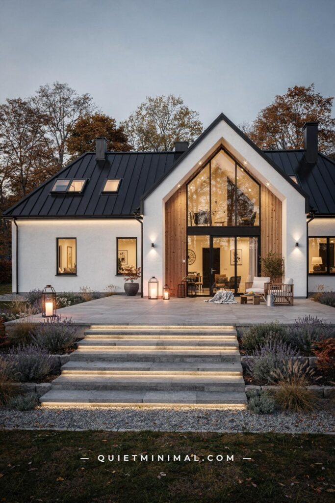
Scandinavian architecture is not a decorating style layered on top of a standard room. It is a system built around light, proportion, material honesty, and functional warmth. Rather than pursuing grandeur, Nordic architecture focuses on livability, comfort, and long-term sustainability, and it began as a direct response to harsh climates and limited daylight. Every decision in an authentic Nordic interior, from window size to ceiling height to the grain of the floorboard, solves a problem. When those underlying decisions are wrong for the style, no amount of throw pillows corrects it.
The twelve issues below are the ones that appear most consistently in homes that try for Scandinavian architecture and miss. Each one names the failure, explains why it happens structurally, and gives you the fix you can act on, whether you are renovating, renting, or simply re-evaluating what you already have.
You Chose the Wrong White for Your Walls
 Save
This is the single most common entry point into Scandinavian architecture, and the single most common place it goes wrong. Not all whites are equal, and the white that dominates a Nordic interior is never the pure, cool, blue-based white that comes out of a standard paint can. Many people are shifting away from all-white walls toward warmer off-whites, and for good reason.
The problem is colorimetric. Cool whites with blue or grey undertones reflect cool-spectrum light back into the room. In North America, where rooms often receive southern or eastern light that is already warm and golden, a blue-based white creates a visual conflict. The wall reads clean in a showroom but icy in the actual space. In Scandinavian-style interiors, the most effective colors are warm whites, chalky grays, beige, muted taupe, and soft greige, because these tones keep the space bright while leaving room for wood grain, textiles, and natural textures to stand out.
From the guides
You've saved it, wanted it. Here's the how: codes, measurements, order. Your choices make it yours.
 The Japandi Honest PlaybookThe honest version of the style: what to keep, what to skip, and the order to do it in.See inside →
 The Room Refresh PlaybookA repeatable four-step method, room by room, in ten minutes, thirty minutes, or one weekend.See inside →
 Make Any Room Feel Cozy on PurposeWhy some rooms hold people and others empty out, and the moves that change it.See inside →
The fix is specific: look for whites with a low Light Reflectance Value (LRV) in the 80 to 87 range rather than the 90s. Anything above LRV 90 tends to read as stark in daylight. Choose whites with yellow, red, or grey undertones, never blue ones. Test three samples at 12 inches by 12 inches (30 by 30 cm) directly on your wall and evaluate them at 8 a.m., noon, and 6 p.m. before committing. The right white will look slightly creamy next to pure white trim, and that contrast is exactly what gives the room depth. If your current walls feel cold, a single coat of a warmer white is often the highest-return change you can make before touching anything else in the room.
Key Takeaway: Choose whites with warm undertones and an LRV between 80 and 87, and test them at three different times of day before painting.

Your Windows Are Dressed Too Heavily
 Save
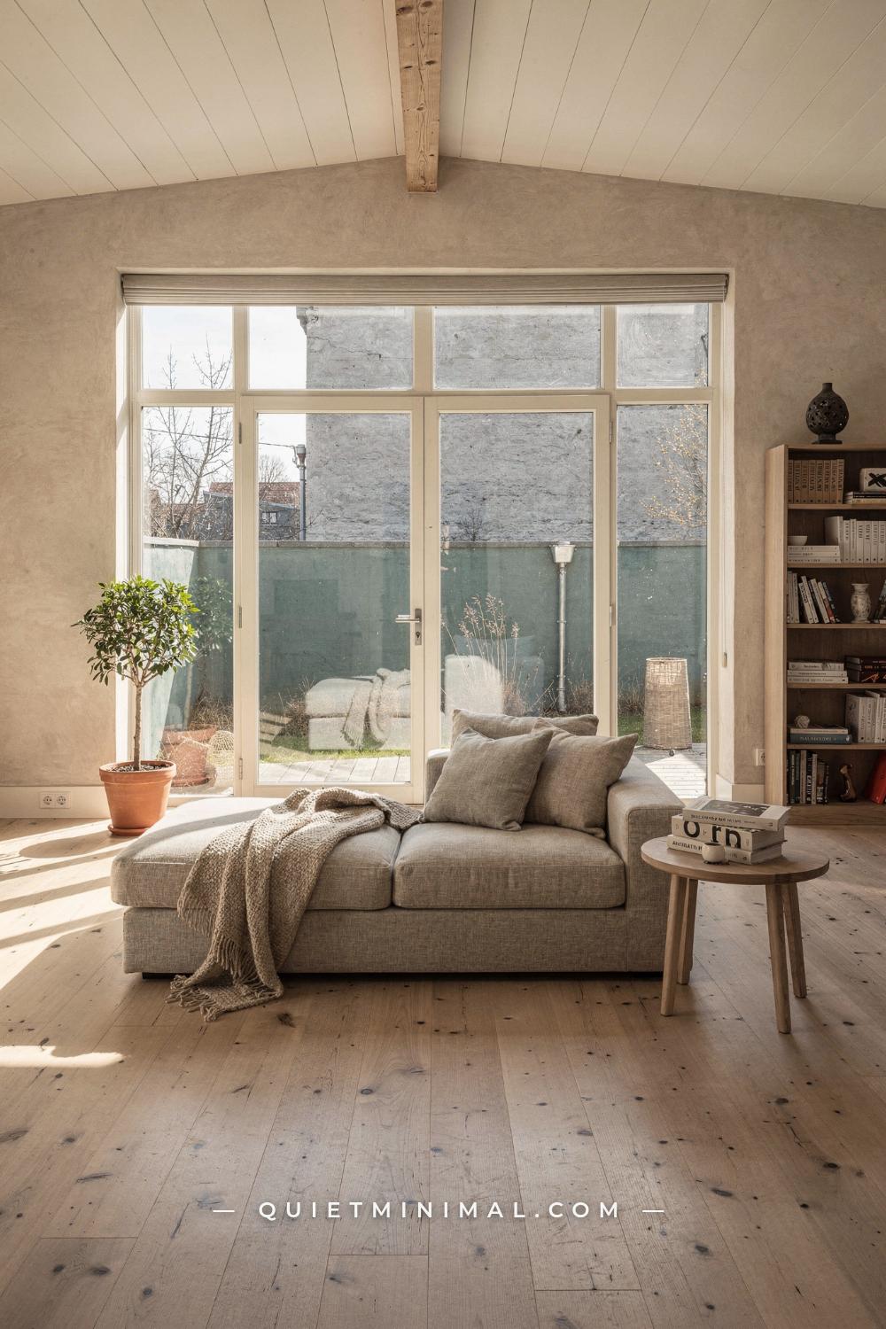
In Scandinavia, light is more than just something to switch on. It is a key part of the architectural experience. With winters that bring long periods of darkness, daylight becomes a precious resource. The entire architectural logic of Nordic homes is built around capturing every possible lumen of natural light. Heavy curtains, blackout liners, and layered draping are the fastest way to neutralize this.
The failure mode is a proportion problem. When a curtain panel hangs from a standard 84-inch (213 cm) rod that is mounted at window-frame height rather than at ceiling height, two things happen: the window looks shorter than it is, and light enters only from the center of the glazing rather than washing down from the full height. A curtain that clips in front of part of the glass compounds this further by reducing the effective window width by 12 to 18 inches (30 to 46 cm) on each side.
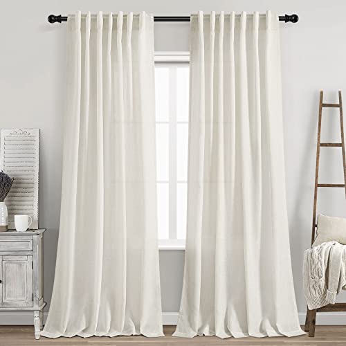
Scandinavian interiors tend to feature pale wood floors, white or softly colored walls, and minimal window coverings to help bounce light around the room. The architectural ideal is sheer linen panels hung 4 to 6 inches (10 to 15 cm) above the window opening, extending to the floor. If you need privacy or light control, use a simple white roller blind mounted inside the recess, completely hidden behind the sheer panel, so the visual mass of the window stays clean. This approach preserves the light transmission that the style depends on while adding a functional layer that disappears when not in use. Avoid curtain rods that end at the window frame width; extend them 6 inches (15 cm) beyond each side of the frame so the panel stacks off the glass entirely when open.
Key Takeaway: Mount curtain rods at ceiling height, use sheer linen panels, and keep all fabric stacked clear of the glass when open to maximize daylight transmission.
Your Wood Tones Are Fighting Each Other
 Save
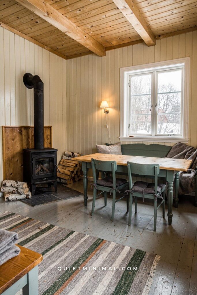
This is the issue that most often explains why a room with good individual pieces never coheres. Wood is favored in Nordic design for its warmth, versatility, and timeless appeal, but that warmth depends on wood tones being intentionally related, not accidentally mixed.
The physics of the problem: wood reflects and absorbs light differently based on its color temperature. Pale birch has cool, almost grey-white tones. Honey oak is warm and golden. Walnut is deep brown with red undertones. When all three appear in the same room, the eye cannot settle, because it is constantly reconciling three separate warmth signals. The room reads as busy even with minimal furniture, because the business is in the material palette rather than the object count.
Today, golden oak has replaced pale birch of the past decade as the signature Nordic wood. Rounded edges and soft silhouettes reference mid-century modernism with contemporary restraint. The practical fix is to anchor the room around one dominant wood in the 60 percent range: the floor and the largest piece of furniture. Then allow one secondary wood tone that is within two shades of the dominant, covering roughly 30 percent of the room’s wood surfaces. The remaining 10 percent can be a contrasting accent, such as a small matte black frame or a single darker wood tray. Never exceed three distinct wood tones in a single room, and never place two competing tones directly side by side, for example a birch dining table with walnut chairs. The contrast reads as unresolved rather than intentional.
Key Takeaway: Anchor the room in one dominant wood tone, allow one close secondary, and limit total wood tones to three, never placing two contrasting tones in direct contact.

Your Ceiling Height Is Working Against You
 Save
Scandinavian spaces are efficient and functional, often featuring open floor plans for versatility, but the openness that makes Nordic architecture breathe is not just about square footage. It is about the vertical dimension of the room. Standard American construction delivers an 8-foot (244 cm) ceiling, and in a room with a pale Scandinavian palette, that ceiling height reads as close rather than airy.
The failure mode is a sightline problem. Clean lines, neutral colors, and natural materials help reduce visual noise and promote a sense of peace. Rooms are often open and airy, with just the right amount of furniture to meet daily needs. When a low ceiling compresses the vertical plane, even a correctly furnished room loses the sense of spaciousness that the style depends on. The eye needs somewhere to travel upward.
If you cannot change the physical ceiling, there are architectural interventions that create the illusion of height without touching structural elements. Paint the ceiling the same color as the walls, specifically the same warm white, to erase the visual boundary between vertical and horizontal planes. Install floor-to-ceiling shelving units, at minimum 90 inches (229 cm) tall, because a piece of furniture that reaches near the ceiling raises the perceived room height even when the actual ceiling is unchanged. Hang pendant lights with 12 to 18 inches (30 to 46 cm) of drop from the ceiling, not longer, so the fixture does not create a new visual horizon that re-emphasizes the low ceiling. Avoid crown molding in Scandinavian interiors: it draws attention to the ceiling line and makes a low room feel more boxed-in.
Key Takeaway: Paint the ceiling the same warm white as the walls, use tall vertical furniture, and avoid crown molding, all three together raise perceived ceiling height by a visible margin.

Your Lighting Has No Layers
 Save
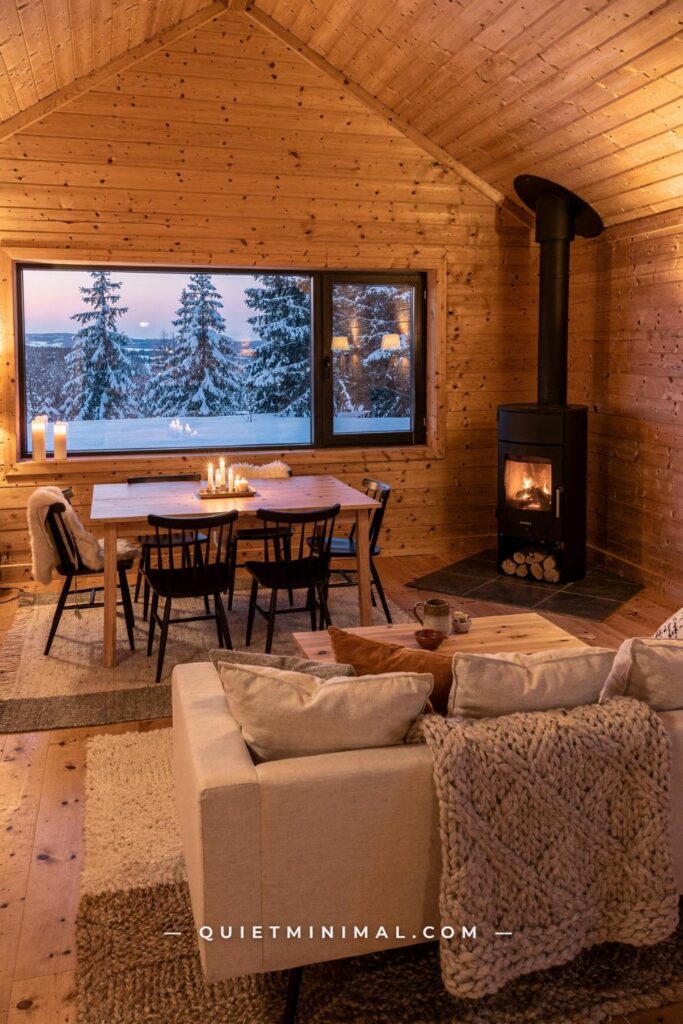
Hygge is created with layered lighting from warm light sources, soft textiles in wool and linen, and natural materials such as wood and ceramics. This is not a styling preference; it is a structural requirement of the design language. Recessed can lighting alone, which is the default in most American new builds, is the fastest way to make a Scandinavian room feel like a commercial space rather than a home.
The problem is directionality. Overhead recessed lights produce downward, vertical light that flattens surfaces. Texture in fabric, grain in wood, and the depth of a layered material palette all depend on light arriving at an angle rather than from directly above. When a wool rug has no raking light catching its pile, it reads as a flat mat. When a limewash wall has no sconce casting a shadow across its texture, it reads as flat plaster. The texture is there, but the lighting cancels it.
The fix requires at minimum three light layers in any room attempting this style. First, ambient: a pendant or chandelier that hangs low enough to establish a visual anchor in the room (for dining, the bottom of the shade should sit 30 to 34 inches (76 to 86 cm) above the tabletop). Second, task: a floor lamp or table lamp at seated eye level, positioned near a chair or sofa corner, producing warm light in the 2700 to 3000 Kelvin range, never higher. Third, accent: a small plug-in sconce, a battery-operated wall light, or a series of candles at low height that produce warm pools at 18 to 24 inches (46 to 61 cm) from the floor. Candles and a well-designed seating area are the quickest ways to achieve the hygge feeling. Turn off overhead lighting entirely in the evening and run only the lower two layers. The room will read as a different space.
Key Takeaway: Achieve three lighting layers in every room: an anchoring pendant, a seated-height floor or table lamp, and low accent lighting, then switch off the overhead in the evening.

Your Floor Plan Is Too Segmented
 Save
Scandinavian spaces are efficient and functional, often featuring open floor plans for versatility. The sightlines that run through a Nordic home are not accidental; they are load-bearing in a visual sense. When a room can be seen through to the next space, the eye reads the combined depth as the room’s effective size. When walls, half-walls, or bulky furniture interrupt that sightline at the 8- to 12-foot (244 to 366 cm) mark, the room shrinks to its actual square footage instead of borrowing depth from the adjacent space.
The failure mode in most suburban American homes is compartmentalization. A builder-grade living room typically has a formal wall separating it from the dining room, and another separating the dining room from the kitchen. Each room individually may be reasonably sized at 200 to 250 square feet (19 to 23 square meters), but stylistically they function as three separate boxes. Scandinavian architecture’s defining quality of airiness cannot exist inside a box.
Where structural walls cannot be removed, address the segmentation visually. Keep furniture at least 6 inches (15 cm) shorter than the doorway opening between rooms, so the eye travels through rather than stopping at the furniture’s top edge. Use the same flooring material across connected spaces rather than transitioning between carpet, tile, and hardwood: the continuous floor plane is what makes two rooms read as one extended space. Place a single piece of furniture, such as a low credenza or console, directly aligned with the sightline from one room to the next. When that piece is in the same material family as the furniture in the adjacent room, the eye stitches both spaces together into a continuous composition.
Key Takeaway: Protect the sightline between connected spaces by keeping furniture below doorway height, matching flooring materials across rooms, and aligning key pieces on the shared axis.

You Are Over-Decorating the Negative Space
 Save
Clean lines, neutral colors, and natural materials help reduce visual noise and promote a sense of peace. Rooms are often open and airy, with just the right amount of furniture to meet daily needs. This minimalist approach is also practical: fewer things mean less to maintain, and well-designed spaces make everyday routines more efficient.
The specific failure here is misunderstanding what negative space does in a Scandinavian room. Empty space on a shelf is not a styling omission; it is an active design decision. The gap between a ceramic bowl and the edge of a shelf is where the eye rests. Without those resting points, the eye is in constant motion and the room reads as restless, regardless of how neutral the color palette is.
The rule of thirds applies in three dimensions here. On any given surface, fill no more than two-thirds of the available space with objects. On shelving, leave at least one full shelf at eye level completely clear. On a coffee table of standard dimensions, around 48 inches by 24 inches (122 by 61 cm), limit objects to three: one tall element, one textural element, and one functional element such as a tray or book. The tray itself counts as a framing device that visually contains the grouping and prevents it from reading as scattered. Groupings on windowsills should be removed almost entirely; the window view and the light it delivers are the decoration.
When choosing decor for this style, it helps to think in layers rather than shopping categories. Color sets the mood, materials create warmth, and small objects finish the room. Good decor does not shout. It supports the larger composition.
Key Takeaway: Leave one full shelf at eye level clear, limit any surface grouping to three objects maximum, and treat window ledges as light sources rather than display surfaces.

Your Textiles Are All the Same Weight
 Save
Interior designer Kashi Shikunova notes that “material remains consistent, but changes in texture add depth, shadow, and visual interest.” This principle is the one most often misunderstood when American homeowners attempt Scandinavian style. They assemble a neutral palette correctly but source all textiles from the same mid-range category: similar weave, similar weight, similar drape. The result is tonally correct but physically flat.
From the guides
You've saved it, wanted it. Here's the how: codes, measurements, order. Your choices make it yours.
The Japandi Honest PlaybookThe honest version of the style: what to keep, what to skip, and the order to do it in.See inside →The Room Refresh PlaybookA repeatable four-step method, room by room, in ten minutes, thirty minutes, or one weekend.See inside →Make Any Room Feel Cozy on PurposeWhy some rooms hold people and others empty out, and the moves that change it.See inside →The fix is deliberate variation in textile weight across three tiers. The bottom tier, which includes area rugs and floor-level throws, should be the heaviest: a hand-knotted wool rug at 0.5 to 0.75 inches (1.3 to 1.9 cm) pile height, or a flat-weave kilim with visible texture. Tactile materials including bouclé, brushed wood, and handmade ceramics give rooms a lively and inviting feel. The middle tier, seating upholstery and bed duvets, should be medium-weight linen or a linen-cotton blend that drapes with visible softness and wrinkles naturally. The wrinkle is not a flaw; it is what makes the fabric read as organic. The upper tier, curtain panels and wall-adjacent textiles, should be sheer to semi-sheer: light enough to move in airflow and to transmit rather than block window light.
Handwoven textiles sit naturally alongside Nordic furniture because both traditions are rooted in craft. When all three weight tiers are present in a room, the eye moves through a range of physical experiences: the heaviness of the floor underfoot, the softness of the sofa, the transparency of the curtain. That range is what creates the layered warmth that photographs of Nordic interiors convey, and that people cannot replicate by buying more objects.
Key Takeaway: Use three distinct textile weights in every room: heavy at floor level, medium-weight linen at seating, and sheer at windows, and let natural wrinkle in linen read as a feature.

Your Furniture Sits Too High Off the Floor
 Save
The visual weight of furniture in a Scandinavian room is read from the floor up, not from the seat down. Low-profile furniture keeps the visual center of gravity near the floor plane, which is the plane that anchors the room’s sense of stability and calm. When furniture sits high on tall legs or has a heavy platform base, the room’s center of gravity climbs toward eye level, and the ceiling appears lower and more oppressive as a result.
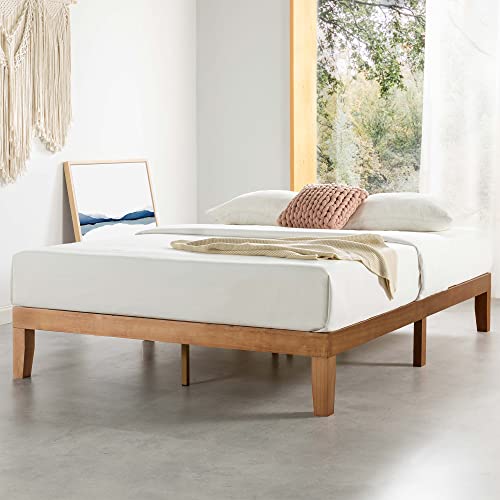
A Scandinavian bedroom stays simple and restful: a low wooden bed, neutral bedding in white or soft gray, layered textiles, and minimal decor. The same principle extends to every other room. Sofas in Nordic architecture typically have a seat height of 15 to 17 inches (38 to 43 cm), compared to the American standard of 18 to 20 inches (46 to 51 cm). That 2-to-3-inch (5 to 8 cm) difference sounds minor but is visible in a photograph and palpable in a room. A lower sofa creates more visual space between the top of the furniture and the ceiling, which directly increases the perceived room height.
The same logic applies to bed frames. A platform bed with a headboard that tops out at 36 to 42 inches (91 to 107 cm) from the floor allows the wall behind it to breathe, creating space for a single art piece, a pair of sconces, or simply empty wall that reads as intentional. A traditional headboard reaching 54 to 60 inches (137 to 152 cm) competes with the ceiling and makes the room feel stuffed regardless of how well the bedding is styled. Soft, organic forms for sofas and armchairs replace angular and strict silhouettes in current Nordic design. Lower and rounder together is the direction.
Key Takeaway: Source sofas at 15 to 17 inches seat height and bed frames at a 36- to 42-inch headboard height, both lower than the American standard, to open the vertical space of the room.
Your Greenery Is Too Tropical
 Save
Plants in Scandinavian architecture are not optional; they are structural. Scandinavian architects often incorporate elements that blur the boundaries between indoors and outdoors. Large windows not only invite natural light but also frame picturesque views of the surrounding landscapes. When a living plant is in the room, it extends that indoor-outdoor connection from the window into the space itself. But the species of plant matters because of silhouette.
The failure mode here is the fiddle-leaf fig. It became the default Pinterest plant for interiors across every style, but its broad, waxy, tropical leaves are visually incompatible with a Nordic material palette. The glossy leaf surface reflects light in a specular way, the same way a polished lacquer surface does, which is the exact opposite of the matte, light-absorbing surfaces that give Scandinavian interiors their softness. The tropical silhouette also signals a warm, lush climate that creates a conceptual conflict with the cool, restrained Nordic references in the rest of the room.
The plants that integrate correctly into Scandinavian architecture share three qualities: matte or semi-matte leaf surfaces, structural but sparse silhouettes, and a connection to northern European flora. Dried plants such as pampas grass are a natural element in Nordic interior design. They add organic texture and a connection to nature without requiring maintenance, fitting the style’s principle of simplicity and sustainability. Beyond dried grasses, consider olive trees for their silver-green matte leaves and architectural branching, snake plants for their vertical structure and stone-grey coloring, and simple terracotta-potted herbs on window ledges. All of these bring nature in without introducing the tropical visual conflict that undermines the material palette.
Key Takeaway: Replace glossy-leafed tropical plants with matte-surface species such as olive trees, snake plants, or dried pampas grass, matched with simple terracotta or matte ceramic planters.

Your Palette Shifted Too Far into Grey
 Save
For a period in the 2010s, grey became the shorthand for Scandi style. It was everywhere: grey walls, grey sofas, grey rugs, grey tile. The problem is that grey-dominant interiors work in Scandinavia partly because of latitude. At 55 to 70 degrees north, the light is soft, diffuse, and low-angle. Grey surfaces in that light develop a gentle warmth as they pick up reflected tones from the landscape. In other climates, the light is intense and golden, and warm-toned interiors in putty, clay, and oiled oak absorb and complement it rather than competing. The cooler end of the Scandinavian palette can feel washed out in direct, high-angle light.
The result in a suburban American home, where direct light is more common than diffuse light, is a room that reads as institutional rather than serene. The all-white interior is receding, and in its place: warm putty, raw linen, aged bone, and deep clay. Scandinavian interiors today are still neutral, just no longer cool.
The practical correction is to audit every grey in the room and ask whether it has a warm or cool undertone. Cool greys, those with blue or green bases, should be replaced with their warm equivalents: greige (grey-beige) instead of pure grey for walls, warm taupe instead of charcoal for upholstery, undyed natural linen instead of silver-grey for curtains. Dusty terracotta, faded sage, warm taupe, and blush stone replace cold whites and greys in current Nordic design. Introduce one accent color in this earthy range into the room, a terracotta planter, a sage-green throw, or an aged clay vase, and the previously grey palette will immediately appear warmer without requiring any major changes.
Key Takeaway: Replace cool-undertone greys with warm greige, natural linen, and warm taupe, then add one earthy accent in terracotta, sage, or warm clay to shift the room’s temperature.

Your Architecture Is Hiding Behind Your Furniture
 Save
The lines and crosses of a Scandinavian living room ceiling reveal the beauty of its structure and architecture, creating a lively counterpoint to the calm space below. The architecture itself, the window reveals, the exposed beams, the floor transitions, and the ceiling planes, is the primary decorative element in Nordic design. Furniture is secondary. When furniture is pushed to the perimeter of a room or arranged to fill the space densely, it covers the architectural elements that the style depends on.
The specific failure mode is wall-hugging. American convention is to push sofas, consoles, and shelving units to the walls to “maximize floor space” in the center of the room. In a Scandinavian context, this does the opposite: it buries the room’s structural character under a ring of furniture and leaves the center of the room as an empty, purposeless void. The room’s perimeter becomes visually dense and the interior becomes visually empty in the wrong way.
The Nordic solution is to float furniture away from the walls by a minimum of 12 to 18 inches (30 to 46 cm). A sofa placed 14 inches (36 cm) from the back wall allows the eye to travel along the baseboard and see the floor plane continuing behind the furniture. This reveals the room as larger than its occupied footprint. It also allows the wall behind the sofa to function as a framed backdrop rather than a furniture support. Scandinavian interior design is about functionality, so built-in cabinets and clever storage solutions maximize every inch of space while keeping the floor plane clear. Where built-ins are possible, they integrate storage into the wall itself, preserving the floor and the architectural lines simultaneously.
Key Takeaway: Float all major furniture at least 12 to 18 inches from the walls, never push a sofa flat against a wall, and treat the visible floor plane behind and beside furniture as a feature.

—
The most useful thing these twelve points share is that none of them require buying anything new before making a decision. Every failure described above is first a spatial or material problem and only secondarily a shopping problem. Audit your room against this list in order, because the problems compound. A wall painted the wrong white makes the wrong wood tones look worse. Wrong wood tones fighting each other get amplified by flat overhead lighting. Flat lighting is worse in a room with heavy curtains blocking natural light. Work through the structural issues first, from the palette to the light to the furniture placement, and the room you have always been chasing will come into focus without a single new purchase required. When you are ready to invest in new pieces, invest in the categories that solve the specific problem you have identified, not the ones that photograph well in someone else’s room.
From the guides
You've saved it, wanted it. Here's the how: codes, measurements, order. Your choices make it yours.
The Japandi Honest PlaybookThe honest version of the style: what to keep, what to skip, and the order to do it in.See inside →The Room Refresh PlaybookA repeatable four-step method, room by room, in ten minutes, thirty minutes, or one weekend.See inside →Make Any Room Feel Cozy on PurposeWhy some rooms hold people and others empty out, and the moves that change it.See inside → Save