Georgia
If a Scandinavian barn house interior were easy to get right, every conversion and new build would look effortless. Most do not. The bones are usually there: the high gable, the wood ceiling, the oversized glazing. What is missing is the decision-making that lives between the bones. A wrong rug size, a pendant hung at ceiling height, an all-pine room with no material relief: any one of these collapses the look from “Nordic retreat” to “unfinished renovation.” This article works through 26 of the most common and most identifiable mistakes in the genre, explains the mechanism behind each one, and gives you the precise correction. Use it as a room-by-room audit before you commit to anything.
Mistake 1: Wrapping Every Surface in the Same Pine and Calling It Done
 Save
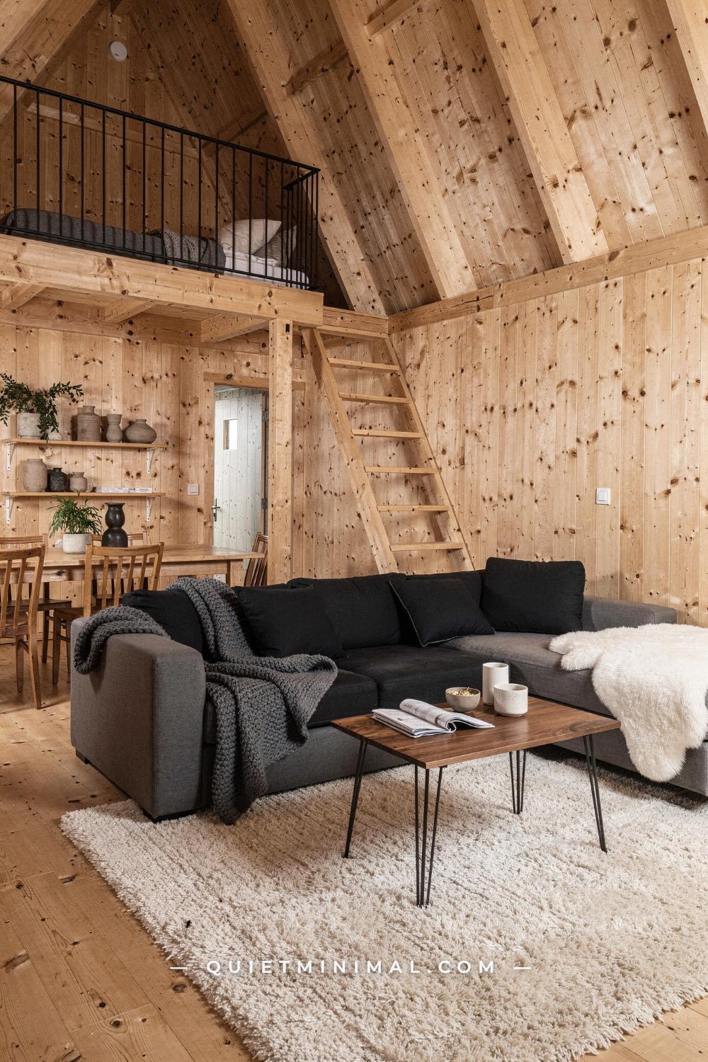
The appeal of an all-pine envelope is obvious. Light knotty pine tongue-and-groove on walls, ceiling, and floor creates a warm monolithic shell that reads as quintessentially Nordic. The problem is that “monolithic” tips into “oppressive” without deliberate material interruption. When every surface is the same species, the same tone, and the same grain direction, the eye has nowhere to rest. The room feels smaller than it is because there is no visual hierarchy telling the brain where a wall ends and a ceiling begins.
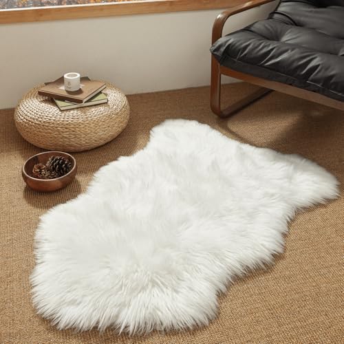
The fix is to introduce at least two materials that read differently from pine at the surface level. A cream shag rug, roughly 6 ft by 8 ft (180 by 240 cm), grounds the seating zone and breaks the floor plane without importing a new color. A white sheepskin draped over a slim daybed provides a second tactile break, introducing a soft-white note that makes the pine read warmer by contrast rather than overwhelming by repetition. The furniture should stay low, in the 14- to 16-in (35 to 40-cm) seat-height range, so the gable volume reads tall above it. A walnut coffee table on hairpin legs, kept to around 40 in by 20 in (100 by 50 cm), introduces a darker wood tone that anchors without competing.
The rule of thumb: in any all-wood room, you need a minimum of three distinct surface categories: the wood envelope itself, a hard non-wood surface (stone, metal, glass), and a soft textile layer. Two out of three and the room looks unfinished. All three and the material story resolves.
Key Takeaway: A pine-clad room needs at least two distinct material counterpoints to read as designed rather than unfinished.
From the guides
You've saved it, wanted it. Here's the how: codes, measurements, order. Your choices make it yours.
 The Japandi Honest PlaybookThe honest version of the style: what to keep, what to skip, and the order to do it in.See inside →
 The Room Refresh PlaybookA repeatable four-step method, room by room, in ten minutes, thirty minutes, or one weekend.See inside →
 Make Any Room Feel Cozy on PurposeWhy some rooms hold people and others empty out, and the moves that change it.See inside →

Mistake 2: Ignoring the Floating Stair as a Vertical Design Element
 Save
A floating open staircase in a full-pine A-frame is one of the most architecturally powerful elements in any barn house interior. Most people treat it as infrastructure: something to finish safely and move on from. That is the mistake. The stair is the room’s vertical spine, and what surrounds it, the lighting cluster above, the landing window framing, the rug below, determines whether the whole volume reads as considered or merely functional.
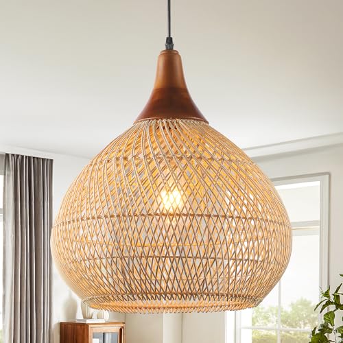
The correction starts with the pendant position. In a high honey-pine gable, a cluster of three woven-sphere pendants at staggered heights, each roughly 14 in (35 cm) in diameter, centered above the stair void is not decorative excess. It is structural: the pendants bring the eye down from an otherwise blank ceiling plane and give the double-height space a focal point other than the stair treads themselves. The drop lengths should vary by at least 8 in (20 cm) between the shortest and longest to read as intentional rather than accidental. Braided floor cushions at roughly 20 in by 20 in (50 by 50 cm) each placed at the stair foot create a landing zone that acknowledges the threshold between the ground-level lounge and the upper shelf.
The second error is overlooking the gable window at the landing. A single pane framing one pine tree at stair-top height performs the same function as a piece of art would on a conventional wall. It is framing the exterior as content. The frame should be unobstructed: no blinds, no sheer, nothing between the glass and the tree line. A woven jute-blend rug, roughly 6 ft by 8 ft (180 by 240 cm), beneath the seating cluster grounds the composition from below. The entire vertical stack: rug, cushions, stair, pendants, window, reads as a single designed composition when those five elements are treated as a unit rather than independent choices.
Key Takeaway: The staircase in a barn house A-frame only works as a focal point when the lighting, the landing, and the window above it are designed as a single vertical composition.
Mistake 3: Mixing Too Many Tile Families in One Bathroom
 Save
A bathroom in a Scandinavian barn house has one of the most generous material budgets in the whole building, which is exactly why it is where the most damage is done. The common failure is layering tiles from incompatible families: glossy subway on the shower wall, matte large-format on the floor, a patterned mosaic in the niche, and a stone vanity top that belongs to yet a fourth material world. The result reads as a showroom floor sample, not a room.
The correction is to choose one hero tile and let it dominate. Handmade vertical subway tiles in a sage-olive green, run floor-to-ceiling behind a frameless glass panel, create a complete backdrop rather than an accent moment. Everything else in the room then exists in service of that decision. A speckled terrazzo floor is acceptable as a second surface because terrazzo already contains multiple tones and reads as a neutral field, not a competing pattern. The vanity countertop in a smooth travertine ivory brings in a third material, but travertine and terrazzo share the same earthy register so they do not fight each other.
The brass detail is where most people over-apply. One rain showerhead and a single wall-mount faucet are enough. The antique brass finish bridges the warmth of the olive tiles and the ivory stone. A terracotta vase around 12 in (30 cm) tall with olive branch stems placed on the vanity edge provides organic colour that echoes the tile without repeating it exactly. A Berber flat-weave runner, roughly 24 in by 60 in (60 by 152 cm), in cream and charcoal placed outside the shower zone gives the bare foot somewhere to land and introduces the only pattern in the room. Four surfaces, one palette register, no tile fighting another: that is the formula.
Key Takeaway: Choose one dominant tile family, then select all other surfaces from the same earthy or tonal register so the bathroom reads as a single considered material story.

Mistake 4: Using the Same Wall Treatment Across the Full Gable Height
 Save
One of the most distinctive features of a modern Scandinavian barn house is the high gable ceiling: light pine cladding at the apex, white plaster walls below. The mistake is treating this as a concession rather than a choice. Many owners cover the entire wall in pine from floor to ridge, eliminating the contrast that makes the gable feel both tall and livable. Others plaster everything white, losing the warmth of the wood ceiling that makes the space feel Nordic at all.
The two-zone approach, pine from the ridge down to roughly the 10-ft (300-cm) mark, then white plaster beneath, is not an accident of barn house building. It is the design logic. The pine apex reads as the sky of the room; the plaster walls below read as the walls. They perform different visual functions. Charcoal flat-front kitchen cabinetry behind the open-plan living area works because it reads against the white plaster zone, not against the pine apex. If the cabinetry were pine-adjacent, it would disappear into the ceiling. If the ceiling were all plaster, the cabinetry would have no warm foil to work against.
The furniture choices in this zone work the same way. A grey linen L-shaped sectional in the range of 110 in by 80 in (280 by 200 cm) sits against the plaster zone and stays neutral. Three hanging cone-shaped wooden pendants over the kitchen zone, at a drop of 28 to 32 in (70 to 81 cm) above the island surface, pull the wood of the ceiling down to human scale without importing another material. A light oak plank floor throughout ties both zones to the same warm base so they read as one house, not two different material worlds stacked on top of each other.
Key Takeaway: In a gable barn house, the pine-to-plaster transition point is a deliberate design decision: respect it rather than resolving it with a single uniform surface.

Mistake 5: Letting the Reclaimed Truss Ceiling Be the Only Drama
 Save
The exposed king-post truss ceiling in a triple-height barn conversion is the most photogenic element in the room, which is exactly why it becomes the only element people design. The walls get whitewashed planks or fieldstone without further thought; the floor gets picked wide-plank; the furniture is positioned to look good in a photograph of the ceiling. The result: a room that photographs well from above and lives poorly from inside.
The mechanism of failure is the absence of a horizontal anchor. When every element in a room is vertical, whether a king-post truss, a fieldstone chimney wall, or tall copper dome pendants, the eye never settles. It keeps scanning upward and finding more vertical information. What is missing is a strong horizontal that commands attention at human scale.
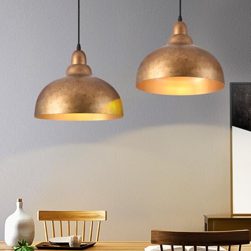
In a great room with aged grey-brown timber trusses spanning a cathedral volume, the reclaimed-wood farm dining table is that horizontal. At roughly 120 in by 40 in (305 by 100 cm), it is long enough to be read as a piece of architecture, not just furniture. The three copper dome pendants at 18 in (46 cm) diameter hang low from the rafters, 28 to 32 in (70 to 81 cm) above the tabletop, completing a vertical-to-horizontal handoff: your eye travels down the truss, along the pendant cord, onto the table surface, and then rests. That is the sequence. Without the low pendant drop and the commanding table beneath it, the eye keeps rising and never finds a place to stop. Wire-frame black steel dining chairs keep the horizontal zone visually light so the table reads as the feature rather than a heavy mass.
Key Takeaway: In a high-truss barn interior, counterbalance every vertical element with a strong horizontal at human scale: a long table, low pendants, and an anchor rug beneath.
Mistake 6: Treating the Concrete Column as an Obstacle Instead of an Anchor
 Save
In a Nordic barn house with an open-plan layout, the raw concrete chimney column is the most architecturally specific element in the space. It is also the one most owners try to soften, hide, or decorate away. They wrap it in shelving, paint it, or surround it with enough furniture that it disappears. That is backwards. The concrete column’s job is to be the hardest, most structural thing in the room, so everything soft and warm around it gains meaning by contrast.
The matte black flat-front kitchen island and cabinetry work in the same tonal family as the raw concrete: dark, hard, material. Placing them in the same sightline creates a dark-material axis through the open plan that gives the room a spine. Against this spine, the pale ash gable rafters and white plaster ceiling perform their warmth function more clearly. The grey bouclé sectional with a white sheepskin throw and wishbone chairs at a pale oak dining table introduce softness and organic texture in the living and dining zones. These materials need the concrete column as a counterpoint; without it, the bouclé just reads as expensive grey furniture.
The tan leather lounge chair at the far edge of the plan is a deliberate distance marker: it tells the eye where the lounge zone ends and the dining zone begins, an important function in a single-volume open plan. A single candle on the dining table performs a hygge function that no overhead fixture can replicate: it introduces a flame-scale light source in a room that might otherwise feel institutional. The horizontal landscape window behind the kitchen, framing a snow-covered birch forest, is framed best when the cabinetry below it is kept to a single dark plane rather than broken up with open shelving.
Key Takeaway: The concrete column is the room’s hardest material on purpose: frame it with dark kitchen elements on one side and soft upholstered textures on the other, and it becomes the design anchor rather than an awkward obstacle.

Mistake 7: Over-Whitening an All-White Barn Until It Loses All Warmth
 Save
The all-white Scandinavian barn is a real and defensible design choice, but it requires one thing to work: the white must have a warm undertone, and the only non-white material in the room must carry enough warmth to stop the interior from reading as bleached. The mistake is choosing a blue-white or a cool neutral white for every surface and then selecting furniture that is also cool-toned, leaving the room with no warmth register at all. This is the difference between a spa and a laboratory.
The correction starts with the wood. In a white cathedral barn with shiplap ceiling painted white and white-painted exposed timber beams, pale blonde oak is the only material doing the warmth work. If that oak is too light, too bleached, or replaced with a cool-toned engineered floor, the room reads clinical. The oak floor, the oak dining table, and the low oak coffee table are a thermal trio: they collectively generate enough warm wood presence to balance an entirely white envelope. The sculptural white fan-shaped pendant at roughly 24 in (60 cm) diameter reads as art rather than lighting when the room is otherwise white-on-white; it creates tonal interest at ceiling level without importing color.
The singular wooden bowl on the low coffee table and the jute area rug at around 8 ft by 10 ft (240 by 300 cm) perform the same warmth function at floor level. The jute is not decorative in the way a patterned rug would be: it is a warmth-carrier, a natural fiber that shifts the room’s temperature reading from “all white” to “white with earth.” Remove it and the floor feels like a gallery. Keep it and the room feels like someone actually lives there.
Key Takeaway: In an all-white barn interior, warm-toned pale oak and natural fiber textiles are load-bearing design decisions, not optional additions.

Mistake 8: Undersizing the Glazing in a Full-Gable Window Wall
 Save
A mountain chalet or alpine-modern barn with full-height black-framed glazing across the entire gable wall is the most dramatic version of this interior type. The mistake is not doing it: it is doing it halfway. Half-height windows, a single central pane flanked by opaque wall, or frames that are too thin to read at scale from inside the room all produce the same result: the view is present but the room is not in dialogue with it. The mountain valley panorama reads as a picture hung on the wall rather than a landscape you are inside.
The frame weight matters more than most people expect. Black steel frames in a warm amber pine gable ceiling should be substantial enough to cast a shadow on the interior floor plane. Frames that are too thin read as window tape from across the room. The structural interplay between the warm amber pine boarding overhead and the charcoal leather deep sectional below creates the contrast the room needs. At roughly 120 in by 80 in (305 by 200 cm), the charcoal leather sectional is heavy enough to anchor the floor against the weightless panorama beyond the glass.
The copper industrial arc floor lamp at around 65 in (165 cm) tall performs a crucial function: it introduces a warm metallic note that bridges the amber pine ceiling and the charcoal seating without requiring a second color family. The log stack beside the black steel firebox column, kept to roughly 24 in (60 cm) wide, is not decoration. It is a visual weight on the left edge of the room, the side without glass, that provides compositional balance. Without it, the room tips visually toward the glazed wall and never comes back. A grey area rug grounds the seating plane and gives the room a floor without competing with the mountain view that the glass provides.
Key Takeaway: Full-gable glazing only works as a design move when the interior framing, the anchor furniture weight, and the edge elements on the non-glass side are heavy enough to hold the room in balance.

Mistake 9: Positioning the Wood Stove Without Considering the Hearth Zone
 Save
A black cast-iron wood-burning stove in a farmhouse barn interior is not a product purchase, it is a room composition decision. The mistake is treating it as the latter only after treating it as the former. People buy the stove, position it against whatever wall has the chimney flue exit, place a log basket beside it, and call the hearth done. What is missing is the full zone around the stove that makes it read as the room’s anchor rather than a large black appliance.
The raised stone hearth is non-negotiable in this reading. Even a modest 6-in (15-cm) raised base shifts the stove from floor-placed object to architecturally considered element. The exposed brick chimney column behind it adds height and a rough material counterpoint to the white shiplap walls. Both the stove and the brick column read better because the white shiplap board surface behind them is the flattest, smoothest surface in the room: the roughness of the iron and the brick becomes legible against that smooth white backdrop.
The round solid walnut coffee table at roughly 36 in (90 cm) diameter with turned legs should face the stove, not the television wall, in a room that has a wood burner as its hearth. This orientation tells every guest what the room is organized around. Aged brass wall sconces flanking the stove zone perform a critical lighting function: they provide warmth-temperature light (around 2700K) at exactly the level where firelight would naturally fall, 4 to 6 ft (120 to 180 cm) from the floor, which means the stove zone reads as lit even when the fire is not burning. French double doors at the room’s edge maintain sight lines while containing the volume. A jute flat-weave rug beneath the sofa anchors the seating zone without competing with the rawer textures at the hearth.
Key Takeaway: Position the wood stove as the room’s organizational anchor, not as a heating appliance; the raised hearth, the chimney column, and the flanking sconces are what give it that status.
Mistake 10: Choosing a Sectional That Fights the Scale of the Gable Volume
 Save
A full-wood-clad gable envelope with low cloud sectional seating is a composition that requires proportional discipline. The mistake is selecting a sofa with a back height that competes with the gable volume rather than deferring to it. A sofa back at 36 in (90 cm) or above in a room with a 20-ft (600-cm) ridge reads as a wall inserted into the space rather than a piece of furniture placed in it. The room feels divided rather than open.
The low cloud sectional at roughly 120 in by 90 in (305 by 230 cm) works because its back sits at or below 28 in (70 cm), which keeps the entire upper volume of the warm amber cedar or pine gable visible from any seated position. This is the wood-cocoon effect: you sit inside the wood shell, not behind a sofa that blocks your view of it. The white linen upholstery performs two functions simultaneously. It is the lightest material in the room, which keeps the seating zone from visually compressing the warm wood ceiling above. And it is the material that most clearly differentiates the seating zone from the wood-on-wood context around it.
The square solid teak coffee table at roughly 40 in by 40 in (100 by 100 cm) is scaled for a cloud sectional: big enough to serve four people at the corners, proportional to the wide low sofa frame. A woven rattan basket on the table at around 14 in (35 cm) in diameter introduces a smaller organic texture that reads as natural and considered without requiring a styled moment. The copper dome pendant over the dining zone, visible from inside the lounge, gives the eye a warm metallic destination at the back of the plan. The white subway tile backsplash in the kitchen zone behind, with warm oak cabinetry, keeps that zone reading as part of the same warm palette envelope without competing for attention.
Key Takeaway: In a tall wood-gable interior, choose a low-back sectional at or below 28 in (70 cm) seat back height so the wood envelope remains the dominant visual experience.

Mistake 11: Treating the Asymmetric Two-Tone Gable as a Problem to Hide
 Save
An asymmetric gable ceiling with one slope in warm pine and the other in a dark charcoal-stained oak is one of the most architecturally interesting moves available in contemporary Nordic barn design. Most people who encounter it either decide to stain both sides to match (losing the contrast entirely) or leave it as-is with no corresponding logic in the furniture below (leaving it feeling accidental). Both choices miss the opportunity.
The two-tone ceiling works because it creates a visual divide that the open-plan furniture can follow. The lighter pine slope corresponds to the more social zone: the grey modular sectional at roughly 110 in by 80 in (280 by 200 cm) sits beneath it, and its natural light overhead makes the seating feel open and inviting. The darker charcoal-stained oak slope corresponds to the more functional zone: the dark graphite flat-front full-height kitchen cabinetry sits beneath it, and the tonal relationship between ceiling and cabinetry reads as intentional rather than coincidental.
The rattan globe pendants at around 16 in (40 cm) in diameter staggered at three different heights in the transition zone between the two ceiling halves perform an important mediating role. They are the element that acknowledges the ceiling shift explicitly, marking the threshold between the lighter-above and darker-above zones. Olive green cushions and a knit throw on the grey sectional introduce a muted natural color that bridges the warm pine and the dark charcoal. Polished concrete floor throughout connects both ceiling zones to the same hard plane below. A Monstera plant in the foreground introduces organic green at standing height, which is the one vertical element at human scale that reads as living rather than architectural. The full-height glazing on the right reveals a meadow view that brings exterior light into the darker ceiling zone.
Key Takeaway: An asymmetric two-tone gable only reads as designed when the furniture zones below it deliberately correspond to the two ceiling halves.

Mistake 12: Adding a Kitchen Accent Wall Without Considering Its Relationship to the Glazed Apex
 Save
A honey pine accent panel behind the cooking wall in a white plaster kitchen is a popular Scandinavian barn move. The failure mode is placing it without accounting for how the glazed apex triangle above it will handle the transition between pine board and plaster ceiling. When the accent panel simply stops at ceiling height and meets raw plaster with no considered join, the wall reads as applied cladding rather than an integrated architectural decision.
The glazed apex is the light source in this kitchen: bright overcast light from the structural glass panels overhead floods down across the honey pine accent wall, and the transition between the two must read as part of the same building logic. The way to achieve this is to run the honey pine accent panel floor to ceiling in a clean, non-distressed board, without any cap rail or break, so the boundary between board and plaster is a crisp material edge rather than a sloppy one. The grey weathered-ash textured pillar in the foreground works as a third material moment because it is positioned at a structural point, not randomly. A trailing pothos vine on the pillar introduces green without requiring a separate plant arrangement.
The white handleless kitchen island at roughly 96 in by 40 in (244 by 100 cm) with white quartz countertop keeps the work surface plane neutral so the honey pine accent wall can carry its visual weight without competition. Large-format grey porcelain floor tiles at around 24 in by 24 in (60 by 60 cm) prevent the floor from becoming busy in a room with multiple surface finishes at wall level. The black slider window to the garden at roughly 48 in by 36 in (120 by 90 cm) provides a moment of negative space in the honey pine wall: it is the window that earns the accent panel its visual value, because without it, the panel would read as solid boarding rather than a deliberate background.
Key Takeaway: A kitchen accent pine panel only integrates cleanly into a barn house interior when it shares a crisp material edge with the ceiling above it and a window cut-out that gives it architectural purpose.

Mistake 13: Installing an Exposed Brick Chimney Without Resolving the Floor Material Below It
 Save
An exposed brick chimney column in a barn conversion carries enormous visual weight. The mistake is running the same herringbone dark brick floor beneath it that continues throughout the room without a material break, effectively dissolving the chimney base into the floor and losing the vertical reading of the element. The chimney should feel as though it rises from a distinct base plane, not from the general floor.
In a white-plaster gable with natural oak collar-tie trusses, the round pale oak coffee table at roughly 36 in (90 cm) in diameter with turned legs placed in front of the chimney establishes the visual base the brick needs. The table sits in the same warm-honey register as the trusses above, creating a top-and-bottom echo that contains the chimney column between two oak references. The cream bouclé sofa facing the chimney establishes a hearth orientation: the room’s seating is organized around the chimney wall, which is exactly how the brickwork earns its design weight.
The black five-arm candelabra chandelier hung centrally from the high gable, at roughly 24 in (60 cm) in diameter, introduces another dark vertical element that echoes the black cast-iron stove below without exactly matching it. This tonal rhyme between chandelier and stove is what makes both elements feel chosen rather than accumulated. Dried flowers in a dark vase on the coffee table maintain the artisanal quality of the exposed brick and raw oak without requiring fresh arrangements. Long cream linen curtains at the full-height black-framed gable window soften the entry of countryside light so the brick chimney reads as warm rather than industrial in the afternoon exposure.
Key Takeaway: An exposed brick chimney column needs a distinct furniture zone beneath it and a dark tonal echo above it to read as a deliberate vertical design element rather than a structural leftover.

Mistake 14: Using Matte Black Walls Without a Countering Warm Surface at Eye Level
 Save
Matte black walls in a Scandinavian barn kitchen are one of the most graphic moves in the genre: the flat dark plane against a light blonde pine gable ceiling creates a visual drama that renders beautifully. The failure happens when the matte black is applied everywhere at lower wall level, including the countertop, the shelving, and the window frame, leaving no warm surface at eye level to stop the room from reading as oppressive below the ceiling line.
The pale oak butcher-block island at roughly 84 in by 36 in (213 by 90 cm) is the correction. Its warm raw wood grain against the flat matte black walls is a two-texture dialogue that functions better than any decorative element placed on the walls. The contrast is strikingly simple because it involves only two materials: matte black and pale oak. Three woven-rush bar stools with black hairpin frames at around 28 in (70 cm) seat height continue the dark-frame language of the room without adding a competing material. The hairpin legs are the bridge: they are dark like the wall but open and light like the stool seat, so they do not read as wall-adjacent.
Two open oak shelves with white ceramic bowls and woven vases introduce a mid-wall moment that prevents the black from reading floor-to-ceiling on the shelf wall. A horizontal window to bare winter trees above the counter zone is the most important element in the room. It frames the exterior as a dark-and-white composition that extends the matte black and birch branch palette beyond the building envelope. The dried birch branch spray in a tall clear glass vase on the island brings that exterior palette inside without requiring seasonal swapping. Light wide-plank oak floor throughout prevents the room from tipping fully dark at the floor plane.
Key Takeaway: Matte black kitchen walls in a barn house require a warm wood surface at counter height, specifically a pale oak or butcher-block island, to prevent the lower half of the room from reading as a visual void.

Mistake 15: Neglecting the Transition Zone Between Staircase and Living Area
 Save
In a Scandinavian cabin interior, the hall or transition zone between the staircase and the living area is typically the shortest distance between two rooms in the entire plan, which is exactly why it gets designed last and least. The mistake is treating it as pure circulation: a path to move through rather than a space with its own visual logic. The result is a zone that looks blank on one side and chaotic on the other because neither the stair nor the living area knows where to stop.
The broad solid pine floating staircase with open risers ascending on one side of this transition zone is the major vertical element. Opposite it, at the center of the transition ceiling, a cluster of three rattan woven-sphere pendants at around 14 in (35 cm) in diameter each, at staggered heights, provides a ceiling-level focal point that is visible from both the staircase and the living area beyond. This pendant cluster is the spatial connector: it belongs to neither room and therefore belongs to both. Its position marks the threshold explicitly.
From the guides
You've saved it, wanted it. Here's the how: codes, measurements, order. Your choices make it yours.
The Japandi Honest PlaybookThe honest version of the style: what to keep, what to skip, and the order to do it in.See inside →The Room Refresh PlaybookA repeatable four-step method, room by room, in ten minutes, thirty minutes, or one weekend.See inside →Make Any Room Feel Cozy on PurposeWhy some rooms hold people and others empty out, and the moves that change it.See inside →The polished concrete floor in this transition zone reads as a hard grey plane that is distinct from the warm honey pine boarding on walls and ceiling. The contrast between the pine and the concrete does the heavy lifting that paint or tile would otherwise require. A dark dining table at roughly 72 in (180 cm) long partially visible on one edge anchors the dining zone without cluttering the transition. A black backless bar stool at about 28 in (70 cm) seat height introduces a vertical element in the dining zone that echoes the stair rail height. The small peaked gable window at the stair landing frames a single pine tree outside, which is the image that keeps drawing the eye upward and makes the staircase feel like a deliberate destination.
Key Takeaway: The transition zone between a staircase and living area in a barn house needs a ceiling-level focal point, typically a pendant cluster, that is visible from both rooms simultaneously.

Mistake 16: Hanging Pendants Too High Above the Dining Table
 Save
This is the single most correctable mistake in Scandinavian barn house interiors, and it is almost universal in gable-ceiling spaces. The height of the gable convinces people that pendants should be hung at the same proportional height as they would be in a room with an 8-ft (240-cm) flat ceiling. In a barn with a 16-ft (485-cm) ridge, that instinct produces pendants hovering 6 or 7 ft (180 to 210 cm) above the table, which means they are lighting the ceiling rather than the dining surface.
The correct target in any dining context is 28 to 32 in (70 to 81 cm) from the table surface to the bottom of the shade. This number does not change because the barn has a gable ceiling; if anything, the high volume makes low-hanging pendants more important, not less, because they are the only elements in the room bringing the scale down to human. Two matte black dome pendants at roughly 18 in (46 cm) in diameter over a live-edge solid oak dining table at about 72 in by 36 in (180 by 90 cm) need to be positioned at that 28 to 32-in (70 to 81-cm) drop height to actually illuminate the forsythia stems in the slim black cylinder vase and the wooden plates at each setting.
The pine tongue-and-groove ceiling angles toward the large black-framed window, so the pendant cord length will differ on each side of the table if the ceiling slopes. Account for this in the installation: both shades should land at the same height above the table surface, even if one has a longer cord than the other. The dark stone surface visible behind the dining zone functions as a backdrop that makes the warm pine ceiling and the matte black pendants read as a complete frame around the table. Black shell chairs with dowel legs keep the visual weight light around a live-edge oak table that already has strong visual presence.
Key Takeaway: In any barn house dining zone, hang pendants to land 28 to 32 in (70 to 81 cm) above the table surface, regardless of how high the gable ceiling is above.

Mistake 17: Choosing White Shiplap Walls and Then Stopping There
 Save
The all-white shiplap barn house interior is a clean and valid starting point. The mistake is treating it as a finished design move. An entirely white shiplap envelope, walls, ceiling, kitchen cabinets, and island, becomes optically flat because the absence of material contrast means no shadow play, no depth, and no visual warmth. The shiplap texture is doing all the surface work, and one surface doing all the work is not enough.
The correction is to anchor the white envelope with materials that are conspicuously not white. A reclaimed barnwood coffee table at roughly 60 in by 30 in (152 by 75 cm) introduces a weathered, grey-brown wood tone that is the maximum visual contrast to the pure white shiplap without leaving the natural material palette. Rattan dining chairs at the light wood table introduce woven organic texture: the rattan is warm, but it is not white, and that distinction matters in a room where everything else is. A jute flat-weave rug in the living zone at around 8 ft by 10 ft (240 by 300 cm) provides a ground plane that is textured, beige, and clearly not shiplap.
The full-height black-framed gable window and sliding glass doors to the summer green forest are doing critical color work here: the forest green beyond the glass is the only saturated color in the room, and it reads as a living feature through the white frame. This is the light source and the color source simultaneously. The simple white cone pendant overhead keeps the ceiling plane from becoming busy. Wide oak plank floors throughout stay warm enough to prevent the room from reading as a hospital corridor. The cream linen oversized sectional is the biggest soft surface in the room, and the word “cream” is doing real work here: it is slightly warmer than white, which is the difference between a room that reads as a considered retreat and one that reads as an unfinished construction.
Key Takeaway: An all-white shiplap barn interior needs at least three conspicuously non-white materials, in reclaimed wood, rattan, and natural fiber textiles, to read as warm rather than sterile.
Mistake 18: Placing Seating Too High Off the Floor in a Hygge-Oriented Barn
 Save
The hygge formula in a Nordic cabin barn interior is built around physical proximity to the floor. Ultra-low modular cream linen seating with cushions piled loosely, seated at 12 to 14 in (30 to 35 cm) from the ground, communicates a posture of relaxation that a conventional 18-in (45-cm) sofa seat height cannot. When people furnish a Scandinavian gable-ceiling barn with a standard sofa height and then wonder why the room does not feel as warm as the photographs they saved, this is usually the reason.
The ultra-low seating posture works because of what it reveals: the whitewashed pine boarding at the lower wall level, visible from seated height, shows the ceiling boards and the dark slate tile floor simultaneously in one sightline. You are surrounded by the room rather than elevated above the floor plane. The whitewashed finish on the pine boards, achieved through a limed or lime-washed treatment rather than a pigmented paint, keeps the boards pale and reflective rather than the orange-amber of untreated pine: this is what makes the room feel cool and Nordic rather than rustic-lodge.
The ultra-low reclaimed wood slab coffee table, at its minimal height, holds a wooden tray at about 18 in (45 cm) in diameter with three unlit tea-light holders and a stack of two or three books. Nothing is propped on a riser, nothing is styled for a photo shoot: the objects are functional, low, and reachable from a seated position on the floor-adjacent cushions. A white sheepskin on the dark slate tile floor beside the window provides a foot-to-floor transition that keeps the seated experience from feeling cold. The full-height black-framed gable window with heavy snow and white pine forest beyond is the hygge backdrop: it is the world outside, framed and observed from a position of warmth inside.
Key Takeaway: Genuine hygge seating in a Nordic barn interior requires a seat height at or below 14 in (35 cm): the posture of being close to the floor is what generates the enclosed, warmth-inside-winter feeling.
Mistake 19: Designing a Half-Glass Ceiling Without Resolving the Material Boundary
 Save
A contemporary barn house with one half of the gable roof in structural glass skylights and the other half in warm pine boarding is one of the most dramatic architectural moves in the modern Nordic genre. The failure happens at the boundary: the line where glass ceiling meets pine ceiling is typically a raw structural beam left exposed without any deliberate resolution, which makes the transition look like a construction joint rather than a design decision.
The boundary beam should be finished to match the darkest material in the room at that height. If the dark wall behind the shelving reads as a near-charcoal or deep navy, the boundary beam in that finish makes the transition from pine ceiling to glass ceiling feel like a choice rather than a compromise. The glass half floods the room with cool blue exterior daylight, and the pine half glows with warm overhead wood: the contrast between these two sky-planes is the room’s primary visual event. Everything in the furniture below should defer to it.
Two light grey modular sofas at roughly 90 in by 36 in (230 by 90 cm) each, facing each other across a round pedestal oak coffee table at about 36 in (90 cm) in diameter, create a furniture composition that is symmetrical and calm enough to let the ceiling duality perform. The round pedestal table is important: a rectangular table would introduce a second linear axis that competes with the linear boundary beam above. A small white ceramic vase with a minimal arrangement on the table keeps the surface from being styled to death. A large Bird of Paradise plant in the right foreground, at standing height, is the room’s only tall organic element and it works because it bridges the warm pine and the glass by being green: the plant reads as living nature from below the wooden ceiling and as a continuation of the forest visible through the full-height windows on the long wall.
Key Takeaway: In a hybrid glass-and-timber gable ceiling, the boundary beam between the two materials must be finished deliberately, not left as a raw structural element, for the ceiling duality to read as an intentional design move.

Mistake 20: Installing a Pine Ceiling Gable Without Resolving the Kitchen Zone Below It
 Save
A full-pine ceiling spanning both slopes of a high gable, uninterrupted from ridge to wall plate, is a beautiful starting condition for a Scandinavian open-plan barn. The mistake is leaving the kitchen zone below it without its own material anchor. When the pine ceiling continues directly above white quartz island and pale oak cabinetry without any ceiling-level distinction between zones, the kitchen blurs visually into the lounge behind it and neither zone feels resolved.
The white quartz island with a wood-clad base at roughly 72 in by 36 in (180 by 90 cm) is the kitchen’s material anchor. It is the hardest, brightest surface in the room: white quartz against warm pine boarding is the room’s central material contrast. The two grey bar stools at the island are the human-scale element that confirms this is a kitchen-to-lounge interface rather than a continuous lounge. A copper pendant light above the dining zone behind the island provides warm light at dining height: 28 to 32 in (70 to 81 cm) above the table surface, creating a distinct light pool that separates the dining zone from the lounge without a wall.
Pampas grass stems in a tall floor vase at roughly 48 in (120 cm) tall beside the sofa provide a soft organic vertical that breaks the pine wall plane at mid-height. Dried pampas adds a warm cream tone that echoes the pine without repeating it. The floor-to-ceiling black-framed windows on the right side of the room, running the full wall height, provide exterior light that warms the pine overhead differently at different times of day. Cream linen sofa and low coffee table in the foreground zone establish the seating area’s material language as separate from the kitchen’s hard-surface register. The two zones share the pine ceiling but have distinct floor-level identities.
Key Takeaway: In a full-pine gable open plan, the kitchen zone needs a hard-surface anchor, typically a white quartz or stone island, that is clearly distinct from the softer material register of the lounge beside it.

Mistake 21: Choosing Dark Weathered Pine Boarding Without Balancing the Interior Light Level
 Save
Dark weathered or fumed pine boarding on both the high gable ceiling and the walls of a mountain barn creates an immediately moody, dramatic interior. The failure happens when people apply this treatment to all four walls and the full ceiling without considering that dark boarding on every surface dramatically reduces the ambient light level. Rooms that appear richly atmospheric in afternoon sunshine become cave-like under overcast skies or after dark.
The resolution is not to reverse the boarding choice: it is to manage the light sources within the dark envelope. Recessed ceiling fixtures in the dark pine ceiling, positioned at the gable’s widest span, provide even ambient light that fills the room without casting harsh shadows. The two wide grey linen sectionals at roughly 100 in by 40 in (255 by 100 cm) each are the room’s palest furnishings: their mid-grey upholstery reflects the ambient light that the dark pine absorbs, which is exactly why the sectionals need to be a relatively light neutral rather than a deep charcoal. If both the pine and the upholstery were dark, the room would have no light-reflecting surface at any height.
The low live-edge oak slab coffee table at roughly 60 in by 30 in (150 by 75 cm) introduces the warm amber wood tone that the weathered pine has largely lost through its fuming or darkening process. The two dark ceramic bowls on the table at roughly 10 in (25 cm) in diameter each sit at the darkest point in the room’s material range: they read as near-black against the mid-grey linen and hold the composition together at the base. The stone-clad firebox integrated into the left wall, unlit, reads as a recess of warmth even before a fire is built. The mountain blue-grey panorama through the full-height black-framed gable window at dusk is the room’s primary light source at the end of the day and its primary design feature at every hour.
Key Takeaway: Dark weathered pine boarding on walls and ceiling requires deliberate placement of recessed ceiling fixtures and at least one pale-toned large furniture surface to maintain livable ambient light.

Mistake 22: Introducing a Statement Color Without a Structural Material to Hold It
 Save
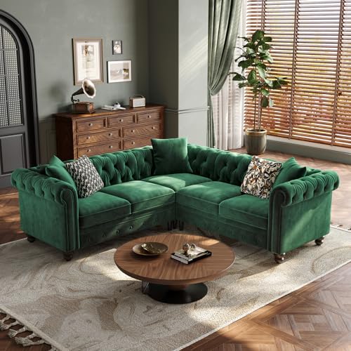
Green velvet in a white-plaster British barn conversion is a confident move. The failure mode is placing a green velvet L-shaped sofa in a white room without an equally weighted material on the opposite end of the room to prevent the sofa from becoming a sofa in a white room. When a single saturated color has no echo, no tonal companion, no surface in the same chromatic family anywhere else in the space, it reads as an accent piece that arrived from a different house.
The dark veined marble kitchen island at roughly 84 in by 36 in (213 by 90 cm) in the foreground of the same room performs this anchoring function for the green velvet sofa at the opposite end. Dark veined marble and forest green share the same earthy, complex, layered quality: they are not the same color, but they come from the same visual register. When you look across the room from the marble island, the green velvet sofa feels like the conclusion of a sentence that the marble started. The rough stone fireplace on the left wall adds a third dark material moment that prevents the room’s dark elements from being isolated to two opposite extremes.
The burnt-terracotta cushions on the green velvet sofa introduce a warm earth tone that echoes the mellow brick in the stone fireplace rather than competing with it. Long pale oak dining table with wishbone chairs and rush-seat stools in the dining zone connects to the honey oak collar-tie trusses above: trusses and furniture share the same warm grain register. The dried flower arrangement in a white ceramic vase at roughly 24 in (60 cm) tall on the marble island keeps that end of the room organic without requiring a live plant arrangement. Wide pale oak plank floors throughout provide the base that ties all four distinct materials, marble, green velvet, stone, and oak truss, to the same warm neutral ground.
Key Takeaway: A statement upholstery color in a barn conversion needs a structural dark material on the opposite end of the open plan to prevent it from reading as an isolated accent.
Mistake 23: Failing to Use the Bird’s-Eye Plan to Test the Furniture Layout Before Committing
 Save
In a barn house with a wide-open floor plan, a high pale birch or maple gable ceiling, and clerestory windows running along both sides of the ridge, the interior reads best when the furniture layout is logical from above. This is not an aesthetic concern: it is a circulation and zone-definition concern. When you look down into the open plan from an upper landing or mezzanine and the furniture reads as clusters scattered without a clear logic, that reading carries into the room itself.
The open-plan three-zone formula for a barn house is: lounge zone anchored by the sectional, dining zone anchored by the table and benches, kitchen zone anchored by the island. In the plan described here, the hunter green deep sectional at roughly 110 in by 80 in (280 by 200 cm) faces the TV wall and clearly defines the lounge zone through its orientation. The oak dining table with two long benches at around 72 in (180 cm) each and two black tulip-base chairs defines the dining zone through its seating configuration: the mixture of benches and chairs confirms that this is a sociable eating surface rather than a work or display table.
Two matte black dome pendants at roughly 16 in (40 cm) in diameter over the dining zone make the zone legible from above as well as from within: the pendant placement reads as a deliberate light zone above the table rather than general ceiling lighting. The black cast-iron wood stove on the right side of the plan anchors the living zone’s far edge and provides the hearth orientation that prevents the hunter green sectional from appearing to face an empty corner. The pale birch ceiling boards against the white plaster walls create a light-on-light ceiling that keeps the volume feeling generous rather than compressed under a dark overhead plane.
Key Takeaway: Test the barn house furniture layout from above before finalising it: the three-zone structure of lounge, dining, and kitchen should read as clear and distinct from a bird’s-eye view.

Mistake 24: Over-Decorating a Restrained Nordic Palette Until It Reads as Eclectic
 Save
Nordic minimalism in a barn house interior is an exercise in material restraint that most people abandon at the accessory stage. The broad decision is usually right: pale bleached oak ceiling, pure white plaster walls and fireplace column, black steel frames, summer forest through the glass. It is the final 10 percent of the design, the accessories, art, plants, and tabletop objects, that undoes the restraint. Too many object families, too many plant species, too many vase shapes and sizes, and the ultra-restrained three-material palette is suddenly hidden behind a styling session.
The correction is to resolve to a maximum of three object categories per zone. In the kitchen zone: two round-seat oak bar stools at the island, two white globe pendants at roughly 12 in (30 cm) in diameter overhead, and a single small white ceramic vase with a minimal arrangement at roughly 8 in (20 cm) tall on the island. Three categories: seating, lighting, object. In the living zone: the light grey sofa, the bleached oak floor, the fireplace column. The floor-to-ceiling black-framed windows to the dense summer green forest perform the color and organic life function that indoor plants would otherwise crowd the room to achieve.
This is the most counter-intuitive feature of Nordic minimalism in a barn house: the windows replace the plants, the forest replaces the accessories, and the wood grain replaces the art. Every time you add an object inside a room like this, you are competing with the landscape outside. The pale bleached oak on the asymmetric gable ceiling slope provides enough visual warmth and grain interest to eliminate the need for a gallery wall, a shelf of ceramics, or a cluster of frames. Accepting this is what separates a Nordic barn house interior that reads as designed from one that reads as a half-finished renovation with good bones.
Key Takeaway: In a Nordic minimalist barn house, the exterior view through the gable windows is doing the decorative work that indoor accessories would otherwise do: resist adding objects that compete with the landscape.

Mistake 25: Treating the Barn House Exterior as a Passive Shell Rather Than an Active Design Element
 Save
A Scandinavian barn house interior that is beautifully resolved but positioned in a flat meadow with no exterior design logic reads as a box dropped in a field. The exterior material choices need to establish the interior’s material palette before anyone walks through the door. When the dark charcoal standing-seam metal roof and the warm vertical cedar cladding on the exterior set up a dark-and-warm material contrast, the interior’s matte black frames and honey-tone pine boarding feel inevitable rather than arbitrary.
The standing-seam metal roof in dark charcoal is the exterior’s loudest material statement. It is a flat, industrial surface that carries significant visual weight when viewed from the three-quarter angle showing both the gable end and the long side elevation. The warm vertical cedar cladding on the mid-section, with its directional grain and natural warmth, is the counterpoint: it is the exterior version of the pine ceiling boarding inside. The large black-framed gable window wall at one end is both an exterior feature and an interior light source: from outside, it reads as a lantern at dusk when interior warm light glows through.
The sliding timber-framed patio door at roughly 96 in by 84 in (244 by 213 cm) in the cedar section provides the physical connection between the interior and the grey-green meadow. When this door is left without a material transition at threshold level, the move from exterior to interior reads as abrupt. A poured concrete step or a flush threshold in the same timber as the door frame resolves the passage without requiring a full entry hall. The silver birch trees in the meadow setting provide the exterior’s equivalent of the interior’s sheepskin: a soft, organic, seasonal texture that contextualizes the industrial metal roof above them.
Key Takeaway: The exterior material palette, dark charcoal metal against warm vertical cedar, must directly anticipate the interior’s material story so the building reads as coherent from the meadow through to the living room.

Mistake 26: Installing a Vaulted Timber Ceiling Without Calibrating the Glazing-to-Wood Ratio
 Save
The final and most architecturally significant mistake in the Scandinavian barn house interior is misjudging the proportion of floor-to-ceiling glazing relative to the horizontal blonde oak ceiling boarding that defines the room. The formula is this: the glazing provides the light and the landscape, the wood ceiling provides the warmth and enclosure. Too much glazing and the room feels exposed rather than enveloped; too little and the room is dark and the wood ceiling works against itself, absorbing the insufficient light rather than glowing with it.
The soaring vaulted ceiling clad entirely in horizontal blonde oak boards, with the boards running parallel to the ridge and spanning the full width, catches and diffuses the bright summer window light from the full floor-to-ceiling black steel frame glazing on the left wall. The boards’ horizontal grain becomes directional: the eye is drawn along the ceiling toward the ridge, which in turn pulls the eye toward the gable end, and from there outward through the forest-view glass. This is the circuit the room creates when glazing and timber ceiling are in the right ratio to each other.
The white quartz waterfall kitchen island at roughly 60 in by 30 in (152 by 76 cm) is the hardest surface in the room and sits at the most human-scale point: hip height. Its smooth reflective plane catches the summer window light and distributes it into the room’s interior zone. Two round oak bar stools at roughly 18 in (46 cm) seat diameter continue the oak warmth at the island without requiring additional material introductions. The small recessed fireplace in the white plaster surround on the right wall provides visual warmth even unlit: the recess creates a shadow that reads as depth in an otherwise flat plaster plane. Two matte black sphere pendants at around 10 in (25 cm) in diameter dropped from the high oak ceiling define the kitchen zone from below. The grey linen compact sofa in the foreground keeps the lounge zone’s material language subordinate to the oak ceiling and the forest beyond: it is the room’s quietest element in the room’s most spectacular setting.
Key Takeaway: In a vaulted blonde oak barn ceiling, calibrate the floor-to-ceiling glazing area to match or slightly exceed the solid wall area, so the timber ceiling receives enough natural light to glow rather than absorb.

The Scandinavian barn house interior genre has a short list of things that consistently go wrong, and most of them share the same root cause: treating one strong element as a complete design move rather than as the starting point for a material conversation. The pine envelope needs the concrete or the wool. The dark stove needs the raised hearth and the brass sconces. The gable glazing needs the dark anchor furniture on the opposing wall. Go back through your space with this list and identify which of these conversations your room is currently having without completing. Pick the two or three corrections that are most actionable right now, whether that is dropping your pendants to 30 in (76 cm) above the table, pulling in a genuine sheepskin, or resolving that unfinished material boundary at the ceiling transition. Start there, and the rest of the room will follow.
From the guides
You've saved it, wanted it. Here's the how: codes, measurements, order. Your choices make it yours.
The Japandi Honest PlaybookThe honest version of the style: what to keep, what to skip, and the order to do it in.See inside →The Room Refresh PlaybookA repeatable four-step method, room by room, in ten minutes, thirty minutes, or one weekend.See inside →Make Any Room Feel Cozy on PurposeWhy some rooms hold people and others empty out, and the moves that change it.See inside → Save