 Georgia
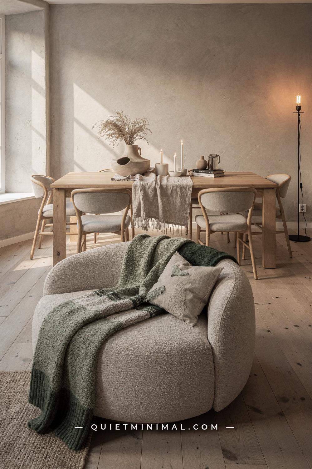
You pulled every reference photo you loved. Light wood, clean lines, neutral walls, a few carefully chosen objects. But when you step back and look at your actual room, something is off. It reads clinical instead of calm. Sparse instead of serene. You followed the formula, so why does it feel like a waiting room?
The answer is that most Scandinavian design guides tell you what the style looks like without telling you why the underlying principles work. That gap is where the mistakes live. Nordic interiors look effortless in photographs because each decision is doing precise structural work: specific wood tones that hold warmth, a particular number of light sources, furniture scaled to leave intentional negative space. When any one of those elements is off by a degree, the whole room tips from “calm” to “cold.” This article walks through 12 of the most common Scandinavian design mistakes, explains the physical or proportional reason each one fails, and gives you a concrete fix for every single one.
The All-White Wall That Drains the Room of Warmth
 Save
The first place most people go wrong is choosing the brightest white on the paint chip. The logic seems sound: Nordic rooms in photos look pale and light-filled, so white must be the base. The problem is that most of those rooms are photographed in Scandinavian climates with a specific quality of cool northern light that makes pure white read as luminous. In a home in Los Angeles, Chicago, or New York with different light angles, different window sizes, and often warmer interior bulbs, pure white reads as flat and slightly clinical. The room does not look bright; it looks bleached.
The structural reason is color temperature. Bright white paint reflects every frequency of light equally, including the cool, slightly blue cast of fluorescent overhead fixtures and morning direct sun. Warm neutrals, by contrast, absorb and re-emit that same light with a golden filter. The room appears to glow rather than glare. Benjamin Moore’s Pale Oak (OC-20) has become the go-to replacement for pure white in Scandinavian-leaning interiors today precisely because it sits in that warm putty register. Sherwin-Williams Accessible Beige (SW 7036) and Farrow and Ball’s Elephants Breath (No. 229) serve the same function: they read as near-neutral to the eye but eliminate the cold cast entirely.
The fix is not to go dramatically darker. A shift of two to three shades toward warm putty, warm white, or soft greige is enough. Paint a single large board (at least 12 inches by 24 inches, or 30 cm by 60 cm) and live with it on the actual wall for three days before committing. Watch it at 8 a.m., at noon, and at 7 p.m. with lamps on. If the board still reads warm or neutral at all three times, it will work. If it flips gray-blue under artificial light, move warmer.
From the guides
You've saved it, wanted it. Here's the how: codes, measurements, order. Your choices make it yours.
 The Japandi Honest PlaybookThe honest version of the style: what to keep, what to skip, and the order to do it in.See inside →
 The Room Refresh PlaybookA repeatable four-step method, room by room, in ten minutes, thirty minutes, or one weekend.See inside →
 Make Any Room Feel Cozy on PurposeWhy some rooms hold people and others empty out, and the moves that change it.See inside →
Key Takeaway: Pure white walls are a Scandinavian myth born from different latitudes; shift to a warm putty or greige tone and the room stops reading as cold.

The Single Overhead Light That Flattens Everything
 Save
This is the single most common technical mistake in Scandinavian interiors, and it produces the most dramatic fix once corrected. The typical starting point is one ceiling fixture, often a pendant or flush mount, doing all the work in the room. The result is a flat, slightly institutional light quality: everything at the same brightness, no shadows that add depth, no warm corners that invite you to settle in. The room looks lit rather than illuminated.
Nordic design approaches lighting as architecture, not as an afterthought. A well-executed Scandinavian room uses five to seven distinct light sources in a single space, positioned at multiple heights. That number is not a stylistic preference; it is a functional response to the long, dark Scandinavian winters that drove the entire design philosophy. More sources at lower heights mean pools of warm light rather than a single beam from above. The eye reads multiple warm pools as intimate and generous. A single overhead source reads as a task environment: a classroom, an office, a hospital corridor.
The formula is straightforward. Anchor the room with one pendant, positioned 28 to 32 inches (71 to 81 cm) above a dining or coffee table surface, so the shade sits at eye level when you are seated. Add a floor lamp in at least one corner with the shade top no higher than 60 inches (152 cm) from the floor. Place at least one table lamp on a sideboard, console, or side table so its light source sits between 18 and 22 inches (46 to 56 cm) above the surface. All sources should use bulbs rated at 2700K to 2900K, which is the warm amber range that reads as firelight rather than daylight. Dimmable circuits on at least two of those sources let you shift the room from daytime functionality to evening warmth without touching a single piece of furniture.
Key Takeaway: Replace a single ceiling fixture with a minimum of three light sources at staggered heights, all at 2700K to 2900K, and the room stops feeling institutional.

The Pale Birch Furniture That Loses Its Edge Against White Walls
 Save
The 2010s version of Scandinavian design ran on pale birch and whitewashed pine: the lightest, most washed-out wood tones available. When those pieces sit against white or near-white walls, they nearly vanish. The room looks unfinished. The furniture that should anchor the space blends into the background, and nothing has visual weight. That weightlessness reads not as Zen calm but as incompleteness.
Wood in Scandinavian design is not decorative: it is the primary source of warmth and visual contrast in a room built on neutrals. When the wood tone is too pale relative to the wall color, it loses its contrast function entirely. Think of it as a color equation: the wall is your lightest value, the floor and furniture are your mid-tones, and your textiles are your darkest and most saturated accents. When furniture and wall occupy the same value, the mid-tone tier collapses. The room reads as a single flat plane.
The current correction is to move to honey oak, oiled oak with visible grain, or smoked ash. These tones sit two to four shades darker than the whitewashed birch they replace, which is enough contrast to read clearly against a warm putty wall without darkening the room. The grain matters too: visible grain gives the wood a handcrafted reading that flat-grain veneer lacks, and that tactile quality is a core principle of current Nordic design. A bedroom platform bed in honey oak against a Pale Oak wall creates exactly the contrast ratio that makes the furniture register as a deliberate choice rather than a leftover.
When buying or replacing furniture, test the wood tone against your wall paint sample before committing. Hold the sample to the actual surface in your actual room light. If you can barely see where one ends and the other begins, the tone is too pale. You need to see a clear shift, at least three to four shades.
Key Takeaway: Pale birch against pale walls creates a flat room with no mid-tone anchor; shift to honey oak or oiled oak with visible grain to restore the contrast that makes Nordic rooms feel grounded.

The Furniture That Is Too Large for the Negative Space Around It
 Save
Negative space is not empty space waiting to be filled. It is an active design element in Scandinavian interiors, doing the specific job of making each piece of furniture read as chosen rather than landed. When furniture pieces are too large for the room, or positioned too close together, the negative space disappears. What replaces it is visual noise: a cluttered room that happens to have neutral colors, which is a contradictory and uncomfortable reading.
The failure mode looks like this: a sectional sofa that runs to within 8 or 10 inches (20 to 25 cm) of the side walls, a coffee table with only 12 inches (30 cm) of clearance to the sofa, and a media unit that spans the full width of the feature wall. Each individual piece might be beautiful. Together, they leave no room for the eye to rest, which is the opposite of what Scandinavian design is meant to deliver.
The proportional rules that create correct negative space are specific. Leave a minimum of 18 to 24 inches (46 to 61 cm) between the front of a sofa and the nearest coffee table edge. Leave a minimum of 36 inches (91 cm) between any furniture edge and a walkway. In a room under 12 feet (366 cm) wide, choose a sofa no longer than 84 inches (213 cm) and resist adding a chaise or sectional extension. In the bedroom, a platform bed should have a minimum of 24 inches (61 cm) of clear floor on both sides, which is the threshold between a room that breathes and one that feels squeezed.
The harder part of this fix is not the measurement: it is accepting that you may need to remove a piece of furniture rather than just rearrange it. A room with one fewer chair and 36 extra inches of clear floor will always read better than a room that is technically full of nice things. The empty floor is doing work.
Key Takeaway: Negative space is a structural element, not a decorating gap; measure 18 to 24 inches of clear floor on every furniture face and remove any piece that cannot meet that number.

The Single-Texture Room That Feels Like a Catalog Page
 Save
A room with beautiful furniture in matching materials and finishes reads as a showroom floor. The eye moves across it in a single pass and finds nowhere interesting to land. This is the catalog-page problem: technically correct, lifeless in practice. It happens when every soft surface is the same smooth fabric, every hard surface the same matte finish, and every object the same degree of craftsmanship. Nothing to touch, nothing to explore.
Texture in Scandinavian design serves a specific acoustic and visual function. Materials with surface variation, such as boucle, raw linen, ribbed wool, jute, honed stone, and rough stoneware, scatter light rather than reflecting it as a flat plane. A flat-woven linen cushion catches light differently from a chunky knit throw placed beside it on the same sofa. That visual difference is what gives the eye something to read, and the variation in surface warmth is what gives the body something to respond to. Smooth rooms feel impersonal because they offer no physical invitation.
The layering sequence for a Scandinavian living room runs in three tiers. The base layer is your large flat surfaces: a plain linen or wool rug in a tone slightly darker than the floor, sofa upholstery in a smooth weave. The mid layer is your contrast-texture pieces: a boucle or ribbed armchair, a jute or paper cord side table or storage basket, a coarse linen throw. The top layer is your handcrafted and rough-surface accents: rough stoneware vessels, a hand-thrown ceramic bowl, a woven rattan tray. Each tier should contrast with the one below it. If your base is smooth, your mid layer must have grain or pile. If your mid is woven, your top layer must be rough or matte-cast.
The current Scandinavian palette for this layering runs in warm naturals: oat, warm sand, pale flax, bone, and deep clay as a single accent. Avoid mixing more than one cool-toned material (gray, icy blue, silver) into the stack, or the warmth you are building collapses back to cold.
Key Takeaway: Plan texture in three deliberate tiers, smooth base, woven mid-layer, rough accents, so the eye has something to read and the room stops feeling like a catalog photo.

The Rug That Is Too Small and Breaks the Room Apart
 Save
A rug that is too small is one of the most visually obvious errors in any interior, and in a Scandinavian room it is particularly disruptive because the style relies on deliberate spatial zoning rather than visual clutter to define areas. A small rug under a large sofa grouping reads as a bath mat. It does not define the seating zone; it merely punctuates it, and the punctuation is wrong. The sofa legs that float off the rug’s edge create a visual chop in the sightline that the eye reads as disconnected.
The sizing rules are consistent and non-negotiable. In a living room, the rug should be large enough for at least the front two legs of every piece of seating to rest on it: for a standard three-seat sofa flanked by two armchairs, this means a minimum of 8 feet by 10 feet (244 cm by 305 cm), and in most suburban rooms a 9-by-12 (274 cm by 366 cm) performs better because it allows all four legs of the sofa to sit fully on the rug. Under a dining table, all chair legs must remain on the rug even when the chairs are pulled out: for a six-person table, that typically requires a rug at least 9 feet by 12 feet.
The correct way to shop for a rug is to tape out its footprint on the floor with painter’s tape before purchasing. Sit in the chairs. Push them back as if you have just finished a meal. If any leg leaves the taped zone, the size is wrong. Do this before you pay for shipping, because this mistake is expensive and heavy to correct.
In Scandinavian rooms, the rug material also carries the warmth function: flat-woven wool or jute in a warm oat or natural tone serves both the texture-layering principle and the acoustic softening of a room with hard floors, which are standard in Nordic homes. Avoid polypropylene materials with a sheen, which reflect light back up and compete with the room’s carefully considered warmth.
Key Takeaway: For a living room, buy the rug that fits all front sofa legs and both armchair legs on it simultaneously, and tape its exact footprint before purchasing to verify the size is right.

The Curtains That Hang at Window Level Instead of Ceiling Level
 Save
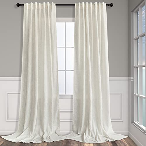
Curtains hung at window-frame height are one of the fastest ways to make a room look shorter and smaller than it is. The physics are straightforward: the eye reads the top of the curtain rod as the visual ceiling. If that rod is at 82 inches (208 cm) and the actual ceiling is at 96 inches (244 cm), you have given away 14 inches of perceived height. In a Scandinavian room that depends on spatial openness to feel calm, that lost height shifts the room from airy to compressed.
The correct position for a curtain rod in a Scandinavian interior is 3 to 6 inches (8 to 15 cm) below the ceiling line, or flush with the crown molding if one exists. The rod should extend 6 to 8 inches (15 to 20 cm) beyond each side of the window frame. Both of these measurements expand the perceived window size and push the visual ceiling up to where the actual ceiling is. The curtain panel length should reach the floor with a 1- to 2-inch (2.5- to 5-cm) break or very slight pooling. Panels that stop short of the floor, at window sill or below-sill height, read as a mistake in Scandinavian interiors, which treat windows as a primary architectural feature rather than a detail.
The fabric choice is the second error at this step. Heavy, lined, opaque curtains block natural light, which is the material that Nordic design is literally built around. The correct Scandinavian curtain is raw or pre-washed linen in a tone one to two shades warmer than the wall, unlined or very lightly interlined so daylight passes through it in a golden filter. If privacy is needed, add a sheer roller shade mounted inside the window frame and keep the linen panels as the visual layer only. A double-rod system allows both to operate independently without either compromising the room.
Key Takeaway: Mount curtain rods 3 to 6 inches below the ceiling and 6 to 8 inches wider than the window frame on each side; this single adjustment adds perceived height and width to the room at zero additional cost.
The Decor That Is Evenly Spaced Instead of Grouped
 Save
Even distribution of objects across a surface is a pattern the brain reads as mass-produced and untouched. When every shelf has four objects evenly spaced, every windowsill has two candles centered, and every console table has a matching pair at each end, the room reads as a retail display. There is no hierarchy, no tension, and no evidence that a person with particular taste made deliberate choices. The room feels like a showroom that has been left exactly as the merchandiser arranged it.
Scandinavian styling works through asymmetric grouping and deliberate empty space between groups. The rule of odd numbers, grouping objects in threes or fives, is the starting point but not the whole answer. The more important variable is contrast in height within a group: a very tall vessel beside a low squat bowl beside a medium-height candle creates a silhouette that has movement. Three objects of the same height, no matter how beautifully chosen, read as a row. A row is a retail convention, not a home.
From the guides
You've saved it, wanted it. Here's the how: codes, measurements, order. Your choices make it yours.
The Japandi Honest PlaybookThe honest version of the style: what to keep, what to skip, and the order to do it in.See inside →The Room Refresh PlaybookA repeatable four-step method, room by room, in ten minutes, thirty minutes, or one weekend.See inside →Make Any Room Feel Cozy on PurposeWhy some rooms hold people and others empty out, and the moves that change it.See inside →The practical method for restyling a shelf or console is the edit-down-then-build-up approach. Remove everything. Place one anchor object, the largest or tallest, at one end or at a two-thirds point along the surface, not in the center. That off-center placement creates the visual interest that a centered anchor cannot. Then add one small low object nearby, touching or nearly touching the anchor, to create a tight cluster. Leave at least one third of the surface completely empty. That empty space is not neglect; it is the Scandinavian negative-space principle applied to the tabletop or shelf scale.
The current Scandinavian palette for decor objects runs in matte ceramics, rough stoneware, and dried botanicals: dusty pampas stems in raw clay vases, matte black geometric bowls, pale bone-colored sculptural objects, and single stems of dried alliums or eucalyptus in narrow-necked vessels. Resist matching materials exactly. Contrast between a glazed ceramic and a rough stoneware piece beside it is more interesting than a matched set.
Key Takeaway: Group objects in odd numbers at staggered heights, anchor the group off-center, and leave at least one third of the surface bare so the grouping reads as chosen, not arranged.

The Sofa That Is Too Sharp-Edged for the Room’s Geometry
 Save
All-sharp-edged furniture is a Scandinavian design error that was common in the early minimalist interpretation of the 2010s and has become one of the clearest markers of a room that has not been updated since. A room where every piece has a square arm, a 90-degree corner, a hard geometric edge reads as severe. The eye moves from corner to corner around the room and finds no relief. The body registers this as tension, not calm. This contradicts the entire purpose of Nordic design.
The reason curved furniture works structurally is that a rounded silhouette interrupts the geometry of the room itself. Most rooms are built from right angles: walls meet at 90 degrees, floors meet walls at 90 degrees, door frames are rectangular. That constant 90-degree repetition is already enough visual rigidity. When every piece of furniture reinforces that same angle, the effect is amplified to the point of severity. A single curved element, a rounded sofa arm, an oval coffee table, a chair with a gently arched back, breaks the pattern and allows the eye to rest at a different angle, which the brain interprets as relief.
The current Scandinavian furniture direction is specifically toward softened curves, not dramatic organic shapes. The reference silhouettes are rounded square arms rather than barrel rolls, coffee tables with eased corners rather than true ovals, side tables with gently tapered legs rather than hard angular ones. You do not need to replace every piece of furniture. Adding one curved element, a round boucle ottoman where a rectangular one was, a curved-arm sofa where a track-arm model sat, begins to shift the room’s reading immediately. In rooms under 200 square feet (18.5 square meters), one curved piece is sufficient to break the severity. In larger open plans, plan for at least two.
The most approachable entry point is the armchair or accent chair: a curved-back or bucket-seat chair in boucle or oat linen serves double duty as both a texture layer and a geometry break, and it sits at a scale that does not require a full furniture replacement.
Key Takeaway: Introduce at least one curved silhouette, rounded sofa arm, oval table, or arched chair back, to break the room’s 90-degree repetition and give the eye a point of visual rest.

The Plant That Is Too Small to Register in the Space
 Save
A small succulent on a windowsill does not do what a full-scale plant does in a Scandinavian room. The proportion issue is specific: in a room where every surface is restrained, a small decorative plant reads as a token gesture, not as a living architectural element. It disappears into the background. Scandinavian design uses plants the same way it uses a floor lamp or a statement sofa: as a piece that holds visual weight in the room and earns its place in the sightline.
The physics of why this matters connect to the vertical axis. Most furniture in a Scandinavian room is low-profile: a platform bed, a low sofa, a low coffee table. That horizontal emphasis is correct because it keeps the eye moving along the room at a calm pace. But without something that activates the vertical axis, the room reads as pressed-flat, and the upper half of the room (from about 48 inches, or 122 cm, to the ceiling) becomes dead space that no furniture is addressing. A large plant in the 4- to 6-foot (120- to 180-cm) range fills that upper zone without adding the visual density of a tall piece of furniture, because its irregular organic silhouette reads as nature rather than architecture.
The specific plants that work in Scandinavian interiors are those with simple structural silhouettes: fiddle leaf figs with their large flat leaves, monsteras with their graphic split forms, rubber plants with their deep green high-contrast presence, or olive trees with their pale-leafed architectural branching. The pot matters as much as the plant: a rough matte terracotta or a simple unglazed stoneware pot in a bone or warm clay tone keeps the container from competing with the plant or the room. A shiny glaze or a basket-woven planter cover adds clutter to the composition. The pot is a base, not an accent.
One large plant in the 5- to 6-foot range placed in a corner or beside a window will do more for the aliveness of a room than five small plants scattered across surfaces. Scale the single plant to the room’s height.
Key Takeaway: Use one large-scale plant, minimum 4 feet (120 cm) tall, in a matte terracotta or stoneware pot to activate the upper vertical zone that low Scandinavian furniture leaves empty.

The Color Palette That Has No Warm Accent at All
 Save
A room in pure warm whites, pale oaks, and oat linens is correct but incomplete. The issue is not that it needs color in the traditional sense: it does not need a bold accent wall or a jewel-toned sofa. What it needs is a warm accent in the muted, earth-tone register that Scandinavian design uses to stop a room from reading as unfinished or provisional. Without it, the room looks like it is waiting for something: a rug to arrive, a decision to be made, a final layer that was never added.
The current Scandinavian accent palette runs in four tones: dusty terracotta, faded sage, warm taupe, and blush stone. These are not bold colors. They sit at a low saturation level, which means they do not compete with the neutral base; they warm it. A terracotta ceramic bowl on a coffee table, a faded sage wool throw draped over a chair, two dusty clay candle holders on a dining table: any of these introduces enough color signal to give the room a tonal identity without creating the “pop of color” that reads as a different aesthetic entirely.
The placement principle for the accent is the same as for objects generally: group it, do not scatter it. Two terracotta vessels grouped on one surface read as a deliberate palette choice. One terracotta vessel on every surface in the room reads as repetitive and slightly anxious. Choose one surface in each room as your warm accent landing point and keep it consistent. Let it appear once at the window in a smaller form (a terracotta pot for a trailing plant), once at the main surface (a ceramic bowl on the coffee table), and once at an accent position (a folded sage throw on a chair). Three appearances in three different scales and functions, and the palette registers as intentional without becoming a theme.
Key Takeaway: Add one muted warm accent tone, dusty terracotta, faded sage, or blush stone, in three forms at three different scales across the room to give the neutral palette a grounded tonal identity.

The Art Hung at the Wrong Height and the Wrong Scale
 Save
Art hung too high is one of the most universal decorating errors, but in Scandinavian rooms it creates a particular problem because the style relies on careful sightline management. When a piece of art is hung at 72 inches (183 cm) or higher on the center, the space between the art and the furniture below it becomes a visual gap that the eye reads as a mistake in proportion. The art floats. The furniture below it looks unconnected. The wall is divided into two zones that do not speak to each other, and the room feels assembled rather than composed.
The gallery standard is to hang art with its center at 57 to 60 inches (145 to 152 cm) from the floor, which positions the visual center of the piece at average eye level for a standing adult. This rule applies regardless of ceiling height. In Scandinavian interiors, the additional consideration is that art should relate to the furniture below it: the bottom edge of the frame should sit no more than 8 to 12 inches (20 to 30 cm) above the top of any sofa, headboard, credenza, or console it is paired with. That proximity reads as connected. The gap collapses and the art and furniture form a single composition.
The scale mistake follows the height mistake closely. A small print on a large wall, even perfectly centered and at the correct height, reads as lost. Scandinavian interiors use large-format, single-piece art rather than gallery walls in most rooms, because one large piece commands the wall the way a single well-chosen piece of furniture commands a room. The correct size for a sofa wall is a frame that spans at least two thirds of the sofa’s width: for a 90-inch (229-cm) sofa, the art should be at least 60 inches (152 cm) wide. For a headboard wall in a standard bedroom, the art should be at least as wide as the headboard itself.
If budget limits a large-format framed print, a single large-format photograph printed on matte paper in a thin, inexpensive frame achieves the same scale effect. The frame width matters less than the print size.
Key Takeaway: Hang art with its center at 57 to 60 inches from the floor, bottom edge within 8 to 12 inches of the furniture below, and use a frame at least two thirds as wide as the piece it anchors.

Getting Scandinavian design right is not about owning the right products or choosing the most expensive materials. It is about understanding the structural logic behind each decision: why a specific wood tone creates contrast, why five light sources produce warmth that one cannot, why a curtain rod at ceiling height is not a stylistic preference but a spatial principle. Each of the mistakes above has a precise reason it fails and an equally precise fix. Start with the change that would make the biggest difference in your specific room. Swap the cool white for a warm putty. Add a floor lamp to a dark corner. Move the curtain rod up 12 inches. Those are the adjustments that shift a room from cold and flat to calm and considered, without a full renovation or a significant budget.
Pick the one fix that matches what is bothering you most, make that change first, and watch what correcting the underlying cause actually does to the room before moving to the next one.
From the guides
You've saved it, wanted it. Here's the how: codes, measurements, order. Your choices make it yours.
The Japandi Honest PlaybookThe honest version of the style: what to keep, what to skip, and the order to do it in.See inside →The Room Refresh PlaybookA repeatable four-step method, room by room, in ten minutes, thirty minutes, or one weekend.See inside →Make Any Room Feel Cozy on PurposeWhy some rooms hold people and others empty out, and the moves that change it.See inside → Save


