Georgia
If you have ever saved fifty Scandinavian living room photos and then looked at your own space and thought, “why does mine look like a waiting room?”—you are not alone, and the answer is not that you need better furniture. It is that the rooms you are saving are doing twelve specific things deliberately, and most guides never explain which twelve things those are or why leaving any one of them out produces the sterile, flat result you are trying to avoid.
The question this article answers is practical and specific: how do you build a Scandinavian living room that genuinely feels warm, personal, and finished, not just white and empty? Every section below addresses one structural decision in the order you would face it, from the wall color you choose on day one to the small styling details you add last. Each one comes with the reasoning, the measurements that actually work, and the failure mode that produces the cold-showroom feeling most people are trying to escape.
By the end, you will not need another mood board. You will have a clear action sequence.
Start With the Right White (or Skip White Entirely)
 Save
The single most common reason a Scandinavian living room reads as cold and uninviting is the paint color. Specifically, it is the use of a stark, blue-undertoned white on every surface, which is the builder-grade default in most North American homes and is almost entirely wrong for this aesthetic.
Real Nordic interiors use warm, off-white tones because Scandinavian architecture was designed around the challenge of bringing warmth into spaces with limited winter daylight. The goal was never clinical brightness. It was soft, diffused light that feels like it is coming from inside the room rather than bouncing off a hospital wall. When you use a cool or stark white, every shadow reads gray and blue, the natural wood tones in your furniture go flat, and the linen and bouclé fabrics you carefully chose look dusty instead of inviting.
From the guides
You've saved it, wanted it. Here's the how: codes, measurements, order. Your choices make it yours.
 The Japandi Honest PlaybookThe honest version of the style: what to keep, what to skip, and the order to do it in.See inside →
 The Room Refresh PlaybookA repeatable four-step method, room by room, in ten minutes, thirty minutes, or one weekend.See inside →
 Make Any Room Feel Cozy on PurposeWhy some rooms hold people and others empty out, and the moves that change it.See inside →
The corrected approach is to go warm from the start. Sherwin-Williams Alabaster (SW 7008) is one of the most reliable choices for this look: it has creamy undertones that stay warm under both natural daylight and incandescent evening light, and it pairs directly with pale oak, ash, and birch furniture finishes without competing. Benjamin Moore White Dove (OC-17) is the second go-to option, with subtle gray-beige undertones that keep the room feeling grounded rather than yellowed. If you want to move a step further from white entirely, Sherwin-Williams Accessible Beige (SW 7036) and Benjamin Moore Edgecomb Gray (HC-173) both sit in the warm greige family that is central to the current Scandinavian palette shift: away from cool neutrals, toward tones drawn from northern landscapes.
One practical note on application: paint the ceiling the same color as the walls, or no more than one shade lighter. The most common mistake after choosing the right wall color is pairing it with a bright-white ceiling, which creates a hard contrast line at the top of the room and makes the space feel like a stage set rather than a room someone lives in. A continuous warm tone from floor to ceiling is what makes the room read as enveloping and considered.
The failure mode to avoid: choosing a paint color from a small chip under store fluorescents. These chips look warmer than they are. Order a large sample, paint a 12-inch (30 cm) square on the actual wall, and observe it at three different times of day before committing. What looks creamy at noon may still shift cool by 8 PM depending on your bulb type.
Key Takeaway: Use a verified warm off-white like Sherwin-Williams Alabaster SW 7008 or Benjamin Moore White Dove OC-17, paint the ceiling in the same family, and view samples on the actual wall in evening light before committing.

Choose Furniture Scale Before You Choose Furniture Style
 Save
The most common furniture mistake in a Scandinavian living room is not the style of the sofa. It is the scale. People choose a large sectional because it looks inviting on the showroom floor, bring it home, and push it against the walls to make it fit, and the room immediately loses the quality that makes Scandinavian interiors work: visible floor space on all sides of every piece.
Nordic design philosophy treats empty floor as an active design element, not wasted space. The breathing room around furniture is what makes a room feel calm rather than crowded, and it is also what allows the quality of individual pieces to read from across the room. When every inch of floor is covered, nothing stands out and the whole arrangement reads as dense.
The practical rule: no piece of furniture should touch a wall unless it is specifically a console or sideboard designed to do so. Your sofa needs a minimum of 18 inches (46 cm) between its back and the wall behind it. If your room cannot accommodate that, the sofa is too large for the space. A three-seat sofa in the 85-to-90-inch (216-to-228 cm) range is the right starting point for a standard living room under 200 square feet (18.5 square meters). In smaller rooms, a two-seat sofa in the 64-to-72-inch (163-to-183 cm) range with two accent chairs reads as intentional and generous rather than cramped.
Leg height matters significantly. Sofas and chairs with tapered legs in pale oak or ash lift the eye and make the floor beneath the furniture readable, which adds visual square footage to the room. Squat, skirted sofas that sit flush with the floor do the opposite: they compress the room visually and eliminate the airiness that is fundamental to the aesthetic. The current direction in Scandinavian furniture leans toward rounded edges and curved profiles over hard right angles. A sofa with a gently curved back and a rounded armchair beside it will read as significantly warmer than a perfectly rectangular sectional, even at the same price point.
Before ordering anything, tape out the footprint on the floor using painter’s tape. Live with the taped outline for 48 hours and walk around it the way you actually move through the room. This is not optional: the reason most furniture decisions fail is that they are made from floor plans and photos, not from lived experience of the actual paths people use daily.
Key Takeaway: Keep all furniture away from walls, target a sofa in the 85-to-90-inch range for standard rooms, and choose pieces with tapered legs and softly curved profiles over boxy silhouettes that sit flush with the floor.

Get the Rug Size Right on the First Try
 Save
Rug size is where the Scandinavian living room goes wrong more reliably than almost anywhere else. The specific failure is choosing a 5×7 or 5×8 rug (152×213 cm or 152×244 cm) for a full seating arrangement and watching the furniture float disconnected above it like it landed on a postage stamp.
The rule is simple once you know it: the rug must reach at least the front legs of every major piece of seating. That means the sofa’s front legs are on the rug, the accent chairs’ front legs are on the rug, and the coffee table sits entirely on the rug. For a standard three-seat sofa with two side chairs, that requires a minimum of an 8×10 (244×305 cm) rug. In a larger room where the furniture is set further back from the walls, a 9×12 (274×366 cm) is the right call. Go down to a 6×9 only if you are working with a genuinely compact conversation area anchored by a loveseat and two small accent chairs.
The second rule: the rug should extend past the outside edges of the sofa by at least 6 to 8 inches (15 to 20 cm) on each side. When the sofa looks wider than the rug, the whole grouping feels squeezed regardless of how good the individual pieces are. A wider rug makes the sofa look intentionally placed rather than accidentally dropped.
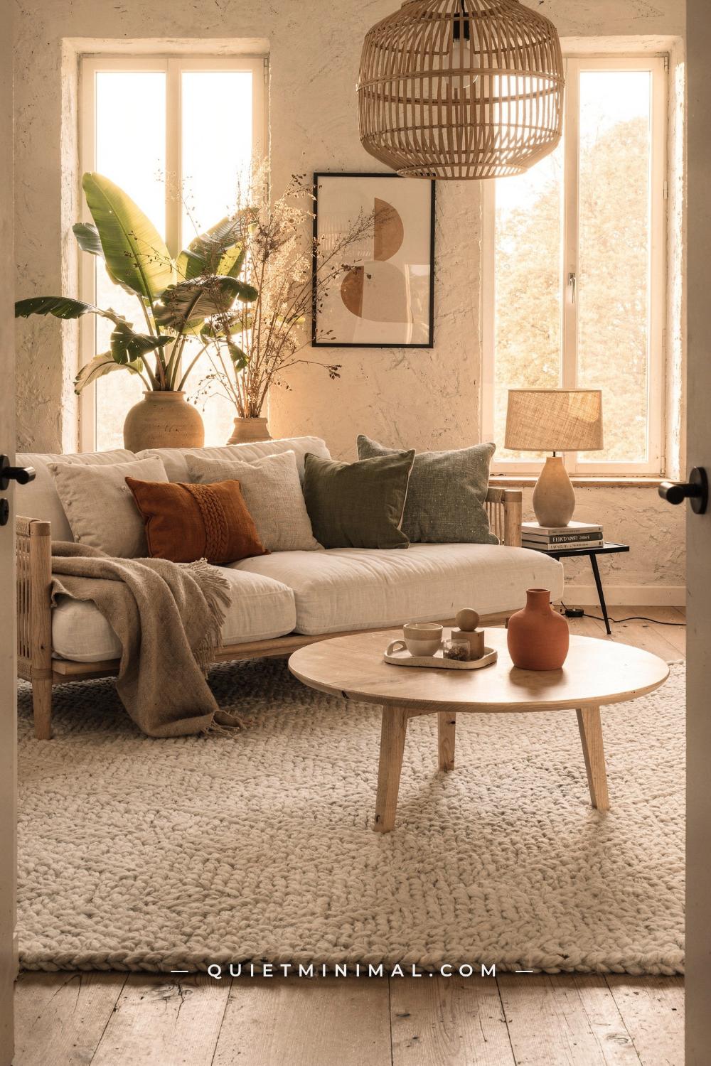
For the Scandinavian aesthetic specifically, the texture and material of the rug matter as much as the size. A flat-weave kilim or a low-pile synthetic in gray is the most common mistake: it reads as a floor graphic rather than a warm anchor. The options that actually work are a chunky hand-knotted wool rug in natural oatmeal or warm ivory, a Berber-style flatweave in undyed natural fiber, or a braided jute rug for casual rooms. All three add texture and warmth at the floor level, which is necessary for the layered quality that distinguishes a finished Scandinavian room from a sparse one. The color should sit within the warm neutral family: oatmeal, natural, warm ivory, or soft camel. A cool gray or stark white rug, however high-quality, will undo the warmth you built with the paint and furniture choices.
One final check: buy a rug pad. A thin rug on a hardwood floor has no mass underfoot and no presence in the room. A quality felt pad adds 0.25 inches (6 mm) of cushion, keeps the rug from curling at the corners, and dramatically extends the rug’s useful life.
Key Takeaway: Size up to at least an 8×10 (244×305 cm) rug for a standard seating arrangement, confirm the front legs of all seating land on it, and choose warm natural fiber textures like wool or jute over flat synthetic options.

Build a Layered Lighting Plan, Not a Single Overhead Fixture
 Save
Nothing drains warmth from a Scandinavian living room faster than a single overhead light source. This is especially true in North American homes where recessed can lighting at ceiling height is the default, because it produces a flat, even, downward wash that eliminates shadows and depth from every surface in the room. Furniture looks flat. Textures disappear. The room looks like a hardware store display, regardless of what you put in it.
Nordic architecture solved the lighting problem centuries before electricity by designing around multiple small light sources at human scale: firelight, candlelight, lanterns, and table lamps. The electric version of this principle is what separates a room that photographs beautifully from one that feels warm when you are actually sitting in it. The goal is overlapping pools of light at three different heights, none of which should be the overhead.
The structure that works: one pendant lamp hanging at approximately 6 to 7 feet (183 to 213 cm) from the floor above the coffee table as the visual anchor and primary task light, one arc floor lamp in matte black or brushed brass behind one of the accent chairs to create a reading zone and add vertical interest, and two table lamps on a sideboard or console along the wall to fill in the background warmth at the lowest level. That is three layers. You can add a fourth with a plug-in sconce on the wall, but three is the minimum for the room to feel finished.
Bulb temperature is as consequential as fixture placement. All sources should be 2700K to 2900K (warm white). Going above 3000K introduces a cool blue cast that fights the warm wall paint and wood tones you carefully selected. Going below 2700K produces an amber glow that reads more like a restaurant than a living room. The 2700K range is the sweet spot: it is close to old-style incandescent warmth without the color distortion of very low-K LEDs.
Dimmer switches are not optional. A room lit at full brightness looks and functions differently than the same room at 60 percent. Most of the warmth in the best Scandinavian interiors comes from dimmed ambient light rather than from decor objects. If your fixtures are not currently on dimmers, that is a weekend electrical project that will do more for the feel of your room than any furniture purchase.
Key Takeaway: Eliminate reliance on overhead recessed lighting, build three layers at different heights using a pendant, a floor lamp, and table lamps, and keep all bulbs at 2700K to 2900K on dimmer switches.

Use Texture as the Primary Source of Visual Interest
 Save
A Scandinavian living room that uses a neutral palette without layering texture is just a beige room. Texture is the mechanism that makes restraint look intentional rather than unfinished. It is the detail that makes a room photograph well from any angle, and more importantly, the detail that makes it feel warm when you are sitting in it rather than looking at a photo of it.
The reason this works physiologically is that the eye responds to varied surface tactility the same way it responds to depth: it reads as richer and more complex than a flat, uniform surface, and complexity signals deliberate curation. A cream linen sofa next to a cream painted wall is flat. A cream bouclé sofa next to a warm off-white plaster wall, with a chunky wool rug below and a woven rattan pendant above, reads as layered and finished, even though the color palette is nearly identical.
The specific textures that belong in a Scandinavian living room today: bouclé or textured weave upholstery for at least one seating piece, a chunky hand-knotted or Berber wool rug underfoot, linen or cotton throw cushions on the sofa in matte woven finishes rather than velvet or satin, at least one ceramic object (vase, bowl, planter) with a hand-thrown organic surface rather than a machine-glazed uniform finish, and a pendant lamp or lampshade in woven rattan, paper cord, or natural fiber. If you have all five of these texture categories represented, the room will read as warm and finished even at a relatively low decor budget.
The failure mode to watch for: adding texture through pattern rather than surface. A geometric-print throw pillow adds pattern, which reads as complexity at a graphic level but does not add tactile warmth the way a chunky-knit cushion does. Pattern-led rooms can look busy rather than layered. In a Scandinavian space, texture should almost always come from the material itself, woven, knotted, thrown, or raw, rather than from print or graphic design applied to a smooth surface.
One more practical note: vary the scale of textures. A fine-weave linen cushion next to a chunky-knit throw next to a rough-edged ceramic vase creates more visual interest than three items all at the same level of fineness. Think of it as designing for your hand as well as your eye.
Key Takeaway: Layer at least five distinct texture categories, including bouclé upholstery, wool or jute rug, matte linen cushions, a hand-thrown ceramic piece, and a natural-fiber pendant, to give a neutral palette its warmth and depth.

Add Color Without Abandoning the Neutral Foundation
 Save
Today, the Scandinavian palette has moved past the all-neutral, all-white formula that defined the style in the 2010s. The new version is still neutral-led, but it incorporates deliberate accent colors drawn from the northern landscape: dusty terracotta, faded sage, warm mustard, olive green, and rich honey. The difference between a room that looks current and one that looks like a decade-old magazine spread is largely this shift.
The principle is restraint through placement, not restraint through elimination. You are not banning color. You are limiting its surface area and keeping its saturation muted. The framework that works: one warm accent color (terracotta, mustard, or honey) and one cool accent color (sage, dusty blue, or olive) introduced at small scale through textiles and ceramics only, never through large furniture pieces or wall paint. A single terracotta cushion on the sofa, a sage-green ceramic lamp on the sideboard, and a mustard linen throw folded over an armchair introduces three distinct accent tones without disrupting the neutral base.
The failure mode is choosing colors that are too saturated relative to the neutrals they sit beside. A bright orange cushion on a cream sofa reads as a decorating mistake rather than a deliberate choice because the contrast is too sharp. The same orange desaturated to a dusty terracotta reads as intentional. The test: hold the potential accent item against your sofa or wall in your actual lighting and check whether the colors feel like they belong to the same room or are fighting each other. If you have to squint slightly because the color jumps forward too aggressively, it is too saturated for the base you have built.
Emerald green and Klein blue are beginning to appear in Scandinavian spaces as accent choices right now, particularly in ceramics and cushions, but they read as statements rather than foundation pieces. Use them sparingly: one item per room maximum, and pair it with an equal or larger quantity of warm neutral to balance the coolness they bring.
One practical sequence for adding color: start with the textiles (cushions and throws), live with them for two weeks, then add ceramics. This staged approach lets you evaluate each addition in the context of what is already there rather than making multiple simultaneous changes and losing track of which one is pulling the room off balance.
Key Takeaway: Introduce one warm accent (terracotta, mustard) and one cool accent (sage, dusty blue) through cushions and ceramics only, keep saturation muted rather than bright, and add one category at a time to evaluate each against the existing neutral base.

Choose the Right Wood Tone for the Whole Room
 Save
Wood is not just a material in a Scandinavian living room. It is the primary source of warmth in a space built around neutrals. Getting the wood tone wrong is the second-most common error after paint color, and the failure mode is subtler: the room does not look wrong exactly. It just never quite feels right, and most people cannot identify why.
The problem usually comes down to mixing wood tones that sit in different temperature families. Cool-toned gray-washed wood next to warm golden oak, or dark espresso wood next to pale birch, creates a visual inconsistency that reads as incomplete rather than curated. The eye registers the mismatch even when the brain cannot name it, and the result is a room that feels slightly off despite containing technically good furniture.
The current Scandinavian direction is clear: golden oak is replacing pale birch as the dominant wood tone. Where the 2010s and early 2020s relied on the very light, almost bleached birch or ash finish associated with IKEA’s core range, current interiors are running warmer, toward a honey-toned medium oak that has more depth and pairs better with the earthy accent palette described above. This does not mean all your furniture needs to match exactly. It means all your wood tones should sit within a one-family range: all warm and medium-toned, or all light and cool-toned, but not both.
The practical rule for mixing woods in one room: pick a dominant tone (the sofa’s legs, the coffee table, and the largest case piece all match or are very close), then allow one accent piece to be one shade lighter or darker within the same warm/cool family. Two shades away is contrast. Three shades away is mismatch.
If you are working with existing furniture that spans a range of wood tones, paint or refinish the smallest pieces (side tables, shelving brackets) to match the dominant tone before buying anything new. This is a faster and cheaper fix than most people assume, and it does more for the coherence of the room than adding new decor.
Key Takeaway: Choose a single warm wood family, currently golden or honey-toned oak for the current Scandinavian look, keep all major pieces within one shade of each other, and fix tone mismatches in small existing pieces before adding new ones.

Place Furniture for Conversation, Not for Perimeter
 Save
The single layout mistake that makes the most otherwise-good Scandinavian living rooms feel wrong is pushing all the furniture against the walls in a ring. This is the instinctive arrangement because it feels like it creates space in the center of the room. What it actually creates is a wide, empty gap in the middle and a perimeter of seating that is too far from itself for comfortable conversation. The room ends up feeling like a hotel lobby: large, impersonal, and oddly formal despite the intention to be relaxed.
The correct Scandinavian layout pulls all the seating toward the center of the room, anchored by the rug, and leaves the perimeter walls mostly clear except for flat console or sideboard pieces. The sofa faces the accent chairs across the coffee table. The whole grouping is an island, with clear walking paths between the sofa back and the wall (that 18-inch minimum referenced earlier) and between the chairs and the adjacent walls.
From the guides
You've saved it, wanted it. Here's the how: codes, measurements, order. Your choices make it yours.
The Japandi Honest PlaybookThe honest version of the style: what to keep, what to skip, and the order to do it in.See inside →The Room Refresh PlaybookA repeatable four-step method, room by room, in ten minutes, thirty minutes, or one weekend.See inside →Make Any Room Feel Cozy on PurposeWhy some rooms hold people and others empty out, and the moves that change it.See inside →For rooms 12 by 14 feet (365 by 427 cm) or smaller, the conversation cluster takes up most of the room’s functional area, and that is correct. The perimeter space is the passage, not the feature. In larger rooms, 15 by 20 feet (457 by 610 cm) and up, you can create a secondary zone, a reading nook in a corner with a single armchair, a floor lamp, and a small side table, that reads as a companion to the main cluster rather than competing with it.
Coffee table distance matters more than most guides acknowledge. The standard is 16 to 18 inches (41 to 46 cm) between the front edge of the sofa and the edge of the coffee table. At 14 inches or less, the table is too close and people bump their knees. At 20 inches or more, the reach for a drink or a book becomes awkward and the grouping reads as disconnected. Measure this before placing anything permanently.
One specific mistake worth naming: placing the sofa with its back to the room’s entry. This creates a visual barrier that breaks the flow from the entry into the living space and makes the room feel cut off from the rest of the home. Position the sofa so it faces the entry at a slight angle, or use the perpendicular wall, so the room reads as open and inviting from the moment you walk in.
Key Takeaway: Pull all seating away from walls into a centered conversation cluster anchored by the rug, keep the coffee table 16 to 18 inches from the sofa, and orient the grouping so it reads as open and accessible from the room’s entry.

Pick Window Treatments That Add Warmth Without Blocking Light
 Save
Window treatments are the most frequently underfunded part of the Scandinavian living room. People spend heavily on the sofa and the rug, then hang a cheap white roller blind or forgo window treatments entirely because “minimalism means less.” Neither version is correct, and both make the room feel unfinished in ways that are surprisingly hard to diagnose.
The role of window treatments in a Nordic-inspired room is not to block light. Scandinavian design is built around maximizing natural light, which means sheer or semi-sheer treatments that filter and soften daylight rather than eliminating it. The right choice for most living rooms is a set of floor-length linen or cotton-linen blend drapes in natural, undyed, or very pale tones, hung from a ceiling-mounted or wall-mounted rod that extends 4 to 6 inches (10 to 15 cm) beyond the window frame on each side. The extension makes the window appear wider than it actually is and allows the full glass area to remain uncovered when the drapes are open.
Height is the other variable most people get wrong. Curtain rods mounted just above the window frame, as is standard in many homes, produce panels that look residential in a basic sense but cut off the room’s vertical dimension. In a Scandinavian room, rods should be mounted 4 to 6 inches (10 to 15 cm) below the ceiling, or at ceiling height if the ceiling is 9 feet (274 cm) or lower. This draws the eye upward, makes the ceiling feel higher, and gives the room the vertical openness that is a defining quality of Nordic interior spaces.
Length should reach the floor. Panels that stop at the window sill or hover 2 to 4 inches above the floor look unintentional. The clean version is panels that just graze the floor or puddle slightly, 0.5 to 1 inch (1 to 2.5 cm) of fabric touching the floor. For rooms with direct foot traffic past the window, grazing is practical. For a dedicated living room where traffic does not cross the window path, a slight puddle is the warmer choice.
Key Takeaway: Hang linen drapes from a rod mounted near the ceiling, extend the rod 4 to 6 inches beyond each side of the window frame, and let the panels reach the floor to maximize the room’s sense of height and warmth.

Edit Your Decor to the Objects That Actually Earn Their Place
 Save
Scandinavian decor editing is where most rooms stall. The impulse after getting the furniture right is to add objects, and adding objects without a clear editorial filter produces a room that looks like a shelf in a home decor store rather than a space someone curated intentionally.
The principle from Nordic design culture is Lagom, a Swedish concept meaning “just the right amount.” In practical terms, it means every object in a Scandinavian living room should be able to answer the question: why is this here? If the answer is “I liked it” or “I had it already,” that is not sufficient. The objects that belong in this space are those that do at least one of the following: add texture at a scale or surface type not otherwise present in the room, introduce a color accent at exactly the saturation level the room needs, or hold personal meaning that makes the space feel inhabited rather than staged.
The specific categories that work: sculptural ceramics with an organic, hand-made quality rather than machine-finished uniformity, hardcover books in curated stacks of three (never fanned out, never displayed spine-down), a single branch or dried botanical arrangement in a tall narrow vase, one or two functional candle holders that look good both lit and unlit, and a small-scale plant in a ceramic or concrete pot. That is five categories. You do not need all five represented simultaneously. You need enough to signal that someone lives here, not so many that the room reads as a collection.
The failure mode to name explicitly: styling in symmetrical pairs. Two matching vases on each end of the console, two identical throws in the same fold on each sofa arm. This kind of rigid symmetry reads as artificial in a Scandinavian context, where the aesthetic is built on organic arrangement and subtle asymmetry. One vase, not two. Three books in a stack, not two neat rows. One throw, casually placed, not two coordinated.
The editing test: stand at the room’s entry and count the objects visible from that vantage point. If you can count more than twelve, the room is over-decorated for this aesthetic. Remove the objects one at a time, starting with the most decorative and ending with the most functional, until the room reads clearly from the doorway without feeling empty.
Key Takeaway: Apply the Lagom principle: keep only objects that add texture, introduce a needed accent tone, or hold genuine personal meaning, and edit until every item visible from the room’s entry earns its place without creating visual noise.

Manage the TV Without Letting It Dominate the Room
 Save
Television placement is one of the most practically important decisions in a living room, and in the Scandinavian context, it is also one of the most aesthetically challenging. A large black screen on a white wall is a visual dead zone when the TV is off, and it competes with every other element in the room when it is on.
The most common mistake is mounting the TV too high. Eye level when seated, not when standing, is the correct reference point. For most seating with a seat height of 17 to 18 inches (43 to 46 cm), the center of the TV screen should sit at approximately 42 to 48 inches (107 to 122 cm) from the floor. Mounting a screen at 60 or 65 inches from the floor, which is what most first installations produce, forces viewers to tilt their necks upward and makes the TV read as visually dominant over everything else in the room.
The Scandinavian approach to the TV wall is integration rather than concealment. Rather than hiding the TV behind sliding panels or inside a cabinet, the Nordic aesthetic places it as a deliberate element within a composed wall arrangement. The surrounding composition does the work: a low media console or sideboard in pale oak or ash below the screen, a gallery wall of framed prints or a single large art piece flanking it, and one or two decorative objects on the console. This contextualizes the TV within the room’s visual language rather than letting it read as an intrusion.
Cable management is non-negotiable. A single exposed cable running down a white wall will draw the eye more than any other element in the room. In-wall cable routing kits are a two-hour DIY project and are available for most wall types. If in-wall routing is not possible, a cable channel cover in the same color as the wall is adequate. The goal is for the cable to disappear visually, not to be contained neatly.
Distance from the sofa to the TV: most designers follow the 1.5 to 2.5 times the screen diagonal rule. For a 55-inch (140 cm) screen, that is roughly 7 to 12 feet (213 to 366 cm) of optimal viewing distance. For a 65-inch (165 cm) screen, 8 to 14 feet (244 to 427 cm). If your room is smaller than the minimum recommended distance, drop one screen size rather than sitting too close.
Key Takeaway: Mount the TV so its center sits at 42 to 48 inches from the floor, build a composed media wall around it using a low oak console and flanking art, and route all cables in-wall or cover them to match the wall color.

Introduce Personal Objects Without Breaking the Aesthetic
 Save
There is a common criticism of Scandinavian interiors that they look beautiful in photographs and cold to live in. The rooms that earn that criticism share one characteristic: they were decorated by removing everything personal rather than editing the personal to its best version.
Scandinavian homes in actual Nordic countries are full of personal objects. Art inherited from family, craft objects made by the homeowner or local makers, books that are genuinely read rather than displayed as props, small items brought back from travel that hold a story. The difference between these rooms and the version that reads as cold and impersonal is not the number of objects. It is that each personal object has been edited for quality and placement rather than just accumulated.
The practical translation for a Scandinavian living room: choose three to five personal objects you genuinely value and give each one a considered position with clear space around it. A gallery wall of three framed prints or photographs in matching thin natural oak frames, hung at varying heights within a controlled horizontal band on one wall, reads as intentional and curated while still being personal. A single ceramic piece made by a local maker or brought from a trip abroad, positioned on the coffee table or sideboard with at least 6 inches (15 cm) of clear space around it, carries more visual weight than a shelf full of objects competing for attention.
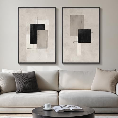
Art selection is where this most often goes wrong in a Scandinavian room. The instinct is to hang art that matches the wall color or stays entirely within the neutral palette. The better approach is to choose art whose colors introduce one of the accent tones already present in the room’s textiles, so the gallery wall and the throw pillows and the ceramics all feel like they belong to the same curated collection rather than separate decisions made at different times.
Books are an underused personal element in this aesthetic. Curated stacks of three hardcover books on the coffee table, with their spines outward, signal a room that is actually lived in. One honest rule: display only books you have read or are genuinely reading. Styled books with the covers facing up, or books arranged purely by spine color, read as prop styling rather than personal objects, and undermine exactly the lived-in quality you are trying to achieve.
Key Takeaway: Edit personal objects to three to five high-quality, genuinely meaningful pieces, display each with clear surrounding space, and choose art whose colors connect to the accent tones already established in the room’s textiles and ceramics.
Respect the Seasonal Shift That Keeps the Room Feeling Current
 Save
One of the most practical principles from Nordic design culture is that a room’s seasonal character changes through textiles and small objects, not through furniture. Nordic homes in cold-climate countries stay visually functional and personally inhabited across months with very different amounts of daylight by shifting the layering of textiles and the presence of light sources rather than redecorating.
For a Scandinavian living room in a North American or European context, this principle means the room’s base (furniture, rug, paint, lighting structure) stays constant year-round, while two or three small categories shift seasonally. In autumn and winter: heavier throws in wool and chunky knit replace lightweight linen ones, candles in simple concrete or ceramic holders appear on the coffee table and sideboard, and a warmer additional layer of light is added (a tabletop candle lamp or an additional floor lamp). In spring and summer: the heavy throws are replaced with single light-linen throws or removed entirely, candles step back, and fresh or dried botanicals move forward as the primary decorative element.
The investment this requires is intentional but modest. Two sets of throw pillows in different seasonal weights (a heavier, more textured set for autumn and winter; a lighter, airier set for spring and summer) and two sets of throws in different weights are enough to shift the room’s feeling across the year without any furniture change. Budget for both sets when you set up the room initially, and store the off-season set in a linen-covered basket or a sideboard drawer rather than a plastic bin, which keeps them accessible and in good condition.
The failure mode is treating the room as finished and static once it is decorated. A Scandinavian living room that does not evolve even slightly between July and December will start to feel like a photograph rather than a living space, and that is the quality most associated with the “cold and staged” criticism. The hygge principle, which is fundamentally about comfort, warmth, and the feeling of being gathered against the cold, requires the room to acknowledge the season it is in.
Key Takeaway: Keep the room’s base constant and shift seasonal feeling through two sets of throws and pillows at different weights, candle holders in autumn and winter, and botanicals in spring and summer, building in this two-set system from the start.

—
A warm Scandinavian living room is built in a specific sequence: start with a verified warm off-white paint color, set the furniture scale and layout before choosing style, size the rug correctly, layer three levels of 2700K lighting, and then add texture, curated personal objects, and the right accent colors in that order. Every decision that goes wrong in this aesthetic does so because one of those foundational steps was skipped or approximated. Get the sequence right and the warmth follows naturally. Get it out of order and you will spend years adding more objects to a room that feels flat, wondering why it never quite arrives.
Start with the paint chip and the painter’s tape. The room you want is built from those two tools outward.
From the guides
You've saved it, wanted it. Here's the how: codes, measurements, order. Your choices make it yours.
The Japandi Honest PlaybookThe honest version of the style: what to keep, what to skip, and the order to do it in.See inside →The Room Refresh PlaybookA repeatable four-step method, room by room, in ten minutes, thirty minutes, or one weekend.See inside →Make Any Room Feel Cozy on PurposeWhy some rooms hold people and others empty out, and the moves that change it.See inside → Save