 Georgia
What separates a Scandinavian interior that feels genuinely warm and curated from one that feels like an empty showroom? The question comes up constantly, and the answer is almost never about finding more products. It is about a specific set of decisions: which wood tone, which sofa scale, which light source, which material pairing. Get those right, and the room earns its Nordic credentials without a single IKEA catalogue open in front of you. Get them wrong, and no amount of white paint or birch furniture will save it.
This article covers 26 real rooms spanning mid-century Nordic, Japandi, boho-Scandinavian, hygge cabin, and forest-house interiors. Each section names the decision that makes that room work, the measurement or proportion that holds it together, and the failure mode to avoid. Read it as a practical checklist, not a mood board.
Bold Color Pairing in a Scandi Mid-Century Room
 Save
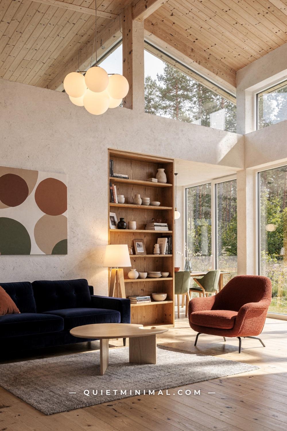
The single fastest way to make a Scandinavian interior feel current rather than generic is to introduce one bold complementary pairing into a neutral base. In this open-plan vaulted space, that pairing is a navy blue velvet two-seat sofa set against a terracotta bouclé lounge chair. Both sit at opposite ends of a warm color wheel, which means they create visual tension without clashing. The white walls and warm birch coffee table act as the referees.
The scale decision here is deliberate. The navy sofa runs approximately 68 in (173 cm), which is compact for a loveseat-scale statement piece. The terracotta chair at roughly 30 in (76 cm) wide is smaller, and that size differential matters: the sofa reads as the anchor and the chair reads as the accent. Reverse those proportions and the pairing loses hierarchy. The birch organic-form coffee table at approximately 36×20 in (91×51 cm) lands between the two seats and belongs to neither, which keeps the conversation open.
The clerestory glazing and pine tongue-and-groove ceiling do two things at once: they flood the space with natural daylight in the morning and add organic warmth from the honey grain overhead. This is a Nordic design principle that predates any trend. Scandinavian homes were engineered around maximum light capture during short-day winters, and the vaulted ceiling with high-set glazing is the architectural answer to that problem. Replicate it in a standard-height room with track lighting on a dimmer pointed at the ceiling: you get reflected ambient light that reads as natural without a structural overhaul.
The abstract circular artwork in terracotta and olive at approximately 24×30 in (61×76 cm) performs a secondary role: it bridges the navy and terracotta seats with a shared color. If you skip the bridging art and hang a piece with no connection to the sofa palette, the pairing starts to look like a coincidence rather than a decision.
The failure mode in bold Nordic pairings is going too dark. Navy works because it reads as deep, not heavy, against white walls. Pair the same sofa with greige walls and the room contracts. Keep the walls pure white and use the furniture to carry all the color.
Key Takeaway: Anchor your Scandinavian bold pairing in a 68 in (173 cm) sofa plus a 30 in (76 cm) accent chair, size differential intact, against white walls. The chairs carry the color so the architecture stays clean.

Biophilic Layering in a Boho-Nordic Living Room
 Save
Scandinavian design’s relationship with plants is not decorative. It is functional: greenery raises indoor humidity, which matters in Nordic climates where winter heating dries out interiors, and it adds a visual temperature that no paint color can replicate. The rule that most rooms get wrong is height distribution. Plants placed only at floor level flatten the room. The correct approach is three heights: floor (fiddle leaf fig in a terracotta pot), mid-level (trailing pothos on the wall mirror), and counter-top (small herb or succulent).
In this room, the sage green L-shaped sectional at approximately 110 in (280 cm) wide anchors the floor plane at a low profile. The intentionally low seat height keeps the room from feeling top-heavy and creates a laid-back scale that reads as genuinely Nordic rather than formal. The raw pine plank coffee table at approximately 48×24 in (122×61 cm) continues the floor-level horizontal emphasis. Both pieces pull the eye downward, which makes the ceiling feel taller.
The wicker rattan dome pendant at approximately 18 in (46 cm) in diameter is the mid-space connector: it hangs low enough to define the seating zone without competing with the plants on the walls or the floor-level pouf. Pendant height matters more than most people realize. Drop it to approximately 72 in (183 cm) from the floor in a living room and it becomes a framing device. Hang it flush to the ceiling and it reads as a light source, nothing more.
The cream jute rug against the light oak floorboards is doing quiet structural work. Jute reads warm against pale oak; a synthetic flat-weave rug in the same dimensions would read cold. The contrast between the woven rug texture and the smooth floor grain adds the kind of layering that the style calls for without adding any visual weight.
The palette of sage green, warm cream, natural tan, and earthy terracotta is a current Nordic update on the all-white base: still restrained, but pulled toward the earth. It ages better than a pure white scheme because the green and terracotta tones are already muted, which means they will read as neutral in two years rather than dated.
The failure mode here is oversaturation. Sage works as a sofa when the walls stay white or warm cream. Paint the walls sage to match and you lose the contrast that makes the sofa legible.
Key Takeaway: Distribute plants at three heights, keep the sofa profile low at approximately 110 in (280 cm) wide, and use a jute rug rather than a synthetic flat weave to hold warmth in the palette.

The TV Wall Formula That Actually Works
 Save
The TV wall is the room’s most frequently botched decision in Scandinavian interiors. The default move is to float the television on a white wall above a low console. That works only if you accept that the black screen will be the dominant visual when it is off. The solution is to frame the TV within a material plane that gives the screen something to recede into. Here, a gray linen sofa at approximately 84 in (213 cm) faces an oak media console with slatted drawer fronts at approximately 60×18 in (152×46 cm), flanked by a full-height open oak bookshelf at approximately 72 in (183 cm) tall. The slatted drawer fronts on the console repeat the vertical grain of the bookshelf, which creates a horizontal composition that the TV sits within rather than interrupts.
Two black-framed botanical prints at approximately 18×24 in (46×61 cm) each hang above the console symmetrically. This is the detail that most TV walls skip. Hanging art at the same level as the television gives the eye multiple stopping points when the screen is dark, so the room does not visually collapse into a single black rectangle.
The rattan wall sconce at approximately 12 in (30 cm) tall provides accent light beside the prints. Track lighting on the ceiling points toward the wall rather than downward, which creates a wash of light across the oak texture and makes the honey-grain veneer glow. That warm incandescent quality at the wall is the hygge element in this room: it does not come from candles alone; it comes from correctly positioned light sources that bounce off warm natural materials.
Warm gray linen on the sofa is a smarter choice here than the fashionable boucle cream, because linen holds its structure through heavy daily use without pilling. The woven throw adds the texture contrast that boucle would otherwise provide.
The failure mode is underdressing the flanking shelf. A bookshelf with only books looks unfinished in a Scandinavian TV wall. Add a small potted plant at the top shelf and two or three ceramic objects mid-shelf, and it reads as curated rather than incidental.
Key Takeaway: Frame the TV between a slatted console and a full-height bookshelf, add art at screen level, and direct track lighting at the wall rather than downward to activate the wood grain and add warmth.

The Japandi Kitchen: Open Shelving Done Right
 Save
The Japandi kitchen is the most precise expression of Scandinavian minimalism that exists in residential design right now. What makes it different from generic minimalism is the deliberate contrast between warm and restrained: warm cream lacquer cabinet faces against natural oak open shelving, matte black appliances as the punctuation. The result is a kitchen that looks considered rather than stripped out.
The key structure here is the vertical open-shelf tower set within the full-height cabinetry. At approximately 24×72 in (61×183 cm), it breaks the monotony of flat cabinet runs and provides a display zone for the ceramic and wooden objects that give the kitchen its personality. The rule is strict: only objects with a clear purpose or a clear beauty go on those shelves. A wooden cutting board, a white ceramic bowl, a glass carafe, a dried blossom branch in a ceramic vase. Nothing else. The moment you add a fourth or fifth object per shelf, the Japandi edit collapses into clutter.
The matte black oven pair flush-mounted at counter height anchors the right side of the composition. Flush mounting is essential: a protruding oven on a plinth disrupts the clean vertical line of the cabinet run. If your existing kitchen has protruding appliances, a simple surround panel in the same cabinet material restores that line for a fraction of the cost of new cabinetry.
The warm cream lacquer on the cabinet faces references the cashmere end of the neutral spectrum rather than stark white. Stark white cabinets in a Japandi kitchen read as sterile. The cream tone softens the space and takes on a slightly different hue depending on time of day and the warmth of surrounding materials, which is a quality that flat-white finishes lack entirely.
Lighting in a Japandi kitchen should be ambient, never spotlit. A single overhead source pointing directly at counters creates harsh shadows and destroys the wabi-sabi quality that the style depends on. Soft ambient light from above combined with the natural daylight from a left side window produces the restrained, quiet glow that makes this kitchen feel calm at any hour.
The failure mode is buying oak shelving that is too orange. The oak here is natural with a light, warm grain. Overly orange or reddish oak in a cream-and-black kitchen reads rustic rather than Japandi.
Key Takeaway: Embed a vertical oak shelf tower at approximately 24×72 in (61×183 cm) within cream lacquer cabinetry, limit shelf objects to three per shelf maximum, and use ambient overhead light rather than direct spotlighting.

The Slatted Feature Wall: How to Build a TV Panel That Looks Like Architecture
 Save
An oak acoustic-slat feature wall running floor to ceiling converts a floating television from a visual problem into an architectural feature. The principle is simple: instead of asking the viewer to ignore the screen, you give the whole wall a visual purpose so the screen becomes one element within it. The vertical oak slats at full ceiling height create a texture plane that reads as warm, tactile, and intentional. The LED strip lighting at top and bottom of the panel does the rest.
LED color temperature matters enormously here. The strips shown run warm amber, approximately 2700K. At 3000K the light turns cool and clinical, and the room loses the Nordic warmth that makes the style work. At 2700K the glow matches candlelight and bounces off the oak slats in a way that reads as firelight from a distance. A strip set to adjustable color temperature is the practical choice because you can dim toward 2200K for evening use.
The cream boucle L-shaped sectional at approximately 120 in (305 cm) is deliberately oversized. That scale against the full-height slat wall prevents the wall from overwhelming the furniture. An 84 in (213 cm) sofa in front of a floor-to-ceiling panel reads as small. Scale up the seating and the proportions lock in.
The round fluted oak drum coffee table at approximately 32 in (81 cm) diameter introduces a curved element into a room dominated by vertical lines, which is the correct way to prevent the slat wall from making the space feel institutional. One curved piece per room is the rule. Two curves compete; one contrast.
The floating oak TV console at approximately 72 in (183 cm) wide holds the television in the lower third of the slatted panel, which is the correct height for eye level viewing from a low-profile sofa. Mounting the television in the upper half of the panel forces the viewer to look up, which causes neck strain and reads as aesthetically wrong in a Nordic setting where everything is designed for comfort.
The failure mode is cheap MDF slats that cup and warp after six months. Solid wood veneer over MDF or WPC (wood-polymer composite) panels handle humidity changes without movement, which matters in kitchens and rooms with wide temperature swings.
Key Takeaway: Run the slatted panel floor to ceiling, set LED strips at 2700K, and ensure the sofa reaches at least 120 in (305 cm) wide so the furniture holds its own against the full-height wall.

The A-Frame Interior: Why the Volume Does All the Work
 Save
An A-frame structure gives Scandinavian design its most powerful asset: raw volume. The pine tongue-and-groove ceiling rising to a vaulted peak, full-height sliding glass doors, and white walls are not design decisions in this room so much as structural gifts. The room earns its Nordic credentials from architecture alone, which means the furniture job is to stay out of the way.
The gray velvet L-shaped sectional at approximately 110 in (280 cm) is sized to feel human-scale within a large, high-ceilinged room without dominating it. Cool gray velvet is the correct upholstery choice in an A-frame because it reads as visually recessive: it sits back against the white walls and lets the vaulted pine ceiling hold the visual weight. A cream or off-white sectional in the same space would read as too dominant.
The oak rectangular coffee table at approximately 48 in (122 cm) long keeps the horizontal floor plane readable. A round coffee table in a room with this much linear architecture reads as an afterthought. The long rectangle aligns with the room’s structural axes.
The wood-burning stove at approximately 28 in (71 cm) tall placed in the far left corner does two things: it provides radiant heat that prevents the large glazed wall from making the room feel cold in winter, and it creates a visual anchor in a corner that would otherwise be dead space. A stove is the original Scandinavian hygge device, and in a room with this much glazing it earns both its aesthetic and its functional place.
The herringbone rug below the seating zone defines the living area within the open plan without using a wall or partition. Herringbone reads more formal than a plain flat weave, which helps give the living zone its own identity against the dining area visible beyond. The natural pine floor throughout prevents the rug from looking like an island; instead, it reads as a layer on top of a continuous warm-toned base.
The failure mode in A-frame rooms is over-furnishing. Every extra piece of furniture competes with the architecture. The rule is: one seating group, one coffee table, one dining cluster, and the stove. Add more and you turn a spectacular room into a crowded one.
Key Takeaway: In a vaulted A-frame, choose cool gray velvet for the sectional so it recedes against white walls, orient the long coffee table on the room’s structural axis, and treat the wood stove as a corner anchor rather than an optional extra.

Wabi-Sabi Nordic: Raw Texture as the Feature Wall
 Save
The wabi-sabi reading of Scandinavian design is the one most misunderstood in American homes. It is not about buying rough-looking objects and placing them on white shelves. It is about selecting materials whose imperfections are inherent to the material itself, then building the rest of the room in restraint so the imperfection has room to breathe.
Here, the board-form concrete vertical plank wall acts as the feature. That raw gray surface runs from floor to ceiling behind the white boucle low-profile sectional at approximately 120 in (305 cm) long. Concrete and boucle are a pairing that works because they represent opposite ends of the texture spectrum: concrete is cold, dense, and directional; boucle is warm, porous, and formless. The contrast between them is the design.
The 48×48 in (122×122 cm) abstract canvas in charcoal and ash gray leans against the wall rather than hanging. This is the wabi-sabi positioning rule: an object that rests naturally rather than being fixed in place reads as honest and impermanent. Hanging the same canvas creates formality that contradicts the raw concrete wall behind it.
The asymmetric coffee table arrangement is the second key decision. A raw tree stump side table at approximately 18 in (46 cm) diameter pairs with a low solid oak flat coffee table at approximately 60×20 in (152×51 cm). The two pieces are deliberately mismatched in material and form, and that mismatch is the point. Matched coffee tables in a wabi-sabi room read as too composed.
The bare branching tree specimen in the left corner is a critical textural element. Its stripped branches add vertical interest at a height the other furniture cannot reach, and the organic silhouette against a gray concrete wall is a composition that is genuinely Nordic: it references the actual landscape of winter trees against stone.
The failure mode is using faux concrete. Concrete-look wallpaper or paint creates a flat surface that reads as imitation at any reasonable viewing distance. Genuine board-form concrete or a concrete render applied over a straight wall delivers the weight, shadow, and variation that the wabi-sabi room needs.
Key Takeaway: Lean the artwork against the wall rather than hanging it, pair matched concrete with deliberately mismatched coffee tables, and use a bare branching tree specimen in the corner to reach the vertical space the furniture cannot touch.

Warm-Tone Art Echo: How to Tie a Room Together With One Canvas
 Save
The room that commits to a large abstract canvas and then picks all the remaining accent pieces from the canvas’s palette is doing one of the most reliable things in Nordic interior design: it is using art as the color brief rather than as a decoration applied after the fact. Here, an oversized abstract in warm orange, yellow, and pink at approximately 36×48 in (91×122 cm) sets the temperature of the entire room. The terracotta leather pouf, the orange ranunculus in the vase, and the woven cream throw all repeat the canvas’s warmth in different materials.
The cream boucle curved modular sectional at approximately 110 in (280 cm) is the neutral chassis that makes this work. A cream sofa reads as both warm and recessive, which means it can take the terracotta pouf and the orange flowers without the palette becoming aggressive. A sofa in any saturated color competes with the art and loses.
The oak side table with hairpin legs at approximately 20 in (51 cm) square is a deliberate scale choice. Small side tables in a room with a large L-shaped sofa read as delicate accessories, which creates a pleasing contrast with the substantial upholstery. Heavy side tables with thick legs compete with the sofa for visual weight.
Natural daylight from three large windows is the reason this palette can be this warm without becoming heavy. Rooms with limited natural light cannot sustain terracotta, orange, and mustard simultaneously: the colors absorb what little light there is and the room darkens. In a well-lit room, warm tones glow rather than absorb.
Well-spaced plants in the corners add fresh green that prevents the warm palette from reading as autumnal. A fiddle leaf fig or a large peace lily in each back corner, at floor level, are enough. They do not compete with the art; they ground the room.
The failure mode is buying a canvas that matches rather than echoes the accent pieces. If the canvas is the exact same terracotta as the pouf, both flatten. The art should have more orange and pink than any object in the room; the objects pick up one element from the canvas, not the whole palette.
Key Takeaway: Use the large canvas as the color brief, pick one accent tone from it for the pouf and one for the flowers, keep the sofa neutral in cream boucle at approximately 110 in (280 cm), and fill corners with fresh green plants to balance the warmth.

Pendant Height in a Scandinavian Dining Room
 Save
The dining room pendant is the element that determines whether a Scandinavian dining room reads as genuinely Nordic or as a generic neutral room with a nice table. The rule in Danish minimalism is precise: three pendants hung at graduated heights over a long dining table, each pendant at approximately 12 in (30 cm) in diameter, the cluster dropping between 30 in (76 cm) and 36 in (91 cm) above the table surface. The varied heights create depth on the ceiling plane, which is the visual element that most single-pendant arrangements lack entirely.
The pale oak rectangular dining table here runs approximately 84×36 in (213×91 cm). At that length, a single centered pendant produces light pooling at one end of the table and shadow at the other. Three pendants staggered along the table length distribute both light and visual mass evenly. The white opal glass globe shades at 12 in (30 cm) each diffuse the light source rather than projecting it, which means the light wraps the table rather than spotlighting it.
Six wishbone-style chairs in light oak around the pale ash table create a monochromatic wood-tone composition that reads as refined rather than repetitive because the chair silhouette is distinctive. The wishbone form, with its Y-shaped back, is one of the most recognizable designs in Nordic furniture history and earns its continued place because it is genuinely functional: the curved back supports the lumbar naturally, and the light ash wood weighs approximately 7 lb (3.2 kg) per chair, which means they are easy to reposition without disturbing the table setting.
The steel-framed black glass partition wall creates a secondary visual plane that makes the room feel larger than it is by implying a space beyond. Black framing against white walls is a Nordic architectural detail borrowed from Danish industrial loft design, and it works in standard residential scale because the thin steel profiles do not add visual weight.
The white cast-iron panel radiator under the large window is a quiet heritage detail. Visible radiators are often hidden in modern renovations, but in a room with this much architectural intention, an honest white radiator is more appropriate than a concealed system.
The failure mode is hanging all three pendants at the same height. Uniform height reads as a lighting installation, not a design decision. The drop variation should be between 4 in (10 cm) and 8 in (20 cm) between the lowest and the highest pendant.
Key Takeaway: Drop three pendants at graduated heights with 4 to 8 in (10 to 20 cm) of variation between the lowest and highest, use opal glass shades at approximately 12 in (30 cm) to diffuse light across the full table length.
The Warm Nordic Kitchen: Material Stacking Done Right
 Save
Material stacking is the technique of layering two or three materials from the same warm-tone family so that each reinforces the others rather than competing. In this kitchen, the palette is warm blonde oak cabinetry against a travertine cream subway tile backsplash, matte white quartz countertops, and wicker dome pendants. Every element is warm-toned and natural; the only cool element is the white quartz, which acts as the clean reset between layers.
The flat-front light oak full-height cabinetry is the dominant material, and blonde oak today is the signature Nordic wood. It reads warmer than pale birch from a decade ago and more refined than orange-tinted pine. The key to making full-height cabinetry read Scandinavian rather than traditional is the absence of visible hardware: recessed edge-pull handles or integrated push-to-open mechanisms keep the cabinet face as a clean plane.
The floating oak wall shelves in three tiers above the travertine backsplash are the kitchen’s display zone. They hold wooden chopping boards, turned bowls, and ceramic pitchers, objects with clear function and a clear material story. Nothing mass-produced sits on these shelves. The objects are either natural wood or matte ceramic because those two material families belong to the same warmth register as the oak cabinetry.
The two wicker dome pendants at approximately 20 in (51 cm) in diameter define the open-shelf island below. Hanging pendant diameter should be approximately half the island width for visual proportion. An island at approximately 36×24 in (91×61 cm) takes a pendant up to 20 in (51 cm) without overwhelming it; go beyond 24 in (61 cm) and the pendant competes with the shelf contents.
Potted herbs on the windowsill are a kitchen-specific biophilic element. They are functional (fresh herbs), fragrant (which registers as warmth), and visual (the green cuts through the warm neutrals without introducing a jarring color). A basil plant and a rosemary in terracotta pots are enough. Larger plants on the kitchen floor crowd the work zone.
The failure mode is mismatching the countertop and backsplash warmth. Bright white quartz against a cool-toned travertine creates a color temperature fight that makes both materials look off. The travertine should be cream, not gray, and the quartz should be warm matte white rather than bright or veined.
Key Takeaway: Stack warm blonde oak, travertine cream, and matte white quartz as complementary warm neutrals, hang wicker pendants at approximately half the island width, and limit shelf objects to natural wood and matte ceramic families.

Texture as Art: Using Cane Panels Instead of Prints
 Save
There is a version of Scandinavian decorating where artwork is replaced entirely by textured objects: woven cane panels, carved plaster reliefs, folded linen panels. This French-Nordic room makes the case for cane panels most clearly. Two framed cane rattan pieces at approximately 30×24 in (76×61 cm) each hang symmetrically above the linen-slipcovered sofa at approximately 90 in (229 cm). They are not art in the traditional sense; they are textural surfaces that catch light and create shadow across their woven grid, which changes over the course of the day as the light angle shifts.
The Vertigo-style wire-frame pendant at approximately 40 in (102 cm) in diameter is the room’s architectural element. A pendant of this scale in a standard-height ceiling requires a ceiling height of at least 9 ft (274 cm) to hang at the correct clearance of approximately 7 ft (213 cm) from floor to pendant bottom. Below that clearance, the oversized pendant becomes an obstacle rather than a feature.
Two round travertine-top coffee tables on oak pedestals at approximately 24 in (61 cm) diameter each replace the conventional rectangular table. Twin coffee tables rather than one rectangular piece allow the seating arrangement to be more fluid: one table is always within reach regardless of where someone is sitting. The travertine surface adds a tactile coolness against the warm sand and cane palette, which prevents the room from becoming too one-tonal.
The tall white ceramic vase holding dried pampas grass is the vertical element that prevents the horizontal emphasis of the sofa and coffee table from flattening the room. Pampas at approximately 60 in (152 cm) total height sits above eye level when viewed from the sofa, which creates a natural ceiling reference without competing with the wire pendant.
The off-white textured rug grounds the composition without adding pattern. In a room where all the texture comes from the cane panels, the pendant form, and the travertine, a flat-woven or low-pile rug in a single tone is the correct choice. A patterned rug competes with the cane panels.
The failure mode is using cane panels that are too small. A 16×20 in (41×51 cm) cane frame on a wall above a 90 in (229 cm) sofa reads as a small decoration, not a design decision. The panels should be at minimum 24 in (61 cm) wide each to hold the wall proportionally.
Key Takeaway: Hang cane panels at minimum 30×24 in (76×61 cm) each symmetrically above the sofa, pair them with twin travertine coffee tables rather than one rectangular piece, and allow a minimum 7 ft (213 cm) floor clearance for the large wire pendant.

Cathedral Volume in a Rustic Scandinavian Cabin
 Save
A soaring cathedral ceiling in warm pine tongue-and-groove plank, floor-to-ceiling windows framing a winter forest, and a white U-shaped sectional at approximately 130 in (330 cm) are the three elements that define the Scandinavian rustic cabin living room. The architecture is doing the heavy lifting, and the furniture job is to provide comfort at a scale that matches the volume without diminishing it.
White upholstery in a timber-volume room works because it holds the light from the glazed wall and reflects it back into the interior, acting as a secondary light source. Cream or oatmeal would absorb that light rather than reflecting it, which would make the room read darker than it is. In a cabin with this much glass, white upholstery is a functional choice as much as an aesthetic one.
The reclaimed wood plank coffee table at approximately 60×24 in (152×61 cm) grounds the seating group with material warmth that the white sectional does not provide. The contrast between the clean white upholstery and the worn wood grain is the defining material pairing of this room. Without the reclaimed table, the sectional reads as a hotel lobby piece rather than a cabin piece.
The cluster Edison-bulb pendant at approximately 18 in (46 cm) cluster span over the dining zone creates a secondary anchor in the open-plan. In a room where the living zone is defined by the sectional and the view, the dining zone needs its own light source at a lower height to feel distinct. Cluster pendants at a drop of approximately 36 in (91 cm) above the dining table surface hit the correct height for both light distribution and visual intimacy.
Black wall sconces on the timber beams add accent lighting without competing with the views. In a room where the exterior view is the feature, interior lighting should never be bright enough to wash out the glass at night. Sconces on dimmers set to approximately 20 percent output create a glow that enhances rather than replaces the view.
The gray flat-woven rug under the seating zone is the right weight for the space. A shaggy or high-pile rug in a room this large creates a zone that feels overly domestic. The flat weave defines the seating area without adding visual mass.
Key Takeaway: Use white upholstery in high-volume timber rooms to reflect the glazing light, anchor the dining zone with a cluster pendant dropped 36 in (91 cm) above the table, and choose a flat-woven gray rug over high-pile to keep the scale reading correct.

Parisian-Nordic: Curved Boucle Sofa in an Ornate Room
 Save
The Parisian-Nordic room works because it solves the problem of classical architectural ornament by placing Scandinavian furniture against it rather than removing it. Crown moulding at 5 in (13 cm) depth on white walls, herringbone oak parquet, and a curved white boucle sofa at approximately 84 in (213 cm) are a combination that belongs to two different aesthetic traditions and merges them successfully because neither competes with the other.
The sculptural curved boucle form is the key moderator. A straight-lined Scandinavian sofa in a room with elaborate crown moulding looks incongruous because the rectilinear modern silhouette argues with the ornate classical detail. The curved sofa acts as a bridge: its organic silhouette is as comfortable next to classical cornices as it is next to a bare plaster wall.
The low travertine rectangular coffee table at approximately 48×24 in (122×61 cm) introduces a warm natural stone tone that echoes the parquet’s honey wood without duplicating it. Travertine today is the stone that completes boucle: both are warm, porous in quality, and non-reflective, which keeps the room from becoming glassy or harsh.
The drum travertine side table at approximately 18 in (46 cm) diameter holds a glass vase with dried berry branches. In a predominantly neutral room, dried botanicals provide texture and a muted color note (deep wine-red or dark burgundy in dried berries) without importing a fresh pigment that would disrupt the chalk-cream palette.
The walnut-frame leather sling chair at approximately 28 in (71 cm) wide in the far corner introduces a material counterpoint: walnut against white boucle, leather against fabric. The sling chair’s visual lightness is critical: it is the opposite of a deep upholstered accent chair, and that lightness prevents the corner from feeling heavy.
Sheer linen curtains on tall windows allow the afternoon light to enter as a warm diffuse wash rather than a direct beam. In a room with this much cream and white, direct sunlight creates harsh shadows that compromise the soft-tonal palette. Sheer linen is the filter that keeps the light warm and directionless.
The failure mode is installing a straight-edged sofa in a Haussmann-proportioned room. The classical architecture needs a curved modern piece to create the right tension. Without the curve, the room reads as a generic neutral interior in a nice building rather than as a deliberate Nordic-Parisian edit.
Key Takeaway: Use a curved boucle sofa in classical-ornament rooms rather than a rectilinear one, pair travertine table surfaces with the herringbone parquet for warmth continuity, and filter direct light through sheer linen to preserve the soft-tonal palette.

The Symmetrical Japandi Fireplace Room
 Save
Symmetry in Japandi design is not about visual perfection. It is about restoring equilibrium in a space that might otherwise feel scattered. In this room, the unlit modern fireplace sits centered on the wall, flanked by matching built-in oak open shelving units at approximately 36×72 in (91×183 cm) each. The white oak-frame sofa at approximately 80 in (203 cm) and two matching oak-frame armchairs complete a seating group that is formally balanced on the central fireplace axis.
Built-in flanking shelves serve two purposes that freestanding bookcases cannot. First, they extend the fireplace composition across the full wall width, making the wall read as a single designed element rather than a fireplace with furniture pushed beside it. Second, the shelves provide a display zone at eye height that frames the firebox without overwhelming it. The firebox itself is left as a quiet center of gravity: a linen textile panel above it, an earthenware vase with dried botanicals on the coffee table below.
The low stepped oak coffee table at approximately 42×20 in (107×51 cm) with its tiered profile adds dimensionality to a horizontal floor plane that might otherwise read as flat. The step detail catches shadow and creates the same effect as the fluted detailing that design sites identify as a signature Scandinavian texture move right now: material stays consistent, but the surface articulation adds depth.
White painted oak frames on the sofa and chairs are a Japandi material reading: the wood is visible but refined rather than raw. It is not the same as Scandinavian bare oak; the white paint places it closer to the Japanese shiro aesthetic, which is where the hybrid name earns its meaning.
A jute rug below the seating zone is the natural-fiber anchor that holds the room to its organic material story. The rough jute against the smooth linen upholstery creates the material tension that both Nordic and Japanese design traditions value: opposites that coexist rather than conflict.
The failure mode in this composition is over-dressing the shelves. Each shelf should hold a maximum of two objects: a book stack plus one ceramic, or one plant plus one small artwork. More than two items per shelf dissolves the Japandi restraint into a curated clutter that reads as Bohemian rather than balanced.
Key Takeaway: Center the fireplace on a symmetrical flanking shelf arrangement at 36×72 in (91×183 cm) each, limit shelf objects to two per shelf, and use white-painted oak frames on seating to deliver the Japandi hybrid rather than pure Scandinavian grain.
You've saved it, wanted it. Here's the how: codes, measurements, order. Your choices make it yours.


The Forest-House Triple Zone: Kitchen, Living, Dining Under One Roof
 Save
When architecture gives you a full-height vaulted pine ceiling and floor-to-ceiling glazing overlooking forest, the interior design question becomes: how do you organize three functional zones without interrupting the room’s relationship with the view? The answer is material continuity and lighting distinction.
Material continuity means every zone shares the same floor, the same ceiling, and the same white wall as its neighbors. The pine ceiling planks run without interruption from the kitchen to the living zone to the dining area. The wide-plank oak floor does the same. There are no zone dividers, no color changes on the walls, no breaks in the natural material palette. The zones are defined by furniture grouping and lighting height, not by material borders.
The white kitchen island with white quartz top at approximately 84×36 in (213×91 cm) is the kitchen’s anchor. Copper pendant lights at approximately 8 in (20 cm) diameter over the island define the kitchen zone’s ceiling plane without hanging low enough to interrupt sight lines across the room. In an open-plan room, kitchen pendants should hang at approximately 72 in (183 cm) from the floor, which is high enough to clear seated sight lines from the sofa to the forest view.
The cream low-profile sofa at approximately 90 in (229 cm) in the living zone is oriented toward the forest glazing, not toward a television. This is a decision that Scandinavian forest-house design insists on: the best view is the first seat. A sofa oriented away from panoramic glazing indicates that the architecture was not thought through.
Woven rattan dining chairs around a long table define the dining zone without imposing a visual weight that competes with the forest view. Rattan’s open woven structure allows sight lines to pass through it, which keeps the room airy. Solid-back upholstered chairs in the same position would act as a wall across the middle of the room.
Pampas grass in a tall vase beside a side table in the living zone creates a vertical element that echoes the exterior forest pines. It is the interior landscape referencing the exterior one, which is the most direct expression of the Scandinavian nature-connected interior philosophy.
The failure mode is installing an oversized kitchen island that blocks the sight line from the living zone to the forest. An island at 84 in (213 cm) maximum, oriented parallel to the glazing wall rather than perpendicular to it, preserves the view corridor.
Key Takeaway: Maintain material continuity across all three zones, orient the sofa toward the forest glazing rather than away from it, and hang kitchen pendants at 72 in (183 cm) from the floor to preserve sitting sight lines.

Compact Nordic: Using a Full-Height Wardrobe Wall as a Room Divider
 Save
The most useful spatial move in a small Scandinavian apartment is building a full-height oak veneer wardrobe run along one wall, floor to ceiling, side to side. The wardrobe wall does three things: it provides the storage that a small apartment needs without visible clutter, it creates an architectural boundary between the entry corridor and the living zone, and the warm oak veneer surface acts as a natural material plane that gives the room visual warmth without any additional decoration.
The gray linen two-seat sofa at approximately 64 in (163 cm) in a compact apartment is the correctly scaled anchor. A standard 84 in (213 cm) three-seat sofa in a room this tight blocks circulation paths and creates visual compression. The 64 in (163 cm) loveseat scale maintains breathing room on both sides of the sofa while still providing comfortable seating for two.
The small round white dining table at approximately 32 in (81 cm) diameter with black-legged chairs is the furniture decision that makes multi-function rooms readable. A round table at this scale seats four and reads as a dining zone without claiming the floor area that a rectangular four-person table demands. The black metal legs of the chairs pick up the red articulating wall lamp accent to create a quiet two-element color story: the black and the red are both present in small quantities, which prevents the room from becoming monochromatic.
The red articulating wall lamp is the single bold accent in an otherwise restrained palette of chalk white, oak, warm gray, and cognac. One accent is the rule. Two or more accents in a small Nordic room create a competition for attention that makes the room feel unresolved. One red lamp is a decision; two red lamps is a trend.
The herringbone parquet floor runs through both the kitchen and the living zone without a change in material or direction. In a small apartment, any material change at the zone boundary creates a visual boundary that makes the space feel smaller. Continuous herringbone parquet at a 45-degree angle to the walls creates diagonal lines that read as longer than the room’s actual dimensions.
The failure mode is buying a wardrobe wall in a finish that is too red or too orange. The oak veneer here reads as warm golden grain, not rustic oak. Reddish-brown veneer in a small white apartment reads dark and heavy rather than warm and considered.
Key Takeaway: Use a full-height oak veneer wardrobe wall as the room divider in small apartments, scale the sofa down to 64 in (163 cm), and commit to one bold accent color, not two.

The Sage Kitchen: Anchoring an Open Plan With Color
 Save
Sage green kitchen cabinetry in an otherwise neutral open-plan room solves a problem that all-white kitchens cannot: it gives the kitchen zone a distinct visual identity without using a physical divider. From the living zone, the sage cabinetry reads as the kitchen’s address. From inside the kitchen, it reads as a warm, muted backdrop that does not compete with the food on the counter.
The fluted oak pedestal dining table at approximately 48 in (122 cm) in diameter is the pivot point between the kitchen zone and the living zone in this open-plan room. The round form with its fluted column pedestal is a current Nordic update on the classic Saarinen tulip table: the organic sculptural form replaces the clinical white of the original with warm oak grain. Wishbone-style oak chairs in sets of four or five surround the table in the correct proportion: at 48 in (122 cm) diameter, four chairs fit comfortably with elbow room, five chairs are possible with 17 in (43 cm) width chairs.
The cream dome pendant lamp at approximately 18 in (46 cm) in diameter over the dining table creates a third lighting zone in the room, distinct from the kitchen’s glass pendants over the island and the sofa-adjacent floor lamp in the living zone. Three distinct lighting zones in an open-plan room prevent the space from feeling like a single large undifferentiated volume. Each zone has its own source and its own height, which gives the room depth when viewed from any angle.
The sage cabinet color in current Nordic interiors is a muted, slightly grayed green, not a saturated garden green. The correct sage sits close to a faded lichen or dried herb tone. A saturated sage reads botanical and lively; the correct Nordic sage reads settled and calm. The distinction is about value: Nordic sage is approximately 70 percent gray, 30 percent green.
The white quartz island with oak bar stools at approximately 28 in (71 cm) stool height provides the kitchen’s prep and casual dining surface. Oak stools with round seat tops at approximately 14 in (36 cm) diameter are the correct scale: larger round tops at 18 in (46 cm) overhang the island edge and read clunky.
The failure mode is pairing sage cabinets with cool-toned white walls. The sage tone needs a warm white or warm cream wall to hold its relationship with the oak. A cool bright white behind sage cabinets makes the green read as gray rather than sage.
Key Takeaway: Use sage cabinetry to give the kitchen zone its own identity in an open-plan, choose a fluted oak pedestal dining table at approximately 48 in (122 cm) diameter, and pair sage always with warm white walls rather than cool bright white.

Gable Glazing: Light as the Primary Design Material
 Save
The gable-glazing Scandinavian forest-house treats light as its primary interior material. The entire gable end of the building is glazed with full-height black-framed panels, which means that as the sun moves throughout the day, the light inside the room moves with it: cool morning light from the northeast, warm afternoon glow from the southwest. The interior design’s job is to respond to that shifting light rather than to fix the room at a single aesthetic moment.
The pale whitened pine tongue-and-groove ceiling, treated with a white oil or lye wash that bleaches the grain while keeping the texture visible, responds to light differently in morning versus afternoon. At noon, the whitened grain reads almost silver. At dusk, it picks up amber from the setting sun and reads honey. This material behavior is the reason whitened pine is the ceiling material of choice in forest-house architecture: it is never the same room twice.
The white quartz-top kitchen island at approximately 60×30 in (152×76 cm) with light oak bar stools at approximately 30 in (76 cm) height sits to the right of the gable wall, positioned to receive the best natural light during morning prep. The round white globe pendant lamps at approximately 12 in (30 cm) diameter over the island provide the even diffuse kitchen light needed when cloud cover reduces the natural light to the point where the quartz surface becomes dim.
The low gray sofa at approximately 84 in (213 cm) is oriented toward the forest view from the gable glazing. Its light gray upholstery reads cool in morning light and warm in afternoon light, a neutral that shapeshifts rather than fixing the room in one mood. The inset modern fireplace with firewood storage below provides radiant heat on overcast days when the glazing admits cold light without warmth.
The material edit across this room is extremely tight: pale whitened pine, chalk white, light gray, and the forest green visible through the glass. There are no pattern elements, no warm accent tones, no contrasting materials beyond the matte quartz and the warm oak of the stools. That restraint is what allows the forest view to read as the room’s main visual event.
The failure mode is adding a colorful rug or patterned cushions to a room like this. Any strong interior color competes with the forest view, which reads as blue-green and ochre depending on the season. The room should be as close to neutral as possible so the exterior landscape can function as the art.
Key Takeaway: In a gable-glazed room, choose whitened pine that shifts in the light, orient seating toward the view, and eliminate interior pattern so the forest functions as the room’s primary visual element.

Gray-and-White Open-Plan: The Urban Nordic Everyday Room
 Save
The most reproduced Scandinavian interior is not the dramatic forest house or the bold mid-century room. It is this one: a gray linen sofa in the living zone, a white flat-front kitchen behind it, a matte black dome pendant overhead, and a round oak coffee table at the center. It is the urban Nordic everyday room, and its strength is in how few decisions it takes to make it work.
The gray linen three-seat sofa at approximately 90 in (229 cm) is the foundation. Gray linen in a white kitchen open-plan is the softest possible transition between the two zones: it is neither white nor an accent color; it absorbs the kitchen’s white without disappearing into it. The critical material detail is the upholstery: linen rather than polyester or microfiber. Linen wrinkles slightly with use, and those wrinkles read as lived-in warmth rather than wear in a Nordic room where the lived-in quality is part of the aesthetic intention.
The large matte black dome pendant at approximately 20 in (51 cm) in diameter is the room’s single architectural gesture. Black in a white-and-gray room reads as the punctuation mark: it tells the eye where to stop. Hanging it over the living zone rather than the kitchen places the room’s visual center of gravity in the seating area, which is correct for a room designed for everyday comfort rather than entertaining display.
The small round oak coffee table at approximately 24 in (61 cm) diameter is intentionally undersized relative to the sofa. A 24 in (61 cm) round table beside a 90 in (229 cm) sofa reads as light and secondary, which is the correct reading: the sofa is the room’s furniture priority. A larger rectangular table in the same position competes with the sofa for floor dominance.
Under-cabinet lighting in the kitchen at approximately 2700K provides a warm working light that distinguishes the kitchen zone from the ambient living light without requiring a ceiling height change or a material partition. It is the subtlest possible zone divider and the most Nordic one.
The wide-plank light oak floor running through both zones provides the material continuity that allows the two zones to coexist without a visual seam. Plank width at approximately 5 in (13 cm) minimum is recommended: narrower strips read as traditional wood flooring rather than Nordic wide-plank.
The failure mode is choosing a cool or blue-toned gray for the sofa. Cool gray against white walls reads cold and sterile. The linen should have a warm undertone, a slight greige or taupe register, to stay Nordic rather than Scandinavian-clinical.
Key Takeaway: Choose warm-undertone gray linen for the urban Nordic sofa, hang one matte black dome pendant over the living zone to mark its center, and run wide-plank oak (minimum 5 in / 13 cm) continuously through both kitchen and living zones.

Classic Swedish Apartment: Ornate Architecture, Nordic Restraint
 Save
The through-room layout of a classic Swedish apartment, with its ornate white crown moulding, warm greige walls, and honey oak herringbone parquet, is the most forgiving Nordic interior canvas. The architecture has already done the heavy lifting: every wall has moulding detail, the floor has pattern, and the warm greige wall color holds the room at a temperature that generic white cannot reach.
The white linen rectangular dining table at approximately 78×36 in (198×91 cm) in the foreground is styled simply: no runner, no centrepiece beyond a single low vase with dried stems. The white linen tablecloth drape is essential. It softens the table’s rigidity and connects it to the linen sofa visible in the living zone beyond. The connective material thread (linen in two zones at two scales) is the room’s compositional logic.
The oak wishbone-style chairs visible around the table continue the warm wood grain of the herringbone parquet floor. The chair and the floor share the same honey register, which creates a warm monochromatic base below the white tablecloth and greige walls. This kind of warm-on-warm material echo is what makes classic Swedish apartments feel complete rather than decorated.
The red-stemmed floor lamp with a brass cone shade in the living zone is a deliberately archival accent. Its dusty red stem introduces a tone that the otherwise greige-and-white palette does not produce naturally, and the brass cone references mid-century Nordic lighting design rather than contemporary mass-market fixtures. One archival accent piece elevates the room’s reading from pleasant to considered.
The gray rounded upholstered sofa at approximately 84 in (213 cm) in the living zone picks up the slightly cool cast of the wall color and sits against the warm parquet floor as its complement. The large abstract pale painting in a warm frame at approximately 36×28 in (91×71 cm) on the wall above the sofa adds a light-valued picture plane that is legible without being dominant.
The failure mode is allowing the ornate crown moulding to push the furniture selection toward traditional or period pieces. Scandinavian design in classical architecture works precisely because the furniture is modern and restrained. Period chairs and antique tables in the same room make it feel like a museum room rather than a lived-in home.
Key Takeaway: In a Swedish ornate apartment, let the architecture carry the visual weight and keep the furniture strictly modern Nordic: a linen dining table, wishbone chairs, a rounded gray sofa, and one archival lamp accent.

Lakeside Nordic: The View-First Interior
 Save
A lakeside Scandinavian room is structured around a single architectural imperative: everything faces the water. The whitened pine cladding on walls and vaulted ceiling provides the warm-neutral surround that makes the blue-green lake visible through the glazing read as an accent color rather than a distraction. The interior palette is almost entirely drained of color so the exterior landscape can function as the room’s art wall.
The oversized cream boucle sectional at approximately 130 in (330 cm) faces the floor-to-ceiling glazing directly. This is the room’s dominant furniture piece, and its scale is calibrated to match the lake view: a sofa at 90 in (229 cm) in a room with 130 in (330 cm) of lakeside glazing reads as too small. The sofa should be large enough to look intentional at that scale.
The low two-tier oak shelf coffee table at approximately 48×30 in (122×76 cm) provides display space on two levels: the upper surface for a mug and a ceramic bowl, the lower tier for stacked books or a folded throw. The two-tier form prevents the coffee table from disappearing visually in front of a large sofa: it has enough height and structure to hold its place in the composition.
The Scandinavian sling armchair at approximately 28 in (71 cm) wide with its oak frame and knit throw is the corner companion. In a room where the sectional occupies the primary seating zone, the armchair provides the secondary seating option that allows the room to function for reading or single-person quiet use without requiring the full sofa to be occupied.
The modern linear fireplace with stacked birch logs below is the room’s heat source and its strongest visual object. Stacked birch logs, not split firewood, not wood rounds, but full-length birch logs, are a Nordic hygge element with specific visual logic: the white bark against the dark firebox opening creates a black-and-white composition within the warm pine room.
The arc floor lamp with a white shade at approximately 72 in (183 cm) tall adds task light at the sectional end for evening reading. Arc lamps in Nordic rooms should always have white or off-white shades: colored shades project tinted light that disrupts the natural white-on-warm-wood balance.
Key Takeaway: Orient the sofa fully toward the lake at 130 in (330 cm) minimum width, stack full-length birch logs in the firebox for the white-bark visual, and use an arc lamp with a white shade for evening task light that does not project colored light.

Hygge Dining: The Candlelit Winter Table
 Save
The hygge dining room is a Nordic winter ritual made physical. The elements are specific and they are non-negotiable: warm light from multiple sources, a cluster of white pillar candles on the table, warm white cabinetry, and a dining table large enough to gather the household comfortably at one surface.
The oak plank-top A-frame trestle dining table at approximately 84×36 in (213×91 cm) is the room’s functional and aesthetic center. The A-frame trestle base gives the table an honest structural quality that heavy pedestal tables lack: you can see how the table holds itself up, and that transparency reads as Nordic. Flat-topped planks, rather than a smooth veneer surface, add the grain irregularity that warm reclaimed wood brings.
Six gray upholstered chairs around the table at the same level seat a full household. The gray velvet upholstery is softer to the eye than exposed wood chair seats, which matters in a room lit primarily by candlelight: soft surfaces read warmer than hard ones under warm incandescent glow.
The three white pillar candles clustered on a stone plate at the table center are the hygge focal point. The stone plate grounds the cluster and prevents the candles from being pushed off-center when dishes move around the table. Candle height should be varied: one tall at approximately 8 in (20 cm), one medium at approximately 5 in (13 cm), one short at approximately 3 in (8 cm). Uniform candle heights look arranged; varied heights look gathered.
The starburst glass chandelier at approximately 24 in (61 cm) in diameter overhead provides the ambient fill light that the candles cannot. At full brightness the chandelier illuminates the room for practical use; on a dimmer set to approximately 30 percent output, it fills the space without competing with the candlelight. The chandelier should always be dimmable in a hygge dining room: a room that cannot modulate its light cannot modulate its mood.
White Shaker cabinetry in the kitchen beyond completes the palette: crisp white against the warm oak table, the candlelight amber, and the cool gray chairs. The kitchen’s presence in the background provides scale and depth without introducing any color that would disturb the room’s restraint.
The failure mode is omitting the candles and relying on the chandelier alone. A chandelier at any brightness reads as a light fixture. Candles read as an intention. A hygge dining room requires both.
Key Takeaway: Cluster three white pillar candles at varied heights on a stone plate, always install a dimmable chandelier, and use gray velvet chair upholstery for warmth under candlelight rather than exposed wood seats.

How Scandinavian Design Works Across Every Room Size
 Save
When you look at a Scandinavian interior mood grid, six rooms assembled from Nordic homes, each showing pale cream, blonde oak, and warm white in a different room type, what becomes clear is that the style is not room-specific. It is principle-specific. The low oak platform bed, the wishbone dining chairs, the round coffee table with its sphere pendant, the curved cream sofa with round side tables: these elements translate across bedroom, dining room, and living room because they share a palette family and a material language rather than a single object.
The principle at work is called visual coherence through material repeat. When the same blonde oak appears in the bed frame, the dining chair, and the round side table, the eye reads those three rooms as belonging to the same house even if they have different proportions. The material is the thread that connects them.
The cushions and throws visible across all six panels are in pale cream, soft sand, and warm white. No pattern. In Nordic design, pattern is almost always textural rather than graphic: the texture of a boucle cushion or a ribbed-knit throw provides the visual interest that a geometric print would provide in another decorating tradition, but without introducing a motif that dates.
The sphere pendant lamp in the round coffee table vignette is the light-source archetype of the Nordic living room: opal glass or white ceramic, approximately 10 to 14 in (25 to 36 cm) in diameter, hanging on a black cord at approximately 64 in (163 cm) from the floor. It is undesigned-looking in the best sense: it provides warm diffuse light and makes no visual claim beyond its circular form and the warm glow it emits.
The bleached wood bed platform visible in one of the panels is the bedroom-specific expression of the same principle: natural wood grain, low profile, and no headboard hardware. Beds in Nordic rooms rest as low as possible to the floor, approximately 10 to 14 in (25 to 36 cm) platform height, so the ceiling reads as tall regardless of actual room height.
The failure mode in achieving room-to-room coherence is trying to match everything exactly. Exact matches read as a showroom set purchased on one afternoon. The Scandinavian approach layers the same material family with different objects, some vintage, some new, some handcrafted, so the room reads as accumulated over time rather than installed at once.
Key Takeaway: Achieve cross-room coherence through material repeat in the same blonde oak and warm cream family rather than exact product matching, and keep all textiles in one of three pattern types: solid, textural weave, or ribbed knit.

Mountain House: Vaulted Timber Volume With a Wall of Winter Glazing
 Save
The double-height Scandinavian mountain house interior is the most demanding version of the style because the volume is so large that furniture choices that work at standard ceiling height become invisible. The vaulted ceiling fully paneled in warm honey pine tongue-and-groove at approximately 18 ft (5.5 m) peak height creates a volume that only oversized seating can inhabit convincingly.
The white and light gray L-shaped sectional sofa at approximately 110×90 in (280×230 cm) is scaled to the volume: at that dimension it fills the seating zone without the room swallowing it. The sofa’s white and light gray upholstery picks up the snow-light from the floor-to-ceiling black-framed windows overlooking bare winter birch trees. In a room where the exterior view is winter white and silver birch bark, a cream or off-white interior palette creates continuity between inside and outside.
The reclaimed wood coffee table at approximately 48×24 in (122×61 cm) with steel hairpin legs introduces a material that the rest of the room does not use: steel. In a room dominated by pine, plaster, and fabric, the hairpin legs are a deliberate industrial accent that prevents the room from reading as a single-material fantasy. One metal element per room is the correct ratio in warm Nordic interiors.
The woven rattan pouf at approximately 18 in (46 cm) diameter fills the footrest function without adding the visual weight of an upholstered ottoman. At this room’s scale, a large upholstered ottoman in front of a 110-in (280 cm) sofa would read as a second seating group rather than an accessory. The pouf reads as light and incidental at any scale.
The cluster of glass globe pendants at approximately 18 in (46 cm) cluster span over the dining zone beyond drops significantly lower than the vaulted ceiling peak, which creates a ceiling-within-a-ceiling effect: the pendants define the dining zone’s intimate height without constructing a physical partition.
The flat-front oak cabinets in the kitchen background maintain the warm wood material family while introducing a different woodworking expression: slab-front cabinets versus the tongue-and-groove ceiling boards. Material family coherence with formal variation is the mountain-house furniture formula.
Key Takeaway: Scale seating to at minimum 110×90 in (280×230 cm) in a double-height vaulted room, use one steel element as the industrial accent, and create a ceiling-within-a-ceiling in the dining zone with cluster pendants dropped well below the vault peak.

The Symmetrical Japandi Fireplace Wall With Flanking Shelves
 Save
The centered linear recessed fireplace flanked by floating oak shelves on both sides is the Japandi iteration of the symmetrical composition: rather than built-in floor-to-ceiling units, the shelves float at two heights beside the firebox. This arrangement is more flexible than built-ins and achievable in a rental or a room where the wall structure cannot support heavy cabinetry.
The white oak frame sofa at approximately 84×30 in (213×76 cm) in cream linen upholstery anchors the room from the far wall. Its white painted frame reads as architectural structure rather than decorative detail, which is how Japanese design treats visible wood elements: as functional reality rather than ornamentation. The matching white oak lounge chair at approximately 28×28 in (71×71 cm) sits beside the sofa on the same axis, completing the symmetrical grouping without repeating the sofa exactly.
The linen-tone abstract textured artwork above the fireplace is the room’s single color event. It is not a print; it is a textural surface, plaster or linen on canvas, that catches light from the right side window and creates relief shadows across its surface. In a room this neutral, a textured artwork does more visual work than any painting could, because it responds to the light rather than being fixed in one reading.
The stepped oak cube coffee table at approximately 40×20 in (100×51 cm) introduces dimensionality at the floor level. The stepped profile, with its two tiers at different heights, creates shadow lines on both surfaces that prevent the table from reading as flat. Dried grasses in a round ceramic vase on the upper tier add the organic element.
The chunky cream wool rug underfoot is the room’s heaviest texture. Its undulating pile surface, shaggy but not excessive, creates a ground plane that is visually warm at any time of day. A flat weave in the same cream would make the room feel more spare; the shaggy pile makes it feel inhabitable.
The warm cream and white oak palette paired with soft putty walls is the closest that Nordic design gets to the Japanese wabi-sabi interior without fully committing to the rougher materials of the wabi-sabi reading. It is a careful hybrid: structured enough to read Scandinavian, quiet enough to read Japandi.
Key Takeaway: Float two rows of oak shelves beside a recessed linear fireplace, use a stepped oak coffee table to add floor-level dimensionality, and choose a chunky shaggy cream wool rug rather than a flat weave to make the palette feel inhabited.

The Timber-Vaulted Forest Interior: When the Ceiling Is the Room
 Save
When the ceiling is fully clad in horizontal blonde oak boards from wall to wall and front to back at full vault height, the ceiling becomes the room’s defining surface. Every other design decision in the room responds to it. The floor, the furniture, the glazing, the fireplace: all of them serve the ceiling’s authority.
The white quartz waterfall kitchen island at approximately 60×30 in (152×76 cm) sits at the right foreground as the room’s working surface. The waterfall edge profile, where the quartz wraps over both short ends of the island and down to the floor, creates clean visual continuity from counter to toe-kick without any visible base cabinet. The two round light oak bar stools with approximately 18 in (46 cm) seat diameter provide the island’s seating, and at 18 in (46 cm), the round seat is appropriately compact for a waterfall island that is 30 in (76 cm) deep.
Two matte black sphere pendant lights at approximately 10 in (25 cm) in diameter hang from the high blonde oak ceiling on long black cords. At a ceiling height of approximately 14 to 16 ft (427 to 488 cm), the pendants require cords of approximately 8 ft (244 cm) to drop to a usable height over the island. Short cords at this ceiling height would leave the pendants floating ineffectively in the upper air with no relationship to the work surface below.
The small recessed fireplace with a white plaster surround on the right wall introduces a white solid-material element against the oak-dominant room. White plaster beside blonde oak is the neutral reset that prevents the room from reading as an entirely timber environment. The plaster surround is deliberately plain: no mantel, no shelf, no frame. The firebox opening and the plaster are the only elements; anything more would compete with the ceiling.
The gray linen compact sofa in the foreground at approximately 84 in (213 cm) provides the living-zone anchor that the kitchen island cannot. Its light gray upholstery under the blonde oak ceiling and beside the forest-facing glazing creates the Nordic material trinity: wood, linen, glass. The view through the full-height black steel-frame glazing is summer green forest, which completes the palette as the room’s only truly saturated element.
The whitewashed wide-plank oak floor continues the blonde wood family from ceiling to floor, creating a wood-bath interior: the material encases the room from above and below, with the white walls as the middle register. This is a specific Nordic architectural formula that requires warm light sources at low level to prevent the wood-bath from reading as oppressive. The sphere pendants on long cords and the recessed fireplace provide that low-level warmth.
Key Takeaway: In a timber-vaulted room, drop pendants on 8 ft (244 cm) cords from a high ceiling to reach a usable kitchen height, use a white plaster fireplace surround as the material reset against the oak, and rely on the exterior view as the room’s only saturated color.

The answer to what makes a Scandinavian interior look warm rather than cold comes down to the same three decisions repeated across every room in this article. First, wood tone: honey or blonde oak with visible grain, never orange, never too pale, never hidden behind opaque stain. Second, light source: multiple warm-spectrum sources at low and mid height, never a single overhead fixture on its own. Third, texture hierarchy: at least two contrasting tactile surfaces in every zone, always including one natural fiber. Get those three decisions right in every room and the Nordic warmth arrives without any further instruction. Start with one room, nail those three, and move to the next.
You've saved it, wanted it. Here's the how: codes, measurements, order. Your choices make it yours.
 Save


