Georgia
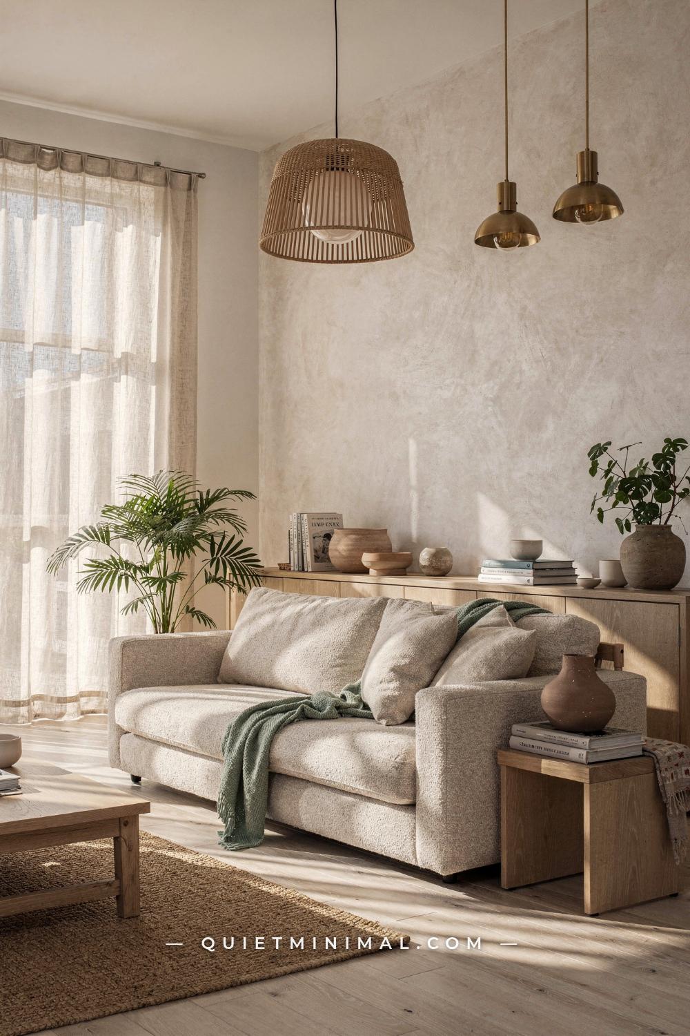
You pulled off the basics. White walls, light wood floors, a linen sofa, a fiddle-leaf fig in the corner. The room should look like every Nordic interior you saved on Pinterest. Instead it reads cold, slightly bare, and oddly stressful to be in. Nothing is technically wrong. But nothing feels right either.
That gap between “correct on paper” and “warm in person” is where most Scandinavian villa interiors fail. The style is genuinely simple, but simple does not mean easy. The results that look effortless in photographs are built on precise decisions about proportion, light temperature, material contrast, and negative space. Get those decisions wrong by even a small margin and the whole room tips from calm to clinical.
What follows is a room-by-room breakdown of the 12 most common problems in Scandinavian villa interiors, including the specific mechanics behind each failure and the practical fix that resolves it. These are not vague suggestions. They are the exact adjustments that shift a room from “Scandinavian-adjacent” to the genuine article.
Your Wall Color Has a Blue Undertone and the Room Pays for It at Night
 Save
Pure white sounds correct for a Scandinavian villa interior, and in photographs taken in bright Nordic daylight it can be. In a North American or British home, under the overhead lighting most people actually use in the evenings, that same white turns visibly blue-grey. The problem is the paint’s undertone colliding with your light source’s color temperature.
Standard LED bulbs sold at 4000K or 5000K render cool-undertone whites as faintly clinical. The room feels like an exam room rather than a retreat. The fix is two-part. First, replace any bulb running above 3000K with a warm white at 2700K. Second, swap your wall color from a pure or cool white to a warm off-white with a yellow or red undertone. Farrow and Ball “All White” (No.2005) sits at a barely-there warm undertone that still reads crisp in daylight but glows softly at night. Farrow and Ball “Pointing” (No.2003) is one step warmer and works beautifully in rooms that receive less than four hours of direct sunlight per day. Benjamin Moore “Pale Oak” (OC-20) is the current go-to for American spaces making the shift from flat white to warm Scandi, offering a light beige that reads almost white in bright rooms but holds warmth under artificial light. Little Greene “Limestone” is the British equivalent.
From the guides
You've saved it, wanted it. Here's the how: codes, measurements, order. Your choices make it yours.
 The Japandi Honest PlaybookThe honest version of the style: what to keep, what to skip, and the order to do it in.See inside →
 The Room Refresh PlaybookA repeatable four-step method, room by room, in ten minutes, thirty minutes, or one weekend.See inside →
 Make Any Room Feel Cozy on PurposeWhy some rooms hold people and others empty out, and the moves that change it.See inside →
Test any candidate color on a 12-by-12 inch (30 by 30 cm) patch on two different walls, specifically in the evening under your actual light sources. Daylight testing tells you nothing useful about how the color performs when you are actually in the room.
Key Takeaway: Your wall color’s undertone only matters at night, so test it under your actual evening lighting at 2700K before committing.

One Overhead Pendant Is Doing the Work of Three Light Sources
 Save
This is the most commonly cited problem in Scandinavian villa interiors and the easiest to diagnose. If you have one main pendant and the corners of your room feel dim and slightly oppressive, your lighting is doing single-source work in a space that needs layered sources.
The physics are straightforward. A single overhead light casts shadows downward from every object in the room: under the sofa, beneath shelving, into the corners. The eye reads those shadows as depth in an uncomfortable way rather than warmth. Layered lighting fills those shadows from different angles and heights, creating the even, enveloping glow that photographs as “calm” in Nordic interiors.
The rule in Scandinavian villa design is three sources per zone, operating at different heights. In a living room: one pendant or ceiling fixture for general fill, one floor lamp for mid-height fill behind or beside the main seating, and one or two table lamps at seated eye level (approximately 24 to 28 inches, or 61 to 71 cm, from the floor to the bottom of the shade). Each source should be on a dimmer circuit or a smart bulb, so you can drop the pendant to 30 percent in the evening while the floor and table lamps carry the warmth.
Candles count as a fourth source and are not optional in a genuine Nordic interior. A cluster of pillar candles on a tray at coffee table height adds the flicker that no LED can replicate. The practical takeaway: if you turn off every light except your overhead fixture and the room feels cold, you have a layering problem, not a decoration problem.
Key Takeaway: Add one floor lamp and one table lamp before changing a single piece of furniture, and your room’s atmosphere will shift more than any paint color swap.

Your Rug Is Too Small and the Furniture Floats Off It
 Save
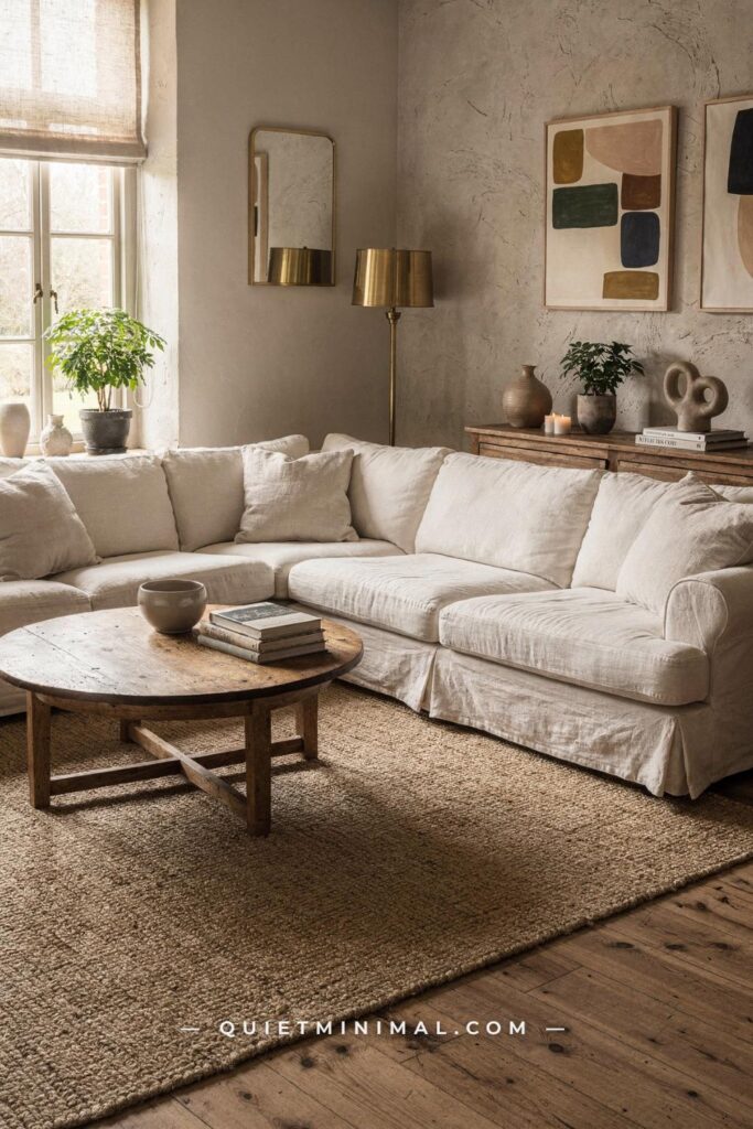
A rug that is too small is the single fastest way to make a Scandi villa living room look unfinished. The error is almost always a 5-by-8 foot (152 by 244 cm) rug in a room that needs an 8-by-10 foot (244 by 305 cm) or 9-by-12 foot (274 by 366 cm) option.
The sightline logic is this: when a rug only covers the coffee table footprint, the sofa and chairs read as separate objects floating on the floor rather than a unified seating zone. The eye looks for a ground plane that ties the furniture together. Without it, the room feels arbitrary, which is the opposite of the intentional restraint that defines good Scandinavian villa interior design.
The minimum rule is that at least the front two legs of every piece of seating should sit on the rug. Ideally all four legs land on the rug for a more grounded, architectural feel. In a villa-scale living room with 10-foot (305 cm) or higher ceilings, a 9-by-12 foot (274 by 366 cm) rug is rarely too large. Texture matters as much as size: a flat-weave wool rug in natural undyed cream or warm oatmeal reads as calm and grounded. A high-pile shag in the same color reads as casual. For Scandinavian villa interiors today, low-pile or flat-weave natural wool or jute-blend rugs in warm neutrals are the correct call.
Key Takeaway: Measure your seating arrangement’s full footprint before buying any rug, then buy the size that covers at least the front legs of every chair and the full coffee table.

Your Wood Tones Are Fighting Each Other Across the Room
 Save
Three different wood tones in a single room is the most common “almost right” mistake in Scandinavian villa interiors. A honey oak dining table, a cooler pine sideboard, and reddish-stained chair legs create visual noise that the eye reads as unresolved, even if each piece is beautiful individually.
The fix is not buying all-matching furniture. Scandinavian interiors are not supposed to look like showroom sets. The fix is committing to a dominant wood tone and letting the others serve as supporting notes at no more than 20 to 30 percent of the total wood surface area.
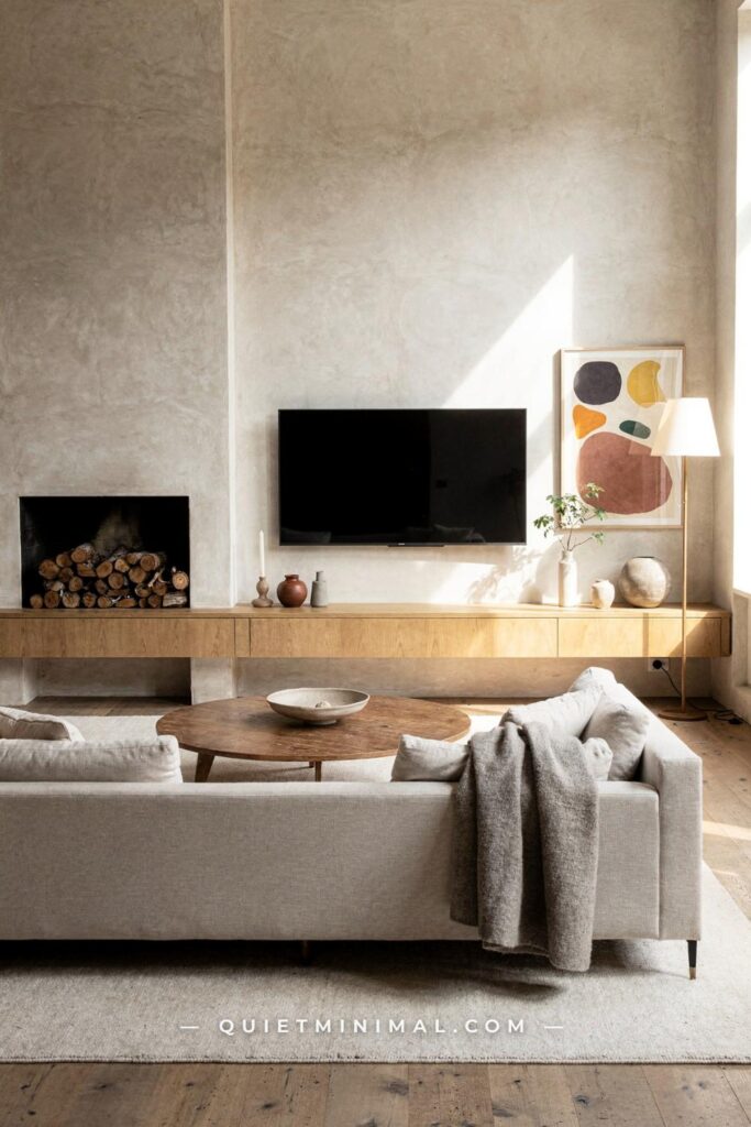
Today, honey oak is the dominant tone: warmer and more golden than the pale birch that defined the previous decade. It photographs well under 2700K lighting and pairs without conflict against warm off-white walls and natural linen textiles. If you have an existing piece in a cooler or darker tone, the simplest resolution is to make it the single accent: one sideboard in smoked ash beside four chairs and a table in honey oak reads as intentional contrast. Two pieces in mismatched tones reads as a mistake. The rule is one dominant tone, one accent tone, no third.
Floors complicate this. If your floors are a cooler, more neutral wood and your furniture is warm honey oak, bridge the gap with a natural wool rug in an oatmeal tone that sits between the two temperatures. The rug becomes the mediator and the room coheres.
Key Takeaway: Decide on one dominant wood tone, allow one accent tone at a maximum, and use a neutral-toned rug to bridge any gap between your floor and furniture.

Your Curtains Stop at the Window Frame and Cut the Room’s Height in Half
 Save
Curtains mounted at the window frame’s top edge are the fastest way to make a room with high ceilings read as low and ordinary. This is a proportion problem: the eye uses the curtain rod’s position as a reference line for the ceiling’s perceived height. Mount the rod at the window and the ceiling appears to start there. Mount the rod 2 to 3 inches (5 to 8 cm) below the ceiling line or cornice and the ceiling appears to start at the actual ceiling.
In a villa with 9-foot (274 cm), 10-foot (305 cm), or higher ceilings, the curtain rod should sit within 3 to 4 inches (8 to 10 cm) of the ceiling. The panels should be long enough to reach the floor with a 1 to 2 inch (2.5 to 5 cm) break, meaning they just graze the floor rather than puddle. Alternatively, a 3 to 4 inch (8 to 10 cm) puddle read as deliberately romantic in Scandinavian bedroom contexts.
The fabric matters as much as the length. Scandinavian villa interiors use linen almost exclusively for curtains, in unlined or lightly lined versions that let light filter through as a warm, diffused glow rather than blocking it. Blackout curtains in a main living area are a hygge killer: the room needs to be able to breathe with filtered daylight. Keep blackout liners for bedrooms only. The width of each panel should be 1.5 to 2 times the width of the window for adequate fullness when drawn. Flat panels with no fullness look more interior-design-catalogue than genuinely Nordic.
Key Takeaway: Mount your curtain rod within 3 inches of the ceiling and use floor-length linen panels with 1.5 to 2 times the window width for fullness that makes both the room and the window feel larger.

Your Sofa Is Too Deep and It Blocks Every Sightline in the Room
 Save
Deep-seated, high-backed sofas feel comfortable in furniture showrooms. In a Scandinavian villa living room, they function as walls. A sofa with a seat depth above 38 inches (97 cm) and a back height above 34 inches (86 cm) breaks sightlines between the seating zone and adjacent spaces, which is particularly damaging in open-plan villa layouts where visual continuity is the whole point.
Nordic furniture design has always favored sofas with tapered or raised legs for a reason: legs create visual clearance beneath the sofa, which makes the floor plane feel continuous and the room feel larger. A sofa sitting directly on the floor with no leg clearance pools visual weight at the base, making the room feel heavier and lower than it is.
The specification to look for: seat depth between 33 and 36 inches (84 to 91 cm), back height between 28 and 32 inches (71 to 81 cm), and legs at least 4 inches (10 cm) tall in a light wood or brushed metal. Bouclé and textured woven fabrics in warm oatmeal, cream, or pale sage are the current material choice for Scandinavian villa sofas today. They read warm rather than cold, hold their shape, and layer well with wool and linen throws.
If replacing the sofa is not realistic, raise it. Furniture risers in solid wood or metal at 4 to 6 inches (10 to 15 cm) create the leg clearance that changes how the sofa reads in the room. It is not a perfect solution, but it is a significant improvement for a minor investment.
Key Takeaway: A sofa with tapered legs at least 4 inches tall and a back height under 32 inches will open sightlines and make any Nordic villa living room feel noticeably larger and lighter.

Every Texture Is Smooth and the Room Has No Tactile Depth
 Save
A room where every surface is smooth, matte-painted, and tightly woven has a specific failure mode: it looks clean but feels cold. The eye processes texture as warmth. When there is no variation in surface quality across the walls, floor, furniture, and soft furnishings, the room reads as flat and slightly institutional even when the color palette is correctly warm.
This is the physics of tactile contrast. A rough surface next to a smooth one makes both feel more present. A limewash plaster wall next to a smooth-painted ceiling makes the ceiling feel crisper and the wall feel warmer. A chunky knit wool throw next to a flat linen duvet makes the linen feel refined. Without the contrast, neither reads.
The current Scandinavian villa interior layers at least four distinct textures in any given room: a textured wall treatment (limewash plaster, ribbed plaster, or clay plaster rather than flat latex), a natural floor material (light oak plank, stone tile, or wool-blend rug with visible weave), upholstery with tactile surface interest (bouclé, slubbed linen, woven cotton in a visible pattern), and a soft layer with a different weave or pile (a chunky-knit throw, a shearling cushion, a flat-weave jute accent). Each of these four textures should be visually readable from 6 feet (183 cm) away. If it only reads when you touch it, it is too subtle.
A practical starting point: swap your duvet cover from smooth percale cotton to a washed linen version. The visible slub and crinkle of linen adds textural depth to the entire bed arrangement for very little cost, and it reads correctly in photographs at any distance.
Key Takeaway: Aim for four texturally distinct surfaces in every room, each readable from 6 feet away, so the eye has contrast to engage with rather than a flat, uniform field.

Your Shelving Is Styled as a Display and It Reads as Clutter
 Save
Scandinavian shelving fails for one reason: everything is treated as equally important. A shelf where ten different objects all compete for attention produces zero hierarchy, which the eye reads as noise. Nordic styling is built on the opposite logic: strong negative space that makes the few displayed objects read clearly.
The rule is the one-third-open principle. At any given moment, at least one-third of your total shelf area should be empty. This does not mean one shelf empty and the others packed. It means negative space distributed across all shelves, so the eye can rest between objects. A single sculptural ceramic bowl given six clear inches on either side reads ten times more present than the same bowl surrounded by six other objects.
From the guides
You've saved it, wanted it. Here's the how: codes, measurements, order. Your choices make it yours.
The Japandi Honest PlaybookThe honest version of the style: what to keep, what to skip, and the order to do it in.See inside →The Room Refresh PlaybookA repeatable four-step method, room by room, in ten minutes, thirty minutes, or one weekend.See inside →Make Any Room Feel Cozy on PurposeWhy some rooms hold people and others empty out, and the moves that change it.See inside →The specific hierarchy for Scandinavian villa shelving: books grouped by color or height in clusters of three to five (not alphabetically, which creates random visual rhythm), one to two sculptural objects per shelf section in contrasting material (ceramic beside wood, or stone beside metal), and a botanical element every two to three sections. Dried botanicals work particularly well in Nordic villa interiors: pampas grass, dried lunaria, eucalyptus branches in a tall cylindrical vase. They add organic irregularity without requiring maintenance.
The reset process: remove everything from every shelf. Put back only the items you would choose if you were styling a room for a magazine. Most people put back about 40 percent of what they removed. The remaining 60 percent should find a home in closed storage.
Key Takeaway: Keep at least one-third of your total shelf area completely empty, and group objects by material contrast rather than category so the eye reads hierarchy instead of clutter.

Your Dining Table Is the Wrong Shape for the Room’s Proportions
 Save
A rectangular table in a square or near-square room creates visual tension that reads as spatial awkwardness. The problem is not the table itself. It is the mismatch between the table’s dominant axis and the room’s actual geometry.
In a square room, an oval or round table removes the directional tension and lets the eye travel freely around the room’s perimeter. In a rectangular room that is significantly longer than it is wide, a rectangular table aligns correctly with the long axis, but proportions still matter: the table should leave at least 36 inches (91 cm) of clear passage on the long sides (the routes people walk to reach their chairs) and at least 24 inches (61 cm) at the short ends. Less than that and the room’s primary circulation path is compromised, which creates the low-grade stress of a room that is difficult to move around in.
The current Scandinavian villa dining table is oval or round rather than rectangular in rooms where the choice is neutral either way. Oval and round tables have no corners, which softens the room’s geometry and aligns with the current trend toward rounded forms across Scandinavian furniture. The material: solid oak in a natural oiled finish. Not veneer, not painted. The visible grain of solid oak in natural light is one of the defining material qualities of the Nordic villa aesthetic.
For chair proportion, the seat height should be 17 to 18 inches (43 to 46 cm) to table underside clearance of at least 11 to 12 inches (28 to 30 cm). Paper cord seats, natural linen cushion pads, or sheepskin seat pads are the correct finishing choices.
Key Takeaway: In any room that is roughly square, choose an oval or round dining table, leave at least 36 inches of clear passage on all sides you walk, and opt for solid oak in a natural oiled finish over veneer.

Your Bedroom Has No Contrast and the Layers Disappear Into Each Other
 Save
A bedroom in all-white or near-white, including the bedding, the walls, the furniture, and the curtains, achieves a kind of visual dissolution. Each individual layer is correct, but because there is no contrast, nothing reads. The eye has nowhere to land and the room feels unanchored rather than peaceful.
The Scandinavian villa bedroom needs one element of deliberate contrast, and that contrast is not black. One or two pieces in a darker, deeper, or warmer tone are enough to give the room’s lighter elements something to push against. The most common version in current Nordic villa bedrooms is a headboard in a deep warm linen, a charcoal-toned wool throw folded at the foot, or a statement pendant in brushed brass or antique bronze above each bedside table.
The contrast should be at mid-room height, meaning visible from the doorway without looking down or up: roughly between 24 and 60 inches (61 to 152 cm) from the floor. A dark accent element at floor level (a dark rug under a pale bed) is mostly hidden. An accent element at headboard height (around 36 to 48 inches, or 91 to 122 cm, from the floor) is visible from across the room and performs its anchoring function.
A secondary layer of contrast comes through material rather than color: a raw textured ceramic lamp base on a smooth-painted bedside table, a nubby bouclé cushion against a smooth linen sham, a matte-finished nightstand beside a sheen-finished lamp. The contrast does not need to be dramatic. It needs to be readable.
Key Takeaway: Add one element at mid-room height in a tone at least two shades deeper than your walls and bedding, and the bedroom’s lighter layers will immediately read as intentional rather than washed out.

Your Kitchen Is Too White and Every Imperfection Shows
 Save
A white high-gloss kitchen looks impeccable in marketing photography shot under controlled daylight. In a real Scandinavian villa kitchen, where cooking, coffee, and morning light all combine, it reads as a surface that is never quite clean, always slightly harsh, and permanently cold.
The failure has two components. High-gloss cabinet finishes reflect everything in the room, including the unflattering overhead lighting that most kitchens run at 4000K. And pure white against white countertops against white tile creates a tonal collapse where the room loses all depth and definition.
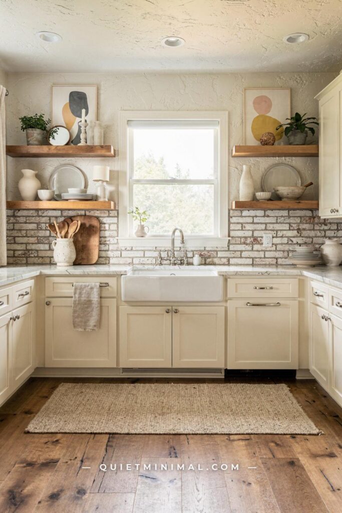
The current Scandinavian villa kitchen resolves this with a two-tone cabinet approach and a warm-toned countertop. Lower cabinets in warm sage, dusty terracotta, warm clay, or dark-stained oak. Upper cabinets in warm off-white or warm cream, not high-gloss, but in a matte or satin finish that does not reflect light directly. The countertop in honed (not polished) stone: honed Calacatta, honed black granite, or a warm quartz in an oat or cream tone. Honed surfaces have a soft, slightly matte quality that reads as tactile rather than sterile.
The hardware switch costs almost nothing relative to its impact: brushed brass, matte black, or antique bronze bar pulls at 7 to 8 inches (18 to 20 cm) length replace chrome bar pulls and immediately bring the color temperature of the cabinetry into the warm register. Cabinet hardware is the lowest-cost, highest-impact change in a kitchen that cannot be fully renovated.
Key Takeaway: Swap high-gloss all-white cabinetry for a two-tone scheme with matte finishes, and replace chrome hardware with brushed brass or matte black to remove the sterile clinical read from any Scandinavian villa kitchen.

Your Art Is Hung at the Wrong Height and the Walls Feel Too Tall
 Save
The standard art-hanging advice of 57 inches (145 cm) to the center of the frame comes from gallery practice, where art hangs in isolation on empty walls at standing viewer height. In a Scandinavian villa interior, where art almost always hangs in relationship to furniture below it, the 57-inch rule produces an awkward gap between the artwork and the piece it should anchor.
The correct relationship: art hung 6 to 8 inches (15 to 20 cm) above the top edge of the furniture it accompanies. Above a console table, a sofa, a headboard, or a sideboard. That 6 to 8 inch gap is the specific window where the art reads as “belonging to” the furniture arrangement below rather than floating independently on the wall. Narrower than 6 inches (15 cm) and the art looks crammed. Wider than 8 inches (20 cm) and the connection breaks.
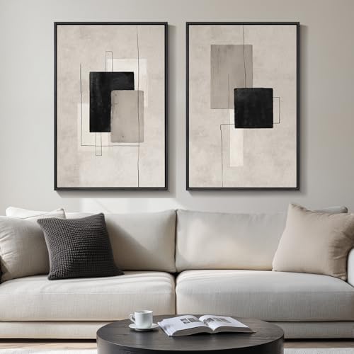
For Scandinavian villa interiors, the current framing direction is simple thin frames in natural oak, black-stained ash, or aluminum in a brushed finish. Ornate, gilded, or chunky frames read as stylistically mismatched. The artwork itself: abstract organic prints in warm neutrals, botanical illustrations, architectural photography, or simple typographic prints in a monochromatic palette. No generic inspirational phrases. No mass-produced coastal prints. One considered piece at the right height outperforms a gallery wall of nine average ones.
For villa rooms with very high ceilings of 10 feet (305 cm) or above, larger format art, specifically pieces above 24 by 30 inches (61 by 76 cm), is necessary to hold the wall’s scale. A small print on a very tall wall reads as an afterthought regardless of how carefully it is centered.
Key Takeaway: Hang art 6 to 8 inches above the furniture below it rather than at gallery height, and choose a format large enough to hold the wall’s scale relative to your ceiling height.
Getting Scandinavian villa interior design right is less about shopping the right products and more about understanding the proportional and sensory physics that make the style work. The walls, the light, the wood tones, the rugs, the curtains, the texture layers, and the art all operate within a system. When one element is off, it pulls at the others. When the system is calibrated correctly, each element makes the next one read better.
Start with the two or three problems in this list that match what you see when you walk into your space right now. Lighting is almost always the fastest return: add two sources before changing anything else. Rug size is the second most likely culprit in rooms that feel disconnected. Wall color is third. Resolve those three and the remaining elements will come into focus more easily than you expect.
From the guides
You've saved it, wanted it. Here's the how: codes, measurements, order. Your choices make it yours.
The Japandi Honest PlaybookThe honest version of the style: what to keep, what to skip, and the order to do it in.See inside →The Room Refresh PlaybookA repeatable four-step method, room by room, in ten minutes, thirty minutes, or one weekend.See inside →Make Any Room Feel Cozy on PurposeWhy some rooms hold people and others empty out, and the moves that change it.See inside → Save