Georgia
If you have lived with a room that looks right on a mood board but feels wrong the moment you sit in it, you already understand the central problem of small Scandinavian house interiors. The style promises calm, warmth, and a space that seems bigger than it measures. What most rooms deliver instead is a pale box where nothing quite lands: the sofa floats, the ceiling feels low, the kitchen reads institutional, and the lighting does exactly the opposite of what all those candle-lit Nordic photographs suggest it should.
The rooms in this article are not aspirational renders. They are real spaces, each of which solves one specific failure that comes up again and again in small Scandinavian homes. For every section, you will find what goes wrong, why it goes wrong at this scale, and the precise material or dimensional fix that corrects it. Measurements run inch-first with centimetres in parentheses, because the difference between a coffee table that grounds a room and one that shrinks it is often a matter of six inches.
The Vaulted Ceiling Problem: Why You Need a Bold Anchor Color
 Save
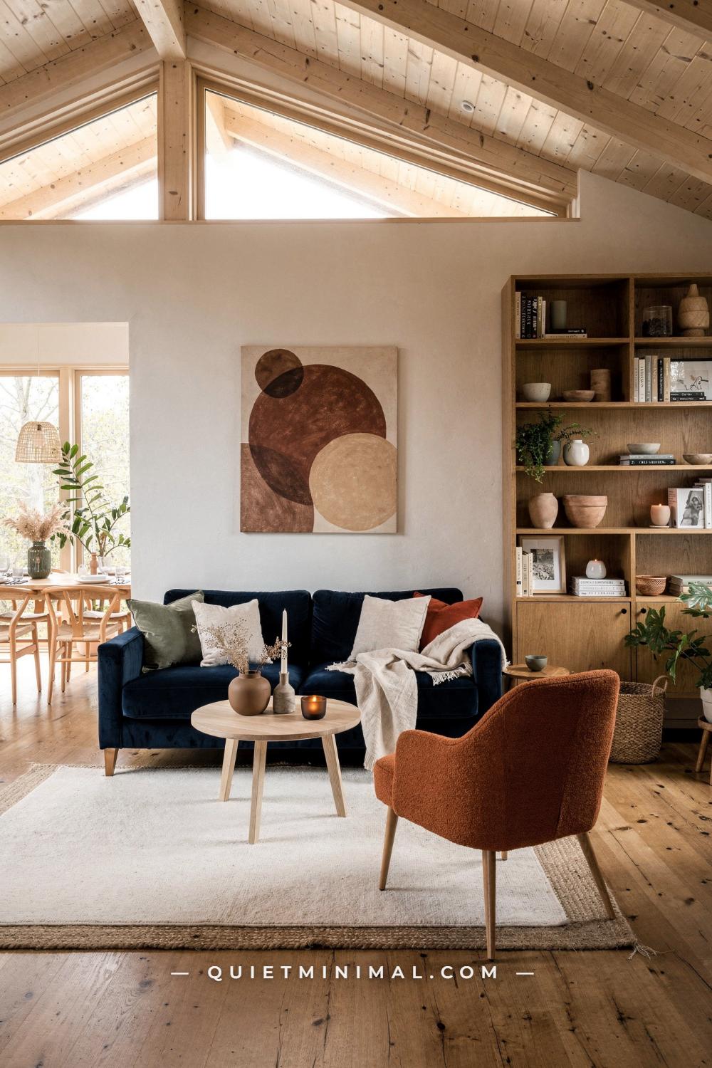
The failure in a high-volume room with a vaulted ceiling is almost always the same: someone fills it with pale furniture in a pale palette, and the space absorbs everything without a fight. You end up with a lot of square footage and nothing for the eye to rest on. The room feels bigger in the wrong way, closer to an airport departure hall than a home.
The fix is a bold color anchor in the seating zone, and it needs to be big enough to hold its own against the ceiling height. A navy blue velvet sofa at approximately 84 in (213 cm) wide is the right call here: that width spans enough of the room’s horizontal plane to read as an anchor rather than a piece of furniture that got left in the middle of a field. Pair it with a terracotta boucle accent chair at roughly 28×28 in (71×71 cm), positioned so the two face each other at a slight angle, and you have created a conversation zone that signals that this is where the room lives.
The birch coffee table at 30 in (76 cm) in diameter is deliberately small. A large table between those two seating pieces would create a physical and visual barrier. The small round table allows sightlines to pass through the seating zone, making the room feel connected rather than partitioned. The pine ceiling above is warm honey in tone, and that warmth is picked up by the birch and by the abstract circular print in rust and brown tones at around 30×30 in (76×76 cm) on the back wall. Everything above the sightline is warm wood and natural light; everything below it is rich, saturated color.
From the guides
You've saved it, wanted it. Here's the how: codes, measurements, order. Your choices make it yours.
 The Japandi Honest PlaybookThe honest version of the style: what to keep, what to skip, and the order to do it in.See inside →
 The Room Refresh PlaybookA repeatable four-step method, room by room, in ten minutes, thirty minutes, or one weekend.See inside →
 Make Any Room Feel Cozy on PurposeWhy some rooms hold people and others empty out, and the moves that change it.See inside →
The navy-to-terracotta pairing is not accidental. These two colors sit across from each other on the color wheel, which means they intensify each other without clashing. In a room with this much pine overhead, cool-warm contrast in the furniture keeps the space from reading as all-one-temperature, which is one of the most common things that makes a high-ceilinged Scandinavian space feel flat rather than serene.
Key Takeaway: In a vaulted Scandinavian room, the seating zone must anchor the space with bold color; a navy sofa at 84 in (213 cm) paired with a terracotta accent chair gives the eye a place to land without fighting the ceiling.

The Low-Seat Problem: Why Plant Volume Replaces Ceiling Height
 Save
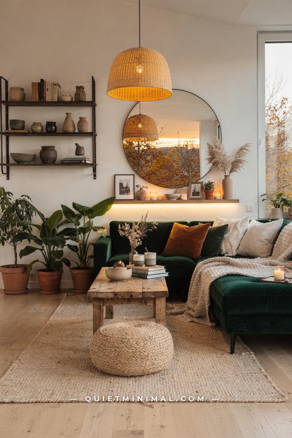
A low-profile sectional solves the problem of furniture that dominates a small room in elevation, but it creates a new one: when every piece of furniture sits below the 30 in (76 cm) mark, the room starts to feel pressed flat. The walls above the furniture line are empty, and that emptiness reads as an unfinished space rather than considered minimalism.
The botanical solution here is specific and proportional. Three large leafy plants in terracotta pots along the left wall are doing more than adding greenery: they are filling vertical space at graduated heights from roughly 24 in to 60 in (61 to 152 cm), which creates a canopy effect that bridges the gap between the low-seating zone and the upper wall. The rattan pendant at approximately 24 in (61 cm) in diameter completes the vertical sequence overhead. Without those three elements, this room would have a low sofa, a floor, and a wall.
The L-shaped forest green velvet sectional at approximately 110×85 in (280×215 cm) is the primary material moment. Forest green is one of the few saturated colors that holds up against the warmth of terracotta pots and cream jute without needing anything else in the room to justify it. The chunky plank coffee table at 48×24 in (122×61 cm) adds visual weight at the center of the seating arrangement, which prevents the sectional from pulling the composition too far to one side of the room. A coffee table this substantial needs to be solid, not glass: glass here would dissolve the center of the seating zone visually and leave the room feeling unfocused.
The oversized round mirror at 30 in (76 cm) behind the sofa performs a specific spatial function in a small room: it reflects the window on the right and doubles the apparent light in the space. Position it centered on the wall directly behind the back of the sectional, ideally at a height where the lower edge aligns with the sofa back at around 30 in (76 cm) from the floor.
Key Takeaway: When a low-profile sectional flattens a small room, fill the vertical plane with graduated botanical height and a substantial ceiling pendant, not more furniture.
The Cabin Living Room Problem: Why Symmetry Is a Structural Tool
 Save
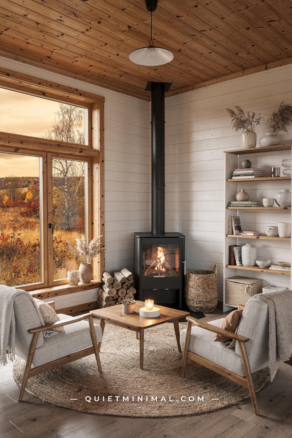
The most common failure in a cabin living room is a single sofa pushed against one wall, facing a television, with everything else arranged around those two fixed points. The result is a room that has a clear front and a clear back, and most of the space behind the sofa feels unused and undefined. In a small cabin, that is a fatal arrangement because there is no overflow zone to absorb the unused space.
The symmetrical pair formula solves the problem at a structural level. Two light-grey linen armchairs at approximately 28×28 in (71×71 cm) each, positioned facing each other on either side of a matte black cast-iron wood stove at roughly 24 in (61 cm) tall, create a room with a clear focal point that is not a screen. The stove is centered against the wall, and the chairs are arranged symmetrically around it on a round jute rug at approximately 5 ft (150 cm) in diameter. That rug defines the seating zone as a contained area, which makes the room feel deliberate rather than sparse.
The low oak rectangular coffee table at 42×20 in (107×51 cm) sits between the two chairs. The proportions matter here: a table this narrow allows both chairs to reach it comfortably without pushing the chairs further apart than the rug will allow. The shiplap walls in a white that leans toward cool grey and the pine tongue-and-groove ceiling above create a material dialogue that the linen and jute carry through in the furniture. Rough surfaces offset smooth ones throughout: rough pine above, smooth shiplap behind, rough jute underfoot, smooth linen on the chairs, rough iron on the stove.
The wicker basket beside the stove at approximately 16×16 in (41×41 cm) is a practical detail that reads as styled: it implies use, which is the specific quality that separates a hygge interior from an interior design photograph.
Key Takeaway: Symmetrical seating flanking a central stove defines a cabin living room as a destination in itself, solving the problem of a room that only works when the television is on.

The Media Wall Problem: How to Make a Television Feel Considered
 Save
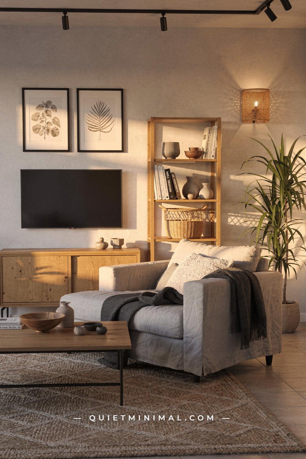
The television problem in a Scandinavian interior is specific. The look depends on restraint, and a black rectangle on a white wall is the opposite of restrained: it reads as a visual hole, pulling every eye in the room toward it regardless of whether it is on or off. Most people handle this by either ignoring it or hiding it behind a panel that introduces its own design problem, which is a piece of furniture that announces it is concealing something.
The correct approach is to build a wall around the television that gives the eye multiple things to look at, so the screen becomes one element among several rather than the only thing in the composition. Two botanical leaf prints in black frames at approximately 16×20 in (41×51 cm) each, centered on either side of the television above the oak media console, are doing exactly this. The prints are close enough to the screen that they frame it rather than flanking it from a distance, which would only draw more attention to the gap between them.
The oak media console with sliding panel doors at approximately 60×18 in (152×46 cm) solves the storage problem below the screen without introducing visual noise. The sliding doors mean no visible hinge hardware, and the oak panels continue the warm-toned wood material running through the room. The dracaena in the corner to the right, at floor height, softens the vertical edge of the console and prevents the media wall from reading as a pure rectangle.
Lighting in this room at dusk comes from a ceiling-mounted track rail with warm-toned bulbs and a rattan wall sconce. The track rail allows individual lights to angle toward the media wall, which washes the prints in warm light and reduces the contrast between the glowing screen and the surrounding wall. That contrast is the reason televisions look so stark in Nordic interiors: the white walls amplify the screen. Directed warm light reduces the differential.
Key Takeaway: Frame a television with two prints, not above it alone, to break the wall into multiple focal points; add directed warm track lighting to reduce the stark contrast between screen and white wall.

The Open-Plan Zone Problem: Why Furniture Performs the Work of Walls
 Save
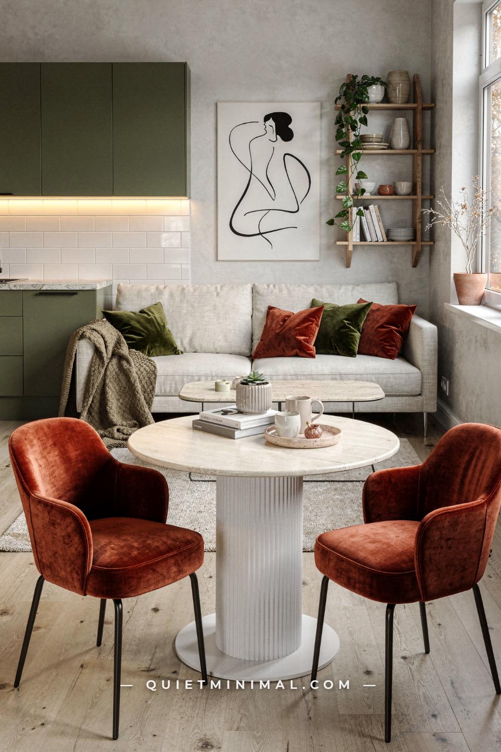
The failure in an open-plan compact apartment is not too little space. It is too much space that has been left undivided: a single volume where it is impossible to tell where you are supposed to sit, eat, or cook. The room feels like a showroom floor because there are no edges, no zones, no reason to move from one part of it to another.
Zone separation through furniture scale and color is the structural solution. The cream linen sofa at 84 in (213 cm) wide is positioned with its back to the dining zone, which is the most important thing it does: the back of the sofa creates a physical and visual edge between living and dining. There is no wall, but the sofa acts as one. The oval travertine-look coffee table at approximately 48×24 in (122×61 cm) anchors the sofa in its zone by giving it a defined center of gravity, so the living area reads as a complete composition rather than a sofa that happens to be in front of a window.
The dining zone is defined by the fluted white pedestal round table at approximately 42 in (107 cm) in diameter with two terracotta velvet armchairs in black legs. The round table with the pedestal base is specifically correct for a small space: there are no legs at the corners to navigate around, which means the chairs can approach from any angle, and the footprint is smaller than a rectangular table of equivalent seating capacity. The terracotta velvet of the chairs picks up the terracotta cushions on the sofa, which stitches the two zones together across the visual divide.
The olive-green kitchen cabinets behind the dining zone complete the spatial sequence: living in cream and terracotta, dining in white and terracotta, kitchen in olive green and white. Three distinct material moments in one volume, organized by color rather than walls.
Key Takeaway: In an open-plan apartment, the back of the sofa creates the wall between living and dining; round dining tables with pedestal bases minimize the footprint and allow chairs to approach from any direction.

The Loft Studio Problem: How to Stack Living Zones Vertically
 Save
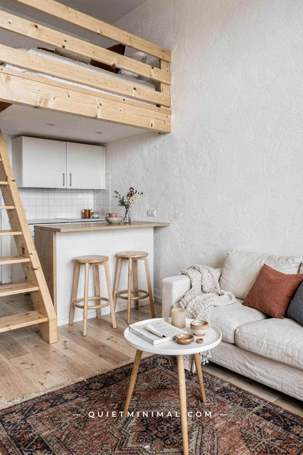
The studio apartment fails in a specific way: the bed is visible from the entry, every zone competes with every other zone, and the ceiling, the only dimension that has not been divided, is doing nothing. A mezzanine sleeping platform solves all three problems at once, but most renters and small-home owners assume it requires a structural renovation. In practice, the mezzanine platform itself is a built element, but everything below and around it is furniture: the galley kitchen, the bar counter, the sofa zone.
The mezzanine loft bed platform sitting approximately 7 ft (213 cm) above the floor creates a sleeping zone that is genuinely separate from the living zone below without consuming any floor area. The open wooden staircase at roughly 36 in (91 cm) wide uses open treads rather than solid risers, which means light passes through it and the staircase does not read as a solid wall. That visual permeability is critical in a small volume: a solid stair creates a partition; an open stair creates a vertical journey.
Below the mezzanine, the galley kitchen with white upper cabinets and a bar counter with two round birch stools at approximately 18 in (46 cm) seat height occupies the zone that would otherwise be dead space under the platform. The birch stools are proportionally correct for a bar-height counter: a full dining chair here would push the occupant’s eye level too close to the underside of the mezzanine above.
The vintage Persian rug in rust and navy at approximately 5×7 ft (150×210 cm) defines the sofa zone on the pale oak floor. The rug provides the one moment of pattern and heritage in an otherwise white and birch interior, which is the detail that prevents the room from reading as a hotel room. The terracotta accent cushion on the cream sofa picks up the rust in the rug and connects the two zones by color without requiring any additional furniture.
Key Takeaway: A mezzanine sleeping platform solves the studio problem by using vertical space, leaving the floor plan entirely free, and requiring open-tread stairs to maintain visual permeability throughout the volume.

The Shaker Kitchen Problem: Why Exposed Brick Belongs Here
 Save
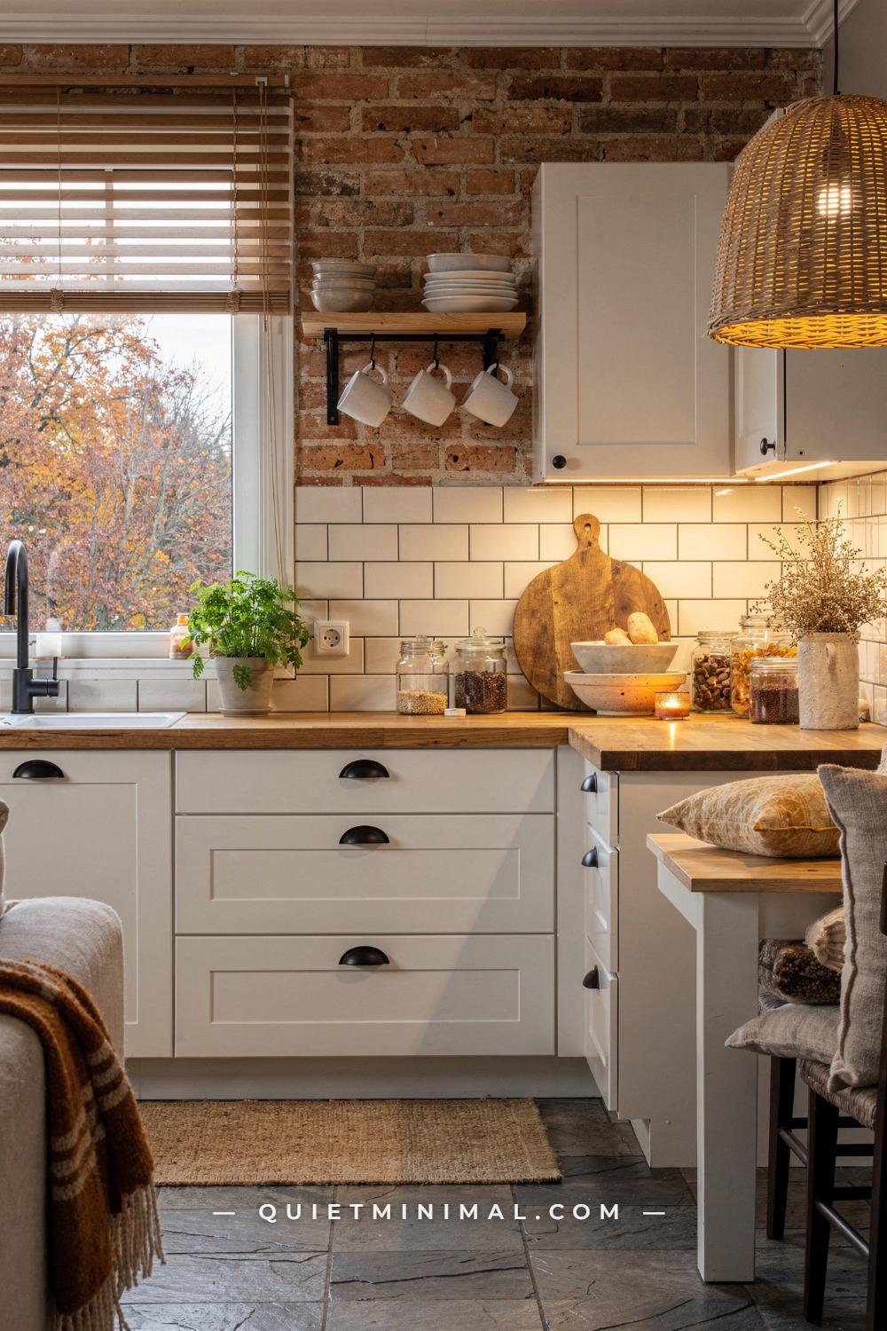
White shaker cabinets are one of the most forgiving kitchen choices in a small Scandinavian home, but they carry one consistent failure: installed in a small kitchen without a focal wall, they read as a box. Every surface is the same material at the same reflectivity, and the eye has nowhere to land except on the appliances, which are not what you want to look at.
The exposed brick wall solves the focal point problem with a material that brings texture, warmth, and visual depth simultaneously. Red-orange brick running floor to ceiling on one wall in this kitchen creates a backdrop that makes every other surface in the room read differently: the cream shaker doors look brighter against it, the warm honey oak butcher-block countertop at approximately 1.5 in (4 cm) thick reads as warm rather than institutional, and the black cup-pull hardware on the cabinet doors becomes a deliberate accent rather than a functional afterthought.
The butcher-block countertop is the most important material decision in this kitchen after the brick. Warm honey oak at this thickness has a presence that white quartz or laminate cannot match at small scale: the wood grain gives the eye something to follow across the surface, which makes the counter feel longer and more considered than its actual dimensions. The mug rail mounted on the wooden wall shelf adds personality without taking up counter space, which is the specific constraint of a small kitchen: every inch of counter is precious, and hanging storage is the correct answer.
The jute runner at approximately 24×60 in (61×152 cm) on the grey tile floor introduces a third material layer at foot level. In a kitchen this tight, the floor is always in view, and a jute runner over a hard tile floor softens the acoustic quality of the space as much as its visual one.
Key Takeaway: A single exposed brick wall in a white shaker kitchen provides the focal point and material warmth that prevents the room from reading as a box; pair it with a butcher-block countertop thick enough to hold its own against the brick’s visual weight.

The Mustard-and-Teal Problem: When Vintage Color Confidence Works in Small Rooms
 Save
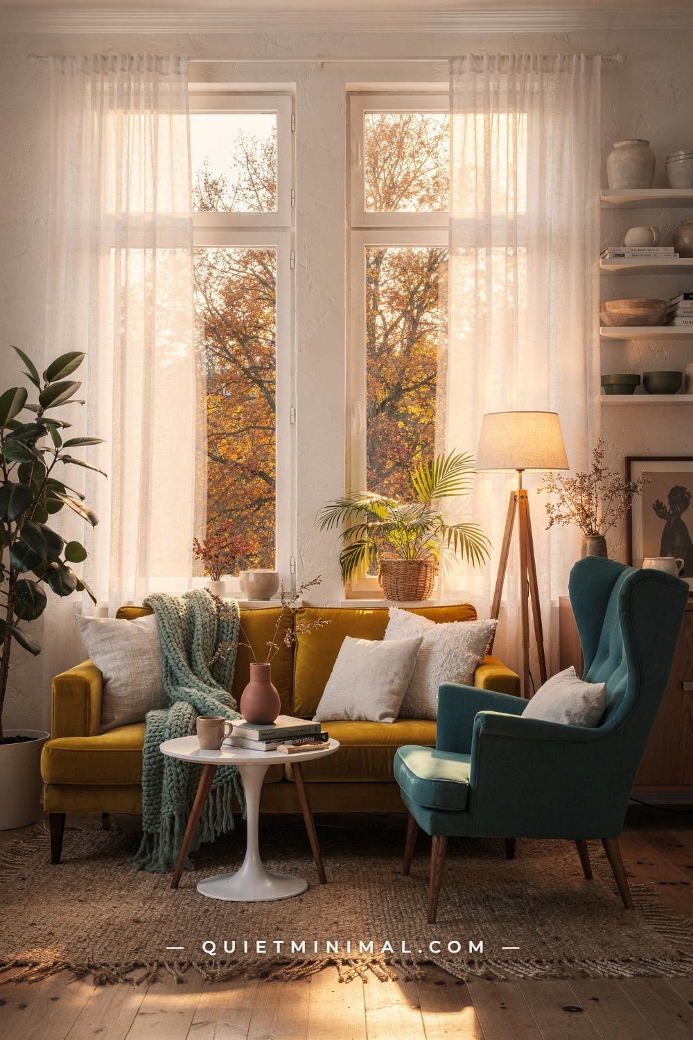
The failure mode for color-confident mid-century interiors in small spaces is not the color itself but the absence of a unifying material thread. A mustard sofa and a teal armchair look like competing furniture, not a composed room, when the only thing connecting them is proximity. Without a shared material running through both pieces, the colors read as a coincidence rather than a decision.
The unifying material here is teak. The mustard velvet sofa at approximately 80 in (203 cm) wide has a teak frame with tapered legs, and the teal high-back armchair has the same teak frame construction. That shared material ground makes the two colors feel like a deliberate pairing rather than two individual purchases from different decades. The warm brown of the teak holds equal distance between mustard and teal on the warmth-to-cool spectrum, which is why it works as the connecting material.
The round white pedestal side table at approximately 24 in (61 cm) in diameter sits between the sofa and the chair. The round form is specifically correct in this composition: a square or rectangular side table would introduce a third geometric language alongside the rectangular sofa and the organic lines of the teak legs. A circle is neutral, and the white finish reflects the wall color rather than adding another tone.
Crown molding on the white walls matters in a space with this much color. The molding provides a horizontal resolution at the ceiling line that makes the colored furniture feel contextually appropriate rather than dropped into a bare box. The two tall divided-pane windows with sheer curtains allow the cool daylight to enter the room without competing with the warm interior tones. The jute-fringe rug at floor level provides the material bridge between the warm teak and the cool white walls.
Key Takeaway: In a mustard-and-teal mid-century pairing, the unifying material must run through both pieces, not just appear as props: shared teak frames make two opposing colors read as a composed decision.

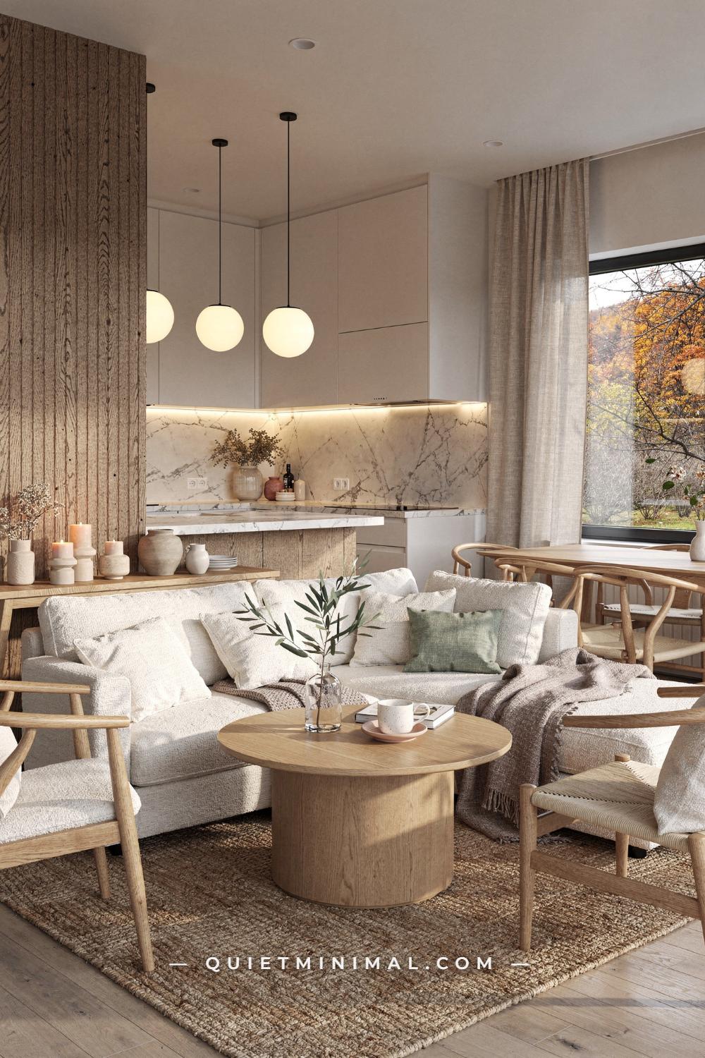
The Open-Plan Zoning Problem: How a Slat Panel Replaces a Wall
 Save
The problem with purely open-plan homes is not that they lack walls. It is that without visual edges, the eye reads the entire volume as a single zone, which paradoxically makes every zone feel smaller because there is no sense of arrival, no moment where you move from one space to another. The solution is not to build a wall; it is to create the suggestion of one with a material that allows light and sightlines to pass through.
A vertical oak slat accent panel running floor to ceiling is the correct answer here, and the proportions explain why it works. The panel is tall enough to read as a room divider at ceiling height, but the gaps between the oak slats mean that you can see the kitchen zone behind it, which preserves the feeling of openness that the open-plan layout was intended to create. It is a visual filter rather than a physical barrier.
The cream boucle L-sectional sofa at approximately 100×80 in (254×203 cm) is positioned in front of the panel, with the sofa’s back to the kitchen zone. This reinforces the division: when you sit on the sofa, the kitchen is behind the panel behind you, and the living zone is entirely in front. The round solid-oak coffee table at approximately 36 in (91 cm) in diameter anchors the sofa in its zone. At that diameter, the table is reachable from every seat on the L without pushing chairs out to a radius that would break the composition.
The three amber globe pendants over the kitchen island provide a warm punctuation mark in the kitchen zone that is visible through the oak slat panel. That warm glow, glimpsed through the vertical rhythm of the slats, is what makes the panel feel architectural rather than merely decorative. It creates a sense of depth: something warm is happening beyond the boundary of the living zone.
Key Takeaway: A floor-to-ceiling oak slat panel divides an open-plan space into legible zones without blocking light or sightlines, and its effectiveness depends on having warm light visible through it from the kitchen side.

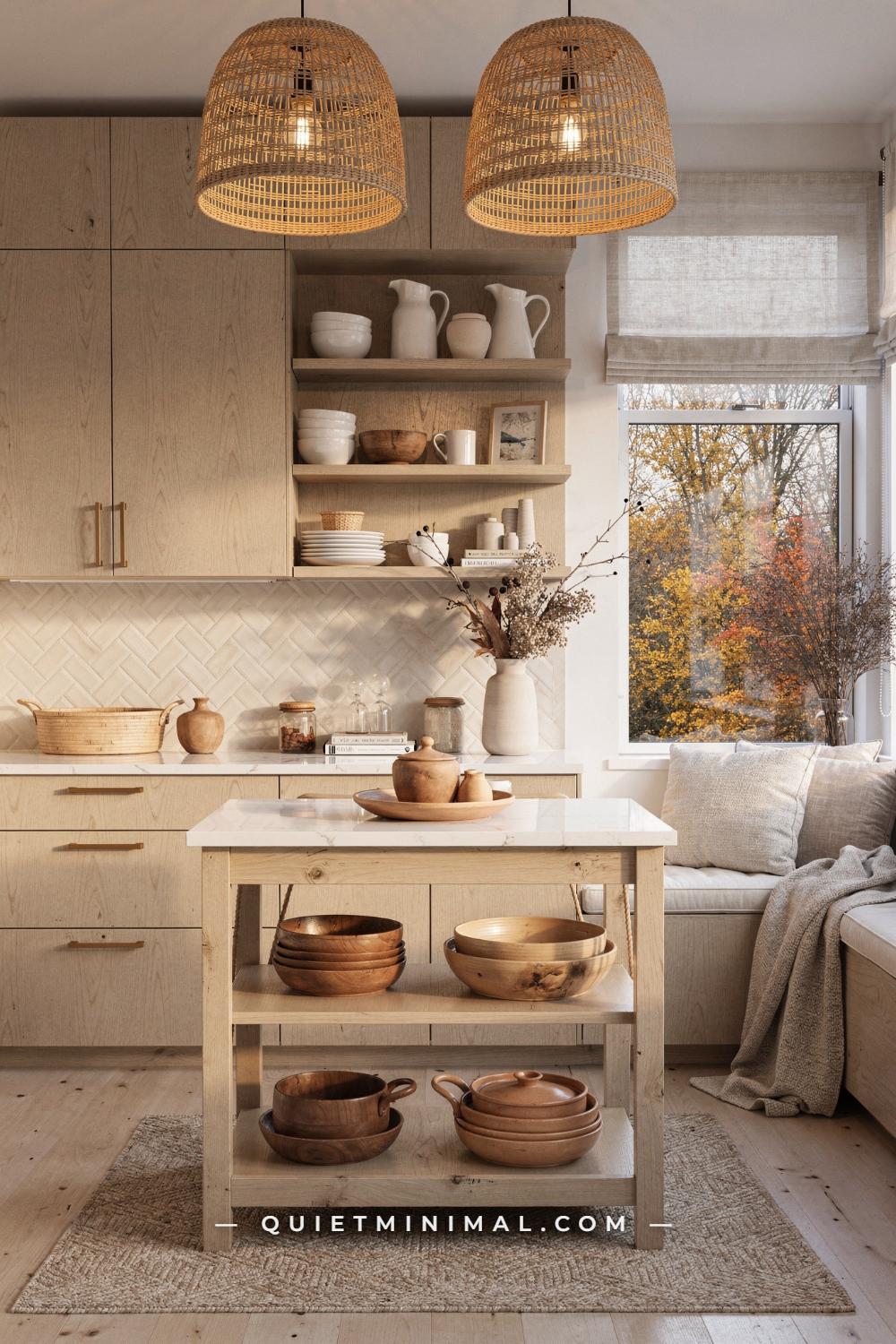
The Gallery Kitchen Problem: Why Wicker Pendants Prevent the Surgical Theater Effect
 Save
Flat-front blonde oak cabinets with white quartz countertops are one of the most balanced material combinations in Scandinavian kitchen design: the oak is warm, the quartz is cool, and together they hold a room at a calibrated neutral temperature. The problem is that this neutrality, when lit with recessed ceiling downlights alone, reads as surgical. Every surface is equal, every corner is equally lit, and the room looks more like a hospital prep room than a kitchen.
Two wicker dome pendants at approximately 20 in (51 cm) each in diameter solve the problem at the source. They introduce an organic, hand-woven texture into a room that currently has flat-cut oak, smooth quartz, and ceramic tile. That texture contrast is the critical design move: you cannot make a kitchen feel warm by adding warm materials of the same category. You need to change the material category entirely, which is what rattan does in a room made of wood and stone.
The placement matters. The two pendants hang over the kitchen island at a height that brings the light source down to approximately 30 in (76 cm) above the countertop. At that height, the pendants create a pool of warm, directed light at work-surface level, which gives the island a different quality of illumination than the surrounding counters. The island becomes the focal point of the kitchen, which is where you want attention: it is where food is prepared and where people gather.
The open oak floating shelves at approximately 36×8 in (91×20 cm) on the back wall, displaying stacked white bowls, wooden bowls, and ceramic pitchers, add the everyday humanity that a kitchen needs. Closed cabinet fronts are the correct choice for storage, but one run of open shelving is the place where a kitchen develops character: the stacked ceramics tell you someone actually cooks here.
Key Takeaway: Wicker dome pendants hung low over a kitchen island solve the surgical-theater problem in a flat-front oak kitchen by introducing organic texture and directed warm light at the one point where the room needs a focal moment.

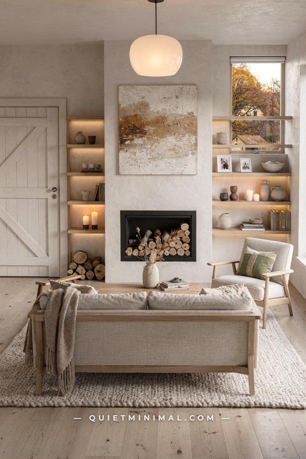
The Fireplace Wall Problem: Why Symmetry Must Be Earned, Not Just Applied
 Save
The symmetrical fireplace wall is one of the most copied configurations in Scandinavian interior design, and one of the most frequently executed incorrectly. The typical failure is a fireplace flanked by two shelving units that are identical in dimension but hold different objects: one side has books, the other has a vase and a plant. The visual result reads as asymmetry trying to look symmetrical, which is worse than simply choosing one or the other. The eye detects the attempt and the mismatch simultaneously.
Earned symmetry means the built-in oak shelving units flanking the fireplace at approximately 36×72 in (91×183 cm) each are filled with the same category of objects at the same approximate density on both sides: books and ceramics on both left and right, at similar heights within each shelf. The objects do not need to be identical, but they need to share a visual weight. If one side has four books and the other has twelve books and a large ceramic jug, the balance collapses.
The linen sofa at approximately 84 in (213 cm) with light oak frame and the matching linen armchair at 28×28 in (71×71 cm) positioned to the side complete the composition by continuing the oak material into the seating zone. The material continuity between the built-in shelves and the furniture frames is what makes the room read as designed rather than assembled: every wood-toned element belongs to the same family.
The large abstract textured canvas at approximately 40×50 in (102×127 cm) above the fireplace provides the one asymmetrical moment in the composition, and it earns its place by being singular. One large piece above the fireplace, centered on the chimney breast, is the visual crown of a symmetrical wall. Two prints flanking a smaller piece would compete with the shelves and destroy the hierarchy.
Key Takeaway: Symmetrical shelving flanking a fireplace fails when both sides hold different object categories; fill each side with the same category of things at the same visual density, then crown the wall with a single large artwork centered above.

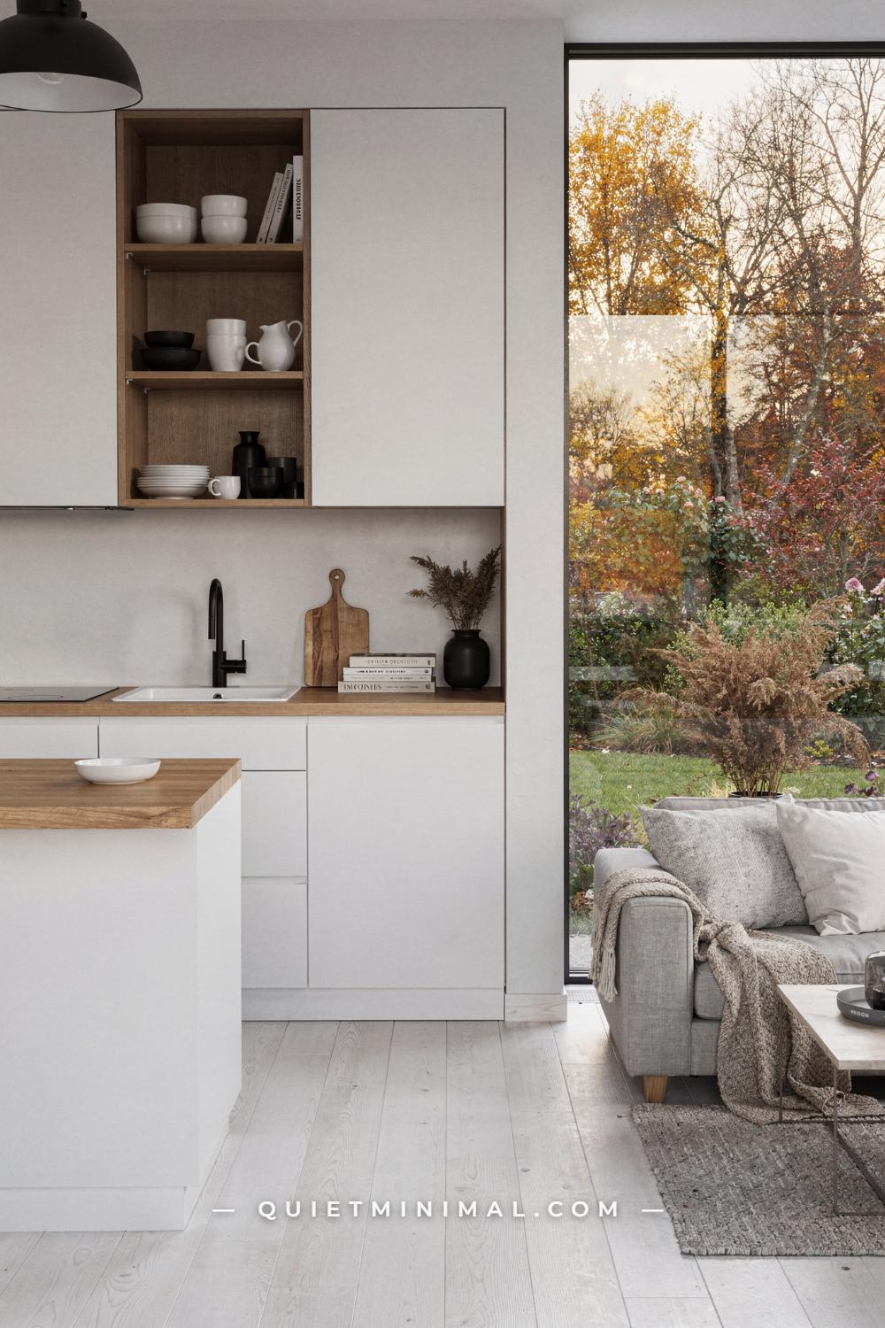
The White-Kitchen Minimalism Problem: How the Birch Niche Does All the Work
 Save
A fully white handleless kitchen is the most demanding interior to execute in a small Scandinavian home. The design philosophy depends on the quality of what is not there: no hardware reveals, no visible hinges, no surface variation. When it works, the room reads as architectural. When it fails, and it fails in predictable ways, the room reads as unfinished, because every element that would normally provide visual interest has been deliberately removed.
The recessed birch niche at approximately 24×36 in (61×91 cm) is the element that makes this kitchen work. It is the one deliberate break in the flat-white cabinet run, and because it is lined in birch shelving that matches the butcher-block countertop at approximately 1.5 in (4 cm) thick, the niche reads as an architectural detail rather than a storage solution. The warm birch blonde against the pure white lacquer is the only material contrast in the room, which means every eye goes to it. It is the focal point the room would otherwise lack entirely.
The birch butcher-block countertop is the second critical element. It runs across the base cabinets and over the white kitchen island at approximately 48×24 in (122×61 cm), creating a continuous warm wood surface at waist height that interrupts the white without breaking its discipline. The grain of the birch is visible enough to read as natural material from across the room.
The matte black basin tap is the punctuation mark: a single dark element against the white that reads as intentional rather than incidental. In a kitchen with no hardware and no surface variation, the tap is the only fixture visible as a designed object. It needs to be matte, not polished chrome, because polished chrome reflects everything around it and becomes invisible in a white room.
Key Takeaway: A fully handleless white kitchen needs exactly one material break to read as architectural rather than unfinished; a recessed birch niche at countertop depth provides the warmth and the focal point simultaneously.

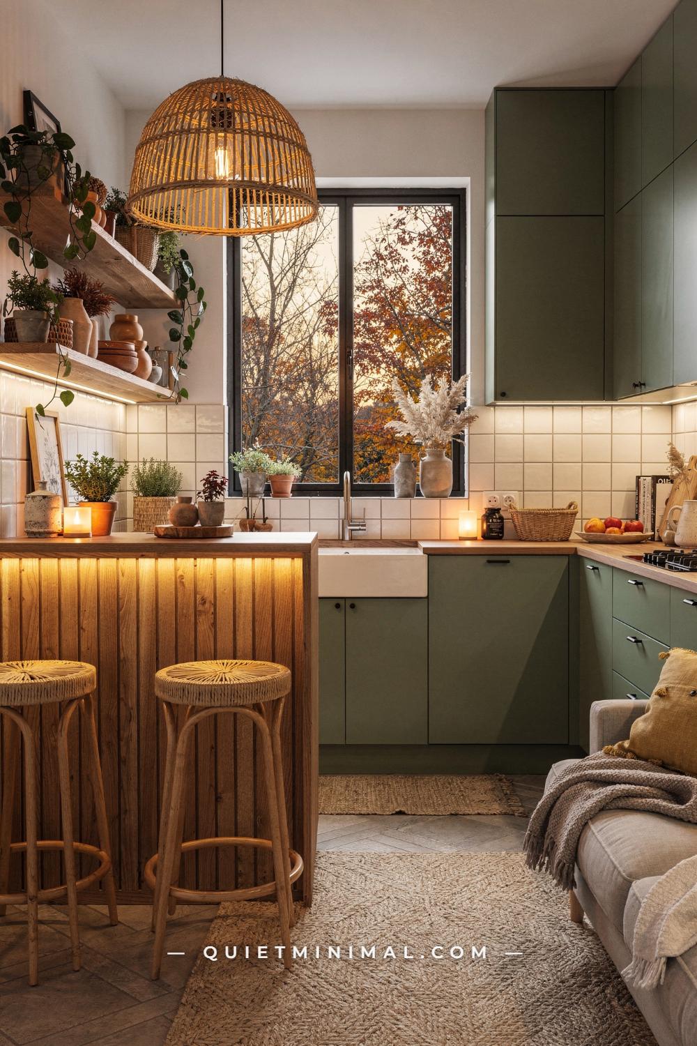
The Sage Green Kitchen Problem: Why the Breakfast Bar Saves the Galley
 Save
The galley kitchen in a small home has a social problem that its space problem obscures. The layout forces everyone who enters the kitchen to stand in a line, which means the person cooking is either working alone or being stood behind. There is no position in a galley kitchen that allows two people to be comfortable simultaneously unless one of them has a dedicated place to sit.
A narrow breakfast bar with a slatted wood front, projecting from the end of one counter run, solves this problem without enlarging the kitchen’s footprint. The bar extends the counter plane by approximately 12 in (30 cm) in depth, but because it is a different height, surface material, or at a different orientation from the cooking surface, it reads as a seating destination rather than an extension of the workspace. Two round rattan-seat counter stools at approximately 24 in (61 cm) seat height give the second person a fixed position at eye level with the cook, which changes the social dynamic of the room entirely.
The sage green flat-front cabinets are the defining material choice here. Sage is the correct green for a small kitchen because it occupies the middle ground between cool grey-green, which can read as grey in poor light, and warm olive, which demands a specific lighting condition to stay green. At this exact value, sage reads consistently warm in morning light and cool in afternoon light, which means the kitchen looks different at different times of day and therefore feels more alive than a fixed-value neutral.
The rattan dome pendant at approximately 16 in (41 cm) in diameter over the breakfast bar does double duty: it provides dedicated light for the seating zone and signals that the bar is a destination, not just an overhang. Without the pendant, the bar reads as a counter shelf; with it, the bar becomes the social heart of the kitchen.
Key Takeaway: A narrow breakfast bar at counter-end with rattan stools at 24 in (61 cm) seat height turns a galley kitchen from a single-person workspace into a social room; the pendant above the bar is what makes the designation official.

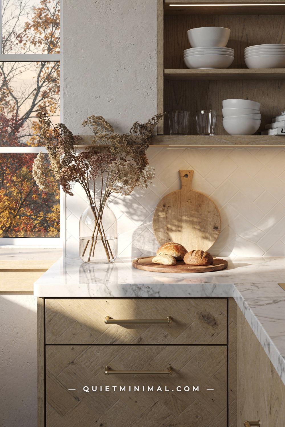
The Counter Vignette Problem: Why the Everyday Kitchen Moment Needs to Be Styled
 Save
The counter vignette is the single detail that separates a kitchen that looks finished from one that looks staged. The failure is almost always the same: either the counter is completely clear, which reads as a kitchen no one uses, or it is full of appliances, which reads as a kitchen with no intention. Neither version makes a small kitchen feel like a place worth spending time in.
The correct edit for a Scandinavian counter vignette uses three categories of object: a cutting board, a vessel with something in it, and a tray or board with something on it. Here: a round oak cutting board at approximately 12 in (30 cm) in diameter leaned against the herringbone tile backsplash, a tall clear glass vase with dried branches at roughly 18 in (46 cm) height, and a round wooden serving board with bread rolls at approximately 12 in (30 cm) in diameter. These three elements cover three scales, three materials, and three heights, which is what creates the visual interest without creating clutter.
The light oak herringbone-veneer lower cabinets with brushed brass bar pulls establish the warmest material note in the room. Herringbone pattern in the veneer adds visual movement to a flat-front cabinet at no additional cost and without introducing a second wood species. The brushed brass pulls at this scale are small enough to read as accents rather than hardware; they connect the cabinet faces to the counter-level styling without dominating either.
The open shelving above the counter, displaying stacked white ceramic bowls at approximately 8 in (20 cm) in diameter and clear glass tumblers, adds the layer of permanent styling that the counter vignette below builds from. Stacked ceramics on open shelving read as curated, not decorative, because they imply function.
Key Takeaway: A Scandinavian counter vignette needs exactly three objects at three different heights and materials: a board, a vessel, and a tray; any more than three reads as clutter, any fewer reads as an empty counter.

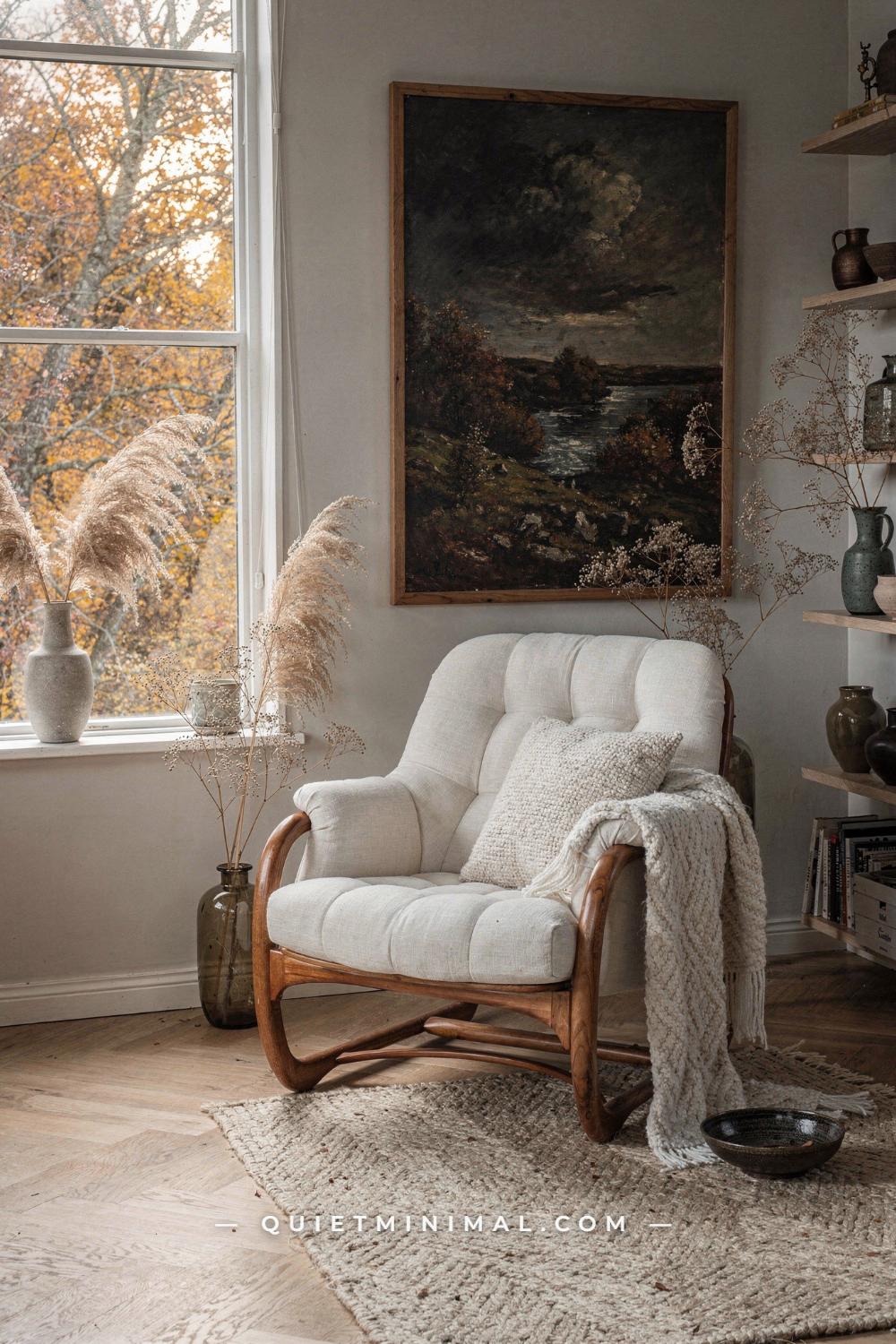
The Reading Corner Problem: Why One Chair Beside One Window Is a Complete Room
 Save
The reading corner fails in small Scandinavian homes when people try to make it too much: a chair, a side table, a floor lamp, a small bookcase, and a plant all competing for the same corner square footage. The result is a mini-room within a room, and it looks exactly as crowded as it sounds. The Nordic approach to a reading corner is instead to make it deliberately spare: one chair, one window, and the confidence to leave the rest of the corner empty.
From the guides
You've saved it, wanted it. Here's the how: codes, measurements, order. Your choices make it yours.
The Japandi Honest PlaybookThe honest version of the style: what to keep, what to skip, and the order to do it in.See inside →The Room Refresh PlaybookA repeatable four-step method, room by room, in ten minutes, thirty minutes, or one weekend.See inside →Make Any Room Feel Cozy on PurposeWhy some rooms hold people and others empty out, and the moves that change it.See inside →The chunky tufted cream linen lounge chair at approximately 34×34 in (86×86 cm) on a curved teak base is large enough to be its own statement. At that seat depth, it reads as a chair designed for genuine horizontal comfort rather than upright perching, which signals its purpose to anyone who walks in. Position it within arm’s reach of the window, with the window slightly behind and to the left, so daylight falls across the page rather than directly into the reader’s eyes.
The large dark landscape oil painting in a warm wood frame at approximately 36×48 in (91×122 cm) mounted on the wall adjacent to the chair provides the visual anchor that prevents the corner from floating. A reading corner without wall art is an isolated chair; with one significant painting, it becomes a curated position within the room. The dark, moody quality of the landscape reinforces the introspective character of the space rather than contrasting with it.
Two slim vases with dried branches at approximately 24 in (61 cm) tall, one on each side of the chair, provide vertical elements at a height that does not block the window. Dried branches in a Nordic context serve the same function as cut flowers without their ephemerality: they bring organic form into an interior without requiring maintenance.
Key Takeaway: A reading corner only works at small scale when it is edited to exactly one chair and one significant painting; adding a side table and lamp and bookcase converts a contemplative pause into a furniture pile.

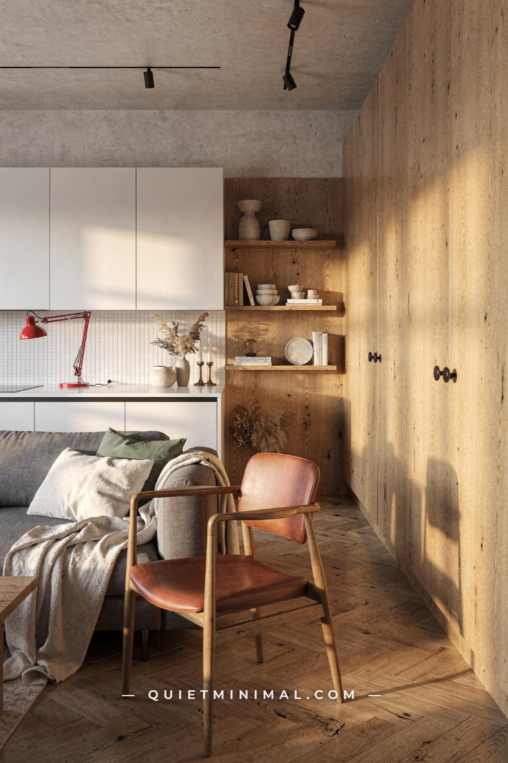
The Storage Wall Problem: How Built-In Oak Panels Create Spatial Rhythm
 Save
The storage problem in a small apartment is rarely a lack of storage capacity. It is the visibility of storage objects, which create visual noise that makes a small room feel smaller than it is. Open-shelving systems, stackable bins, and freestanding wardrobes all solve the capacity problem while multiplying the visual one.
Full-height light-oak wardrobe panels with small black finger-pull handles at approximately 96 in (244 cm) tall solve the problem at the architectural level. When wardrobe panels run floor to ceiling and use the same wood veneer as the flooring tones, the corridor or wall they occupy reads as a single, continuous surface rather than a sequence of storage units. The eye travels the length of the wall without stopping to count doors or assess contents. That unbroken visual travel is what makes the wall read as architecture rather than furniture.
The black finger-pull handles are the correct hardware choice here. They are small enough that at 96 in (244 cm) of panel height, they read as a narrow horizontal accent rather than as door hardware. A larger pull would break the panel surface; a completely handleless panel would require a push-latch mechanism that adds its own visual complexity. The finger pull is the minimum intervention that makes the door operable without compromising the surface reading.
The herringbone parquet floor in warm honey tones connects the wall panels to the floor plane, which is the material thread that makes the corridor read as a designed spatial sequence rather than a hallway lined with wardrobes. The grey low-profile sofa at approximately 84 in (213 cm) wide visible in the foreground establishes the room’s primary color register: grey and oak, with the red articulated task lamp above the kitchen as the single warm accent punctuation. One red lamp in a room of grey and oak reads as deliberate; anything more than one red element reads as a collection.
Key Takeaway: Full-height wardrobe panels in light oak running floor-to-ceiling with minimal hardware convert storage into architecture; the effect depends on matching the oak tone to the floor to create one continuous warm surface.
The Open-Plan Kitchen-Dining Problem: How One Color Anchors the Zones
 Save
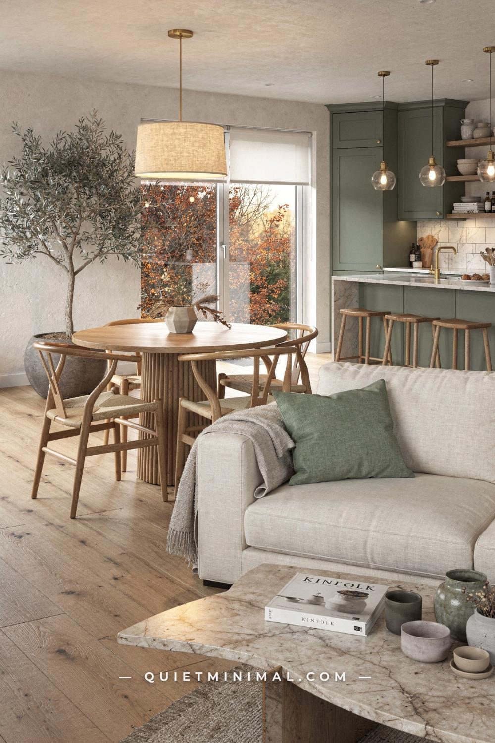
The open-plan kitchen-dining room suffers from a specific proportion problem when every zone is the same color: nothing tells you where the kitchen ends and the dining room begins, and the entire volume reads as one undifferentiated room. The furniture positions the dining table in a particular spot and the kitchen cabinets in another, but without a color change, those positions feel arbitrary rather than intentional.
One bold color on the kitchen cabinets solves the zone-separation problem with more precision than any furniture arrangement. Sage-painted kitchen cabinets on the right side of the open plan create an immediate visual boundary: you know exactly where the kitchen begins because the color changes. Everything on the sage side of the room is kitchen; everything on the warm-oak and cream side is living and dining. The color is the wall.
The round fluted-base oak dining table at approximately 48 in (122 cm) in diameter with four wishbone oak chairs is positioned in the transition zone between the kitchen and the living area. Round is again the correct form for a small dining zone: the 48 in (122 cm) diameter is the minimum comfortable seating diameter for four people, and the fluted base eliminates the leg-space anxiety of a four-legged table. The beige linen drum pendant at approximately 18 in (46 cm) in diameter hung above the table marks the dining zone from above.
The sage accent cushion on the cream sofa in the foreground is the connecting thread between the kitchen zone and the living zone. When the cabinet color reappears on the sofa, even as a single cushion, the room reads as one designed composition rather than two rooms that share a floor. That one cushion justifies the sage cabinet color to the entire living zone.
Key Takeaway: In an open-plan kitchen-dining room, painting the kitchen cabinets one distinct color creates the zone boundary that no amount of furniture rearrangement can; echo that color on one cushion in the living zone to stitch the composition together.

The Overhead Layout Problem: How Bird’s-Eye View Exposes Poor Zone Planning
 Save
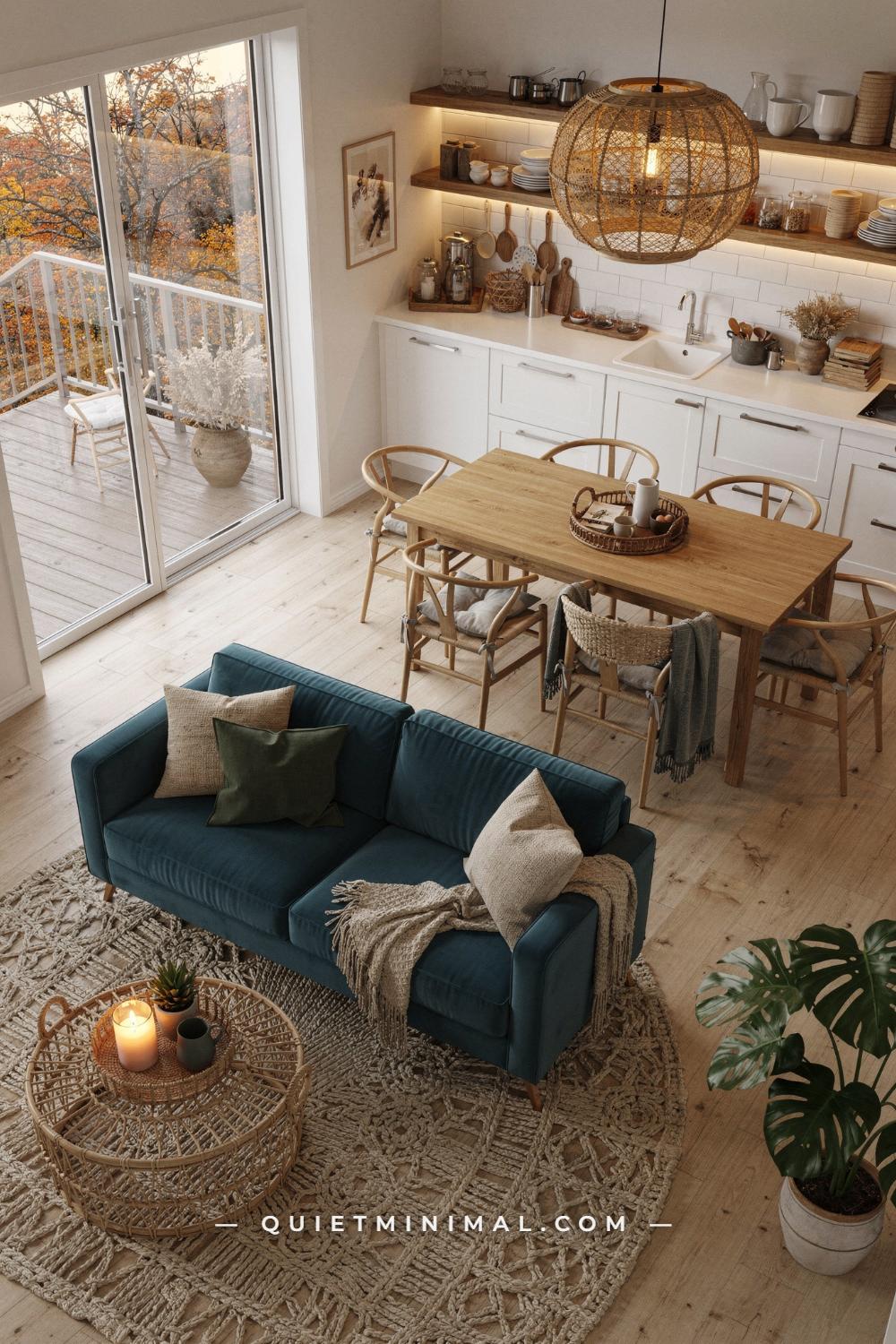
The bird’s-eye view of an open-plan space is the most revealing diagnostic of whether the layout works. From above, furniture arrangement either makes spatial sense, with clear circulation paths, defined zones, and a logical flow from entry to living to dining to kitchen, or it exposes the underlying confusion that a ground-level walk-through might not catch: furniture pushed to the walls, a dead center, or a traffic path that cuts straight through the seating zone.
The circulation rule in a small open-plan home is that you should be able to walk from the entry to every zone without passing through any seated position. In this layout, the teal blue velvet sofa at approximately 84 in (213 cm) wide is positioned parallel to the long oak dining table behind it, and the low rattan tray coffee table at 48×24 in (122×61 cm) anchors the sofa zone at center without blocking any path. The macrame-style jute rug at approximately 8×10 ft (244×305 cm) defines the sofa zone’s boundary so clearly that anyone walking from the entry to the kitchen navigates around the rug rather than through it.
The long oak dining table at approximately 72×36 in (183×91 cm) is positioned in the middle zone between living and kitchen, with wishbone chairs that tuck completely under the table when not in use. Tucked chairs reduce the effective footprint of the dining set from approximately 72×60 in to 72×36 in (183×152 cm to 183×91 cm), which is a meaningful difference in a small room.
The sliding glass door to the outdoor terrace on the left side requires a clear path of at least 36 in (91 cm) from the door to the living zone, and the monstera plant in the far corner performs the function of a visual stop: it tells the eye that the room ends at that corner, preventing the outdoor view from feeling like it pulls the interior apart.
Key Takeaway: Plan an open-plan layout from the overhead view first; the test is whether you can reach every zone without crossing a seated position, and a rug-defined sofa zone makes that circulation path legible without any additional furniture.

The Swedish Apartment Problem: How Heritage Architecture Changes the Furniture Rules
 Save
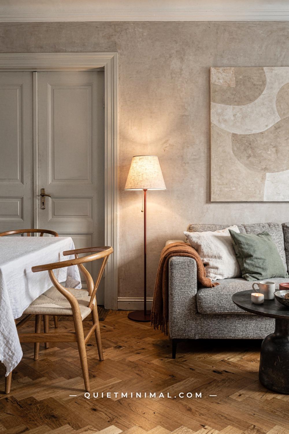
A Swedish pre-war apartment with crown molding and herringbone parquet already has a visual language at a level of finish that most modern furniture cannot match without looking either timid or out of place. The failure mode here is choosing furniture that ignores the architecture: sharp-edged flat-pack pieces below period molding, or overly rustic objects on a honey-toned herringbone floor, both produce the same result, which is a room where the furniture and the building appear to be having separate conversations.
The furniture choices that earn their place in a heritage Swedish apartment are those that acknowledge the room’s existing material register. Oak wishbone chairs with woven paper-cord seats at approximately 30 in (76 cm) tall belong in this room because they share the vocabulary of handcraft and natural materials that the parquet floor and crown molding already establish. The woven seat connects to the herringbone floor pattern; the oak frame connects to the parquet wood tone.
The low grey boucle sofa at approximately 84 in (213 cm) wide sits at the right proportion for the room because boucle has the textural complexity that a heritage space demands. A flat-weave linen sofa would look thin in this volume; boucle has enough surface interest to hold its own against the herringbone floor and the period plaster above.
The conical linen floor lamp on a rust-red steel rod at approximately 60 in (152 cm) tall is the one modern element that introduces a note of creative tension into an otherwise classical interior. The rust-red stem is a calibrated accent: it references the warmth of the herringbone floor without matching it exactly, which is the correct way to introduce a contrasting color into a room of warm neutrals.
Key Takeaway: In a heritage Swedish apartment, every piece of furniture must acknowledge the room’s existing material register; woven seats reference herringbone parquet, boucle upholstery earns its place against period plaster, and one contemporary accent color prevents the room from becoming a museum.

The Open Kitchen Shelf Problem: Why Personality Lives on the Top Shelf
 Save
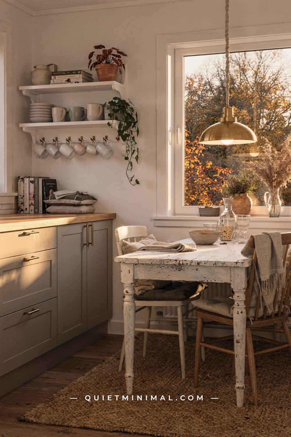
The open kitchen shelf fails when it is treated as a display case: every object spaced equidistantly, at the same height, in the same condition. The result is a shelf that looks like a stage set. It does not read as a kitchen where anyone actually cooks, eats, or lives.
The personality shelf works differently. The top shelf, at approximately 36×6 in (91×15 cm), is where the editing happens: stacked cookbooks in varying heights, a trailing ivy plant with stems that fall below the shelf edge, and a terracotta pot with a textural plant at the back. The ivy’s trailing stems are the key detail, because they break the horizontal plane of the shelf and introduce an element that cannot be purchased or staged. Living plants that grow beyond their prescribed position signal that time passes in this kitchen.
The mug hooks below the shelf, holding ceramic mugs in blue, green, tan, and white, are the functional element that makes the shelf honest. A shelf of only decorative objects reads as pretentious; a shelf of mugs on hooks below a trailing plant reads as a kitchen. The slightly mismatched glaze colors of the mugs, gathered over time from different sources, are evidence of use rather than decoration.
The greige shaker lower cabinets with brushed brass pulls connect the storage below to the personality shelf above. Greige is the correct cabinet color for a kitchen that relies on warm wood, terracotta, and brass as its accent palette: it is neither the cool grey that would make the wood look orange nor the warm cream that would compete with the butcher-block countertop. It sits in the neutral position between them.
Key Takeaway: Open kitchen shelving reads as lived-in rather than staged when the top shelf holds at least one trailing plant that grows beyond the shelf plane; everything below that plant earns the authenticity the trailing stems establish.

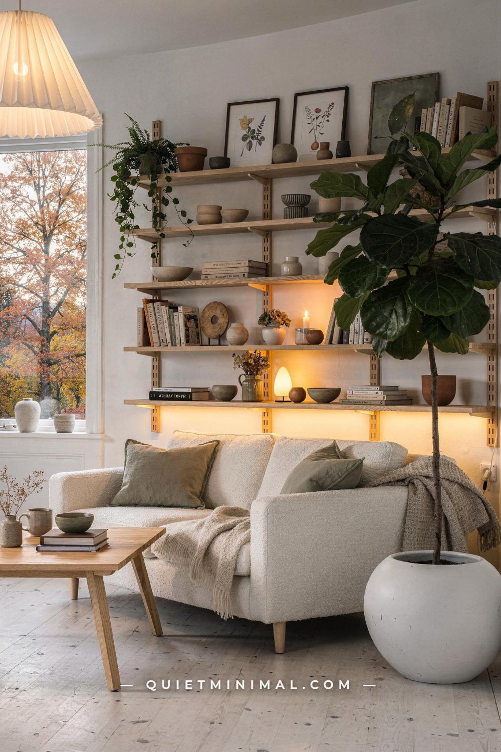
The Plant Wall Problem: Why a Shelving Feature Wall Beats a Gallery Wall in a Small Room
 Save
The gallery wall has become the default solution for a blank living room wall in small Nordic interiors, and the problem is that it stops working below a certain wall width. On a wall narrower than 8 ft (244 cm), a gallery arrangement of prints looks like a migration of small rectangles rather than a composed statement. The visual weight of the framed pieces does not increase proportionally with the number of frames; at some point adding more frames just adds more frames.
The perforated birch bracket shelving system spanning approximately 72 in (183 cm) across the back wall solves the feature-wall problem differently. The shelves themselves are the feature: the birch grain, the perforated pattern that allows the brackets to be repositioned, and the shadow lines between shelf levels all create visual interest without relying on content. The books, trailing plants, and framed botanical prints on the shelves are the layer that lives on top of the feature.
The perforated system is specifically better than a fixed-shelf installation in a small room because it is adjustable. In a room where every inch of wall space is significant, the ability to move shelf heights to accommodate a new tall vase or a stack of oversized books without reinstalling fixings is a practical design advantage.
The large fiddle leaf fig in a white round planter at approximately 18 in (46 cm) in diameter beside the sofa adds a vertical botanical element at floor level that echoes the trailing pothos on the upper shelves. That botanical thread from floor to shelving-top is what creates the room’s most important spatial quality: the sense that the room grows rather than stops.
Key Takeaway: In a living room wall narrower than 8 ft (244 cm), a spanning birch shelving system creates a stronger feature wall than a gallery of prints because the shelves themselves carry visual weight and the content layer builds on top of it.

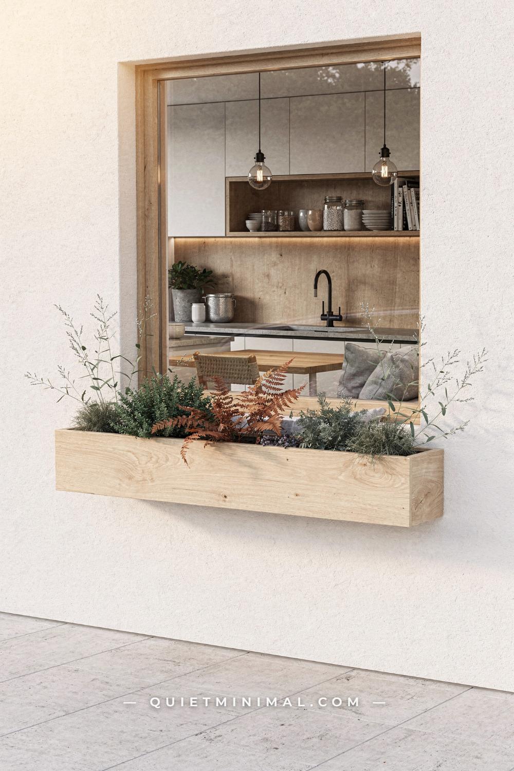
The Greige Kitchen Problem: Why the Wood Backsplash Prevents the Dead Neutral
 Save
Greige flat-front handleless kitchen cabinets are a safe, professional choice in a Scandinavian interior, and they carry exactly that risk: they are so correct that they can become invisible. A kitchen where every surface holds the same midpoint between warm and cool, with no point of material contrast, reads as a room that was designed to avoid mistakes rather than to make decisions.
The wood-paneled backsplash at approximately 36×6 in (91×15 cm) as a floating ledge shelf in matching light oak is the decision that saves the kitchen from being too cautious. Running a wood panel horizontally across the backsplash zone, where you would normally find tile, is a deliberate departure from the expected material, and it works precisely because it is unexpected. The greige cabinets expected ceramic or stone behind them; the oak panel behind the counter creates a material counterpoint that makes both surfaces read more clearly.
The wood backsplash functions correctly at this scale: it runs behind the working counter between the upper cabinets and the countertop surface, approximately 18 in (46 cm) of vertical height. At that height it is practical, because it does not run above the upper cabinet line where it would compete with the ceiling. The floating ledge shelf integrated into the top edge of the panel holds glass jars and small ceramics at countertop height, which adds the visual layer without consuming counter space.
The two bare Edison bulb pendants on black cables above the island are the light source that justifies the entire material palette. Bare glass bulbs produce a warm, amber-toned light that activates the oak grain in the backsplash and makes the greige cabinets read as warm rather than grey. Install them at approximately 30 in (76 cm) above the island countertop, and the kitchen changes character after 4pm.
Key Takeaway: Greige handleless cabinets need one deliberate material surprise to prevent reading as a neutral exercise; a horizontal wood-panel backsplash in matching oak delivers that contrast at exactly the right scale and position.

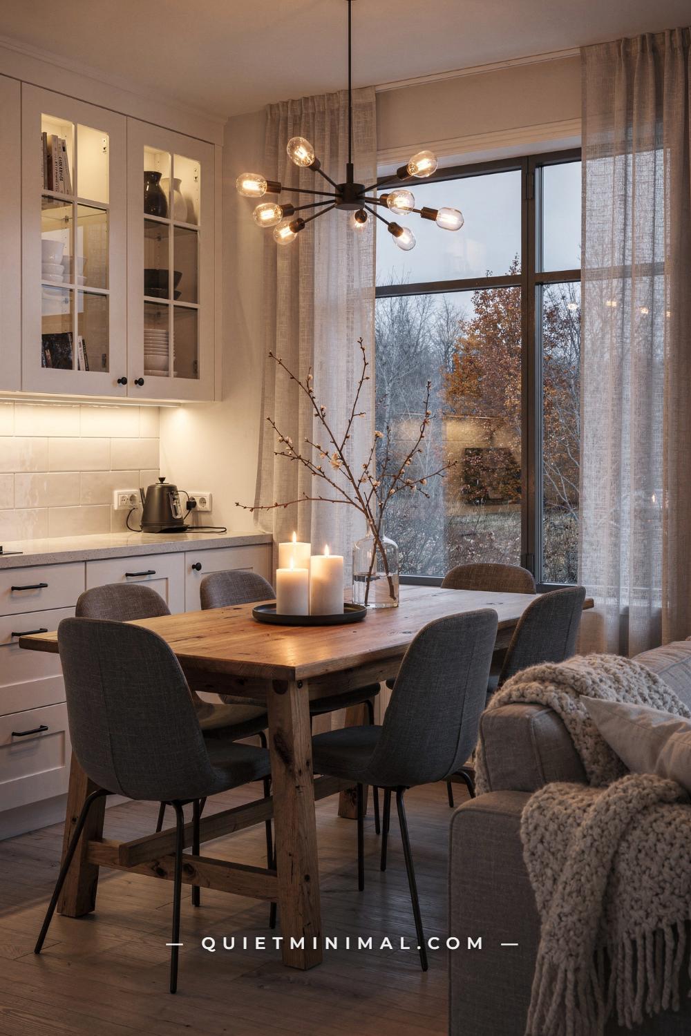
The Candlelit Dining Problem: How to Build the Hygge Evening Table
 Save
The candlelit dining table in a Scandinavian interior is not purely a decorative gesture: it is a functional response to the quality of artificial light in Scandinavian homes during winter, when natural daylight disappears before most people finish work. The failure mode is treating the candles as decoration and relying on overhead lighting to illuminate the table. Overhead-lit dining tables feel interrogative rather than intimate; the light comes from above and flattens faces and food equally.
The correct formula is three white pillar candles on a dark ceramic plate at table center, with the overhead sputnik-style chandelier dimmed to approximately 20 percent of its maximum output above. The candles at the center of the long oak trestle table at 72×35 in (183×89 cm) provide the primary working illumination for faces and food, while the chandelier above at approximately 24 in (61 cm) spread provides the ambient fill that prevents the room from feeling cave-like. The ceiling spots in the kitchen zone behind remain at approximately 40 percent, which allows the kitchen to be visible but does not compete with the dining zone’s warm glow.
The glass vase with bare branch stems at approximately 18 in (46 cm) tall is the height element at the table that allows sightlines to pass through it. Bare branches rather than foliage mean there are no dense leaves to block the view across the table, and the grey-brown of the winter stems reads as a quiet botanical note rather than a festive decoration.
The cream knit throw on the sofa arm in the foreground and the sheer linen curtains at the windows complete the hygge atmosphere: these are objects that make the room feel occupied and lived-in from the moment you enter it, before anyone has sat down or lit the candles.
Key Takeaway: The candlelit Scandinavian dining table requires the overhead pendant dimmed to 20 percent, not switched off; full darkness around three candles reads as romantic staging, while a dimmed overhead provides the ambient fill that makes the candlelight feel like the natural condition of the room.

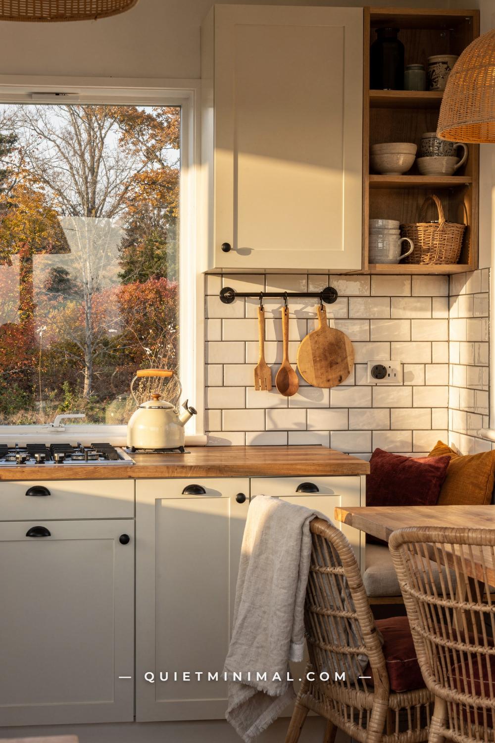
The Shaker-With-Character Problem: Why a Utensil Rail Is the Honest Kitchen Detail
 Save
The utensil problem in a small kitchen is not usually about storage. It is about what the stored utensils signal. Drawer-stored utensils are invisible, which is correct for most objects in a small Scandinavian kitchen. But kitchen tools that are beautiful in their material quality, wooden spoons and round cutting boards in particular, belong on the wall because hiding them wastes the design work their makers put into them.
A wall-mounted utensil rail below the upper cabinets, running approximately the width of one cabinet section, solves the visibility problem correctly. The rail keeps the counter clear, which is the primary goal in a small kitchen, while putting the best-looking tools on display. Wooden spoons, a spatula, and a round cutting board at approximately 10 in (25 cm) in diameter hung on the rail are enough: the rail is about editing, not about displaying every utensil you own.
The cream shaker cabinets with matte black round knobs are the specific combination that makes the character elements in this kitchen work. Cream shaker doors have enough warmth in their off-white to accept the round black knob without the hardware reading as a contrast element; the knob blends into the door face at a glance and only reads as hardware when you approach to open it. Round knobs, not bar pulls, are the scale-appropriate choice in a compact kitchen: bar pulls require a swing arc that becomes awkward in tight spaces.
The white subway tile backsplash with black grout is the detail that gives the kitchen its backbone. White tile with white grout reads as a blank surface; the black grout lines create a grid that gives the eye a structure to rest on without adding any color. At the scale of a subway tile at approximately 3×6 in (8×15 cm), the grout lines are fine enough to read as texture rather than pattern.
Key Takeaway: A wall-mounted utensil rail displays the tools that are worth looking at while keeping the counter clear; the selection should include no more than five objects, because a full rail reads as functional chaos rather than considered display.

The Dining-Living Corridor Problem: How a Round Walnut Table Anchors a Narrow Room
 Save
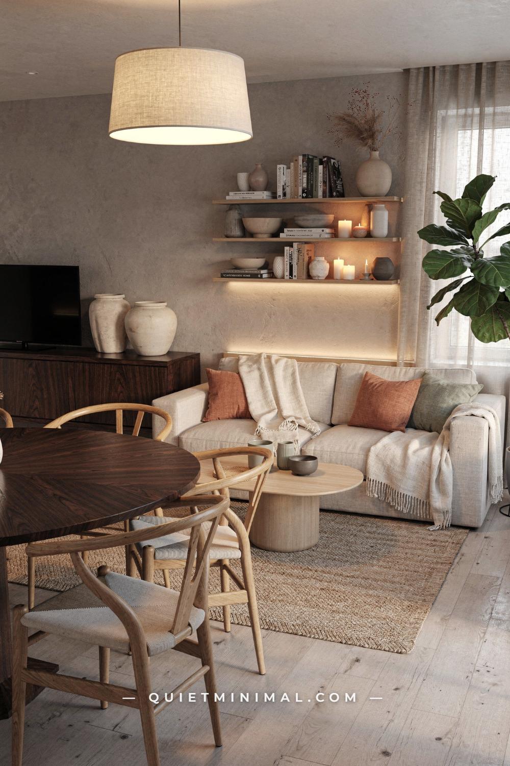
A corridor apartment or a deep rectangular living-dining room has a specific proportion problem: the room is longer than it is wide, which makes the two zones feel like a hallway with furniture in it rather than two distinct destinations. Rectangular furniture aligned parallel to the long axis of the room makes this worse by reinforcing the corridor shape. The fix is to break the long axis with a round form.
A round dark walnut dining table at approximately 48 in (122 cm) in diameter positioned in the foreground dining zone does this work at the scale of the whole room. The circular form has no parallel to align with the room’s long axis, which immediately breaks the corridor feeling. The dark walnut grain adds a tonal depth to the warm taupe palette that light oak alone cannot provide: walnut at this depth reads as a deliberate material choice rather than a wood tone that happened to be available.
The beige low-profile sofa at approximately 84 in (213 cm) wide in the background with two orange accent cushions is the relationship between the two zones made explicit. The orange is a warm, saturated note in a room of warm neutrals: taupe walls, cream cushions, walnut grain. Without the orange cushions, the sofa disappears into the background palette and the two zones lose their connection.
The light oak TV console at approximately 60×16 in (152×41 cm) on the left wall, sitting below the room’s centerline in height, preserves the horizontal reading of the walls. A tall TV unit here would interrupt the sightline from the dining zone into the living zone; a low console maintains the view across the room’s full depth.
Key Takeaway: In a corridor apartment, a round dining table breaks the room’s long axis and creates a zone boundary; the dark wood of the table must be differentiated from the lighter wood of the living-zone furniture to give each zone its own material identity.

The Sage Kitchen Finale Problem: How the Final Room in the House Must Earn Its Keep
 Save
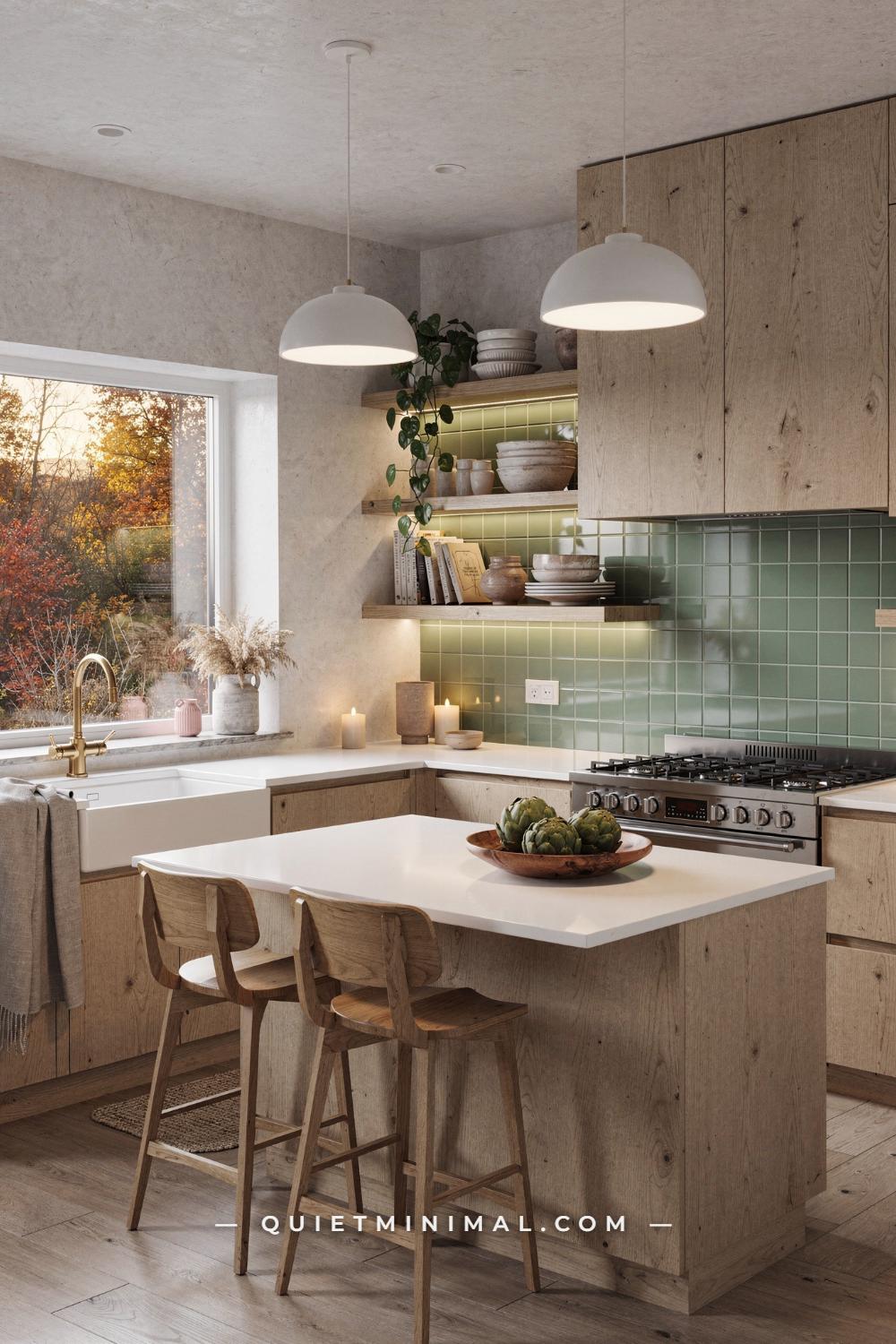
The last kitchen in a well-documented small Scandinavian house must resolve the material conversation that has been running through every room, and the failure here is choosing a palette that contradicts what the rest of the house has established. After rooms in navy, terracotta, forest green, sage, and oak, a kitchen that reverts to grey or stark white reads as a reset rather than a conclusion. The final room in the material journey must feel like it belongs to the same house.
Sage green square tile behind the stainless range as the backsplash is the color anchor that places this kitchen within the warm-green thread running through the home. Glossy ceramic tile at the sage register reads differently than painted cabinets in sage: the glaze catches light and shifts between cool green and warm green depending on the time of day and the direction of the light, which gives the backsplash a liveliness that matte paint cannot achieve. The tile square at approximately 4×4 in (10×10 cm) is small enough that the overall surface reads as a field of color rather than a tile pattern.
Blonde oak flat-front cabinetry at full height and the white quartz island at approximately 48×24 in (122×61 cm) provide the neutral surfaces that allow the sage tile to perform without competition. The island is white, not oak, because the contrast between the pale island and the oak cabinetry around it creates the visual definition of the island as a separate working surface. Two white dome pendants at approximately 14 in (36 cm) in diameter each hang above the island at a height that directs warm light down onto the quartz surface.
The farmhouse sink with a brass faucet at the window is the most human moment in the kitchen: the view, the water, and the brass hardware all coexist at the scale of daily use. Floating oak shelves above the sink hold a pothos vine and stacked ceramic bowls, completing the organic-material thread that has run from section one to section twenty-six.
Key Takeaway: The final kitchen in a small Scandinavian house must use the home’s recurring color in one bold material, a glossy tile rather than paint, so the room reads as the conclusion of a material journey rather than a decorating choice that happened in isolation.

Every one of the twenty-six rooms in this article began with a specific problem, a proportion that didn’t work, a zone that had no edge, a material that was too cautious, a light source that was doing the opposite of what was needed. The through-line in every solution is the same: small Scandinavian house interiors work when the decisions are specific and the reasoning is structural, not decorative.
If you are starting from scratch, the two most consequential choices are the sofa width and the one bold material decision in your kitchen. Get those right and everything else anchors to them. If you are working with an existing room, the fastest intervention is almost always the one this article returns to most often: introduce one surface of genuine warmth, whether that is oak, birch, rattan, or brick, into a room that has been too cautious with its palette. The Nordic aesthetic is not about restraint for its own sake. It is about restraint in the service of the materials and proportions that matter most.
From the guides
You've saved it, wanted it. Here's the how: codes, measurements, order. Your choices make it yours.
The Japandi Honest PlaybookThe honest version of the style: what to keep, what to skip, and the order to do it in.See inside →The Room Refresh PlaybookA repeatable four-step method, room by room, in ten minutes, thirty minutes, or one weekend.See inside →Make Any Room Feel Cozy on PurposeWhy some rooms hold people and others empty out, and the moves that change it.See inside → Save