 Georgia
If you’ve started collecting reference photos for a Spanish Mediterranean interior, you’ve probably noticed the same handful of images cropping up everywhere: one perfect courtyard, one perfect archway, one perfect wrought iron chandelier. What’s harder to find is guidance on what happens once you leave that one photogenic room and walk into your actual kitchen, laundry room, or guest bedroom, where the style has to hold up under daily use. A Spanish Mediterranean interior isn’t one look applied uniformly to every room, it’s a set of materials and proportions, terracotta, plaster, wrought iron, warm wood, that shift slightly depending on what a room is asked to do. Get the ratio wrong in a small bathroom and it reads like a cave. Get it wrong in a guest room and it reads like a costume.
This guide goes room by room, thirteen of them, with the specific materials, measurements, and the one mistake that shows up most often in each space, so the style holds together from the front door to the terrace instead of stopping at the living room.
1. The Living Room: Warm Plaster Without the Cave Effect
 Save
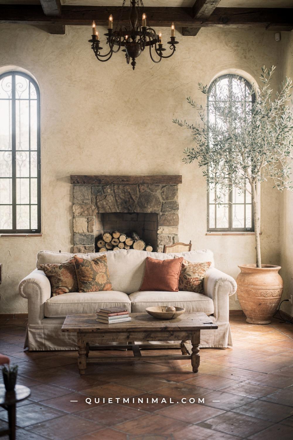
The living room is where most Spanish Mediterranean interiors go wrong first, because it’s the room people over-commit to. Saturated colors like Benjamin Moore’s Terra Cotta Tile (2090-30) or Sherwin-Williams’ Fired Brick look rich in a swatch, but painted across all four walls with modest natural light, they pull the ceiling down and the room reads as a cave, a failure mode current coverage of the style flags repeatedly.
The fix is a ratio, not a color choice. Reserve full saturation for one wall, roughly a quarter of the room’s total wall area, and keep the rest in a warm cream or sand tone, closer to Sherwin-Williams’ Sunbaked Hues family at its lightest end. Exposed ceiling beams, spaced 16 to 24 inches (40 to 60cm) apart, do more to establish the style than color ever will. Layer in a wrought iron chandelier, a rug in faded clay or olive that extends at least 8 inches (20cm) beyond the sofa’s front legs, and one round wood coffee table instead of a glass or acrylic one, which breaks the material story the room is telling.
The room that gets this wrong usually has the opposite problem from what people expect: not too little color, but color applied with no restraint and no relief. A living room with terracotta walls, a terracotta rug, and terracotta upholstery in the same room has nowhere for the eye to rest.
From the guides
You've saved it, wanted it. Here's the how: codes, measurements, order. Your choices make it yours.
 The Japandi Honest PlaybookThe honest version of the style: what to keep, what to skip, and the order to do it in.See inside →
 The Room Refresh PlaybookA repeatable four-step method, room by room, in ten minutes, thirty minutes, or one weekend.See inside →
 Make Any Room Feel Cozy on PurposeWhy some rooms hold people and others empty out, and the moves that change it.See inside →
Key Takeaway: Save full-saturation terracotta for one wall and let exposed beams, iron fixtures, and a warm neutral base carry the rest of the room.
2. The Primary Bedroom: Iron and Linen, Not Heavy and Dark
 Save
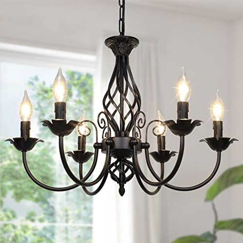
The most common mistake in a Spanish Mediterranean bedroom is furniture scale and tone borrowed from a different, heavier version of the style, dark carved wood, an oversized four poster frame, deep mahogany finishes. That reading belongs to a formal Old World interior, not the sun-washed, grounded direction current coverage of Mediterranean interiors keeps pointing toward, where the emphasis is a slower, more rooted way of living rather than ornate furniture.
A low profile iron bed frame, simple vertical or gently curved bars rather than scrollwork, keeps the room feeling current. Dress it in linen bedding in clay, olive, or undyed cream rather than white, and let a single woven textile, a jute rug or a wool throw folded at the foot of the bed, add texture instead of pattern. Nightstands should stay simple: plain wood, no more than 24 inches (60cm) wide, so they don’t compete with the bed frame’s ironwork. If the room has an arched window, leave it uncovered by heavy drapery; a woven wood blind that raises fully lets in the daylight this style depends on, since blocking that window with fabric is one of the most common renovation mistakes flagged in current second-home design coverage.
The failure mode to watch for is a bedroom that reads more medieval hacienda than Mediterranean farmhouse, dark stained wood furniture, deep red or navy bedding, and heavy curtains that block the exact light the rest of the palette is built to catch.
Key Takeaway: Keep the bed frame low and simple, dress it in linen instead of heavier fabric, and leave the windows uncovered enough to let the room’s whole palette read correctly.

3. The Primary Bathroom: Zellige on the Walls, Warmth Underfoot
 Save
Zellige is the single material most cited for this style’s bathrooms, handmade from clay and glazed with natural minerals, which gives every tile slight variation in color and surface that a printed ceramic tile can’t fake. The detail that separates a bathroom that reads Spanish Mediterranean from one that reads generically Moroccan or coastal is orientation: install the tile in a vertical stacked layout rather than the horizontal subway pattern that dominates most American bathrooms, since the vertical run elongates the wall and reads as more considered.
Pair the wall tile with a warm-toned cement or terracotta floor tile rather than white or gray porcelain, and keep hardware to one finish, either brass or aged bronze, in both the faucet and the mirror frame. An arched mirror, roughly 26 by 40 inches (66 by 102cm) is a workable standard size, repeats the architectural motif from the rest of the house at bathroom scale.
The failure mode here is mixed metals and mixed tile temperatures in the same small room: a warm clay zellige wall paired with a cool gray floor and chrome fixtures fights itself, and in a room this size, that friction is impossible to miss. Keep every material in the room, tile, grout, hardware, and mirror frame, in the same warm family, and the room reads intentional instead of assembled from three different bathroom trends at once.
Key Takeaway: Install zellige vertically rather than horizontally, and keep every hardware finish in the room warm, not mixed.

4. The Entry: One Arch Isn’t Enough
 Save
Design writers covering this style single out one entry mistake more than any other: adding a single arched doorway or one arched mirror and calling the room done, without repeating the shape anywhere else nearby. An isolated arch reads as a leftover architectural feature rather than a deliberate design choice, because arches in genuine Spanish Mediterranean interiors are a repeated rhythm, not a one-off gesture.
If your entry only has one arch, the front door frame itself, echo the shape at least once more in the same sightline: an arched mirror above the console, or an arched wall niche. A rustic wood or iron console table roughly 34 to 36 inches (86 to 91cm) tall gives enough surface for a large terracotta pot and a stack of woven baskets underneath for shoe and mail storage.
A patterned cement or encaustic tile floor in muted terracotta and cream, rather than a plain neutral runner, does more entry-level styling work per square foot than almost any other single choice, since it’s the first material a guest sees and sets the tone before they’ve looked at anything else in the house.
Key Takeaway: Never leave a single arch to do all the architectural work; repeat the shape at least once more within the same sightline.

5. The Dining Room: A Table Built for Gathering, Not a Showroom Set
 Save
Should the dining chairs match? In most Spanish Mediterranean interiors, no, and matching them is the mistake. A full matched set of six or eight identical chairs reads as a furniture showroom purchase, while the actual style comes from pieces that look collected over time: rush seated wood chairs mixed with one or two upholstered leather chairs, often at the ends of the table, gives the room the slightly imperfect, gathered feeling the style is built on.
Current design coverage keeps pointing toward rounded forms, so a round or oval table, 54 to 60 inches (137 to 152cm) across for a room seating six, suits this style better than a rectangular table with hard corners. A shallow arched niche built into the wall behind the table, roughly 6 to 8 inches (15 to 20cm) deep, gives a place to display ceramics without cluttering the table, and repeats the entry’s arch motif.
The failure mode is over-matching: a matched chair set, a matched runner, and matched dinnerware all from the same collection removes the sense that anything in the room was chosen individually, which is the opposite of what makes this style feel authentic.
Key Takeaway: Mix at least one chair style at the table rather than matching every seat, and let a round table anchor the room instead of a sharp-cornered rectangle.

6. The Kitchen: Where the Backsplash Sets the Whole Palette
 Save
The kitchen is the room where builder-grade cabinetry most often fights this style, because white shaker cabinets, the default in most recent renovations, run cool while every other material in a Spanish Mediterranean interior runs warm. A zellige backsplash in terracotta or clay behind a bank of cool white cabinets looks like two different design decisions layered on top of each other rather than one considered kitchen.
The more reliable order of operations is cabinetry first: warm honey or walnut toned wood, or cream cabinets with warm undertones rather than cool gray-white, then the zellige backsplash installed in the same vertical stacked pattern used in the bathroom, so the two most tile-heavy rooms in the house speak the same language. A stone or butcher block counter in a warm tone, rather than bright white quartz, keeps the palette from splitting between warm walls and a cold countertop.
Open shelving, one or two runs at most, gives a place to display hand thrown ceramics and keeps upper cabinetry from feeling heavy, while a wrought iron pot rack, hung roughly 18 to 20 inches (46 to 51cm) above the island, adds ironwork without taking wall space. The failure mode is treating the backsplash as the only styling decision in the room; if the cabinet undertone is cool, no backsplash choice will make the kitchen read as warm.
Key Takeaway: Choose warm-toned cabinetry before choosing tile, since a cool cabinet undertone will undercut even the most correct zellige backsplash.

7. The Courtyard: The Room With No Roof
 Save
A courtyard is the one space on this list that most other decor styles don’t have an equivalent for, which is exactly why it’s the room people get least right. The mistake isn’t the furniture, it’s treating the courtyard as leftover outdoor space rather than a room with its own floor plan and sightlines.
Start with the paving: terracotta pavers in a simple grid, with a mosaic tile inlay reserved for one focal point, a fountain base or the space outside a set of French doors, rather than spread across the entire floor, which reads as busy rather than intentional. Furniture needs to be genuinely weather-rated wrought iron or teak, not an indoor piece moved outside for a season, since iron built for interiors will rust within one wet season. Large terracotta pots, at minimum 18 to 24 inches (46 to 61cm) in diameter for an olive or citrus tree, read as architecture once two or three of them anchor the corners.
The detail that ties a courtyard to the house is continuity: if the same terracotta tone runs from the living room floor through the doorway into the courtyard paving, the two spaces blur into one, the mechanism current coverage of indoor-outdoor Mediterranean design keeps pointing to as the difference between a courtyard that feels attached to the house and one that reads as a separate patio.
Key Takeaway: Reserve mosaic tile for one focal point in the courtyard rather than the whole floor, and match the paving tone to the adjoining interior floor so the two rooms read as one.

8. The Hallway: The Gallery Space Everyone Skips
 Save
Hallways are the most consistently under-decorated room in this style, mostly because they’re treated as pass-through space instead of as the corridor where a house reveals a second layer of detail. In genuine Spanish Mediterranean interiors, a hallway is where a built-in niche or a small display of ceramics does the work a whole shelf would do in a living room.
A shallow arched niche, built or framed into the wall at roughly 12 to 16 inches (30 to 41cm) wide, gives a place to display two or three ceramic pieces without adding furniture to a narrow space. Wall sconces work better than overhead lighting here, spaced roughly 6 to 8 feet (180 to 245cm) apart along one wall, since they wash the plaster with warm light and cast shadow in the niches rather than flattening them. A woven runner in a faded geometric pattern, rather than a plain solid color, carries the tile motif from the entry through the rest of the house.
The failure mode is a hallway left completely bare on the theory that it’s just a connector between rooms, which breaks the sense of continuity the rest of the house has built, since a guest notices the one blank stretch of wall more than they notice the ten decorated ones.
From the guides
You've saved it, wanted it. Here's the how: codes, measurements, order. Your choices make it yours.
The Japandi Honest PlaybookThe honest version of the style: what to keep, what to skip, and the order to do it in.See inside →The Room Refresh PlaybookA repeatable four-step method, room by room, in ten minutes, thirty minutes, or one weekend.See inside →Make Any Room Feel Cozy on PurposeWhy some rooms hold people and others empty out, and the moves that change it.See inside →Key Takeaway: Treat the hallway as a small gallery, not empty space, with one niche or a short run of art and sconce lighting instead of an overhead fixture.

9. The Home Office: Warm Wood Instead of Cold Modern
 Save
A home office is usually the last room in a house to get styled, and the furniture that ends up in it, a black metal desk frame, a mesh office chair, cool gray storage bins, is the furniture most at odds with everything else in a Spanish Mediterranean interior. The room doesn’t need to look like a showroom, but it does need to stay in the same material family as the rest of the house or it reads as an afterthought bolted onto a finished home.
A solid wood desk, even a simple one without ornamentation, does more for the room than any accessory choice. Pair it with a leather chair rather than mesh or molded plastic, and swap a black metal task lamp for a brass one, roughly 18 to 22 inches (46 to 56cm) tall, which repeats the metal tone used everywhere else in the house. Built-in shelving with one arched niche gives the room the same architectural rhythm as the hallway and dining room, at a smaller scale.
The failure mode is a home office that looks like it was furnished from a different store than the rest of the house, cold modern pieces chosen for function with no attempt to match material or tone, which is often the one room a video call reveals to guests who’ve never seen the rest of the home.
Key Takeaway: Match the desk, chair, and lighting to the same warm wood and brass material family as the rest of the house instead of defaulting to cold modern office furniture.

10. The Guest Room: The Same Style, a Lighter Hand
 Save
The primary bedroom can carry more saturated color and more layered texture than a guest room can, because the primary bedroom is used daily by people who chose the palette, while a guest room needs to read as welcoming to someone spending a night or two, not as a full expression of the homeowner’s taste. Applying the exact same terracotta and olive intensity from the primary suite to a smaller guest room is a common overcorrection, and in a smaller footprint, that same intensity reads as the cave effect faster than it does in a larger room.
The better approach is one bold accent rather than several: a single woven textile above the headboard, with the rest of the room kept in warm white or cream. An iron bed frame ties the room to the rest of the house without repeating every material choice from the primary suite, and a lighter jute rug, rather than a patterned wool one, keeps the floor from competing with the textile.
The failure mode is a guest room that either ignores the style entirely, reading as a generic beige rental room, or over-applies it with heavy pattern in a space too small to hold it. One well-chosen textile does more here than three coordinated accessories.
Key Takeaway: Give the guest room one strong Mediterranean accent rather than the full palette intensity of the primary bedroom.
11. The Laundry Room: Pattern Where No One Expects It
 Save
Most homeowners never think about their laundry room’s style at all, which is exactly the gap that makes it worth doing right: a patterned tile floor here is a low-cost, low-risk way to bring Spanish Mediterranean detail into a utility space without touching anything that has to match a larger design decision elsewhere. Because the room is small and mostly out of guest sightlines, it’s a reasonable place to be bolder with pattern than you might be in a living room.
Encaustic or cement tile in a warm terracotta, ochre, and cream palette, arranged in a repeating geometric pattern, does the same work here as it does in the entry, at a smaller scale and lower stakes. Open wood shelving above the machines, holding folded linens and two or three woven baskets, keeps the room functional while still reading as considered. Simple brass or unlacquered cabinet pulls, rather than brushed nickel or chrome, keep the room from feeling disconnected from the rest of the house.
The failure mode is choosing a stark black-and-white checkerboard tile, which is a farmhouse motif, not a Spanish Mediterranean one, in a room that’s otherwise ready to carry real color. A warm-toned patterned tile does the same visual job with the correct palette.
Key Takeaway: Use the laundry room’s low visibility as an opportunity for a bolder patterned tile floor in the style’s warm palette, not a black-and-white checkerboard.

12. The Stair: Pattern on the Risers, Never the Treads
 Save
A painted tile staircase is one of the most recognizable single features of this style, and it’s also one of the easiest to get wrong in a way that’s both a design mistake and a safety issue. The rule is fixed: pattern belongs on the risers, the vertical face of each step, never on the tread, the horizontal surface you actually walk on. A standard riser height runs 7 to 7.75 inches (18 to 20cm), which is enough surface for a clear geometric or floral tile pattern to read without looking cramped.
Treads should stay a plain, solid, non-slip material, either painted wood, stone, or a matching solid tile, so the pattern doesn’t compete with footing on a surface people use dozens of times a day. A wrought iron balustrade with simple vertical bars, rather than ornate scrollwork, keeps the stair from feeling busy, and a woven runner secured down the center of the treads adds one more warm layer without covering the risers.
The failure mode people run into is patterning both the tread and the riser, which turns a stairwell into visual noise and, on a well-trafficked stair, a genuine trip hazard, since a heavily patterned tread makes the edge of each step harder to see at a glance.
Key Takeaway: Keep the pattern on the risers only and leave every tread a plain, solid, non-slip surface.

13. The Terrace: Where Indoors and Outdoors Should Match
 Save
The terrace is the clearest test of whether a Spanish Mediterranean interior actually extends past the walls of the house. Current coverage of the style keeps returning to the same mechanism: continuous flooring and furnished outdoor rooms that read as seriously as the indoor ones, rather than a patio treated as an afterthought. If the terrace floor changes material the moment you step through the door, the indoor-outdoor read collapses.
Matching or closely coordinating terracotta tile between the interior floor and the terrace does more for this than any furniture choice. A pergola of weathered wood beams, spaced to match the rhythm of the interior ceiling beams if the house has them, ties the two spaces together overhead as well as underfoot. Furnish the terrace like a real room, a full dining table and chairs rather than two folding chairs against the wall, with a woven outdoor rug anchoring the seating area.
The failure mode is stark white outdoor furniture, the kind sold as an all-purpose patio set, dropped into a terrace otherwise fully in the style’s warm palette. Wrought iron or dark wood furniture keeps the material story consistent from the living room straight through to the terrace’s edge.
Key Takeaway: Match the terrace floor material to the adjoining interior floor and furnish it as a real room, not a leftover patio.
A Spanish Mediterranean interior holds together when the same handful of materials, terracotta, plaster, wrought iron, and warm wood, show up in every room in a ratio suited to that room’s job, not applied identically from the entry to the laundry room. The living room and courtyard can carry more saturation and pattern, while the guest room and bathroom need a lighter hand to avoid the cave effect that undoes so many attempts at this style. Start with the one room you use most, whether that’s the kitchen or the primary bedroom, and get its palette and materials right before touching the next space. Once that first room reads correctly, the rest of the house has a reference point to match, and the whole home starts to feel like one considered place instead of thirteen separate ideas borrowed from thirteen different photos.
From the guides
You've saved it, wanted it. Here's the how: codes, measurements, order. Your choices make it yours.
The Japandi Honest PlaybookThe honest version of the style: what to keep, what to skip, and the order to do it in.See inside →The Room Refresh PlaybookA repeatable four-step method, room by room, in ten minutes, thirty minutes, or one weekend.See inside →Make Any Room Feel Cozy on PurposeWhy some rooms hold people and others empty out, and the moves that change it.See inside → Save


