 Georgia
If your Swedish farmhouse bedroom looks a little off, you are probably not imagining it. The style has a quiet logic to it, and when one element is wrong, the whole room reads as slightly unsettled, even if you cannot name why. The details that make a Swedish farmhouse bedroom feel genuinely restful are more specific than most advice admits: the exact warm tone of the plaster, the weight of the linen, the width of the pine planks underfoot, the way a single iron rod holds heavy curtains without looking decorative. Get those details right and the room exhales. Get them wrong and you end up with something that looks like a mood board rather than a bedroom. These 25 mistakes are the ones that come up again and again. Each one has a mechanism, a reason it reads wrong, and a specific correction. Work through the list against your own room and you will understand exactly what to adjust.
Mistake 1: Treating the Walls Like a Blank Canvas Instead of the Room’s Warmth Source
 Save
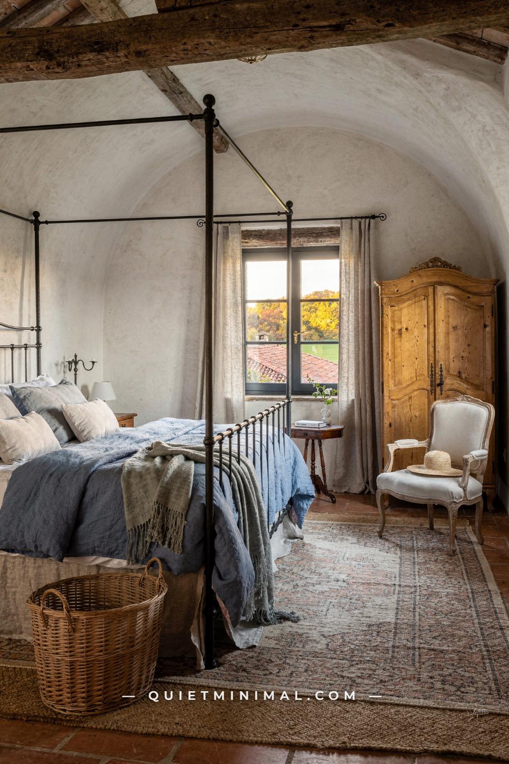
The most common starting error in a Swedish farmhouse bedroom is painting the walls a flat, cool, bright white and calling it done. Cool white reads as clinical in this aesthetic, not serene. The mechanism is simple: Swedish farmhouse rooms draw their warmth from the wall surface itself, because the palette of natural linen, honey pine, and iron relies on the wall to provide the underlying warmth that ties all those neutrals together. A stark, blue-toned white actively fights the rest of the room. The pine looks orange against it. The linen reads dingy. The iron looks harsh.
The correction is not just choosing a warmer white. It is also thinking about surface. The plaster curve in this room does something a flat-painted drywall surface cannot: it catches light at different angles throughout the day, shifting from cream in the morning to amber gold in the afternoon. That variation is what makes the room feel alive rather than static. If you are working with standard drywall, consider a limewash technique, which applies multiple thin layers and creates a similar soft depth in the finish without full replastering. The effect is especially visible on the wall that your window light strikes directly.
If you are choosing paint, work in warm whites with an LRV (light reflectance value) between 82 and 88. Below 82, the wall starts to feel heavy. Above 88, you are back in cool-and-clinical territory. The wall finish matters as much as the color: flat or matte sheens absorb light the way plaster does. Eggshell bounces it and makes the surface look harder and more contemporary than the style wants.
For the ceiling, match it to the walls or go slightly warmer. Swedish farmhouse rooms do not use white ceilings as a separate plane the way modern interiors do. The ceiling is part of the same warm envelope. One exposed rough-hewn beam is enough to give the ceiling its identity. More than two beams in a standard 9 ft (274 cm) ceiling starts to look theatrical rather than agricultural.
From the guides
You've saved it, wanted it. Here's the how: codes, measurements, order. Your choices make it yours.
 The Japandi Honest PlaybookThe honest version of the style: what to keep, what to skip, and the order to do it in.See inside →
 The Room Refresh PlaybookA repeatable four-step method, room by room, in ten minutes, thirty minutes, or one weekend.See inside →
 Make Any Room Feel Cozy on PurposeWhy some rooms hold people and others empty out, and the moves that change it.See inside →
Key Takeaway: Use a warm white with an LRV between 82 and 88 in a flat or matte finish, and consider a limewash layer to give the wall surface the kind of depth that makes natural linen and honey pine look right against it.

Mistake 2: Buying a Nightstand That Competes With the Bed Frame Instead of Grounding It
 Save
An iron bed frame with brass finials is a graphic element. It has weight, line, and a dark patina that pulls the eye. The mistake most people make is pairing it with a nightstand that also demands attention: another painted piece, a chunky reclaimed-wood slab, or a modern drum table in a contrasting finish. Two strong pieces side by side create visual competition and the bed loses its role as the room’s anchor.
The dark walnut three-drawer chest here is not competing because it is doing something specific: it is warm where the iron is cool, solid where the rails are linear, and short enough that it sits clearly below the bed’s finials. The chest is approximately 20 x 18 in (51 x 46 cm) at the surface, which is exactly the right proportion for a 54 in (137 cm) wide iron bed in a standard bedroom. Smaller and the nightstand looks like an afterthought. Larger and it begins to crowd the side of the bed and breaks the sense of open floor that gives the iron frame its graphic clarity.
The rule for pairing a nightstand to an iron bed in this aesthetic is the contrast principle: one warm material beside a cool metal always reads better than two materials fighting for the same quality. Dark walnut, honey pine, antique mahogany, and even a painted cream piece with visible age all work because they bring a softness that the iron needs. Matching metallic nightstands, all-black steel tables, and high-gloss lacquered pieces break this completely: now the room has two hard surfaces at eye level and no softness between them.
Height matters too. The nightstand surface should sit within 2 in (5 cm) of the mattress top. Too low and reaching for a glass or a book requires an awkward reach that breaks the ease the style promises. Too high and the chest becomes a visual wall that blocks the lower section of the bed from view when you enter the room, making the space feel smaller and more closed in.
On top of the nightstand, a single clear glass vase with branching stems is enough. The negative space around it is part of the composition. Filling the surface with multiple objects collapses the breathing room and makes the careful wood-and-iron pairing invisible.
Key Takeaway: Pair an iron bed frame with a solid-wood nightstand in a warm finish, sized so the surface sits within 2 in (5 cm) of the mattress top, and keep the surface sparse enough that the dark grain stays visible as the warm counterpoint to the metal.

Mistake 3: Using a Wardrobe That Hides Storage Without Adding to the Room’s Material Story
 Save
Most people approach wardrobe storage in a Swedish farmhouse bedroom as a purely practical problem: find a closed wardrobe, fill it, close the doors. The result is a room with a large, flat, door-heavy piece on one wall that contributes nothing to the material story and actually deadens the wall it occupies. Swedish farmhouse interiors have historically treated storage as architecture, not furniture.
The open built-in system shown here, running approximately 84 in (213 cm) tall and filling a full wall section, works because every element inside it is part of the palette: white painted shelving, rattan baskets in warm caramel that contrast the white, and cream linen folded or hanging in plain sight. None of it is hidden. The storage is the room’s third texture layer, sitting between the rough pine ceiling beams above and the pale pine plank floor below.
Rattan baskets sized between 14 and 18 in (36 to 46 cm) wide are the right scale for this shelving depth. Smaller baskets look fussy and create too many visual units. Larger baskets begin to look like they belong in a utility room rather than a bedroom. The baskets do not need lids: seeing the linen inside them is part of the display. Consistency matters here. Use the same basket family in two sizes rather than mixing four different basket styles from four different sources. The mix reads as unsorted rather than curated.
The white chest of drawers with black hardware below the window follows the same logic as the wardrobe. The black hardware is a bridge to any iron elements elsewhere in the room. This is how a cohesive Swedish farmhouse bedroom builds its material thread: you place the same finish or tone in at least three different positions in the room so it reads as intentional rather than accidental. One piece with black hardware is a single decision. Three pieces that share it create a system.
If you have a closed wardrobe and cannot replace it, consider replacing the doors with a simple hanging linen panel on a black iron rod. The panel costs a fraction of new doors, and the transition from hard door to soft fabric is one of the most effective ways to reduce the box-of-furniture quality a standard wardrobe brings into a room of this kind.
Key Takeaway: Treat storage as a material layer by using open shelving with consistent rattan baskets between 14 and 18 in (36 to 46 cm) wide, and connect hardware finishes across at least three pieces in the room so the detail reads as a deliberate system rather than a coincidence.

Mistake 4: Placing the Chandelier Too Low and Losing the Attic’s Vertical Drama
 Save
In an attic bedroom with a steep pitch, the chandelier position is the single decision that most visibly succeeds or fails. Hang it too low, at the typical 7 ft (213 cm) ceiling clearance rule, and it drops into the visual field of the room, cutting the apex sight line in half and making the vaulted ceiling feel like an obstacle rather than an asset. The whole point of whitewashed log walls rising to a peak is the sense of volume they create. A chandelier hung at 7 ft (213 cm) in an 11 ft (335 cm) apex ceiling murders that volume.
The crystal drop chandelier seen here works because it is hung at the peak. At approximately 18 in (46 cm) in diameter, it is sized correctly for the room’s footprint without trying to become the room’s only focal point. The crystals catch the daylight filtering through the lace curtains and scatter small points of reflected light across the whitewashed log grain, a secondary effect that would disappear entirely if the fixture were lower.
The rule for attic chandeliers: measure from the floor to the ceiling peak, subtract 7 ft (213 cm), and hang the fixture so its lowest point is at the result plus 7 ft (213 cm). In a 12 ft (366 cm) apex, the lowest crystal should be at 11 ft (335 cm) from the floor. This keeps the fixture in the architectural zone of the room, not in the human zone where people walk and sit.
The ornate carved wood bed frame here, approximately 60 in (152 cm) wide with a tall headboard, creates a second focal axis from the floor up. The chandelier anchors from the top down. These two vertical elements meet in the visual middle of the room, and everything else, the pine chest at approximately 36 x 48 in (91 x 122 cm), the terracotta vases, the worn Persian rug underfoot, sits quietly in the supporting role. When the chandelier is too low, it competes directly with the headboard and neither wins.
The whitewash on pine log walls requires a specific approach to stay warm rather than gray. Pure white limewash over honey pine will pull cool within two to three years as the lime chalks. Add a small amount of ochre pigment to the limewash mix before application, approximately a half-teaspoon per gallon. The result stays cream-warm as it ages rather than pulling chalky-gray.
Key Takeaway: In a vaulted attic bedroom, hang the chandelier at the ceiling peak and size it at 18 to 24 in (46 to 61 cm) in diameter so it anchors the apex without dropping into the human zone of the room.

Mistake 5: Using Wallpaper as a Background Filler Instead of a Specific Dialogue Partner for the Armoire
 Save
Botanical wallpaper is one of the most requested elements in a Swedish farmhouse bedroom, and it is also one of the most frequently misused. The typical mistake: applying a busy, large-scale floral print to a wall that already has a dominant piece of furniture in front of it. The wallpaper and the furniture compete for the same visual frequency and neither reads clearly. The room becomes dense and exhausting rather than rich and collected.
The sage green botanical print behind this carved oak armoire works because the scale and tone of the wallpaper are calibrated specifically to the piece in front of it. The wallpaper’s botanical pattern reads at a mid-scale, neither so small it becomes a texture nor so large it becomes a second painting. The sage green ground is close in value to the armoire’s shadowed recesses, which allows the armoire’s carved relief to stay readable against the wall rather than dissolving into the pattern. When the wallpaper tone matches the furniture’s shadow tone, the piece pops forward instead of flattening.
The antique carved oak armoire here is approximately 48 x 84 in (122 x 213 cm). For a piece this large and this carved, the wallpaper behind it should have a ground color no more than two shades away from the armoire’s dominant finish. Dark walnut on pale cream wallpaper loses the armoire in contrast and makes it look pasted onto the wall rather than belonging to it. The sage green here has exactly enough contrast to define the armoire’s silhouette while being warm enough not to cut it.
The carved walnut bedside cabinet at approximately 16 x 24 in (41 x 61 cm) acts as the room’s transitional element, smaller than the armoire, close in wood tone, and positioned so it ties the linen-dressed bed into the same wood-and-wallpaper corner. The round jute rug at 36 in (91 cm) diameter grounds the corner as its own zone without expanding the footprint into the rest of the room.
One brass wall sconce rather than a table lamp is the right lighting choice for a bedside cabinet this small. A table lamp on a 16 in (41 cm) deep surface takes up roughly a third of the usable area. The sconce frees the surface for a single terracotta vase of hydrangeas and leaves the surface readable.
Key Takeaway: When a large carved armoire anchors the wall, choose a botanical wallpaper whose ground color sits within two shades of the armoire’s dominant finish, so the piece pops forward from the wall instead of competing with it.

Mistake 6: Opening the Room to the Outdoors Without Letting the Light Do the Work
 Save
French doors in a bedroom are one of the most beautiful architectural moves a Swedish farmhouse room can make. The mistake is not in having them. The mistake is treating them like a wall feature and dressing them the same way you would dress a window: with heavy, stiff panels that stay pinned back against the wall and block the light from doing its actual job.
The dappled morning light crossing the honey-oak plank floor here is not an accident. It is the result of sheer white curtain panels that move with the air from the open doors, creating that soft, shifting light that makes the room feel like it breathes. Sheer panels in this context should be 108 in (274 cm) in length, pooling very slightly on the floor, so when the doors are open the fabric lifts and shifts without going taught. Panels that are exactly floor length look correct when static but immediately read as stiff when air moves through.
The honey-oak plank floor, approximately 5 in (13 cm) wide boards in a warm golden finish, is crucial here because the light from the French doors travels along those boards toward the bed. A rug placed between the doors and the bed would interrupt that light path and break the sense of connection between inside and outside. This is the one configuration in a Swedish farmhouse bedroom where you want bare floor between the door and the foot of the bed.
The matelasse quilt in queen size, approximately 90 x 90 in (229 x 229 cm), is the right bedding choice for this configuration because its texture reads from a distance. Standing in the doorway and looking into the room, you want the bed to feel inviting. A flat duvet cover reads as flat at this distance. The matelasse’s raised pattern catches the morning light and reads as dimensional, which signals warmth and material quality from all the way across the room.
The dark wood nightstand with a trailing vine is the only vertical accent in this composition. One living element, not a collection of potted plants across the windowsill, is the right ratio. Multiple plants at the French door frame would create a visual barrier that dilutes the sense of genuine indoor-outdoor connection.
Key Takeaway: With French doors, use 108 in (274 cm) sheer panels that pool slightly at the floor, keep the floor between the doors and the bed bare so morning light can travel the full depth of the room, and choose textured bedding like matelasse that reads as dimensional from across the space.

Mistake 7: Choosing a Gallery Wall Above the Bed When the Bedding Pattern Already Has Enough to Say
 Save
Buffalo check is a strong pattern. It has a definite scale, a definite color, and a definite grid that the eye reads quickly and follows. When you place a gallery wall above a bed dressed in buffalo check pillowcases and a checkered duvet, you are asking the eye to do two different reading tasks simultaneously: follow the grid of the check and follow the arrangement of the prints. The room does not become richer. It becomes busy.
The wall above this bed works because it is restrained in exactly the right way. Three prints in dark frames, a Monet floral at approximately 14 x 18 in (36 x 46 cm) and two landscape paintings flanking it, are enough to give the wall a composition without crowding it. In a sloped attic wall with tongue-and-groove boards, the three-print grouping also follows the natural ceiling angle rather than fighting it with a rigid horizontal line of frames.
The rule when your bedding has a pattern: your above-bed wall treatment should have a maximum of three pieces and they should share a common frame finish. Here the dark-framed prints unify the grouping and connect visually to the dark pine bedside chest below. Three prints in three different frame styles would create a completely different reading: curated chaos instead of collected calm.
The pine 3-drawer bedside chest at approximately 18 x 24 in (46 x 61 cm) is doing exactly the right amount of work. The brass vintage oil lamp with a glass shade at approximately 12 in (30 cm) tall is positioned at the back corner of the chest so it does not block the terracotta vase with the dahlia in front. The lamp creates the warm amber light that makes the tongue-and-groove walls read as ochre rather than white. Changing to a cool LED in this lamp would shift the entire wall color and break the mustard-and-cream palette of the bedding.
The wicker breakfast tray at approximately 14 x 18 in (36 x 46 cm) on the bed is the detail that makes the room feel inhabited rather than staged. One prop that implies daily use is worth five decorative objects that imply display.
Key Takeaway: When your bedding carries a strong pattern like buffalo check, limit the above-bed wall treatment to three prints in a shared frame finish, and use warm-toned bulbs in your bedside lamp to keep the pattern’s color reading true throughout the evening.

Mistake 8: Splitting the Wall With Wallpaper and Wainscoting Without a Plan for the Seam
 Save
The wallpaper-above, wainscoting-below wall treatment is one of the most popular moves in Swedish farmhouse bedroom decorating, and the failure rate is high because most people get the proportions wrong. The standard mistake is using a chair-rail height of 36 in (91 cm), which is the typical construction measurement, and then papering from there to the ceiling. In most 9 ft (274 cm) rooms, this creates more wallpaper than wainscoting: roughly 72 in (183 cm) of patterned wall versus 36 in (91 cm) of painted panel. The wallpaper dominates and the wainscoting reads as an afterthought rather than an architectural grounding element.
The split that works in a Swedish farmhouse bedroom is 42 to 48 in (107 to 122 cm) of wainscoting from the floor up, leaving 60 to 66 in (152 to 168 cm) of wallpaper above. This feels counterintuitive because the wainscoting is taller than standard, but the effect is of a room grounded by the wall architecture rather than floated on it. The delicate blue and white floral wallpaper here reads correctly at this proportion because it has enough of the painted lower section to anchor it.
The seam between wallpaper and wainscoting is where most DIY applications fail. Without a cap rail, the wallpaper edge lifts over time, especially in rooms with any humidity variation. A simple 2 in (5 cm) flat cap rail in the same finish as the wainscoting, painted to match, gives the wallpaper a clean termination point and makes the wall treatment look built rather than applied.
The cream painted iron bed with turned posts at approximately 54 in (137 cm) wide and the pine three-drawer antique chest at approximately 30 x 30 in (76 x 76 cm) are deliberately modest in finish. In a room with this much wallpaper pattern, both pieces need to be quieter in visual weight than you might otherwise choose. A heavily carved or ornate iron bed here would compete with the floral print. The turned posts are enough detail. The mason jar of wildflowers on the chest top is the one place where the pattern is allowed to speak loudly: wildflowers at this scale echo the wallpaper botanicals without copying them.
Key Takeaway: Set beadboard wainscoting at 42 to 48 in (107 to 122 cm) rather than standard 36 in (91 cm), cap the seam with a flat 2 in (5 cm) rail, and choose bed frame and furniture pieces that are quieter in detail so the wallpaper reads clearly as the room’s focal surface.

Mistake 9: Treating a Leaning Floor Mirror as a Decorative Object Rather Than a Room-Expanding Device
 Save
A floor mirror in a Swedish farmhouse bedroom is almost always positioned too far from the window. The instinct is to place it on the wall opposite the bed, where there is floor space for it to lean. But a mirror on the wall opposite the window reflects the back of the room, not the light. You get a view of the door or the opposite wall, which adds no visual depth and no additional light.
The arched gilt floor mirror here, approximately 30 x 72 in (76 x 183 cm), is positioned on the left wall so it reflects the arched French door window directly across. The result is that the room appears to have two windows. The amber and russet foliage of the garden, the quality of light, the depth of the view: all of it appears twice. This is the mirror-as-window device that Swedish farmhouse rooms have used for centuries, and it works specifically because the mirror is placed on the wall adjacent to the window, not opposite it.
The arch of this mirror is also important to the room’s material conversation. The whitewashed brick walls and exposed timber trusses are rectilinear and rough. The mirror’s arched top introduces a curve that softens the room’s geometry and connects to the arched French door window without copying it exactly. If you are choosing between a rectangular floor mirror and an arched one for a room with exposed structural elements, the arched option will almost always work better in this aesthetic because it brings relief to what is otherwise an angular environment.
The mid-century armchair in warm amber at approximately 28 x 30 in (71 x 76 cm) is positioned between the mirror and the window, in the corner where reflected light from both converges. This makes the armchair read as the room’s warmest spot, which is exactly what you want from the room’s reading or dressing seat. A chair positioned in a dark corner of the same room would read as an obstacle. Position it in the light and it becomes an invitation.
Key Takeaway: Place a leaning floor mirror on the wall adjacent to the window, not opposite it, so the reflection doubles the window’s light and view rather than reflecting the back of the room.

Mistake 10: Using a Pendant Lamp as a Ceiling Fixture Rather Than as a Sculptural Room Center
 Save
The most underused design move in a Swedish farmhouse bedroom is the cord-hung rattan pendant. Most people avoid it because they assume a pendant lamp centered on the ceiling over the bed is the only placement option, and a pendant over the bed feels awkward and too low. The result is that they default to a flush-mount ceiling fixture, which produces flat, even, unflattering overhead light with no shadow, no warmth gradient, and no sculptural presence.
The rattan flat-shade pendant here at approximately 22 in (56 cm) in diameter is not centered over the bed. It is hung from a cord strung diagonally across the white plaster ceiling, positioned over the antique pine writing desk at approximately 42 x 24 in (107 x 61 cm). This placement makes the lamp a ceiling-level design element that divides the room into a working zone and a sleeping zone without a physical partition. The cord is exposed and runs in a visible line from the electrical point to the hanging position. In a Swedish farmhouse bedroom, the exposed cord is not a problem to hide. It is a material detail in the same category as the rough pine grain and the rush seat.
Rattan pendant shades in this aesthetic should hang so the bottom of the shade is between 66 and 72 in (168 to 183 cm) from the floor. Lower and you are in the sight line for anyone taller than average. Higher and the lamp loses its intimate quality and begins to read as a ceiling element rather than a room element. The shade itself should be woven in a pattern open enough to cast light through the weave onto the ceiling above, creating secondary ambient spots that soften the room rather than just illuminating a single pool below.
The blue-gray painted interior door is one of the most specific and often overlooked detail in this kind of room. The door is the one surface that opens and closes, giving the room a moving plane. When that plane is painted in a muted duck-egg tone rather than left white to match the walls, it reads as an architectural event rather than a functional necessity. The door color also bridges the terracotta curtain panel and the raw pine floor in the palette without copying either.
Key Takeaway: Hang a rattan pendant shade from a cord-strung ceiling position over the work or desk zone rather than over the bed, at 66 to 72 in (168 to 183 cm) from the floor, so it creates a warm zone division and a sculptural ceiling element simultaneously.

Mistake 11: Using Fairy Lights Without Anchoring Them to a Material Surface That Gives Them Context
 Save
Fairy lights in isolation, draped across a curtain pole or looped over a headboard, read as teenage bedroom decoration. The problem is not the lights. The problem is that they have no material context: they are simply floating in the air without a surface that gives them meaning. In a Swedish farmhouse attic bedroom, the same fairy lights placed along the top edge of a wall-mounted pine shelf become something entirely different.
The wall-mounted pine shelves here, approximately 36 in (91 cm) wide each, create a material backdrop for the amber fairy light glow. The warm light picks up the grain of the rough pine planks and the spines of the paperback books, creating multiple small warm surfaces rather than a single floating strand. This is the difference between a light that illuminates something and a light that simply occupies space.
The shelf styling matters as much as the lights. Books arranged without regard to color create noise. In this room, the book arrangement is informal but consistent: paperbacks that tend toward cream, red, and muted floral covers, aligned with the patchwork quilt’s rose and cream palette. The terracotta pots with trailing ivy at approximately 4 to 6 in (10 to 15 cm) in diameter add a living element at the top of the shelves that softens the pine edge and connects the shelf zone to the lace curtain and the garden visible through the gable window.
The black scrolled iron bed frame at approximately 54 in (137 cm) wide is consistent with the shelf brackets and the dark ceiling beam above. This is the material thread running through the room: dark iron in three positions (bed frame, shelf brackets, beam) against a white pine background. The patchwork rose quilt at queen size, approximately 90 x 90 in (229 x 229 cm), is what makes the iron frame feel warm rather than harsh. The quilt’s handmade quality tells the eye that this room is inhabited, and the iron frame becomes its structural partner rather than its visual opponent.
Key Takeaway: Anchor fairy lights to a pine shelf or plank wall rather than draping them freestanding, so the light illuminates the material surface and creates warm ambient zones rather than appearing as decoration without context.

Mistake 12: Wallpapering an Attic Ceiling Without Accounting for How Pattern Scale Changes With the Slope
 Save
Covering every surface of an attic room in the same wallpaper is one of the boldest moves in Swedish farmhouse bedroom design. When it works, it creates an enveloping room-within-a-room quality that feels genuinely immersive. When it fails, it creates a room where the pattern scale reads completely differently on the ceiling than on the vertical walls, and the resulting mismatch makes the space feel chaotic rather than intentional.
The mechanism behind the failure is perspective. Wallpaper on a vertical wall is viewed at a 90-degree angle, roughly face-on. Wallpaper on a sloped attic ceiling is viewed at a 30 to 60-degree angle, depending on your position in the room. At an oblique angle, a large-scale floral pattern with individual blooms spaced 12 in (30 cm) apart on the wall will appear to compress to 7 or 8 in (18 to 20 cm) on the ceiling, making the ceiling pattern denser and visually heavier than the wall pattern even though they are identical. The ceiling feels lower and more pressing than it actually is.
The blue and green rose wallpaper used here reads correctly across all surfaces because the pattern is a medium-dense botanical with blooms at approximately 4 to 6 in (10 to 15 cm) scale that compress evenly on the ceiling without reading as significantly different from the wall application. If you are planning a full envelope in an attic, this mid-scale density is the correct starting point.
The blue-gray beadboard accent wall behind the bed is the room’s pressure valve. In a fully wallpapered attic, the eye needs one surface to rest. The vertical beadboard ridges in a tone pulled from the wallpaper’s sky blue read as a quiet pause without breaking the room’s character. Without this accent wall, the full-envelope wallpaper pushes inward from all sides and the bed loses its framing.
The brass 5-arm crystal candelabra chandelier at approximately 24 in (61 cm) wide is sized correctly for the peak. Too small and it reads as a pendant in a costume. Too large and it dominates the apex and competes with the wallpaper’s pattern. At 24 in (61 cm), it is the apex punctuation: enough to confirm the ceiling’s height without taking over the room.
Key Takeaway: For a full attic wallpaper envelope, use a mid-scale pattern with blooms no larger than 6 in (15 cm) across, and add one beadboard accent wall behind the bed in a tone pulled from the wallpaper to give the eye a resting surface.

Mistake 13: Pairing a Black Iron Bed With a Rug That Shares Its Tonal Weight
 Save
A black wrought iron bed frame at approximately 60 in (152 cm) wide is one of the most visually dominant pieces in a Swedish farmhouse bedroom. When you place a dark rug directly beneath it, particularly a charcoal, navy, or deep burgundy pattern, you double the visual weight at floor level and the bed appears to be sinking. The room reads as heavy from the knees down.
The braided natural jute rug here at approximately 60 x 90 in (152 x 229 cm) solves this precisely because it is light in tone and has a texture that reads as warm and organic rather than flat. The jute braid’s honey-caramel color is almost exactly the midpoint between the white shiplap ceiling and the dark iron frame. It holds the floor visually without adding tonal weight to the bed zone.
Braided jute in a farmhouse bedroom should extend at least 24 in (61 cm) beyond each side of the bed and at least 18 in (46 cm) beyond the foot. This means a 60 x 90 in (152 x 229 cm) rug is the minimum for a standard queen bed, and 8 x 10 ft (244 x 305 cm) is preferable if the room width allows it. A rug that does not extend far enough beyond the bed reads as a bath mat rather than a room-anchoring element.
The two driftwood-frame mirrors above the headboard at approximately 20 x 28 in (51 x 71 cm) each are doing the work that a single centered headboard art piece usually does, but with more material interest. Driftwood sits at the organic end of the natural materials spectrum. Against a white shiplap ceiling and a black iron frame, the driftwood mirrors read as the room’s third material register: not as dark as the iron, not as pale as the shiplap, and not as warm as the pine dresser. They occupy the middle tone and connect everything.
The low pine 5-drawer dresser at approximately 54 x 30 in (137 x 76 cm) is correctly scaled for the room because its horizontal emphasis counters the vertical graphic of the iron bed posts. A tall dresser here would create two competing vertical elements. The low profile keeps the dresser in its supporting role.
Key Takeaway: Under a black iron bed frame, choose a braided or woven rug in a warm honey or caramel tone rather than a dark pattern, extending at least 24 in (61 cm) beyond each side of the bed so the rug anchors the floor zone without doubling the visual weight of the frame.

Mistake 14: Hanging a Gallery Wall Without a Unifying Spatial Logic Behind It
 Save
The gallery wall above an iron bed is one of the most-pinned elements in the Swedish farmhouse aesthetic, and it is one of the most frequently hung incorrectly. The common failure mode is the random-mix arrangement: different frame finishes, different sizes without a logic, pieces placed wherever there is room, with inconsistent gaps between them. The resulting wall reads as a collection of things rather than a composition, and it competes with the bed for the room’s focal attention rather than enhancing it.
The seven botanical prints and oval gilt mirror above this bed work because they operate by a specific spatial rule: the outermost pieces define a rectangle approximately 36 x 48 in (91 x 122 cm) on the wall, and all pieces sit within that invisible boundary. The gaps between frames are consistent at approximately 3 in (8 cm). The oval gilt mirror is centered on the top edge of the arrangement, which gives the composition a visual apex that stops the eye and provides a curved counterpoint to the rectangular frames below.
All seven botanical prints share the same approximate frame size of 8 x 10 in (20 x 25 cm) average. This uniformity of frame size, within a varied arrangement, is the technique that makes a gallery wall look deliberate rather than accumulated. When every frame is a different size, the eye has to do too much work to find the logic. When frames share a size family, the arrangement can be irregular in layout while still reading as composed.
The white painted iron bed with ruffled lace bedskirt at approximately 60 in (152 cm) wide requires the gallery arrangement to be wider than the headboard to work correctly. A gallery arrangement narrower than the headboard reads as an extension of the headboard rather than a wall treatment in its own right. The safe rule: the gallery’s outer boundary should be at least 6 in (15 cm) wider than the headboard on each side.
The blush chunky knit throw draping across the foot of the bed is the room’s only strongly tactile textile. Against the white linen duvet and the ruffled lace bedskirt, the knit reads as the warmth detail, which is exactly what the butter-cream wall and the dark mahogany chest need to prevent the room from reading as too sweet or too pale.
Key Takeaway: Define a consistent outer boundary for your above-bed gallery arrangement, keep frame sizes within the same size family, use consistent 3 in (8 cm) gaps, and make the arrangement at least 6 in (15 cm) wider than the headboard on each side so it reads as a wall treatment rather than a headboard accent.
From the guides
You've saved it, wanted it. Here's the how: codes, measurements, order. Your choices make it yours.
The Japandi Honest PlaybookThe honest version of the style: what to keep, what to skip, and the order to do it in.See inside →The Room Refresh PlaybookA repeatable four-step method, room by room, in ten minutes, thirty minutes, or one weekend.See inside →Make Any Room Feel Cozy on PurposeWhy some rooms hold people and others empty out, and the moves that change it.See inside →
Mistake 15: Using a Bookcase as Storage Without Making It Part of the Room’s Atmosphere
 Save
Most people treat a bedroom bookcase as a utility piece: fill it with books, put it against a wall, and consider the problem solved. The result is a bookcase that functions correctly but contributes nothing to the room’s atmosphere. In a Swedish farmhouse bedroom with exposed timber roof trusses and white plaster walls, a bookcase full of books can actually be one of the most atmospheric elements in the room, provided the books themselves are part of the palette.
The freestanding painted cream bookcase here at approximately 30 x 72 in (76 x 183 cm) tall is filled with old leather-bound books in cognac, ochre, cream, and dark green tones. These colors are not accidental. They repeat the multicolored patchwork floral quilt’s palette at a different scale and material. The books become a slow color echo of the quilt, and the bookcase shifts from furniture into room content.
Old leather-bound books can be sourced from estate sales, thrift stores, and antique markets for a fraction of what new decorative books cost. The key is to select for color tone rather than subject matter. Pull all books with white, cream, or tan spines for the upper shelves, where they reflect the ceiling light. Use darker cognac and forest green spines in the lower two shelves, where they ground the bookcase rather than floating it.
The antique painted cream cupboard used as a nightstand at approximately 20 x 24 in (51 x 61 cm) is the smarter choice over a standard nightstand in this configuration because it adds another piece of painted furniture in the cream-and-pine family without requiring any additional sourcing logic. The wildflower vase on top connects to the matching floral curtains at the dormer window. This is how a room develops coherence: not by buying matching sets, but by finding the same tonal family in different categories of object.
The round braided rug in natural and sage at approximately 48 in (122 cm) diameter is correctly sized for the floor zone between the bed and the bookcase. A rectangular rug in this configuration would create a rigid footprint that makes the attic feel boxed. The round rug softens the corner and allows the exposed timber trusses overhead to read as the room’s primary architecture.
Key Takeaway: Sort bookcase contents by spine color rather than subject and use the upper shelves for cream-and-tan tones, lower shelves for darker cognac and green, so the bookcase functions as a slow palette echo of the room’s textiles rather than a neutral storage unit.

Mistake 16: Placing Bedside Lamps at Identical Heights and Losing the Room’s Visual Warmth Variation
 Save
Flanking bedside lamps are one of the defining elements of a Swedish farmhouse bedroom, and the most common error is treating them as a strictly symmetrical pair: same height, same placement, same surface level on both sides. Perfect symmetry in this aesthetic reads as showroom rather than home. The room looks dressed but not inhabited.
The pair of ceramic pink table lamps at approximately 16 in (41 cm) tall here are nominally the same fixture, but the room around them is not symmetrical: the limed-oak wardrobe on the left at approximately 42 x 84 in (107 x 213 cm) creates a different visual weight on that side than the open wall on the right. In a room with this asymmetric furniture balance, the lamps create a deliberate horizontal tension line across the bed that ties the heavier left side to the lighter right side. This works because the lamps themselves are in the same family, ceramic, warm-toned, and soft in silhouette.
The warm glow of the lamp pair at evening is specifically tied to the bulb temperature. For this palette, chalk white walls, sage green, and blush pink, the correct bulb temperature is between 2,200 and 2,700 Kelvin. Above 2,700K, the sage green reads as cool mint and the blush reads as peach. Below 2,200K, the room goes amber-heavy and the white walls read as cream-yellow. The 2,400K range is the specific target for keeping the sage green identifiably sage and the pink identifiably blush in artificial light.
The limed-oak wardrobe is one of the more distinctive finishes in this room. Liming is a technique in which a white paste is worked into the open grain of oak, then the surface is buffed back so only the grain lines hold the white. The result is a finish that looks lighter than raw oak but maintains the wood’s natural grain movement. It connects in this room to the whitewashed plank ceiling above and to the white spindle bed, creating a three-point white thread across three different material types.
The gilt-framed landscape painting above the bed at approximately 14 x 18 in (36 x 46 cm) is hung at the correct height: the bottom edge should be 8 in (20 cm) above the top of the headboard, not pressed against it. The 8 in (20 cm) gap gives the painting room to read as a wall element rather than an extension of the headboard.
Key Takeaway: Use flanked bedside lamps in the same ceramic family but accept the room’s natural asymmetry in furniture placement, and specify bulbs between 2,200 and 2,700 Kelvin to keep sage and blush palettes reading correctly in evening light.

Mistake 17: Installing a Vaulted Pine Ceiling and Then Ignoring the Ceiling as a Design Surface
 Save
A steeply vaulted natural pine tongue-and-groove ceiling is an architectural feature that most rooms would kill for, and the design mistake most people make with it is leaving it unaddressed: no pendant, no ceiling-hung element, no deliberate relationship between what is happening at ceiling height and what is happening at floor level. The ceiling becomes wallpaper in the structural sense, beautiful but passive.
The wicker drum pendant lamp at approximately 16 in (41 cm) in diameter hung from this vaulted pine ceiling is the element that turns the ceiling from backdrop into participant. Positioned approximately two-thirds of the way from the wall to the ceiling peak, it hangs in the slope zone where the ceiling is low enough for the pendant to feel intimate without interfering with movement in the room. In this position, the wicker drum is reading against the pine grain behind it at close range, and the natural material-on-natural material reading is one of the characteristic pleasures of Nordic cabin interiors.
The pine platform bed at approximately 60 in (152 cm) wide is the right frame choice for a room with this ceiling. A tall headboard would create a visual block that interrupts the ceiling’s sweep from the low eaves to the peak. A platform bed with no headboard, or a low profile headboard below 30 in (76 cm), allows the eye to travel from the floor, up the white shiplap walls, and along the pine ceiling in one uninterrupted movement. That sweep is the room’s primary pleasure, and anything that breaks it reduces the room’s impact.
The blue-toned vintage Turkish rug at approximately 60 x 90 in (152 x 229 cm) is the palette accent that keeps the natural pine and cream from reading as too uniform. In an all-natural-material room like this one, you need one piece that introduces a deliberate color note. The faded blue of the Turkish rug does this without competing with the pine ceiling’s warmth: the blue is aged and desaturated enough to read as a neutral in the context of the room while providing the eye with a clear stopping point in an otherwise warm-on-warm palette.
The macrame wall hanging at approximately 18 x 24 in (46 x 61 cm) and the straw hat on the wall hook are examples of the kind of single-object wall moment that works better in this aesthetic than a framed print: the texture reads at multiple distances, and the object carries an implied domestic history that a print does not.
Key Takeaway: In a vaulted pine ceiling room, hang a natural-material pendant lamp in the ceiling’s slope zone rather than at the peak, and use a platform bed or low-profile frame to preserve the ceiling’s uninterrupted sweep from eaves to peak.

Mistake 18: Painting Walls in the Wrong Shade of Sage Green and Losing the Botanical Quality
 Save
Sage green is the most popular accent color for Swedish farmhouse bedrooms, and the failure rate with it is high because there is an enormous range of what gets sold as sage. True sage green in this context is a warm, gray-leaning green with a strong gray undertone and a yellow-green base, not a blue-green, not a pure gray-green, and absolutely not a bright or saturated green that reads as spring foliage. When the sage tone tips toward blue-green, it loses its botanical quality and starts reading as a spa color. When it tips toward gray-green without enough warmth, it reads as a cold industrial tone that fights the honey pine and cream of everything else in the room.
The sage green shiplap walls here are working correctly because they sit in that narrow warm-gray-green band. Against the natural pine beam vaulted ceiling and the raw pine panel headboard at approximately 60 in (152 cm) wide, the green reads as the color of dried herbs rather than fresh mint. This is the precise quality to aim for: desaturated, dry, botanical. Not vivid, not cool, not clinical.
When choosing a paint color for sage green shiplap in a Swedish farmhouse bedroom, test your shortlist at approximately 12 x 12 in (30 x 30 cm) patch size on the actual shiplap, in both morning and afternoon light, before committing. Many colors that read correctly on a small chip shift noticeably at full wall scale. A sage that reads warm and dusty on a chip may read olive-heavy at full wall scale if the room gets strong afternoon sun. The afternoon test is the most important one.
The light pine 4-drawer dresser at approximately 48 x 30 in (122 x 76 cm) beside the window is the correct wood finish pairing for this wall color. A darker walnut or mahogany dresser against sage green shiplap would create too much contrast and make the dresser read as a featured element rather than a supporting one. The light pine disappears almost to match tone with the cream-and-sage palette, which is exactly what a dresser in this position should do.
Dried wildflowers in a terracotta pot on the dresser top are the correct accent: their muted ochre and dusty-rose tones repeat the warmth in the pine beam above and the cream Persian rug below without introducing any new color family. Fresh flowers in a vivid color at this position would introduce a competing note.
Key Takeaway: Choose sage green with a warm gray-green base and test it at 12 x 12 in (30 x 30 cm) on the actual wall surface in both morning and afternoon light before committing, looking specifically for the dried-herb quality rather than fresh mint or spa-teal.

Mistake 19: Choosing Curtains That Are Too Short and Breaking the Attic Room’s Floor-to-Ceiling Line
 Save
Curtain length is the single most visible proportion error in a Swedish farmhouse bedroom. The standard pre-packaged curtain length of 63 in (160 cm) or 84 in (213 cm) works in rooms where the window sits in a flat, full-height wall. In an attic room with sloped plank walls, the window is often set into a dormer or recessed into the slope, and curtains that stop at the window frame rather than reaching the floor look like they ran out of fabric.
The long lace curtain panels at this window run floor to ceiling, approximately 96 to 108 in (244 to 274 cm), and pool very slightly on the dark plank floor. In an attic room where the ceiling pitch limits wall height at the room’s edges, the floor-to-ceiling curtain is the most effective way to draw the eye upward and create the sense that the room is taller than the physical architecture allows. The shadow patterns of leaf light filtering through the lace onto the white plank walls are a secondary benefit of the long panel: the light passes through more fabric area and creates a denser, more complex shadow than a short curtain at the same window.
Lace curtain panels in this context should be hung 6 in (15 cm) above the window frame’s top edge, on an iron rod that extends 4 in (10 cm) beyond the frame on each side. This makes the window look wider and taller without any structural change. Hanging lace directly from the top of the window frame is the most common curtain mistake and it makes windows read as smaller and lower than they are.
The ornate scrolled iron bed in white at approximately 54 in (137 cm) wide is a statement piece whose scrollwork demands a room with enough visual softness to contain it. The lace curtains provide that softness: their cotton mesh translates all directional light into diffused glow, and the iron’s hard scrollwork reads as delicate rather than industrial in this ambient quality. Hang the same bed in a room with bare windows and blinds and the iron reads entirely differently, heavier and more dominating.
The white distressed tall 5-drawer chest at approximately 30 x 54 in (76 x 137 cm) and the small white side table at approximately 18 x 24 in (46 x 61 cm) keep the furniture palette deliberately monochromatic. In a room with this much pattern (floral quilt, lace curtains, Persian rug), all furniture in the same white distressed family keeps the eye available to read the textiles rather than jumping between multiple wood tones.
Key Takeaway: In an attic bedroom, use floor-to-ceiling curtain panels at 96 to 108 in (244 to 274 cm) and hang them 6 in (15 cm) above the window frame, extending 4 in (10 cm) beyond the frame on each side, to make the window read as taller and wider than it physically is.

Mistake 20: Installing a Wood-Burning Stove Without Treating It as the Room’s Compositional Anchor
 Save
A cast iron wood-burning stove is one of the most authentically Swedish elements a bedroom can contain. It is also one of the most frequently misplaced. The typical mistake: pushing the stove into a corner as an afterthought, behind the bedroom door or against a secondary wall where it reads as a utility appliance that happens to be in the bedroom. The stove loses its weight and warmth as a room element and becomes just a heat source.
The cast iron wood stove at approximately 18 x 36 in (46 x 91 cm) tall here is positioned in a corner, but a considered corner: the wall section it occupies is visible from the bedroom door and from the foot of the bed simultaneously. This placement means the stove is in the sightline from the two primary vantage points in the room. When you enter, you see the stove. When you lie in bed, you see the stove. This is what makes it a compositional anchor rather than a utility item.
The stovepipe running up the plank wall to the ceiling is a design element in its own right. Black pipe against white plank wall creates a graphic vertical line that echoes the pine plank seams around it, but in a material of completely different quality. The pipe’s hard, industrial precision reads against the pine’s organic irregularity and the contrast makes both surfaces more visible than either would be alone.
The sheepskin rug at approximately 36 x 48 in (91 x 122 cm) placed over a flat-weave jute rug at approximately 60 x 90 in (152 x 229 cm) is the layered-rug technique that is one of the most practical moves in a Swedish hygge bedroom. The jute provides the flat, non-slip base and the room-scale anchor. The sheepskin provides the tactile warmth and the visual softness on top. Together, they read as more considered than either rug alone, and the texture contrast between flat jute and thick sheepskin fleece is exactly the kind of material opposition that makes a simple Nordic room feel rich.
The pine wall-mounted floating nightstand with a small herb plant replaces a standard side table and keeps the floor visually open around the stove. Open floor space in a room with a large dark cast iron stove is important for proportion: if the floor is crowded with furniture beside the stove, the stove reads as stuffed into the corner rather than set into it.
Key Takeaway: Position a bedroom wood stove so it is visible from both the room’s entry point and the foot of the bed, use the exposed stovepipe as a graphic vertical element, and keep the floor area around it open to let the stove read as a compositional feature rather than a utility appliance.

Mistake 21: Using a Nightstand When a Seagrass Stool Would Do More for the Room’s Material Depth
 Save
The standard bedside table is such a default that most people never question whether it is actually the right choice for the room they are building. In a white shiplap Swedish farmhouse bedroom with dark oak plank floors and rough-hewn ceiling beams, a standard rectangular nightstand adds another piece of wooden furniture to a room that already has considerable wood mass. The result is a room that reads as furniture-heavy rather than material-layered.
The woven seagrass stool at approximately 18 x 22 in (46 x 56 cm) tall used as a nightstand here is the correct alternative because it introduces a completely different material quality than anything else in the room: not wood, not iron, not linen, not cotton. The seagrass weave is the room’s fifth material note, and its organic, slightly rough texture holds its own against the shiplap without competing with any other element.
The functional test for a stool nightstand: the surface should sit within 2 in (5 cm) of the mattress top, same as a conventional nightstand. A seagrass stool at 22 in (56 cm) tall is correct for a platform bed with a mattress height of approximately 22 to 25 in (56 to 64 cm) from the floor. For a higher bed frame with a mattress at 28 to 30 in (71 to 76 cm), a standard seagrass stool is too low and a side table or chest will serve the position better.
On top of the stool: the small wicker basket at approximately 12 in (30 cm) wide functions as the storage that a nightstand drawer would provide. A drum-shade table lamp is the third element on the stool surface, but the correct proportion here is to use a lamp no taller than 18 in (46 cm) so that its shade, which should be at eye level when sitting up in bed, does not overpower the small stool surface.
The black metal wall sconce above the headboard is the room’s secondary lighting source, and it is the design element that resolves the bedside lighting question that the stool lamp cannot fully answer. The stool lamp provides intimate, low light for bedside reading. The wall sconce provides the room’s ambient wash when the main overhead light is off. Two sources, two heights, two qualities of light: this is the layered lighting approach that Swedish farmhouse bedrooms need to feel genuinely restful at night.
Key Takeaway: In a room with significant wood furniture mass, replace one or both nightstands with a woven seagrass stool at 22 in (56 cm) tall, confirming it sits within 2 in (5 cm) of the mattress top, and pair it with a wall sconce above for ambient light the stool lamp cannot provide.

Mistake 22: Choosing a Headboard in the Wrong Material for a Sage Green Plank Wall
 Save
A sage green plank wall is a strong color decision. It has warmth, depth, and a botanical quality that makes everything in front of it read a certain way. The mistake is choosing an upholstered headboard in a linen or boucle that sits too close to the sage tone. When headboard and wall share too similar a value, the headboard disappears into the wall and the bed loses its anchor. The room looks like the bed is floating against a green surface rather than standing as a distinct element in its own right.
The rattan or cane panel headboard at approximately 60 x 24 in (152 x 61 cm) here solves this precisely because rattan’s natural tan is about four to five tones warmer and lighter than the sage green wall. The cane weave creates a textural pattern that reads clearly against the flat painted plank surface, and the natural fiber’s warmth separates the headboard from the wall without requiring high contrast. This is the material-contrast principle: when the wall is a color with both green and gray in it, the headboard should be a natural warm neutral that reads clearly without fighting the color.
An upholstered headboard in sage green fabric against a sage green wall is the most common error in this specific pairing. If you want an upholstered option, the correct fabrics are natural linen in oat or cream, which provide enough value contrast to read clearly while remaining within the Swedish farmhouse palette.
The open cube pine nightstand at approximately 16 x 16 in (41 x 41 cm) is the right scale beside a rattan headboard: small, open, and in the same natural material family as the cane. The glass vase of dried meadow grasses and gypsophila on the nightstand surface continues the botanical theme of the wall color without adding another strong color note. Dried botanicals at this scale read as a texture, not a color.
The brass globe wall sconce at approximately 8 in (20 cm) in diameter is the specific hardware finish that makes the sage green plank wall sing. Sage green and brass have a direct complementary relationship: the warm gold of the brass pushes against the gray-green of the sage and makes both richer. Matte black hardware on this wall reads as harsh. Nickel reads as cold. Brass is the singular correct choice.
Key Takeaway: Against a sage green plank wall, choose a rattan or natural-tan cane headboard that contrasts in both material and tone, specify brass hardware for wall sconces, and avoid upholstered headboards in green or gray fabric that risk disappearing into the wall color.

Mistake 23: Installing Skylights Without Treating the Ceiling Zone Around Them as a Compositional Field
 Save
Triple skylights are one of the most generous light sources a bedroom can have. The mistake is treating them as purely functional: the light comes in, the room is bright, and the ceiling between and around the skylights is left as plain plaster or painted drywall with no design decision made about it. The result is a ceiling that looks interrupted by the skylights rather than organized around them.
The ornate white plaster ceiling medallion at approximately 24 in (61 cm) in diameter centered beneath the triple Velux skylights at approximately 24 x 36 in (61 x 91 cm) each is the design decision that turns three functional skylights into an architectural ceiling composition. The medallion anchors the ceiling zone below the skylights and gives the brass 3-arm chandelier at approximately 18 in (46 cm) wide a correct visual platform to hang from. Without the medallion, the chandelier hangs from a featureless ceiling and reads as floating. With the medallion, it reads as set into the room’s architecture.
The relationship between the skylight volume above and the ornate carved dark oak bed frame at approximately 60 in (152 cm) wide below is what makes the room feel genuinely layered rather than simply decorated. The carved oak headboard is the most complex visual element at eye level. The triple skylights are the most powerful light source at ceiling level. The brass chandelier and plaster medallion form the bridge between these two registers.
The lush fiddle-leaf fig and copper-leaved heuchera flanking the bed are the correct plant choices here because their leaf scale is large enough to be legible in this high-ceiling room. Small plants or trailing vines would be lost in a room with this much vertical volume. The fiddle-leaf fig’s broad leaves catch and diffuse the overhead garden light from the skylights, creating shifting shadow patterns on the warm off-white plaster walls that change through the day as the sun moves across the roof glazing.
The botanical gallery wall of six prints to the right at approximately 8 x 10 in (20 x 25 cm) each is correctly positioned on the wall beside the bed rather than above it. In a room with a carved headboard this ornate, the above-bed wall should remain clear. The gallery migrates to the side wall where it creates a reading surface alongside the bed without competing with the headboard’s carving.
Key Takeaway: In a room with multiple skylights, add a plaster ceiling medallion below the skylight zone to anchor the chandelier and give the ceiling a compositional center, and use large-leaf plants flanking the bed to catch and diffuse the overhead garden light at floor level.

Mistake 24: Using a Floral Wallpaper Accent Wall Without Anchoring It With Flanked Lighting
 Save
A single floral wallpaper accent wall behind the bed is one of the most photographed elements in a Swedish farmhouse bedroom, and it consistently fails in the same way. The wallpaper is installed correctly. The bed is positioned correctly against it. But the two flanking bedside positions get standard table lamps on wooden nightstands, and the result is a wall that reads as a backdrop for the lamp pair rather than as a designed wall in its own right.
The floral accent wall here, a delicate small-scale print with white and sage roses on cream, works because of the pair of brass wall sconces flanking the bed rather than despite them. Sconces positioned at approximately 60 in (152 cm) from the floor to the center of the fixture, which places them at shoulder height when seated in bed, graze the wallpaper surface with warm light that reveals the paper’s texture and depth. A table lamp on a nightstand shines horizontally across the surface of the nightstand and reaches the wallpaper tangentially at best. The sconce light is directed at the wall it sits on, which is exactly what a patterned wallpaper needs to read correctly in artificial light.
The sconce positioning also determines the composition of the wall. Placed 28 to 30 in (71 to 76 cm) from the bed’s centerline on each side, the sconces define the wall zone that belongs to the bed and give the headboard a symmetrical architectural frame. This is the flanked-lighting principle used in traditional European bedrooms and it works in Swedish farmhouse interiors precisely because it treats the bed as furniture set within architecture rather than furniture placed in front of a wall.
The antique French carved gilt mirror at approximately 24 x 36 in (61 x 91 cm) above the painted vanity dresser on the left wall is the room’s secondary focal point. It connects to the brass sconces through the gilt finish, creating a warm metallic thread across two walls without any single piece dominating. The painted French vanity at approximately 42 x 30 in (107 x 76 cm) is the right piece for this corner because its painted surface in a soft cream reads as old and personal rather than new and purchased, which is the quality Swedish farmhouse interiors reward above all others.
The antique walnut 2-drawer nightstand at approximately 24 x 28 in (61 x 71 cm) beside the bed is proportionally correct: the nightstand surface should sit at mattress height, and 28 in (71 cm) aligns with the typical mattress-and-box-spring configuration in a European farmhouse bed frame.
Key Takeaway: On a floral accent wall behind the bed, use flanked brass wall sconces positioned at 60 in (152 cm) from the floor and 28 to 30 in (71 to 76 cm) from the bed’s centerline on each side, so the sconce light grazes the wallpaper surface and reveals its pattern depth in evening light.

Mistake 25: Building the Linen Bed Layer With Matching Pieces Instead of a Graduated Tone Stack
 Save
The linen bed is the heart of a Swedish farmhouse bedroom, and the most widespread mistake in building it is buying a matched set: duvet cover, two pillow shams, one euro sham, all in the same color from the same linen product page. The result is a bed that reads as a bed-in-a-bag purchase with better fabric. The matched set has no visual progression, no depth gradient, and no sense of accumulated comfort. It looks correct in the folded photograph on the product page. In a real room, it reads as flat.
The graduated linen pillow stack seen here moves from natural flax at the back, the deepest and warmest tone, through oat in the middle layers, to cream at the front sleeping pillow. This is the tone gradient that gives the bed its visual depth. From the foot of the room, the linen duvet in natural flax reads as one warm surface. As the eye moves toward the headboard, the pillows step through increasingly light tones, creating a sense of layered depth that a matched set at a single tone cannot produce.
The queen-size linen duvet at approximately 90 x 90 in (229 x 229 cm) should be in a prewashed stonewashed linen, not raw linen. Raw linen will soften with washing but starts stiff enough to read as coarse rather than inviting. Stonewashed linen has already been through the softening process and drapes with a relaxed, lived-in quality that is the defining texture of this aesthetic. The slightly wrinkled surface of washed linen is not a fault. It is the point.
Pillow count matters. For a queen bed in this aesthetic: two sleeping pillows in cream washed linen at standard 20 x 26 in (51 x 66 cm), two euro shams in oat washed linen at 26 x 26 in (66 x 66 cm), and one or two long lumbar pillows or bolsters in the flax tone at approximately 12 x 24 in (30 x 61 cm) make up the full graduated stack. This is six to seven pillows total. More than this and the bed begins to read as excessive. Fewer than four and the gradient disappears.
The white ceramic ewer at approximately 10 in (25 cm) tall with a branch of white flowering cherry blossoms is a better bedside vase choice than a glass jar or a ceramic pot because the ewer’s pour-spout silhouette introduces a gentle organic curve to the bedside surface. The small antique bronze candlestick lamp at approximately 18 in (46 cm) tall is the correct scale for a table beside a bed this dressed: too large and the lamp dominates; too small and it is lost in the pillow mass.
Key Takeaway: Build the linen bed in a graduated tone stack moving from natural flax at the back through oat to cream at the front, using stonewashed linen rather than raw linen, so the bed reads with visual depth and a relaxed, inhabited quality rather than the flat uniformity of a matched set.

—
Every one of these mistakes has a correction that is specific rather than vague. The Swedish farmhouse bedroom is not a style you can assemble from a mood board alone. It works when the material logic is intact: warm plaster or washed pine catching light correctly, iron framed by natural fiber, linen graduated in tone rather than matched from a catalog. Go back to whichever of these 25 sections felt most familiar and make that one change first. The room will tell you what to address next.
From the guides
You've saved it, wanted it. Here's the how: codes, measurements, order. Your choices make it yours.
The Japandi Honest PlaybookThe honest version of the style: what to keep, what to skip, and the order to do it in.See inside →The Room Refresh PlaybookA repeatable four-step method, room by room, in ten minutes, thirty minutes, or one weekend.See inside →Make Any Room Feel Cozy on PurposeWhy some rooms hold people and others empty out, and the moves that change it.See inside → Save


