 Georgia
If you have spent any time saving Swedish farmhouse interiors, you already know what the palette looks like: warm off-whites, dusty sage, slate blue, and honey-toned wood, all sitting together with a calm that feels effortless. What those images never show is how many decisions sit underneath that calm. The wrong white makes your sage green look gray-green and gloomy. The wrong accent placement turns a palette that should feel grounded into something that looks like a mismatched hotel lobby.
This guide is a sequence, not a mood board. Start at Step 1 and finish each decision before moving to the next. By the end, you will have a complete Swedish farmhouse color palette mapped to every surface in your home, with real verified paint names and the specific reasoning for each choice.
Step 1: Understand What Makes a Palette “Swedish Farmhouse” Before Choosing Anything
 Save
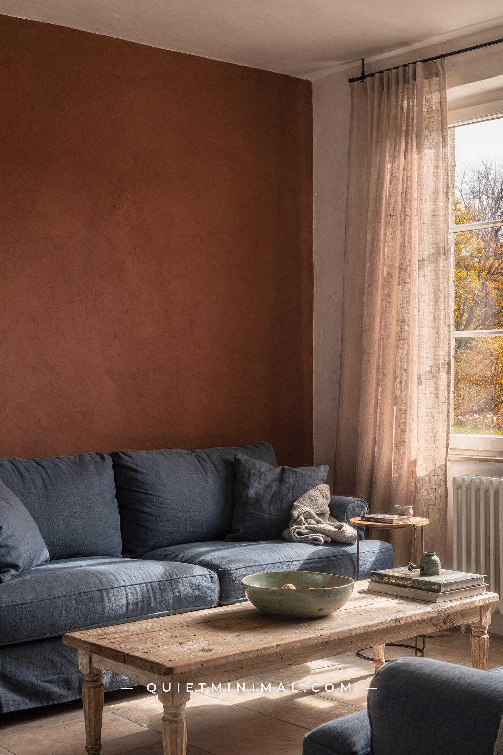
Before you open a paint app or pull a single swatch, you need to understand the palette’s structure, because Swedish farmhouse is not the same as Scandinavian minimalism and it is not the same as American farmhouse. It sits in between, and the gap is where most decorating mistakes happen.
The Swedish farmhouse palette is rooted in the Gustavian tradition: the design period running from 1771 to 1809 under King Gustav III, who brought a simplified version of French neoclassicism back to Sweden. Country homes adopted the elegance but stripped the gilding. The result was a palette built around light reflection, because Swedish winters are long and dark and every surface was working to bounce light around a room. Soft pearl whites, powdery slate blues, muted sage greens, and dusty grays were not just aesthetic choices; they were functional ones.
Fast-forward to today and that same logic still applies, layered now with the warmth direction Scandinavian design has been moving toward for the past several years. Honey oak has replaced whitewashed pine as the dominant wood finish. Terracotta and burnt sienna are appearing as accent choices alongside the traditional blues. The cool gray walls that dominated a decade ago are giving way to warmer, more dimensional off-whites with yellow or pink undertones.
From the guides
You've saved it, wanted it. Here's the how: codes, measurements, order. Your choices make it yours.
 The Japandi Honest PlaybookThe honest version of the style: what to keep, what to skip, and the order to do it in.See inside →
 The Room Refresh PlaybookA repeatable four-step method, room by room, in ten minutes, thirty minutes, or one weekend.See inside →
 Make Any Room Feel Cozy on PurposeWhy some rooms hold people and others empty out, and the moves that change it.See inside →
The palette structure that makes Swedish farmhouse work is a five-layer system. First is your base: the warm off-white that covers 60 to 70 percent of every surface. Second is your secondary neutral: a warm beige, greige, or taupe that takes up another 15 to 20 percent, used on woodwork, cabinetry, or a quieter accent wall. Third is your signature color: the slate blue, sage green, or dusty blue-gray that reads as the palette’s personality. Fourth is your depth color: a near-black, deep charcoal navy, or olive-black that anchors doors, hardware, and select trim. Fifth is your accent: a terracotta, warm gold, or muted mauve that appears in textiles and ceramics, never on large surfaces.
The failure mode at this stage is choosing colors before understanding this ratio. People pick five colors they like and apply them in equal amounts. The result is a room that looks striped rather than layered.
Key Takeaway: Swedish farmhouse is a five-layer ratio system, not a collection of colors; locking the ratio before choosing any specific paint name is the first decision that determines everything else.

Step 2: Choose Your Base White by Light Direction, Not by Swatch
 Save
The single most common mistake in building this palette is choosing the base white from a swatch card under a store’s fluorescent lighting. That chip will look completely different on your wall at 8 a.m. in a north-facing bedroom. The base white is the decision that every other color will be judged against, so choosing it wrong means every secondary color reads wrong too.
Swedish farmhouse whites are warm whites, not cool whites. Cool whites have blue, gray, or violet undertones that fight with the dusty blues and sage greens you will be layering in later, because the undertones compete rather than harmonize. You want a white with a subtle yellow, pink, or beige undertone, enough to keep the room feeling like sunlight is in it even when the sky outside is overcast.
The two verified options that appear most consistently in this palette space are SW Mushroom SW 6388, a warm beige-toned white with an LRV of around 63 that reads creamy in medium light, and SW Drift of Mist, a softer off-white that sits at the lighter end of the spectrum. BM Swiss Coffee OC-45 is the Benjamin Moore equivalent: a warm off-white with a gentle yellow undertone that does not tip into butter or cream but stays clean and calm.
If your rooms get strong south or west light, you can use any of these confidently. If your primary living spaces face north or east, check the LRV. You want a base white with an LRV no lower than 60 for north-facing rooms, because anything darker will read as a medium beige rather than a bright, airy white by afternoon. For rooms with especially limited natural light, SW Sunbleached sits at the lighter end of the Sherwin-Williams muted-naturals family and will keep the space from feeling dim.
Apply your chosen base white to a 12 in (30 cm) square patch directly on the wall. Check it at 8 a.m., 12 p.m., and 6 p.m. under your actual light. Do not decide until you have seen all three readings.
Shiplap in the sitting room scene: the wide-planked oak floor and the shiplap wall behind the armchair give a real-world demonstration of how the warm beige base reads against natural wood tone and blue-gray trim. The blue-gray trim in SW Morning Fog SW 6255 (the window trim color visible here) works because the base is warm enough to counterbalance Morning Fog’s cool blue-violet undertone. Reverse those two, put the cool gray on the walls and the beige on the trim, and the room reads gray and flat.
Key Takeaway: Match your base white’s LRV to your room’s light level, not to the color you like best in the store; an LRV of 60 or above is the minimum for north-facing Swedish farmhouse rooms.

Step 3: Lock Your Secondary Neutral Before Choosing the Signature Color
 Save
The secondary neutral is the color that bridges your base white and your signature color. Skip this step and you will jump directly from an off-white wall to a saturated dusty blue cabinet, and the transition will feel abrupt, like two rooms placed side by side rather than one layered space.
In the pantry scene, the pale off-white walls are the base. The cream linen towel and the raw pine shelving provide the secondary neutral layer: a warm tan that sits between the wall color and the dusty slate blue of the glazed pitcher and the trim. That warm tan occupies the mid-range of the palette so the jump to the blue does not feel jarring.
Your secondary neutral in a Swedish farmhouse palette should be a warm beige, greige, or sandy tan. It typically appears on: the wide-planked floor (in a medium-taupe stain), natural wood cabinetry left in its raw or lightly oiled state, furniture upholstery in a boucle or linen weave, and any shiplap or tongue-and-groove paneling you paint in a slightly deeper tone than your base white.
In the palette family shown in this section, Cafe Latte (a warm tan at approximately #D8C8B7) and Fennec Fox (a muted sage beige at approximately #D5D8C7) both function as secondary neutrals. Neither is saturated enough to compete with the signature blue; both are warm enough to keep the palette from going cold.
The practical test: hold your secondary neutral paint chip against your chosen base white. If the secondary reads clearly different but the two feel like they belong to the same family, you have the right combination. If the secondary looks pink against the white, the white may have too much yellow. If it looks green, the white may have too much blue. Both problems are LRV and undertone conflicts; fix the base white first.
The cream ceramic pitcher visible here, standing approximately 8 in (20 cm) tall on the pine shelf, is also a useful physical reference. Anything in your secondary neutral zone should read like that pitcher: warm, quiet, grounded.
Key Takeaway: Your secondary neutral must be warm-undertoned and clearly distinct from the base white but never compete with the signature color; use a warm tan, greige, or sandy beige in the 60 to 70 LRV range.

Step 4: Select the Signature Color Using the Undertone Rule
 Save
This is where Swedish farmhouse diverges from every other style that uses similar-looking colors. The signature color in this palette must share an undertone with the base white. That rule eliminates most of the conflicts people bring to design forums when they say their sage green “doesn’t work” with their walls.
BM Swiss Coffee OC-45 has a warm, slightly yellow undertone. The sage greens that work with it are the ones with yellow in them too: a muted eucalyptus, an olive-inflected sage, a green that leans toward the warmer side of the green spectrum. A sage green with a blue undertone (like a gray-sage that reads almost blue-gray in low light) will fight the yellow in Swiss Coffee and produce a result that looks like two palettes from two different rooms sitting in the same space.
The bedroom in this section shows BM Swiss Coffee OC-45 on the walls paired with a sage linen duvet and a muted blue-green painted dresser. Both the sage and the blue-green share yellow-green undertones, so they harmonize. The iron bed frame in matte black provides the depth layer and keeps the room from going soft.
For your Swedish farmhouse signature color, the three most dependable choices are:
Sage green with warm undertones: Look for greens that contain yellow, not blue. In the Sherwin-Williams family, SW Acacia Haze SW 9132 is a muted sage with warmth. In the broader palette research for this guide, SW Evergreen Fog SW 9130 appears consistently as a cabinet color that works because it reads as green-gray with more warmth than it seems in isolation.
Dusty slate blue with gray undertones: This is the Gustavian blue. It should read as blue-gray in most light, not true blue. Colors like SW Morning Fog SW 6255 work here; as detailed paint reviews confirm, it carries a blue-violet cast that behaves differently at 8 a.m., noon, and under lamplight, so test it across three lighting conditions before committing.
Dusty sage with pink undertones: Acacia Haze’s sibling category, these colors lean greige-sage. They read as sage in warm light and as warm gray in cool light, which makes them versatile but harder to describe. This is where Fennec Fox and similar muted sage-beiges live.
Apply 12 in (30 cm) samples of your shortlisted signature color directly next to your locked base white on the same wall. View them in your actual room lighting before committing.
Key Takeaway: The signature color must share an undertone family with the base white; warm-undertoned base whites need warm-undertoned sages or grayed-blues, not cool blue-grays.

Step 5: Add the Terracotta or Warm Earth Accent at the Right Scale
 Save
Terracotta is the accent that modern Swedish farmhouse palettes borrowed from Mediterranean and Provençal farmhouse interiors, and it is the accent that goes wrong most often when people apply it at the wrong scale.
The hallway in this section is the correct demonstration of scale. The terracotta is underfoot: a handmade brick floor in a warm burnt clay color, with inset patterned cement tiles at the threshold measuring approximately 8 in (20 cm) square. The walls are white lime plaster. The door frames are painted in a dusty slate blue. The warm walnut armoire visible through the doorway, standing at approximately 72 in (183 cm) tall, provides the warm brown secondary anchor. The woven seagrass basket on the floor, approximately 12 in (30 cm) in diameter, adds a textural version of the same warm earth tone.
Notice what is absent: terracotta on the walls, terracotta on furniture, terracotta on trim. The accent stays on the floor and in textural objects. That restraint is what makes it work.
In a Swedish farmhouse interior applied to a rental or a home without terracotta flooring, this accent lives in: ceramic vessels on shelves (a 5 in / 13 cm tall terra-cotta cup beside a kitchen pendant, a glazed stoneware pitcher on a butcher block), woven grass baskets used for storage, a single terracotta-toned linen pillow on a sage or cream sofa, or a jute or sisal rug in a warm tan that reads slightly orange in afternoon light.
The palette language here uses three named tones: a dusty slate blue for the architectural elements (door frames and shutters), a warm sand plaster tone for walls, and a warm driftwood rust-brown for floor and wood accents. That three-tone combination with terracotta as floor rather than wall is the Provençal-to-Swedish farmhouse crossover that shows up in the most-saved versions of this aesthetic on Pinterest today.
The practical rule: terracotta covers no more than 10 percent of any room’s visible surface area. When it exceeds that threshold, it stops reading as an accent and starts reading as a dominant color, shifting the palette away from Swedish farmhouse and toward a warmer Mediterranean palette.
Key Takeaway: Terracotta belongs in objects and flooring at a maximum 10 percent surface coverage; the moment it reaches a wall or a large piece of furniture it overwrites the palette’s Swedish character.

Step 6: Map the 70/20/10 Ratio Across Every Room in Your Home
 Save
The 70/20/10 rule is the structural principle that turns a collection of colors into a Swedish farmhouse palette. You apply it in every room individually, not across the whole house as an average. Each room must hit the ratio on its own.
The living room in this section is an executed version. The off-white sand plaster walls and the cream sofa together account for approximately 70 percent of the room’s visible surface: the background layer. The slate-blue woven throw, the limestone side table, and the wall panel in burnt sienna make up the 20 percent secondary layer, what the eye travels to after the background. The golden chamomile pillow at approximately 18 in (46 cm) square, the small sage green ceramic cup approximately 3 in (8 cm) tall, and any other single accent pieces cover the remaining 10 percent.
The failure mode at this stage is treating the secondary layer as a collection of equal accents. The slate-blue throw and the burnt-sienna panel in this scene are both secondary-layer colors, but they do not compete because they read differently: one is cool, one is warm, and they bracket the cream sofa without canceling each other. If you add a third strong color at the same scale, the 20 percent layer becomes 30 percent, the background recedes too far, and the room looks busy.
Room-by-room application notes:
Living room: 70 percent warm off-white walls and cream upholstery, 20 percent slate-blue on one architectural feature (fireplace surround paint, a built-in painted a signature color, or major textile), 10 percent terracotta and gold in ceramics and pillows.
Kitchen: 70 percent warm off-white walls and upper cabinets, 20 percent signature color on lower cabinets or island, 10 percent warm wood countertop and hardware.
Bedroom: 70 percent base white walls and bedding, 20 percent secondary neutral in the headboard or rug, 10 percent signature accent in a ceramic vase, dried botanicals, or a single throw.
Bathroom: 70 percent pale off-white plaster or tile, 20 percent dusty blue or sage in one cabinet color or tile accent, 10 percent warm brass hardware and a single linen textile.
Key Takeaway: Apply the 70/20/10 ratio room by room, not across the house as a whole, and treat the 20 percent layer as a bracketing pair of contrasting tones rather than a single strong color.

Step 7: Choose the Kitchen Cabinet Color Using the Wood-Tone Compatibility Test
 Save
The kitchen cabinet color decision is where the Swedish farmhouse palette either comes together or falls apart, because the cabinet color sits next to more surface types simultaneously than any other painted surface in the home. It has to work with the wall color, the countertop material, the floor finish, the hardware metal, and the ceiling height all at once.
The kitchen vignette in this section is the reference to use. Eucalyptus-sage green shaker cabinets in approximately the Warm Eucalyptus tone from the palette (hex #8E9A84) sit against warm off-white plaster walls. The countertop is a honey oak butcher block. The pendant lamp is woven rattan, approximately 16 in (41 cm) in diameter. The small terracotta ceramic cup beside the boucle throw, approximately 3 in (8 cm) tall, brings the warm earth accent into the kitchen without applying any terracotta to a major surface.
The wood-tone compatibility test works like this: hold your chosen cabinet color chip flat against the actual countertop or floor sample you plan to use. If both have yellow undertones, they harmonize. If one has a pink undertone and one has a yellow undertone, they fight. Honey oak butcher block has a golden-yellow undertone, which means it is compatible with sage greens and eucalyptus greens that also carry yellow. It is not compatible with blue-gray cabinet colors like SW Morning Fog or a true slate, because those cool grays fight the warmth of the wood and make the countertop look orange by comparison.
If your floor is a warm taupe or medium oak, the same rule applies. Sage green with yellow undertones, eucalyptus with yellow undertones, or a warm off-white on the lower cabinets: all are compatible. A cool gray lower cabinet against warm oak flooring is the most common kitchen mistake in Swedish farmhouse interiors, and it shows up repeatedly in renovation regret posts.
SW Evergreen Fog SW 9130 is the most frequently confirmed sage green for lower cabinets in this palette style. At an LRV of approximately 47, it reads as a clear sage in natural light and as a muted gray-green under cooler overhead lighting, which means it is versatile without being wishy-washy. Pair it with warm off-white uppers, honey oak or butcher-block countertops, and brushed brass hardware. That four-element combination is the verified Swedish farmhouse kitchen that appears across the most-saved kitchen pins in this aesthetic.
Key Takeaway: Run the wood-tone compatibility test before committing to a cabinet color; cool grays and warm wood tones fight each other, and a sage or eucalyptus green with yellow undertones is the only signature color that bridges both without friction.

Step 8: Build the Depth Layer with a Near-Black That Has a Warm Undertone
 Save
Every palette needs a depth color: the darkest tone in the system that defines edges, grounds a room, and prevents the whole space from reading as pale and formless. In Swedish farmhouse, this is not pure black. It is a near-black with a warm undertone.
SW Mt Etna SW 9174 is a deep charcoal navy that is the most verified depth color in this palette space. It sits between a very dark gray and a dark navy, with enough warmth to work beside the cream and sage already in the palette without reading cold. SW Tricorn Black SW 6258 is slightly softer than a true black and works well on exterior doors and front doors while still feeling part of the palette family.
The library nook in this section demonstrates what the depth layer looks like when it enters as a textile rather than as paint. The deep burgundy velvet reading chair occupies the depth position in this room: it is the darkest, most saturated element in the scene. The almond cream shelves and books, the golden chamomile dried stems in the sage green ceramic vessel approximately 5 in (13 cm) tall, the dusty-olive knit throw, and the small brass table lamp all appear lighter because the burgundy chair grounds them. Remove the chair and the room loses its visual gravity.
In a Swedish farmhouse palette, the depth color appears on:
Doors and door frames: A matte near-black on interior doors reads architectural and intentional. Paint just the door, not the surrounding trim, and the effect is clean. Paint both door and trim in the same near-black and the result is heavier, more dramatic, only appropriate in larger rooms.
Pendant lamps and hardware: A woven rattan pendant with a black canopy plate and black cord, or matte black cabinet pulls on sage green lower cabinets, introduces the depth layer into the kitchen without painting anything.
Single accent chair or sofa leg: A chair upholstered in a deep olive, dark burgundy, or charcoal fabric in the 10 to 15 LRV range brings the depth color in as a textile without any paint commitment.
Avoid using the depth color on ceilings in rooms with standard 8 ft (244 cm) ceiling heights. The room will read as a box.
Key Takeaway: The depth color in a Swedish farmhouse palette must be warm-undertoned, not cool black; apply it to doors, hardware, and a single textile, never to ceilings in standard-height rooms.
From the guides
You've saved it, wanted it. Here's the how: codes, measurements, order. Your choices make it yours.
The Japandi Honest PlaybookThe honest version of the style: what to keep, what to skip, and the order to do it in.See inside →The Room Refresh PlaybookA repeatable four-step method, room by room, in ten minutes, thirty minutes, or one weekend.See inside →Make Any Room Feel Cozy on PurposeWhy some rooms hold people and others empty out, and the moves that change it.See inside →
Step 9: Apply the Botanical and Floral Accent Layer Without Overloading the Walls
 Save
Botanical elements, whether wallpaper, framed prints, or illustrated linens, are a defining accent layer in Swedish farmhouse interiors. The style’s historical roots in Gustavian neoclassicism included floral motifs and nature prints as deliberate decorative choices, and they appear consistently in the most-saved versions of this palette on Pinterest today.
The sitting room corner in this section shows the right scale and placement. A single wall with a cream botanical wallpaper featuring sage, taupe, and burgundy motifs provides the pattern layer. The remaining walls, by implication, are plain shell white. The soft gray linen armchair and the warm taupe woven wool rug stay solid-colored. The single framed botanical print above the chair is a repeat of the wallpaper’s motif language but smaller and more contained.
The Valspar color system referenced in this palette, with Shell White VP 7007-12 (warm off-white), Gracious Gray VP 8004-32D (warm medium gray), Country Charm VP 3007-10B (warm tan), and River Oak VP 3004-9C (warm oak brown), provides the paint coordinates for the surfaces that sit around a botanical accent. Each of these colors shares a warm undertone that keeps it compatible with the cream-ground wallpaper without draining its color.
The practical placement rule: the botanical layer occupies one architectural surface per room. That can be an accent wall in wallpaper, a set of 4 to 6 framed prints arranged in a grid (each approximately 8 in by 10 in / 20 cm by 25 cm), or a printed linen on one chair or one set of curtain panels. If you apply botanical elements to two walls and two textiles in the same room, the pattern density becomes overwhelming and the background palette disappears.
The river-oak wood side table here, approximately 22 in (56 cm) tall, demonstrates how natural wood in the warm oak range functions as a visual rest between the patterned wallpaper and the solid upholstery. Keep at least one natural wood piece in any room where you use a botanical pattern, to provide that neutral anchor.
Key Takeaway: The botanical accent layer belongs on one architectural surface per room, surrounded by solid-color painted or upholstered surfaces in warm neutrals that keep the pattern readable without competing with the base palette.

Step 10: Build the Open Shelving Display Using a Three-Tone Ceramic Rule
 Save
Open shelving in a Swedish farmhouse kitchen is not a neutral surface: it is a fifth color in the palette, delivered through the objects displayed on it. The hutch in this section is a masterclass in three-tone ceramic discipline.
The palette on those shelves contains exactly three ceramic tones: blue-and-white transferware plates stacked in groups (approximately 10 in / 25 cm diameter), cream unglazed stoneware pitchers at approximately 8 in (20 cm) tall, and white smooth ceramic vessels. The honey pine shelving itself, in a warm golden-taupe that maps to the Muted Bronze tone at approximately #CAA278, provides the warm wood layer. The round wooden cutting board leaning at approximately 12 in (30 cm) diameter repeats the wood tone in a different form. The white stone countertop below closes the composition with a clean horizontal.
That three-tone ceramic rule is: one cool-colored glaze (the blue-and-white transferware, which maps to Colonial Blue at approximately #3D5370), one warm cream unglazed stoneware (which maps to the Shoji White tone at approximately #E0DBCE), and one true white vessel. Everything else on the shelf is wood, dried botanical, or an organic textural object.
The failure mode on open shelving is five or six different ceramic colors displayed in equal amounts. You end up with a shelf that looks like a store display rather than a curated home. The current direction for Scandinavian farmhouse shelving specifically is away from purely white displays and toward a layered blue-cream-wood combination, which mirrors the kitchen palette’s signature blue on lower cabinets and the warm off-white of the upper cabinets.
Practical sizing note: keep the tallest item on a shelf no more than three-quarters of the shelf height. If your shelves have 12 in (30 cm) between tiers, the maximum vessel height is 9 in (23 cm). Taller items work only at the back of a deep shelf where they are partially obscured by the items in front.
Key Takeaway: Open shelving reads as a palette layer, not a neutral backdrop; apply the three-tone ceramic rule (one cool-glazed, one warm stoneware, one white vessel) and keep all display items within a three-color range.

Step 11: Apply the Swedish Farmhouse Palette to the Living Room’s Soft Furnishings
 Save
The living room soft furnishings are where the palette either stays Swedish farmhouse or drifts into generic neutral-beige. The scene in this section is precise: a dusty blue-gray linen sofa sits on a sashay-sand woven wool rug, against warm white plaster walls. The deep burgundy ceramic vase with dried branches on a warm taupe side table introduces the depth accent. Cream-painted window trim holds the architectural boundary.
Working from the HGSW palette system visible in this section, the soft furnishing decisions map directly to the verified Sherwin-Williams colors. The sashay-sand rug corresponds to HGSW Sashay Sand 6051, a blush-peach warm sand that reads more cream than pink in afternoon light. The sofa’s dusty blue-gray linen corresponds to the Bracing Blue HGSW 6242 range, a dusty steel blue that is the soft-furnishing translation of the signature blue used on cabinets and trim elsewhere.
The key decision in the living room is the rug. The rug is the largest textile in the room, which means it sits in the secondary neutral or accent zone depending on your palette mapping. If your walls are warm white and your sofa is a dusty blue, the rug should be a warm sand, warm taupe, or warm greige, never a cool gray. A cool gray rug under a blue sofa against warm white walls pushes the room into a much cooler palette than Swedish farmhouse reads at its best.
Sizing note: a living room rug should be large enough that all four legs of the sofa rest on it, or at minimum the two front legs. A rug that sits entirely in front of the sofa and does not extend under it looks like a bath mat in a living room. For a standard three-seat sofa at approximately 84 in (213 cm) wide, the rug should be at minimum 8 ft (244 cm) by 10 ft (305 cm).
The dried branches in the burgundy vase are a specifically Swedish farmhouse touch: gathered botanical material with no flower color, providing organic form without introducing another paint-color-level hue into the room.
Key Takeaway: Choose the living room rug in a warm sand or warm taupe to counter-balance a dusty blue sofa; a cool gray rug and blue sofa combination pulls the palette out of Swedish farmhouse territory into a cooler Nordic modern register.

Step 12: Introduce Warm Yellow Accents Without Breaking the Palette’s Calm
 Save
Warm yellow is the accent that most Swedish farmhouse palette guides skip, because it requires more precision than the blues and sages. Applied poorly, yellow breaks the palette’s calm. Applied at the right scale and value, it is what makes the palette feel alive rather than merely restrained.
The shelf vignette in this section shows correct yellow scale. A clear glass mason jar, approximately 5 in (13 cm) tall, holds sunflowers and wild daisies. The sunflower yellow is fully saturated, bright, and seasonal. But it occupies approximately 4 in (10 cm) of visual height on a shelf that is probably 24 in (61 cm) wide. The small sage ceramic crock beside it, the lemon-yellow linen napkin folded at the lower right, and the burlap-textured basket further right: all together they form the warm accent cluster that the palette needs without exceeding the 10 percent accent ceiling.
The rule for warm yellow in this palette: use it at a fully saturated intensity but in very small objects (glass jars, ceramic cups, folded napkins, a single pillow), or use it at a muted, dusty intensity in larger objects (a wheat-beige linen duvet, a chamomile-yellow throw). Never apply a bright sunflower yellow to a surface larger than an 18 in (46 cm) pillow. The Buttercream and Blue palette row shown in this section’s graphic demonstrates the muted version: a buttercream at approximately #F4E5A2 alongside a pale ivory and a dusty periwinkle, which is how you build a yellow accent that reads warm and aged rather than kindergarten-bright.
The Honey and Greige palette tier in this section’s research is the second application path: a warm honey amber (#EBB75E) in a small glazed ceramic piece, surrounded by the medium taupe and brown tones of the secondary neutral layer. That combination keeps the yellow grounded rather than floating.
Seasonal note: in autumn and winter months, the warm yellow accent in Swedish farmhouse interiors traditionally shifts from sunflower to dried wheat and dried chamomile. The color becomes more muted but the warmth remains. Swapping out a single vase of sunflowers for a bundle of dried chamomile stems costs almost nothing and keeps the palette feeling seasonal without repainting anything.
Key Takeaway: Bright warm yellow belongs only in objects smaller than 18 in (46 cm) in any dimension; use a muted wheat or chamomile value for anything larger to keep the accent from overwhelming the palette’s calm.

Step 13: Map the Whole-House Palette Across Rooms Using a Consistent Anchor Color
 Save
A whole-house Swedish farmhouse palette needs one color that appears in every room, acting as the connective thread that makes the home feel cohesive rather than a collection of separately decorated spaces. That color is the anchor, and it is almost always the base white.
The whole-house palette system visible in this section is organized around SW Alabaster SW 7008 as the primary wall and ceiling color, with SW Kilm Beige SW 6106 as a secondary neutral for rooms where the base white needs a warmer, slightly deeper option (hallways, powder rooms, home offices with limited light). SW Evergreen Fog SW 9130 appears on the built-in bookcase: a muted sage green-gray that functions as the signature cabinet color. SW Tricorn Black SW 6258 appears on the front door and interior accent doors. SW Languid Blue SW 6226 is listed for dining rooms and bedrooms, where a softer, more serene dusty blue replaces the deeper Bracing Blue used in the living room.
The honey-oak hardwood floor in this scene is the consistent anchor at the floor level. Floor color is the one element that does not change room to room (unless you have area rugs covering it in every space), so it must be compatible with every signature color in your palette. Honey oak with golden undertones works with the warm sages, warm blues, and warm off-whites in the Swedish farmhouse system. If your existing floor is a red-toned cherry or a very dark walnut, the sage-green signature color needs to lean slightly yellow-green to avoid fighting the floor undertone.
The practical whole-house checklist at this stage:
- One base white, applied to walls and ceilings in every room: SW Alabaster SW 7008 or equivalent.
- One secondary neutral, used in two or three rooms where the base needs warmth: SW Kilm Beige SW 6106 or SW Mushroom SW 6388.
- One signature color, used on cabinets, built-ins, or one accent wall per room: SW Evergreen Fog SW 9130 or SW Acacia Haze SW 9132.
- One depth color, used on no more than two doors in the house: SW Tricorn Black SW 6258 or SW Mt Etna SW 9174.
- Two accent colors in textiles only, never on walls: dusty blue in the living room and dining room, sage green in the bedrooms and bathrooms.
Key Takeaway: The base white is the whole-house anchor; it must appear on every wall and ceiling in the home to create the visual thread that connects rooms with different signature colors.
Step 14: Style the Flat Surfaces Using the Warm Cream Foundation Rule
 Save
Flat surfaces (coffee tables, console tables, benches, side tables) are where the Swedish farmhouse palette gets executed at the smallest, most tactile scale. The bench vignette in this section is a complete styling unit that follows the warm cream foundation rule: every object starts from a cream or warm neutral base before adding color.
The elements in this scene: a white ceramic pitcher approximately 8 in (20 cm) tall holding white wildflowers, two gold-leaf picture frames approximately 8 in by 10 in (20 cm by 25 cm) each leaning with botanical prints, a sage-floral textured linen pillow approximately 18 in by 18 in (46 cm by 46 cm), a wicker rattan tray approximately 14 in (36 cm) in diameter holding a cream ceramic bowl approximately 5 in (13 cm) wide and a wooden bead garland approximately 24 in (61 cm) long, stacked cream hardcover books at one end, and a lit votive glass candle approximately 3 in (8 cm) tall at the opposite end.
Count the colors: cream, warm oat, muted honey beige, dusty sage, gold, and natural wood. That is six surface tones, but four of them are warm neutrals (cream, oat, honey beige, natural wood). The dusty sage and the gold are accents, occupying a combined total of less than 25 percent of the vignette’s visual surface.
The warm cream foundation rule states that at least 60 percent of any flat surface styling should be cream, warm white, or warm neutral in tone. If you introduce a dark color (the smoky olive or weathered taupe at the bottom of this palette), it should appear in one object only, as a contrast anchor.
The lit votive candle is a detail that separates a staged tableau from a lived-in vignette. The warm light it adds at the lower left of the composition is not decorative only: it warms all the surrounding cream surfaces and pushes any cool undertones in the sage pillow back toward warmth. In a real room, candles placed on flat surfaces do this at every scale.
Key Takeaway: Use the warm cream foundation rule on every flat surface: at least 60 percent of the styling should be cream, oat, or warm neutral, with color accents limited to a maximum of two tone families.

Step 15: Apply the Five Farmhouse Kitchen Palette Variations by Mood
 Save
Not every Swedish farmhouse kitchen looks identical. The five palette variations that cover the full range of this aesthetic give you a clear starting point depending on the existing architecture and the room’s primary mood.
Warm and Timeless: Cream walls and warm white uppers, taupe countertop, sage green lowers, honey wood tone. This is the most resolved, most versatile version. It reads warmest in south-facing rooms and works in spaces of any size. The sage green and the warm cream have matching yellow undertones. Cabinet hardware: brushed brass.
Modern Farmhouse: White walls and uppers, light gray countertop or island, sage green on one cabinet run, charcoal on the island, natural wood shelving. This version introduces more contrast and reads more contemporary. It works best in rooms with strong natural light because the light gray can read cold in north-facing kitchens. Cabinet hardware: matte black.
Warm Neutral: Beige walls, greige uppers, mushroom-toned island, olive green on lower cabinets only, medium oak countertop. This is the most forgiving version for rental kitchens where you can only change a few elements: paint the lowers olive, add a medium oak butcher block on top of the existing counter if possible, and replace hardware with aged brass.
Classic Farmhouse: White walls and uppers, dove gray island, navy blue lower cabinets or pantry door, sage green accent on the open shelving back panel, warm wood toe kick. Navy at approximately BM Hale Navy HC-154 (a verified deep navy blue at an LRV of approximately 7) works here because the white surrounds it and prevents it from reading as heavy. Navy and sage in the same kitchen: keep the sage on the open shelving back panel and the navy on the painted lower cabinets.
Rustic Farmhouse: Cream walls, brown stone or rough plaster countertop, forest green lower cabinets, iron black pendant and hardware, reclaimed wood shelving. This is the most textural version and works in rooms with exposed ceiling beams or brick.
Key Takeaway: Match the kitchen palette variation to your room’s light level: Warm and Timeless for any exposure, Modern Farmhouse for strong natural light only, and Rustic Farmhouse for rooms with existing architectural texture that needs a dramatic contrast anchor.

Step 16: Finish the Bedroom Palette with a 30-Swatch Reference and Final Checks
 Save
The bedroom is the last room to finalize because it is the most personal space in the palette and the most forgiving: fewer hard surfaces mean more of the color story is delivered in textiles, which are easier to swap than paint.
The bedroom vignette in this section draws from a 30-swatch reference organized into six tonal families: Soft Neutrals (Lace White, Oatmeal, Cream, Mushroom, Linen), Garden Greens (Sage, Moss, Fern, Leaf, Olive), Floral Hues (Dusty Rose, Blush, Lavender, Periwinkle, Buttercup), Warm Earths (Terracotta, Warm Brown, Honey, Cocoa, Stone), Soft Blues (Milky Sky, Duck Egg, Soft Teal, Faded Denim, Dusty Blue), and Natural Accents (Mustard, Dried Lavender, Faded Terracotta, Soft Sage, Warm Tan).
For a Swedish farmhouse bedroom, pull your palette selections from no more than three of these six families, and keep the primary selection firmly in Soft Neutrals. The vignette here uses Lace White on the walls, a sage linen quilt (Garden Greens), a dusty-rose embroidered pillow (Floral Hues, just one piece), dried lavender in the cream ceramic vase (Natural Accents), and a periwinkle botanical print in a gold frame (Floral Hues as art, not as textile or paint). That is four color families represented, but Soft Neutrals dominate at approximately 65 percent of the visual surface.
The mushroom-toned wooden nightstand, approximately 26 in (66 cm) tall and 18 in (46 cm) wide, is doing two jobs: it anchors the warm earth layer without adding a separate warm-earth-toned textile, and it gives the small cream ceramic vase, approximately 4 in (10 cm) tall with dried lavender, a background warm enough to let the lavender read as a floral accent rather than as just a gray-purple stem.
Final palette check for the bedroom: stand in the doorway with every textile, every throw, and every decorative piece in place. If you can count more than four distinct color families, remove pieces from the smallest families until you are back to three. If the room reads monochromatic (all one tone with no variation), add a single piece from the Floral Hues family in a muted value: a blush or dusty rose pillow, a periwinkle botanical print, or a lavender-stem bundle in a clear glass vessel.
The completed Swedish farmhouse palette is not a fixed formula. It is a structural decision: one base white throughout the home, one secondary neutral as a quieter option for lower-light spaces, one warm-undertoned signature color on cabinets and built-ins, one near-black depth color on doors and hardware, two accent tones in textiles only, and botanical or organic elements in the 10 percent accent zone. Every room applies those layers at the 70/20/10 ratio. That structure, more than any specific paint name, is what makes the palette feel resolved.
Key Takeaway: Lock the bedroom palette to a maximum of three color families drawn from the 30-swatch reference, with Soft Neutrals dominant at 60 percent or above, before adding any accent textile or framed art.

Building a Swedish farmhouse color palette is a sequence of locked decisions, not an open-ended mood-board exercise. Start with the base white and confirm it across three lighting conditions before moving to the secondary neutral. Lock the secondary before selecting the signature color, and verify the undertone compatibility at each step. Apply the 70/20/10 ratio room by room. Keep terracotta and warm yellow in objects, not on walls. Put botanical and floral elements on one surface per room and surround them with solid-painted neutrals. The palette resolves when every decision supports the one before it. With your selections confirmed through this process, order your paint samples and start with one room, see it through to completion, and let that room set the standard for every space that follows.
From the guides
You've saved it, wanted it. Here's the how: codes, measurements, order. Your choices make it yours.
The Japandi Honest PlaybookThe honest version of the style: what to keep, what to skip, and the order to do it in.See inside →The Room Refresh PlaybookA repeatable four-step method, room by room, in ten minutes, thirty minutes, or one weekend.See inside →Make Any Room Feel Cozy on PurposeWhy some rooms hold people and others empty out, and the moves that change it.See inside → Save


