 Georgia
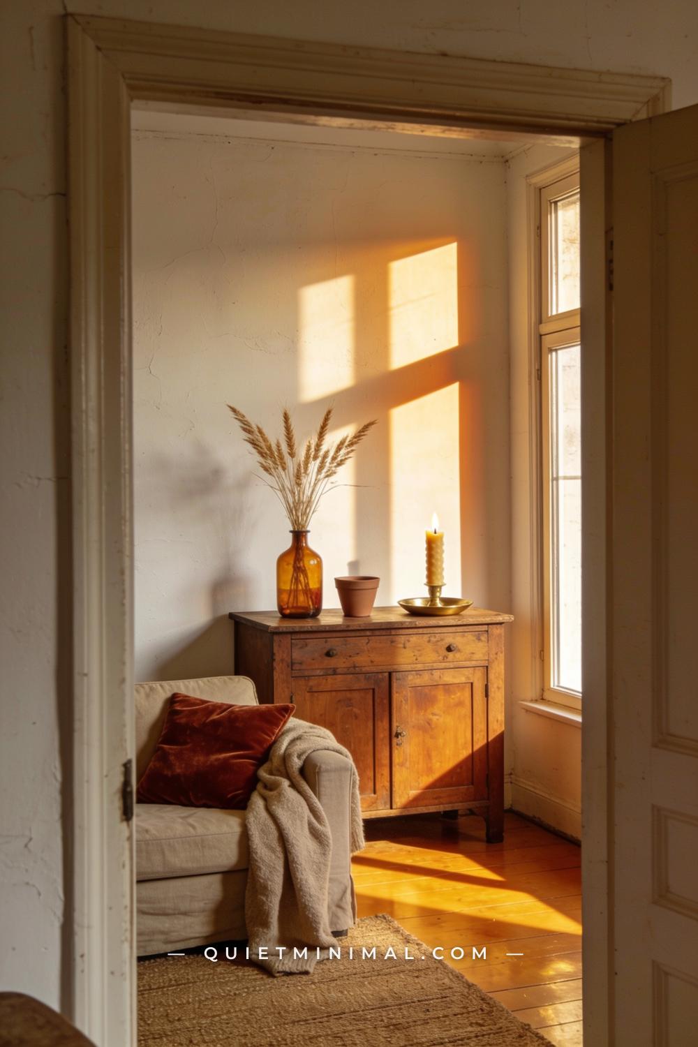
Most fall decor advice tells you what to buy and stops there. The result is a cart full of pretty objects that never quite look right together — too busy, too orange, too obviously seasonal. The vintage autumn aesthetic is different. It builds like a good outfit: a neutral base, then layers of texture, warmth, and age that feel curated rather than assembled. These 12 ideas follow that same logic. Each one adds a specific layer to a room, so by the time you reach the end, you have a space that feels genuinely warm and collected — not a seasonal display that gets boxed up in November.
1. Start With a Warm Neutral Base — Walls and Floors First
 Save
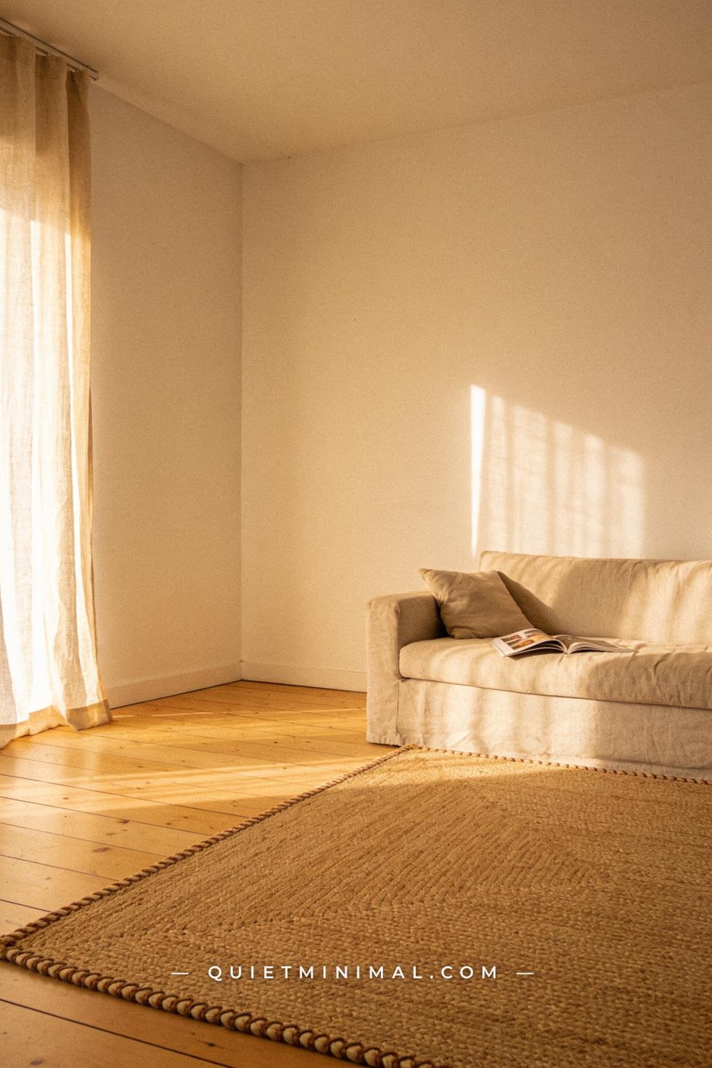
The vintage autumn aesthetic fails when it lands on top of a cold grey or stark white room — there’s no warmth underneath to support it. Before any object goes down, the bones of the room need to read warm. That means walls in an off-white with a slight yellow or red undertone (Sherwin-Williams’ Antique White SW 6119 or Benjamin Moore’s White Dove OC-17 are reliable starting points), and a floor covering in a natural fiber like jute, sisal, or a faded wool flat-weave. Neither of these needs to scream autumn — they just need to not read cold.
Think of the base layer as the canvas a painter primes before any color goes on. Jute rugs in particular do invisible heavy lifting: they add organic texture, warm the floor visually, and provide a neutral anchor that keeps every layer above them from looking chaotic. A large jute rug — sized generously so all front legs of seating sit on it — is one of the highest-return investments in this aesthetic.
From the guides
You've saved it, wanted it. Here's the how: codes, measurements, order. Your choices make it yours.
 The Japandi Honest PlaybookThe honest version of the style: what to keep, what to skip, and the order to do it in.See inside →
 The Room Refresh PlaybookA repeatable four-step method, room by room, in ten minutes, thirty minutes, or one weekend.See inside →
 Make Any Room Feel Cozy on PurposeWhy some rooms hold people and others empty out, and the moves that change it.See inside →
Key Takeaway: A warm-undertone wall and a natural-fiber floor covering are the invisible foundation that makes every vintage autumn layer on top of them look intentional.

2. Anchor a Vignette With an Aged Wood Surface
 Save
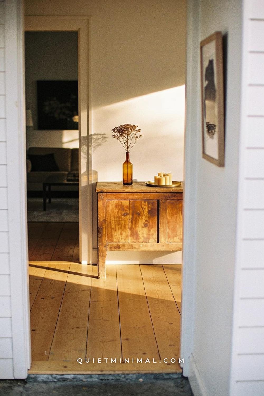
Every vintage-autumn room needs one piece of genuinely aged or aged-look wood — a console table, a sideboard, a coffee table with a worn finish — because it sets the tone for every other object in the room. New-looking furniture in this aesthetic reads off. The eye immediately reads the contrast between a shiny flat-pack finish and a dried floral arrangement as “craft store display,” not “curated home.” A solid wood piece with visible grain, knots, or a matte oil finish changes everything around it.
You don’t need to thrift-hunt for weeks. Many Amazon and Wayfair brands now produce console tables with acacia or mango wood tops that have a convincingly aged look at a reasonable price. The key is to look for a matte or oiled finish rather than a lacquered shine. Place it where it can hold a single, unhurried vignette — against a main wall, behind a sofa, or in an entryway.
Key Takeaway: One aged-wood surface anchors the entire vintage aesthetic; everything else in the room takes its tonal cue from it.

3. Bring In Amber Glass for Instant Warm Light
 Save
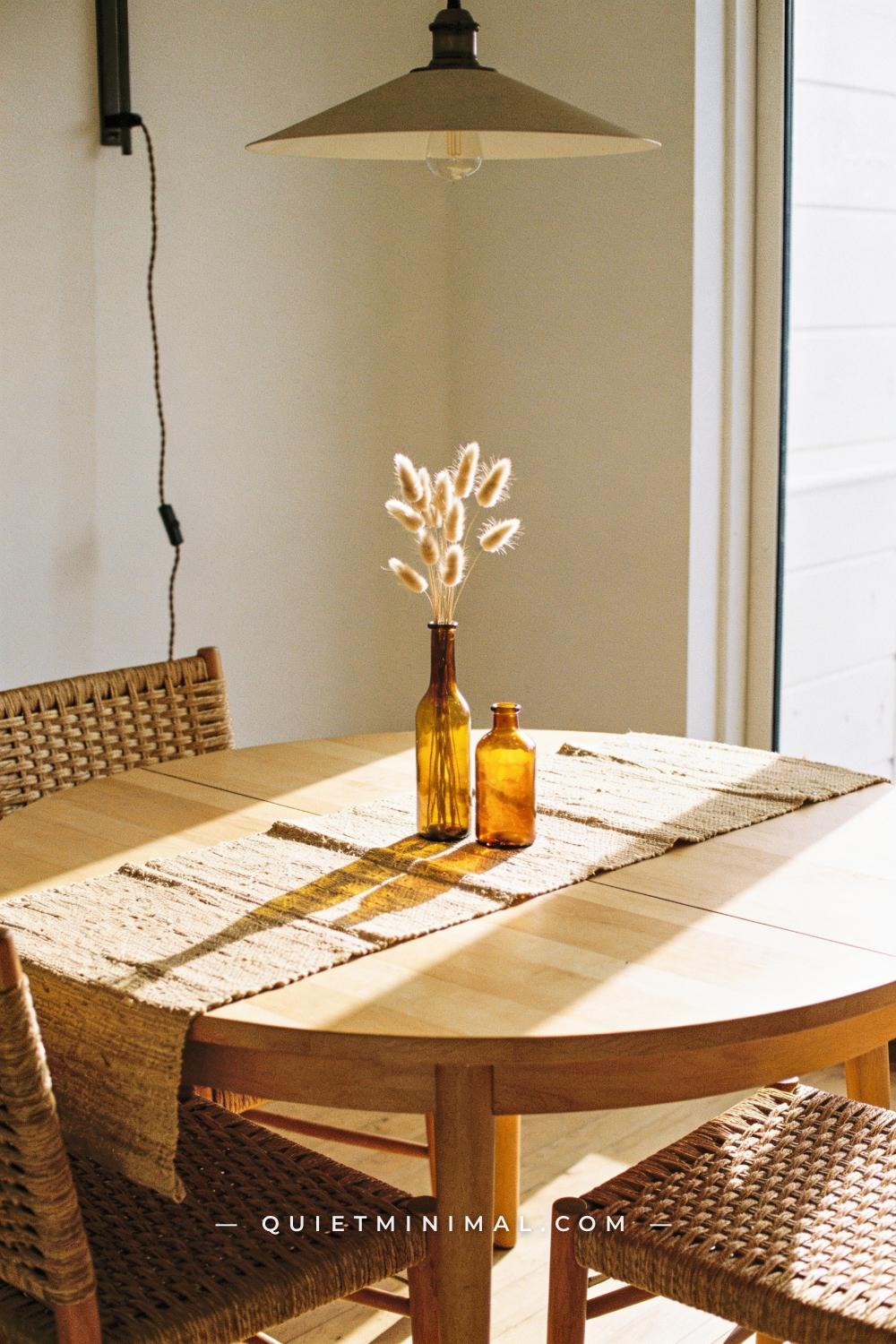
Amber glass is the single most efficient tool in the vintage autumn palette. When daylight passes through amber, it turns honey-gold and casts a warm glow onto whatever surface it sits on — an effect no candle can quite replicate and no paint color can substitute for. A grouping of amber glass vessels on a dining table, a window ledge, or an aged-wood sideboard immediately reads as warm, old, and deliberate.
The style works because amber glass has genuine historical precedent — apothecary bottles, Victorian preserving jars, mid-century barware all share this color. When you use it in a room, the eye reads “collected over time” rather than “bought last week.” Mix heights: one tall slim vase, one shorter rounded bottle shape. Keep the arrangement spare — two or three pieces with breathing room between them reads better than a crowded lineup.
Key Takeaway: Amber glass vessels grouped in odd numbers at varying heights deliver warm, historically-grounded color without a single orange throw pillow in sight.

4. Layer in Dried Botanicals Instead of Fresh Flowers
 Save
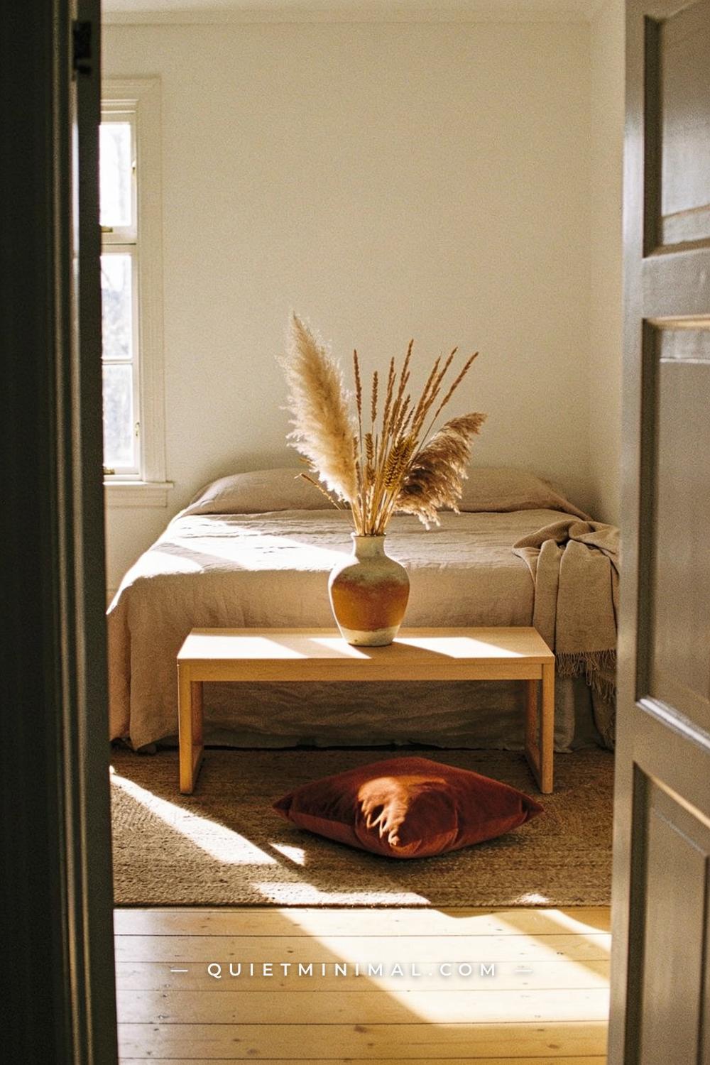
Fresh flowers in autumn feel slightly wrong — too bright, too manicured, too temporary. Dried botanicals have the right visual weight for this aesthetic: muted, structural, and lasting. Pampas grass in a creamy ivory tone, dried wheat sheaves, bunny tail grass, preserved eucalyptus, and dried lunaria (honesty plant) all sit within the vintage autumn palette without forcing the look into a craft-fair direction. The key is restraint — a single stem arrangement in a matte ceramic or amber glass vessel, not an overflowing mixed bundle.
Dried arrangements also solve the maintenance problem entirely. A well-chosen dried stem arrangement can last a full season — or longer — without water or care. For this aesthetic, lean toward arrangements that have an unfinished, slightly wild quality: a few stems slightly taller than the vase, a soft droop to one side. Perfection is the enemy of vintage warmth.
Key Takeaway: Dried botanicals in muted ivory and straw tones — kept spare and slightly imperfect — are the easiest way to add organic vintage texture to any surface.

5. Add Velvet in Autumn’s Deepest Tones
 Save
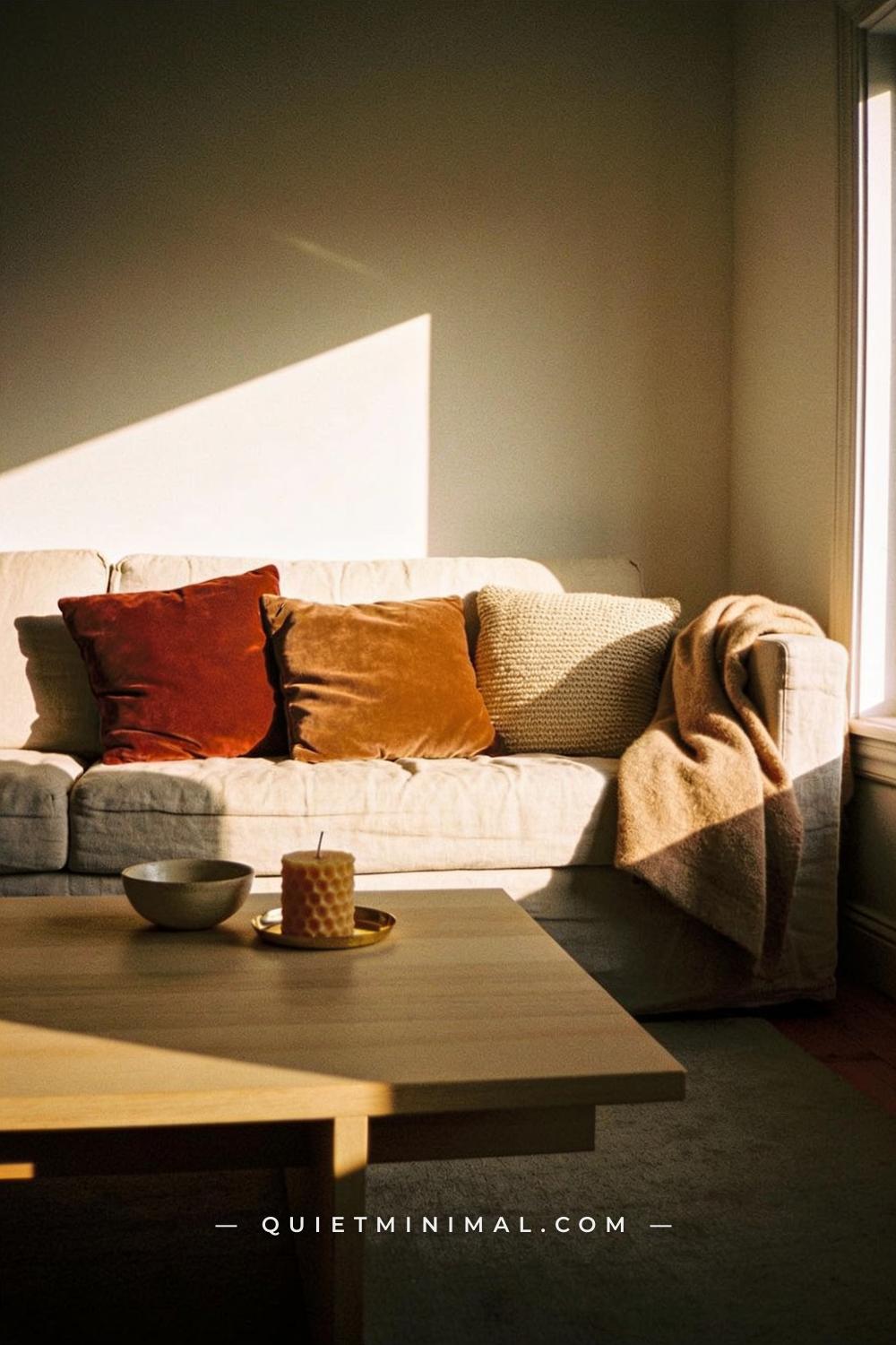
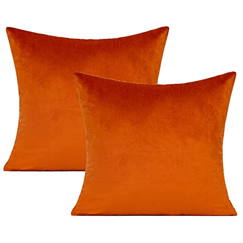
Velvet is autumn’s most generous textile — it absorbs light, shows color depth, and reads as rich without being heavy. In the vintage aesthetic, it works best in tones that sit slightly away from primary orange: deep rust, muted caramel, dried-rose, and forest green are all stronger choices than a bright burnt orange, which can tip the palette into harvest-festival territory. Two velvet cushions on a neutral linen sofa — different but adjacent tones, slightly different sizes — read as collected and intentional.
The practical note: velvet at this aesthetic level doesn’t need to be expensive. The key attribute is nap consistency and a matte (not shiny) finish. Crush velvet or high-sheen velvet reads cheap and very current — neither works here. Look for cotton or polyester-cotton velvet with a tight, even pile in the color descriptions above.
Key Takeaway: Two velvet cushions in muted rust and caramel tones do more visual work for the vintage autumn look than any other single textile purchase.
6. Use Beeswax Candles — Not Paraffin
 Save
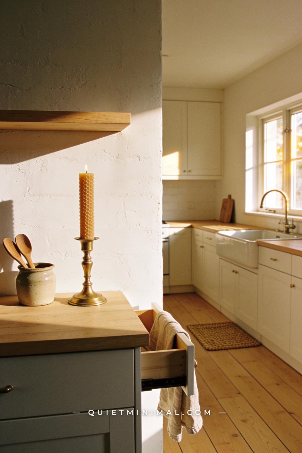
Paraffin candles can be any color and scent, but they share one visual quality that works against vintage aesthetics: their white wax reads as synthetic and modern even when they’re styled in antique holders. Beeswax candles solve this immediately. Their natural honey-amber color is the right temperature for this palette, they burn with a warmer, slightly brighter flame, and they carry a faint natural scent that isn’t added fragrance. On a brass candlestick or a raw wooden charger, a beeswax pillar reads as genuinely old.
Taper candles in beeswax work on candlestick holders and create elegant height variation in a vignette. Pillar candles in beeswax work on a wooden board or a terracotta plate to anchor the base of an arrangement. Either way, the slightly irregular, hand-dipped look of beeswax adds the small imperfection that makes a vignette feel real rather than styled.
Key Takeaway: Switching to beeswax candles is a small detail that changes the entire color temperature of a vignette — their natural amber wax belongs in this palette in a way white paraffin simply doesn’t.

7. Introduce Brass Accents — But Keep Them Spare
 Save
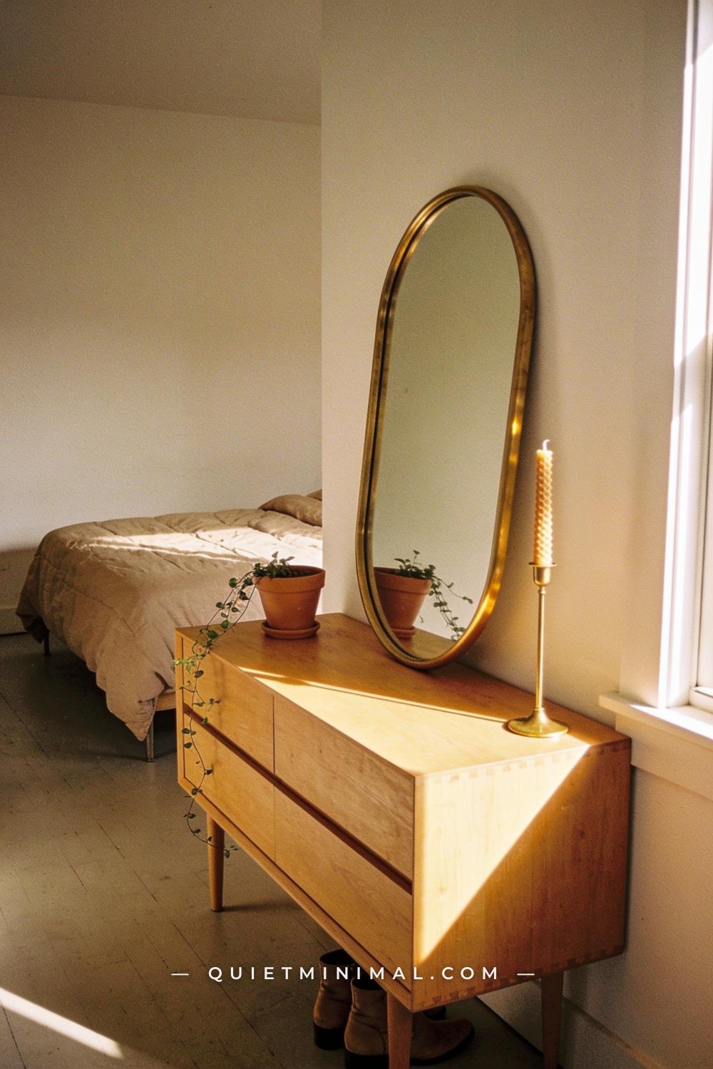
Brass in its brushed or unlacquered form — not polished, not gold-tone — reads as genuinely aged in a vintage autumn room. The key is to use it as a quiet repeating accent rather than a dominant material. A brass candlestick, a brass tray, a brass drawer pull or two: each one reinforces the warmth of the palette without announcing itself. More than three brass objects in a single vignette starts to feel like a thematic statement rather than a natural collection.
Unlacquered brass will darken and develop patina over time, which works entirely in favor of this aesthetic. If you prefer a consistent tone, brushed brass (which doesn’t patina the same way) gives you the warm metal quality without the maintenance. Avoid bright polished brass, which reads as early-2000s rather than vintage.
Key Takeaway: One or two brushed brass accents — a candlestick, a small tray — add the aged-metal warmth this palette needs without the heavy-handed look of all-brass styling.

8. Layer Textiles: Linen First, Wool Second, Woven Third
 Save
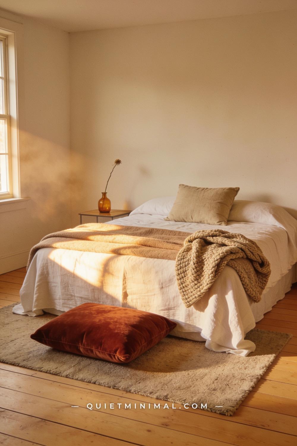
The vintage autumn aesthetic is fundamentally about layered texture, and the most successful textile layering follows a specific order: linen as the base (sheets, duvet cover, pillow shams — its matte, slightly rumpled quality grounds everything), then wool in a heavier blanket or throw for warmth and weight, then a woven or knitted accent — a chunky-knit throw, a flat-woven wool rug — as the outermost tactile layer. Each material is different enough in texture that the layers read individually, but all three sit in the same warm natural-fiber family.
The color discipline here matters more than in any other layer. Keep linen and wool in warm neutrals — oatmeal, flax, ivory — and let the one or two accent colors (rust velvet cushion, caramel throw) do the color work. An all-color textile layer — rust linen, mustard wool, orange knit — reads as a costume, not a room.
Key Takeaway: Linen base, wool mid-layer, woven accent — built in warm neutrals with one or two muted autumn tones — is the textile formula behind every vintage autumn bedroom that looks genuinely composed.
From the guides
You've saved it, wanted it. Here's the how: codes, measurements, order. Your choices make it yours.
The Japandi Honest PlaybookThe honest version of the style: what to keep, what to skip, and the order to do it in.See inside →The Room Refresh PlaybookA repeatable four-step method, room by room, in ten minutes, thirty minutes, or one weekend.See inside →Make Any Room Feel Cozy on PurposeWhy some rooms hold people and others empty out, and the moves that change it.See inside →
9. Style With Terracotta, Not Orange Plastic
 Save
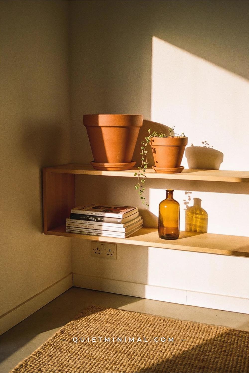
Terracotta brings the orange-brown warmth of autumn into a room in a way that never reads seasonal or costume-y — because terracotta is a material, not a color trend, and it has been used in homes for centuries. Matte terracotta pots in varying sizes grouped on a shelf, a windowsill, or a console table anchor the warm autumn palette without the artificial brightness of an orange pumpkin or a mass-market resin decoration.
The distinction between good and bad terracotta styling is surface finish. Glazed terracotta — shiny, uniform — reads modern and craft-store adjacent. Unglazed or matte-fired terracotta, slightly irregular in form, reads exactly as old as it is. If you can find pots with a slightly rough or chalky exterior surface, even better. Style them with trailing or dried plants — a sprig of dried thyme, a rosemary stem, a small succulent — rather than empty, which makes them look like unused pots.
Key Takeaway: Unglazed matte terracotta pots grouped in different sizes on a shelf or sideboard bring genuine warmth and historical weight to the vintage autumn aesthetic without any seasonal cliché.

10. Hang Something Textile — Not Just Framed Prints
 Save
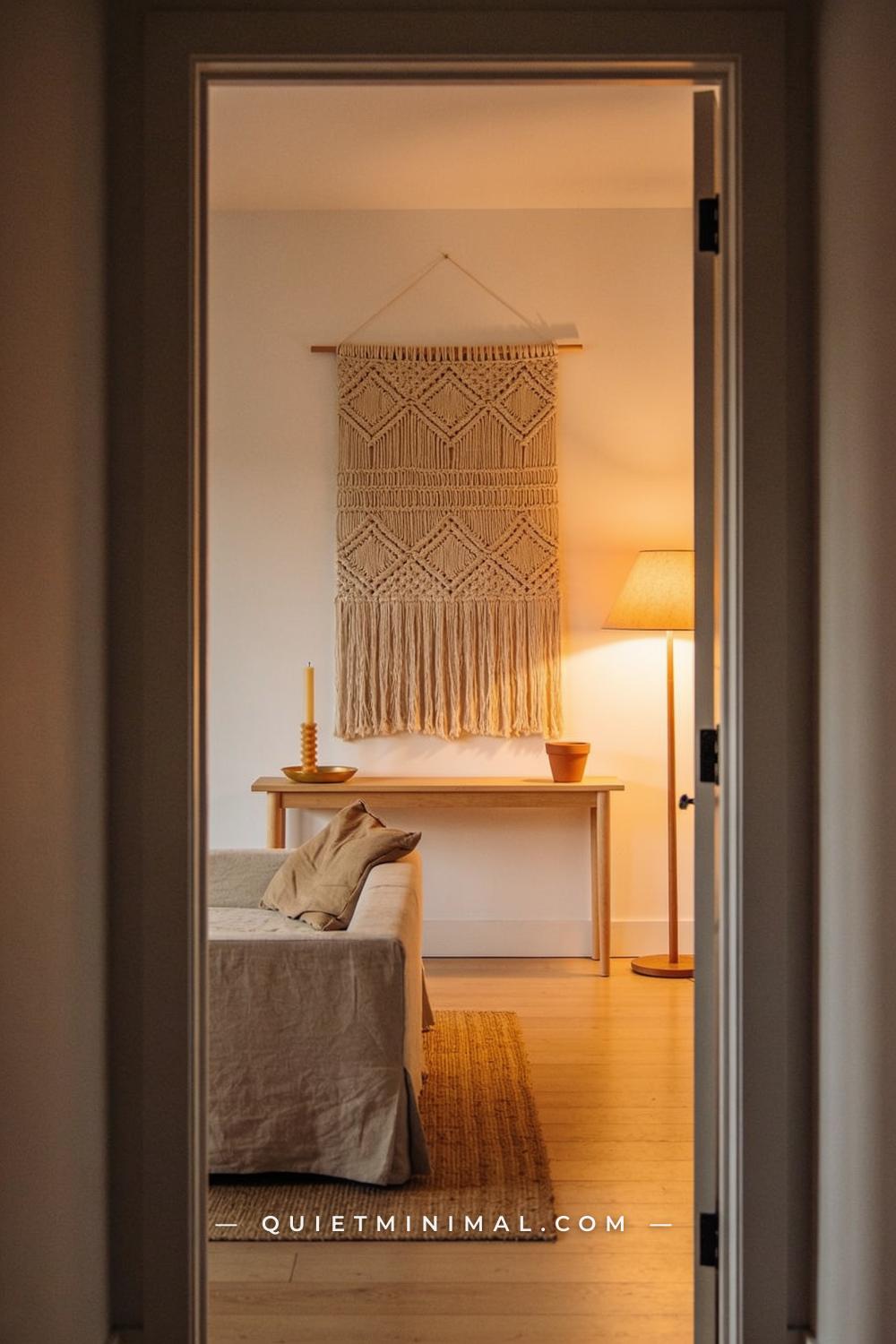
Framed prints are not wrong in a vintage autumn room, but they are common — and alone on a wall, they can make a room feel more Etsy-print-shop than genuinely collected. A textile wall hanging — woven macramé, a flat-woven wool piece, a large linen panel — adds a layer of dimension and texture that a flat print simply can’t. It also absorbs sound, which subtly makes a room feel more intimate.
The vintage autumn version of a wall textile leans toward undyed or earth-tone wool and cotton weaves with visible structure — not tightly woven and not heavily dyed. Natural, slightly rough, with fringe. A large piece above a console or sideboard functions as the room’s visual anchor in the same way a large framed artwork would, with the added benefit of texture. Keep the piece in natural tones so it doesn’t compete with the rest of the palette.
Key Takeaway: A natural-fiber woven wall hanging above a console or behind a sofa adds the tactile depth and visual anchor that framed prints alone can’t deliver in a vintage autumn room.

11. Set a Table Vignette That Works Any Day of October
 Save
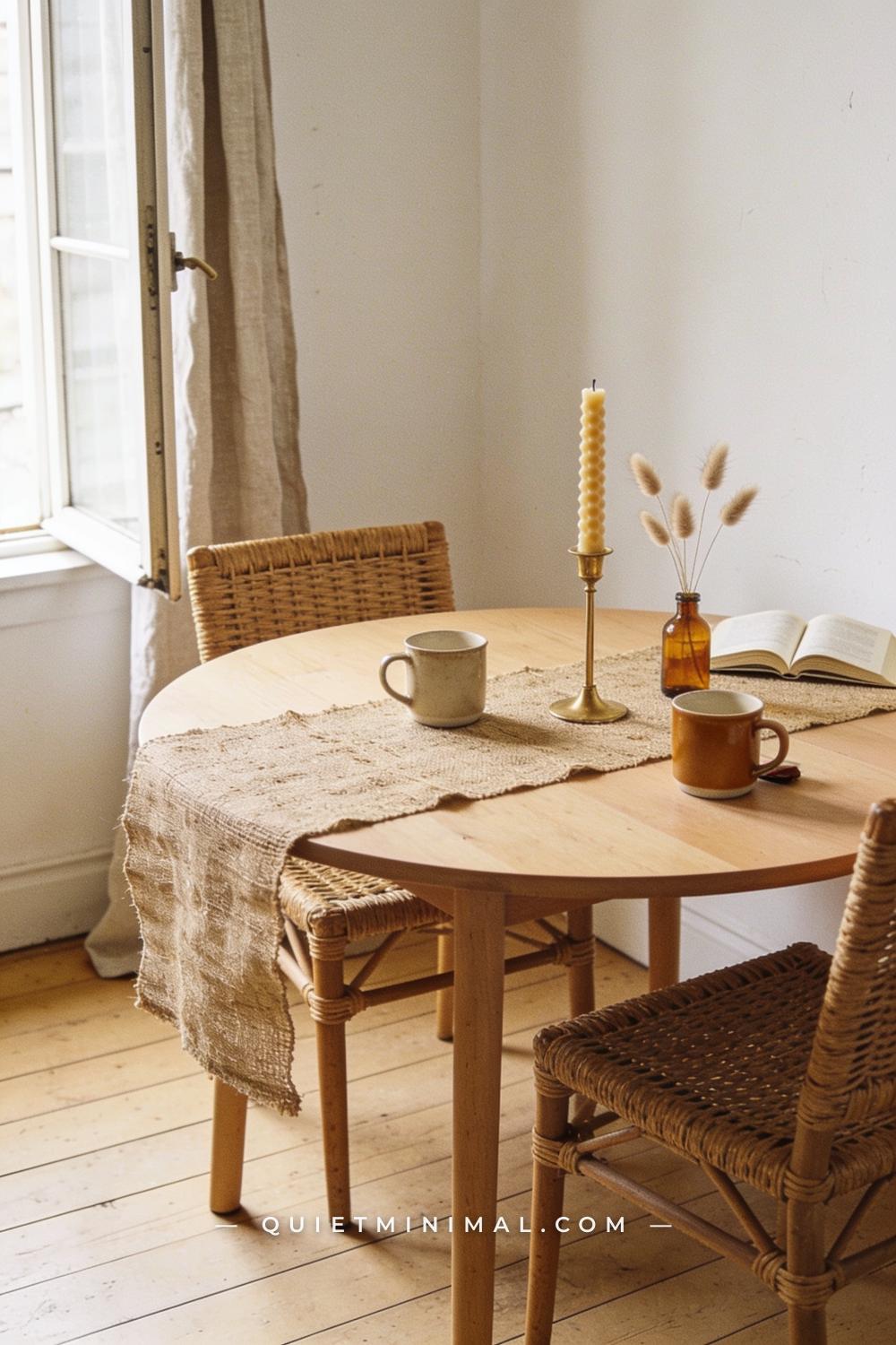
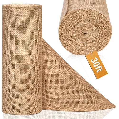
A table vignette — not a full seasonal tablescape — is one of the most overlooked opportunities in the vintage autumn aesthetic. A jute runner across a round table, two or three mismatched stoneware mugs or small ceramic vessels, a beeswax taper in a simple brass holder, and a dried botanical arrangement that takes up less space than a dinner plate: this is a vignette that can stay out all month, works at any time of day, and doesn’t require rearranging before every meal.
The vintage quality here comes from the stoneware and the brass — both carry the handmade, imperfect quality that reads old. Matte caramel or dark brown stoneware in particular is having a genuine design moment right now: it reads Wabi-Sabi adjacent without the full Japanese minimalism commitment, and sits perfectly in the autumn palette. A matching set of two or four of the same mug instantly becomes a collected-looking object when they’re in the right color.
Key Takeaway: A spare table vignette built on a jute runner with stoneware, brass, and a single dried botanical arrangement brings the vintage autumn aesthetic to the dining room without requiring a full seasonal tablescape overhaul.
12. Edit the Room — Remove What Doesn’t Belong to This Palette
 Save
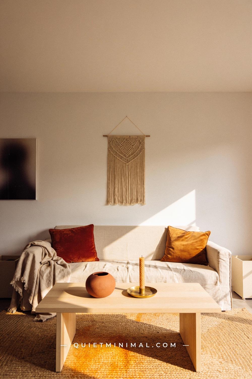
The final and most important layer in building a vintage autumn aesthetic is a subtraction. Go back through each surface you’ve styled and remove any object that isn’t in the palette — cool grey ceramics, bright white decorative objects, anything plastic or obviously synthetic, any seasonal novelty item that doesn’t have a material or historical reason to exist in the room. The vintage autumn aesthetic is a quiet one. It doesn’t shout. It accumulates warmth through repetition of the same few materials and tones, not through volume of objects.
A common mistake at this stage is to keep “just one more” thing — a shiny silver frame, a bright decorative pumpkin, a mass-market scented candle in its packaging. Each exception dilutes the palette. The room should feel like someone has lived with these objects for years, not assembled them in a weekend. When you walk away and the room looks slightly emptier than expected, you’re probably close to right.
Key Takeaway: Editing out every object that doesn’t belong to the warm, natural, aged palette is what transforms a collection of good individual purchases into a room that reads as genuinely curated.

The vintage autumn aesthetic rewards patience and restraint more than any other seasonal decorating approach. Start with your base — warm walls and a natural-fiber floor — then work through the layers: an aged wood surface, amber glass, dried botanicals, the right textiles, and the small material details that signal age and care. The final edit, removing what doesn’t belong, is where the whole thing resolves. Give yourself the full first week of the season to build and adjust rather than styling the room in a single afternoon. The spaces that read as genuinely collected almost always got there one considered object at a time.
 Save
Styling Ideas
 Save
How to Build a Vintage Autumn Aesthetic Decor Layer by Layer
 Save
Anchor Your Vintage Autumn Vignette With an Aged Wood Surface
 Save
Dried Botanicals Are the Vintage Autumn Aesthetic Layer You’re Missing
 Save
Linen, Then Wool, Then Woven — the Vintage Autumn Textile Layer Order
 Save
Hang a Textile on Your Wall for a Truer Vintage Autumn Aesthetic
 Save
Set an Everyday October Table Vignette With a Vintage Autumn Aesthetic
From the guides
You've saved it, wanted it. Here's the how: codes, measurements, order. Your choices make it yours.
The Japandi Honest PlaybookThe honest version of the style: what to keep, what to skip, and the order to do it in.See inside →The Room Refresh PlaybookA repeatable four-step method, room by room, in ten minutes, thirty minutes, or one weekend.See inside →Make Any Room Feel Cozy on PurposeWhy some rooms hold people and others empty out, and the moves that change it.See inside →


