 Georgia
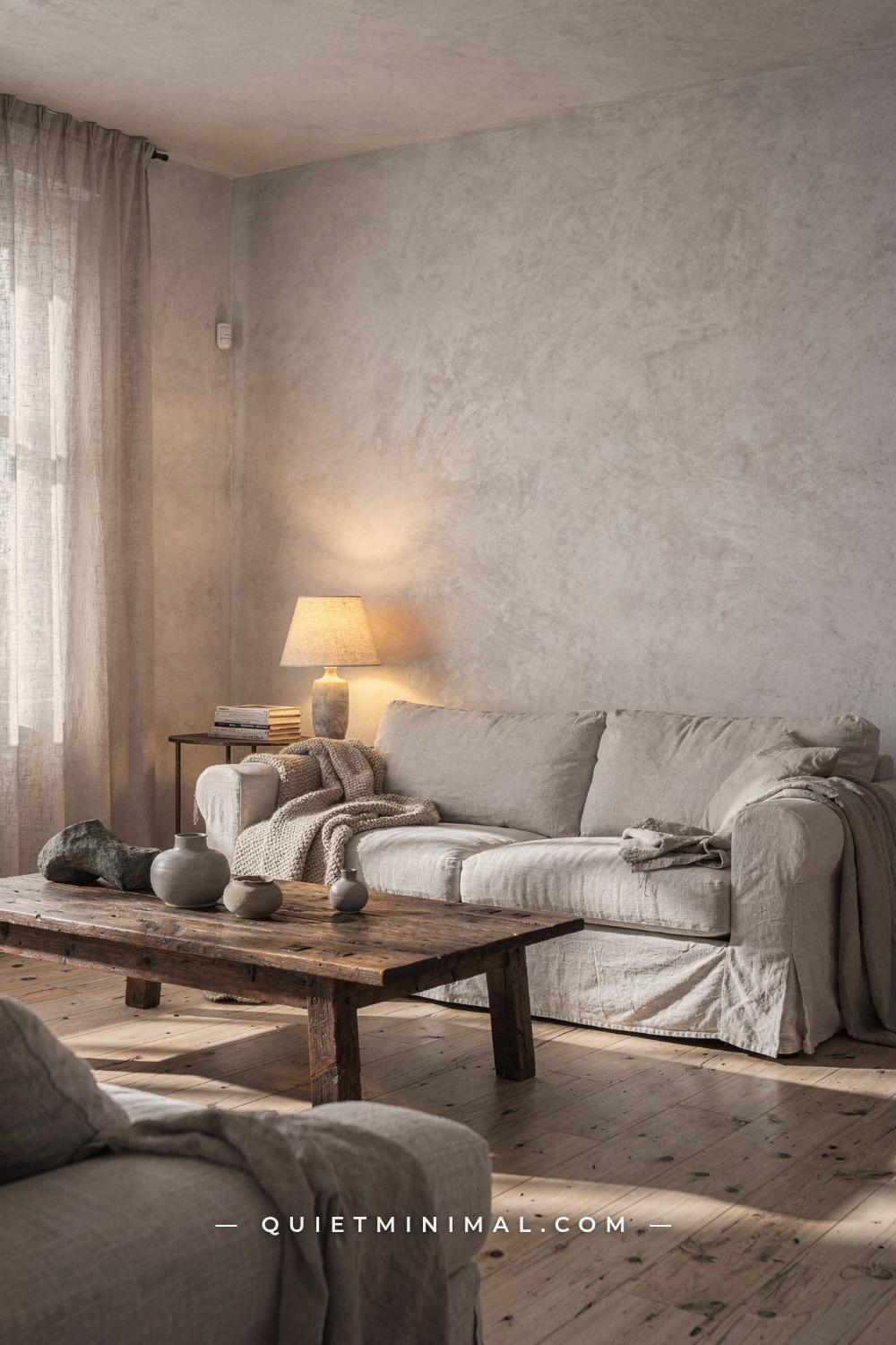
You have done the research. You bought the linen throw and the handmade ceramic bowl. You painted the walls a neutral and cleared out the clutter. But when you stand in the doorway and look at the room, something is still wrong. It doesn’t feel calm. It feels flat, or busy, or like a mood board that hasn’t quite landed.
That is a very specific feeling, and it has a very specific cause. Wabi sabi is one of the most misunderstood aesthetics in home decor precisely because it looks simple. But every element in a wabi sabi room is doing a specific job, and when one of those jobs is handled incorrectly, the whole room reads as off without you being able to point at why. The mistakes below are the ones that show up most consistently in rooms that have the right intention but the wrong execution. Each section names the failure, explains why it happens at a structural level, and gives you the fix.
The Over-Accessorized Shelf That Cancels Itself Out
 Save
The most common wabi sabi mistake is accumulation. Someone understands the philosophy, starts collecting handmade and aged objects, and then puts all of them out at the same time. The result is a shelf crowded with worthy things that cancel each other out. Each object competes for the same quiet authority, and none of them wins. The room feels busy in a way that is hard to name because every individual piece is technically correct.
The physics behind this failure: wabi sabi depends on negative space the same way a musical note depends on silence. Without the pause, there is no note. When objects are packed edge to edge, the eye has nowhere to rest. The brain registers the whole surface as visual noise and the nervous system does not settle. Environmental psychology research confirms that rooms with lower visual contrast and more open surface area measurably reduce cognitive load compared to densely accessorized ones. A wabi sabi room works because it gives the eye permission to stop.
The fix is not a different set of objects. It is fewer of the ones you already have. A practical rule: put out a third of what you think the space needs, then step back. If the shelf still reads as calm with that edit, you have found the right density. The pieces that come off the shelf are not failures. They go into a loose rotation, displayed one or two at a time, swapped out with the season. That rotation is itself a wabi sabi practice. Impermanence is not just an aesthetic quality. It is part of how the rooms gets made and maintained.
From the guides
You've saved it, wanted it. Here's the how: codes, measurements, order. Your choices make it yours.
 The Japandi Honest PlaybookThe honest version of the style: what to keep, what to skip, and the order to do it in.See inside →
 The Room Refresh PlaybookA repeatable four-step method, room by room, in ten minutes, thirty minutes, or one weekend.See inside →
 Make Any Room Feel Cozy on PurposeWhy some rooms hold people and others empty out, and the moves that change it.See inside →
Choose pieces with quiet material authority. A rough-surfaced stoneware bowl in warm ochre, a single dried stem in an unglazed bud vase, one small weathered stone. Space them with intention and let the wall be part of the composition. The wall is not background. In a wabi sabi room, the wall is a participant.
Key Takeaway: Restraint is the active ingredient in a wabi sabi room, not the number or quality of objects on display.

The Cool-White Paint Problem That Flattens Every Texture
 Save
Here is a mistake that happens before a single piece of decor goes into the room: the walls are painted the wrong white. Standard bright white paint (typically with a cool or blue undertone and a slight sheen) actively works against every other wabi sabi element in the room. It flattens natural textures. It makes raw wood look grey and dull. It makes handmade ceramics look muddy by contrast. And it makes the room read as clinical rather than calm.
The reason this matters at a physics level: wabi sabi materials are chosen because they absorb and reflect light softly, with warmth. Aged wood, linen, raw plaster, unglazed ceramic. These materials all have warm undertones in the yellow-to-amber range. When the wall behind them is a cool, bright white, the contrast created is too high. The brain reads high contrast as stimulating, not relaxing. The exact opposite of the intended effect.
The fix is not simply “go to a warmer white.” The finish matters as much as the color. A matte or limewash finish on a wall creates a breathable, mineral-based surface that shifts subtly as the light moves across it throughout the day. Limewash walls look different at 10am than at 4pm. That is not an accident. That variation is what makes the wall feel alive. A flat plastic-based paint, regardless of its color, cannot do this. It sits dead on the surface.
If you are not ready to commit to limewash, a chalk-finish or mineral-based matte paint in a warm off-white, sand, or fog grey is a significant improvement over standard wall paint. Look for colors with warm rather than blue or grey undertones. Specific tones to seek: warm cream, ashen stone, aged parchment, soft warm ochre used at low saturation on a single accent wall. What to avoid at all costs: bright white with a sheen, pure cool grey, and any color described as “crisp” or “fresh” in a paint manufacturer’s description. Those words mean stimulating. Wabi sabi needs the opposite.
Key Takeaway: The wall finish creates the acoustic quality of the room visually. A limewash or matte mineral surface is doing structural work that standard paint cannot replicate.

The LED Daylight Bulb That Destroys the Mood at Night
 Save
A room can have the right palette, the right materials, and the right furniture arrangement, and still feel completely wrong after dark. The cause is almost always the light source. LED bulbs rated at 5000K or higher produce a daylight-spectrum light that is efficient and bright and completely destructive to a wabi sabi atmosphere. At that color temperature, textures flatten, warm tones cool off, and the room shifts from intimate to interrogation-adjacent.
The color temperature of a light source is measured in Kelvin. Daylight sits around 5000 to 6500K. Warm incandescent light sits at 2700K. The sweet spot for wabi sabi rooms is 2200 to 2700K, sometimes described as “warm white” or “ultra-warm” on bulb packaging. At 2200K, the light produced is amber rather than white, which is the same temperature as candlelight. Surfaces lit at this temperature appear to glow from within rather than be illuminated from without. That is a meaningful difference in how the room feels.
Beyond color temperature, the placement of light sources matters enormously. Wabi sabi rooms rely on indirect and layered lighting, not a single overhead fixture. One central overhead light distributes light evenly, which eliminates shadow. Shadow is not a problem in a wabi sabi room. Shadow is the tool that gives depth to textured walls, reveals the grain in aged wood, and makes a room feel genuinely three-dimensional. Remove the shadow and the room becomes flat.
The fix: remove the overhead as the primary light source. Replace it with a floor lamp, two table lamps, and if possible, one source of ambient indirect lighting (a lamp directed toward a corner or wall). Choose bulbs at 2200 to 2700K across all fixtures. If the overhead cannot be removed or bypassed, fit it with a dimmable warm LED and keep it at no more than 30 percent brightness after dusk. Add a paper or linen shade to any exposed bulb. The shade diffuses the light before it reaches the room and removes the harshness of a bare source.
Key Takeaway: Wabi sabi lighting lives at 2200 to 2700K, in indirect and layered sources, never overhead and never cool-spectrum.

The Symmetrical Gallery Wall That Reads as Showroom
 Save
A perfectly symmetrical gallery wall is one of the most reliable signals that a room is not actually wabi sabi. It is wabi sabi in vocabulary but not in logic. Wabi sabi is built on the principle of fukinsei, which is the Japanese aesthetic preference for asymmetry and irregularity. A row of evenly spaced matching frames in the same size is the direct opposite of this. It tells the eye exactly what to expect at every point along the wall, and the eye, having found no surprise or interruption, moves on without settling.
The specific failure of the symmetrical gallery wall in a wabi sabi room is not that it looks bad. It can look neat and orderly. The problem is that it reads as intentional in the wrong direction. Wabi sabi intention is quiet and unannounced. A perfectly composed grid of frames announces its own arrangement. The room starts to feel decorated rather than inhabited.
The fix requires a shift in how wall art is approached altogether. In a wabi sabi room, one meaningful piece of art with substantial negative space around it does more emotional work than twelve pieces arranged carefully. Choose a single canvas or panel in a muted earthy palette, 24 inches by 36 inches (61 by 91 centimeters) minimum for a living room wall, and hang it slightly off-center. Not dramatically off-center, which would read as a mistake. Subtly off-center, at a position that the eye notices as organic rather than engineered.
If a grouping of pieces feels necessary, use no more than three, in different sizes, with irregular spacing between them, and no piece touching the frame of another. The gaps between them should be unequal. Irregular spacing is not carelessness. It is the visual equivalent of the pauses in a conversation that make the words mean something.
Texture in the artwork itself matters. A flat photographic print in a polished frame reads differently than a canvas with a visible weave or a paper piece with organic edges. The surface of the art should carry the same material character as the rest of the room.
Key Takeaway: One asymmetrically placed piece with generous negative space does more work than an entire gallery wall arranged with precision.

The Faux-Rustic Confusion That Pulls the Room in Two Directions
 Save
Wabi sabi and farmhouse rustic share some surface-level vocabulary. Both use aged wood. Both use natural materials. Both embrace imperfection. But they are doing fundamentally different things, and when they get mixed together in a single room, the result is a room with no coherent atmosphere. It reads as half-formed.
The distinction matters at the level of material character. Farmhouse and rustic aesthetics work with bold texture: shiplap, galvanized metal, distressed painted wood, chunky reclaimed beams with rough-sawn edges. These materials are visually loud. They announce themselves. The room’s character comes from their presence and weight.
Wabi sabi materials are chosen for their quietness. Raw linen. Unglazed ceramic. Aged pale oak with a matte finish. Smooth river stone. Limewash plaster. These materials have texture, but it is fine-grained and subtle. They do not announce themselves. They are discovered. The room’s character comes from the accumulation of these quiet discoveries, which is why the aesthetic requires negative space. Without it, the quiet discoveries are never made.
When farmhouse materials enter a wabi sabi room, the volume mismatch is immediate. A shiplap wall behind a minimalist ceramic arrangement reads as contradiction. The shiplap is too loud. It competes with the objects that are supposed to hold the room’s attention quietly. The eye goes to the shiplap and stops there.
The fix is a material audit. Pull out anything that reads as rustic-industrial: galvanized or painted metal fixtures, distressed wood with heavy paint, shiplap paneling, chicken wire, anything with a vintage-farmhouse commercial quality. Replace with materials that are organic but refined: pale or naturally oiled wood with visible grain (not artificially distressed), unglazed or matte-glaze ceramics, linen and wool textiles, and aged metals that are matte bronze or raw iron rather than galvanized steel. The test for any object: does it announce itself, or is it discovered? If it announces itself, it is probably wrong for this room.
Key Takeaway: Wabi sabi uses fine-grained quiet materials that reward close attention. Bold rustic textures compete instead of complement and pull the room’s atmosphere apart.

The Mass-Produced “Wabi Sabi” Set That Reads as Staged
 Save
The mass-produced wabi sabi set is now everywhere. Matching sets of three ceramic vases in graduated heights, all the same glaze, all the same proportions, all sold together in a box. They are specifically marketed to look handmade. They are not. And when they are placed in a room, the room reveals the contradiction immediately, even if the person looking cannot name what they are sensing.
The problem is not that these pieces are made in a factory. The problem is that they are designed to be identical. Wabi sabi objects carry value precisely in their singularity. A handmade ceramic bowl with an uneven rim is wabi sabi because that particular unevenness is unrepeatable. It is the result of one set of hands on one piece of clay on one specific day. A mass-produced bowl designed to look uneven is performing imperfection rather than embodying it. The room reads as staged because it is staged. The objects are props rather than participants.
The fix requires a different sourcing approach. Instead of buying a set, buy pieces one at a time from different makers, different origins, different periods. A stoneware cup from a local ceramics market. A small vase found at a secondhand shop. A bowl inherited from a family kitchen. The mix of origins is what gives a wabi sabi collection its credibility. No two pieces should be from the same manufacturer or from the same visit to the same store.
When sourcing online, look for makers who show the specific piece rather than a product image. Etsy and small ceramics studios often list individual items with photographs of the actual object being sold. That specificity is the tell. If the listing shows a clean render or a stock-style photograph with ten identical pieces, it is a mass-produced product dressed as handmade. The object itself knows the difference, and so will the room.
A practical edit: group objects in odd numbers, never matching heights or glazes, with at least one piece that is visibly smaller or larger than the others. The eye reads odd groupings as organic and even groupings as arranged. The difference between those two readings is the difference between a room that feels inhabited and one that feels dressed.
Key Takeaway: A single genuinely handmade piece from one specific maker carries more wabi sabi weight than an entire coordinated set designed to look imperfect.

The Synthetic Textile That Ages Badly Instead of Gracefully
 Save
Textiles are where wabi sabi rooms most often fall into synthetic substitutes. Polyester throw blankets are sold as linen-look. Microfiber upholstery is marketed as having a “soft natural feel.” Acrylic rugs are manufactured in muted earthy palettes that visually approximate jute or wool. These materials look close enough in a photograph and in a store. In a room, at a lived-in scale, they fail in a specific and important way.
Wabi sabi textiles are valued for how they change over time. Genuine linen softens with every wash, developing a natural drape and a lived-in crease that gets more interesting with each year of use. Wool develops a slight felted quality at high-wear points that reads as patina rather than deterioration. Jute and sisal rugs take on a slightly worn quality at the center that makes the room feel genuinely used. These are not flaws. They are the process the materials are supposed to undergo.
Synthetic textiles do not age this way. They do not soften or develop patina. They pill, degrade, and flatten. A polyester throw after two years of use does not look more interesting than it did new. It looks worn out rather than worn in. That is a critical distinction. Wabi sabi materials carry beauty forward as they age. Synthetic materials simply decline.
The fix is to prioritize fiber content over price when it comes to the textiles that get the most use and the most visibility. For bedding, look for stonewashed or pre-washed linen with a thread count that feels heavy and substantial rather than thin. For throws, wool or a wool-cotton blend. For rugs, jute, sisal, or a flat-woven wool with a muted palette and irregular texture. For upholstery on a sofa or chair, genuine linen or a linen-cotton blend. The wrinkles in linen are not a problem to manage. They are the point.
If the full cost of replacing synthetic textiles at once is prohibitive, prioritize the textiles closest to the body and to eye level. Bedding and sofa cushion covers first. Those are the surfaces the room registers most immediately.
Key Takeaway: Genuine linen, wool, and jute age into better versions of themselves. Synthetics do not, and that difference defines whether a room reads as wabi sabi or simply as muted.
From the guides
You've saved it, wanted it. Here's the how: codes, measurements, order. Your choices make it yours.
The Japandi Honest PlaybookThe honest version of the style: what to keep, what to skip, and the order to do it in.See inside →The Room Refresh PlaybookA repeatable four-step method, room by room, in ten minutes, thirty minutes, or one weekend.See inside →Make Any Room Feel Cozy on PurposeWhy some rooms hold people and others empty out, and the moves that change it.See inside →
The Matching Furniture Suite That Removes All History
 Save
A matching three-piece furniture suite is one of the fastest ways to drain a wabi sabi room of its atmosphere. Matching suites are designed for visual harmony through sameness: the sofa, the armchair, and the loveseat all in the same fabric, the same leg finish, the same proportions, delivered together in the same truck. The result is a room that feels like a showroom floor rather than a home.
Wabi sabi rooms draw their emotional depth from the sense that the objects in them were gathered over time, from different sources, with different histories. A sofa that has been used for a decade beside an armchair found at a secondhand market beside a coffee table that was a grandparent’s side table. The mix of periods and origins is what gives the room credibility. It reads as lived in because the objects tell different parts of the same ongoing story.
The physics of why matching suites fail in this context: when furniture matches perfectly, the eye reads the whole grouping as a single object and moves past it. There is no discovery, no variation, no detail that rewards a second look. In contrast, a mix of furniture from different periods holds the eye because each piece has something individual to offer. The patina on the rattan armchair. The specific grain pattern in the live-edge table. The way the linen sofa has settled slightly into the shape of the person who sits there most.
If a matching suite is already in place and a full replacement is not realistic, the most effective intervention is addition rather than substitution. Add one piece from a different source, in a visibly different material or period, that interrupts the suite’s visual uniformity. A vintage rattan chair. A raw oak stool used as a side table. A low linen pouf in a slightly different tone. One piece of genuine variation shifts the room out of showroom territory.
For rooms being set up from scratch, a working rule: no more than two pieces of furniture from the same maker, and no two pieces with matching upholstery. If the sofa is in natural undyed linen, the armchair can be in a similar linen but in a different tone, or in a textured cotton, or in a light-colored worn leather. Variation within a tonal family reads as intentional. Identical repetition reads as purchased.
Key Takeaway: Furniture from different sources and different periods creates the sense of accumulated history that makes a wabi sabi room feel genuinely lived in rather than assembled.

The Overcrowded Plant Arrangement That Reads as Jungle
 Save
Plants in a wabi sabi room connect the interior to the natural world. A single well-chosen plant in the right vessel does this quietly and effectively. An overcrowded arrangement of twelve different plants at different stages of health does the opposite. It reads as chaotic rather than organic, and it pulls the eye in too many directions at once.
The failure mode here is the same as with objects on a shelf: accumulation without editing. Each plant individually may be the right choice. Together, grouped too densely, they create a level of visual complexity that a wabi sabi room cannot absorb. The negative space disappears. The room reads as busy.
There is also a practical problem with dense plant groupings in a wabi sabi context: plants in poor health visibly disrupt the atmosphere. A yellowed leaf, a plant outgrowing its vessel, a pot with mineral buildup on its rim. These are not the kind of imperfection wabi sabi celebrates. The philosophy honors natural aging and honest wear. It does not embrace objects in decline. A plant in poor condition reads as neglect rather than acceptance of impermanence. Those are different things.
The fix: limit plants to one or two per room, chosen for their presence at scale rather than their variety. A single mature plant in a generous unglazed terracotta or stoneware vessel is more powerful than six smaller plants arranged in a cluster. Height matters. A plant that reaches 48 inches (122 centimeters) or taller creates a visual anchor in a corner or against a wall. It draws the eye up and gives the room vertical dimension without cluttering horizontal surface space.
Vessel choice matters as much as plant choice. Unglazed terracotta develops a natural white mineral ring at its waterline over time. That ring is patina. It is exactly what the material is supposed to do. A glossy ceramic or plastic nursery pot is the wrong vessel for a wabi sabi room. Transfer plants to unglazed or matte-glazed vessels as a simple, low-cost intervention that immediately shifts a plant grouping into the right register.
Key Takeaway: One plant at genuine scale in an unglazed vessel creates more atmosphere than a cluster of smaller plants, and it is far easier to keep in condition that supports the aesthetic.

The Shiny Surface That Interrupts the Whole Palette
 Save
Every wabi sabi room has at least one surface that was not thought through fully, and it is usually a shiny one. A polished chrome faucet in an otherwise muted bathroom. A glossy lacquered coffee table surrounded by matte natural materials. Mirrored drawer pulls on a raw wood dresser. A glass vase beside matte ceramics. Each of these creates a small visual jolt, a moment where the light bounces hard and fast off one surface in a room full of surfaces that absorb and diffuse light.
The reason this disrupts a wabi sabi room at a sensory level: the aesthetic depends on surfaces that engage the eye through texture and subtlety rather than through reflection and shine. A matte limewash wall, a rough-surface linen upholstery, a raw oak grain, an unglazed ceramic bowl. These surfaces reward slow looking. They reveal more as the light moves. A shiny surface does the opposite. It captures light and bounces it back immediately. The eye stops there, registers a reflection, and moves on. It does not settle. It is the opposite of the sensory response a wabi sabi room is designed to produce.
The fix is a finish audit across all hardware and surfaces. Replace polished chrome with matte bronze, raw iron, or brushed brass in a low-luster finish. Replace glossy ceramic tiles with matte stone or textured natural clay tiles. Replace lacquered furniture surfaces with raw or naturally oiled wood. Replace glass vessels with ceramic or unglazed stoneware. These substitutions do not require replacing entire pieces of furniture. Hardware swaps on a vanity, dresser, or cabinet are some of the most cost-effective interventions in a room because the hardware touches every sightline simultaneously.
One exception: a single hand-mirror or a small framed mirror on a wall is acceptable and useful for bringing depth to a room without a natural view. The key is that the mirror’s frame is in a matte, organic material (raw wood, aged iron, raffia-wrapped edge) and that it is one point of reflection in a room of matte surfaces, not one of many.
Key Takeaway: Every shiny surface in a wabi sabi room is a small visual interruption. A finish audit across hardware and vessels resolves most of them at low cost.

The Builder-Grade Floor That Disconnects the Room from Its Materials
 Save
The floor is the largest surface in any room. It sets the material tone for everything sitting on top of it. When the floor is builder-grade high-gloss laminate or polyurethane-finished engineered wood in a cool grey-brown tone, it undermines every other wabi sabi material in the room. The floor is too uniform, too shiny, and too cold to anchor the muted, textured, warm materials the aesthetic requires.
High-gloss polyurethane finishes on wood floors create a plastic-like surface that reflects light harshly and emphasizes the uniformity of the planks rather than their individual grain. Builder-grade laminate goes further in the wrong direction: it is a photograph of wood printed on a synthetic surface. There is no real grain, no natural variation, no material depth. Placed under a genuinely handmade rug and organic wood furniture, the contrast in material honesty is immediately legible, even if the viewer cannot name what they are registering.
The ideal wabi sabi floor is wide-plank solid or engineered wood with a natural oil or hard-wax finish. These finishes penetrate the wood grain rather than sitting on top of it. The result is a floor that feels like wood because the wood surface is exposed. Natural oil finishes also allow the floor to be spot-repaired, re-oiled, and maintained without stripping, which means the floor genuinely ages in place. Visible scratches and worn areas in a naturally oiled floor read as use. The same marks in a polyurethane floor read as damage.
If replacing the floor is not an option, a correctly proportioned area rug resolves most of the problem. A jute or wool flat-weave rug in a warm natural palette placed under the main seating grouping takes the builder-grade floor out of the room’s primary sightlines. The rug should be large enough to sit under the front legs of the sofa and at least two legs of adjacent chairs. For a living room, that usually means a minimum of 8 feet by 10 feet (244 by 305 centimeters). A rug that is too small floats in the center of the room and makes the floor more visible, not less.
Key Takeaway: The floor’s finish and material quality set the credibility of every other material in the room. A natural oil finish or a correctly sized jute rug resolves most builder-grade floor problems without replacement.

The Curated Clutter That Looks Intentionally Imperfect
 Save
There is a specific category of wabi sabi failure that is more advanced than the others: the room where everything has been artfully “un-arranged.” Books fanned open at interesting angles. A throw draped in a calculated diagonal. A few stems laid casually across a surface that is somehow still completely photogenic. Every surface looks slightly undone in a way that required precise choreography to achieve.
This is curated clutter, and it is the opposite of wabi sabi even though it borrows wabi sabi’s visual language. The tell is that the imperfection has been performed. Real wabi sabi imperfection is incidental. It is the natural result of an object being used, placed where it was needed, and left there without adjustment. A book left open on a table because someone stopped reading to answer the door. A throw used last night and folded loosely before the day started. A ceramic cup sitting where it always sits, handle turned to the user’s preferred angle.
The distinction matters because the room registers the difference between genuine and performed informality even when the viewer cannot articulate it. A staged casualness has a quality of over-control that the eye detects in the same way it detects a forced smile in a photograph. It reads as wrong at a pre-verbal level.
The fix is to stop arranging and start using. Identify the objects that genuinely belong to how you use the room. The cup you always reach for in the morning. The book open to the chapter you are in. The blanket you pull over when the evening gets cool. These objects, used as they are actually used, create authentic imperfection without any staging required.
Beyond that, the most important intervention is removing objects that do not belong to genuine use. If an object is in the room because it looks right for the aesthetic and not because anyone actually uses it, it is a prop. Remove it. The objects that remain, placed where use naturally puts them, create the only kind of imperfection that wabi sabi actually rewards.
Key Takeaway: Wabi sabi imperfection is the byproduct of genuine use, not a style of arrangement. Stop staging and start using, and the room will settle into itself.

The room you are trying to create is not a difficult one to achieve once the failure modes are visible. Most of the corrections above cost nothing or very little. Pull a third of the objects off the shelf. Swap a bulb for one rated at 2700K. Move the overhead lamp and add a table lamp on the opposite wall. Let the linen stay wrinkled. Return the ceramic cup to where you actually set it down, not where it looks best in a photograph.
Wabi sabi is not a look you build toward. It is a standard of attention you apply to what is already in the room. When you know what is interrupting the atmosphere and why, you can fix it with precision instead of continuing to add more objects in search of something that will never arrive through addition. The room gets calm by having the right things present and the wrong things gone.
From the guides
You've saved it, wanted it. Here's the how: codes, measurements, order. Your choices make it yours.
The Japandi Honest PlaybookThe honest version of the style: what to keep, what to skip, and the order to do it in.See inside →The Room Refresh PlaybookA repeatable four-step method, room by room, in ten minutes, thirty minutes, or one weekend.See inside →Make Any Room Feel Cozy on PurposeWhy some rooms hold people and others empty out, and the moves that change it.See inside → Save


