 Georgia
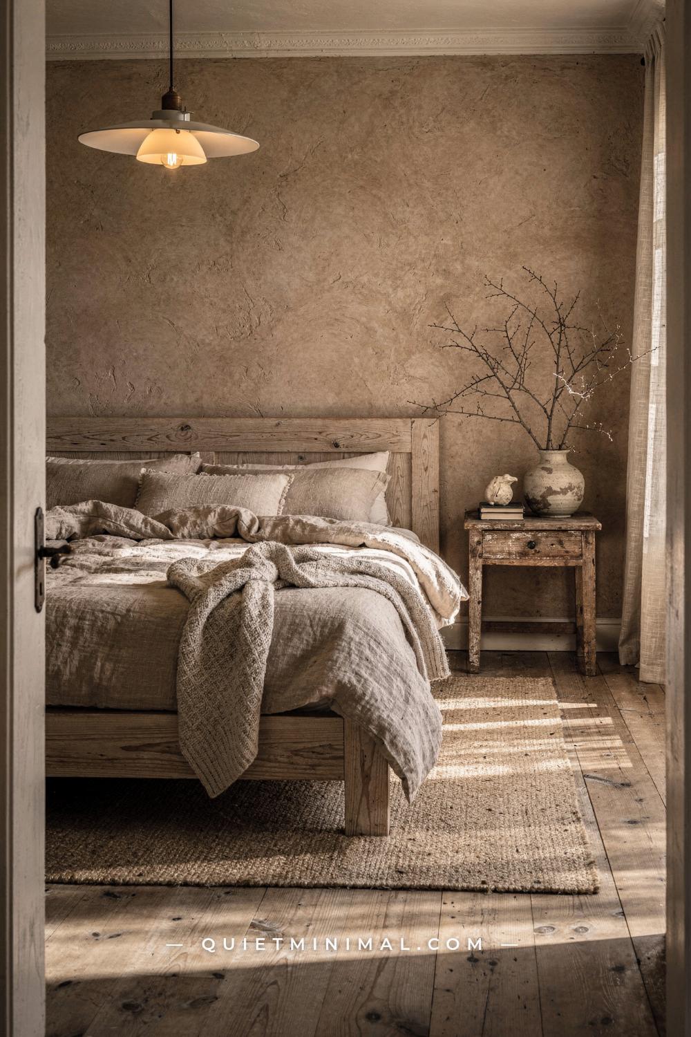
Your wabi sabi bedroom looks different on the wall than it did on your phone screen. The linen throw is there, the rattan pendant is hung, the handmade ceramic is on the nightstand, and something is still off. It reads either slightly cluttered or slightly cold, and you cannot pin down exactly why. That is the central problem with wabi sabi as a design project: the philosophy is about imperfection, so it is easy to assume the bar for execution is low. It is not. The gap between “beautifully imperfect” and “just needs tidying” is almost always decided at the material and decision level, not the Pinterest-save level. This guide works through every layer of a wabi sabi bedroom, from the wall color to the bulb temperature to the way negative space functions, so you can understand the reasoning behind each choice and stop guessing.
Why Wabi Sabi Is Harder to Execute Than It Looks
 Save
The phrase “wabi sabi” translates imperfectly from Japanese for a reason. “Wabi” points toward things that are fresh and simple; “sabi” points toward beauty that comes from age. Put together, the concept asks you to hold both at once: restrained and quietly weathered, not sparse and not worn out. That dual requirement is what makes the aesthetic difficult. Most decorating styles have a clear dial to turn: add more warmth, add more color, add more pattern. Wabi sabi has no such dial. You are instead making a series of judgment calls about which imperfections read as intentional and which ones read as oversight.
The most honest way to understand why wabi sabi fails in practice is to separate the look from the philosophy. The look is a set of material signals: matte finishes, earthy neutrals, raw or lightly finished wood, natural fiber textiles, handmade ceramics with slightly irregular forms. The philosophy is about accepting transience and finding beauty in things that show their age. When you decorate from the look alone, you end up with a staged set. When you decorate from the philosophy, you end up with a room that actually relaxes you. The specific, material-level decisions below are about getting both right at the same time, so the room looks considered rather than assembled.
The failure mode to watch for in this section is buying a category of object rather than a specific object. “I need a handmade ceramic” leads you to buy whatever is labeled handmade at a home goods chain. “I need a ceramic with an uneven rim and a matte ash glaze that will look better in three years than it does today” leads you to something that actually carries the aesthetic. The specificity is the whole point.
Key Takeaway: Wabi sabi fails when you decorate from the look instead of the philosophy: focus on choosing materials that will age well rather than objects that currently appear rustic.
From the guides
You've saved it, wanted it. Here's the how: codes, measurements, order. Your choices make it yours.
 The Japandi Honest PlaybookThe honest version of the style: what to keep, what to skip, and the order to do it in.See inside →
 The Room Refresh PlaybookA repeatable four-step method, room by room, in ten minutes, thirty minutes, or one weekend.See inside →
 Make Any Room Feel Cozy on PurposeWhy some rooms hold people and others empty out, and the moves that change it.See inside →

The Wall Color Decision That Most People Get Backwards
 Save
The instinct in a wabi sabi bedroom is to paint everything a single, muted neutral. That instinct produces a flat room. The philosophy calls for something quieter: tonal depth rather than color contrast, and one wall that carries slightly more weight than the others. The wall behind the bed is that wall.
Sherwin-Williams Cavern Clay SW 7701 is one of the most material-authentic choices for that accent wall. It is a warm terracotta-adjacent clay tone that references the earthy surface of raku pottery and sun-dried stone. It does not read as orange, and it does not shout “accent wall” the way a saturated color would. Against it, a low platform bed in pale or honey-toned wood looks grounded rather than floating. The remaining three walls should be a warm off-white with a clear beige undertone, not a bright or cool white. Bright white has a slight blue or titanium cast that fights every warm wood tone in the room and makes natural fiber textiles look dingy by comparison.
If a terracotta-adjacent clay feels too committed, Benjamin Moore Saybrook Sage HC-114 works as a full-room color rather than an accent. It is so desaturated it functions as a warm neutral: a gray-green that sits quietly behind the room’s materials rather than competing with them. On a wall that gets good morning light, it reads as a soft, mossy warm tone. In lower light, it deepens slightly. That tonal shift throughout the day is a wabi sabi quality in itself: a room that looks different at 8 a.m. than it does at 8 p.m.
The finish matters as much as the color. Matte or flat finish only. An eggshell finish on a wabi sabi bedroom wall catches light in a way that reads as clean and manufactured. A flat or matte finish absorbs light, makes the wall look like plaster or limewash, and adds the quiet depth that makes the color feel lived-in rather than freshly applied. If you want to take it further, a limewash or Venetian plaster application over any of these colors will add real texture variation that shifts with raking light.
Key Takeaway: Use a warm clay or desaturated sage on the bed wall in matte finish only: the sheen level of your paint does more for wabi sabi authenticity than the specific color you pick.

The Platform Bed: Why Height off the Floor Is Not Optional
 Save
Bed height is one of the most specific and most ignored elements of a wabi sabi bedroom. The visual center of gravity in a wabi sabi room sits lower than it does in a conventional bedroom. A standard bed frame with an 18-inch (46 cm) mattress height creates a room that looks upright and formal even before a single accessory is added. A platform bed that puts the top of the mattress at 16 to 18 inches (40 to 46 cm) off the floor, or a floor-level futon-style frame that puts it at 8 to 12 inches (20 to 30 cm), grounds the room visually and changes how every other element in the space reads.
The reason this works philosophically is that it reduces the bed’s visual dominance. In most bedrooms, the bed is the tallest piece of furniture and the visual anchor by height. Lower it, and the room starts to breathe around it. The ceiling feels higher, the walls feel wider, and the objects on the nightstand are no longer below eye level when you are lying down. That last point is practical: a handmade ceramic or a single book at 12 inches (30 cm) from the floor, visible from a low bed, has a completely different presence than the same object perched on a nightstand that sits at 26 inches (66 cm) above the floor.
Material matters for the frame itself. Pale, lightly finished woods like ash, hinoki cypress, or natural-tone white oak are the clearest signals. The grain should be visible and the finish should be a light oil or natural wax, not polyurethane. Polyurethane creates a sealed, plastic-like surface that reflects light and reads as manufactured rather than grown. Dark stained wood, while handsome in other contexts, shifts the room toward moody rather than serene. Wabi sabi asks for warmth without heaviness, and pale wood delivers that more reliably than any other material in this category.
A slatted headboard in the same pale wood, kept to a height of 24 to 32 inches (61 to 81 cm) above the mattress, completes the frame without overpowering the wall behind it. Upholstered headboards, even in natural linen, add softness but reduce the material honesty of the frame. A slat or simple plank headboard that shows the wood grain is the more direct choice.
Key Takeaway: A platform bed frame in oiled pale wood at 16 to 18 inches (40 to 46 cm) high lowers the room’s center of gravity and makes every other wabi sabi element read as intentional rather than incidental.

Linen Bedding and Why the Weave Grade Changes Everything
 Save
Linen bedding is listed in every wabi sabi guide, but the category spans a much wider quality range than most readers realize. The difference between linen that reads as wabi sabi and linen that reads as “I bought the affordable option at a home goods store” comes down to the weight and the wash treatment of the fabric.
Look for a fabric weight between 150 and 170 grams per square meter (GSM). Below 150 GSM, linen can be almost sheer and will wrinkle in a way that looks disheveled rather than relaxed. Above 180 GSM, it becomes stiff and slow to soften, which is fine for tablecloths but produces a bed that looks made rather than rested in. The 150 to 170 GSM range hits the point where the fabric drapes naturally, holds a soft crinkle rather than a sharp wrinkle, and improves with every wash rather than pilling or thinning.
Stonewashed linen, which is tumbled with stone during finishing, starts its life at the soft, draped stage rather than requiring three months of washing to arrive there. This matters because a wabi sabi bedroom is supposed to look quietly settled from day one, not like it needs to be broken in. Pre-washed, pre-softened linen in undyed natural tones (oatmeal, warm sand, natural flax, or a muted stone gray) are the starting point. Avoid pure white linen in this context: a true white reads as crisp and laundered, which is the opposite of the lived-in warmth wabi sabi calls for.
Layering is the technique that carries the most visual weight here. A flat sheet, a duvet or quilt, and a separate throw at the foot of the bed, each in a slightly different natural tone, creates the depth that makes the bed look considered rather than just dressed. The throw at the foot should be loosely folded, not perfectly draped: a fold-and-drop at an angle is more honest than a neat horizontal fold. The failure mode is using a single coverlet in one color with nothing underneath. That reads as a made bed in a neutral color, not as a wabi sabi bed.
Key Takeaway: Stonewashed linen at 150 to 170 GSM in undyed natural tones, layered in at least three pieces with a casually dropped throw at the foot, is what makes a wabi sabi bed look genuinely rested in rather than styled.

Nightstands: The Rule About Surfaces and Negative Space
 Save
The nightstand is where the wabi sabi bedroom most commonly breaks down into clutter. The surface is small and there are always items that need to live somewhere, so things accumulate: a lamp, a phone charger, a glass of water, a book, a small plant, a candle. Put all of those on a 12-by-14-inch (30 by 36 cm) surface and you have a shelf, not a nightstand. The wabi sabi nightstand follows a strict limit: three objects maximum on the surface, and one of those is the lamp.
The nightstand material should be unfinished, lightly finished, or organically shaped. An unfinished wood stump, a raw-edge slab on hairpin legs, or a simple box in natural oak without visible hardware are all appropriate. The point is that the surface itself should show material honesty: visible grain, a slightly rough or tactile quality on the edge, no lacquer, no gloss. A nightstand with a shiny factory finish undermines every natural-material choice on the bed beside it.
Two objects beyond the lamp, maximum. A handmade ceramic in a matte earthy glaze, a single dried stem, a small stack of two books (not five), or a rough-hewn stone work as individual pieces. The objects should be things you actually use or things that carry personal meaning. A purely decorative ceramic bought because it looks wabi sabi will read as prop. A ceramic you use for your morning tea, or that you bought from a specific potter whose work you follow, carries a quieter kind of presence that is much harder to manufacture.
Negative space on the nightstand surface is not wasted space. It is the signal that you made a choice about what goes there. A nightstand that is half empty reads as confident and intentional. A nightstand that is completely covered reads as overflow. If you genuinely need to keep more items nearby, a small woven basket on the floor beside the nightstand handles phone chargers, a small book, and similar items without loading the surface.
Key Takeaway: Limit the nightstand surface to a lamp plus two objects maximum, and choose an unfinished or lightly oiled wood surface so the material itself contributes to the room rather than disappearing behind gloss.

Lighting Temperature: The One Number That Changes Everything
 Save
Bulb temperature is the single most overlooked technical decision in a wabi sabi bedroom, and getting it wrong undoes every material choice in the room. The number to know is 2200K to 2700K. That is the color temperature range that produces a warm, amber-tinted light. A bulb at 3000K or above, which is sold as “soft white” or “bright white” in many stores, produces a cooler, cleaner light that reads as modern and functional. Functional light is the exact opposite of what a wabi sabi bedroom needs.
At 2200K to 2700K, a globe bulb in amber-tinted glass will make natural linen look like it was warmed by candlelight, bring out the honey tones in pale oak, and give the room’s earthy neutrals a depth they simply do not have under cooler light. At 3000K or above, the same materials flatten. The linen reads as beige fabric. The oak looks like wood furniture. The handmade ceramic looks like pottery. The atmosphere collapses because the light strips the materials of the warmth that makes them work together.
The fixture type matters alongside the bulb. A blackened or oxidized iron lamp base, slightly asymmetric or hand-forged in appearance, serves as one of the room’s few dark anchors. In a palette of warm whites, oatmeal linens, and pale wood, the eye needs at least one point of visual weight. Matte black or dark iron does that without disrupting the calm: it reads as solid and grounding rather than stark. A lamp base that is shiny brass, chrome, or a painted color introduces a surface quality that fights the matte-everything principle of the rest of the room.
For ceiling lighting, the answer in a wabi sabi bedroom is generally no ceiling fixture at all, or a single woven rattan or natural fiber pendant that allows a very low-wattage bulb. Overhead recessed lighting, even dimmed to 20 percent, produces a flat downward light that erases the shadow and texture depth that makes a wabi sabi room feel three-dimensional. Layer two table lamps, one on each nightstand, and consider a low floor lamp in a corner if the room is large. Dimmer switches on all lamp circuits are not optional: static lamp brightness feels institutional.
Key Takeaway: Use a 2200K to 2700K amber globe bulb in a blackened iron lamp, every time, and put it on a dimmer: the bulb temperature does more for wabi sabi atmosphere than any other single decision in the room.

Textiles Beyond the Bed: Where Wabi Sabi Rooms Get Their Warmth
 Save
The bed is usually where wabi sabi textile choices stop. That leaves the rest of the room tonally disconnected, particularly the floor and the windows, and is one of the main reasons a room feels assembled rather than settled. Textiles need to carry through the whole space to make the palette feel unified rather than staged in patches.
For the floor, a natural fiber area rug in jute, sisal, seagrass, or undyed low-pile wool is the right category. The rug should be large: for a queen bed, a minimum of 8 by 10 feet (244 by 305 cm), positioned so at least 24 inches (61 cm) of rug extends beyond each side of the bed frame. A small rug that only covers the area directly under the bed looks like an afterthought and floats without purpose. A properly sized rug anchors the bed and visually defines the sleeping zone as its own space within the room.
For windows, linen curtains in an undyed or barely-off-white tone, hung 4 to 6 inches (10 to 15 cm) above the window frame and extending to the floor, do two things: they make the window feel taller, and they diffuse direct sunlight into the soft, slightly hazy glow that a wabi sabi bedroom needs. Sheers in a loose, open weave allow more light than a blackout lining but still warm and scatter the direct sun. The curtain rod should be a simple, matte black or natural iron rod with minimal hardware. Ornate finials, curtain rings in bright brass, or a curtain track with a visible runner all pull the eye to the hardware rather than the textile.
One throw blanket somewhere other than the bed: a chunky-knit or loose-weave throw draped casually over a low chair or folded on a low bench at the foot of the bed adds a layer that makes the room feel lived-in without adding any object to a surface. It suggests use without demanding attention.
Key Takeaway: Anchor the bed with a natural fiber rug at least 8 by 10 feet (244 by 305 cm), hang linen curtains floor-to-ceiling in a loose weave, and add a single thrown blanket on a low chair to carry warmth beyond the bed.

Ceramics and Objects: The Editing Rule That Designers Always Apply
 Save
Every wabi sabi article tells you to use handmade ceramics, dried botanicals, and natural objects. Almost none of them tell you how many to use or what the editing logic looks like. The result is rooms that accumulate these objects until the shelves and surfaces feel like a collection rather than a selection.
The rule that designers apply consistently is the rule of intentional grouping with mandatory empty space. Any grouping of objects in a wabi sabi room should contain no more than three items, and the space around the grouping should be larger than the grouping itself. If a shelf is 24 inches (61 cm) wide, a grouping of three objects should occupy no more than 10 to 12 inches (25 to 30 cm) of that width, leaving the remaining 12 to 14 inches (30 to 36 cm) completely empty. That empty space is not wasted. It is the visual pause that allows the objects to be seen rather than scanned.
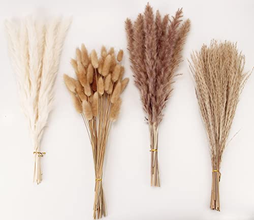
Object selection follows a simple criterion: things that are handmade and will improve with age, or things found in nature that do not require maintenance. A handmade ceramic with a matte glaze will develop micro-scratches over time that deepen rather than diminish its presence. A bundle of dried pampas grass or preserved eucalyptus needs no water and holds its texture for months. A smooth river stone requires nothing. These are all objects that reward time rather than resisting it, which is the physical expression of the wabi sabi philosophy rather than a decoration choice.
The failure mode is buying objects that imitate age without actually aging. A factory-made ceramic with a “rustic” texture applied by a mold, or a piece of driftwood purchased from a craft store rather than gathered from a walk, reads as prop rather than presence. The difference is often detectable even at a distance: manufactured rusticity has a uniformity to the texture variation that real age does not. Real aged surfaces are unpredictable. Manufactured aged surfaces repeat.
Key Takeaway: Group objects in sets of three maximum on surfaces that are more than half empty, and choose only objects that will look better in two years than they do today.
From the guides
You've saved it, wanted it. Here's the how: codes, measurements, order. Your choices make it yours.
The Japandi Honest PlaybookThe honest version of the style: what to keep, what to skip, and the order to do it in.See inside →The Room Refresh PlaybookA repeatable four-step method, room by room, in ten minutes, thirty minutes, or one weekend.See inside →Make Any Room Feel Cozy on PurposeWhy some rooms hold people and others empty out, and the moves that change it.See inside →
Walls Beyond Paint: When Texture Becomes the Room’s Entire Personality
 Save
Paint and material finish are covered above, but the wall surface itself is a separate question in a wabi sabi bedroom. A flat painted wall, even in the most perfect clay tone, is still a flat surface with no tactile dimension. In a room built around materials you can feel, the wall being smooth and untextured is the equivalent of one flat note in an otherwise layered composition.
There are three options that work at different commitment levels. The first is limewash paint, which is available from several brands including Portola Paints and Romabio, and can be applied over existing painted walls with a wide brush in overlapping strokes. The result is a surface with visible tonal variation that shifts in raking light, reads as slightly aged, and feels warmer than any flat paint can. This is a one-day DIY project that produces a dramatic shift in how the room reads.
The second option is a large-scale textured canvas or plaster-panel wall piece hung as a focal element on the wall beside the bed, not above the headboard where it competes with the frame, but on the adjacent side wall at roughly eye height when seated. A textured abstract in pale clay, sand, and natural white, with visible dimensional ridges and brushwork, catches the light differently throughout the day and gives the wall the tactile depth that paint alone cannot. This requires no wall commitment and moves with you if you rent.
The third option, for those doing a renovation, is a genuine limewash or Venetian plaster application by a professional. The cost is real but so is the result: a surface with genuine depth, slight color variation, and a material honesty that paint simply cannot replicate. In a room where every other material is chosen for its tactile quality, a plaster wall that matches that standard makes the whole room cohere in a way that goes beyond any individual piece of furniture.
Key Takeaway: Add tactile depth to at least one wall through limewash paint, a large textured canvas, or a professional plaster application: a flat painted wall is the quietest but most consistent gap in an otherwise well-built wabi sabi bedroom.

Negative Space: The Hardest Thing to Protect as You Style
 Save
Negative space is the element that nearly every wabi sabi bedroom guide mentions and nearly every first-time attempt fails to protect. The challenge is that styling feels productive. Adding an object, hanging a piece, filling a shelf: these actions feel like progress. Removing something, leaving a wall bare, keeping a corner empty: these feel like decisions not made. They are the most important decisions in the room.
The practical rule for a wabi sabi bedroom is that at least 40 percent of every horizontal surface should be empty, and at least one wall in the room should have nothing on it at all. That wall is not a failure: it is the room’s visual rest point, the place the eye goes to stop. Without it, the eye has nowhere to land and the room feels busy regardless of how “natural” the individual objects are.
Floor space follows the same logic. The area between the bedroom door and the bed should be clear. No bench in the middle of the floor (unless it is directly at the foot of the bed), no floor lamp that splits the approach path, no stacked books or baskets that accumulate over time. A clear floor path into the room makes the space feel larger and creates the sense of breathing room that wabi sabi requires.
Closets and storage take on a different role in a wabi sabi bedroom than in most. Because the room needs to look spare, everything that is not selected for display needs to be behind a door. Open shelving with visible folded clothes, visible shoe collections, or visible organizing bins actively contradicts the visual calm the rest of the room is trying to create. If closed storage is not an option, simple linen curtain panels on a tension rod can panel-off open shelving at a fraction of the cost of built-ins.
The hardest test of negative space discipline comes over time. A wabi sabi bedroom styled correctly at month one will have accumulated objects by month six unless there is a clear rule about what comes in and what has to leave. A one-in, one-out rule works practically: when a new object enters the room, an existing one leaves. Not to another surface in the bedroom, but out of the room entirely.
Key Takeaway: Keep at least one wall completely bare and 40 percent of every surface empty: negative space in a wabi sabi bedroom is not an absence of decision, it is the most important decision you make.

Natural Elements: What Actually Belongs and What Reads as Prop
 Save
Natural elements in a wabi sabi bedroom work when they are selected for material honesty and fail when they are selected for the category they represent. Dried botanicals, for example, are on every wabi sabi checklist. A plastic-looking dried palm leaf bought at a craft store, arranged in a clear glass vase that has no textural quality of its own, is still on that checklist. It is also not wabi sabi by any meaningful definition.
The natural elements that work are ones that have genuinely changed state: dried grasses that were once green, preserved stems that hold a different texture than they would when fresh, branches collected from outside that carry the color variation of actual sun exposure rather than the uniform brown of a factory-dried product. Pampas grass in its natural bleached form, dried rice-flower stems, preserved olive branches, and dried seed pods all work because they show actual change over time rather than simulating it.
Live plants work only if they are low-maintenance enough to actually thrive without becoming a source of anxiety. A small potted moss in an unglazed terracotta pot, a single stem of pothos in a bud vase, or a tiny succulent grouping in a rough stone planter are all options that do not require daily attention and will not die dramatically if you travel for a week. High-maintenance plants that require specific light, frequent watering schedules, or visible stakes and supports introduce a maintenance energy into the room that works against the settled calm the aesthetic is trying to create.
Stones, water-smoothed pebbles, a single piece of rough-surface agate, or a small stack of flat river stones placed on a surface add material weight and texture without any maintenance requirement at all. These are the most low-effort and most permanently honest natural elements available. A smooth stone on a nightstand does not need water, light, or replacement. It will be there in exactly the same state in five years, which is precisely the kind of permanence-within-impermanence that the philosophy is built on.
Key Takeaway: Choose natural elements that have genuinely aged or changed state, keep maintenance requirements low enough that they never become a chore, and use a rough-surface ceramic or an unglazed pot rather than a clear glass vessel to ground the arrangement.
Scent and Sound: The Two Dimensions Most Rooms Forget
 Save
A wabi sabi bedroom that looks right but smells like nothing, or worse, smells like a synthetic candle, is missing one of the most visceral layers of the aesthetic. Scent is part of the philosophy: the faint smell of aged wood, of dried grass, of beeswax rather than paraffin, of clean linen, of stone in a cool room. These are sensory signals that confirm what the eyes are seeing. They cannot be faked with a mass-market synthetic fragrance that smells like a spa hotel lobby.
Beeswax candles are the right category for wabi sabi: they burn cleaner than paraffin, they produce a faint natural honey scent that is not perfumed, and their surface texture is matte and organic rather than the smooth, glossy finish of a mass-market pillar candle. A grouping of two or three beeswax pillar candles in different heights on a low wooden tray on a dresser surface adds visual warmth when unlit and scent warmth when burning. The tray acts as a defined surface, so the candles have a home and are not simply placed directly on the furniture.
Natural incense, specifically single-ingredient incense rather than compound fragrances, is the other option: oud, cedarwood, hinoki, or sandalwood in a stick or resin form with an unglazed or stone incense holder. The scent should be wood-adjacent, earthy, or slightly smoky: the kind of smell that makes a room feel like it has a history rather than a product. Use it sparingly, ten to fifteen minutes in the morning or before sleep, not as a constant ambient layer.
Sound is less discussed but equally relevant. A wabi sabi bedroom is served by silence, by the sound of an open window, or by very specific audio: water sounds, low-frequency ambient tones, or instrumental music without percussion. This is not a decorating recommendation in the conventional sense, but it is a completeness argument: you can build the most precise wabi sabi bedroom in the world and a notification sound or a TV in the corner will collapse the atmosphere in the same way a bright LED bulb would.
Key Takeaway: Add beeswax candles and a single wood-scent incense stick on a raw wood tray to introduce honest scent layering: the smell of the room should confirm the visual language, not contradict it.

The Mistake Everyone Makes at Month Six
 Save
Every wabi sabi bedroom starts well and drifts. The drift pattern is consistent: a second ceramic arrives because one gift or one market find seemed right. The nightstand gains a charger, then a second book, then a small plant. The chair in the corner takes on a layer of clothing. A second rug appears in the doorway. None of these additions are wrong in isolation. Collectively, they reverse the negative space discipline that made the room work.
The reason this happens specifically at the six-month mark is that the initial styling effort fades and daily life takes over. The principles that felt clear while you were actively building the room become less visible when you are living in it and adding things incrementally. Each individual addition seems minor. The accumulation is not.
The practical solution is a scheduled reset: once every three months, stand in the doorway and look at the room with the same eye you had when you first styled it. Check the nightstand surfaces: is there more than a lamp and two objects on each? Check the floor: is the approach path to the bed clear? Check the walls: is there still at least one bare wall? Check the corner chair or bench: is it carrying clothing that should be in the closet? Reset each of these to the standard established when the room was right.
What gets reset does not have to be discarded. A rotation system works well for small objects: keep a basket or small box in the closet that holds the objects currently not displayed. Rotate two or three items into the room, remove two or three, every few months. This keeps the room from accumulating without requiring you to give things away. It also means the room feels slightly different over time without being restyled from scratch, which is itself a wabi sabi quality: gentle change rather than sudden overhaul.
Key Takeaway: Schedule a quarterly reset by standing at the door and checking all surfaces, the floor path, and the one bare wall against the original standard: drift is inevitable in any lived-in room, and the reset is the maintenance practice that keeps wabi sabi honest.

—
A wabi sabi bedroom works when every material decision has a reason and every empty space is a choice rather than an oversight. The wall color earns its depth from a matte finish in a warm clay or desaturated sage. The bed frame grounds the room by sitting low in lightly oiled pale wood. The linen layers in 150 to 170 GSM stonewashed fabric. The lamp runs at 2200K in amber glass. The nightstand holds a lamp and two objects and nothing else. The one bare wall stays bare. That is the answer to why most wabi sabi bedrooms do not look right: they accumulate objects where the philosophy calls for restraint, and they compromise on material quality where the details are what the eye actually reads.
Start with the wall color and the bulb. Those two decisions cost the least and reset the most. Everything else layers in from there.
From the guides
You've saved it, wanted it. Here's the how: codes, measurements, order. Your choices make it yours.
The Japandi Honest PlaybookThe honest version of the style: what to keep, what to skip, and the order to do it in.See inside →The Room Refresh PlaybookA repeatable four-step method, room by room, in ten minutes, thirty minutes, or one weekend.See inside →Make Any Room Feel Cozy on PurposeWhy some rooms hold people and others empty out, and the moves that change it.See inside → Save


