 Georgia
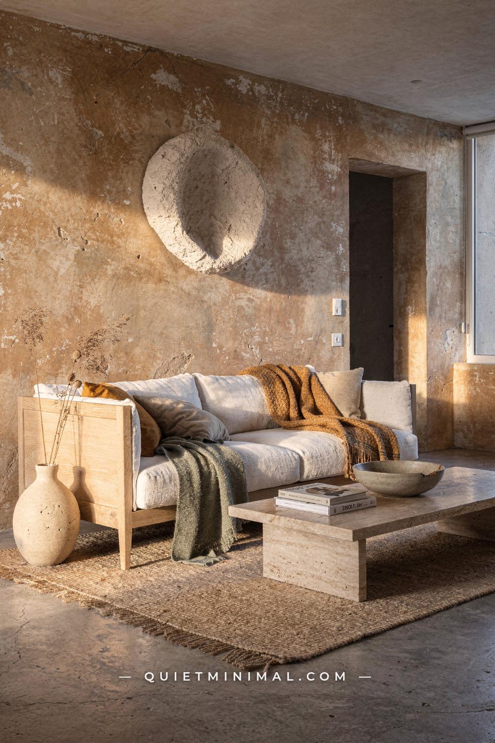
You have probably read that wabi sabi interior design is about “embracing imperfection.” That phrase is everywhere, on Pinterest, in design roundups, in the caption under every rattan-tray flatlay. And it is not wrong, exactly. It is just so incomplete that following it tends to produce a room that looks like a stage set for imperfection rather than an actual home with a real, felt quality to it.
Here is what happens in practice: someone reads the advice, buys a chipped ceramic vase, layers three linen throws, adds a raw wood stool, and ends up with a space that feels cluttered and slightly forced. Something is off, and they cannot name it. The issue is not the objects. It is the mental model. Wabi sabi is not a collection of approved items. It is a way of deciding what deserves to stay, what should be allowed to age, and what the room can comfortably live without. That decision-making process is what most of the popular advice completely skips.
This article goes section by section through the most common pieces of wabi sabi interior advice and shows you where each one breaks down, what the actual principle underneath it is, and how to apply it in a way that produces a room that genuinely feels calm, considered, and lived in rather than styled for a photo.
The “Imperfection” Rule Is Not About Buying Broken Things
 Save
The phrase “embrace imperfection” has been interpreted, almost universally, as a license to buy things that look old or rough. That interpretation is backwards. Wabi sabi’s relationship with imperfection is about allowing things you already own to age honestly, not about sourcing items that have been pre-aged for your convenience.
This matters because faux-distressed pieces carry a fundamental contradiction. They are manufactured to look worn, which means they are perfectly worn. Every chip is the same depth. Every grain is uniformly rustic. A trained eye picks this up immediately, and even an untrained eye registers it as something slightly wrong, even if the person cannot say what. The room feels like a theme park version of an old farmhouse: all the visual cues of age with none of the actual history.
From the guides
You've saved it, wanted it. Here's the how: codes, measurements, order. Your choices make it yours.
 The Japandi Honest PlaybookThe honest version of the style: what to keep, what to skip, and the order to do it in.See inside →
 The Room Refresh PlaybookA repeatable four-step method, room by room, in ten minutes, thirty minutes, or one weekend.See inside →
 Make Any Room Feel Cozy on PurposeWhy some rooms hold people and others empty out, and the moves that change it.See inside →
The better principle is this: start with what you already have. A wooden dining table that has been used for three years and carries the marks of meals and homework already has more wabi sabi credibility than a brand-new “reclaimed” table from a furniture retailer. An inherited ceramic bowl with a small hairline crack is doing more work in a wabi sabi room than a dozen artisan pieces bought together from the same Etsy shop. The imperfection has to be real and incidental, not selected and displayed.
When you do buy new pieces, the filter is not “does this look old” but “is this made of a material that will age honestly.” Raw, untreated oak will grey and deepen over years. Unglazed stoneware will pick up the oils from handling. Undyed linen will soften and wrinkle in a way that reads as warmth rather than neglect. These are the categories worth spending on, because the patina you get in three years is the point.
The failure mode here is a room full of things pretending to be something they are not. Wabi sabi rooms work because they are honest. Every material is doing exactly what that material does when left largely alone.
Key Takeaway: Wabi sabi imperfection is earned by time and use, not sourced from a product listing, so start curating what you own before buying anything new.

Beige Is Not a Philosophy. Texture Is.
 Save
The advice to “use a neutral color palette” is technically correct. But it has been simplified, in most Pinterest content, to “paint everything beige and add some cream.” That version produces rooms that feel flat and slightly hollow, because the color is doing the job but the surface has nothing to say.
The actual wabi sabi principle is not about hue, it is about how a surface holds and responds to light. A perfectly smooth flat wall painted in warm oatmeal reads as neutral, yes, but it also reads as finished, sealed, and inert. A limewash wall in the same color family has tonal variation built in. The same patch of wall looks lighter in the morning, deeper in the afternoon, and almost amber in lamp light. That is a living surface, and that quality is what makes a room feel calm rather than blank.
The distinction matters practically. If you are choosing a wall treatment, the difference between standard matte paint in a beige tone and limewash or Venetian plaster in a similar tone is not just visual texture. It is the difference between a backdrop and a material that participates in the room. Limewash in soft clay, sand, or warm stone tones is the most commonly cited wabi sabi wall finish today, and the reason is exactly this: it reads differently depending on the time of day and the quality of light in the room.
Beyond walls, the texture principle applies to every surface. A jute rug reads differently from a wool rug, which reads differently from a faded cotton flat-weave. None of these is inherently correct. The question is whether the material has visual and physical depth, whether it catches light, whether it has irregularity at the surface level. Glossy lacquer, polished chrome, and machine-perfect finishes are the actual enemy of wabi sabi rooms, not because they are modern but because they have nothing to offer a room except reflection. They give back what is already there. Textured matte surfaces add something.
Choose finishes that show their process: hand-thrown ceramics, rough-sawn timber, loosely woven natural textiles, and pressed plaster. The color can remain in the warm neutral family. The texture is where the work happens.
Key Takeaway: Neutral colors only land in a wabi sabi room when the surface they sit on has enough texture to hold and shift light throughout the day.

Negative Space Is Not Empty Space. It Has a Job.
 Save
One of the most persistent misreads of wabi sabi in Western interiors is that less stuff means the job is done. Homeowners remove half the objects from a shelf, feel the space open up, and call it wabi sabi. What they have actually done is decluttered. Decluttering and negative space are not the same thing.
Decluttering is subtractive. You remove what you do not need. Negative space is compositional. It is the deliberate decision to leave an area of the room without visual content so that the things that are present can be seen more clearly and felt more fully. In a wabi sabi room, a bare wall is not a wall that has not been decorated yet. It is a choice to let the object beside it, or the light falling across it, or the material of the wall itself, carry the full weight of attention.
This has practical consequences for how you arrange a room. In a wabi sabi living space, the furniture does not fill the perimeter. There are actual gaps, not because you ran out of furniture but because those gaps are doing something. They slow the eye. They let each piece breathe. A ceramic vase placed on the floor against a bare plaster wall carries far more presence than the same vase on a shelf crowded with other objects, even if those other objects are beautiful.
The sizing question matters here too. A single large-format piece of textured art on a wall does more for a wabi sabi room than three or four smaller pieces arranged in a gallery cluster. The single piece has room to exist. The cluster competes. Scale up the objects you love and remove the ones surrounding them.
Negative space also applies to surfaces. A raw wood coffee table with one object on it, a single ceramic bowl, a folded piece of linen, is working harder than the same table with a styled tray, several candles, a plant, and a stack of books. The styled version is a composition. The minimal version is a room.
Key Takeaway: Negative space is a design tool, not an absence; the gaps around objects are as deliberate as the objects themselves.

Natural Materials Do Not Automatically Mean Wabi Sabi
 Save
Every wabi sabi guide mentions natural materials, and rightly so. Raw wood, linen, clay, stone, wool, rattan, jute: these are the materials the aesthetic is built on. But collecting a room full of natural materials and expecting a wabi sabi result is where a lot of interiors stall.
The issue is arrangement and restraint. A room can have a jute rug, a rattan pendant, a wicker basket, two driftwood sculptures, a wooden bowl, dried palm leaves, and a linen sofa and still feel busy, chaotic, and relentlessly themed. When every single object is signaling the same natural material story, the room starts to feel like a mood board rather than a home. Each piece is shouting the same word, and the cumulative effect is noise.
The actual principle is that natural materials work in a wabi sabi room because they relate to each other through contrast and quiet. You need rough against smooth: a raw linen sofa against a polished travertine side table. You need warm against cool: aged wood beside a pale stone or plaster surface. You need dark against light, matte against something with a very slight sheen, dense against open. Without these relationships, natural materials flatten into a single undifferentiated texture that reads as neutral in the worst sense: absent of interest.
There is also the question of synthetic materials. The strict reading of wabi sabi excludes them, and for good reason: polished plastics and synthetic velvets carry no potential for honest aging. But a more practical approach recognizes that a room can have a small number of well-chosen synthetics, a simple white cotton bedsheet, a basic upholstered frame, without violating the spirit of the aesthetic, as long as those pieces are not the dominant visual story.
The filter for natural materials is not category but behavior: does this material change and deepen with use, or does it stay exactly the same, or does it degrade in a way that looks like neglect? The first category belongs in a wabi sabi room. The third does not.
Key Takeaway: Natural materials need contrast and restraint to read as wabi sabi; a room where every object is rustic reads as themed, not authentic.

The Clutter-Versus-Imperfection Line Is Where Most Rooms Fail
 Save
This is the single most common failure mode in wabi sabi interiors: the person has read that wabi sabi celebrates imperfection, so they have left things slightly undone, slightly scattered, slightly lived in. The bed is a little messy. The books are piled in an approximate stack. There are dried flowers dropping petals onto the shelf. And the result feels untidy, not serene.
Wabi sabi is not messy. It is specifically and intentionally imperfect, which is an entirely different thing. The difference is intentionality at the level of each object and each surface. A slightly rumpled linen duvet reads as natural and honest because linen rumples that way and you are letting it. A pile of three unread books stacked beside a candle stub and a half-empty mug reads as a surface that has not been addressed. One is an expression of a material’s honest behavior. The other is an accumulation of unfinished tasks.
The practical test is simple: can you explain why each thing is where it is? In a wabi sabi room, the answer does not have to be a design reason. It can be that this object belongs to someone who uses it daily, that this piece of furniture is where it is because that is where the light falls, that this shelf is empty because the wall behind it has enough surface interest on its own. But there is an answer. In a cluttered room, the answer to “why is this here?” is often “I haven’t moved it yet.”
This distinction also applies to how you handle worn or damaged items. A ceramic mug with a small chip in the rim that you use every morning is a wabi sabi object. A broken lamp you have not thrown away yet is just a broken lamp. The philosophy celebrates objects that have aged through use and are still fully functional. It is not a justification for keeping things that have simply deteriorated.
Edit more aggressively than you think you need to. The room will feel calmer than you expect, and the things that remain will have more presence than they did surrounded by everything else.
Key Takeaway: Wabi sabi is intentionally imperfect, not incidentally untidy; every object that remains in the room should have a reason to be there.

Wabi Sabi and Japandi Are Not the Same Style
 Save
These two aesthetics are frequently used interchangeably on Pinterest, and it causes real problems in practice, because they operate from fundamentally different premises. Japandi, a portmanteau of Japanese and Scandinavian design, is structured, deliberately composed, and precisely curated. It values clean lines, matched pairs, careful symmetry, and refined craftsmanship. A Japandi room looks designed. That is the point.
Wabi sabi does not look designed. It looks settled. The difference sounds subtle, but it changes every decision you make in a room. In a Japandi space, you would choose two matching ceramic vessels of slightly different heights and place them with geometric precision. In a wabi sabi space, you would choose one vessel you have owned for years, place it roughly where the light falls best, and leave it.
Japandi’s palette tends toward cooler, cleaner neutrals: crisp white, pale grey, and the cooler range of natural wood tones. Wabi sabi’s palette runs warmer and earthier: warm ochre, sand, aged white with yellow undertones, clay, charcoal, and muted moss green. These overlap at the center, which is why the styles get conflated, but they diverge at the edges in ways that matter.
The structural quality of furniture is another dividing line. Japandi furniture has precise joinery, clean edges, and finishes that are smooth and considered. Wabi sabi furniture can have visible tool marks, slightly uneven legs, surfaces that have been left rough or oiled rather than lacquered. A hand-planed wooden table is more wabi sabi. A precisely dovetailed walnut cabinet with flush-fit drawers is more Japandi. Both are beautiful. They are just solving different problems.
You can use both in the same home, as many people do, but knowing the difference allows you to be intentional about which rooms or which zones within a room are doing which kind of work. The living room might be wabi sabi: organic, warm, settled. The home office might be Japandi: structured, precise, calm in a different register.
Key Takeaway: Wabi sabi looks settled and organic where Japandi looks designed and precise; conflating them produces rooms that are trying to do both and achieving neither.

Lighting Is the Wabi Sabi Element Nobody Talks About
 Save
Lighting is the most underserved element in wabi sabi design advice. Most articles mention natural light briefly and move on. But the quality, direction, and warmth of light determines whether a wabi sabi room reads as peaceful or flat, and getting it wrong undoes every other correct decision you have made.
The core principle is this: overhead lighting is the enemy of wabi sabi. A single recessed fixture or ceiling-mounted light washing the room evenly removes shadow, flattens texture, and makes every surface look approximately the same. In a room with limewash plaster walls, a textured rug, and a hand-thrown ceramic lamp, even overhead light turns all of those carefully chosen surfaces into a backdrop. They stop doing their job, because shadow is what makes texture visible.
Wabi sabi lighting works from the floor and surfaces up. Table lamps with warm bulbs (2700K or lower) placed at seated eye level or below. Floor lamps with paper or linen shades. Candles in ceramic or clay holders, used deliberately rather than decoratively. These light sources create pools and shadows, which let the textured surfaces of the room show what they are made of. A limewash wall lit from a lamp 18 inches (45 centimeters) below it looks completely different, richer, more dimensional, than the same wall lit from directly overhead.
Bulb temperature matters more than most people realize. A cool white bulb (4000K or above) turns warm clay and ochre tones grey. The whole palette you chose for its warmth reads cold under that light. Stick to warm white or amber-tone bulbs throughout a wabi sabi space. If you have fixed overhead lighting you cannot remove, use a warm dimmer and bring it to the lowest practical level, then layer in floor and table sources to do the actual work.
Natural light management is also part of this. Wabi sabi rooms work best with softened natural light, not blocked and not exposed. Unlined linen curtains in undyed or warm oatmeal tones filter midday sun without removing it, creating the soft diffused quality that makes the surfaces of a wabi sabi room look their best.
Key Takeaway: Wabi sabi texture only reads under low, warm, directional light; replace overhead fixtures with floor and table sources at 2700K or lower.

The Wall Treatment Is Doing More Work Than the Furniture
 Save
Most people planning a wabi sabi room spend the majority of their budget on furniture and objects, then choose a flat wall paint color as a secondary decision. This is backwards. In a wabi sabi room, the walls are the dominant surface, and the quality of that surface sets the ceiling on how good the rest of the room can look.
A smooth, flat wall in a warm neutral is a perfectly acceptable backdrop. It just will not do anything. The room will look pleasant and inert. Add a limewash finish in the same color family and the wall starts behaving: shifting tonal value as the light changes, picking up warm amber in lamplight, reading cooler and softer on overcast days. The room feels alive in a way that no paint color on a flat surface can achieve.
The key wabi sabi wall treatments to consider, in order of investment and impact, are as follows. Limewash paint is the most accessible: DIY-friendly, available in most natural paint ranges, and produces genuine tonal variation in one coat. Brands like Portola Paints, LIME by The Real Milk Paint Co, and various European import suppliers offer natural formula limewash. Apply it with a wide brush in crossing strokes and do not try to achieve evenness. The unevenness is the product.
From the guides
You've saved it, wanted it. Here's the how: codes, measurements, order. Your choices make it yours.
The Japandi Honest PlaybookThe honest version of the style: what to keep, what to skip, and the order to do it in.See inside →The Room Refresh PlaybookA repeatable four-step method, room by room, in ten minutes, thirty minutes, or one weekend.See inside →Make Any Room Feel Cozy on PurposeWhy some rooms hold people and others empty out, and the moves that change it.See inside →Venetian plaster requires more skill but produces a deeper, more dimensional surface that rewards close-up inspection while also reading well from across the room. Applied in layers with a steel trowel and burnished to a soft sheen in places, it reads as stone rather than paint.
Raw clay plaster, either DIY with pre-mixed American Clay or Behr’s newer clay-based finishes, produces a matte, slightly earthy surface with a warmth that flat paint cannot replicate. It is also one of the most forgiving to apply imperfectly, which suits the aesthetic well.
For renters, large-format textured canvas panels or plaster-effect wallpaper in clay or stone tones can approximate the quality of a textured wall without permanence. A single wall treated this way in a bedroom or living room does more for the wabi sabi feel of the space than any collection of objects on a shelf.
Key Takeaway: Budget for the wall treatment before the furniture; a limewash or plaster surface sets the tonal and textural foundation that makes every other element in the room work harder.

Plants in a Wabi Sabi Room Are Not Optional, But Most People Choose the Wrong Ones
 Save
The conventional advice is simply to “add plants.” Every wabi sabi design article includes greenery as a category, and the associated images tend to show sculptural monstera leaves or trailing pothos. These are not wrong, but they also are not specific enough to be genuinely useful.
The wabi sabi principle for plants is the same one that applies to every other category: the plant should behave like itself, in its natural form, without being shaped into something it is not. That means asymmetric growth habits over formally pruned shapes. It means imperfect leaves, the occasional yellowing at the edges, an arrangement that is not equidistant from every other plant in the room. The goal is not a plant styled for a photo shoot. It is a plant that exists in your room the way plants exist outdoors: a little unpredictable, a little irregular.
In practical terms, this points toward certain plant categories. Dried botanicals are particularly well suited because they have already done their changing and now just hold their form, quietly. A bundle of dried pampas grass, bleached eucalyptus, or dried seed heads in a tall narrow floor vase costs almost nothing and holds its quality for years without intervention. The absence of maintenance is itself a wabi sabi quality.
For living plants, the best choices have irregular, asymmetric forms: ficus lyrata (fiddle-leaf fig) when kept in its natural shape rather than pruned, snake plants with their uneven leaf heights, large-leaved plants that have a few imperfect edges and are not treated with leaf shine. The container matters as much as the plant. An unglazed terracotta pot, a rough stoneware planter, or a woven grass basket that has been used long enough to show some wear are appropriate. A shiny glazed or plastic pot undermines the whole thing.
Placement on the floor is more wabi sabi than placement on a shelf or side table. A large floor plant beside a bare wall, without anything else nearby, has real presence. Two small matching plants flanking a shelf bracket look curated in the wrong way.
Key Takeaway: Choose plants with irregular natural forms and place them directly on the floor in unglazed or roughly textured containers, leaving space around them rather than grouping.

The Color Palette Is Warmer Than You Think, and More Specific
 Save
The popular shorthand for wabi sabi color is “beige and neutral.” This is a starting point, not an endpoint, and following it literally produces rooms that feel correct but not felt, accurate but not warm.
The actual wabi sabi palette is warm, earthy, and specific. The key distinction is temperature: all of the neutrals in a true wabi sabi room have warm, yellow, or amber undertones, not cool grey or blue undertones. Warm white instead of crisp white. Oatmeal instead of light grey. Sand instead of cool stone. Taupe with a yellow base instead of taupe with a pink or grey base. These differences are subtle on a paint chip and significant in a room.
The palette also includes accent tones that most wabi sabi content omits. Muted moss green is the most cited emerging wabi sabi tone right now, appearing in ceramics, dried botanicals, and occasional textile accents. Faded indigo (the color of much-washed Japanese denim or natural indigo textiles) reads beautifully against ochre and warm white. Rust and dried clay red appear in small doses, in a terracotta pot, a thrown ceramic, an unglazed vessel in a brick-red clay body.
The failure mode most associated with wabi sabi color is monotony: a room where every surface is in the same warm-neutral family with no accent, no darker note, no point of contrast. That room reads as beige, not wabi sabi. The muted earthy palette works because of the relationships between its tones, warm ochre wall beside a charcoal ceramic beside natural linen beside a pale wood floor. Remove the contrast and you flatten the palette into wallpaper.
Specifically avoid cool-tone neutrals, glossy finishes in any color, and the crisp bright whites associated with Scandinavian minimalism. Those whites are colder and harder than wabi sabi’s warm, aged, slightly impure whites, and they make the earthy tones next to them look dirty by contrast.
Key Takeaway: The wabi sabi palette is warm-white, ochre, sand, and muted moss green with warm undertones throughout, not the cool-tone neutrals of Scandinavian minimalism.

You Cannot Buy Your Way Into a Wabi Sabi Room
 Save
This is the conclusion that the entire philosophy leads to, and the one that most Western interpretations of wabi sabi never quite arrive at: you cannot shop your way into this aesthetic. Wabi sabi is the result of a set of decisions about what to keep, what to use, and what to allow to age, not a product category.
This creates an obvious tension with the idea of “getting the wabi sabi look.” And it is a real tension, not one to paper over. The truth is that some things can be bought that support a wabi sabi room: genuinely handmade ceramics from a maker whose process you can trace, natural-material textiles in undyed or plant-dyed form, raw wood furniture from a maker who leaves the surface honest. These things participate in a wabi sabi room the right way because they are made to age, made by hand, and made with material integrity.
What does not work, and what fills most “wabi sabi finds” roundups, is mass-produced items designed to look wabi sabi. The factory-stamped ceramic that is embossed with intentional finger marks. The polyester throw woven to look like raw linen. The injection-molded “concrete” side table. These objects stop doing the wabi sabi thing the moment you look at them for more than a few seconds. They are performing a philosophy they have no relationship with.
The more durable path is slower. Start with what you own. Identify the pieces in your home that have genuine history, things that have been used, that carry a story, that are made of a material that will only get more interesting with time. Move those to prominence. Move the pretenders into storage or out of the house entirely. Then, when you add something new, use the material-integrity filter: is this made by a person, from a natural material, in a way that will age honestly?
A room built on this principle over two or three years looks completely different from a room assembled in a single shopping session. It feels different too. That difference is exactly what people are reaching for when they search for wabi sabi, and it cannot be delivered by a cart.
Key Takeaway: Build a wabi sabi room over time by promoting what you already own that has genuine history, and add only pieces made by hand from materials that age honestly.

Asymmetry Is a Rule, But Not the One You Think
 Save
Asymmetry is one of the most referenced principles in Japanese aesthetics, appearing as Fukinsei in the list of Zen design principles that underpin wabi sabi. The common interpretation is: do not make things symmetrical. So people hang art off-center, arrange objects in odd numbers, and avoid matching pairs. This is partially correct.
The more precise principle is that asymmetry in wabi sabi is not random, it is weighted. A composition is asymmetric in a way that feels balanced because the visual weight of each element is considered. One large object on the left can balance three small ones on the right. A heavy dark ceramic vessel can balance a larger but lighter ceramic one. Asymmetry in wabi sabi rooms has gravity to it. It does not feel haphazard. It feels like something resting in its natural place.
This is the difference between wabi sabi asymmetry and arbitrary randomness. If you take a symmetrical shelf arrangement and simply shift one object two inches to the left, you have made it asymmetric but not necessarily better. The goal is to arrange objects in a way that looks as if they arrived at their positions through use and through the natural weight of the material, not through a deliberate offset.
In practice, this means choosing one object per surface as the dominant element and letting everything else be secondary. On a sideboard, one large handmade ceramic bowl is the weight. Two smaller objects at different distances from it provide the asymmetric balance. The space on either side of them is not equal, because equal spacing would be symmetrical, but the visual weight across the surface is resolved.
Furniture scale also contributes to asymmetry. A room where every piece of furniture is the same height reads as evenly gridded. A low sofa next to a taller raw-wood console, a floor-level lamp beside a high wall shelf: these height variations create the kind of asymmetric visual rhythm that wabi sabi rooms are known for.
Key Takeaway: Wabi sabi asymmetry is weighted and resolved, not random; treat each surface as a composition where one dominant object sets the visual gravity and everything else responds to it.

The Rugs That Break the Aesthetic (and the Ones That Do Not)
 Save
The rug choice is often the last decision in a room and the one that most frequently undermines everything that came before it. A wabi sabi room built on limewash plaster, honest wood furniture, and a handmade ceramic collection can be read as completely generic if the rug beneath it is a high-pile shag in a too-perfect ivory, or a machine-printed geometric in fashionable terracotta.
The wabi sabi rug has specific qualities. It should have low pile or be a flat-weave, because high-pile rugs have a uniform plushness that feels more like comfort-maximalism than organic restraint. It should have slight irregularity in pattern or weave, visible in the subtle variations of hand-knotted or handwoven construction. Its colors should be the same muted, warm, slightly weathered tones as the rest of the room: faded ochre, undyed natural, muted moss, aged cream. A pattern is acceptable if it is low-contrast and organic, a loose abstract repeat rather than a precise geometric.
The size matters too, and the standard guidance (buy a rug large enough to anchor all legs of your furniture) holds here, but with a wabi sabi modifier: the rug should not have a perfectly even border all around. In a square room, an asymmetrically placed rug, closer to one wall than the other by 4 to 6 inches (10 to 15 centimeters), looks more natural than a rug perfectly centered on the floor plan.
The rugs that break wabi sabi rooms most reliably are: machine-made rugs with sharp, perfectly repeated patterns; high-sheen Persian-style rugs with jewel tones; overly fluffy rugs that read as luxury; and any rug with a too-perfectly-even pile height. These do not fail because they are bad rugs. They fail because they carry an implicit message of polish and perfectionism that cancels out the honest material quality of everything around them.
A vintage or antique rug in worn, faded tones is often the best single rug choice for a wabi sabi room, because it has already done the aging that the rest of the room aspires to.
Key Takeaway: Choose a flat-weave or low-pile handwoven rug in muted, faded natural tones, placed slightly off-center, and avoid machine-perfect patterns or high-sheen finishes entirely.

The rooms that actually feel like wabi sabi, the ones that stop you when you see them and make you want to stay, are not built from a shopping list. They are built from a sequence of decisions about restraint, material honesty, and what a room can comfortably live without. The three principles that survive every section of this article are these: start with what you already own and has genuine history, choose surfaces and materials that age honestly rather than staying frozen, and remove more than you think is necessary.
A wabi sabi room is not a project you finish. It is a room you keep deciding about. What to let stay. What has earned its place through use. What can go because the space around the things that remain is doing more work than the things themselves ever could.
Start there, with one wall and one shelf. Let the rest follow.
From the guides
You've saved it, wanted it. Here's the how: codes, measurements, order. Your choices make it yours.
The Japandi Honest PlaybookThe honest version of the style: what to keep, what to skip, and the order to do it in.See inside →The Room Refresh PlaybookA repeatable four-step method, room by room, in ten minutes, thirty minutes, or one weekend.See inside →Make Any Room Feel Cozy on PurposeWhy some rooms hold people and others empty out, and the moves that change it.See inside → Save


