 Georgia
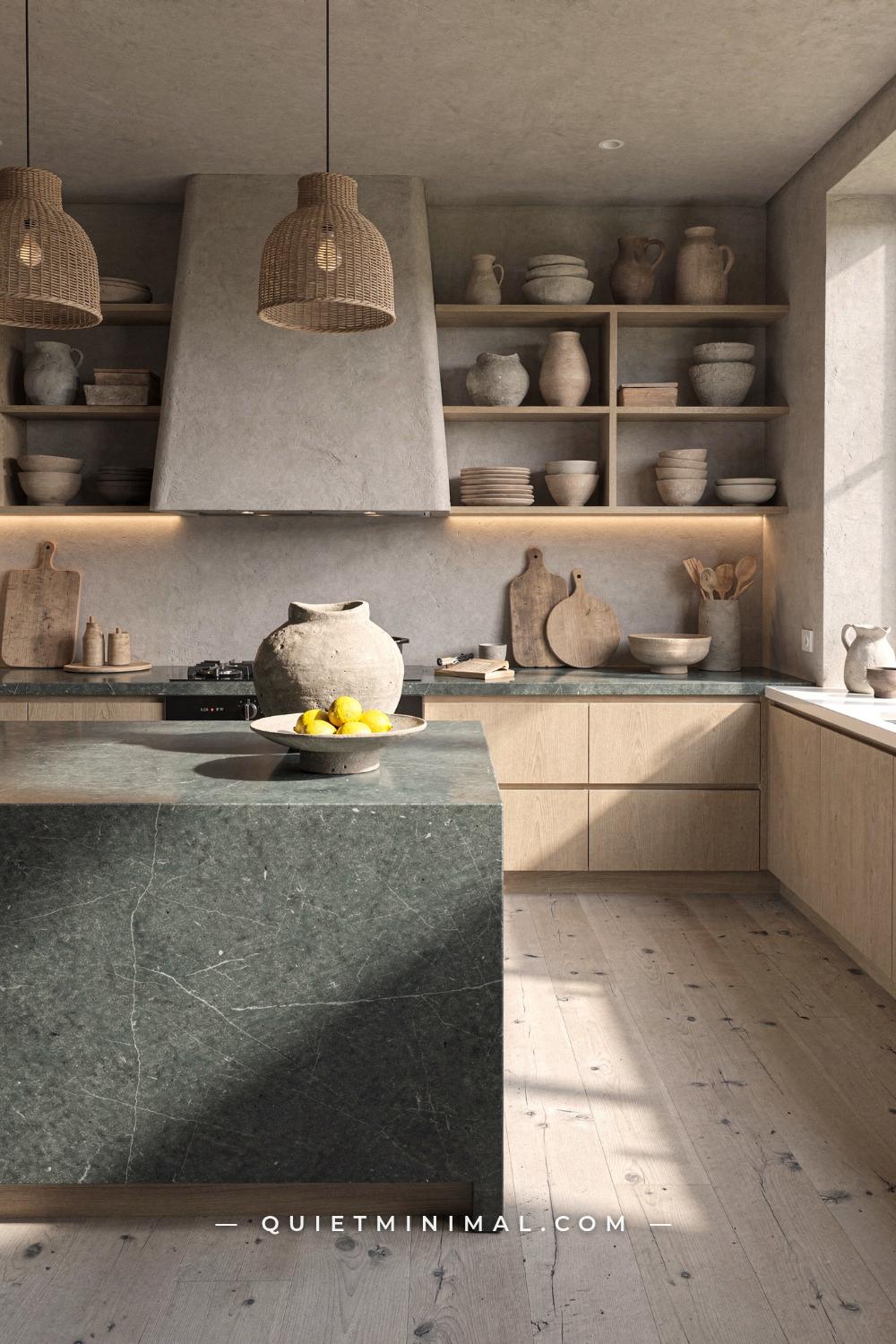
If your kitchen looks perfectly finished but still feels cold, flat, or like a room nobody actually cooks in, the problem is not a missing accessory. It is almost always a finish problem, a light problem, or a proportion problem that polished, glossy, builder-grade kitchens all share. Wabi sabi design does not mean deliberately roughing things up or going rustic. At its core, it is the Japanese philosophy of finding beauty in imperfection, impermanence, and natural material honesty. In a kitchen, that translates to specific material choices, specific light temperatures, and specific spatial decisions that collectively produce a room that feels lived-in, grounded, and genuinely personal rather than staged.
The twelve sections below each start with the version of the problem you are probably living with right now, explain exactly why it makes the room feel off, and then show you the wabi sabi fix alongside the material logic behind it. No abstract philosophy. No mood-board language. Just room-by-room decisions you can make, one at a time, starting this weekend.
The Gloss Cabinet Problem: Why Shiny Finishes Make a Kitchen Feel Institutional
 Save
High-gloss cabinet fronts became the default choice in American kitchens sometime around 2010 because they photograph bright and clean, and they read well on listing sheets. But gloss surfaces do something specific to a room at human scale: they act as mirrors. Every light source, every window, and every overhead fixture bounces off the face of each cabinet door and creates a diffuse, flat-lit quality that removes all shadow and depth from the room. What you lose is volume. The cabinets stop reading as three-dimensional objects sitting in a space and start reading as a single bright plane. The room collapses visually.
The wabi sabi fix is matte or low-sheen cabinetry in an earthy, desaturated tone. The most useful color families are warm greige (think Benjamin Moore’s Revere Pewter HC-172 as a reference point), clay, sage, and chalky white. Sheen level matters as much as color: a dead-flat or eggshell finish catches shadow. When a cabinet door sits at a 30-degree angle to a light source, a matte finish shows the corner, the reveal, and the door frame as distinct tonal shifts. That is depth. That is what makes a kitchen feel like a real room rather than a product render.
You do not need to replace your cabinets to do this. A quality cabinet paint in an eggshell or dead-flat sheen, applied with a foam roller to flat doors and a brush on the profiles, is a weekend project that changes the entire weight of the room. Paint the lower run in your earthy tone and leave the uppers lighter if you want to maintain some brightness. The contrast between a grounded lower cabinet and a softer upper register is itself a wabi sabi compositional move: nothing is uniformly one thing.
From the guides
You've saved it, wanted it. Here's the how: codes, measurements, order. Your choices make it yours.
 The Japandi Honest PlaybookThe honest version of the style: what to keep, what to skip, and the order to do it in.See inside →
 The Room Refresh PlaybookA repeatable four-step method, room by room, in ten minutes, thirty minutes, or one weekend.See inside →
 Make Any Room Feel Cozy on PurposeWhy some rooms hold people and others empty out, and the moves that change it.See inside →
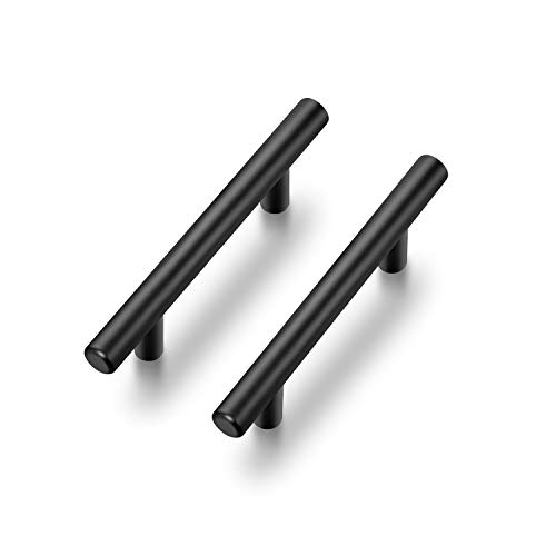
The secondary fix is hardware. Builder-grade brushed nickel pulls are designed to disappear, and they do, but in a way that makes the cabinets feel generic. Switch to unlacquered brass, aged bronze, or hammered iron hardware. These finishes develop a subtle patina over time: that is the point. A pull that looks slightly different in six months than it did on day one is doing exactly what wabi sabi asks of a material.
Key Takeaway: Swap gloss cabinet finishes for a matte or eggshell sheen in a warm earthy tone and pair them with hardware that develops patina, because it is the shadow and depth that make the room feel three-dimensional.
The 4000K Lighting Problem: How Cool White Light Kills Every Warm Material You Buy
 Save
Light color temperature is the single most overlooked specification in a kitchen renovation, and it is directly responsible for the most common complaint designers hear: “I chose all warm materials and the room still feels cold.” The math is simple. Most builder-grade recessed downlights ship at 4000K, sometimes 5000K. At those temperatures, the light source has a faint blue-green cast. It is designed to mimic daylight for task visibility. What it actually does is strip the warmth out of every material in the room. Your creamy zellige tile reads as pale gray. Your white oak shelves read as bleached beige. Your warm greige cabinets read as cool taupe. The materials you spent real money on are being neutralized by the light source above them.
The wabi sabi fix is a wholesale shift to 2700K or 2900K across every fixture in the kitchen, combined with layered rather than single-source lighting. The framework is: ambient (pendants or a flush ceiling fixture at 2700K), task (under-cabinet LED strips at 2700K, not 4000K), and accent (a single directional spotlight hitting the backsplash or the open shelf). Three layers means you can dial each zone independently.
Pendant lights above the island are where wabi sabi character shows most clearly in the lighting layer. Rattan, woven seagrass, paper fiber, and natural linen shades all diffuse light rather than direct it, which means the bulb’s glow scatters through the weave and creates soft shadows on the ceiling and surrounding wall. That shadow pattern is not decorative in the accidental sense: it is what the room needs to feel like something other than a commercial kitchen. Natural-fiber pendant shades exist at multiple price points, and because the shade does the work, the fixture itself can be simple.
Under-cabinet LED strips deserve particular attention because they are the light source closest to your backsplash, countertop, and any open shelving above them. Installing a 2700K strip behind a thin wood valance or a routed channel in the shelf face creates the warmest possible wash on the countertop surface. That wash shows honed stone’s veining, zellige tile’s glaze variation, and butcher block’s grain as richly as they look in magazine photography, because magazine photography uses exactly this warm directional light.
Dimmer switches are not optional in a wabi sabi kitchen. The mood shifts between morning prep and evening cooking are a feature, not an afterthought. A fully-lit kitchen at noon and a half-dimmed kitchen at 8 p.m. with two pendant lights glowing over the island are the same room at two completely different emotional registers.
Key Takeaway: Replace every kitchen light source with 2700K bulbs, layer pendants plus under-cabinet plus one accent, and add dimmers, because warm-spectrum layered light is what finally makes your warm materials look warm.

The Smooth Backsplash Problem: Why Flat Subway Tile Makes a Kitchen Feel Like a Cafeteria
 Save
Standard 3×6-inch white subway tile with a glossy glaze and tight, bright-white grout lines is possibly the most neutral surface that has ever been installed in a kitchen. It is inoffensive, easy to clean, and it photographs as a clean white background. It is also the fastest way to make a kitchen feel like an airport lounge. The problem is uniformity. Every tile is exactly the same dimension, exactly the same gloss, exactly the same flat white. The surface has no light variation, no depth, no story. Your eye passes over it in a fraction of a second and finds nothing to hold onto. That is the visual equivalent of silence in a room that needs some texture.
Zellige tile is the most direct fix, and it works precisely because it is the formal opposite of subway tile. Zellige is a handmade Moroccan clay tile fired at lower temperatures than porcelain, which produces a glaze that pools at the edges, varies in depth from tile to tile, and sometimes shows a faint crazing or surface irregularity that catches light differently at every angle. Each tile boasts its own one-of-a-kind color variations and texture, adding a subtle yet striking character to any space. In a wabi sabi kitchen, that variation is not a defect. It is the entire point.
The color range for a wabi sabi application is specific: bone white, warm cream, soft sage, clay, or pale terracotta. Avoid anything bright or saturated. The surface variation in zellige does enough visual work on its own. A deep indigo zellige is a statement tile. A bone-white zellige in a wabi sabi kitchen is a texture decision. Those are different rooms.
Installation matters as much as tile selection. Ask your installer to use a slightly wider grout joint (3/16 inch rather than the standard 1/16 inch for subway tile) and to choose a sanded grout in a warm beige or sandy tone. Bright white grout lines create a grid that emphasizes regularity. A warm, slightly wider joint does the opposite: it lets the tiles read as individual objects rather than a uniform surface, which is exactly the quality you are after.
For renters or anyone not ready for a tile project, peel-and-stick zellige-look panels now exist in realistic finishes that photograph and live reasonably well. The tactile depth is not the same, but the visual shift from flat white to something with surface variation is real and immediate.
Kitchen backsplashes are the top place people love zellige: the micro-variation makes even white kitchens feel bespoke. That effect is precisely what a wabi sabi kitchen is asking for.
Key Takeaway: Replace flat, uniform subway tile with zellige in a warm neutral tone and a wider grout joint in sandy beige, because it is the tile’s built-in surface variation that gives the room the depth a flat glaze cannot.

The Upper Cabinet Problem: Why a Full Cabinet Run Makes the Ceiling Feel Low
 Save
Upper cabinets running all the way to the ceiling or stopping 12 inches short of it are a storage solution that became an aesthetic default. In a kitchen where every wall has a full upper-cabinet run, the sightlines behave in a specific, unflattering way: your eye hits a cabinet face at roughly 18 inches above the counter and travels no further upward. The ceiling effectively disappears because there is a solid object between eye level and the ceiling line. The room reads as a box. And because every cabinet door is a flat, closed surface, the wall above the counter has zero layering, zero depth, and zero personality.
Removing all or part of your upper cabinet run and replacing it with open floating shelves on one wall is the highest-impact structural move in a wabi sabi kitchen. The reason it works at the compositional level is that open shelves let your eye continue upward past the shelf surface to the wall behind and eventually to the ceiling. The room gains vertical depth. You can also see the wall material behind the shelves, which in a wabi sabi kitchen should be something worth seeing: plaster-finish paint, limewash, or the zellige backsplash continuing up the wall.
The shelf itself matters. Pale oak or white oak at 1.5 inches (38mm) thick with a raw or lightly oiled finish is the right weight. Thin metal shelves read as retail. Very thick shelves (above 2 inches) start to feel heavy. The bracket should be simple: a concealed floating bracket or a raw steel L-bracket in a matte black or aged iron finish. Avoid ornate brackets. Avoid pipe shelving unless you are deliberately going industrial, which is a different aesthetic entirely.
What lives on the open shelf is where wabi sabi philosophy becomes daily practice. The rule is: display only what you use regularly and find genuinely beautiful. Handmade stoneware bowls in cream, muted green, or rust. A wooden cutting board leaned against the wall. A small terracotta planter. A stack of three or four cookbooks. Nothing shiny, nothing matching as a set, nothing that was bought specifically to be “decor.” The imperfect, slightly mismatched collection is the correct one.
Set your lowest shelf at 54 inches (137cm) from the floor: that is high enough to keep the counter usable beneath it and low enough that items on the shelf are reachable without a stool. Space a second shelf 14 inches (35cm) above the first. Two shelves is almost always enough. Three starts to look like retail display.
Key Takeaway: Remove upper cabinets on at least one wall and replace them with open floating shelves in pale oak at 54 inches from the floor, because letting your eye travel upward past the shelf to the ceiling and back wall is what gives the room its vertical dimension.

The Countertop Problem: Why Polished Quartz Reads as Plastic
 Save
Polished quartz engineered stone is the single most-specified countertop material in American kitchens over the last decade, and the reason is reasonable: it is durable, non-porous, stain-resistant, and consistent. That last quality is the problem. Consistency in a countertop means the surface looks exactly the same at every point. There is no veining variation, no surface depth, no change in how it reflects light from one end of the counter to the other. Coupled with a high-gloss polish, it reads as a solid object rather than a material with history. In a wabi sabi kitchen, a surface that has no variation is a surface that has no story. And no story means the room still feels like a showroom.
The wabi sabi countertop fix is a honed or leathered natural stone, or a raw butcher block with an oil finish. Honed means the surface has been ground to a matte finish rather than polished to a mirror shine. Honed Carrara marble, honed soapstone, honed matte granite, or honed limestone all share the quality that their surface texture is visible and tactile. You can see where the stone has been worked. The matte finish shows veining as tonal depth rather than as a reflective line. A leathered finish goes one step further: the stone’s natural pores and micro-texture are preserved, and the surface has a faintly pebbly quality under your fingertips.
Soapstone is worth naming specifically because it is underused and underrated. It runs from a warm dove gray to a deep blue-gray with visible veining, its surface has a naturally low sheen even without sealing, and it develops a gentle, even patina as mineral oil is applied over time. That patina is the sabi in wabi sabi: a material aging gracefully, visibly, on purpose.
Butcher block is the most affordable entry point. White oak or walnut butcher block at 1.75 inches (44mm) thick, finished with a raw linseed or tung oil rather than a polyurethane varnish, shows grain variation, accepts minor knife marks as honest use, and darkens slightly with repeated oiling. The darkening is not a maintenance failure. It is evidence that the surface has been used, which in a wabi sabi kitchen is a feature.
If you are not ready to replace countertops, honed stone tile can be used as a countertop surface and grouted with a sandy-toned sanded grout. It requires sealing but creates the same matte, variable surface quality at a fraction of the slab cost.
Key Takeaway: Choose honed natural stone or oiled butcher block over polished engineered quartz, because a surface that develops subtle variation over time is one that makes the room feel chosen rather than installed.

The Stainless Steel Problem: Why All-Metal Finishes Make a Kitchen Feel Commercial
 Save
Stainless steel appliances and brushed chrome faucets are specified in builder-grade and mid-range kitchens for the same reason subway tile is: they are neutral, they are expected, and they photograph as “clean.” The problem at the room level is that stainless steel has a commercial association that is nearly impossible to overcome regardless of surrounding decor. A stainless range hood flanked by warm plaster walls and zellige tile still reads as the equipment zone of a restaurant. The material carries its context with it.
This does not mean you need to replace your appliances. It means the visible metal finishes in your kitchen should shift from reflective silver to matte black, aged brass, or unlacquered bronze wherever possible. The specific targets are: faucet, cabinet hardware, light fixtures, and range hood. If your range hood is stainless, a plaster-coat finish applied over the exterior (a growing option from specialty finish companies) changes its character entirely without touching the appliance mechanics. If that is not accessible, simply surrounding the stainless hood with warm materials on all sides, zellige tile to the ceiling, open wood shelves flanking it, and a plaster-painted wall above, reduces its commercial read significantly.
A matte black bridge faucet or a solid unlacquered brass faucet is the highest-leverage single swap in this category. An unlacquered brass faucet starts bright and darkens and patinas over six to twelve months of use. By month twelve it looks as though it has been in the kitchen for twenty years. That is not an accident of neglect: it is the material doing exactly what wabi sabi asks of metal, which is to show the passage of time without hiding it.
Cast iron and enameled cast iron cookware left on open hooks or a hanging rail above the range also belongs in this category. A black cast iron pan hung on a simple matte black hook is not a styling prop. It is a functional object whose material has a weight, surface texture, and patina that contributes to the room’s material story. That is wabi sabi: the everyday object as the beautiful object.
Key Takeaway: Shift all visible hardware, faucets, and fixtures from reflective silver to matte black, aged bronze, or unlacquered brass, because these finishes develop patina and remove the commercial association that stainless steel carries into a domestic kitchen.

The Flat-Floor Problem: Why Uniform Tile Makes a Kitchen Feel Like a Showroom
 Save
Glossy, uniform floor tile, or the same smooth porcelain plank running wall to wall, is the floor equivalent of the polished quartz countertop: it removes all surface variation and replaces it with a single reflective plane. The reflection picks up the harsh overhead light and sends it back upward, doubling the flatness of the room. From a sightlines perspective, a reflective floor also makes the space feel smaller because it creates a false horizon: the eye reads the reflection as depth and gets confused about where the floor ends.
Terracotta tile is the most coherent wabi sabi floor choice, and it solves the problem at every level. Traditional terracotta (Saltillo or similar unglazed terra cotta formats from 8×8 inches up to 16×16 inches) has a naturally matte, slightly porous surface that absorbs rather than reflects light. Tone varies from tile to tile, from warm amber to burnt sienna to pale clay, and the variation is inherent in the firing process rather than applied artificially. A terracotta floor in a kitchen creates visual warmth that reads from across the room: you feel the room get warmer before you can specifically identify what changed.
The practical concerns about terracotta are real and worth addressing directly. Unglazed terracotta is porous and requires sealing with a penetrating sealer every two to four years. It is also softer than porcelain and can chip at edges with heavy impact. If that maintenance profile is not workable, honed porcelain tile in terracotta tones is a direct substitute: the surface variation is less organic, but a warm matte porcelain in 12×12 inch (30x30cm) format laid in a brick or irregular pattern reads as authentically earthy at normal viewing distance.
Wide-plank pale oak or white oak flooring is the alternative for those who prefer wood. Raw or lightly oiled rather than polyurethane-finished, so the grain is visible and the surface has a low sheen. At 5 inches (127mm) or wider per plank, the floor has enough visual scale to anchor the room without competing with the wall materials.
Over a hard floor of any of these types, a woven jute or sisal runner in the main work zone softens the sound, adds tactile warmth underfoot, and introduces a natural fiber material that is itself a wabi sabi object: irregular, slightly rough, and honestly made.
Key Takeaway: Replace uniform glossy tile with matte terracotta, honed stone-look porcelain, or oiled wide-plank oak, and layer a jute runner over it, because a floor that absorbs rather than reflects light changes the room’s emotional register from the ground up.

The Harsh Overhead Light Problem: Why Downlights Alone Flatten Every Surface
 Save
A single grid of recessed downlights is the builder’s go-to lighting plan because it is the cheapest way to light a full kitchen uniformly. Uniform is the problem. Every surface in the room receives the same amount of light from the same angle. There are no shadows. There is no hierarchy between the island and the perimeter. The shelf and the floor and the countertop and the ceiling all read at the same brightness. The room feels flat and interrogating, like a lighting showroom.
Pendant lights above the island are not decorative additions to a lighting plan. They are a zone-creation tool. When you hang two or three pendants 32 inches (81cm) above the island countertop, you are creating a lit zone that reads as distinct from the perimeter of the kitchen. The island becomes the room’s social and culinary center, which it already is functionally. The pendant lights make that legible visually. The perimeter, lit by under-cabinet strips and a dimmed ambient source, recedes slightly. The room now has depth: a bright center and a softer edge.
For wabi sabi kitchens, pendant light material is as important as fixture shape. Natural stone travertine shades, woven rattan or seagrass, hand-thrown ceramic, and raw linen are all materials that diffuse rather than direct light. The diffusion creates a glow rather than a beam, and the glow casts soft, variable shadows on the surrounding surfaces that change slightly as daylight outside shifts. That variability, the shadow on the backsplash at 8 a.m. being slightly different from the shadow at 6 p.m., is exactly the kind of daily impermanence that wabi sabi prizes.
From the guides
You've saved it, wanted it. Here's the how: codes, measurements, order. Your choices make it yours.
The Japandi Honest PlaybookThe honest version of the style: what to keep, what to skip, and the order to do it in.See inside →The Room Refresh PlaybookA repeatable four-step method, room by room, in ten minutes, thirty minutes, or one weekend.See inside →Make Any Room Feel Cozy on PurposeWhy some rooms hold people and others empty out, and the moves that change it.See inside →The practical ceiling layout: keep one or two dimmable recessed lights for task situations (unpacking groceries, cleaning up) and treat the pendants and under-cabinet strips as your primary ambient and task lighting during all other hours. This means the recessed lights might only run at full brightness twice a day for fifteen minutes. The rest of the time, the kitchen is lit by warm, layered, human-scale sources.
Key Takeaway: Add pendants in a natural-fiber or stone material at 32 inches above your island countertop and dim your recessed lights to supplement rather than dominate, because layered lighting creates the shadow variation that makes a wabi sabi kitchen feel alive.

The Empty Countertop Problem: Why Minimalism Without Objects Feels Abandoned
 Save
Minimalism in its most rigid form treats all visible objects as clutter and all surfaces as ideally empty. The result in a kitchen is a room that reads as unoccupied: too careful, too clean, and emotionally cold. This is the failure that makes people say a space “doesn’t feel like a home.” Wabi sabi and minimalism are not the same philosophy. Minimalism is about reduction. Wabi sabi is about honest presence: keeping only what is used and finding it beautiful specifically because it is used.
The countertop is where this distinction lives most visibly. An entirely clear countertop reads as a hotel kitchen. A counter with three or four well-chosen objects reads as a place where someone actually cooks. The wabi sabi rule is not “display everything” or “display nothing.” It is: display the objects you genuinely reach for every day, and let them be imperfect.
The specific object categories that work: a round or slightly asymmetric hand-thrown ceramic bowl holding three or four pieces of fruit (not styled, just the fruit that is on the counter). A wooden cutting board, ideally end-grain walnut or a similar hardwood, leaned against the backsplash rather than lying flat. A cast iron pan on the stovetop or on a simple hook above it. A single terracotta pot holding a small herb, basil or rosemary, that actually gets used. A dark glass or stoneware bottle of olive oil. A small linen cloth folded casually on the counter edge.
What does not belong: matching canisters, countertop appliances that do not get used weekly, decorative trays, printed dish towels with phrases on them, fake plants, and anything that was bought specifically to be “wabi sabi decor.” The philosophy notices when an object is performing rather than being.
The shelf styling logic follows the same rule. On open shelves, group objects by material family rather than by color or size. Stoneware together. Wooden objects together. Not rigidly: a wooden spoon in a ceramic crock is a natural grouping. But the visual language of grouped natural materials reads as more coherent than a mixed arrangement of ceramic, acrylic, and metal objects at the same level.
Odd numbers. Groups of three or five read more naturally than pairs. A single object and a group of three at different heights read better than two objects at the same height. These are the small compositional decisions that separate a styled shelf from a shelf that just has things on it.
Key Takeaway: Keep three to five functional, imperfect objects on the counter rather than clearing it entirely, because a surface that shows honest daily use reads as lived-in rather than staged.

The White Wall Problem: Why Flat Paint Makes a Wabi Sabi Kitchen Feel Incomplete
 Save
Standard flat latex wall paint in white or a pale gray is specifically formulated to be uniform: every square inch of coverage looks the same. It is designed to disappear. In a wabi sabi kitchen, a wall surface that disappears is a missed opportunity. The wall behind open shelves, the wall above the backsplash, and the wall around the range hood are all visible surfaces in a kitchen that spends a lot of time actively hosting human eyes. If those surfaces are flat and uniform, the room’s material story stops at the countertop and never reaches the walls.
Limewash paint is the fix with the most impact for the least structural change. Limewash is applied in overlapping layers with a wide brush, and the technique deliberately introduces variation in coverage depth and tone. The dried surface shows lighter and darker areas that shift as the light source moves across the wall throughout the day. Applied in a warm greige or dusty bone tone, a limewash wall in a kitchen provides a backdrop that reads as European farmhouse, Japanese plaster, or aged Mediterranean wall depending on the surrounding materials. It works with all of them because it is itself honest: it is a wall showing how it was made.
The application is straightforward enough for a motivated DIYer. Most limewash paint products (Portola Paints’ Roman Clay and Classico Limewash are two verified options with established color libraries) apply in two coats over a clean, primed wall. The first coat is brushed on and partially rubbed back before drying. The second coat is layered at a different angle. Total wall time is four to six hours for a standard kitchen. The result ages beautifully rather than yellowing or chipping like conventional paint.
An alternative is Venetian plaster or a microcement finish, both of which are thicker than paint and produce a more dramatically layered surface. These are typically applied by a professional and cost significantly more. For a DIY-friendly version that reads similarly at distance, roman clay paint products achieve roughly 70 percent of the same visual effect.
Whatever wall treatment you choose, the key rule is that it should have a visible surface quality: something you could reach out and feel if you touched the wall. That tactile quality, even when not physically touching the wall, is perceptible from across the room. It is what separates a wabi sabi wall from a painted one.
Key Takeaway: Apply limewash or roman clay paint to at least one visible kitchen wall in a warm greige or dusty bone tone, because a surface with visible depth and tonal variation gives the room a material layer that flat paint cannot.

The Plant Problem: Why Ornamental Plants Feel Staged in a Kitchen
 Save
Large, dramatic plants positioned in a kitchen for purely ornamental reasons tend to read as set-dressing. A massive fiddle-leaf fig in the corner of a kitchen is visually interesting for about two days and then becomes invisible background. More importantly, it signals that the plant is there to be looked at rather than to be used, and that is the opposite of the wabi sabi relationship to objects.
The wabi sabi kitchen plant approach is: small, functional where possible, and positioned where light actually supports the plant rather than where the pot looks good on camera. The windowsill above the sink is the highest-value plant location in any kitchen because it gets direct light and it is at eye level during the most-used moments of the day (washing, prepping). A small terracotta pot with a trailing pothos, a single herb plant in a matte ceramic pot, or a small succulent in an irregular handmade vessel are all appropriate. The scale matches the windowsill. The plant is not trying to be a statement.
Herbs belong on the kitchen windowsill for functional reasons that are also aesthetic reasons. A potted rosemary, thyme, or basil plant is visibly a kitchen plant: it is there to be used, which makes it honest. In a wabi sabi kitchen, the honest use of an object is its best justification for being in the room.
Terracotta pots are the right vessel for almost every kitchen plant. They are porous (which is better for most herbs), they are naturally imperfect in their finish, they age to a patchy, mineral-stained surface that is visually interesting, and they are inexpensive. A three-inch terracotta pot that has been used for three growing seasons looks dramatically more interesting than a brand-new decorative pot that was bought to match the counter. That three-season patina is sabi in its most direct form.
Trailing plants (pothos, ivy, tradescantia) earn their place in a kitchen by growing visibly over time. A trailing stem that reaches six inches below the shelf edge changes the room’s vertical geometry in a subtle but real way. It softens the hard shelf edge and creates a living material at mid-height that bridges the gap between the countertop and the wall above.
Key Takeaway: Put a small herb or trailing plant in a terracotta pot on the windowsill above the sink and let it grow honestly rather than arranging ornamental plants for visual effect, because a plant that shows real use and real growth is doing what wabi sabi asks of living things.

The Textile Gap Problem: Why a Hard Kitchen Feels Unfinished Without Soft Materials
 Save
A kitchen built entirely from hard materials, stone, wood, tile, metal, and painted plaster, is acoustically and visually cold regardless of how warm those individual materials are. Hard surfaces reflect sound and light in ways that soft materials absorb. When you stand in a kitchen with no textiles at all, the room has a slight echo, and every piece of tableware you set down sounds harder than it needs to. These are not imaginary sensations. They are the acoustic and tactile consequences of an all-hard surface room. Wabi sabi addresses this directly because natural fiber textiles are among the most honest, time-developed materials available.
Linen is the primary wabi sabi textile for a kitchen. Raw, undyed, or naturally-dyed linen has a surface irregularity (called slubs) built into the weave: small thick spots and thin spots that are a byproduct of the flax fiber’s natural variation. These irregularities are visible in good light. A linen curtain panel catching morning sun shows a slightly uneven, warm, organic texture that no polyester approximation replicates. Linen also softens and becomes more supple with every wash, meaning a linen dish towel you have used for two years looks better than a new one. That trajectory is wabi sabi.
Where textiles belong in a kitchen: curtain panels on any kitchen window, hung from ceiling height on a simple black or brass rod and allowed to pool slightly on the floor. This is the highest visual impact position because curtains define the proportion of the window wall and introduce vertical soft material at the room’s perimeter. A linen dish towel folded and left on the counter or draped over an oven handle. A woven rattan or seagrass basket for storing onions, potatoes, or bread, on an open shelf or on the counter. A jute or sisal runner on the kitchen floor.
Texture within the textile matters. Tightly woven, smooth cotton towels are fine for function but add nothing visually. A waffle-weave linen, a rough-textured slub linen, or a hand-loomed cotton with visible variation all introduce the kind of surface interest that the rest of the wabi sabi kitchen is built on.
Color is simple: undyed natural, oat white, warm cream, dusty sage, or pale clay. No patterns. No stripes. No graphic prints. The texture is the visual event in a wabi sabi textile. A stripe or a check competes with the room’s material story rather than supporting it.
Key Takeaway: Hang undyed or oat-white linen panels from ceiling height on every kitchen window and add a woven basket and a textured linen dish towel to the open shelf, because natural fiber textiles absorb sound and light in a way that makes an all-hard kitchen finally feel complete.

The Open Shelf Clutter Problem: Why Too Many Objects Undermine the Whole Aesthetic
 Save
Open shelves in a kitchen are the most public edit in the room. Everything on them is on display every time anyone stands in the kitchen. The failure mode is not overcrowding in the conventional sense: it is overcrowding with the wrong objects, objects that compete rather than cohere. A shelf that holds six matching white canisters and three subway-tile-themed tea towels is technically not overcrowded. It is, however, a shelf that tells no story because everything on it is the same voice at the same volume.
Wabi sabi shelf curation has one governing principle: the objects should be genuinely different from each other in material, size, and surface quality, and there should be enough negative space between groups that each object reads individually. A bowl sitting next to another bowl of identical size at the same height is a pair. A bowl sitting alone, with a wooden board leaning behind it and a small pot six inches to its right, is a composition.
The material diversity rule in practice: aim for at least three different natural materials on any given shelf span. Ceramic, wood, and plant (a living material) is the most reliable combination. Stone, wood, and dried botanical is another. Ceramic, woven fiber, and wood works. What does not work: three ceramic objects of similar size without any other material. Three wooden objects without any contrast. Any grouping where everything is the same material feels like product display rather than a personal shelf.
The negative space rule: at least 20 percent of each shelf should be empty visible wall. Not cluttered with smaller objects, not filled with a trailing plant, but genuinely empty. That empty section is what gives the eye permission to rest and what makes each object’s presence count. When every inch of a shelf is covered, the eye cannot land anywhere. When there is space, the bowl reads as a bowl. The wooden board reads as a wooden board. Each object earns its position.
The edit process for an existing overcrowded shelf: remove everything. Set it all on the counter. Now put back only the objects you would genuinely be sad to lose from the kitchen. That is almost certainly fewer than half of what was on the shelf. The rest goes into a cabinet, into storage, or out of the kitchen entirely. The objects that remain should be the honest ones: used, handmade where possible, imperfect in surface, and genuinely different from each other.
Key Takeaway: Curate open shelves to three to five objects per shelf span with at least 20 percent empty space, using at least three different natural materials, because negative space is what allows each object to be seen rather than lost in visual noise.

Your kitchen does not need a full renovation to feel grounded. The wabi sabi shift in a kitchen is almost always a material and light story: swapping gloss for matte, bright white for warm cream, flat surfaces for textured ones, and uniform light for layered warmth. Start with the lighting, because 2700K bulbs cost almost nothing and change the entire reading of every other material in the room. Follow that with one wall of open shelves, the backsplash, and the hardware. Each change compounds the effect of the previous one. By the time you have addressed four or five of the failure points above, the kitchen you have now and the kitchen you want are the same room.
From the guides
You've saved it, wanted it. Here's the how: codes, measurements, order. Your choices make it yours.
The Japandi Honest PlaybookThe honest version of the style: what to keep, what to skip, and the order to do it in.See inside →The Room Refresh PlaybookA repeatable four-step method, room by room, in ten minutes, thirty minutes, or one weekend.See inside →Make Any Room Feel Cozy on PurposeWhy some rooms hold people and others empty out, and the moves that change it.See inside → Save


