Georgia
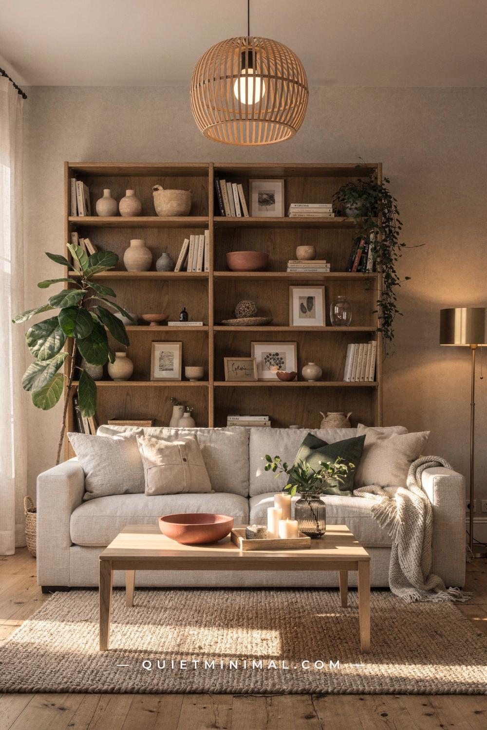
You saved the images. You bought the pale oak furniture. You kept everything tidy and uncluttered. And yet the room still feels like a dentist’s waiting room with better throw pillows. That gap between the warm Scandinavian interior you envisioned and the slightly sterile space you ended up with is not a taste problem. It is a handful of very specific, correctable mistakes, and once you can name them, they are easy to fix.
The warm version of this aesthetic is not a different style. It is the same style executed with the right layers in the right sequence. The cold version happens when one or two critical decisions get skipped: the lighting stays flat, the textures stay uniform, the wood tones all match, or the walls stay a white that has a blue bias hiding in it. Any one of those choices drains the warmth out of everything else in the room. This article names all twelve, explains exactly why each one fails, and tells you the fix.
You Used a White That Has a Blue Undertone
 Save
Not all whites are the same, and the undertone difference is the single most common reason a Scandinavian interior ends up looking cold even when every other decision was correct. A white with a blue or grey undertone does something specific: it fights the warm materials around it. Your honey-oak floor suddenly looks yellowish and cheap against it. Your linen sofa reads dingy rather than textured and natural. The whole room develops a subtle tension that you cannot name but absolutely feel.
The mechanism is straightforward. Paint undertones are read relative to each other and to the light in the room. A blue-white on the wall bounces cool light back into the space, and that cool cast lands on every surface, fabric, and wood grain in the room. You end up with a room that is technically decorated correctly but emotionally reads as a waiting room.
The fix is specific: move to a warm white or a soft warm greige. Sherwin-Williams Alabaster SW 7008 is the most widely validated option for this aesthetic because it has a very slight cream bias without going yellow. For something with just a bit more body, Sherwin-Williams Accessible Beige SW 7036 reads as a warm greige that sits beautifully behind pale oak and linen. On the Benjamin Moore side, White Dove OC-17 is the go-to warm white, and Edgecomb Gray HC-173 bridges the gap between white and greige with enough warmth to feel intentional without feeling heavy. If you are working with limited natural light, stick with Alabaster or White Dove. If your room gets good afternoon sun, Accessible Beige or Edgecomb Gray will carry beautifully.
From the guides
You've saved it, wanted it. Here's the how: codes, measurements, order. Your choices make it yours.
 The Japandi Honest PlaybookThe honest version of the style: what to keep, what to skip, and the order to do it in.See inside →
 The Room Refresh PlaybookA repeatable four-step method, room by room, in ten minutes, thirty minutes, or one weekend.See inside →
 Make Any Room Feel Cozy on PurposeWhy some rooms hold people and others empty out, and the moves that change it.See inside →
Before you repaint the whole room, buy a large peel-and-stick sample, at least 12 inches by 12 inches (30 cm by 30 cm), and live with it for two full days. Check it in morning light, afternoon light, and under your lamps at night. The undertone will shift across those conditions and you need to see all three before committing.
Key Takeaway: Always choose a warm-undertone white or greige as your wall base; a blue-biased white will visually fight every warm material you place against it.

Your Lighting Comes from One Source
 Save
A single overhead light is the fastest way to make a Scandinavian interior feel like a floor plan rather than a home. The problem is not the fixture itself. The problem is what one light source does to the geometry of a room: it distributes light evenly, which sounds like a good thing but actually flattens everything. Shadows disappear. Depth disappears. The room stops having a near side and a far side, a bright corner and a shadowed one. Every surface reads at the same value, and the result is clinical rather than warm.
Warm Scandinavian rooms work on layered light. That term sounds complicated but the principle is simple: you want at least three sources at different heights, with different intensities, and all of them at a warm color temperature. The bulb temperature is not optional here. Anything above 3,000K on the Kelvin scale starts to read as cool white. Aim for 2,700K to 2,800K across every bulb in the room for a consistent warm glow.
In a living room, the structure is: one primary light from above (a pendant or a ceiling flush-mount, not recessed can lights, which are too sharp), one floor lamp positioned behind or beside a seating piece to create a reading pool, and one or two table lamps at surface height to anchor the lower layer of the room. In a bedroom, replace the floor lamp with two bedside sconces or table lamps placed at the same height on either side of the bed. In a dining space, a pendant centered over the table does most of the work, but a sideboard lamp or a wall sconce on the adjacent wall gives the room its depth.
Candles count as a light layer, and in the Nordic tradition they are not decorative, they are functional. A cluster of three pillar candles on a tray, or a set of tapers in simple wooden or ceramic holders, adds a flicker quality that no bulb can replicate. You do not need twenty of them. Three or four placed at table height or lower, in the corners of the room where the lamp light does not quite reach, will close the loop.
The most important single upgrade you can make in any Scandinavian room is to put the overhead light on a dimmer and turn it down to roughly 40 percent in the evening, letting the table and floor lamps carry the room. This one change, which costs nothing if you already have a compatible dimmer switch, will make the space feel 30 to 40 percent warmer on the first night you try it.
Key Takeaway: Layer at least three light sources at different heights, all at 2,700K to 2,800K, and put your overhead on a dimmer so it stops dominating the room at night.

Every Texture in the Room Is the Same
 Save
A Scandinavian room that uses only smooth, flat, or uniform surfaces is a room that has removed all the visual information the eye uses to read warmth. Texture is not decorative in this aesthetic. It is structural. The reason a Nordic interior feels warm even when it uses a restrained palette and minimal furniture is that every surface is doing textural work: the grain in the oak, the weave in the linen, the pile in the wool rug, the matte chalk of a ceramic vase. Remove that layering and you have a room that looks like a furniture catalogue page rather than a space someone inhabits.
The failure mode here is usually the result of convenience shopping rather than bad taste. When you buy everything from the same store or the same collection, the finishes tend to coordinate at the expense of contrast. You end up with a smooth cotton-blend sofa, a flat-weave rug, lacquered furniture, and cushions in the same fabric as the sofa. Everything matches. Nothing feels alive.
The correction is to think about texture the same way you would think about a color palette: you want a range of values from coarse to fine, and you want at least four distinct materials in every room. A useful framework is to include one hard material (wood, stone, or ceramic), one soft woven material (linen, cotton, or wool upholstery), one pile or loop material (a wool or jute rug, a boucle chair), and one organic or irregular material (a rattan piece, a hand-thrown ceramic, dried botanicals). Within those four categories, the specific choices can be whatever serves the palette. The point is that the categories themselves should all be present.
Boucle is the most talked-about texture addition right now, and it earns the attention: the looped surface catches light differently at every angle, which means a boucle sofa or armchair looks subtly different in morning light versus lamp light, and that variability reads as warmth. But boucle is not the only route. Ribbed knit cushions, chunky hand-knotted rugs, rough-finished stoneware, and matte plaster walls all accomplish the same end by different means. The goal is contrast between surfaces, not a specific product category.
One area people consistently under-texture is the floor. If you have a smooth, light-colored rug or a bare wood floor, you have missed the warmest part of the room’s visual temperature. A wool rug with visible pile, knots, or a woven pattern adds the single most significant texture upgrade per dollar of any purchase in the room. Size matters here: the rug should be large enough that all front legs of the sofa and chairs sit on it, which in most living rooms means a minimum of 8 feet by 10 feet (244 cm by 305 cm).
Key Takeaway: Make sure every room contains at least four distinct surface textures from hard materials through pile and woven fabrics to organic forms, because texture is how warmth registers visually, not just physically.

Your Wood Tones All Match
 Save
When all the wood tones in a room match exactly, the result is not harmony. It is monotony. The eye expects to find variation between floor, furniture, and accessories when reading a space as warm and lived-in. When everything is the same honey-oak finish, the different pieces stop reading as individual objects and start blurring into a single undifferentiated backdrop. The room looks like a display floor rather than a home.
The mechanism is contrast. Contrast between materials and tones is what gives a room visual structure. When a darker walnut chair sits beside a lighter oak table, each piece defines the other. The table looks warmer, the chair looks richer, and the room gains depth it did not have when both pieces were the same finish. Remove the contrast and you remove the depth.
The practical fix is to introduce at least two distinctly different wood tones and to keep them separated by at least two steps on the spectrum from light to dark. A pale ash floor with a mid-tone honey-oak dining table and a set of darker walnut chairs is a reliable three-tone ladder that gives the room visual structure without feeling chaotic. You do not need to match: you need to relate. The key word is intentional contrast, which means the tones should be different enough that the difference reads as a choice, not a mistake.
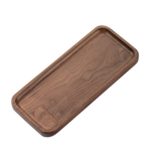
If you are working with existing furniture you cannot replace, introduce contrast through smaller pieces. A dark-stained wooden tray on a light coffee table, or a pale oak shelf mounted above a darker media console, adds the tonal range the room needs without requiring a furniture overhaul. Wooden picture frames, lamp bases, and stools are all low-cost ways to introduce a second or third wood tone into a room that is currently monotone.
The current direction in Nordic interiors is to pair honey oak at the furniture scale with darker smoked ash or brushed walnut at the accessory scale, keeping the floor in a mid-tone natural oak. That three-level approach ensures that no single finish dominates, which is exactly what a warm, layered Scandinavian room needs.
Key Takeaway: Introduce at least two distinctly different wood tones separated by two steps on the light-to-dark spectrum, because matching wood finishes throughout removes the depth that makes a room feel warm rather than flat.
You Treated the Style as Pure Minimalism
 Save
The most widespread misunderstanding about Scandinavian design is that its goal is to remove as many objects as possible from the room. That reading produces spaces that look correct in photographs but feel inhospitable in person, the kind of room where you are afraid to set your coffee cup down because there is nowhere obvious to put it. That is not the aesthetic. That is a furniture showroom.
The actual principle of Nordic design is to remove visual noise, not objects. Visual noise is clutter without purpose: stacks of unsorted mail, mismatched decorative objects that have no relation to each other, furniture that blocks movement or competes for attention. Removing that is correct. Removing all personality along with it is the mistake.
A warm Scandinavian room still has things in it. The coffee table has a ceramic bowl, a small plant, and a design book. The shelf has a few curated objects with space between them. The sofa has two or three cushions in different textures. The walls have something on them: a print, a small woven piece, a mirror, a shelf with a few books. The room does not have many things, but the things that are there feel chosen and placed.
The lived-in quality that makes Nordic rooms feel warm comes from evidence of use, not evidence of disorder. A throw blanket that looks like it was just picked up from the sofa rather than staged, a plant that has grown past its nursery shape, a few personal books mixed in with the coffee table objects. These details do not add clutter. They add the human presence the room needs to feel like someone actually lives there.
A useful editing rule: for every object you remove from a surface in the name of minimalism, ask whether the surface now reads as intentionally empty or just forgotten. Intentionally empty is fine: a long dining table with only a simple ceramic vase at its center reads as serene and deliberate. A surface with one random object pushed to one corner reads as neglected. The standard is intention, not quantity.
Key Takeaway: Remove visual noise, not personality; a warm Scandinavian room should show evidence of a life lived in it, not a showroom cleared of every human trace.

Your Curtains Are Blocking the Light You Need
 Save
Natural light is the most important material in a Scandinavian interior, and it is free. The mistake of blocking it with heavy, dark, or fully opaque curtains is particularly damaging because it removes the one element that makes every other choice in the room work better. Pale oak looks richer in natural light. Linen textures are visible in natural light. Warm-undertone paint glows in natural light. Strip that light out and the room goes flat regardless of what else you have done.
The failure here often comes from a good instinct applied incorrectly. Privacy is a legitimate concern, and blackout functionality in a bedroom is often genuinely necessary. But the solution is layered window treatment, not a single heavy panel pulled across the window all day. A sheer linen panel hung permanently and a separately hung blackout roller shade used only at night gives you both privacy and daylight without sacrificing either.
The mounting position matters as much as the fabric. Most curtain rods are installed directly above the window frame at the height of the architrave, which is typically 4 to 6 inches (10 to 15 cm) above the glass. Move the rod to 3 to 4 inches (8 to 10 cm) below the ceiling line and extend it 8 to 12 inches (20 to 30 cm) beyond the window frame on each side. The curtain panel, when open, clears the glass entirely and pools slightly on the floor. This single change makes a standard window look twice the size and keeps the entire glass area unobstructed during the day.
Fabric choice is also a warmth decision. A crisp white synthetic panel in a polyester or poly-blend fabric reflects light back at the room at a cool angle. A natural linen or cotton-linen blend in a warm ivory or soft oatmeal tone diffuses light as it passes through, warming its color temperature before it enters the room. The difference in the way these two fabrics handle afternoon sun is immediately visible and significant.
If your budget only allows one change to your window situation, mount the rod higher and extend it wider. That adjustment costs less than new curtains and makes more impact than any fabric upgrade.
Key Takeaway: Mount curtain rods 3 to 4 inches below the ceiling and extend them 8 to 12 inches beyond the frame on each side, then use sheer linen panels that clear the glass fully when open so natural light reaches every corner of the room.

The Rug Is Too Small for the Room
 Save
A rug that is too small for the seating group it is meant to anchor is one of the most visually obvious mistakes in any interior, and in a Scandinavian room it is particularly costly because the rug is usually doing three jobs simultaneously: adding the room’s primary texture layer, warming the color palette at floor level, and defining the seating zone as a coherent unit. When the rug is undersized, none of those three jobs gets done properly.
The specific failure looks like this: two front sofa legs on the rug, two back legs off it. The sofa appears to be perching on the edge of the rug rather than sitting within it. The armchairs float separately because their legs cannot reach the rug at all. The result is a seating group that looks like it was pushed together from different parts of the room rather than composed as a unit.
The minimum sizing rule for a living room seating group is that all front legs of every seat in the group must reach the rug. For most standard configurations with a three-seat sofa and two armchairs, that typically requires an 8-foot by 10-foot (244 cm by 305 cm) rug at the smallest. A 9-foot by 12-foot (274 cm by 366 cm) rug is better if the room proportion allows it, because it lets the back legs of the sofa sit on the rug as well, which gives the composition a fully settled, intentional quality.
If you have an existing rug that is too small and replacing it is not currently possible, place a larger natural-fiber rug such as jute or sisal underneath it. The layered rug approach adds the visual mass the room needs while also introducing a second texture. The inner rug sits centered on the outer one and the combination reads as deliberate layering rather than a sizing compromise.
In a dining room, the rule is simpler: the rug must extend at least 24 inches (61 cm) beyond each side of the table so that chairs can be pulled out and pushed back without catching the rug’s edge. Most people underestimate this clearance and end up with chairs that snag the rug every time someone sits down.
Key Takeaway: Size your living room rug so all front legs of every seat in the group reach it, with a minimum of 8 by 10 feet, because an undersized rug fractures the seating group visually and removes the floor texture the room depends on for warmth.

You Chose Cool-Toned Metals for Every Fixture
 Save
Choosing chrome, brushed nickel, or stainless steel for every metal fixture in a Scandinavian room is a sourcing habit, not a design decision, and it works against warmth in a very direct way. Cool metals reflect cool-toned light back into the room. They also read as highly precise and industrially produced, which is the opposite of the handcrafted, organic feeling that defines the warm end of Nordic design.
The shift to brushed brass, unlacquered brass, or matte black as dominant metals in Scandinavian interiors has been consistent for several years and is firmly established in the current direction. Brushed brass in particular reads as warm without reading as traditional or ornate, which makes it the most versatile option for a modern Nordic room. The “brushed” finish matters: polished brass reads as formal and high-contrast, while the brushed or satin finish is quiet and matte, which suits the scale of the aesthetic.
Matte black is the other metal direction worth understanding. It is not warm in the way that brass is warm, but it anchors a room in a way that prevents the palette from floating. In a room full of pale oak, linen, and warm white walls, a pair of matte black sconces, a matte black curtain rod, or matte black cabinet hardware functions as a visual full stop that makes everything around it look more intentional. The warmth in that room still comes from the wood, the textiles, and the paint: the matte black simply gives the eye a place to rest.
From the guides
You've saved it, wanted it. Here's the how: codes, measurements, order. Your choices make it yours.
The Japandi Honest PlaybookThe honest version of the style: what to keep, what to skip, and the order to do it in.See inside →The Room Refresh PlaybookA repeatable four-step method, room by room, in ten minutes, thirty minutes, or one weekend.See inside →Make Any Room Feel Cozy on PurposeWhy some rooms hold people and others empty out, and the moves that change it.See inside →The worst version of this mistake is a room with stainless steel appliances, chrome faucets, brushed nickel light fixtures, and silver-toned picture frames. Every reflective surface is sending a cool signal. The fix does not require replacing the appliances: start with the smaller pieces first. Cabinet pulls, light switch plates, curtain rod hardware, and faucets are the fastest places to introduce a warmer metal tone, and they are all swappable with a screwdriver and an afternoon.
When mixing metals, the rule is to keep two tones maximum in a single room and to let one lead (typically brass or matte black) with the other appearing as an accent. Three or more metal tones reads as unresolved rather than layered.
Key Takeaway: Replace chrome or brushed nickel fixtures with brushed brass or matte black hardware starting with the smallest swappable pieces, because warm metals read as organic and handcrafted while cool metals push the room toward the clinical end of the spectrum.

There Is No Living Plant in the Room
 Save
A Scandinavian interior without plants is a Scandinavian interior that has lost its connection to the natural world that the aesthetic is built on. The style’s relationship with nature is not decorative: it is structural. Nordic design developed in environments where bringing elements of the outdoors inside was a psychological necessity during dark winters. Plants carry that logic forward in a real way. They are not styling props. They are part of the room’s argument about what warmth means.
The practical design function of a plant is to break geometric regularity. Every piece of furniture in a well-executed Scandinavian room has clean lines, deliberate proportions, and controlled silhouettes. A living plant has none of that: its growth is asymmetric, its leaves are irregular, its shape changes over time. That organic irregularity is exactly the visual contrast the room needs to stop reading as a catalogue set.
Size and placement are both critical. A small succulent on a windowsill does almost nothing for a room’s warmth at the spatial level. You need at least one large plant, meaning a floor plant with a mature height of 4 to 6 feet (120 to 180 cm), positioned in a corner or beside a piece of furniture where its silhouette will read against the wall. Fiddle-leaf figs, rubber plants, olive trees, and large monstera plants all work well in this role. The planter itself should be in a warm material: matte terracotta, brushed stoneware, woven rattan, or raw concrete. A white plastic nursery pot defeats the entire purpose.
A medium plant at counter or shelf height gives the room a second layer of organic texture at a different scale. A trailing pothos, a snake plant, or a bunch of dried pampas grass in a ceramic vase adds the mid-height presence that a single large floor plant cannot cover on its own.
If you travel frequently or work long hours, pick plants that genuinely tolerate neglect: snake plants, pothos, ZZ plants, and rubber plants all thrive with minimal attention and still deliver the visual impact the room needs. The goal is a plant that will still be alive in six months, because a dead or struggling plant reads worse than no plant at all.
Key Takeaway: Place at least one large floor plant in a warm ceramic or rattan planter in a room corner where its organic silhouette reads against the wall, because living plants provide the asymmetric, irregular forms that prevent a Scandinavian room from reading as a showroom.

The Wall Color Is Warm but the Trim Is Stark White
 Save
Painting warm-toned walls but keeping brilliant-white trim is a finish decision that undermines the warmth you worked to create on the walls. The trim is not a neutral: it is a strong visual element. When the trim reads as cool and the walls read as warm, the room develops a low-grade visual conflict that you feel as a lack of cohesion rather than being able to name it precisely.
The mechanism is the same as the wall-white undertone problem, but in reverse. Now the walls are warm and the trim is introducing a cool element at every door frame, window frame, and baseboard. The eye compares the two colors at every edge where they meet, and if one is clearly cooler than the other, the comparison makes both look wrong. The walls look too yellow. The trim looks too harsh. Neither reads as intended.
The fix is to bring the trim to a warm white that has a compatible undertone to the wall color. It does not need to be the same color as the wall, just in the same color temperature family. For walls in Accessible Beige SW 7036, the trim reads best in Alabaster SW 7008 or Shoji White SW 7042. For walls in Edgecomb Gray HC-173, the trim reads best in Benjamin Moore White Dove OC-17 or Chantilly Lace OC-65. The wall-to-trim contrast is preserved as an intentional design element, but both colors now belong to the same warm family, and the conflict disappears.
If you are renting and cannot repaint trim, use the same warm-white logic in the objects you place near trim edges. A warm ivory linen curtain panel that extends from floor to ceiling visually replaces the window trim’s influence. Large framed artwork near doorways pulls the eye away from the trim comparison zone.
One additional detail that is frequently overlooked: the ceiling. In most Scandinavian rooms, the ceiling should match the trim color rather than the wall color, and it should be the warmer of the two options available to you. A cold-white ceiling above warm-toned walls drains the warmth from above, which is a direction the eye naturally drifts. Keep the ceiling in the same warm white as the trim and the room stays cohesive from floor to ceiling rather than splitting visually at the cornice line.
Key Takeaway: Paint your trim and ceiling in a warm white that shares the same undertone family as your wall color, because a cool-toned trim creates a low-grade visual conflict with warm walls that makes the whole room feel slightly off.

The Furniture Scale Is Off for the Room
 Save
Oversized or poorly proportioned furniture is the most structurally damaging mistake on this list because it cannot be fixed with accessories or lighting. When a sofa is too deep, too tall, or too wide for the room it sits in, it consumes the visual breathing room that makes the Scandinavian aesthetic readable as calm rather than crowded. The room stops feeling like a considered space and starts feeling like a storage unit that has been arranged with some care.
The scale error works in both directions. Furniture that is too large blocks movement, dominates sight lines, and makes the room feel cramped regardless of how warm the color palette or how well-layered the textures. Furniture that is too small for the room reads as hesitant and unresolved, like pieces that were placed temporarily and never replaced with the real thing.
For a Scandinavian living room, the proportions to know are: sofa height between 26 inches and 32 inches (66 cm to 81 cm) from floor to seat, with the back of the sofa reaching no higher than 34 to 36 inches (86 to 91 cm) from the floor. Scandinavian design’s characteristic “low-slung” quality comes from this restrained seat height. A sofa with a seat height above 32 inches reads as American or transitional rather than Nordic, and it takes up more visual volume in the room than the low-profile version.
The coffee table should sit 1 to 2 inches (2.5 to 5 cm) below the seat height of the sofa. The gap between the sofa and the coffee table should be 16 to 20 inches (41 to 51 cm), which is close enough to reach a drink without leaning over but far enough that the walking path between them does not feel pinched. The walking path around the outside of the furniture group should be at least 36 inches (91 cm) for primary traffic routes and 24 inches (61 cm) for secondary routes.
If you discover that the furniture you own is too large for the room, the fix before replacing anything is to remove pieces rather than rearrange them. One armchair removed from a living room that has two often makes the remaining pieces look better proportioned than they actually are, because the visual crowding disappears. Work with what you have at the reduced quantity first and then assess whether replacement is actually necessary.
Key Takeaway: Keep sofa seat height between 26 and 32 inches and maintain at least 36 inches of clear walking path around the furniture group, because furniture that crowds the room removes the visual breathing room that makes Scandinavian spaces feel calm and warm rather than chaotic.

There Is Nothing Personal on the Walls
 Save
Bare walls in a Scandinavian room are often the result of caution: a fear of getting the scale or placement wrong, a hesitation about which prints will look right together, or a general uncertainty about whether the style even allows wall art. It does. Empty walls in this aesthetic do not read as minimalism. They read as unfinished.
The absence of anything personal on the walls removes the visual identity of the space. The room can have every other element correct: warm paint, layered lighting, well-chosen textures, correctly scaled furniture. Without something on the walls that reflects the person who lives there, the room still feels like a template rather than a home.
The Nordic tradition for wall arrangements is not a rigid grid of matching frames. It is a collected grouping of pieces that relate to each other through material or tone rather than matching exactly. Thin pale oak frames and thin matte black frames can coexist in the same grouping because both are restrained in their presence. What would break the arrangement is mixing ornate gold frames with minimalist black ones, or combining prints that have completely different visual scales (a tiny postcard-sized print beside a 24-inch by 30-inch [61 cm by 76 cm] canvas looks like a mistake rather than a composition).
A starting framework that works for most wall situations: one large anchor piece (20 inches by 24 inches / 51 cm by 61 cm minimum) positioned at eye level, centered on the wall or above a piece of furniture. Then build a loose grouping around it with two or three smaller pieces, keeping an 2-inch to 3-inch (5 to 8 cm) gap between frames. The gap should be consistent across the grouping but does not need to be measured with a ruler: the eye will tolerate a half-inch variation either way.
The content of the art matters less than people expect. Abstract prints in warm neutrals, botanical line drawings, simple typographic prints in a warm color, black-and-white photography: all of these work in a warm Scandinavian room. What does not work is anything with high visual saturation or complexity, such as a large photographic print of a busy cityscape or a highly detailed pattern, because those introduce visual noise at a scale where the room has no way to absorb it.
A ceramic wall hanging, a small woven textile piece, or a mounted piece of driftwood adds organic texture to the wall plane and complements the textile and material layering happening at furniture level. These non-print wall elements are particularly useful in a room that already has a lot of framed prints, because they change the register and prevent the wall arrangement from reading as a flat grid.
Key Takeaway: Anchor each main wall with at least one piece sized 20 by 24 inches or larger at eye level, then build a loose grouping around it using complementary smaller pieces in restrained frame finishes, because empty walls read as unfinished rather than minimal.

You Skipped the Hygge Moment in Every Room
 Save
Hygge, the Danish concept that sits at the heart of Nordic interior philosophy, is often reduced in practice to the idea of a candle on a shelf. That reduction misses the point. Hygge in a room is not a single object. It is a scene: a specific arrangement of things that together create a pocket of warmth and invitation that makes you want to sit down, slow down, and stay.
Every room should have at least one hygge moment, and by moment the definition is specific: a chair positioned beside a light source, with a surface nearby for a drink or a book, and something soft within reach. That is the minimum viable version of the idea. It can be a reading chair beside a floor lamp with a small side table and a throw blanket. It can be a window seat with linen cushions and a woven basket of extra blankets underneath it. It can be a dining nook with upholstered bench seating and a low-hanging pendant light that makes the table feel like the center of the universe.
The rooms that fail this test are usually rooms where the furniture is arranged for appearance rather than for use. The sofa is positioned facing the most photogenic wall, with everything centered and balanced but nowhere comfortable to put anything down. The armchair is placed in the corner because it completes the symmetry, but it is 6 feet (180 cm) from the nearest lamp and 4 feet (120 cm) from the nearest surface. Sitting in it with a book is theoretically possible and practically uncomfortable.
The correction is to design for use first and appearance second, which in practice usually means the room ends up looking better anyway. Position at least one seat so that it is within arm’s reach of a light source, within arm’s reach of a flat surface, and has something soft at hand. Then assess whether the arrangement still looks good. In most rooms it will, because human-scale comfort and visual warmth are produced by the same design decisions.
The final layer is sensory: a candle is not decorative here. In a Nordic room it is a light source and a scent source and a visual anchor all at once. A single scented soy candle in a simple ceramic or concrete holder on the side table beside the chair closes the hygge composition in a way that no styled product shot can replicate, because it activates memory and comfort in a way that a decorative object alone cannot.
Key Takeaway: Design at least one scene per room where a seat, a light source, a nearby surface, and something soft are within arm’s reach of each other, because hygge is a composed human-scale arrangement, not a single accessory placed for a photograph.

The gap between a cold Scandinavian room and a warm one is almost never about buying different things. It is about identifying which of these specific mechanisms is working against the warmth you are trying to create. Start with the paint undertone and the lighting, because those two decisions affect every other choice in the room. Once the backdrop is warm and the light is layered, the textures and scale and personal details will begin to work together in a way they cannot when the foundation is off. Pick the two or three mistakes on this list that you recognize most clearly in your own space, and correct those first. The room will tell you what it needs next.
From the guides
You've saved it, wanted it. Here's the how: codes, measurements, order. Your choices make it yours.
The Japandi Honest PlaybookThe honest version of the style: what to keep, what to skip, and the order to do it in.See inside →The Room Refresh PlaybookA repeatable four-step method, room by room, in ten minutes, thirty minutes, or one weekend.See inside →Make Any Room Feel Cozy on PurposeWhy some rooms hold people and others empty out, and the moves that change it.See inside → Save