 Georgia

The all-white kitchen had a good run. But if your saved pins have shifted toward warmer, earthier tones — terracotta walls paired with white cabinetry in particular — you’re not alone, and you’re not behind a trend. You’re ahead of one. The terracotta-and-white kitchen is the move that designers have been quietly recommending for two years, and it’s finally landing in real homes at scale.
The reason it works isn’t aesthetic luck. It’s color science. Terracotta is a warm mid-tone that makes white cabinets read crisper, brighter, and more intentional. White cabinets make terracotta walls feel grounded rather than overwhelming. They balance each other in a way that all-neutral or all-bold kitchens rarely achieve.
What this article covers: the specific paint shades that work (and which to avoid), how to handle hardware, lighting, backsplash, and flooring so the whole room holds together — and how to make this look work even in a smaller kitchen. These aren’t concepts. They’re decisions you can act on this weekend.
1. Choose the Right Terracotta Shade — the Undertone Is Everything
 Save
From the guides
You've saved it, wanted it. Here's the how: codes, measurements, order. Your choices make it yours.
 The Japandi Honest PlaybookThe honest version of the style: what to keep, what to skip, and the order to do it in.See inside →
 The Room Refresh PlaybookA repeatable four-step method, room by room, in ten minutes, thirty minutes, or one weekend.See inside →
 Make Any Room Feel Cozy on PurposeWhy some rooms hold people and others empty out, and the moves that change it.See inside →
Terracotta is not one color. It spans from pale dusty clay to deep burnt sienna, and the undertone — orange, pink, or brown-leaning — determines everything about how it reads with white cabinets.
Three verified paint shades consistently perform best in real kitchens. Sherwin-Williams Cavern Clay (SW 7701) is the most widely photographed — it leans orange-warm without veering into pumpkin territory. Benjamin Moore Pueblo (2175-30) sits a shade deeper with a slightly brown undertone that grounds the room. Farrow & Ball Red Earth (No.64) is the most sophisticated option, with a complex warm-pink undertone that photographs beautifully in natural light.
Avoid terracotta shades with a pink-primary undertone if your cabinets are a cool or bright white — the contrast becomes jarring rather than crisp. Warm whites and off-whites pair with pink-leaning terracotta; bright whites pair better with orange-leaning shades.
Key Takeaway: Sample your terracotta on a 12×12-inch patch of wall and photograph it next to your actual cabinet color in both morning and evening light before committing.
2. Pick the Right White for Your Cabinets
 Save
This is the question no inspiration gallery answers: which white? And it matters more than the terracotta shade you choose.
Bright white cabinets (think Sherwin-Williams Extra White or Benjamin Moore Chantilly Lace) work best with orange-leaning terracotta. The contrast is sharp and graphic — it gives the kitchen a crisp, almost modern feel even if the cabinet style is traditional. Warm off-white cabinets (Benjamin Moore White Dove, Sherwin-Williams Alabaster) work with the full terracotta spectrum but feel most natural against brown-leaning shades. They pull the room together rather than create contrast.
Cool whites (with grey or blue undertones) are the one combination to avoid. Cool white against warm terracotta creates a subtle discord — both colors fight for dominance and neither wins.
Key Takeaway: Match the temperature of your white to your terracotta — warm terracotta with warm white for harmony, or warm terracotta with bright white for contrast.
3. Don’t Fear It in a Small Kitchen
 Save
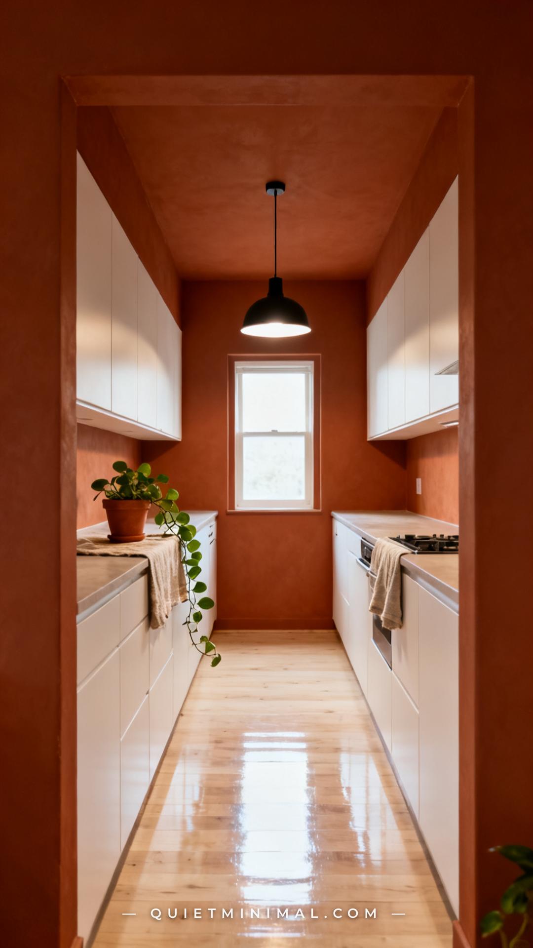
The most common reason people abandon the terracotta-kitchen idea is fear that it will make a small kitchen feel smaller. That fear is based on a real principle — dark colors can visually advance walls. But terracotta, specifically, is an exception.
Because terracotta is a mid-tone warm hue (not a true dark), it advances the wall without collapsing the space. In a galley or L-shaped kitchen, this actually makes the room feel more defined and purposeful. Pair it with pale flooring — blonde wood, light stone tile, or white grout — and the vertical walls feel taller because the floor reflects upward.
The mistake that does make a small kitchen feel cave-like: painting the ceiling terracotta too. Keep the ceiling white, and the room breathes. The color should stop at the top of the wall.
Key Takeaway: Pale flooring and a white ceiling neutralize any “too dark” effect that terracotta walls might create in a compact kitchen.
4. Hardware Finish Makes or Breaks the Look
 Save
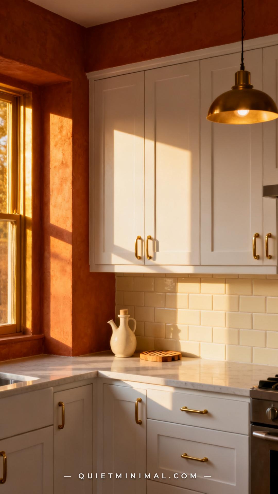
Hardware is the punctuation of a kitchen. In a terracotta-and-white kitchen, it plays an outsized role because there’s already a lot of color contrast happening on the walls and cabinets. The hardware either harmonizes or fights.
Three finishes work reliably with this pairing. Brushed brass is the warmest choice — it echoes the golden undertones in terracotta and makes the whole room feel intentional. Matte black creates the most graphic, contemporary contrast — it grounds the warm tones without competing. Unlacquered brass (a more aged, patinated gold) is the choice when the room is leaning rustic or Mediterranean.
Avoid polished chrome or nickel. These cool-toned metals flatten the warmth of terracotta. They read as an oversight, not a choice.
Key Takeaway: Brushed brass or matte black are the two hardware finishes that reliably work — pick based on whether you want the room to feel warmer or crisper.
5. Choose a Backsplash That Doesn’t Compete
 Save
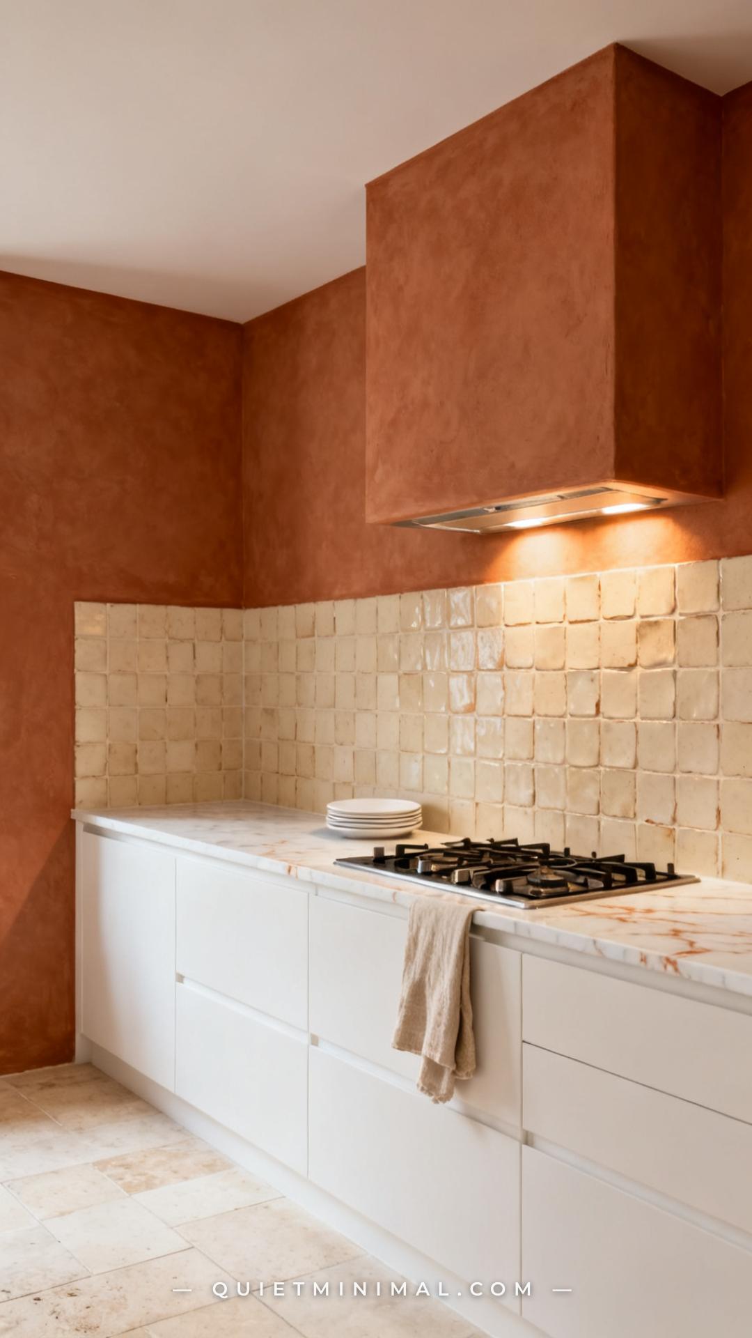
The backsplash sits at the intersection of the wall color and the cabinets, which makes it the most visually loaded surface in this pairing. The temptation is to make it a feature — to add pattern or contrast. Resist that impulse.
In a terracotta-and-white kitchen, the wall color is already the feature. The backsplash should support it, not compete. Cream, off-white, or ivory tiles — particularly handmade formats like zellige, subway, or linen-textured ceramics — let the terracotta read as the hero while keeping the lower cabinet zone feeling clean. Terracotta-toned tile on the backsplash can work, but only if the shade is slightly lighter than the wall, creating a gradient rather than a flat repeat of the same color.
Busy pattern tiles (Moroccan encaustic, bold geometric) will fight with both the wall color and the cabinetry. They work in a white kitchen. They don’t work here.
Key Takeaway: Cream or off-white tile in a simple format keeps the backsplash from competing with terracotta walls — the wall color is the star, the backsplash is the supporting cast.
6. How Lighting Changes Everything About Terracotta
 Save
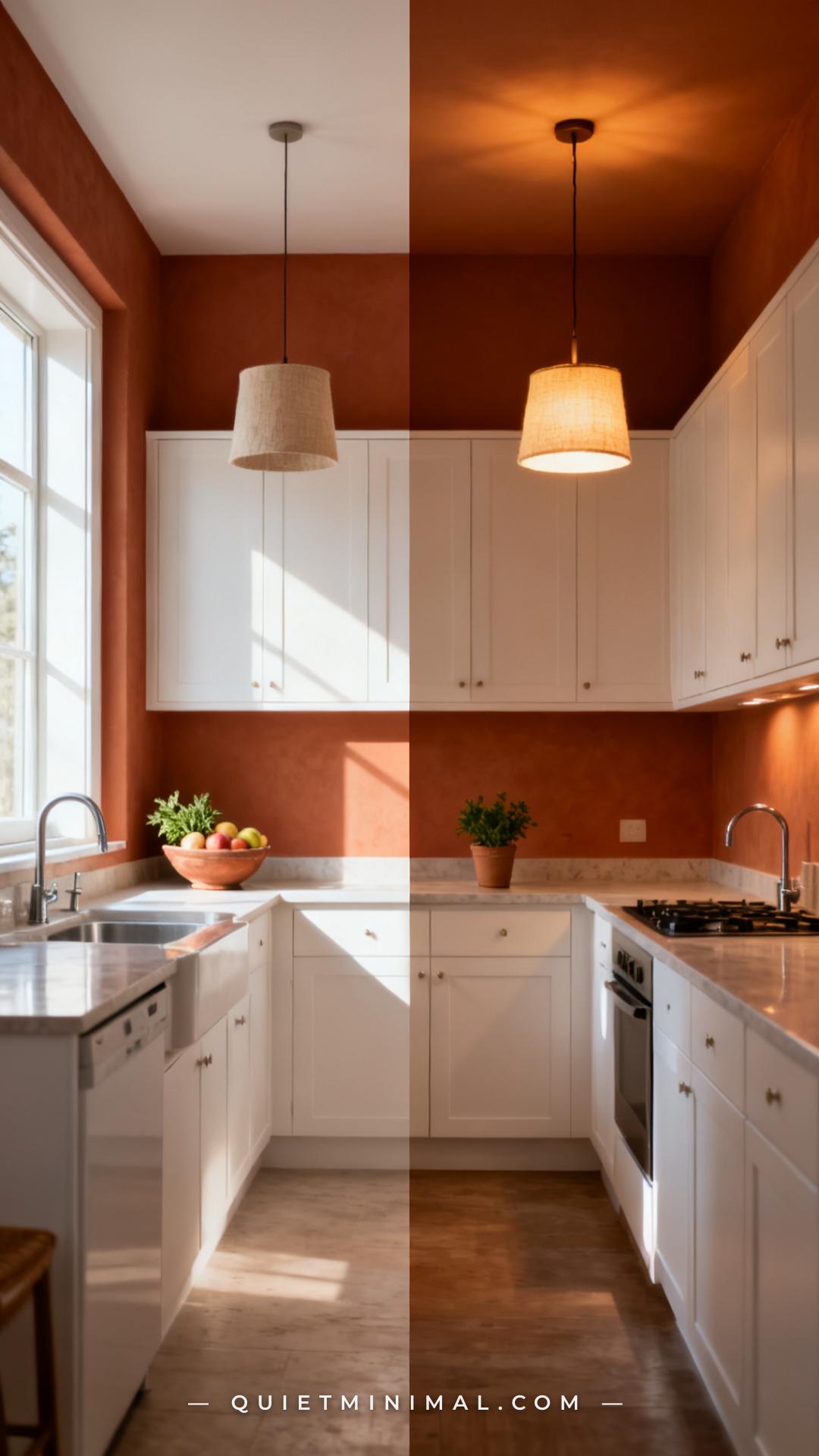
Terracotta is one of the most light-sensitive colors in the kitchen palette. It can look like a sophisticated, dusty clay in daylight and shift to an intense orange under warm incandescent light at night. This isn’t a flaw — it’s a behavior you need to plan around.
In a north-facing or low-light kitchen, terracotta walls will skew warmer and darker. In this case, choose a slightly lighter shade than you’d initially select, and use daylight-balanced LED bulbs (2700K–3000K) to maintain the color’s integrity after dark. In a south- or west-facing kitchen with strong natural light, terracotta looks its best — the sunlight activates its warmth without pushing it orange.
Under fluorescent or cool-white LED lighting, terracotta shifts toward muddy brown. If you have an older kitchen with fluorescent fixtures, replace them before committing to this wall color — the investment is worth it.
Key Takeaway: Use 2700K–3000K LED bulbs and plan your terracotta shade selection around your kitchen’s natural light direction, not just how it looks on a paint chip.
7. Open Shelving Creates a Natural Bridge
 Save
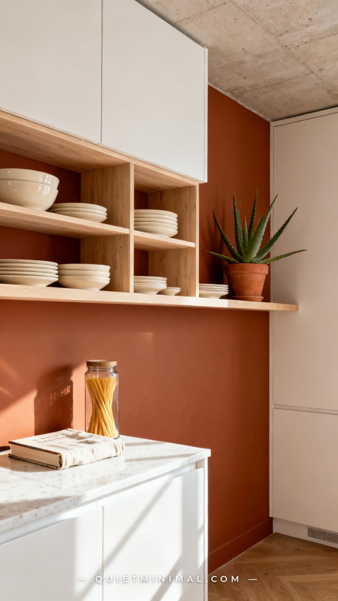
Open shelving in a terracotta kitchen isn’t just a storage decision — it’s a visual one. When you mount open wood or painted shelves against terracotta walls, the wall becomes the backdrop, and the shelves become a curated display frame. It’s one of the most effective ways to make the color feel intentional rather than overwhelming.
Pale or natural wood shelves work best here. The wood tone echoes the warmth of terracotta without competing. Floating white shelves also work and keep things cleaner if the room is already busy with color. What doesn’t work: dark stained shelves in a small terracotta kitchen — too much visual density in one zone.
Style the shelves with restraint. Cream ceramics, natural textures (woven baskets, linen napkins), and greenery. Avoid bright-colored dishware that introduces a third color family into an already layered palette.
Key Takeaway: Open shelving on terracotta walls works when the shelf material is warm-neutral and the styling stays within a cream-and-natural palette.
8. Flooring That Grounds the Room
 Save
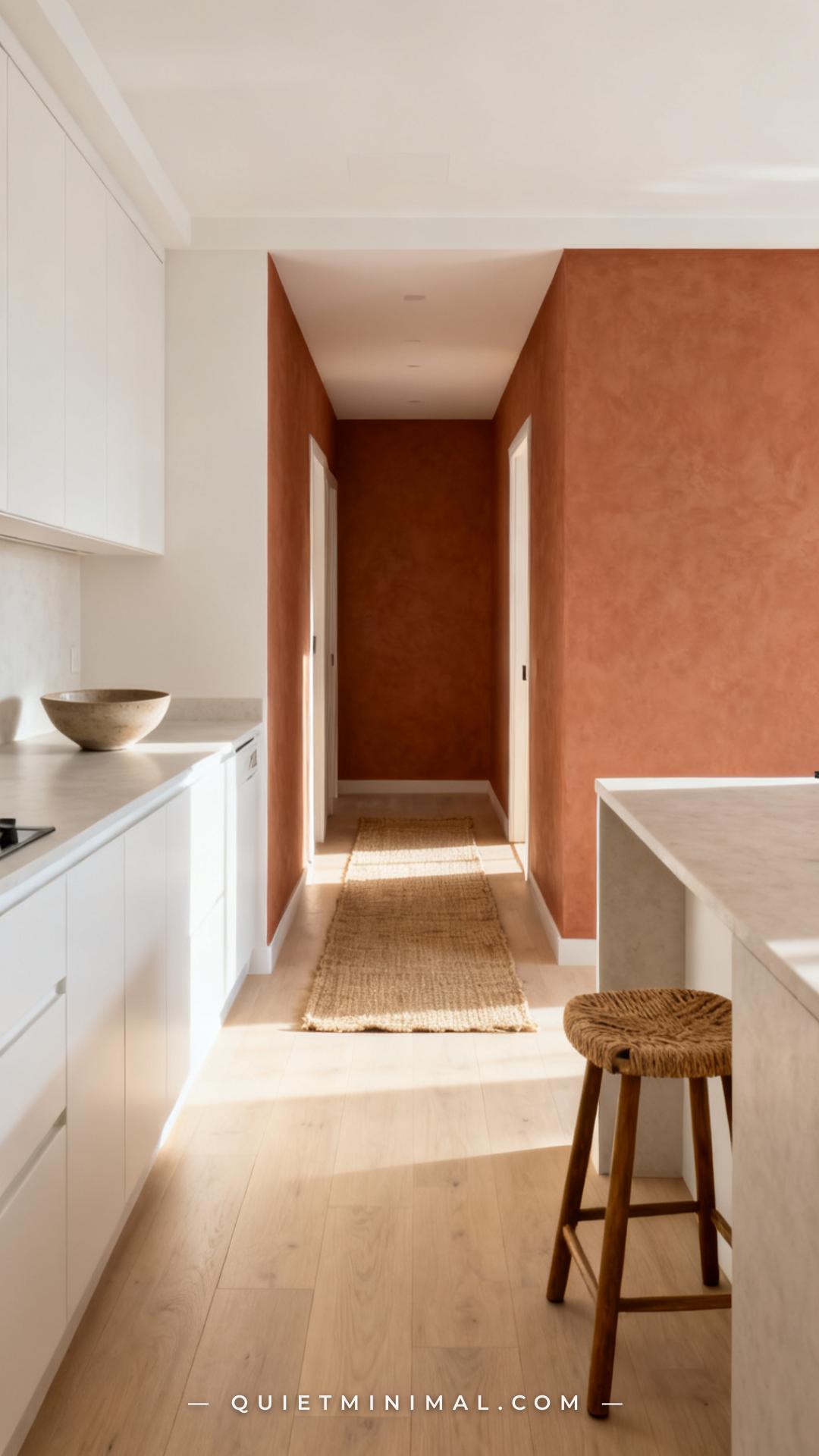
The floor is what keeps a terracotta kitchen from feeling top-heavy. When you have warm, medium-toned walls and white upper cabinets, the floor needs to provide a visual landing point that neither echoes nor clashes.
Pale blonde or natural wood flooring is the most reliable choice. It reflects upward, brightens the lower third of the room, and ties naturally into the warm palette without duplicating the terracotta tone. Light stone tile — travertine, cream limestone, or white subway-set hex — works equally well and skews slightly more modern.
Dark wood floors can work in a large, well-lit kitchen but become oppressive in compact spaces. They absorb light instead of reflecting it, and paired with terracotta walls, the room tips toward cave rather than cocoon. If you have existing dark floors, white or cream area rugs in the floor zone visually lighten the surface.
Key Takeaway: Pale floors reflect light upward and keep a terracotta-walled kitchen feeling open — this single choice counteracts the “too dark” risk more than any other.
From the guides
You've saved it, wanted it. Here's the how: codes, measurements, order. Your choices make it yours.
The Japandi Honest PlaybookThe honest version of the style: what to keep, what to skip, and the order to do it in.See inside →The Room Refresh PlaybookA repeatable four-step method, room by room, in ten minutes, thirty minutes, or one weekend.See inside →Make Any Room Feel Cozy on PurposeWhy some rooms hold people and others empty out, and the moves that change it.See inside →9. The Upper Wall Zone — Crown Molding and Ceiling Transition
 Save
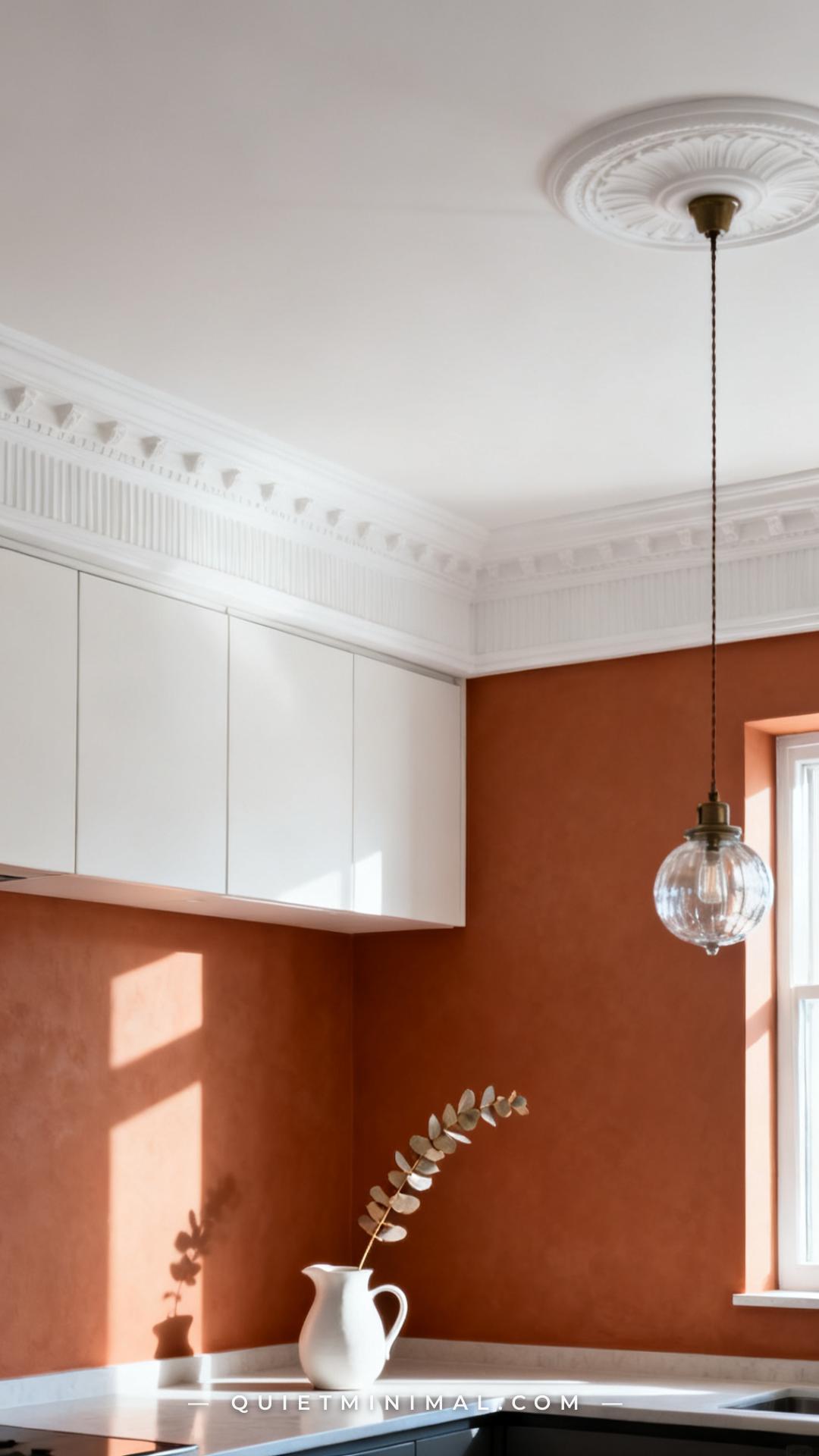
Where the terracotta wall meets the ceiling is the detail that separates a thought-through kitchen from a rushed paint job. Without a clean transition, the room can look like the tape ran out.
Crown molding in white creates a defined horizontal boundary that makes the ceiling height feel more deliberate. It also gives the eye a resting point between the warm wall and the white ceiling. In a kitchen without crown molding, a painted “ceiling line” — simply ending the wall color one inch below the ceiling line and carrying the white of the ceiling into that inch — creates the same visual effect with less investment.
A common mistake: letting the terracotta bleed into the soffit above upper cabinets. Paint soffits white, consistent with the ceiling, so the upper cabinet zone reads as part of the clean white framework.
Key Takeaway: A white crown molding or clean ceiling-to-wall break at the top of your terracotta walls gives the room a finished, intentional look — paint the soffit white, not terracotta.
10. Countertop Materials That Work With This Palette
 Save
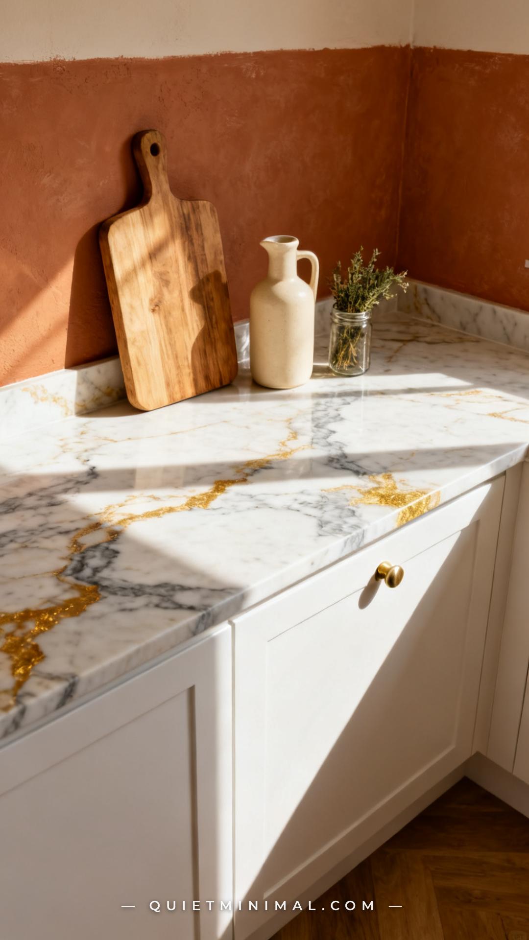
With terracotta walls and white cabinets, the countertop is the horizontal surface that either ties the palette together or introduces an awkward third element. The range of what works is actually fairly wide — but the logic matters.
White quartz with subtle warm veining (Calacatta-style or Arabescato) works because it continues the white-cabinet theme horizontally while the warm veining nods to the terracotta. Butcher block in a light maple or ash tone is the warmest, most rustic option — it ties directly into the terracotta palette. Cream or greige soapstone adds a sophisticated, matte texture that feels collected rather than designed.
What to avoid: cool grey concrete or slate countertops. They fight the warmth of the walls and make the room feel disconnected. Similarly, high-gloss black countertops with terracotta walls can work in very large, design-forward kitchens, but in the average residential kitchen they create too much visual tension.
Key Takeaway: Countertops in warm white, wood, or warm stone tie the terracotta-and-white palette together — grey or cool-tone surfaces create disconnection.
11. Plants and Greenery Do More Work Than You Think
 Save
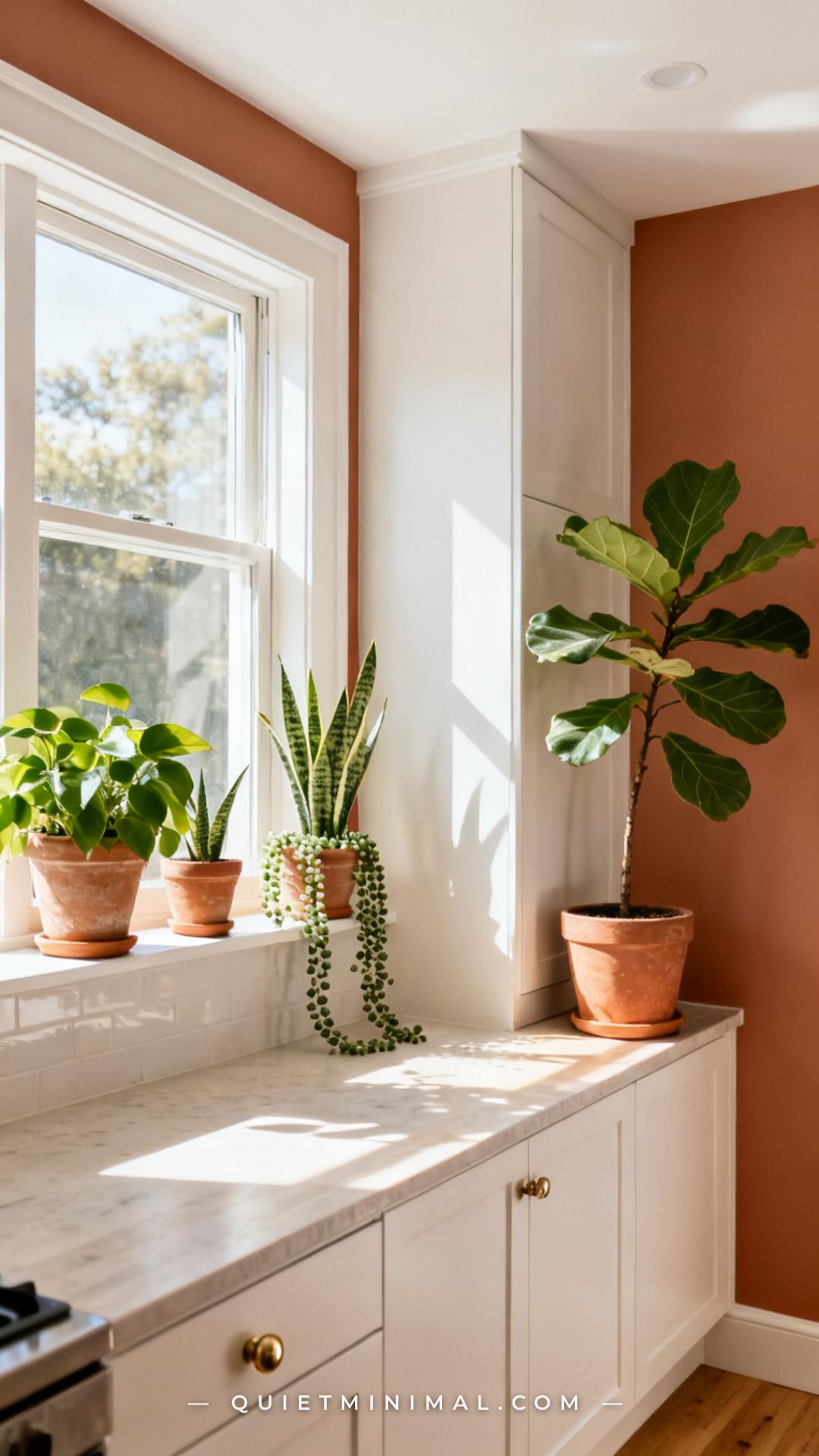
Greenery in a kitchen is often treated as decorative afterthought. In a terracotta-and-white kitchen, it’s a genuine design tool — and one that does work that no other element can.
Green sits opposite orange-red on the color wheel. That means plant greenery creates the highest natural contrast possible against terracotta walls, without introducing a manmade color. A single fiddle-leaf fig branch in a terracotta planter against a terracotta wall creates depth through texture variation. Trailing pothos on an open shelf against a terracotta backdrop adds movement.
The container matters as much as the plant. Terracotta pots on terracotta walls create a tone-on-tone effect that’s surprisingly sophisticated — the pot reads as an object rather than competing with the wall. White ceramic pots on terracotta walls create the same crisp contrast as the white cabinets. Avoid bright-colored pots (cobalt, yellow) which introduce colors the palette can’t absorb.
Key Takeaway: Green plants on terracotta walls create the most natural contrast in the room — use terracotta or white pots to keep the container in the existing palette.
12. Textiles That Complete the Look Without Overloading It
 Save
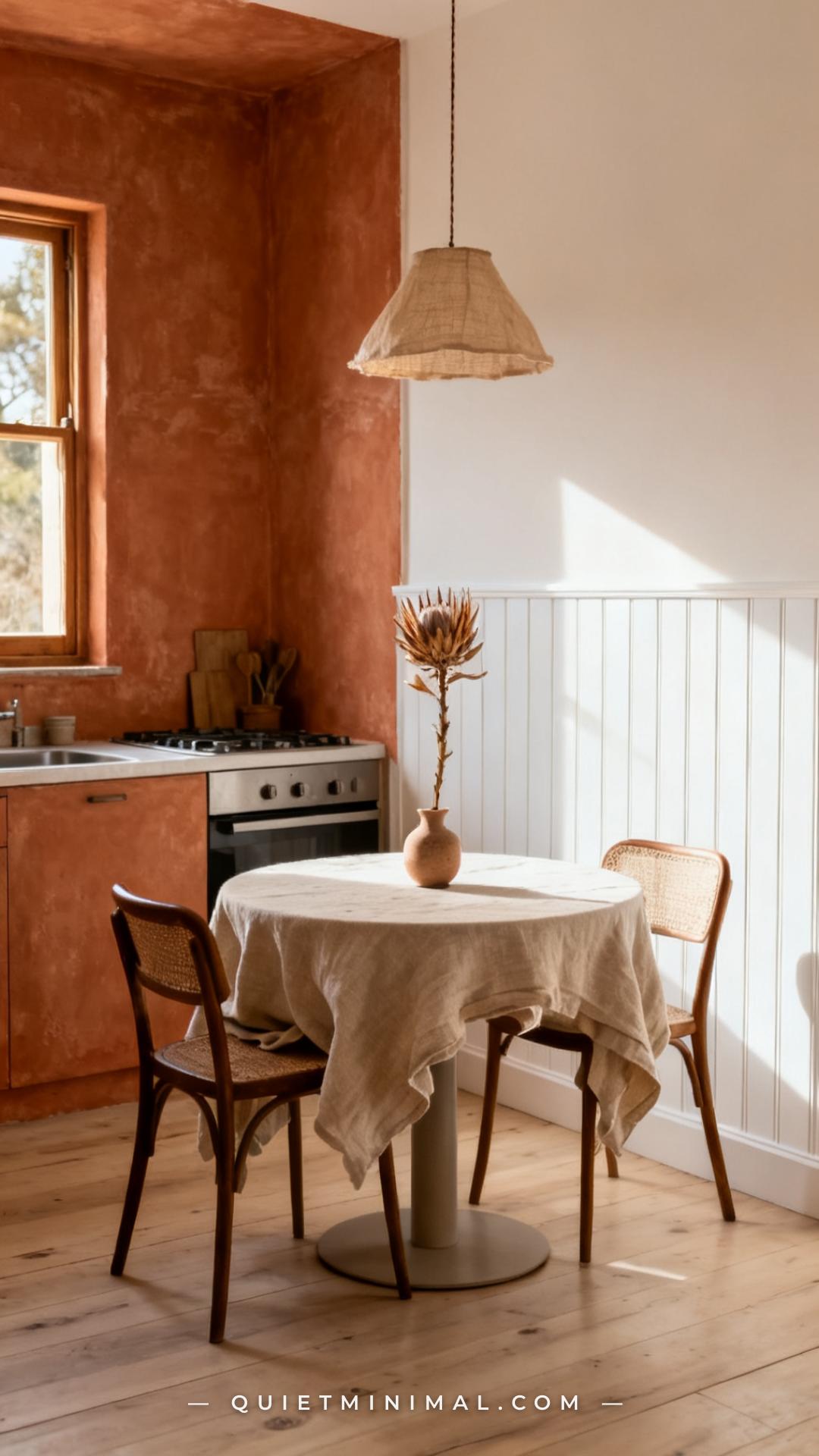
In a kitchen, textiles are the soft layer — dish towels, seat cushions, a rug, a cafe curtain — and in a terracotta palette they carry the final third of the visual story that paint and cabinetry start.
The palette that works here is narrow on purpose. Oatmeal, cream, natural linen, and pale warm grey are the textile tones that absorb into a terracotta-and-white kitchen without competing. Rust and burnt orange textiles can work as an accent, but use them sparingly — one item maximum or the room tips into monochrome.
Woven textures are particularly effective: a natural jute rug, a cotton-linen blend dish towel, a rattan seat cushion. The texture echoes the earthy, organic register of terracotta itself. Flat, glossy textiles (polyester, shiny cotton sateen) feel out of register with the warmth of the palette.
Key Takeaway: Stick to oatmeal, cream, and natural linen in your kitchen textiles — they support the warmth of terracotta without adding a competing color.
13. The Half-Wall Option for Renters and the Commitment-Averse
 Save
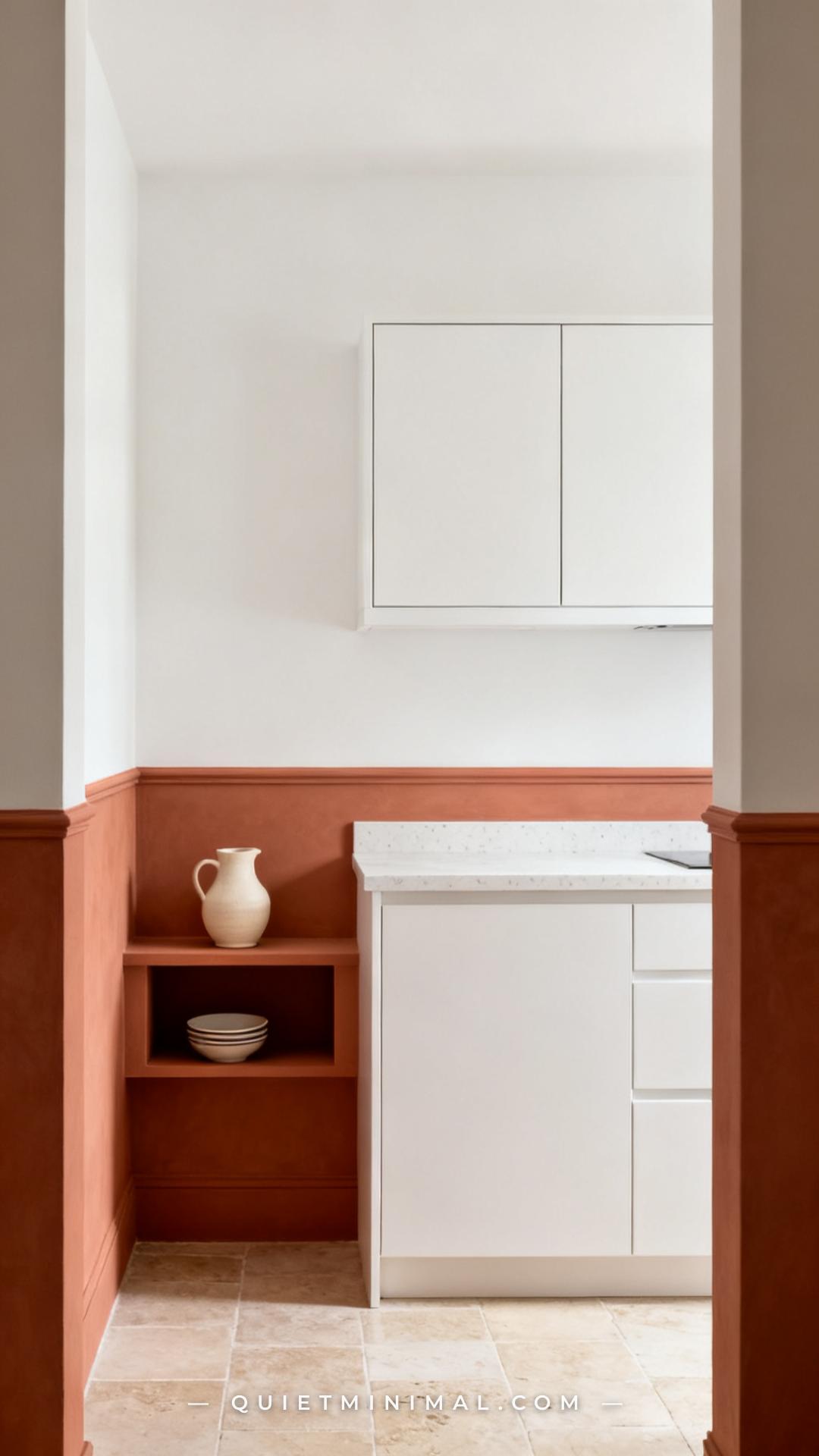
Full-room commitment to terracotta walls isn’t the only path. The half-wall approach — painting the lower half of the kitchen walls terracotta to chair-rail height, or treating a single accent wall — is the most practical entry point for renters, for people in smaller kitchens, or for anyone who wants to test the look before going all-in.
A terracotta lower wall with a white upper wall creates a horizontal division that actually makes the ceiling feel higher, not lower. The white upper zone bounces light; the terracotta lower zone anchors the room. With white upper and lower cabinets, the terracotta reads as a band of color that frames the whole kitchen rather than enveloping it.
Single-wall applications — the wall behind open shelving, or the wall opposite the window — work the same way. They introduce the warmth and the visual payoff without the full commitment, and they’re repaintable without repainting the entire room.
Key Takeaway: A terracotta lower wall or single accent wall gives you 80% of the visual impact of the full-room look with a fraction of the commitment and the cost.
14. Styling the Counter: What to Leave Out
 Save
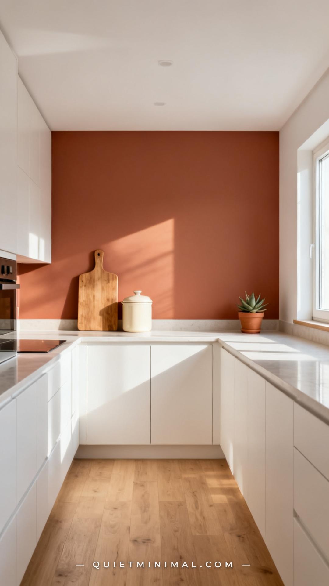
A terracotta kitchen has more visual warmth than a white kitchen, which means counter clutter reads more intensely. The rule is simple: style with restraint, edit aggressively.
The counter items that work in this palette are the ones that add texture without adding color: wooden cutting boards, cream ceramic canisters, linen dish towels folded flat, a single terracotta pot with greenery. Each item should justify its place on the counter by adding something the wall color doesn’t already provide — texture, material contrast, or a shape.
What to remove: bright small appliances in bold colors (red stand mixer, cobalt blue kettle), patterned dish towels with competing color families, and decorative items that were purchased for a white kitchen and haven’t been reassessed since. A terracotta kitchen deserves a fresh edit of what sits on the surface, not a carry-over from the previous palette.
Key Takeaway: Counter styling in a terracotta kitchen should be minimal and within the cream-wood-ceramic palette — each item earns its place by adding texture, not color.
The terracotta-and-white kitchen is one of those combinations that rewards specificity. The rooms that look effortless aren’t accidental — they’re the result of deliberate choices about undertones, hardware finish, flooring tone, and counter restraint. The rooms that fall flat usually missed one of those decisions, not the whole vision.
Start with a paint sample. Hold it next to your actual cabinet color in your actual kitchen light. That single test will tell you more than any inspiration gallery. If it sings, you have everything in this article to take it the rest of the way. Pick one section to act on this week — the hardware, the backsplash, the counter edit — and build from there.
From the guides
You've saved it, wanted it. Here's the how: codes, measurements, order. Your choices make it yours.
The Japandi Honest PlaybookThe honest version of the style: what to keep, what to skip, and the order to do it in.See inside →The Room Refresh PlaybookA repeatable four-step method, room by room, in ten minutes, thirty minutes, or one weekend.See inside →Make Any Room Feel Cozy on PurposeWhy some rooms hold people and others empty out, and the moves that change it.See inside → Save


