 Georgia
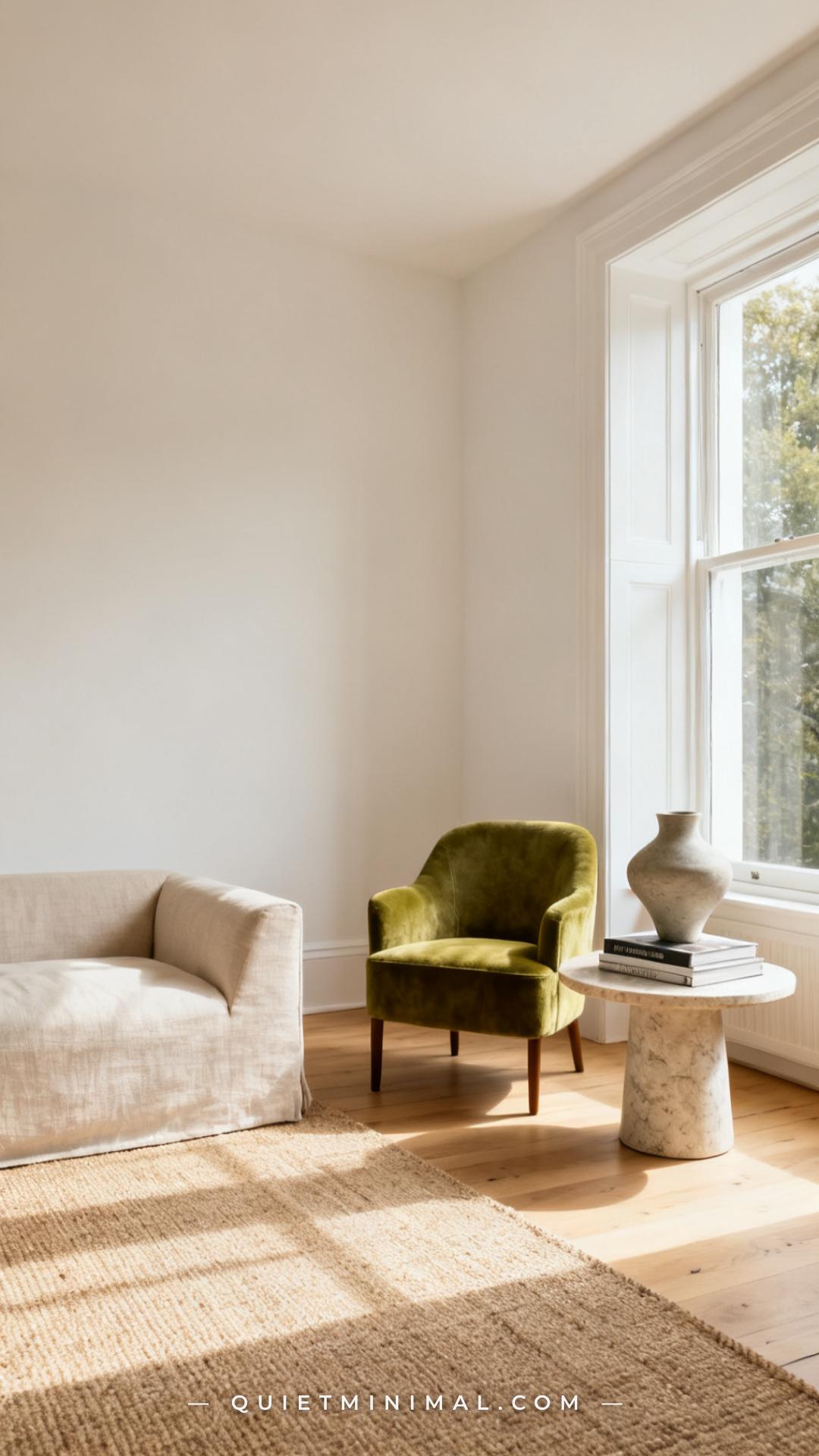
Wasabi green is having its moment — and it’s not hard to see why. This sharp, yellow-leaning green sits somewhere between chartreuse and olive, bright enough to make a room feel alive, grounded enough to avoid looking like a highlighter exploded on your walls. If sage green felt like a whisper, wasabi green is a confident, unhurried statement. The designers and color forecasters tracking 2025–2026 trends are naming yellow-greens as the next wave of botanical color, and wasabi is leading it.
But here’s the thing most roundup articles won’t tell you: placement matters enormously with this color. Put it in the wrong spot, against the wrong material, and it reads retro or acidic. Put it in the right spot — as an accent chair, a kitchen backsplash, a velvet pillow against warm linen — and the whole room sharpens into focus. This guide covers 25 specific ideas, room by room, with real advice on what to pair it with and where to stop.
1. Wasabi Green Velvet Accent Chair in the Living Room
 Save
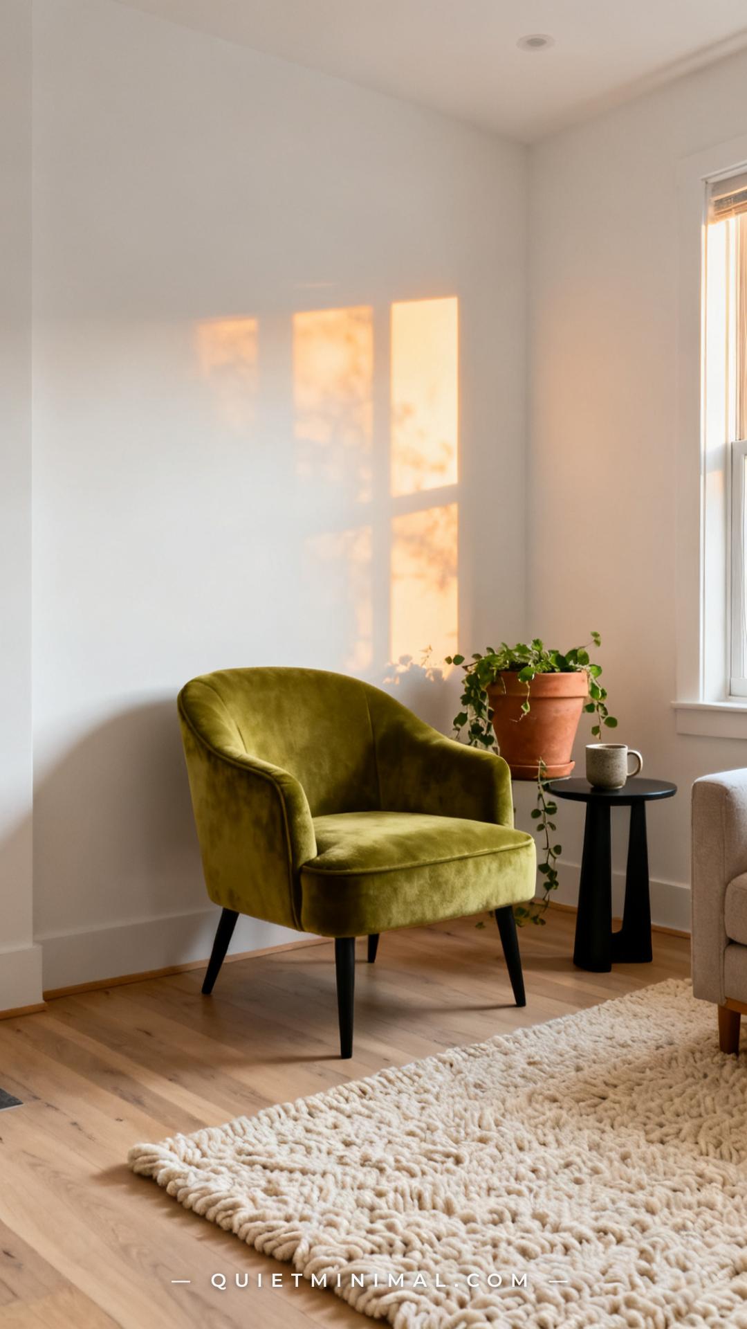
A wasabi green velvet accent chair is one of the safest entry points into this color because it’s a moveable commitment. Velvet amplifies the hue’s richness without making it feel flat — the way light shifts across the pile creates depth that keeps the green from reading as a single flat block of color. Pair it with warm white walls and pale wood floors, and the chair becomes a focal point without overwhelming the room.
From the guides
You've saved it, wanted it. Here's the how: codes, measurements, order. Your choices make it yours.
 The Japandi Honest PlaybookThe honest version of the style: what to keep, what to skip, and the order to do it in.See inside →
 The Room Refresh PlaybookA repeatable four-step method, room by room, in ten minutes, thirty minutes, or one weekend.See inside →
 Make Any Room Feel Cozy on PurposeWhy some rooms hold people and others empty out, and the moves that change it.See inside →
The material pairing is critical here. Velvet against linen or boucle softens the sharpness of wasabi. Against cool gray or stark white upholstery, the yellow-green can push into neon territory. Stay warm — cream, oatmeal, terracotta accents — and the chair settles into the room like it was always supposed to be there.
Key Takeaway: A wasabi green velvet accent chair reads sophisticated, not loud, when the surrounding palette stays warm and neutral.

2. Wasabi Green Kitchen Backsplash Tile
 Save
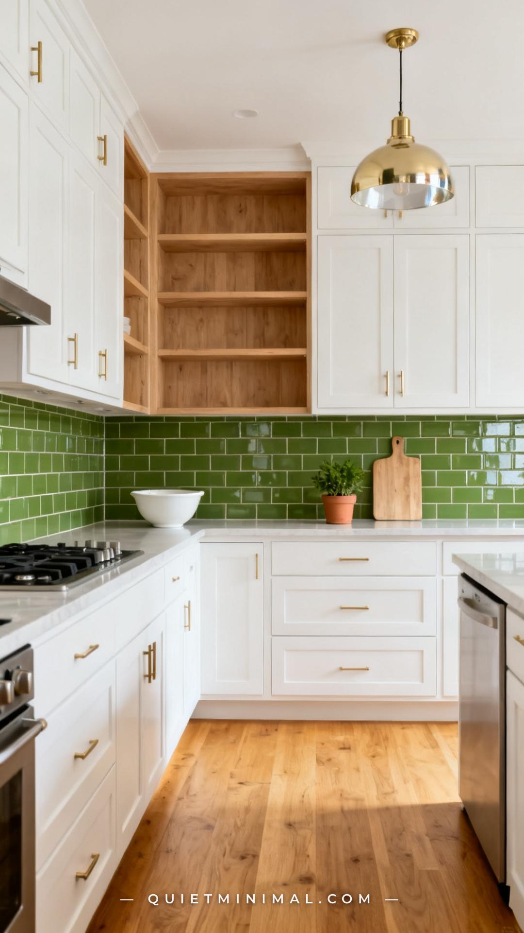
A wasabi green backsplash tile is one of the boldest moves on this list — and one of the most rewarding when it works. The key is the cabinet color. White or cream cabinets let the tile do its job without competition. Dark navy or forest green cabinets will muddy the contrast. The wasabi tiles need a light, neutral partner to pop properly.
Glossy tiles amplify the color’s energy and are easier to keep clean, which matters in a kitchen. Matte wasabi tiles work too, but they require excellent lighting — a dim kitchen will make them look murky. Pair with brushed brass hardware rather than chrome or nickel, which can cool the yellow-green into something that reads more acidic.
Key Takeaway: Wasabi backsplash tile earns its place when the cabinets are light and the hardware stays warm — brushed brass is the non-negotiable pairing.

3. Wasabi Green Linen Throw Pillows on a Neutral Sofa
 Save
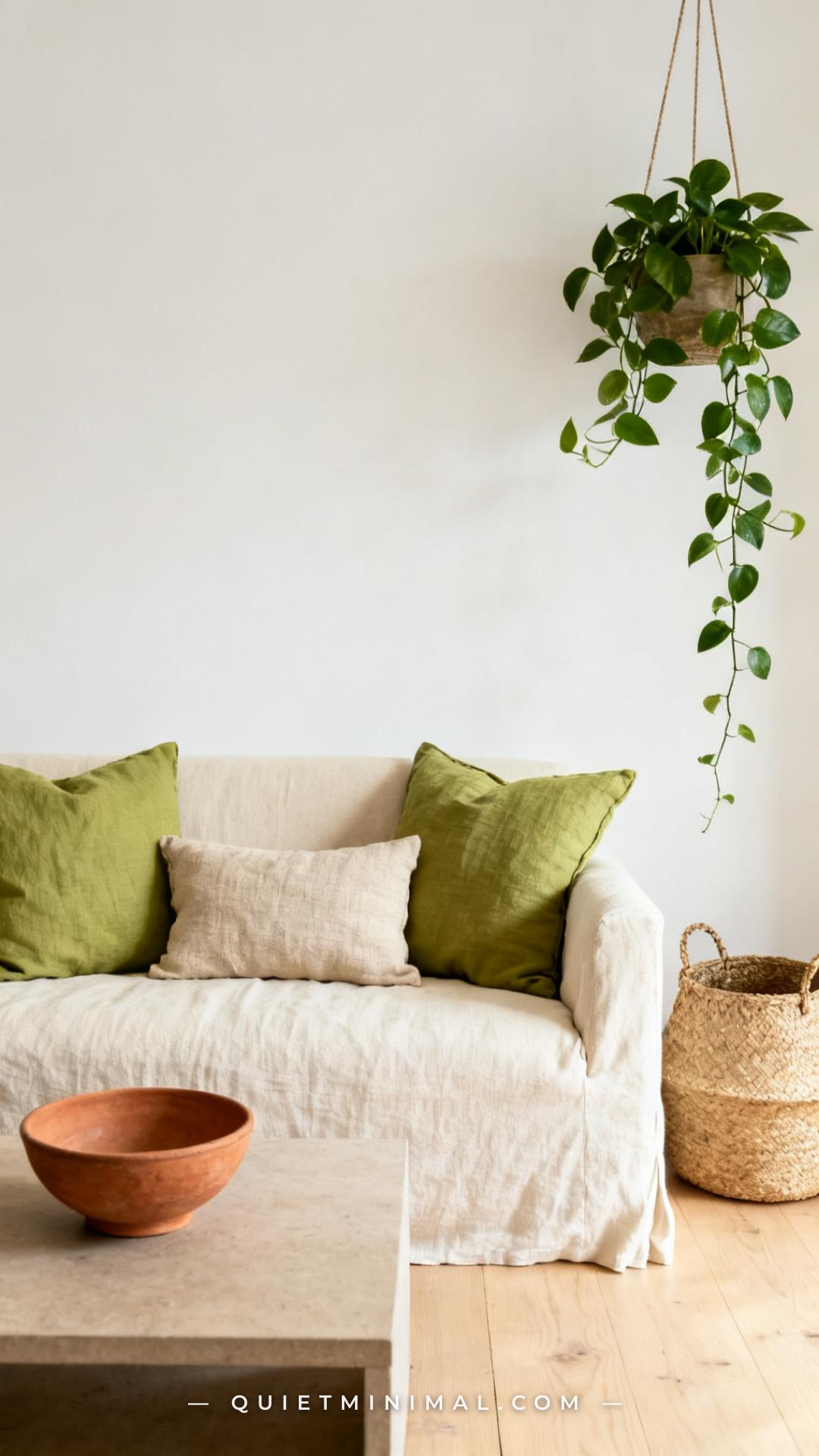
Throw pillows are the lowest-commitment version of any color experiment, and wasabi green in a linen or cotton fabric is an ideal starting point. On a cream or oatmeal sofa, two wasabi pillows create a color story without taking over the room. The texture matters: a flat, polyester pillow in this green will look cheap. Choose linen, cotton slub, or velvet for the right amount of dimension.
The proportion rule to follow here: wasabi pillows work best as accents flanking a neutral lumbar or a textured natural-fiber pillow. An all-wasabi pillow arrangement can tip into themed rather than curated. Let one or two wasabi pieces anchor the arrangement and fill the rest with warm neutrals — cream, sand, oatmeal.
Key Takeaway: Two wasabi linen pillows flanking a neutral lumbar is the proportion formula that reads curated, not themed.

4. Wasabi Green Painted Bedroom Accent Wall
 Save
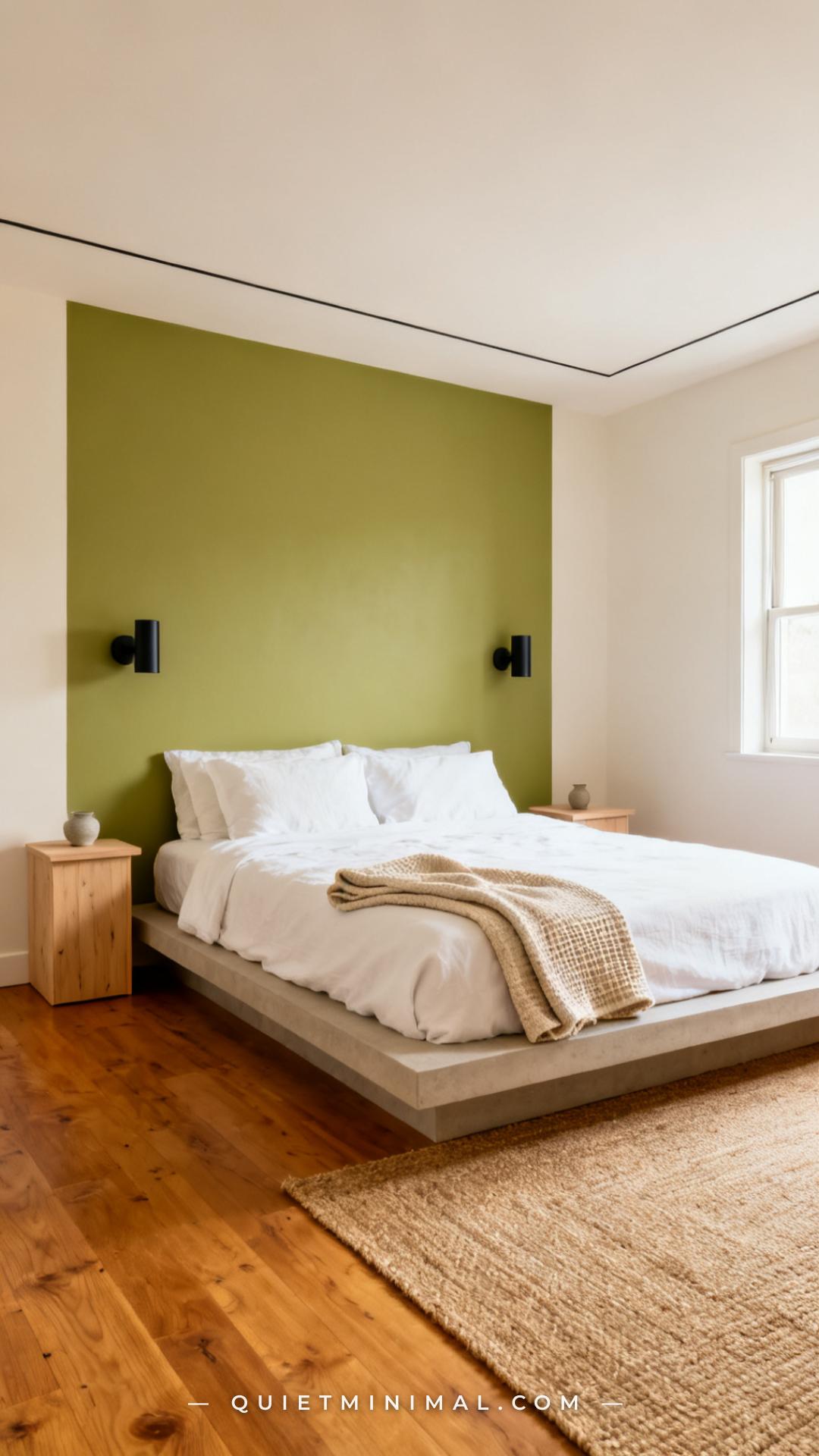
A painted accent wall in wasabi green can completely reorient a bedroom’s energy without a full commitment to four green walls. The wall behind the bed is the natural choice — it frames the headboard like a piece of art and gives the bedding something to contrast against. White or ivory bedding is the correct pairing. Wasabi against gray bedding reads cold; against navy it fights. Stay light and warm on the textiles.
For paint, Sherwin-Williams “Lemondrop” (SW 6914) is a verified wasabi-adjacent yellow-green, and Behr “Pickle” (M360-6) lands in the same family. Test the chip in your specific room lighting before committing — wasabi green shifts dramatically under warm incandescent light (it reads more golden) versus cool daylight (it sharpens into true yellow-green). Both readings can be beautiful, but they’re different rooms.
Key Takeaway: Paint the wall behind the bed, dress the bed in white linen, and choose warm-toned lighting to pull the golden notes from the paint rather than the acid notes.

5. Wasabi Green Ceramic Vases and Vessels
 Save
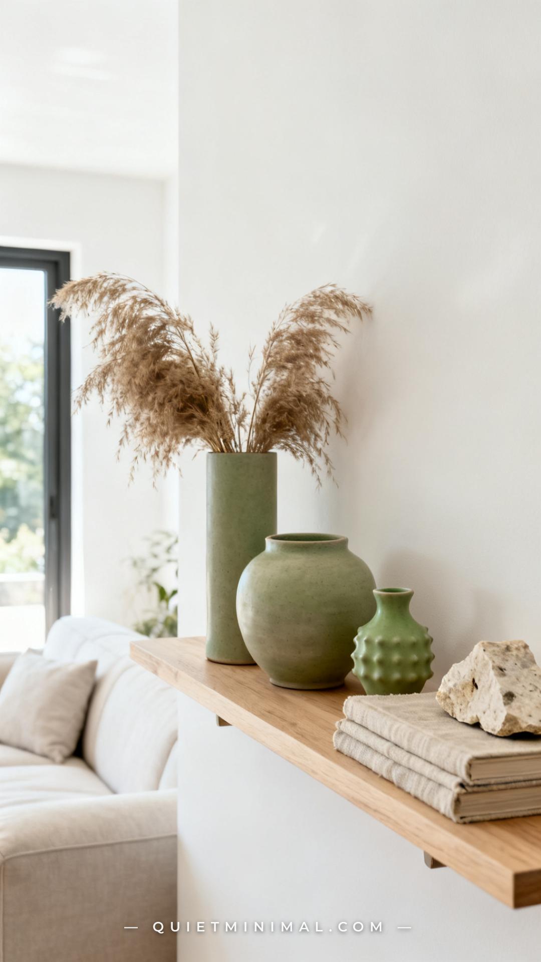
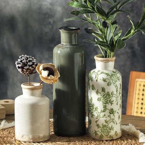
Ceramic vessels in wasabi green are one of the most versatile styling tools in this palette. They work on open shelving, on dining tables as centerpieces, on bedroom nightstands, and grouped on a console table in an entryway. The irregularity of handmade or artisan ceramics softens the sharpness of the color — a perfectly smooth machine-made vessel in wasabi can look clinical, while a slightly textured, hand-thrown pot looks collected and intentional.
Group them in odd numbers and vary the heights. Three wasabi vessels of different sizes create more visual interest than a matching set. Mix a matte finish with a semi-gloss finish within the group for texture variation. Pair with dried botanicals — pampas grass, dried eucalyptus, or lunaria — rather than fresh flowers, which can compete with the color.
Key Takeaway: Group three wasabi ceramic vessels at varying heights with one matte and one semi-gloss finish for a shelf arrangement that looks deliberately collected.
6. Wasabi Green Kitchen Cabinets on the Island Only
 Save
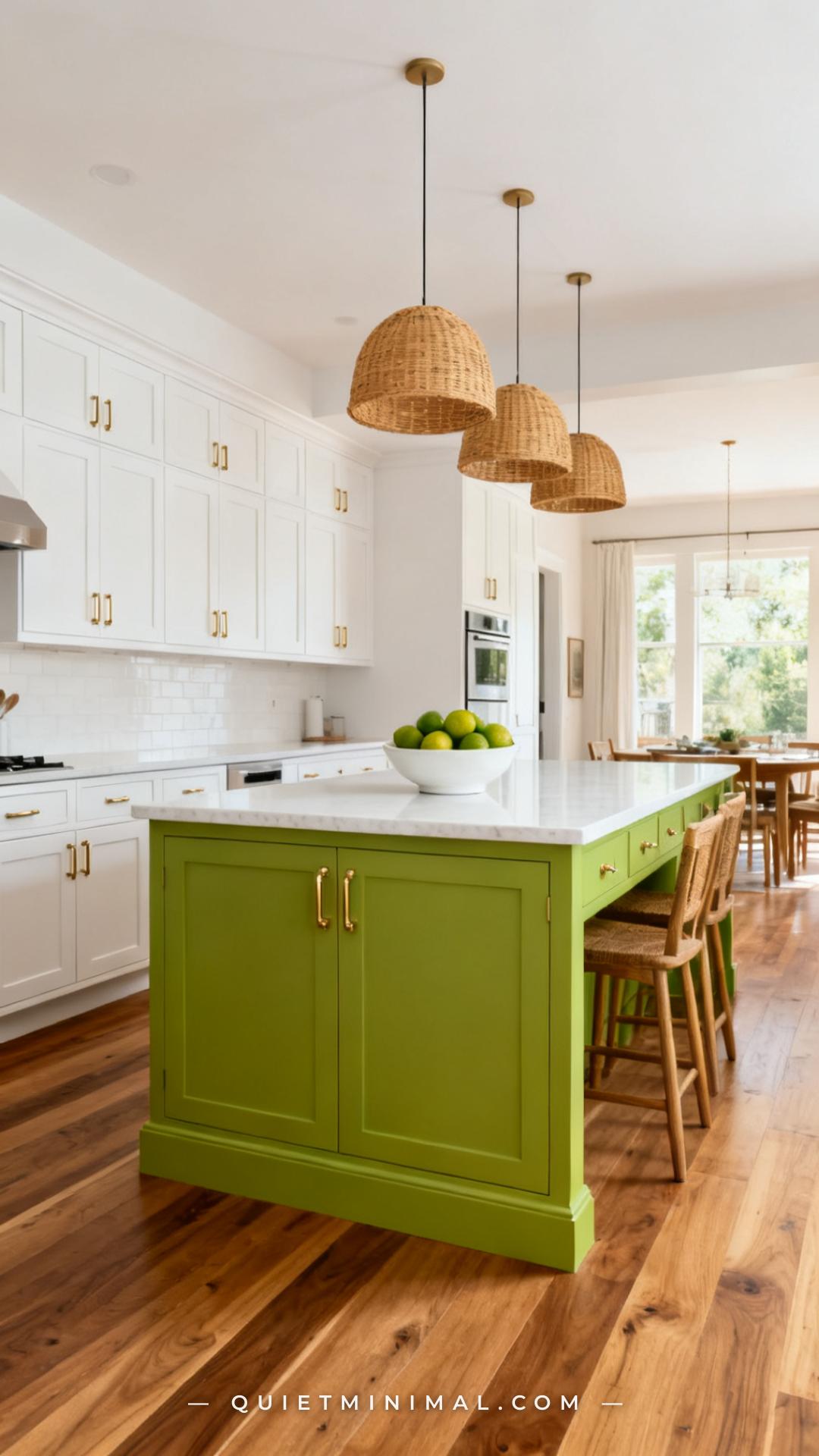
Painting only the island in wasabi green while keeping the perimeter cabinets white is a designer-level move that gives you all the drama of a bold kitchen without the claustrophobia of four green cabinet walls. The island becomes a piece of furniture rather than just cabinetry — it anchors the kitchen the way a statement sofa anchors a living room.
The countertop choice matters enormously here. White quartz or white marble keeps the palette clean and lets the green be the story. A dark countertop on a wasabi island can feel heavy and dated within a few years. Keep the countertop light, keep the hardware warm (brushed brass, not chrome), and the island holds its own without tipping into novelty.
Key Takeaway: A wasabi-painted island with a white quartz top and brushed brass pulls is a timeless move; the same island with dark stone and silver hardware dates quickly.

7. Wasabi Green Velvet Curtain Panels in the Living Room
 Save
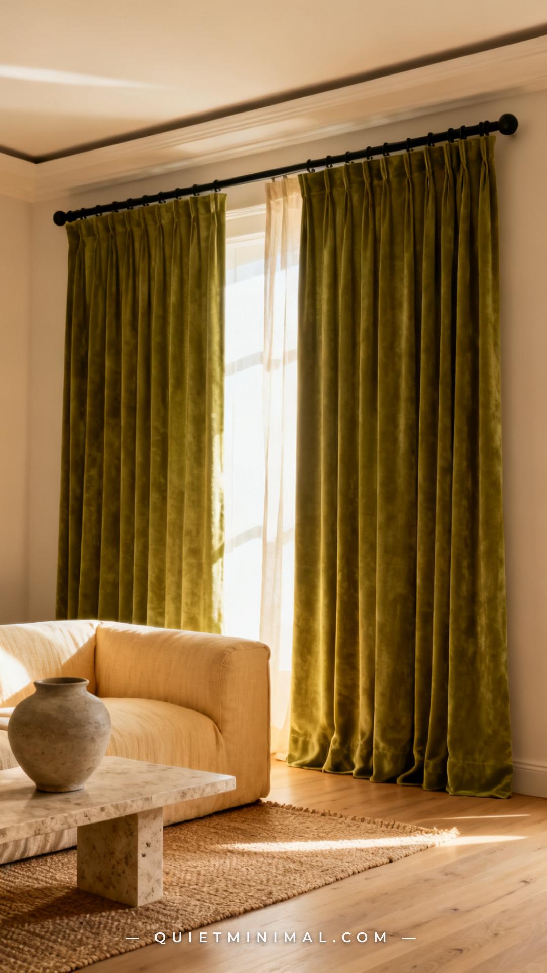
Floor-to-ceiling wasabi velvet curtains are one of the most impactful ways to bring this color into a room because they cover a large vertical surface — you feel the color rather than just noticing it. The velvet pile catches light as the panels move, so the green shifts between deep forest tones and bright yellow-green throughout the day. This is a feature, not a problem.
The rod placement rule: mount the rod as close to the ceiling as possible, and let the panels be at least a few inches longer than the window so they pool slightly on the floor. This lengthens the visual perception of the room’s height dramatically. Against cream walls and pale wood floors, wasabi velvet curtains read as luxurious rather than overwhelming.
Key Takeaway: Mount the rod at ceiling height, let the wasabi velvet panels pool slightly, and the color reads as rich and architectural rather than bold for boldness’s sake.

8. Wasabi Green Dining Chairs Around a Natural Wood Table
 Save
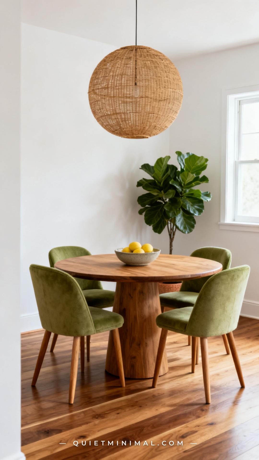
Wasabi green dining chairs paired with a natural wood table is one of the cleanest material combinations in this palette. The raw warmth of the wood neutralizes the sharpness of the yellow-green, and the result is a dining room that feels lively and welcoming rather than edgy. Oak, walnut, and rattan all work — avoid dark espresso finishes, which cool the palette and make the green feel harsher.
If four wasabi chairs feels like too much, start with two host chairs at either end of a rectangular table and leave the side chairs in a neutral — cream, oat, or a natural linen. This gives you the color hit without full commitment and is actually a more dynamic arrangement because it breaks the visual monotony of matching sets.
Key Takeaway: Two wasabi host chairs at each end of a natural wood table is a lower-commitment version that reads more intentional than a matching set of four.

9. Wasabi Green Bedding and Duvet Cover
 Save
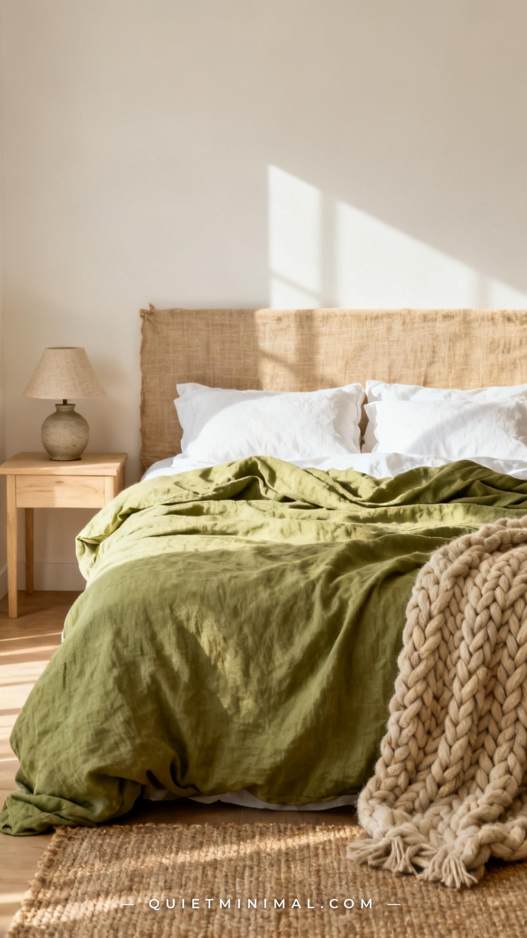
A wasabi green linen duvet is a high-impact move for the bedroom because the bed is the room’s largest horizontal surface. In linen, the color softens considerably — the slightly nubby texture of linen diffuses the yellow-green into something that reads more botanical than acidic. Pair with white cotton pillowcases rather than matching wasabi cases. All-wasabi bedding can feel like a color-block exercise; the white breaks it and makes the green feel intentional.
The supporting palette for the rest of the room should stay warm and restrained: natural oak wood tones, linen curtains in cream or oat, a jute or wool rug. A wasabi duvet in a room full of cool grays and chrome will fight. In a room full of warm neutrals and raw materials, it anchors the space with exactly the right amount of energy.
Key Takeaway: Wasabi linen duvet with white cotton pillowcases is the combination — all-wasabi bedding tips over into overwhelming, and the white breaks it beautifully.

10. Wasabi Green Painted Front Door
 Save
The front door is the single best place to try a bold paint color because it’s a small, contained surface with an obvious visual purpose. A wasabi green front door against white siding is a combination that has been showing up on design sites and neighborhood walks since 2024 — it’s fresh, but not eccentric. The color reads as intentional rather than accidental because the contrast with white trim is so clean.
From the guides
You've saved it, wanted it. Here's the how: codes, measurements, order. Your choices make it yours.
The Japandi Honest PlaybookThe honest version of the style: what to keep, what to skip, and the order to do it in.See inside →The Room Refresh PlaybookA repeatable four-step method, room by room, in ten minutes, thirty minutes, or one weekend.See inside →Make Any Room Feel Cozy on PurposeWhy some rooms hold people and others empty out, and the moves that change it.See inside →Hardware matters on a front door more than almost anywhere else in the house because it’s so visible. Matte black is the right call with wasabi green — it adds a graphic quality that sharpens the look. Brushed brass also works and reads warmer. Chrome or nickel hardware softens the impact and is the less interesting choice. Frame the door with terracotta planters rather than white ones — the warm clay tone bridges the gap between the green and the white siding beautifully.
Key Takeaway: A wasabi green front door with matte black hardware and terracotta planters on either side is the complete exterior formula — don’t swap any element without testing the combination first.

11. Wasabi Green Open Kitchen Shelving Accents
 Save
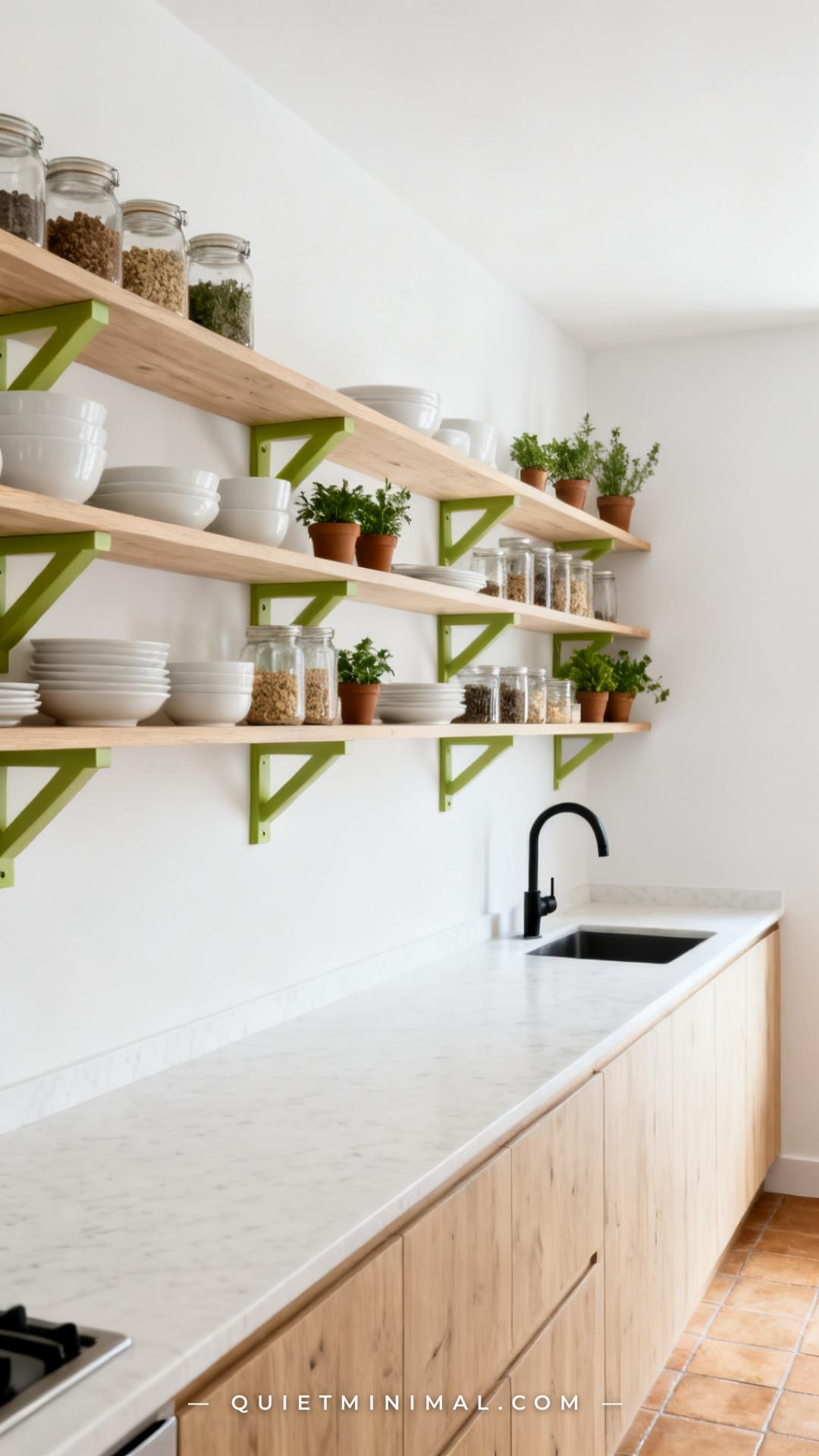
Open kitchen shelving with wasabi green brackets or painted shelf faces is a more restrained application of the color — it integrates the green into the architecture of the kitchen rather than putting it on a surface that dominates. The result is a color accent that feels designed rather than decorative. This works particularly well in kitchens where the walls are white and the cabinetry is either white or wood-toned — the wasabi shelf detail pulls the room forward.
Keep the items on the shelves neutral: white ceramics, clear glass, natural wood cutting boards. Colorful dishes or patterned items compete with the wasabi bracket color and make the shelves feel cluttered. The green is the accent; the shelf contents should be simple.
Key Takeaway: Wasabi shelf brackets on white walls with all-white ceramics above is a graphic, architectural approach that reads more intentional than stacked green accent pieces.

12. Wasabi Green Bathroom Vanity
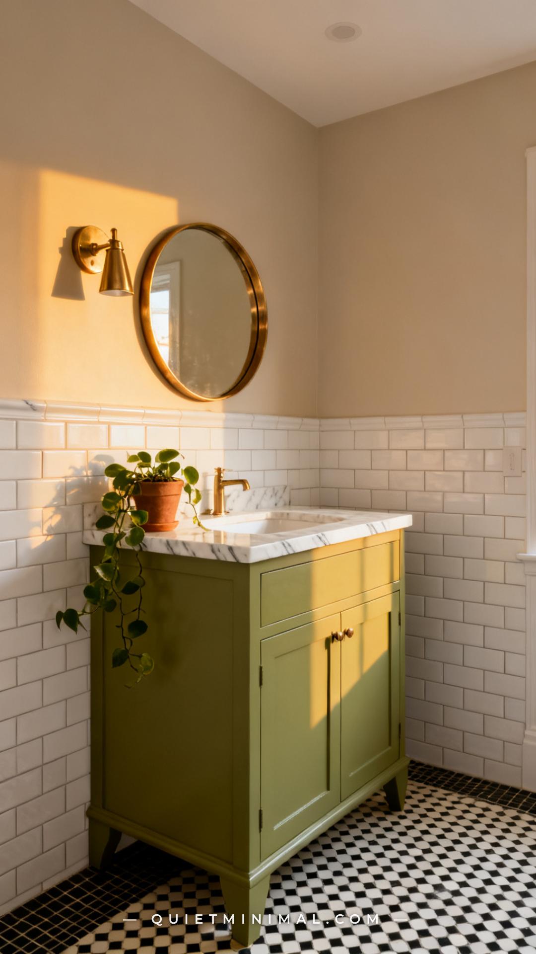 Save
A wasabi green bathroom vanity is a contained, high-impact choice that works especially well in a powder room — a small space where a bold color decision is expected, even celebrated. The small footprint of a powder room means the wasabi vanity becomes the entire point of the room, which is exactly the right approach. In a full bathroom, keep the vanity as the only colored element and let the walls, tile, and fixtures stay white or neutral.
The countertop material choice is critical: white marble or white quartz keeps the palette sophisticated. A butcher block top on a wasabi vanity veers into farmhouse-retro territory that can feel dated. The mirror shape matters too — a round mirror in unlacquered brass or warm gold softens the angularity of the green and makes the vanity feel more like a furniture piece than a fixture.
Key Takeaway: Wasabi vanity, white marble top, round brass mirror — this is the three-element formula that moves the bathroom from bold to beautiful.

13. Wasabi Green Woven Baskets and Storage Accents
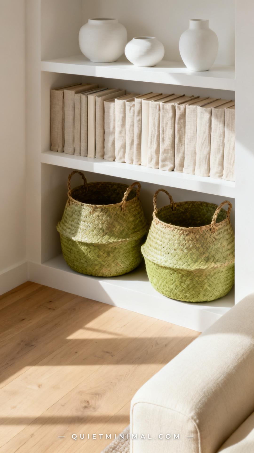 Save
Woven baskets are an underused vehicle for wasabi green in living rooms and bedrooms. The weave texture diffuses the intensity of the yellow-green considerably, so a woven wasabi basket reads as earthy and artisan rather than bright. They sit beautifully on lower shelves, under coffee tables, and in bedroom corners for blanket or toy storage. The organic material acts as a visual bridge between the botanical color and the natural materials elsewhere in the room.
Look for baskets woven from seagrass, water hyacinth, or jute — the natural fibers that are sometimes dyed in yellow-green tones. The dye process on natural fibers tends to produce a slightly muted, sun-washed version of the intended color, which works in favor of wasabi specifically. The slightly faded quality keeps it from reading as neon.
Key Takeaway: A woven wasabi basket reads earthy and intentional because the texture naturally mutes the yellow-green — it’s the gentlest way to introduce this color into storage furniture.

14. Wasabi Green Painted Fireplace Surround
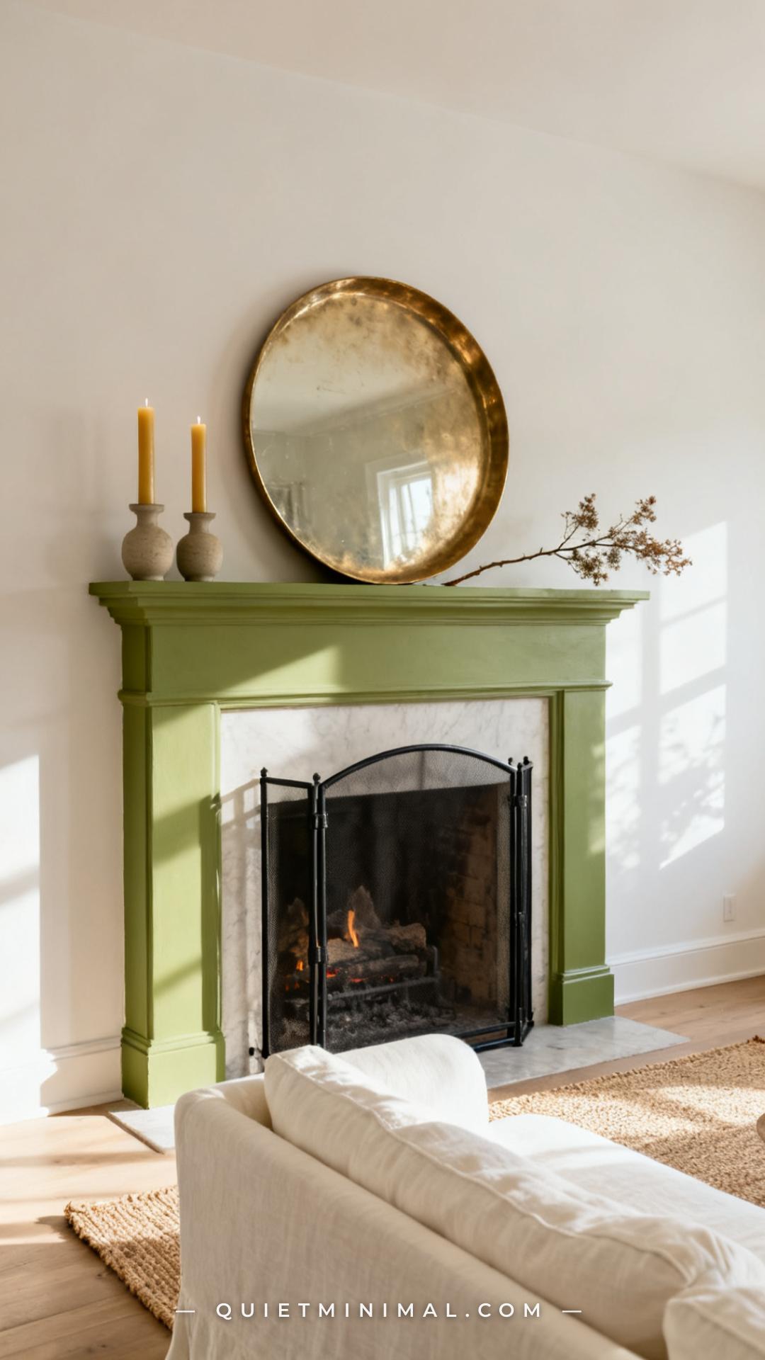 Save
Painting a fireplace surround in wasabi green treats the fireplace the way it should always be treated: as a piece of furniture. The color anchors the wall, gives the mantel a visual reason to exist even when no fire is burning, and turns the entire fireplace zone into a design moment. This works particularly well in living rooms where the walls are already a warm neutral — the wasabi surround doesn’t need to compete with anything else.
Keep the mantel styling extremely spare. A wasabi surround already carries visual weight, so a crowded mantelpiece reads chaotic. One or two sculptural objects, a round mirror, and perhaps one dried botanical arrangement is enough. Symmetry is optional — a single large object centered on the mantel is often more graphic and intentional than a symmetrical pair.
Key Takeaway: A wasabi fireplace surround only needs one or two objects on the mantel — the color does the heavy lifting and a cluttered mantel fights it.
15. Wasabi Green Linen Curtains in the Bedroom
 Save
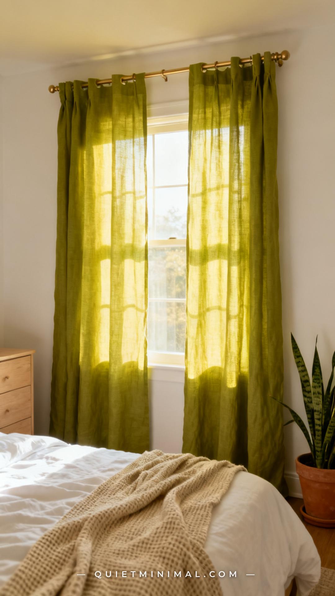
Linen curtains in wasabi green filter daylight into a warm, green-tinted glow that makes a bedroom feel like it’s surrounded by leaves. This is one of the most atmospheric applications of the color — the effect is most noticeable in east or south-facing rooms that receive strong direct light. The curtains themselves are subtle during low-light hours and dramatic in full afternoon sun.
Linen’s slightly translucent weave is part of the effect — a fully blackout curtain in wasabi green simply blocks the light rather than transforming it. If you need light control for sleeping, pair the wasabi linen curtains with a simple white roller blind behind them. The linen layer provides the color and the aesthetic; the roller blind handles the blackout function.
Key Takeaway: Wasabi linen curtains work as light filters, not blackout panels — layer them over a white roller blind if you need room darkening.

16. Wasabi Green Accent in the Home Office
The home office is an underrated room for a bold color moment. A wasabi green accent wall behind the desk is an excellent use of the color because it adds energy and focus — qualities that are useful in a work environment — without affecting the feel of the rest of the house. If you’re on video calls frequently, wasabi behind you reads as a deliberate design choice rather than a distraction; it’s more interesting than a blank white wall and more intentional than a gallery wall.
Balance the wall with pale, light-reflective materials elsewhere in the room: a blonde wood desk, a white or cream chair, a warm neutral rug. The goal is for the wasabi wall to provide the energy and let everything else recede. A desk cluttered with objects and a wasabi wall compete; a clean, minimal desk against wasabi green is a graphic combination worth working toward.
Key Takeaway: Wasabi behind the desk in a home office adds focus and energy — keep the desk surface minimal so the wall, not the clutter, is the visual anchor.

17. Wasabi Green Candles and Small Tabletop Accents
Candles are the smallest-scale version of a wasabi green accent, and they are completely reversible — if the color doesn’t work in a room, you burn them down and buy something else next season. A group of wasabi green pillar candles on a dining table or a coffee table introduces the color at eye level in the most approachable possible way. The flame adds a warm light that actually softens the yellow-green and makes it read more organic.
Group them in odd numbers (three or five) on a raw concrete tray, a slate slab, or a piece of natural wood. Avoid white or glass trays — they make the arrangement feel more like a spa display than a home decor moment. Pair with dried botanicals or small amounts of dried citrus peel to lean into the botanical, almost-edible quality of the wasabi color.
Key Takeaway: Three wasabi pillar candles on a raw concrete or slate tray is the simplest way to test the color in any room before committing to furniture or paint.
From the guides
You've saved it, wanted it. Here's the how: codes, measurements, order. Your choices make it yours.
The Japandi Honest PlaybookThe honest version of the style: what to keep, what to skip, and the order to do it in.See inside →The Room Refresh PlaybookA repeatable four-step method, room by room, in ten minutes, thirty minutes, or one weekend.See inside →Make Any Room Feel Cozy on PurposeWhy some rooms hold people and others empty out, and the moves that change it.See inside →


More for Your Ideas


Save your favorite
More pins for this article