 Georgia
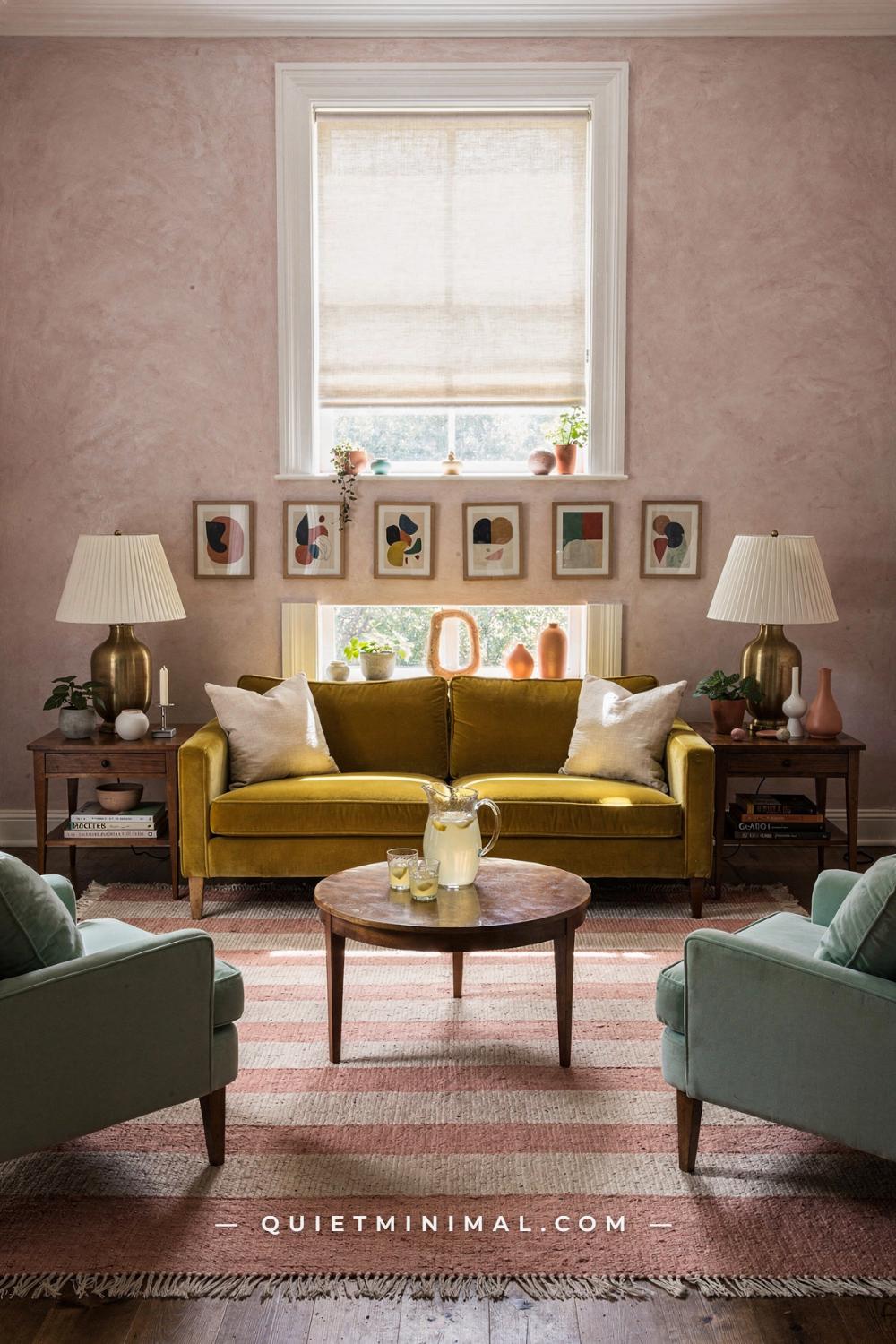
You have seen the rooms: a mustard sofa centered under a perfectly hung row of frames, pink walls, a mint sideboard, everything arranged as if someone had measured it with a ruler and then loved it anyway. Wes Anderson living room ideas are some of the most saved on Pinterest, and they are also some of the hardest to copy, because the look depends on order as much as on color.
Most guides hand you a mood board and wish you luck. This one gives you a sequence. Each section below is one stage, in the order a decorator would work: choose the anchor color, commit the walls, decide where the light comes from, add the counter-color, paint a vintage piece, then build up symmetry, pattern, collections and trim. Each stage ends with a definition of done, so you can stop at any point and still have a finished-looking room.
You do not need to do all twenty-three stages. A real home can stop at eight and look wonderful. Sizes are inch-first throughout, and every move can be made in a rental unless it involves paint, and paint is reversible.
Choose Your Anchor Color and Put It on the Sofa
 Save
Every Wes Anderson-inspired room begins with one confident color, and the easiest place to put it is the largest piece of furniture. A tufted mustard-gold velvet sofa about 84 in (213 cm) wide, set across the back wall, does more for the look than any amount of styling, because it states the palette the moment you walk in.
Why the sofa and not the walls? Because a sofa is reversible in a way that paint commitments often feel not to be, and because velvet carries color with a depth that flat paint cannot. Mustard, burnt orange, dusty pink, mint and powder blue are the colors most associated with this style; choose the one you are happiest to see every day. Mustard is the most forgiving, because it sits warmly with wood floors and cream walls, which is what most homes already have.
Once the anchor is chosen, build the rest of the palette around it in two steps. First pick a supporting warm color that sits near it, here burnt orange in a velvet wingback chair of about 30 in (76 cm). Then pick a contrast that sits across the color wheel, here sage green in the cushions. Terracotta, cream and honey oak fill in the rest. That gives you a palette of five: anchor, neighbor, contrast and two neutrals.
The failure mode at this stage is buying a rainbow. Rooms in this style look full of color, but each one usually keeps to a tight family of four or five hues, repeated many times. A sofa in mustard, a chair in orange, cushions in sage and terracotta, a rattan armchair with a floral cushion and a glass-and-brass coffee table: the variety comes from texture and pattern, not from adding new colors.
Done looks like this: the sofa is in place, its color is decided, and you have written your five-color palette on a card you carry when you shop. Everything you buy from now on has to fit that card.
Key Takeaway: Put your anchor color on the sofa, then write a five-color palette and buy nothing that falls outside it.
Paint the Walls a Color That Means It
 Save
The second stage is the walls, and the rule is to choose a color that commits. Wes Anderson rooms never use a timid greige; the walls are a decision, often a deep teal, a dusty pink, a mint, a mustard or a salmon. A deep teal paired with a warm honey-pine plank ceiling, as in this library living room, is a good example of how a strong wall color becomes calm when it meets warm wood.
Choose your wall color in relation to the anchor sofa. If the sofa is warm (mustard, orange, rust), a cool wall such as teal or mint makes it glow. If the sofa is cool (powder blue, mint), a warm wall such as salmon or dusty pink does the same job. Here an orange velvet sofa of about 72 in (183 cm) on the right faces a low walnut coffee table of about 48 by 22 in (122 by 56 cm), and against teal it reads like a spotlight.
Sample before committing. Paint two large swatches of at least 24 by 24 in (61 by 61 cm) on different walls and look at them in morning and evening light. Saturated colors shift dramatically; a teal that looks perfect at noon can turn nearly navy after dark. Choose a matte or eggshell finish; saturated color in a higher sheen reflects glare and loses depth.
Painting the ceiling is optional at this stage, but notice what the honey-pine ceiling does: it warms the whole room from above and keeps the teal from feeling cold. If you have a plain white ceiling, consider a warm cream rather than a bright white, so the strong wall color does not end at a hard white line.
A red tulip-style chair beside a tripod floor lamp adds one small dose of a third warm color, and floor-to-ceiling bookshelves on the left wall turn the teal into a backdrop for a collection.
Done looks like this: the walls are painted, the sample swatches are gone, and the anchor sofa looks brighter than it did against the old color.
Prepare the walls properly, because saturated color shows every flaw. Fill dents, sand the patches smooth, and prime with a tinted primer close to the final color; a gray-tinted primer under deep teal or a pink-tinted one under salmon gives truer color in two coats instead of four. Cut in the edges by hand, and keep a wet edge as you roll so the finish dries without lap marks.
Key Takeaway: Choose a wall color that commits, cool against a warm sofa or warm against a cool one, and sample it in large swatches first.
Turn One Wall Into Storage You Can See
 Save
Wes Anderson-inspired rooms are full of things, but they are rarely messy, because the things live in a defined place. The third stage is to give your collections a home, and a painted bookcase is the classic solution. A red-painted bookcase packed with cloth-bound books in muted jewel tones, behind a red-and-cream ticking stripe sofa of about 84 in (213 cm), turns storage into a feature wall.
Paint the bookcase a color from your palette rather than leaving it white or wood. A red or mustard bookcase becomes architecture; a white one becomes background. If your bookcase is a standard flat-pack unit, paint it with a primer for laminate and a durable enamel, and it will look built-in, especially if you add a simple trim board along the top to meet the ceiling.
Fill the shelves in groups, not evenly. Put books in runs of eight to twelve, then break them with a single object, a small plant, a vase, a stack lying flat. Keep the colors of the books within your palette; if you own many bright paperbacks, turn some spines inward or cover them in plain paper, which gives the shelves the calm, cloth-bound look.
The ticking stripe sofa adds the second signature pattern of this style: stripes. Red and cream ticking reads cheerful and slightly old-fashioned, which is exactly the tone. An olive plaid cushion about 20 by 20 in (51 by 51 cm) brings the contrast color in, and a dark wood tripod side table with a lower shelf holds a stack of art books and a lamp.
The failure mode at this stage is filling every shelf. A shelf that is 100 percent full reads as storage; one that is about 70 to 80 percent full, with gaps and flat stacks, reads as styled. Leave room for things you will find later.
Done looks like this: one wall holds your books and collections, the bookcase is painted in a palette color, and the shelves have breathing room.
Key Takeaway: Paint one bookcase in a palette color and fill it in groups to about three-quarters full, so storage reads as a styled wall.
Plan the Lamp Light Before You Shop
 Save
The fourth stage is light, and it comes before the smaller furniture because it decides where everything else goes. Wes Anderson interiors glow. They are lit by lamps, sconces and pendants rather than by a single ceiling fixture, and the color of that light is warm amber.
Plan at least three light sources at different heights: a floor lamp beside the main seat, a table lamp on a credenza or side table, and a pendant or sconce. In this retro living room bathed in amber evening light, the glow comes from lamps placed around the room, falling across a rust-brown velvet L-shaped sofa of about 100 in (254 cm) and a mustard swivel chair of about 30 in (76 cm). The overhead light is not doing the work.
Choose bulbs at 2200K to 2700K. That warm range turns saturated colors rich; cooler bulbs make mustard look greenish and pink look gray. Put lamps on dimmers or smart plugs, so evening light can drop to a soft glow.
A walnut credenza along the back wall holds a vintage turntable, vases and a lamp, which is a good model: one surface that collects the light, the music and the objects. A colorful geometric block rug in pastel and primary patchwork sits between the sofa and chair, and the lamp light makes its colors read soft rather than loud.
Plan outlets now. A room with three or four lamps needs outlets in the right places, and running extension cords across the floor is the quickest way to spoil a carefully composed room. If you cannot add outlets, use flat cord covers painted the wall color, or choose a rechargeable lamp for the spot farthest from power.
Done looks like this: you know where each lamp goes, the bulbs are warm, and the ceiling light can stay off in the evening.
Choose shades with care, because a shade colors the light it lets out. Pleated fabric shades in cream, mustard or pink cast a warm glow; opaque shades push light up and down onto the furniture, which makes the room look more like a film set. Keep every bulb in the room the same color temperature so no single lamp reads as a cold spot.
Key Takeaway: Light the room with three warm lamps at three heights before buying small furniture, and keep the ceiling fixture for daytime only.
Add the Counter-Color Across the Room
 Save
With the anchor, walls, storage and light in place, the fifth stage is to add a second strong color on the opposite side of the room. This is what gives the style its tension. A deep green velvet three-seat sofa of about 84 in (213 cm) on one wall faces a rounded mustard-yellow armchair of about 32 in (81 cm) on the other, and the space between them becomes charged.
Place the counter-color directly across from the anchor if you can. The eye travels between them and reads the room as a composition. If the anchor is mustard, a green, blue or teal across the room works well; if the anchor is pink, try green or mustard.
Keep the counter-color on a piece smaller than the anchor. One large sofa and one armchair in opposing colors feel balanced; two large sofas in opposing colors compete. Here the green is on the larger sofa and the mustard on the armchair, and the effect is balanced because the cream walls give both room.
Cushions are where the palette mixes. Jewel-toned pillows in cobalt, orange and a printed pattern on the green sofa pull in the colors from elsewhere in the room. Use three to five cushions on a three-seat sofa, in at least two sizes, typically 20 in (51 cm) and 18 in (46 cm), so they look layered rather than lined up.
A chunky reclaimed-wood coffee table on a jute rug grounds the two colors with natural material, and a tall fiddle-leaf fig adds height. That natural layer, wood, jute and plants, is important. Without it, two strong velvets facing each other can look like a showroom.
Done looks like this: the anchor and counter-color face each other, the cushions mix both, and a natural rug or table sits between them.
Check the counter-color in the evening, under the warm lamps you placed in the previous stage. Some greens turn muddy and some blues turn gray after dark. If the counter-color loses its character at night, try a slightly brighter version of it in a cushion first before buying a whole chair.
Key Takeaway: Place a smaller piece in a counter-color directly across from the anchor, and bridge them with natural wood and jute.
Paint One Vintage Storage Piece
 Save
The sixth stage is the piece that makes visitors ask where you found it: a painted vintage sideboard. A mint-green sideboard on mid-century legs, holding a vintage tube television with a rounded screen, beside a burnt-orange tufted velvet sofa of about 78 in (198 cm), is pure Wes Anderson, a slightly odd, slightly nostalgic object made beautiful by a confident color.
Look for solid wood sideboards and credenzas at thrift stores, estate sales and online marketplaces. Pieces with tapered legs and simple doors take paint best. A sideboard about 48 to 60 in (122 to 152 cm) wide suits most living rooms.
Choose a color from your palette that is not yet on a large surface. Mint, powder blue, pale pink and mustard all work. Prepare properly: clean, sand lightly, use a bonding primer, then two coats of furniture enamel in satin. Leave the legs in natural wood or paint them a contrasting color for a crisper look.
Use the sideboard as a stage. A vintage television, a lamp, a plant and one stack of books are enough. Above it hang a gallery of bold abstract prints in warm colors, and the sideboard becomes the focal wall.
A matching orange barrel armchair of about 28 in (71 cm) pairs with the sofa, which introduces the theme that will matter later: matching pairs.
The failure mode here is distressing. A painted piece in this style should look loved, not artificially aged. Skip the sanded edges and crackle glaze; a clean, saturated finish looks like the film sets, and distressing looks like a different style.
Done looks like this: one painted vintage piece holds a lamp and a few objects, with a gallery above, and it is the first thing a guest notices.
Key Takeaway: Paint one solid-wood vintage sideboard in a palette color with a clean satin finish, and treat its top as a stage.
Style the Sideboard Top Like a Set Dresser
 Save
Once the painted piece is in place, the seventh stage is to style it, and this is where the style differs most from minimalism. A Wes Anderson surface is full. A mint-green glazed-door sideboard about 48 in (122 cm) wide crowded with an orange retro lamp, a glass terrarium, a ZZ plant and a small alarm clock is dense, but it is ordered.
Set dressers in film arrange objects so each one can be read. Apply three rules. First, vary the height: one tall piece such as a lamp, two mid-height pieces such as a terrarium and a plant, and a few small ones such as a clock or a dish. Second, keep a common color thread: in this case orange, green and cream repeat across the objects. Third, leave a little space between each object, about 2 to 3 in (5 to 8 cm), so the shapes stay distinct.
Group by theme where you can. A sideboard can hold travel souvenirs, or ceramics, or clocks and small instruments. A coherent theme makes density look curated.
This densely layered corner also uses two burnt-orange velvet sofas of about 78 in (198 cm) to frame the scene and a vintage CRT television on a rattan-panel credenza, so two storage pieces sit at different heights. Marigold yellow and folk-art primary colors in small accents keep the corner lively.
Rotate objects seasonally. Swap a few pieces in fall and again in spring to keep the display fresh, and store the rest. Density only works when it is edited; anything that has not been looked at in a year should leave the surface.
Done looks like this: the sideboard holds five to nine objects at three heights, with a shared color thread and small gaps between them.
Key Takeaway: Style a full surface with one tall, two medium and a few small objects that share a color thread, spaced so each can be seen.
Choose One Architectural Detail From an Era
 Save
The eighth stage is architecture. Wes Anderson rooms often feel rooted in a specific decade because of one architectural detail: paneling, a plank ceiling, glass block, an arch. A sunlit living room with a knotty-pine plank ceiling and a glass-block privacy wall that floods the space with diffused daylight from the left has two such details, and they give the room its sense of time.
Pick one detail you can add or emphasize. A plank ceiling can be added in pine or cedar tongue-and-groove boards. Glass block, once considered dated, now reads as retro and lets in light while keeping privacy; it can be added as a partial wall or replaced with a glass-block-style window film in a rental. Paneling, arches and picture rails are other options.
The detail sets the decade, so choose furniture to match. Here a chartreuse velvet modular sofa of two square modules, about 80 in (203 cm) wide, with rust-orange round cushions of about 18 in (46 cm), sits in front of floor-to-ceiling white open shelving filled with books, and a low walnut bench serves as a coffee table. The furniture is modular and low, which suits the plank-ceiling decade.
Chartreuse is a bold choice for a sofa; it works here because the pine ceiling and the warm wood give it a warm backdrop, and rust cushions sit opposite it on the color wheel. A single yellow tulip accent picks up the sunlight.
The failure mode is mixing too many eras. A room with a 1920s fireplace, a 1960s sofa and a 1980s glass-block wall can look confused. Choose one decade for the architecture and furniture, and let accessories come from anywhere.
Done looks like this: one architectural detail is installed or emphasized, and the furniture matches its era.
If you cannot change any architecture, a single vintage light fixture can carry the era instead. A sputnik pendant, a ribbed glass globe or a pleated paper lantern dates a room as clearly as paneling does, and it moves with you when you leave a rental.
Key Takeaway: Add or highlight one era-specific architectural detail, such as a plank ceiling or glass block, and choose furniture from the same decade.
Carve Out a Nook
 Save
The ninth stage is to create one small, intimate zone within the larger room. Wes Anderson sets are full of nooks: a booth, a window seat, a built-in desk. A built-in dining nook recessed inside a terracotta-red floor-to-ceiling bookcase, with a pale blue-gray arched alcove and small sconces inside, is a perfect example.
A nook gives a living room a second purpose and a sense of discovery. It can be as simple as a corner with a small round table and two chairs, or as ambitious as a built-in banquette framed by shelving. Here a round walnut pedestal table of about 36 in (91 cm) sits centrally, with a cantilever chrome-and-cane chair of about 32 in (81 cm) tall and a bentwood bistro chair, and a floral-print banquette wraps the back of the alcove.
Mismatched chairs are a signature move. Two different chairs around one table read as collected over time. Keep them related in one way, both wood, or both with cane seats, or both in a palette color, so they look chosen.
Paint the inside of the nook a different color from the surrounding bookcase. The pale blue-gray inside the terracotta frame makes the alcove recede and feel cozy, the way a painted ceiling makes a room feel enclosed.
Light the nook separately. Small sconces inside an alcove or a rice-paper globe pendant above a table make it usable in the evening and give it its own glow. A small gallery of graphic abstract prints inside the arch completes it.
A striped-and-checkered flat-weave rug underneath defines the zone on the floor.
Done looks like this: one corner of the room has its own table, seating, light and rug, and feels like a small room of its own.
Keep the table small enough to walk around. A round table about 30 to 36 in (76 to 91 cm) across seats two comfortably and leaves at least 30 in (76 cm) of clearance to the nearest furniture, which is the minimum for pulling a chair out without bumping anything.
Key Takeaway: Create one nook with its own table, light and rug, and paint its interior a different palette color to make it feel enclosed.
Mix Leather and Folk Textiles Around the Fireplace
 Save
The tenth stage is the hearth, or whatever serves as the focal point of your main seating. A white-painted fireplace with corner built-in walnut bookshelves, faced by an amber-cognac leather sofa of about 84 in (213 cm) with printed pillows and flanked by two oak-frame armchairs with mustard cushions, shows the classic arrangement: seating facing the focal point, with a pair of matching chairs on either side.
Leather brings a literary, lived-in warmth that balances the brighter velvets elsewhere. A cognac or amber leather sofa ages well and suits the scholarly, slightly eccentric tone of the style. Mix it with patterned textiles: printed pillows, a bold pink Persian-medallion rug, mustard cushions.
A round walnut coffee table stacked with books sits centered on the rug. Round tables suit a seating group built around a fireplace, because they keep the walking route soft and leave space for the two armchairs.
Above the mantel, hang one large piece of art. Here a large abstract painting in yellow and blue color fields fills the space; a big, simple composition reads better than several small frames on a mantel. Keep the firebox clean and unlit in summer, or fill it with a stack of birch logs that you never light if the fireplace is decorative only.
A leaded window with amber and blue glass panes adds colored light, and a large monstera in the corner softens the built-ins.
Done looks like this: the main seating faces one focal point, a pair of armchairs flanks it, and one large piece of art hangs above.
Leave about 16 to 18 in (41 to 46 cm) between the sofa and the coffee table, close enough to reach a cup and far enough to walk through. Space the two armchairs so the distance from each to the table is the same, which keeps the symmetry exact even when the sofa is long.
Key Takeaway: Face the main seating toward one focal point, flank it with a matching pair of chairs, and hang one large artwork above it.
Color the Ceiling Too
 Save
The eleventh stage is the ceiling. In most homes it stays white; in a Wes Anderson-inspired room it often carries the wall color. Salmon-terracotta walls with a matching anaglypta-patterned ceiling in the same tone envelop a room and make it feel like a jewel box.
Color-drenching the ceiling works best in rooms with ceilings of at least 8 ft (2.4 m) and good daylight. Use the same color, or one shade lighter, on the ceiling. A textured ceiling paper such as anaglypta, painted over, adds subtle relief that catches light.
A large green velvet L-shaped modular sofa about 110 in (279 cm) along its long side and a cream-and-burgundy wide-stripe sofa of about 84 in (213 cm) in the foreground show how strong upholstery sits against drenched walls: green is the natural complement to salmon, and the stripe adds the uniform-like pattern the style loves.
A gallery wall covering the whole back wall, mismatched frames of abstract prints and color-field canvases layered edge to edge, turns the drenched color into a backdrop for a collection. When you hang a full-wall gallery, lay it out on the floor first, keep the outer edges of the arrangement roughly rectangular, and keep gaps between frames consistent, about 2 in (5 cm).
A walnut rectangular coffee table on a red Persian runner and a globe-style ceiling light complete the room. The red rug picks up the burgundy stripe.
The failure mode is drenching a dark room. A salmon or pink drenched room with little daylight can feel heavy and orange at night. In that case, keep the ceiling a pale version of the wall color.
Done looks like this: the ceiling shares the wall color or a lighter version of it, and the room feels enclosed rather than boxed.
Key Takeaway: Paint the ceiling the wall color, or one shade lighter, to wrap the room, provided it has a ceiling height and daylight to carry it.
Add Pattern With One Wallpaper
 Save
The twelfth stage is wallpaper, and the rule is one pattern, one place. Full-coverage orange-red floral wallpaper with large blooms in orange, coral and green on an off-white ground, in a single corner of a retro living room, gives the space a strong focal point without taking over the whole room.
Choose a pattern whose colors come from your palette card. Large-scale florals, bold geometrics and stripes are the classic choices. Scale matters: a large pattern on a small wall feels bold and deliberate; a tiny pattern on a large wall can look busy from across the room. Pattern repeats of about 18 to 27 in (46 to 69 cm) suit most feature walls.
In a rental, peel-and-stick wallpaper gives the same effect and comes off cleanly. Test a sample on the wall for a week to make sure it adheres and removes well.
An orange egg-shaped wingback armchair of about 30 in (76 cm) on slim tapered black legs, with a mustard cushion, sits in front of the paper. The chair matches the dominant color in the pattern, which is the trick that makes wallpaper and furniture read as one composition. Behind it, a walnut-veneer sideboard of about 48 in (122 cm) on tapered legs holds a vintage television.
Keep the rest of the walls plain once you have a patterned wall. A room with wallpaper on one wall and paint on the others reads as intentional; a room with two different wallpapers in view at once usually reads as chaotic.
Done looks like this: one wall or corner has a patterned paper in your palette colors, and a chair in front of it picks up its dominant color.
Order one roll more than you think you need. Large repeats waste more paper at each drop, and a later batch can differ slightly in color, so buying everything from the same batch at the start saves the most common wallpaper headache.
Key Takeaway: Use one wallpaper in one place, and set a chair in its dominant color in front of it so they read as one composition.
Ground the Seating With a Graphic Rug
 Save
The thirteenth stage is the rug, and in this style the rug is often the most graphic element in the room. A colorful patchwork geometric rug in pastels and primaries on a cream ground, under a rust-brown velvet sectional of about 100 in (254 cm) and a mustard tufted armchair of about 30 in (76 cm), anchors an amber-lit mid-century living room.
A geometric rug works because it adds pattern on the floor, where it is least likely to compete with art and wallpaper. Choose one that includes your anchor color and at least two others from your palette, and the rug will tie the whole room together.
Size it generously. The rug should be large enough that at least the front legs of every seat in the group rest on it. For a sectional and an armchair, that usually means about 8 by 10 ft (2.4 by 3 m) or larger. A small rug floating in the middle makes the furniture look scattered.
A walnut credenza along the back wall holds brass objects and a lamp, and the amber light makes the rug’s pastels look soft. In this style, the lamplight and the rug together create much of the warmth.
You've saved it, wanted it. Here's the how: codes, measurements, order. Your choices make it yours.

Geometric throw pillows on the sectional echo the rug at a smaller scale. That repetition, the same type of pattern at two sizes, is a reliable way to make a strong rug feel settled.
The failure mode is a rug that clashes with a patterned wall. If you already have wallpaper, choose a rug with a simpler pattern, a stripe or a two-color geometric, so the floor and wall do not argue.
Done looks like this: a graphic rug in palette colors sits under the front legs of every seat, and its pattern repeats in the cushions.
Put a rug pad under it. A pad keeps a flat-woven or low-pile rug from sliding, protects the floor beneath, and makes a thin graphic rug feel more substantial underfoot. Choose a pad about 1 in (2.5 cm) smaller than the rug on every side so it stays hidden.
Key Takeaway: Choose a graphic rug in your palette, large enough for the front legs of every seat, and echo its pattern in the cushions.
Frame a Doorway With Built-Ins
 Save
The fourteenth stage is the doorway, which in this style is often framed as if it were a proscenium. Sage-green painted built-in bookshelves about 96 in (244 cm) tall running floor to ceiling and looping over an arched passageway to the hallway turn an ordinary opening into a stage set.
Building shelves around a doorway is one of the most effective carpentry projects in a living room. It adds a large amount of storage, frames the view to the next room, and gives the wall architecture. If a full built-in is not possible, two tall bookcases on either side of the door with a shelf bridging the top give a similar effect.
Paint the built-ins a palette color. Sage green works beautifully with the warm colors of the style. Books color-sorted across one shelf in a rainbow add the playful order the style loves; keep the sorting to one or two shelves so it reads as a highlight, not a gimmick.
A small abstract print in a dark frame leans on a lower shelf, monstera and tropical plants grow in a tall cobalt-blue ceramic pot, and a teal painted cane sideboard of about 48 in (122 cm) stands nearby. Blue glass and coral accents add sparkle and warmth.
The arch is what makes this view so memorable. An arched opening echoes the round forms in the furniture and softens the strong verticals of the shelves. If your doorway is square, an arch can be built in drywall, or suggested with a painted arch shape on the wall around the opening.
Done looks like this: the main doorway is framed by shelving or paint, and the view through it looks composed.
Key Takeaway: Frame your main doorway with painted built-ins or a painted arch, so the opening reads like a stage.
Use Stripes to Give the Room Its Uniform
 Save
The fifteenth stage is stripes. In the films, stripes are uniforms: on wallpaper, on upholstery, on awnings. Mustard-striped wallpaper floor to ceiling, ornate plaster crown molding and raw pine plank floors give a Victorian living room a crisp, organized personality.
Vertical stripes on the walls make a room feel taller. Choose stripes about 2 to 4 in (5 to 10 cm) wide for a living room; very thin stripes can vibrate visually, and very wide ones can look like a circus tent. Two tones close in value, mustard and cream, read more refined than high-contrast pairs.
A powder blue rounded barrel armchair of about 30 by 30 in (76 by 76 cm) sits at the center holding a pink ruffle cushion. Powder blue against mustard stripes is the kind of playful contrast the style is known for.
Beside it, a fireplace with an ornate surround painted mustard, with its firebox clean and unlit, and a wicker basket holding a tall stem of crimson gladiolus, shows how far paint can go: painting a period fireplace in the wall color makes it part of the room’s uniform.
A burl-wood chest of drawers anchors a blue-painted alcove beyond, with tropical leaves spilling from it, which adds depth and a second color zone.
If you do not want striped wallpaper, painted stripes work well on a single wall, and striped upholstery or curtains carry the idea without any wall treatment. Use painter’s tape and a level, and seal the tape edge with the base color before painting the stripe for crisp lines.
Done looks like this: one surface carries stripes in palette colors, either on the walls or on a large piece of upholstery.
If you hang striped paper, start at the center of the most visible wall, not at a corner, so the stripes fall symmetrically around the focal point. Corners are rarely perfectly plumb, and a stripe that starts in a corner can drift visibly by the time it reaches the far side of the room.
Key Takeaway: Add stripes in two palette colors close in value, on one wall or one large piece of upholstery, as the room’s uniform.
Make a Symmetrical Pair
 Save
The sixteenth stage is symmetry, the most recognizable feature of the style. Two tufted cognac leather armchairs, each about 28 by 32 in (71 by 81 cm), facing each other on a cream tile floor and flanking a vintage metal trunk used as a side table, create the hotel-lobby calm the films are famous for.
Build symmetry around a center line: a fireplace, a window, a sofa, a doorway. Place matching pairs on either side, chairs, lamps, sconces, side tables, and keep them at equal distances. Measure. Symmetry that is almost right looks like a mistake; symmetry that is exact looks deliberate.
Here sage green painted walls above a wood-paneled chair rail and deep green tile wainscoting provide the frame, and paired ribbed paper globe sconces repeat the symmetry on the wall. Two of everything is the rule.
The trunk between the chairs is a wonderful touch. Vintage luggage and trunks are recurring props in this style; they make excellent side tables, add storage and suggest travel and story.
Warm white lamplight from the sconces gives the scene its glow. In a symmetrical arrangement, matching lights on both sides are essential; one lamp on one side and nothing on the other breaks the composition.
Symmetry can feel stiff if everything is matched. Introduce one asymmetric element, a plant on one side, a stack of books on the trunk, so the composition feels lived in.
Done looks like this: one seating group is arranged symmetrically around a center line, with matching chairs and matching lights at equal distances.
Use painter’s tape on the floor to test the arrangement before moving heavy pieces. Mark the center line, then the outline of each chair, and walk through the space for a day. It is far easier to move tape than a pair of leather armchairs.
Key Takeaway: Arrange one seating group in exact symmetry around a center line, with matching chairs and lights, then add one asymmetric touch.
Mix Four Chairs Around One Sofa
 Save
The seventeenth stage is the most fun: gathering a mix of seating in different colors around one sofa. A red velvet roll-arm sofa of about 84 in (213 cm) at the center, surrounded by a mustard velvet armchair, a powder blue chaise and a teal barrel chair, in a grand room with brilliant yellow paneled walls and a powder blue ceiling, is the style at its most exuberant.
Mixed seating works because it looks collected, but it needs rules. Keep the shapes related, rounded backs, roll arms, or barrel forms, so the variety is in color, not in style. Keep the fabric related, here all velvet. And make sure each chair color appears somewhere else in the room, in a cushion, the rug, the walls or the ceiling.
A crystal chandelier about 24 in (61 cm) across with brass arms gives the room its grand note. A tall abstract canvas sits in a teal arched niche on the back wall, and a deep coral Persian rug lies beneath the seating.
The powder blue ceiling is a smart detail. A pale ceiling color complements the yellow walls and makes the room feel like a stage set with a painted sky. If a colored ceiling seems too much, try it in a smaller room first, a hallway or powder room.
This is a stage where restraint is still required. Four chairs in four colors around one sofa is the maximum; a fifth color begins to look random.
Done looks like this: a sofa and up to four chairs in different palette colors share a fabric and a shape family, and each color is repeated elsewhere.
Leave enough space between the pieces for people to move. Aim for about 30 to 36 in (76 to 91 cm) of walkway around the outside of the seating group and about 16 in (41 cm) between a chair and the nearest side table, so a room full of color still works for a crowd of guests on a busy evening.
Key Takeaway: Mix up to four chairs in different palette colors around one sofa, but keep them related in shape and fabric.
Carry the Palette Into the Hallway
 Save
The eighteenth stage moves beyond the living room. A Wes Anderson-inspired room feels more convincing when the view through its door continues the story. A hallway in deep hunter green with a yellow painted floor and a bold yellow door frame opening to a second room shows how a passage can become a set in its own right.
Hallways are the best place to take a risk. They are small, people pass through them quickly, and a bold color there makes the rooms on either side feel connected. Choose a color from your palette that is darker than your living room walls, so the hallway feels like a framed transition.
Painting a floor is a bold, inexpensive move. Use a floor paint designed for traffic, apply a primer and at least two coats, and finish with a clear protective topcoat in a high-traffic area. A high-gloss yellow floor reflects light into a dark hallway.
A graphic striped rug in orange and black runs along the floor, a navy slatted bench of about 48 by 18 in (122 by 46 cm) with cushions sits on the right, and a low chrome-yellow sideboard of about 36 in (91 cm) with an aloe in a pot stands on the left. A ribbed glass globe pendant hangs under a skylight, and framed prints hang on the green walls.
A bench and a small sideboard turn a hallway into a useful space: a place to sit, leave keys and set down bags. Keep both shallow, about 12 to 16 in (30 to 41 cm) deep, so the hallway stays easy to pass through.
Done looks like this: the hallway visible from the living room carries a palette color, a bench or sideboard, and a graphic rug.
Light matters most in a hallway, because it usually has little or no daylight. A pendant or ceiling light plus one small lamp on the sideboard gives the space a warm glow and keeps a deep color from swallowing the light at night.
Key Takeaway: Paint the hallway a deeper palette color, add a shallow bench and sideboard, and the living room’s story continues through the door.
Hang a Tight Gallery Above the Credenza
 Save
The nineteenth stage is the gallery wall above a piece of storage. A mint green credenza about 48 by 30 in (122 by 76 cm) on splayed teak legs, holding an open vintage turntable with record sleeves stored below, sits under a cluster of colorful art prints against sunshine yellow walls with white crown molding.
The key to a gallery in this style is tightness. Frames are hung close together, typically 2 in (5 cm) apart, and the cluster sits about 8 to 10 in (20 to 25 cm) above the top of the credenza, so the furniture and the art read as one unit. A loose gallery with wide gaps reads as scattered.
Choose frames in one or two finishes for consistency, and art in your palette colors. Abstract prints, color studies and graphic compositions suit the style well and let the colors carry the wall.
Plan the layout on the floor or with paper templates taped to the wall. Start with the largest piece in the center, slightly above the midpoint of the credenza, then build out. Keep the outer edge of the cluster roughly within the width of the credenza.
A large tropical plant at the left and a floral armchair in the corner balance the arrangement. A coral-and-teal floral area rug on a parquet floor and a white saucer pendant complete the corner, and a doorway reveals a mint vintage kitchen beyond, extending the palette.
A turntable on a credenza is a recurring prop. Records stored below in an open section add color and texture to the storage piece, and the music makes the room feel lived in.
Done looks like this: one gallery hangs tightly above a storage piece, with consistent gaps, sized to the width of the furniture beneath.
Use the same mat color in every frame if your art varies a lot in style. A consistent white or cream mat ties together prints of different sizes and colors and keeps a dense gallery from looking accidental.
Key Takeaway: Hang a tight gallery about 8 to 10 in above a credenza, with 2 in gaps, so the art and furniture read as one unit.
Center the Room on One Axis
 Save
The twentieth stage is to check the whole room against one axis. Wes Anderson frames are famous for their central composition, and a room that sits on a clear center line feels like one of his shots. Tall paneled mint walls, a centered yellow button-tufted sofa of about 72 in (183 cm) flanked by two coral armchairs, each about 30 in (76 cm), on a round coral rug, and a blue-and-cream checkerboard floor show the idea.
Stand in the doorway and find the line that runs from you to the far wall. Center the main sofa on it, then center the coffee table, the rug, the pendant and the art on the same line. Place pairs of chairs and lamps symmetrically on either side. This is the step that turns a colorful room into a composed one.
A checkerboard floor reinforces the order. If you are not replacing a floor, a checkerboard rug or peel-and-stick vinyl tiles give the same graphic effect. Blue and cream, black and white, or green and cream all suit the style.
On a salmon accent wall, a gallery of abstract prints hangs above a red lacquered console. Two matching table lamps on side tables and a diamond-shaped pendant overhead complete the composition, and a bookshelf at the far right provides a deliberate asymmetry.
The failure mode at this stage is centering the furniture but not the light. A pendant hung off-center, or lamps at different heights, will undermine the order. Measure the pendant’s position and the lamp heights.
Done looks like this: the sofa, rug, table, pendant and art all sit on one visible center line, with matching pairs on either side.
Key Takeaway: Find the room’s center line from the doorway and align the sofa, rug, table, light and art on it.
Paint the Floor
 Save
The twenty-first stage is the floor, and in this style painted floors are a delightful surprise. A sage green painted plank floor under warm golden yellow walls makes a mid-century corner feel like a set from a storybook.
Painting floorboards is cheap, reversible with sanding, and dramatically changes a room. Choose a color from your palette that contrasts with the walls; sage under yellow, or pale pink under green, both work. Use a floor paint rated for foot traffic, prime the boards, and apply two to three coats with a protective topcoat.
A painted floor reflects the wall color less and adds its own. In a corner with a mint wall cabinet of about 36 by 24 in (91 by 61 cm) holding vinyl records above a matching mint credenza of about 40 by 24 in (102 by 61 cm) with a turntable, the sage floor ties the mint storage into the room.
A mustard upholstered armchair with a floral cushion sits to the right, a mint dome lamp stands on a small side table, and five small pink-framed prints cluster on the wall. A coral floral rug softens the painted floor.
Painted floors chip in high-traffic routes, especially by doors. Keep a small pot of paint for touch-ups and use rugs on the main paths. A slightly worn painted floor fits the style; a heavily chipped one does not.
In a rental, a large painted floorcloth, a heavy canvas painted and sealed, gives the effect without touching the floor.
Done looks like this: the floor carries a palette color, the main walking routes are protected with rugs, and touch-up paint is stored.
Before painting, clean the boards thoroughly, fill any large gaps, and sand lightly to give the primer something to grip. Allow each coat to cure fully, often a few days for floor paint, before replacing furniture, and lift rather than drag heavy pieces for the first few weeks.
Key Takeaway: Paint the floorboards in a palette color that contrasts with the walls, protect the routes with rugs, and keep touch-up paint.
Soften the Palette With Pastel Walls
 Save
The twenty-second stage is a check on intensity. After many bold decisions, some rooms need softening. Dusty rose pink plaster walls with a sage green ornate ceiling, an arched window on the back wall, and two matching mustard velvet button-tufted sofas facing each other across a blush pink shag rug show how pastel walls calm a strong furniture palette.
Pastel walls give saturated furniture room to breathe. Dusty pink, pale mint, powder blue and cream are the pastels most associated with the style. Choose one that sits in your palette as the lighter version of a color you already use.
The two matching sofas, each about 84 by 32 in (213 by 81 cm), facing each other is another symmetrical arrangement, ideal for conversation. Center them on the arched window, and the window becomes the room’s focal point.
A globe pendant on a long industrial rod overhead and a large monstera at the far right add height and contrast to the soft palette. The sage ceiling, a pale version of a contrast color, frames the room from above.
Plaster or limewash walls give pastels depth. A flat pastel paint can look sweet; a mottled limewash in the same color looks old and soft. Limewash works on most surfaces with the right primer.
Ask yourself at this stage whether the room is restful. If the answer is no, the fix is almost always the walls: a pastel version of your strongest color lets everything else stay as it is.
Done looks like this: the room feels lively but restful, with saturated color on furniture and a soft pastel on the walls.
Key Takeaway: If the room feels too intense, soften the walls to a pastel version of a palette color and keep the saturated color on the furniture.
Finish With Painted Trim Around the Windows
 Save
The final stage is the trim, the detail that makes a room look finished. Terracotta orange walls with teal green molding and window surrounds, and triple sash windows with white shades centered on the back wall, show how painted trim frames a view and completes a palette.
Painting trim in a contrasting color is one of the quickest ways to make a room feel considered. Choose a color from your palette that contrasts with the walls: teal on terracotta, pink on green, mustard on blue. Use a semi-gloss or satin enamel on trim, which wipes clean and gives a crisp edge against matte walls.
Center your main seating on the windows if you can. Here a coral tufted mid-century sofa of about 72 in (183 cm) sits at the center, with a mustard armchair on the left and a taupe tweed armchair on the right, on a striped cream-and-tan area rug. A wooden two-tier coffee table of about 48 by 18 in (122 by 46 cm) holds a ceramic tray and a small plate of snacks with a glass pitcher of iced tea.
The taupe tweed armchair shows a useful lesson: one neutral piece in a room of strong color gives the eye a rest. In a finished room, aim for roughly one neutral piece for every three colored ones.
Window treatments matter. White roller shades or simple cream curtains keep the trim visible; heavy patterned curtains would hide the frame you just painted.
Done looks like this: the window and door trim is painted in a contrasting palette color, the seating is centered on the windows, and the room is complete.
Key Takeaway: Paint the trim around windows and doors in a contrasting palette color, and center the seating on the windows to finish the room.
You now have the full sequence: anchor color, committed walls, visible storage, warm lamps, a counter-color, a painted vintage piece, careful styling, an era detail, a nook, a focal point, a colored ceiling, one wallpaper, a graphic rug, a framed doorway, stripes, symmetry, mixed chairs, a hallway, a tight gallery, a center line, a painted floor, softer walls and painted trim. The look is not a set of objects but a set of decisions made in order, each building on the last.
Start with stage one this week. Choose your anchor color and write the five-color palette card. Everything else follows from that card, and you can stop at any stage with a finished room.
You've saved it, wanted it. Here's the how: codes, measurements, order. Your choices make it yours.
 Save


