Georgia
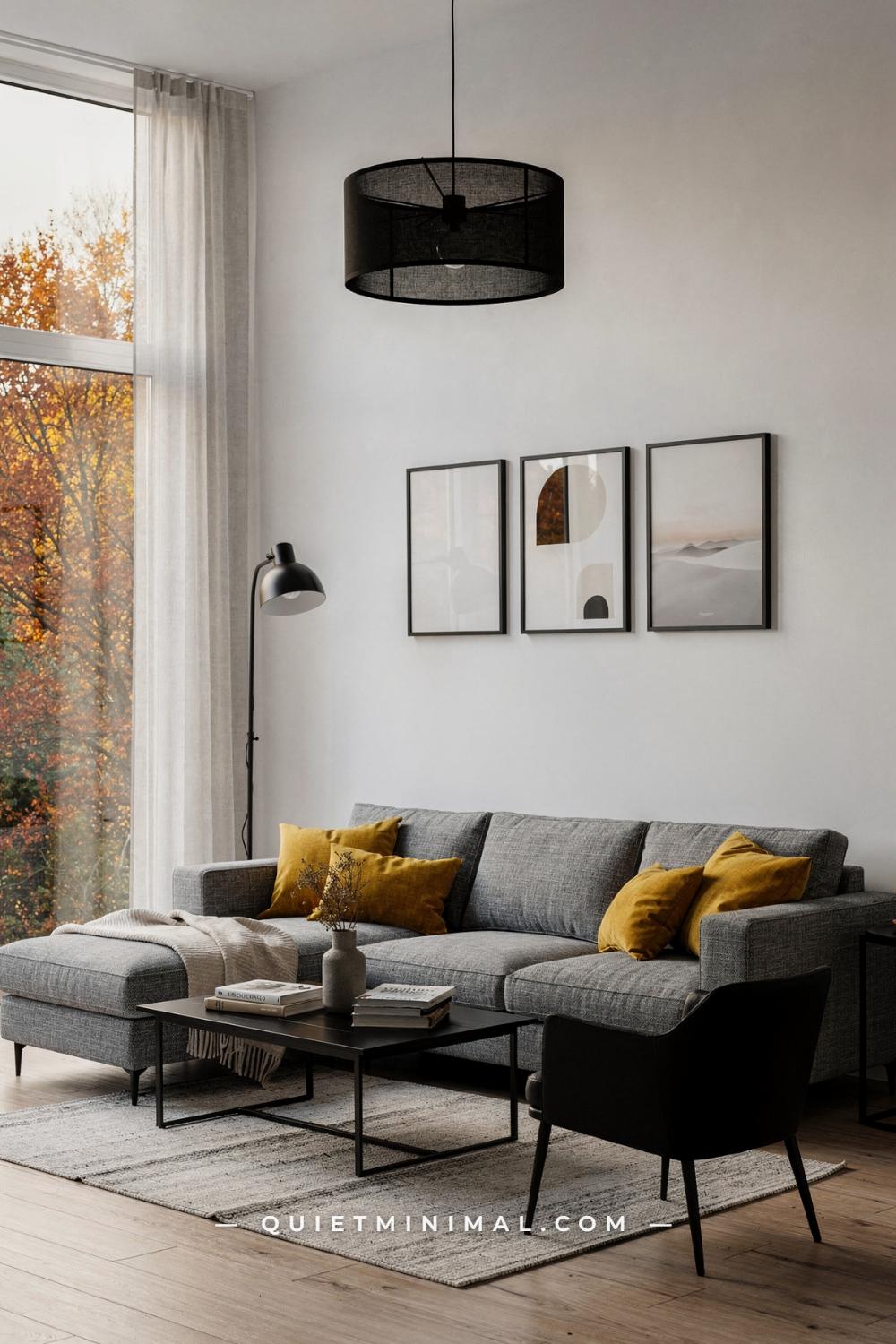
You love the look of a white and gray living room. The calm, the light, the way everything feels edited and intentional. But there is one question sitting under every pin you save: how do you keep a white and gray living room from feeling cold, flat, or faintly like a waiting room? It is a fair worry, because the difference between a gray room that feels serene and one that feels sterile is almost never the sofa or the paint chip alone. It is a chain of small decisions about undertone, light, texture, and contrast, and each one is learnable.
The good news is that the answer is definite. A white and gray living room feels warm when the whites are warm-leaning, the grays are layered across at least three depths, the lighting works at more than one height, and something natural (wood, wool, linen, green) interrupts the palette. The sections below walk through every facet of that answer, with the real measurements and the specific ways each idea goes wrong, so you can build the room you keep saving.
Start With a Warm White, Not a Stark One
 Save
The single biggest reason a white and gray living room feels cold has nothing to do with the gray. It is the white behind it. A stark, blue-leaning white acts like a refrigerator light for the whole room: it flattens gray upholstery, makes shadows look blue, and gives you that clinic feeling no throw pillow can fix. The fix is a white with the slightest warm undertone, something in the family of Benjamin Moore Simply White OC-117, which the brand itself describes as a clean white with the slightest hint of warmth. On the wall it reads as white, full stop, but it reflects light back with a soft cast instead of a hard one.
Here is how to choose without guessing. Paint two sample boards, one with a crisp decorator white and one with a warm white, and lean them against the wall behind your sofa for two full days. Look at them at 8 a.m., at noon, and at 7 p.m. with the lamps on. The stark white will look brilliant at noon and faintly blue at night. The warm white will hold its temper at every hour. That evening behavior is what you are actually buying, because evenings are when you live in this room.
Let the architecture of the room confirm the choice. In a high-rise space with floor-to-ceiling glass and a light gray sectional around 115 by 85 inches (292 by 215 cm), the wall color is doing quiet background work against a lot of daylight, and a warm white keeps that daylight golden rather than glacial. Warm metal accents, like a set of three brass candlesticks at varied heights on a white lacquered coffee table of about 50 by 28 inches (127 by 71 cm), multiply the effect. Brass is warm white’s natural ally; chrome is stark white’s. Pick the pairing on purpose.
From the guides
You've saved it, wanted it. Here's the how: codes, measurements, order. Your choices make it yours.
 The Japandi Honest PlaybookThe honest version of the style: what to keep, what to skip, and the order to do it in.See inside →
 The Room Refresh PlaybookA repeatable four-step method, room by room, in ten minutes, thirty minutes, or one weekend.See inside →
 Make Any Room Feel Cozy on PurposeWhy some rooms hold people and others empty out, and the moves that change it.See inside →
Key Takeaway: Choose a warm-leaning white for the walls first, because every gray in the room takes its temperature from the white behind it.

Anchor the Room With One Charcoal Wall
 Save
A white and gray room without a dark anchor floats. Everything sits in the same two light values, the eye finds nowhere to rest, and the room reads as washed out rather than calm. One charcoal wall fixes this instantly, and the reason it works is a proportion rule decorators lean on constantly: the 60-30-10 split. Roughly 60 percent of the room is your dominant light value (white walls, pale floors), 30 percent is your secondary mid value (the gray sofa, the rug), and 10 percent is the deep accent. A single charcoal accent wall delivers that 10 percent in one move, and it is the move that makes the other 90 percent look intentional.
Placement matters more than paint choice. Put the charcoal on the wall that already carries the room’s focus, almost always the TV wall or the wall behind the sofa, never a random side wall. A U-shaped gray sofa around 110 by 110 inches (280 by 280 cm) facing a charcoal media wall turns that wall into a backdrop, so the white floating TV unit, about 79 by 14 inches (200 by 36 cm), reads crisp instead of lost. For the charcoal itself, a deep warm gray brown like Farrow & Ball Mole’s Breath No.276 keeps the wall moody without going cold; a blue-black charcoal would fight a warm gray sofa.
The failure mode is overreach. Two charcoal walls start closing the room in, and a charcoal wall opposite a big window turns into a mirror of glare at midday. One wall, the focal wall, matte finish, and stop there. A flat or matte sheen absorbs light and looks like velvet; anything shinier shows every roller mark.
Key Takeaway: Give the room exactly one deep charcoal wall on the focal side, in a matte warm charcoal, so the light grays have something to push against.

Read the Daylight Before You Pick the Gray
 Save
Gray is the most light-sensitive color you can put on a wall or a sofa, because every gray is a carrier for an undertone: blue, green, violet, or brown. The same gray paint looks serene in one living room and like wet concrete in another, and the difference is the direction the windows face. North-facing rooms get cool, indirect light all day, which amplifies blue and violet undertones. A cool gray in a north room is how you get the icy result people blame on gray itself. South-facing rooms get warm, direct light that flatters almost anything, so you have more freedom there.
The practical routine is simple. Identify which way your main window faces, then choose against the light, not with it. Cool light wants a warm gray, meaning a gray with brown or taupe in it. Warm light can handle a cooler, bluer gray, and that is where deep blue-leaning charcoals like Farrow & Ball Down Pipe No.26 earn their reputation, since south light keeps them rich instead of cold. Test with sample pots on two walls, one near the window and one opposite it, and check them morning and evening before you commit.
Apply the same thinking to the big soft pieces. A mid-gray woven corner sofa around 98 by 98 inches (250 by 250 cm) will look warmer in a bright room and cooler in a dim one, so request a fabric swatch and live with it on the sofa spot for a few days. Blond oak floors and white cabinetry, like a 79 by 14 inch (200 by 36 cm) floating unit, buffer the whole scheme, because wood reads as warmth no matter what the light does.
Key Takeaway: Match the gray’s undertone against your window direction, warm grays for cool north light and cooler grays for warm south light, and test with samples before committing.

Flank the TV Wall With Symmetry
 Save
The TV wall is the hardest wall in a white and gray living room, because the screen is a big black rectangle fighting your calm palette. The most reliable way to absorb it is symmetry: two matching elements flanking the screen or the media unit so the black rectangle reads as the center of a deliberate composition instead of a hole in the wall. The human eye reads pairs as order, and order reads as calm. That is the whole trick.
Work from a short checklist. First, the pair itself: two tall matching plants in identical white ribbed pots, two matching table lamps, or two matching sconces. Areca palms are ideal because their height, roughly 5 to 6 feet (150 to 180 cm) in a floor pot, matches the vertical weight of a wall-mounted screen. Second, the center: a long, low white gloss unit around 79 by 12 inches (200 by 30 cm) gives the screen a pale plinth that separates it from a mid-tone warm gray wall. Third, the smalls: a pair of matte white stoneware vases about 14 inches (35 cm) tall, placed to one side of the unit rather than dead center, so the symmetry stays relaxed instead of rigid.
Where this fails is scale mismatch. Two tiny plants beside a 65-inch screen look like an accident, and two different plants look like clutter. Match the pots exactly, match the heights roughly, and keep the wall color behind everything a soft mid-tone warm gray with a bright white ceiling above it, so the pair frames the screen rather than competing with it. If your room runs cool, a gray fabric ottoman around 36 by 24 inches (91 by 61 cm) at the unit’s end adds the soft note that gloss cabinetry cannot.
Key Takeaway: Absorb the TV with a matched pair of tall plants or lamps flanking a long white media unit, keeping the pair identical in pot and height.

Try Mid-Gray Walls for Instant Depth
 Save
If pure white walls feel too exposed and charcoal feels like a commitment, mid-gray is the quiet middle path, and it does something neither extreme can: it makes white trim, white ceilings, and pale furniture pop forward by contrast while wrapping the seating zone in actual color. A warm mid-gray like Farrow & Ball Purbeck Stone No.275 sits right in that pocket, gray enough to read as color, warm enough to stay friendly. Against it, a light gray linen sofa takes on definition it would never have against white.
The key to mid-gray walls is contrast management in both directions. You need elements lighter than the wall and elements darker than the wall, or the room turns to porridge. Lighter: a chunky cream loop-pile rug underfoot and a white boucle accent stool about 18 inches (46 cm) across. Darker: a round glass coffee table about 36 inches (91 cm) across in a black powder-coated frame, black-framed abstract line prints around 20 by 28 inches (51 by 71 cm), and a black wall sconce. That ladder of values, cream, light gray, mid-gray, black, is what gives the room its depth.
The mistake to avoid is matching the sofa too closely to the wall. A mid-gray sofa on a mid-gray wall erases the room’s largest piece of furniture and leaves you with a gray cave. Keep at least two full value steps between wall and sofa, which usually means the sofa is noticeably lighter. If your heart is set on a deeper sofa, keep the wall pale and let cushions carry the dark notes. A sand-colored ceramic vase about 12 inches (30 cm) tall on the coffee table adds the warm mid-note that ties wall to rug.
Key Takeaway: Mid-gray walls work when the sofa sits at least two value steps lighter and black accents carry the dark end of the ladder.

Add Shine in Three Measured Places
 Save
Matte everything is the other reason gray rooms go flat. Matte walls, matte fabric, matte wood: nothing catches light, so the room has no sparkle at any hour. The correction is polished and reflective surfaces, but dosed carefully, because a white and gray room with shine everywhere slides into showroom territory. A workable rule is three reflective moments per room: one mirror or mirrored piece, one glass surface, and one polished metal finish. Three gives the light enough to play with; six gives you a jewelry counter.
Place the three where they earn their keep. A square glass coffee table about 40 by 40 inches (102 by 102 cm) on a chrome base sits at the visual center and doubles the light from lamps and windows. A geometric mirrored wall panel, around 36 by 36 inches (91 by 91 cm), belongs opposite or adjacent to a window so it bounces daylight deep into the room rather than reflecting the TV. Polished chrome then shows up in the smalls: a side table frame, a lamp base about 22 inches (56 cm) tall, curtain hardware. One metal finish, repeated, reads as a decision; three metal finishes read as indecision.
Shine also needs soft counterweights or the room gets hard-edged. A dark charcoal velvet ottoman about 24 inches (61 cm) across and velvet cushions absorb light right where the glass and mirror are throwing it, and that push-pull between sparkle and softness is what makes the glamorous version of this palette feel inviting rather than cold. Glass and chrome cool a room down; velvet and wool warm it back up. Keep both in play. And if fingerprints on glass bother you, choose a mirrored piece over a glass tabletop, since vertical surfaces stay clean far longer than horizontal ones.
Key Takeaway: Limit reflective surfaces to three moments, one mirror, one glass table, one repeated metal, and balance each with a matte velvet or wool texture.

Soften the Palette With Curved Furniture
 Save
White and gray are linear colors. They love grids, right angles, and clean geometry, which is exactly why so many gray rooms end up feeling rigid. Curved furniture is the antidote, because a curve in a monochrome room reads as softness before you even register the color of it. One curved anchor piece changes the posture of the whole space. A C-shaped cream boucle sectional, roughly 120 by 80 inches (305 by 203 cm), sweeping around a round charcoal rug turns the seating zone into an embrace rather than a row.
The composition rule is round answers round. A curved sofa wants round partners: a pair of small pedestal coffee tables about 20 inches (51 cm) across instead of one hard rectangle, a round rug beneath, a drum pendant cluster overhead with three shades about 16 inches (41 cm) each. Mixing one big curve with sharp rectangles everywhere else makes the curve look like a mistake; repeating the curve three or four times makes it the room’s theme. Graphic black-and-white barrel chairs, around 30 by 30 inches (76 by 76 cm), can stay angular in silhouette because their rounded backs still nod to the scheme.
The failure mode is underestimating footprint. Curved sectionals do not hug walls, and they need breathing room behind the arc to look intentional, at least 18 inches (46 cm) from any wall they back onto. In a tight room, swap the curved sectional for a curved armchair or a round ottoman and keep the sofa straight. Boucle upholstery earns its popularity here: the looped texture catches light softly and hides everyday wear better than flat weaves, which matters on a cream piece.
Key Takeaway: Add one curved anchor piece and echo it with round tables, a round rug, or rounded chair backs, leaving at least 18 inches behind the arc.

Light the Room at Three Heights
 Save
Ask any lighting designer why a monochrome room feels dead at night and you will get the same answer: one light source, at one height, usually overhead. A white and gray palette is merciless about this because there is no warm color to fake warmth; the light itself has to carry it. The fix is the three-height rule: light at ceiling level, light at eye level, and light at table level, all warm (2700K bulbs), all dimmable where possible.
Here is how the layers divide the work. Ceiling light, whether recessed spots or a slim pendant around 40 inches (102 cm) of drop, provides general fill and nothing more; it should never be the only thing on. Eye-level light comes from sconces, floor lamps, or a low-hanging pendant, and this is the layer that flatters people and fabrics. Table-level light, candles on a glass coffee table around 40 by 24 inches (102 by 61 cm), a small lamp on a side table, is the layer that makes a room feel intimate. Taper candles count as real lighting in a monochrome room; their warm flicker against gray velvet is the cheapest warmth you can buy.
Texture multiplies the effect. Light lands differently on velvet, shag, and sheer voile, so a mist-gray velvet sofa around 72 by 34 inches (183 by 86 cm), a chunky white shag rug, and floor-length sheers give those three light layers three different surfaces to play on. Where this fails: cool-white bulbs (4000K and up) will undo every bit of it. Check the Kelvin rating before the style, and if a fixture you love only takes a fixed cool bulb, keep looking. A swivel armchair in the same velvet, around 32 by 32 inches (81 by 81 cm), doubles the warm pool wherever the lamplight lands.
Key Takeaway: Run warm light at three heights, ceiling, eye level, and table level, all at 2700K, because in a monochrome room the lighting is the warmth.

Go Dark on the Walls When the Light Is Strong
 Save
A charcoal or near-black wall in a white and gray scheme is not risky; a dark wall in a dim room is. The distinction matters. Dark walls need a strong natural light source to read as dramatic rather than gloomy, so the decision starts with an honest look at your windows. A large window or a bright exposure can support a deep charcoal with a blue-black undertone on the main wall; a small north window cannot, and in that room the dark note belongs on furniture and textiles instead.
When the light allows it, the composition writes itself. Keep three things pale against the dark field: the ceiling, the floor, and the art. A soft warm off-white ceiling overhead, pale blonde hardwood at the edges, and botanical or abstract prints in black frames, around 16 by 24 inches (41 by 61 cm) in a row of three, give the eye bright stepping stones across the dark. A charcoal L-shaped sectional about 108 by 72 inches (274 by 183 cm) sitting half a value lighter than the wall keeps the sofa visible instead of swallowed, and one graphic white-gray lumbar pillow is enough punctuation.
Warm light is non-negotiable here. Recessed tungsten spots aimed at the art wall and a black arc floor lamp about 75 inches (190 cm) tall over the reading end of the sofa create pools of warmth that make dark walls feel cocooning. Cool bulbs on a dark wall produce the basement effect everyone fears. Finish wise, matte or flat paint deepens the color; eggshell reflects just enough to look patchy on very dark tones. And keep the coffee table low and dark, around 48 by 28 inches (122 by 71 cm) in black lacquer, so the sightline across the room stays open to the pale floor beyond.
Key Takeaway: Only take walls dark when the room has strong natural light, then keep ceiling, floor, and art pale and light the wall warmly.

Let Stone and Gold Do the Warming
 Save
The most convincing warmth in a white and gray room comes from materials that are warm by nature, and pale stone with warm metal is the quietest version of that trick. Gray-veined white marble underfoot reads as cool at first glance, but pair it with brass, bronze, or gold accents and something interesting happens: the warm metal pulls the warm veining forward, and the whole floor stops feeling cold. The palette never leaves white and gray, yet the room gains temperature.
If you are choosing stone or a stone-look floor, read the veining before the background. Hold a checklist in mind: vein color (gray, taupe, or gold-flecked), vein scale (fine wisps or bold strokes), and finish (polished reflects light and feels dressier; honed is softer and shows fewer smudges). For a warm scheme, choose stone with taupe or gold in the vein rather than pure graphite gray, and repeat that vein tone in one accessory, like a small bronze dish about 12 inches (30 cm) across on a round white leather ottoman of roughly 30 inches (76 cm). That repetition is what makes the accent look chosen rather than random.
The failure mode is temperature clash: a blue-gray veined floor with yellow-gold accents argues with itself all day. Keep undertones married. Cream linen upholstery on a sectional around 120 by 72 inches (305 by 183 cm), a taupe-gray panelled wall, and one large abstract artwork around 40 by 50 inches (102 by 127 cm) with gray and gold in it tie floor to wall. Full-height sheer linen curtains finish the job by turning hard daylight into a warm wash. One tall indoor tree in the corner, strelitzia or similar, adds the living note that polished stone always needs.
Key Takeaway: Choose stone with taupe or gold veining, repeat that vein tone in one metal accent, and keep every undertone in the room on the warm side.

Warm a Marble Room With Hidden Ceiling Light
 Save
Polished pale floors and paneled walls are beautiful at noon and chilly at 8 p.m., because every surface in the room is bouncing cool ambient light back at you. The professional correction is light you cannot see: a warm LED strip tucked into a ceiling tray or cove, washing the ceiling plane with an amber glow. It changes the perceived temperature of the entire room without adding a single visible fixture, and it is the reason luxury hotel lobbies feel warm despite acres of stone.
The mechanics are straightforward for an electrician or a confident DIYer. A coffered ceiling tray with a recessed ledge hides a warm-white LED strip (2700K, high CRI so whites stay true), aimed up so the ceiling reflects the light down as a diffuse wash. Put it on a dimmer; full strength is for cleaning, a third strength is for evenings. Run the math on length before ordering: measure the inside perimeter of the tray in feet and buy a continuous strip rated slightly longer, because visible gaps in the glow read as mistakes at this level of finish.
Everything else in the room should answer that warmth quietly. Gold-trimmed wood legs on a cream sectional about 120 by 80 inches (305 by 203 cm), a bronze bowl around 10 inches (25 cm) on a white leather ottoman of 28 inches (71 cm) across, and a taupe-gray molded panel wall all sit in the same warm register as the cove glow. Skip this layer and the same room with the same furniture reads noticeably colder after dark, which is usually when owners conclude the marble was the mistake. It was not. The missing warmth was above them.
Key Takeaway: A dimmable 2700K LED cove in the ceiling tray adds invisible warmth that keeps stone floors and paneled walls from going cold after dark.

Plan an Evening Version of the Room
 Save
Most living rooms are designed in daylight and lived in after dark, which is why so many gray rooms disappoint their owners at 9 p.m. A white and gray scheme needs an evening plan as deliberate as its daytime one. Run down this checklist: one warm wall sconce or picture light at mid-height, one candle grouping at table height, dimmers on anything overhead, and every bulb in the room at 2700K or lower. Four items, all inexpensive relative to furniture, and together they change what the room feels like for half the hours you use it.
The sconce does the heavy lifting. A single warm sconce at roughly 60 to 66 inches (152 to 168 cm) from the floor, mounted on or beside the accent wall, gives the room a hearth-like focal glow. A charcoal wall behind a white floating TV unit of about 79 by 14 inches (200 by 36 cm) drinks that amber light and gives back a soft warmth instead of glare. Candlelight then handles intimacy: a candelabra with tapers on a coffee table around 47 by 24 inches (120 by 60 cm) sits at the height where conversation happens, and flicker at that level is what reads as cozy against flat-weave wool and knitted cotton textures.
What to skip: the overhead recessed grid as your evening light. Ceiling spots at full power flatten every texture in the room and push gray toward institutional. If your room only has overheads today, the dimmer swap is the single highest-impact change, and any electrician can do it in an afternoon visit. Evening gray should glow, not glare. A knitted pouf about 18 inches (46 cm) across pulled near the coffee table finishes the picture, because low soft seating is where that candle-height light does its best work.
Key Takeaway: Give the room a deliberate evening kit: a warm mid-height sconce, candles at table height, dimmers overhead, and 2700K bulbs throughout.

Balance a Dark Feature Wall With Pale Upholstery
 Save
The classic dark-wall mistake is piling dark furniture in front of it, which buries the room’s biggest pieces and turns the space into a cave. The balancing move is the opposite: a pale sofa against the charcoal wall, so the wall becomes a backdrop that makes the seating glow. A light gray linen L-shaped sectional around 108 by 68 inches (274 by 173 cm) in front of a near-black charcoal feature wall has a presence it could never achieve against white drywall. Contrast is doing the decorating for you.
Keep the middle of the room dark but small. A low black oval coffee table about 48 by 28 inches (122 by 71 cm) echoes the wall without adding bulk, and a weathered gray rug, including a good second-hand one with some wear in the pile, bridges the pale sofa and the dark wall with a mid-tone that has patina. Three black-framed botanical prints at 16 by 24 inches (41 by 61 cm) each, hung in a row 2 to 3 inches (5 to 8 cm) apart, sit on the dark wall as quiet structure. On a charcoal field, black frames recede and the art itself floats.
The other half of the balance is light and life. A black arc floor lamp around 72 inches (183 cm) sweeping over the sectional’s chaise end gives a warm pool for reading, and a fiddle-leaf fig at the window end backlit by daylight keeps the dark scheme from feeling airless. The proportions to remember: dark wall plus pale seating plus dark accents in small doses. Reverse any two of those and the room tips. Cool daylight from the window is welcome here; it is the artificial light that must stay warm.
Key Takeaway: Put the palest sofa against the darkest wall, keep dark accents small and low, and add warm light plus one large plant to keep the contrast alive.

Use Black as Punctuation, Not a Paragraph
 Save
Black is the strongest seasoning a white and gray room has, and like any strong seasoning, the dose is the whole game. Too little and the room has no edges; too much and it stops being a white and gray room at all. A dependable working rule is the three-touch system: black appears in exactly three places, and each touch is small relative to the room. Frames, a lamp, and one piece of furniture hardware, for instance. Three touches read as crisp punctuation; ten touches read as a different palette.
Choose touches that draw lines, because black’s job in this palette is outline and definition. Two black directional sconces with shades about 8 inches (20 cm) across, bracketing a pair of black-framed monochrome prints at 20 by 28 inches (51 by 71 cm) each, draw a precise rectangle of light and line above a white sofa around 84 by 34 inches (213 by 86 cm). A rectangular glass coffee table about 48 by 24 inches (122 by 61 cm) with a thin black frame adds the third touch at the room’s center. Notice what is not black: the rug, the curtains, the sofa. Those stay pale so the black lines stay legible.
The failure mode is the black accessory creep that happens one purchase at a time: a black tray, then a black vase, then black planters, until the room’s value structure inverts and the whites look like the accents. If you want to add a fourth black element, retire one first. And keep finishes consistent: matte powder-coated black reads modern and calm, while glossy black reads formal and shows dust. Mixing the two in one room quietly undermines both.
Key Takeaway: Cap black at three deliberate touches, favor matte over gloss, and treat every additional black piece as a trade, not an addition.

Let Plants Supply the Missing Color
 Save
A strict white and gray palette has one built-in gap: it contains nothing alive. Green is the only color that never argues with gray, because every gray already carries a hint of the natural world in it. Plants fill that gap while staying inside the calm register, and they add the one thing no textile can: irregular, organic shape. Against the straight lines of sofas and shelving, a plant’s sprawl is visual relief.
Think in three sizes. One large floor plant, a ZZ plant or a fiddle-leaf in a round white planter, anchors a corner and pulls the eye to a part of the room that usually goes unfurnished. One medium plant, like an aralia or a potted palm near the window, bridges furniture height. One trailing plant, a pothos on a windowsill shelf, softens a hard edge and draws the eye upward. That trio covers low, mid, and high the same way layered lighting does, and it costs a fraction of a single accent chair. White or pale ceramic pots keep them inside the palette; terracotta pushes the room toward farmhouse, which is a fine choice, just a different one.
Plants also solve a styling problem specific to gray sofas. A medium gray sofa around 96 by 60 inches (244 by 152 cm) against a light gray wall like Farrow & Ball’s Pavilion Gray No.242 can look weightless, and a large plant beside it restores the sense of mass. Keep an asymmetric gallery of black-framed abstract prints, roughly 12 by 16 to 16 by 20 inches (30 by 41 to 41 by 51 cm), on the sofa wall and let the plants own the floor. Water and light needs aside, the only real failure mode is neglect: a struggling plant does more damage to a serene room than no plant at all, so pick varieties that match the light you actually have.
Key Takeaway: Add plants in three sizes, floor, mid, and trailing, in white or pale pots, choosing varieties matched to the room’s real light.

Put the Pattern on the Wall, Not the Sofa
 Save
Pattern in a white and gray room works best in one big dose, and the wall is a better place for it than the upholstery. A marble-effect wallpaper on the TV feature wall gives you movement, veining, and depth across the room’s largest uninterrupted surface, while the sofas stay solid and calm. Patterned sofas lock you into a look and show wear in the pattern’s high-contrast spots; a papered wall can be changed by a paperhanger in a day and never gets sat on.
When you weigh wallpaper against paint for this job, the comparison is honest. Paint in a mid-tone gray is cheaper, faster, and forgiving of imperfect walls; it gives you color but no movement, so the room relies entirely on furniture for interest. Marble-effect paper costs more per wall and demands decent wall prep, since seams and bubbles show on a printed design, but it delivers a built-in focal point that paint cannot imitate. If your room has a fireplace below the screen, a white electric surround about 48 by 14 inches (122 by 36 cm) layered against the veined paper doubles the focal effect, and a round chrome convex mirror around 24 inches (61 cm) above it finishes the vertical stack.
Keep the glam grounded with texture below. A chunky ivory shag rug layered over a gray carpet, gray velvet seating like an L-sectional around 110 by 72 inches (280 by 183 cm), and a small crystal chandelier about 18 inches (46 cm) across make the marble wall feel plush rather than slick. Velvet drapes at the window in the same gray family as the paper’s veining pull the wall color around the room. A white gloss coffee table about 48 by 28 inches (122 by 71 cm) with a chrome frame mirrors the paper’s sheen at floor level, so the shine reads as a scheme rather than a single feature.
From the guides
You've saved it, wanted it. Here's the how: codes, measurements, order. Your choices make it yours.
The Japandi Honest PlaybookThe honest version of the style: what to keep, what to skip, and the order to do it in.See inside →The Room Refresh PlaybookA repeatable four-step method, room by room, in ten minutes, thirty minutes, or one weekend.See inside →Make Any Room Feel Cozy on PurposeWhy some rooms hold people and others empty out, and the moves that change it.See inside →Key Takeaway: Concentrate pattern in one marble-effect wallpapered wall, keep seating solid, and ground the glam with shag and velvet textures.

Layer Two Rugs to Fix a Cold Floor
 Save
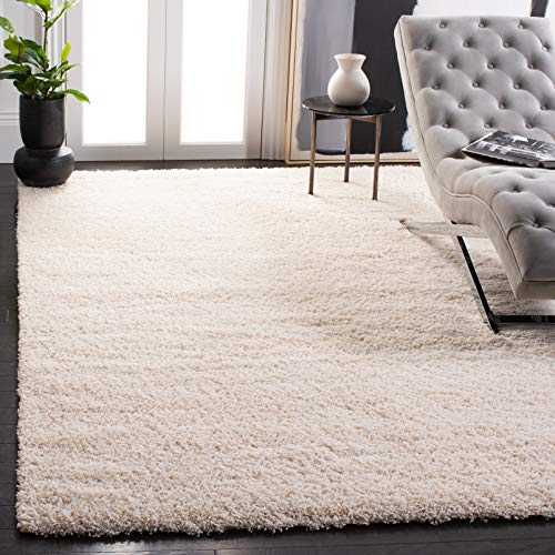
Carpet that stops short of warm is a common gray-room problem: the wall-to-wall is practical but thin, or the wood is pretty but echoing. The designer fix is rug layering, one quiet base rug with a smaller character rug on top, and it is a styling habit worth copying because it adds insulation, softness, and depth in one move. The base layer does the covering; the top layer does the talking.
The sizing rule keeps it from looking like a laundry pile. The base rug should be large enough to sit under all the front legs of the main seating, which for a corner sofa around 110 by 72 inches (280 by 183 cm) usually means an 8 by 10 foot (244 by 305 cm) rug or larger. The top rug runs about two-thirds the base rug’s width, centered under the coffee table and pulled toward the main sofa, not floating in the middle. A chunky ivory shag over a flat gray base is the classic combination: the contrast in pile height is what reads as luxury, and the ivory keeps the gray from swallowing the floor.
Where layering fails: two rugs of similar thickness bunch and slide, and a top rug that nearly matches the base rug’s size looks like a measuring error. Vary the pile dramatically and the size clearly. If you have a bay window, let the layered rugs stop at the bay’s edge rather than chasing the shape of the room; a rectangular rug zone against an angled bay reads tidier than one that tries to follow the angles. Add a slim velvet armchair about 32 by 32 inches (81 by 81 cm) at the bay itself, just off the rug, and the window becomes its own destination instead of dead space.
Key Takeaway: Layer a small plush rug two-thirds the width of a large quiet base rug, front legs of the seating on the base, and stop the layers cleanly at bay windows.
Carry the Palette Into the Next Room
 Save
In an open-plan space, a white and gray living room does not end at the sofa. The kitchen, the dining spot, and the hallway are all in the same sightline, and the fastest way to make an open plan feel chaotic is to let each zone pick its own palette. The fix is a carry-over rule: choose three elements in the living room and repeat each one at least once in the adjoining space. Three repetitions are enough for the eye to register continuity without the space feeling matched to death.
A reliable trio is wall color, metal finish, and wood tone. A living room wall in a warm light gray like Sherwin-Williams Repose Gray SW 7015, which the brand’s own color guidance describes as a light gray with a warm undertone, flows naturally into a kitchen in a soft warm white like Benjamin Moore White Dove OC-17. Matte black then repeats across zones: slim sconces about 6 inches (15 cm) wide flanking a large abstract artwork around 48 by 60 inches (122 by 152 cm) in the living area, answered by three black globe pendants about 10 inches (25 cm) across over the kitchen island. The oak or rattan note, a woven side table around 16 inches (41 cm) at the sofa’s end, can echo in bar stool seats or a fruit bowl.
Watch the floor most of all. Large-format marble-look tile running continuously through both zones is the strongest unifier available, because a flooring change mid-sightline cuts the space in half. If replacing floors is not in the plan, a striped low-pile rug under a white deep-seat sectional of about 120 by 80 inches (305 by 203 cm) can point its stripes toward the kitchen and lead the eye across.
Key Takeaway: Repeat three living room elements, wall tone, metal finish, and wood, in the adjoining space, and keep flooring continuous through the sightline.

Give the Anchor Wall Room to Work
 Save
Every white and gray living room has one wall doing the anchoring, usually the TV wall or the fireplace wall, and the layout question is how the furniture serves it. The common mistake is pushing everything against the walls, which leaves a dead moat in the middle and makes the anchor wall feel like a screen at the front of a classroom. Pull the seating in. A corner sofa floating even 12 to 18 inches (30 to 46 cm) off the wall changes the room’s proportions and makes the space behind it feel deliberate.
The numbers that keep a layout comfortable are worth memorizing. Leave 16 to 18 inches (41 to 46 cm) between sofa edge and coffee table, close enough to set down a glass, far enough to walk through sideways. A white rectangular coffee table around 47 by 24 inches (120 by 60 cm) suits a sofa seat length of 6 to 8 feet; the table should run roughly two-thirds the sofa’s length and sit at or just below cushion height. Main walkways want 30 to 36 inches (76 to 91 cm) of clearance, and the viewing distance from sofa to a wall-mounted screen works out to about 1.5 to 2 times the screen’s diagonal.
Smaller pieces then orbit the anchor. A white knitted pouf about 18 inches (46 cm) across floats as a footrest or extra seat, a round frameless mirror around 24 inches (61 cm) on the side wall bounces window light toward the seating, and a plant in a white pot marks the room’s far corner. Each piece has a job and a clear sightline to the anchor wall. When every seat can see the focal wall without turning, the layout is finished.
Key Takeaway: Float seating off the walls with 16 to 18 inches to the coffee table and 30 to 36 inches for walkways, all seats facing the anchor wall.

Make Gray Feel Like Farmhouse
 Save
Gray and farmhouse sound like different eras, but they meet happily once you understand what farmhouse style actually contributes: not a color, but a texture stack. The white and gray palette can stay exactly as restrained as you like while the surfaces do the warming. Work from a five-texture checklist: something shaggy (a deep-pile rug), something woven (a plaid or knit throw), something smooth and painted (white wood furniture), something natural (wicker baskets), and something warm underfoot (hardwood at the rug’s edge). Five textures, and the room feels layered before a single colored object enters it.
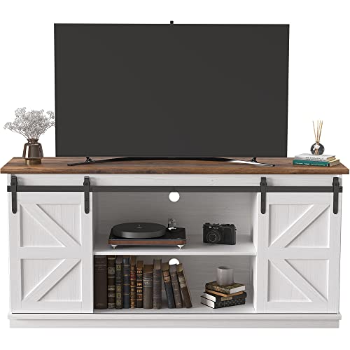
The furniture shapes carry the style. A white X-brace coffee table around 48 by 24 inches (122 by 61 cm) and a white sliding barn-door console about 70 by 18 inches (178 by 46 cm) bring the farmhouse geometry: cross-bracing, visible hardware, honest painted wood. Against a warm greige wall in the family of Benjamin Moore Pale Oak OC-20, those white pieces stay crisp instead of chalky. The sectional, an oversized plush gray L-shape around 120 by 90 inches (305 by 228 cm), should be the softest thing in the room, piled with white and ivory pillows in mixed textures rather than matching sets.
The failure mode is theme-park styling: too many signs, too much distressed paint, roosters anywhere. Restraint is what keeps farmhouse gray current. Let the textures and the furniture silhouettes carry the style, keep the art abstract and the palette quiet, and the room reads as warm American casual rather than a themed set. A turned-wood floor lamp about 62 inches (157 cm) tall with a cream shade adds the one traditional silhouette the seating zone is missing, and warm recessed ceiling light over the whole arrangement keeps the whites creamy instead of stark.
Key Takeaway: Build farmhouse warmth with five stacked textures and honest furniture shapes, not with themed decor, keeping walls a warm greige.
Match Curtains to Walls for a Seamless Room
 Save
One of the calmest moves in a white and gray living room is letting the curtains disappear into the walls. Floor-to-ceiling gray linen panels in the same family as the wall color erase the visual chop that contrast curtains create, so the window wall reads as one continuous soft plane. The room feels taller, wider, and quieter, and the furniture gets to be the focus. This works especially well in apartments with expansive windows, where curtains cover a huge percentage of the wall area and contrast there would dominate everything.
The details decide whether it looks intentional. Hang the rod as close to the ceiling as the architecture allows and let panels just kiss the floor; panels that hover an inch above the floor look like a measuring mistake, and panels that pool read as romantic, which is a different room. Fabric weight matters: a medium-weight linen or linen blend hangs in clean columns, while thin synthetics cling and show every draft. Choose a gray half a step lighter or warmer than the sofa, so a gray L-shaped sectional around 110 by 80 inches (280 by 203 cm) still separates from the window wall behind it.
With the shell this quiet, one sculptural piece per zone keeps the room from going blank. A round white tulip-base coffee table about 36 inches (91 cm) across, an arc floor lamp around 72 inches (183 cm) with a white disc shade, and one large abstract gray brushstroke canvas around 40 by 30 inches (102 by 76 cm) are enough. A wall in a pale cool off-white like Farrow & Ball’s Blackened No.2011 sits perfectly under this scheme, since it is white with just enough gray in it to keep the drapery from disappearing entirely.
Key Takeaway: Hang floor-to-ceiling curtains in the same gray family as the walls, mounted high and kissing the floor, so the window wall reads as one soft plane.

Add Wall Molding So Paint Never Looks Blank
 Save
A large painted wall in a restrained palette risks one specific failure: blankness. The color is nice, the wall is smooth, and the room still feels unfinished because nothing on that wall catches a shadow. Applied molding solves it with structure instead of stuff. Board-and-batten on a charcoal accent wall, or beadboard on a white side wall, gives the paint job an architecture, and shadows between the battens do the decorating all day as the light moves.
The spacing rule is what separates tailored from homemade. On a standard 8-foot (244 cm) wall, vertical battens spaced 12 to 16 inches (30 to 41 cm) apart read as intentional; wider gaps look sparse, narrower ones look busy. Keep batten width around 3 to 4 inches (8 to 10 cm), run them floor to ceiling, and paint wall and battens the same color in the same sheen so the effect is texture, not stripes. A charcoal board-and-batten wall behind a mounted TV and a white floating media unit about 60 by 16 inches (152 by 40 cm) gives the electronics a crafted backdrop that plain paint cannot.
Balance the treatment with simpler surfaces nearby. A textured light gray sectional around 100 by 90 inches (254 by 228 cm), a slim white coffee table about 47 by 24 inches (119 by 61 cm) on metal legs, a white knit floor pouf around 20 inches (51 cm) across, and a round white mirror about 24 inches (61 cm) on the adjacent beadboard wall keep the room quiet. One molded wall per room is the discipline; two start competing, and the room tips from crafted into busy.
Key Takeaway: Add board-and-batten to one wall with battens spaced 12 to 16 inches, painted to match the wall, so the room gains shadow and structure without more objects.

Warm the Scheme With Real Wood
 Save
If you take only one lesson from every warm-feeling gray room, take this: wood is the difference. White and gray are both mineral, architectural colors, and wood is the organic note that tells your nervous system the room is for living in. Even one real wood element, a fluted oak coffee table about 40 inches (102 cm) across, changes the temperature of the whole seating zone. More is better, up to the point where the palette starts reading as rustic.
The strongest version going right now is the slatted wood wall: vertical oak slats running full ceiling height behind the TV, with a warm LED strip tucked into the recess so light grazes across the grain. It combines accent wall, texture, and lighting in a single move, and against it a cream boucle sectional around 120 by 90 inches (305 by 228 cm) and a cream shag rug look intentional rather than pale. Walls in a soft warm white like Benjamin Moore White Dove OC-17 frame the wood without cooling it down.
Match your wood tones within a room or the effect scatters. Oak, ash, and light walnut all sit in the same honey-tan family and mix happily; adding a red-toned cherry or a very dark espresso introduces a second temperature that white and gray will not absorb. A natural wood tripod floor lamp around 65 inches (165 cm) and the oak legs on side tables should rhyme with the slat wall’s tone. The failure mode is faux-wood laminate with a printed grain; in a palette this honest, the eye finds it. One potted olive tree beside the wood wall completes the warmth, because silvery green foliage sits naturally beside oak grain.
Key Takeaway: Add real wood in one honey-tan tone family, ideally a slatted feature wall or fluted oak table, and keep every wood note in the room within that family.

Allow Yourself One Accent Color
 Save
A white and gray living room does not have to be colorless to stay calm, but the palette can only absorb one guest at a time. The rule that keeps it working: pick exactly one accent color and repeat it three times in the room. Three sightings are what turn a random object into a color story. Mustard ochre is the classic partner for gray because it is warm, earthy, and assertive enough to register against charcoal and white without shouting.
Placement follows a loose triangle. Cushions on the sectional carry the accent at seating height, a throw or a second pair of cushions repeats it nearby, and a third note, a small vase, a stripe in one of the framed abstract prints, a book spine on the coffee table, lands the color at a different height across the room. Against a gray woven sectional around 108 by 80 inches (274 by 203 cm), white walls, and black-framed art, ochre reads warm rather than loud. Swap it for rust, sage, or dusty blue and the same system holds; what breaks the system is a second accent color arriving uninvited.
Black furniture frames the whole arrangement. A black rectangular coffee table about 48 by 24 inches (122 by 61 cm), a black drum pendant around 18 inches (46 cm) across, a black arc floor lamp near 65 inches (165 cm), and a black accent armchair of about 28 by 28 inches (71 by 71 cm) give the pale room its structure, while the ochre keeps that structure friendly. Warm oak underfoot ties the two temperatures together. If you tire of the accent in a year, this system is cheap to change: swap three cushion covers and a vase, and the room takes on a new season without touching a single large piece.
Key Takeaway: Choose one accent color, repeat it three times at different heights, and let black furniture and warm wood hold the structure around it.

Face the Sofas Toward Each Other
 Save
The most underused layout in white and gray rooms is also the oldest: two matching sofas facing each other across a coffee table. It works because it makes the room about conversation rather than the screen, and symmetry in a restrained palette reads as ceremony. Two light gray sofas, each around 88 by 36 inches (224 by 91 cm), mirrored across a dark gray stone slab table about 50 by 30 inches (127 by 76 cm), give the room a formal spine that an L-shaped sectional cannot.
The layout has requirements, so measure before you commit. You need a room at least 12 feet (366 cm) wide so each sofa gets its walkway; 30 to 36 inches (76 to 91 cm) behind each sofa keeps circulation comfortable. The rug must span the full conversation zone, front legs of both sofas on it, which for this pairing means something like 96 by 72 inches (244 by 183 cm) at minimum, and bigger is better. A high-pile gray shag at that size turns the whole center of the room into a soft island, and a stone or marble slab table grounds it with weight.
Because the architecture is symmetrical, the styling should be too, with one controlled exception. Matching end tables and a pair of lamps keep the axis clean, then a single asymmetric note, white flowers in a glass vase off-center on the table, keeps the formality from going stiff. Full-length silk or velvet drapes swept from corner windows frame the axis, and a sculptural pendant about 32 inches (81 cm) across centered over the table marks the heart of the room from above.
Key Takeaway: Face two matching sofas across a substantial table with 30 to 36 inches of clearance behind each and a rug spanning both, styling symmetrically with one off-center note.

Size the Rug to the Sectional, Not the Room
 Save
Rug sizing is where more gray living rooms go wrong than anywhere else, because a too-small rug makes even beautiful furniture look like it is waiting for instructions. The rug’s job is to unify the seating zone, so it takes its dimensions from the furniture, not from the floor area. Three rules cover nearly every case: front legs of all seating on the rug at minimum, 6 to 8 inches (15 to 20 cm) of rug showing beyond each end of the sofa, and 12 to 18 inches (30 to 46 cm) of bare floor between rug edge and walls.
Run the math on a big U-shaped sectional and the numbers get serious. A sectional around 140 by 100 inches (355 by 254 cm) needs a rug in the 9 by 12 foot (274 by 366 cm) class, or larger if you want all legs on. This is the purchase people undersize to save money, and it is the one that costs the room the most. A monochrome geometric rug with fringe under a charcoal U-sectional and a white coffee table about 47 by 24 inches (120 by 61 cm) defines the zone boldly; pattern at floor level is low-risk because furniture breaks it up.
Pattern scale deserves a word. Large, low-contrast geometrics read as texture from standing height and pattern from seated height, which is exactly what a calm room wants. Small busy patterns fight the cushions and art. If your dream rug only comes one size too small, layer it over a larger plain jute or flatweave base rather than floating it alone; a floating rug under a big sectional is the visual equivalent of a postage stamp on a parcel.
Key Takeaway: Size the rug so all seating’s front legs sit on it with 6 to 8 inches showing past the sofa ends, and layer a small rug over a large plain base rather than floating it.

Commit to Tone-on-Tone Gray
 Save
The bravest version of this palette drops contrast almost entirely: gray walls, gray sofa, gray table, with white appearing only in the art and the ceiling. Done timidly it is the office waiting room. Done with conviction it is the most sculptural look in the whole white and gray family, and the difference between the two outcomes is value spacing. The grays must be related but never identical, each at least one shade step from its neighbor, so the room reads as a gradient rather than a paint match that failed.
Build the gradient deliberately. Walls in a light gray with a cool, crisp cast like Benjamin Moore Gray Owl OC-52 set the top note. A matte gray sectional around 110 by 80 inches (280 by 203 cm) sits a step or two deeper. Deep charcoal cushions and an oval gray coffee table about 48 by 28 inches (122 by 71 cm) on black hairpin legs carry the bottom end. Then, crucially, metallic accents interrupt the matte field: a chrome sphere floor sculpture about 18 inches (46 cm) across and a chrome disc floor lamp around 65 inches (165 cm) act as the room’s jewelry, reflecting light into a palette that has almost none.
Art carries the white. One large framed abstract print, around 48 by 36 inches (122 by 91 cm) in a clean white frame, centered on the main wall, becomes the room’s single bright note, which is why monochrome rooms can handle bigger art than colorful ones. Keep window treatments pale and sheer so daylight stays soft, and let one tall plant near the glass remind the eye that the outdoors exist. Commitment is the whole game: if you find yourself adding beige to warm it up, this was never your palette, and that is fine.
Key Takeaway: Tone-on-tone gray works when every gray sits a full shade step from its neighbors and chrome plus one large white-framed abstract supply the light notes.

Frame the Sofa With a Pair of Lamps
 Save
A sofa against a long wall can look stranded, and the fix that stylists reach for is flanking: matching elements on either side that give the sofa a frame. A pair of chrome arc floor lamps, each about 65 inches (165 cm) tall, sweeping in from both ends of a gray sectional around 120 by 85 inches (305 by 215 cm), turns the seating into a composed vignette. Symmetry at the edges lets you relax about symmetry everywhere else.
The wall above the sofa follows its own spacing math. A horizontal row of three matching black-framed abstract prints, each about 20 by 28 inches (51 by 71 cm), should span roughly two-thirds the sofa’s width, hang with 2 to 3 inches (5 to 8 cm) between frames, and sit so the center of the arrangement lands 57 to 60 inches (145 to 152 cm) from the floor. Hung higher, the art floats away from the furniture; hung in mixed frames, the row loses its rhythm. Three identical frames, equal gaps, level tops: those three details are what make the arrangement read as professional.
Keep the coffee table styling low so the lamps and art hold the vertical interest. A white lacquered table around 52 by 28 inches (132 by 71 cm) with a round ceramic vase of dried branches and two stacked books is enough. An open white shelving unit about 36 by 72 inches (91 by 183 cm) at the room’s edge handles storage and display without crowding the composition, and a dark throw folded over the chaise adds the one deep note that keeps the pale scheme grounded.
Key Takeaway: Flank the sofa with a matched pair of arc lamps and hang three identical frames two-thirds the sofa’s width, 2 to 3 inches apart, centered at 57 to 60 inches high.

Finish With One Sculptural Light
 Save
Every white and gray room has a ceiling, and most of them waste it. A single sculptural overhead fixture is the finishing move that pulls the whole palette upward, and in a restrained room it can afford to be bold, because nothing else is competing for attention. An infinity-ring LED chandelier about 36 inches (91 cm) across, matte black rings with a warm integrated strip, reads as functional sculpture: it lights the room and furnishes the ceiling at the same time.
Scale and drop are the two numbers to get right. For diameter, add the room’s length and width in feet and treat that sum as inches: a 14 by 18 foot room suggests a fixture around 32 inches (81 cm) across. Over a coffee table between facing sofas, each around 90 by 36 inches (229 by 91 cm), hang the fixture 30 to 36 inches (76 to 91 cm) above the table surface so it anchors the conversation zone without blocking sightlines. Warm integrated LED, 2700K, on a dimmer, keeps the rings from reading as an office fixture. An electrician can add a ceiling tray with cove lighting around it for a second, softer layer.
Let one architectural echo answer the fixture. A dark vertical slat column about 12 inches (30 cm) wide, running floor to ceiling in the background, gives the black rings a partner in the room’s structure, while a round two-tone coffee table about 40 inches (102 cm) across with pampas grass in a white cylinder vase keeps the center organic. Walls in a true clean white like Benjamin Moore Chantilly Lace OC-65 make the black metalwork read as drawing rather than weight.
Key Takeaway: Hang one sculptural warm LED fixture sized to the room (length plus width in feet, read as inches) and dropped 30 to 36 inches above the coffee table.

So, how do you keep a white and gray living room from feeling cold? You manage temperature at every layer: a warm-leaning white on the walls, grays spaced across at least three depths, warm light at three heights, wood and wool and green interrupting the mineral palette, and one dark anchor to give the light tones something to stand against. Do those things and the palette stops being a risk and starts being what you saved all those pins for, calm, bright, and quietly warm. Pick your two or three sections above, order paint samples and fabric swatches this week, and let the room come together one deliberate decision at a time.
From the guides
You've saved it, wanted it. Here's the how: codes, measurements, order. Your choices make it yours.
The Japandi Honest PlaybookThe honest version of the style: what to keep, what to skip, and the order to do it in.See inside →The Room Refresh PlaybookA repeatable four-step method, room by room, in ten minutes, thirty minutes, or one weekend.See inside →Make Any Room Feel Cozy on PurposeWhy some rooms hold people and others empty out, and the moves that change it.See inside → Save