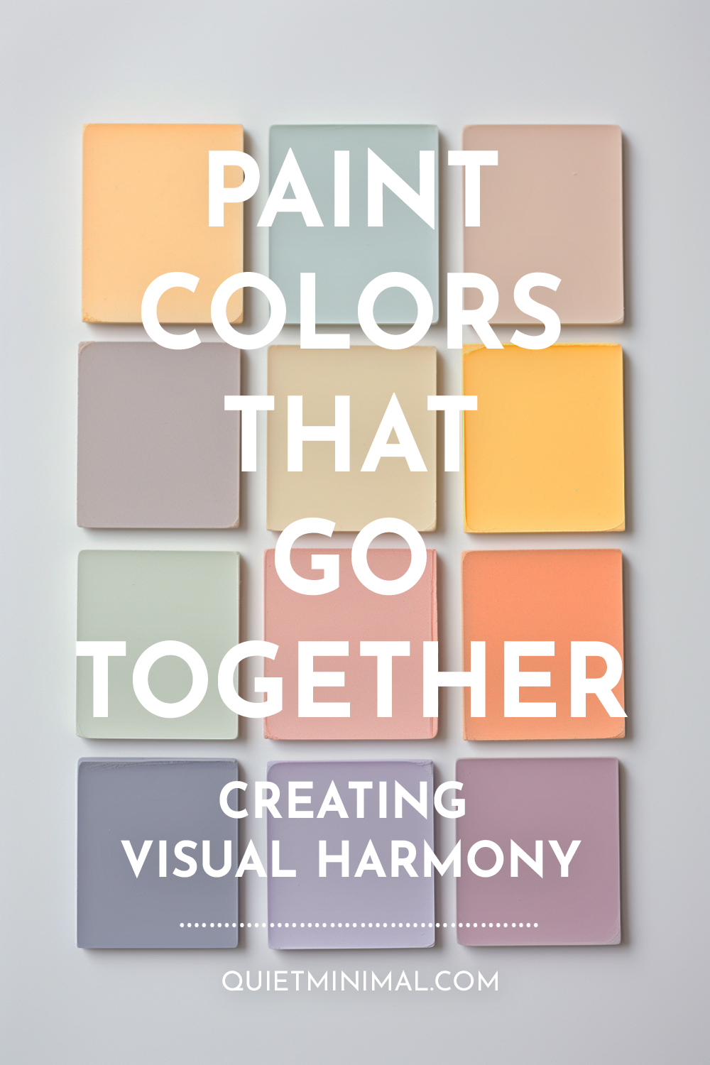
Interior design is both an art and a science. When selecting paint colors to create beautiful, harmonious spaces, you must balance personal taste with color theory fundamentals. Follow these unconventional yet stunning paint color combinations for interiors that wow.
- Complementary colors add vibrancy
- Analogous colors promote tranquility
- Odd color pairings intrigue the eye
- Layer tones, tints, and shades
- Repeating colors connects the space
Understanding Color Theory
The basics of color theory provide the foundation for combining paint colors. The color wheel depicts primary, secondary, and tertiary hues. Complementary colors sit opposite each other, creating high contrast. Analogous colors reside side-by-side, promoting harmony.
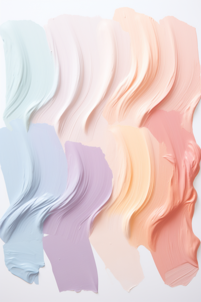
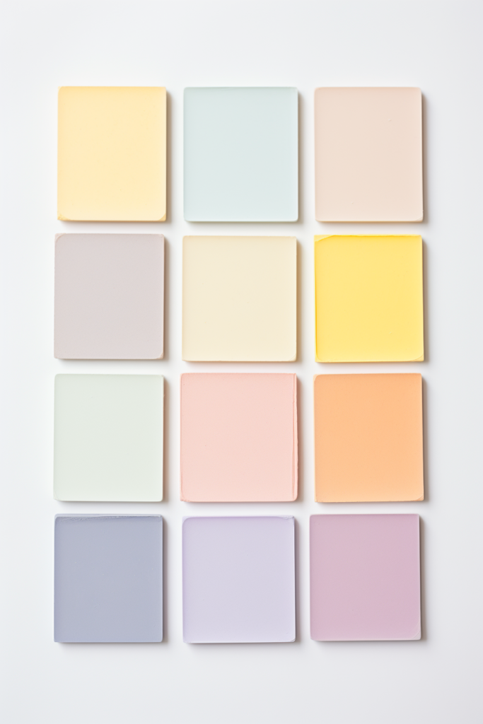
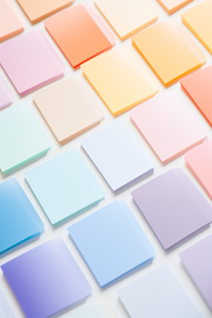
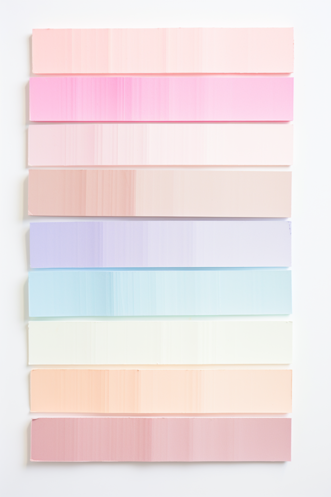
When selecting multiple paint colors, aim for a 60(main color)-30-10 split. The majority of colors anchor the scheme, while accent colors provide interest. Additionally, varying tones, tints, and shades of one hue create depth through monochromatic schemes.
- Base schemes on color wheel fundamentals
- Complementary colors have high contrast
- Analogous hues promote visual harmony
- Monochromatic varies tones of one hue
- 60-30-10 creates a color hierarchy
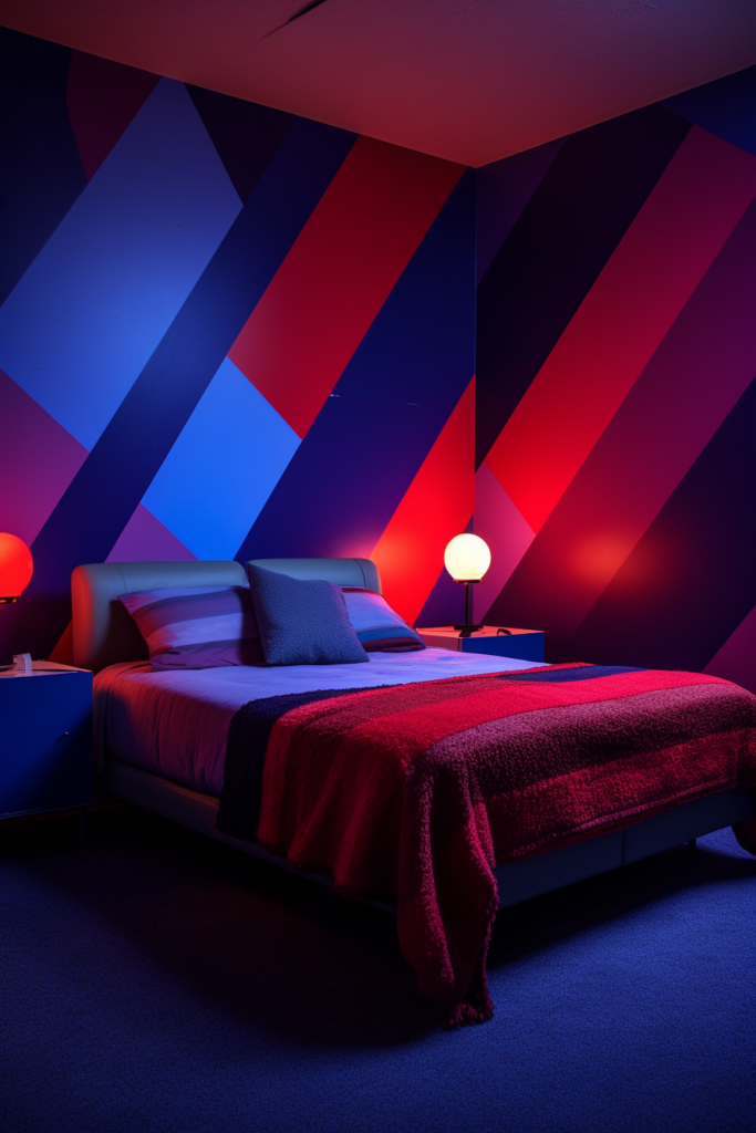
Thrilling Complementary Combinations
Complementary color schemes utilize opposite colors on the wheel. Contrast adds excitement, yet coordinating analogous accents promotes balance.
A violet accent wall pops against lemon walls and citron decor. The analogous green and blue hues bridge the gap between contraries.
Similarly, a fuchsia feature wall dazzles against seafoam green backdrops. Soft blue undertones connect the complementary duo.
- Violet and lemon create a vibrant combo
- Seafoam and fuchsia excite the eyes
- Analogous hues add balance
- Soft blues bridge the gap
Soothing Analogous Appeals
Analogous schemes utilize three or more side-by-side colors on the wheel, promoting visual harmony. Tranquil, like a seaside sunset, sage, sea glass, and sky blue, embodies restful elegance.
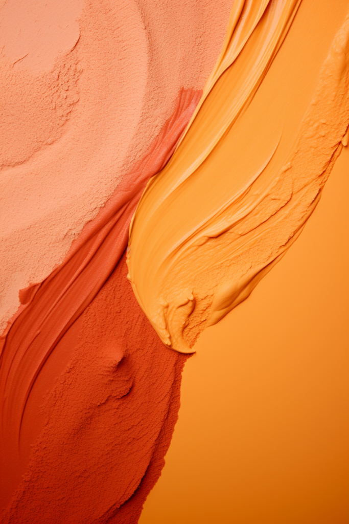
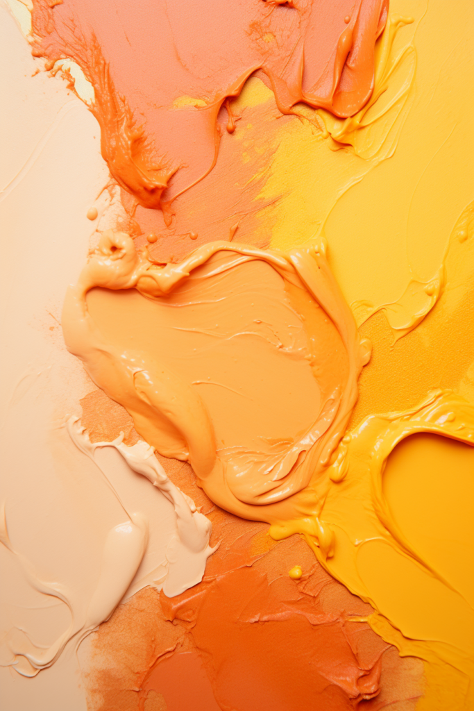
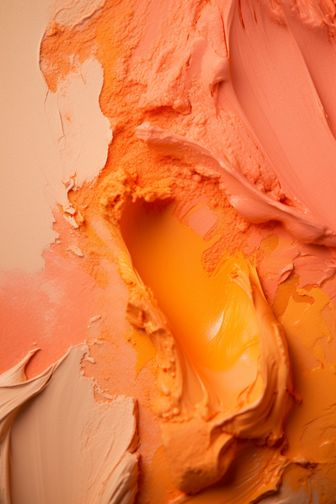
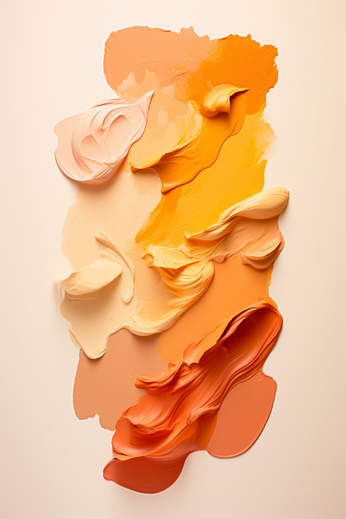
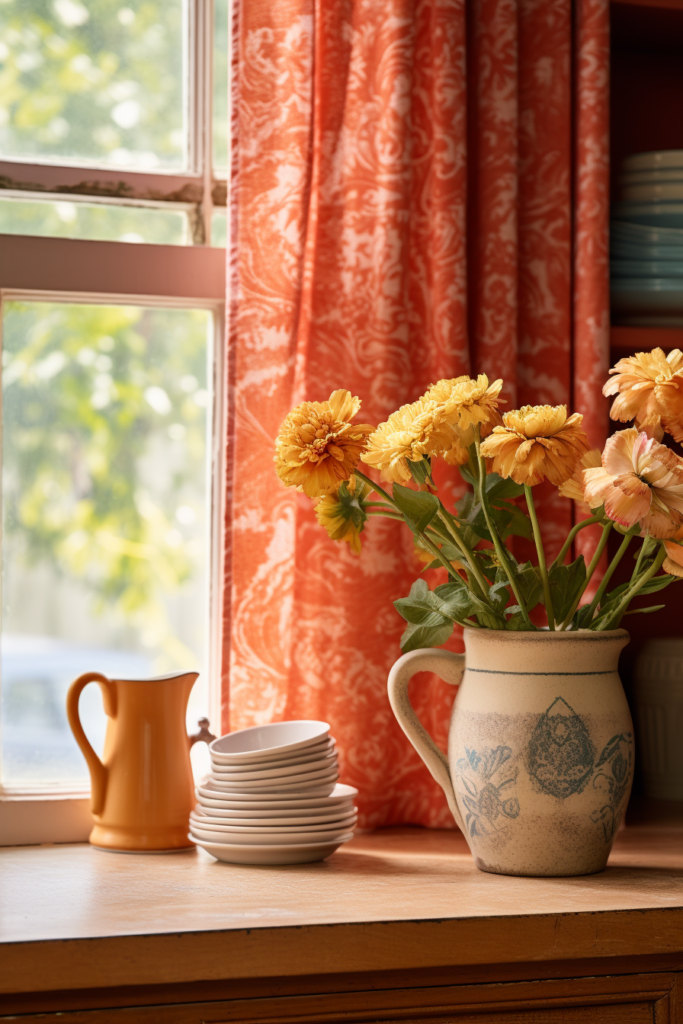
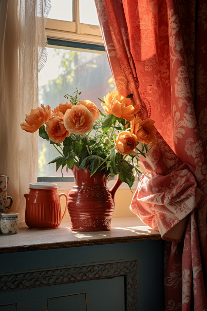
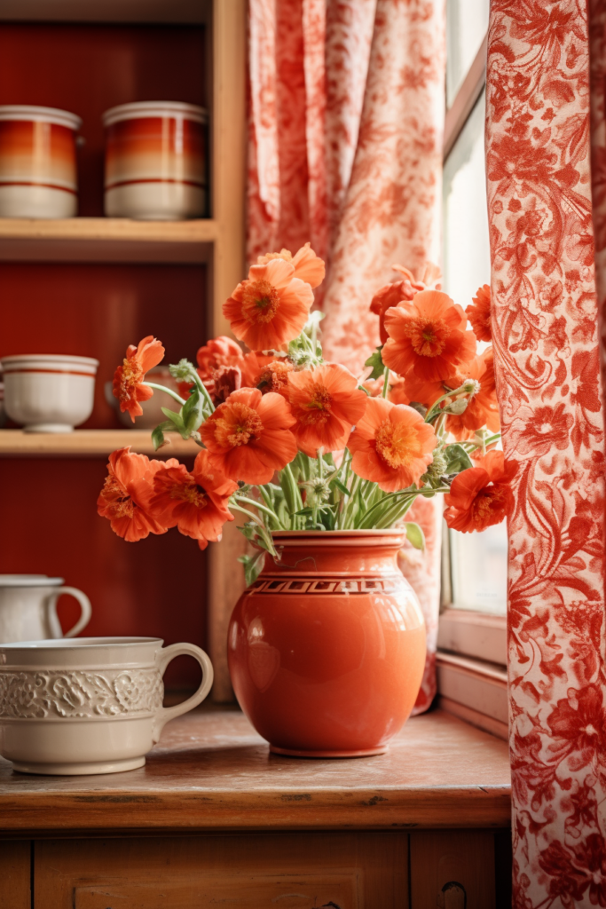
Equally peaceful is a peach, terracotta, and marigold blend, evoking images of a desert mirage at sunset. Accenting with darker brown hues grounds the airy palette.
- Sage, sea glass, and sky blue equal seaside
- Peach, terracotta and marigold say desert
- Connect colors promote harmony
- Accent analogous with darker shades
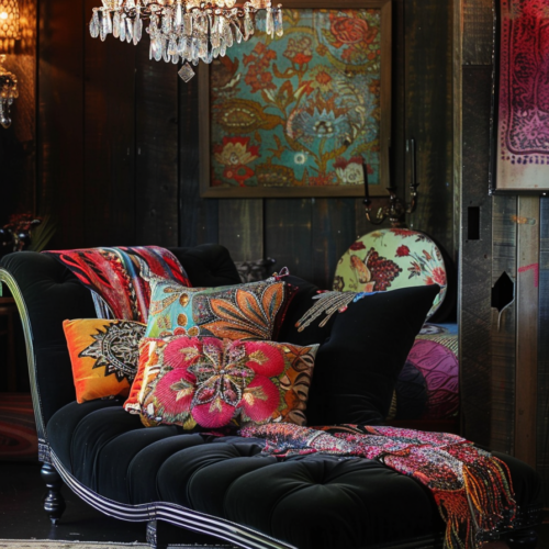
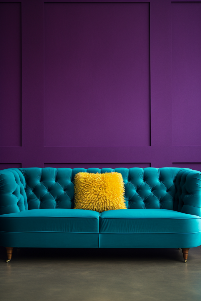
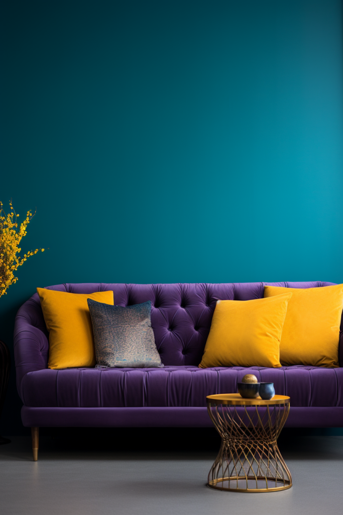
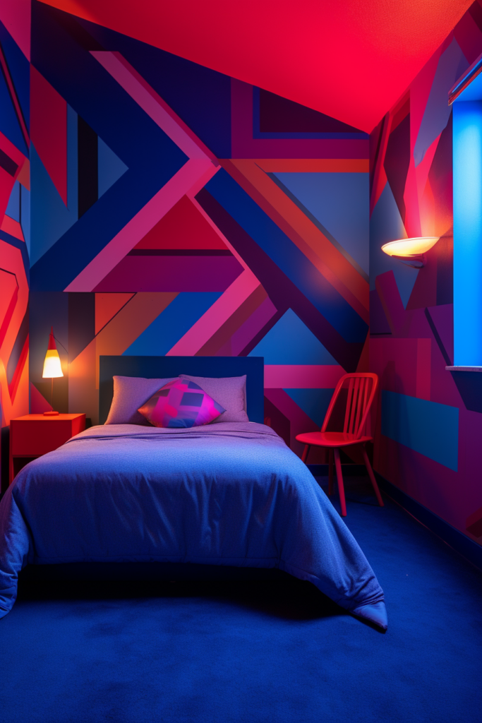
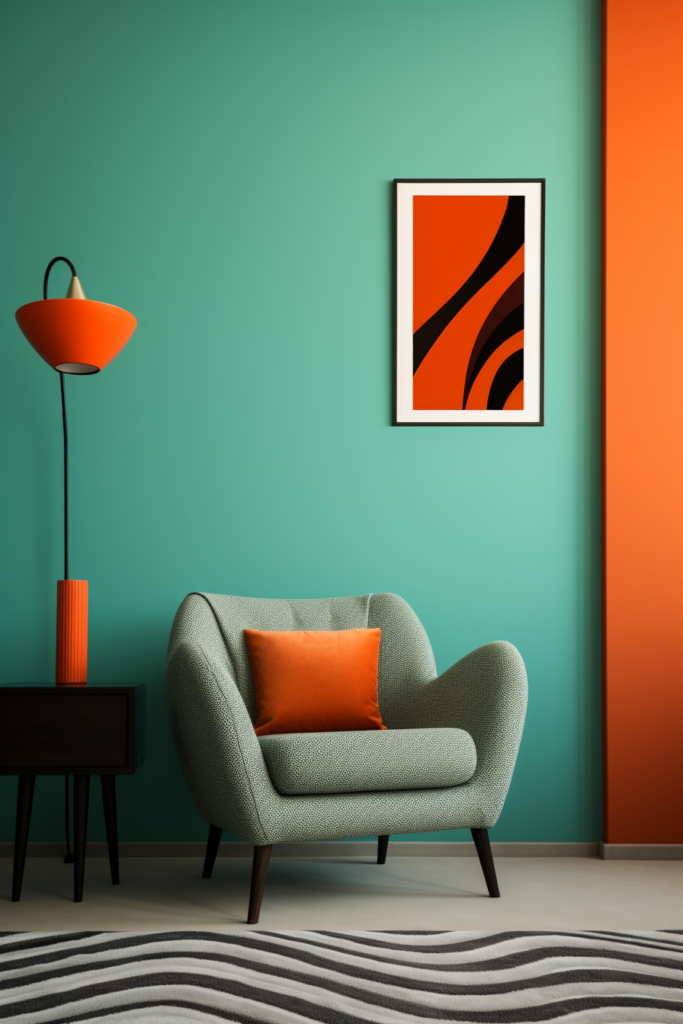
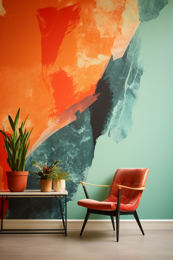
Unexpected Color Combos
Unlikely color combinations intrigue the eye and stimulate the senses. These unusual paint pairings provide the “wow” factor in any space.
Chartreuse and crimson make a dramatic statement, especially with black and white accents. Adding metallic touches enhances the dynamic vibe. Consider this bold blend for an eclectic, modern aesthetic.
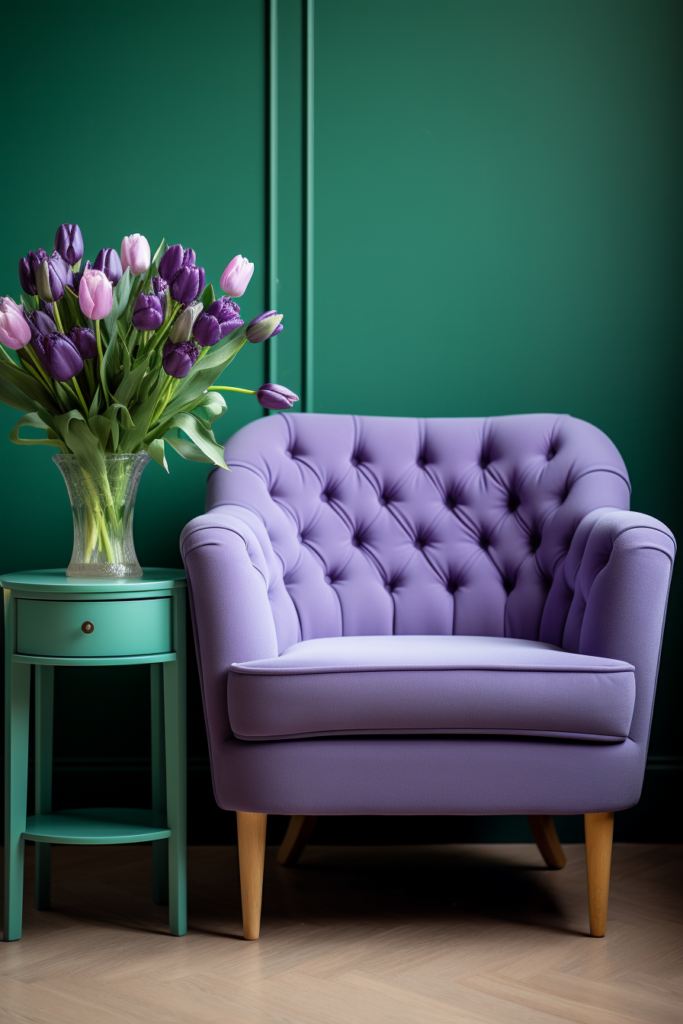
Similarly, lavender and lime green attract attention, particularly to intricately patterned wallpaper. Furnishings follow suit, like emerald Chesterfield sofas, violet velvet chairs, and citron occasional tables. Follow with punchy accent pillows and drapery for extra pop.
- Chartreuse and crimson electrify
- Lavender and lime green captivate
- Black, white, and metallics intensify
- Consistent furnishings and fabrics unify
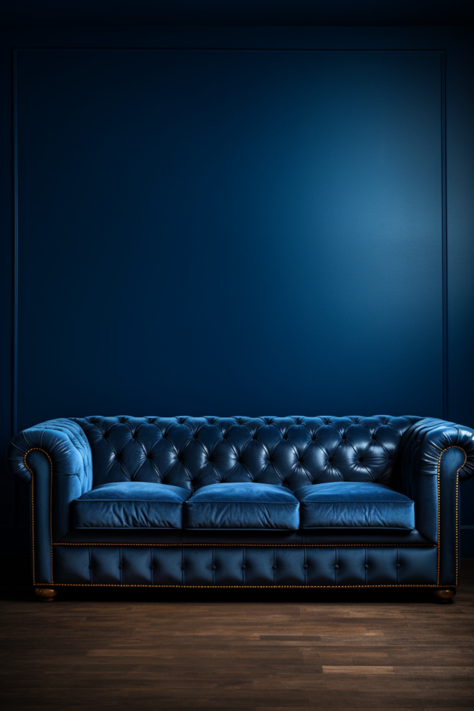
Monochromatic Magic
Monochromatic color schemes utilize a single hue, relying solely on its numerous tones, tints, and shades for interest. For example, navy blue offers endless variety.
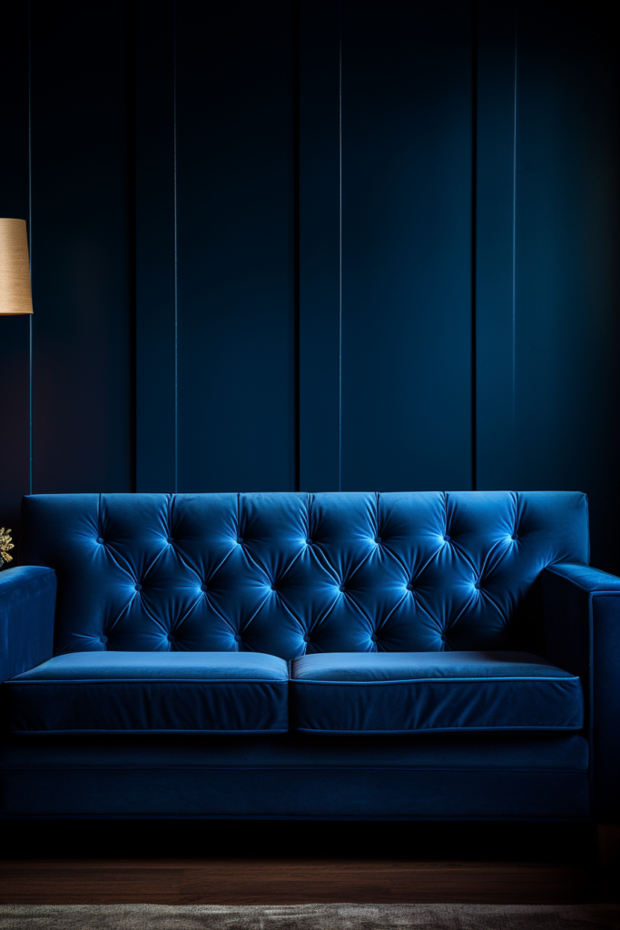
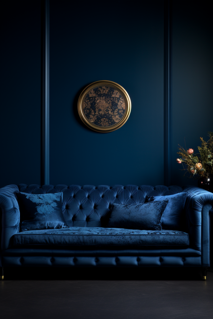
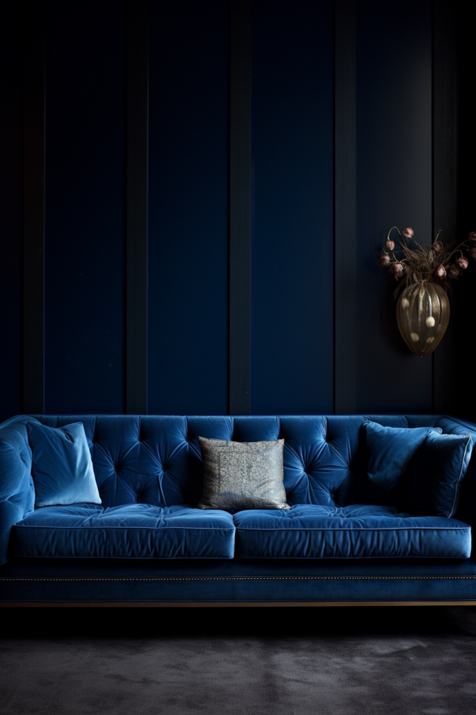
Pair navy walls with lighter blue ceilings, darker blue cabinetry, and vivid cobalt accents. Analogous turquoise undertones connect the cool, moody aesthetic.
Similarly, a rich chocolate palette oozes sophistication. Espresso walls, cocoa accents, and creamy trim add delectable dimension. Accented with amber hues, it warms the sensual scheme.
- Navy displays hue range
- Turquoise undertones unify
- Chocolate captivates the senses
- Amber accents add warmth
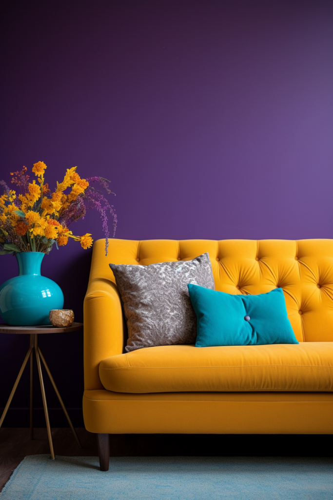
Repeating Colors Connect
Repeating colors throughout a space connects the aesthetic, promoting cohesion. Using multiple paint colors and echo colors in textiles, furnishings, and accessories.
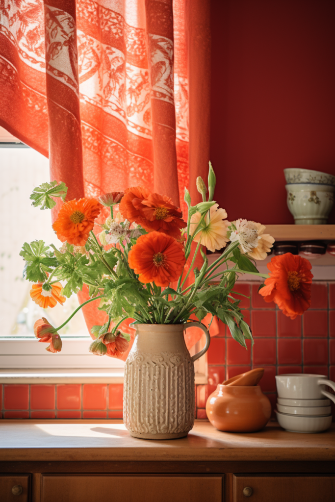
In a peach, terracotta, and marigold space, introduce peach and terracotta paisley pillows. Display marigold flower arrangements in terracotta vases. Use peach and marigold plates and serveware in the kitchen. Paint furnishings in one accent color and upholstered seating in the others.
A navy blue space layers lighter blues throughout on tossed pillows, drapes, and ceramics. Introduce analogous teal and cobalt blue via framed art, clipped blooms in dark blue glass vases, and vivid accent chairs.
- Repeat all colors in textiles
- Display flowers in coordinating containers
- Upholster seating in accent colors
- Frame, decorate, and bloom in analogous hues
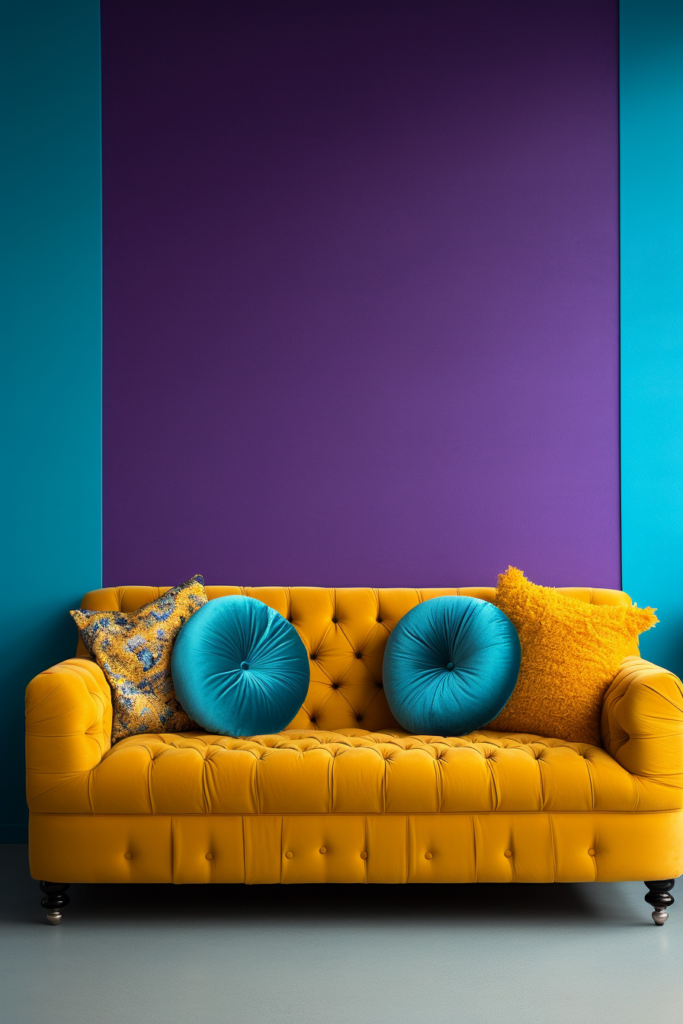
Colorblocking Concentrates Color
Color blocking concentrates multiple hues into one space by painting each wall a different color. This eye-catching display allows you to enjoy the variety. Start with one grounding neutral wall.
In a bedroom, paint three moody navy blue walls and one spicy terracotta accent wall. Navy ceilings and an area rug boost the color-blocking impact.
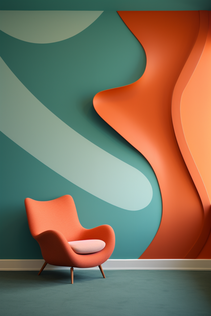
For an office, a color block with three serene blue-green walls and one contrasting persimmon-orange wall stimulates creativity. Adding metallic silver accents intensifies the energy.
- Color block walls for focal points
- Ground scheme with one neutral wall
- Navy and terracotta stimulate the senses
- Blue-green and orange boost creativity
- Metallic accents electrify color-blocking
Painted Ceilings Provide Pizzazz
While walls garner the most attention, painted ceilings serve up added panache. They provide another opportunity to not only repeat or coordinate with wall colors but also to deviate and contrast.
In a bedroom with robin egg blue walls, paint the ceilings a darker navy. The intensity inspires dreams and relaxation once heads hit the pillows.
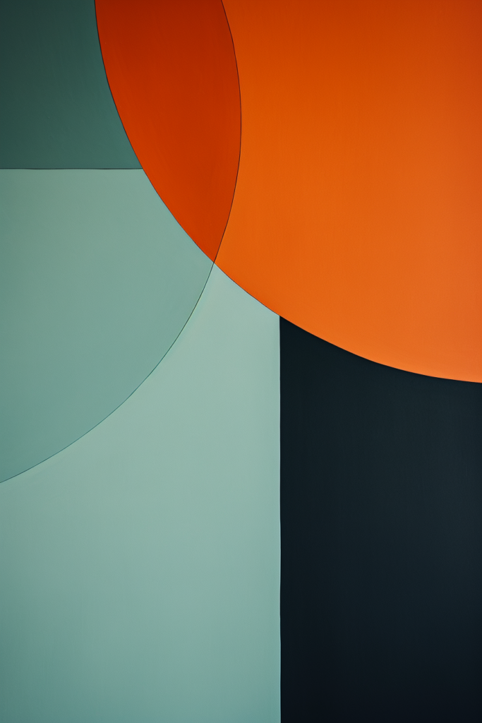
For a bold black walled dining room, paint the ceiling a striking tangerine. The surprising pop of color above energizes evening dinner parties and illuminates the sleek space.
- Repeating or contrasting ceilings wow
- Dark navy stimulates sleep
- Tangerine excites black backdrop
- Colored ceilings add extra elegance
Painting Furniture And Doors
Painting built-in cabinetry, furnishings, and interior doors harmonize fixtures with selected wall colors. However, restraint prevents overwhelming spaces with too much color.

In a pale peach dining room, painting the hutch a slightly deeper shade of peach provides added dimension and richness. Paint built-in bookshelves with the same hue.
In a cobalt blue living space, painting the door robin egg blue and the fireplace mantel turquoise connects the analogous wall and accent colors with panache and purpose.
- Painting fixtures promotes harmony
- Deeper shade adds depth
- Lighter pastel for contrast
- Analogous colors connect beautifully
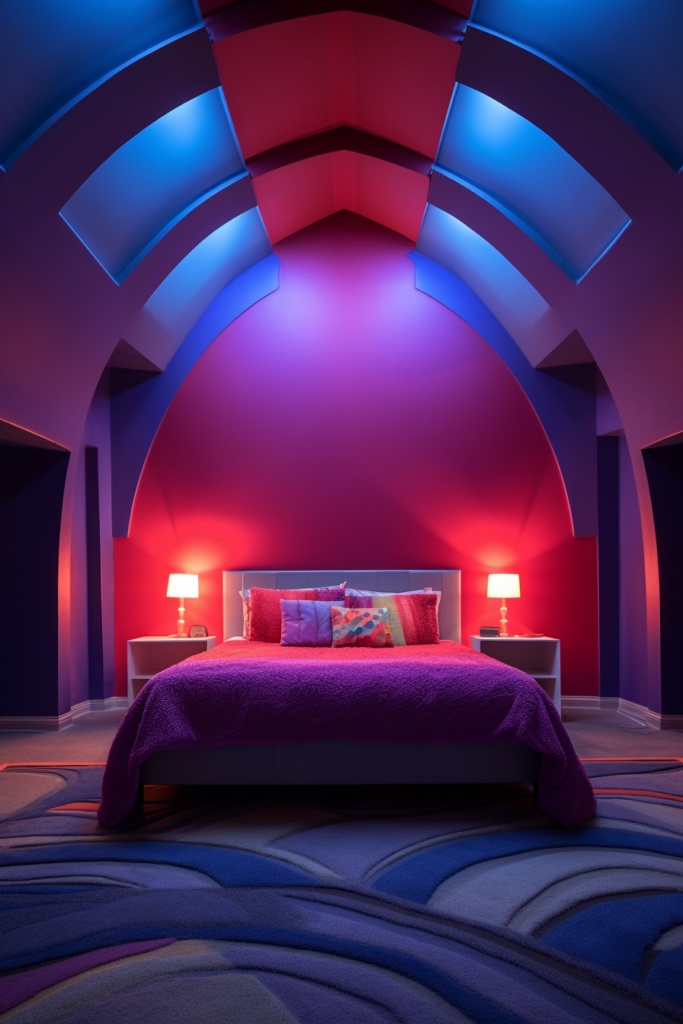
Black And White Anchors Color
While entirely monochromatic black and white palettes offer timeless sophistication, adding colorful accents creates dramatic dynamism. Vivid hues truly thrive against these extremes.
Imagine a black-walled living space with bright crimson toss pillows, cerulean blue vases, golden lemon side chairs, and bubblegum pink drapes. The lively accents thrill against the moody backdrop.
Conversely, an ivory dining space with chartreuse upholstered host chairs, violet pendants dangling above the table, fuchsia buffet accents, and navy window treatments proves ultra chic. Both color-rich palettes wow guests and offer endless inspiration.
- Black and white anchors provide contrast
- Vibrant accents truly captivate
- Ivory allows colors to shine as well
- Dramatic color combos offer inspiration
Color Injection With Wallpaper
Paint need not hog the spotlight when adorning interior walls. Wallpaper offers thrilling opportunities to incorporate color with patterns, textures, and dimensions that paint alone cannot provide. Fearless wallpaper choices in powder rooms, statement walls, and accent rooms illuminate, stimulate, and utterly transform mundane spaces with extra vivid color combinations.
Modern abstract patterns allow you to echo colors seen throughout the home with more vibrancy on a single wall. In color-blocked spaces, mimic the wall colors with sheen, metallics, or shimmer for stunning effect. Wallpaper takes color combos from 0 to 60 instantly.
- Wallpaper patterns and colors, wow
- Powder and accent rooms beg bold prints
- Statement walls reflect house colors
- Shimmery papers amplify color-blocking
- Wallpaper provides an instant transformation
Conclusion
Selecting the most pleasing and harmonious interior wall colors requires balancing color preferences with fundamental color theory. Mastering the nuances takes experimentation and imagination. Begin with inspiration from these stunning yet unusual paint color combinations for unforgettable, distinctive, and serene spaces.
Follow Quiet Minimal on Pinterest for more home design tips and inspiration.